#slab serifs
Explore tagged Tumblr posts
Text
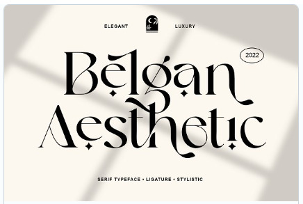
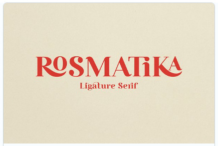


Here's the latest offering of free graphic design assets from Creative Market. The files this month are 3 fonts and a Photoshop template that gives you instructions to make a vintage Risoprint effect which is a kind of retro offset screen print style. It's coolio :)
I believe these are available for free for the month of November. Free type and graphic design files from Creative Market.
#free fonts#slab serif font#free slab serif fonts#free photoshop templates#free typefaces#typography#graphic designers#free commercial clip art#illustrators#typeface#fonts#graphic design#graphic art#graphic designer
22 notes
·
View notes
Text
okay but isn't this exactly how it went down:
5sos: *doesn't do collaborations much*
michael: yeah we collectively have this severe anxiety no one likes us
halsey:
roy:
calum's sister and gf both being musicians:
taylor swift inviting them to birthday her party in 2019:
the chainsmokers, being the only ones ever to convince them otherwise who INVITED THEM ON AN ENTIRE TOUR:
galantis: that was the best collaboration I've ever done! blew my mind how nice you guys are and how I learned from you this new experience of being able to be myself as a musician and not pressured by deadlines,, not having rules that 'it must be so'
michael: *still busy stressing about that one snare drum beat*
#michael clifford#galantis#rolling stone interview#lighter#5sos#5 seconds of summer#luke hemmings#ashton irwin#calum hood#okay at least michael talked about learning he can let go of these things and people like them?? bestie that's why you need collabs more#am literally doing the exact same thing as michael with my music rn though#sorry for the plain text. tried chat font and i can't with that much slab serif im sorry im an american typewriter for titles only girlie#did i just out myself as a typeface nerd? i think so. design school rewires your brain. or attracts the most picky neurodivergents
12 notes
·
View notes
Note
Top 5 fonts
god bless you. god bless you forever. i love to have an excuse to talk about fonts
THE ONE...THE ONLY....DIDOT!!!!!!!! high contrast and gorgeous with a history dating back to the 1700s. she's an og and yes, definitely a font best used in print and not digital work, but god look at her. she's so so pretty

2. baskerville. a classic. you know her, you love her. i have so much love for old-style serifs; they're like old friends. i never get tired of them. caslon doesn't quite have the elegance of baskerville but i feel similarly about her

3. freight. she's got sans AND serif variations but i particularly fell in love with her sans-serif. she's really friendly and versatile in a way geometric fonts tend to eschew. what a stunner! (DISCLAIMER: this is my personal brand font. i cannot recuse her from the running in spite of this. i recognize my biases and lay them before the letter of the law)

4. sofia pro. another excellent friendly sans-serif; she's just so pleasant, especially when widely kerned, AND she's got a rounded variant. queen.

5. georgia. i am basic. i love a chunky serif, especially if they have these blocky sort of serifs. georgia is just so accessible. i LOVE that g descender so much

honorable mention: times new roman (fucking SUE ME she's beautiful), FF DIN
top 5 asks! 🧐
#tldr: grotesk sans-serifs and high contrast serifs#i have yet to find a slab serif that makes me lose my mind but i don't use em all that much#thank you so so much for this ask i am DELIGHTED#ask game#bolt top 5
13 notes
·
View notes
Text
i don’t think a lot of ppl know what good font pairings look like. or what good font design looks like. but also who cares
#it’s all subjective when ur looking at it from an artistic design pov but for me it’s like… if youre designing for a public announcement or#for a thing that is supposed to deliver information accessibly….. maybe do not pair two slab serifs. maybe do not use slab serif or display#for the entire body copy. all this being said i mostly do poster designs and those can get as wild as u want#i mean…. there are design principles ofc and there are a lot of bad designs out there. but i think knowing the ‘rules’ helps u bend them in#a way that fulfills the vision you have and actually makes the design appealing even if its abstract and super stylized
4 notes
·
View notes
Photo

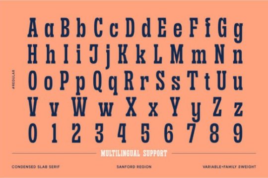
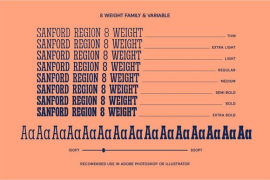
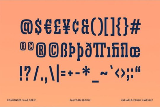
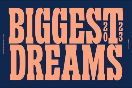


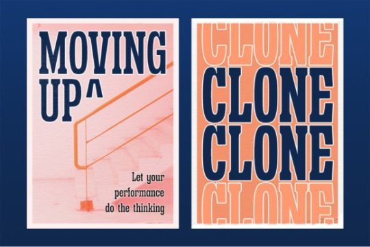
Sanford Region Font by letterhend
6 notes
·
View notes
Text


Logo - National Eczema Association
Font: Besley Semibold (the E is sized up)
Designer: Owen Earl, Indestructible Type
Distinct Features: Vertically symmetrical E? Flat topped T, slight tail on a
0 notes
Text


Elspeth v2, a traditional slab serif. Quote: Life of Brian movie (1979) by Monty Python. Extended Latin character set.
0 notes
Text
me when i new font for my comic website

#also me when six shots of whiskey#but i realized that the mspfa and flaringk viewer all used courier new#which is fine but it doesnt have the same slab serif vibe as courier std so i changed it over an hour or so#all because i switched to firefox today and the website didnt look as good. little miracles :)#anyways im pretty sleepy so im gonna rest now
1 note
·
View note
Text
i need to make a new handwriting font and compare it to the one i made when i was 13
#actually theres two i made then but the first one all the Os have smiley faces in them and the capitals are slab serif for some reason.#thats not the one im counting
0 notes
Note
HI I LOVE FONTS WILL YOU MAYBE TELL US ABOUT/SHOW SOME OF YOUR FAVORITES (particularly if you've got a good monospace serif I loveeeee a good monospace serif....)
VERY educated take. Delightful.
Monospace is so fun! Making serifs work in monospace is t o u g h since it's so cramped for wide glyphs already... I respect everyone who tries sososo much

Belwe is fun! Not just serif, but SLAB SWASH serif. Tryhards

Is Nova a serif? no. are the curly stems adorable? absolutely

And check this out, a WELL! In a mono font! In case you ever want to print this on itty bitty newsprint. Incredible
24 notes
·
View notes
Note
now that the lyrics project is complete what was your thought process for all the designs?? 👀 been wanting to ask but wanted to wait till you finished
well well well (i'll do it by song)
Pisara meressä: i wanted an informal vibe, like it's gotta be obvious that it was just written down in a notebook. just to reference the lyric Voit vetää hommat vihkoon but like. literally. so the cursive is just how i would normally write cursive, and the pencil sketch is retained. and the water drop below the P of the title lyric was there from the initial designs
Tuhoaisti: based off the käärijä logo font! it's not bold tho. i wanted to get the sense of destruction across visually. one of the easiest to make imo
Aaveisiin: based off courier. i wanted a vintage vibe with the typeface so i went with this slab serif font. it's all meant to be minimalistic. the window at the bottom is like. where the former lover or smth could look through. and the eyes are for that feeling of being watched. one of my faves
Suuren päivän ilta: i wanted a neon sign vibe, and considering the instrumentals, i wanted smth sleek and sans-serif. so it's somewhat based off this font (the all-caps one). and the doodles are based off the lyrics too. i made it red since it does get mentioned in the song (punasiin käytäviin), tho i also associate red with tuhoaisti and täydellisin. also i ditched my first work of it, and now i use the scrap paper to test color combos
Täydellisin: kinda hard at first, since spi was red and this was also very much red to me. and idk at first what font since i didn't want it to look like spi but i still wanted the neon sign vibes, and also somehow incorporate the seductive vampire imagery. that's when i found the font linked above (i used the cursive one here). i tried to make it glow but ehh... the double lines work i guess?? and the nearest i had to red that was neon was pink
Satama: based off the font kuumaa uses in their pubmats (which u posted recently). because of the modern sound of the instrumental, i wanted smth sans-serif but not as sleek as the spi font. the ship and fence are related to harbors, and the clock is a reference to both the ticking sound throughout the song and the promo videos for it. (it's even set at 1:00! 12 and 1! like in the promo!)
Loppujen lopuks: colors are based off this one poster i made for the song some time ago (it's on IG and the kuumaa fans discord). i wanted to make the text more rounded, and with more lines, but it wouldn't fit in the spaces. the stars are also based on the poster. mostly vibes-based from the instrumental since the lyrics themselves are not very visual imo. another of my faves
Valmiit: based off garamond font, since i wanted a serif font. to match the graduation vibes. same with the colors and the graduation/student caps. the train is mentioned in that very lyric too
Kerran sadassa vuodessa: my literal handwriting. sky blue, but not the light blue of pisara meressä, since it's cloudy. the birds and the heart are based off the lyrics, and the grass is just vibes
Tässä on kaikki: sunny!! i wanted a big font, i played around with some rounded ones but i couldn't get the spacing right. the teal is from the mix of blue and yellow. i thought the double lines make it more fun, as well as the wind. the bus is, well, supposed to represent a tourbus. the song has great roadtrip vibes in general
Luotan tulevaan: i wanted the flowiest script, but that wouldn't fit the page! and in glitter pen yellow gold so it's glowy like an actual streetlamp. and the lyrics are meant to be surrounded by a streetlamp too. tbh i also associate this song with blue (and dusk) but i feel like that's too much blue already (and i wanted to use it for yyl)
Yks yö lainaa: i had some more intricate fonts in mind, but i settled for this one that's similar to the täydellisin one but less cursive. the cleanliness reminds me of some poster fonts and i think that's really nice. dark blue since it's about night, but glitter gold too since i associate it more with this song. the couple is running in the park they sneaked into in the lyrics. it's got the colors of each kuumaa album! probably my fave of them all
overall: my original plan was to do the title of each song in the center, surrounded by lyrics everyone suggested. but i'm bad at layouts. and it felt like too much work, especially with my college stuff alongside everything. i also thought of putting stickers or photos, but that would mean buying more stuff. even if i'm not as fond of those i did for some of my fave songs, i'm alright with how it turned out! tbh i did all this for the 6 month anniversary of pisara meressä
i'm planning to do this too with jo3 after it releases 😉
5 notes
·
View notes
Text

Early Sketches for a slab serif for Metis Foundry.
7 notes
·
View notes
Text

Quick linocut test print of my final letter design of a slab serif "U".
Sep 14 2019
#theghostofdash#art#watercolor#linoliumprint#linolium#linocut#linocutprint#typography#typographydesign#typographyart#slabserif#ribbon#testprint#print#letterpress
2 notes
·
View notes
Text
टाइपोgraphy
Hii, myself jaswant this is my blog and it is a part of my typography assignments. So, I am going to showcase all the work which i have done in this module and my understandings from each one of them.

So, yaa this is my first assignment which was just for understanding the basic elements of typography like ascender, descender, baseline they are also called anatomy of typography. For this assignment the brief was to just present the understanding from the lectures so this was a last minute poster which i made and submitted as there was a deadline :(
The second assignment was that we got a font/typeface which we have to do research on and make a presentation on which was fun like when you sit and do a research about a font or a typeface you go deeper into exploring it knowing about it searching for the details and comparing it with different and similar types then seeing the same font on social media and observing it, its so fun to do so.
So this was the part of this assignment


The brief given was to make a motion poster on the font which was given and i mad it also and got approved but the bad luck is that i can't able to export the gif file :( it was out of my storage but i made the animation(the motion image above the poster) so what i tried to show in that was so basically it is a typeface named ARCHER which was designed by Tobias Frere- Jones and Jonathan Hoefler so they both made this typeface, it is a slab serif font, now slab serif fonts have thick block like structure which makes them different and why do they have that structure it is because this typeface emerged in the early 19th century so it was the time of industrial revolution so they wanted some bold and eye catching fonts in there posters and signages and that's the reason why it was created and when it comes to archer typeface it was released in 2001, it is known for its boldness which it carry from the slab serif and it has the round terminals and curves which can be seen if you notice the typeface so that shows how it is approachable and friendly so i tried to show that in the animation when the letters get zoomed you go through the main changes or can be said differences which this and other slab serif typefaces had.
Now comes the third assignment

This was the class work and the brief was that we have to write our name in a way that should depict the topic which is shown here my assignment is not accurate but the first one was written in different styles in which I wanted to show that I am a graphic designer, in the second one I tried to merge my native language telugu which is curvy so I tried to use it because I had to show where I am from, the next one was what is my favourite wildlife animal and it is cheetah so I tried to make spot like structure on texts and it was made like that, after that the next one was i have to show I love himalayas and I made that which shows that the form of melting and some sharp edges which may show it but i feel like its not good enough and the next one and the last one is I have to write that I hate this exercise and I tried to write it in that way. So this was the assignment and the next one is magazine layout
https://drive.google.com/file/d/1g-1oE37RQGeFBnnKUqyF35RXTpBhgHke/view?usp=drive_link


This is the bloom magazine layout.
so this the link for the magazine layout which i worked on for the word bloom so this assignment was that we can take a random word which we have to make a text as image like its is something like expressive type we need to express the meaning of the word with the image so it was that and we have to click images and arrange the images and make the word so it was something which should be included in this magazine.

This is the image which was finalized as the text as image so i have to make this on the basis of the main meaning of the word bloom means growing or can be said like its going to grow so I used kind of graffiti style to show that as it is more famous in the young age group which in some sense means in future there will be growth or its growing so I used it.
next one is experimental layout so on this one i tried 6-7 rough layouts and these are the finalized ones


This is one of it


This is the second one and
this one is still needed to work on but yaa these are the layouts which I worked on lately so the brief for this one was simple we need to experiment and explore what can we do with the image and text but the catch was that we need to add text about 50 to 100 words or more then that.
Now the next assignment which we got was to redesign the price tag of any clothing company so I took Lee Cooper price tag and it was my first time to make something like that and I enjoyed making, trying and experimenting it.

So this was it.
Now its the blackout poetry
it is a famous and very interesting activity to do not only as a designer but also when anyone is free then he/she can do this activity, so what we have to do in this activity is we have to take a newspaper sheet not only that anything like book, magazine etc, we have to take some specific words and darken the remaining sentence and the words which we have chosen that have to make some meaning like


Yaa so we need to make it like this.
So, these are the assignments which were given in this module of typography, this module not only talked about the type/font it gives a whole new perspective the next time we see any text or any poster or any billboards anything if it have text we observe it and try to recall what kind of font or family it belongs to and is it good or not what will be the pair for that font how it will be if we used another font on the same background and there are lots of stuff still to learn I am still reading and observing(trying too) and knowing things and that's it this was my work i mean this whole month work i worked on.
Poster Design
Here it comes the second module 'POSTER DESIGN'.
What we learnt so far in this module:
Posters have played a significant role in communication for centuries, going through different cultural and artistic movements they had been part of various things.
There are different types of posters, as we go more deep into this topic we can get to know about evolution and history of posters. They have changed time to time according to the periods which they were on. Still reading about it :)
So when it comes to the principles of designing a poster or things to keep in mind while designing the poster are
We should keep at least 1 inch margin on each sides of the poster for the text.
Text on the poster should be lesser as its just the brief of a particular event or product and also it depends on where is the poster going to be sticked and also who are the targeted audience and what is the purpose of the poster.
When designing a poster we should keep in mind about the texts readability and legibility.
Posters are mostly center aligned.
These are some of the rules we should follow while creating a poster.
Now comes the 1st assignment

This is the first assignment of the module where we have to form a group of 5 people and make a poster and the theme was Social Justice and Equality and we had to show Figure and ground in it. So in this poster we showed that both social justice and equality go hand in hand here we used Swiss design in this poster.
Here comes the 2nd assignment


This is the second assignment which was also a part of group project but it didn't workout so I made this poster on Social conflict. So in this poster we had to take news of any topic and team will be divided on the basis of that and we had to do research and find a common topic in our group and e had to make a poster so in my team the topic which we finalized was social conflict and here is the poster for it.
The third assignment was interactive poster


this was a group project and my group mates where Anumeha, Anisha, Nandini, Ayushi.
This the next assignment one teaser and one final poster
This is teaser poster

This is final poster

and this was also a group project and my group members were
Kalyani, Anushka, Raunak
next one is one word and one concept.


So these are the assignments of poster design module.
4 notes
·
View notes
Photo

Designer Focus: SilverStag Type Foundry
Today we're focusing on the SilverStag Type Foundry for our designer focus
Full blog post: Designer Focus: SilverStag Type Foundry
Fonts in this collection
FlyBridge - Bold Ligature Rich Sans
Madriz Black - Retro Slab Serif Font
Refract - Edgy Grotesque Font Family
Cosmic Solace - Ligature Typeface
Lightshift - Funky Display Typeface
Tangled Rockaway Vintage Serif Font
ROCKFALL - Bold Ligature Typeface
The Portray - Elegant Serif Typeface
Costa de Malaga - Art Deco Font Pack
Raving Display Editorial Serif Font
#aff#fonts#typeface#font#fontdesign#typelove#fontaddict#typographyinspiration#typeinspiration#fontoftheday#typographic#fontcollector#letteringdesign#typographyart
2 notes
·
View notes
Text


Website Header/Body Text - Online Fonts
Font: Roberto Slab
Designer: Christian Robertson
Distinct Features: F arm has no serif, low contrast, n has symmetrical serif feet
0 notes