#talbot baines reed
Explore tagged Tumblr posts
Text
The Fifth Form at Saint Dominics
I just wanted to take a moment to shout about this book! And thank you for the rec @eclare1000 💖 It's available for free to download on Project Gutenberg and is a delightful read. A beautifully written schoolboy story from 1887, sort of a morality tale but very entertaining with great character portraits. And it did actually have me in suspense by the end!
And if it leaves you wanting more there are small number of lovely fics at AO3.
3 notes
·
View notes
Text

My Friend Smith, by Talbot Baines Reed
1 note
·
View note
Link
Talbot Baines Reed was an English writer of boys' fiction who established a genre of school stories that endured into the mid-20th century. Among his best-known...
Link: Talbot Baines Reed
0 notes
Text

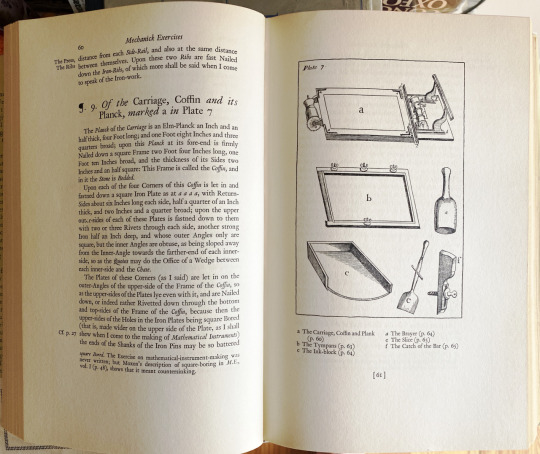
joseph moxon
joseph moxon (1627–91), mathematical instrument maker, & hydrographer to charles ii, added to his skills all those requisite in typography: in 1669 he issued the first complete english typfounders’ specimen [talbot baines reed (a.f. johnson, ed.), A History of the Old English Letter Foundries, faber & faber, london, 1952, p170] .
moxon wrote the Mechanick Exercises, comprising two volumes: volume one addressed smithing, joinery, & building trades in general, & was completed in 1678; volume two on printing issued in sections, 1683-4. illustrated are dust jacket, & spread showing plate 7 that originally appeared facing opening of §10 «Of the Press»—cp. ‹ben franklin’s copy›—from the excellent revised & annotated edition of moxon’s Mechanick Exercises on the whole Art of Printing [herbert davis & harry carter (eds), oxford university press, 1962, pp 60-1]. from the introduction: «His book was by forty years the earliest manual of printing in any language, and it put in writing a knowledge that was wholly traditional.» [ibid., p.vii].
«For almost a century it remained the only authority on the subject; subsequently it formed the basis of numerous other treatises, both at home and abroad, and to this day it is quoted and referred to, not only by the antiquary who desires to learn what the art once was, but by the the practical printer, who may still on many subjects gather from it much advice & information as to what it should still be.» [op.cit., p175].
2 notes
·
View notes
Text
Logo development
When researching old English for the name generation, I found that old English alphabet uses a similar style to some blackletter fonts. Talbot Baines Reed, a 19th century printer, observed that Black letter appears in need all presses from England's earliest printers (Reed, 1887, p.48). Therefore, by using Blackletter I am connecting the brand back to England Heritage, clearly showing that the crafts have history that should not be forgotten. Furthermore Gen Z find Black letter appealing because it is fun and playful (Crossley and Houghton, 2024).
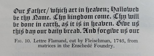
Image from book history of old English letter foundries, example of old black letter.
When looking at examples of Black letter, I noticed that the C design reminded me of a C and an R. I thought this may be interesting to create a logo for my visual identity because it plays on the historical style. This relates to the main concept of my project, bringing traditional crafts back to the forefront of contemporary practice.

To start I began sketching possible designs on paper, using the blackletter typefaces as inspiration. This allowed me to study the letters and see how they are made. I found combining a capital C and lowercase r was more successful because the two letterforms use similar curves and serifs to create the decorative typeface.
I then used these sketches to create some digital logos. Experimenting with different bush styles

I liked how the strokes made the letterforms feel hand drawn instead of digitally created. This brings the elements of hand made crafts back into the logo design. Although the logo needs to be digital I want to hint at the hand crafted element of the concept.
Following this I chose four versions I thought were most ledgible and fit with the blackletter style.

I thought these designs were most successful because they use a varied line weight, hinting at calligraphy brush stroked. However, I though the right side logos were more abstract, which may not suit the target audience as they prefer more simple and straight forward communication.

Based on this, I chose the 3rd experiment to develop into a full word to see how using similar shapes would create a logo. I think this was useful in seeing how a logo type could look based on the letterforms I created. However, I think creating the full logo type makes the logo lose the link to Blackletter. Therefore I will need to experiment with combining the letterforms with black letter to see if this is more effective in convey how the websites aim is to show how historical crafts have a place in contemporary setting.
Although I like how the letterforms looked similar, I think they look too separate making it look disjointed and unbalanced.
Reed, T. (1887). History of the old english letter foundries. Revised Edition. Faber ; London
1 note
·
View note
Text
Agents of S.H.I.E.L.D. Cast and Crew thank you for the Past SEVEN years
Agent Phil Coulson - Clark Gregg
Agent Melinda May - Ming-Na
Skye/Daisy Johnson - Chloe Bennet
Agent Leo Fitz - Iain De Caestecker
Agent Jemma Simmons - Elizabeth Henstridge
Agent Alphonso "Mack" Mackenzie - Henry Simmons
Agent Elena Rodriguez - Natalie Cordova-Buckley
Holden Radcliffe - John Hannah
Agent Grant Ward - Brett Dalton
Agent Lance Hunter - Nick Blood
Agent Bobbi Morse - Adrianne Palicki
Lincoln Campbell - Luke Mitchell
Agent Piper - Briana Venskus
GHOSTRIDER / Robbie Reyes - Gabriel Luna
Patriot / The Director / Jeffrey Mace - Jason O'Mara
Calvin Johnson / The Doctor - Kyle MacLachlan
The Superior / Anton Ivanov - Zach McGowan
Hope MacKenzie - Jordan Rivera
Gabe Reyes - James Henrie
Vin-Tak - Eddie McClintock
Agent Davis - Max Osinski
Agent Anderson - Alexander Wraith
Burrows - Patrick Cavanaugh
Ellen Nadeer - Parminder Nagra
Mr Giyera - Mark Dacascos
Rosalind Price - Constance Zimmer
Luther Banks - Andrew Howard
Lash - Matthew Willig
Jiaying Johnson - Dichen Lachman
Gordon - Jamie Harris
Robert Gonzales - Edward James Olmos
Kara - Maya Stojan
Agent Weaver - Christine Adams
Agent Oliver - Mark Allan Stewart
Agent Antoine Triplett- BJ Britt
Danial Whitehall - Reed Diamond
Graviton/Colonel Glenn Talbot - Adrian Pasdar
Deathlok / Mike Peterson - J. August Richards
Ian Quinn - David Conrad
Raina - Ruth Negga
Ruby Hale - Dove Cameron
Werner von Strucker - Spencer Treat Clark
Polly Hinton - Lola Glaudini
Agent Tomas Calderon - Kirk Acevedo
Toad - T.J. Alvarado
Qovas - Peter Mensah
Agent Jasper Sitwell - Maximiliano Hernandez
Agent Flix Blake - Titus Welliver
Agent Victoria Hand - Saffron Burrows
Doctor J. Streiten - Ron Glass
Lash/Doctor Andrew Garner- Blair Underwood
General Rick Stoner - Patrick Warburton
Gabe - James Henrie
Isabelle Hartley - Lucy Lawless
Agent Shaw - Charles Halford
Zav - Kaleti Williams
Agent Phelps - Anthony D. Washington
Zack Bynum - Bryan Keith
Diego - Carlos Rivera Marchand
Agent Kim - Chen Tang
Sunil Bakshi - Simon Kassianides
Carl Creel - Brian Patrick Wade
Kara Palamas / Agent 33 - Maya Stojan
Alisha Whitley - Alicia Vela-Bailey
Joey Gutierrez - Juan Pablo Raba
R. Giyera - Mark Dacascos
Hellfire / J.T. James - Axle Whitehead
Nathaniel Malick - Joel Dabney Courtney
Madame Hydra / Aida "Ophelia" - Mallory Jansen
Lucy Bauer - Lilli Birdsell
Elias "Eli" Morrow - José Zúñiga
Enoch Coltrane - Joel Stoffer
Tess - Eve Harlow
Kasius - Dominic Rains
Grill - Pruitt Taylor Vince
Flint - Coy Stewart
Hale - Catherine Dent
Ruby Hale - Dove Cameron
Marcus Benson - Barry Shabaka Henley
Keller - Lucas Bryant
Jaco - Winston James Francis
Snowflake - Brooke Williams
Pax - Matt O'Leary
Malachi - Christopher James Baker
Izel - Karolina Wydra
Wilfred "Freddy" Malick - Darren Barnet
Luke - Luke Baines
Sibyl - Tamara Taylor
Kora - Dianne Doan
Sequoia - Maurissa Tancharoen Whedon
Special Guest Stars
Eric / Sam / Billy Koenig - Patton Oswalt
Gideon Malick - Powers Boothe
The Clairvoyant / Agent John Garrett - Bill Paxton
Agent Peggy Carter - Hayley Atwell
Dum Dum Dugan - Neal McDonough
Agent Maira Hill - Cobie Smulders
Nick Fury - Samuel L. Jackson
Sif - Jaimie Alexander
STAN LEE
Director / Writer Joss Whedon
Director / Writer Jed Whedon
Producer / Writer Maurissa Tancharoen Whedon
28 notes
·
View notes
Photo


Selection of Covers from ‘The Boy's Own Paper’
Total Issues: 1767+744=2511
A morally uplifting boys' story paper concentrating on adventure, sport and public school life, it remains a byword to this day and ranks (along with Punch, The Strand Magazine and very little else) as one of the great British institutions of periodical publishing. Authors include W.H.G. Kingston, R.M. Ballantyne, Jules Verne, Talbot Baines Reed, Gordon Stables, G.A. Henty, etc, etc. Serials indexed in "Through the Years with the B.O.P." by Brian Doyle (Collector's Digest Annual, 1962). Further Reading: Take a Cold Tub, Sir!: The Story of the Boy's Own Paper by Jack Cox (Guildford, Surrey, Lutterworth Press, 1982), not an index but a history. Weekly issues were bound as monthly issues, and the monthly issues were bound as annuals. There are 63 Annuals from 1879-1941. http://www.philsp.com/data/data073.html
#boy's own paper#boy's own#boy's own magazine#adventure#victoriana#victorian#empire#colonial#postcolonial#comic#magazines#periodicals#papers#pamphlets#cartoons#thrillers#potbiolers#pulp fiction#penny dreadfuls#edwardian#fin de siecle
1 note
·
View note
Photo

http://www.ebooksread.com/authors-eng/talbot-baines-reed/tom-dick-and-harry-532.shtml
0 notes
Photo

Image from 'Kilgorman. A story of Ireland in 1798. [With an introduction by J. Sime.]', 003058491
Author: Reed, Talbot Baines
Page: 215
Year: 1895
Place: London
Publisher: T. Nelson & Sons
View this image on Flickr
View all the images from this book
Following the link above will take you to the British Library's integrated catalogue. You will be able to download a PDF of the book this image is taken from, as well as view the pages up close with the 'itemViewer'. Click on the 'related items' to search for the electronic version of this work.
#bldigital#bl_labs#britishlibrary#1895#similar_to_170432553197_place_of_publishing#similar_to_170432553197_published_date#similar_to_170432553197_bubblyness_y
0 notes
Text
New edit in the Wikipedia article on Talbot Baines Reed
On June 10, 2015 at 06:29AM, Colonies Chris made an edit the Wikipedia article on Talbot Baines Reed.
0 notes
Text
Ten Books to Know Me
Rules: 10 books for people to get to know you better, or that you just really like.
Tagged by @broomsticks, thank you so much! 💖 Love that you listed Battle Royale—what a good manga series!
Going a little loosey-goosey on the selections, here.
Batman Annual #2 by Tom King and Lee Weeks I’m not a well-versed capes person, but this always makes me cry.
Blankets by Craig Thompson Beautiful graphic novel about coming of age in the midwestern US.
Bravetart: Iconic American Desserts by Stella Parks It’s a damn good cookbook and a wonderful history of American desserts. Parks’ research and introductions to the foods are as worth reading as the food is worth making.
Cat’s Eye by Margaret Atwood Probably the reason I imprinted on narratives of middle-aged protagonists reflecting on their pasts.
The Fifth Form at St. Dominic’s by Talbot Baines Reed The platonic ideal of my interest in the public school novel.
I Love Dick by Chris Kraus Absolutely perverse recounting of a woman’s sexual obsession with an uninterested man, and I mean that as high praise. Makes the private into the public in a way that seared me.
The Little Schemer by Daniel P. Friedman A textbook written like a children’s picture book, complete with illustrations, about one of the most beautiful programming languages of all time.
Middlesex by Jeffrey Eugenides A formative exposure to gender identity as changeable and imperfect.
Pond by Claire-Louise Bennett Quiet, mundane, wonderfully descriptive recounting of a life in rural Ireland.
The Sandman (collected series) by Neil Gaiman and various artists Nostalgia in a 10-volume series.
Tagging, if you’re interested! @yletylyf @sproutwings @mademoiselle-red @ralphlanyon @kellychambliss @liesmyth @golden-biro
13 notes
·
View notes
Photo

antique | egyptian
illustrated is the earliest founder’s showing of the face called by the foundries «antique»: vincent figgins from the 1817 appendix to his 1815 specimen [facsimile: berthold wolpe (ed.), Vincent Figgins Type Specimens 1801 & 1815, printing historical society, london, 1967]. nicolette gray says «His double pica Antique [illustration, ‘Two Lines Small Pica’] is magnificent. It has all the deliberation, the firm, solid, reasonable precision which is the fascination of the Egyptian.» [XIXth Century Ornamented Types and Title Pages, faber & faber, london, 1938, p30]. giving some elevated theory behind the antique, nicolette gray tells us: «But if type tends to be neater it is also richer, as if Wilkie had something of Etty’s bloom or Mulready something of the verve of Lawrence. It has more weight, too; it is emphatically a product of the same period as Inwood’s St Pancras Church (1819-22 ) and Smirke’s British Museum (1823-47). Here is a classicism not altogether illuminated with the sunlight of greek rationalism, the heavy forms are opressed with the burdens of their weight, the shadow of the Egyptian collection which it was to house (installed by troops in 1834) seems cast over the façade of the Museum. It is significant that the typical letter of the period was called at its first appearance Antique but that the alternative name, Egyptian, became the common usage. The distinction between the two civilizations is not always clear in the minds of the revivalists.» [op. cit., p28]. it is unclear, to me, as yet, as to why egyptian stuck as the more usual appellation for this species of type.
0 notes
Photo
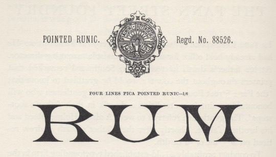
pointed runic
generally, i take the term runic to denote a fount of sorts requisite for setting the inscriptions of pagan, northern-germanic tribes in the letters they called runes [cf. isaac taylor, The Aphabet, vol.2, kegan paul, trench, & co., london, 1883, p210]. but in Plain Printing Types theodore low de vinne gives a taxonomy of types he assigns to the category «antique», & one is called runic: «Runic is the name given to another style of antique of light face, of condensed form, with pointed serifs, and often without lower case characters.» [the century co., nyc, 1902, p326]. perhaps here we get closer to the face illustrated, but not quite, i think. stanley morison in his slim biography of Talbot Baines Reed [privately printed at the university press, cambridge, 1960] gives account of reed’s proprietorship of the type foundry he took over at his father’s death in 1881, the fann street foundry (vide footnote to ‹clarendon›); & morison shows several specimens from a fann street foundry catalogue [Specimens of Printing Types, Ornaments, &c, sir charles reed and sons, london, 1887], of which the illustration is one [op cit., p38]—morison must have found it striking. if runic is a species of antique, i do not see it in this face; or perhaps it was felt to resemble the ancient runes: there must be some logic in the name [✓].
#typography#stanley morison#runic#talbot baines reed#fann street foundry#isaac taylor#theodore low de vinne
0 notes
Photo

clarendon
the original «clarendon» was registered by the firm thorowgood & co. of london, in 1845, while under the direction of robert besley; & was cut by besley’s partner benjamin fox at their fann street foundry*. «The type was an Egyptian with bracketed serifs and fulfilled a demand for a bold face suitable for dictionary work. It was so successful that the word Clarendon for a heavy type has become part of the common language. There had been types of similar design before Besley’s, which went under the name of Ionic.» [talbot baines reed (a.f. johnson, ed.), A History of the Old English Letter Foundries, faber & faber, london, 1952, p296]. of clarendon theodore low de vinne tells us: «Clarendon, a popular variety of condensed antique, was first made for the Clarendon Press of Oxford, to serve as a display letter in a mass of text-type, and for side headings in dictionaries and books of reference.» [Plain Printing Types, the century co., nyc, 1902, p331.] de vinne gives a taxonomy of «antique» faces: «Antique differs from roman [he means old-face roman] in the boldness of its lines: stem, serif, and so-called hair-line are always of greater thickness. … The intent of the designer was to produce, for purpose of display, a bolder style that should be as distinct and easily read as that of the old lapidary characters. For this reason it was called antique by some founders and egyptian by others.» (cp. ‹antique | egyptian›) according to de vinne square serif is a characteristic of a strict antique, but ionic antique has bracketed serifs & «has large face, open counters»; & a further square serif variant, the doric antique, «has features of roman» [ibid., p323-5]—added confusion as doric was «the Caslon name for Sans Serif» [reed, op.cit., p251], & i can discover no doric antiques in the bruce’s new-york type-foundry (de vinne’s main supplier) specimen book of 1869. nicolette gray considers clarendon & ionic to denote the same type style: «Besley’s letter, in its slightly compressed form became the normal, but it was certainly not the first Ionic letter. The Ionic is an Egyptian with the slab serif bracketed and a definite differentiation between the thick and thin strokes. … In 1842 Caslon have an upper and in 1843 a lower case with the characteristics fully developed, but of normal width, and retaining the Egyptian E and F, without serifs to the middle arm.» [XIXth Century Ornamented Types and Title Pages, faber & faber, london, 1937, p51]. jan tschichold concurs with gray (some details muddled): «The fully developed ‘Clarendon’ dates from the year 1843 [ionic dates from 1843, clarendon was 1845]. The first form of this type, called ‘Ionic’ — quite similar to the Clarendon by the Haas Type Foundry depicted here — was cast by Henry Caslon, Type Foundry [sic], London.» [Treasury of Alphabets and Lettering, Rheinhold, New York, 1966, p233]. the hass’sche schriftgiesserei [münchenstein, switzerland] clarendon was drawn by hermann eidenbenz in 1951. the illustration above is tschicholds [ibid., p199]. for another clarendon revival vide ‹volta›.
* the foundry founded by robert thorne in 1808, & acquired by william thorowgood at auction in 1820. robert besley became a partner in the firm c. 1838 at which time the foundry became styled thorowgood & co. upon thorowgood’s retirement the firm continued as robert besley & co, besley’s partner being his punch-cutter benjamin fox. in 1861 charles reed joined the firm, & the firm continued as reed & fox. after the death of fox in 1877 the firm continued as sir charles reed & sons, with talbots baines reed as sole proprietor until his death in 1893. operating until 1905 as a limited company, the material was finally acquired by stephenson, blake & co. [op. cit., pp 194 & 296-7.]
#typography#clarendon#ionic#robert besley#benjamin fox#talbot baines reed#theodore low de vinne#nicolette gray#jan tschichold
0 notes
Photo
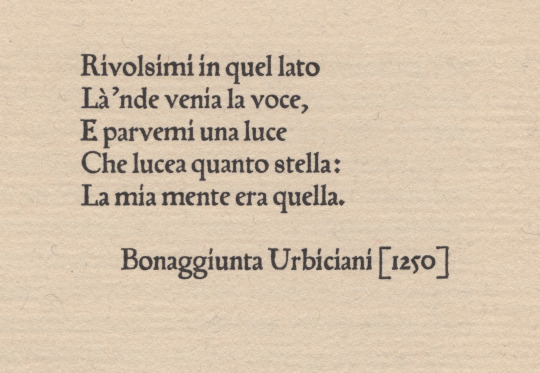
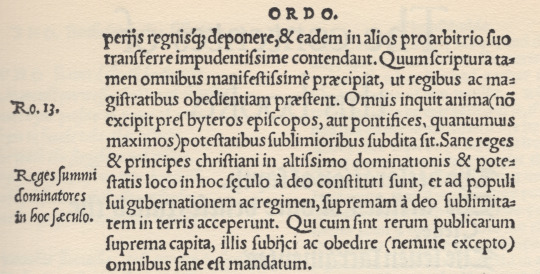
not schöffer’s roman
peter schöffer of gernsheim [1425-1503] was a scribe who apprenticed to the inventor of the black art, johannes gutenberg. schöffer united with gutenberg’s partner, johann fust, in legal proceedings against gutenberg resulting in «appropriation» of guntenberg’s printing apparatus; after which he married fust’s daughter, christina, & articled with fust in a new printing office—fust & schöffer. urbiciani’s poem [1st illustration*] prefaces a little book entitled Hand and Soul by dante gabriel rossetti [the halcyon press, maastricht, 1928]: it is set in types attributed to schöffer—which would have been amongst the first transalpine romans. the matrices descended schöffer’s family until jacobus scheffers, a printer at bois-le-duc [’s-hertogenbosch], sold them to johannes enschedé on 26 august 1768—enschedé used them only for study. the book is set in a fount cast by the historic firm of joh. enschedé en zonen, haarlem, in the early 20th c., from the restored material [ibid., colophon]. however, we learn from a.f. johnson: «One roman of this class has survived to our day, and is part of the wonderful collection of early types owned by Enschedé of Haarlem. In the specimen of this roman issued in 1926 they attribute it to Peter Schöffer of Mainz, and consider it to be the oldest type in their collection. It came to the Haarlem firm in 1768 from one Jacobus Scheffers, a printer at Bois-le-Duc, a descendent of the Schöffers. Their dating of the type is too early, but it is at least early sixteenth century. It is first found at Cologne in 1527.» [Type Designs, grafton & co., london, 1959, p.44]. johnson further directs us via footnote [ibid.] to A History of the Old English Letter Foundries by talbot baines reed (edition edited & expanded by johnson) who puts us firmly in the picture: «Thomas Berthelet, who succeeded Pynson as King’s printer in 1530, introduced two, or possibly three, new romans and an italic from Cologne, where there was an anonymous punch-cutter at work in the twenties, one of whose designs has survived to our generation. Whether he worked as an independent founder or was an employee of one of the leading Cologne printers, Quentel or Cervicorn, cannot be discovered. … The 88 roman [2nd illustration†] is found at Antwerp with J. Steelsius in 1539. This type seems to have some relation to Quentel’s roman first found in 1527, a type which has survived, at least in part.» [faber&faber, london, 1952, pp 87-8]. the textile research centre in leiden has an interesting page about peter quentel & his activity in 1527.
* printed letterpress on van gelder mould-made paper in the office of joh. enschedé en zonen.
† frank isaac, English & Scottish Printing Types 1535���58 * 1552–58, the bibliographical society, 1932, fig. 4.
#typography#letterpress#peter schöffer#poetry#bonaggiunta urbiciani#joh. enschedé en zonen#thomas berthelet#peter quentel#alfred forbes johnson#talbot baines reed
0 notes
Photo

Image from 'Kilgorman. A story of Ireland in 1798. [With an introduction by J. Sime.]', 003058491
Author: Reed, Talbot Baines
Page: 8
Year: 1895
Place: London
Publisher: T. Nelson & Sons
View this image on Flickr
View all the images from this book
Following the link above will take you to the British Library's integrated catalogue. You will be able to download a PDF of the book this image is taken from, as well as view the pages up close with the 'itemViewer'. Click on the 'related items' to search for the electronic version of this work.
#bldigital#bl_labs#britishlibrary#1895#similar_to_170091821632_place_of_publishing#similar_to_170091821632_published_date#similar_to_170091821632_bubblyness_avesize
0 notes