#stanley morison
Explore tagged Tumblr posts
Visit Tumblr Blog
Explore Tumblr blogs with no restrictions, modern design and the best experience.
Last Seen Tumblr Blogs


Fun Fact
Premium Tumblr themes are available from anywhere between $9 to $49.
Text


Typography Tuesday
GIOVANNI BAPTISTA VERINI
Sometime between 1526 and 1527, Italian calligrapher and writer Giovanni Baptista Verini published his noted 4-part handwriting manual, Liber Elementorum Litterarum, probably at Toscolano on Lake Garda. This very rare book stands between the great manuals of Albrecht Dürer's Four Books on Measurement (1525) and Geoffroy Tory's Champfleury (1529).
The images shown here are from a 1947 printing of the third part of Varini's manual, published as Luminario or the Third Chapter of the Liber Elementorum Litterarum on the Construction of Roman Capitals, with an English translation by English librarian and typography expert Alfred F. Johnson (1884-1972) and an introduction by the master type historian and designer Stanley Morison (1889-1967). It was published in Cambridge by Harvard College Library and in Chicago by the Newberry Library, and printed in London by the Office of The Times in an edition of 510 copies.
Next to nothing is known about Verini himself. In his introduction, Morison writes:
The meagre details concerning the career of Giovanni Baptista Verini provide material for few positive statements. He was young, he was a citizen of Florence, . . . and a bookseller there. . . . If Verini's "Luminario" . . . was not reprinted, if was a disappointment he was prepared for, as witness the text he chose to place on the title page of part three, here reprinted after four hundred and score years: OMNIA LABUNTUR SED VIRTUS SOLA VIRESCIT [Everything slips away, but only virtue remains verdant].

View a post on Albrecht Dürer's manual.
View a post on Geoffroy Tory's Champfleury.
View more Typography Tuesday posts.
#Typography Tuesday#typetuesday#Giovanni Baptista Verini#Liber Elementorum Litterarum#lettering manuals#writing manuals#Alfred F. Johnson#Stanley Morison#Harvard College Library#Newberry Library#The Times#The Times of London#Roman letters#Roman capitals#16th century type
428 notes
·
View notes
Text

peculiar ornament[s] of john bell
peter quennell’s words [small caps are mine] from his Baudelaire and the Symbolists [chatto & windus, london,1929, p14]. set in monotype bell—vide ‹the letters of john bell›. the finisher was described by morison as a «small nondescript ornament» & so far as he knew «peculiar» to john bell’s edition of perdita’s poems*—vide ‹perdita 2 [the english sappho]›. on close inspection, not a single ornament but composition of two each of two ornaments: lozenge pair flanked by flower. * stanley morison, John Bell, printed for the author at the university press, cambridge, 1930, p113.
2 notes
·
View notes
Note
Hi! In your My Immortal fanbinding, what fonts are used for chapter 21? and if you don't know, is there a way for me to contact ve and ask?
I asked ve, who said "it's IM Fell English regular/italics https://fonts.google.com/specimen/IM+Fell+English and small caps https://fonts.google.com/specimen/IM+Fell+English+SC"
9 notes
·
View notes
Text
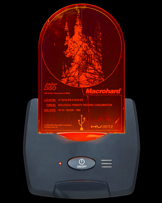
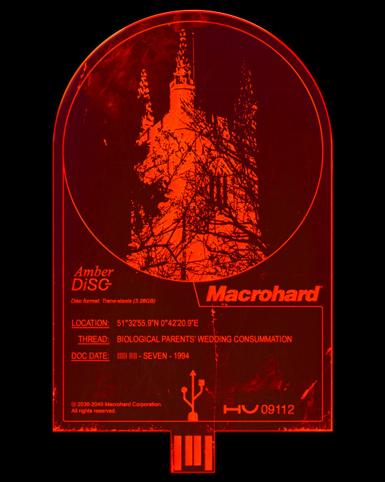

The physical is becoming lost, only tokens of what was remain. Devices conjured from the scraps of now, display a relic. A shadow. An etched effigy of the past. Like a snow globe, the encapsulated is being unto itself.
𝘈𝘮𝘣𝘦𝘳 DiSC “ST. MARY’S CHURCH” on AMBER STASIS DEVICE 01.
[DIGITAL ARTWORK, 2023]
TRANSCRIPT:
[device clicks] Location: 51 degrees, 32 minutes 55.9 seconds North. 0 degrees, 42 minutes, 20.9 seconds East. Thread: biological parents’ wedding consummation. Documentation Date: 9, 7, 1994. A path begins here in the destruction of two others. One lineage continued. One lost. Will this hybrid usurp the existing? Or is it doomed to continue the thread? Signals suggest the former. Life, however, has other plans, we- [radio static] [device unclicks]
‘Bespoke Acrylic info-coded disc-like sheet render inserted into a composite of existing imagery, forming an AMBER STASIS DEVICE.’
IMAGE SOURCES: Device Body: iStock 92019028. Grill: iStock 527515345. Button and Ridge: iStock 452100979. Lights: iStock 185858156. Acrylic Sheet Mock-up: by Harry Vincent.
TYPEFACES: [Disc Logo] ‘Times New Roman’ by Stanley Morison. ‘Arial’ by Robin Nicholas and Patricia Saunders. [Information] ‘Arial’ (Various weights) by Robin Nicholas and Patricia Saunders. [MacroHard Logo] ‘Helvetica Black Oblique’ by Max Miedinger.
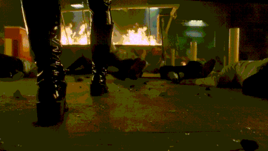
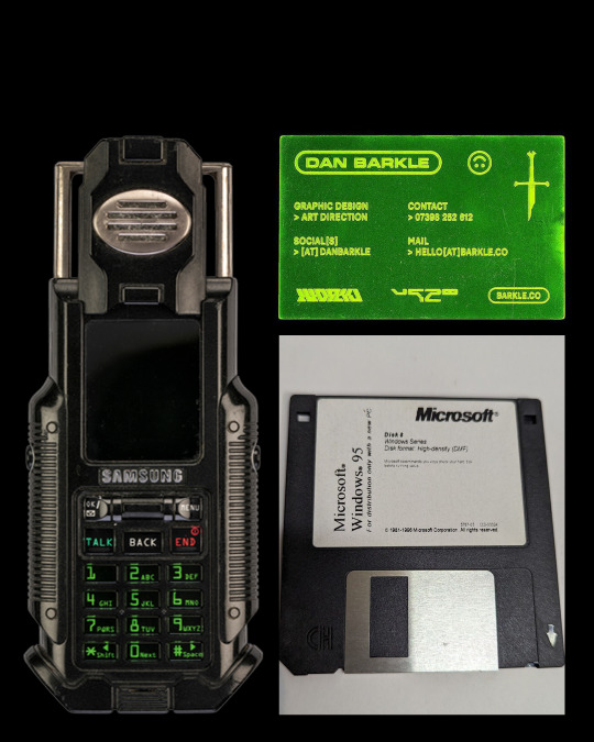
REFERENCES: “I’m in.” Opening sequence from ’The Matrix Reloaded’ (2003), by The Wachowskis. SAMSUNG SPH-N270. Acrylic Business Card, by Dan Barkle. Microsoft Windows 95 Software 3.5" Floppy Disk.
IMAGE DESCRIPTION: A portrait image of a Red and Orange Acrylic arched window-shaped sheet with engravings on it, plugged into a Blue-ish Grey device, with small buttons on. The device glows when connected together, and all on a Black background.
6 notes
·
View notes
Text
I'm gonna ramble about fonts now
There's a lot that you have to do to make a font that you can regularly use. Even just upper and lowercase letters is 52 characters, but add on numbers, their shift characters, and basic punctuation and you're at around 80 characters. And most keyboards can type 94(ish) characters
So any font that's going to be regularly used on the internet needs nearly 100 characters. And each one of those needs to be made individually. There's probably some tricks like mirroring and rotating pqbd and maybe making some tweaks, but there's still no escaping having to make nearly 100 characters
And then after you've made those characters, you have to define where the top and bottom of the line are, as well as where the left and right sides of the letter are. Then you have kerning which is adjusting the spacing between specific pairs of letters because maybe you have a fancy cursive font and you don't like how some of the loops overlap. Even for simpler fonts, kerning is done to make the spacing nicer

There's literally thousands of pairs to check, and if you do it wrong then there's gonna be someone who notices
Here's some more examples of kerning


And a lot of this goes unnoticed by most people. They just scroll through a bunch of fonts until they find one that they like
And the idea of having to pay for a font seems silly on the surface (why would you have to pay to write something) but there's actually a ton of work that goes into fonts so the fact that we have such good fonts for free is actually kinda amazing
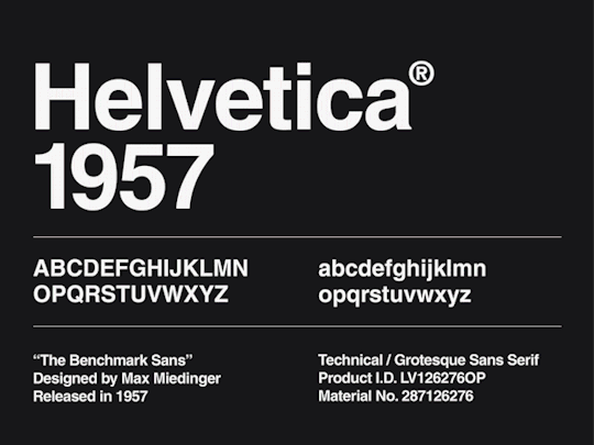
I'm sure font designers are getting paid *something*, but they aren't getting nearly enough appreciation imo. I know it's unrealistic to expect everyone who made everything that's commonly used to get the appreciation they deserve, but the fact that I don't know who made Arial, Helvetica, Georgia, or even Times New Roman (which was the required font for my essays in high school) is crazy to me
(btw, Arial was made by Robin Nicholas and Patricia Saunders, Helvetica was made by Max Miedinger and Eduard Hoffmann, Georgia was made by Matthew Carter, and Times New Roman was made by Stanley Morison and Victor Lardent)
ALSO I never really think about fonts at all. Like, I know the names of a few fonts but I can't identify any of them. Maybe I could pick out Courier, but that's probably just because it's the only monospace font that I know
Another thing that I never think about is language support. If I write 日本語の何か, either the font that Tumblr uses supports both Japanese and English, or it recognises that the unicode is for Japanese characters and switches fonts automatically. I can't check because I'm on mobile, but it's cool either way
Actually, I just googled and apparently Tumblr uses Neue Helvetica, which has characters for Latin, Cyrillic, Hebrew, Greek, Japanese, Korean, Hindi, Urdu, Khmer, and Vietnamese, so it is using the same font. The wiki article only lists Max Miedinger and Eduard Hoffmann as the designers, so it sounds like those guys made thousands of characters
Also, Max Miedinger's birthday was Christmas Eve which is pretty cool
I was about to hit post, but I just realised I still haven't talked about how fonts are an art even though I never think of them when I think about types of art
Okay now send post
1 note
·
View note
Text
I like the story around how Times New Roman came around. Stanley Morison criticizes The Times for terrible typeface. Gets hired to design the new typeface. Inspirational.
0 notes
Text
Un día como hoy (11 de octubre) en el diseño

El 11 de octubre de 1967, fallece Stanley Arthur Morison, tipógrafo, ejecutivo de impresión e historiador de la imprenta británico. Gracias a él, existen los estándares de impresión actuales y asesor de Monotype Corp. Co-creador de las fuentes Times New Roman, Gill Sans, Perpetua, Bembo, Ehrhardt y Bell, nació en 1889 #retrocomputingmx #stanleymorison #timesnewroman
0 notes
Text

Motion typographic poster
Assignment brief: Create motion typographic poster on the assigned typeface. Highlight the counters, special anatomical features, and also any specific glyph that you like in that typeface
My typeface is Times new roman
Designed by Stanley Morison in 1931
Reflections: I learned about Times new roman typeface, like where it is use the most. I also learned a lot about how to create motion poster.
0 notes
Text
The Poster and Design Reform • Gordon Russell Design Museum • 2023
I recently gave a talk, online, to the Gordon Russell Trust. The Trust runs the Gordon Russell Museum and celebrates the achievements of Russell as a key figure in 20C design reform.
The story of design reform in the Uk usually begins with William Morris and John Ruskin and is mostly described in relation to furniture design, architecture and various handicrafts. For Morris, and for his typographer colleague, Emery Walker, printing became part of this cultural phenomenon through letterpress printing and the private press editions of the Kelmscott Press.
The process of lithography is a kind pf magic that allows for a print to be taken from a flat surface, and without the enormous downward pressures required by the letterpress process.
Lithography was developed at the very end of the 18C and became, in the course of 19C, the technology that allowed for the industrialisation of the print economy. In addition to evident scaling effects of quantity and speed, lithography also allowed for much larger areas to be printed, without excessive pressure, and for the progressive integration of image and type into a single coherent form. The large-sized poster became, during the 1870s, the first form of image made to be seen, from a distance, and whilst moving…
In the 20C, the Design and Industries Association tried to extend the reach of design reform with mass production, so as to reach a wider audience. It is in this story that Gordon Russell, Ambrose Heal, Frank Pick, Allen Lane, Herbert Read and Kenneth Clark play a part. In printing, this began to make serious books available for a wider public and the role of Allen Lane in setting up Penguin is crucial, Various other personalities, Francis Meynell, Gerard Meynell, Stanley Morison, Eric Gill and Frank Pick, transformed the visual presentation of news, and technical information and advertising. Beatrice Warde and Nicolete Grey also played important roles in making the cultural significance of print culture more widely known. The transformation of visual print culture in Britain was transformed during the 1930s and during WW2. At the same time, developments in printing technology made the production of colour posters, prints and books more widely available.
A number of artists and publishers worked together to make original coloured prints available to a wider public, sometimes in poster form. The names of Paul Nash, John Piper, Harold Curwen and Frank Pick played crucial roles in promoting this effort. London Transport and Shell Posters were complemented by print editions from Contemporary Lithographs, Lyons Teashop Posters, and School Prints. By the time of the Festival of Britain, the integration of art, architecture, design and experience had become much more coherent, and for many more people.
I love this alignment between art and life.
The recording of my talk will be placed on the talks archive of the Gordon Russell Museum website.
1 note
·
View note
Text

"TWO TAKEN TO HOTEL DIEU IN SERIOUS STATE," Kingston Whig-Standard. June 27, 1933. Page 3. ---- Stanley Kehoe May Have Suffered Fracture of Skull ---- AUTOMOBILE ACCIDENT ---- When the car in which they were riding left the roadway and ran into a ditch and then crashed through a fence, Stanley Kehoe, of 86 Clarence Street, and Alberric Lanos, of 111 Lower Union Street, were injured and removed to the Hotel Dieu Hospital. The accident occurred about ten o'clock on Monday night on Division Street, just north of the city limits.
At the Hotel Dieu today it was stated that Kehoe had received more serious injuries than his companion. It was feared that he had suffered a fractured skull and it was stated he would undergo an X-ray examination. In addition to head injuries, he suffered injuries to his knee and chest. Lanos only suffered minor injuries. The car was badly damaged. Lanos, who was driving, is the owner of the car.
The accident was investigated by Constables Timmerman and Hickey. The report of the police officers shows that the car, which figured in the accident was a 1929 Chevrolet sedan. The car was travelling south on Division Street towards Kingston, when it left the roadway and ran into a ditch on the west side of the road, a few hundred yards north of the city limits. The auto toppled over on a rough piece of roadway and crashed through a fence, landing on a very rocky piece of land. In the crash the top of the car, the right side of the car, the windshield and fender suffered serious damage. Dr. M. J. Morison and Dr. F. X. O'Connor attended the injured men at the scene of the accident and afterwards had them taken to the Hotel Dieu Hospital in R. J. Reid's ambulance.
#kingston ontario#motor vehicle accident#car crash#ditched#serious injuries#traffic police#life of the automobile#death of the automobile#great depression in canada
0 notes
Text
Visual Identity
Below are the common visual themes of the Green Party, exploring colour patterns and typefaces. I have noticed the use of bright green throughout their campaigns, and although I could not find an exact copy of their typeface, I found that the fonts Helvetica and Times New Roman were close enough. I plan to incorporate these fonts and colours in the visual language of my animation.


Helvetica Typeface
Helvetica or Neue Haas Grotesk is a widely used sans-serif typeface developed in 1957 by Swiss typeface designer Max Miedinger with input from Eduard Hoffmann. Helvetica brings unusually tight spacing between letters that give the typeface a dense, solid appearance, making it perfect for capturing headlines. Notable features of Helvetica as originally designed include a high x-height, the termination of strokes on horizontal or vertical lines and an unusually tight spacing between letters, which combine to give it a dense, solid appearance.

Times New Roman Typeface
Times New Roman is a serif typeface commissioned by the British newspaper The Times in 1931 and conceived by Stanley Morison. Being a default font on most computers, Times New Roman is a classic typeface that everyone is familiar with. Being used in olden day newspapers, I feel like this font would be great to use as the theme of my audio speech relates to politics and the news.

1 note
·
View note
Text


Typography Tuesday
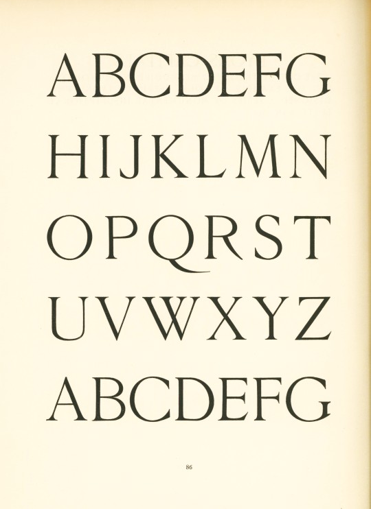
This week we present some specimens from one of British type designer, printing historian, and printing executive Stanley Morison's (1889-1967) earliest works, On Type Faces, printed by the Riccardi Press in a limited edition of 750 copies for the Medici Society and The Fleuron in 1923. Morison, the long-time typographic consultant for the Monotype Corporation (1923-1967) and the principal designer of Times New Roman, was primarily interested in clean, crisp design:
The letters simply must not come between the writer and his reader, The whole duty of typography . . . is to communicate to the imagination without loss by the way of the thought of image intended to be communicated by the author. All changes, improvements, and modifications in letter form need, therefore, to be so carefully and subtly wrought as to be almost invisible.
The titling specimens from On Type Faces presented here offer examples of Morison's design principles.
View other posts with work by Stanley Morison.
View other type specimen books.
View more Typography Tuesday posts.
#Typography Tuesday#typetuesday#Stanley Morison#On Type Faces#Riccardi Press#Medici Society#The Fleuron#type specimen books#type display books#type specimens
130 notes
·
View notes
Text

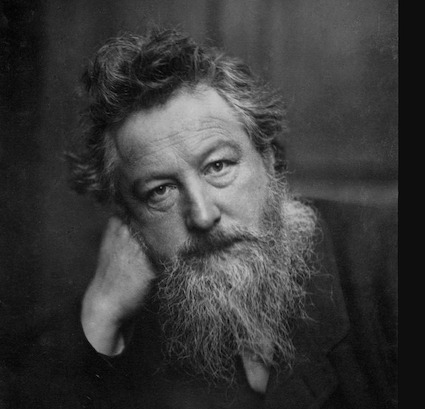
happy 135th, stanley
stanley morison, most eminent typographical scholar of the twentieth century, was born 6 May 1889. post hoc ergo proper hoc: 6 may is the feast of st john ante portam latinam, & st john is patron saint of printers & engravers.
image: frontispiece (bumped up a bit) from Stanley Morison | 1889—1967 | A Radio Portrait [w.s. cowell, ipswich, 1969; photo by janet stone]. caption set times new roman italic; times new roman is the typeface family designed by morison for his 1932 redesign of The Times—for more information vide ‹chiasmus›.
2 notes
·
View notes
Text
Books On Books Collection - Johann David Steingruber
Books On Books Collection – Johann David Steingruber
Architectural Alphabet (1773/1972) Architectural alphabet (1773/1972)Johann David SteingruberCasebound, sewn, headbands. H356 x W260 mm, 112 pages, including 33 facsimile prints. Published by Merrion Press, London. Edition of 425, of which this is #9. Acquired from Chevin Books, 24 July 2020. Photos: Books On Books Collection. Several professional and academic architects and designers as well…

View On WordPress
#Anton Glonner#Christian Friedrich Carl Alexander Margrave of Brandenburg-Ansbach#Frederica Carolina#Fritz Franz Vogel#George Friedrich II Margrave of Brandenburg-Ansbach#Giuseppe Torelli#J.S. Bach#Johann David Steingruber#John Thorpe#Joseph Kiermeier-Dobre#Robin Nicholas#Stanley Morison#Takenobu Igarashi#Thomas Gobert
1 note
·
View note
Text


“These are my versions of the way amber nectar can preserve organisms in stasis - taken from that and applying it to physical places that have meaning to me, through a lens of seeing past the planned obsolescence of current day devices. I like the contrast between the amalgamative Frankenstein nature of such a device that is holding - and is guardian of - a precious core memory/place.”
𝘈𝘮𝘣𝘦𝘳 DiSC “COLLINGWOOD” on AMBER STASIS DEVICE 02.
[DIGITAL ARTWORK, 2024]
‘Bespoke Acrylic info-coded disc-like sheet render inserted into a composite of existing imagery, forming an AMBER STASIS DEVICE.’
IMAGE SOURCES: Device Body Upper: iStock 481727360. Device Body Lower: iStock 1010799880. Light: iStock 185858156. Acrylic Sheet Mock-up: by Harry Vincent.
TYPEFACES: [Disc Logo] ‘Times New Roman’ by Stanley Morison. ‘Arial’ by Robin Nicholas and Patricia Saunders. [Information] ‘Arial’ (Various weights) by Robin Nicholas and Patricia Saunders. [MacroHard Logo] ‘Helvetica Black Oblique’ by Max Miedinger.
IMAGE DESCRIPTION: A portrait image of a Red and Orange Acrylic arched-window-shaped sheet with engravings on it, plugged into a Warm Grey device that resembles the bottom part of a mobile phone keypad - with small buttons on. The device glows when connected together, and all on a Black background.
0 notes
Photo

Perpetua
#Perpetua#Eric Gill#Stanley Morison#Statue#Font Cartoon#Monotype Corporation#Vibia Perpetua#Felicity#statuesque#marble#font#black and white#blackandwhite#pen and ink#typography cartoon#anthropomorphism#anthropomorphic#typography#seif#Typeface#Columbia#Boredom#Ennui#What time is it#checking your watch#check your watch#watch#Laurel wreath
3 notes
·
View notes