Statistics
We looked inside some of the posts by paulrennie and here's what we found interesting.
Average Info
Notes Per Post
10
Likes Per Post
9
Reblog Per Post
1
Reply Per Post
0
Time Between Posts
10 days
Number of Posts By Type
Text
17
Last Seen Tumblr Blogs


Fun Fact
Total funding amounts to $125.3M.
Text
Things I Like • The Face Magazine (Culture Shift) • NPG • 2025


I have just visited the exhibition, at London's NPG, about the impact of the 1980s magazine The Face. This story, like that of Factory in Manchester, is quite well known...it's about young people, music, fashion and print. And how nightclubs provided a space in which a new and exciting scene emerged, and was expressed through a new kind of print culture - through images and typography especially.
The NPG show is about how the fashion image speeded up in relation to this new street culture...The images are fabulous and beautiful and dynamic.
Of course, if you look carefully, this story isn't entirely new...the images derive from the earlier experiments in image and art-direction that began with Alexey Brodovitch, Diana Vreeland and Richard Avedon...and thence through Bailey etc in London during the 1960s, and on. There were nods toward the pictures by William Klein and Sarah Moon and Biba too.
Before The Face, there was Andy Warhol's Interview, and in London, David Bailey's knock-off called Ritz. These were presented like the society pages of Tatler, but with a lot more style...and with an embrace of a straight-up and street-style image. That's where The Face came from, and pitched a new younger scene.
I was delighted to see that the NPG had produced a terrific fridge-magnet of Kylie in a polished chrome frame (see above).


1 note
·
View note
Text
Unpacking my Library • Keep Smiling / the printed universe of Pontus Hulten • 2025

This book is about the Swedish museum and gallery director, Pontus Hulten. During the 1950s and 1960s, and especially the 1970s onwards, Hulten greatly expanded the scale, scope and tone of the cultural transmission associated with high-cultural institutions. The exhibitions, curation and catalogues, were augmented and enhanced by a host of printed ephemera that expressed the joy, excitement, and adventure in discovery of life and art.
Hulten was part of a global counter-cultural effort to democratise art, and to escape the dead-hand of high-cultural gate-keeping. Hulten adopted strategies of promotion and outreach derived from retail, lifestyle and advertising, and showed that there was a much larger audience for serious ideas than had previously been imagined...His strategies derived from the earlier experiments in cultural outreach from the Dada avant-garde and from Soviet construction...But also from TV and magazines.
In the 1970s, Hulten became the director of the new Beaubourg in Paris, and used its wide-open spaces (no walls) to shape new forms of cultural engagement across and between the usual categories and demarcations of museum hierarchy.
I was in Paris, at the beginning of this Beaubourg adventure and those exhibitions really changed the way that I thought about art and life. I've written before about the building and engineering of this structure, and about how the building gave shape and scope to new cultural forms...just pop Beaubourg into the search box. Obvs, I was especially interested in how new forms of communication design were able to contribute to this expanded universe.
The book has been edited and designed by Stina Gromark, so as to match these themes and feelings. Congratulations Stina, great work.
1 note
·
View note
Text
Unpacking my Library • Running + Returning • Jyll Bradley • 2025

Jyll Bradley is a contemporary artist who creates work that combines sculpture and architecture, with light and experience. That needn't always be about scale, although it is always about space... People often confuse the spatial aspect of architecture with its material characteristics of structure and specification. Jyll does the opposite, and lightens everything, literally and metaphorically.
I love Jyll's work because it explores one of my favourite ideas, about the possibility of architecture without walls. Usually, I think of this in terms of communication design; so it is interesting to see it expressed as a form of sculpture that is lightweight, and completely different from how we usually think about sculpture in terms of mass and heavy materials. It's especially exciting to see the work outdoors and at scale.
I've been lucky enough to see Jyll's work in Folkestone, and at London's South Bank.
This lovely book, just published, celebrates her work in fine style.
1 note
·
View note
Text
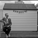
Things I Like • Trailer Horse • Dona Ann McAdams • Nevada • 1991

0 notes
Text
Things I Like • Mondrian • Broadway Boogie-Woogie • 1943

This one of my favourite paintings...In fact, it isn't just a painting; it's a map and a visual score, and a shows a moment of historical transformation between musical genres...from big-band swing jazz, to a more driven be-bop sound. I love those layers.
The classic Mondrian primary-colour grid becomes a representation of the street-plan of Manhattan around Broadway and 52st. The larger coloured blocks are specific jazz clubs associated with the emergence of new musicians, new sounds and a new scene.
Nowadays, the picture hangs in NYCs MoMa, and regularly becomes the focus and starting-point for contemporary musical interpretation.
The new music was given a platform, and a new typographic expression by the famous Blue Note studio. There; music, image, and type, all combined.
0 notes
Text
Unpacking my Library • The Alienation Effect • Owen Hatherley • 2025

This is a terrific new book.
The European émigrés contribution to mid-century modernism in the UK has usually been described, up until now, in relation to architecture and painting. And generally with the caveat that the European style and approach was resisted...
This book tales a wider view and examines the role of photographers and publishers in scoping a new kind of image and print culture which, broadly speaking, gave expression to a set of ideas and values which were aligned with post-war social-democracy.
The starting point for this would be Stuart Hall's famous essay, from 1972, which describes the social-eye of Picture Post. In this essay, Hall identified the photographic weekly, its editors and its photographers as having constructed a new visual language that aligned with the emerging political values of post-WW2 reconstruction.
Owen Hatherley has applied this same idea beyond Picture Post, and looks a bit more generally at the emergence of relatively inexpensive illustrated books as part of the WW2 publishing boom and thereafter.
For example, the famous Britain in Pictures series of illustrated essays is presented as a sort of British iteration of print-culture constructivism (as per the early Soviet period), and with photo-mechanical colour reproduction by Adprint, a company that later became Thames and Hudson...
The founding orthodoxy of European modernism identified a cultural phenomenon that connected Mocow, Berlin and Paris, with New York; and more-or-less passed Britain by.
Quite a lot of my own writing has been about similar themes in British graphic design. For example, I have written about the safety propaganda produced by RoSPA as being part of this broader expression of the values first identified by Stuart Hall.
I'm delighted by the publication of this book. Well done Owen.
If you are interested in the illustrated books from Britain during the middle part of the 20C, you might enjoy these short essays about
Cookery Books https://www.are.na/block/3162642
Guide Books https://www.are.na/block/3162647
Garden Books https://www.are.na/block/3162638
Children's Books https://www.are.na/block/3162640
Illustrated Books for Grown-Ups https://www.are.na/block/3162645
1 note
·
View note
Text
Unpacking my Library • Resistance • Steve McQueen • Turner Contemporary • Margate • 2025

Not just a book about images; but a book about how images change people and the world...
1 note
·
View note
Text
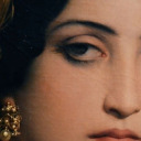
Things I Like • The Modern Face • c1970


I saw these faces on a magazine from about 1970...they look almost Georgian (18C). I don't mean that the faces look exactly as faces from that period (although they seem to); but that they were obviously from a distant past. In a slightly different style they could even be from Roman Pompeii...
That made me think about how much the face, and the image culture that shapes it - fashion, technology and of desire, has changed.
0 notes
Text
Things I Like • Type as Type/Type as Image/Type as Pattern • John Lewis • 1970s

1 note
·
View note
Text
Things I Like • Stencil Cut Letters • 2025

Ivy League digger...Romney Marsh 2025
1 note
·
View note
Text
Things I Like • Numbers of Magazines • c1970

Fifty, and ranged left
0 notes
Text
Things I like • Numbers on Magazines • c1960

Seventy Thousand!
0 notes
Text
Glass Berio Ravel...orchestral street sounds
Days and Nights in Rocinha (1997), by Philip Glass, is an orchestral composition. Glass describes it thus, Rocinha is a neighborhood in Rio de Janeiro famous for its lively cultural life and especially its “samba school” (Whose appearance is the highpoint of the “Carnival” every year). I often visited Rocinha during the weeks before “Carnival” and have always been moved and delighted by its unique environment. Days and Nights in Rocinha is my musical impression and tribute to this place.
The piece, by Glass, is structured in the style of Bolero (1928) by Ravel. Bolero is probably Ravel's most famous or well-known orchestral piece. Ravel developed Bolero as a structured repetition of an insistent theme, that gradually gets bigger and louder as more of the orchestra join in.
There's a kind of energetic madness in Ravel'swork that is missing in that by Glass. Rocinha remains controlled, and slightly locked-down throughout.
I was thinking if only ot could be a bit more like Ravel, and then I recalled Luciano Berio's (1975) reworking of Boccherini's, Musica notturna delle strade di Madrid (Night Music of the Streets of Madrid) (18C). The Berio combines the different versions of the originals, and provides for a slightly fragmented and layered version.
Charles Ives was a pioneer American modernist in orchestral music, at a time when US musical culture was still pretty under-developed.
America has always done popular music really well…but it took a long time for its serious orchestral music to become something that could stand alongside the German, French, and Italian, traditions in Europe.
The Juilliard School, America’s first conservatory school, was only established in 1905! The school was first set up as the Institute of Musical Art, before being endowed by Augustus Juilliard, and others, during the 1920s.
Ives was the son of a military band instructor and he spent much of his childhood watching parades and listening to marching bands. That’s not so bad. Don’t forget that American marching bands have tunes by JP Souza (1854-1932), the March King.
Anyone who has watched a marching band will understand that, as the band marches up-and-down, it has to turn on itself…that means that, briefly, there is music coming from two directions, at least…that’s a new and exciting noise.
This fragmentation is the same kind if insight as cubism and as understanding that the straight-on view of the the theatre stage is a bit limited…we don’t hear the world symphonically, we here it as fragments that we assemble into a coherent gestalt.
Ives was one of the first people to try and describe this fragmented perception of life, and sound, through music. You get the same thing in the European later Romantics, especially Gustav Mahler…but the Europeans tended to do it with bits of folk song and traditional tunes.
In its original 18C form, the Boccherini is quite formal and stately…it is music to process and promenade by…In Luciano Berio’s new interpretation, the street becomes much more dynamic and messy…that’s great; with bits of tune coming from everywhere.
What I really want is Glass, with more Berio, and a lot more Ravel.
0 notes
Text
Unpacking my Library • Modernist Graphic Design in Britain • McLaren + Pritchard • 2024

What a lovely book. Designed so as to perfectly express the ideas represented therein...Slightly amazed to see my name in the index, and to realise that I been a very small part of this great adventure; ongoing. Terrific.
2 notes
·
View notes
Text
Things I Like • Enamel Badge • Rennies • 2024

Blue enamel shop badge with anchor trademark, and guilloche wave. Beautifully and traditionally made for us by Gomme, in Birmingham.
0 notes
Text
Things I Like • Paper Samples • GF Smith •2024


We received a lovely paper-sample book from GF Smith. The pink and yellow remined me of the Mexican modernist architecture of Louis Barragán. The shape of the book, reminded me of the Schröder House by Gerrit Reitveld, in Holland.
I love the this idea of architecture expressed in the miniature everyday. Perfect.
Communication design as architecture without walls
0 notes
Text
Unpacking my Library • Pop-Up • France • 2024


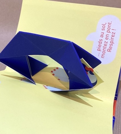


This pop-up book has just arrived. It's a charming series of keep-fit style exercises, animated through paper engineering. Great flat-colour and typographic style too. A really lovely thing by Marion Bataille, and just published. TOP, thumbs-up!
1 note
·
View note