#vibrant color schemes
Explore tagged Tumblr posts
Text
1K GIGI Prompts Collections 'Elegant Emblems: Symbolic Artistry in a Grid' 5806 Free 10 pages out of 1000 pages
Get Free 10 pages MTMEVE00552G_69_0001 – 1K GIGI Prompts Collections – Elegant Emblems, Symbolic Artistry in a Grid 5806 10PagesDownload 1K GIGI Prompts Collections ‘Elegant Emblems: Symbolic Artistry in a Grid’ 5806 series provides two documents, one document is 10 pages of prompts in 1000 pages, available for free download. One document is the complete 1000 pages of prompts, this is a paid…
#character design#detailed backgrounds#digital illustration#fantasy elements#graphic novel style#grid composition#high artistic skill#imaginative settings#science fiction themes#storytelling through art#vibrant color schemes
0 notes
Photo


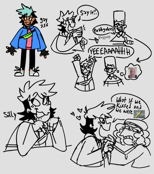
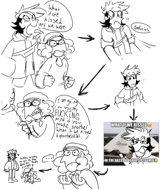
In my clone high era here’s my Harriet redesign, some Confucius doodles & a silly little tophucius (?) comic-ish thingy, I promise they make sense together and I’m not ill at all I swea
#art#clone high#clone high season 2#clone high harriet tubman#clone high confucius#topher bus#tophucius#i think that’s what their ship name would be#it sounds nice I think#NOBODY can resist the bass pro shops pyramid#hot take i like the vibrant colors#i think harriet just needed colors that work better together#her proportions are what bothered me more than her color scheme#something abt the way she’s shaped in the show felt off to me she just seemed very stiff I think#ANYWYASY I am such a tophucius truther they have such a dynamic I swear I’m not insane I promise#I FORGOR JFK WAS IN ONE OF THEM#clone high jfk
799 notes
·
View notes
Text
There's something about Nightcord in white that makes them all so pretty, I don't know why.
Maybe it's the sheer contrast to what they'd started out with?? Costumes that were most dark, deep, colors, if not that muted??
Costumes where sometimes there was a color that popped out amongst everything else and if the costume was something besides dark or muted, it was just one of the few??
Like, I keep thinking about it and to just, see them in more brighter colors is so...aaaahh 😭🥺🥹


#project sekai colorful stage#project sekai#hatsune miku colorful stage#proseka#prosekai#colorful stage#project sekai leaks#prsk leaks#seriously tho#it feels like#thinking about it#their main color scheme has been dark/muted with some SOME events breaking out of that#such as secret distance with the pastels and on this canvas i paint with the red#i feel like most of their more vibrant/saturated colored costumes are either: a fes costume or from a mixed event
21 notes
·
View notes
Text

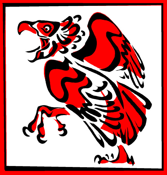
dancing bird
#boiledegg art#forgot how much i love this color scheme. its so simple but so vibrant. red black white.... 10/10#trying to figure out a cool layered approach like this where i start with the red blobs and put the black lines above them#a very cool look. im liking it a lot#wanted to try it bc i was looking at some of my older salmon art and i was like 'wait this bangs. however i was doing this layering thing-#-very wrong. i was like. faux layering. like sorry past me thats not how it works usually
138 notes
·
View notes
Text

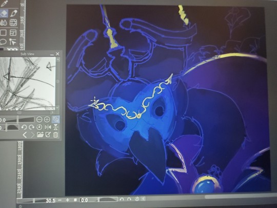
Day 27-29
WIP Below:


#Genuinely idk how to feel about this jknejkrhn#It's a better gulper eel vs my past attempts but also#I wanted to try a vibrant color scheme and my feelings are mixed#Idk how to balance vibrant and also dark shadow vibe aaa#What I did candy gore of a gulper eel though? Maybe I should#Day 27#27 Minutes#Day 28#58 Minutes#Day 29#1 Hour#Total: 2 Hours 25 Minutes#Animal Practice
12 notes
·
View notes
Text
OKAY so that's what we have for Ola as of right now
[ID: A colored sketch of a boy with dark warm skin, a nose piercing and a colorful head covering styled like a hijab amira, but showing his hair and neck a bit. Its fabric is bright yellow with orange, red and blue patterns. He also wears a golden necklace. /end ID.]

I didn't want it to look like an actual hijabi so I made it show a bit of his neck and hair so it hopefully it isn't technically one
I am debating changing it completely so we don't mistake it but the problem is that I am completely in love with this sillouette so T_T
(Also im not sure if his clothes show his chest or what there's still a long way to go)
#im happy with his colors however#his skin tone was going to be a bit lighter but the values were too close to the yellow on his uh headwrap?#so i darkened it up a bit for contrast and now its better#its very vibrant and im planning on recycling this same color scheme with some variation in proportion for the other characters in the—#—main cast#ola oc#my doodles#described#also uh im open for feedback if anyone here actually wears hijab and has some cents to give#here we go again with yet one more problem#H E L P
12 notes
·
View notes
Text


SQUELCH
#after god#obikawa kiyoshi#minami akio#orokapi#manga coloring#the color scheme for this was the green one at first#but i ended up going with vibrant colors#but i ended up not liking them#so i had to go thru 1000 different layer modes to go back to the green i initially planned#even then it’s nothing like it was meant to be 😔#rajart
56 notes
·
View notes
Text

i draw him so much that at this point its more of a curse
#random five pebbles drawing number 172527251766 (approximately)#rain world#rain world five pebbles#rw fp#five pebbles#i may be a bit obsessed with him but its fine#hes super fun to draw i love his color scheme#damn it the colors got messed up i remembr it being more vibrant while drawing it#drawinsometimez
23 notes
·
View notes
Text
zombie with brains

#Vibrant#Dark fantasy#Illustration#Zombie#Eerie twist#Skull#Purple skulls#Pink tentacles#Gruesome#Brains#Dark blue#Light gray#Color scheme#Contrast#Solid white background#Striking visual impact#Graffiti-inspired#Print-ready#Quality#Applications#Fantasy art#Horror#Spooky#Macabre#Surreal#Creepy#Gothic#Urban#Street art#Disturbing
24 notes
·
View notes
Text


midnight doodles
#you can pry this colour scheme from my cold. dead. hands.#digital art#artists on tumblr#digital illustration#digital artist#my artwork#sketch#my art#vibrant colors#cw bright colors#eye strain#ill make a full proper illustration one day lol#just definitely not today#or tomorrow
10 notes
·
View notes
Text

thought it might be fun to give palette some visual differences after they got bound to their magic pen
#my ocs#palette the cat#doodles#wanted to allude to the vibrant color schemes of magical girls like precure#i may have made his original colors too dull but idk if that's bc of my monitor
4 notes
·
View notes
Text
people who hate on tighnari for having straight hair fuck you fuck you fuck you fuck you
#tighnari#equishit#why r so many of the criticisms about his design basically just 'i wish he looked more like all the other characters in the roster'#his vibrant color scheme and hair are what make him special..they're cute#it's ok if it doesn't fit your personal taste but taking them away isn't 'fixing him'
45 notes
·
View notes
Text
While I’m talking asoiaf dragons, Shrykos’ (Prince Jaehaerys’ she-dragon) name seems to have been heavily inspired by the Shrykes, the green-scaled lizard-men of far eastern Essos (literally only one letter of difference). Which also tracks with the one scene we have where Jaehaerys appears (no, I’m not counting his death-scene), which consists of Viserys telling him and his siblings a fictional tale about Jaehaerys I battling fantastical creatures beyond the wall. I therefore conclude that she likely had green-scales as her base-colour. As well as that Jaehaerys was plugged into all kinds of tales and legends about even far-away places.
#asoiaf#valyrianscrolls#jaehaerys targaryen#shrykos#not based on anything I'd make her secondary coloration gold#bc the bronze combo is already taken by vhagar and rhaegal and silver by moondancer and maelor's and aegon V's eggs#ok pearl for moondancer but that's really similar#plus it's a nice link to Sunfyre and Aegon#Morghul likewise gets no description but by name he's gotta be an edgelord#maybe a reversal of Morning's colour scheme...primarily black with pink or dark purple...#going by their names they're kind of thematic opposites...#back to Shrykos I'd also probably make the shade of green one of the darker yet still vibrant ones#smaragd or phthalo...#bc Moondancer has pale green on lockdown and show Vermax olive
23 notes
·
View notes
Text
rhe batons in the maestro mv are so chonky 😭
#BUT I AM . OBSESSSEDDDDDD the worldbuilding the vibes usuallt#usually* mvs that have a primarily black n white/monochrome/less vibrant color scheme i completely forget abt 😭 But this one was didferent#this was revolutionary..
2 notes
·
View notes
Text


BANG YONGGUK - THE THIRD EP
#yongguk#bap#~gif#~#the quality of these is terrible and the coloring is iffy but i just wanted to do a little rainbow thing and i did so it's getting posted!#i really love the third one tho that shot in the mirror and the color scheme is so good#i sharpened up the colors and made it more vibrant but it was already really good tbh
2 notes
·
View notes
Text

I don't wanna fight exporting a half done picture so here's a picture of my tablet I took with my phone (very scuffed lol, I know)
Long post 🦆
Alright, I do not like moping for long time when physical ailment strikes, so today I:
went and got a brace to keep my thumb still when I'm not using it
looked up a couple extra stretches for my wrist
set a timer on everything I did to be no longer than an hour
finally applied that "drawing from the shoulder" thing my professors try to hammer in
And, as of right now, I feel much better than I did 24 hours ago :D it's definitely still hurting a little, but I don't think I'm gonna have to take more than the recommended amount of ibuprofen and drown my hand in ice just to go to sleep now haha. I'm still very mad this even happened >:( buut freaking out about it last night made me extra proactive about it today, so all is well (relatively)
I was able to work on that project today, I'm very excited to show it off so here's a progress picture :3. I'm only just now realizing I made the left eyebrow/hand shorter than the right lol. Ran out of time for the feathers on the coat, but I think it's in a good spot right now. I only had the face drawn when I picked it back up today, so I made a decent amount of progress. I can't make any clean lines right now (see above), so this is really still just a draft. Hopefully I'll get it done by Monday night!
Last thing; I learned that clip studio can actually record time lapses for you, and doing it this way didn't freak out my computer, so voila (flashing lights cw, I flashbang myself a lot by accidentally removing the background):
It took me so long to draw out the top lol (I made his face really fluffy, and idk yet if I'm gonna keep that change or not)
#i got my sads out yesterday so today with filled with productive spite#i have also stopped using my thumbs to type when i text/reply to people on this hellsite#i look like a dumbass pecking at my phone with my pointer finger but i'm a dumbass who can finally draw >:)#oh yeah my personal goal was to be more intentional about my colors#trying to make something a bit more vibrant for once#and only picking colors based on a color scheme#indigo looks more purple when put up against a ton of blue (i think????)#and yellow is a complimentary color to blue#so everything will be close to blue and very dark#while the few areas that were gold are going to be a lot brighter#i think in the final version all of the shadows need to be blue; even for the gold areas#right now the gold pops wayyyyyyyyyyyyyy too much and is a bit distracting#or maybe i just make it less bright#i just need to mess with it a bit more i think#not rb
5 notes
·
View notes