#very happy with the painterly style I tried out
Explore tagged Tumblr posts
Text
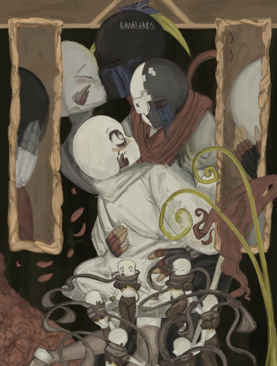
Cheers, to a new us
#very happy with the painterly style I tried out#undertale au#undertale aus#undertale#undertale fanart#undertale fandom#undertale au sans#ink!sans#ink sans#Inksans#Error sans#Error!sans#Errorsans#inksans x errorsans#errorxink#ink x error#error x ink#errorink#Errink#inkerror#geno!sans#genosans#geno sans#geno x ink#Ink x geno#Utmv#Utmv ink#utmv error#scouts art
505 notes
·
View notes
Text
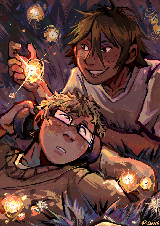
happy tsukkiyama day to those who celebrate 🌙⛰️✨
like this art? it's a print, here! | like what i do? support me on ko-fi!
i'm so bad with dates i didn't even realize today's numbers were 11 and 12 ASKSKS (also i missed POCKY DAY? man, i had an idea for a doodle for that but oh well. i'll still draw it fdgfdhd)
i almost panicked about not having any art for tskym day bc cmon.... they're my boys........ but thankfully i had a deadline to finish some art prints last week and now here we are pftt
the process for this one is a little different from what i'd consider my usual way of drawing. i usually do lineart, flat colors, rendering, and yadda yadda, but maybe it's because i've been doing a lot of painterly disco elysium art lately that i decided to just paint over the scaled-up thumbnail and see where it takes me! (you can see in the timelapse me struggling over cleanly inking tsukki's face before i went 'screw this' LOL)
drawing this was pretty fun! i always wanted to try out my painterly style outside of disco elysium fanart and now i've done it! (well, done it again, bc i've kind of tried it for kghn day too pftt)
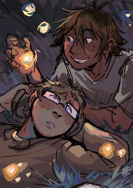
there is still something very charming abt the thumbnail in my humble onion, i don't think i was able to retain the exact silent tenderness in tsukki's face from the thumbnail in the final thing but oh well, c'est la vie dghdj (also me drawing yammers with visible nostrils jumpscare [this is only funny to me ASKSK])
#haikyuu#haikyuu!!#tsukishima kei#yamaguchi tadashi#tsukkiyama#tsukiyama#sunnysidedraws#sunnysideball#described#id in alt text
861 notes
·
View notes
Note
💕 self-love time! talk about which ones of YOUR creations (edits, artworks, fanfics) you like the most then send to other creators to do the same 💕
okay i did VP on my last one, i'm gonna do digital art for this one, which is generally a little harder for me, especially recently as i've been in a big art funk and have really been struggling with doing it and also just appreciating it.
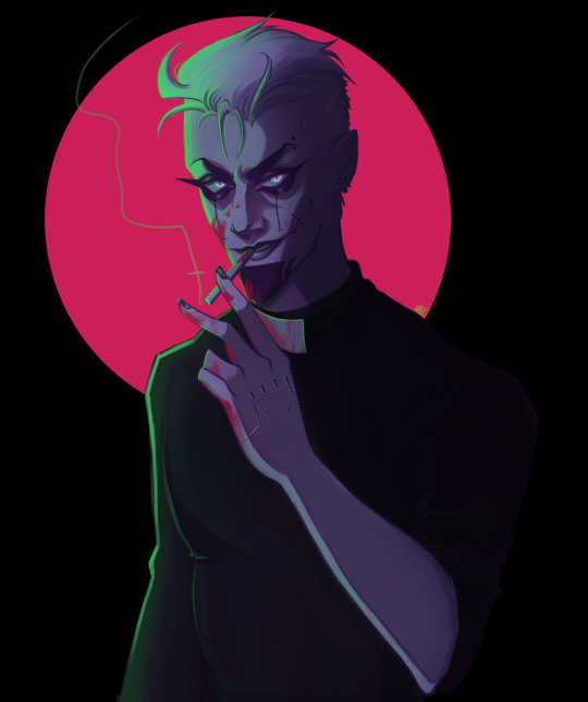
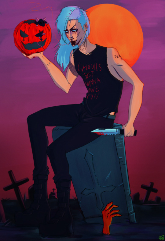
the first one is maybe the last time i was really happy with something i made (its a couple months old). i just really like the colors and lighting and it was the first time going back to a more painterly style in a while. i did the one on the right for halloween and i was so happy with the overall vibe of it, kind of an old 90s anime on vhs you rented from blockbuster knd of deal.

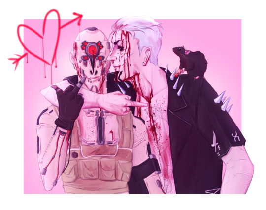
these are a bit older, but i'm still happy with them. i don't usually like doing full body so its a challenge for me especially with other elements, but of course i had to do this homage to a nightmare on elm street. i'm also extremely bad with mech/maelstrom but i like this dum dum one despite its flaws.
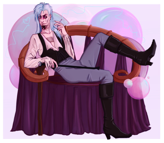

another movie reference, but i looove this one, it's one of my favorite pieces actually, and i'm still pretty proud of it. and the one on the right has a lot of issues, but it is to this day the most elaborate piece i've done (full background!! wow!!! can you tell i don't do that a lot lol) and i spent a lot of time on it and tried to put a lot of personality into it too. it was made with lots and lots of love and i will not be pointing out the things i don't like about it because its still very special to me regardless :3
#aaa thank you for asking <3#its harder for me to appreciate my art but i am proud of these for numerous reasons#and rn now i really needed to be reminded that i can do nice things sometimes fsdalfjksalfjasl
20 notes
·
View notes
Text
WEEK 11 BONES AND ALL


This lecture was about how to pose a character in Blender and then uploading that posed model to Sketchfab. I had attempted to use armatures in Blender before, not to great success but it meant I was semi-familiar with the terms used in class today. I enjoyed the process! My knowledge of anatomy helped me a bit in placing the bone, but I struggled a bit with the more technical aspects - like naming the bones and symmetrizing them, as it took me a couple tries to do it successfully. I think the first part of this class has made me a bit more confident with armatures, as going into the assignment I was a bit worried about them because of my previous experiences with them in Blender.
Again, I am remaking my fly man model. This time I wanted to more accurately depict humanoid anatomy - with particular focus on his arms and how they connect to his chest. Because he has two sets, I need to give him almost two sets of shoulders and pectoral muscles, to ensure that when he is posed, it looks anatomically correct. Below is a quick sketch I made illustrating this, which I made to better understand what I need to do in Blender.


I've included a few more bones in my characters armature, so all parts of it are poseable, like the tie, wings and antenna. This is just so I can create more dynamic poses, and give the impression that this model is affected by things like gravity and wind. As these parts, in real life would be most affected by these things, and are used in animation to create secondary action, which makes the motion more dynamic. This is something I want to achieve with the posing of my model.
I'm far more happy with this model, I think it has more accurate anatomy - when I added an armature, the arms move naturally and the torse stretches how I'd expect. I think it fits Tartakovsky's style very well, with clear, geometric shapes and a playful take on multiple architypes. The combination of a familiar monster architype - the fly and an over-worked office worker, I think, works very well together and is recognisable as both.
I made a quick place-holder texture for this model in Krita, focusing on using pleasing colours and experimenting a little with adding painterly textures using different brushes in the programme. I liked how it turned out, but I feel I can push it further, but I'm also worried about the quality of my UVs, as that's something I have struggled with this semester. I may have to re-do them again, which means re-doing the texture, but I'm not so worried, as it means I can push the design even further.

0 notes
Text
Hi I have a piece of so called “lost media” that I’d REALLY like to find, or rather obscure media. I have tried to look information about this up in my free time, no luck. I have not been able to find the slightest trace of this book anywhere. Extremely strange childrens book about a pirate. It was in picture book format. “Cheery” Painterly oil pastel style. Despite the cheery looking and vibrant aesthetic the whole thing has this very, very unsettling undertone of dread throughout it that I can vividly remember being strongly upset about as a kid. Reading this book was one of my earliest formative memories just for how much it traumatized me, and I think this book is how I learned about the impact of death as a concept to begin with. I don’t know who wrote, illustrated, or published it, or even when it came out - but it definitely came out before 2010.
I may get some things wrong because I remember reading it when I was no older than 7 but this is the best summary I can provide: The book centers around a pirate with a large crew going on silly adventures. The next few pages detail the ship captain pirate going on adventures with his crew, and it’s all very happy go lucky until the pirate dies in some sort of accident. The tone for the next few pages then shifts dramatically, as it depicts the rowdy ship’s crew mourning the captain’s death (I can strongly remember them gathered alongside a beach sending a coffin out to sea with a lantern on it, the illustration is very dreary, and they all have their hats off In their hands and they’re crying and looking down), And then the book just…ends. No resolution, no happily ever after, just a staunchly grim scene to close this picture book out with.
It’s extremely sudden and takes a left turn VERY quickly, and I assume it’s morbid tone is why it’s hard to find. I can’t imagine parents wanting to buy this book for their kids because the way it handled death was…really weird and it could easily traumatize a young kid. I sure know it did that for me. Maybe I stumbled across a parody book that poked fun at kids books by having something really dark and shocking at the end? I don’t know. But whatever this book is, I would really love to see it again.
If anyone has ANY info or leads on the creepy pirate kid’s book - PLEASE let me know. Even if it’s just a book that looks or sounds similar, it just might be it.
Thanks! ^_^
278 notes
·
View notes
Text
Thumbnailing: Subject's Way
Thumbnails are an important workflow tool artists use to make creating their works more efficient. They are essentially tiny, low detail versions of the idea you may have in mind, and save time by helping you catch potential compositional errors, clashing colors in palettes(if you blob some colors on), and poses that simply might not.. work in character art as well as many other things not mentioned.
I am a very visual person and sometimes putting ideas to paper really helps me focus better on the task at hand. Organizing things into steps on the page really helps me not get overwhelmed. It might prove helpful to you as well.
In this tutorial, I'll take you through my workflow process when planning paintings and simple character illustrations.

I start off the process by doing a ton of sketches of whatever thing from many angles, poses, etc. Usually if I have a certain image in mine I simply sketch that and adjust little things like angle, placement of limbs, etc. Work teeny tiny, you can enlarge it later. I,t really depends on what the goal is for that piece what the process looks like. Here the goal was to just draw a character, so I have many options.
environment sketches look a bit different for me, as I will sketch them in literal cubes. I am still working through the technique. I just haven't gotten good enough at them yet to consider a tutorial by me would be helpful to anyone though.
Like with piece D, it's good to plan compositional elements here too. I added the moon that would go in the eventual background, swords in the hands of B and E, etc. Had I had more time, F would have gotten rough roses, but I digress.

After I have base sketches, I do very rough lines so I know what I'm looking at, and it primes me for what I could possibly have issues with in doing the final. I keep it VERY loose and don't dwell too much on details. If I'm drawing a character, I'm not even going to look up references, unless their silhouette is very complex. There is not much need for accuracy here. Just to nail down your subject's silhouette.
At this point, you can start eliminating which poses you don't want. Here I was very indecisive so I went through with sketching all of them.
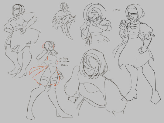
At this step ill also take the time to plan variants if I feel like I would be indecisive about them/need them for certain platforms (optional).

Here's where things start to actually take the form of thumbnails. I work large and draw most of the anatomy of the subject so that things are positioned correctly in the frame. Draw the whole of something, even if you know it's going to get cropped out. There is nothing worse than trying to draw in a way that is already cropped, it messes up your anatomy bad, and you'll spend more time trying to fix it, especially if you are just starting out as an artist.
Physically drawing a box around them to help with framing is really good to help plan the composition of the final piece. Again, you can eliminate stuff here as well if they don't make interesting compositions. Consider the rule of thirds and how much breathing room you want or need in your piece. The one not in a box was eliminated because I didn't like the pose nor would it make a very interesting piece.
I also use different colors on the boxes so I can overlap them and keep my eyes from getting confused where one "drawing" ends and one begins.

If I'm planning portraits/art in my painterly style, I'll take the time to block in some colors just to see what I should shoot for in the final. I will also do several pairings of colors in their own sets of thumbnails if the piece needs it/i want varients. I highly suggest blobbing so that you can see how potential colors will play with one another. Learning the teeniest bit of color theory will help, I promise, but for now, i'lI'lll refrain from the mini-lecture.

these three two (you'll see), I figured would make better cel-shaded/quicker pieces due to how zoomed out they are, any true details I would want to focus on don't exactly work for my current style faraway. Be sure to tailor compositions that suit your style. I will be keeping these sketch ideas for future reference.
It's important to remember that just because an idea doesn't get used in this piece, that doesn't mean it can't be used in a further piece down the road. I actually have a horrible habit of deleting my thumbnails after I'm done with them, but if I'm thumbnailing in a sketchbook? I find myself browsing back over them for future pieces to get some rough ideas of what could work later.
One last thing, you don't have to plan as many thumbnails as I did, but I do suggest at least 3 or 4 to really stretch your creativity.
Thumbnails also make for a good warm-up. If you're curious, I did the initial sketches in this order: A C E D B F. I think it helped me loosen up a bit, but you can be the judge of that.

I went back and tried another approach for a painting, but now I have the base for 3 paintings I could pursue, albeit rough, but it's good to learn how to paint like a sculptor, I digress.
That's all there is to it. the key is being clean enough to get the idea down, but rough enough to save time. work small, using basic shapes to create silhouettes. You can enlarge it later and use it as a base sketch.
Last two cents: I've also learned that sometimes if a piece is just not working, it's probably more than likely a compositional issue, anatomy, or perspective, Which is why thumbnailing can help you catch these issues early.
happy drawing :)
a/n: this is my first time really creating a tutorial. this might not be groundbreaking information for some of you and that's okay. this tutorial was initially created for someone in an art server I'm in on Discord, hence the slide-text-slide format. I have taken the images and text from that and compiled them here to make it easier to pick up the tips. I do not consider myself a pro on any of the things mentioned by any means, merely my take on it all. Get multiple sources, educate yourself, practice, and find what works for you. - Sub
#its not perfect#but i hope it helps#tutorial#composition#digital art#digital illustration#digital painting#reference#art tutorial#art#sketch#thumbnails#illustration#medibang paint#medibangpaint#digital drawing#drawing
21 notes
·
View notes
Photo
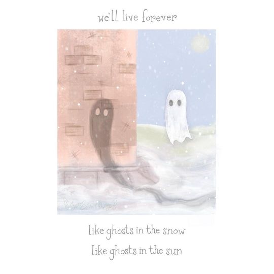
Ghosts of Snow and Sun
----------
Sneaking in one last wintry art piece for the month ❄️
I had this idea for ages inspired by a line from 2 different My Chemical Romance songs—Vampires Will Never Hurt You and The World is Ugly, and tried a softer, more painterly style to bring it life 👻 (Unlife?)
I’m still not sure which of the two versions I ultimately ended up with is better, but I am happy with the overall results. 🎨 Shall we talk about that dilemma? ⬇️
⭐️ Like My Art and Want to see more of it? Here's All My Links! ⭐️
----------
As sorta said before: This looks a bit different, no? 😆 This odd little artwork is one I had in the back of my mind for months, ever since I whipped up Echolocation back in July. I made the sketch back then toying with the idea of bringing it to life in gouache, but after getting the iPad for Christmas...Well, okay, at first I thought I'd end up using this other art app called "Art Set 4" because its reputation is all about how über-realistic the textures it has for things like oil paint are, but after reading up on the app and getting a mixed impression, I went back to Procreate and just found some oil paint replica brushes for it instead and combined those with the few default paint-like brushes Procreate comes with to get roughly the look I wanted. It's still not quite as textured as I think I might've gotten with the other app, but it's close enough all things considered.
To that end, this was my first proper attempt at digital painting, as my usual approach to digital art would be considered drawing or illustrating, I think. And it was the fact that I had such a strong image in my mind of what I wanted that allowed me to switch gears with any sort of confidence I could pull off something passable in the end.
As for where exactly that imagery came from, settle in for story time, Sparklers! To begin, the words on the piece (which once again are not a font, but rather hand-written and then a few letters copy & pasted because Procreate continues to delight me for hand-lettering) come from two different My Chemical Romance songs, Vampires Will Never Hurt You, and The World is Ugly. And the whole idea was born not only out of a desire in me to make more MCR fan art that has to do with individual songs/lyrics instead of just whole albums or well-known imagery from the band, but also because there's just something about "Ghosts in the snow, ghosts in the sun," that lurks in my brain like a crow after a shiny object. This is a very literal interpretation of the words, obviously—having an actual ghost in the snow and a shadow, which is effectively a ghost made by the sun—but A. I thought it was cute, and B. This was one of those rare times where the final artwork popped into my head 95% complete, and I do so hate to waste those opportunities when they come along. Truthfully, there's not much else I can say about the making-of process, though. 😅 Digital painting, as it turns out, at least for me, is a lot like the rare occasions where I paint with acrylics IRL. Once I have my basic shapes and outlines where I want them, there's a lot of "put paint on, blend it out to the point it almost can't be seen, realize what I've done, add more paint, try to add more noticeable shading but blend it out again when it starts to look too hard," rinse and repeat. And repeat. And repeat. And repe But I did find trouble in that just about when I thought I was finished with the whole thing, I stared at it and couldn't help but feel what I'd managed to accomplish still wasn't close enough to the picture in my mind; The ghosts were too small, the background behind the white/snow ghost was too distracting, all the colors were still a bit more saturated than I was imagining, and why was the shadow ghost facing completely the wrong direction if that orb in the background is indeed the sun and not and early-rise moon? All that and more. 🫠 So I decided to tweak what elements I could to try and get closer to the version in my head as well as make what was there make slightly more logical sense. My mistake was that I did my tweaking on the original painting file without making a copy and really didn't preserve the "before" in case I changed my mind later. (I had saved a .PNG, but not a file with all the separate layers to make future editing possible without basically re-painting the whole thing anyway.) And truth be told, I'm still not sure which version I like better. Just while typing up this description I've changed my mind about 3 times as to which one I'll end up posting. 🙃 The tweaked version, as a friend of mine pointed out, has a more minimalist feel, and I can confirm the vision in my head definitely spoken to minimalism. But there's a certain charm to the original, even if it doesn't make as much visual sense, and I can't help but wonder if this is one of those instances where ignoring the logical aspects is worth it for the overall impression--Like how in Frozen there's that tiny moment where Elsa's hair clips through her shoulder. In normal viewing, you probably won't notice it, and it was necessary so her hair could transform without breaking the character model (at least if what I've heard via the internet is accurate, it might not be, but we'll pretend it is to prove my point) and so even though in real life hair can't clip through body parts like that, ultimately that inaccuracy was worth everything else it allowed to happen. I hope that makes sense and I didn't just ramble on for a whole paragraph for nothing. 😅 Which version did I end up going with? In the end, I settled for the tweaked version because...well, mostly reasons I've already stated, but also today when I woke up and had to finally decide, there was an unknown something ("je ne sais quoi") that kept me coming back to it in my fight to decide. I'm still not entirely sure if this is the "right" choice, but I really wanted to have this posted today and if I keep putting it off to debate which version it should be, it's likely it'll never go up at all and that's worse than picking the "wrong" version in my eyes. Either way, I do still like both versions, and I think that speaks to why just picking one was so hard--It's not that one version is technically worse than the other, it's that they're both good in their own ways and which one better fits the overall image I want other people to see is where I'm struggling. I think, if and when I can find the time, I might actually be interested in making a third version from scratch (well, from that initial sketch I had, anyway rather than from either of the two painted versions I've described) that leans even more minimalist and see if that serves as a sort-of tiebreaker, but I have other projects I want to move on with for a while first before I commit to that, which means it'll have to wait a while if it happens at all. At least in the meantime, I can take solace in knowing I accomplished my goal of a more painterly look and doing some lyric-specific MCR art. 🤷♀️ Now, I'm off to work on some of those "other projects" I mentioned because I have so very many ideas lately and not nearly enough time and motivation to do them all...😅
----------
Artwork © me, MysticSparkleWings
Vampires Will Never Hurt You / The World is Ugly Lyrics © My Chemical Romance
----------
⭐️ Like My Art and Want to see more of it? Here's All My Links! ⭐️
#my chemical romance#mcr#mychem#mcrforever#mcrmy#my chemical return#vampires will never hurt you#the world is ugly#mcr lyrics#ghosts in the snow#ghosts in the sun#digital paiting#digital art#procreate#procreate art#digital oil painting#pastel#ghosts#shadows#snow#snowy art#wintry art#winter#wintry#minimalistic#xxmysticwingsxx#mysticsparklewings
8 notes
·
View notes
Note
hi kay!!! i hope u are doing well (i have been enjoying all of ur posts as you do a rewatch lol) but i had an art related question. I've always really loved your art style, and I was curious if you took time to develop it specifically or if it just happened over time. Do you have any tips about how to be more comfortable with your own art style?
hello!!!!! thank you, this is a super good question!
my current art style is something that initially happened around 3 years ago i think? I wanted to make drawing easier for myself because I had less time and energy and also was having less fun with art, and I thought that drawing with a bigger brush might like...force me to have some restraint with details and get me to simplify the shapes more? this was the theory & the goal i set out with
i’d been admiring a lot of chris samnee and david aja’s art (heroes, they’re heroes, heroes), so i was looking for a blockier liner to use for my own stuff, bc at that point my art was very loose and more detailed (ex. [x] [x] [x] )

so i downloaded some chisel-tip-looking brushes and ended up doodling this lil dude [x]

and i was like!!!!! oh!!!!!!! i like him. i like his lil nose. i want to do this again.
So then i had that drawing up on my phone as a reference for the next few times I drew, so that I could see what it was that I’d liked about it and try to make it happen again!
as far as being COMFORTABLE with your own style, i think I’m mostly comfortable with mine because I know what I like? i’ve modelled it after art that I enjoy, and I’ve tried to make it so that even if I’m not always thrilled with how it LOOKS bc of underlying issues with anatomy or whatever, it’s always really fun to DO, and that makes me happy :)
but a lot of it is saying “okay, i like this. WHY do i like this” and then trying to do more of that the next time around, or trying to incorporate cool things that other artists do into your own stuff and seeing if it fits or not. and then doing it a lot more times until it feels good. folks who’ve followed this blog for a million years know that i used to be big into softer sketchier lines and painterly stuff, and now im fully on the heavy inking train and i Love It A Lot. inking is fun now!!! incredible
i hope this helps a little bit, anonymous pal!! good luck <3
PS: you can go to kayvsworld.tumblr.com/tagged/mine/chrono and highkey watch me learn to draw, bc I’ve kept all of my ancient baby art up since i first started :)
PPS: also u can find the brush i use over here [x] 4 free if ur curious :)
15 notes
·
View notes
Text
Lava’s Art Masterpost
Hey, all! Welcome to my art masterpost! I have no idea if this is a thing that is done typically for art, but oh well, I like organizing things, so here we are! What you’ll find here is mostly Dragon Age, with a few non-DA pieces in there, and there’s a range of styles I like to use, depending on my mood. But a lot of what you’ll see will most likely combine lineart with some other form of coloring/shading.
Feel free to browse at your leisure, and I hope anyone who stumbles upon this enjoys what they find! :D And thank you to anyone who sees this and likes, or reblogs, or even just stops by to peruse a bit!
All that said, away we go!
Digital Portraits:
1. Portrait of Nameless Woman, 2020 - This one is just an experiment with a watercolor brush that I did. It’s not anatomically perfect, but I enjoyed playing around with shading.
2. Sketch of Aja Amell, 2020 - This one is basically sketch practice with my Amell~ Not really the most expressive pictures, but it’s a start toward drawing her more expressively. Full disclosure: Aja is one of those OCs of mine that I have had trouble with deciding on a definitive appearance for several pictures, and I really want to work on upping my level of consistency when drawing her.
3. Long-Haired Fenris, 2020 - Exactly what it sounds like; this was for practice drawing Fenris’s features (I love how distinct they are), but with long hair because I am weak for it. This one was a fun piece to shade, and mixing the stylized lineart that I normally use with a greyscale shading spectrum was really enjoyable.
4. Portrait of Ilorin Lavellan, 2016 - This is an oldie. Basically practicing expressions, and it is technically a WIP, but I’m still very happy with how the shading turned out, especially because this is actually (aside from the unfinished hair) one of the more minimal pieces I’ve done in terms of lineart It’s still there, and it still shapes the flow of the picture in some ways, but it also ends up flowing with the shading instead of standing out next to it, which I like. (Both styles are good, though, and I love seeing other artists try both too.)
5. Old Portrait of Aja Amell, 2016 - Much older picture I did of Aja; she... honestly looks very little like the newer one, I think, and that consistency is something I’m still working on, but this one was the first picture of Aja with that particular hairstyle I drew. What I like about this picture is how young she looks; it fits with her image as a fresh and sheltered Circle mage who’s only about 20 years old at the time of DAO.
6. Old Portrait of Trilyn, 2016 - They very first piece of art I posted to tumblr~ It’s not exactly how I envision Trilyn anymore, but it was still very fun to draw, and helped me get a feel for drawing him in the future.
Dynamic Movement Pictures/”Moment’s in Time”:
1. Tabris in Arl’s Estate, 2020 - TW: blood. I am super proud of this one. My ultimate goal is to draw all of my Warden DAO OCs, and I could not believe I’ve never drawn my Tabris, and so here she is. This was, in large part, practicing expressions because I absolutely love art that depicts characters in motion, or capturing some kind of expression.
2. Velyn in the Rain, 2017 - This one was actually based on some art that I saw in a Teen Wolf fic! It was an experiment with a more expressive style (and one of the first pieces I did without lineart left in the finished version) and it was a huge step out of my comfort zone. But overall, I am extremely happy with how it turned out.
3. Jem Nocking an Arrow, 2016 - And here is the lineart version. This was entirely an excuse to draw my DAI baby, Jem, and to do a cool archer pose because archers are my fav, and I love characters in motion.
4. Solas Teaching Trilyn Fade Magic, 2016 - This one was a painterly picture that was also (like the Velyn picture) something which I tried to keep lineart out of. Overall, I am proud of a lot of parts of the pic, but I think I would definitely go back over it and change a few things now if I had the patience.
5. Trilyn Closeup WIP, 2016 - TW: injury, blood, mention of abuse in the author’s note. A lot of early pictures I have are of my OC, Trilyn, and this is one of my absolute favorites. His entire upper body is technically in the picture, but I hadn’t finished rendering it yet, so this was what I posted. And it was an experiment with a cross-hatching style with the pencil tool for some texture, with air brush shading and a blurring tool. It’s a style I had fun playing around with!
6. Trilyn Blood Ritual, 2016 - TW: blood, injury (the slight cut used to supply the ritual with blood). This one was definitely a sort of “captured moment” from a backstory I gave Trilyn, and I think what I was really going for was an atmospheric piece that could fit with any potential fic I wanted to write for Trilyn. And then it ended up being practice for extreme lighting/shading techniques, and drawing the blood and the gross mass of demon ichor (or whatever the heck that is) turned out to be highlights of making the piece for me.
Art + Text:
1. Freedom and Control, 2020 - TW: scars, but very difficult to see. This one was ambitious for me! It started originally just as Solas and my Tal-Vashoth OC, Saara, facing each other, because I love the dynamic I’ve built for them in my head, but then it turned into an attempt at a tarot-esque background, and just sorta grew from there... Overall, I’m happy with how it turned out, especially with how Solas and Saara themselves turned out. The version you can actually see a larger view is here.
2. Marianna and Delia Codex and Art, Pt. 1, 2020 - I love writing my own codex entries, first off, and I love combining art with text to create a (hopefully) seamless work. This work was an attempt to flesh out these OCs of mine with both art (because unique facial structures are hard for me to get down, but so important regardless) and text (because writing~). I think it turned out well overall, but there are elements of the portraits that I might at some point touch up a bit.
3. Marianna and Delia Codex and Art, Pt. 2, 2020 - Part 2, with what I refer to as a “DAI Outfit Change” because I have always loved seeing fans show their own OCs as they look in DAO, DA2, and then finally DAI. So I absolutely wanted to jump on that bandwagon myself. The skin tones are a little off (and I’m sorry about that!) because I was playing with the watercolor brush at that point, and it dilutes the colors I use. Still working to figure that out, but I was very happy with the overall lineart and structures of the faces.
4. Alistair/Aja Amell Picture with a Blurb, 2017 - Ooooold, old, old, old, OLD! I still love the art, and I’m soooo happy with how the interaction between Alistair and Aja turned out (drawing kisses is extremely difficult for me; I always end up creating a distorted weird lip-creature, instead of realistically puckered lips...). I’m not as happy with the blurb that went with it? At that point, I was still very much figuring out my own DAO worldstate, and the characterization for everyone, so, eh. Take it with a grain of salt!
Unfinished Costume Designs:
1. Ancient Elvhen Armor with Dwarven Influence, 2018 - People who do costume design work are amazing and mystical beings, and I wish I could do what they do. This was an attempt at merging the Keeper robes from DAI with a more dwarven armor aesthetic, solely because I created an ancient elvhen character, Ceda, who was taken in by the Cad’halash dwarves mentioned in the Witch Hunt dlc, and I wanted this character to have a mix of the elven style of armor and the dwarven style. I’m overall decently happy with it, but there’s still that persistent level of self-criticism present.
2. Herald of Andraste Outfit WIP, 2016 - This was a very old picture, not one I showed around a lot, but the idea for this was entirely born of my intense interest in how fashion and outfit designs could be used to create a symbolic image for the Herald of Andraste. In general, I love the combination of ceremonial armor with long and flowing cloth, so that was what I went for here. I’m still actually very proud of how this came out, and headcanon something similar for my Herald in my canon DAI worldstate.
Pencil Sketches:
1. Quick Saara Sketch, 2019 - TW: saarebas mouth scars. Exactly what it says; very quick sketch of Saara I did in a small notebook I carry around with me. This was basically a test for myself to see if I could manage to draw Saara with the features and facial structure I envisioned for her without needing to use a lot of references.
2. Mass Effect Character Sketch; Jesse, 2018 - Similar reason for drawing this one as the above Saara sketch! With these characters, I love sometimes the way they can turn out with the specific character creator used for them, and when I draw them, I enjoy trying to create a definitive look for them using what I get from the CC, and my own knowledge of Hooman Faces.
3. Saara Sketch, 2017 - TW: saarebas mouth scars. A more detailed sketch of Saara than the one above, and one I definitely put more time into overall. It’s currently the profile picture I’m using for ao3, and is the definitive go-to reference picture I use whenever imagining Saara in a fic, or for other Saara pics I make. I am extremely proud of this picture, and feel like I should work in graphite more often. It’s such fun, and the texture is so nice to look at.
4. Sketch of Nameless Alamarri Woman, 2017 - This was a sketch I did of what I envisioned some Alamarri tribes to look like; I used artistic depictions of Gaul tribes and hairstyles for inspiration, and have used this as a go-to reference for my version of Alamarri tribes. Nothing super notable about this one, but I really liked the way the shape of her face turned out.
Events and Gifts:
1. Another Scar, 2020 - TW: blood, injuries, gore. The most recent piece of art on the list, and a gift for @cartadwarfwithaheartofgold; featuring sisterly love between Rica and fem!Brosca, which was her requested prompt. This was a tough piece for me because of the difficulty with the lighting I dealt with. For some reason, that one particular element of it gave me so much trouble. Overall, I’m very happy with how it turned out, though, especially the skin tones of the sisters; Brosca I always sort of like as having this greyish, more gaunt look to her, while Rica I like seeing with a darker, richer, and warmer tone to her.
2. A Very Cousland Christmas!, 2019 - This was for a holiday exchange for a server, and I drew a friend’s Cousland (Elissa, the girl on the left) with my Cousland (Gazza, the girl on the right). I love kid-fic, and I love kid-art, and so I decided... baby Cousland art! Drawing kid proportions was the toughest part, I recall, and I thiiiink it turned out well, and I’m still quite proud of it overall. Elissa’s design came entirely from my friend, but I added the holly~
3. Exchange Gift with Dis Brosca and Mabari, 2018 - This was an exchange gift for @fanfoolishness, using her lovely Dis Brosca, and was my first real attempt at backgrounds... I struggled with the coherence of the foreground and background a bit, but I’m still very proud of how it turned out, especially with the colors I had to work with. What I also really enjoyed working with was the lighting and the expression on Dis’s face. Backlit subjects are always fun to play around with!
4. Inktober Picture, “Deep”, 2017 - TW: scars, injury, mentions of abuse in the author’s note/attached dialogue snippets. This was for an Inktober prompt (the only one I’ve ever done, sadly... because I am bad with deadlines...), and again features Trilyn. Trilyn’s backstory has him a former slave in Tevinter, and a lot of the early works I do for him are sort of deep-dives into his life there. It’s all meant to be an exploration of the things he endures, and then those moments when he overcomes it all and takes back his own autonomy and self. This art is definitely provocative, and I can understand if not everyone likes it, but to me, I just wanted to show just what he faces (without glorifying it) before showing the moment of his own triumph.
5. Christmas Holiday Picture with my Brosca and a Friend’s Amell, 2017 - This was a piece of art drawn first by a friend of mine, @nanahuatli~ She drew the Amell, the background, the mistletoe, etc. All I did was add my Brosca to the mix to finish the image. It was a lot of fun to do, 1) because it was fun trying to match her style so that the picture looked cohesive, 2) because I love doing collabs with friends, and 3) because it was just such a fun thing to imagine my surly short Brosca, looking at this weird plant/fungus/thing dangling over some puckering human! It was an absolute joy to do this collab with her!
6. OC Kiss Week Pic of Jem and Saara, 2017 - TW: saarebas mouth scars. A spur-of-the-moment thing meant to demonstrate just what kind of dynamic my OC, Jem, has with my other OC, Saara (both of whom are members of Leliana’s network in DAI). This was a very quick picture (deadlines...) and was mostly just to have fun drawing these two characters interacting, and to see if I could make them look like themselves. I think I did a decent job with it overall, especially with Jem’s kissy-face! (Again... drawing kisses are the bane of my existence, although hands and feet take a close second.)
11 notes
·
View notes
Photo
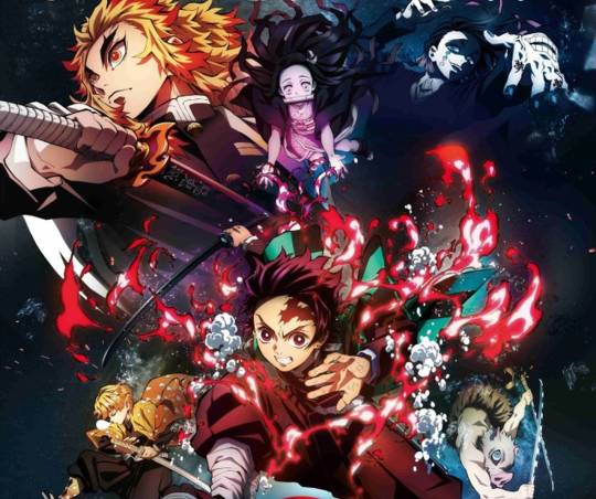
Plot: Ever since the death of his father, the burden of supporting the family has fallen upon Tanjirou Kamado's shoulders. Though living impoverished on a remote mountain, the Kamado family are able to enjoy a relatively peaceful and happy life. One day, Tanjirou decides to go down to the local village to make a little money selling charcoal. On his way back, night falls, forcing Tanjirou to take shelter in the house of a strange man, who warns him of the existence of flesh-eating demons that lurk in the woods at night. When he finally arrives back home the next day, he is met with a horrifying sight—his whole family has been slaughtered. Worse still, the sole survivor is his sister Nezuko, who has been turned into a bloodthirsty demon. Consumed by rage and hatred, Tanjirou swears to avenge his family and stay by his only remaining sibling. Alongside the mysterious group calling themselves the Demon Slayer Corps, Tanjirou will do whatever it takes to slay the demons and protect the remnants of his beloved sister's humanity. [Written by MAL Rewrite]
Episodes: 26
Main Characters: Kamado Tanjirou Kamado Nezuko Agamatsu Zenits Hashibira Inosuke
Points: 8/10
Ufotable always delivers and once again they've laid down a milestone in anime history, although Demon Slayer has - despite very amazing graphics, a solid engaging storyline, good voice acting and beautiful soundtrack – few faults that I cannot overlook although this may not be fault of the animations studio, but rather the story in itself, as in the source material, the manga. Nonetheless Demon Slayer has fulfilled the original goal of an anime production: I picked up the manga.

Demon Slayer was hyped up so much, that it couldn't live up to it and now that I have decided to watch it, I can't say it excited me as much as it may have excited other, but nonetheless I am not one of those that watch anime just to find faults as I did enjoy Demon Slayer a whole lot because of quite a few aspects.
The overall theme of Demon Slayer is a dark one, set in a fantasy world where onis (demons, monsters) roam over the world and even humans can turn into onis. Thus it happens that the main male character's (Tanjirou's) family is slaughtered by demons while he tries to save the only member still alive: his sister, who then turns out to have been turned into an oni, but some reason or another she's just magically different from all the other onis. Let's call it a plot device I don't totally dig, but hence his journey to heal his sister and revenge his family begins. The premise is not entirely original, but I am not against using shounen tropes.

What Demon Slayer excels at is the dark atmosphere, the beautiful backgrounds, fluent fighting animations and skill uses with special effects. This is to be expected of ufotable, but it just needs to be mentioned that among animation studios ufotable is often just on another level. The occasional CGI use was... quite horrible though. It especially feels out of place since you see in every fight what ufotable is capable of. Watching CGI figures move over the screen in important conversations or even few stoic movements in bigger fights just made it feel like you were looking at a beautiful picture and something just suddenly falls out of it. It was unnecessary and thus disturbing the general flow of the anime. Nonetheless what might have made up for it were the painterly ink-like waves rushing from Tanjirou's swords in fights. That always kept me quite awed.
Besides very little character development (Tanjirou and Nezuko barely received any, they were always strong and good hearted) we do get a few tear jerking moments after every boss fight as Tanjirou seemingly frees every oni from their torment by killing them and honestly, the theme itself of freeing a pained human was very satisfying to watch, especially after the boss fights were already very engaging and beautiful to watch, although one might mention that there's always a huge chunk of monologue coming from Tanjirou, which is sometimes annoying.

Apart from that I have to make a few question worthy remarks: While demon certainly are a threat, Tanjirou's family didn't seem to know or care and they lived years all alone up on that mountain and never did an oni come by? Not certainly something I absolutely understand. Tanjirou also receives too little development and then apparently he's stronger in a year than those who might have trained 10 years? Only in the end he receives a massive blow to the face as he certainly loses big time, which was a bit redeeming. Also Nezuko is told in her sleep that onis are fiends and humans are family and this is just too much of a convenient tool to make the plot work. Tanjirou also apparently can smell anything which makes me question his humanity. It's just out of this world. In addition one might not be too fond of the side characters for how incredibly annoying they can be. Zenitsu is crying half of the time, which isn't always amusing, while Inosuke always runs into a fight head first and rarely questions anything and just screams around. There is a bit of plot development which strengthens these characters but for now it's too little to call it satisfying. I also hope the pillars receive more development. Despite all that keep in mind that Demon Slayer is a truly good anime.
It's a very worthwhile watch. There are beautiful graphics, fluent animations with a unique style to them, a compelling story line and interesting characters which hopefully receive more spotlight and development in the next instalment.

Animation/Character Design – 8.75
Characters/Story – 7.75
Enjoyment – 8.25
0 notes
Photo

Something I started drawing last week when I was sick and decided to finish last night...
Just Willow floating around~
Playing with some dancing lights or whatever
I think that’s the first picture in his new, fancier outfit? He got it in our, uh, third session or so maybe...? In any case, months ago and I don’t think I’ve ever posted a picture of it. Well, here it is. A proper character reference sheet is definitely on my to do list...
Love drawing this idiot and I’m pretty happy with how it turned out (: I think I’m going back to the way I always used to draw for now. The more painterly style is fun and I like how it looks, but it’s also very...inefficient. Everything takes ages to finish...
(I tried to add a little animation too but it’s crap and I much prefer the static picture... still, it can be found on my deviantart.)
9 notes
·
View notes
Text
Devlog #34 - Status Update, Character Design, and UI

Hello! It's time for another update on the development status of Brassica. It’s also our first actual devlog purely about Brassica!
After working on separate projects for a while, we are now in the process of getting back on track working on the same game again. Because of that we're happy to announce that the rest of Brassica's Act 2 will be released in March!
It grew a bit in size from what we originally planned but that just means more game for you~
The exact date will be announced when we can more clearly estimate how long the remaining tasks will take but we're in the process of finishing everything up so it shouldn't be too long.
As for Act 3, our current plan is to release it in April. From now on development should be a lot faster but because we mainly worked on it on the side until now, that is still only a rough estimate. We'll definitely keep you updated on any developments regarding the release dates though!
Well, and that's about it for the status update. Because it's been a while since our devlogs actually described much of our development process (and we haven't shared much about our thought processes behind Brassica), we decided to bring that back with today's devlog.
PECTIN will tell you a bit about Saffron and his design while eZombo describes the development of the UI. So without further ado, here we go:
Art - PECTIN
Saffron is the curious prince the player takes control of in Brassica. Before I began concepting him Felix and I defined his character. At this point we already knew he would be one of the princes Sappho tricks into going on the journey. (And would then fall in love with another prince because YaoiJam'18). We soon agreed on naming him Saffron. So I already associated the colours of the spice "saffron" with him here. We also wanted to make him a protagonist with his own personality. Thinking of the player who role-plays him we thought it would be cool to have his character split into three separate personalities he could have: - the cunning and a bit wild prince - the typical goody two-shoes type of hero - and the soft boi who's overwhelmed by the whole predicament and really needs a hug Another external influence was, my intention to try and fuse traditional things with modern sportswear. Brassica is a fairytale but it's told in a contemporary voice. That's where the idea came from. ...Okay. So I had his name, colours I could associate with him, the three archetypes and my goal to fuse sportswear with traditional clothing. Having all of these "pointers" I began looking for reference pictures. I browsed through online stores of popular sports brands to find things that would fit the character. Due to Saffron's character ranging from cute to rather untamed (in the sense that he would climb a tree without hesitation) I thought that wearing shorts would be most suitable and comfy. But for the top and the overall outfit I wanted to let myself get inspired by traditional elements. The name "Saffron" reminded me of the spice and then its use in Indian culture. I never designed a character with Indian influences before and thought researching into that would be interesting. I found a lot of stuff I could translate into the design. Even the leggings Saffron wears were intially inspired by my findings about Indian culture. Here's a visual breakdown of what inspired what (excuse my srawly handwriting >-<):

During the process of drawing out his design, as I always do, I thought about how each component of the outfit would "flow". There're lot's of lines and intersections in his outfit that guide the eyes along the his body:

And here is our boy again as a sprite. Not much different right? Here I put one of his hands in his shorts' pocket, because I think it would suit someone who is either unsure and does that or feels liking hiding something.
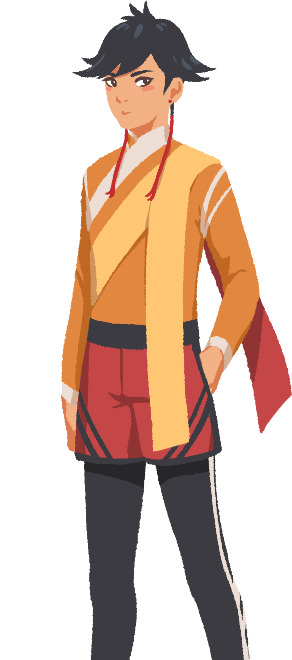
That's it about Saffron! I could go on about his colours but I'll save that for when I explain the general artstyle of Brassica! :3
UI - eZombo
Because Brassica was planned as an entry for Yaoi Jam 2018, we thought about ways to keep the scope small. One idea we came up with was to reduce the size of the screen that shows backgrounds and characters so producing the art is a bit faster than filling a full HD 16:9 canvas. One inspiration for that was Sticky Zeitgeist by Porpentine & Rook but something like the Undertale console version where the graphics at the border of the screen change based on the in-game location was also something we considered.
When it came to actually planning the screen, Undertale's influence came through again, because the main area of the screen actually has an aspect ratio of 4:3. This obviously leaves a lot of unused screen space but one thing we knew we could definitely use to fill this was the text box. Having it separate from the main screen also made sure that it didn't overlap with the characters or backgrounds so the space that was reserved for that could be used to its full potential.
With two elements already on the screen, we still had the sides to fill with content. Just using graphics as borders definitely was an option but because Brassica's story plays out a bit like a road movie, we thought having a map of the game world would definitely add to the feeling of that. And to make the UI visually more balanced again, the last bit of free space was then filled with some information on the time of day and how many days were left for the quest of the princes which basically added all the important context for what is going on in the center of the screen.
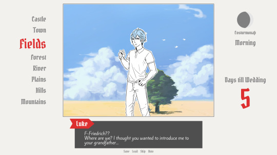
A first mock-up of the UI featuring a familiar face and St. Bernard...
Around that time, we also developed the idea of presenting the whole game screen like a paper or puppet theater. This seemed like a good way to bring all these different elements together while still supporting the colorful fantasy-ish look of the game art.
I did a quick sketch of how this could look, which turned the mock-up into this:
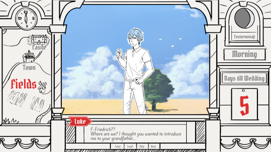
Aside from adding some more purely graphical elements, I adjusted the text box and the flag that showed the name of the character that is currently speaking. The map was graphical now instead of just a list (which would have given away future locations) and I was overall fairly happy with the direction the UI was going in. A few of the border elements overlapped with the main screen now but I tried to make sure it only happens in areas where we wouldn't put any focus.
After getting some feedback from PECTIN I then went on to work on the final lineart while also trying to simplify all the shapes. By then, the characters were also being concepted so instead of Luke I could put Ode into the mock-up (along with a reference for a possible background style).

As you can see, some unnecessary lines, elements, and text were removed to simplify the look of the UI and make sure that the important elements aren't overshadowed by anything else. Overall I tried to keep the lines clean without making them look overly sterile, so any round shapes are generally drawn freehand instead of using any vector shapes. Except for the compass, moon, and their enclosing arcs. Those just looked sloppy when they weren't exact. Not using fixed line widths was another way to make the lines more organic even when they were perfectly straight. The idea to use different colored flags for each character also came into play now, although Ode's color here is actually used by Hans now…
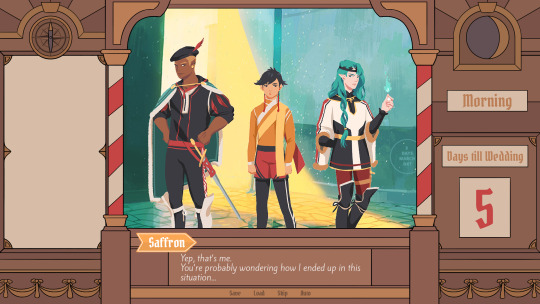
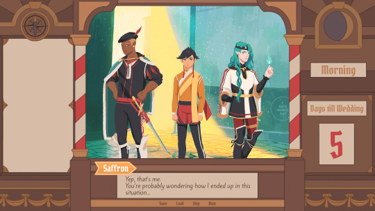
Colors were next on the agenda. First a basic pass, followed by some adjustments and line colors to make the lines fade more into the background. Having the concepts for the three princes was very helpful for this step because it was important that the UI colors fit into the overall color scheme while keeping the focus on the actual game art. That's why red is only used close to the center and for important UI elements (the current location on the map is also marked in red). The rest of the colors are rather muted and monochrome on purpose with only a little bit of gold to break it up.
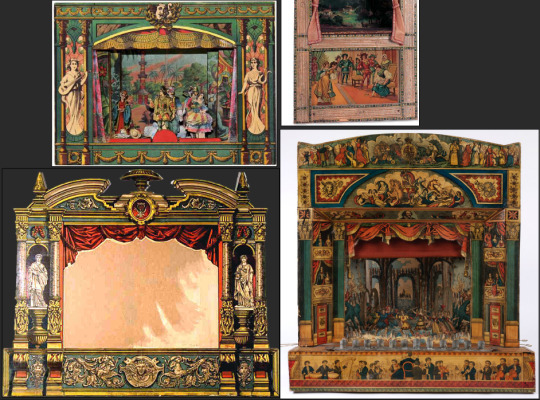
Throughout the whole process my main references were old paper theaters but especially during the coloring process I deviated from these references in favor of using colors that would match with most backgrounds.
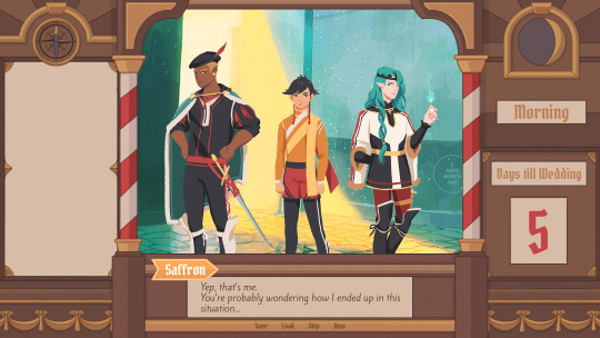
Once we were happy with the colors, I did a relatively quick shading pass, just adding shadows with a fairly abstract light source to keep most shadows parallel to the lines. I also added some subtle noise to make everything look a bit more organic.
For the most part it still looked too clean though, so PECTIN suggested overlaying the UI with some watercolor textures.

Which lead to this final mock-up and not only solved the problem but also gave the UI a more painterly look that didn't interfere as much with the general artstyle.
Well, but as always, there are still a few things that changed on the way into the engine.
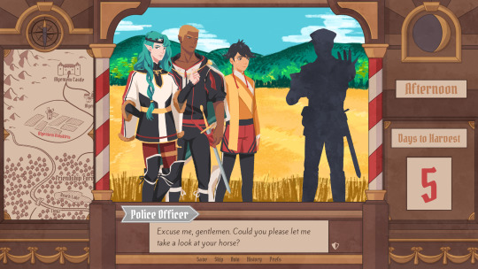
The map was obviously added (which could probably fill a devlog by itself), the text on the side was changed to better reflect the current quest of the princes (although the other sign may or may not return in future acts...), I added a CTC icon and updated the quick menu (although I can't remember why "Load" was removed so maybe that will return again), but most importantly: The text box was reduced from three to two lines of text. This wasn't as much an active decision as it was caused by the fact that small line spacing in Ren'Py cuts of parts of some letters until all lines of text are displayed. There are some games that still do this but personally I don't really like how it looks while the text appears. Increasing the textbox would have caused a lot of work because I would have had to shift around more elements of the UI to keep a balanced layout so it was simply easier to remove a line of text and increase the line spacing.
This had a pretty strong effect on the writing because sentences have to be fairly short now or if that doesn't work, broken up into multiple lines. Even if it wasn't exactly planned, it still influenced the writing style of Brassica and further distinguished it from our other games (although there's more to say on that one) and in hindsight, only two lines of text also look a lot cleaner in this layout.
I could go on about the actual implementation of the UI but this has already been a pretty lengthy post so maybe I'll save it for another devlog.
But that's it for now! We'll be back in two weeks with some more development insights and our current status. We also plan to start posting these devlogs regularly again, so stay tuned for that! As always, thank you so much for reading and we hope you could find a few things of interest in this devlog.
#brassica#fairytale#devlog#gamedev#game#development#otome game#romance#tutorial#visual novel#indiedev#indie#okay
8 notes
·
View notes
Text
Graded Unit | Personal Work Review
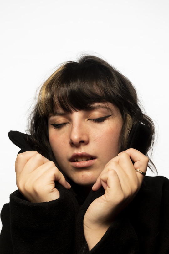
Clean White Portrait
I think what makes this image appealing is the strong contrast between the dark black clothing and the bright white background. Within the shoot, this image was a spontaneous shot that ultimately turned out to be my favourite of them all. I like the very commercial/editorial feel to the image and it looks like it could belong in a magazine.
Dandelions
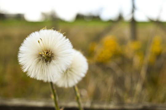
This is one of my favourite shots from the beginning of my photography journey. Early on in the pandemic, I spent a lot of time out in nature with my camera. My favourite part of this image is the shallow depth of field and how the white of the dandelions stand out from the background so prominently.
Muscovy Duck
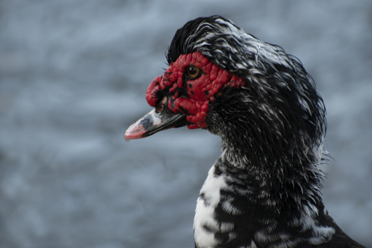
This image is one that I am extremely proud of. The red in the duck's face is striking and contrasts highly with the soft blue, out of focus background. The texture in the feathers and the red skin of the duck's face helps to make it stand out from the background more and gives the bird a fuller and more 3-dimensional effect.
Glasgow Architecture
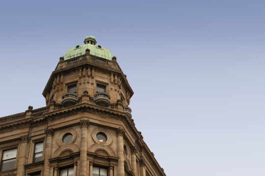
Architecture is a style of photography I have only briefly tried but I felt that the images turned out very successful. This shot is my favourite of the final three and what I find most appealing is the contrasting colours and the sharp edges of the building are very strong and distinct.
Inspired by Art - Girl with a Pearl Earring
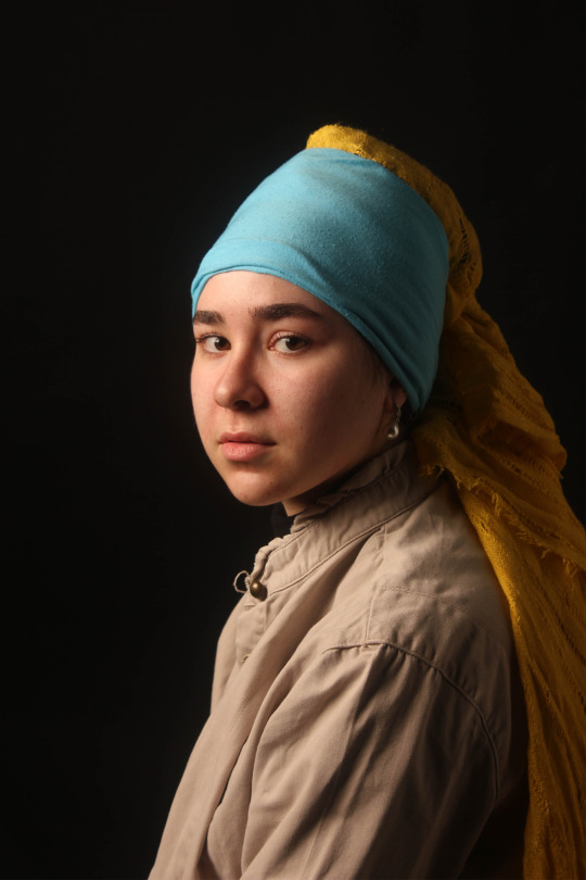
This image was shot for the Inspired by Art brief during last year's NQ course. For the portrait, I decided to emulate the Girl with a Pearl Earring painting by Johannes Vermeer. This image was my first ever studio project and I felt very proud of the image I produced. I think the concept and the twist on the original painting is what made this image so successful.
Silhouette
This image is my most successful attempt at producing a silhouette photograph. I think that the key aspect which made this image successful was shooting at the right time of day and fully covering the light rays from the sun to ensure the subject was fully in darkness. The bright blue and orange of the sky really helped the subject to stand out.

Inspired by Art - Still Life
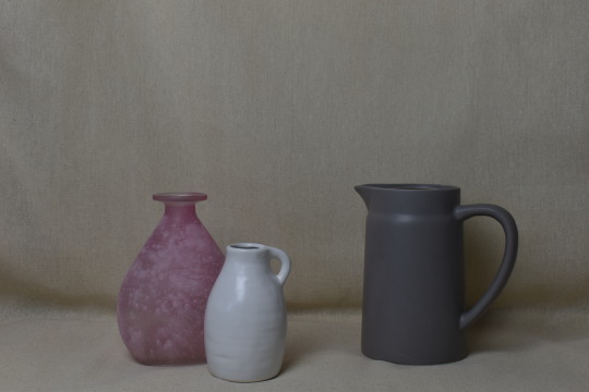
This was another shot from the NQ Inspired by Art brief that was inspired by still life paintings from the Golden Age. This was the first time I had shot "traditional" still life images and found that it was an interesting style of photography that I had never tried before. My favourite thing about this image is the simplicity of it. The varied textures in the vases give it a bit of variety and the soft muted colours help to emulate the painterly feel.
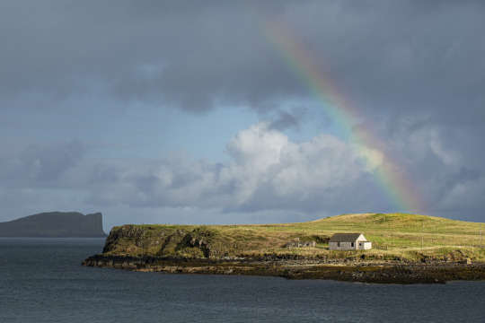
An Corran Beach
This image was shot on the Isle of Skye on An Corran Beach. Before this trip, I hadn't been very successful or happy with any landscape photography I had produced but this trip changed that when I was shooting scenery like this. What makes this image strong is the direct sunlight and bright colours and the bright and happy atmosphere that it creates. The texture of the rocks, grass and gentle waves help to bring it to life.
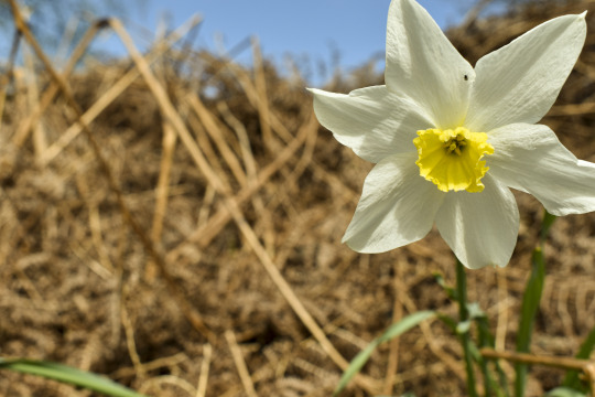
Daffodil
Similar to the image of the dandelions, this daffodil photograph was among some of my favourite nature shots. The shallow depth of field helps the viewer focus on the flower as well as the strong white and yellow which stands out from the softer background. There is great texture in the petals of the daffodil and some soft shadows.
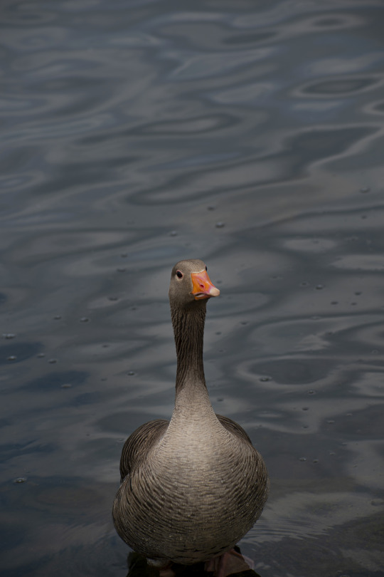
Greylag Goose
I think this is one of my strongest images to date and what makes it successful is the sharpness and detail in the face and upper body of the goose. The shallower depth of field helps the goose to stay separate from the background but we can still see the ripples and waves in the water. There is a great texture to the feathers and almost a vignetting effect which brings attention to the goose.
0 notes
Text
A4 Synopsis
Title: Growing responsibility
Age: 12-16 Genre: Drama, Maturation plot, Redemption plot.
Platform: YouTube Technique: 2D animation *i cut out some dialogue in the beginning and replaced with body language, some dialogue remains at the end but if the shots are from either behind or long shots of the characters who are speaking, and focus on character body language and mood rather than awkward lip-synching.*
1. (Historical/personal/Summary)
Remi and her parents lived happily working in their quaint little flower shop in an old fashioned French town. Remi was a happy young girl who had a passion for painting but when her father mysteriously went missing after going to meet with some investors, she had no time for painting anymore and had to help her mother run the shop. Due to an illness her mother passed away soon after, leaving Remi to run the shop by herself. Being unable to pursue her passion and the stress of working in what feels like a dead end shop she grows up with a pessimistic attitude, becoming ungrateful towards customers and neglecting caring for the plants in the shop. A mysterious old man with his hair covering most of his face starts frequenting outside her shop, one day the old man tries to talk with Remi about her wilting plants only to be rudely dismissed by her. The following evening as she's leaving to go buy some groceries and drops her keys down a drain, unable to reach the keys and in her stressed state she curses loudly and slumps herself down on a bench opposite the shop to calm herself down. The old man from before sits next to her on the bench begins to talk about his daughter who had a wonderful passion for painting, Remi then listens closely and realises that the man is her missing father. The father tells Remi why he was missing and apologises, he tells her he will help her around the shop and that if she wishes she can go to the art college like she always wanted. Remi chooses to stay with her father as she wants to be with family again and instead she opens an art gallery inside the flower shop, bringing her passion for painting and her family business together.
2. (Aims/How will it grab the audience)
The story aims to pull in viewers aged 12 to 16 with topics of family, responsibility and maturation themes. Themes of family and growing up are a common theme among younger audiences as it gives them something to relate to and makes them feel a sense of freedom when the character is forced to take on responsibility or independence, in this case where the character Remi is left alone and has to independently look after the shop by herself, she struggles with the responsibility and just wants to paint again but she has to learn to take responsibility and try to combine her passion of painting with the family business in order to achieve happiness. At the end of the story her character redeems itself and she matures.
3. (Story structure/What will it look like?)
The story will follow a Linear structure, following the life of Remi, as she grows from age 12 to 16. It will be 2D animated, with a painterly Ghibli-esque style for the scenic French town and all the backgrounds, and with 2D semi realistic characters. The colours will be warm and colourful at the start of the story and then get duller as Remi’s personality changes. The last scene when she decides to stay in the shop will show warm colours again to show a return to stability and happiness.
4. (Environment/costumes/smells etc)
It is set in an old fashioned French town, inspired by a real town named ‘Colmar’ in France. The environment shows autumn leaves surrounding the cobblestone flooring and a canal with narrow wooden boats that pass by, the flower shop front faces the canal and a wooden fencing trails along the canal edge. An overpowering floral smell hangs inside the shop, but outside it smells of fresh pastry from the bakery next door. Younger Remi wears a yellow top and a knee length brown skirt, her blue florist apron is covered in colourful paint, she wears a yellow flower in her hair. Older Remi wears duller clothes, a black top and faded blue jeans, her apron is tattered from overuse, the colourful paint stains are now replaced with a sewn on blue patch.
5. (Characters/personality)
Remi (age 12) - a cute energetic kid, happy, passionate about her painting, likes to be praised, enjoys helping her parents around the flower shop. has very good relationship with her dad who calls her his ‘Mini Monet’.
Remi (age 16) - Her eyes look tired, wears her hair up in a messy ponytail, unhappy, unmotivated, uncaring and arrogant, she has very little passion for taking care of the plants in the shop, and shows zero effort with customers. she has no time for her passion of painting anymore and takes it out on others. She is both sad and angry about her fathers disappearance, her mothers passing was what flipped the switch for her behaviour, and she stopped caring about anything after.
The mother: Always at the till working, she is caring but also has little time to praise Remi, which is why the younger Remi would talk with her father more. She is organised, she will let Remi go paint after she has helped around the shop first. She passes away leaving Remi to look after the shop by herself.
The father/old man: Adores his family and has lot of pride, when he loses a deal with investors and loses the families fortune, he feels he cant go back to face the family. When he finally builds the courage to go back he is faced with a very different Remi to what he remembered and his wife has passed away. When he finally gets to talk to Remi he talks about the daughter he remembers to try to get Remi to listen to him, once Remi recognises him he then explains everything and gives her an option to go to art college if she would like.
6. ‘Growing Responsibility’ will be produced using Procreate, After effects and Premiere Pro. Procreate will be used to digitally paint the backgrounds creating a traditional watercolour effect, Characters would be Animated using the animate function on Procreate and then backgrounds, characters and effects will be combined using After effects. Premiere pro will be used to match up audio/dialogue to the scenes. I will be using the skills of a French accented voice actor and actress to voice the father and the daughter, Remi.
0 notes
Photo
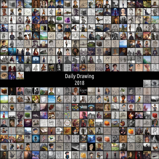
Year three of daily drawing - my experiences
Read about my first year HERE and my second year HERE
Wow! Three full years of daily drawing, all done. When I started out I didn’t even think I’d make it past the first week. I’m still baffled, to be honest. Time to look back on this third year, and on the challenge as a whole. I have a LOT of thoughts, let’s see if I can make some sense of them under the cut.
What was the plan? At the end of last year, I said this about my plans for 2018:
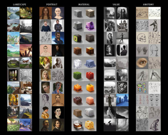
Do more studies, for real this time. I’ll be keeping a tally in my bullet journal of value, anatomy, landscape, portrait and material studies and aim to do at least twenty of each this year. Aside from that, I’m actually pretty happy with how my developement has been going this past year so I aim to just keep that up. I want to do at least one more year of dailies, because I just really like the number three and it means I’ll have over a thousand total.
And how did that work out? Well, I made my study goal! 100 total, and 20 in each listed category. Though, as expected, I ended up making the bulk of them in the last two months to catch up. I think I learned a lot from doing those, but looking back, I feel like I only scratched the surface. See the way studies work is you copy first, then try to reproduce it without reference, then implement the techniques in an original artwork. I stopped at copying, meaning I learned about a third of what I could have if I had taken a bit more time.
Something else I wanted to work on in 2018 was to stop letting these dailies cut into my sleep time. I set a timer on my phone for 8pm everyday to remind me to start drawing, and used my bullet journal to keep track of all the days I was in bed before midnight. While it definitely didn’t work *all* the time, I do feel like it made a significant difference. The feeling I got everytime I was in a late train home from band rehearsal and I realized I’d already made my daily earlier that day was priceless.
Time to quit? I already predicted I’d probably want to stop after my third year. Turns out that once I’d formed that thought in my mind, I suddenly started to *really* feel like quitting. I mean, I wasn’t about to quit before I’d reached the three year mark, I’m way too stubborn for that, but I did notice a significant drop in my motivation around April. I had an increasingly hard time coming up with things to draw, often lacked the mental energy for more ‘finished’ looking sketches, and overall started to feel like it was a chore instead of something I enjoyed. Near the end of the year I often spent over an hour just hovering my pen over my tablet before actually drawing anything. A sure sign that this challenge was no longer serving its purpose and it was time to stop.
Besides that, this year also brought along some pretty big life events for me, meaning I had little to no brain space and energy to spare for art for a while. Though forcing myself to draw through that exhaustion wasn’t fun, I’m relieved to notice that it didn’t kill my love for creating. If anything, it fueled my longing to make more elaborate artworks, to spend more than just an hour on something, to allow myself to let something sit for a few days before returning to it.
An unexpected obstacle was a sudden bug in Photoshop, or my tablet, or both, that messed with my pen pressure. Meaning that for every 10 pen strokes I did, about 8 or 9 would come out as gross hard-angled black blobs. I have no idea what triggered this, and still no idea how to fix it (I use a pirated version of Photoshop so I can’t update it), so it meant that every drawing took at least twice the effort since I now spent over half my time ctrl+z ing until I could draw the line I intended. Seeing as my motivation was already dwindling, this certainly didn’t help in keeping these dailies fun to make.
Am I happy with the things I drew? Looking back on the things I drew in 2018, I think I’ve further solidified my workflow, having a clear preferred method of sketching and coloring. I sometimes tried turning off the line layers to see if it could work without, which was fun to see, but overall I think I stayed inside my comfort zone a lot (except for the studies). I don’t think I mind, though. Now that I know how I like to work, I can do it much more efficiently than I could before, and that’s a valuable time saver. I also focused on making my drawings look a bit less flat, approaching it as three-dimensional shapes rather than lines. There’s still a lot more work to be done in this department, but I’m happy with the steps I’ve taken so far!
What did I set out to learn, and did I? For 2018 specifically, it was ‘to make great strides in my mastery of anatomy, value, materials, portraits and landscapes’. As stated above, I feel like I haven’t nearly learned enough from the studies I did. Making these studies did give me more experience in a painterly workflow, and I noticed my eye for value and color getting sharper over time, but to really make the kind of progress I’d been looking for I’ll have to go the extra mile. Maybe I’ll get around to that now that I don’t feel obligated to post it all.
What did I learn that I didn’t expect to? That even when I’d made a habit out of daily drawing, I can’t and shouldn’t go on forever. I thought the reason I’d quit eventually would be because I’d simply be bored with it. I don’t think I expected to have as much trouble finding the energy to keep it up, nor did I realize the time spent on these dailies meant less time spent on larger artworks.
Looking back on the challenge as a whole:
What did I set out to learn, and did I?
1. To get over my fear of creating bad art I obviously didn’t 100% shake that feeling, but then again I’m starting to feel like I shouldn’t aim for that. As long as it’s not holding me back anymore, that bit of frustration when something doesn’t work as well as I hoped it would is the thing that’s going to drive me to keep improving. And looking back on how utterly stuck I was before starting this challenge, I’d say this goal has definitely been achieved. Now, I know creating something imperfect is always better than creating nothing at all, and I’ve also experienced that a lot of the time things work out better than I’d feared.
2. To make better art Oh that definitely happened. I’ve improved way more in these past three years than in the three years before that. Some of the dailies I made in an hour are better than the artworks I’d spend multiple days on back then. As intended, the sheer amount of practice resulted in a better eye for cohesive proportions, and it allowed me to finally get comfortable with a certain style. Even though in hindsight I could have done way more to improve through this challenge, I’m very happy with the skill upgrade it did bring.

What did I learn that I didn’t expect to?
1. That I can actually do this It sounds silly, but trust me when I say I never *ever* actually believed I was going to last for longer than a week. I always thought I wasn’t the type of person who could keep up with resolutions. What I learned is that apparently I *am* stubborn enough to keep up with challenges, as long as I feel like I have something to prove to myself. And as long as I’m the one who set the rules. That way I can’t complain about them, after all! ;)
2. To be self-indulgent There was a clear shift somewhere halfway through the challenge where I realized I had been holding off on drawing too much of the same thing, because I felt like my followers would be fed up with it. I felt like I wasn’t ‘legit’ when I was only drawing fan art. I realized that was holding me back, because now I was spending time and energy on figuring out the proper subject for my dailies before even putting pen to paper! The moment I let go of those expectations, and allowed myself to be as self-indulgent with my drawings as I’d like, my art improved. As did my love for art, and the response I got from you!
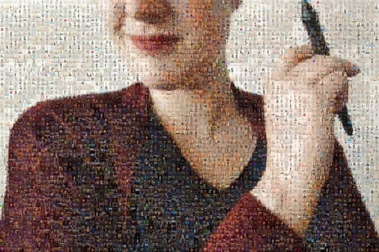
Plans for 2019
I figured it was best for me not to jump right into a new challenge after this, so I’ve been spending my time just recharging. As I write this, it’s been 13 days since my last daily, and I haven’t felt the need to draw since. I’m taking it slow, getting a feel for where I stand now and what I’d like to learn next. I treated myself to a Schoolism subscription during their Winter Sale, meaning I have access to amazing course material all year, and I can’t wait to see how that will help me grow.
I look forward to making sketches without ‘having to’ post them. Meaning I can copy art by other artists to learn from them without plagiarizing. Meaning I can decide to continue a sketch the next day, with fresh eyes.
One thing I will still consistently do, is make a monthly Patreon illustration. I’ve rearranged the reward tiers to make the most out of the time I have, and I look forward to keep creating and improving with the help of my lovely Patrons.
I’m making a booklet with all the dailies in it, as well as some more in-depth reflection and tips & tricks. Partly because some of you expressed interest, and partly because I feel like it’s important for me to have a physical thing to show for all my efforts. I’ll let you know as soon as pre-orders open!
Right, I think that was about it! If you’re considering a daily drawing challenge and are wondering if it’s for you, feel free to message me if you have questions! If you decide to do daily drawings because of me (which is just... wow), I’d love it if you tagged me in one so I can check them out!
I want to thank you from the bottom of my heart for sticking with me through this challenge! Your enthusiasm encouraged me to keep going, and seeing your tags and comments in the mornings was one of the highlights of my day.
I’ll leave you with some links:
Check out every single daily in my daily drawing tag
If you’d like, you can support and be involved in my art journey through my Patreon
If this information was in any way useful to you, or you’d just like to make my day, you can buy me a coffee
Find me on twitter and instagram too!

120 notes
·
View notes
Text
Weekend Top Ten #352
Top Ten Cartoons of my Childhood
After last week’s celebration of cinematic vulgarity (in which our hero, despite dropping more Fs and Cs than an explosion at a Scrabble factory, still managed to forget about Nick Frost in Shaun of the Dead), I wanted to restore balance to the Force somewhat by turning the clock back to simpler, more gentle times. In fact, we’re rewinding eighty-plus years by looking at children’s cartoons of my youth.
So here we have, quite simply, my favourite cartoons from when I was a kid. Now I’m saying “when I was a kid” to mean the 1980s – despite the fact that I was, really, still a kid for most of the 90s too. But Batman: The Animated Series debuted early in the 90s, and at that point I think the crossover between what I loved as a nipper and what I love now started to happen. I don’t think I can rank where Young David would place Batman without Old David weighing in to call it the greatest animated show of all time (fun fact: it is). So I’ve stuck to the 80s, which rules out the likes of Animaniacs, Reboot, Tiny Toons, Aladdin, X-Men, and loads more. Maybe I should have just called this “cartoons of the 80s” and been done with it. But here we are.
So, in conclusion: these are, to the best of my memory, my favourite cartoons from when I was a small boy. I’ve tried to think about what I loved and remembered from back then, rather than attempt to appraise what the shows are like nowadays; many of these I’ve not seen for decades, and some of them really do not hold up (Turtles in particular is rather shonky, and even my beloved Transformers varies wildly in quality). But they are what they are, and exist as articles of their time; I loved all of these as a nipper, and in many cases went out of my way to get comics, books, toys, and other manner of merchandise relating to my favourite telly programmes.
Now let’s take a trip down memory lane!
The Transformers (1984-1987): I mean, come on; how could I not? This show casts a longer shadow than anything else. I’ve also watched more of it than other shows, and more recently, so I can confidently say that although it was a relatively cheap toy cartoon from 35 years ago, a lot of it holds up well, so strong were some of these characters and the inherent concept of Robots in Disguise.
The Real Ghostbusters (1986-1991): I loved Ghostbusters almost as much as Transformers. I had the fire station, Ecto-1, a proton pack, the works. I’ve watched some of this relatively recently, too, and it’s very, very good – Old David likes it a lot more than the 80s Transformers toon. There’s even an episode where they bust Orson Welles’ ghost. True story.
Garfield TV Specials (1982-1991): I’m specifically talking about the often whimsical, frequently bittersweet, sometimes bonkers specials that aired sporadically throughout the 80s, many of which I owned on VHS. I remember CITV showed the first few in short groups, so it felt like a short Garfield TV series; but the invention and beautiful painterly style stuck with me, along with the music. Garfield and Friends (’88-’95) also gets a warm mention here, but was wackier and skewed younger, and even as a kid I didn’t love it as much as the more complicated Specials. Also shout out to Happy Birthday, Garfield, which was a behind-the-scenes look at Jim Davis and the Garfield machine, and was a phenomenal influence on little me.
Teenage Mutant Hero Turtles (1987-1996): funnily enough, I always associate the Turtles with the 90s, but I know they debuted in the 80s and I think the TV series aired over here in 1989, so I’m counting it anyway. Turtles was kind of a defining “Big Show” for me as I entered double digits, replacing previous faves Transformers and Ghostbusters (I think Garfield continued in the background as a comic strip). I obsessed over the toys and the merch and the fact that we were denied ninjas and nunchucks on this side of the pond. For shame. Last time I saw the original show I thought it was awful, however.
Muppet Babies (1984-1991): oh, I loved this. I’d have been quite young I guess, although probably the same age as when I was watching Transformers, so go figure. But this was really my main intro to the Muppets, and I remember when they more-or-less featured the Muppet Babies in Muppets Take Manhattan, and seeing them rendered in live-action blew my tiny mind.
The Raccoons (1985-1992): this show seemed to go on forever, a mainstay of my childhood. I remember watching the original TV movie/special, with its human cast and the dogs that go into the woods looking for a star, or something, and finding it a bit weird that those characters were more or less ditched in the series proper. But I still loved it, and I remember it as being rather sophisticated and more complicated than the usual kids’ fair; Cyril Sneer was, obviously, a bad guy, but I seem to remember him becoming complicated and genuinely loving his son who he didn’t quite understand, and slowly warming up over the course of the show. He wasn’t Megatron or Skeletor, is what I’m saying. Plus you had Bert Raccoon, who was a bit of an arse and not always in the right, either. I’ve not seen it in years so maybe I’m misremembering, but Little David found it compelling.
Count Duckula (1988-1993): I know Duckula debuted on Danger Mouse, and I did watch DM too, but really I’m all about the duck. Being a big fan of vampires I was all over this, and I just found everything about it hilarious. I was a bit of a Yankophile too, so I liked that David Jason gave him an American accent. I had tons of Duckula comics, most of which I reckon we threw away. But yeah – loved this show.
Duck Tales (1987-1990): sticking with the duck theme, we have this gem. One of the greatest themes in TV history, and humanity’s favourite Scot, Scrooge McDuck. This was a rollicking, hilarious adventure show with tons of personality, and really helped to kickstart the Disney animation boom of the late 80s/early 90s, which in my mind also encompassed things like Roger Rabbit and the resurgent animated movies, too. I even went to see the movie! I’ve yet to see the remake, sadly, but I applaud the casting of David Tennant.
Inspector Gadget (1983-1986): who didn’t love Inspector Gadget? I think this was probably one of those where it was the repetition of tropes and scenes – “sorry about that, Chief”, “I’ll get you next time, Gadget!” – that made it popular. Gadget was cool, Claw was scary, Brains was funny; this was top-drawer telly. I even wrote a synopsis, a few years ago, for a movie sequel called Inspector Gadget Returns, in which Gadget is old and washed-up, and a grown-up Penny has to bring him out of retirement when Dr. Claw returns. Kinda wish I was an established screenwriter so I could pitch it to someone, to be honest.
Dogtanian and the Three Muskehounds (1981-1982): aw, this show was very sweet. I remember watching it when I was very young (it’s the only show on this list that basically pre-dates me!), and my mum would do the voices of the characters for me. I really don’t remember it very well or how it holds up, but I know that for a little while there, it was seriously my jam. Teeny Tiny David loved it something rotten. If we’re sticking with anthropomorphised animals doing classic literature, I remember Willy Fog much better, funnily enough, but this just sneaks in based on that early childhood love.
Well, there we go. Now I want to watch all of these again. And Willy Fog, for that matter.
1 note
·
View note