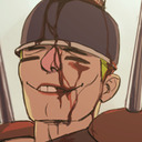
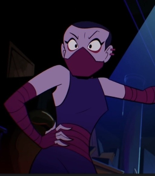
#used their comic designs but their movie color pallets
Explore tagged Tumblr posts
Visit Tumblr Blog
Explore Tumblr blogs with no restrictions, modern design and the best experience.
Last Seen Tumblr Blogs


Fun Fact
The Tumblr app for Google Glass was released on May 16, 2013.
Text

#nimona#ballister boldheart#ballister x ambrosius#ambrosius goldenloin#used their comic designs but their movie color pallets#donut steel
161 notes
·
View notes
Text
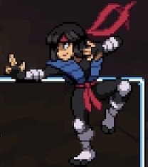
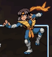
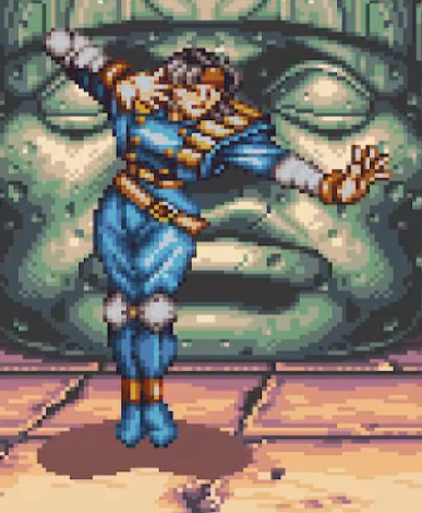
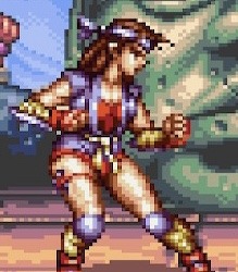
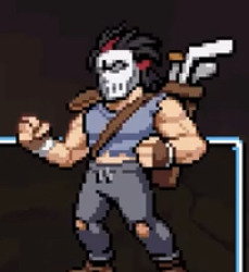
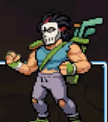
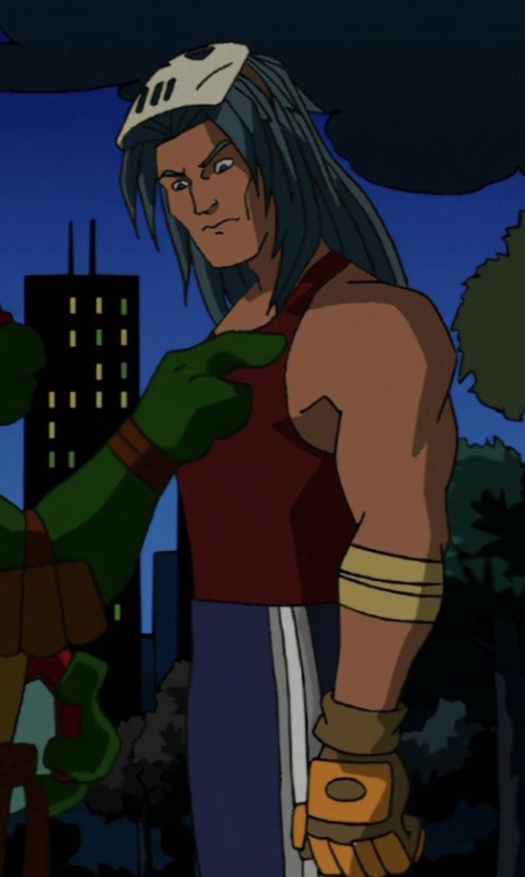
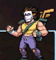
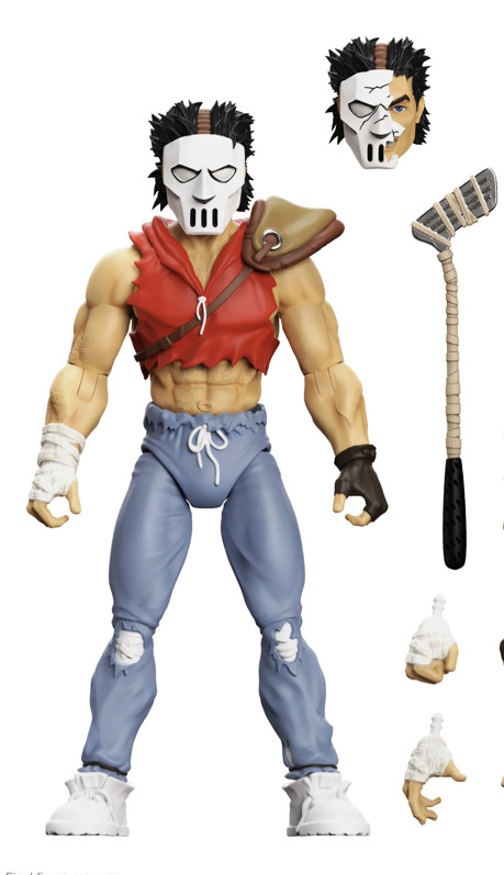
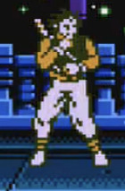
All TMNT Shredder’s Revenge Color References - Karai
Been playing Shredder’s Revenge recently due to the new dlc and since I haven’t seen much discussion in terms of references the new dlc, I decided to look into a lot of it myself. This is just Karai’s colors for now and definitely isn’t complete (updated: I have done all the characters by now, check out the bottom of my post for links to all the other posts), but feel free to give me any additional info you might know and I hope you enjoy checking this out.
I wanted to add numerous move references as well, but I don’t think I’d be able to put enough pictures for that and colors so it’ll probably be a different post.
# 1 - Default - AFAIK, Karai hasn’t actually appeared in the 1987 show nor related media (besides Tournament Fighters), so I think this is a new design.

# 2 - Mirage Shredder Outfit - In the mirage run, Karai at one point did don the Shredder outfit which shares a similar color scheme in colored depictions of Mirage characters. Since practically every version of Karai also having some heavy links to the Shredder story wise, it makes a lot of sense that she would have a Shredder pallet.

# 3 - 2007 Movie? - There’s a lot of different things I think this could be a reference to, including Foot Soldiers in general, the IDW design, the 2014/2016 movie Karai, the older 2003 design etc. Slot 3 seems to be for the 1990 movie designs for most of the cast, so as the 2007 movie debatably shares the same universe as the 90’s movies, I think that would make a lot of sense, although she has even less red on her than this in-game color.

# 4 - 2003 Show - This slot seems to be universally for the 03 show and it appears to also be the case for Karai. The blue is quite pronounced compared to Karai in most of the earlier seasons she appeared in, so either it’s supposed to be based on the S7 design or they just wanted to make it more visually distinct.
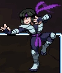
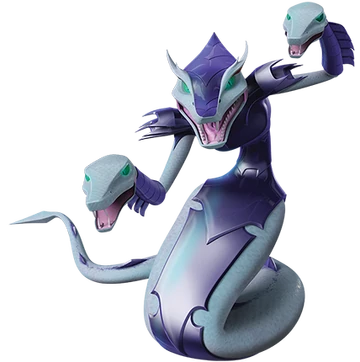
# 5 - 2012 Show (Mutant) - This one was confusing me for a while as I haven’t actually watched all of 2012 yet, but I have seen enough to recognize her standard design which this almost definitely isn’t. Slot 5 seems to be mostly for the 2012 designs however, so I looked more into it and found out she did turn into a purple and white snake which seems to fit.
# 6 - Tournament Fighters Genesis - This slot seems to generally be reserved for the Rise variations of characters (specifically the turtles, Splinter and Casey), but Karai’s surprisingly isn’t (nor does that color seem to be anywhere in this game). I do like this color variant though.
Also worth noting that I don’t think any of her colors reference the alternate pallet for the Genesis Karai. While an alternate pallet exists, from what I know, she wasn’t playable in the original release of the Genesis version so I don’t think there was any way to see the alternate pallet legitimately (it is available in the Cowabunga Collection however).


# 7 - Tournament Fighters SNES (Alt) - Don’t know why her Alt is listed first when you have all the colors, but it seems to be.
# 8 - Tournament Fighters SNES

# 9 - Aska? - This is by far what I’m most stumped on. The red and gold seems close enough and I can kinda see the blue/purple on Aska as white for her gameplay sprites, but a lot of other art involving Aska tends to display that clothing as a clear purple or blue. I haven’t been able to figure out any other potential reference for this however.
# 10 - Mirage Comics - The original TMNT Comics produced by Mirage were produced in black and white, which this design reflects.
If you have the dlc, this is quite clear given that the survival mode included a ���Mirage” dimension which is black-and-white, alongside many waves having comic book panels.

# 11 - NES (General) - AFAIK, Karai never actually appeared in a NES TMNT game, but the simple color pallet and the fact that other characters have actual NES color pallets they’ve used before in their 2nd-to-last color slot.

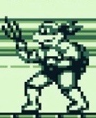
12 - Gameboy - Essentially the same situation as the NES color.
All other (currently made) Color References posts:
1. Karai
2. Leonardo
3. Michelangelo
4. Raphael
5. Donatello
6. April O’Neil
7. Master Splinter
8. Casey Jones
9. Usagi
10. Mona Lisa
11. Mondo Gecko
39 notes
·
View notes
Text

It’s more TMNTtober 2023 prompts. Day 14 to 17 this time. I would've put day 18 here but I think it deserves to be on its own. I still like the design change I got going on for my AU 03 Splinter. Of course, no one beats the OG 03 rat dad.
Finding good color pallets for Tokka and Rahzar was kinda hard. Had to use a page from a movie tie-in comic and the Turtles Forever pic of them. It worked out in the end.
Yes, I tried to mix color pallets of Klunk before and after BTTS and boy the orange baby is adorable. I know they look an awful lot like Fireheart from Warrior Cats, but I say that's representation. (Yes this pose is from Kibbitzer. Just so you know.)
#ninjakitten’s art#tmnttober 2023#teenage mutant ninja turtles#teenage mutant ninja turtles 1991#tmnt 2 secrets of the ooze#secrets of the ooze#teenage mutant ninja turtles 2003#teenage mutant ninja turtles 2k3#tmnt#tmnt 2003#tmnt 2k3#tmnt splinter#splinter tmnt#splinter#master splinter#hamato splinter#tmnt tokka#tmnt rahzar#tmnt foot elite#tmnt foot clan#tmnt klunk#tmnt cats#cats
10 notes
·
View notes
Text
Investigating Rubber Hose Pt. 1
Designing Characters!
Rubber Hose is a style of animation that first emerged in the 1920s, named after the noodle-like limbs the style portrays with no form of joints and free articulation.
By far, the example that most would be familiar with would be the early workings of Walt Disney. These include Mickey Mouse in his eldest appearances such as 'Steamboat Willy (1928)' and 'The Haunted House (1929)'
I was drawn to exploring this because I've been wanting to push animating movement separated from the logic of human bodies. The flailing, smooth arms and legs of the rubber hose style seemed perfect.
First, I gathered a collection of characters from both the time period where the style originated and some more modern examples who were also influenced by it.


Many of the earlier examples emphasized the use of simple shapes to make up their characters such as Oswald the Lucky Rabbit's head and body very prominently featuring circles. This was apparently due to the speed that many studios found they needed to produce their films to keep up with the demand of audiences. The simpler they were, the quicker they could be drawn. I also discovered a lot of trademark design quirks came from many characters' origins in newspaper comics.
When we look at some more modern adaptations, I see they tend to lean from this a bit. Obviously, with modern technical advancements, we can now much more quickly and efficiently animate much more complicated designs and many seem to like to make modern designs and simply apply rubber hose rules.


Cuphead (2017, pictured left) and Steven Universe: The Movie (2019, pictured right) are great examples of contemporary uses.
Cuphead's title characters are an occurrence that certainly is a bit closer to how the originals would design their lineup. They have big feet often gloved, and that classic pie eye as well. Alongside this, all the characters move with that iconic bounce that helps to give them a cheery feel, in stark contrast to the darker ideas present in the game.
Spinel, from Steven Universe the movie, takes a few more liberites with her design. The primarily black and white colors are replaced with bright colors closer to the show's pallet, the pie eye is made by having a constant white highlight across the pupils. They even push the jointless limbs further by having her able to stretch and manipulate them endlessly, even making her legs able to propel her like springs.
As much as I love modern examples, I decided for my animation I'd much like to lean into the more classic shorts for inspiration.
From all my exploration, I settled on this design.


I'd end up abstracting him a bit further but it's mostly loyal to the final product.
Pt. 2 Here
Pt. 3 Here
2 notes
·
View notes
Text
get to know your moots bludpudding edition
tagged by @devilrebirth my beloved
what's the origin of your blog name?
umbrella academy season 1. I’m klaus in an alternate timeline where he enjoys the sight of blood.
otp(s) + shipname
➢ jayce talis + viktor tendercrisp / jayvik (arcane. of course. as we all know)
➢ vash the stampede + nicholas d. wolfwood / vashwood (trigun)
➢ edwin payne/paine + charles rowland / payneland (sandman/dead boy detectives)
➢ jackson healy + holland march / marchly (the nice guys PLEASE TALK TO ME ABOUT THE NICE GUYS)
➢ clancy + torchbearer / clancybearer (twenty one pilots)
➢ and of course my lovies the corinthian + dr. stephen bennett (as of now their spinoff is called genesis)
favourite colour
red but i'm obsessed with primary colors. my favorite color pallete to work with.

favourite game
i have upwards of 2k hours in the sims 4 but tbh i use it as more of a creative tool rather than a game. final fantasy xiv has been my SHIT lately i love open world games they're adhd enrichment
song stuck in your head songs to get to know me
my essence:
➢ REAL SUPER DARK - waterparks
➢ vampire money - my chemical romance
➢ next semester - twenty one pilots
weirdest habit/trait?
i have a sensory aversion to pants and since i spend most of my time at home that means i also spend most of my time half naked. hell im not wearing any pants right now and it is delightful
hobbies
➢ i fuchkign love drawing !1!!!!
➢ specifically the design aspect of art is what I'm passionate about. fashion, character, environment. I love taking the time to create things from scratch and all the research that goes along with it.
➢ learning about things that work better as interesting conversations rather than actual useful information. most berries aren't even botanically berries they're aggregate fruits.
➢ whatever my current special interest or hyperfix is. the corinthian is a hobby.
➢ I'm trying to get better at writing so that's been going on on the dl
if you work, what's your profession?
i've worked as an animal socializer, graphic designer, and print shop technician + operator. I'm currently studying to get my degree in comics + narrative.
if you could have any job you wish, what would it be?
would love to go make dc comics gayer
something you're good at
I can find joy in any situation and have an unkillable spirit
something you're bad at
i can't drive
something you love


these things I keep in my house
something you could talk about for hours off the cuff

something you hate
I get protective over my interests and I really dislike that aspect of myself so much. trying to figure out how to Not do that
something you collect
➢ the teeth of my loved ones. it's a spiritual thing and all very extensively consensual (for my dog I have the teeth she had to get removed and for my mom I have a 3D printed model). trusting me with a piece of your body that represents your uniqueness as a living being is one of the deepest possible displays of affection. we're in it together for the long haul if I've got your chompers.
➢ old keys
➢ funko pops
➢ round cat plushies
➢ physicals of my favorite comics
something you forget
how am i supposed to know
what's your love language?
words of affirmation + acts of service
favourite movie/show
➢ I have yet to find a movie that encapsulates everything I love. been really into the shrek franchise lately though
➢ sandman. of course
favourite food

gonna cry thinking about baked mac n cheese with breadcrumbs
favourite animal


fruit bats. hell yeah
what were you like as a child?
I've always been who I am I've just gotten louder about it
favourite subject at school?
art history or philosophy
least favourite subject
anything that makes me write essays. I'd rather do math and that's saying a lot
what's your best character trait?
I strive to be as emotionally intelligent as possible. the dsm-5 HATES to see me coming
what's your worst character trait?
I'm extremely stubborn. if I'm set on something it's gonna happen
if you could change any detail of your day right now what would it be?
big bowl of gourmet pasta for dinner
if you could travel in time, who would you like to meet?
I don't fuck with time travel humans are not supposed to be doing all that
recommend one of your favourite fanfics (spread the love!):
Ocean Boulevard - platinumangst
i think about merman shark healy a LOT save me animalistic wet fat man. animalistic wet fat man save me
1 note
·
View note
Text
Color Trends by Decade: Advertising, Home Decor, etc
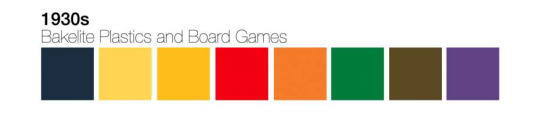
1930s: Escape in Technicolor
During the wave of the Great Depression, Americans persevered by finding affordable, family-friendly means of entertainment and recreation. The 1930s was also a time that bore timeless, iconic pop culture that audiences today cherish and reinvent for contemporary tastes and ideals. Film, board games, comics and magazines were created during this time period — some names remain as favorites across generations. Despite the dread and despair of the Depression, there were many joyful, colorful, and rich colors that represented the era, which represented how Americans kept magic in everyday life.

1930: Great Depression, Escapism, Wizard Of Oz, Practical, Simple, Mix & Match, Finding Joy In Color (E.G., “Depression Glass”), Frank Lloyed Wright Falling Waters
Trends in advertising
A Century of Color - Retro Swatches
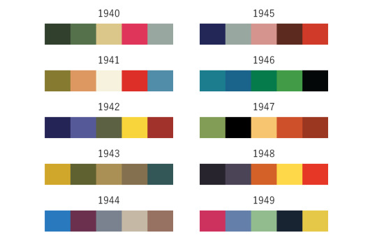
1940s: Patriotism & Primaries
The government had to keep civic and military morale uplifted during the war and rationing. Propaganda posters adopted a rich patriotic palette and promoted a cheerful and romantic sense of duty in the populace. Willie Gillis, a character invented by Rockwell, is a humorous and likable archetype of the all-American drafted soldier. Willie Gillis’s is brighter and cheerier than the more neutral palettes that appeared elsewhere. Primary colors such as blue, navy, red, and yellow were widely used alongside muted military colors such as olive, brown, and tan. Due to rationing, wartime fashion became more minimalistic and pragmatic. In the world of entertainment, adults and children saw movies, cartoons, and comic books that espoused pro-America messages to garner more support for the war. In “Der Fuehrer’s Face”, a wartime propaganda short by Disney released in 1943, Donald Duck dreams of his life being controlled by the Nazis, set in somber, muted and muddy tones of green, brown and yellow.

1940: WWII, Rosie The Riveter, Telephones In The Home, Tupperware, Polaroid, Shoulder Pads, Simple Design, Big Band, Movies, Willingly Making Sacrifices For The War, Dorothy Draper (1939 Book Decorating Is Fun!, Subtitled “How To Be Your Own Decorator”)

Trends in advertising
A Century of Color - Retro Swatches
100 Retro Pallets + Bonus!
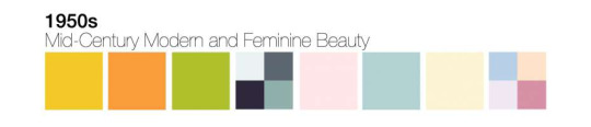
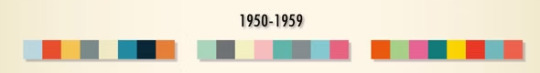
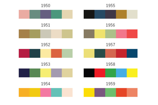
1950s
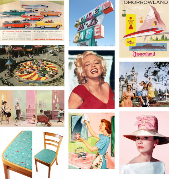
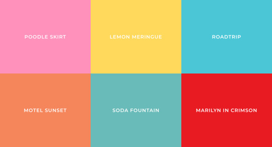
During the 1950s, America came home. Soldiers returning from World War II attended college, bought homes and started families. Another decade of American consumerism, glamor and prosperity swept the nation. Advertisers created razor-sharp campaigns for different family members: mothers, fathers and the newly-created age group: teenagers. Powdery pastels became fashionable and associated with American housewives to convey youth, warmth and joy. Fashion, cars, graphic design, furniture, and decor design were all seeping with delicate pinks, blues, and greens. In the 1950s, you could even buy colored toilet paper. The 1950s was a classic age for families of motorists who flocked to fantastical amusement parks and illuminated atomic-age motels in their streamlined vehicles.
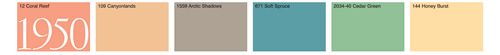
1950: War Over, Women At Home, Suburban Sprawl, TV’s In The Home, Poodle Skirts, Elvis, I Love Lucy, Youthful Attitude, Baby Boomers Emerge, Convenience, 2 Car Garages, DIY, Barbie, Fiestaware, Formica.
Trends in advertising
A Century of Color - Retro Swatches
100 Retro Pallets + Bonus!
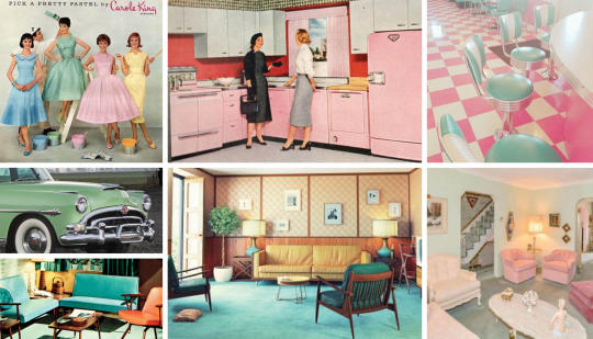
The end of World War II sparked a calm and soothing need for many Americans. This decade showed a love of pastel colors, an array of softer hues to appeal to the American housewife and teenagers. Pastels could be seen in the home, fashion, and even the automobile industry.
0 notes
Text
alright here’s some I rly like and some I came up with :)
• Noirs first language was French after his parents were French immigrants, his mother taught him French before they died and then he learnt English (I came up with this one for a fic and did like 3 hours of research total)
• Miles has tried “spice training” Gwen so her white ass can handle spicy food
• Peter B is trans and he and MJ had Mayday through IVF
• They all have a Minecraft server with about 12 texture packs
• they have movie nights where one gets to pick the movie with a very loose set of rules: during one of these sessions a horror movie was picked and noir had a plate of pizza rolls thrown at his head after asking if anyone wanted anything while he was up, since his voice was very similar to the killer
• All of them HATE peppermint
• Hobie constantly uses the phrase “I don’t believe in concepts” and is the only one allowed to use it since he made the watch replica
• the watch has a ton of random features including but not limited to changing the wearers color to disguising features that especially stand out. (Usually used for spiders like noir and hobie, in case they need to do something stealth related or hide their color pallets/background popups when in other universes)
• Pavitr still calls miles “new guy”
• Peni and Margo went on a “ruining the hqs tech” spree after Gwen was sent back and recruited them. Miguel was pissed off and LYLA thought it was funny
• They’ve set up a “bitties protocol” on noirs watch that takes photos of his chest when fighting and sends them to the teens group chat. (Context: noir has a more muscular chest from Nazi-punching which led to nice tits jokes and thus the bitties protocol) Peni and Margo made the program, and LYLA was in on it and fully on board. Miguel was not. He was not happy when he found it. He was also not happy when learning it was originally used on him.
• Miguel and Ben Rielly are together and have adopted Lego Spider-man as their son and Spider-cat as their cat
• Spider Hatsune-Miku once did a show for the society, after which Gwen dragged Hobie to go talk to her and Spider-miku immediately pulled the “hatsune miku does NOT talk to British people!” line on him.
• as peni got older she looked more and more like her comic design, currently it’s about halfway
• all of them have had to replace doorknobs due to the enhanced strength the day they got it. Pavitr got chewed out by his Maya Auntie after.
• language differences are INSANE and so is the group Spotify playlist
• Pav and Peter are transmasc, Gwen is transfem, and Hobie is genderfluid
• noir and ham are aroace
• Margo somehow managed to get Miguel to pay all the spiders after a year
• most of them got super bendy so hide and seek game is peak
• floor (and walls and ceiling) is lave is PEAK
• all of them have fangs. This includes the horse.
• miles and Gwen have decided that they’re even after she went through his sketchbook and opened his figure and he ripped part of her hair out and have agreed no more of that (they both still feel bad about respective actions but won’t let the other apologize anymore)
I have a lot, if you couldn’t tell lmao
yeah this was just an opportunity to share them all so yippee :D
Guys reblog this post and give me your absolute favorite Spider-Verse headcanon(s).
It can be of any character (OR multiple characters). It could be silly, sad, stupid, hell it could make literally NO sense. Idc just GIMME SOME I WANNA HEAR EM!’ 🔥🗣️
#spiderverse#spider gwen#spiderman noir#spider ham#miles morales#pavitr prabhakar#hobie brown#peni parker#peter b parker#miguel o'hara#margo kess#I have an issuew#and I got a chance to share that issue with the world :D
178 notes
·
View notes
Text
Drawing Prompts
This is for anyone who want's to try it, if you can pls tag me so I can see your awsome art. Feel free to mix them if you want.
Seasons: Draw a character or a pair that you want representing that season.
Illustrations: Illustrate a scene from a movie, book or a fanfic that you want
Flower: Draw a character with a flower that you associate that character with (Bonus: Make the symbolism match the character)
Cover: Grab a cover that you like and draw your character in that style (Bonus: Choose a song that you like but don’t like the cover and design it with the characters you want)
Au: Draw your character in your favorite Au (Bonus: choose a book or a fanfic and draw them in that universe)
Animals: Draw a character as the animal you think suits them.
Tarot: Draw the character as tarot cards but choose a mythology (Egyptian, Greek, Hindi, etc.) as the aesthetic.
Fantasy: Draw humans character as a magical creature.
Photo: Choose a background photo from anywhere (Pinterest, Pexels, etc.) and make a little comic using the color pallet and the place.
Words: Using a random generator draw your characters doing the words that you got.
Worldwide: Choose a foreign country and draw your character in that country with clothes from there.
Dance: Choose a type of dance (Bachata, Tango, Flamenco, etc.) and a song and draw them dancing.
Daytime: Use the color pallet of your favorite time of the day (Sunset, Dawn, Midnight, etc.) and your favorite place to draw your favorite couple.
Music: Choose a song and draw your character in it.
Video: Choose your favorite part of one of the videos (David, Ash, Sam, etc.) And draw it.
Hurt/Comfort/Angst:
“I came as soon as I heard”: A entering the room running and stops suddenly as they see B covered hurt in the bed or ground.
“You are bleeding”: A is talking about something and turns to B noticing they are bleeding, just as A says it B collapses in their arms
“I fell down”: B is sick and falls down the stairs A enters the room and finds B burning up and on the ground, when A ask to talk to them B says “I fell down” before passing out.
“My head hurts”: A enters the room swaying and hurt B goes to help them and A murmurs “My head hurts” before collapsing.
“Stop apologizing, it wasn’t your fault”: A holding B while they are crying on the ground.
“Aren’t you tired?” “Don’t worry about me”: A had an accident or is recovering from illness B is obviously exhausted, so A Tricks B into sleeping with them.
“It’s okay I got you”: A enters their home that has been robbed and finds B on the ground hurt, they hold them tightly as they call for help.
Fluff:
Sleeping together: Use the color pallet to give the sensation of warmth
Cuddling: Use a cold pallet to make the warm stand out, you can only use one warm color.
Falling asleep on the other: Make a comic and use a golden pallet or pastel colors.
Caring for a sick partner: Use only two colors.
Photos of their childhood: Make them seem old.
Swimming: Use a red or purple source of light, draw them underwater.
Carry one of the partners carrying the other to bed: Draw them in a black canvas and only use lighting
Breakfast in bed: Choose a random color pallet and the opposite of it.
Walking in the forest: Use only green, blue and orange.
Picnic: Use an old painting as reference and use it’s aesthetic.
Stargazing: Use Blue and Purple only
26 notes
·
View notes
Note
what are your favourite superhero tv shows?
If I had to pick just one it'd be Jessica Jones, it really leans into the dark aspects of superhero nonsense and does not shy away from heavy themes, but that makes the few moments of levity all the more impactful. The way it handles how messy PTSD and SA are is so kind and grounded, not just despite the fantastical elements, but because of them. Like truly this show is a work of art, every shot and line is packed with meaning. But honestly Daredevil is a close second. The cinematography makes me insane!! Like the continous shot hall fight scenes!!! And the way the lighting and costume department uses color!! (Also Luke Cage is definitly worth watching, it stumbles in places but it is very good! Also defenders as some amazing character moments but the plot is not it. and iron fist is...there.)
Loki and Wanda Vision are stellar shows, the costume and set design alone are enough to elevate these shows. The acting and choreography are so good and they have all the right kind of weirdness I want from comic book properties! Unfortunately, the writing issues are glaring. Like the early episodes are masterful, but they are less than the sum of their parts which sucks ass I wish these shows were better. Falcon and the winter soldier doesn't have the writing problem, I totally see what the show is trying to say, the dramatic moments hit so well. It is very grounded, but it doesn't grip me the way the Netflix shows do, mainline Marvel movies have a color pallet problem. Like this is an important show and it's deeply meaningful I've watched it three times, but like I can't shake the feeling that the messaging is reform or the police and military and not abolish, which is not the move. But it understands why the issues exist which is really good!! (Also I haven't watched past episode 3 of moon knight, but I'll finish it soon-ish, but I like what I've seen so far)
Also Invincible!! It's an amazon prime show based on a comic that's not DC or Marvel, which like hell yeah!! This is THE superhero parady show! It is so meaningful and pointed in its parady, like it is truly is saying something about what the genre of superheroes represent. I'm not going to tell you what they represent because spoilers, this is truly a show you should go into blind, but also it is worth watching over and over again. All the character moments are deeply impactful and it's truly a beautiful coming of age story and I'm so hyped for s2 (Also Sandra Oh is there and she plays a milf, it's fantastic)
Speaking of cartoons! The Batman animated series was what hooked me on the idea of superheroes (the original superman movies were my introduction, but these cartoons got me to stay) I remember going into blockbuster and begging my mom to let me rent the DVD copies of this show. At some point, Batman beyond got mixed in there, also a fucking stellar show. Oh my goodness don't even get me started on Teen Titans!! Like DC's cartoons do not miss!! The Harley Quinn show goes fucking hard!! (very different target audience and tone than the animated series, but like Harley deserves it)
And while we're talking about cartoons, the ultimate spider-man lives rent-free in my head. I could not tell you the plot or even if the show is good, but Peter is so fucking funny. Also, the DC CW shows are my guilty pleasure. I know they're bad but Supergirl is hot and Katie McGrath is SO FUCKING HOT as Lena Luther. Don't ever watch these shows, but man I love them
#oh goodness this is so long#someone ask me about the marvel color pallet problem#someone ask me about the allegory in the daredevil show#'allegory? like cs lewis?' you ask#no it's more like Spenser which is so much worse#it's my fringe analysis that honestly is stupidly surface level#but like no one else is claiming allegory in this show which like why#asks
8 notes
·
View notes
Text
OC Ref: Hamato Diana Shen
This is one of several references for the @tmnt-universal-fanfic-comp‘s Call for Characters.
Character info under the cut, if you don’t like tcest or the pairing RLR, please move on. You may want to blacklist the tags #turtlecest #tcest and #RLR if you enjoy other media from me but not that.
@nyanbacon-art
Story:
Usually Aggressive Empathy in the Abyss verse but also sometimes other ‘verses, such as my up-coming highschool AU Forever. She hasn’t made her debut yet, however.
Where to Find my Content:
Mostly on Ao3 under PrincessGemma12 but I also have a FF.net account, WattPad, InkBunny and DeviantArt under the same name. I have another Tumblr that I won’t be linking but if you find it say “Hello.”
Abbreviations: H. = Hamato
Description:
The second generation of Teenage Ninja Turtles. She wields twin sai, as well as an odachi sword when the mood strikes, and has a black mask. Typically Raphael and Leonardo’s daughter, however, I have incarnations of her where her bearer is another OC. She’s generally sixteen when I work with her and is the unofficial leader of the kids her age (Saheth, Y’Gynumi, Gralzak, Jones Ken’ichi, Jones Kyoshi, H. Natsuko).
Parents:
H. Leonardo, H. Raphael.
Siblings:
H. Akira, H. Kaito, H. Atsuko.
Other Family:
H. Donatello, H. Michelangelo, H. Miwa (alt. Oroku Karai), Casey Jones, April O’Neil, Shinigami, Slash, Mona Lisa, Leatherhead, Renet Tilley - Uncle(s)/Aunt(s) and “Uncle(s)”/”Aunt(s)”
Tang-Shen, H. Yoshi/Master Splinter - Grandparent(s)
H. Margaret, Saheth, Y’Gynumi, Gralzak, Levena Tilley, Jones Ken’ichi, Jones Kyoshi, H. Natsuko, others - Cousin(s)/”Cousin(s)”.
Physical Description:
The spawn of mutant turtles, so… second generation mutant turtle? That’s… not a mutant? She’s about five-foot-four, with an inverted triangle shape: broad shoulders, small hips, thin (think Rise!Mikey, honestly) thighs, no butt, no bust. Rise!Mikey has greatly influenced her design, so she has his build and shell, but the 2012 TMNT color pallet. Her eyes are the same color as Raphael’s and she has a similar temperament, but moves and carries herself more like Leonardo. She has a scar on her plastron, it’s kinda an oval shape. She has wraps around her feet, same kind of belt as Raph, but also a strap across her plastron like Donnie, for her sword. She doesn’t wrap her hands or wrists but does wear a black-beaded bracelet. She paints her nails black. All of her gear is black, she is the goth-styled child.
Personality:
She has a temper almost worse than her fathers’, but she uses meditation and training to balance her emotional state like Leo does. Overall, though, she’s very chill, real relaxed, albeit over-protective of her younger siblings and friends but she’s a ninja turtle-spawned ninja turtle, so we expect that, right? While not as big of a Space Heroes fan as Leo, Diana loves sci-fi and fantasy, The Twilight Zone and Netflix’s Black Mirror being some favorites of hers. She spent a lot of time with Uncle Mikey growing up, him training her to be Dr. Prakenstine’s minion, so she’s inherited his knack for practical jokes and crazy shenanigans. She hates the taste of jasmine rice, which has Leo fuming, but loves bacon and Rice Sides. She can’t cook but makes a mean sponge cake when prompted.
Important Likes:
Fantasy and sci-fi shows, movies, books, comics, video games and graphic novels.
The Twilight Zone
Black Mirror
Fable
Iron Man
Captain Marvel
Death Note (the anime)
Knitting
Cheesecake
Plain cheese pizza (also with bacon as a topping)
Saheth
Jones Ken’ichi
Important Dislikes:
Dr. Tyler Rockwell
Cockroaches (or really any bugs)
Jasmine rice
She has a peanut allergy
Scratchy fabrics
The cold
Orange juice
Eggs done over-easy or fried
Sugar cookies (she does, but Mikey makes them with too much sugar for her and April only bakes them around the holidays)
Other OC refs:
Hamato Akira, Hamato Kaito, Hamato Atsuko; Saheth, Y’Gynumi, Gralzak; Jones Ken’ichi, Jones Kyoshi; Hamato Natsuko.
The list above will be updated with links accordingly.
#tmnt#tmnt universal fanfiction competition#fanfiction competition#teenage mutant ninja turtles#original character#oc reference#aggressive empathy in the abyss#aeita au#tcest warning#turtlecest#RLR#raph x leo#raph/leo
1 note
·
View note
Text
First Look: Descendants 3 Promo Picture Breakdown

With the third installment in, what is to date, the best Disney Channel Original Movie franchise with the first movie’s premier night surpassing High School Musical’s opening, coming to our screens this Summer. it is obvious we will be starting to get some advertising and promotions from the movie to ramp up the hype.
This comes most recently in the form of a set of character promotional photos courtesy of Just Jared Jr, not only giving us our first look at main characters outside of the main four V.Ks but also Hades.
So we’re going to break these down in terms of styling and authenticity to the characters both from the original material and previous movies.
Original Release:

So before Just Jared Jr. released his set, this image made the rounds giving us our first official look at our main four V.Ks Carlos, Evie, Mal and Jay. Honestly from a personal perspective I have never been a fan of shooting from a low angle mainly because it creates that very unneccersary shadow effect on the necks so aside from Carlos and Evie, you can’t tell they have necks. It could also be the costumes fault which we’ll go into when we get a closer look at them further down.
Overall though with the actual styling, I like how the look has evolved again from the second movie after that look evolved from the first movie. It is still very much all about the leather to be a V.K. and for some characters it works but for others not so much.

We also had this promo of Uma and her two henchmen Harry Hook and Gil, it is interesting to see the three still together despite Uma now not really having need of cronies but I love how all three of them look.
New Promos:
Alright so we have 9 images and 8 characters to talk about. Surprisingly though there is no sign of Ben or any of the Auradon Prep kids and that may be because they’ll have their own set released but it is weird to have the main four and even Uma but not Ben.
Mal:

Mal is obviously the main character and so her shot is the one we start with. I don’t like this look one bit for Mal. I know in the first two video promos with Hades being teased and that Under the Sea special that Mal had her main look from Descendants 2, I was expecting Mal to obviously update her look but this just seems basic for her. They do say less is more but this look not only looks reverted but too plain.
First of all, these shots are way too dark because the amount of purple in the outfit as seen in the first image isn’t as visible here, so that’s a misstep, also the fact that obviously Hades is Mal’s dad explains the heavy layer of black but I really do miss all the purple.
Next her hair, I didn’t really believe Mal’s wig in the first movie but definitely believed it in the second movie, this seems just like the first movie again just a little bit thinner and longer, also with the lighting in the image it makes her hair look blue rather than purple so of course there is that misstep between her and Evie.
Evie:

Similarly with Evie, she looks like she has purple hair. It’s really confusing and I don’t know if it is to do with the story of Descendants 3 but I would love some clarity or insight because this franchise has done a lot to distinguish colours for the specific characters and purple and blue are Mal’s and Evie’s respectively.
I will say I do like her hair though, I like the fact that even though Evie isn’t royalty in Auradon she still wears a tiara because that’s just her style. I love the red heart jewel in the middle and I would love it if this was one of Dizzy’s designs.
As for her outfit, I would say the side-view doesn’t do it much justice but the front view isn’t as good either. The outfits in these promos almost look like battle armour and there is a severe lack of blue for Evie in the outfit. I actually don’t think there is any blue.
I really liked her outfit in Descendants 2 because I felt it was mature, stylish and appropriately regal for the character. This just does not say Evie to me from the neck down, I can’t imagine Evie as a fashion designer would create this for herself and believe it to be “fabulous”.
Carlos:

Carlos genuinely looks like a cross between a spaceman and motocross racer, neither of which I would ever associate with the son of Cruella De Vil.
Interestingly enough he is not wearing shorts here despite the fact Carlos has always worn shorts because I think they’re trying to show Carlos as the youngest of the four which works naturally anyway as Cameron Boyce is 3-4 years younger than the other three. I do miss the shorts I have to say, because it added a certain youthful quality to the looks that again is needed for the character in my opinion.
Also I get how the black and white colour pallet is supposed to represent the dalmatian theme he is associated with, but I feel his first two looks represented that a lot stronger than this, it almost comes across as a cow-hide than dalmatian theme. I do miss the fur I have to say, that fur collar in the first movie spoke to me like the green paw print on Beast Boy’s jacket shoulder in Titans.
I have to say also, I don’t get the hair. I think the color is still great but I don’t like them taking Cameron Boyce down the Ross Lynch route of pretty boy hair and to be honest I loved the slick look he had at the start of Descendants 2.
Jay:

Jay’s I would say is most authentic to his character and shows an organic evolution throughout the three movies, even though he has sleeves here I do find it works as a more mature look developing on his original style as opposed to how the other three look.
All his colours are still there, there’s the golds, the patches of black, the reds. I can believe this is what a modern day son of Jafar would wear. Leather works for the character anyway and this is leather-bound brilliance.
I have to say, I can’t decide if I miss the beanie or not but I would have maybe liked to see a bandanna or some sort of headwear because, if these are battle outfits, I feel Jay would wear a bandanna.
It is shocking that this, out of the four, is my favourite look because Jay, as anyone who has read my reviews know, has not been my favourite character but I will say he definitely knows how to be stylish which I thought I would say about Evie or Carlos.
Uma:

Now you see looking at this I can kind of understand Mal’s look if she’s trying to compete with Uma or vise-versa. But the problem is, Uma wins hands down as this is Uma’s style. I love everything from the accents of seagreen, to the shape of the outfit, the hair and the accessories.
Speaking of hair, it was interesting that in Descendants 2 and that special Under the Sea, Uma had braids which mostly were extensions which China McClain had embedded into her already braided hair. The look worked for the with the whole pirate gang captain attire. Here though, I will be interested to see if Uma keeps her Sea Witch status and this is definitely Sea Witch style hair. It’s very regal and you can tell where her hair ends and the extensions begin but that’s only because she filmed this alongside Black Lightning, although in Season 2 she does have shorter hair so maybe she dip-dyed and then had that cut for the show. Regardless I love how she kept the braid-style, it almost takes her look from gang leader to crime boss.
As for the accessories, Evie should be ashamed that Uma is showing her up with her bling. The necklace that she either got or stole from her mother is still there but I will agree with some critics from the her first appearance that in some shots the necklace kept changing size, but here it looks like a trinket rather than a magical object. She also seems to have more bling on as well as that so I am looking forward to seeing that in full. Also her bracelets and nails are subtle enough to not be garish but also to be the right level of stylish. Clearly her time at sea has done her good.
Harry:

If Harry has taken over Uma’s crew from the last movie, then this is the look of a renegade gang leader. I love the level of chains going on with his trousers, it’s subtle because of the darkness of the photo but seeing the shine makes it so cool.
I will say I miss the curliness and unkempt nature of his hair in Descendants 2. Here it does look good but flat, and also I miss his hait. It may not go with the outfit but I do miss it.
The leather vest with the belt motifs is a great choice for the character. I am a bit annoyed about the lighting and obscurity of his shirt because in that first promo you can clearly see it’s a skull shirt whereas if no one was to see that and instead just see this they’d be unsure if his chest is covered in body hair or tattoos because it isn’t quite distinguishable.
I like the use of the hook even though it’s merely an accessory for Harry to honor his father, I like the leather wrist-straps, love the fact he still wears guy-liner. It adds a level of camp to the character without making it seem goofy.
The only thing I don’t understand is those straps around his neck which I think are supposed to be braces but it’s too dark to tell and his arms are in the way.
But he looks good, he was one of my favourites in Descendants 2 and I am thrilled he is back with this look for the third movie.
Gill:

Gil has actually surprised me as while his Descendants 2 look was very suitable for the comic-relief role he had and actually reminded me a lot of the looks in Hook for the lost boys, this is a step up and a more mature version of that.
Looking at the head alone I do see why Jay may not have gone with a bandanna as with the long hair here the two do look alike, the two actors look alike anyway so it makes sense not to confuse the styles too much especially as you’re talking about the sons of Jafar and Gaston who are two completely different characters.
I do believe he is actually bulkier here than he was in Descendants 2 which again evolves his character and makes his resemble his father Gaston more. I will say also, I love the amount of straps he has. It references the fact that in the animated movie during the song Gaston, Gaston chewed a leather belt and spat it out. Leather is always good in my opinion and an obvious choice for villains.
I’m not crazy about his long hair, again I think it’s copying Jay a little bit too much, also I would like to see him with some sort of weaponry particularly if he is still part of Harry or Uma’s crew. Maybe not a gun like his father but a sword or a dagger or something. Uma has magic, Harry has his hook, Gil needs something.
Hades:

Alright so this is the big reveal of Cheyenne Jackson as Hades, we get two photos here to give us a proper look and I will start with the side-view.
Obviously immediately I am focusing on the hair because, my god that is not Hades. The look overall screams punk or rocker to me which, as we’ve seen with the V.Ks, is the style the movies have taken them but even with Maleficent they at least kept in touch with how the original character looked. Here that hair 1) Has way too much product in and 2) Looks ridiculous. I get they’re trying to represent the flaming hair that Hades in animation always has which is obviously not easy to do in live-action but then go with something subtler like Once Upon a Time did, do not tell me Hades is now apparently a punk. I will say they got the colour right and the mohawk effect does look like fire but, hopefully they’ll CG it in the movie but I would prefer Cheyenne Jackson to be bald and just for them to say they’ll add the hair in later.

In the front view the hair doesn’t look as bad but knowing how it looks on the side-view I can’t forgive it. However with the front view we get a better look at the outfit and again it screams punk, Where’s the robe, where’s the smoke, nothing here is giving me Hades, Lord of the Underworld.I will say he does look a lot like what they did with Steve Coogan in Percy Jackson and the Lightning Thief but that wasn’t good either and obviously that wasn’t meant to be based on the Disney version and rather Greek Mythologu, but the Disney version is obviously drawing inspiration from Greek Mythology and I am not getting any of that here.
It’s more of a renegade warlock type of look than it is a supposed god of the Underworld. The only good thing about the look is the colour because at least they’re right, the leather coat does kind of answer why Mal’s look is so dark in this movie but surely this isn’t just going to be a question of Mal siding with her father and therefore dressing like him.
Also I can kind of see Cheyenne Jackson and Kristin Chenoweth together in a sitcom or American Horror Story style setup, but as the Lord of the Dead and Mistress of All Evil...I just don’t see those two characters as a thing.
As someone who loves Greek Mythology and the Hades character James Woods portrayed so well, I am not getting any respect for either interpretation in this portrayal. I do think Cheyenne Jackson is the wrong casting choice for the character,
Overall I am not as hyped for these looks as I was for the Descendants 2 first look promos we got, I do think there is some good and surprising good but I do also feel nervous for some of my favourites. It’s not all about the fashion at the end of the day but it is part of what makes this franchise enjoyable.
So those are my thoughts on this first official look at the characters of Descendants 3, if they do release a set for the Auradon kids I will probably do another post to dissect them but until then post your comments on what you think about these looks and if you think the styling of these characters are a key component to these movies? Which are your best and which are your worst? Post your comments and check out more posts.
#descendants#disney#descendants 2#descendants 3#mal#evie#jay#carlos de vil#uma#harry hook#gil#hades#maleficent#evil queen#jafar#cruella de vil#ursula#captain hook#gaston#cj hook#frankie facilier#celia facilier#dr. facilier#dove cameron#sofia carson#booboo stewart#cameron boyce#china anne mcclain#china mcclain#thomas doherty
50 notes
·
View notes
Text
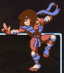
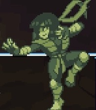
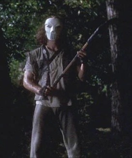
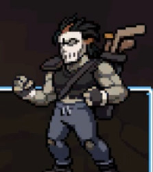
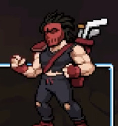
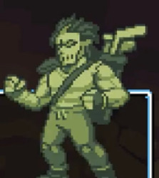
All TMNT Shredder’s Revenge Color References - Casey Jones
Other character posts are linked at the bottom of this post.
Been playing Shredder’s Revenge recently due to the new dlc and since I haven’t seen much discussion in terms of references the new dlc, I decided to look into a lot of it myself. Feel free to give me any additional info/corrections you might know and I hope you enjoy checking this out.
# 1 - Default 87 (Wish this guy appeared in more than 5/193 episodes)
# 2 - 1989 Playmates Toys Action Figure - It doesn’t have as much green on the actual toy, but stuff like the green equipment definitely makes it seem correct.
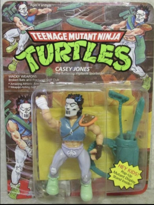
# 3 - 1990’s movie(s) - Likely based on the first movie
# 4 - 2003 Show - This does also resemble the 2007 movie design since the coloring is quite similar. Since a lot of other characters reserve this spot for 03 though, I’m putting that.
# 5 - 2012 Show - This is where it’s harder to tell what the Casey is based on, but a lot of characters do put their 2012 design right after 2003 from what I can tell. As to the actual design itself, while it doesn’t quite capture the face paint nor spray paint looks, the mostly gray, black and white design (that isn’t “black-and-white” like Mirage) does look similar to the 2012 design.
# 6 - Rise of the TMNT (Foot Recruit) - I don’t think any of the colors are based on the Casey from the Rise movie, but this does have a similar color scheme to Cassandra. Plus it’s where a Rise alt for the turtles and Splinter went.
# 7 - Tournament Fighters Genesis
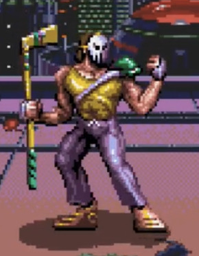
# 8 - Colored Mirage Design? - I both found a picture of Casey from a colored Mirage comic and 2 toys (including the one below) which all seem to be based on the Mirage Casey. Alternatively, it seems like he wore a close costume in the Batman crossover comics. I’m not exactly sure where else he uses the design though and I am struggling to find more images of that colored Mirage comic using the same color scheme, but it seems like the closest I’ve found so far. Also worth noting that the toy has more so tan-ish accessories rather than white.
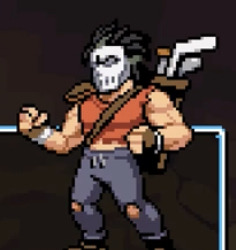
# 9 - Original Mirage Comics
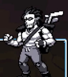
# 10 - NES - I doubt it’s specifically a reference to the NES Tournament Fighters, but it does look close and probably is the most likely NES game that’s specifically referenced (besides maybe Usagi who I need to look into more as of making this post).
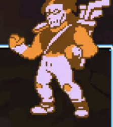
# 11 - Gameboy - I don’t believe Casey was in any actual Gameboy games, but the pallet is definitely Gameboy inspired.
All other Color References posts:
1. Karai
2. Leonardo
3. Michelangelo
4. Raphael
5. Donatello
6. April O’Neil
7. Master Splinter
8. Casey Jones
9. Usagi
10. Mona Lisa
11. Mondo Gecko
37 notes
·
View notes
Photo
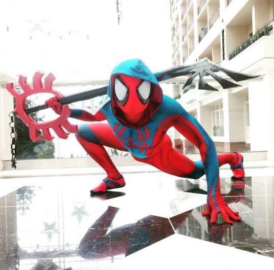
It's fun just hearing people go "Hey look its spiderman! ...with a keyblade? Kingdom Hearts Spiderman? That's cool!"
The responses have been awesome and positive! I wore it for the first time few years ago to Dragoncon, and people loved the combination of Spiderman and Kingdom Hearts. It gets even more love now that the Spiderman : Into the Spiderverse movie has popularized the Spiderverse and the possibilities of all sorts of different spider-people.
Kingdom Hearts Spiderman came from inspiration I got from some fan art that I saw around when Spiderman Homecoming came out. It showed a homemade spider suit (with the hood) partnered with Sora in an outfit with some Spiderman coloring/detailing. Around the same time the Ben Reilly Scarlet Spider comics rebooted, and in the first few issues, he is wearing the suit that I use for my KH Spiderman cosplay.
I ordered the suit custom made for me from a site called Zentaizone (a common suit people use for spider suits). I then found and painted some waterproof shoes so I could run/climb in the suit easier, as well as got a face shell and lenses for a cleaner face look. The big custom part was the design and construction of the keyblade. I drew up a few designs, some complex and some simple, and decided to go with the simple more noticeable spiderman looking design (spider logo handguard, spider legs end with webbing up the blade). I then used the colors on my suit to help figure out a color pallet for the keyblade, and that's how it came about.
Cosplay has given me a lot of confidence and has created a great outlet for creativity. Plus it's gotten me a ton of new friends, cause it's always easy to find people who love the same things you do when you literally wear it. If you ever feel like there is nothing new to cosplay, just start combining things or getting a bit creative! It's fun, and people generally love to see weird/unique things at conventions.
---- Ninjaneer Cosplay
Photo : https://www.instagram.com/alchemistbun_/
47 notes
·
View notes
Note
I mean Gos and QJ's girlfriend (wife? I haven't been into DWD for a looong time) look an awful lot alike to me!
Girlfriend. Ex. ("It's complicated.")
And while I see what you mean with the color schemes and such. Red hair, cream color feathering, green eyes, both are Ducks...


It's probably just that Gosalyn and Claire equate in appearance to like... redheads with green eyes.
Claire was also designed by the artist of that story, I think, and so thier choice looks pretty good for the color scheme.
Really, tho, design wise, Claire looks remarkably similar to Roxanne from "A Goofy Movie", like, am I the only one who sees this?

I should also point out that red hair is relatively common in the character cast, as well as its just a common thing to do in cartoons because of how much that type of hair stands out, despite being actually quite rare in reality.


((Welcome to the 90s, this was just how we did designs back then, nearly everyone special and important was either redheads, auburn, brunettes or just orange))
Thematically speaking, I suppose I could go as far to draw parallels between Goz and Claire in the sense that both of them seem to have helped create a stable environment for Drake and Jack, both of whom are pretty good foils of each other when you start to break down the basics. In fact, if I could only figure out the right words, I could probably draw up a good detailed comparison as to why this is pretty well done
However, I've seen people try to use the visual comparison of Gosalyn and Claire as some sort of indication that perhaps QuackerJack was attracted to Gosalyn or something ((... y'all who do, frighten me)), when it's really just as simple as he had a coworker at QuackWerks who really connected with him and it doesn't matter what her color scheme is, it really just looks nice on the pallets for the comic book.
Now... I really hope you're just pointing out the thematic choices of the color pallet and not because you're trying to imply something entirely. 🙃
Edit: Unless you mean that you'd think they're related.
I mean, I considered the interesting possibility that QuackerJack and Gosalyn may have some distant relative in thier tree somewhere, as we know nothing of QuackerJack's past beyond select info, but Goz is a confirmed orphan, so... Naw.
20 notes
·
View notes
Text
No Longer the Butt of the Joke: Aquaman Movie Review

Aquaman has always been the butt of many jokes thrown around the local comic shop because his somewhat comical skill set and costume design have never allowed him to rise above the status of a B list character. Now that we live in a comic book film renaissance, it is time to dust off that trident and really give Aquaman the film treatment he deserves. Does the new Aquaman film have what it takes to change the public's opinion, or should he just return to the depths from which he came?
The Plot
Aquaman tells the origin story for Arthur Curry, the son of a lighthouse operator and the Queen of Atlantis, who tries to avoid his duty on the throne of Atlantis. It is up to Arthur to intervene when a corrupt family member not only takes the throne but threatens to wage war with the humans who live on land.
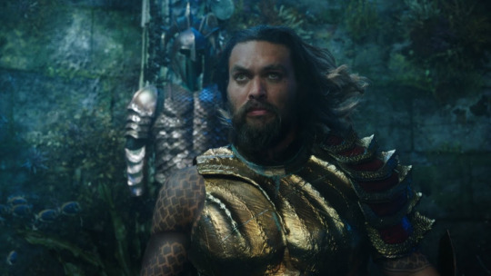
The first thing that needs to be said about this film is that it fully realizes how ridiculous and comic booky its source material is. The film really plays into the cheesy action movie vibe that is all too familiar with any classic 80's flick. This self-aware quality gives the movie personality and simply makes it more light-hearted than the other films before it.
That being considered there are parts of this film that look so out of this world that it can be somewhat jarring to watch on screen. There are multiple scenes in which the characters ride giant seahorses, talk to giant sea monsters, or just float in water that can give you a laugh. That being said it creates a fun yet ridiculous time at the movies.
The plot for Aquaman does a pretty impressive juggling act as it attempts to keep all of its storylines together. At times it may seem as if the movie is trying to do too much in its attempt to flash back to its origin story while also bringing you up to speed with what's happening in the present. Rest assured audiences won't ever be lost throughout the film, but it should be noted that it can be somewhat all over the place.
The director, James Wan, creates some of the most elaborate and fun action sequences of the year in this film. The action scenes seem as if they are taken in as few cuts as possible. The camera will follow characters through demolished buildings, underwater civilizations, and exotic locals in a way that shows off the films impressive choreography.

Many were skeptical about the films ability to pull off long sequences that take place underwater. I can say without a doubt that the visual effects in the film are some of the best of the year. The city of Atlantis uses just about every color on the pallet while giving it a distinct look that hasn’t been seen on screen.
The Cast and Characters
The true selling point for this film is its cast. Jason Momoa, from Game of Thrones fame, lends the film an insane amount of personality and charisma to really sell this character. Momoa finds a nice balance between humor and seriousness that really drives the film. His physical appearance and mastery of the choreography simply add to the character and his on-screen presence. This is a take on the character that most audiences have never seen before and will be sure to love.

Another notable performance is by Amber Heard, who plays Aquaman’s love interest named Mera. Much like Momoa, Heard gives this role an incredible amount of personality and charisma which makes it hard not to love her on screen. It is also nice to see a love interest in a superhero film that is as strong, if not stronger, than the hero.
The Verdict
Aquaman has come a long way from his comic book roots. His latest film outing reimagines the character in a way that is both fun and likable. Jason Momoa and Amber Heard provide the film with much-needed personality, while its director creates an interesting world for them to inhabit. That being said the plot of the film does have some moments that can be laughable and it does juggle too much at times. This is a step in the right direction for the DC cinematic universe but just falls short of being as impressive as Man of Steel and Wonder Woman. It’s characters and their world still make this a film to see on the big screen but perhaps on a discount day at the theater.
#aquaman#dc comics#superhero#jason momoa#amber heard#movies#films#movie review#film review#cinesaver
1 note
·
View note
Text
Christmas With The Joker
“It’s not relentlessly cheerful, is it?”

So, only one episode in, and they do a Christmas special. One episode into this series that they wanted to be dark, serious, and adult…and they do a Christmas special. A Batman. Christmas. Special. Huh. Well, it is becoming that time of year. So let’s sleigh right into: Christmas With The Joker
SPOILERS BEYOND THIS POINT
Villain: The Joker Robin: Yes Writer: Eddie Gorodetsky Director: Kent Butterworth Animator: Akom Airdate: November 13, 1992 Episode Grade: B This episode holds the distinction of being the very first episode of Batman The Animated Series I ever saw. I had seen Mask Of The Phantasm prior (which was a glorious place to start), and eventually Warner Brothers started releasing these Batman TAS VHS tapes each featuring a particular villain. My mom bought me one featuring the Joker, which included this episode, along with The Laughing Fish. I picked it out specifically because of the screenshot of the Joker wrapped up in his straightjacket shown on the back, and I assumed this was from his origin episode. I didn’t get an origin episode, but I did get a Christmas special that I now watch every single year. I absolutely love it.
I’ve always been someone that enjoys the darker side of Christmas. Carol Of the Bells. A Christmas Carol. That one Twilight Zone episode featuring a drunk Santa Claus that ends up making Christmas magical for everyone. It’s funny, because despite this, I very much enjoy the more innocent side of Halloween (think of cute Beistle die cuts or Scooby Doo). This episode fits right into this archetype, and maybe that is why I love it so much. Of course, this isn’t the only reason. We also get the first appearance of the Joker, voiced by Mark Hamill (yes, that Mark Hamill), and overall a very entertaining episode, Christmas concept aside.
So it’s Christmas Eve, and Dick Grayson (Robin) is home for the holidays. All he wants to do is spend the night relaxing to Christmas dinner and It’s a Wonderful Life, but Bruce isn’t about to let up his night watch just because of the following day. He just knows that something will happen, and right as he finally gives in to Robin’s movie request, we see that the Joker has somehow interrupted pretty much every channel broadcast, and is airing a Christmas special all his own. Featuring a kidnapped Commissioner Gordon, Detective Bullock, and Summer Gleeson, a news reporter (I had no idea it was her before reading it on the DCAU wiki. Kinda cool that it’s not simply some unnamed character!). Batman, aware of the Joker’s love of destructive games sets out with Robin to find his broadcast, and put an end to the Christmas Eve havoc. Throughout the episode he gets sidetracked by an exploding train track (done by the Joker of course), a barrage of cannonballs being fired straight into the city (done by, again, the Joker), and a barrage of Christmas-themed dangers at an abandoned toy factory. At the end of the episode, with the Joker found, and the kidnapped three dangling above a vat of acid, the Joker has Batman open up a special present addressed specifically for him (complete with bat wrapping paper). “Don’t do it, Batman!” shouts Robin, but Batman knows that it’s the only way to save the three and Gotham City as a whole. What’s inside? A pie in the face, what else? Immediately afterward, although Joker tries to run, he slips on a roller skate and nearly falls into the acid himself…but is caught by Batman on the way down. Everyone is saved, and the two heroes even get to finally watch their Christmas special in peace.
Let’s talk about the two big things with this episode: Robin and the Joker. The idea of using an older Robin was obviously a way to bring some realism to the character, and to not ruin the tone that they were going for. Robin is historically kind of a goofy character, and was meant to be a role model for the kiddies. Wanting to avoid specifically kid elements in their show, they used a college-aged Robin. I think it works sometimes, and not so much at other times. It is a little weird seeing such an old character wearing the Robin outfit, but they also made an effort to tone down the silliness of it a little bit. Thank god we didn’t get those little elf shoes and those freshly-waxed legs. While Robin’s usefulness varies throughout the show, I think in this episode they work pretty well together, and for an episode like this, it gives Batman someone to talk to, and introduces some comic relief. Hearing Batman referred to as a Scrooge and seeing him bag on Robin’s choice of movies is pretty funny, and I feel like these two have similar exchanges about Christmas as a lot of us do in real life. The action scenes with Robin were also pretty good, and I never really felt like either of them had nothing to do/were a damsel in distress. That’s the one thing about Robin that bugs me sometimes, and it wasn’t until much later when they got consistently good at having more than one superhero on screen at once, balancing everything out. I will admit, some of it did get a little too corny for my liking…particularly the way Batman would bark things like, “Easy, Robin!” But it also reminded me a little bit of the Adam West show in a charming way that I accept much more with a Christmas episode. So take these comments how you take them.
And the Joker? Fantastic debut. He’s funny. He’s menacing. He’s batshit insane. He’s charismatic. He’s everything a classic, definitive Joker should be. I love Heath as much as anyone else, but being a great Joker vs being a definitive Joker are two different things. I wouldn’t get rid of either of them, and I think they both perfectly represent the type of character they are meant to be. I think the Joker changed a lot throughout this show. He giggles unlike later in the series here, and he’s clearly mentally unstable in a different, albeit very fun way. But then there are moments like where he laughs in someone’s face because he knows that her mother is on a train that is headed straight for a blown up bridge. He’s that character that you love to hate, and as much as you want Batman to sock each and every one of those yellow teeth out of his mouth, you also can’t help but root for him to keep getting away just so that you get more of him. It is kinda weird for me picturing this episode’s version of the Joker with Harley, and Harley Quinn may be the main reason why the Joker’s personality changed a little bit and got a hair more serious. In this episode he’s like, well, a cartoon character. More than usual. He has a stylized personality as much as he has a stylized look.
When I mentioned earlier that this episode fits alongside a lot of the darker aspects of Christmas, to clarify a little bit more, it’s not just because you have a psychotic killing clown and a scary guy dressed as a bat. It also has the vintage aspect to it. You have the “dark deco” 30′s aesthetic already in place. Then you add the vintage-looking wintery landscape...the Nutcracker music...and even the dark, snowy city that almost makes me think of Victorian England. I think all of this creates the old-timey Christmas feel without shoving religious morals, or Santa Claus, or greedy marketing down our throats. It succeeds in being a Christmas special almost exclusively through vibes, and mention of it being the holiday. Okay, and Robin’s green and red pajamas are pretty festive as well. The DCAU would do a couple more Christmas episodes later, another one of them being Batman, and while this one is also great, it communicates Christmas in a vastly different way than this one, a way which is much more modern. Both can be great, but this is the Batman Christmas special I will come back to year after year.
As far as my girlfriend Char’s impressions, she really liked this episode too. As someone who has never seen a single episode of the DCAU before this blog, she said that she expected and was hoping for Harley Quinn, but wasn’t necessarily disappointed that she didn’t show up. Picturing a world of Batman TAS before Harley’s existence is something that I feel like we all sorta gloss over since it’s almost like she’s always existed. And while the show got better with her first appearance, I’m glad that they could do a solid Joker beforehand. Char loved the Joker’s representation, and was surprisingly very much in line with what she expected from the character. She said that he was very creepy, but in a very entertaining way. She also noted his design, particularly his color pallet (wait till she sees TNBA). Some more comments about Harley Quinn were made, and she’s scared for Harley after seeing what a maniac the Joker is. She ships Harley and Poison Ivy, something that I see a lot. I don’t necessarily disagree 100%, but, well, we’ll save a lot of that conversation for later.
An older Robin was something that Char was really into, and I got the impression that she never really cared for the super young Robin, as, well, yeah, it is kinda strange. Back when the character was introduced, maybe not so much, nut nowadays? Yeah. What the hell, Batman. Also, Loren Lester provides a voice that she always sorta pictures with the character, and again, she noted how definitive everything seemed.
Some other stray observations she made: She agreed with me on some of Batman’s lines being corny, but she also found them a little bit creepy.It was a unique Christmas special. Batman and Robin sorta feel like father and son, but only sorta. This is something the show will get into much more as we go on. She thought the Joker would make a hilarious game show host if he weren’t, well, evil. She noted how shitty the star on the tree at the very beginning was. Apparently Arkham Asylum needs a better interior decorator. And lastly, she loved the ending. As do I. It’s so unsettling, yet so perfect. Better than what I expected when I saw the screenshot on the back of the VHS as a kid. Char’s grade: B
Major Firsts: The Joker, Robin, Summer Gleeson, Arkham Asylum, Xmas episode, we see the Batmobile has a TV, a musical number (The Joker sings) Next time: Nothing To Fear
#dcau#dc animated universe#batman#batman tas#batman the animated series#the joker#christmas#xmas#christmas with the joker#robin
3 notes
·
View notes