#used his tech colors for the bg basically
Explore tagged Tumblr posts
Text
my version of maskless 8-ball because i love him💜

plus uncolored because yes

3 notes
·
View notes
Text
Obey me brothers order in which they got introduced to the internet and how good they are at using it
I did say I was working on some Obey Me stuff lololol
Lucifer

Order
* The first to use the internet
* He has to make sure it’s safe for his brothers to be on
* Or at least have an idea of what’s going on
* He canonically was the one who introduces it to Levi and Levi had been tech insane forever so he has to be amongst the first
How good are they at using it?
* Just below average
* Much better than a Boomer parent using tech
* But still not as good as the younger generations
* I mean he can he just isn’t aware of the trends and major internet stuff
* Pretty sure he only knows a bunch of internet slang mostly because of Levi tho
* Does not understand them at all though
* “What is this Skibidi…. Toilet?”
* But he uses all tech stuff just prefers to use older things
Mammon
(Tumblr is a bitch and took away yellow saying that it doesn’t look good on white, like bitch? There are other color bg not only white? Do ya’ll even know your own hellsite?)

Order
* Fourth person to get into it
* Didn’t care much for it as an Angel
* Outside of the basics didn’t use it much tbh
* Once he was in the Devildom and incorporated into his sin he was too busy trying to hustle people for money and gambling
* For the most part outside of my top 3 of those who accessed tech I believe most of the brothers didn’t care much for modern tech as they were either busy or it just wasn’t important for them to incorporate into their lives
* Continuing on, it’s not until he heard about online auctions, gambling, betting, etc. that has to do with his sin that he got into tech
How good are they at using it
* This is what he’s in the top 3 with
* He’s number 2 in how good he is with tech
* Can use it
* Can build it
* Can take apart any piece of tech and put it back together
* Can probably make your tech even better if he tries and wants to
* Also knows how to get a top model device for cheap and how much parts are worth
* If Levi is unavailable to help with tech stuff it’s Mammon there to the rescue
* Very good with all online stuff also
* Navigates and finds stuff pretty well and easily
* Knows internet slang and picks up on new trends and phrases easily
* “Ya know I got the rizz baby gurlll”
Leviathan

Order
* Originally you’d think he’d be first
* But he’s third just like his birth order
* Only because it took Lucifer forever to understand wtf was the internet and introduce Levi to anime so another brother skipped pass him for second
* Hooked onto anime really really fast
* Also was into anime in heaven so that’s why he’s in the top 3
How good are they at using it
* Best person
* This one’s a given
* Mods, creation, destruction, recreation
* Could probably make a bomb from a device just chooses not to and doubts his ability to do that
* When they first came down to the devildom everyone was clueless and Levi was onto his Ruri-chan shit from the get go like a true stan and internet user
* Internet slang? Trends? Words? Levi straight up knows it by the heart
* Despite not participating in trends and dancing, he can do them flawlessly just had no self confidence
* Speaking of, pretty sure he accidentally created a bunch of internet slang
* Also it’s canon he speaks in Internet slang irl
* “ROFL not Mammon thinking he can rizz his way out of that situation! He can’t even mew properly!”
* You want a good deal or anything that involves tech stuff game or just anything go to Levi
* Probably taught or helped Mammon know all he knows
* Also massive streamer type energy come to him once you have the basics for streaming set up and he’ll make you amazing
Satan

Order
* He has to be the last person to know and use tech
* He’s the last born so he has to interact and know about tech last
* And even then didn’t really care for tech
* Probably only cares about tech to read online books and movie adaptations (scandalous) and to contact others especially the Anti-Lucifer League
How good are they at using it
* Is not bad tbh
* Better than Lucifer out of spite
* As mentioned before only cares about tech to read online books, watch movies and contact
* Knows trends doesn’t participate unless it’s about books, cats or a prank on Lucifer
* Doesn’t understand or care much about them though
* Better than Belphie worse than Beel
* Only knows the basics of internet slang
* “Rizz? What is that?”
Asmodeous

Order
* This is the brother who stole second place from Levi
* Because of his Asmo parties he eventually found social media and by extension the internet
* If it wasn’t for the Asmo parties and publicity he would’ve had no interest in tech and the internet
How good are they at using it
* Good enough
* Can use almost any app
* But doesn’t know much about the phone in general
* If you need help with a social media app he’s the person to go to
* A lot of social stuff online in the human realm is by his influence
* Does a lot of livestreams on the devildom’s version of instagram
* Does he know trends, slang and challenges?
* Do you even know who the heck you’re talking about?
* He created a lot of the bougie slang and phrases
* “Period Ah Period Uh-“
* “AND THAT’S ON PERIOD!”
Beelzebub

Order
* He’s the 5th to get into it and originally got into it only because his job as an angel when they went a bit tech and it was easier to get notifications on stuff
* Still didn’t use it as an Angel and still doesn’t use it much as a devil outside of ordering food and watching food videos or texting
How good are they at using it
* Average at it tbh
* As I said he uses the phone at the bare minimum outside of food stuff
* Knows all the best food apps
* And the best apps the help with workout routines
* Text him if you need food, just make sure that you get to it first and that he’s been saved some
* Also knows how to stream and does a lot of workout streams
* Come to him to help you work out how to start streaming tbh he’s good at that
* Back to him streaming tho a lot of people show up to his stream because he’s hot at tbh
* Sometimes ends up on Asmo’s streams for skin and makeup stuff or trends
* Is only into food eating and workout trends tbh and not much else
* Not that good at slang gets help from his brothers to understand (and by extension ig also helps Lucifer learn slang)
* “What is rizz? Is that some new food?”
Belphegor

Order
* Literally not the last just because Satan was created last
* Got into it in heaven because of Beelzebub and Lilith
* Actually into it because of the sleep asmrs and stuff to help you sleep and goofy shit he can learn like pranks
How good are they at using it
* Better than Satan due to spite for Lucifer and being involved in Beel’s streaming and stuff
* Also uses it often to search up stuff about where the stars are to adjust the planetarium and be a bit invested in what happens in the human world in Lilith’s honor
* Is great at slang for the sake of Beel who is a sweet oblivious oaf and being asleep or half asleep while being around Mammon, Levi or Asmo at any given time
* Knows trends, rarely participates unless he barley has to do anything in them
* Smug bastard tho
* “You know I got that sleep rizz”
#headcannons#obey me!#obey me headcannons#obey me lucifer#obey me mammon#obey me leviathan#obey me satan#obey me asmodeus#obey me beelzebub#obey me belphegor#Obey me#obey me shall we date#Obey me !#obey me otome#obey me brothers#obey me boys
52 notes
·
View notes
Text
u know it's such a shame that kingsman universe only focuses on eggsy and harry (and a merlin a little) 'CAUSE there are such a huge amount of stories that could be told and questions to be answered (and yeah i know that its normal in not giving any plot or development to bg charachters but why they 've added interesting details IT tRiGGerS QuEsTiOns... *sighs*)

SO - some of my thoughts and (obvious) questions about k*ngsmn.. (i just 'd really like to see that....)
- THAT particular moment from the very beginning of the film - when lee dies - i damn want to know what effect it had on james (maybe even this outstanding (in every way) suit is needed for him to prove himself that he 's damn awesome and deserving the lancelot title??)
- harry in the film was referring to james as a friend and aaaand??? what james was like with all of the others (arthur and percy especially) in that 17 years? sounds like a good question
- it would be really cool to see some perci-roxy interaction u know... 😟
- IT ALSO WOULD BE REALLY cool to see perci actually talking
- that look harry and percival exchange at the end of the all-kingsman we-will-miss-lancey-james-sorely meeting IT MEANT SMTH it should 've.....
- when roxy becomes a kingsman agent she becomes the only female agent... that's very very very interesting--
- also the arthur moment. so chester dies and the main questions is how they choose a successor 😐
- and im very much interested how all the kingsmen 've dealt with the consequences of the v-day situation (the whole world was fighting so there should be hundreds of thousands dead...)... AND much more importantly: where the hell have the statesmen been during all of this valentine connected shit (yeah in the second film they 're epic but they 're kinda spies too so they shoul 've seen some situation going all damn over the world (celebrities disappering moment...) its their job...) *but lets just put this question to the box-for-the-stupid-questions-we-ll-never-get-an-answer-for where already question about the stupidity of james's death lies*
- there should be more respect for merlin in films (he 's like the big brain of the idiots - they 'd literally be weak without him) - i mean he wasnt killed in the second film 'cause he 's not treated like an agent by kngsmn... (and pls give him a normal office he 's a genius tech-wizard - this situation with him basically working on this tube-train-station is strange to me...)
- and back to my obsession: this contrast of perci wearing strictly super-classical black suit (other agents may wear more gray or more with-patterns suits??) while james 's wearing this tan-sandlike-even-goldish-a-little color ?? it probably has a huge meaning behind it

and still:
- why there can't fucking be two lancelots (his death is a trauma i can do nothing about it..)
*still silently thinks about that scene with james using that guy as a shield while killing them all by shooting off al damn bullets**
#to be continued moment#no i wont just shut up so i'll give you a little more pain with reading my shitty english (if anyone 'll actually reAD it lol#percival#james spencer#lancelot#merlin#roxy morton#kingsman#random thoughts (agaiin) ✨️💫#statesman#k*ngsmn shitpost
31 notes
·
View notes
Text
danny phantom season 2, ep 12-16 thoughts! these episodes, in comparison to the first 10 or so, felt way more laid back and low-stakes, which I appreciate sometimes. I didn't appreciate how lazy jack's halfa design was in masters of time, it made me so annoyed I redesigned it. 👎🏻 u_u
see prev episode thoughts in this tag <3
-'picking a fight with me and my upgraded form!' 'you upgraded to a mullet?' DANNNNY. YOU CANT SAY THAT TO TECHNUS. YOUVE HAD A MULLET TWICE NOW ('fun' split danny, and evil future danny BOTH HAD THEM). I HAVE THE RECEIPTS.
-danny seeing technus hurting valerie and yelling I AM GOING TO BREAK YOU IN HALF. SAMEEEE <3
-axion labs is now a part of vladco. FUCK YOU VLAD. hes not even really IN this episode, but just thought I'd throw out a nice fuck you anyway.
-'capable of blasting a single person into space in (2) minutes!' tucker. that would kill someone. i mean yeah they might get to space, but theres NO WAY THEY WOULDNT CATCH FIRE, OR THEIR ORGANS WOULDNT LIQUIFY BECAUSE OF THE STRAIN. THEY'D PROBABLY PASS OUT BEFORE THEN, BUT. ...no, okay, I get why vlad bought this company. this is RIGHT up his alley.
-danny KNOWS VAL DIDNT DO THIS, THAT SOMEONE STOLE THE SUIT. AND SPENDING ALL NIGHT CHATTING WITH HER. <3 and val is a 9TH DEGREE BLACKBELT?? danny's mom is, too!! omg and she hunts ghosts, his parents would love her. and her fav fruit is kumquat bc its a funny word. im so with danny val is amazing. I love her and I Do Not Want To Hear It From Sam.
-I knew danny wanted to be an astronaut, but the bowling tidbit is like. yes give me more useless info abt these characters, I love tiny details that make them feel more human, and im glad hes got hobbies aside from ghost stuff, we dont really see a lot of that!!! (I mean, we knew 'fun' danny from when he split himself in half liked bowling, so obv it makes sense he LIKES it, but hes very GOOD at it. so proud of him, bowling king) val calling him neil armstrong and them teasing each other. LOVE THAT.
-technus you are my favorite grandpa for setting this up. SAM WHY ARE YOU BEING SO CREEPY BE HAPPY FOR YOUR FRIEND!!! STOP SPYING ON THEM!!! who actually cares if technus did 'set them up' together, theyre having fun and enjoy each others company!!! 'you think the universe wants you two to be together?' 'i dunno, but maybe /I/ do!' EXACTLY DANNY!!! SOO TRUE.
-and valerie being happy sam said she wants to try and be happy for them and make room at the lunch table for them. and hugging sam over it. VAL NEEDS MORE FRIENDS.
-VAL GOING AFTER TECHNUS IN HER SUIT WITH (1) MILK, AND (1) TREE BRANCH AND KEYS!!!. I LOVE YOUUUU BEST GIRL. her new suit kicks ass
-dannys like 'HEY IM AN ASTRONAUT :D' AW. ...HES IN SPACE... the fact he's actually intending to give her the ring. with SAMS NAME ON IT?? IM CRINGING DANNY NO. YOU CANT DO THAT...thank god he didnt. thank god valerie cut it off and said they can just stay friends for now. tbh, they both have a lot on their plates!! they obv both still like each other...it can be a future thing!! when she knows about phantom! youre 14 theres no need to rush. I just want her to have friends and be happy :(
-...danny struggles to do (1) pull up. SAME. but all the ghost fighting in phantom form REALLY doesnt carry over at ALL? that sucks
-sam being as fit as she is, is not just a goth. shes a goth jock.
-honey I Shrank Our Kid, One of his Enemies, and his Bully: the episode
-dash's crush on phantom is So Obvious. fitness buddies :) watching them interact always makes me laugh. also, phantom, with PANTS. 'how many costume changes you gonna go through, what is this, vegas??' DASSH DJKSFHASKDF
-MADDIE GOING AFTER THE MOUSE WITH A BROOM, WHAT THE FUCK. AAAH. JUST BUY SOME KIND OF MOUSE TRAP.
-danny likes lime and vinegar chips. which sound very good.
-'our boy finally has the physical prowess of a 60 year old president!' ...poor danny LMAO
-'what's wrong with beauty pageants' oh tucker you sweet naïve child. what ISNT wrong with them. who approved this for a high school?? (I mean, yes. unfortunately child pageants exist, but...) also danny and tucker once again treating the pretty girls like objects. I need to meet the grown man who wrote this, I just want to talk...
-prince aragon's dragon form reminds me of maleficent (color scheme wise) which is always a bonus. considering the episode is called beauty marked, I feel like the sleeping beauty references are deliberate
-sam with the fake fangs. once again her accessories never miss. hate the 'not like other girls, girls who get sucked into this kind of thing are all shallow and all want to be carbon copies' bs tho.
-sam trying to be the Worst Bride, being rude as shit. DORA IS GOING TO GET KILLED. DID YOU MISS THE PART WHERE SHE SAID THE PRINCE WILL HAVE HER HEAD IF YOU ARENT THE IDEAL BRIDE. YOU /KNOW/ DANNY WILL COME SAVE YOU. JUST ACT CHILL UNTIL THEN. even if you were doing fine to get him to take off the crown, consider maybe not letting his poor sister get punished also?? sure, she could also take off the crown and has dragon powers, but did you know that for sure?? dora didnt even really realize it until you guys talked!! (or at least, she was scared to stand up to him. you had no guarantee she would...) but. good for dora. ANOTHER friendly ghost to add to the List :)
-tucker is so under appreciated in his time. if he was doing a tech-based campaign today he'd have a better shot. people in 2004 had NO IDEA how much tech would be a part of our day-to-day lives...altho. tbh if you're going to be running for student council president, maybe you should..focus on things to actually improve the school? since he's going for a tech angle, he could say like, he would be running fundraisers for the schools computers to be upgraded, etc? we've already SEEN he can be good at money-making entrepreneur type stuff!!
-oh my god wait. this episode is JUST YUGIOH?????! A REBORN PHAROH USING A TEENAGER AS A VESSEL?? YESSSSSS
-tucker using his new minion to feed him grapes and carry him. AND LOCUSTS ONTO THE BULLIES. I love how when he's possessed, he gains winged eyeliner.
-this episode is giving me big 'plankton makes everyone in bikini bottom his slaves and build monuments of him from the spongebob movie' vibes. and the pharaoh has a traitor who works for him? VERY big yugioh vibes. aknadin confirmed
-I like that danny is still completely exhausted after using ghostly wail. (still patiently waiting on him to get duplication)
-LOVE the fenton's 80s outfits. I get hes 14 and embarrassed by everything they do because theyre his parents, but. cmon, this is one objectively cool thing theyve done. love 80s fashion.
-...was vlad just standing on that streetlight waiting for danny to come out? how'd he know they'd be coming out the back? how long has he been up there???
-oh, wait, his ecto-acne has flareups? that SUCKS. danny was...well I dont want to say he was LUCKY HE HALF-DIED, but he was lucky his was pretty instant (I'm assuming that had to do with the power/scale of the portals being different?) I remember in the ep we met him, vlad made a point of saying he was stuck in a hospital for a long time, so. that really actually sucks and I feel bad. not that it excuses anything he's done...but like. it does suck.
-vlad being so sure danny wouldnt help him he made it somehow contagious to his friends to make sure he'd get help? danny is a nice boy, he wouldve helped if it was anyone else. the only reason he wouldn't have is because of the shit vlad did to him, on purpose. vlad 100% dug his own grave by being the biggest asshole, so it is very hard to feel bad for him.
-clockwork is back!!! and making danny learn lessons The Hard Way. Uhhh, okay. I kind of get Danny’s logic, that time traveling this far back would prevent vlad from becoming a halfa also, ergo no arch nemesis or ectoacne to worry about. But the fact that was basically the first solution Danny came up with to solve this problem is actually so funny. It’s so extreme

-APPRICIATION FOR THESE 80S LESBIAN BG CHARACTERS.
-vlad telling maddie in the lab (in the 80s) he has something he's wanted to tell her 'for a long time'...how long have they known each other? I assumed they met in college, since jack always calls vlad his college buddy/roommate, so jack and vlad for sure met in college, but did vlad know maddie longer? thats surprising if so. Tho we don’t know what year of college they’re in so they could mean they met as freshmen and a few years have past…speaking of maddie shes crushing the 80s look.
-vlad blames jack, but. maybe dont stick your face 2 inches from the portal??! THIS FEELS LIKE LAB SAFETY BASICS. IF SOMETHING HAS POTENTIAL TO BE DANGEROUS, DONT GET NEAR IT. WITH YOUR FACE UNPROTECTED IN ANY WAY. (altho jack didnt really give a Big Warning besides screaming BONZAI. so. also that, but cmon.) also, they need gloves, goggles, and to pull all of their hair back tbh. but fuck lab safety, I guess!
-cryyyyinnng at how lazy they were with jack's ghost form design, its just plasmius' design on jack!!! you couldve given him his own design!!
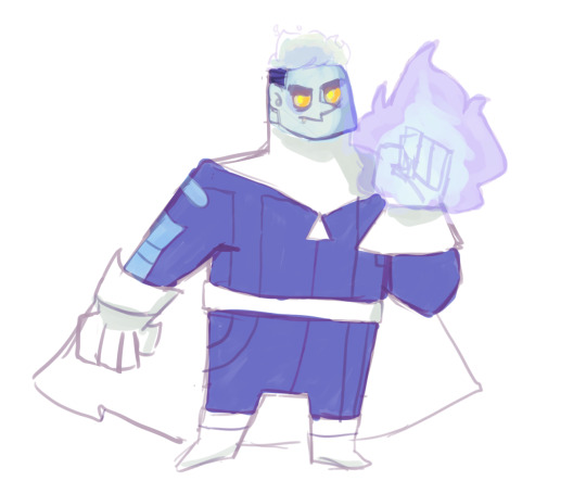
-there. I did that in about 10 minutes and its somehow less lazy than what made it into the show. embarrassing! better yet, I think the episode would've been better if maddie would've gotten the ectoacne. or maybe its just me, wanting to see her design! anyway. I'm sure people have already done redesigns of them both as halfas. I have to go look after I finish this watch through. Also mildly frustrated jacks resentment and bitterness is basically also a copy paste of vlads backstory. They’re different characters, I really don’t think jack would stew in bitterness and jealousy the same way vlad would!! I also don’t think he’d give up after one time of trying to hunt ghosts and getting laughed at. Our canon timeline says different…I dunno, I get it was for laughs, but I’m annoyed because the POTENTIAL this plot has…
-did vlad really wear a stupid cheese hat to his wedding. ok actually that kinda rules. and the cheese door knocker. the dairy-only buffet table. vlad still got rich, just on being the New Dairy King. (Assuming that means he owns a lot of dairy businesses?) ok! this actually is great. hope maddie isn't lactose intolerant!
-'no matter how hard I tried, I could never get rid of my ghost half, the half I knew Maddie could never accept' ohh, ouch, what a horrible thing to say to her HALF GHOST SON. 'YOUR MOM WILL NEVER ACCEPT YOU' BASICALLY.

-maddie strapping danny to the table with a lazer pointed at him in a secret lab she keeps from vlad that she makes a point of saying is sound proof so he can scream all he wants...CHRIST. DANNYS POOR PYSCHE.
-also, not to feel bad for alternate vlad (because, he did lie to maddie saying jack blames her and never wants to see her again...) but. being married to a woman 20+ years and she immediately goes back to jack? if she didnt love vlad and feels like she had to hide shit from him, and says she wasted her best years with him, WHY MARRY HIM. it feels like leading him on!!! cannot believe im feeling bad for vlad, but. this alternate timeline vlad is significantly Less Horrible than Our Vlad. did she not think she'd get funding for her ghost stuff? (which, fair assumption since they're considered 'ghost fanatics/nuts in canon...but...) why did she think jack or vlad would be her ONLY OPTIONS? be like your sister. be single. Actually, this au could’ve been really interesting if after the accident, vlad lied to her and said jack never wanted to see her again, but she stays single. Imagine how much that would bug vlad… like, in her mind, it was never a competition it was jack or no one type situation…
-danny being like 'leave him ALONE' this jack is a HOMEWRECKER, DANNY. let them go to court and settle this at the least. ...or just throw vlad into the portal. (100% human, defenseless vlad) CHRIST, MADDIE THATS BRUTAL. THATS MURDER.
-danny seeing his mom immediately accepting him and his dad being half ghosts in this universe, if I was him this would be a great sign that his universe's maddie would also.
-*maddie voice* "clockwork will help!" *2 seconds later, with clockwork* "I will Not Help." TOUGH LOVE KING. YES LET DANNY SEE THE SODA HIMSELF AND DEVOLP BETTER OBSERVATION SKILLS.
-when clockwork ""reset time to the way it was"" just before danny "meddled"" ...did he really erase a whole alternate timeline? ...damn. because maddie and danny both called it an alternate timeline by name, it splitting when the college incident went different, so it wouldnt have really mattered if he reset it, right. like because danny's timeline is on a different stream? why didnt clockwork just. show danny a replay and not Reset That Timeline. wh...I wonder how many people that Erased From Existence. Anyway! once again stating clockwork is casually terrifying!
10 notes
·
View notes
Text
Startup spoilers. I've heard the first hour or so is fairly tutorial heavy, so this post will be my impressions as they happen of the introductory segment for PLA, and then a bit beyond that.
Filter "trainer kage" to block any of my posts about my playthrough
[I've basically kept myself entirely in the dark outside a handful of mechanics, forms, and new 'mons, so any story-related stuff that was discussed or revealed--if any was--pre-release I ignored, so its all brand new~]
Lmao god himself takes on the role of the "Welcome to the world of Pokémon" professor
I gotta admit, "basically the premise of PMD except you don't get Pokémonified" was not what I expected (this is not a bad thing)
Though alright, I can see what people mean a bit in the graphics--trees and grass definitely look wonky beyond the style of the game, the human and pokemon models look nice though, so far at least. A few graphical oddities but nothing fugly or anything. Water's pretty, IMO. So're the clouds.
GOD TRANSMUTED MY CELLPHONE LMAOOOOO well I guess that explains the tech level discrepancy
Also like the ambient cries in the BG
Wait. The PC is 15??? THEY LOOK LIKE A BABY THOUGH, THEY LOOK LIKE 10. Wow lol
I love Akari already though, her facial expressions are great when she's like >_>
Also, wow, they're just blunt about "yeah the pokemon will fucking kill you, you might die out there" I was not expecting that in terms of tone (but I like it, it's not like the series hasn't handled darker tones in the past, it's nice to see that return)
I'm going for Cyndaquil because I saw the leaks and I kin Hisuian Typhlosian (jk but I love it). His name is Blaze and I love him already~
Hm, I like the non-combay capture mechanics~ Battle capture mechanics seem standard-ish?
Wait, wait can pokemon learn more than 4 moves and you can customize their 4-mpve skillset? Is that how it works? That's how it looks, is that right??? (Please yes)
"It seems we won't have to leave you to due, after all" ?!?! HARSH MUCH??? (But I like it)
...Okay but the implication that the eye color you start with is just colored contacts and your real eye color is unknown is pretty fun. Swapped my eye color when I swapped clothes lol
Oh I look so much better with the hat lol. But ngl, kinda wish I'd gone with the girl for once, her appearance is actually really cute in this game
Mm, I think I'll like the gather-craft aspect, I enjoy that in games. But lol @ being told to just spend my cash on clothes XD
Oooh, you can choose when to evolve your pokemon instead of it happening automatically?? I like that!
So battling, catching pokemon, and using them to get items all give XP, with using them to get items giving it just to that mon? I like the addition~
Whoops, definitely do NOT want to head over by the angry looking Snorlax lol
Messed around just doing whatever for a while, the gameplay is really fun~
Changed up my appearance, I'm a femboy now :p
Also definitely love the evo animation.
Huh, so new status ailments can replace a previous one? Interesting
First Alpha and I did laugh, delelelewhooooooooooooooop (Blazed smoked it with Agile and Strong style Ember, two hits nice)
Lmao okay I like Iridia and Adaman
Also interesting, I suppose this "almighty Sinnoh" is how the Sinnoh region eventually came by its name?
Also, looking at the request board... asdfg OH NO, Drifloon playing with kids!? Better stop it from trying to drag them to hell lol
But mostly I'll get to more of it later, I should sleep lol
2 notes
·
View notes
Text
Implementation of Skeleton Screens
Learn about what a skeleton screen UI is, and other types of skeleton screen libraries, along with their pros and cons. Traditionally, spinners and loaders have been a way of informing users that content would take a while to load. While that approach is fantastic, modern architecture is rapidly becoming obsolete.
Skeleton screens
are becoming the ideal substitute for conventional loaders, as they concentrate on progress rather than waiting times, reducing disappointment in loading-time.
The difference between a loader and a skeleton screen UI UI and UX experts tell us that we can keep them engaged while users wait for content to be loaded to a tab.The idea behind using spinners to engage users before content loads is great; however, the result could be less than ideal because most users may get bored staring at a dummy animated spinner like a clock is. That is what Luke Wroblewski elaborates about.Skeleton screens have a better user experience by raising annoyance with load-time. By concentrating on improvement rather than waiting times, it creates the impression for users that the information will be shown incrementally on the computer. This is confirmed by Bill Chung in his study. Define Skeleton Screen?A skeleton screen is a variant of the UI that does not contain actual content; rather, it imitates the layout of the page by showing its elements in a manner identical to the actual content as it loads and becomes accessible (i.e., when network latency allows).A skeleton screen is basically a website wireframe, with text and pictures in placeholder frames. Why is a Skeleton Screen different?A skeleton UI resembles the actual user interface on the website, so users can understand how soon the site or mobile device can load even before the content appears. Here are a few explanations of why you would want to consider using skeleton screens in your next project: • It's simpler to emulate a page's layout with a skeleton screen, • the material loads slowly (not all at once).Skeleton screens are often known as: • ghost components, • placeholders of content, • loaders of content.Blockchain.com, YouTube, Twitter, Medium, and other large-scale tech firms view skeleton screens as their content enhances the UX.
Types Of Skeleton ScreensThere are various types of screens with skeletons. The key ones are placeholders of text and placeholders of pictures (or color).Most developers tend to use text placeholders as the skeleton UI on their pages because they are easy to create, and the developer does not need any information about the actual content substance; instead, the skeleton imitates the UI.Color placeholders are more difficult to create since they require material information.Other common packages promote the implementation of skeleton screens in web apps. Let's take a closer look at Trigger Placeholder and Skeleton Reaction Ready.Before deciding which to use for our application, we will look at the pros and cons of each kit. React PlaceholderPROS • Components to the placeholder are used to build a custom skeleton UI.• Animation of the pulses (i.e. the effect of motion on the element) is assisted.• It comes with an API based on the components. CONS • Skeleton components are kept separately, so updating a component's styles can entail upgrading the skeleton component too. • The learning curve is not linear since multiple elements are required for different needs. React Loading SkeletonPROS• It is API-based and has one part for all customization with props.• It can be used as a separate part of the skeleton and also directly inside any part, so it is versatile.• Supports thematic and animated Pulse. CONS • For a basic skeleton UI it is easy to implement but difficult for more complex skeletons.• Having a different part of the skeleton would make it more difficult to manage as the UI and styles shift. How to create your own skeleton screen?Drawing the Skeletons in CSSNext, we will draw the basic shapes which will make up the skeleton of the deck. We can do this by adding various gradients to the image-background property. By nature, linear gradients extend from top to bottom, with various transitions to avoid colors. If we describe the only one-stop color and leave the rest translucent, we can draw shapes.Keep in mind that here are stacked on top of each other multiple background images, so the order is important. The last description of the gradient is at the back, the first at the top.
.skeleton { background-repeat: no-repeat; background-image: /* layer 2: avatar */ /* white circle with 16px radius */ radial-gradient(circle 16px, white 99%, transparent 0), /* layer 1: title */ /* white rectangle with 40px height */ linear-gradient(white 40px, transparent 0), /* layer 0: card bg */ /* gray rectangle that covers whole element */ linear-gradient(gray 100%, transparent 0); }
As with standard block-level components, these shapes extend to fill the entire room. If we want to change that, we need to define the dimensions explicitly for them. The value pairs set the width and height of each layer in background-size, keeping the same order we used in the background image:
.skeleton { background-size: 32px 32px, /* avatar */ 200px 40px, /* title */ 100% 100%; /* card bg */ }
The final step is the placement of the elements on the board. This works much like position: absolute, with values reflecting the property at the left and right. For example, we can simulate a 24px padding for the avatar and title, to suit the appearance of the actual content card.
.skeleton { background-position: 24px 24px, /* avatar */ 24px 200px, /* title */ 0 0; /* card bg */ }
Breaking it up with the Custom PropertiesIn a basic example, this works well-but if we try to create anything a little more complicated, the CSS quickly gets messy and very difficult to read. If that code had been given to another creator, they would have no idea where all those magic numbers come from. Having it sure would suck.Fortunately, we can now use custom CSS properties to write skeleton styles in a far more succinct, developer-friendly manner-and even take into account the relationship between different values:
.skeleton { /* define as separate properties */ --card-height: 340px; --card-padding:24px; --card-skeleton: linear-gradient(gray var(--card-height), transparent 0); --title-height: 32px; --title-width: 200px; --title-position: var(--card-padding) 180px; --title-skeleton: linear-gradient(white var(--title-height), transparent 0); --avatar-size: 32px; --avatar-position: var(--card-padding) var(--card-padding); --avatar-skeleton: radial-gradient( circle calc(var(--avatar-size) / 2), white 99%, transparent 0 ); /* now we can break the background up into individual shapes */ background-image: var(--avatar-skeleton), var(--title-skeleton), var(--card-skeleton); background-size: var(--avatar-size), var(--title-width) var(--title-height), 100% 100%; background-position: var(--avatar-position), var(--title-position), 0 0; }
Not only is this much more legible, it's also much easier to later change some of the values. Plus we can use some of the variables (think —avatar-size, —card-padding, etc.) to describe the individual card styles and keep it in line with the skeleton version at all times.It is now very easy to add a media question to change parts of the skeleton at different breakpoints too:
@media screen and (min-width: 47em) { :root { --card-padding: 32px; --card-height: 360px; } }
Adding AnimationsWe can animate our skeleton to make this even easier, and make it look more like a loading indicator. All we need to do is put a new gradient on top layer and then, with @keyframes, animate his location.
As a reputed Software Solutions Developer we have expertise in providing dedicated remote and outsourced technical resources for software services at very nominal cost. Besides experts in full stacks We also build web solutions, mobile apps and work on system integration, performance enhancement, cloud migrations and big data analytics. Don’t hesitate to
get in touch with us!
0 notes
Text
I hear and I obey - here’s the background info for this pic. :D Just be warned: I’m a Trekkie just barely getting into Star Wars lol. I did my research, but it’s a little hard because Disney retconned everything but the movies. I have no idea what counts as “in the movies” because I haven’t seen them all (also, stuff like the midi-chlorians could be an unspoken thing in the movies - no idea if they are or not, but it’s a possibility). Originally I wasn’t gonna do any prompts bc school, but then I saw someone submitted Star Wars as a prompt lol. I’d been half thinking about doing a Star Wars AU after I watched Rogue One, so this was good motivation for me to do something. The bg info is under the cut bc it’s pretty long.
Another heads up: I mention everyone, but the only ones I really thought about were Vision, Wanda, and those directly related to them (Tony, Ultron, and Pietro). I also use “First Order” to refer to the bad guys, but if I were writing a fic, I probably would come up with a different name (Empire to First Order, First Order to whatever).
Maximoffs
Wanda and Pietro are from a planet rife with political turmoil and… just bad conditions overall (I’d name one if I could lol). They’re both sensitive to the Force, Wanda more so than Pietro.
Their parents died because of the Rebellion - specifically Tony’s long-range weapons. There was a First Order outpost near their home, and their parents got caught up in the crossfire.
Wanda and Pietro grew up on the streets after that, resenting Tony.
Pietro is a hella good pilot. He knows how to hotwire/upgrade ships and make them go faster. He’s teaching Wanda, but she’s a bit of a clumsy flyer.
Pietro meets Strucker, a general for the First Order, first and convinces Wanda that they should join the Order to be able to get back at Tony.
Strucker isn’t sensitive to the Force, but he knows how to use a lightsaber (and does, to an extent - but not very often because it has the potential to blow his cover). He keeps up a lie that he’s a Sith, which is what ultimately drew Pietro and Wanda in since he promised he could train them.
Strucker trains the twins (poorly, but they don’t know that) to use the Force and gives them lightsabers (basic hand-me-down ones, bc the twins are a gamble Strucker keeping hidden from his higher-up Ultron - his plan is to replace Ultron with one of the twins, most likely Wanda since she’s more Force-sensitive. Pietro is physically stronger but she wields her lightsaber better and is better at using the Force).
Ultron
At least five years before the twins meet Strucker, Tony is builds an android. He’s the best there is at making them. There aren’t many Jedi Knights anymore, so he had the grand idea of making droids that could be Jedis to help the Rebellion.
His first Force-sensitive droid is Ultron. Tony uses his own biological material (blood, maybe other things) when creating Ultron so Ultron has midi-chlorians and can connect with the Force.
Ultron is a failure as soon as Tony boots him up. Ultron defects almost immediately and joins the First Order.
Ultron, meanwhile, quickly rises in ranks but not as quickly as a Force-user would expect to. He trains himself because his connection to the Force is weak and because the (unnamed) Sith Lord doesn’t think he’ll do well. Loki keeps an eye out but doesn’t help Ultron.
Ultron believes his connection is weak because he has too much metal/droid parts, so he kidnaps Helen Cho to force her to help him run experiments on people and cadavers. Ultimately, though, he blames Tony, for his weak connection - because if it’s Tony’s biological material or if it’s the body Tony made for Ultron, it’s still Tony’s fault. This spurns his hatred.
Eventually, a year after the twins join the First Order, Ultron and Cho have perfected the balance needed between droid and human. Ultron plans on uploading his programs into the body.
The body was a cadaver of a Jedi Knight. The skin got dyed red, as per Ultron’s wishes, and there’s metal all over the outside and inside for support and to connect the cpu to the extremities to move properly etc. There is no longer any hair on the body because of the treatments it underwent. There’s a piece of a kyber crystal in the forehead; the crystal is a chip from a bigger crystal that powered a superweapon (which, depending on kyber crystals work, might be retconned and just left as a kyber crystal was placed in his forehead).
Avengers
Nick Fury is responsible for the Avengers. He made the small, elite team to do missions quickly and to do them well. He knows they don’t get along (or, rather, Tony and Steve don’t really get along well, and when they fight, it pulls the others in), but they’re good when they’re connecting.
Tony: Ultron’s failure ended Tony’s attempts at making Force-sensitive droids, but he continued making battle-ready droids that serve as protectors with his AI, J.A.R.V.I.S. (I actually have no idea if AIs are in Star Wars, but it’s conceivable given all the tech they have). He has a very weak connection to the Force. He’s a good pilot and trooper, but he makes erratic movements that make it hard for people to work with him.
Steve: He’s a Rebel trooper. He’s a decent pilot, but he’s no one’s first choice if there are other pilots available. His cryotube was stolen from the First Order about two years before Tony started working on Ultron. Steve was a failed human experiment from a previous war - failed as in they couldn’t control his mind, but he did get super-strength. His friend, Bucky, was the only success. Once Steve got wind of the First Order reawakening old human experiments (which they did because of Ultron and the possibilities he created just be being alive), he got hope; ever since word about a First Order mercenary called the Winter Soldier started getting to the Rebel forces, he’s been low-key searching for the Winter Soldier to see if it’s Bucky.
Natasha: She had been a merc-for-hire, willing to do the dirty work for any side so long as they paid the right price, but Clint scooped her up into the Rebel forces. She’s a hella good pilot and trooper - the only one that can best her in a shoot-off is Clint.
Clint: He’s another really good all-rounder like Natasha. She’s a faster pilot, but he’s far steadier at the helm. He can shoot any weapon, and unless it’s the first few times he’s using that type, he’ll hit the bullseye every time. Some think he’s Force-sensitive to explain how he’s such a good marksman, but he denies any sort of connection. Clint’s hearing was damaged as a teenager from an explosion he was near.
Bruce: He’s a scientist and rarely goes into the field, unlike Tony. He only joined the Rebel forces after his experiment on himself failed. He’d tried replicating the First Order’s human experiments, like the ones done on Steve, based off of the rumors and little excerpts he could find.
Thor: He’s a Jedi Knight, the most powerful/only one the Rebellion has. His brother Loki was also trained as a Jedi, but Loki defected to the Dark Side. Thor is good as a mechanic (to fix things, not create them).
Rhodey: He’s an exemplary pilot and a decent shot. He’s usually paired with Tony because they’re childhood friends; he can read Tony and Tony’s various moods better than most people. He’s the one that dragged Tony into the Rebellion because of his strong sense of justice.
Sam: He’s an up-and-coming pilot and Steve’s understudy to eventually lead the Avengers. He joined the Rebellion when his friend, Riley, got killed by the First Order. He’s good with weapons but his melee fighting needs work.
When the storylines meet up
Approximately a year after the twins join the First Order, Ultron gets wind of them. He decides he’ll train them and kills Strucker for disobedience and the attempted mutiny. The twins are put off by this (Strucker had kept them isolated so they didn’t really know what the First Order was ever doing), and when Ultron tells them of his experiments, they start thinking they’ve made a mistake.
The Avengers have gotten the word about Ultron’s experiments, since they’d been tracking him since he defected, and they know they have an opening to attack Ultron’s Star Destroyer ship when he completed his new body.
When the twins see Ultron’s new body, they know they need to leave the First Order and to take the body with them/away from Ultron. Their plan to escape and steal the body before Ultron can upload his programs into it coincidentally coincides with when the Avengers attack.
Basically the bare bones of AoU’s plot but in space lol: The Avengers get the body, the twins, and Cho out of the Star Destroyer, but Pietro dies going back to get Natasha and Clint (since he was the best pilot in good enough condition). Tony wakes the body with Thor and Bruce’s help, putting his J.A.R.V.I.S. AI into it. Ultron was far more successful in designing an android (Cho says he’s more along the lines of a synthetic human instead of an android, and Vision prefers that term as well) that could use the Force.
Thor teaches Vision how to meditate, and he’s left in isolation until the kyber crystal in his forehead changes color from red (or if kyber crystals can’t change colors one they have one (and this is based off of the knowledge that Jedis make their light sabers and mediate with the crystal to get it to represent them - so if they can’t change from red to a different color, then the original blue hue of an unused kyber crystal goes here)) to yellow (meaning he has a balanced effort between scholarly and physical pursuits). Wanda is also left in isolation with a kyber crystal to test where her loyalties lie. Hers changes to purple (which means she’s in a gray area, will use both Dark and Light techniques). It also means she has to work for others to trust her more, but Clint accepted her right off the bat, as did Vision and Thor.
Both Vision and Wanda join The Avengers, being trained by literally everyone in their various fields of expertise (ex. Clint teaching them to shoot, Thor teaching them in the Force, Nat teaching them stealth, etc).
For the lightsaber designs, I gave Vision a saberstaff (one that can be split into two normal lightsabers) because it’s difficult to master. I felt like it fit him. ¯\_(ツ)_/¯ I gave Wanda a lightsaber with a curved hilt because the angle the blade comes out at often confuses opponents and gives better precision to the wielder. As for their clothes designs, I tried to keep Vision a little more respectful to the Jedi robes while retaining his MCU color scheme. Wanda I kept a little more free because she’s in the gray area... and her color scheme is not applicable, at all, to the Jedi robes (more applicable to the Siths) lmao. Since red is an integral part of her character, I couldn’t change it. I left in little things tho (the hood on her overcoat, making her shirt long and her pants a shade of brown).
But yeah, that is all the background info I collected and built upon for this au... Probably at least 90% was already around when I saw the Valentine’s Day prompt lol. So, anon who posted it, if you’re reading this, thank you for the kick in the butt I needed. Hope you’ve at least somewhat enjoyed this lol.
16 notes
·
View notes
Text
Implementation of Skeleton Screens
Learn about what a skeleton screen UI is, and other types of skeleton screen libraries, along with their pros and cons. Traditionally, spinners and loaders have been a way of informing users that content would take a while to load. While that approach is fantastic, modern architecture is rapidly becoming obsolete.
Skeleton screens
are becoming the ideal substitute for conventional loaders, as they concentrate on progress rather than waiting times, reducing disappointment in loading-time.
The difference between a loader and a skeleton screen UI UI and UX experts tell us that we can keep them engaged while users wait for content to be loaded to a tab.The idea behind using spinners to engage users before content loads is great; however, the result could be less than ideal because most users may get bored staring at a dummy animated spinner like a clock is. That is what Luke Wroblewski elaborates about.Skeleton screens have a better user experience by raising annoyance with load-time. By concentrating on improvement rather than waiting times, it creates the impression for users that the information will be shown incrementally on the computer. This is confirmed by Bill Chung in his study. Define Skeleton Screen?A skeleton screen is a variant of the UI that does not contain actual content; rather, it imitates the layout of the page by showing its elements in a manner identical to the actual content as it loads and becomes accessible (i.e., when network latency allows).A skeleton screen is basically a website wireframe, with text and pictures in placeholder frames. Why is a Skeleton Screen different?A skeleton UI resembles the actual user interface on the website, so users can understand how soon the site or mobile device can load even before the content appears. Here are a few explanations of why you would want to consider using skeleton screens in your next project: • It's simpler to emulate a page's layout with a skeleton screen, • the material loads slowly (not all at once).Skeleton screens are often known as: • ghost components, • placeholders of content, • loaders of content.Blockchain.com, YouTube, Twitter, Medium, and other large-scale tech firms view skeleton screens as their content enhances the UX.
Types Of Skeleton ScreensThere are various types of screens with skeletons. The key ones are placeholders of text and placeholders of pictures (or color).Most developers tend to use text placeholders as the skeleton UI on their pages because they are easy to create, and the developer does not need any information about the actual content substance; instead, the skeleton imitates the UI.Color placeholders are more difficult to create since they require material information.Other common packages promote the implementation of skeleton screens in web apps. Let's take a closer look at Trigger Placeholder and Skeleton Reaction Ready.Before deciding which to use for our application, we will look at the pros and cons of each kit. React PlaceholderPROS • Components to the placeholder are used to build a custom skeleton UI.• Animation of the pulses (i.e. the effect of motion on the element) is assisted.• It comes with an API based on the components. CONS • Skeleton components are kept separately, so updating a component's styles can entail upgrading the skeleton component too. • The learning curve is not linear since multiple elements are required for different needs. React Loading SkeletonPROS• It is API-based and has one part for all customization with props.• It can be used as a separate part of the skeleton and also directly inside any part, so it is versatile.• Supports thematic and animated Pulse. CONS • For a basic skeleton UI it is easy to implement but difficult for more complex skeletons.• Having a different part of the skeleton would make it more difficult to manage as the UI and styles shift. How to create your own skeleton screen?Drawing the Skeletons in CSSNext, we will draw the basic shapes which will make up the skeleton of the deck. We can do this by adding various gradients to the image-background property. By nature, linear gradients extend from top to bottom, with various transitions to avoid colors. If we describe the only one-stop color and leave the rest translucent, we can draw shapes.Keep in mind that here are stacked on top of each other multiple background images, so the order is important. The last description of the gradient is at the back, the first at the top.
.skeleton { background-repeat: no-repeat; background-image: /* layer 2: avatar */ /* white circle with 16px radius */ radial-gradient(circle 16px, white 99%, transparent 0), /* layer 1: title */ /* white rectangle with 40px height */ linear-gradient(white 40px, transparent 0), /* layer 0: card bg */ /* gray rectangle that covers whole element */ linear-gradient(gray 100%, transparent 0); }
As with standard block-level components, these shapes extend to fill the entire room. If we want to change that, we need to define the dimensions explicitly for them. The value pairs set the width and height of each layer in background-size, keeping the same order we used in the background image:
.skeleton { background-size: 32px 32px, /* avatar */ 200px 40px, /* title */ 100% 100%; /* card bg */ }
The final step is the placement of the elements on the board. This works much like position: absolute, with values reflecting the property at the left and right. For example, we can simulate a 24px padding for the avatar and title, to suit the appearance of the actual content card.
.skeleton { background-position: 24px 24px, /* avatar */ 24px 200px, /* title */ 0 0; /* card bg */ }
Breaking it up with the Custom PropertiesIn a basic example, this works well-but if we try to create anything a little more complicated, the CSS quickly gets messy and very difficult to read. If that code had been given to another creator, they would have no idea where all those magic numbers come from. Having it sure would suck.Fortunately, we can now use custom CSS properties to write skeleton styles in a far more succinct, developer-friendly manner-and even take into account the relationship between different values:
.skeleton { /* define as separate properties */ --card-height: 340px; --card-padding:24px; --card-skeleton: linear-gradient(gray var(--card-height), transparent 0); --title-height: 32px; --title-width: 200px; --title-position: var(--card-padding) 180px; --title-skeleton: linear-gradient(white var(--title-height), transparent 0); --avatar-size: 32px; --avatar-position: var(--card-padding) var(--card-padding); --avatar-skeleton: radial-gradient( circle calc(var(--avatar-size) / 2), white 99%, transparent 0 ); /* now we can break the background up into individual shapes */ background-image: var(--avatar-skeleton), var(--title-skeleton), var(--card-skeleton); background-size: var(--avatar-size), var(--title-width) var(--title-height), 100% 100%; background-position: var(--avatar-position), var(--title-position), 0 0; }
Not only is this much more legible, it's also much easier to later change some of the values. Plus we can use some of the variables (think —avatar-size, —card-padding, etc.) to describe the individual card styles and keep it in line with the skeleton version at all times.It is now very easy to add a media question to change parts of the skeleton at different breakpoints too:
@media screen and (min-width: 47em) { :root { --card-padding: 32px; --card-height: 360px; } }
Adding AnimationsWe can animate our skeleton to make this even easier, and make it look more like a loading indicator. All we need to do is put a new gradient on top layer and then, with @keyframes, animate his location.
As a reputed Software Solutions Developer we have expertise in providing dedicated remote and outsourced technical resources for software services at very nominal cost. Besides experts in full stacks We also build web solutions, mobile apps and work on system integration, performance enhancement, cloud migrations and big data analytics. Don’t hesitate to
get in touch with us!
0 notes
Text
Amonkhet Commander Set Review
For each new set, I write an article discussing the new legendary creatures and the nonlegendary cards that I think will be relevant in Commander. This review is obviously a bit late, as I was taking a hiatus from the blog when Amonkhet got released, but the review might benefit from having a few months to play with the set and get a more accurate impression of the cards.
The Commanders of Amonkhet
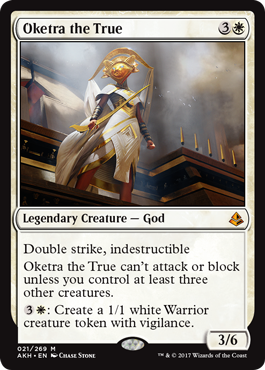
The token generation is pretty inefficient compared to some other white commanders, and although double strike will help her get to 21 commander damage, the limitation on her ability to attack keeps her from reaching her potential as a Voltron commander.
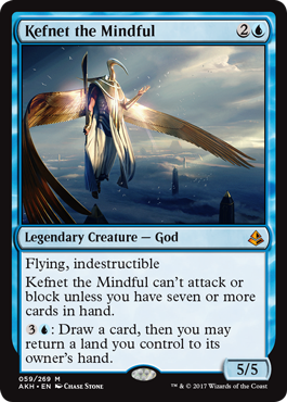
Seems like a strong commander for monoblue control. He allows you to hold up counterspells and cash in your unused mana for cards right before you untap, while also potentially serving as a late-game threat once you’ve got a full grip of answers.
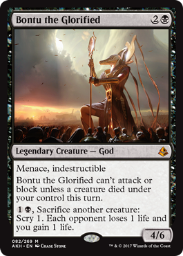
The relatively low power and the weak effect of her activated ability makes me think that the payoff for building around her is not worth the effort. That being said, she’s easily one of the best commanders for breaking symmetry on The Abyss, Magus of the Abyss, and Spreading Plague.
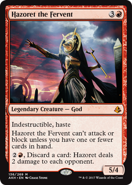
Like Bontu, the rewards aren’t really worth the trouble of activating Hazoret or bringing her online. The life totals in Commander are way too high to waste time dealing damage 2 at a time (Purphoros notwithstanding).
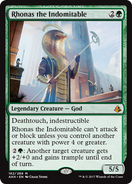
His activated ability is not much of a reason to run this guy as a commander, and the Voltron potential implied by his power-to-cost ratio is, of course, diminished by his requirement that you commit to playing other creatures instead of focusing on dealing 21.
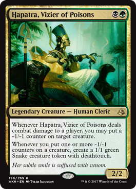
I try to keep an eye out for potential themes in need of a commander, but BG -1/-1 counters wasn’t really on my radar. Hapatra ended up being a pleasant surprise, as it turns out there was enough tech available for her that she added a new archetype to the Commander metagame.
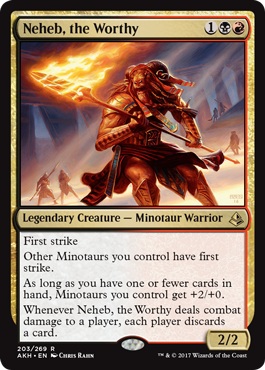
Most effective tribal commanders are ones that take a tribe with a lot of borderline playable creatures and give them just enough of a boost to create a viable deck. The problem with Neheb is that most Minotaurs are not on the borderline; they are unplayable. +2/+0 and first strike is not going to be enough to make Cursed Minotaur and Gnarled Scarhide playable in a 40-life multiplayer format with tons of board wipes.
However, Neheb might do some good work as a discard outlet for madness/reanimator strategies and as a way to repeatedly trigger things like Geth’s Grimoire or Waste Not. Here’s a rough list.
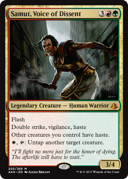
Double strike and haste make for a strong Voltron Commander, so throw together some ramp to get her down early and some decent auras/equipment (Hero’s Blade, Grafted Exoskeleton, and any saboteur equipment will probably be good in this deck) and call it a day.
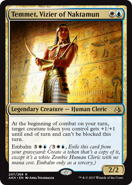
He can’t use his ability to help deal commander damage (even when he’s embalmed), so you’re stuck trying to eliminate multiple opponents with giant tokens (or ones with brutal saboteur abilities) sliding past their blockers. Overall, the plan seems kinda weak, but there are a few cute things you can do to make the unblockability more relevant.
The Maindeck Cards
In this set review, I’ll be using two five-point rating scales to evaluate the nonlegendary cards, one that measures how many decks a card is playable in (we’ll call that “spread”), and one that measures how powerful it is in those decks (”power”). Here’s a brief rundown of what each rank on the two scales means:
Spread
1: This card is effective in one or two decks, but no more (ex: The Gitrog Monster). 2: This card is effective in one deck archetype (ex: self-mill decks). 3: A lot of decks will be able to use this card effectively (ex: decks with graveyard interactions). 4: This card is effective in most decks in this color. 5: Every deck in this color is able to use this card effectively.
Power
1: This card is always going to be on the chopping block. 2: This card is unlikely to consistently perform well. 3: This card provides good utility but is not a powerhouse. 4: This card is good enough to push you ahead of your opponents. 5: This card has a huge impact on the game.
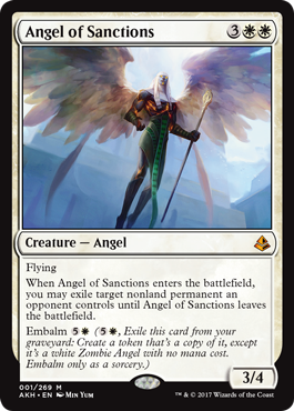
Spread: 1
Power: 3
Banishing Light is good because it’s cheap and hard to get rid of. Angel of Sanctions trade those two advantages for the ability to deal three in the air and return once after it gets killed, which I think is a pretty raw deal. It also compares really unfavorably with Admonition Angel.
However, embalm does work well with populate, so Trostani ought to get more value out of it than most commanders.
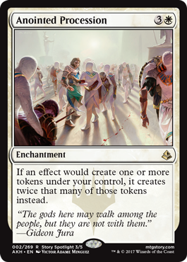
Spread: 2
Power: 3
If your deck has a heavy token theme or your Commander makes tokens, this should be an easy inclusion.
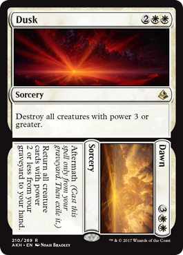
Spread: 3
Power: 3
This card is great in token decks, hate bear decks, decks with lots of mana dorks, and Doran builds. 3+ power kills most of the threats in the format while protecting your little dudes. Plus, even if your (nontoken) weenies get killed later, the second half of this card regrows them for you. Great value.
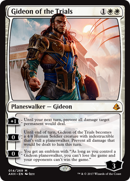
Spread: 1
Power: 1
Maybe in some Ad Nauseam combo deck as the third copy of Angel’s Grace (with Phyrexian Unlife being the second)? He doesn’t do much since he’s pretty easy to remove later on in the game when people are actually winning.
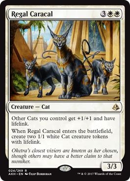
Spread: 1
Power: 3
It’s obviously most effective in Kemba and Raksha. You might be tempted to run it in a token list or a blink deck, but I think in those situations it fares poorly compared to other options at the same price point.
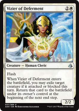
Spread: 2
Power: 1
These types of effects often create combo potential, but the combination of an end step return and a limited scope of targets handicaps the Vizier to the point of unplayability.
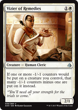
Spread: 1
Power: 1
Assists with Persist combos and generates infinite mana in combination with Devoted Druid. Unfortunately, it doesn’t accomplish anything by itself, which makes it less appealing than other combo pieces in the same colors that are effective in isolation.
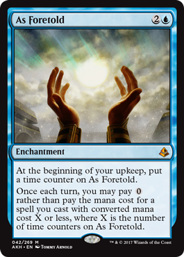
Spread: 2
Power: 3
It acquires counters too slowly to be of much use outside of decks with extremely low average CMCs, and only getting one free spell per turn is likewise pretty limiting. However, decks with lots of cheap counterspells that frequently cast them on their opponents’ turns ought to be able to milk much more mana out of this card than the other decks in the format. In Baral, Azami, etc, this could easily end up producing a great deal of mana if you can manage to get two or more counters on it.
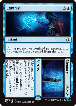
Spread: 4
Power: 2
Commit can keep just about anything from killing you and is basically an Utter End when you’re responding to a shuffle effect. I’m not sure how often you’ll pull the trigger on Memory, but having the option to refill your hand is sweet.
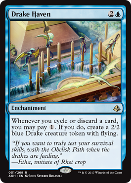
Spread: 1
Power; 3
There aren’t a whole lot of Blue decks that discard often enough to make Drake Haven worthwhile, but Baral control might be one of them.
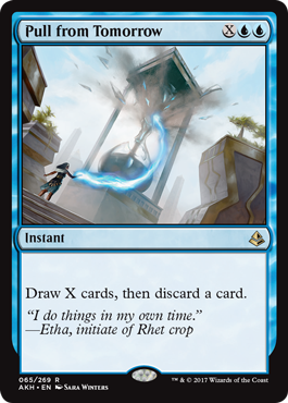
Spread: 4
Power: 4
The strongest X mana draw spell in monoblue ever printed. I would play this in any deck already running Blue Sun’s Zenith and Stroke of Genius.
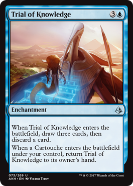
Spread: 1
Power: 2
Sift is far too weak for most Commander decks, but this could do good work in Brago decks that were already blinking Oath of Jace.
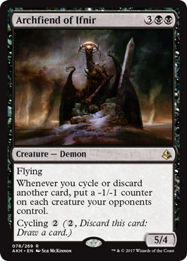
Spread: 2
Power: 3
In decks that have enough self discard this card is comparable to Elesh Norn. It even cycles which makes it easy to reanimate and smooths out draws. Plus, if you’re playing it in a green deck, you can find it with Survival of the Fittest, cast it, and then use Survival to cycle through a bunch of creatures and pile counters on your opponents’ stuff.
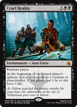
Spread: 4
Power: 1
Very expensive, only hoses one person, and 5 life per turn cycle is not the fastest clock.
Spread: 2
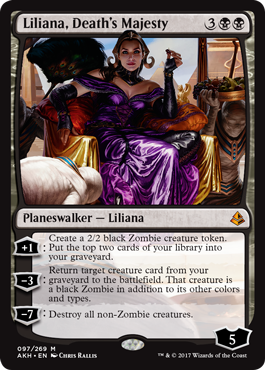
Power: 2
She's a Zombify with a couple of tokens attached. That’s probably good enough for a Zombie tribal deck but I don’t think she’s good enough for decks that aren’t interested in Zombie synergies since cheaper reanimation exists.
Spread: 2
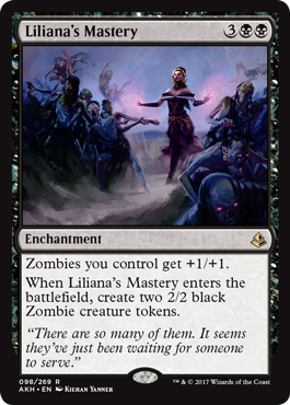
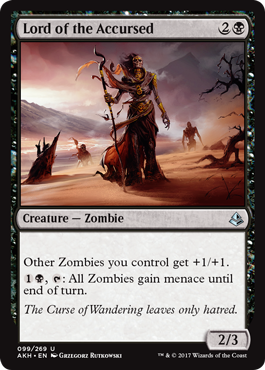
Power: 2
Lumping these together because both of them are limited to Zombie tribal decks. I think both cards are a little on the weak side, but it’s not like Zombies were a strong tribe to begin with, so they ought to fit in just fine.
Spread: 1
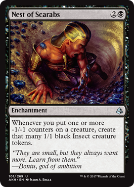
Power: 3
Hapatra can use it to generate more bodies to power her sac outlets or swing with, while The Scorpion God can keep stinging scarabs to farm cards.
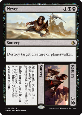
Spread: 5
Power: 2
If you want this effect, Hero’s Downfall is just a much better card, since being able to interact with your opponents on their turn is way more relevant to most games than a smidgen of graveyard hate and a 2/2.
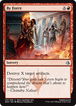
Spread: 4
Power: 3
This is a decent card that suffers from an abundance of strong competitors. It’s probably the fourth-best mono-Red artifact destruction spell (after Fiery Confluence, Vandalblast, and Shattering Spree), but that might be too low on the totem pole to make it into most decks.
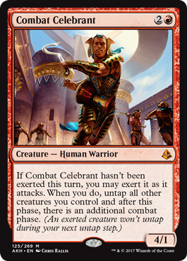
Spread: 2
Power: 2
Joins the long list of cards that infinite combo with Kiki-Jiki. Also goes infinite with other copy effects and is serviceable in aggro decks, as well.
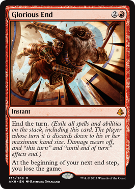
Spread: 1
Power: 1
It’s flashy, but it’s mostly worse than Final Fortune, and it’s not like anybody was playing that card.
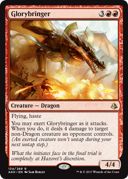
Spread: 2
Power: 2
Repeatable red removal, even if every other turn.
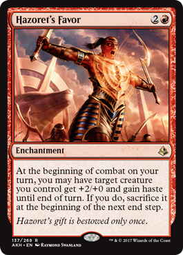
Spread: 1
Power: 3
The only deck I can think of that would be interested in both the haste and the sacrificing would be Marchesa, the Black Rose.
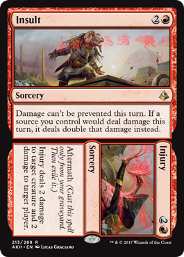
Spread: 1
Power: 3
It’s a little reductive to call this a Cleaver Riot, but that’s the easiest point of comparison for evaluating this effect. I think most Red decks will pass on this card, but Heartless Hidetsugu needs damage doublers so he can eliminate any player foolish enough to let their life total settle on an even number.
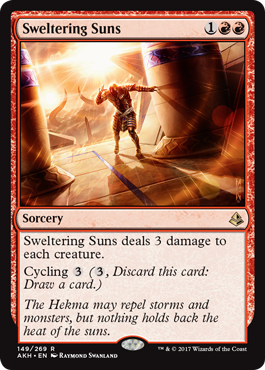
Spread: 5
Power: 3
Really good in metagames with lots of mana dorks and utility creatures. Plus, cycling means that it’ll never be a dead card. High ceiling + high floor = probably worth running.
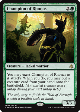
Spread: 3
Power: 2
It mostly seems worse than Elvish Piper (and it’s not like Elvish Piper is that great), since it requires you to risk it in combat, it only works every other turn, and you can’t surprise anyone by dropping fatties in during combat/at end of turn. It's probably also worse than Frontier Siege in terms of total mana generation.
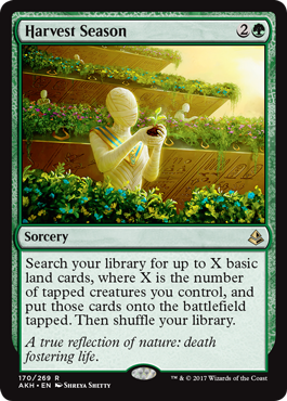
Spread: 2
Power: 2
There are plenty of Green decks that are dependent on mana dorks, and a decent number with token themes, but I still wouldn’t expect this to regularly ramp out more than two lands until you get to the late game (at which point the ramp is not very impactful).
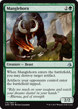
Spread: 4
Power: 3
Comparable to Reclamation Sage. Manglehorn is stronger in metas where fast artifact mana is prevalent since it greatly slows down development in exchange for flexibility and a superior creature type. It’s pretty reasonable to run both. Also relevant is how it shuts off Winter Orb the turn it comes in, removing the surprise factor.
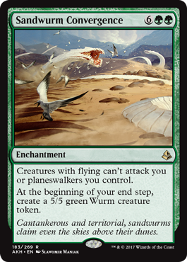
Spread: 2
Power: 3
I think this card could have legs in Enchantress builds. Enchantress builds tend to be Pillowfort-y and have a lot of mana lying around, so paying 8 mana to shut out flyers isn’t far outside of what those decks were already doing. Plus, Enchantress decks tend to be low on win conditions, which a steady stream of 5/5s ought to ameliorate.
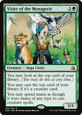
Spread: 3
Power: 3
Only good in creature-heavy decks, and especially strong in Animar and Momir Vig. Unlike Oracle of Mul Daya, you might not get immediate value out of him in the early game since the creatures will cost mana that you might not have and it’s harder to chain together multiple creatures. Solid in Monogreen since the creature density tends to be higher and ramp spells shuffle the deck for a redraw.
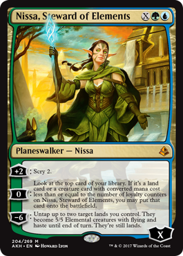
Spread: 4
Power: 1
Doesn’t protect itself, and it’s not guaranteed to get you card advantage unless you go through the trouble of setting it up. The ultimate is also pretty weak in this format.
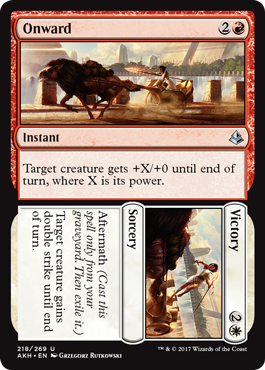
Spread: 1
Power: 2
There aren’t a whole lot of Red/White Voltron commanders that don’t already have double strike, but I think Zurgo will be eyeing this as a means of shortening his clock.
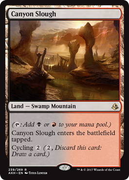
Spread: 4
Power: 2
Every new cycle of duals with basic land types makes fetches that much better, and obviously cycling makes these lands more useful in the late game than most other mana fixers. I’d consider these a staple part of a Commander manabase, although I’d be wary about running them in decks that desperately need all their lands to come into play untapped (decks with really tight curves and/or decks that need to get a lot done in the first few turns of the game, for example).
Wrapping Up
Let me know if you think I’ve misjudged any of these cards or if you’ve discovered any other cool uses for cards from Amonkhet that I didn’t think of. Thanks for reading!
57 notes
·
View notes
Text
Keeping Insulin Cool (Win a Cool Pack of Your Own!)
New Post has been published on http://type2diabetestreatment.net/diabetes-mellitus/keeping-insulin-cool-win-a-cool-pack-of-your-own/
Keeping Insulin Cool (Win a Cool Pack of Your Own!)
Today, we're talking cool packs, with a chance to win one of your own! Be sure to read through to the Giveaway at the end of this post.
Growing up in the mild climate of Oregon, I was raised to despise excessive heat. But you know what hates heat more than me? Insulin.
Insulin is a fragile substance that does not do well in extreme hot or cold temperatures, and it's never more evident than in the sweltering heat of the summer months. Whether you're lounging at the beach, trekking through European towns, or just running errands, there's never a better time to think about the life of your insulin.
Insulin + Heat: What Happens?
The nitty-gritty of insulin science: it's a big protein that has the potential of breaking down into smaller proteins when exposed to heat. That basically leads to ineffectiveness (see high blood sugars!).
Industry expert Charles Fraser, Senior Director of Medical Information Services at Sanofi, explained in a phone interview that the breakdown of insulin varies depending on the temperature to which the insulin was exposed and for how long, and we need to be particularly cautious about exposing insulin to temperatures over 86 degrees for any length of time. How long and how hot is risky?
"If you went directly home from the pharmacy, within that short period of time the stability is not going to be impacted," Fraser said. "If you put the insulin in your car on a hot day and then went shopping, and the car was 135 degrees inside, and the insulin was in there for two hours? It is conceivable that insulin is already breaking down."
But how can you tell if your insulin is going bad? You know, short of the sudden skyrocketing BGs? You might notice that your otherwise clear insulin is starting to look a little cloudy. Fraser says sometimes you can even see the crystals starting to form in the vial.
Since it's sort of a mystery exactly how quickly your insulin will degrade, it's better to be safe than sorry! And the safe route is to keep your vials, pens or pump nice and cool as much as possible.
So, how do you do that?
Cool Packs Go Hi-Tech
Traditionally PWDs used ice or other water-related cold packs to keep their insulin cool when outside or away from a refrigerator. And for that choice, there's a new company on the scene that is taking insulin protection to a whole new level.
Texas-based Kewl Innovations is fittingly named. It's sole product, the ClimaPak, is dedicated to keeping insulin cool — or warm, depending on the situation. The ClimaPak is a small, battery-powered device that continuously monitors the environment to keep your insulin at the proper temperature. It's a snazzy little contraption that holds two insulin pens, two insulin bottles, or one of each. It seems like a great solution, especially for outdoor adventurers who need to keep their insulin protected year-round.
In a conversation with Shayne O'Sullivan, Kewl Innovation's Community Engagement Specialist (read: social media person), I learned that the company's founder, Mike Wilkinson, has a personal D-connection: he has type 2 diabetes. After being diagnosed, Mike noticed he had difficulty keeping his insulin cool while traveling. He was tired of the hassle of cold packs and requesting hotel rooms with fridges. Having worked in the healthcare and tech industries for 30 years, Mike decided to do something about it and went to work creating the ClimaPak.
In our email exchange, O'Sullivan writes, "We've all heard horror stories about folks who end up injecting useless insulin after being outside in the hot sun all day, or people who end up freezing their insulin from leaving it on ice for too long. ClimaPak keeps insulin at the right temperature, with no messes or extra steps to plan (who likes packing coolers, or running by the store to buy ice!)."
Another fun feature is their programmable alarms and last-injection timers, showing when you last took your shot. Similar to the pen-cap-with-timer product Timesulin, the ClimaPak will eliminate the "Did I take my shot?" quandary faced by many folks who take multiple daily injections.
Sounds pretty kewl, huh? Especially since this product is useful for keeping your insulin safe in icy winter situations, too. The downsides?
First, they brag about it being portable and lightweight, but let's face it: this is yet another bulky thing to be carrying around. ClimaPak is 6.7 inches tall, 4.78 inches wide, and 2.78 inches across and it weighs 22oz, which O'Sullivan points out is less than an iPad. But from contextual photos, it appears to be about the size of a small, portable hair drier, and very space-age looking. (Loads of fun at airport screenings, to be sure.)
And then there's the price tag. At a whopping $199.99, my first thought was Ouch! It would be handy to have, but only if I had extra money to burn! The device also requires regular charging. Although you can juice it up using a wall or car charger, the rechargeable battery only lasts 3-5 days. Not such a good option if you're hiking in the Himalayas. But if you are going on a long-distance trip away from an electrical outlet, you can purchase an extra battery pack for $60.
Tried-and-True to Keep It Cool
For those who bristle at paying that much for a cooler, there are much more affordable options. FRIO cases have long been a go-to resource for PWDs to keep their insulin just right. They are extremely convenient to use and affordable to boot.
All you have to do is soak the soft FRIO case in cool water for about five minutes, and the specialized gel inside becomes enlarged and forms a perfect temperature barrier for the contents of the case. They don't require any refrigeration and won't need another soak in water for at least a week. FRIO cases look like big envelopes, and come in a variety of shapes, sizes and colors for everything from your insulin bottles and pens to a special "wallet" case for your insulin pump! They are very easy to pack in a suitcase or backpack, i.e. not the least bit bulky.
FRIO cases are also very affordable, ranging between $20 and $40.
Keeping your insulin cool — and in the winter months, safe from freezing — is very important in protecting the stability and effectiveness of this critical medicine, which in turn helps keep you healthy.
If you have another product or option that you use to keep your insulin safe, we'd love to hear about it!
And now...
A DMProducts Giveaway
Enticed by the products we just shared? Want one of your own? We're giving away one ClimaPak and two Frio cases (your choice of size and color) to three lucky winners!
As always, entering for your chance to win is as easy as leaving a comment.
Here's what to do:
1. Post your comment below and include the codeword "DMProducts" somewhere in the comment (beginning, end, in parenthesis, in bold, whatever). That will let us know that you would like to be entered in the giveaway. You can still leave a comment without entering, but if you want to be considered to win the contest, please remember to include "DMProducts."
2. This week, you have until Friday, July 27, at 5 p.m. PST to enter. A valid email address is required to win.
3. The winner will be chosen using Random.org.
4. The winner will be announced on Facebook and Twitter on Monday, July 30, so make sure you're following us! We like to feature our winners in upcoming blog posts, too.
This contest is closed.
Disclaimer: Content created by the Diabetes Mine team. For more details click here.
Disclaimer
This content is created for Diabetes Mine, a consumer health blog focused on the diabetes community. The content is not medically reviewed and doesn't adhere to Healthline's editorial guidelines. For more information about Healthline's partnership with Diabetes Mine, please click here.
Type 2 Diabetes Treatment Type 2 Diabetes Diet Diabetes Destroyer Reviews Original Article
0 notes
Text
Implementation of Skeleton Screens
Learn about what a skeleton screen UI is, and other types of skeleton screen libraries, along with their pros and cons. Traditionally, spinners and loaders have been a way of informing users that content would take a while to load. While that approach is fantastic, modern architecture is rapidly becoming obsolete.
Skeleton screens
are becoming the ideal substitute for conventional loaders, as they concentrate on progress rather than waiting times, reducing disappointment in loading-time.
The difference between a loader and a skeleton screen UI UI and UX experts tell us that we can keep them engaged while users wait for content to be loaded to a tab.The idea behind using spinners to engage users before content loads is great; however, the result could be less than ideal because most users may get bored staring at a dummy animated spinner like a clock is. That is what Luke Wroblewski elaborates about.Skeleton screens have a better user experience by raising annoyance with load-time. By concentrating on improvement rather than waiting times, it creates the impression for users that the information will be shown incrementally on the computer. This is confirmed by Bill Chung in his study. Define Skeleton Screen?A skeleton screen is a variant of the UI that does not contain actual content; rather, it imitates the layout of the page by showing its elements in a manner identical to the actual content as it loads and becomes accessible (i.e., when network latency allows).A skeleton screen is basically a website wireframe, with text and pictures in placeholder frames. Why is a Skeleton Screen different?A skeleton UI resembles the actual user interface on the website, so users can understand how soon the site or mobile device can load even before the content appears. Here are a few explanations of why you would want to consider using skeleton screens in your next project: • It's simpler to emulate a page's layout with a skeleton screen, • the material loads slowly (not all at once).Skeleton screens are often known as: • ghost components, • placeholders of content, • loaders of content.Blockchain.com, YouTube, Twitter, Medium, and other large-scale tech firms view skeleton screens as their content enhances the UX.
Types Of Skeleton ScreensThere are various types of screens with skeletons. The key ones are placeholders of text and placeholders of pictures (or color).Most developers tend to use text placeholders as the skeleton UI on their pages because they are easy to create, and the developer does not need any information about the actual content substance; instead, the skeleton imitates the UI.Color placeholders are more difficult to create since they require material information.Other common packages promote the implementation of skeleton screens in web apps. Let's take a closer look at Trigger Placeholder and Skeleton Reaction Ready.Before deciding which to use for our application, we will look at the pros and cons of each kit. React PlaceholderPROS • Components to the placeholder are used to build a custom skeleton UI.• Animation of the pulses (i.e. the effect of motion on the element) is assisted.• It comes with an API based on the components. CONS • Skeleton components are kept separately, so updating a component's styles can entail upgrading the skeleton component too. • The learning curve is not linear since multiple elements are required for different needs. React Loading SkeletonPROS• It is API-based and has one part for all customization with props.• It can be used as a separate part of the skeleton and also directly inside any part, so it is versatile.• Supports thematic and animated Pulse. CONS • For a basic skeleton UI it is easy to implement but difficult for more complex skeletons.• Having a different part of the skeleton would make it more difficult to manage as the UI and styles shift. How to create your own skeleton screen?Drawing the Skeletons in CSSNext, we will draw the basic shapes which will make up the skeleton of the deck. We can do this by adding various gradients to the image-background property. By nature, linear gradients extend from top to bottom, with various transitions to avoid colors. If we describe the only one-stop color and leave the rest translucent, we can draw shapes.Keep in mind that here are stacked on top of each other multiple background images, so the order is important. The last description of the gradient is at the back, the first at the top.
.skeleton { background-repeat: no-repeat; background-image: /* layer 2: avatar */ /* white circle with 16px radius */ radial-gradient(circle 16px, white 99%, transparent 0), /* layer 1: title */ /* white rectangle with 40px height */ linear-gradient(white 40px, transparent 0), /* layer 0: card bg */ /* gray rectangle that covers whole element */ linear-gradient(gray 100%, transparent 0); }
As with standard block-level components, these shapes extend to fill the entire room. If we want to change that, we need to define the dimensions explicitly for them. The value pairs set the width and height of each layer in background-size, keeping the same order we used in the background image:
.skeleton { background-size: 32px 32px, /* avatar */ 200px 40px, /* title */ 100% 100%; /* card bg */ }
The final step is the placement of the elements on the board. This works much like position: absolute, with values reflecting the property at the left and right. For example, we can simulate a 24px padding for the avatar and title, to suit the appearance of the actual content card.
.skeleton { background-position: 24px 24px, /* avatar */ 24px 200px, /* title */ 0 0; /* card bg */ }
Breaking it up with the Custom PropertiesIn a basic example, this works well-but if we try to create anything a little more complicated, the CSS quickly gets messy and very difficult to read. If that code had been given to another creator, they would have no idea where all those magic numbers come from. Having it sure would suck.Fortunately, we can now use custom CSS properties to write skeleton styles in a far more succinct, developer-friendly manner-and even take into account the relationship between different values:
.skeleton { /* define as separate properties */ --card-height: 340px; --card-padding:24px; --card-skeleton: linear-gradient(gray var(--card-height), transparent 0); --title-height: 32px; --title-width: 200px; --title-position: var(--card-padding) 180px; --title-skeleton: linear-gradient(white var(--title-height), transparent 0); --avatar-size: 32px; --avatar-position: var(--card-padding) var(--card-padding); --avatar-skeleton: radial-gradient( circle calc(var(--avatar-size) / 2), white 99%, transparent 0 ); /* now we can break the background up into individual shapes */ background-image: var(--avatar-skeleton), var(--title-skeleton), var(--card-skeleton); background-size: var(--avatar-size), var(--title-width) var(--title-height), 100% 100%; background-position: var(--avatar-position), var(--title-position), 0 0; }
Not only is this much more legible, it's also much easier to later change some of the values. Plus we can use some of the variables (think —avatar-size, —card-padding, etc.) to describe the individual card styles and keep it in line with the skeleton version at all times.It is now very easy to add a media question to change parts of the skeleton at different breakpoints too:
@media screen and (min-width: 47em) { :root { --card-padding: 32px; --card-height: 360px; } }
Adding AnimationsWe can animate our skeleton to make this even easier, and make it look more like a loading indicator. All we need to do is put a new gradient on top layer and then, with @keyframes, animate his location.
As a reputed Software Solutions Developer we have expertise in providing dedicated remote and outsourced technical resources for software services at very nominal cost. Besides experts in full stacks We also build web solutions, mobile apps and work on system integration, performance enhancement, cloud migrations and big data analytics. Don’t hesitate to
get in touch with us!
Source:
whizzystack.co
#b2b ecommerce
#b2b content marketing
#b2b seo
#b2b market research companies
#Ecommerce
0 notes
Text
Implementation of Skeleton Screens
Learn about what a skeleton screen UI is, and other types of skeleton screen libraries, along with their pros and cons. Traditionally, spinners and loaders have been a way of informing users that content would take a while to load. While that approach is fantastic, modern architecture is rapidly becoming obsolete.
Skeleton screens
are becoming the ideal substitute for conventional loaders, as they concentrate on progress rather than waiting times, reducing disappointment in loading-time.
The difference between a loader and a skeleton screen UI UI and UX experts tell us that we can keep them engaged while users wait for content to be loaded to a tab.The idea behind using spinners to engage users before content loads is great; however, the result could be less than ideal because most users may get bored staring at a dummy animated spinner like a clock is. That is what Luke Wroblewski elaborates about.Skeleton screens have a better user experience by raising annoyance with load-time. By concentrating on improvement rather than waiting times, it creates the impression for users that the information will be shown incrementally on the computer. This is confirmed by Bill Chung in his study. Define Skeleton Screen?A skeleton screen is a variant of the UI that does not contain actual content; rather, it imitates the layout of the page by showing its elements in a manner identical to the actual content as it loads and becomes accessible (i.e., when network latency allows).A skeleton screen is basically a website wireframe, with text and pictures in placeholder frames. Why is a Skeleton Screen different?A skeleton UI resembles the actual user interface on the website, so users can understand how soon the site or mobile device can load even before the content appears. Here are a few explanations of why you would want to consider using skeleton screens in your next project: • It's simpler to emulate a page's layout with a skeleton screen, • the material loads slowly (not all at once).Skeleton screens are often known as: • ghost components, • placeholders of content, • loaders of content.Blockchain.com, YouTube, Twitter, Medium, and other large-scale tech firms view skeleton screens as their content enhances the UX.
Types Of Skeleton ScreensThere are various types of screens with skeletons. The key ones are placeholders of text and placeholders of pictures (or color).Most developers tend to use text placeholders as the skeleton UI on their pages because they are easy to create, and the developer does not need any information about the actual content substance; instead, the skeleton imitates the UI.Color placeholders are more difficult to create since they require material information.Other common packages promote the implementation of skeleton screens in web apps. Let's take a closer look at Trigger Placeholder and Skeleton Reaction Ready.Before deciding which to use for our application, we will look at the pros and cons of each kit. React PlaceholderPROS • Components to the placeholder are used to build a custom skeleton UI.• Animation of the pulses (i.e. the effect of motion on the element) is assisted.• It comes with an API based on the components. CONS • Skeleton components are kept separately, so updating a component's styles can entail upgrading the skeleton component too. • The learning curve is not linear since multiple elements are required for different needs. React Loading SkeletonPROS• It is API-based and has one part for all customization with props.• It can be used as a separate part of the skeleton and also directly inside any part, so it is versatile.• Supports thematic and animated Pulse. CONS • For a basic skeleton UI it is easy to implement but difficult for more complex skeletons.• Having a different part of the skeleton would make it more difficult to manage as the UI and styles shift. How to create your own skeleton screen?Drawing the Skeletons in CSSNext, we will draw the basic shapes which will make up the skeleton of the deck. We can do this by adding various gradients to the image-background property. By nature, linear gradients extend from top to bottom, with various transitions to avoid colors. If we describe the only one-stop color and leave the rest translucent, we can draw shapes.Keep in mind that here are stacked on top of each other multiple background images, so the order is important. The last description of the gradient is at the back, the first at the top.
.skeleton { background-repeat: no-repeat; background-image: /* layer 2: avatar */ /* white circle with 16px radius */ radial-gradient(circle 16px, white 99%, transparent 0), /* layer 1: title */ /* white rectangle with 40px height */ linear-gradient(white 40px, transparent 0), /* layer 0: card bg */ /* gray rectangle that covers whole element */ linear-gradient(gray 100%, transparent 0); }
As with standard block-level components, these shapes extend to fill the entire room. If we want to change that, we need to define the dimensions explicitly for them. The value pairs set the width and height of each layer in background-size, keeping the same order we used in the background image:
.skeleton { background-size: 32px 32px, /* avatar */ 200px 40px, /* title */ 100% 100%; /* card bg */ }
The final step is the placement of the elements on the board. This works much like position: absolute, with values reflecting the property at the left and right. For example, we can simulate a 24px padding for the avatar and title, to suit the appearance of the actual content card.
.skeleton { background-position: 24px 24px, /* avatar */ 24px 200px, /* title */ 0 0; /* card bg */ }
Breaking it up with the Custom PropertiesIn a basic example, this works well-but if we try to create anything a little more complicated, the CSS quickly gets messy and very difficult to read. If that code had been given to another creator, they would have no idea where all those magic numbers come from. Having it sure would suck.Fortunately, we can now use custom CSS properties to write skeleton styles in a far more succinct, developer-friendly manner-and even take into account the relationship between different values:
.skeleton { /* define as separate properties */ --card-height: 340px; --card-padding:24px; --card-skeleton: linear-gradient(gray var(--card-height), transparent 0); --title-height: 32px; --title-width: 200px; --title-position: var(--card-padding) 180px; --title-skeleton: linear-gradient(white var(--title-height), transparent 0); --avatar-size: 32px; --avatar-position: var(--card-padding) var(--card-padding); --avatar-skeleton: radial-gradient( circle calc(var(--avatar-size) / 2), white 99%, transparent 0 ); /* now we can break the background up into individual shapes */ background-image: var(--avatar-skeleton), var(--title-skeleton), var(--card-skeleton); background-size: var(--avatar-size), var(--title-width) var(--title-height), 100% 100%; background-position: var(--avatar-position), var(--title-position), 0 0; }
Not only is this much more legible, it's also much easier to later change some of the values. Plus we can use some of the variables (think —avatar-size, —card-padding, etc.) to describe the individual card styles and keep it in line with the skeleton version at all times.It is now very easy to add a media question to change parts of the skeleton at different breakpoints too:
@media screen and (min-width: 47em) { :root { --card-padding: 32px; --card-height: 360px; } }
Adding AnimationsWe can animate our skeleton to make this even easier, and make it look more like a loading indicator. All we need to do is put a new gradient on top layer and then, with @keyframes, animate his location.
As a reputed Software Solutions Developer we have expertise in providing dedicated remote and outsourced technical resources for software services at very nominal cost. Besides experts in full stacks We also build web solutions, mobile apps and work on system integration, performance enhancement, cloud migrations and big data analytics. Don’t hesitate to
get in touch with us!
Source:
whizzystack.co
#b2b ecommerce
#b2b content marketing
#Ecommerce
#b2b market research companies
#Ecommerce
0 notes