Don't wanna be here? Send us removal request.
Text
Week 12 - Compulsory Question 2
For Week 10, this is what I wrote for my vision statement:
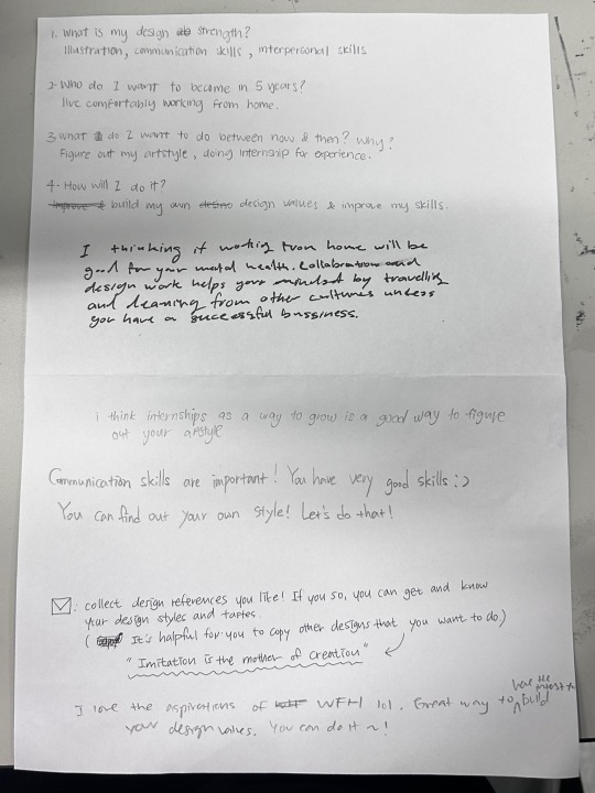
The comments from my classmates were warm and encouraging, which I genuinely appreciated. One piece of advice I found particularly helpful was to seek out more references and imitate them to discover my own art style.
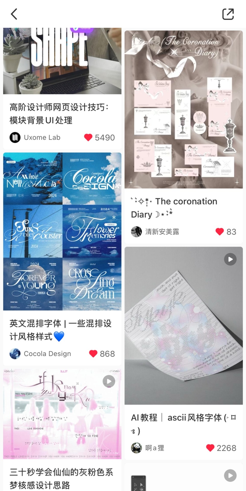
However, I did feel that my statement was too broad. I realized I missed the opportunity to outline my future interests, what I want to achieve as a designer, and the emotions I hope to evoke in others through my art.
If I could improve my statement, other than working from home, I would love to open my own small business. My goal is to create and sell art that brings comfort and relief from stress. Life can be so hectic, and I hope to make art that inspires smiles after a long day at work. I envision developing a universe of characters that offer solace to others, potentially even creating merchandise featuring these characters. Another important goal is to continue managing my social media accounts and actively engaging with my community, which I've been running since 2019. Looking ahead, I also plan to improve my fluency with various programs and software, produce more art consistently, and share my work more often.
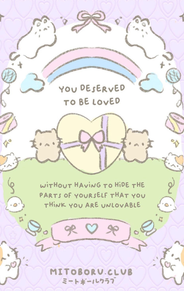
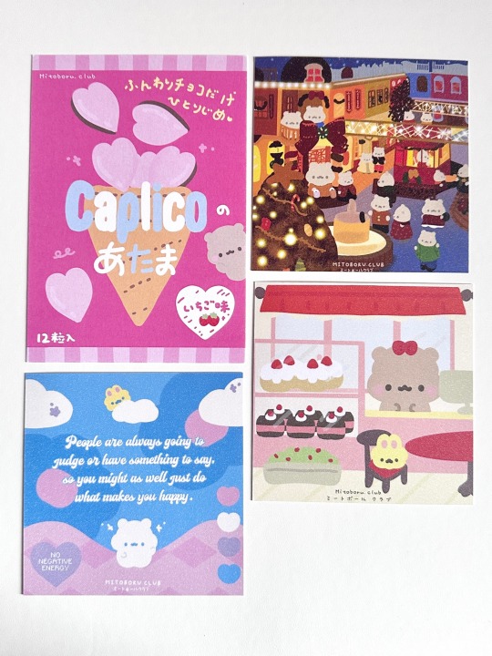
This piece is by Mitoboru, a local designer that I chanced upon while attending the art fair where they held a booth.
Their work truly inspires me, as they use cute, simple art to address a serious topic: mental health. The artist has openly shared their own struggles with mental health and advocates passionately for awareness. Their art aims to provide comfort while shining a light on this important issue. Initially, they created art as a way to cope with their own challenges, but they soon realized how uplifting positive posts online could be. This realization motivated them to extend the same comfort to others who are suffering in silence.
I admire how they offer support to others while receiving it in return; it’s a beautiful cycle of love, healing, and care. Through this process, they’ve built a strong identity, something I aspire to achieve with my own small business. Their artwork is also highly relatable, which not only attracts attention but builds a strong and vibrant community.
Currently, through my illustration module, I am in the process of learning my art style and have been working towards these goals.


Outside of school projects, another thing I’ve been doing to make this goal a reality is building my own community.
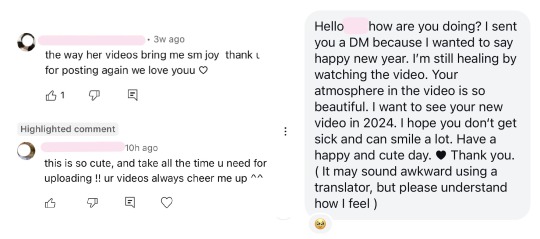
(420 WORDS)
REFERENCES:
“---.” Mitoboru Club ♡, mitoboruclub.carrd.co.
Claire Milbrath’s New Paintings and an Ode to the Bichon: A Symbol of Joy, Playfulness, Love and Companionship. 29 Oct. 2024, www.itsnicethat.com/articles/claire-milbrath-zine-art-illustration-050122.
The rise of Kawaii Art: How the Cult of 'Cute Art' is Capturing the Attention of Collectors and Investors. 20 Oct. 2022, maddoxgallery.com/news/302-the-rise-of-kawaii-why-cute-art-is.
Positive Psychology: Cute Art. fairies.zeluna.net/2023/03/the-power-of-cute-art.html.
0 notes
Text
Week 11 - Compulsory Question 1
For our group, we decided to create a collage manifesto:
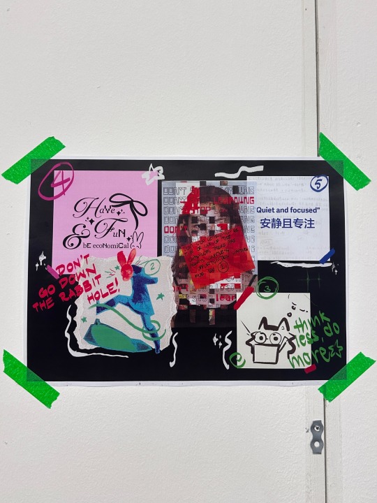
Although I have always had my own manifestos, I have never written them down anywhere, mostly just keeping them in my thoughts. I find creating a poster, and viewing it physically helps so much more in reminding myself of my own rules. Sometimes, we get so caught up in things that we easily forget our purpose so I find this activity to be extremely insightful.
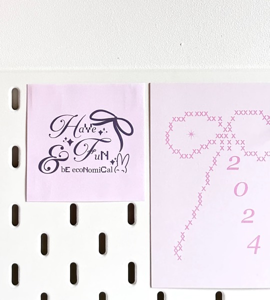
An alternative manifesto I would have added to the collage would be “Don’t complicate things”. I realize I tend to overthink and make things way harder than it is in my head. Because of these thoughts, I start to procrastinate due to not knowing where to start. Another I would also add is “Be straightforward and keep it simple”. As I want to create art that is easy to look at and understand. In today’s hectic world, I want my art to bring joy and relief from daily stress.
Recently, I’ve noticed that I’m getting better at answering questions about my identity as a designer, thanks to my experience in CTS B. The self-reflection exercises in week 2 and 10 have been particularly helpful in clarifying what kind of designer I want to be. In the past, I often lacked confidence in my responses because the question felt too broad. I didn’t know my style and felt I had nothing figured out. However, through CTS and my other modules, I’ve gradually discovered what I like and dislike as a designer. This journey has boosted my confidence, as I’m now starting to produce designs that truly reflect my vision and passion.
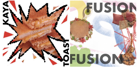
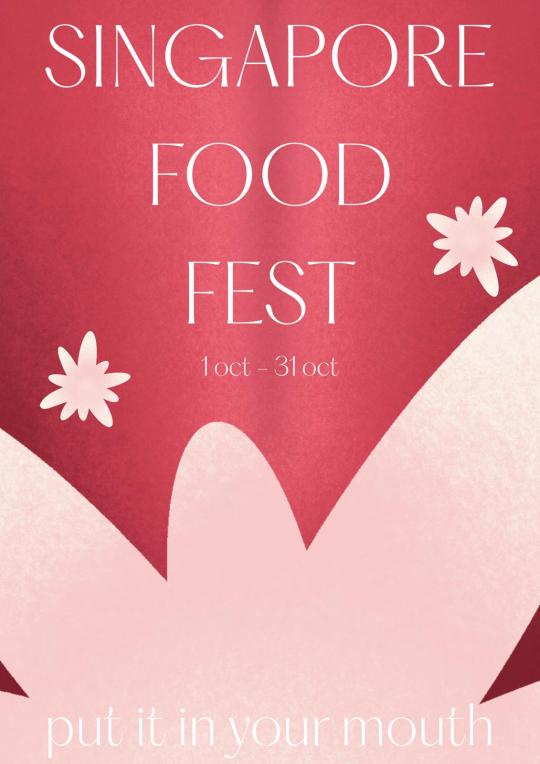
Additionally, I’ve been applying my manifestos to my other modules, and it has been incredibly beneficial. For example, in Studio, we had to create designs for a food festival that could adapt to various formats. Our initial designs were messy and, honestly, quite difficult to apply across different media. We decided to pivot to a more adaptable design that also strengthened our brand image. This shift not only simplified our work but also streamlined our workflow, making everything more efficient.
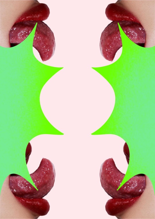
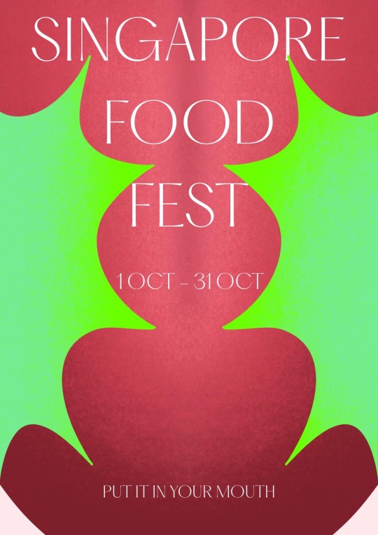
Another module where my manifesto really helped was illustration.


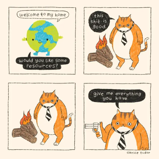
I originally planned to animate all the small flying human figures in my piece. However, I soon realized that this would be impractical and not economical. Making the piece look too noisy, which would go against my goal of showing peace and simplicity. Plus, since my cats are the main focus of the illustration, it makes more sense to animate them instead. This way, people can better appreciate the main subjects. From this, I learned that sometimes less is more, and working smart is better than just working hard.


(453 WORDS)
REFERENCES:
Charlotte Burgess-Auburn. "Why designers need a manifesto." Fast Company, 13 Oct. 2022, www.fastcompany.com/90794246/why-designers-need-a-manifesto.
Hwang, Alvin. “Writing a Design Manifesto.” Design for Mindfulness, 18 Apr. 2024, designformindfulness.blog/writing-design-manifesto.
“I Want to Be Free When I’m Designing”: Maria Chiara Moro on the Importance of Experimentation. 28 Oct. 2024, www.itsnicethat.com/articles/maria-chiara-moro-graphic-design-170322.
Clarice Tudor’s Climate-focused Comic Series Depicts Boris Johnson as a Fat Cat in Battle With Mother Earth. 10 Nov. 2022, www.itsnicethat.com/articles/clarice-tudor-licaf-ten-years-to-save-the-world-illustration-091121.
0 notes
Text
Week 4&5 - Field Trip to National Gallery Singapore + Analyse Artistic Traditions and Lineages
We had a field trip to the National Gallery and here are some of the paintings I found most interesting:
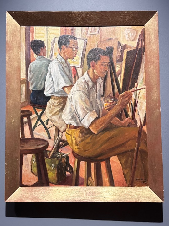
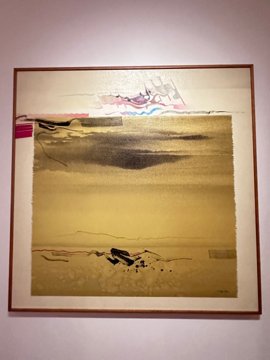
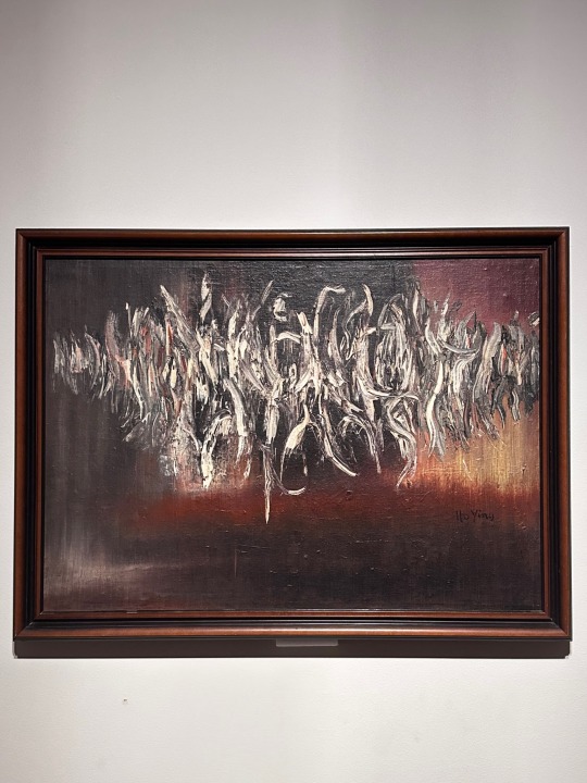
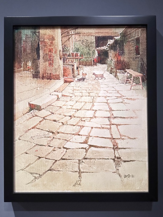
I found this painting to be the most interesting and talked about it during class:
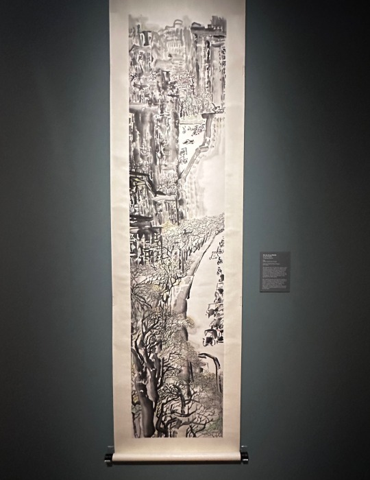
The reason being how they chose to use a vertical scroll to paint this scenery instead of the typical horizontal landscape canvas. I thought this was extremely smart as it further elongates the painting, highlighting the depth and showing the beautiful cityscape.
However, upon feedback from our lecturer, our mistake was that we focused too much on analyzing the materials used in the painting instead of the context and history of the painting.
We should first start with context, give reasons on why materials are used and how the painting is composed. Then, historical facts can be used to back up the points and end with a conclusion. Sometimes it can also end with a question like if this is the right way to communicate the context.
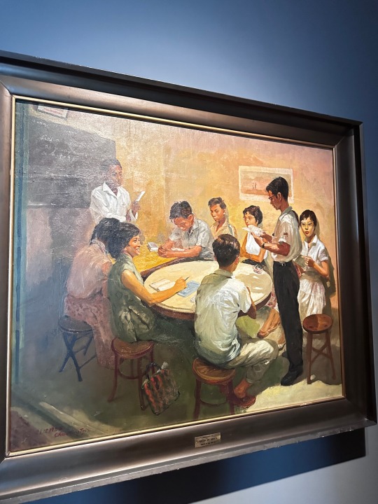
Other than gallery artworks, I feel that now I’m more clear on how to analyse designs too, especially abstract ones. As for our studio work, we will be designing more abstractly. We were told not to illustrate directly (e.g. illustrating food for food fest). This is my first time designing abstractly so I do find it challenging. The project is definitely pushing me out of my comfort zone and design boundaries though.



(234 WORDS)
REFERENCES:
Studio Lowrie’s Sundance Film Festival Identity Proves Small Studios Can Take on Projects of Any Scale. 11 Sept. 2024, www.itsnicethat.com/features/studio-lowrie-sundance-film-festival-2020-identity-graphic-design-240320.
Antonia Terhedebrügge and Mado Klümper’s Identity for Sehsüchte Festival Combines “Soft Forms and Edgy Lines.” 21 June 2019, www.itsnicethat.com/articles/antonia-terhedebruegge-mado-kluemper-sehsuechte-film-festival-graphic-design-210619.
Franceschini, Cinzia, and Cinzia Franceschini. “How to Analyze Art – Formal Art Analysis Guide and Example - Artlex.” Artlex - Art Dictionary and Encyclopedia, 25 Nov. 2022, www.artlex.com/formal-art-analysis.
Creative, Proactive. “Context'S Significance in Art Analysis: Exploring Depths - Proactive Creative - Guides for Visual Artists.” Proactive Creative - Guides for Visual Artists, 22 Dec. 2023, proactivecreative.com/importance-of-context-in-art-analysis/
0 notes
Text
Week 2 - Connecting Theory and Practice
I’m really grateful to attend today’s class as it answered a question that I’ve always thought about but felt intimidated to answer. Who am I as a designer? The main reason why I struggled with this question was because I never knew where to start and what actually builts my identity.
We first started with creating slides filled with pictures of how we see ourselves.
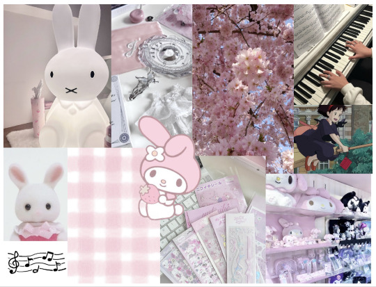
Looking at the slides gave me a clear art direction of how I want to present myself through design.
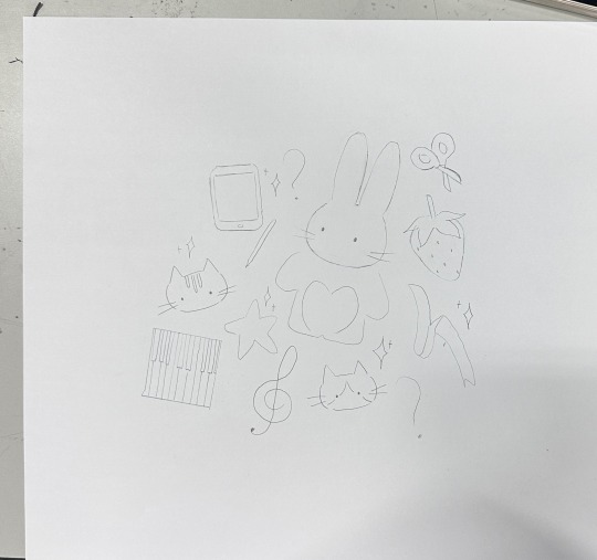

To be honest, I was really stuck at the beginning, having no idea what to draw at all. However, with some time plus guidance, I started sketching and slowly I was really happy with my sketch. Doing this activity made me realize my habit of making things harder and more complicated than it should be. Perhaps if I hadn’t been intimidated by figuring out my self-identity I would already had grown my artstyle by now.
During class discussions, one thing I found interesting was how others approached finding their self-identity differently. For example, some of my classmates talked about mental health while others talked about their families. This led me to think, other than from within ourselves, I think our identity can come from our life experiences as well. After all, experiences are what change us as individuals.
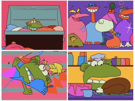
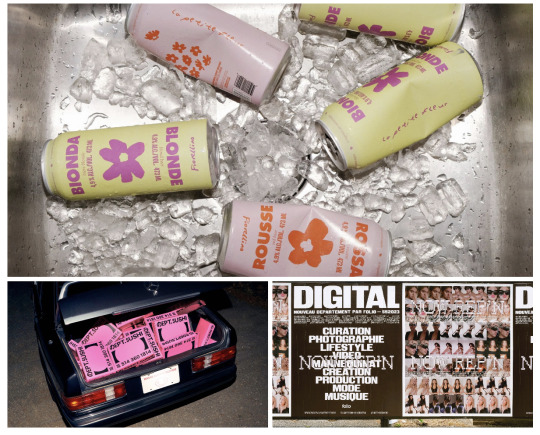
I think this class was really a valuable one that would help me further in my career. I learnt more abt myself and how I want to express myself creatively, to approach it with no fear. Also, getting stuck is a part of the process and I’ll eventually figure it out.


(270 WORDS)
REFERENCES:
Angela Kirkwood Felt “Purposeless” – so She Made a Short Film About a Bird That Can’t Fly. 9 Sept. 2024, www.itsnicethat.com/articles/angela-kirkwood-marvin-animation-film-project-200824.
AWP’s Brand Identities Need to Be “Gritty And Disruptive – or It’s Not Ours.” 11 Sept. 2024, www.itsnicethat.com/articles/awp-graphic-design-discover-300724.
Jenewein, Sticky Notes-Lydia. “How to Find Your Designer Self — and Understand How YOU Approach Design.” Medium, 4 Aug. 2022, uxdesign.cc/how-to-find-your-designer-self-and-understand-how-you-approach-design.
0 notes
Text
Week 1 - Praxis: Creative Practice and Critical Thinking
Today’s class was insightful as I learned the importance of balancing critical and creative practice. Our class activity was to write a story about social issues:

The topic I wrote was unequal opportunity in society. After exchanging opinions with my friends and lecturer, I learned that mine was too creative, and I was advised to add more statistic, survey reports and facts. This made me realize that I’ve always tended to approach things creatively, forgetting the importance of showing facts.
If I were to rewrite the essay, I would add more facts at the bottom. Using the creative part to gain attention while the critical part at the end of my story can support it, and make it more realistic.

I’ve learned that critical and creative practice should co-exist, as both are needed to communicate things more clearly.
This reminded me of data visualization which we learned in studio last year.
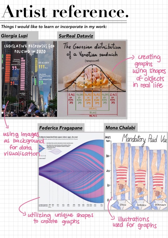
Too many facts is boring and most people would only want to focus if things were shown creatively. (e.g. through movies, illustrations, paintings..) However, too few presented facts also doesnt make any changes. So, we need a balance of both. The right way is to grab people's attention first, keep them interested, then show them the facts.
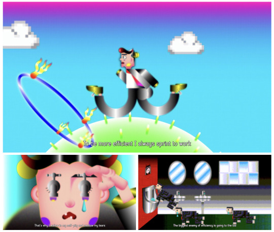
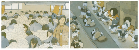
As we will be designing an app in digital skills soon, learning this has been helpful so I can present the app well with a balance of both creative (illustrations) and critical (information in the app) practice.
(232 WORDS)
REFERENCES:
Forget ‘Quiet Quitting’, Elizabeth Lum’s Animation Proves Hustle Culture to Be a Sham. 12 Sept. 2024, www.itsnicethat.com/articles/elizabeth-lum-hustle-secrets-animation-project-101023.
Illustrator Chenyue Yuan Digs Deep Into Social Histories to Tell the Story of Chinese Labourers Living and Working in Factories. 12 Sept. 2024, www.itsnicethat.com/articles/chenyue-yuan-pearls-daughters-illustration-160921.
0 notes
Text
WOII Summary
Overall, I would say this course has greatly enriched my understanding of design. It was definitely confusing at times and some topics were hard to understand, but going through class activities, discussions, and researching the topic on my own after class has expanded my perspective. I learned many new topics that I had never ever heard of before and I appreciated that the topics we learned can be applied to anything, other than in our modules and design, they could be applied to real life as well. Additionally, when researching, I've discovered new artists that I can gain inspiration from. Looking at different artists also enhanced my ability to relate topics to their work. Furthermore, the course prompted me to contemplate design with greater depth, learning how and why design is the way it is today. We were also given the chance to work in groups most of the time during class activities, which I am grateful for because it definitely taught me more about how to become an even better collaborator. All in all, I am happy to be able to attend such an interesting course. Thanks to this class, equipped with a deeper understanding of design principles, I now feel more confident during my working processes.
(208 WORDS)
0 notes
Text
Week 11 - Post Modernism
I personally found the topic of postmodernism to be interesting as it aligns with my beliefs in design that there shouldn’t be one dominant style. I think diversity is extremely important in the world of design, and if we are restrained by rules in design, design wouldn’t be special anymore. Something I’ve been pushing myself to do more often recently is stepping out of my comfort zone when designing. Attending today’s class reminded me to challenge myself even further.
As despite my beliefs, I do find myself struggling with freely expressing myself in design. I’ve always been insecure about my ideas and unsure of if my idea is good or bad, right or wrong. Learning that it is okay to challenge traditional norms has encouraged me to further explore new styles.
Recently, when designing a poster for craft, I have also stepped out of my comfort zone.

I did the poster in a style that I have never done before, so I found the process to be extremely tough. However, I definitely learned a lot from doing so. Which is why I plan to try out even more different styles in the future, allowing myself to design freely.
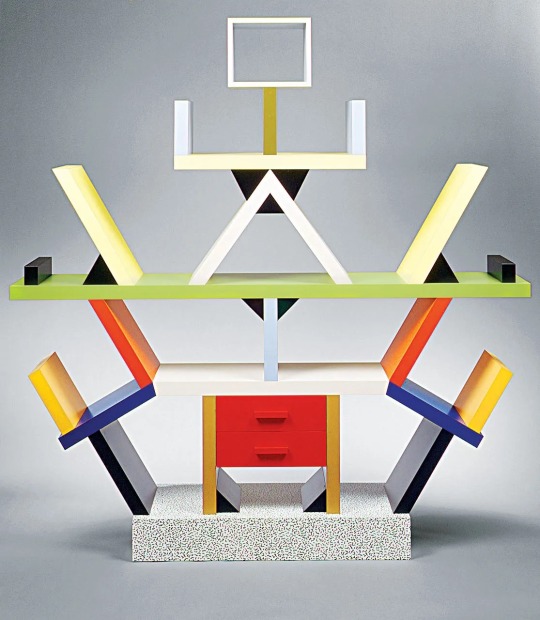
Our class activity this time was to design our own posters in pairs.

We mainly focused on the type for this poster design. If I had more time, I would have made suitable elements from scratch for the poster, like different shapes and characters as I think this is still a very typical poster that you would see often in design. However, given the time we had, I was happy with the outcome.
(271 WORDS)
References:
“Diversity in Design - DesignSingapore Council.” DesignSingapore Council, 31 May 2021, designsingapore.org/stories/Diversity-in-Design.
Hill, Carlyn. “Step Out of Your Creative Comfort Zone.” Creative Resources, 26 Sept. 2019, creativeresources.threadless.com/step-out-of-your-comfort-zone.
Mkhize, Lori. “What Are the Postmodern Principles of Design? Embracing Eclecticism in Home Decor.” fieldguided.com, 23 June 2023, fieldguided.com/what-are-the-postmodern-principles-of-design.
Q, Fabrique &. “Memphis Group: Awful or Awesome?” Design Museum, designmuseum.org/discover-design/all-stories/memphis-group-awful-or-awesome.
Özelbiçer, Ata, and Ata Özelbiçer. “Dadaism and Design: Embracing the Absurd and Nonsensical.” Visual Design Journey, 5 Aug. 2023, visualdesignjourney.com/dadaism-and-design-embracing-the-absurd-and-nonsensical.
0 notes
Text
Week 9 - Cultural Materialism
Being a phrase I have not heard of before, cultural materialism peaked my interest.
It's a way of looking at art that focuses on how they're made. It uses three ways:
1. Infrastructure- looks at how the tools, materials, and resources available influence the way things are created. Also considers how the environment impacts design choices.
2. Structure- looks at how societal organization and economic factors play a role in design. (example: availability of labor, resources, and the economic system can influence designs)
3. Superstructure- considers the beliefs, values, and symbols associated with designs. Also involves understanding how cultural ideologies and meanings are embedded in designs.
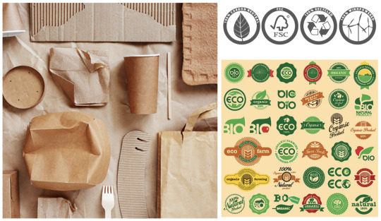
Cultural Materialism helps us designers see how different parts of society affect how things are designed. It shows how technology, money, culture, and design are all connected.
For the class activity, we were asked to pick 1 piece of infrastructure around us and answer the following questions for discussion.
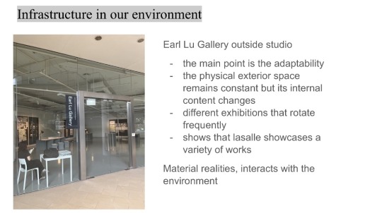

Our group chose the Earl Lu Gallery to discuss as it is not just a space to display artworks but it has elements that supports artists. They are essential in our cultural enviroment, a place for artists exhibition, for audiences to engage with art, and for various cultural activities.
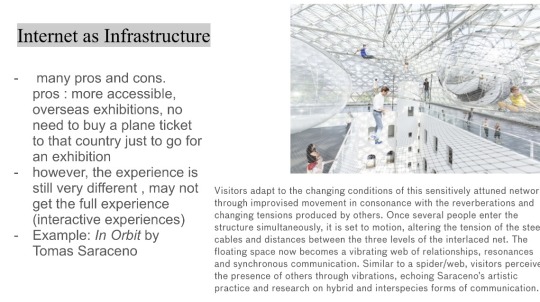
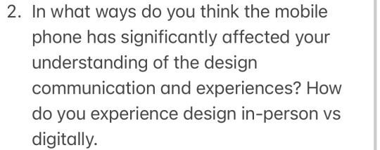
There are pros and cons to how phones affected our design experiences. For example, now we are able to experience exhibitions overseas virtually, which is a pro as it’s more convenient. However, it comes with limited engagement and definitely a loss of atmosphere.
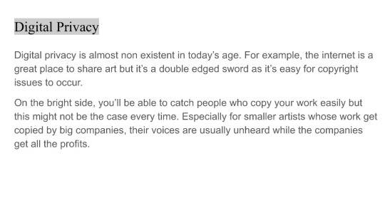

Seeing this question, we thought of copyright issues. Artists share their work, but with no privacy, big companies sometimes copy it without permission, leaving smaller artists unrecognized and unpaid.
(273 WORDS)
References:
Owczarek, Aleksandra. “Implementing Genuinely Sustainable Packaging in a Small Brand.” Packhelp, 19 Jan. 2024, packhelp.com/sustainable-packaging.
Daevas Inc. “Integration of Culture in Design.” Daevas Design, 12 Dec. 2016, daevasdesign.com/integration-culture-design.
Furuto, Alison. “‘In Orbit’ Installation / Tomás Saraceno.” ArchDaily, 15 Jan. 2018, www.archdaily.com/394622/in-orbit-installation-tomas-saraceno.
Jasani, Azmina, and Emelyne Peticca. “The Tension Between Copyright Law and Appropriation Art: Where Is the Line Between Artistic Innovation and Stealing?” The Art Newspaper - International Art News and Events, 29 Sept. 2021, www.theartnewspaper.com/2021/09/29/the-tension-between-copyright-law-and-appropriation-art-where-is-the-line-between-artistic-innovation-and-stealing.
0 notes
Text
Week 4&5 - How to Analyze a Work of Design + Field Trip to National Museum of Singapore
During our class in week 4, we were asked to bring different objects to school and organize them into different categories such as materials, craftsmanship, and sentimental value. This activity allowed us to better understand what we learned during the lecture; the Design Analysis Framework. I found learning about design analysis framework to be intriguing, especially learning about processes, one of the five components of the framework.
Usually when looking at designs, I would rarely think about how and why it is processed this way, I mostly focus only on the material and the meaning behind it. Thinking more about the process would help me get into the designers' minds and understand their designs better. This reminded me of the importance of CPJ, why Lasalle encourages us to record down all our processes so they can better understand our designs and reasons for decisions made in our designs.
It was helpful to learn about this framework as well, so now I know where to start when analyzing designs.

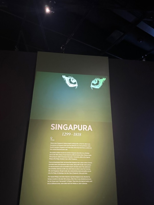
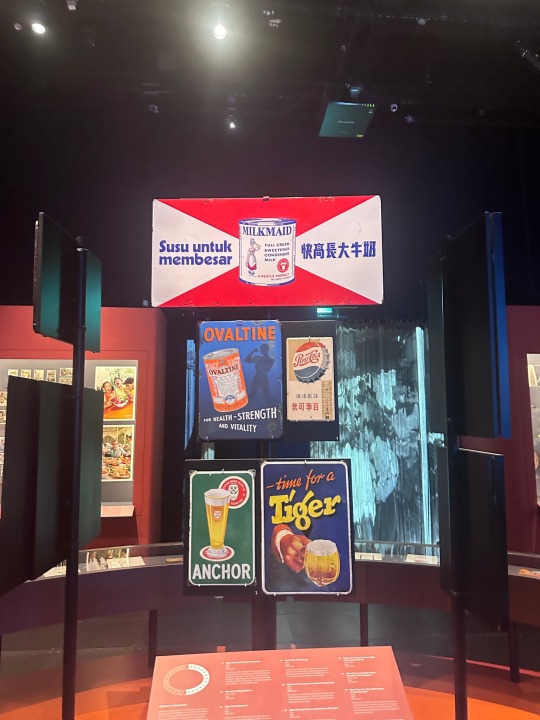
We were able to put what we learned to use in the following week at the National Museum of Singapore. One of the exhibitions that caught my attention was the recycling exhibition, ‘Re-’.
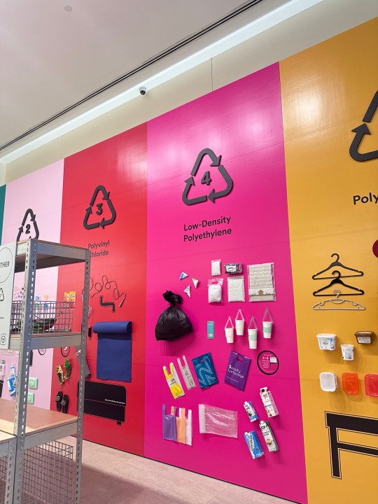
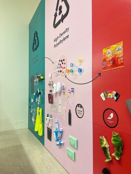
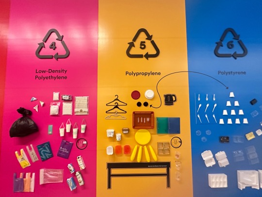
The exhibition was made with the purpose of provoking and educating visitors about plastic because rather than ignoring the fact that plastic is a problem, we should learn about what we can do to help. This exhibition has lots of bright colors, which was what first caught my eye. This led me to think about the process of creating this exhibition. I realized other than the designers using bright colors to catch attention, they also decided to use familiar everyday household items to represent the plastics, making the exhibition relatable to visitors. There were also some missing objects in this exhibition that you have to find in other exhibitions, which made the exhibition more engaging for visitors and encouraged them to take a look at other exhibitions too.
(330 WORDS)
References:
Domestika. “What Is Design Process and Why Is It Important?” Domestika, 21 Sept.2023,www.domestika.org/en/blog/9917-what-is-design-process-and-why-is-it-important.
Kavčič, Romina. “Design Documentation Process: Why Is It Important? - Design Strategy Guide.” Design Strategy Guide, 21 Feb. 2023, designstrategy.guide/design-management/design-documentation-process-why-is-it-important.
This Digital Exhibition Reveals the Process Behind Gehry’s Iconic Walt Disney Concert Hall. 28 Mar. 2024, www.itsnicethat.com/news/resn-sculpting-harmony-web-design-graphic-design-news-071223.
---. gehry.getty.edu. Frank Gehry and the Walt Disney Concert Hall | Sculpting Harmony (getty.edu)
0 notes
Text
Week 3 - Semiotics
Out of the three categories in semiotics, the ‘symbol’ category interests me the most as its meaning is taught and can change depending on culture. Learning about this was the most notable idea in today’s class for me. It was fascinating to learn that people from different countries see the same symbols differently and we all interpret its meaning differently.

This leads me to think that as designers it's most important that we understand the cultures of our audiences first before designing. This would allow us to communicate smoothly and better through our designs.
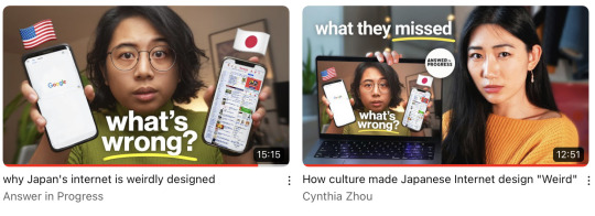
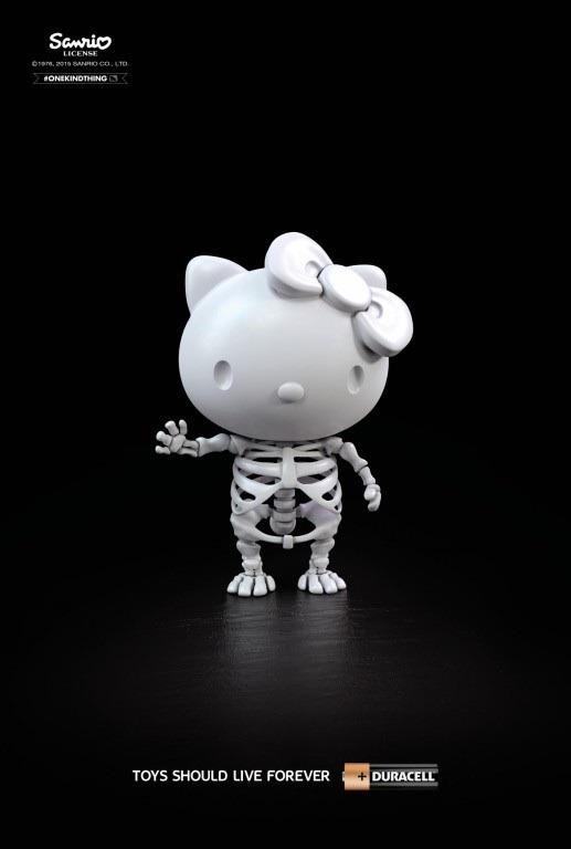
The poster I’ve selected to decode is a McDonald’s poster by Leo Burnett London:

Formal Analysis:
The bright yellow in contrast to the dull background shifts the viewers' focus towards the familiar McDonald’s arch we all are familiar with.
Contextual Analysis:
Signifiers:
As this was a poster created during the pandemic, a time when people couldn’t step out much from their homes, the arch in connection with the window implies that McDonald’s delivers straight to your doorstep. The poster was made with the intention of reminding people that McDonald’s can be delivered to you. The yellow colour also represents the light in the dark of night, implying that no matter how late, McDonald’s will deliver.
This poster would grab the attention of potential night owl customers who might be hungry in the middle of the night during this period of time or families looking for a quick meal at home. It is simple, minimalistic but also eye-catching at the same time which is what makes this poster so successful.
(264 WORDS)
References:
Pegu, Disha. “Gestures and Their Meanings Around the World.” Villanovo - Luxury Villa Rentals, 22 June 2020, www.villanovo.com/magazine/article-gestures-and-their-meanings-around-the-world
Admin. “Cultural Differences in Symbol Interpretations Across Languages.” Chakra Galaxy, 5 Mar. 2024, chakragalaxy.com/blogs/guides/cultural-differences-in-symbol-interpretations-across-languages.
Cynthia Zhou. “How Culture Made Japanese Internet Design ‘Weird.’” YouTube, 10 Dec. 2022, www.youtube.com/watch?v=Opy-SjDU0UY.
Novik, Victoria. “Cultural Sensitivity in Design: Why It Matters and How to Develop It.” Medium, 28 June 2023, victorianovik.medium.com/cultural-sensitivity-in-design-why-it-matters-and-how-to-develop-it-.
0 notes
Text
Week 1 - Phenomenology
I found it intriguing to learn that the same image can change depending on many different factors, leading to different interpretations of the same work of art. This can be seen in today's class activity too, I found that everyone’s interpretation of the word 'time' was very different from each other. Some took pictures of old people, while some took pictures of our surrounding environment like cracks in walls and old trees.
For me, I thought to compare the old and new, however, I had trouble finding pictures and felt rushed.
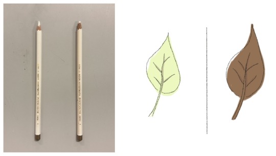
I didn't think my images; a leaf and pencil were a series. Though, when I presented, my classmates pointed out that pencils come from trees, so it's a series. This too shows that our mental state changes our views, as when I was preparing my pictures, I was rushing, so during that state of mind, I could not look at the pictures the same as my classmates who weren’t in a rush.
One of my favorite art pieces, ‘Can’t Help Myself’ by Sun Yuan and Peng Yu is an example of phenomenology.
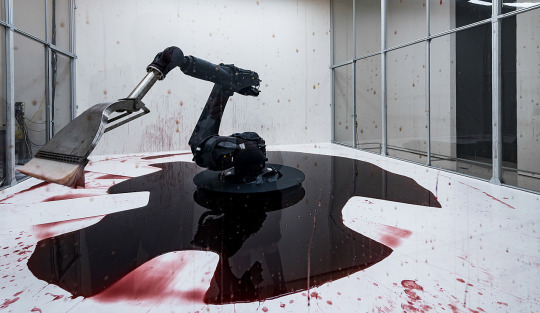
It is an artwork that has caused many disputes about its meaning. Some see this artwork as pointless labor at a dead-end job, while some connect it to mental health, stating the robot reminds them of themselves who can’t help it when they go through self-harm, panic attacks, or anxiety. On the other hand, some can’t seem to comprehend why people are feeling sentimental towards a robot. It is clear that people with different life experiences and mindsets view the same artwork very differently.
(267 WORDS)
References:
Eric, Ralls. “Think You Like Art? It May Come Down to Your Mental State.” Earth.com, 16 Apr. 2018, www.earth.com/news/mental-state-art-perception.
POPCINEMA. “Sun Yuan and Peng Yu, Can’t Help Myself, 58th International Art Exhibition
Venice, Italy 2019.” YouTube, 19 Sept. 2019, www.youtube.com/watch?v=nX6C6xY86-c.
0 notes
Text
Week 12 - Compulsory Question 3
Personally, other than design, I really love music. Which is why I’m interested in working with the music department. I’m interested in collaborating by designing album covers, posters, websites, or any promotional materials for concerts and events. I’ve also always been fascinated by stage sets so I’d love to collaborate with either the performance or music department to design their stages. If any of these departments have social media, I’d also be interested in creating content for them, like designing YouTube thumbnails.
For my final project, I’d like to create a project that would help bring awareness. For now, I’m thinking of bringing awareness to mental health, like ADHD in women. Studies have shown that most women don’t know they have ADHD till late in life. The diagnosis can be life changing so I believe it would be helpful to create more talk about this.
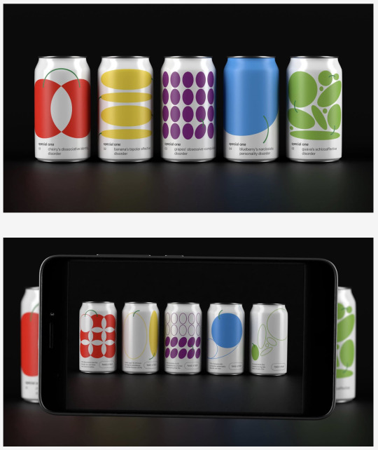
I’m interested in working with IMH to make pamphlets, posters, websites or packaging designs for ADHD supplements. I’d like to focus on making it cute and approachable so it can attract more people and look less daunting. Another organisation that I have interest working with is SPCA, as I’m passionate about making sure there are fewer strays on the streets. Pet shelters are always in need of money so I would like to handle their social media by drawing and posting cute illustrations of each animal and their personal story, so people would be engaged and more willing to donate.
Professionally, I believe CTS helps me in branding. Learning CTS, I’m able to organise my thoughts and explain the idea of my packaging or logo design to the client more efficiently. Being able to articulate my designs properly is important, as it would help me gain the clients trust. Learning to document my art process would also help me in showing all the different drafts I have, because something I hate might be what the client wants.
(322 WORDS)
References:
Designing for Social Good: How Designers Can Make a Difference – Make:Iterate. 3 Jan. 2023, makeiterate.com/designing-for-social-good-how-designers-can-make-a-difference.
CNA Insider. “Women With ADHD: How a Diagnosis Changed Our Lives.” YouTube, 13 Nov. 2021, www.youtube.com/watch?v=9GzC_bfr2ZE.
“The Power of Cute.” Princeton University Press, press.princeton.edu/books/hardcover/9780691181813/the-power-of-cute.
“How Stories Change the Brain.” Greater Good, greatergood.berkeley.edu/article/item/how_stories_change_brain.
Image links:
Special One – Packaging of the World. 28 May 2021, packagingoftheworld.com/2021/05/special-one.html.
0 notes
Text
Week 11 - Compulsory Question 2
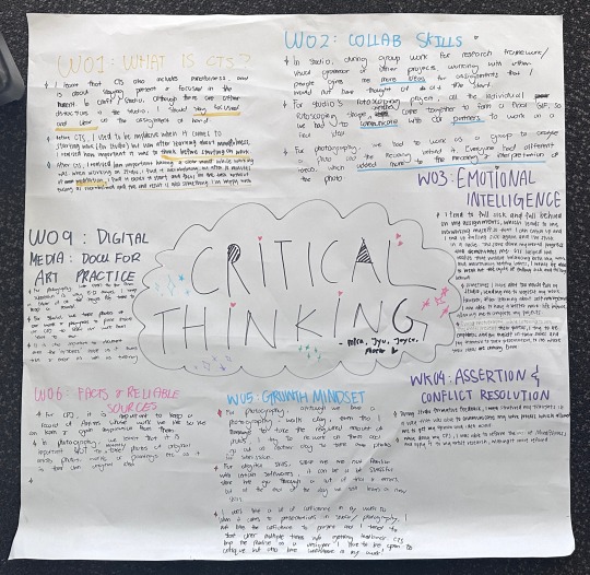
There are lots of times in Craft where I’d feel extremely distracted. The studio is a large space and with that many people, it can be chaotic and hard to focus on work sometimes. Learning about mindfulness really helped me focus better on my work. I struggle and I’m slow with crafting so self-managing has helped me to have less work piled up at home.
Craft is honestly a challenge for me, I even hated it the first few weeks. I found cutting frustrating because if I made one wrong move I’d have to restart. I felt this in Digital skills as well, since we are new to the programs. However, growth mindset has taught me that challenges help me grow. With this mindset, I’ve begun to enjoy these modules more.
Other than craft, mindfulness has also helped me in Studio. With the amount of work that has to be done, I get easily overwhelmed, causing me to not think straight and lacking in ideas. Mindfulness has taught me how important a clear mind is when it comes to planning. I find my ideas more refined when I’m 100% focused in the present moment.
However, of course, there are times when I’m just stuck and can’t think of more ideas. At times like these, I’ve learned to appreciate collaboration. Learning to look at things from other people's perspectives has led me to think of ideas that I’d never think of. I used to not enjoy collaboration mainly because I’d get insecure and compare myself to them. I thought this in Photography class too. When others presented their photos, I thought they were just better. However, now I’d head out myself to take more pictures. Rather than comparing myself, I’m inspired by them.
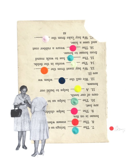
Before, I’d rather hide my mistakes but now, I’ve learned how important it's to document everything. Documenting helps me better articulate my ideas to others too. Learning this has helped me understand the purpose of CPJ more.
(330 WORDS)
References:
MindTools | Home. www.mindtools.com/adzev6y/mindfulness-in-the-workplace.
Founders, Society for Creative. “How Stepping Out of Your Comfort Zone Can Lead to Growth - From a Minted Design Challenge — Society for Creative Founders.” Society for Creative Founders, 7 Apr. 2018, www.societyforcreativefounders.com/blog/minted-design-challenge-comfort-zone.
How Stress Impacts Creativity and What to Do About It? www.lokyatha.com/library/stress-creativity-relation.
How to clear your mind and cultivate creativity (fastcompany.com)
Kavčič, Romina. “Design Documentation Process: Why Is It Important? - Design Strategy Guide.” Design Strategy Guide, 21 Feb. 2023, designstrategy.guide/design-management/design-documentation-process-why-is-it-important/#design-documentation-benefits.
Image links:
---. “Visual and Creative Artists Magazine | Format.” FORMAT, 10 July 2023, www.format.com/magazine/features/art/the-jealous-curator-danielle-krysa-creative-block.
0 notes
Text
Week 10 - Compulsory Question 1
Before, I would have never connected critical thinking with designers. Now, I understand how important it is for designers. The module guides us on how to think, grow, and brainstorm our ideas appropriately as designers. We are taught the vital mindset designers should have for further growth—which allows us to grow more efficiently as designers. Other than using these skills in design, it’s even helpful for us in our daily lives.
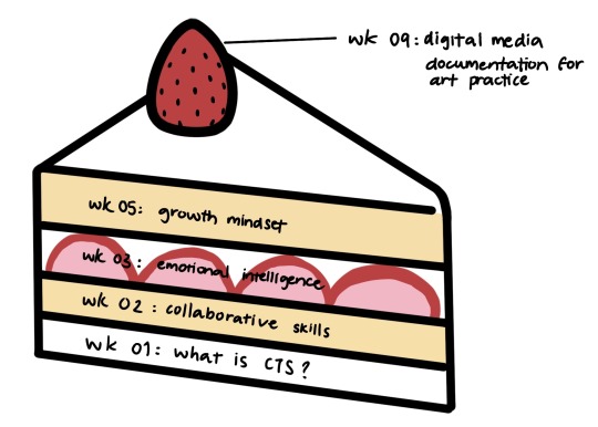
Our group’s choice of visual metaphor was the ecosystem. The ecosystem will not be able to function without one of its components, and we believe that’s the same with critical thinking. All the topics we learned are equally important and they go hand in hand with each other. Another alternative visual metaphor I can think of is a cake, as with one of the layers missing from each other, the cake will be incomplete.
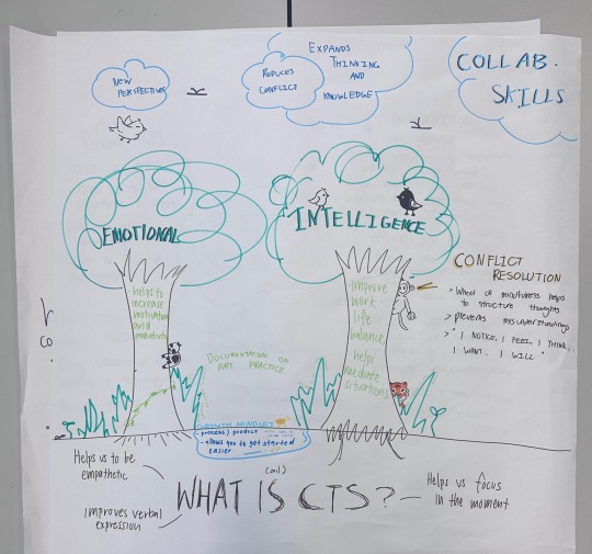
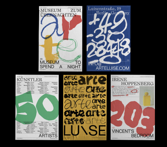
As a perfectionist, the most memorable session for me would be the growth mindset. Always feeling scared to fail, being taught that failure is an opportunity to grow really comforted me. Understanding that it's a process and failure isn’t the end of the world allowed me to be braver and challenge myself more. I also used to be extremely sensitive when receiving criticism, learning to take them constructively rather than personally allowed me to talk more in group discussions— something I’m definitely still working on and wish to do more.
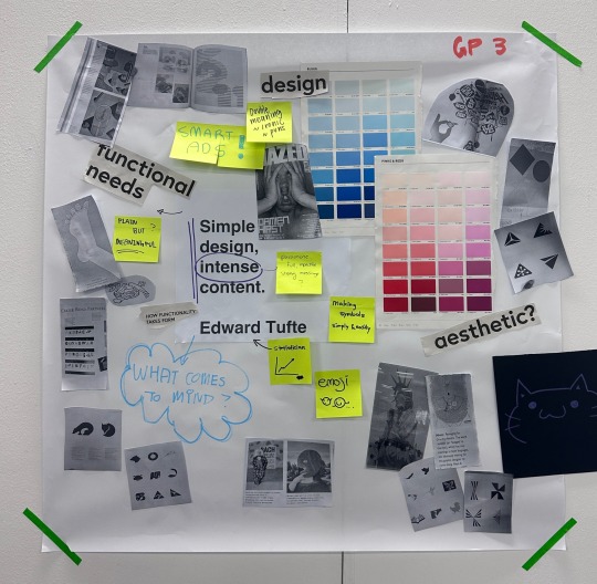
With my fear of criticism, I used to hate working in groups, but after this module, I began to see the value of group work. I find that my creativity is often expanded after listening to others' ideas and it allows me to look at things from a different perspective. I find myself enjoying the brainstorming process with my group members, it teaches me to be open-minded and think freely. I also find it beautiful when our different strengths complement each other, as one person’s strengths is another’s weakness.
(325 WORDS)
References:
Lucy. “Why Critical Thinking Is Important as a Designer.” Pixel Productions Inc., 20 May 2019, www.pixelproductionsinc.com/why-critical-thinking-is-important-as-a-designer.
Sieck, Winston. “Critical Thinking in Everyday Life.” Global Cognition, 19 Sept. 2021, www.globalcognition.org/critical-thinking-everyday-life.
TEDx Talks. “Failure Is Part of Success: Eduardo Zanatta at TEDxBYU.” YouTube, 30 Apr. 2012, www.youtube.com/watch?v=bujIb_sQZvQ.
“7 Benefits of Design Collaboration | Approval Studio.” Approval Studio – Online Proofing Software for Artwork Projects, 22 Aug. 2023, approval.studio/blog/what-are-the-benefits-of-design-collaboration-for-creating-a-better-product.
Aftab, Mashia. “The Benefits of Collaborative Design in 2023 | Best Guide.” ENOU Labs, 5 June 2023, enou.co/blog/collaborative-design.
Image links:
Forget About Success or Failure, Learning Is the Key for Graphic Designer Sunny Li. 8 Nov. 2023, www.itsnicethat.com/articles/sunny-li-arte-luise-hotel-graphic-design-240620.
0 notes
Text
Week 3 - Emotional Intelligence
The emotional intelligence I am strongest at is definitely empathy. It has always been easy for me to put myself in other’s shoes and empathize with them. Even from a young age, people would talk to me about problems they have as they found me comforting. At some point, I was nicknamed 'therapist'. It’s great to learn that something I have been unconsciously doing throughout my life is helpful to me as a collaborative designer in training. Thanks to today’s class skits, I have thoroughly understood how important empathy is, especially in group projects.
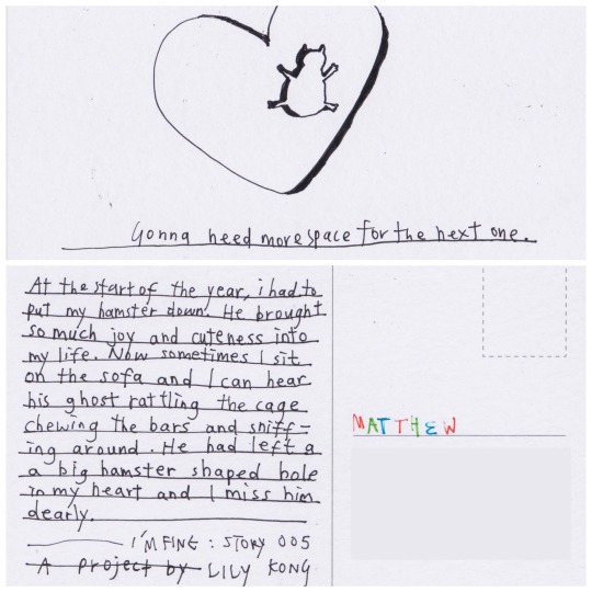
Despite empathy being my strength, it can also be my weakness at times. Too focused on helping others, I tend to forget about myself. Which is why I believe self-management is something I need to work on. I tend to worry about others to the point where it affects my work as well. I find myself less focused with my creativity depleted. Therefore, nowadays I would put myself first before helping others. I understand that I can only help others if I have taken care of myself.
Other than that, I have a lot of fun in the studio working with my friends. So much fun that sometimes, I forgot to focus on my work, causing me to fall behind. I’m self-aware of this so nowadays I would distance myself from my friends and only allow myself to have fun after work is done. I believe self-management can lead me to a greater work-life balance lifestyle.
(250 WORDS)
References:
Evans, Darren. “The Role of Empathy in Design.” Brandingmag, 11 Feb. 2021, www.brandingmag.com/2021/02/11/the-role-of-empathy-in-design.
Obenauer, Sarah. “Collaboration Begins With Empathy - Make a Mark - Medium.” Medium, 7 Dec. 2021, medium.com/makeamark/collaboration-begins-with-empathy-10ee5c8686a3.
McNerney, Sam. “How Your Mood Affects Your Creativity.” Big Think, 30 Sept. 2021, bigthink.com/articles/how-your-mood-affects-your-creativity.
Ung, Victor. “Stop Helping Everyone - Ascent Publication - Medium.” Medium, 8 Oct. 2018, medium.com/the-ascent/5-benefits-of-self-care-for-selfless-people-25bd36f06408.
Yadav, Mohit. “Understanding the Role of Self Management at Work With 7 Effective Strategies - Risely.” Risely, 13 June 2023, www.risely.me/self-management-at-work-with-effective-strategies/#Benefits_of_self_management_in_the_Workplace.
Image links:
Lily Kong on Bringing Themes of Loneliness and Vulnerability Into Her Work Since the Lockdowns. 25 Oct. 2023, www.itsnicethat.com/articles/lily-kong-illustration-140921.
0 notes
Text
Week 2 - Collaborative Skills
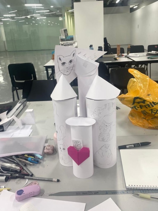
While building the monument, I realized that my weakness was not figuring out my role in the collaboration fast enough. At first, I was part of the drawing team, but near the end, I realized the others drew way faster than me. If I had realized my role faster, it would have improved the work pace much better. However, collaboration is a skill that takes time to learn. I believe my self-awareness of my mistakes this time will lead me to do better in future projects, as studies have shown that self-awareness is critical for collaborations.
However, I do believe one of my strengths is open-mindedness. I love seeing things from other’s points of view as it expands my way of thinking and knowledge. Our group also understood how important this is so we made sure to spend time listening to each other, discussing, and brainstorming before constructing the monument.

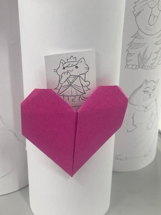
With the time and material given, I believe we did our best but there is definitely room for improvement. In terms of materials, I wouldn't have used paper. The paper was flimsy and hard to handle. Plus, the white paper made it look so boring, coloured paper would look much better. The castle could be in colours we often find on common cat breeds, like calico cats.
For the design, rather than having cats drawn on, I would design the castle itself to embody a cat—with a few cats hanging around the castle building to show the playfulness of cats.
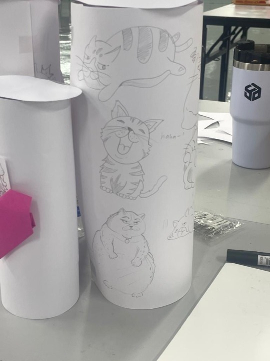
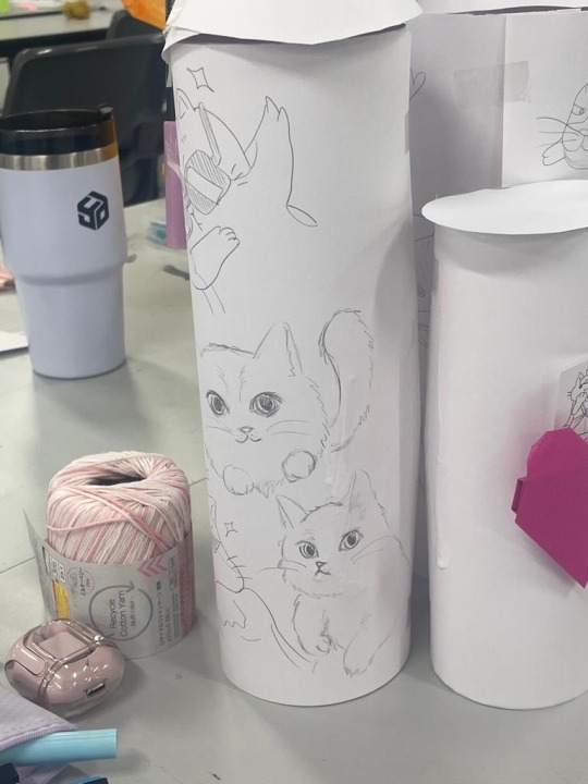
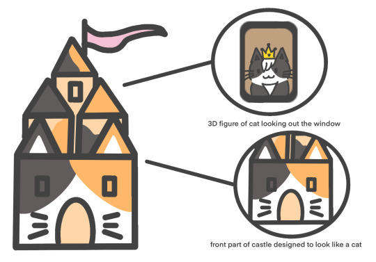
(250 WORDS)
References:
Massachusetts Institute of Technology. “Collaboration Is a Key Skill. So Why Aren’t We Teaching It? | MIT Sloan Management Review.” MIT Sloan Management Review, 23 June 2022, sloanreview.mit.edu/article/collaboration-is-a-key-skill-so-why-arent-we-teaching-it.
The Power of Self-Awareness: How to Build Successful Teams | By Gustavo Razzetti (fearlessculture.design)
Techspecialist Consulting Limited. “Open-Mindedness in Workplace - Techspecialist Consulting Limited - Medium.” Medium, 14 Dec. 2021, medium.com/@techspecialistconsult/open-mindedness-in-workplace-be497ceed7a7.
Cats hanging around the castle idea inspired by:
“This Is in Germany, Made to Honor All Homeless Cats (3 Pics).” STREET ART UTOPIA, 15 Nov. 2021, streetartutopia.com/2021/11/15/this-is-in-germany-made-to-honor-all-homeless-cats-3-pics.
Cat With a Kitten, *Gargoyle-chimère on the Roof of the Château De Pierrefonds, France. Built ca.1393-1407. *a Grotesque Carved Human or Animal Face or Figure Projecting From the Gutter of a Building, Typically Acting as a Spout to Carry Water Clear of a Wall. artifactsdiscovery.com/details/349.
Cat House | LiveRiga. www.liveriga.com/en/3177-cat-house.
Image links:
Mother Collaborates on Rolling Papers for Cannabis Criminal Justice Reform. 18 Oct. 2023, www.itsnicethat.com/news/mother-last-prisoner-project-vibes-release-papers-creative-industry-080823.
0 notes
Text
Week 1 - What is Critical Thinking?
Before this class, I thought critical thinking was simply to think with evidence backing up one’s opinion. However, after this class, I have learned that critical thinking is more than that. It’s about taking a step back from the situation, asking relevant questions and analysing, weighing the pros and cons before judgements.
I found learning this to be really helpful as sometimes I find it hard to voice out my own opinions in fear of judgement from others. I believe that practicing this enhances self-confidence in one's opinions, as clearer thinking improves verbal expression.
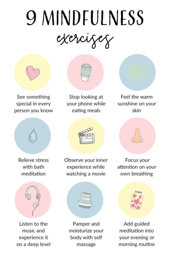
Verbal expression is a skill I want to improve on, I believe this would allow me to better express myself in my designs as well. In our fast-paced world, we often lose sight of the present moment, preoccupied with the past or future. This has caused my thoughts to be messy which is why I appreciated that this class brought up mindfulness. I used to practice mindfulness every night, but being caught up with work and moving to a new country, I haven’t kept up with it. This has greatly affected my work performance. It was a great reminder to resume my mindfulness practice.
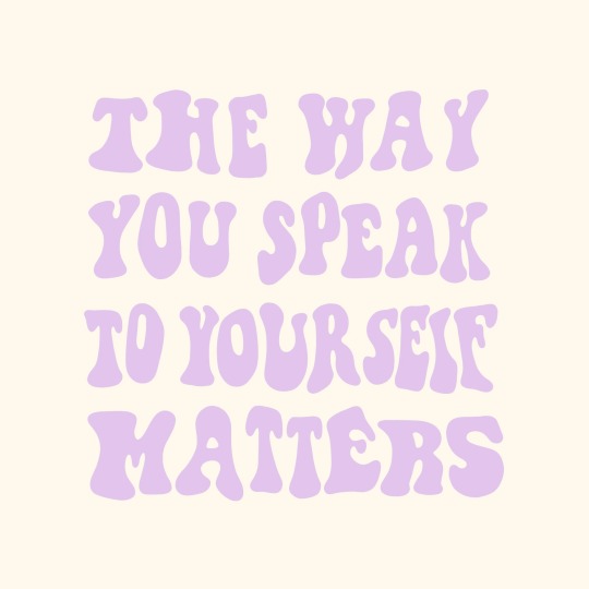
I was also reminded of how important it is to question ourselves as artists. Being a perfectionist, this question resonated with me:

Learning how we artists need failures, as failures provide us further growth was extremely comforting. I understood that as long as I try again, it’s not failure, it's a practice.
(250 WORDS)
References:
Critical Thinking: How to Develop Confidence and Self Awareness - Steven West - Google Books
Kuhn, Michael. “The Most Important Soft Skill for Designers: Communication.” Medium, 1 Jan. 2022, uxdesign.cc/the-most-important-soft-skill-for-designers-communication-e69253d82a69.
Brownlee, Dana. “4 Powerful Ways Mindfulness Encourages Peak Performance.” Forbes, 2 Feb. 2020, www.forbes.com/sites/danabrownlee/2020/02/02/4-powerful-ways-mindfulness-encourages-peak-performance/?sh=5744ef0e3f60.
The Art of Failure | National Endowment for the Arts
Image links:
Three Pinterest Users Share Stories on Escapism, Mindfulness and Activism Over Lockdown. 3 Nov. 2023, www.itsnicethat.com/articles/pinterest-art-month-sponsored-content-220421.
Magda. “9 Powerful Mindfulness Exercises to Add Into Your Daily Self-care Routine - Magda Design - Printable Planners and Resources for Graphic Designers.” Magda Design - Printable Planners and Resources for Graphic Designers, 7 Feb. 2021, magdadesignart.com/9-powerful-mindfulness-exercises-to-add-into-your-daily-self-care-routine.
Screenshot from WK1 CTS Google slides
1 note
·
View note