Don't wanna be here? Send us removal request.
Text
Another Woman Has Accused Robert Scoble of Sexual Harassment

Robert Scoble at the NEXT Berlin conference on April 24, 2013
Dpa / AFP / Getty Images
Robert Scoble, the high-profile tech evangelist and blogger, and longtime fixture at industry events, has been accused by a second woman of groping. Michelle Greer, who worked with Scoble at Rackspace in 2009 and 2010, says Scoble groped her at a tech conference in 2010. The accusation comes on the same day that the technology journalist Quinn Norton accused Scoble of assaulting her in the early 2010s at Foo Camp, a hacker conference. Norton wrote, "And then, without any more warning, Scoble was on me. I felt one hand on my breast and his arm reaching around and grabbing my butt."
Scoble is an influential figure in tech. He started his Scobleizer blog in 2000, and parlayed the blog into lucrative roles including technology evangelist at Microsoft, futurist at Rackspace, and most recently, entrepreneur in residence at Upload, a virtual reality startup that recently settled a sexual harassment lawsuit with a former employee. He's a fixture at tech conferences, where he gives talks with titles like "Beyond Mobile." He's also written several books with a co-author, Shel Israel, including 2016's The Fourth Transformation, about how in the future, we will replace everything we do on our phones with moving our eyes or even brainwaves.
Greer was a senior manager in corporate communications at Rackspace, where one of her responsibilities was to produce content for Scoble's now-defunct "Building 43" project, a social networking and content community that largely focused on startups. One night in February 2010 when Greer was at the Startup Riot tech conference with Scoble in Atlanta, a few people from Rackspace ended up in the hotel bar.
"I remember seeing him with two drinks in his hand," she told BuzzFeed News. "My boss sat next to me, and Scoble sits across from me and starts touching my leg." She said that she told the group she was tired and had to go up to her room. Once she got there, she called her boyfriend and told him what had happened.
A couple days later, when the team was back in San Francisco, Scoble's producer (who was present during the incident) apologized to her. As she recalled, he told her, "I'm so sorry, my employees will never touch you again." But Scoble himself never apologized, and Greer decided not to go to HR with what had happened.
When contacted by BuzzFeed News via Facebook Messenger on Thursday, Scoble said, "What happened with Michelle happened with my boss," as well as "other women in the room." He declined to comment further, saying only that he would be doing a live video at midnight Pacific.
After the incident, Greer still had to work with Scoble. Their face-to-face interaction was limited, since she was based in Austin and he was in San Francisco, but still, Greer said, "I was afraid of him," and she dreaded their occasional interactions at conferences and events. She decided to try to transfer to a different team at Rackspace, but within the next few months, two different teams told her they didn't have the head count to put her on their teams. In the meantime, her job performance was suffering. "I had basically shut down," she said. "I was miserable."
One day, she got called into an office by her boss, who told her he didn't think she could be happy at the company, and let her go. (Greer's former boss did not return a phone call from BuzzFeed News.) At her exit interview, she said, she told HR everything that had happened. "You could tell they felt bad," she said. "They were like, why didn't you come to us before? I was like, it's Robert Scoble. If this gets out, he has the bigger megaphone than I do. I could be totally hosed."
The timing, she said, was terrible: "I had just gotten a condo. I had a mortgage."
For Greer, one of the most galling things about what happened was watching Scoble continue to act like an advocate for women in tech on social media and elsewhere. "He'll share a lot of stuff about women in tech. He tries to act like an ally." In July, she posted a comment on Facebook that said, "I have always worked with mostly men. They know things should change. If you don't get rid of the bad actors though, nothing changes." Scoble liked her comment. "I responded, 'You're a bad actor. I can't tell you how awful I felt after working with you. Watching you like this post angered me.' He said, 'Saying I am sorry isn't enough to undo the harm I have done.'"

Years after the incident and her subsequent firing, Greer is still angry about how she was treated. "I have to explain for the rest of my life why I only worked at Rackspace for 10 months. I wish I had gone to HR when it happened so I could have nipped it in the bud, and it wouldn't be this cancer that just spread."
To Greer, it seems as though she's been victimized all over again. "He apologizes and then he keeps doing this crap," she said. "I lost my job. It traumatized me for life."
0 notes
Text
Unlocking Hidden Gems Within Schema.org
Posted by alexis-sanders
Schema.org is cryptic. Or at least that's what I had always thought. To me, it was a confusing source of information: missing the examples I needed, not explaining which item properties search engines require, and overall making the process of implementing structured data a daunting task. However, once I got past Schema.org's intimidating shell, I found an incredibly useful and empowering tool. Once you know how to leverage it, Schema.org is an indispensable tool within your SEO toolbox.

A structured data toolbox
The first part of any journey is finding the map. In terms of structured data, there are a few different guiding resources:
The most prominent and useful are Google's Structured Data Features Guides. These guides are organized by the different structured data markups Google is explicitly using. Useful examples are provided with required item properties. Tip: If any of the item types listed in the feature guides are relevant to your site, ensure that you're annotating these elements.
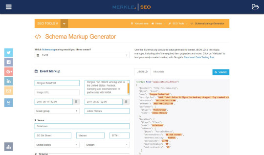
I also want to share Merkle's new, free, supercalifragilisticexpialidocious Structured Data Markup Generator. It contains Google's top markups with an incredibly user-friendly experience and all of the top item properties. This tool is a great support for starting your markups, and it's great for individuals looking to reverse-engineer markups. It offers JSON-LD and some illustrative microdata markups. You can also send the generated markups directly to Google's structured data testing tool.
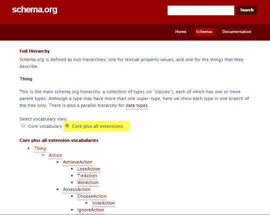
If you're looking to go beyond Google's recommendations and structure more data, check out Schema.org's Full Hierarchy. This is a full list of all Schema.org's core and extended vocabulary (i.e., a list of all item types). This page is very useful to determine additional opportunities for markup that may align with your structured data strategy. Tip: Click Core plus all extensions to see extended Schema.org's libraries and what's in the pipeline.
Last but not least is Google's Structured Data Testing Tool. It is vital to check every markup with GSDTT for two reasons:
To avoid silly syntactic mistakes (don't let commas be your worst enemy - there are way better enemies out there ).
Ensure all required item properties are included
As an example, I'm going to walk through the Aquarium item type Schema.org markup. For illustrative purposes, I'm going to stick with JSON-LD moving forward; however, if there are any microdata questions, please reach out in the comments.
Basic structure of all Schema.org pages
When you first enter a Schema.org item type's page, notice that every page has the same layout, starting with the item type name, the canonical reference URL (currently the HTTP version*), where the markup lives within the Schema.org hierarchy, and that item type's usage on the web.

*Leveraging the HTTPS version of a Schema.org markup is acceptable
What is an item type?
An item type is a piece of Schema.org's vocabulary of data used to annotate and structure elements on a web page. You can think about it as what you're marking up.
At the highest level of most Schema.org item types is Thing (alternatively, we'd be looking at DataType). This intuitively makes sense because almost everything is, at its highest level of abstraction, a Thing. The item type Thing has multiple children, all of which assume Thing's properties in a cascading in a hierarchical fashion (i.e., a Product is a Thing, both can have names, descriptions, and images).
Explore Schema.org's item types here with the various visualizations:
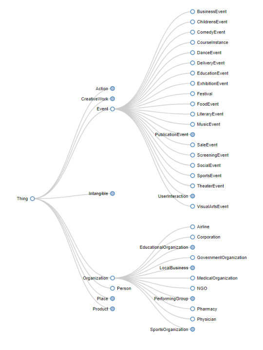
https://technicalseo.com/seo-tools/schema-markup-generator/visual/
Item types are going to be the first attribute in your markup and will look a little like this (remember this for a little later):

Tip: Every Schema.org item type can be found by typing its name after Schema.org, i.e. http://schema.org/Aquarium (note that case is important).
Below, this is where things start to get fun - the properties, expected type, and description of each property.

What are item properties?
Item properties are attributes, which describe item types (i.e., it's a property of the item). All item properties are inherited from the parent item type. The value of the property can be a word, URL, or number.

What is the "Expected Type"?
For every item type, there is a column the defines the expected item type of each item property. This is a signal which tells us whether or not nesting will be involved. If the expected property is a data type (i.e., text, number, etc.) you will not have to do anything; otherwise get ready for some good, old-fashioned nesting.
One of the things you may have noticed: under Property it says Properties from CivicStructure. We know that an Aquarium is a child of CivicStructure, as it is listed above. If we scan the page, we see the following Properties from:

This looks strikingly like the hierarchy listed above and it is (just vertical and backward). Only one thing is missing where are the Properties from Aquarium?
The answer is actually quite simple - Aquarium has no item properties of its own. Therefore, CivilStructures (being the next most specific item type with properties) is listed first.
Structuring this information with more specific properties at the top makes a ton of sense intuitively. When marking up information, we are typically interested in the most specific item properties, ones that are closest conceptually to the thing we're marking up. These properties are generally the most relevant.
Creating a markup
Open the Schema.org item type page.
In this case, we'll go to http://schema.org/Aquarium.
Review all item properties and select all relevant attributes.
After looking at the documentation, openingHours, address, aggregateRating, telephone, alternateName, description, image, name, and sameAs (social media linking item property) stood out as the most cogent and useful for aquarium goers. In an effort to map out all of the information, I added the Expected Type (which will be important in the next step) and the value of the information we're going to markup.

Add the starting elements of all markup.
All markup, whether JSON-LD or microdata, starts with the same set of code/markup. One can memorize this code or leverage examples and copy/paste.
JSON-LD: Add the script tag with the JSON-LD type, along with the @context, and @type with the item type included:

Start light. Add the easier item properties (i.e., the ones that don't require nesting).
First off, how do you tell whether or not the property nests?
This is where the Expected Type column comes into play.
If the Expected Type is Text, URL, or Number - you don't need to nest.
I've highlighted the item properties that do not require nesting above in green. We'll start by adding these to our markup.
JSON-LD: Contains the item property in quotation marks, along with the value (text and URLs are always in quotation marks). If there are multiple values, they're listed as arrays within square [brackets].
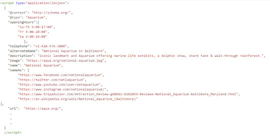
Finish strong. Add the nested item properties.
Nested item properties are item types within item types. Through nesting, we can access the properties of the nested item type.
JSON-LD: Nested item properties start off like normal item properties; however, things get weird after the colon. A curly brace opens up a new world. We start by declaring a new item type and thus, inside these curly braces all item properties now belong to the new item type. Note how commas are not included after the last property.
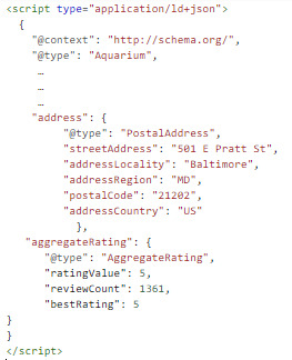
Test in Google's Structured Data Testing Tool.
Looks like we're all good to go, with no errors and no warnings.
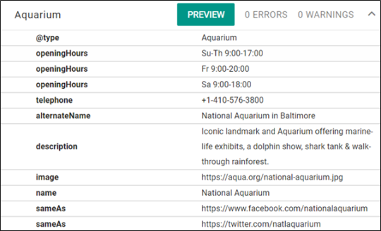
Side notes:
*address: Google's documentation list address, nested within PostAddress as a requirement. This is a good indicator of why it's important to review Google's documentation.
openingHours: Multiple times are listed out in an array (as indicated by the square brackets). As the documentation's Description section mentions using a hyphen for ranges and military time.
Note: Google's documentation uses the openingHoursSpecification item property, which nests OpeningHoursSpecification. This is a good example where Google documentation shows a more specific experience to consider.
telephone: Sometimes you need to add a country code (+1) for phone numbers.
image: URLs must be absolute (i.e., protocol and domain name included).
TL;DR:
Schema.org's documentation can be leveraged to supplement Google's structured data documentation
The Expected Type on Schema.org tells you when you need to nest an item type
Check out Merkle's Structured Data Markup Generator if you want to try simply inserting values and getting a preliminary markup
Thanks!
A huge thanks to Max Prin (@maxxeight), Adam Audette (@audette), and the @MerkleCRM team for reviewing this article. Plus, shout outs to Max (again), Steve Valenza (#TwitterlessSteve), and Eric Hammond (@elhammond) for their work, ideas, and thought leadership that went into the Schema Generator Tool!
Sign up for The Moz Top 10, a semimonthly mailer updating you on the top ten hottest pieces of SEO news, tips, and rad links uncovered by the Moz team. Think of it as your exclusive digest of stuff you don't have time to hunt down but want to read!
0 notes
Text
Moz's Brand-New SEO Learning Center Has Landed!
Posted by rachelgooodmanmoore
CHAPTER 1: A New Hope
A long time ago in a galaxy far, far away, marketers who wanted to learn about SEO were forced to mine deep into the caverns of Google search engine result pages to find the answers to even the most simple SEO questions.
Then, out of darkness came a new hope (with a mouthful of a name):

...the Learn SEO and Search Marketing hub!
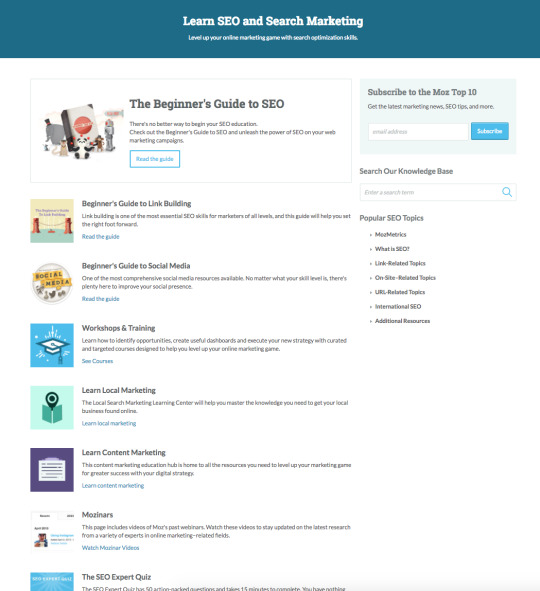
The SEO and Search Marketing hub housed resources like the Beginner's Guide to SEO and articles about popular SEO topics like meta descriptions, title tags, and robots.txt. Its purpose was to serve as a one-stop-shop for visitors looking to learn what SEO was all about and how to use it on their own sites.
The Learn SEO and Search marketing hub would go on to serve as a guiding light for searchers and site visitors looking to learn the ropes of SEO for many years to come.
CHAPTER 2: The Learning Hub Strikes Back
Since its inception in 2010, this hub happily served hundreds of thousands of Internet folk looking to learn the ropes of SEO and search marketing. But time took its toll on the hub. As marketing and search engine optimization grew increasingly complex, the Learning Hub lapsed into disrepair. While new content was periodically added, that content was hard to find and often intermingled with older, out-of-date resources. The Learning Hub became less of a hub and more of a list of resources some of which were also lists of resources.

Offshoots like the Local Learning Center and Content Marketing Learning Center sprung up in an effort to tame the overgrown learning hub, but 'twas all for naught: By autumn of 2016, Moz's learning hub sites were a confusing nest of hard-to-navigate articles, guides, and 404s. Some articles were written for SEO experts and explained concepts in extensive, technical detail, while others were written for an audience with less extensive SEO knowledge. It was impossible to know which type of article you found yourself in before you wound up confused or discouraged.
What had once been a useful resource for marketers of all backgrounds was languishing in its age.
CHAPTER 3: The Return of the Learning Center
The vision behind the SEO and Search Marketing Hub had always been to educate SEOs and search marketers on the skills they needed to be successful in their jobs. While the site section continued to serve that purpose, somewhere along the along the way we started getting diminishing returns.
Our mission, then, was clear: Re-invent Moz's learning resources with a new structure, new website, and new content.
As we set off on this mission, one thing was clear: The new Learning Center should serve as a home base for marketers and SEOs of all skill levels to learn what's needed to excel in their work: from the fundamentals to expert-level content, from time-tested tenets of SEO success to cutting-edge tactics and tricks. If we weren't able to accomplish this, our mission would all be for naught.
We also believed that a new Learning Center should make it easy for visitors of all skill levels and learning styles to find value: from those folks who want to read an article then dive into their work; to those who want to browse through libraries of focused SEO videos; to folks who want to learn from the experts in hands-on webinars.
So, that's exactly what we built.
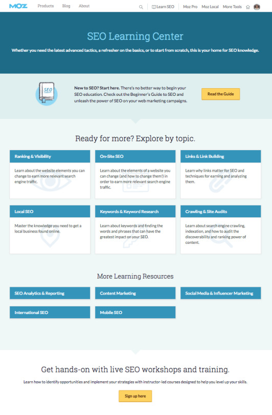
May we introduce to you the (drumroll, please) brand new, totally rebuilt SEO Learning Center!

Unlike the list of lists in the old Learn SEO and Search Marketing hub, the new Learning Center organizes content by topic.
Each topic has its own topic hub. There are eleven of these and they cover:
Ranking and Visibility
On-Site SEO
Links and Link Building
Local SEO
Keywords and Keyword Research
Crawling and Site Audits
Analytics and Reporting
Content Marketing
Social Media and Influencer Marketing
International SEO
Mobile SEO
Each of the eleven topic hubs host a slew of hand-picked articles, videos, blog posts, webinars, Q&A posts, templates, and training classes designed to help you dive deeper into your chosen SEO topic.
All eleven of the hubs contain a fundamentals menu to help you wrap your brain around a topic, as well as a content feed with hundreds of resources to help you go even further. These feed resources are filterable by topic (for instance, content that's about both ranking & visibility AND local SEO), SEO skill level (from beginner to advanced), and format.
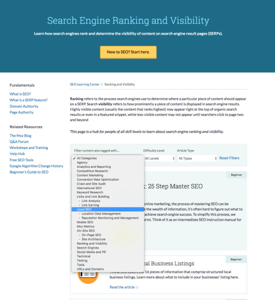
Use the Learning Center's filters to zero in on exactly the content you're looking for.
And, if you're brand new to a topic or not sure where to start, you can always find a link to the Beginner's Guide to SEO right at the top of each page.
But we can only explain so much in words - check it out for yourself:
Visit the new SEO Learning Center!
CHAPTER 4: The Content Awakens
One of the main motivations behind rebuilding the Learning Center website was to make it easier for folks to find and move through a slew of educational content, be that a native Learning Center article, a blog post, a webinar, or otherwise. But it doesn't do any good to make content easier to find if that content is totally out-of-date and unhelpful.

In addition to our mission to build a new Learning Center, we've also been quietly updating our existing articles to include the latest best practices, tactics, strategies, and resources. As part of this rewrite, we've also made an effort to keep each article as focused as possible around specifically one topic - a complete explanation of everything someone newer to the world of SEO needs to know about the given topic. What did that process look like in action? Check it out:
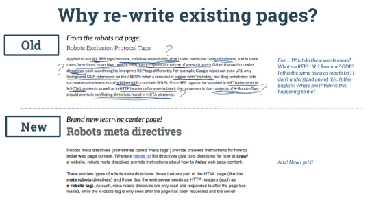
As of now we've updated 50+ articles, with more on the way!
Going forward, we'll continue to iterate on the search experience within the new Learning Center. For example, while we always have our site search bar available, a Learning Center-specific search function would make finding articles even easier - and that's just one of our plans for the future. Bigger projects include a complete update of the Beginner's Guide to SEO (keep an eye on the blog for more news there, too), as well as our other introductory guides.
Help us, Moz-i Wan Community, you're our only hope
We've already telekinetically moved mountains with this project, but the Learning Center is your resource - we'd love to hear what you'd like to see next, or if there's anything really important you think we've missed. Head over, check it out, and tell us what you think in the comments!
Explore the new SEO Learning Center!
Sign up for The Moz Top 10, a semimonthly mailer updating you on the top ten hottest pieces of SEO news, tips, and rad links uncovered by the Moz team. Think of it as your exclusive digest of stuff you don't have time to hunt down but want to read!
0 notes
Text
The Beginner's Guide to Structured Data for SEO: How to Implement Structured Data [Part 2]
Posted by bridget.randolph
Welcome to Part 2 of The Beginner's Guide to Structured Data: How to Implement Structured Data for SEO. In Part 1, we focused on gaining a high-level understanding of what structured data is and how it can be used to support SEO efforts.
(If you missed Part 1, you can go check it out here).
In Part 2, we'll be looking at the steps to identify opportunities and implement structured data for SEO on your website. Since this is an introductory guide, I'll be focusing on the most basic types of markup you can add and the most common use cases, and providing resources with additional detail for the more technical aspects of implementation.
Is structured data right for you?
Generally speaking, implementing structured data for SEO is worthwhile for most people. However, it does require a certain level of effort and resources, and you may be asking yourself whether it's worth prioritizing.
Here are some signs that it's a good time to prioritize structured data for SEO:
Search is a key value-driving channel for your business
You've recently audited your site for basic optimization issues and you know that you've achieved a competitive baseline with your keyword targeting, backlinks profile, site structure, and technical setup
You're in a competitive vertical and need your results to stand out in the SERPs
You want to use AMP (Accelerated Mobile Pages) as a way to show up in featured areas of the SERP, including carousels
You have a lot of article-style content related to key head terms (e.g. 10 chicken recipes) and you'd like a way to display multiple results for those terms in the SERP
You're ranking fairly well (position 15 or higher) already for terms with significant search volume (500050,000 searches/month)*
You have solid development resources with availability on staff and can implement with minimal time and financial investment
You're in any of the following verticals: e-commerce, publishing, educational products, events/ticketing, creative production, TV/movie/book reviews, job listings, local business
*What is considered significant volume may vary according to how niche your market is.
If you said yes to any of these statements, then implementing structured data is particularly relevant to you! And if these criteria don't currently apply to you, of course you can still go ahead and implement; you might have great results. The above are just a few of the most common indicators that it's a worthwhile investment.
Implementing structured data on your site
In this guide, we will be looking solely at opportunities to implement Schema.org markup, as this is the most extensive vocabulary for our purposes. Also, because it was developed by the search engine companies themselves, it aligns with what they support now and should continue to be the most supported framework going forward.
How is Schema.org data structured?
The way that the Schema.org vocabulary is structured is with different types (Recipe, Product, Article, Person, Organization, etc.) that represent entities, kinds of data, and/or content types.
Each Type has its own set of properties that you can use to identify the attributes of that item. For example, a Recipe Type includes properties like image, cookTime, nutritionInformation, etc. When you mark up a recipe on your site with these properties, Google is able to present those details visually in the SERP, like this:
Image source
In order to mark up your content with Schema.org vocabulary, you'll need to define the specific properties for the Type you're indicating.
For example:
If you're marking up a recipe page, you need to include the title and at least two other attributes. These could be properties like:
aggregateRating: The averaged star rating of the recipe by your users
author: The person who created the recipe
prepTime: The length of time required to prepare the dish for cooking
cookTime: The length of time required to cook the dish
datePublished: Date of the article's publication
image: An image of the dish
nutritionInformation: Number of calories in the dish
review: A review of the dish
...and more.
Each Type has different required properties in order to work correctly, as well as additional properties you can include if relevant. (You can view a full list of the Recipe properties at Schema.org/Recipe, or check out Google's overview of Recipe markup.)
Once you know what Types, properties and data need to be included in your markup, you can generate the code.
The code: Microdata vs JSON-LD
There are two common approaches to adding Schema.org markup to your pages: Microdata (in-line annotations added directly to the relevant HTML) and JSON-LD (which uses a Javascript script tag to insert the markup into the head of the page).
JSON-LD is Google's recommended approach, and in general is a cleaner, simpler implementation... but it is worth noting that Bing does not yet officially support JSON-LD. Also, if you have a Wordpress site, you may be able to use a plugin (although be aware that not all of Wordpress' plugins work they way they're supposed to, so it's especially important to choose one with good reviews, and test thoroughly after implementation).
Whatever option you choose to use, always test your implementation to make sure Google is seeing it show up correctly.
What does this code look like?
Let's look at an example of marking up a very simple news article (Schema.org/NewsArticle).
Here's the article content (excluding body copy), with my notes about what each element is:
[posted by publisher 'Google'] [headline]Article Headline [author byline]By John Doe [date published] Feb 5, 2015 [description] A most wonderful article [image] [company logo]
And here's the basic HTML version of that article:
Article headline
By John Doe
If you use Microdata, you'll nest your content inside the relevant meta tags for each piece of data. For this article example, your Microdata code might look like this (within the
of the page):
Article headline
By John Doe
A most wonderful article
The JSON-LD version would usually be added to the
of the page, rather than integrated with the content (although adding it in the is still valid).
JSON-LD code for this same article would look like this:
{ "@context": "http://schema.org", "@type": "NewsArticle", "mainEntityOfPage": { "@type": "WebPage", "@id": "https://google.com/article" }, "headline": "Article headline", "image": { "@type": "ImageObject", "url": "https://google.com/thumbnail1.jpg", "height": 800, "width": 800 }, "datePublished": "2015-02-05T08:00:00+08:00", "dateModified": "2015-02-05T09:20:00+08:00", "author": { "@type": "Person", "name": "John Doe" }, "publisher": { "@type": "Organization", "name": "Google", "logo": { "@type": "ImageObject", "url": "https://google.com/logo.jpg", "width": 600, "height": 60 } }, "description": "A most wonderful article" }
This is the general style for Microdata and JSON-LD code (for Schema.org/Article). The Schema.org website has a full list of every supported Type and its Properties, and Google has created feature guides with example code for the most common structured data use cases, which you can use as a reference for your own code.
How to identify structured data opportunities (and issues)
If structured data has previously been added to your site (or if you're not sure whether it has), the first place to check is the Structured Data Report in Google Search Console.
This report will tell you not only how many pages have been identified as containing structured data (and how many of these have errors), but may also be able to identify where and/or why the error is occurring. You can also use the Structured Data Testing Tool for debugging any flagged errors: as you edit the code in the tool interface, it will flag any errors or warnings.
If you don't have structured data implemented yet, or want to overhaul your setup from scratch, the best way to identify opportunities is with a quick content audit of your site, based on the kind of business you have.
A note on keeping it simple
There are lots of options when it comes to Schema.org markup, and it can be tempting to go crazy marking up everything you possibly can. But best practice is to keep focused and generally use a single top-level Type on a given page. In other words, you might include review data on your product page, but the primary Type you'd be using is Schema.org/Product. The goal is to tell search engines what this page is about.
Structured data must be representative of the main content of the page, and marked up content should not be hidden from the user. Google will penalize sites which they believe are using structured data markup in scammy ways.
There are some other general guidelines from Google, including:
Add your markup to the page it describes (so Product markup would be added to the individual product page, not the homepage)
For duplicated pages with a canonical version, add the same markup to all versions of the page (not just the canonical)
Don't block your marked-up pages from search engines
Be as specific as possible when choosing a Type to add to a page
Multiple entities on the same page must each be marked up individually (so for a list of products, each product should have its own Product markup added)
As a rule, you should only be adding markup for content which is being shown on the page you add it to
So how do you know which Schema.org Types are relevant for your site? That depends on the type of business and website you run.
Schema.org for websites in general
There are certain types of Schema.org markup which almost any business can benefit from, and there are also more specific use cases for certain types of business.
General opportunities to be aware of are:
Organization: use Organization markup on your homepage to indicate that your website is a brand site.
Knowledge Graph content: brand information (logo, social profiles) as well as your business mailing address, and corporate contact info (like phone numbers) can be marked up on the homepage and appear in a Knowledge Graph box in branded search:
Sitelinks Search Box: if you have search functionality on your site, you can add markup which enables a search box to appear in your sitelinks:
Image source
Breadcrumbs: get breadcrumbs in the SERP:
Image source
VideoObject: if you have video content on your site, this markup can enable video snippets in SERPs, with info about uploader, duration, a thumbnail image, and more:
A note about Star reviews in the SERP
You'll often see recommendations about marking up your reviews to get star ratings in the SERP results. Reviews have their own type, Schema.org/Review, with properties that you'll need to include; but they can also be embedded into other types using that type's review property.
You can see an example of this above, in the Recipes image, where some of the recipes in the SERP display a star rating. This is because they have included the aggregate user rating for that recipe in the review property within the Schema.org/Recipe type.
You'll see a similar implementation for other properties which have their own type, such as Schema.org/Duration, Schema.org/Date, and Schema.org/Person. It can feel really complicated, but it's actually just about organizing your information in terms of category > subcategory > discrete object.
If this feels a little confusing, it might help to think about it in terms of how we define a physical thing, like an ingredient in a recipe. Chicken broth is a dish that you can make, and each food item that goes into making the chicken broth would be classified as an ingredient. But you could also have a recipe that calls for chicken broth as an ingredient. So depending on whether you're writing out a recipe for chicken broth, or a recipe that includes chicken broth, you'll classify it differently.
In the same way, attributes like Review, Date, and Duration can be their own thing (Type), or a property of another Type. This is just something to be aware of when you start implementing this kind of markup. So when it comes to markup for reviews, unless the page itself is primarily a review of something, you'll usually want to implement Review markup as a property of the primary Type for the page.
In addition to this generally applicable markup, there are certain Schema.org Types which are particularly helpful for specific kinds of businesses:
E-commerce
including online course providers
Recipes Sites
Publishers
Events/Ticketing Sites
including educational institutions which offer courses
Local Businesses
Specific Industries (small business and larger organizations)
Creative Producers
Schema.org for e-commerce
If you have an e-commerce site, you'll want to check out:
Product: this allows you to display product information, such as price, in the search result. You can use this markup on an individual product page, or an aggregator page which shows information about different sellers offering an individual product.
Online Courses: If your product is an online course, you can use the Schema.org/Course type to get more specific snippets.
Offer: this can be combined with Schema.org/Product to show a special offer on your product (and encourage higher CTRs).
Review: if your site has product reviews, you can aggregate the star ratings for each individual product and display it in the SERP for that product page, using Schema.org/aggregateRating.
Things to watch out for
Product markup is designed for individual products, not lists of products. If you have a category page and want to mark it up, you'll need to mark up each individual product on the page with its own data.
Review markup is designed for reviews of specific items, goods, services, and organizations. You can mark up your site with reviews of your business, but you should do this on the homepage as part of your organization markup.
If you are marking up reviews, they must be generated by your site, rather than via a third-party source.
Course markup should not be used for how-to content, or for general lectures which do not include a curriculum, specific outcomes, or a set student list.
Schema.org for recipes sites
For sites that publish a lot of recipe content, Recipe markup is a fantastic way to add additional context to your recipe pages and get a lot of visual impact in the SERPs.
Things to watch out for
If you're implementing Recipe Rich Cards, you'll want to be aware of some extra guidelines:
You'll have to build AMP versions of your recipes pages
If you want to have a host carousel/list with multiple recipes for the same keyword, you must have a summary page that lists all the recipes in that collection (e.g. chicken recipes), and use ItemList markup to summarize recipes.
See Mark Up Your Lists for more detail on this.
Schema.org for publishers
If you have an publisher site, you'll want to check out the following:
Article and its subtypes,
NewsArticle: this indicates that the content is a news article
BlogPosting: similar to Article and NewsArticle, but specifies that the content is a blog post
Fact Check: If your site reviews or discusses claims made by others, as Google diplomatically puts it, you can add a fact check to your snippet using the Schema.org/ClaimReview.
Image source
CriticReview: if your site offers critic-written reviews of local businesses (such as a restaurant critic's review), books, and /or movies, you can mark these up with Schema.org/CriticReview.
Note that this is a feature being tested, and is a knowledge box feature rather than a rich snippet enhancement of your own search result.
Image source
Things to watch out for...
If you use AMP (Accelerated Mobile Pages) or are considering implementing this feature, you'll need to a) make sure you include structured data on your AMP versions, and b) you'll need Articles markup on your canonical version if you want to make it into the Top Stories AMP carousel.
Google has some additional guidelines around accessibility for Articles (pagination, canonicalization, restricted content, and First Click Free).
Schema.org for events/ticketing sites
If your business hosts or lists events, and/or sells tickets, you can use:
Events: you can mark up your events pages with Schema.org/Event and get your event details listed in the SERP, both in a regular search result and as instant answers at the top of the SERP:
Courses: If your event is a course (i.e., instructor-led with a student roster), you can also use Schema.org/Course markup.
Things to watch out for...
Don't use Events markup to mark up time-bound non-events like travel packages or business hours.
As with products and recipes, don't mark up multiple events listed on a page with a single usage of Event markup.
For a single event running over several days, you should mark this up as an individual event and make sure you indicate start and end dates;
For an event series, with multiple connected events running over time, mark up each individual event separately.
Course markup should not be used for how-to content, or for general events/lectures which do not include a curriculum, specific outcomes, and an enrolled student list.
Schema.org for job sites
If your site offers job listings, you can use Schema.org/JobPosting markup to appear in Google's new Jobs listing feature:
Note that this is a Google aggregator feature, rather than a rich snippet enhancement of your own result (like Google Flights).
Things to watch out for...
Mark up each job post individually, and do not mark up a jobs listings page.
Include your job posts in your sitemap, and update your sitemap at least once daily.
You can include Review markup if you have review data about the employer advertising the job.
Schema.org for local businesses
If you have a local business or a store with a brick-and-mortar location (or locations), you can use structured data markup on your homepage and contact page to help flag your location for Maps data as well as note your local status:
LocalBusiness: this allows you to specify things like your opening hours and payment accepted
PostalAddress: this is a good supplement to getting all those NAP citations consistent
OrderAction and ReservationAction: if users can place orders or book reservations on your website, you may want to add action markup as well.
You should also get set up with GoogleMyBusiness.
Additional resources for local business markup
Here's an article from Whitespark specifically about using Schema.org markup and JSON-LD for local businesses, and another from Phil Rozek about choosing the right Schema.org Type. For further advice on local optimization, check out the local SEO learning center and this recent post about common pitfalls.
Schema.org for specific industries
There are certain industries and/or types of organization which get specific Schema.org types, because they have a very individual set of data that they need to specify. You can implement these Types on the homepage of your website, along with your Brand Information.
These include LocalBusiness Types:
AnimalShelter
AutomotiveBusiness
ChildCare
Dentist
DryCleaningOrLaundry
EmergencyService
EmploymentAgency
EntertainmentBusiness
FinancialService
FoodEstablishment
GovernmentOffice
HealthAndBeautyBusiness
HomeAndConstructionBusiness
InternetCafe
LegalService
Library
LodgingBusiness
ProfessionalService
RadioStation
RealEstateAgent
RecyclingCenter
SelfStorage
ShoppingCenter
SportsActivityLocation
Store
TelevisionStation
TouristInformationCenter
TravelAgency
And a few larger organizations, such as:
Airline
Corporation
EducationalOrganization
GovernmentOrganization
LocalBusiness
MedicalOrganization
NGO
PerformingGroup
SportsOrganization
Things to watch out for
When you're adding markup that describes your business as a whole, it might seem like you should add that markup to every page on the site. However, best practice is to add this markup only to the homepage.
Schema.org for creative producers
If you create a product or type of content which could be considered a creative work (e.g. content produced for reading, viewing, listening, or other consumption), you can use CreativeWork markup.
More specific types within CreativeWork include:
Book
Course
Episode
Game
Movie
MusicComposition
MusicPlaylist
MusicRecording
Painting
Photograph
Sculpture
SoftwareApplication
TVSeason
TVSeries
VisualArtwork
...and several others.
Schema.org new features (limited availability)
Google is always developing new SERP features to test, and you can participate in the testing for some of these. For some, the feature is an addition to an existing Type; for others, it is only being offered as part of a limited test group. At the time of this writing, these are some of the new features being tested:
Actions
Books
Podcasts
Datasets
Music
Software Apps
Top Places Lists (Publishers)
Live Coverage(Publishers)
Structured data beyond SEO
As mentioned in Part 1 of this guide, structured data can be useful for other marketing channels as well, including:
Social Cards
Email markup
AdWords
For more detail on this, see the section in Part 1 titled: Common Uses for Structured Data.
How to generate and test your structured data implementation
Once you've decided which Schema.org Types are relevant to you, you'll want to add the markup to your site. If you need help generating the code, you may find Google's Data Highlighter tool useful. You can also try this tool from Joe Hall. Note that these tools are limited to a handful of Schema.org Types.
After you generate the markup, you'll want to test it at two stages of the implementation using the Structured Data Testing Tool from Google - first, before you add it to the site, and then again once it's live. In that pre-implementation test, you'll be able to see any errors or issues with the code and correct before adding it to the site. Afterwards, you'll want to test again to make sure that nothing went wrong in the implementation.
In addition to the Google tools listed above, you should also test your implementation with Bing's Markup Validator tool and (if applicable) the Yandex structured data validator tool. Bing's tool can only be used with a URL, but Yandex's tool will validate a URL or a code snippet, like Google's SDT tool.
You can also check out Aaron Bradley's roundup of Structured Data Markup Visualization, Validation, and Testing Tools for more options.
Once you have live structured data on your site, you'll also want to regularly check the Structured Data Report in Google Search Console, to ensure that your implementation is still working correctly.
Common mistakes in Schema.org structured data implementation
When implementing Schema.org on your site, there are a few things you'll want to be extra careful about. Marking up content with irrelevant or incorrect Schema.org Types looks spammy, and can result in a spammy structured markup penalty from Google. Here are a few of the most common mistakes people make with their Schema.org markup implementation:
Mishandling multiple entities
Marking up categories or lists of items (Products, Recipes, etc) or anything that isn't a specific item with markup for a single entity
Recipe and Product markup are designed for individual recipes and products, not for listings pages with multiple recipes or products on a single page. If you have multiple entities on a single page, mark up each item individually with the relevant markup.
Misapplying Recipes markup
Using Recipe markup for something that isn't food
Recipe markup should only be used for content about preparing food. Other types of content, such as "diy skin treatment or "date night ideas," are not valid names for a dish.
Misapplying Reviews and Ratings markup
Using Review markup to display name content which is not a reviewer's name or aggregate rating
If your markup includes a single review, the reviewer's name must be an actual organization or person. Other types of content, like "50% off ingredients," are considered invalid data to include in the name property.
Adding your overall business rating with aggregateRating markup across all pages on your site
If your business has reviews with an aggregateRating score, this can be included in the review property on your Organization or LocalBusiness.
Using overall service score as a product review score
The review property in Schema.org/Product is only for reviews of that specific product. Don't combine all product or business ratings and include those in this property.
Marking up third-party reviews of local businesses with Schema.org markup
You should not use structured data markup on reviews which are generated via third-party sites. While these reviews are fine to have on your site, they should not be used for generating rich snippets. The only UGC review content you should mark up is reviews which are displayed on your website, and generated there by your users.
This is a relatively recent update to the guidelines.
General errors
Using organization markup on multiple pages/pages other than the homepage
It might seem counter-intuitive, but organization and LocalBusiness markup should only be used on the pages which are actually about your business (e.g. homepage, about page, and/or contact page).
Improper nesting
This is why it's important to validate your code before implementing. Especially if you're using Microdata tags, you need to make sure that the nesting of attributes and tags is done correctly.
So there you have it - a beginner's guide to understanding and implementing structured data for SEO! There's so much to learn around this topic that a single article or guide can't cover everything, but if you've made it to the end of this series you should have a pretty good understanding of how structured data can help you with SEO and other marketing efforts. Happy implementing!
Sign up for The Moz Top 10, a semimonthly mailer updating you on the top ten hottest pieces of SEO news, tips, and rad links uncovered by the Moz team. Think of it as your exclusive digest of stuff you don't have time to hunt down but want to read!
0 notes
Text
The Future Of Health Care Could Be Humans, Robots - Or Both

Minerva Studio / Getty Images
At the well-funded startup Omada Health, coaches teach patients to prevent diabetes by eating better and exercising. They don't meet face-to-face, but communicate over the internet - and the coaches are increasingly aided by a machine-learning-powered software that provides cues for interacting with the patients.
Since the San Francisco company was founded in 2011, these coaches were a mix of full- and part-time staffers. But in November, Omada let go of all the part-timers and instructed the remaining coaches to rely more on the software, the company told BuzzFeed News.
CEO Sean Duffy insists that his long-term goal isn't to replace people with software. The thesis is that we don't think we'll ever be at a point in Omada's trajectory where we'll ever take people or coaches out of the equation, he told BuzzFeed News. But they've got really smart systems to help them.
Like many other tech-enabled health care services that connect patients with experts - coaches, therapists, nurses, doctors - over video chat, email, and text, Omada is trying to navigate a fundamental shift in labor. People are expensive - at least compared to automated, data-driven chatbots that could give advice and diagnose diseases without needing a salary or a college degree. But bots aren't nearly as good at holding conversations, perceiving emotions and subtext, and delivering sensitive information like, say, a cancer diagnosis. If they want to grow, startups will have to figure out whether their patients and businesses alike will be best served by man, machine, or some blend of the two.
There's a spectrum of totally autonomous machine learning and the other side is totally human-driven, said Mike McCormick, principal at Comet Labs, a venture capital firm that invests in artificial intelligence startups. And then there's every shade of gray in the middle of that.
The previously unreported cuts at Omada last fall were small, and affected 10 to 12 part-time coaches, according to a spokesperson. It has about 60 to 70 full-time coaches and 250 employees overall. In another set of layoffs that Duffy said were unrelated, the startup also laid off roughly 20 workers last week, saying it had to focus on Omada's core business and expertise, while orienting the company for long-term success. Omada has raised $125 million in venture capital, including $50 million this month in a round led by the health insurer Cigna.
There's a spectrum of totally autonomous machine learning and the other side is totally human-driven.
Duffy said that as Omada has treated more patients and collected more of their data, it's trained an algorithm to detect important behavioral changes. For example, if a person weighed in on a digital scale every day consistently, then stopped weighing in for three days, the system would flag the coach. It'd then suggest messages they might send to a participant that might result in an outcome - in this case, to find out how a person is doing and why they're skipping weigh-ins, Duffy said.
The CEO was quick to note that the machine isn't prewriting messages down to the word, but rather suggesting a gist to convey. He said that users could tell when a nominally human-written message is computer-generated, and that this makes them lose trust in the system.
Coaches can also say no. If we get enough coaches declining these suggestions and saying, 'That violated my intuition as a human being,' it trains the system to get better and better and give better and better suggestions, he said.
The part-timers had access to this technology, but Duffy said that the company benefited more from having full-timers who are constantly involved and invested in improving it.
Omada isn't the only company exploring how to use AI to improve health care. Startups like Babylon Health, HealthTap, and Remedy are developing chatbots to assess patients' symptoms. Big Health has an entirely automated program called Sleepio, which stars a cartoon professor and is designed to help people with severe insomnia. But these nascent technologies are too new to definitively prove that machines can improve health more than humans can.
To survive, any kind of virtual health service will have to prove that it can get people to sign up, stay involved, and actually improve their health, said Liz Rockett, director of Kaiser Permanente Ventures, which has invested in both Omada and Big Health. Doing the work of proving efficacy and reach is the best way to define that line of what works and what doesn't including on the question of using coaches in the delivery or having an all-virtual offering, she wrote in an email to BuzzFeed News.
For now, there are way more people-to-people telemedicine services. Ginger.io initially tried to infer behavioral patterns and mental health problems from passively tracked smartphone data, but switched to a text and video-chat model with human therapists.
So in 5 to 10 years, will patients be more likely to interact with a human or a chatbot when they open up a health app? It'll largely depend on how high stakes the situation is, McCormick said. You'd want to hear that you have cancer from a trained expert with an extremely high degree of accuracy and emotional sensitivity. But for, say, nutrition coaching, he said, maybe people are ready now ... It has to be nuanced.
0 notes
Text
3 Not-So-SEO-Friendly Trends to Watch Out For
Posted by Daniel_Marks
It seems like every couple months (weeks?) there's a new post predicting the end of SEO:
But rather than proclaiming that SEO is already dead (it's not), let's look at 3 ways in which the SEO industry might eventually die and ways in which SEOs can prepare themselves.
1. New ads
Google is constantly experimenting with new ad formats that actually provide a better user experience than organic results. The better the ads, the less traffic that will be captured by organic listings. What are some examples of when PPC ads provide a better UX than organic results?
Finding service providers in select cities:
Google has rolled out home service ads to a few markets as a way of making it easier to find various contractors. Even sites with incredible local SEO will have a hard time competing with the convenience of these ads, not to mention the extremely valuable endorsement by Google.
More info: Google Home Services Ads Launch In AdWords Express
Researching cars:
This is a relatively simple example of Google providing a bunch of relevant information directly in the SERPs with a simple interface that will, inevitably, come at the expense of people clicking through to organic listings about car reviews, details, dealerships, etc. I suspect that Google will continue rolling out these rich, informational interfaces to high-value verticals such as credit cards, mortgages, legal services, and so on.
More info: Google launches its giant mobile search ads for automakers in the US
Finding flights:
It's hard to imagine such a prominent, compelling interface not sucking up a decent amount of organic clicks. Google Flights has also likely contributed to the fact that Google earns twice as much travel-related revenue as Expedia.
App discovery
This is one of the most ambitious ad interfaces that Google offers - you can literally play apps directly within Google! No need to download the app or click through to a site. It's incredible.
Image source
SEO hasn't traditionally been a huge driver of app discovery, so app streaming for games specifically might not be that disruptive to SEOs, but you can imagine this functionality being rolled out for all sorts of purposes. For example, instead of building functionality similar to Google Flights, maybe Google could simply send you to the Kayak app interface within search results and piggyback off the improved user experience of apps dedicated to one specific purpose.
More info: Google Adds NEW Interactive Ad Format Targeting Gamers
Searching for products
As interesting as the previous examples were, the most dangerous Google ad products for most SEOs would likely be the different ones related to product discovery.
Product Listing Ads (PLAs), for example, offer a fairly basic interface relative to the previously mentioned examples, but this simplicity makes them very dangerous because it makes them so easy to scale. Google doesn't need to build a bespoke solution for different verticals or sets of queries.
It's not hard to imagine a future where product queries on Google simply return a large set of product cards with the option to buy directly within the Google interface. The pieces are already there with PLAs and the limited rollout of the ability to buy directly on Google through select websites. All it would take is Google expanding the number of product cards and the number of sites that offer direct checkout through Google. The implications of a shift like this are hard to overestimate.
These product-related ad interfaces include:
Product Listing Ads (PLAs):
Showcase shopping ads:
More info: Google rolling out major change to PLAs for broad product queries, among other Shopping updates
Buying directly on Google:
More info: Winning the shopping micro-moments
There are other examples of rich ad interfaces (please share some below, as it's always interesting to see more!) and Google has many reasons to continue rolling them out as far and wide as possible:
To attract more clicks: The more compelling the ad, the more people will click on it, the more money Google will make
As a response to ad blockers: Entice users to whitelist Google because their ads are actually a better user experience than organic results
Simply a better UX: Finding a handyman through the new format is easier than navigating the organic results, which makes people happy, which makes Google happy
What can SEOs do about it?
Stay aware of these new ad formats to make sure you're experimenting with those that are relevant to your business
Avoid competing on SERPs that are overtaken by interactive ads
Find ways to differentiate your on-site experience from what Google is offering
Best-case scenario:
Ad-blocking continues to grow and these rich ads remain on a small percentage of overall queries because they're difficult to scale.
2. New search interfaces
What happens when people no longer find what they're looking for by typing in a Google search and clicking through to a result? Some of these alternative interfaces include:
Voice search
It's difficult to rank for a search query that is heavily personalized and has only one result:
Non-Google "search engines"
There are a lot of sites that arguably offer a better search experience for a specific type of query:
Wikipedia – Informational queries
Yelp – Local business queries
Amazon – Transactional queries
Will people shift more and more of their searches to sites that offer a search experience tailor-made to one specific type of query?
"Pre-search," such as Google Now
Google Now effectively tries to give you information you're interested in before ever having to type in a query:
You can imagine quite a few verticals that could be disrupted by improvements to pre-search:
Flights: We know you tend to fly home for the holidays. Instead of searching for "flights to Vancouver," we'll surface some holiday flight deals for you in November.
Entertainment: You don't need to search for a specific movie or play. We'll surface tickets to events we predict you'll be interested in before you ever type in a query.
Food: We know you're walking around at dinnertime and there happens to be an Indian food restaurant nearby which we predict you'd like - let's send you a notification about it.
Products: We know you tend to buy Jordan shoes. Let's show you the latest Jordan release before you ever need to look for it.
Using chatbots
Last but not least, perhaps conversational commerce will actually take off and people will start finding products/information by using chatbots:
Image source
More examples here: 11 Examples of Conversational Commerce and Chatbots in 2016
Shrinking SERPs
This has been well-covered, but Google continues to aggressively enrich organic results such that the mythical “ten blue links” SERP only makes up about 3% of searches:
The expansion of ads above the fold for some queries hasn't helped, either. It's hard to capture organic clicks on a SERP that looks like this (cut off):
These changes are especially impactful on mobile devices which already have limited screen real estate as is.
What can SEOs do about it?
Optimize for whatever “search engine” your users are on. You'll need to understand where your audience is searching for information that might be relevant to your business and then optimize for the platform they're on.
Use structured data. The easier your site is to understand, the more future-proof it'll be.
Avoid competing on SERPs that are overrun by rich interfaces.
Best-case scenario:
These new interfaces consume a relatively small percentage of overall searches. They might continue to cover more and more informational queries (“when is Mother's day 2017?”), and personal ones (“set an alarm for 7am”), but transactional queries (“new Jordan shoes”) remain on conventional screens because ultimately, finding products through voice search or a chatbot might not be the most enjoyable experience:
1/ Conversational commerce is unproven, even in Asia. If texting takes more time than clicking a button on a webview, why is it better? - Connie Chan (@conniechan) April 1, 2016
3. New Google?
Google could potentially become so good at understanding websites that you don't need to worry about SEO. Good user experience could become 100% indistinguishable from good SEO. Want to use asynchronous JavaScript to render your global nav? Go for it! Want to hide content behind a sign-in wall? No problem! Want to launch your site internationally without hreflang tags? Who cares! Google doesn't really want to reward a site because it knows what rel=canonical is; it wants to reward it because it satisfied a user's intent. Therefore, Google is inherently working to make SEOs obsolete; maybe one day they'll succeed.
What can SEOs do about it?
Broaden your skillset and make sure you're providing value beyond simply optimizing a website for Google.
Best-case scenario:
Google will always need the help of SEOs to understand the Internet.
Despite these threats, I think it's very unlikely that SEO disappears as a discipline anytime soon. I have yet to run into a site that doesn't have large SEO opportunities to capture, given the right projects. I also believe the best-case scenario for each threat is actually the most likely scenario. That being said, it can still be helpful to think through future threats to the SEO industry. Can you think of any others?
Sign up for The Moz Top 10, a semimonthly mailer updating you on the top ten hottest pieces of SEO news, tips, and rad links uncovered by the Moz team. Think of it as your exclusive digest of stuff you don't have time to hunt down but want to read!
0 notes
Text
Why You Should Steal My Daughter's Playbook for Effective Email Outreach
Posted by ronell-smith
During the holidays, my youngest daughter apparently had cabin fever after being in the house for a couple of days. While exiting the bedroom, my wife found the note below on the floor, after the former had slyly slid it under the door.
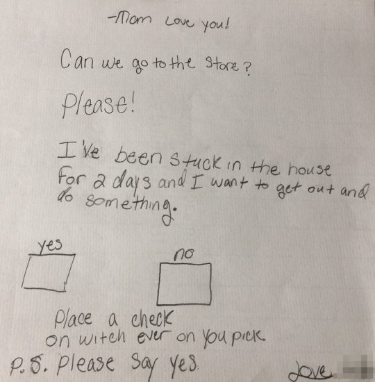
Though tired and not really feeling like leaving the house, we had to reward the youngster for her industriousness. And her charm.
Her effective "outreach" earned plaudits from my wife.
"At least she did it the right way," she remarked. "She cleaned her room, washed dishes, and read books all day, obviously part of an attempt to make it hard for us to say no. After all she did, though, she earned it."
Hmm...
She earned it.
Can you say as much about your outreach?
We're missing out on a great opportunity
Over the last few months, I've been thinking a lot about outreach, specifically email outreach.
It initially got my attention because I see it so badly handled, even by savvy marketers.
But I didn't fully appreciate the significance of the problem until I started thinking about the resulting impact of bad outreach, particularly since it remains one of the best, most viable means of garnering attention, traffic, and links to our websites.
What I see most commonly is a disregard of the needs of the person on the other end of the email.
Too often, it's all about the "heavy ask" as opposed to the warm touch.
Heavy ask: "Hi Ronell ... We haven't met. ... Could you share my article?"
Warm touch: "Hi Ronell ... I enjoyed your Moz post. ... We're employing similar tactics at my brand."
That's it.
You're likely saying to yourself, "But Ronell, the second person didn't get anything in return."
I beg to differ. The first person likely lost me, or whomever else they reach out to to using similar tactics; the second person will remain on my radar.
Outreach is too important to be left to chance or poor etiquette. A few tweaks here and there can help our teams perform optimally.
#1: Build rapport: Be there in a personal way before you need them
The first no-no of effective outreach comes right out of PR 101: Don't let the first time I learn of you or your brand be when you need me. If the brand you hope to attain a link from is worthwhile, you should be on their radar well in advance of the ask.
Do your research to find out who the relevant parties are at the brand, then make it your business to learn about them, via social media and any shared contacts you might have.
Then reach out to them... to say hello. Nothing more.
This isn't the time to ask for anything. You're simply making yourself known, relevant, and potentially valuable down the road.
Notice how, in the example below, the person emailing me NEVER asks for anything?
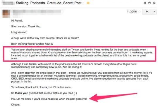
The author did three things that played big. She...
Mentioned my work, which means she'd done her homework
Highlighted work she'd done to create a post
Didn't assume I would be interested in her content (we'll discuss in greater detail below)
Hiring managers like to say, "A person should never be surprised at getting fired," meaning they should have some prior warning.
Similarly, for outreach to be most effective, the person you're asking for a link from should know of you/your brand in advance.
Bonuses: Always, always, always use "thank you" instead of "thanks." The former is far more thoughtful and sincere, while the latter can seem too casual and unfeeling.
#2: Be brief, be bold, be gone
One of my favorite lines from the Greek tragedy Antigone, by Sophocles, is "Tell me briefly - not in some lengthy speech."
If your pitch is more than three paragraphs, go back to the drawing board.
You're trying to pique their interest, to give them enough to comfortably go on, not bore them with every detail.
The best outreach messages steal a page from the PR playbook:
They respect the person's time
They show a knowledge of the person's brand, content, and interests with regard to coverage
They make the person's job easier (i.e., something the person would deem useful but not necessarily easily accessible)
We must do the same.
Be brief in highlighting the usefulness of what you offer and how it helps them in some meaningful way
Be bold in declaring your willingness to help their brand as much as your own
Be gone by exiting without spilling every single needless detail
Bonus: Be personal by using the person's name at least once in the text since it fosters a greatest level of personalization and thoughtfulness (most people enjoy hearing their names):
"I read your blog frequently, Jennifer."
#3: Understand that it's not about you
During my time as a newspaper business reporter and book reviewer, nothing irked me more than having people assume that because they valued what their brand offered, I must feel the same way.
They were wrong 99 percent of the time.
Outreach in our industry is rife with this if-it's-good-for-me-it's-good-for-you logic.
Instead of approaching a potential link opportunity from the perspective of "How do I influence this party to grant me a link," a better approach is to consider "What's obviously in it for them?"
(I emphasize "obviously" because we often pretend the benefit is obvious when it's typically anything but.)
Step back and consider all the things that'll be in play as they consider a link from you:
Relationship - Do they they know you/know of you?
Brand - Is your brand reputable?
Content - Does your company create and share quality content?
This content - Is the content you're hoping for a link for high-quality and relevant?
In the best case scenario, you should pass this test with flying colors. But at the very least you should be able tp successfully counter any of these potential objections.
#4: Don't assume anything
Things never go well when an outreach email begins "I knew you'd be interested in this."
Odds suggest you aren't prescient, which can only mean you're wrong.
What's more, if you did know I was interested in it, I should not be learning about the content after it was created. You should involved me from the beginning.
Therefore, instead of assuming I'll find your content valuable, ensure that you're correct by enlisting their help during the content creation process:
Topic - Find out what they're working on or see as the biggest issues that deserve attention
Contribution - Ask if they'd like to be part of the content you create
Ask about others - Enlist their help to find other potential influencers for your content. Doing so gives your content and your outreach legs (we discuss in greater detail below)
#5: Build a network
Michael Michalowicz, via his 2012 book The Pumpkin Plan, shared an outreach tactic I've been using for years in my own work. Instead of asking customers to recommend other customers for a computer service company he formerly owned, he asked his customers to recommend other non-competing vendors.

Genius!
Whereas a customer is likely to recommend another customer or two, a vendor is likely able to recommend many dozens of customers who could use his service.
This is instructive for outreach.
Rather than asking the person you're outreaching to for recommendations of other marketers who could be involved in the project, a better idea might be to ask them "What are some of the other publications or blogs you've worked with?"
You could then conduct a site search, peruse the content the former has been a part of, then use this information as a future guide for the types and quality of content you should be producing to get on the radar for influencers and brands.
After all, for outreach to be sustainable and most effective, it must be scalable in an easy-to-replicate (by the internal team, at least) fashion.
Bonus: Optimally, your outreach should not be scalable - for anyone but you/your team. That is, it's best to have a unique-to-your-brand process that's tough to achieve or acquire, which means it's far less likely others will know about, copy or use it or one like it.
Awaken your inner child, er, PR person
Elements of the five tips shared above have been, singularly, on my mind for the better part of two years. However, they only coalesced after I read the note my daughter shared, primarily because her message delivered on each point so effectively.
She didn't wait until she needed something to get on our radar; never over-sold the message; was selfless in realizing we all likely needed to get out the house; didn't assume we were on the same page; and activated her network by first sharing the note with her sister first, and, through her mom, me.
Now, the question we must all ask ourselves is if the methods we employ as effective?
Sign up for The Moz Top 10, a semimonthly mailer updating you on the top ten hottest pieces of SEO news, tips, and rad links uncovered by the Moz team. Think of it as your exclusive digest of stuff you don't have time to hunt down but want to read!
0 notes
Text
Easy Marketing Investments to Improve Your E-Commerce Store
Posted by KaneJamison
At least once or twice per month, I talk to a small e-commerce store owner who wants to invest in content marketing. Often times, I have to break it to them that they're not ready for content marketing.
You see, before you spend a bunch of time generating traffic from your target audience, it's important to make sure those visitors get the best experience possible while browsing your store.
So, in this post, I want to give store owners and e-commerce newbies a clear idea of where they can invest their time before investing in more paid and organic traffic to their sites. Many of these can be accomplished for less than $1,000 or a few hours of your time.
With a few small-scale investments you can help drive performance on conversions, SEO, and more.
So what are they?
Rewrite Your Weak Product Descriptions
Take Better Product Photography
Build Lookbooks & Product Collections
Start Adding Product Videos
Upgrade Your Review Software & Process
Let's look at these opportunities in detail, and better yet, show you some actual examples of what your site could look like.
Rewrite your weak product descriptions
From product details to features and benefits, product descriptions must pack a lot of information in a short format. You may have overlooked some missed opportunities.
If you answer “yes” to any of the following questions, consider investing in improved product descriptions.
1 - Does your current product page copy speak only to your ideal customer?
If you've built buyer personas for your brand, make sure the copy addresses the appropriate persona's unique pain points and concerns. Bland descriptions meant to appeal to everyone - or just bots - aren't as effective.
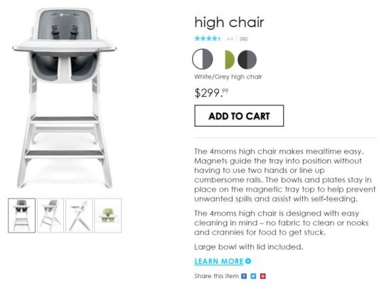
This high chair example from 4moms.com focuses on the three things that matter to their audience: single-handed adjustments, spilt-food prevention, and easy cleanup.
2 - Does your copy focus on benefits rather than features?
You can list features all day long, but customers really want to know how your product will make their life better.
The Amazon Echo sales page does a great job of focusing less on the technical features of the product, and more on the cool things you can do with it.

3 - Are you describing your product with the same words that your customers use?
Using the same language that your customers do will help you better communicate with your target audience in a way that sounds natural for them and touches on their pain points.
A simple way to find these words is to do some reverse engineering. Start by looking at customer reviews and feedback you've collected (and those of your main competitors as well) to pick out common words and phrases that satisfied customers are using. From here, you can tie that customer language back into your own descriptions.
I was shopping for a new tent last week and saw this awesome reviewer on Amazon drive home a point that the copywriters had missed. If you read that entire review, the phrase “family tent” is mentioned about 13 times.
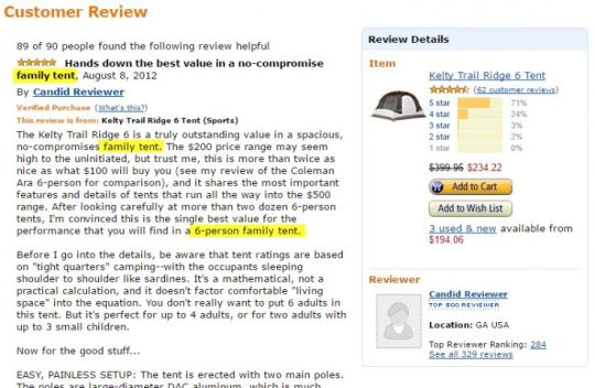
But if you read the product description, "family tent" only shows up once. The description fails to mention many of the benefits covered by the reviewer: lots of pockets, sleeping arrangements, ability to catch a breeze but keep the doors closed, etc.
There's an opportunity here for a competitor in the tent or outdoor space to improve their own product descriptions for the same tent (or even put together a larger guide to family tents).
4 - Are you telling your product's story?
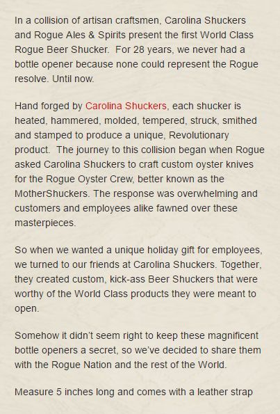
The folks over at Rogue Brewing understand that the people buying gifts from their website are probably passionate about well-made products, not just well-made beer. Here's a great example from their site that tells the story of their 28-year search for a decent beer shucker (bottle opener):
Take better product photography
Photography matters. Research from BigCommerce suggests that 67% of consumers consider image quality “very important” when making a purchase online.
Good product photos do more than just show shoppers what you're selling - they provide context and help customers visualize using your products. Plus, high-quality photos will reduce product returns that happen due to misleading images.
So what can you do to upgrade your product photos?
Smartphones aren't going to cut it
Use a DSLR camera, not your smartphone. Although modern smartphone cameras can take higher resolution photos than ever before, you'll get better results from a DSLR. Lower-end models start at around $500 - try finding a used body online and spending more money on a better & cost-effective fixed lens that can handle video, too.
Build a cheap lightbox
Create a lightbox for well-lit photos with a solid white background. For less than $10, you can build your own lightbox that will vastly improve the quality of your product images.
Use creative angles
Shoot products from multiple angles. Be sure to include several images on every product page. The more perspectives and viewpoints you have, the better customers will be able to judge your product.
It's OK to tweak & process your images to make them pop
Process your images with filters that enhance color and overall image quality. Photo filters resolve poor lighting or color issues and vastly improve your product photos. Just try not to get carried away with dramatic filters that distort the color of your products, as this can be misleading for the buyer. Here's a good example from ABeautifulMess.com showing the difference before and after image edits:

If you don't have time or the inclination to take your own photography, outsource it to a professional. No matter what route you go, know that upgrading your product page photography is well worth the investment.
Build lookbooks & product collections
You can also provide more context for your products through lookbooks, which showcase your products in use. The term “lookbook” is mostly common in the fashion industry, but the concept can be extended to a variety of industries.
The photos in the lookbook for Fitbit's Alta model of fitness tracker help shoppers envision themselves wearing them. Fitbit's lookbook also establishes a brand lifestyle promise - impossible with product photos alone. Even better? The various photos are clickable and take you to the product page for that color/style of wristband:

Product collections are another great variation on this strategy. In this “Mediterranean Collection” page on Coastal.com, shoppers get an opportunity to shop by “style,” and to see examples of the glasses on actual faces instead of just a white background:

As I alluded to before, this isn't just an opportunity for fashion sites. The trick is to make sure you're showing your products in action.
Plenty of other retailers have an opportunity to show off their product in use, like these photos from the Klipsch website showing off their soundbars in various settings:

Car accessories? Same thing.
Heck, even office furniture is easier to purchase when you see how it looks in a workspace.
Start adding product videos
Adding video to product pages is another relatively low-budget improvement you can make, yet it has extreme value for shoppers and your bottom line.
Why? Because video's ability to quickly educate shoppers is a powerful conversion tool. Eyeview Digital reported that including video on landing pages can improve conversions by as much as 80%, and ComScore indicated that online shoppers are 64% more likely to buy after watching a video.
So how can you put video to work on your product pages?
Whether you're demonstrating a how-to or simply showcasing a product and outlining product details, adding video on your product pages provides a whole new experience for online shoppers that helps overcome purchase objections and answers their questions.
Video also allows you to give shoppers a more complete overview of the product and to go beyond static pictures with a story element. These engaging visuals can help shoppers envision themselves using your products in a way that photography alone simply can't.
Zappos is well known for including videos on what seems like every listing, but what's more impressive to me is how much personality and brand voice they show off. While shopping for boots recently, I have to say Joe was my favorite video personality:

Click image to open product video in a new window.
If you're up for taking this on with a DIY approach, it's reasonably easy to create your own product videos at home with the right equipment. Or, outsource this project to a local professional or videographer for hire.
Upgrade your customer reviews software & process
In the current e-commerce landscape, competition is fierce - and there's always someone willing to deliver cheaper and faster.
That's why social proof is more important than ever before. Research from eConsultancy shows that 61% of consumers indicate they look to product reviews before making a purchase, and that product reviews are 12x more trusted than product descriptions from companies.
Customer reviews make your product pages more effective, allowing shoppers to evaluate the product based on real customer opinions - and can help you spot product issues.
I'm listing a few common platforms here, but you should really check out Everett Sizemore's guide to product review software, which has some great insights on the performance of the entire marketplace of product review software options, including technical SEO concerns:
BazaarVoice
Yotpo
Trustpilot
PowerReviews
Traditional product reviews may not be right for all stores...
The best option for you will depend on the tool's ability to integrate with your store, your preferred functionality, and your budget. Sometimes, traditional product reviews won't be the best choice for your product or store.
In this example from ThinkGeek, they've opted to just let people leave Facebook comments rather than any product reviews at all. Which makes sense, because they're Star Trek garden gnomes, and it's not like you need to tell people whether they were the right size or not. Even better than Facebook comments, they also solicit product photos via social media on their #geekfamous hashtag.
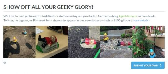
Here's another example where my favorite wallet company, SlimFold, simply highlights great product reviews that they received from press and customer emails. While it makes it harder for them to solicit new reviews, they only have a handful of products, and this format allows them to put more emphasis on specific reviews.
There are many different tools that will allow you to showcase elements of social proof like ratings and reviews, so take your time carefully reviewing different options to see which is the best fit for your needs and budget, and if normal product reviews aren't the right fit, feel free to take a different approach.
Make enough of these small investments and you should see big improvements over the long term.
Tackling these small investments - as your schedule and budget allows - will dramatically improve the overall user experience and the effectiveness of your e-commerce store.
Consider which aspects are the most important to complete first, and then start doing your research and put together a strategy for how you'll prioritize these site upgrades. With a well-thought-out plan of action, you can focus on the projects that will drive the best results for your business, rather than trying too many different tactics all at once.
Looking for more ideas? Take a look at our guides on product page optimization, category page optimization, and conversion rate improvements for e-commerce.
This is by no means the complete guide to investing in your e-commerce store, so in the discussion below, I'd like to hear from you. What creative ways have you improved your e-commerce site content in the past that boosted conversions or organic search?
Sign up for The Moz Top 10, a semimonthly mailer updating you on the top ten hottest pieces of SEO news, tips, and rad links uncovered by the Moz team. Think of it as your exclusive digest of stuff you don't have time to hunt down but want to read!
0 notes
Text
That Weird Glamour Shot Selfie App You're Seeing Is Called Meitu
Mega-popular selfie app Meitu is experiencing a bump in popularity in the US right now.
Hello, you. You probably don't look like a magical beautiful cartoon. Well, there's a fix for that!

Here is our San Francisco bureau chief, Mat, made beautiful.
Meitu
The Meitu app is wildly popular in China and elsewhere in Asia, and has been around for a few years. Basically, it's an app that lets you edit your selfies to look better (or over the top). BuzzFeed even did a video about using it in June 2015.
Last month, the New York Times reported that Meitu, the Chinese company behind the app, was looking for a valuation of as much as $5.23 billion.
View Entire List ›
0 notes
Text
How to Identify Your E-commerce Product Page Keywords Using MozBar
Posted by BrianChilds
A common challenge when doing SEO for e-commerce sites is deciding how to choose keywords for product pages. When it comes to e-commerce in particular, there's always that question on a page-by-page basis of “Which keyword is right for this page?” Especially for existing sites that need an SEO update, finding time to do page-specific keyword research can be burdensome. But product pages deserve every ounce of SEO they can get. Today, I'll show you a way to make your e-commerce product page keyword research a lot easier.
My secret weapon?
MozBar.
By the end of this post, you'll discover how you can easily:
Look at the results for keywords related to your topic and get a sense of which words deliver the most similar results
Get a sense for how search engines might see your term versus others
Find related topics that deliver similar results, note those words, and then use them on your page
Save time identifying what represents a good keyword and whether the results match your expectations
Let me show you how.
What makes a good SEO e-commerce keyword?
Since e-commerce pages often have direct competition from other websites, you need to go above and beyond when it comes to optimization. You'll want to make sure you take into consideration not only the search intent of your desired customer, but also verify that the keyword you choose is actually delivering similar results in the SERP. When people search for products, you want to measure how narrow you have to go before a search result page starts displaying products similar to what you have.
For this example, I'll use an e-commerce site that sells macbook and car decals. Think of all the different variants of those two broad search terms. There are 12 different subcategories of car decals alone.
One category is family decals, which allows a person to pick and choose amongst individual icons to create a customized family to display on the back of your minivan.
For this family decal segment, there are dozens of different individual product pages, so the goal is to make sure we optimize not just for a broad term like “car decal” but for a more nuanced term like “family car decal.” And then for the products themselves, dig into modifying terms relevant to the features.
Use MozBar to save time researching SEO e-commerce keywords
A common way to figure out what's showing up for a search term is to just run a search query. But when you have thousands of pages, this can take forever.
This is where the MozBar Page Optimization feature really helps you get the job done. It allows you to stay on the website to do analysis without jumping between tabs to run search queries.
Let's go through the steps.
1. First, of course, download the MozBar extension for Google Chrome (I'll wait).
2. Next, go to your product page and activate your MozBar extension by selecting the icon until it turns blue (there are three statuses, FYI - on, DA mode, and off).
3. Then, select the Page Optimization icon near the top-left of your browser window. The icon looks like a little page with a circle in the corner:
4. A small text box window will appear. You'll want to have a list of terms ready to go, so if you haven't done your keyword research yet, head over to Keyword Explorer and use the "Suggestions" tool to get some preliminary ideas. I usually enter a broad category-level keyword, then select “Optimize":
In addition to all the normal great stuff that MozBar provides, such as Domain Authority and Page Authority, the Page Optimization tool also gives you a quick overview of how well this individual page is optimized for the term you're researching. This is similar to the information you'd get in the Moz Pro Campaign tools, but here you can see it for any page without having to have Moz open in another tab.
5. Once you've entered your search term, select the “On-Page Content Suggestions” tab:
The On-Page Content Suggestions tab shows you a list of keywords that the search engines typically associate with the term you entered. Think of this as other planets in the same constellation as the keyword you entered. You can use these generally to understand what additional words to put on your page, but you can also use them to identify the target keyword for the page overall.
Here's where this gets awesome. Prepare to shave minutes off of your normal workflow.
Aligning search intent with e-commerce keywords
Starting with your highest-value products, navigate to the product page, open up MozBar, enter in your broad target keyword for the associated category, and then select the On-Page Content Suggestions tab.
Then, look for the keywords from the list that appear most aligned with your specific product. In this example, we're looking at a family car decal product that exists in a broader category of car decals.
The question to ask is: Which keyword displays products that are most similar to your product?
If you can find results that align closely with your product, then you can understand something about how search engines are interpreting the term and have a higher chance of optimizing for the right keywords.
To see which pages are ranking for a given suggested keyword, simply select the “See top ranking URLs” dropdown. It will display the URL and rank position of sites delivering content similar to your initial target search term:
Using this example, you can interpret that “family stickers” definitely delivers results closely aligned with this product. Note that this correlates to the blue "Relevance" bar associated with that suggested keyword.
Make a note of the terms that are providing highly aligned search results pages, and then move onto the next product page. Once you have your list compiled, you'll be able to be more selective and informed with your page optimization choices.
I hope you find this e-commerce keyword trick helpful. Let me know in the comments section of this article!
Bonus tip for making your life easy:
When doing this kind of research, I recommend saving yourself some time down the road by copying the URLs that show up in the On-Page Content Suggestions tab into a new spreadsheet or document. You can compile and research these URLs later using Open Site Explorer.
When it comes time to think about building links to my optimized pages, you'll have a ready list of competitors to analyze. Look at their Inbound Links, Top Pages, and Anchor Text in Open Site Explorer in order to create a list of potential linking sites and content ideas.
Get started with MozBar for Chrome
If you're interested in more keyword research strategies, consider signing up for a Keyword Research Workshop in the Moz Training site. For a deeper dive on MozBar, sign up for our January 24 webinar!
Sign up for The Moz Top 10, a semimonthly mailer updating you on the top ten hottest pieces of SEO news, tips, and rad links uncovered by the Moz team. Think of it as your exclusive digest of stuff you don't have time to hunt down but want to read!
0 notes
Text
Lyft Co-Founder John Zimmer Drives And Dishes On Automation, Car Subscriptions, And Cash

Lyft Co-founder John Zimmer
John Sciulli / Getty Images
As the calendar got ready to flip to 2017 this past Saturday, Lyft co-founder and president John Zimmer got behind the wheel of a white Chevrolet Equinox and turned on his app's “Driver's mode.” For four years running, Zimmer has taken a Lyft shift driving San Francisco's revelers across town on New Year's Eve. It was time to get back in action.
Lyft had a busy 2016. It started the year by raising $1 billion from a group led by General Motors, though that wasn't enough to significantly cut into Uber's almost $7 billion funding lead. Later, it was rumored to be for sale, but said it was instead approached by potential buyers it turned down. And its role as a network connecting cars and passengers became more intriguing with the emergence of automated driving, a development that could make Lyft emerge as the software directing these robot-driven cars to pickups and dropoffs, and will likely bring along more competitors.
I was Zimmer's first pickup of the night, as I had been a year prior, giving us plenty to catch up on. Almost as soon I uttered my first question, Zimmer got a pickup request, and we were off to the races.
Automated Future

Lyft
When Zimmer told his second pickup of the night, Miranda, that her ride was free, she celebrated by asking him to play Shaggy on the car's speakers. Zimmer obliged, and when “Angel” came on, the already festive mood turned really festive.
You can tell Zimmer enjoys giving these rides, which is ironic, given that his company's future may not include human drivers. At the start of 2016, autonomous vehicles were still abstract; much hyped but little used in the real world. By the end of the year, autonomous driving became much more real when Uber's self-driving cars hit the streets of Pittsburgh and San Francisco (at least temporarily), and the company's autonomous truck made its first delivery.
Lyft is getting in on the self-driving action too. This year, it plans to introduce autonomous driving cars along some fixed routes, according to a blog post Zimmer penned in September. And within five years, Lyft expects that a fleet of autonomous cars will handle the majority of its rides in the US.
But Zimmer cautioned me not to relegate Lyft's 700,000 or so human drivers to the unemployment line just yet. There should still be work for them when the cars drive themselves, he explained. “In my mind these automated vehicles are more like rooms on wheels,” Zimmer said. “It could be a social experience, it could be a movie theatre on wheels, it could be a bar on wheels. There will be people that we need to provide those services.”
In the near term, Zimmer said, Lyft is still trying to recruit more human drivers. Today, only a minuscule percentage of miles traveled in the US are in Lyfts and Ubers, Zimmer said, and if his company can convince people to ditch their cars in favor of ride hailing, it could create more work for drivers, even if some of the routes are driven by robots.
What of Zimmer's New Year's Eve driving ritual though? “I enjoy it. It's fun,” he told me. But in a few years? “Maybe then I'll be your bartender.”
The Manufacturers Cometh

Lyft
After dropping off Miranda, Zimmer picked up a new passenger, Matthew, and began driving down the 101 highway towards San Francisco's Tenderloin district. The road ahead was clear, but it was hardly a metaphor for the competition and challenges Lyft is facing.
Five months ago, Tesla CEO Elon Musk unveiled a 'master plan' for his company that teased the idea of turning self-driving Teslas into part time ride-hailing vehicles, which would put the car manufacturer squarely in competition with Lyft and Uber. Tesla isn't the only car manufacturer going down this path. Last August, Ford said it too would develop autonomous vehicles and use them for ride hailing. Toyota, BMW, and other manufacturers have also expressed plans to develop self-driving cars.
Car manufacturers' entry into ride hailing would pose major threats to Lyft: They can gain access to vehicles at a cheaper cost by producing them on their own, and in many cases they have relationships with customers that run deeper than the nascent ride hailing companies.
This doesn't mean Lyft is toast. When autonomous cars go mainstream, Zimmer explained, there will be three components to the business: the cars themselves, the self-driving technology, and the networks they run on, like Uber and Lyft. Zimmer argued that the networks, which manage the movement of cars and relationships with customers, will be the most important of the three, noting that Lyft and Uber have a head start over new competitors.
“We know where the passengers are and where the demand is going,” Zimmer said. Lyft, he argued, could serve more people with fewer cars than newcomers because it knows where to position the cars to efficiently meet the demand. The long play for Lyft, Zimmer said, is to get people to give up car ownership in favor of Lyft subscriptions where they'd buy miles just like they buy minutes from cell providers. Autonomous cars could help take this from an unreasonable expense to a cheap enough alternative that it would demand serious consideration.
Show Me The Money, Johnny

Lyft
Zimmer's final pickup was Siaga, an American Airlines flight crew member in town for New Year's who needed to get to H&M for an emergency New Year's outfit. Siaga could splurge a bit since his ride was on Zimmer, placing him in a growing group of people who have had their rides subsidized by Lyft.
Lyft, according to Bloomberg, has promised investors to keep its losses below $150 million per quarter. And in December, a Bloomberg report stated that although Uber would make more than $5.5 billion in net revenue in 2016, it could lose $3 billion in the process. These reports led some to question whether ride hailing companies were real businesses, so I asked Zimmer if they were. He responded affirmatively.
“On a per-ride basis, rides are profitable,” Zimmer explained. The losses, he said, come from trying to win over new passengers (you may have seen people handing out $50 Lyft credits on a street near you - this is part of that effort). “Having a certain amount of scale is the early part of the business, but doing 17 million+ rides every month will lead us to a profitable business.” Lyft, he said, has tripled its number of rides since we met last year.
So when will Lyft be profitable? Zimmer wouldn't say. But he said the company has a plan to use less money than it's raised to get to profitability. “When you look at the unit economics per ride, there is a comfortable margin there that will allow us to cover all our expenses and become profitable.”
With that, it was my turn to be dropped off. Seems like Lyft is in good shape to be around next New Year's Eve too, so we'll pick this up then.
0 notes
Text
How to Delegate SEO Work Effectively
Posted by zeehj
Whether you're the only SEO at your company, work within a larger team, or even manage others, you still have to stay on top of your projects. Project management skills aren't and shouldn't be exclusive to someone (or some tool) with the title “project manager.” I believe that having good project manager skills is essential to getting work done at all, let alone delivering high-quality work in a timely and efficient way.
In defense of management
Freakonomics Radio released this podcast episode in October called In Praise of Maintenance. The TL;DR (or TL;DL, rather) is that our society rewards innovators, but rarely (if ever) celebrates the maintainers: the people who get sh*t done, and do it reliably, often without anyone's noticing. This podcast episode confirmed what I'd been feeling for a long time: We don't award enough praise to the good project managers out there who keep engagements moving forward. And that's largely because it's not a sexy job: it's not exciting to report to stakeholders that necessary services that have been reliable for so long are, as always, continuing to be reliable.
It's only when things aren't running smoothly does it seem project managers get recognition. A lack of a rewards system means that we're not teaching PMs, Consultants, Account Managers, and more that their excellent organizational skills are their most valuable asset. Instead, the message being communicated is that innovation is the only praise-worthy result, which oftentimes may not be essential to getting your work done. The irony here is that innovation is the by-product of an excellent project management framework. The situational awareness of knowing how to delegate work to your colleagues and a repertoire of effective organizational habits is vital if you ever want to free up your attention to allow for the headspace and concentration ingenuity requires.
Sound familiar? Lately I've been focused on the idea of a cluttered headspace, where it feels like everything on your to-do list is floating ephemerally around in your head, and you can't seem to pin down what needs to be done. Of course, this isn't specific to just professional life (or consulting work): it can happen with personal tasks, which can present their own set of organizational challenges. Regardless of your professional role, crunch time is exactly when you need to put on your project manager hat and get yourself organized. Read on to find out the tools and tricks I use to stay on top of my work, and how I delegate work when needed without losing a personal touch on projects.
Manage projects with tools that work for you
What do you do to make that process easier? One Slack conversation that seems to always come up is which project management tools do we use (and which is best). I take the annoying middle-ground stance of “whatever tool you use is best” and I stand by it (don't worry, I'll get to the actual list in a minute): a tool is only useful if it's actually used.
So how do you get started? It's always important to have preferred methods for project tracking, note keeping, and reminders. Depending on your role and learning style, you may find that some tools work better than others for you. For instance, while I have a few tools I work with to stay on top of client work, I also have a clear plastic desk cover that I can jot down notes and reminders on. Here's a breakdown of the tools I use to manage projects, and the needs they meet.
Inbox by Gmail. Yes, it's different from classic Gmail. The two greatest aspects of Inbox, in my opinion, is the ability to snooze emails until a specific day and time, and save reminders for yourself (e.g. “Check in on Ty's progress for the page speed audit,” or “Watch the video in this link after work”). Why are these my favorite Inbox features? Both functions serve similar purposes: they tell you what you need to know, when you need to know it. The ability to snooze emails and save reminders for yourself is invaluable when we're talking about headspace: this way, you can use your email as your to-do list for any given day. If you know you don't have to respond to someone until X date, there's no reason their previous email should sit in your Inbox taking up space. As a result, I use Inbox as my personal assistant to remind me when I need to jump back to a deliverable or respond to a client. It's possible to reach Inbox zero on a given day, even if you have an email awaiting your response. Just snooze it and attend to it when you really need to.
Google Drive. Sure, not a sexy or new tool, but it's my home for everything. Not only does GDrive cover all the file types that I need (Documents, Sheets, and Presentations), it also allows for easy, real-time collaboration on files with your colleagues and clients. If you like to nudge people to do things, too, you can assign contacts work to do from your GDocs (just highlight text, click the comment icon to the right, and insert the @ symbol with their name). If you're crafting a presentation with a colleague, for instance, you can assign slides with questions for them. I recommend tagging them with your question and including a due date for when you need their answer.
Tools my colleagues love:
Trello. It's not my personal favorite, but a lot of my teammates love using Trello as their to-do lists, or even for tracking web dev or SEO projects. If you prefer text over visuals, you can also try Basecamp (which I tend to prefer).
Asana. Another great project management tool - I tend to use it on a project basis rather than a to-do list. If you're a developer, you may prefer JIRA.
Of course, it's possible to manage and delegate work without these, but I'm of the mind that pen, paper, and email can only get you so far, especially if you want your delegation process to be somewhat automated (think tagging colleagues in comments within documents, or assigning projects to them within standard project management tools like Asana).
How to delegate effectively
Tools can only get you so far: any good delegation process starts with a conversation (no more than five or 10 minutes) about the work you need and a great brief. The conversation establishes whether your colleague actually has the bandwidth to take your work on, and the brief goes into greater detail of what you actually need done. The brief format I follow works for a large number of different deliverables - I've used this same layout to delegate page speed, technical and backlink audits, and content briefs to colleagues. Below are the fields I always include, and the type of information always provided:
Subject: [BRIEF] Work I Need Done
Deadline: The precise date and time you need it, with enough time for you to review the work before delivering it to your stakeholders or your client. If it's something like a page speed audit, I would allow up to a full week to review it and ensure that it's in the best format and all the information is correct. Of course, it also depends on how familiar the delegate is with projects like these - if they've done a number of audits for you in the past, they may know your style and you may not need as much time to edit their final work.
Output/Deliverable: The format in which you need this work delivered to you. Maybe it's a Google Doc or an Excel Spreadsheet. This brief format can work for any output you need, including more creative pieces (do you need a video edited to :30 seconds in a .mov format? A photo edited to certain specs and saved as a PNG or IDD?).
Expected hours: This may be the most challenging element of the entire brief. How long do you anticipate this work to take, start to finish? Keep in mind the experience level of the person to whom you're delegating. Is this their first SEO technical audit, or their 30th? You will almost definitely need to check in with your delegate a few times (more on that later), so how long do you anticipate these meetings to take? Just like the deadline timing estimate, use your best judgment based on work you've done with this person in the past, and the type of work you're assigning.
Relevant materials: This is where you can provide additional articles or tools that should help your colleague do the work you've assigned to them. Some good examples are 101 articles (like ones on the Moz blog!), or a tool you know you always use in projects like the one you're delegating (think SEMRush, new photo editing software, or Google's Keyword Planner).
Check in with your delegate along the way
Once you've delivered your brief, the next step is to make sure you check in with your delegate along the way. Even the most experienced person can benefit from added context, so whether it's an in-person meeting or a five-minute call, touching base shortly after delivering a brief is necessary to ensure you're on the same page. Beyond kicking off a project, it's important to have check-ins along the way to stay on track.
At Distilled, we like to follow a check-in model at the following completion points:
1% (kickoff conversation);
5% (validation of process);
30% (ensure you're on the right track before you invest too much time into the project);
and 90% (final editing and proofing).
Not only is this good to keep everyone on the right track, it's even more valuable both to the person delegating and the delegate to know how much work should be completed at which points, and how much detail is required as you give feedback.
In many ways, great project management and delegation skills are really future-proofing skills. They allow you to be on top of your work regardless of what work (or life) throws at you. You can be the best SEO in the world, but if you can't manage your projects effectively, you'll either fail or not see the greatest impact you otherwise could achieve. It's time to ditch praising the model of a lone innovator who somehow “does it all,” and instead truly celebrate the maintainers and managers who ensure things remain operational and steady. Often, our biggest problems aren't best solved with a complex solution, but rather a clear mind and supportive team.
A large part of turning projects around comes down to improving the project management process, and being organized allows you to juggle multiple clients and acknowledge when you're at capacity. Without a solid foundation of project management skills, there is no groundwork for successful innovations and client projects. The next time you're looking to bolster your skill set, do an audit of how you manage your own work, and identify all of the things that prevent you from delivering the best work on time.
Sign up for The Moz Top 10, a semimonthly mailer updating you on the top ten hottest pieces of SEO news, tips, and rad links uncovered by the Moz team. Think of it as your exclusive digest of stuff you don't have time to hunt down but want to read!
0 notes
Text
What Link Building Success Really Looks Like
Posted by mark-johnstone
A few weeks ago, a post was published entitled The SEO Myth of Going Viral. It referenced 8 pieces of content across 4 different sites that went viral and, most importantly for SEO, gained hundreds of linking root domains. I was the creative director on a lot of those campaigns while working as the VP of Creative at Distilled. Today, I'd like to add some important context and detail to the original post.
I actually agree with much of what it said. However, it's based on the assumption that one big viral piece of content would result in a visible jump in rankings across the domain within about 3 months of the content being released. There are a few challenges with this as a basis for measuring success.
I wouldn't advise setting your hopes on one big viral hit boosting your rankings across the domain. Not by itself. However, if that viral hit is part of ongoing link building efforts in which you build lots of links to lots of pieces of content, you can begin to see an upwards trend.
"Trend" is the important word here. If you're looking for a dramatic step or jump as a direct result of one piece of viral content, this could cause you to overlook a positive trend in the right direction, and even tempt you to conclude that this form of content-based link building doesn't work.
With regards to this type of link building and its impact on domain-wide rankings, I'd like to focus on the follow 4 points:
How success really looks
Why success looks like it does
Other factors you need to consider
How we can improve our approach
What successful link building really looks like
Simply Business was held up in the SEO myth post as an example of this kind of link building not working. I would argue the opposite, holding it up as an example of it working. So how can this be?
I believe it stems from a misunderstanding of what success looks like.
The post highlighted three of the most successful pieces of content Distilled created for Simply Business. However, focusing on those three pieces of content doesn't provide the full picture. We didn't make just three pieces of content; we made twenty-one. Here are the results of those pieces:
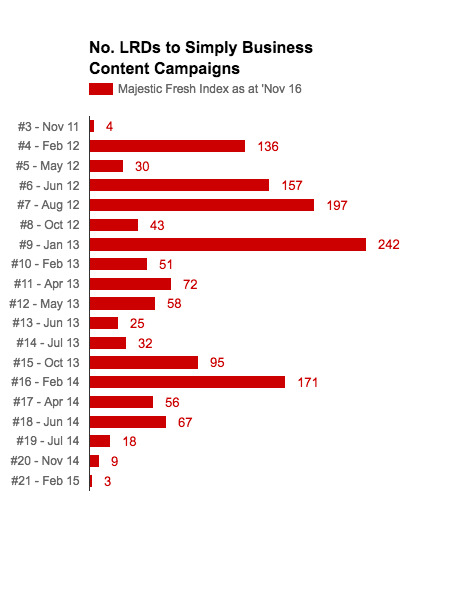
Note: Data missing for the first two pieces of content
That's links from 1466 domains built to 19 pieces of content over a period of 3 years.
The myth in question is as follows:
Building lots of links to one piece of content will result in a jump in domain-wide rankings within a reasonable timeframe, e.g. 3 months.
Though this wasn't the hypothesis explicitly stated at the start of the post, it was later clarified in a comment. However, that's not necessarily how this works.
An accurate description of what works would be:
Building lots of links to lots of pieces of content sustainably, while taking other important factors into consideration, can result in an increase in domain-wide rankings over time.
To hold up, the myth required a directly attributable jump in rankings and organic traffic within approximately 3 months of the release of each piece of content. So where was the bump? The anticipated reward for all those links?

No. The movement we're looking for is here:

Not a jump, but a general trend. Up and to the right.
Below is a SEMRush graph from the original post, showing estimated organic traffic to the Simply Business site:
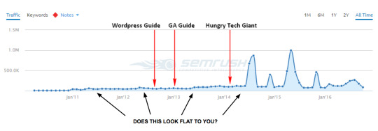
At first glance, the graph between 2012 and 2014 might look unremarkable, but that's because the four large spikes on the right-hand side push the rest of the chart down, creating a flattening effect. There's actually a 170% rise in traffic from June 2012 to June 2014. To see that more clearly, here's the same data (up to June 2014) on a different scale:

Paints quite a different picture, don't you think?
Okay, but what did this do for the company? Did they see an increase in rankings for valuable terms, or just terms related to the content itself?
Over the duration of these link building campaigns, Simply Business saw their most important keywords ("professional indemnity insurance" and "public liability insurance") move from positions 3 to 1 and 3 to 2, respectively. While writing this post, I contacted Jasper Martens, former Head of Marketing and Communications at Simply Business, now VP of Marketing at PensionBee. Jasper told me:
"A position change from 3 to 1 on our top keyword meant a 15% increase in sales."
That translates to money. A serious amount of it!
Simply Business also saw ranking improvements for other commercial terms, too. Here's a small sample:
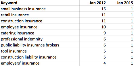
Note: This data was taken from a third-party tool, Sistrix. Data from third-party tools, as used both in this post and the original post, should be taken with a grain of salt. They don't provide a totally accurate picture, but they can give you some indication of the direction of movement.
I notice Simply Business still ranks #1 today for some of their top commercial keywords, such as "professional indemnity insurance." That's pretty incredible in a market filled with some seriously big players, household UK names with familiar TV ads and much bigger budgets.
Why success looks like it does
I remember the first time I was responsible for a piece of content going viral. The social shares, traffic, and links were rolling in. This was it! Link building nirvana! I was sitting back waiting for the rankings, organic traffic, and revenue to follow.
That day didn't come.
I was gutted. I felt robbed!
I've come to terms with it now. But at the time, it was a blow.
I assume most SEOs know it doesn't work that way. But maybe they don't. Maybe there's an assumption that one big burst in links will result in a jump in rankings, as discussed in the original post. That's the myth it was seeking to dispel. I get it. I've been there, too.
It doesn't necessarily work that way. And, actually, it makes sense that it doesn't.
In two of the examples, the sites in question had one big viral hit, gaining hundreds of linking root domains, but this on its own didn't result in a boost in domain-wide rankings. That's true.
Google would have pretty volatile search results if every time someone had a viral hit, they jumped up in the rankings for all their head terms.
But if a site continues to build lots of links regularly over time, like Simply Business did, Google might want that site to be weighted more favorably and worthy of ranking higher.
The Google algorithm is an incredibly complex equation. It's tempting to think that you put links in and you get rankings out, and a big jump in one will correspond to a big jump in the other. But the math involved is far more complicated than that. It's not that linear.
Other factors to consider
Link building alone won't improve your rankings.
There are a number of other influential factors at play. At a high level, these include:
A variety of on-site (and technical) SEO factors
Algorithmic updates and penalties
Changes to the SERPs, like the knowledge box and position of paid results
Competitor activity
I'm not going to go into great detail here, but I wanted to mention that you need to consider these factors and more when reviewing the impact of link building on a site's rankings.
Below is the graph from SearchMetrics for Concert Hotels, also via the original post. This is another site to which Distilled built a high volume of links.

As you can possibly tell from the large drop before Distilled started working with Concert Hotels, the site was suffering from an algorithmic penalty. We proceeded under the hypothesis that building high-quality links, alongside other on-site activity, would be important in the site's recovery.
However, after three or four large link building successes without any corresponding uplift, we recommended to the client that we stop building links and shift all resources to focus on other activities.
As you'll see at the end of the chart, there appears to be some positive movement happening. If and when the site fully recovers, we'll never be able to tell exactly what contribution, if any, link building made to the site's eventual rankings.
You can't take the above as proof that link building doesn't work. You have to consider the other factors that might be affecting a site's performance.
How can we improve our approach?
As I mentioned at the start of this post, I actually agree with a lot of the points raised in the original post. In particular, there were some strong points made about the topical relevance of the content you create and the way in which the content sits within the site architecture.
Ideally, the content you create to gain links would be:
Topically relevant to what you do
Integrated into the site architecture to distribute link equity
Valuable in its own right (even if it weren't for links and SEO)
This can be a challenge, though, especially in certain industries, and you might not hit the sweet spot every time.
But let's look at them in turn.
Topical relevance
If you can create a piece of content that gains links and is closely relevant to your product and what you do for customers, that's great. That's the ideal.
To give you an example of this, Distilled created a career aptitude test for Rasmussen, a career-focused college in America. This page earned links from 156 linking root domains (according to the Majestic Historic Index), and the site continues to rank well and drive relevant search traffic to the site.
Another example would be Moz's own Search Engine Ranking Factors. Building lots of links to that page will certainly drive relevant and valuable traffic to the Moz site, as well as contributing to the overall strength of the domain.
However, your content doesn't have to be about your product, as long as it's relevant to your audience. In the case of Simply Business, the core audience (small business owners) doesn't care about insurance as much as it cares about growing its businesses. That's why we created several guides to small business marketing, which also gained lots of links.
As Jasper Martens explains:
“Before I left Simply Business, the guides we created attracted 15,000 unique visits a month with a healthy CTR to sign-up and sales. It was very effective to move prospects down the funnel and make them sales-ready. It also attracted a lot of small business owners not looking for insurance right now.”
Integrating the content into the site architecture
Distilled often places content outside the main architecture of the site. I'll accept this isn't optimal, but just for context, let me explain the reasons behind it:
It creates a more immersive and compelling experience. Consider how impactful New York Times' Snowfall would have been if it had to sit inside the normal page layout.
It prevents conflicts between the site's code and the interactive content's code. This can be particularly useful for organizations that have restrictive development cycles, making live edits on the site difficult to negotiate. It also helps reduce the time, cost, and frustration on both the client-side and agency-side.
It looks less branded. If a page looks too commercial, it can deter publishers from linking.
While it worked for Simply Business, it would make sense, where you can, to pull these things into the normal site architecture to help distribute link equity further.
Content that's valuable in its own right (even if it weren't for links and SEO)
Google is always changing. What's working now and what's worked in the past won't necessarily continue to be the case. The most future-proof way you can build links to your site is via activity that's valuable in its own right - activities like PR, branding, and growing your audience online.
So where do we go from here?
Link building via content marketing campaigns can still make a positive impact to domain-wide rankings. However, it's important to enter any link building campaign with realistic expectations. The results might not be as direct and immediate as you might hope.
You need to be in it for the long haul, and build links to a number of pieces of content over time before you'll really see results. When looking for results, focus on overall trends, not month-to-month movements.
Remember that link building alone won't solve your SEO. You need to make sure you take other on-site, technical, and algorithmic factors into consideration.
It's always worth refining the way you're building links. The closer the topics are aligned with your product or core audience's interests, the more the content is integrated into your site's architecture, and the more the content you're creating is valuable for reasons beyond SEO, the better.
It's not easy to manage that every time, but if you can, you'll be in a good position to sustainably build links and improve your site's rankings over time.
Sign up for The Moz Top 10, a semimonthly mailer updating you on the top ten hottest pieces of SEO news, tips, and rad links uncovered by the Moz team. Think of it as your exclusive digest of stuff you don't have time to hunt down but want to read!
0 notes
Text
How to Craft the Best Damn E-commerce Page on the Web - Whiteboard Friday
Posted by randfish
From your top-level nav to your seal-the-deal content, there are endless considerations when it comes to crafting your ecommerce page. Using one of his personal favorite examples, Rand takes you step by detailed step through the process of creating a truly superb ecommerce page in today's Whiteboard Friday.
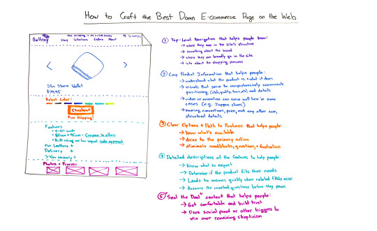
Click on the whiteboard image above to open a high-resolution version in a new tab!
Video Transcription
Howdy all and welcome to a special edition of Whiteboard Friday. My name is Rand Fishkin. I'm the founder of Moz, and today I want to talk with you about how to craft the best damn ecommerce page on the web. I'm actually going to be using the example of one of my very favorite ecommerce pages. That is the Bellroy Slim Wallet page. Now, Bellroy, actually, all of their pages, Bellroy makes wallets and they market them online primarily. They make some fantastic products. I've been an owner of one for a long time, and it was this very page that convinced me to buy it. So what better example to use?
So what I want to do today is walk us through the elements of a fantastic ecommerce page, talk about some things where I think perhaps even Bellroy could improve, and then walk through, at the very end, the process for improving your own ecommerce page.
The elements of a fantastic e-commerce page
So let's start with number one, the very first thing which a lot of folks, unfortunately, don't talk about but is critical to a great ecommerce process and a great ecommerce page, and that is...
1. The navigation at the very top

The navigation at the top needs to do a few things. It's got to help people:
Understand and know where they are in the site structure, especially if you have a more complex site. In Bellroy's case, they don't really need to highlight anything. You know you're on a wallet page. That's probably in Shop, right? But for Amazon, this is critically important. For Best Buy, this is hugely important. Even for places like Samsung and Apple, critical to understand where I am in the site structure.
I want to know something about the brand itself. So if this is the first time that someone is visiting the website, which is very often the case with ecommerce pages, they're often entry points for the first exposure that you have to a brand. Let's recall, from what we know about conversion rate optimization, it is uncommon, unusual for someone to convert on their first visit to a brand or a website's page, but you can make a great first impression, and part of that is what your top navigation needs to do. So it should help people identify with the brand, get a sense for the style and the details of who you are.
You need to know where, broadly, you can go in the website. Where can I explore from here? If this is my first visit or if this is my second visit and I'm trying to learn a little bit more about the company, I want to be able to easily get to places like About, or I want to be able to easily learn more about their products or what they do, learn more about the potential solutions, learn more about their collections and what other things they offer me.
I also, especially for ecommerce repeat visitors and for folks who are buying more than one thing, I want to have this simple navigation around Cart. I don't, in fact, love how Bellroy minimizes this, but you want to make sure that the Search bar is there as well. Search is actually a function. About 10% to 12% of visitors on average to ecommerce pages will use Search as their primary navigation function. So if you make that really subtle or hard to find or difficult to use, the Search feature can really limit the impact that you can have with that group.
I want that info about the shopping process that comes from having the Cart. In Bellroy's case, I love what they do. They actually put "Free shipping in the United States" in their nav on every page, which I think, clearly for them, it must be one of the key questions that they get all the time. I have no doubt that they've done some A/B testing and optimization to make sure, "Hey, you know what? Let's just put it in front of everyone because it doesn't hurt and it helps to improve our conversion rates."
2. Core product information

Core product information tends to be that above-the-fold key part here. In Bellroy's case, it's very minimalist. We're just talking about a photo of the wallet itself, and then you can click left or right, or I think sometimes it auto-scrolls as well on desktop but not mobile. I can see a lot more photos of how many cards the wallet can hold and what it looks like in my pants, how it measures up compared to a ruler, and all that kind of stuff. So there's some great photography in here and that's important, as well as the name and the price.These core details may differ from product to product. For example, if you are selling a more complex piece of technology, the core features may, in fact, be fairly substantive, and that's okay. But we are trying to help. With this core product information, we're trying to help people understand what the product is and what it does. So wallet, very, very obvious. If we're talking about lab equipment or scientific machinery, well, a little more complicated. We better make sure that we're communicating that. We want...
Visuals that are going to serve to... in this case, I think they do a great job, but comprehensively communicate the positioning, the positioning of the product itself. So Bellroy is clearly going with minimalist. They're going with craft. They're a small, niche shop. They don't do 10,000 things. They just make wallets, and they are trying to make that very clear. They also are trying to make their quality a big part of this, and they are trying to make the focus of the product itself, the slimness. You can really see that as you go into, well obviously, the naming convention, but also the photography itself, which is showing you just how slim this wallet can be in comparison to bulky other wallets. They take the same number of cards, they put them in two different kinds of wallets, they show you the thickness, and the Bellroy is very, very slim. So that's clearly what the positioning is going for.
Potentially here, we might want video or animation. But I'm going to say that this is only a part of the core content when it truly makes sense. Great example of when it does make sense would be Zappos. Zappos, obviously, has their videos for nearly every shoe and shoe brand that they promote on their website. They saw tremendous conversion rate improvements because people had a lot of questions about how it moves and walks and how it looks with certain pieces of clothing. The detail of having someone explain it to you, as I'm explaining ecommerce pages to you in video form, turned out had a great impact on their conversion rate. You might want to test this, but it's also the case that this content, that video or animation content might live down below. We'll talk about how that can live in more of the photos and process at the very bottom at the end of this video.
Naming convention. We want price. We want core structural details. I like that Bellroy here has made their core content very, very slim, just the photos, the name, and the price.
3. Clear options to the path to purchase

This is somewhere where, I think, a lot of folks unfortunately get torn by the Amazon model. If you are Amazon.com, which yes, has phenomenal click-through rates, phenomenal engagement rates, phenomenal conversion rates, but you are not Amazon. Repeat after me, "I am not Amazon." Therefore, one of the things that Amazon does is they clutter this page with hundreds of different things that you could do, and they built that up over decades, literally decades. They built up so that we are all familiar with an Amazon page, ecommerce page, and what we expect on it. We know there's going to be a lot of clutter. We know there's going to be a ton of call-to-actions, other things we could buy, things that are often bought with this, and things that could be bundled with this. That is fine for Amazon. It is almost definitely not fine for you unless you are extremely similar to what Amazon does. For that reason, I see many, many folks getting dragged in this direction of, "Hey, I want to have 10 different calls-to-action because people might want to X, Y, and Z." There are ways to do the "might want to X, Y, and Z" without making those specific calls-to-action in the core part of the landing page for the ecommerce product. I'll talk about those in just a second.
But what I do want you to do here is:
Help people understand what is available. Quick example, you can select the color. That is the only thing you can do with this wallet. There are no different sizes. There are no different materials that they could be made of. There's just color. Color, Checkout, and by the way, once again, free shipping.
I am trying to drive them to the primary action, and that is what this section of your ecommerce page needs to do a great job of. Make the options clear, if there are any, and make the path to purchase really, really simple.
We're trying to eliminate roadblocks, we're trying to eliminate any questions that might arise, and we want to eliminate any future frustration. So, for example, one of the things that I would do here, that Bellroy does not do, is I would geo-target based on IP address. So I'd look at the IP address of the visitor who's coming to this page, and I would say, "I am pretty sure you are located in Washington State right now. Therefore, I know that this is the sales tax amount that I need to charge." Or, "Bellroy isn't in Washington State. I don't need to charge you sales tax." So I might have a little thing here that says, "Sales Tax" and then a little drop-down that's pre-populated with Washington or pre-populated with the ZIP code if you know that and "$0." That way it's predictive. It's saying already, "Oh, good. I know that the next page I'm going to click on is going to ask me about sales tax, or the page after I enter my credit card is." You know what, it's great to have that question answered beforehand. Now, maybe Bellroy has tested this and they found that it doesn't convert as well, but I would guess that it probably, probably would convert even better with that messaging on there.
4. Detailed descriptions of the features of the product

This is where a lot of the bulk of the content often lives on product pages, on ecommerce pages. In this case, they've got a list of features, including all sorts of dimension stuff, how it's built, what it's made from, and what it can hold, etc., etc.
What I'm trying to do here is a few things:
I want to help people know what to expect from this product. I don't want high returns. Especially if I'm offering free shipping, I definitely don't want high returns. I want people to be very satisfied with this product, to know exactly what they're going to get.
I want to help them determine if the product fits their needs, fits what they are trying to accomplish, fits the problem they're trying to solve.
I want to help them, lead them to answers quickly for frequently asked questions. So if I know that lots of people who reach this page have this sort of, "Oh, gosh, you know, I wonder, what is their delivery process like? How long does it take to get to me because I kind of need a wallet for this trip that I'm going on, and, you know, I'm bringing pants that just won't hold my thick wallet, and that's what triggered me to search for slim wallets in Google and that's what led me to this page?" Aha, delivery. Great job. You've answered the question before or as they are asking it, and that is really important. We want answers to the unasked questions before people start to panic in the Checkout process.
You can go through this with folks who you say, "Hey, I want you to imagine that you are about to buy this. Give me the 10 things in your head. I want you to say out loud everything that you think when you see this page." You can do this with actual customers, with customers who are returning, with people who fit your target demographic and target customer profile but have not yet bought from you, with people who've bought from your competitors. As you do this, you will find the answers to be very, very similar time after time, and then you can answer them right in this featured content. So warranty is obviously another big one. They note that they have a three-year warranty. You can click plus here, and you can get more information.
I also like that they answer that unasked question. So when they say, "Okay, it's 80 millimeters by 95 millimeters." "Man, I don't know how big a millimeter is. I just can't hold that information in my head." But look, they have a link "Compare to Others." If you click that, it will show you an overlay comparison of this wallet against other wallets that they offer and other wallets that other people offer. Awesome. Fantastic. You are answering that question before I have it.
5. A lot of the seal-the-deal content

When we were talking before about videos or animations or some of the content that maybe belongs in the featured section or possibly could be around Checkout, but doesn't quite reach the level of importance that we've dictated for those, this is where you can put that content. It can live below the fold, scrolling way down. I have yet to see the ecommerce page that has suffered from providing too much detail about things people actually care about. I have seen ecommerce pages suffer from bloating the page with tons of content that no one cares about, especially as it affects page load speed which hurts your conversions on mobile and hurts your rankings in Google because site speed is a real issue. But seal-the-deal content should:
Help people get really comfortable and build trust. So if I scroll down here, what I'm seeing is more photos about how the wallet is made, how people are using it. They call this the nude approach, which cleverly titled, I'm sure it makes for a lot of clicks. The nude approach to building a wallet, why the leather is so slender, why it adds so little weight and depth, why it lasts so long, all these kinds of things.
It's trying to use social proof or other psychological triggers to get rid of any remaining skepticism. So if you know what the elements of skepticism are from your potential buyers, you can answer that in this deeper content as people get down and through this.
Now, all right, you might say to yourself, "These all sound like great things. How do I actually run this process, Rand?" The answer is embedded in what we just talked about. You're going to need to ask your customers, your potential customers, your customers who bought from you before, and customers who did not buy from you but ended up buying from a competitor, about these elements. You're going to need to test, which means that you need some infrastructure, something like an Unbounce or an Optimizely, or your own testing platform if you feel like building one, your engineers do, in order to be able to change out elements and see how well they convert, change out pieces of information. But it is not helpful to change things like button color, or to change lists of features, or to change out the specific photos when the problem is, overall, you have not solved these problems. If you don't solve these problems, the best button color in the world will not help your conversion rate nearly enough, which is why we need to form theories and have hypotheses about what's stopping people from buying. That should be informed by our real research.
SEO for ecommerce pages
SEO for ecommerce pages is based on only a few very, very simple things. Our SEO elements here are keywords, content, engagement, links, and in some cases freshness. You hit these five and you've basically nailed it.
Keywords, do you call your products the same thing people call your products when they search for them? If the answer is no, you have an opportunity to improve. Even if you want to use a branded name, I would suggest combining that with the name that everyone else calls your things. So if this is the slim sleeve wallet, if historically Bellroy had called this the sleeve wallet, I would highly recommend to them, "Hey, people are searching for slim wallet. How about we find a way to merge those things?"
Content is around what is on this page, and Google is looking for content that solves the searcher's problem, the searcher's issue. That means doing all of these things right and having it in a format that Google can actually read. Video is great. Transcripts of the video should also be available. Visuals are great. Descriptions should also be available. Google needs that text content.
Engagement, that is going to come from people visiting this page and not clicking the back button and going back to Google and searching for other stuff and clicking on your competitor's links. It's going to come from people clicking that Checkout button or browsing deeper in the website and from engaging with this page by spending time on the site and not bouncing. That's your job and responsibility, and this stuff can all help.
Links come from press. It can come from blogs. It can come from some high-quality directories. Be very careful in the directory link-building world. It can come from partnerships. It can come from suppliers. It can come from fans of the product. It can come from reviews. All that kind of stuff. People who give you their testimonials, you can potentially ask them for links, so all that kind of stuff. Those links, if they are from diverse sets of domains and they contain good anchor text, meaning the name of your actual product, and they are pointing specifically to this page, they will tremendously help you rank above your competition.
Freshness. In some industries and in some cases, when you know that there is a lot of demand for the latest and greatest, you should be updating this page as frequently as you can with the new information that is most pertinent and relevant to your audience.
You do these things, and you do these things, and you will have the best damn ecommerce page on the web. All right, everyone, thanks for joining us. We'll see you again hopefully on Whiteboard Friday. Take care.
Video transcription by Speechpad.com
Sign up for The Moz Top 10, a semimonthly mailer updating you on the top ten hottest pieces of SEO news, tips, and rad links uncovered by the Moz team. Think of it as your exclusive digest of stuff you don't have time to hunt down but want to read!
0 notes
Text
The 2016 #MozCon Video Bundle Has Arrived!
Posted by Danielle_Launders
We're excited to announce that the MozCon 2016 Video Bundle is ready! That means no more #FOMO - you can catch up on all 27 sessions and over 15 hours of online marketing goodness from some of the brightest minds in the industry. Want to earn more featured snippets? Yup, we cover that. Looking for new tools and tactics for link acquisition? You'll learn that, too!
Can't wait to get started? Feel free to jump ahead:
Buy the MozCon 2016 Video Bundle
If you attended MozCon 2016, don't worry - the videos are included with your ticket. Just check your inbox for an email containing a unique link to redeem a free “purchase.”
MozCon 2016 was the best yet, and I'm not just saying that because I want ya'll to join me at MozCon 2017. We are really proud of our program this year and can't wait to share it with everyone, we think you'll learn a ton and fall in love with the speaker lineup and presentations as much as we did.
The polls are in...
Here's what our attendees had to say about their experience at MozCon:
Out of the attendees that completed the survey, over 60% said that the content presented was interesting and relevant to their work, while over 80% found that the content itself was advanced enough.
The bundle itself
You'll have access to all of the presentations, which includes videos of the speakers as well as their slide decks.
For $299, the MozCon 2016 Video Bundle gives you instant access to:
27 videos, that's over 15 hours of content from MozCon 2016
Stream or download the videos to your computer, tablet, or phone. The videos are iOS, Windows, and Android compatible
Downloadable slide decks for all presentations
Buy the MozCon 2016 Video Bundle

Ready for your free full session?
We understand wanting to take a test drive before signing on the dotted line, which is why we're sharing one of our highly-rated sessions with you! You can see what MozCon 2016 is all about with a full session from Joe Hall. He shares how information architecture shapes the way we organize data and build websites and how to rethink IA for SEO and content marketing.
A big and special thanks to everyone on the Moz team that worked hard to make these videos available (and in less than a month after the show!). It definitely takes a village. I want to send thanks (and hugs!) to the crew that worked so hard to process, edit, design, build, code, and more to make this happen. We wish you happy learning and hope to see you at MozCon 2017 in July.
Sign up for The Moz Top 10, a semimonthly mailer updating you on the top ten hottest pieces of SEO news, tips, and rad links uncovered by the Moz team. Think of it as your exclusive digest of stuff you don't have time to hunt down but want to read!
0 notes
Text
Predicting Intent: What Unnatural Outbound Link Penalties Could Mean for the Future of SEO
Posted by Angular
This post was originally in YouMoz, and was promoted to the main blog because it provides great value and interest to our community. The author's views are entirely his or her own and may not reflect the views of Moz, Inc.
[Estimated read time: 8 minutes]
As SEOs, we often find ourselves facing new changes implemented by search engines that impact how our clients' websites perform in the SERPs. With each change, it's important that we look beyond its immediate impact and think about its future implications so that we can try to answer this question: "If I were Google, why would I do that?"
Recently, Google implemented a series of manual penalties that affected sites deemed to have unnatural outbound links. Webmasters of affected sites received messages like this in Google Search Console:
Webmasters were notified in an email that Google had detected a pattern of "unnatural artificial, deceptive, or manipulative outbound links." The manual action itself described the link as being either "unnatural or irrelevant."
The responses from webmasters varied in their usual extreme fashion, with recommendations ranging from "do nothing" to "nofollow every outbound link on your site."
Google's John Mueller posted in product forums that you don't need to nofollow every link on your site, but you should focus on nofollowing links that point to a product, sales, or social media page as the result of an exchange.
Now, on to the fun part of being an SEO: looking at a problem and trying to reverse-engineer Google's intentions to decipher the implications this could have on our industry, clients, and strategy.
The intent of this post is not to decry those opinions that this was specifically focused on bloggers who placed dofollow links on product/business reviews, but to present a few ideas to incite discussion as to the potential big-picture strategy that could be at play here.
A few concepts that influenced my thought process are as follows:
Penguin has repeatedly missed its "launch date," which indicates that Google engineers don't feel it's accurate enough to release into the wild.
The growth of negative SEO makes it even more difficult for Google to identify/penalize sites for tactics that are not implemented on their own websites.
Penguin temporarily impacted link-building markets in a way Google would want. The decline reached its plateau in July 2015, as shown in this graph from Google Trends:
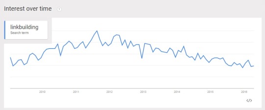
If I were Google, I would expect webmasters impacted by the unnatural outbound links penalty to respond in one of these ways:
Do nothing. The penalty is specifically stated to "discount the trust in links on your site." As a webmaster, do you really care if Google trusts the outbound links on your site or not? What about if the penalty does not impact your traffic, rankings, visibility, etc.? What incentive do you have to take any action? Even if you sell links, if the information is not publicly displayed, this does nothing to harm your link-selling business.
Innocent site cleanup effort. A legitimate site that has not exchanged goods for links (or wants to pretend they haven't) would simply go through their site and remove any links that they feel may have triggered the issue and then maybe file a bland reconsideration request stating as much.
Guilty site cleanup effort. A site that has participated in link schemes would know exactly which links are the offenders and remove them. Now, depending on the business owner, some might then file a reconsideration request saying, "I'm sorry, so-and-so paid me to do it, and I'll never do it again." Others may simply state, "Yes, we have identified the problem and corrected it."
In scenario No. 1, Google wins because this helps further the fear, uncertainty, and doubt (FUD) campaigns around link development. It is suddenly impossible to know if a site's outbound links have value because they may possibly have a penalty preventing them from passing value. So link building not only continues to carry the risk of creating a penalty on your site, but it suddenly becomes more obvious that you could exchange goods/money/services for a link that has no value despite its MozRank or any other external "ranking" metric.
In scenarios No. 2 and No. 3, Google wins because they can monitor the links that have been nofollowed/removed and add potential link scheme violators to training data.
In scenario No. 3, they may be able to procure evidence of sites participating in link schemes through admissions by webmasters who sold the links.
If I were Google, I would really love to have a control group of known sites participating in link schemes to further develop my machine-learned algorithm for detecting link profile manipulation. I would take the unnatural outbound link data from scenario No. 3 above and run those sites as a data set against Penguin to attempt 100% confidence, knowing that all those sites definitely participated in link schemes. Then I would tweak Penguin with this training dataset and issue manual actions against the linked sites.
This wouldn't be the first time SEOs have predicted a Google subtext of leveraging webmasters and their data to help them further develop their algorithms for link penalties. In 2012, the SEO industry was skeptical regarding the use of the disavow tool and whether or not Google was crowdsourcing webmasters for their spam team.

"Clearly there are link schemes that cannot be caught through the standard algorithm. That's one of the reasons why there are manual actions. It's within the realm of possibilities that disavow data can be used to confirm how well they're catching spam, as well as identifying spam they couldn't catch automatically. For example, when web publishers disavow sites that were not caught by the algorithm, this can suggest a new area for quality control to look into." - Roger Montti, Martinibuster.com
What objectives could the unnatural outbound links penalties accomplish?
Legit webmasters could become more afraid to sell/place links because they get "penalized."
Spammy webmasters could continue selling links from their penalized sites, which would add to the confusion and devaluation of link markets.
Webmasters could become afraid to buy/exchange links because they could get scammed by penalized sites and be more likely to be outed by the legitimate sites.
The Penguin algorithm could have increased confidence scoring and become ready for real-time implementation.

"There was a time when Google would devalue the PR of a site that was caught selling links. With that signal gone, and Google going after outbound links, it is now more difficult than ever to know whether a link acquired is really of value." -- Russ Jones, Principal Search Scientist at MOZ
Again, if I were Google, the next generation of Penguin would likely heavily weight irrelevantly placed links, and not just commercial keyword-specific anchor text. Testing this first on the sites I think are guilty of providing the links and simply devaluing those links seems much smarter. Of course, at this point, there is no specific evidence to indicate Google's intention behind the unnatural outbound links penalties were intended as a final testing phase for Penguin and to further devalue the manipulated link market. But if I were Google, that's exactly what I would be doing.

"Gone are the days of easily repeatable link building strategies. Acquiring links shouldn't be easy, and Penguin will continue to change the search marketing landscape whether we like it or not. I, for one, welcome our artificially intelligent overlords. Future iterations of the Penguin algorithm will further solidify the “difficulty level” of link acquisition, making spam less popular and forcing businesses toward legitimate marketing strategies." - Tripp Hamilton, Product Manager at Removeem.com
Google's webmaster guidelines show link schemes are interpreted by intent. I wonder what happens if I start nofollowing links from my site for the intent of devaluing a site's rankings? The intent is manipulation. Am I at risk of being considered a participant in link schemes? If I do link building as part of an SEO campaign, am I inherently conducting a link scheme?

So, since I'm an SEO, not Google, I have to ask myself and my colleagues, "What does this do to change or reinforce my SEO efforts?" I immediately think back to a Whiteboard Friday from a few years ago that discusses the Rules of Link Building.

"At its best, good link building is indistinguishable from good marketing." - Cyrus Shepard, former Content Astronaut at Moz
When asked what type of impact SEOs should expect from this, Garret French from Citation Labs shared:

"Clearly this new effort by Google will start to dry up the dofollow sponsored post, sponsored review marketplace. Watch for prices to drop over the next few months and then go back and test reviews with nofollowed links to see which ones actually drive converting traffic! If you can't stomach paying for nofollowed links then it's time to get creative and return to old-fashioned, story-driven blog PR. It doesn't scale well, but it works well for natural links."
In conclusion, as SEOs, we are responsible for predicting the future of our industry. We do not simply act in the present. Google does not wish for its results to be gamed and have departments full of data scientists dedicated to building algorithms to identify and devalue manipulative practices. If you are incapable of legitimately building links, then you must mimic legitimate links in all aspects (or consider a new career).
Takeaways
Most importantly, any links that we try to build must provide value. If a URL links to a landing page that is not contextually relevant to its source page, then this irrelevant link is likely to be flagged and devalued. Remember, Google can do topical analysis, too.
In link cleanup mode or Penguin recovery, we've typically approached unnatural links as being obvious when they have a commercial keyword (e.g. "insurance quotes") because links more naturally occur with the URL, brand, or navigational labels as anchor text. It would also be safe to assume that natural links tend to occur in content about the destination the link offers and that link relevance should be considered.
Finally, we should continue to identify and present clients with methods for naturally building authority by providing value in what they offer and working to build real relationships and brand advocates.
What are your thoughts? Do you agree? Disagree?
Sign up for The Moz Top 10, a semimonthly mailer updating you on the top ten hottest pieces of SEO news, tips, and rad links uncovered by the Moz team. Think of it as your exclusive digest of stuff you don't have time to hunt down but want to read!
0 notes
Text
Title Tag Length Guidelines: 2016 Edition
Posted by Dr-Pete
For the past couple of weeks, Google has been testing a major change to the width of the left-hand column, expanding containers from 512 pixels to 600 (a 17% increase). Along with this change, Google has increased the available length of result titles:
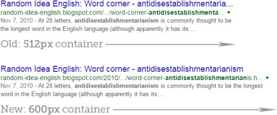
This naturally begs the question - how many characters can we fit into a display title now? When Google redesigned SERPs in 2014, I recommended a limit of 55 characters. Does a 17% bigger container mean we've got 9 more characters to work with?
Not so fast, my friend…
This is where things get messy. It'd be great if we could just count the characters and be done with it, but things are never quite that easy. We've got three complications to consider:
(1) Character widths vary
Google uses the Arial font for result titles, and Arial is proportional. In other words, different characters occupy different amounts of space. A lower- case 'l' is going to occupy much less space than an upper-case 'W'. The total width is measured in pixels, not characters, and the maximum amount you can fit in that space depends on what you're trying to say.
In our 10,000-keyword tracking set, the title below is the longest cut or uncut display title we measured, clocking in at 77 characters:

This title has 14 i's and lowercase l's, 10 lowercase t's, and 3 narrow punctuation marks, creating a character count bonanza. To count this title and say that yours can be 77 characters would be dangerously misleading.
(2) Titles break at whole words
Prior to this change, Google was breaking words at whatever point the cut-off happened. Now, they seem to be breaking titles at whole words. If the cut happens in the middle of a long word, the remaining length might be considerably shorter. For example, here's a word that's just not going to fit into your display title twice, and so the cut comes well short of the full width:

(3) Google is appending brands
In some cases, Google is cutting off titles and then appending the brand to the end. Unfortunately, this auto-appended brand text still occupies space and counts against your total allowance. This was the shortest truncated display title in our data set, measuring only 34 words pre-cut:

The brand text "- The Homestead" was appended by Google and is not part of the sites
tag. The next word in the title was "Accommodations", so the combination of the brand add-on and long word made for a very truncated title.
Data from 10,000 searches
Examples can be misleading, so we wanted to take a deeper dive. We pulled all of the page-1 display titles from the 10,000-keyword MozCast tracking set, which ends up being just shy of 90,000 titles. Uncut titles don't tell us much, since they can be very short in some cases. So, let's focus on the titles that got cut. Here are the character lengths (not counting " ...") of the cut titles:
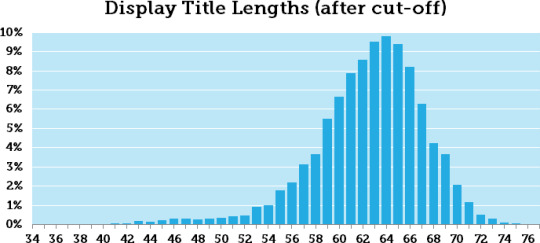
We've got a fairly normal distribution (skewed a little to the right) with both a mean and median right around 63. So, is 63 our magic number? Not quite. Roughly half the cut titles in our data set had less than 63 characters, so that's still a fairly risky length.
The trick is to pick a number where we feel fairly confident that the title won't be cut off, on average (a guaranteed safe zone for all titles would be far too restrictive). Here are a few select percentages of truncated titles that were above a certain character length:
55% of cut titles >= 63 (+2) characters
91% of cut titles >= 57 (+2) characters
95% of cut titles >= 55 (+2) characters
99% of cut titles >= 48 (+2) characters
In research, we might stick to a 95% or 99% confidence level (note: this isn't technically a confidence interval, but the rationale is similar), but I think 90% confidence is a decent practical level. If we factor in the " ...", that gives us about +2 characters. So, my recommendation is to keep your titles under 60 characters (57+2 = 59).
Keep in mind, of course, that cut-offs aren't always bad. A well placed "..." might actually increase click-through rates on some titles. A fortuitous cut-off could create suspense, if you trust your fortunes to Google:

Now that titles are cut at whole words, we also don't have to worry about text getting cut off at confusing or unfortunate spots. Take, for example, the dangerous predicament of The International Association of Assemblages of Assassin Assets:

Prior to the redesign, their titles were a minefield. Yes, that contributed nothing to this post, but once I had started down that road, it was already too late.
So, that's it then, right?
Well, no. As Google evolves and adapts to a wider range of devices, we can expect them to continue to adjust and test display titles. In fact, they're currently test a new, card-style format for desktop SERPs where each result is boxed and looks like this:

We're not even entirely sure that the current change is permanent. The narrower format is still appearing for some people under some conditions. If this design sticks, then I'm comfortable saying that keeping your title length under 60 characters will prevent the majority of cut-offs.
Note: People have been asking when we'll update our title tag tool. We're waiting to make sure that this design change is permanent, but will try to provide an update ASAP. Updates and a link to that tool will appear in this post when we make a final decision.
Sign up for The Moz Top 10, a semimonthly mailer updating you on the top ten hottest pieces of SEO news, tips, and rad links uncovered by the Moz team. Think of it as your exclusive digest of stuff you don't have time to hunt down but want to read!
0 notes