#typograhpy
Explore tagged Tumblr posts
Text

Editorial Old
209 notes
·
View notes
Text


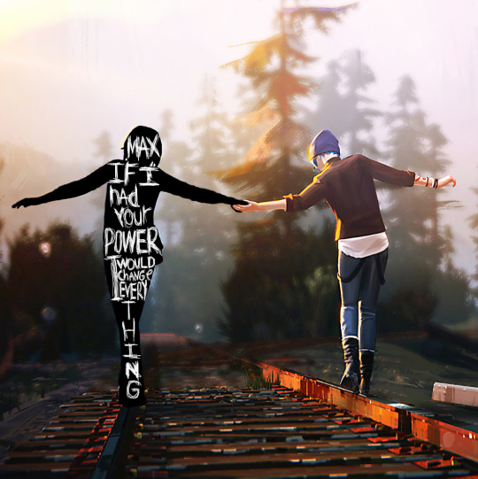
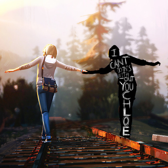
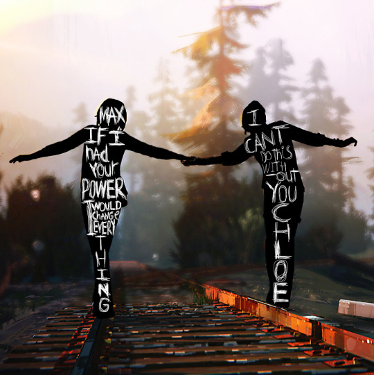
Inspired by this incredible edit on tiktok
I was interested in trying something a bit more experimental today. I'm pretty satisfied with how it turned out although I hope to improve in the future. For fun here's both of them together.

#aesthetic#letter aesthetic#aesthetic fonts#feelings#paper aesthetic#Life is strange#lis#life is strange game#max caulfield#chloe price#pricefield#text edit#edit#writing edit#font edit#typograhpy#typeedit#life is strange aesthetic#traintracks#video game#painting#blackout#golden hour#golden hour aesthetic#experimental#edgy#quotes#quote#web weaving
151 notes
·
View notes
Text


“slut!”
#taylor swift#taylor swift edit#tswift edit#tswift#taylor swift lyrics#lyric edit#tsedit#tscreators#typograhpy#edits#lyrics#slut!#slut! taylor’s version#1989#1989 tv#1989 taylor's version#tuserheidi#userpunk#eras tour#taylor swift eras#lexposts
50 notes
·
View notes
Photo

source unknown
8 notes
·
View notes
Text
I need this font, where can I get it?

Sylvia Plath
3K notes
·
View notes
Text

Y-week of the Alphabet Superset: yatagan!
Back to my usual style with simple colours and graphics to highlight the subject and typograhpy. Still a bit of an experiment for this series as the title for once is very much in the background. Also only one more left!
3 notes
·
View notes
Text
Photography, a full body of an 30 year old Indonesian man is standing with stylish looking ahead, wearing a blue hoodie labeled (your text) with white handwritten font, black jeans, red sneaker, messy short hair. The background is dark wall full of colorful neon light words pattern with typograhpy style, dark floor, smoky. Make sure the text (your text) is read clearly.

0 notes
Text
Typograhpy
the previous typography research was based on how typography itself will the story but since in children's book the illustrations make the cover much more interesting I started to look at more children's book typography

0 notes
Photo

poem:- if I were a song... whitneyhansonpoetry photo: Pinterest 2023 DESIGNS BY JOE NO RIGHTS RESERVED #chrometype #logotype #typograhpy #typographic #typographer #fonts #snapmagazine #amnestymagazine #grafikradar #acidgraphix #certainmagazine #generaleclectic #rawarstudio #y2kstyle #collectgraphics #foliofolio #thedesignblacklist #visualgraphic #y2k #y2kaesthetic #y2kfashion #digitalarchive #eyeondesign #chrome #appareldesign #tshirtdesign #digital #vhs #nostalgia #retro
0 notes
Text


House Song // Searows
#aesthetic#letter aesthetic#aesthetic fonts#feelings#text edit#edit#writing edit#font edit#typograhpy#typeedit#painting#experimental#edgy#quotes#quote#web weaving#light blue#blue aesthetic#glow#house song#searows#glow aesthetic#song aesthetic#lyrics aesthetics#lyric aesthetic#lyrics aesthetic#lyrics#song lyrics#aesthetic lyrics#feel music
3 notes
·
View notes
Text
i’m starting to feel quietly accomplished now that i can look at a typeface’s “italic” version and whisper to myself, “that’s not a true italic, that’s just an oblique”.
1 note
·
View note
Text


Book Arguments to remember in Bullet Journal
#booksummary#books#neilpostman#amusingourselvestodeath#amusement#amusing#reading#bulletjournal#drawing#predictions#remember#typograhpy#telegraphy#photography#television
2 notes
·
View notes
Photo


VIDAR is a paper company that I invented. The company would be located in Lindsborg, Kansas, and accordingly the design is inspired by the Dala horses that are a staple of that little town. The company would speicalize in high quality artistic type paper. The largest part of this project was designing the catalogue. It was a struggle to work with so many elements at once; photo, layout, packaging design, text. I had to make everything for this project, and it was very challenging. However, I am satisfied with how everything looks at the end. I’ve never looked at so much material for inspiration before; for this project I looked at CA magazine, I looked at dala horse design and nordic patterns, I looked at paper packaging designs and notebook designs. Taking all that in and changing it into design that suited a paper company, that features the paper and uses black and white to make things look elegant and high quality was tough. Not to mention finding or taking photographs of paper looking interesting or dynamic is very hard. But I am pleased with it and I think it achieves a style that suits the company brand.
1 note
·
View note


