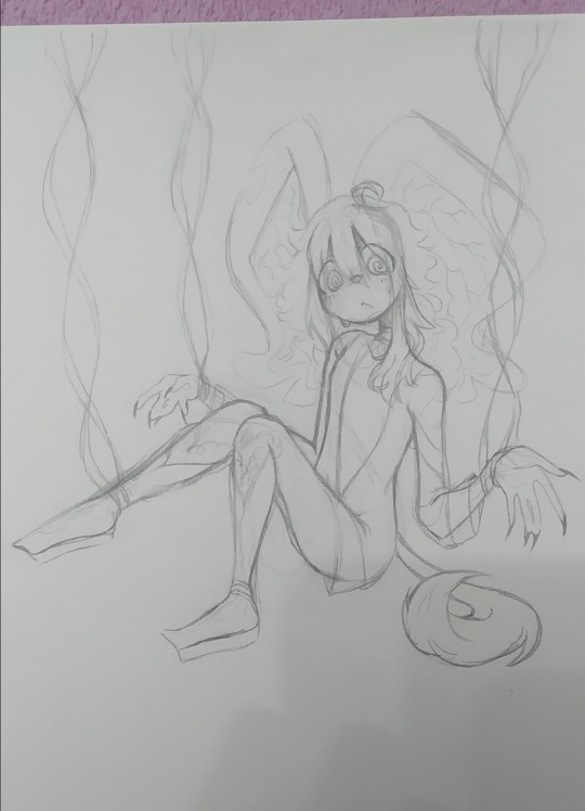
#tried a new way of doing lineart i think i like it!
Explore tagged Tumblr posts
Text

Happy New Year everyone!! Here's to more art in 2025!!! 🥂🎉
#I think my personal faves of the year were February June and October#although I like May July and Dec a lot too :3 and August had a lot of personal meaning for me!#I drew a lot in July bc of artfight. and in November I felt my art style started shifting as I tried new stuff with brushes#September was a three-way art collab w my friends! one of those you do the sketch / you do the lineart / you do the coloring things#some of the stuff in this also wasn't posted here bc it was fandom oc stuff + oc/canon stuff that I post on a different blog lolll#those being January March April May and October#mine#original#fanart
9 notes
·
View notes
Text

cringetober day 6: neko/other animal features
aww, cute snow leopard girl! and she's SO normal!!!!
#art#original character#dottie#cherry's new job#tried doing actual lineart again because i really love it but i think i like it more with a textured brush tee bee atche#i'm trying to think of a way to work in “stop looking at me with them big old eyes” but i can't think of anything#dottie does have really big eyes though#cringetober 2023
4 notes
·
View notes
Text

"The only way to win a rigged game is to hope its in your favor."
(Clearer version + Thoughts beneath cut)

I tried a new rendering and lineart style with this, and I think it turned out really well!! This piece sort of flashbanged my brain and I just HAD to do it. I'm not super big on the final versions background and lighting but it's alright.
Also this is to showcase my Wildlife Grian designnnn. The actual design won't have the Watcher features, but everything else is abt the same. I took inspiration from casino dealers with his outfit, what with the dress shirt and bow tie and slacks, but I made the vest a sweater vest to give it that element of the original Grian. Also its really hard to see but the bow middle is meant to look a bit like an eye and a poker chip.
#trafficblr#life smp#life series fanart#grian#life series#wild life#wild life smp#wild life spoilers#watcher grian#grian fanart#v1p-art
535 notes
·
View notes
Text
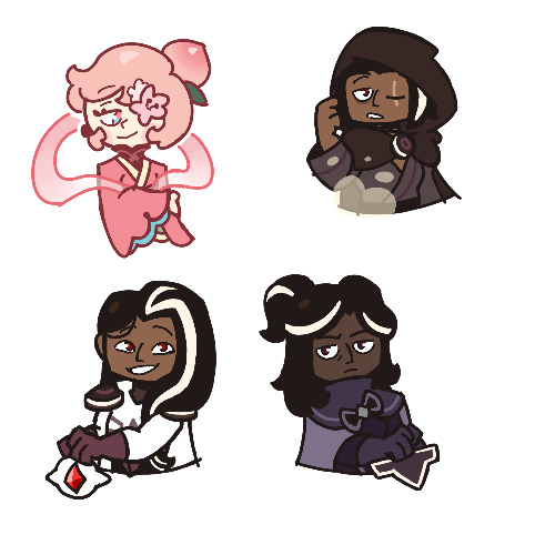
…Okay, you may end up seeing these drawings yet again on a later date
I finished the page, which was small at 500x500 px, but I wanted to make the page bigger. I did that, and I drew one new thing, but now I don’t know what else to draw on there. So for now, I figured I might as well post the original full page right now
Yeah, sorry for the laziness
This is the other sketch I finished on there, for those curious
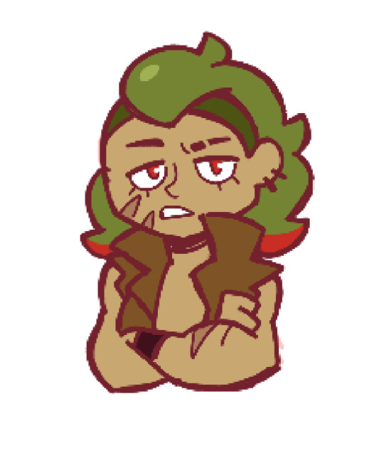
Anyways, so yeah, this new style practice I’m trying
The original page I tried these out on is this, which also isn’t full, but I thought trying it out with actual characters instead of just random poses and shapes would be better, so I switched over to Cookie Run characters
The method is still a work in progress when it comes to all the shapes and the red sketch layer
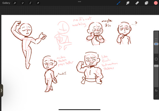
I suppose what I should do now is try drawing a bunch of different Cookies that have different body shapes, so that I have practice with that. As well as maybe attempt some full body ones
I suppose you can suggest some if you want, considering I don’t know who to draw other than like, Hollyberry or Avocado, since I should try drawing large but not buff characters here. But I should also probably draw more skinny, and also chubby
But on to what I actually drew
So I already talked about Peach Blossom and the top Dark Choco drawing prior, so no real need to elaborate
The Dark Choco and Dark Cacao one was me drawing them in their younger forms to see how they compare. Not for any sort of study thing, but just in a symbolic sort of way. Since they’re so similar looking
I think I had a lot more fun with Choco, especially his hair. I remember Cacao being mostly annoying for his weird cloak thing that I don’t understand
The hand pose was ass though. I knew the general idea of what I wanted, that being them with their hands over their swords, but I was struggling to figure out how to draw the hands. Not to mention I had to change the pose from the red sketch because the swords were further down than I put them. I still don’t think I did the pose exactly correct, but screw it, it’s good enough
I’m also noticing that Choco looks way lighter in skin tone compared to Cacao. Like yeah, I know he’s normally slightly lighter, but it’s far more noticeable here. I’m pretty sure it’s because I used Dark Choco’s ToA colors here (bc they work better with my black lineart), which are slightly lighter, as well as just that Dark Choco is wearing much lighter colors while Dark Cacao’s are relatively darker. So maybe it just makes them contrast more
I liked drawing them, but I also did basically do the same body type 3 in a row, so I should probably draw different characters
Anyways, let’s talk about that extra sketch
So for those who likely don’t remember, that there is an OC of mine called Prickly Pear Cookie
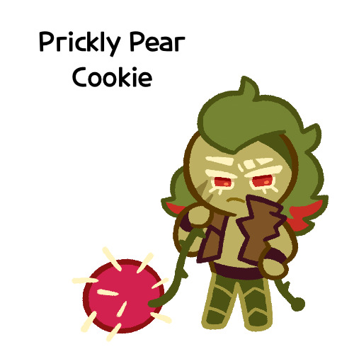
I made her entirely on a whim one day, and she doesn’t really have any character or story, just vibes, but I really like her design and wanted to draw it again
I probably should give her some sort of bra though. The shirtless chest looks cool but in my opinion sounds really uncomfortable without at least that
I did originally draw her with the green skin, but it looked weird so I shifted it to more of a yellow so it looks more human
Honestly I really like how she turned out
But yeah, I think that’s about it for now. Just wanted to show this
#I need to tweak and perfect it more#but it’s turning out relatively nice#I just need to stop falling back on old drawing habits#I need to relearn hands a new way#I have a reference that I found later on so I might use that#anyways#cookie run#dark choco cookie#dark cacao cookie#peach blossom cookie#art stuff#art style#cookie run oc#prickly pear cookie#my art
166 notes
·
View notes
Text
I've said for the better part of two years, well before it was even announced, that a Misfits and Magic season 2 might kill me, and in fact it tried (in only the best ways)! And not only did it give me the gift of a new all-time favorite D20 episode (sorry, Neverafter's "Once Upon A Time," there's a new dealing-with-PC-death-in-the-most-perfect way episode, and it's "A Place of Knowing"), it also gave me something I've been waiting years for: little lineart symbols that perfectly match my usual tattoo aesthetic, so I can finally get the D20 tattoo I've been dreaming of, for my favorite campaign, no less.
Just one problem: I'm not much for social media, and having consumed all the MisMag season 2 content I can find, I still can't find anything that confirms what all six of the little creature symbols should be. So I figured I'd farm the question out to the internet, and see if anyone saw/heard something I missed. So: the index cards.
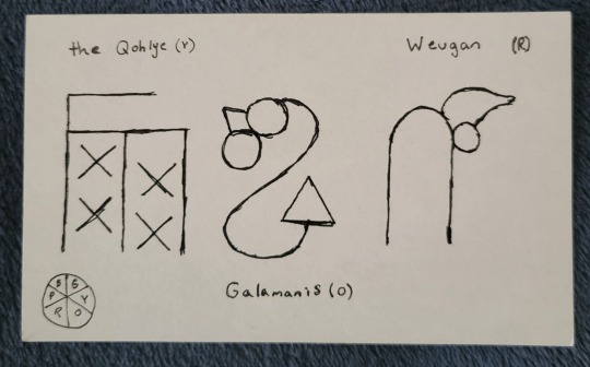
The warm half of our color wheel, as depicted by the Gowcentric Orrery, is straightforward. The symbols appear on Tabby in direct coordination with their names when the Pilot Program visits Galamanis, the Qohlye, and Weugan in episodes 2, 3, and 6. They also all look reasonably recognizable as their animals (I'd say the Qohlye the least, and Weugan the most, but there's still a winged goat, a lizard, and a dog in the shapes). So that was easy. The problem is, unless I missed something, we're not shown the other three island/creatures in as straightforward a way.
Across different episodes, we do see symbols that clearly represent Tabby, the knotted symbol for magic's rules, and, of course, Tabby's enemies to lovers best friends relationship with Jammer, but because they're recognizable, I discounted them from my research. But, in episode 4 (on Seegenpelater) we do see three other symbols, which are never formally explained on the show, appearing when the Pilot Program are conversing with text-Tabby. Without finding anything to confirm or deny it, I've assumed that these three other symbols are in fact the cool side of our color wheel, breaking Tabby's pictogram language into the six basic magic principals he was made to coordinate. Which leaves the problem of working out which symbol is which of our favorite little magic guys.
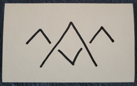
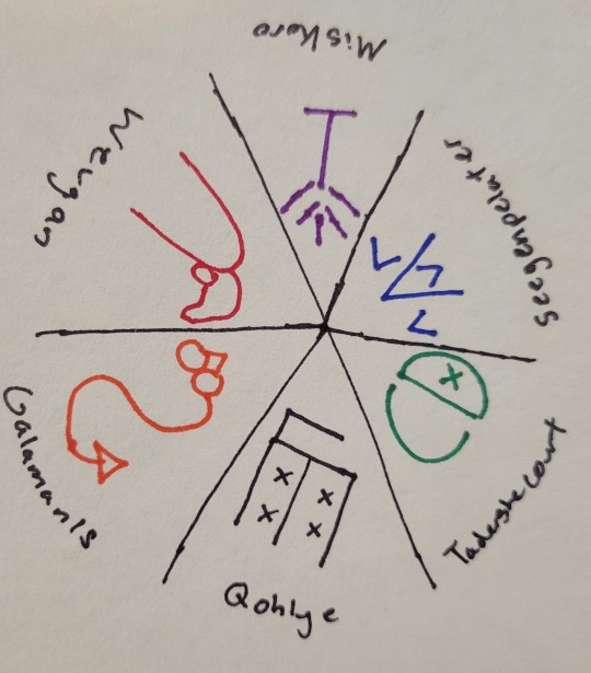
With limited understanding, the only clues I really could think to go off of were the general shape of the symbol, and the word they appear before on Tabby's tablet when he's doing his magic-eight-ball routine. I'm almost 100% certain the above symbol is Seegenpelater's. I'd say this looks about as close to a two-headed camel as the warm side of the wheel looks to their animals. It also was accompanied by the word "doubtful" on Tabby's screen, which I do think corresponds reasonably to Seegenpelater being the basis of illusory/enchantment magic (ie, magic that casts reality in doubt). That would make it the blue wedge, opposite Galamanis, and leaves us with purple (Miskoro) and green (Tadershecourt).
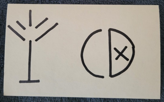
This is where I hit the snag. I don't think either of these especially resembles our boy Tad. I could honestly see an argument for either depicting an antlered creature. My best guess is that the one on the left is Miskoro and the one on the right is Tad: I'd say the left looks to me like a winged guy with a tail, and the right does have a vague skull shape to it. We also see both of these symbols used twice. The left symbol accompanies the phrase "likely," while the right is joined with "ask later." I don't find that particularly helpful, since both phrases to me could be associated with Miskoro's transformation magic, but given that Tad's is a magic of curtailing/lessening, I'd be more inclined to give him the latter (also, I think it looks like a power button, and it's fun to think about Tad's symbol literally being a kind of off switch).
Assuming I'm correct, and that these symbols do all correspond to the orrery (as opposed to us just not seeing some symbols because it didn't come up during gameplay), that would make our full, official Gowcentric Orrery look something like this (apologies for the quick, shitty sketch):
Does anyone know a confirmation one way or the other if this is right? If @quiddie or the Dimension 20 art team has released an official version? I've literally been thinking about this for the past two months, so if anyone else has an answer, or even just a theory, I'd really love to hear it!
#my thoughts#dimension 20#d20#d20 mismag#d20 spoilers#misfits and magic#evan kelmp#k tanaka#sam britain#whitney jammer#aabria iyengar#hopefully thats enough tags that at least somebody with an answer will see this!#I've definitely gotten symbol tattoos from shows without confirmation before#cough cough circular galifreyan#but this one i really want to get right#also d20 merch team release pins for this season#or literally any new mismag merch#im begging you#misfits and magic 2#d20 meta#mismag meta
70 notes
·
View notes
Text
@rascalentertainments Hey! As an apology for being gone and missing the official announcement for this DTIYS, I humbly offer my take on Asha and Star!
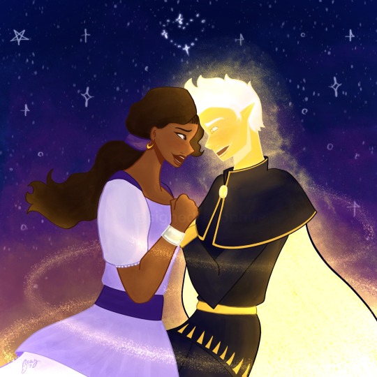
This was too cute to resist! I love how excitable Star is and I’m working my way through reading your, Wave’s, and all other rewrites that have updated during my absence.
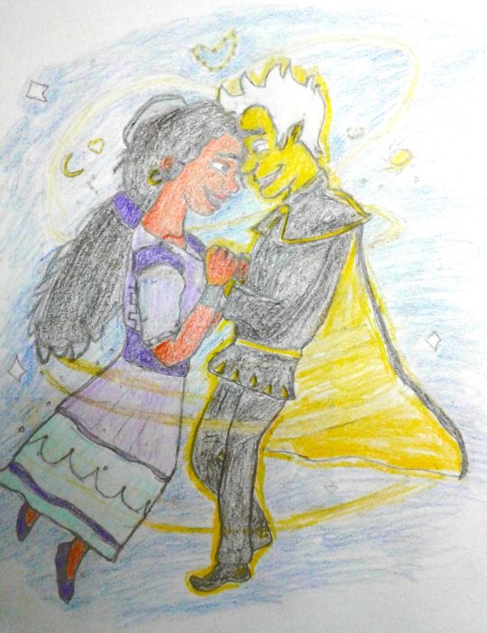
Original:


Notes under the cut because this is getting pretty long lol
So I tried a new colouring style for this one
I was inspired by a lot of the artists I saw on Art Fight, and tried to incorporate that into my style
Specifically, the bold lineart and colour-blocked sections
It’s both easier for me long-term, and helps me create a finished piece without too much shading
That said, I did go crazy with the shades and tones in this one, because I just loved the glow
I do like the touch of a slight sunset/sunrise in the background, as it adds more warmth and magic to the piece
I LOATHE that bold line around Star’s cape but this is the photo I emailed over to my phone, so this is what you’re stuck with
While we’re at the improvements, comparing to your piece, Star and Asha look a bit stiff. I’ll have to work on some gesture movements
On the other hand, I really like the sky! It reminds me of Princess and the Frog
I also think the flow effect I did around Star looks reminiscent of pixie dust, which is a cool nod to Peter Pan!
The metal (?) bracelet I’m proud of— again, learning form other writings on Art Fight
I’m. Not sure about Star. He has a very cool face shape, nose and eyes wise, and I think I sort of generalized him here. Oh well, this means I’ll probably be doing more practice doodles of him in the future!
I do think that your Asha and Flicker’s seem very similar in my style, so I’ll work on making them more distinct in future pieces. I think RFTS!Asha has more doe eyes and a smaller nose, as well as distinct braids in her hair, where your Asha can have more upturned eyes and loose hair
I will have to find a way to make hair look loose and free in this style, but I’m quite happy with the finished result
Aaaaanyways… I hope you enjoy this! Now if you’ll excuse me, Imma go to bed lmao
#disney wish#wish 2023#asha x star#asha#star x asha#saph doodles#starsha#wish granted au#dtiys challenge#dtiys entry#dtiysart#draw this in your style
62 notes
·
View notes
Text
Here ye here ye, another breaking down processes post from yours truly!
For this animation, my plan was to make something I'm proud of AND also something to force me to take my time since with all previous animation works they were all rushed. I normally tend to speed through work as someone whose illustrations are painterly and I like to keep them rough. Also lets be totally honest my other plan for this animation was to animate Mizrox being so sickeningly sweet.
Fun fact, this animation was going to be longer. I had tried to plan out Olrox climbing on top of Mizrak during the kiss to lay on his chest. There was an attempt trying to rough that out and several ref videos It was scrapped because for the life of me I could not figure it out. Also hypothetically if I was going to keep it, I would cut to another angle (perhaps Mizrak's face close up) and then cut to another angle that would make it easier to see that climbing over the top. OR, consider Olrox already sleeping on his chest (im just rambling now but this is basically 'if you were able to do this again' section).
I wish I actually went through a more proper tie-down process because the jump from going from my rough straight to clean was rough (badum tsk) for the first few seconds. Defintely learnt my lesson ALSO Olrox is surprisingly really fun to draw from behind.
I challenged myself to see if I could get the idea of "bigger movements, less in-betweens, smaller/slower movements, more in-betweens." Though the effect of Olrox rubbing his face against his arm may be a little too jarring and I steered quite a bit away from my rough and self-reference video in hopes of making the face rubbing more apparent because I thought the character acting was too subtle and wanted a contrast to the other half of the scene. I reconfigured my CSP animation workspace for this too so it definitely made the process less tedious when cleaning up the animation.
(Which by the way I do record a lot of self-references depending on the section! For things I can't do/uncomfortable doing, I'll end up looking up videos. It's the easiest for me to catch subtle things in body language and also get a feels for the motion.)
Also I'm really satisfied with Olrox's anticipation before his smooch and the shoulder roll at the end even though technically the arc doesn't complete itself. MIZRAK THOUGH, when cleaning up I realised my rough wouldn't make sense because he's already looking at him so there's no need for a turn, and then the lack of a shoulder movement felt jarring, so all of that was done without any thought, wish I did think about it more though.

Now compositing was a monster in its own right and basically me jumping back and forth between turning on and off different layers, but here are all the new things I did; I duplicated and blurred the lines of the lineart, beveled the shadows so it was lighter on the inside, and added a rim of blur so the focus drew towards the couple. Also will absolutely admit that my fanboy ass went "... be crazy and try to mimic the show." The final did not go that route because I thought it was more important to emphasize the mood/atmosphere (Also Olrox is intentionally stylized differently because i wanted him to be softer here and I had to give him eye highlights for plot HELP). THOUGH to say I did not try to mimic the style, the #2 lighting test was my 'attempt' LOL 😭 I can never consume media normally.
Here are the lighting tests I went through. I definitely knew I wanted to go with a morning vibe, though I tested out a night ver for fun and did some edge lighting which led to mixing both version #2 and #3 to make #4.
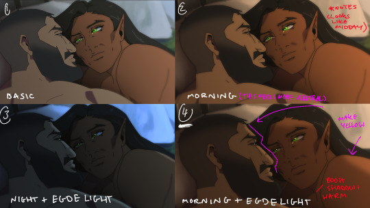
Fun fact, I almost went with #2 due to fear of getting too heavy-handed with compositing and therefore losing the animation (even though I really liked #4 at the time). Thanks to a friend, they also shared the sentiment of liking #4, though pointed out it felt like midday and encouraged me to make the colours warmer and deepen the shadows. It is a really tough balance but I think for a softer scene like this, the more additional layers of comp worked out in the end.
The edge light was a last minute thing because someone told me to add sound and to have light stream in. Also at this point I deadass forgot that you know, Olrox, is a vampire, but hey rule of cute overrules. We can pretend its light not from the sun LOL

Also yay I got to show off my own style a tad, I love paintingggg. It's not as completely fully rendered coz I knew that it would get covered up but I still made sure it was quite clean regardless. I didn't realise how much of it would be covered up even though I did make sure they would fit/make sense for bg LOL
Now we are done!
If you've gotten this far thank you! There's gonna be less frequency of these animations due to the semester starting back up soon and I don't get many opportunities to actually 2D animate (despite it being an animation degree RAH). Also I remembering cringing and laughing a lot when I immediately started putting colour down going "oh i can see the end of the horizon, i have too much power as an artist, people will see this i cant let them see me be crazy"

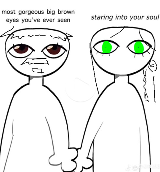
[Here's some memes I drew over while my friend was reviewing my work]
#mystery talks#castlevania nocturne#artists on tumblr#castlevania#castlevania fanart#fan animation#olrox/mizrak#i still keep going “oh no people who worked on the show will see this theyre gonna see im insane /lh”#its ok coz being crazy pushes you to achieve things
91 notes
·
View notes
Text
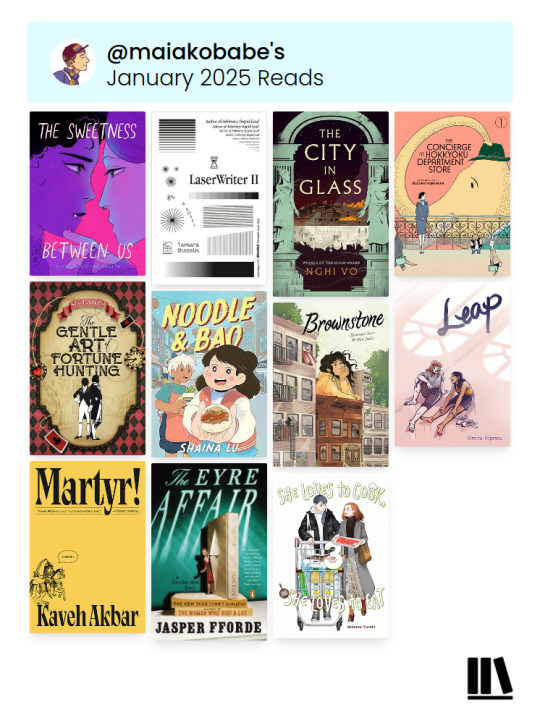
January Reading and Reviews by Maia Kobabe
I post my reviews throughout the month on Storygraph and Goodreads, and do roundups here and on patreon. Reviews below the cut. You might notice the layout image looks different! I have switched to using the Storygraph wrap up and I'm now linking to the Storygraph reviews as well :)
The Sweetness Between Us by Sarah Winifred Searle
Perley and Amandine are both readjusting to high school life after a major health crisis. Perley was diagnoses with diabetes; Amandine was turned into a vampire after a car crash nearly ended her life. They bond in remedial classes over just wishing their lives could go back to normal. Perley tentatively rejoins the knitting club; Amandine wants to rejoin a sports team but struggles with exhaustion; both of them have less energy than they had before. Their friendship develops into something more, but can they maintain a romance when they are both still figuring out their own shit? This is a very sweet slice of life story with a fun dash of the supernatural. I wanted a little more from some of the queer themes; I spent most of the book unsure of Perley's pronouns. But I was absolutely rooting for these two oddball teens to find their way back to each other.
LaserWriter II by Tamara Shopsin
This is a novel, loosely, but more so it's a little window back into a specific era of repairable technology and the people who were drawn to it. Set almost entirely in a (real, I think) Mac repair shop in New York City in the 1990s, this book jumps from backstory to backstory, introducing a range of self-taught computer fanatics. The cast and the story both feel wide but not deep. I didn't get to know anyone well, not even Claire, the newest hire and lead character. It did give me some serious nostalgia, even though I was really too young in this era to really have any meaningful relationship with it's technology. A weird but charming little book.
The City in Glass by Nghi Vo, read by Susan Dalian
The demon Vitrine has been nurturing, building, challenging and haunting the port city of Azril for hundreds of years when the angels come to burn it to the ground. She tries to defend her people from the heavenly attack but only succeeds in cursing one of angel, embedding a thorn of spite in his side. When his brothers leave, he is forced to stay, and since he has nothing else to do, he watches her begin the long, painful process of cleaning and rebuilding. This is a dreamy stream of consciousness book with less plot that I'm used to from Nghi Vo. I'll admit this one captured me less than her work usually does though the prose is very beautiful.
The Concierge at the Hokkyoku Department Store vol 1 by Tsuchika Nishimura
Akino is a new hire at the Hokkyoku Department Store, a store build to serve talking animal customers including many unusual and nearly extinct species. Akino must find a way to be present, polite and helpful without hovering or intruding on the customers experience. This is harder than it sounds, especially with fussy managers always watching the store floors! Sweet, silly, and very warm hearted. I like the delicate, retro lineart style.
The Gentle Art of Fortune Hunting by KJ Charles read by Cornell Collins
Another fun historical m/m romance from KJ Charles, this one more in the comedy of manners genre. I had a good time with it, I liked the leads, and as usual the secondary characters really shown. I did wish the enemies part of the enemies to lovers plot had lasted a bit longer, and the overall silliness of the story isn't going to make this the first Charles book I rec to anyone unfamiliar with her work, but it kept me entertained.
Noodle and Bao by Shaina Lu
Momo loves living in Town 99, a historically Chinese neighborhood where she knows everyone and all the best places to eat and hang out. But things are changing. Her parents are worried about making rent, and her favorite restaurant was kicked out of its location and now operates out of a cart. The owner of the new restaurant, Fancé Cafe, has big plans to buy out the whole block and upscale everything. Momo rallies her friends and neighbors to fight back against the gentrification. This is a very sweet book for young readers, with talking animal characters and whimsical food battles interwoven with community organizing. An epilogue explains the issues around gentrification for a child who might not have encountered it before.
Brownstone by Samuel Leer and Mar Julia
Almudena grew up with her white mom, always wondering about the Guatemalan father she'd never met. Until one summer mid-high school when her mom heads off to Europe for a dance tour and drops her off at the Brooklyn brownstone her father, Xavier, is renovating. Almudena has to navigate around a language barrier, an through unfamiliar neighborhood, and into a close knit Latino community many of whom see her as not brown enough to count. But Almudena is determined not to let this opportunity to know her father slip away. This is such a warmhearted book, funny and kind, with a really well developed cast. The art and the writing make a perfect whole, capturing a deeply specific mid-1990s moment. I've been following the artist's self published releases for years and I'm so happy to see their work shine in a full length book!
Leap by Simina Pepesco
Ana is a college student in a contemporary dance program in Budapest, but her heart has fallen out of dancing. She skips her own classes to spent time rehearsing with her secret girlfriend, Carina, an ambitious ballerina in the classical program. Her new roommate, Sara, transferred out of classical and into contemporary and is thriving in the new, more supportive environment. She's also starting to develop feelings for the kind teacher, Marlena, who helped her transfer. Both of them are struggling to figure out their relationships with their art, as well as their sexualities, as well as how safe or not safe it feels to be out at their private, gossip-prone school. This is a really well told and well drawn coming of age story; I also really appreciated it as a story of queer friendship which complicated some of the standard narratives around first crushes/first relationships/coming out being kind of anti-climatic, half affirming, half disappointing. Definitely recommend!
Martyr! by Kaveh Akbar
What a book! Several of my friends called this one of their top reads of last year and I can see why. The book centers around Cyrus Shams, a poet and recovering addict, who was raised in the US by a single father. The pair left Iran when Cyrus was a baby after his mother was killed in a passenger plane, shot down by mistake by the US army. In his late 20s, Cyrus is mostly drifting through life, working weird part time jobs, sometimes writing, trying to stay sober. He wants to write about the concept of martyrdom, about dying for a cause, or what makes people consider a death meaningful. When he hears of a Persian artist literally hosting her last weeks as she dies of cancer in the Brooklyn Museum of Art, Cyrus flies to New York City to speak with her. Their conversations will impact him more than he could ever have dreamed. This is an usually structured book, full of flashbacks, alternate POVs, dream sequences. It's rich with layers of symbolism and meaning, especially with repeated references to names, to lineage, to legacy, the lingering trauma of violence and revolution, and what a life of art demands from the artist. This book surprised and moved me. I'm delighted that it was chosen by my book club, so I've got a lengthy conversation with friends about this book to look forward to!
The Eyre Affair by Jasper Fforde read by Susan Duerden
The Eyre Affair is a mystery-crime-sci-fi-comedy novel for the literary nerd. It is set in England in an alternate universe version of the 1980s, in which cloning of extinct animals for household pets is common, time travel looked down on as wretched career choice, and literary crimes get their own whole division in the police force. Thursday Next is a veteran of the Crimean War (which has been running more than a century) and a Lit Crimes special agent- her expertise is immediately needed when a priceless Dickens' manuscript is stolen by a thief whose image does not register on film. Things quickly get strange- and also hilarious.
Re-read in 2025: I revisited this after reading and loving Jasper Fforde's stand alone sci-fi novel Early Riser last year. Unfortunately, The Eyre Affair suffered in comparison- the main villain of the book is very weak, and I can now see the pacing issues of this debut novel. I still found it very funny and probably caught more of the classic lit jokes than I did last time, but it's no longer the Fforde novel I'd suggest people start with. Try one of his more recent works!
She Loves to Cook and She Loves to Eat vol 3 by Sakaomi Yuzaki translated by Caleb Cook
This series just keeps getting more and more adorable! This volume introduced two new characters, and I braced for a moment hoping they wouldn't be rivals to the main couple, who are very slowly beginning to flirt. I should not have doubted!! Both newbies immediately seen that Nomoto and Kasuga are interested in each other and begin to cheer lead/wing man from the sides. Plus, in the author's note, the author talks about selling merch for a Japanese organization supporting marriage equality. I can't wait to read more!
36 notes
·
View notes
Text
fuck this shit again

have the voice of the opportunist, and this is really making me realise how much I suck with colouring in my drawings. the lineart looks like this

oh, there's a little teaser for para in the corner. oops.
though I think I've probably made oppy just as slimy and sleazy as he was meant to look. so that's a point in the drawing's favour, I guess. he probably looks like a dilf if you squint hard enough.
broken's done so now there's like nine more to go hoooo boy.
by the way the thing I'm doing where I cover their right eyes with their wings isn't just a cheap cop-out for me to avoid drawing said right eye. it's symbolism (oh totally). because they can only experience a very specific point of view. it limits their perspective. in the end, the voices can't always truly see the right thing, and the way they are restricts them into seeing only what's left behind. so their left eye remains uncovered.
now i don't have anywhere as much to say about the opportunistic bitch but I do have a bit. for one, I'm not part of his massive hatedom. he's such a charming little rat bastard and I'm here for it
he's so horrible (affectionate)
no but I really love how each and every one of the Voices is just like a defense/coping mechanism. individually, they were developed by TLQ to make sense of the situation and adapt to whatever bullshit he's being forced through at the moment, right? but in excess, or even when the situation takes the smallest unexpected turns, they can get pretty unhelpful pretty quick.
oppy in PatD perfectly encapsulates this. (wow, what a profound insight, captain obvious. who could've guessed. not like every third post about pristine cut says this already.) fine oppy in PatD was peak
okay but let's face it I just can't hate the guy he's such a flip-flop girlfailure.
well it's kind of interesting how, in a way, this dude also exhibits another potential reaction to fight or flight situations. there's freeze but we're not talking about that today. and then there's fawn. the opportunist wants power, but that's not just what there is to it. in the end, this desire for power stems from an underlying need for control. often, he's manifested by a taste of control for the first time. control spawned from betrayal spawned from fear. from apprehension. from the need for autonomy, met with a lack thereof (thanks narrator you son of a gun), but then regained in triumph.
the opportunist clings to each sorry sliver of power he can get. because once he's tasted it, he requires it so deeply it's become something he just has to have, like an addiction. and he may appear kind of pathetic, or risk everything else for each new taste of power. and he may stop himself from letting himself stray too far, may force himself away if he must. and affection, or kindness, or connection, or trust- they cannot exist, not for this control he craves so much. yes, he's selfish. but being anything else that's not selfish isn't even a choice at all in the face of this power, this control, this sheer craving of his.
but in the end all the opportunist wants is belonging. he wants a purpose and he wants meaning, especially to others. he wants to matter. and having control is surely a way to show that you matter, right? being at the top has to show that you mean something. that you're not pointless. that you exist and have a right to exist.
even if all the actions you take, vile and scheming and despicable, tell everyone else that you shouldn't.
then again, his perspective blinds him. as with all of the other voices.
now it shouldn't be too much of a hassle to figure out the symbolisms in his design but in case it wasn't obvious enough his tie brooch was supposed to be an ouroboros. I thought it was neat when I first designed him. I'm having second thoughts now. plus, I tried to steer his design in a different direction from most others, who tend to stick with "tumblr twink in a nice suit". um...well, I don't know if it worked.
and GOD why did I choose this specific shade of green. I mean, it's unnecessarily tacky? and bright? and way too obvious like him? hopefully it matches? oh well.
#stp#slay the princess#slay the princess voices#stp voices#voice of the opportunist#stp analysis#stp opportunist#slay the princess fanart
31 notes
·
View notes
Text
The Bro!!!
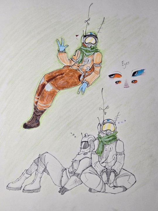
+ hatchling- tried an interesting new way to draw them in their suit. It took a while, but I had a lot of fun! I went ahead and did the more sketchy lineart that I tried a while back, too, and I think it looks pretty good.
Now, second thing: I have a few little Outer Wilds comic ideas, but as of right now (and more than likely indefinitely), I'm a fully traditional artist. Comics will be hard to do traditionally, and I've never tried to draw them before (so, like usual, it might not be the best), but my artistic ability has gotten better I think. So- would you all want to see? It'll certainly take me a while, and things like this would still be the primary things I post, but I wouldn't mind trying my hand at comics eventually.
19 notes
·
View notes
Note
any advice 4 when u want to keep drawing 2 improve but u cant get over perfectionism ? like when u just dont care how its gonna turn out, if its bad its bad yknow?
ahh yes lowkey ive struggled with this a lot. not as much now as in the past tho, and honestly its beecuz ive developed a more neutral view on myself/my art in general. its going to take time to get to this state of mind, so dont be too hard on yourself when you find yourself falling into bad habits.
advice under the cut (kind of long winded) ⬇️⬇️⬇️
the first thing ive done to overcome perfectionism is focus less on details and more about overall shape and form. when i sketch im trying to get roughly what i want, and i limit the strokes i do in certain parts of my sketch to like 1-3 depending on what im drawing (im ngl i also am very impatient and have created a workflow that makes it so i am able to start and finish pieces as fast as possible LOLOLOL. shrugs. i just like drawing fast).
a good example would be this thing i just drew:
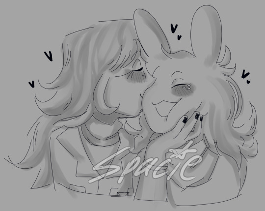
in all of my sketches i tend to use as few strokes as possible and just get the basic idea down. good for not overly focusing on teeny tiny details and worrying about them later (i also use the same technique for lineart, but just end up connecting the lines. thats another tip i have, if you like your sketches more than your fully lined pieces, just line the same way you sketch! or you could also use your sketch as your lineart :P)
another tip i have is to draw from references, and once again, focus mostly on shape/form/the big picture of your subject before going into details (do you know how many planes there are on the human face....i still dont know howta draw faces properly but im not mad at myself anymore about it, i just open up a reference and try to learn). i also recommend having a drawing session where the goal is to draw awfully. draw something you want to draw, but that you're not sure if you'll draw it right, and draw it. dont try to correct it, acknowledge that what you made isnt perfect, and then draw something else. you're learning! of course its not gonna be perfect. but inevitably, you're going to get frustrated. just remember if its something you really want to go back to, you will be able to revisit it in the future. feel your anger and frustration, but do your best to not direct it inward.
small side tangent about shading- I AM SO SHIT AT SHADING SKFHSAFDJHS. people dont tend to notice (surprising), since ig my shading style is considered "beautiful" or something, but if you looked at it on a technical level, there are mistakes everywhere. i havent really tried to improve it. i dont really care most of the time b/c i just like shading for fun. and especially when im shading my sketches, i already have it in my mind that its not supposed to be perfect. its a sketch. this is where im supposed to make all of my mistakes. once i start making my way to the final product is when i start worrying more about if i did the lighting correctly (even then ik im not good at it im not trying to be a god im just trying to draw things that make me happy).
additionally, i really rec u dont try and fudge a sketch until its better if you're deep in a Perfectionist moment. keep the old sketch and start over on a new sketch taking bits and pieces you liked from the original, and improving on those that you dont (shitty thumbnails are also good if you have a vague idea in mind but need ta figure out howta place subjects in your scene). honestly drawing the same thing/idea over and over gets me a better understanding of my subject each time, so naturally each iteration looks better. it doesnt take me that long to sketch tho, so if sketching takes you forever (sometimes if sketching takes you forever its b/c you're a perfectionist skjfskdjf) just think about how much time you're willing to spend on something. remember☝️ its okay to give up/take a break on something and try again later. sometimes you just needta stop looking at your art and like. look at a tree or something lmfao.
i will also say that im not looking to go into a career in art, im more of a hobbyist. ik school environments dont exactly.....help with perfectionism lol. there are certain expectations put on people who go into the art field that are inescapable. if this is the case for you, i still think what ive discussed before can help you, but i also think that you may need to lean more on the mental tips i have also provided below.
alright! mental health tips in regard to art:
so, i have c-ptsd, and with that comes a lot of self image issues that ive had to work on. my feelings about myself extended to the way i felt about my art. it was shit, it was awful, i cant draw like this other person can so why bother, if its not perfect i shouldnt draw at all, etc. and honestly, something thats helped is affirmations. my affirmations are c-ptsd related, but ive noticed a shift in the way i view myself, and by extent, my art since ive started repeating them to myself daily. and honestly, i think a requirement of overcoming perfectionism is telling yourself that your art doesnt hafta be perfect, A LOT. LOL. LIKE YOU ACTUALLY HAFTA ACTIVELY TELL YOURSELF YOU'RE NOT AWFUL LMAOOOO. its funny, we dont think much about how we naturally are self critical about ourselves, and we dont realize that we are basically repeating negative affirmations about ourselves over and over and thats why we're not improving (mentally).
even when you're not drawing, i think it would benefit some people to have some kind of notification on their phone to remind them to tell themselves that their art doesnt hafta be perfect daily/however often you feel you might need it. and then with that affirmation, practice Shitty Drawing. one of the best tips ive ever gotten for this was from one of my friends monnie. get out your sketchbook or some printer paper, take out a shitty pen, and DRAW. and then any mistakes you make are permanent and you cant just endlessly try and fix them. it forces you ta sit with this uncomfortable feeling that something you made isnt perfect. eventually your brain will realize that when your art isnt perfect, you can still draw and you're ALLOWED to continue to draw even if what you make isnt spectacular. if you dont want to repeat an affirmation daily, try to remember to at least repeat it before you sit down to draw. something along the lines of "my art doesnt hafta be perfect in order for me to want to draw. im allowed to draw even if its not perfect" or something else. it depends on what you most struggle with in regards to your perfectionism. im ngl its probably going to feel cringe at first, but i promise you, it really works if you put it into practice longterm.
shoot for neutrality instead of positivity first. let me tell you thats where i am now and its so much less exhausting drawing lmfaooo. i make something that looks like shit and im just like. i dont fucking careee i dont give a fuccckkkkk
those are my tips :] i hope this was helpful!
#spacie spoinks#art tips#kind of?#art advice#i would have added more art but i dont have my art saved on this device KSHFSKJDFH#i copy and pasted my art above from my tumblr post 💀💀💀💀💀💀#anyway#have a great day anon!!
10 notes
·
View notes
Text
chibi style sasusaku :3
i’m not very good at drawing actual chibis so this is the way i draw them xD
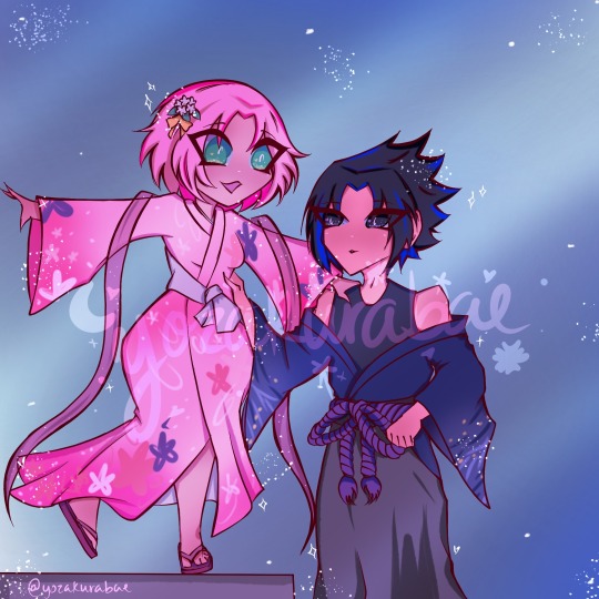
do not repost
tried a new lineart style and i think i like it :3
#yozakurabae#art#fanart#my art#ship art#do not repost#sasuke uchiha#sakura haruno#sasuke x sakura#sasusaku
35 notes
·
View notes
Text

When you realize you're falling in love with the team's new tank.
Version with text below cut!

Okay, I really love how this drawing turned out, since you can probably tell it was another Rumiko Takahashi style practice, but I mainly love it because of just how... Corny it is?? LMAO In the best way possible, it reminds me of those very specific cheesy, dramatic ship fanarts from 2013, and I'm very much here for it. I don't usually do things this cheesy, but it just turned out like this naturally lol- Not at all intentional, but it made me giggle. (๑˘︶˘๑)
This is serious art meant to be these two early on before they start their relationship, but I just like how accidentally dramatic it turned out LMAO (*¯︶¯*) They really are so cute, and I love their slow decent into caring about each other, and all the "oh no-" moments along the way
Also, I tried out a new brush for hydrangeas! I always draw my flowers by hand, and trust me, I don't plan to stop doing that. It adds so much more personality and stylistic unity to the piece, but not only was I tired and curious about this brush, but I think it matched the energy of this pretty nice? I think I managed to mesh it pretty well, I just wish the lineart was a bit thicker on the brush. ( ´ ꒳ ` ) Otherwise, I really do love this piece!
#oc x canon#ocxcanon#canon x oc#oc x character#oc x inuyasha#inuyasha x oc#inuyasha#inuyasha oc#inuyasha fanart#inuyasha fanfiction#fancharacter#fan character#inuyasha fancharacter#fan oc#anime art#my artwork#my art#shipping#ship art#oc x cc#oc x canon shipping#oc x canon community#artists on tumblr#digital art#anime#anime fanart
12 notes
·
View notes
Text
rat brainrot going hard
sorry for not posting this week, i was cooking some stuff but this drawing took almost the entire week to do, worst part, it was a shitpost
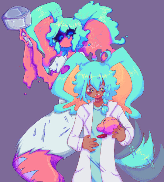
i still dont know why this took me so much
so uh, almost all my drawings this week have been related to this two(and lis) so much so that i struggled because i wanted to draw other things so i would just stare at a blank sheet of paper for over half an hour, god that was torture, tho i dont mind drawing the sillies, sometimes it gets a bit boring drawing the same over and over y'know? im also going to take this as an opportunity to ramble about my forgo gijinka, because surprisingly i hadnt done that yet.
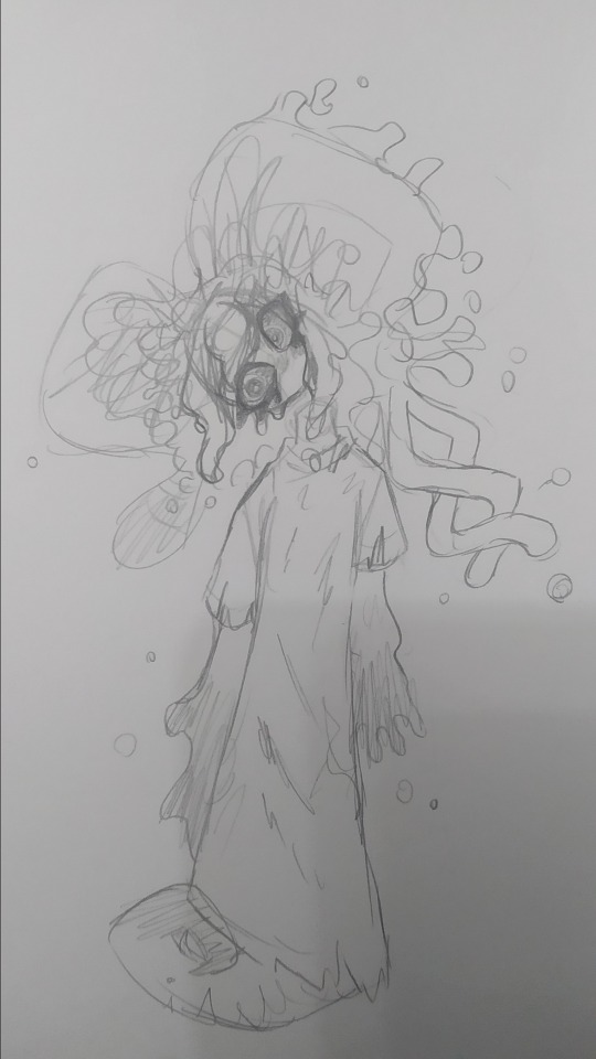
og image

ok now to actually talk about the wet rat
ive tried doing a gijinka of em since i joined the fandom (my first gijinka was fecto elfilis (well not really they were fnaf, but i mean when i got into kirby and when i started using the term gijinka))
but most of the time it just looked like elfilin but like...evil, with a different ear and a hospital gown, thats it, so i barely drew them since i didnt like that, but on february, i actually sketched an idea that i liked, and thought it looked cute but a bit off (i mean off in a good way)
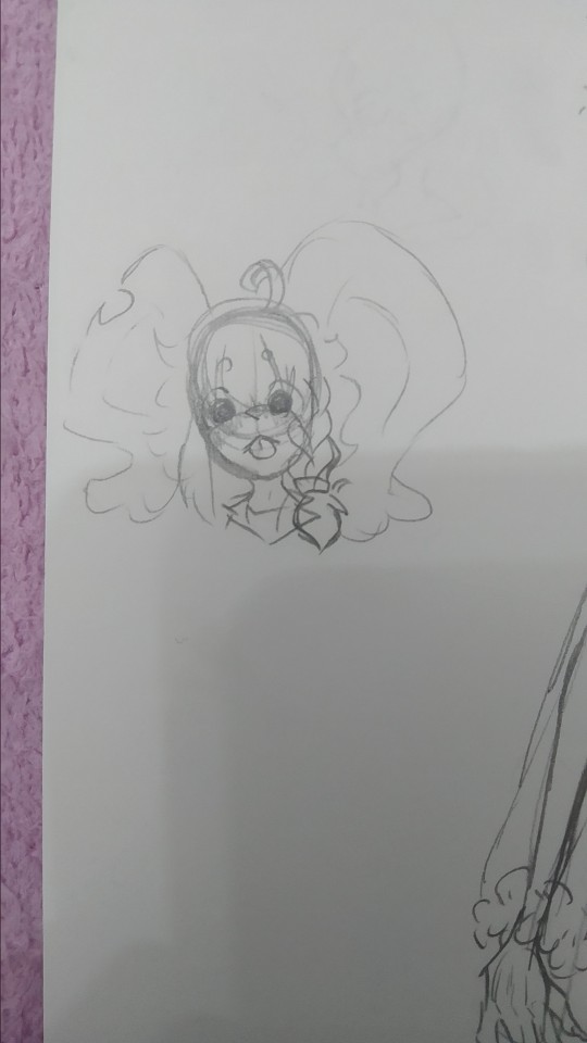
(yes im posting this image again because i think its the best drawing of my forgo (im very inconsistent with my style ok))
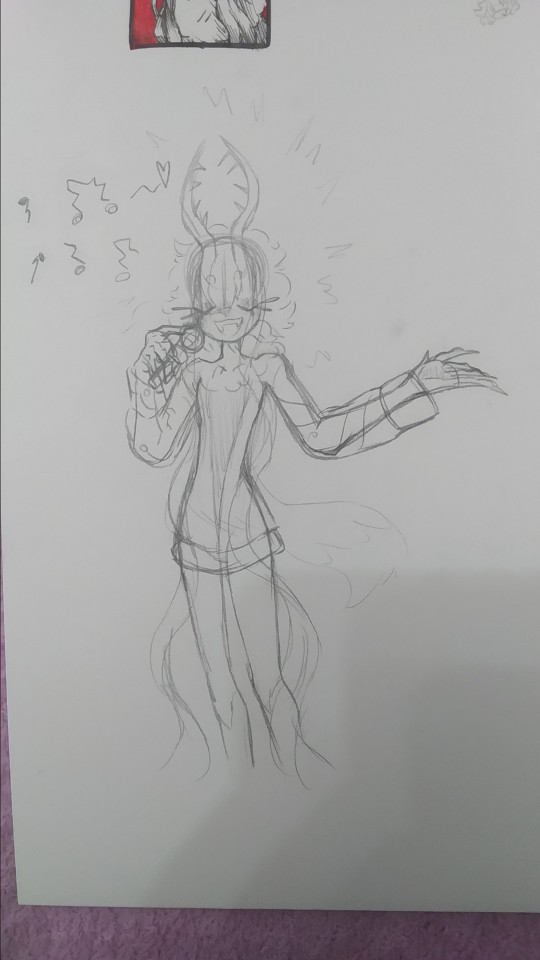
they have their eyes closed most of time, like in game, i considered giving them legs but i ended up with the tail, since i didnt want to end up with like a fourth evil elfilin, the arms are like that so i can have em be small and weird like in the actual game, but i also made it so they can like change it, that way i can make em have hands and stuff if necessary (like to hold that frying pan for example)
not sure if a lot of you notice it but um, bro has no neck, i took away his neck privileges, i did it just to see but i ended up falling in love with that and stuck around, and also that allows me to draw them bending their head like in the drawing above because their neck isnt necking and i like that, i like being able to draw characters doing stuff that shouldnt be anatomically possible or is abnormal (i did something a bit similar with void) thair clothes are rugged because well forgotten land you know what i mean, but in general theyre actually pretty simple
i also did the drawing in digital

i tried doing very sketchy lineart, i tried a new brush in this one and thats the one im using for my last drawings (not sure if anyone noticed the brush change) it was pain painting it because i did it all with the brush in the same size, not changing it, god did my hands hurt and it was a bad idea
i accidentaly downloaded the following 3 drawings twice lol
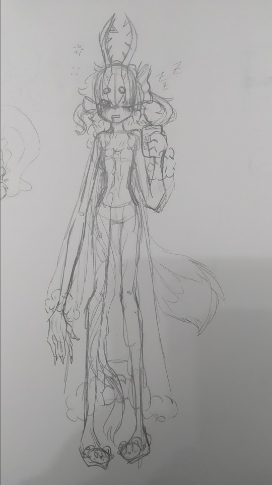
sleepy zzzz
i think they would wear something like this to sleep, i dunno i just wanted to draw em in something cute, and sleepy, with elfilin slippers (the mug also has elfilin btw) oh and also i like changing their hair, here one of their long bangs is tied into a bow, kinda like callie from splatoon, i have some drawing im probably wont post, one more of forgo wich looks very much like the upper one but like eyes closed, and one of fecto elfilis gyaru because my sister asked me to draw them like that, bad thing is i didnt look up references on gyaru since i couldnt use my phone at the moment, i did like the hair i did for them in that one tho, they have their bangs tied up in a bun, and then left the rest loose, making it look longer than it actually is. i might redraw it, but actually looking up gyaru so i can make something more accurate, i like the style, but im not too informed on it
elfilin being silly like a kitty :p
not much more to say on this, just sillines :3
there is totally not a cropped drawing there
based on the kirby manga, where they make it so elfilis sings really bad, at first i didnt like it that much since i had imagined they'd sign great, but after i while i started to find it a bit cute so now its a headcanon, they like to sing but suck at it.
writing this just made me remember i wanted to do another drawing too for this with kirby and them singing, but i forgot to do it, im kinda tired (and its late) ill probably draw it, but for next post or another one
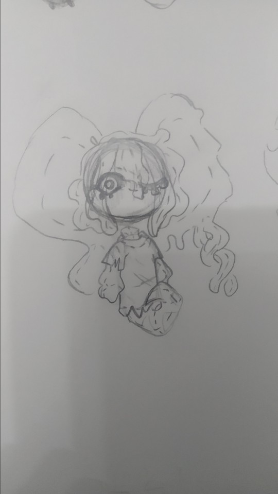
tried drawing fecto forgo as a plushie, silly.
i wanna learn how to sew so i can make plushies of characters (like prince fluf!) but im way too lazy, i will get around it some day! (hopefully)
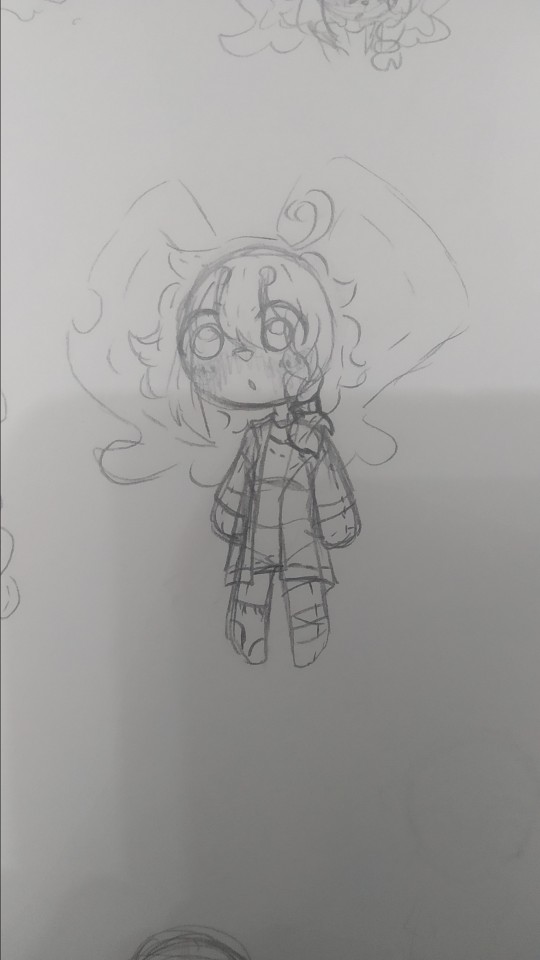
elfilin too as a plush
i also wanna learn to sculpt, i tried doing a clay kirby once, but one his feet broke in half, and one day my mom put it in a box, and his eyes fell off and stuck to the box :(
i really wanna do figures for characters i like or dont have enough merch or my ocs (prince fluff, flamberge, fecto elfilis)
but as i said, im way too lazy and unmotivated, though its be nice, one day, maybe one day if i stop procrastinating
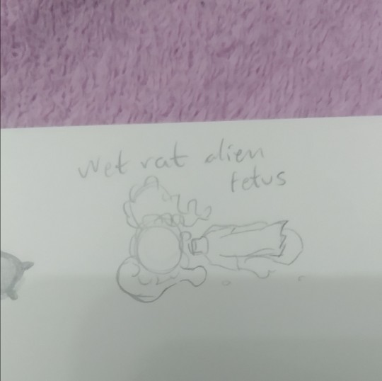
it doesnt have the same ring to it as "feto rata mojada alien" wich is how my sister and i call them (she doesnt know that much about kirby, but i sometimes show her my drawings (reluctantly sometimes, but im the older so like >:) she has too if she wants to show me her stuff too))
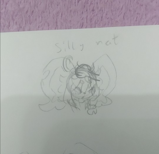
silly rat and wet rat, thats how i call em (because wet rat alien fetus is too long sometimes)
you can tell the brainrot was too strong (were near done(kinda))
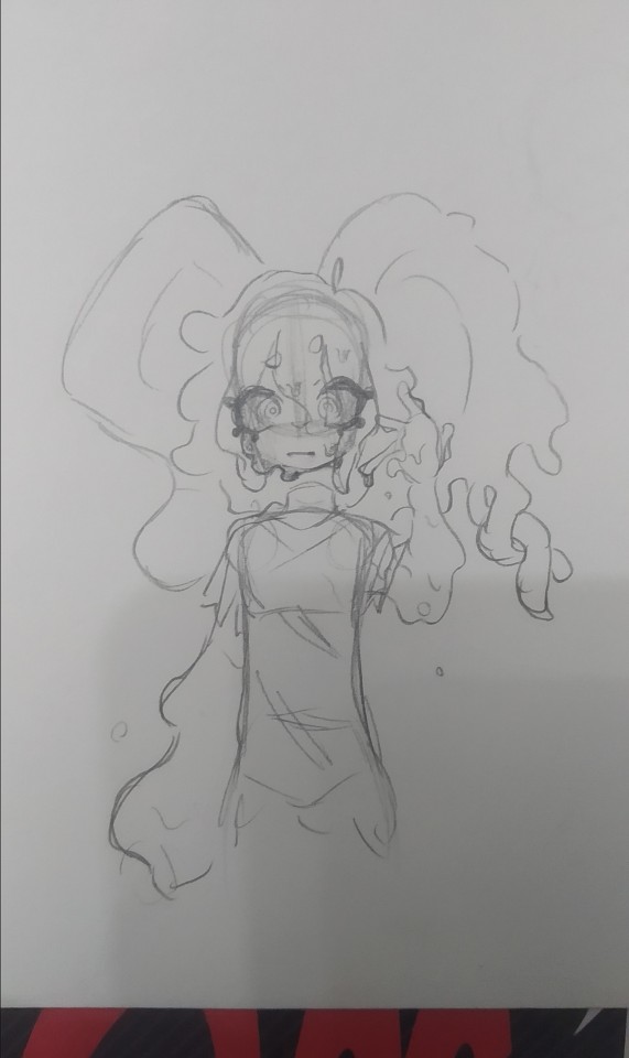
they gain a mouth whenever i fell like it very much
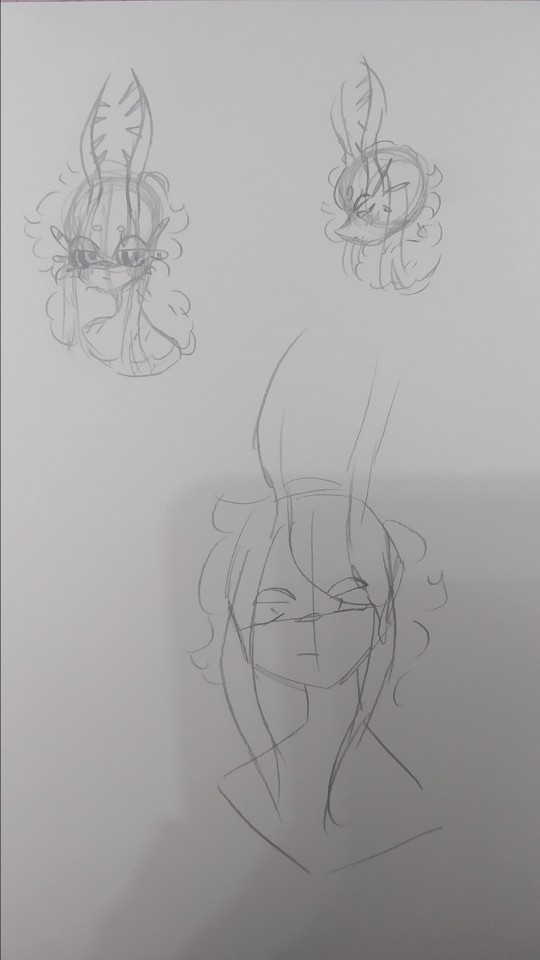
artblock hit, and all the rest of pages i stared at them for 30 minutes
it felt weird looking at my fecto elfilis with the eyes so big, it looked off (in a weird way)
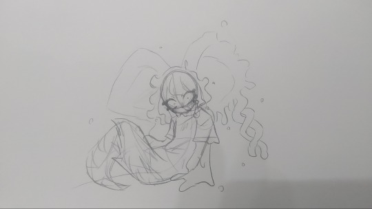
dunno, tried drawing them in a different pose i i dunno really
i think these are from tuesday. i did more but those were oc (mostly splatoon) or other kirby character related, and i want this to be a rat post (might post those tommorow or another day maybe)
i dunno (x2), i tried drawing elfilin like elfilis, i really liked the hands here. i still struggle a bit with anatomy but i think this was quite good for my usual character just stading looking at the front or a quarter profile. im considering making this into a fully digital drawing, what do i say by considering im actually doing that fuck it, i just think it looks kinda cool

"This new creation, driven by pure chaos, was defeated by the bright light of Kirby's hope."
Chaos Elfilis reminds me of a moth. kirby's hope is a bright light.
you can see my thought process. i just thought itd be a bit cute and kinda silly and funny.
the kirby fandom wiki, said that chaos elfilis looked akin to a moth, and it just stuck with me, so i wanted my gijinka of them to be moth inspired, and thats when i saw just how cute moths are! i mean im still a bit scared of insects but at least now i kinda like em.
i feel like i need to say sorry to that one moth i desintegrated in a matter of seconds with a book because i thought it was an spider and didnt think (im so sorry little guy)
but ah yeah elfilis, moth, it made sense to me since chaos elfilis has the soul of morpho knight, who is a butterfly, and moths are kinda like butterflies too. and i thought itd be cute
so uh yeah i sometimes like making my chaos elfilis be a bit like a moth, that includes liking light, a lot, so uh kirby is like a lamp in here because i said so
now to talk about the desing since for some reason i hadnt earlier, as i said before, they are very moth inpired so uh im might say that word way too many times (im sorry i suck at explaining stuff)
their horns are thinner to resemble moth anntenae, and they curve just because i thought it look cool, and to differentiate it a bit from fecto elfilis. their bangs tie into a bun (i forgot to draw that but i dont wanna go and change it now, way too tiredv man and i still have to post this on other places) the bun looks a bit like an eye, because well, they are basically a soul boss, and moths have things in their wings that look like eyes, btw chaos elfilis doesnt have their wings here because i got lazy and i didnt want them to like cover most of the drawing. the things coming from their bun are like the trhee things theyve got in their head, theyre shaped like that to resemble insects legs a bit, fecto elfilis also had the 3 things (i dunno how to call em sorry) as their eyelashes, but chaos elfilis has just white eyelashes, because the bun already has the 3 things and because my morpho has white eyelashes so (i still havent done my morpho gijinka yet, i just know im gonna give the butterfly some white eyelashes cuz cute and pretty grimm reaper) the rest of the hair is shaped into like a ponytail but like, adn shaped, with whats left shaped like a lil moth
the waistband they have is a nod to morpho, they used to have a bow shaped just like the butterfly morpho appears as, but i took it out because i thought it crowded the design way too much, and also because it was too on the nose. the arms have those golden things because my fecto has it and because my og chaos elfilis gijinka had them so i wanted to bring it back, the hand fades into white because the red in the hand wasnt hard to distinguish so i came up with that to make it easier to see.
the red part of the pants are actually a bit fuzzy akin to a moth and the white part has those stripes to loke like insect stuff because y'know akin to a moth. the boots are like the red part in their legs their model in-game has, so i just made em tall boots, the high heels? originally it was platform just ike my fecto but then i wanted to draw them in high heels when i was slightly redoing chaos elfilis, and welp, i loved it and now theyve got high heels. those rings around the ankle are inspired by the ones leaongar has around their arm. also can you tell anatomy is not my strong suit? and that i dont draw high heels often?
i made a slight change in my kirby, making the sleeves be a different color, since the one he had before i felt was way too white, and i wanted to have more saturation in it
i also forgot but elfilin is supposed to wear that during forgotten land, and then i decided that after the anding of the main story he changes clothes, but i forgot about that while doing this so he has his pre-ending clothes (also because i still cant really decide on their second outfit for the post-game)
god im so tired i wanna talk and show more drawings but o shit im sweating why is it so hot in here
um thank you for reading all the unnecessary long rambles about why i do certain stuff in my gijinkas, i appreciate it a lot (im still sorry about writing walls upon walls of text but i just cant help it)
Jambuhbye! :D
#art#fanart#kirby#kirby fanart#kirby gijinka#silly#digital art#firealpaca#traditional art#fecto elfilis#elfilin#chaos elfilis#kirby elfilis#fecto elfilis gijinka#elfilin fanart#elfilin gijinka#chaos elfilis gijinka#gikabi#gijinka#fecto forgo gijinka#fecto forgo#shitpost#they have invaded my brain#fuck it the next drawing are probably gonna be them too btw#its 1:53 rn lord save me please#you know what#staright up kill me please#i love you tumblr mwah thank you for not having such a small character and image limit like x formerly know as twitter#i still dont know why the alastor elfilis blew up on twitter#im cooking some fanfics btw
34 notes
·
View notes
Note
Whats your art process and what would you reccomend for someone who would like to achieve a style similar to yours? i love this mix of cartoonism and realism. your work is such an inspiration >.<
oh gosh! thank you?! 💞 i'll do my best to explain it, but even I have a difficult time trying to understand my own art process/style because of how inconsistent it is;; (i still have a lot to learn!) this is gonna be a long reply so i'll place it under the cut
process:
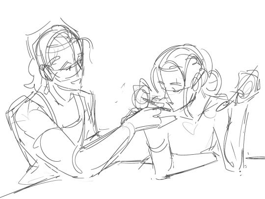

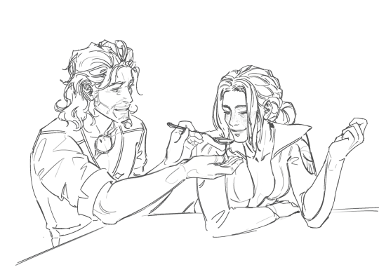
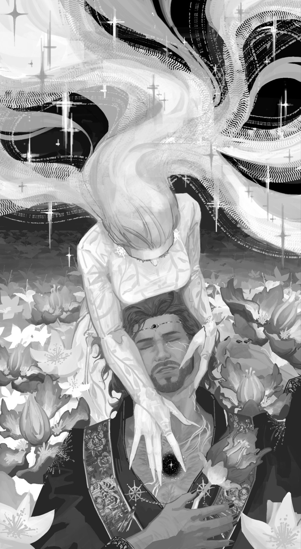
I start loose with a more gesture type rough sketch. I mainly just do lineart in the same layer as my sketch and erase away parts I don't like. Sometimes I'll lower the sketch's opacity and on a new layer do my lineart (which is what i did for the drawing above). But regardless doing that loose gesture sketch helps keep my drawing dynamic even as I refine over top of it!
- I duplicate layers A LOT for safekeeping my previous progress, especially if I'm thinking of making a big change (ex. changing limb position)
If I wanna put colors down underneath it I set my lineart to Multiply. For coloring I'm very inconsistent with the process, but recently I've been using a more subjective coloring style, where I pick my own shadows and highlights to try relying less on blending modes (which is gonna be too long to get into here;;) Finally if I feel like it, I make a layer on top of my lineart layer where I render everything
Oh this is something that helps me a lot for colors! I have 2 layers that are a mid-gray tone placed above all my other layers. One I set to the Color mode (to make the drawing black and white), and the other I set to the Luminosity blending mode (to make the drawing's brightness the same..?not sure)
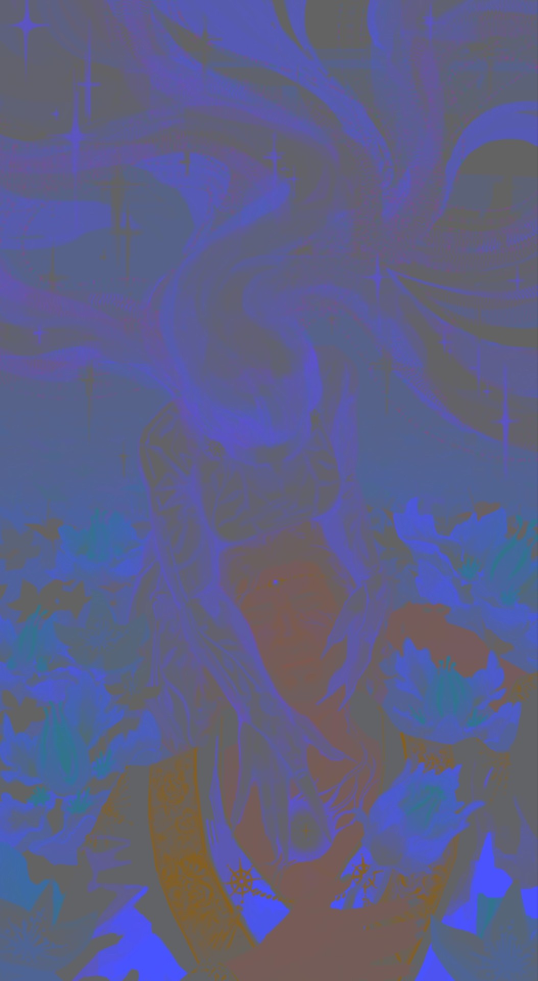
The Color layer helps me check if I have enough contrast in values, and the Luminosity layer helps me check if I have enough contrast in color hue and saturation!
style:
This is really difficult to answer because style encompasses so many different aspects of art, but I'll try to focus my answer on the mix of cartoonism and realism that you mentioned!
I struggled trying to explain what my style is like so I just broke down one of my drawings that exemplifies a lot of my stylizations! Hopefully these can give you some pointers about what I tend to think about when I draw (click for higher quality)
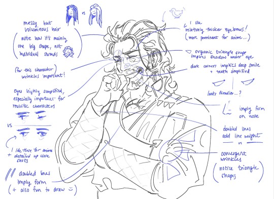
(+to add to this i use a brush with no size pressure, only opacity pressure)
What I recommend for stylizing a realistic character: The way I learned to stylize a more realistic character like this one was to import a reference of his face, then trace over it very deliberately, making sure to stick to big shapes and characterizing details I thought were important to achieve his likeness! Then I'd turn the reference layer off and freehand it over and over, comparing and redrawing until I managed to get the mix of accuracy and stylization I liked!
What I recommend to find a style: I basically ended up with my style subconsciously as an intersection between the things I like to see in art + the things I like to draw! Most of my inspiration comes from anime (😔) and artists online. I'll see a very specific stylization I like in others' art, and try replicating it to see if I like how it fits with my style + if I enjoy drawing it in that way. I did this a lot over the years, accumulating into a big mosaic of inspiration from all the artists whose work I personally enjoy and learn from! I know this isn't exactly answering how to get a style like mine, but I think knowing this general process may help you out in the long run!
ahh i think that's it! i tried to be as comprehensive as i could without being too verbose (my bane). i hope this is the answer you were looking for and that it can help you! 💞 and thank u for the ask! it was a good exercise for myself to analyze my own art
#my asks#anonymous#tutorial#...? art info? not sure what to tag this#i spent a very intense day mulling over this ask#hopefully i answered this correctly...!#art resources
45 notes
·
View notes
Text
I am looking thru files rn and take a lot of pictures of my own art for progress, bc I think like many creatives, it's hard to explain or describe how i get from point A to B in art. im a horrible teacher but this piece for example: (explained under cut)

i tried drawing their little cafe outfits really fast but i just didnt vibe with it. idk what made me want to redo the whole thing. i like the attempt at cooler colors for asougi though. so then we move onto these and:

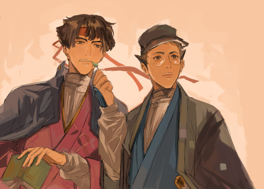
the first pic looks like an absolute MESS, but what i generally do is get a sketch down, and COLOR out of the way first? I assume it's to set the general tone/ vibe for the piece, which is why you notice a lot of plain color blocks in the bg. then i go back and do lineart and merge all the layers to paint! :D
tbh it's a very back and forth process, and the best way someone described it to me is "you put down blobs of color and then go crazy" which is very, very true.
I think i like the aspect of "carving" in traditional art, where you kinda play around with paint so you go over it again and try something new. so i try to apply that to digital. i think in a lot of my pieces you can see i teeter on the line of messy lineart with color to full blown painting.
anyways there was no point of this, but this is why i always wanna keep track of old art and why i go and revamp old concepts. like i can always try again! also why thumbnailing is very. very. important. but my main goal in art is to have fun when u can, so that's why i play alot.
#mine#no one asked for this but im thinking about my art a lot#and how much it's changed#we've come so far sniffle. like im so serious when people who have followed me for a while are the strongest troopers bc. e#AS LONG AS I IMPROVE THATS WHATS IMPORTANT <3#sometimes u need a yaoi ship to push u to the brink of insanity and suddenly you appreciate art and learn. life is beautiful
44 notes
·
View notes