#tried a more cartoony style again
Explore tagged Tumblr posts
Text
This one turned out weird but I'm happy with the results

#toph beifong#atla#drawing#hand drawn#sketch#i love pinterest#like so much reference pictures#tried a more cartoony style again
103 notes
·
View notes
Text
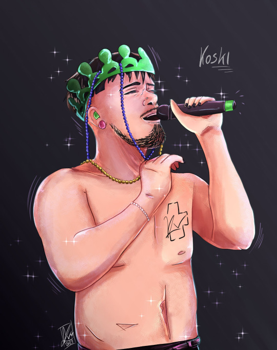
King Käärijä from Koski Gig
#Again I can't say it oiud enough#He should wear more pearls#I tried a different style do you like it 🥺#Or should I go back to the more cartoony look#myart#fan art#fanart#käärijä#jere pöyhönen#käärijä fanart#Koski gig#Käärijä dress up series
71 notes
·
View notes
Text
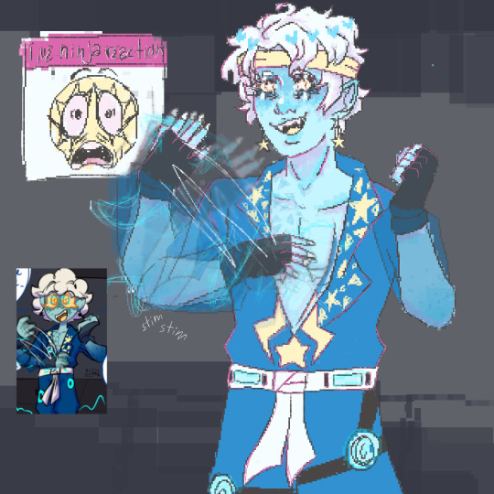
sooo i may have redoodled that one panel from @spinjitsuburst (can i @ u i AH.) cabinet man auu...,,.,,
i may have gone on a lil little tiny bit too much on my alt,, UHH
BUT I RLLY, RLLY THINK ABOUT THIS A LOT LMAO
i was gonna draw skybound ver but,,, srj was alr on mh mind
#LAST SRJ SKETCH FOR A WHILE I PROMISE I DONT WANNA SPAM???#ANYWAS I LOVE LOVE THIS AU SM#I DONT WANT TO REPEAT MYSELF OVER AND OVER AGAIN#i mean i totally would gush about it again#just dont want to seem weird????#man this is a jay acc im alr far past weird#ANYWAYS SORRY IF U SEE THIS AND U DONT LIKE GETTING @'D AT#ill one day work up the courage to give u an ask <3 /p#i wish i couldve spent more time on this but it's literally finals week#MY PARTNER TELLS ME TO SHUDDAP ABOUT THIS AU BTW#😭😭😭😭 SO MEANNNN WOWWW (its prolly bc i forget ive alr talked about it so its a restart everytimeskbskajjs)#💗💕💗💖💕💗💖💖💖💗💕💗💞💞💕💖💖💗💕💞💞#im too tired for words take these instead#my art style does not translate well from cute cartoony art helPPhh#i hope this isnt bothersome#i kept thinking about the sleeves while drawing this#i kinda(definitely) love it#i tried so hard not to automatically draw my ver of srj BUT SOME ELEMENTS R STILL THERE I THINK?? SORRY#gn im totally going to bed thinking aboit this like some normal person#skybound has a hold on me ok?
29 notes
·
View notes
Text

youtube just recommended this to me and....wellp, time to watch it and cry!!!!! 🤧
#junk#zelda#tp#the music to this trailer....fuuuuuuck it's so good!! that oboe!!!! :'(#not gonna lie i hope they try another 'darker' zelda again#like...idk it'd be nice if they tried another artistic direction instead of this cartoony one they've had going for a while now#and i knooooow zelda has never really been about trying to be more 'mature' or 'realistic' but#tp was a nice change even if it was done to try to come back from all the backlash that the tww style got#anywayssss#i really want to re-play a lot of the main zelda games (even the adventure of link wat) but well no time for that!! :/
1 note
·
View note
Note
I'm going to be asking a lot of artists I follow this question, but how did you develop your style? It SEEMS like most people find their style and stick with it forever, just making improvements and iterations. I tend to work in a lot of different styles because I enjoy doing that, though I know there are things I gravitate towards as well. But I wonder what your journey was and how you got feedback and improved while staying true to what you enjoyed?
Hi there!
I definitely wouldn't say that I've found my style and stuck with it forever-- I feel like each of my projects has asked for a certain kind of art, and has presented new challenges that push me in new directions.
Some of that comes from seeing someone else's work and having something click into place that might fix errors/faults in my own, and then I might try to incorporate that, such as bigger outlines on my characters to help distinguish them from the background, or maybe a way someone else simplifies eyes that can help make mine look less weird.
When I first started drawing, I can see where I encountered certain influences because my sketchbooks suddenly switch to incorporating some new stylistic element that I liked from whatever I was reading/watching at the time. But it was never QUITE right, it was never just copying, there was always something ~wrong~ with it. And that wrongness was my style! As much as I hated it, that was what distinguished my art from being just a copy of someone else's. I hate it less now, and understand that other people see something there that maybe I don't, because it's just what happens when I filter other people's work through my head. My soul, if you will.
There are definitely through-lines with my work, driven by what I like drawing and what comes easily to me-- hatching is almost always a major component, and I like making expressive characters. Here's some of my earliest available stuff, from my old webcomic:

Then not long after that, I started The Last Halloween, which pushed me to challenge myself in both layout and style:

And here's the same comic, years later:

And here's a series I did for kids, where I had to use full color and lay off on the hatching, as well as learn how to reconstruct animals that we have no photo references for, which is definitely a place where style comes majorly into play, whether I wanted it to or not:
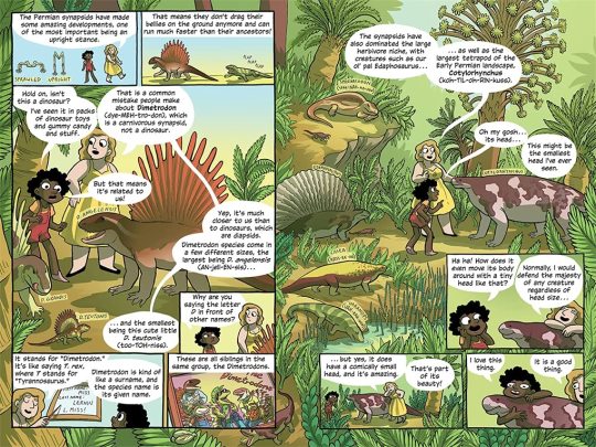
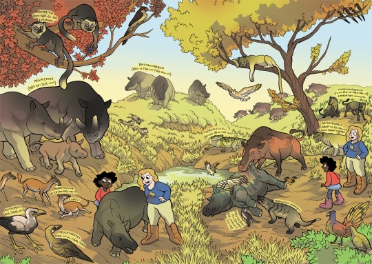
Then there was the horror book I did, where I tried to push my work to be less cartoony overall, and to work very hard on improving my hatching:
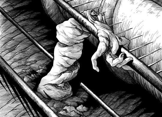
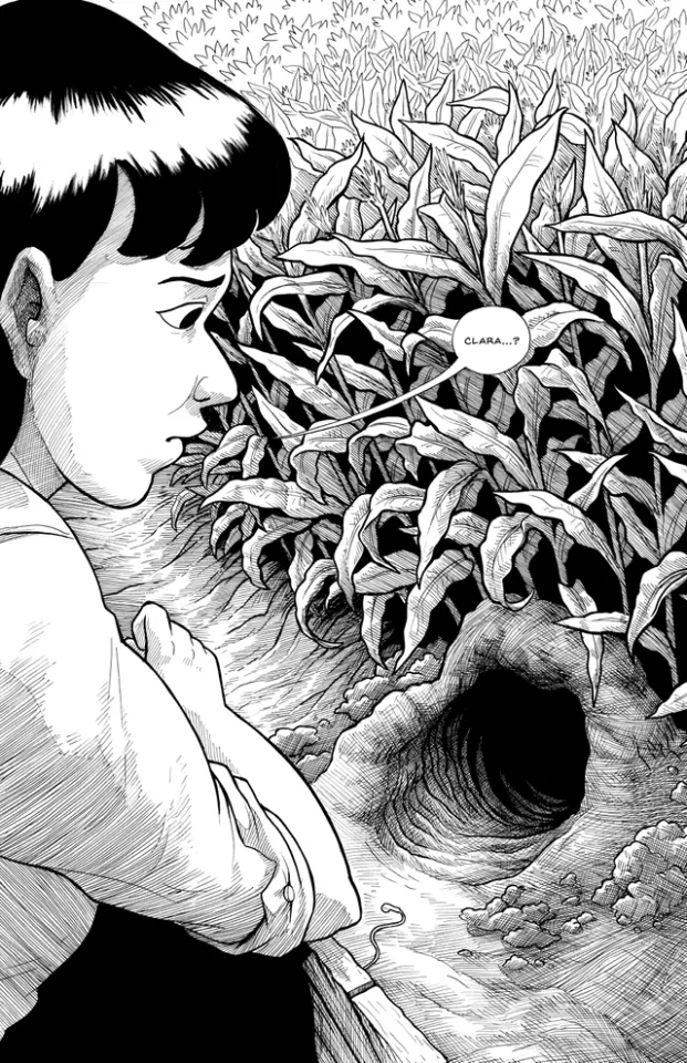
Then I started work on Scarlet Hollow, where I incorporated a limited/muted palette and had to once again push myself to make less-cartoony art, as well as learn more consistency so I could draw sprite sets. This was a big challenge for me, and has helped me grow as an artist so much!
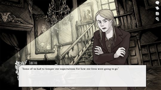
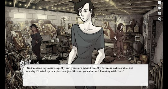
And most recently, I wrapped up work on Slay the Princess, which required that I go back in the cartoony direction, but in a very different way than I was used to. This took a lot of sketching to figure out, and there's still a decent amount of artistic stumbling in Chapter 1 while I settled into it.
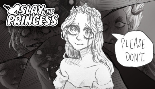
She's drawing on anime/Disney influence, but each Princess required a bit of stylistic variability. Some are more anime, while some are more realistic than even the Scarlet Hollow characters.
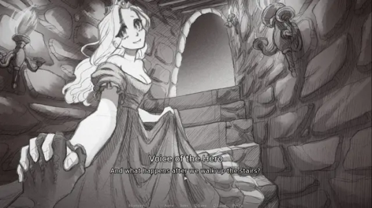
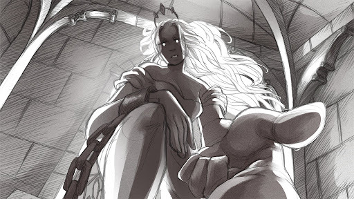
So I wouldn't worry too much, honestly! A person's style is often something that reveals itself over the course of their career, rather than something they choose and then try to stick to forever.
Even if you don't think you have a style, you do. It might vary a lot piece by piece, especially if you're trying to closely imitate another person's art, but the more work you do, the more you'll figure out your own strengths and interests!
#long post#my art#junior scientist power hour#the last halloween#abby howard#scarlet hollow#slay the princess#once you work long enough on art#style starts to feel more like modes you switch in and out of#all based around a core of what you're good at and what you can do#which in itself will change sometimes!#and of course your style with different mediums is gonna be different too#like slay the princess is pencil which is why it looks more distinct from my other work#never forget that at its core art is about messin around#wait shoot i should've put all this in the post#but it's long enough as it is
425 notes
·
View notes
Note
Do you have some REALLY old sketches or drawings of kny characters you could show us, like maybe before your artstyle developed? 😋 (Idk I'm just so curious how you ended up with this fluffy adorable style bc I LOVE IT T-T)
oh my god i absolutely do--
lets use muichiro as an example
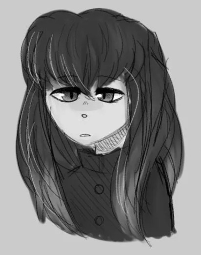
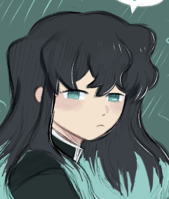
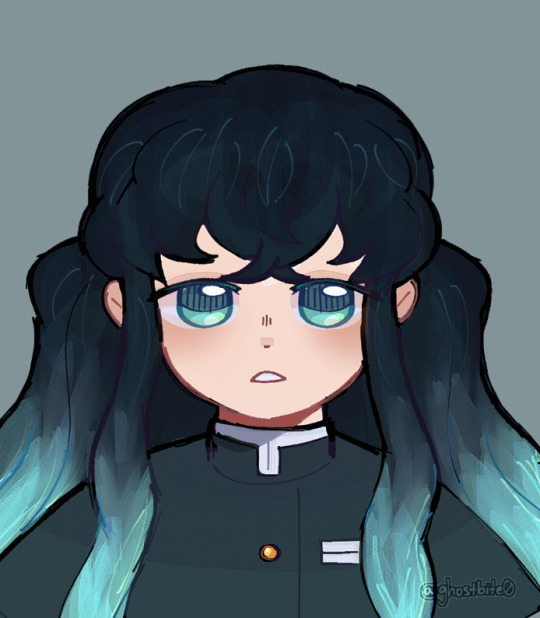
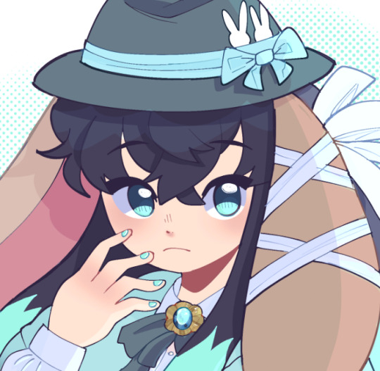
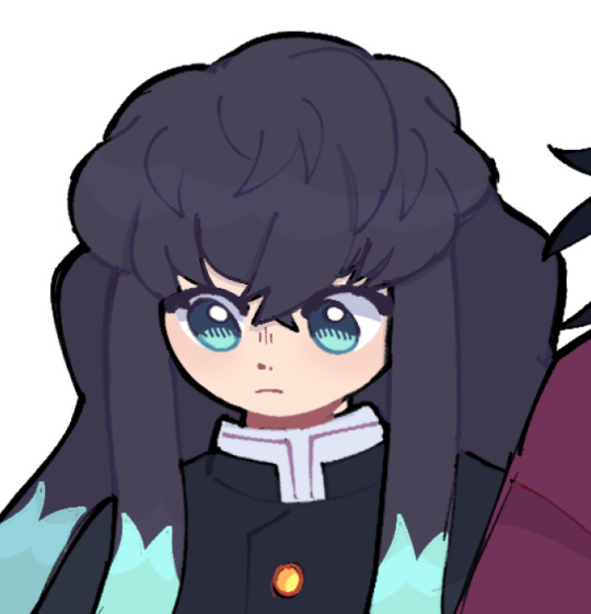
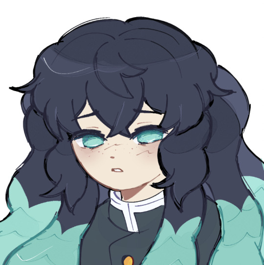
the first drawing was from 2019, to give you an idea of what my art looked like at the time
i had no idea how i wanted to go about drawing humans. at the time it was drilled to me i should draw more realistically, so my work suffered greatly. this is why the hair is so messy and the face just looks so... walten-filesy, i guess
the second drawing was from early 2023, when i tried drawing muichiro again as a result of catching up on demon slayer!
i was still not drawing humans, so you can tell i was kinda experimenting a bit with the brushes. i color picked from his official design
i stopped drawing him for a few months, as i really hated how it turned out. i ultimately gave up on my art for a bit
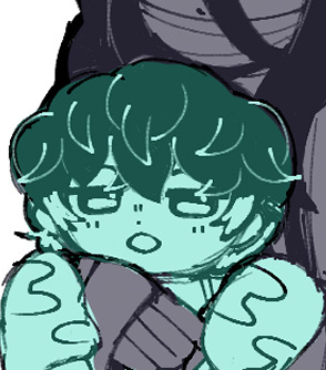
then, at the end of the swordsmith village arc, i tried again. i ended up getting really attached to all of the hashira, so i drew them little profiles-- as shown in the third image
this is where you can see im staring to develop my style properly. i came to terms with the fact that i wanted a more cartoony style, and i started to embrace it. i also made my own color palette to better fit my art style
from then on, i was fixated on demon slayer, and with muichiro being my favorite, i drew him constantly. the fourth image was drawn a couple months later, after the baby hashira craze
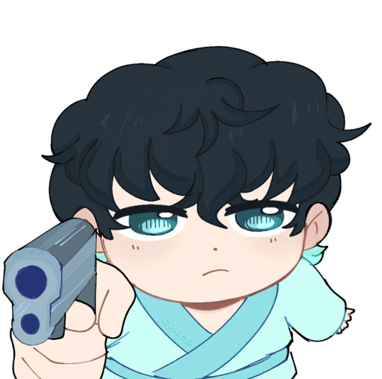

you can see how much it was changing. the detail in the eyes, the way i drew the hair, his palette, etc. through constantly practicing and drawing him, i developed my style more and more
the fifth image comes from the "hugging muichiro" series, in which i had to draw muichiro nine different times
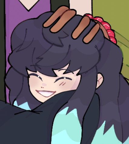
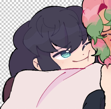
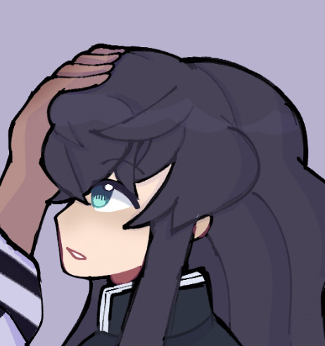
i began studying art styles i really liked, and particularly analyzed the way muichiro was drawn in the manga. i loved his hair, and tried to replicate it in my style. you can also see i revised the palette a bit more to better compliment my work!
finally, the sixth image-- my more recent style!
his current rendition really just comes from me having drawn him so many times. my style just grew and grew and grew! i modified his color palette even more, making his hair more blue tinted and giving him a cool color palette
that saying "practice makes perfect" really does reign true tbh. the reason my style is the way it is was because i kept practicing and revising my work, and i would adopt things i like from other people, such as gotouge themself
i hope this helps!!!
my art literally started off looking like That. trust . everyone has potential!
#askbites#art help#digital art#artwork#art#artists on tumblr#my art#art study#art process#demon slayer#kny#artbites#illustration#muichiro tokito
173 notes
·
View notes
Text
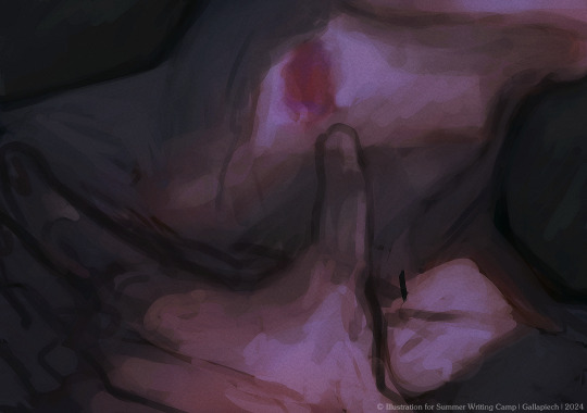
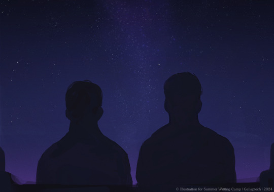
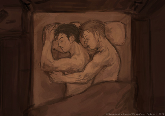

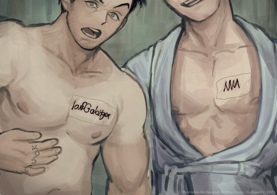
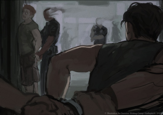
Give it up for art post number 3 for Highway of Hedoism!
[READ IT HERE]
+ some bts stuff because i enjoyyyyy doing that :)
Not much to comment on this one lol, it's a little rough I suppose. I think I prioritized quantity over quality here and that's definitely something I would've done differently if I could go back in time.
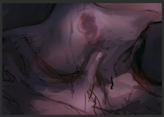
I'm still not sure it gets the image across? I hope it does. Sorry if it doesn't ehe...
I don't actually have a sketch for the outside one! I made it pretty fast and in one sitting lol.
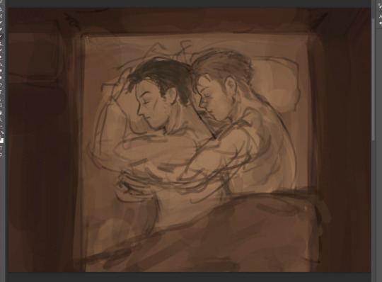
a mimir. I loooove parallels! When we were discussing moments to be drawn I thought it would be really nice to have a little nod to their first time sharing a bed and seeing how much their relationship has changed over their journey!!
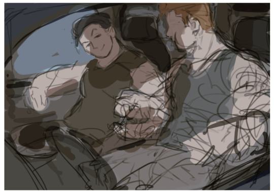
One of the issues I ran into while working on these is my struggle to keep the style consistent enough lol. ofc artists are their own biggest critics so maybe it bothers me more than it bothers everyone else ehe. In the end I do really like this one! Maybe a bit too cartoony? I hope it's not too distracting LOL!
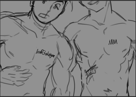
I remember when we just started working on this I had asked Rory if they could get matching tattoos because I looooove that. But she was one step ahead of me and had already planned it hehehe ♥ We discussed some possibilities of their spelling qualities before settling on the current ones. I hope you enjoy the shoddy linework LOL I made sure to write them both with my non dominant hand. I also thought it would be funny if Ian wrote his name and then thought "fuck wait, i gotta add C for Clayton." And then quickly tried to squeeze it in. 🤣 (Also, once again me forgetting about clothing. Thank you Rory for reminding me about the bathrobe 🙏
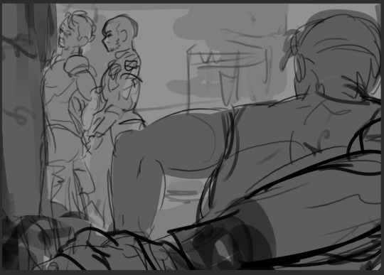
Yeah. uh. I think mickey looks nice in this one :)
I think there will be one more art post after this one! The last one,,, aaahh! The end is nearing. I hope you're all enjoying the fic! I've been immensely enjoying reading everyone's reactions to it! Thank you so much for all your kind words ♥
#gallavich#my art#ian x mickey#mickey milkovich#ian gallagher#shameless au#shameless us#gallavich fanfic#gallavich fanart#gallavich au#HoH
333 notes
·
View notes
Text

@dynamicsimp hope ya like it!
EYESHOT AU DITY
I literally did this in one day- help.
So yeah, I tried out the gosh-dang challenge and honestly?
Quite happy with how it came out! It was very interesting and actually very fun working on a piece with a monochrome pink palette!
Gosh, I haven't gotten to use my REAL lineless style (I use it for stickers but I haven't done any stickers in forever) where all the cel shading is real harsh and as it says in the title: no outline.
Lately, I've been more focused on lighting and texture in my digital works and just making everything 'softer' and more 'realistic' but dang, I forgot how much I missed just using my harsh and more cartoony style.
But because it looked good, here's the one with some light:

I am very happy especially since I do believe there is some improvement in the style.
(In that it doesn't look as amateur as when I first started out. But I think that's mostly cause I used monochrome here)
Does anyone else get that struggle? Feeling like you're not advancing then keep pushing yourself to change and improve but also really missing the original style?
Anyways some of y'all might be wondering where I've been for pride month....
I PROMISE IT'S NOT CAUSE I HATE PRIDE MONTH OR LGBTQ+ PLEASE PUT YOUR PITCHFORKS DOWN!!!!!
Mainly it has mostly been art block and just demotivation especially since I'm STILL WORKING ON THAT BIG PROJECT UGHHGHHHGGGHHGG.
(I'm not blaming y'all I'm just feral)
And just general procrastination.
BUT.
I do have another project in the works. So to any of my lovely marshiemallows who have seen my previous posts,
you'd know that I'm very...opinionated about Macaque. More specifically his attitude in canon and how the fandom treats him.
(Keep in mind the thing was planned before s5)
DISCLAIMER: Again, I do enjoy Mac's character. I just think he's a bit of a d!ck and kinda hates how a lot of the fandom (not all) brushes that over and throws the bucket of Wukong's sins down on the king's head.
(I also would not hesitate to wack him with a stop sign on the chopping block if given the chance /hj)
But without further ado I decided to do something other than complain and present you guys this:
Yay! So if you're into Macaca bullying, join the Mac bullying train! CHOO CHOO!
(also big thanks to @furornocturna for beta reading and helping with characterizations and stuff. There will be another post just detailing bout the fic later but yea go check them out, their work's great)
AND HAPPY ANIVERSARY TO DYNAMICSIMP FOR THE AU!
#lmk#lego monkie kid#my beloved#art#py's_art#lmk au#lmk eye shot au#lmk fanart#shadowpeach#lmk monkey king#lmk macaque#lmk sun wukong#lmk liu er mihou#lmk six eared macaque#the hero and the warrior were like the sun and the moon
226 notes
·
View notes
Text
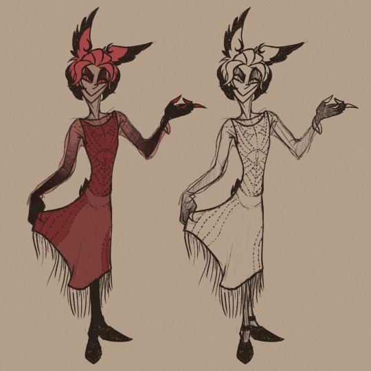
"Lose the jacket"…
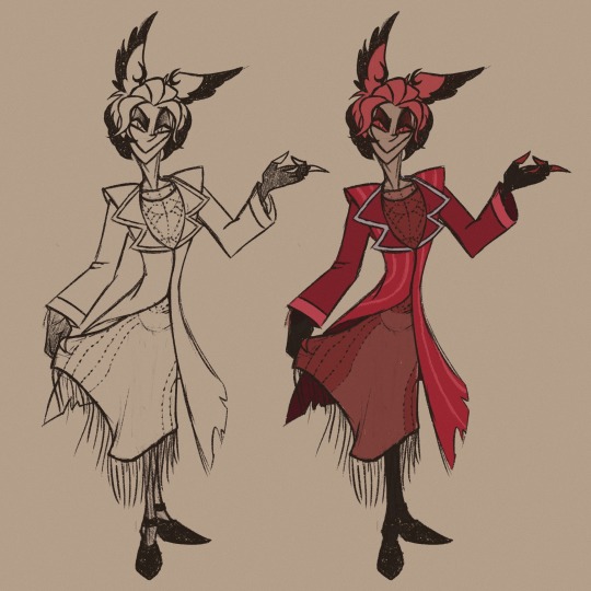
More Alastor in dress from this post because I am completely normal about it (I’m not).
@prince-liest : answering previous asks, let’s establish now that if I mention you directly in my posts, you are free to link the art to your fics without asking (after all, it wouldn’t have existed without them). I’m pretty sure I’m not done with them. Cheers <3
Artist’s little side note (because I feel like rambling again): so Hazbin gave me two life improvements (well, three, if you add the music) - one was stepping foot into the unknown aroace territory and being hit on the head with realisation that it was my home all along, making my questionable behaviours and reactions in the past a whole lot less… weird. At least for me, the allos probably still thought I was weird af, but that’s their problem now.
Second improvement was discovering a cartoony style that just sits right with my hand. I’ve always loved cartoons, had a little nostalgic era at the end of high school where I went back to the stuff I’d watched as a kid (Jake Long, Ben 10, Kid vs Kat, Samurai Jack), then I was discovering shows that were made quite recently already as an adult (Over the Garden Wall, Gravity Falls, The Owl House), I loved them for various reasons… but every time I tried to play with their style, I couldn’t get past a few drawings.
I also never truly worked out my own cartoony style, so I thought I’d be stuck with realism for all eternity - which is not bad by any means, it’s just that added pressure of your own artistic ego whispering into your ear that if you misplace one tendon or muscle, or get the proportions wrong, you’ll likely burn down in some special part of hell, specifically for artists that are too lazy to check their anatomy atlas for every single drawing they make. Or maybe that’s just me.
The point is – I don’t remember the last time I produced so many drawings in such a short time, and it’s a blast. And I can focus on posing and emotions more than anything, thus learning new tricks, and it might improve my realistic art as well, right now limited by my fear of it somehow looking incorrect (because that would surely mean the end of the world).
-End of ramble-
#hazbin hotel#alastor#hazbin alastor#radio demon#my art#aroace alastor#alastor in a dress#he’s a cutie patootie#princeliest#spilling more thoughts#aroace#art ramblings
207 notes
·
View notes
Text

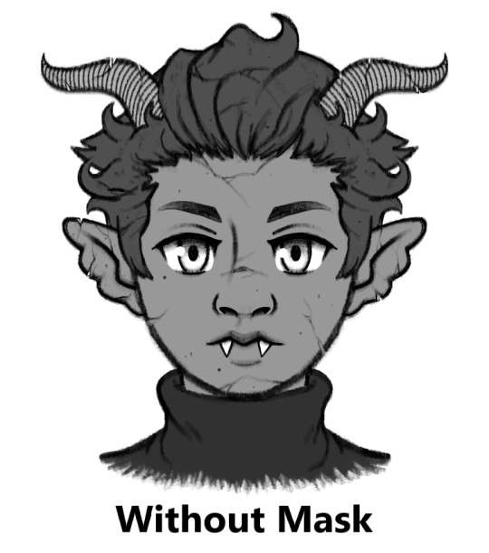
Here's my take on a Halloween Town Vidar. He's a gargoyle with a wolf skull mask.
Design notes under the read more:
I previously mentioned in my Halloween Town Vor post that when Nomura designed Sora, Donald, and Goofy's Halloween Town designs, he took inspiration from two different creatures for each of them. Sora is inspired by vampires and imps, Goofy is Frankenstein's monster mixed with a werewolf, and Donald is a mummy and invisible man. I once again took a similar approach here, though instead of using an even mix of motifs like I did with Vor's fairy + sphinx design, I went down more of a Sora route. IMO, if you look at Sora's Halloween Town design, it mostly reads as vampire despite lots of overlap between vampire and imp design elements, with the exclusively impish details really only being his imp/pumpkin mask and maybe his clawed gloves. For Vidar, he is mostly gargoyle with the wolf motif coming primarily from his wolf skull mask, but there's some overlap of creature motifs with the claws and fangs.
Now, why did I choose to make Vidar a gargoyle? Here are my reasons:
Made of stone. References how Vidar tries to harden his heart to the harm he's potentially causing the worlds. The cracks in the stone represent his slowly crumbling will and the eventual abandonment of his plans. As well, I think him being a living statue well represents his somewhat stoic demeanor and the mythological Vidar's title as the "silent god".
Gargoyles serve as guardians of the buildings they adorn. Throughout the game Vidar was trying his best to protect people and prevent anyone else from dying, especially Baldr.
Water spout gargoyles collect rain water and divert it from the walls and rooftops of buildings to prevent damage to those buildings. Water is sometimes symbolic of darkness in the KH series (for example, the KH1 opening where Riku offers his hand to Sora and gets enveloped by the darkness the waves). So, in my mind, this function of gargoyles represents Vidar's attempts to preserve Baldr by removing the darkness from Baldr's heart.
Gargoyles are commonly found on cathedrals and churches, and I think that religious aspect of them fits Scala society and Vidar's commitment to Light fairly well.
If Vidar were to visit Christmas Town via Halloween Town, I imagine his gargoyle form would change into a sort of "guardian angel" form, but keeping some of the more demonic elements such as the horns for a more Lucifer-esque angel. Sort of like how Christmas Town Sora still keeps many of his Halloween Town elements despite donning a Santa outfit.
Reason why I chose the wolf skull mask:
Probably the most well-known event in the Norse god Vidar's mythology is his battle with the great wolf Fenrir, who he kills by ripping its jaws apart. Thus Vidar wears the top jaw of a wolf skull as a mask, as a sort of "trophy" and reference to this mythology. Of course the "real" Fenrir would be much larger than a normal wolf, but the mask is just a representation.
Now, I'll explain all of my individual design choices from top to bottom:

Gargoyle Horns: There's many styles of gargoyle horns, but I decided to give him more realistic-looking animal horns to add more detail.
Gargoyle Ears: I quite like this type of gargoyle ear with the multiple rounded segments even though I couldn't find many examples of it, and I think it nicely differentiates the ears from elf/demon ears. Vaguely Rochelle Goyle from Monster High inspired, as well.
Wolf Skull Mask: Already explained, but I tried to go semi-realistic here, once again to add more detail and make it more clear what kind of animal skull this is. If this design were to actually appear in a Kingdom Hearts game, I could potentially see this mask being stylized in a more cartoony way (especially if put into the chibi mobile game style.)
Gargoyle Wings (Feathered): I originally gave Vidar the more typical style of gargoyle wing which looks like a bat wing, but I felt that style of wing in conjunction with the horns, claws, and elongated skull mask made him look too much like a dragon, which wasn't what I was going for at all. So I changed it to the other common stye of gargoyle wing, a bird-like wing. I think this also better reflects his role in the game as someone sided with Light.
Stone Skin and Hair: As mentioned, he's made of stone and covered in cracks and nicks. He's pretty much all stone (except his eyes? I guess?)
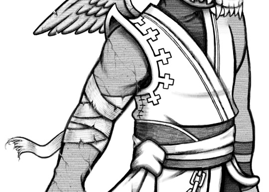
Shoulder Pads? (Don't know what else to call them): I made them more pointy and curled up at the edges for that Nightmare Before Christmas look.
Shoulder Pad Design: I turned the square design on Vidar's shoulder pads into crosses. One, to reference gravestones, but also again to reference back to cathedrals and that religious aspect of gargoyles. Also, it's a subtle detail, but I added a stitched seam to the side of Vidar's coat as well.
Bandages: Vidar's original design features bandage-like cloth underneath one of his gloves, so I took that detail and just put it all around his arm. Weathered and torn for the creepy look.
Wrist Bands: In Vidar's original design, he sports two asymmetrical gloves. Here, the bandages take the place of the more complicated glove, while these two black bands take the place of the simpler glove, which was just a black, fingerless glove comprised of a main glove and two straps above it.

Gargoyle Claws: Not much to say here. Can sort of double as wolf claws, but obviously without the fur.
Scala Emblem Chain: I changed the chain from a bead chain to a more grungy link chain for that Halloween look. Also, I wasn't able to depict this in a way that satisfied me, but I imagine the metal of the charm and chain being a little tarnished and scratched up.
Dirtied Sash and Coat Edge: It's not blood, just grime. Grime, tearing, and weathering for more creepy factor. His coat is pretty long anyway so I could see it getting dirty in the streets of Halloween Town pretty easily.

No Boots: To show off his gargoyle feet. In his original design his pants tuck into his boots, so I don't really know what the bottom of his pants are supposed to look like. I just cinched them at the bottom to maintain that puffed-out look. Is it weird that his feet only have three toes but his hand has three fingers and a thumb? Yeah. But I couldn't get four toes to look right. Just assume he's supposed to have four.
I decided to draw this Halloween Town design in black and white this time, but if I had colored it, you can imagine the color scheme of his clothes being darker and less saturated than his original design to better match Halloween Town.
Also, this was just a coincidence, but both Vor and Vidar's Halloween Town designs feature wings, claws, and fangs, and have a sort of cat (sphinx) and dog (wolf) theme. Which I think is cute and makes them feel more like a duo. :)
That's it. Thanks for reading.
55 notes
·
View notes
Text
I drew a racer icon for Queen Berry and some other doodles


I tried to keep it in the style as best as possible, but also look like she attempted a more cartoony style. The cake doodle was an idea of how she'd start her boss fight by emerging from a giant cake before fighting Ralph. Also, I'm free from Finals Hell, so I will try to draw again and post. (I'm not sure on the AU name where it's just her switched with Turbo, so yeah I'll work on it. For now, Queen's Rule.) Royal Family AU is more of my focus, since it's both of them.
#myoc#wreck it ralph#oc#au#wreck it ralph oc#wreck it ralph queen's rule au#wir queen's rule au#wreck it ralph queen berry battenette#wir queen berry battenette#wir queen berry#wreck it ralph queen berry#wreck it ralph queen berry cybrid#wir queen berry cybrid#wir scarlet#wreck it ralph scarlet
29 notes
·
View notes
Text
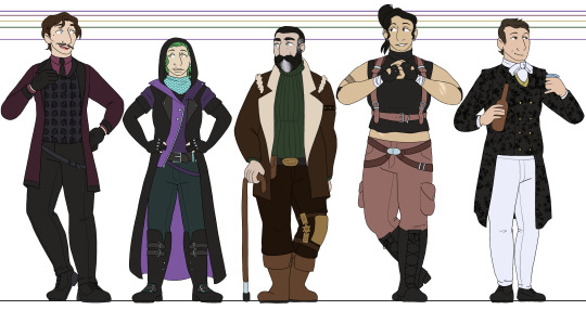
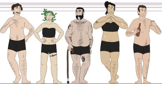
after 500 years, im back to working on line-ups for the oxventure PCs for each campaign, this time the hobby horses :3 as with the oxventurers guild, i put a good amount of thought into this, though maybe not as much as the guild haha but regardless, i'll go into more detail under the cut for anybody curious :]
once again, they all have their own eye shines (or, in barnaby's case, are dead behind the eyes lol), though theyre simpler shapes this time. edvard gets stars, lilith gets a squiggle, kasimir gets a hooked shape, and zillah gets hearts.
edvard - i see him as just kind of. soft around the edges from his rich upbringing, but generally is on the thinner side, kind of rounding out in the middle. very Just A Guy with his build and body hair. i went with brown hair rather than black because otherwise, everyone besides lilith would have black hair and it was just to monotonous for me XD still, i tried to keep it dark and not too bright so it would fit the vibe. also, for some reason i thought his vest was floral until i started coloring this, but it totally is not in canon??? :') i liked it too much to not do a floral pattern anyways.
lilith - i really adore her canon outfit, i just get very confused about the layering of everything. so i tried to do distinctive color-blocked for her outfit, while also restricting her outfit's palette to just purples and teals/blue. i am so bad at drawing snakes. i am so so so bad at drawing snakes XD also, i decided to give everybody at least one tattoo because i just thought it would be fun and im taking advantage of the gritty setting. theyre all cool and tough so they have tattoos and totally not because i just love drawing tattoos lmaooo
kasimir - kas is not much of a leap from canon. i love kasimir's design. i just gave him plenty of tattoos under that massive jacket of his. based vaguely on johnny's tattoos, i did my best to reference their arms but ended up more going off of the vibe rather than copying anything specific. johnny's tattoos are simply too intricate and beautiful for me to do repeatedly djfgbdfhd and okay i say this constantly but my faaavorite kasimir design element is his whale belt buckle. its so cute. i love it
zillah - she was also easy for the same reason, i just adore zillah's design. its simple and very fitting. so i just gave her exactly what she has, but like lilith, i simplified the color palette. since my art style is much more cartoony than colin craker's, especially when i dont hatch or shade, restricting the colors makes the designs look cleaner. i almost forgot to color in zillah's hand wraps by the way and i literally put my hand over my mouth, i only caught it as i was typing this XD it was so needlessly over-dramatic
barnaby - i dont know fully how to explain it, but barnaby is definitely the design i am most pleased with. not because i think he has the best design here necessarily, but because hes just so perfectly what i picture in my head. with a lot of my designs, ill adjust small details based on my mood or i just won't fully be confident in my decisions, but with this design? thats just barnaby. chef's kiss. like edvard, i gave him brown hair instead of black for some diversity. i also kept his very thin hair and high forehead because it makes him so endearing to me <3 no five o'clock shadow though, he has to keep himself looking young
#oxventure#oxventure blades in the dark#edvard lumière#lilith cappellanaga#kasimir jones#zillah bruseau#barnaby fortescue iii#i cant believe i said 'ill finish these tomorrow' on my last post for these. oh my god.#its been over half a year and this took me 16 hours LMAO though i am a bit rusty w lineart and full color
32 notes
·
View notes
Text


I recently acquired a plush Luffy in a silly little outfit, I felt like drawing it :3
I tried to draw the full body in the style of the special One Piece episode Fan Letter, but there are things I should fix in order make it more accurate. I will probably try this style again sometime in the future, hopefully I can break through some habits and push the proportions to be more cartoony and truer to the Fan Letter art style! The headshot at the top left was a quick doodle in a style I'm more comfortable in ^^
#art#artists on tumblr#digital painting#one piece#monkey d. luffy#one piece fanart#straw hat pirates
22 notes
·
View notes
Text
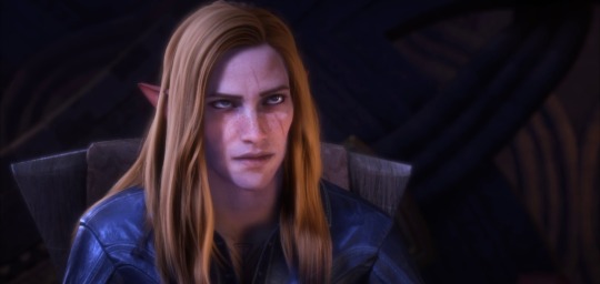
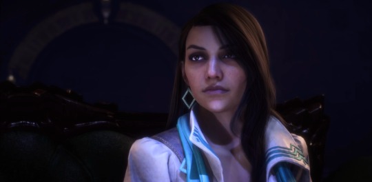
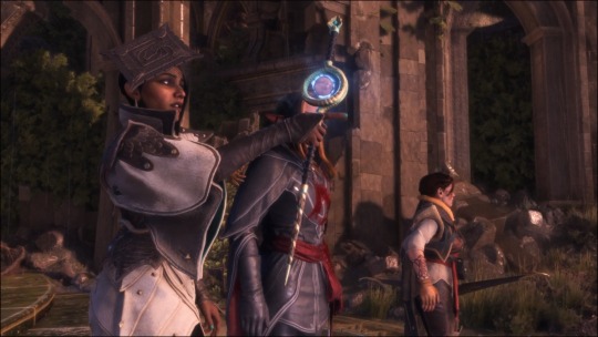
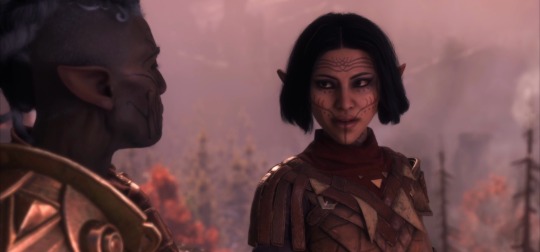
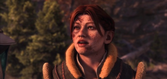
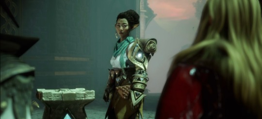
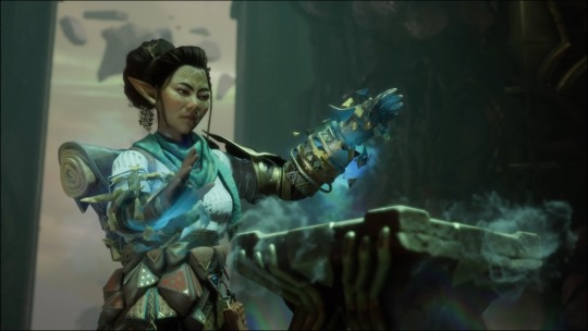

enda “rook” de riva
replay // shadows of arlathan + in entropy’s grasp
thoughts and notes -
shadows of arlathan
- “Solas can speak with people in their dreams, even kill them” he what? Since when can he kill them? What lore did i miss?
- They were evil gods who enslaved their people - how does Harding know these things? Lol is this stuff hidden in codex entries i didn’t read closely enough? Stuff Harding and Varric learned over the last 9 years? If so, how/why were they learning these things in their search for Solas when, in theory, the Evanuris being a danger was not on their radar?
in entropy’s grasp
- Upon re reading tevinter nights, strife is a completely different character. He was supposed to be chatty, smiley, and sarcastic, and notably did NOT have facial tattoos/vallaslin. Very strange, I wonder if this version of strife was not written by Patrick weekes. He’s also very monotone - no shade to the VA, but it was alarming to see the first less-expressive cutscene also paired with an inexpressive character. Gave me the worry that quality was going to go downhill fast after the introductory sequence to the game, but luckily that wasn’t the case.
- (Re: cutscenes - bioware games in general have 3 levels of cutscene from my observation. The capital-C Cutscene, the lowercase-c cutscene, and then the convo-cutscene, the first being the most detailed and cinematic and the last being the least. Speaking with Strife and Irelin felt like the first example of the convo-cutscene where characters just stand across from each other and chat back and forth. Which is fine but again, it’s that lack of expression paired with strife’s more monotone voice and bearing that really worried me for a hot second.)
- I do love Irelin’s design. i actually like strife’s a lot too; I just think he should be bare-faced like in the novel.
- bellara’s intro is also so strange. She barely acknowledges the gods thing. They tried a little too hard to make her quirky here. She grows on me, a LOT, over the game - they just frontloaded way too much of the super cute and absentminded thing here. I think that should’ve come to light after her introduction had a weightier heft to it. Someone also mentioned it makes no sense that she, without any questions, gives some randoms (incl. Neve if you brought her, who is Tevene) essentially a tour of what is theoretically some very powerful secrets. It would’ve been worth a brief scuffle with her, I think, and then a few lines of not just explanation, but hastily attempting to convince her you aren’t here to poach elven secrets or magic. Even a code word provided by Strife and Irelin would’ve sufficed to put to rest any concerns that never even reached the light of day.
- Ogre - i quite like the darkspawn designs, even if they’re slightly cartoonier than before. I do think it has to do with the fact that the designs themselves, with this art style, are more readable in general; i can pick out details on the types of darkspawn that I couldn’t before because of the more muted color schemes of the prior games. (I loved those, to be perfectly clear; i just like how clearly and sharply i can see what’s going on here. But i do think there’s something to be said about the cartoonish quality; there’s probably something that could’ve been done to make them slightly less so. I think they managed it with the blighted dragons.)
#oc: enda de riva#dragon age: the veilguard#datv spoilers#dragon age#dragon age the veilguard#datv#veilguard spoilers#datv thoughts#neve gallus#lace harding
22 notes
·
View notes
Text
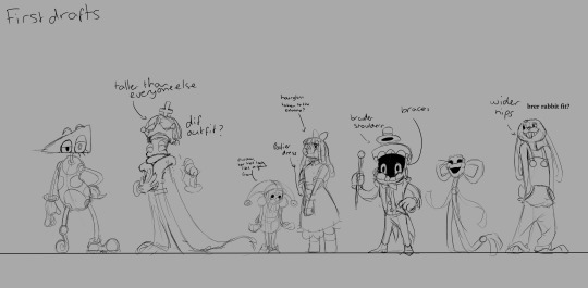
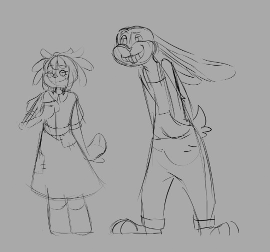
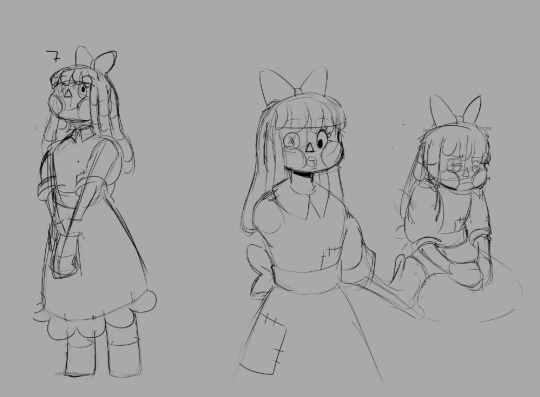
Thought I'd share my first drafts of all the characters!
Don't know what I was thinking with the braces on Caine, lol. I guess i just wanted a way to connect his upper and lower jaw.
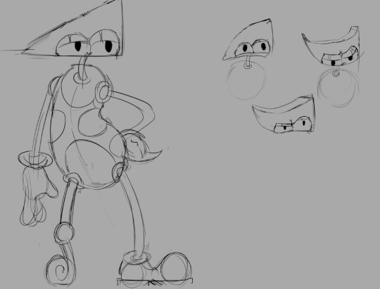
Zooble was BY FAR the most difficult to design, since they're already so insanely cartoony. I actually tried making them a robot at one point!
I settled with a devil because a lot of old cartoons would have stuff like devils as their antagonist, and I didn't think that a robot would fit the era of animation I was going for.
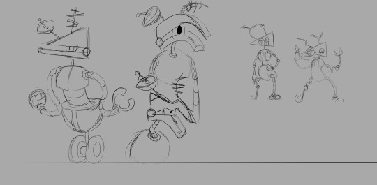
An alternate colour scheme for Zooble. It was way too generic in my opinion.
Looks like they were also meant to have whiskers at some point.

The first ever sketches I did for this au!
The pose in the middle was inspired by a Christma comic I was going to make as an introduction to the au. Create some intrigue, y'know?
I've definitely had the most fun drawing caine's expressions!
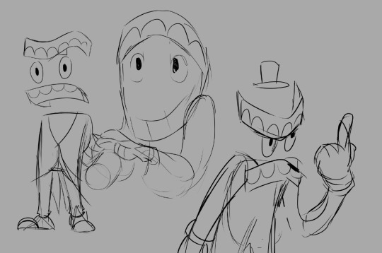
More caine!
I focused a lot less on keeping entirely to proportions and more on the line of action, akin to the rubberhose style of animation.

First sketches of Jax and Ragatha. I love drawing anthropomorphic charcters, so Jax was naturally my second choice to draw!
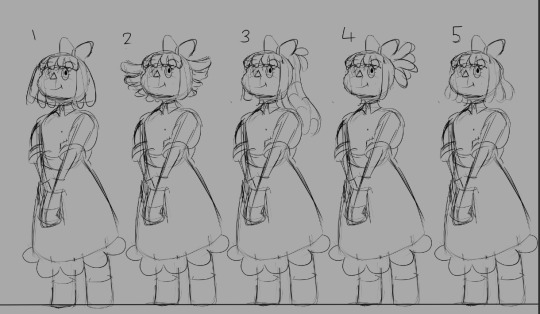
I then played around with all the possible hairstyles Ragatha could have. I didn't want the design to be too similar to other aus, while also conveying her kind demeanor. A lot of aus end up tying her hair back!

More Caine! again, the one in the middle is a pose I would have used for the Christmas comic! I was still figuring out how many restrictions the toons would have, so I'm glad I scrapped it. Wouldn't want to set anything in stone that early in development.
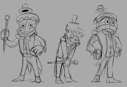
Some other poses for the early designs of the characters! Jax was definitely my favourite of these!
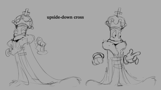
I never went for Kinger's upside down cross because I'm pretty certain that an animation studio in the 50s wouldn't allow a symbol of Satan on a character that wasn't pure evil.


That's it! I hope the next time we meet, I have some new work to show you!
#the amazing digital circus#toon au#toon pomni#toon jax#toon ragatha#toon gangle#toon caine#First Draft
123 notes
·
View notes
Text

Damn it… not this again. Why does it always come back to this?
Mabelverse AU
Volume 1: Back in Town
Part 1 || Part 2 || Part 3 || Part 4 || Part 5 || Part 6 || Part 7 ||Part 8 || Part 9 || Part 10 || Part 11 || Part 12 ( soon )
Hiii, everyone. Yeah, I know, it’s been a while… and only one page, sorry about that. 😅 I recently got a job, and now I don’t have time for anything! I come home so tired that I can’t do much but sleep, eat, and work. These past two weeks have been a blur. Also, I’m kinda hating how the comic looks right now. I’ve been reading Over the Garden Wall comics, and I love the style, so I tried to take some inspiration from there, but honestly… I feel like I suck at it. I haven’t had time to practice drawing, and I’m so frustrated with trying to switch from anatomy to a more cartoony style. Like, how do I make that transition? It just looks like crap right now. 😩
Sorry, I’m rambling. I’m just really tired and frustrated. Updates are probably going to be really slow for a while, and I might even want to redraw some stuff, or just take more time to get it to where I like it. My brain is such a mess sometimes. I love sketchy comic styles, but I also love clean comic styles, and it’s driving me nuts trying to figure out what to do! 😖
But anyway, I promise the story is all figured out plot-wise. You haven’t even seen 0.001% of what I have planned! Just bear with me while I try to get it all out. Thanks for sticking around. 💙
#mabelverse au#gravity falls#mabel pines#bill cipher#gravity falls au#gravity falls mabel#the book of bill#gravity falls comic#gravity falls fanart#gravity falls stan pines#stanley pines#gravity falls stanley#stan pines
24 notes
·
View notes