#tonal separation depth cue
Explore tagged Tumblr posts
Photo
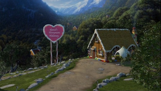
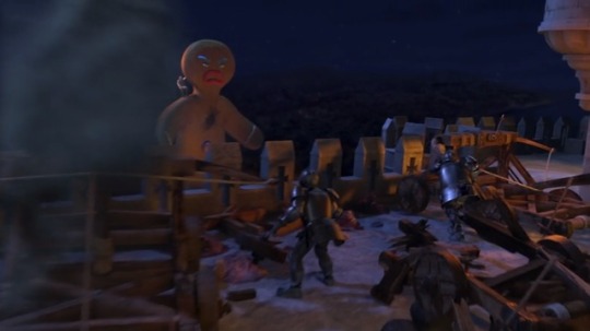
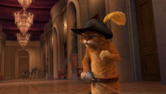
Depth cues in the movie Shrek 2™ 1) Size change, textural diffusion, colour separation, overlapping, aerial diffusion. 2) Size change, textural diffusion, tonal separation, colour separation, overlapping, aerial diffusion. 3) Convergence, size change, textural diffusion, overlapping.
1 note
·
View note
Text
Week-3 Tonal Seperaion, Color Seperation, Flat Space, Limited Space and Ambiguous Space
TONAL SEPARATION
Tonal Seperation is the contrast between adjacent tones creates tonal separation.It’s the range between the different brightness levels within photos determines its degree of contrast. Having a contrast is important for the images because it will create a sense of depth in image.

For this image, tonal seperation is very important becuase without it image becomes much more flat
COLOR SEPERATION
Color separation is the process by which original full-color digital files are separated into individual color components for four-color process printing. Every element in the file is printed in a combination of four colors: cyan, magenta, yellow, and black. In cinema color seperation used for adjusting the images different parts like it’s hue, saturation, brightness .

Flat Space
Flat space is not an illusion. Flat space emphasises the two-dimensional quality of the screen surface. The walls are frontal, and there are no longitudinal planes or converging lines. Actors are staged on the same horizontal plane, they are the same size.

Example from Better Call Saul tv show
Limited Space
Limited Space the depth cues in the shot include size change, up/down position and tonal separation. There are no longitudinal planes, only frontal surfaces.

Ambiguous Space
The lights are off in the hall, some stray light illuminates the stairs, and the two actors are somewhere in the dark. The picture is ambiguous because it’s impossible to tell the actual size and spatial relationship in the shot.
https://www.youtube.com/watch?v=1wJQ5UrAsIY
Example to Ambiguous Space
0 notes
Text
Week 3 - Space
Tonal separation
Tonal values are essential for communicating depth and points of interest in film and video. But many filmmakers think about contrast when it’s too late.
Contrast is a term that applies to several aspects of filmmaking: contrast ratios with lighting, contrast adjustments in color correction software, contrast in color, contrast in compositional shapes — the list goes on — but primarily, contrast refers to tone.
The Principle of Contrast & Affinity states: The greater the contrast in a visual component, the more the visual intensity or dynamic increases. The greater the affinity in a visual component, the more the visual intensity or dynamic decreases.
Contrast = Greater Visual Intensity
Affinity = Less Visual Intensity
Photo credit to Premiumbeat


youtube
Color separation
Color separation is the process by which original full-color digital files are separated into individual color components for four-color process printing. Every element in the file is printed in a combination of four colors: cyan, magenta, yellow, and black, known as CMYK in the world of commercial printing.

Flat space
Flat space emphasises the two-dimensional quality of the screen surface. The walls are frontal, and there are no longitudinal planes or converging lines. Actors are staged on the same horizontal plane, they are the same size.

youtube
Limited space
Limited Space the depth cues in the shot include size change, up/down position and tonal separation. There are no longitudinal planes, only frontal surfaces. Limited space uses two or more of the frontal planes to create depth. The idea is to create a flat plane which separates one plane from another. If there is only one plane, the image is considered flat.
youtube

Ambiguous space
In order to create the idea of depth, you usually have to relate it to something. Ambiguous space is the removal of those cues so the viewer doesn’t know what they’re looking at. A normal place at an odd angle or a close up of a part of an object are 2 examples.
youtube
0 notes
Text
80 Years Of Animated Fairy Tales:
By the early 1930s Walt Disney faced a dilemma: his popular cartoon shorts about Mickey Mouse were starting to lose money. His competitors could afford to produce cartoons at a loss as lead-ins to their live action films; Disney, who did not have a movie studio, could not.
But he had another idea: he could produce a full-length film of his own. Only, instead of making a live action film, he could produce a full-length cartoon feature, running, say, for about 88 minutes. Good length. Sure, it might cost as much as $500,000. (Cue gasps.) He would need 300 artists. It had never been done before. It’s safe to say that very few people thought this was a good idea. And that $500,000 turned out to be a very wrong estimate. It’s also very safe to say that this idea is why we have the entertainment megacorporation of Disney as it exists today.
The process of creating Snow White officially began when Walt Disney acted out the story he had in mind to his main animators. Later, some of them said Disney’s performance had brought them to tears; whether this was true, or just a later Disney legend, is a bit difficult to determine. But the preparation had started long before that. Disney had wanted artists that could be cartoonists, but not��just cartoonists, and paid to have his cartoonists take art classes, first at the Chouinard Art Institute, and later at the newly formed Disney Art School. (Somewhat scandalously, some of these art classes involved—gasp—nude models, which apparently had the side effect of encouraging cartoonists to show up.) Cartoonists were also sent to the zoo to study animals.
This was all great, but it left just a few little technical problems: first, the difficulty of creating the illusion of depth from two dimensional drawings, needed to give the film a realistic feel; second, the difficulty of creating four lifelike animated humans; and third, not having enough artists available, even after the art school program. Oh, sure, Disney had artists diligently churning out Mickey Mouse cartoons, but for this, he needed more. Three hundred more.
This might have been impossible except for a fortunate (for Disney) historical fluke: Disney just happened to need those artists during the Great Depression. Which in turn meant quite a few just happened to be available at considerably lower-than-usual rates.
That still left Disney with the two other issues. The solution to the first was a technical milestone: a multiplane camera. First, the art was separated and put on different levels of glass. Then, each piece of glass was separated. This meant that when the camera moved in, the art on top would get “bigger” faster than the art on the bottom—giving the illusion of depth, and allowing the camera to move in and out, the same way it could in a live action film. As an added bonus, this meant that special effects—for instance, rain, which was not always animated, but instead a film of actual water drops—could be filmed on a separate piece of glass.
Next came the issues of trying to animate three adult humans, one girl, and seven dwarfs—and make their actions look realistic. Animated cartoons had included human figures before, of course—but always in exaggerated, unrealistic forms, and the results had looked, well, wrong. For Snow White, animators studied dancers and asked the voice actors for the dwarfs to dance, studying their movements as well, to see how humans actually move. The end result seems commonplace today, but at the time it was an innovation: animated humans with (nearly) natural movement.
It wasn’t perfect—the Huntsman’s movements, for one, are not always entirely convincing; an artistic/production error led to an accidental “shimmer” effect with the Prince, and a few of Snow White’s movements are off as well. But at the time, audiences found it jaw-dropping.
So how does it hold up today?
I’d have to say, mixed.
A significant part of the problem—and one, to be fair, pointed out by the animators at the time—is the film’s pacing. It starts off sharply, moves into a terrorizing forest sequence (a sequence that not all small children survive) then pauses for a long, extended housecleaning scene, pauses for another long sequence focused on the dwarfs, and then another long sequence focused on the dwarfs, and finally jumps back into the action as the queen belatedly realizes that the Huntsman gave her the wrong heart. Which means that we get a very long, often slow cartoon about singing, cleaning, working, and properly washing faces and hands, where very little actually happens (unless you are counting the story of that poor tortoise) bookended with sequences of near horror and terror.
As you might be realizing, this creates a rather jarring tonal problem as well, and for all its ambition to be the first full-length animated film, Snow White isn’t quite there in anything but length: rather, it’s a sometime uneasy mix of the old cartoon shorts with a full-length film. To a very large extent, this was playing up to the audiences of the time, who had certain expectations from their animated cartoons that focused on short, funny gags and characters doing silly things. Walt Disney, almost always good at reading his potential audience, correctly guessed that this audience would be expecting silly dwarf scenes, and provided that—even as his animators complained that the dwarfs’ scenes went on for far too long.
But in a way, they had to: Despite the need to fill 88 minutes of screen time, Walt Disney severely cut the original story, eliminating the original beginning, with its deeply symbolic elements, two of the queen’s attempts to assassinate Snow White, and the gruesome ending in which the evil stepmother is forced to dance in hot iron shoes until she dies. Not that the evil stepmother gets away scot-free—or alive—in the Disney version, either, but the death occurs largely off screen, confirmed mostly by the hungry eyes of the lurking vultures.
(Not that the vultures convinced small me at all. We didn’t see the witch really die, after all, and she was a witch with a magic mirror, so clearly she was totally still alive and was going to come back and kill all of the little birds and rabbits. So, yay Disney for sorta trying to reduce the cartoon violence, but minus several points for leaving a little six-year-old me in quaking terror.)
Cutting those two assassination attempts was almost certainly necessary to keep Snow White from looking too credulous—especially since, to keep the last assassination attempt believable, Disney did keep Snow White almost as young as she was in the Grimm fairy tale. Almost. As noted last week, Snow White, in the original Grimm/Lang versions, is seven when she first becomes “as beautiful as she could be,” and runs off to the woods shortly after that. This Snow White seems to be at least twelve—she’s old enough to work as a scullery maid, and take on a motherly role to the dwarfs. But not much older than that. She’s drawn with a flat chest and the features of a young girl, and voiced with a childish, high pitched voice—in striking contrast to the rich, older tones of her stepmother.
(It’s also in striking contrast to the voices of later Disney princesses, usually voiced with richer, more mature tones; the closest vocally to Snow White are the younger heroines Alice in Alice in Wonderland and Wendy in Peter Pan, who aren’t princesses or love interests. For entertainment, try comparing the voices of Snow White (1937), Cinderella (1950), Belle (1991) and Elsa and Anna (2014).)
It’s not just her appearance and voice, either, but many of her actions that indicate her youth and inexperience. When Snow White first sees the Prince, she runs. Sure, she later pops out of a tower to sing at him, a probable nod to Rapunzel, and, to be fair, older girls might also flee after being surprised by the head of a stranger popping up over a wall, but that initial reaction suggests a certain immaturity. In the forest, she reacts to her surroundings in sheer terror, running, tripping, falling, and weeping—later calling herself silly for doing so. In part, of course, she is fleeing her stepmother, under the perhaps justified feeling that she can’t possibly escape the woman…even if the evil queen only seems to be employing one other servant and a raven. True, the evil queen also has a magical mirror, which should count for something, but the mirror does not seem to be particularly good at the whole chasing-down-princesses-in-the-wood bit.
But her most childish moment comes later in the film, when she eats the apple offered to her by the old witch. Everything—the warnings from other characters, the reactions from the animals, the sudden appearances of the vultures who, I must say, did not show up for the major housecleaning binge, like, thanks, vultures—should tell her not to do this. She was intelligent enough to make the best of things under her stepmother; intelligent enough to realize that she had been foolish for no reason at all; intelligent enough to bargain her way into a home with the dwarfs. And yet, this.
It feels wrong, and makes sense only if Snow White is enchanted (which she doesn’t seem to be), if Snow White is incredibly stupid (which again, apparently not, based on other bits of the film), if Snow White is too terrified to say no (an explanation that appears in other retellings, but not here), or if she is simply too young to know better. Disney went with the last.
But that reasoning in turn creates another jarring moment, since this young girl, young enough to take an apple from a terrifying old woman despite ample warning, is the same young girl who, just moments earlier, takes on a motherly role with the seven dwarfs—all men older than she is. (Well, at least six of them are. Dopey may be three.) It’s not just that she, with a lot of domestic assistance from the various cute animals, cooks and cleans for them—she also orders them to clean up before dinner, and kisses them all on the head good night.
In part, Snow White can take on this role because—in stark contrast to the Grimm version—when she arrives, the little cottage is an absolute disaster, and the dwarfs, if not exactly interested in cleanliness, are interested in getting a decent meal. The dwarfs in the Grimm tale don’t actually need Snow White as their housekeeper; it’s a fair trade for their protection, as well as part of the ongoing Grimm moral lesson (good girls focus on housework, not vanity). In the Disney version, Snow White earns her way into the cottage with hard work—with, admittedly, the help of a lot of animals, as a nice nod to the idea that it’s almost certainly impossible for one girl to take care of seven very messy men without help.
This also allows the film to linger on its theme of work. It’s not completely new to the story: in their version of “Snow White,” The Grimms had associated housework with positive images of women and girls—basically, girls that do housework, and avoid the temptations of vanity, stay alive and get the prince. The Disney version doesn’t quite follow this: it’s surprisingly, and even hilariously, not all that concerned with issues of vanity and personal appearance—hilariously, given the Disney Princess product line this film would eventually help launch. Yes, Snow White does look at herself in the well once, but the purpose of this is more to set up a song (“I’m wishing!”) and to show off that Disney’s animators had accomplished the hitherto impossible: creating an animated image of something reflected in water, than to say much about her looks. (Thanks, multiplane camera!) And that’s about it for Snow White’s vanity.
But the Disney version does pick up the work focus, only with a twist. It focuses on the sheer joy of having work to do, and the idea that working will bring you joy. In our first glimpse of Snow White, we see her smiling as she scrubs steps. We later see her singing and smiling as she cleans up the house, and a number of adorable woodland animals eagerly help her out—and have fun doing so. We see the dwarfs—whose accents, grammar and failure to bathe regularly stem from then-popular representations of working class people—sing about the sheer joy of working. All this while doing housework and mining, typically classified as tedious, menial jobs.
Doing tedious tasks have often been part of a hero’s journey and assigned tasks feature in many fairy tales, often with the assistance of small animals the hero had helped along the way. But this particular message seems to spring more directly from the Great Depression than from fairy tales, a message that reflected the relief of having any job at all, no matter how menial or tedious. And to a certain extent the original condition of that cottage may also have reflected certain images from the Great Depression: neglected, almost run down, small enough that the seven dwarfs all have to share a single bedroom—though at least they’ve personalized their beds. And although definitely cartoonish, the images of the dwarfs curling up in various odd places also fit familiar images of unemployed people finding jobs wherever they could.
That these scenes are cut between shots of the dwarfs picking up huge gems from the mine suggests that something is seriously wrong with this kingdom’s economy—echoed in the scenes in Snow White’s nearly empty castle. The dwarfs have gems, yes, but no one is buying them. Still. It’s a job, and so, hi ho, hi ho, off to work they go.
Since I’ve brought that up, I must say that I found the songs a bit of a mixed bag on this outing as well. Three, granted, became instant classics and Disney staples—“Heigh-Ho,” “Whistle While You Work,” and “Someday My Prince Will Come,” and it’s entirely possible that hearing the latter in far, far, too many television commercials over the years shaped my instinctive cringing at the sound of it sung in Snow White’s little piping voice. “I’m Wishing,” sung in the same little high pitched voice, which has not been as eagerly embraced by advertisers, did not evoke the same reaction, so that could well be it.
But I can’t say that my reaction to the washing song and the silly song done by the dwarfs had anything to do with advertising: those songs have not become popular staples, for a reason. As the animators complained, they are featured in sequences that last far too long, almost to the point of forgetting that yes, yes, there’s an evil witch out there. The moment she comes back, the dwarfs immediately recede: the Evil Queen doesn’t just have a far more powerful presence, she’s visually more interesting.
Walt Disney, however, insisted on leaving in the lengthy sequences: he wanted the dwarfs to be individuals, characters that the audience could embrace. Even if, in the end, Snow White and her prince couldn’t, or at least didn’t—they head off to a palace, while the dwarfs stay behind, sadly waving their hats, getting ready to head back to work. Housework brought Snow White to her prince; mining work leaves the dwarfs open to having complete strangers, evil witches, and assorted animals just walk into their home at any time, arranging things to suit themselves. But then again, I can hardly say that the dwarfs did anything to save Snow White, other than put her in that coffin: not only do they leave Snow White at the cottage without protection (as in the original fairy tale) but they waste several valuable moments fighting with the animals who are trying to warn them. Well done, dwarfs.
Which is probably why, in the end, my favorite characters end up being the Evil Queen, magnificent in her evil, willing to go to hideous lengths to remain the loveliest woman in the land, only to fall off a cliff because she didn’t have the sense to make her disguise something she could easily drop in order to run faster.
And the little tortoise.
I’d totally forgotten this film even had a little tortoise. It turns out, however, that he’s the most adorable and heartwarming character in the entire film, and yes, I’m including all of the dwarfs and the cute little animals. Possibly because each and every time he finally achieves his slow, hard-fought-for goal, he gets knocked down and has to start all over. With a smile. I’ve been there, tortoise, I’ve been there. Hugs.
And that leads to the other great part of the film: the animal animation, which is spectacularly beautiful, with each and every animal individually animated. Disney would only reach those heights in a few more films: it’s incredible that they started off so well here. They are almost—almost—enough to help little viewers forget that this film also has a very scary witch. VERY SCARY.
Watching the film, it’s remarkable just how many elements of the Disney brand are already in place: the adorable helpful little animals, the first of the Disney princesses, and of course, the memorable songs. As much as Walt Disney liked to say afterwards that it all started with a mouse, it’s equally accurate to say that it all started with a fairy tale. What’s also remarkable is just how many elements of the Disney brand are not there, and would be developed later. We’ll be seeing that as we continue.
0 notes
Photo
Fluid Label Focus on Crónica 019
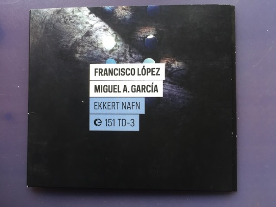
Francisco López & Miguel A. García: Ekkert Nafn (2019)
Reviewed format: review copy of CD Album as kindly provided by Crónica
Welcome to another new review in the Fluid Label Focus series on the Crónica label in which today I’m reviewing an album that I received as a review copy on CD from Crónica quite by surprise. With many review copies nowadays coming in in digital format through the email or other ways, finding an extra review copy in my physical package of a release I didn’t review yet was a very nice gift. Indeed this album, titled Ekkert Nafn by Francisco López & Miguel A. García was also the exact kind of album I had actually been subconsciously waiting to check out for quite some time, with the last time I’ve checked out López work being through a CD release in a very arty package that I ordered from the quality but unfortunately by now closed Experimedia mail order store so seeing his name on this album already gave me high expectations as through my always ongoing interest in underground and experimental music the glimpses of descriptions of his sound always left me intrigued. Indeed through the ever-growing interconnection by networking with an ever growing number of artists and labels that I review I’ve already come across Miguel A. García’s name as well, but didn’t know yet what kind of sound his material has. Through Ekkert Nafn I found out however that these two Spanish sound artists and experimental musicians have a lot in common in terms of their approach to composing, manipulating and performing with sound but through subtle cues there is a kind of division between the two artists audible on this album, although when listening to this album in full, the transition from López’ piece to the track by Miguel A. García is so seamless that the compositions become one piece, one continuous experience. And while before writing my reviews I always read the release descriptions and refer to them somewhat too, the more compact text on the back cover which doesn’t reveal a lot is in this case also enough to be able to get into these pieces, as like López also said in an interview before, not knowing what these sounds are sourced from is often better than having this knowledge to get into the compositions with a completely fresh mind and no pre-formed expectations in your mind in advance. So that’s also the approach I will take with this review, as much interpretation of the compositions without too much reference to possible recognisable sounds. Before I get into the compositions, I’ll talk a bit about the artwork of this release on CD, as always. The CD of Ekkert Nafn comes in a nice compact cardboard gatefold sleeve with artwork by Raul Dominguez and the signature Crónica design by Miguel Carvalhais. The front cover is quite fitting to my impression of the sound works on this album themselves, abstract paint-like swipes of white and purple-ish colour combined with blue dots puncturing these textures appear over a dark nocturnal background which matches the rather mysterious nocturnal ambience I’m getting from the pieces, strange glimmering sounds appearing in front of you in the dark quiet night. In the middle you can see the artist names, album title, Crónica logo and catalogue numbers in uppercase type in a nice contemporary labelling style. The spine follows the familiar Crónica style again, artist names in normal uppercase type, album title in bold and label name, catalogue numbers + year in regular style again over a black background. The back cover is black as well, listing the track list plus track timings, creation dates and locations, copyright data, links and album credits in serif type. Inside the gatefold you can find more artwork (which is especially focussed around the aforementioned holes in which lights and shapes peeking through). The CD itself is housed in a round die cut in which it can slip in and out. The CD features signature Crónica design, black background, with a pretty bold border around it and shows the Crónica logo in transparent style, catalogue numbers, artist names and album title and the CD logo.
Now onto the pieces themselves, as I mentioned, listening to both pieces by Francisco López and Miguel A. García in sequence on this album does give a listening experience that feels more like one continuous piece rather than two solo works (Untitled #351 by Francisco López being track 1 and Applainesads by Miguel A. García being track 2) and this isn’t entirely surprising as the back cover states that both artists based their pieces on the same batch of source sounds that they also collaborated on within the creation process of that sound set itself. There is definitely a cross of sonic material on this album but while reading this description might make you wonder if that doesn’t render the compositions very similar to eachother, that’s not really the case. Instead the pieces compliment eachother. For a start, let’s look at López’ piece Untitled #351. Lopéz takes on a very dynamic, varied and intriguingly alien approach to his sound world and composition, giving us sounds we think we recognise but bringing these into very mysterious situations. Glimmering mechanical sounds backed with low sub bass pulsations often give the impression of some kind of strange abstract moving structure of particles glowing and twisting in front of you, in the dark night. This “night” suggestion is one I got from both pieces because the sound is very focused in a certain direction in the stereo field, often leaning to centre or a bit more to the right of the stereo field, this mixed with the curious separation in frequencies of the sonic spectrum in which the low end is very low, while other sonic energy floats in the mid-high - high end of the spectrum but has some quite prominent resonant frequencies sticking out quite a lot. Very quiet sections, quite lowercase are also prominent in López’ piece, with a quiet listening environment or headphones being a true requirement for this piece to be able to actually hear everything within it as the piece can vary from louder sections of at times, industrial styled sections of composed sound rhythms and metallic pulsations to very soft, sub-bassi sections of soft tones and tonal elements. This constant variation in manipulation, blend of sonic textures and at times surprisingly musical ways of handling sound through repeating rhythms or tones creates a listening experience that feels like a very nice fresh approach to soundscapes and the Sound Art field in general as while the sonic images are audibly rooted in concrete real-world sounds, the glimmering, glitchy, at times punchy rhythmic pulsations, bass throbs, metallic “percussion” textures and high frequency details together form an ever changing sonic landscape that moves from intense bright activity to sections of very subdued “hidden sounds” at the edge of the threshold of hearing, which creates a great depth, progression and “story line” to the piece which makes it a very memorable, inspiring immersive listen which I highly recommend. Because of the adventurous structure of the piece I also don’t want to spoil how this piece progresses but I can tell it’ll definitely give you whole fresh new perspective on how powerful and also fun sound art and composed soundscapes can be. Applainessads, Miguel A. García’s piece follows up López piece in a great way through a more drone based continuous kind of flowing soundscape which is more high end based in terms of sound spectrum and which features plenty of eerie strange sounds, some of which are recognisable as nature sounds, like crickets and wind. It forms a great extended coda to Untitled #351 with its mixture of nature sounds blended with metallic textures and resonating droning tones. But also this piece does feature its own kind of rhythmic elements in the form of hollow “drop” like sounds that appear quite distant, like water drops reverberating in a damp wet cave. I’d say this piece feels quite a lot like an examination of strange dust particles in the night air turned into a subtly evolving soundscape, like a brooding mostly continuing ambience of metallic resonant ghostly textures that feels both oddly alien and strange but also comforting organic and natural at the same time. Its differing compositional and textural style definitely does make it obvious as being a distinct different piece from López’ composition but the coherent metallic resonance that is also audible in López piece connects both together for a seamless experience and thereby forms an awesomely unique layered sonic journey that feels quiet at times and yet also so close in front of you.
Ekkert Nafn by Francisco López & Miguel A. García is definitely a very strongly recommended album and one of the best Crónica releases from this year as well. A thrilling, immersive and highly detailed sonic journey of concrete sound bordering on recognisable musical elements that unpredictably flows from one event to another and conjures up awesome nocturnal images of subdued or more “open” mystery through the mixtures of nature sounds, metallic mechanical sounds, resonances, sub bass rhythms and lush high frequency details. A highly recommended release for anyone into the composed side of soundscapes, sound art and fans of Drone, Industrial as well as perhaps Noise will also find familiar elements in these pieces to enjoy and with such expertly crafted textural compositions this is an album to re-listen many times. Definitely go check out this album.
Limited Edition CD and Digital Album are available from the Crónica Bandcamp page here: https://cronica.bandcamp.com/album/ekkert-nafn
#limited edition#cd#crónica#2019#soundscapes#sound collage#field recordings#glitch#lowercase#nocturnal#immersive#francisco lópez#miguel a. garcía#Ekkert Nafn#fluid label focus#album review
0 notes
Photo
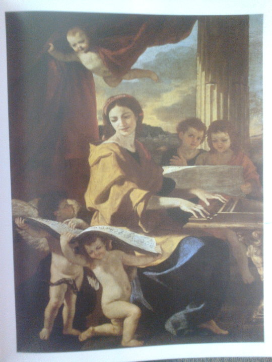
Contextual Research. Depth Cues in Deep Space. Nicolas Poussin- Use of Overlapping, Tonal Separation and Aerial Diffusion
1 note
·
View note
Text
Space
The Most Complex Visual Component
4 Types of Space:
Flat Space - Low Intensity
Limited Space - Medium Intensity
Deep Space - High Intensity
Ambiguous Space - INSANE Intensity
Depth Cues
- Perspective The adding of vanishing points
1 point perspective - As if you’re looking down a street.
2 point perspective - As if you are looking into the corner of a room.
3 point perspective - As if you are looking up at a skyscraper.
(The more the vanishing point is in the frame, the more it creates! Especially for Animators! (As to film these perspectives would be harder.))
- Size Difference Size denotes distance especially in unison with parallax
- Textual Diffusion An object has more textual detail the closer it is to us.
- Ariel Diffusion (Haze) Causes a loss of detail, texture and tonal contrast at longer distances
- Shape Change Shapes change due to depth (e.g. Your head shape)
- Tonal Separation
Bright objects appear closer than darker ones. Warmer objects appear closer than colder ones.
- Up/Down Position
Lower objects appear closer, higher objects further away.
- Over-lap When one object overlaps another, illusory depth is created.
- Focus As depth goes out of focus, they lose their ability to denote illusory depth.
Flat Space
Frontal Plane
Eliminating vanishing points
Size Constancy
Constant textual detail
Shallow depth of field
Limited Space
Frontal Plane
Eliminated vanishing points
Size Sifference
Deep space without converging lines.
Deep Space
At least 1 vanishing point
Size Difference
Over-lap
Textual Diffusion
Focus
Longitudinal Movement
Ambiguous Space
Mirrors/Reflections
Camouflage
Disorientating Camera Angles
Removal of other visual components.
*Occurs when viewer is unable to fully determine size and shape of relationships
Lens Test
A comparison of lens capturing the same size shots. LS / MS / MCU / CU
[Other Visual Components]
#VCS#Visual Components series#The Seven Visual Components#Space#Film and Animation#Film#Animation#Module 2#Principles and Practises of Film and Animation#Principles Module#My RVJ#RVJ#Observations#Considerations#Reference#Lens#Ambiguous#Deep#Limited#Flat#Depth Cues
0 notes
Text
On compositions as assemblages
Robert Ashley, Automatic Writing (1979).
Robert Ashley (born 1930) is an experimental composer, performer and theatre artist who was one of the originators of Ann Arbor's ONCE festival (1961-1969). He is notable for compositions that acknowledge and played off of the environment in which they were performed, making space one of the parameters for which his works were designed. Commenting on his preface for the composition Vespers by Alvin Lucier, David Toop paraphrases:
You can’t hear Vespers on a recording, he says, because the experience of hearing the music comes from the space in which it’s performed. He also talks about attempts to subvert the concert hall or redesign concert halls specifically for experimental music, as if it’s going to stand still for another hundred years to please the architects. He talks about fire marshalls. Basically, if you think you’re being subversive but at the same time pleasing the fire marshalls then you’re not subverting much at all.
Automatic Writing (1979) is a piece focusing on involuntary speech and miscellaneous by-products of Robert Ashley's voice, it is one of his many works dealing with multiple levels of context and interpretation. As in Wolfman (1964), electronic amplification of sound is essential to the work, allowing meaning and sound to be re-presented on equal ground rather than with a hierarchy. The work was prompted by Ashley's depression, itself caused by a lack of interest from the public:
I was out of work, so I decided to "perform" involuntary speech. The performances were more or less failures because the difference between involuntary speech and any other kind of allowed behavior is too big to be overcome willfully, so the performances were largely imitations of involuntary speech, with only a few moments here and there of "loss of control." These moments, triumphs for me, are documented elsewhere, in rumors and in legal briefs against my behavior on stage. Commonly, for instance, people think that involuntary speech is a symptom of drunkenness. (Watching people on the subway who are engaged in involuntary speech behavior and who obviously can't afford to get drunk should be enough to teach that drunkenness and involuntary speech are different, but we can't see that logic.) This is dangerous territory for a performer. It is against the "law" of our society to engage in involuntary speech. That's why we are embarrassed to talk to ourselves. That's why Tourette had to leave the room. That's why we are embarrassed by poetry.
Automatic Writing is a good example of an auditory assemblage, prompted by a complex socio-cultural, personal and technological situation. Manuel DeLanda, quoting Deleuze, defines the assemblage as "a multiplicity which is made up of many heterogeneous terms and which establishes liaisons, relations between them, across ages, sexes and reigns – different natures." Ashley mediates his raw, personal experience of Tourette's syndrome through multiple levels of performance (instances of this work prior to recording), re-iteration (the voices heard are mostly that of Mimi Johnson, but based on his original utterances), technology (a polymoog, as well as a switching circuit by Paul DeMarinis, whose purpose is unclear), and spaces (the artificial environment recreated through the mixing process, the unclear provenance of the bass). All the different natures - none more valid or invalid than the other - negotiate their uneasy coexistence in this piece, as they do in real life.
"Allez laisse toi aller" (come on, let yourself go) murmurs Mimi Johnson after the 5 minute park. Not a suggestion, rather, an order: this assembled composition can be heard as a playful encouragement for the these natures to stop torturing their host.
https://www.allmusic.com/album/ashley-automatic-writing-purposeful-lady-slow-afternoon-she-was-a-visitor-mw0000168923
https://davidtoopblog.com/2014/03/09/automatic-writing/
https://www.dramonline.org/albums/robert-ashley-automatic-writing/notes
http://www.lovely.com/titles/cd1002.html
"AUTOMATIC WRITING" (1979)
Voices: Robert Ashley and Mimi Johnson.
Electronics and Polymoog: Robert Ashley.
Words by Robert Ashley.
French translation by Monsa Norberg.
The switching circuit was designed and built by Paul DeMarinis.
Produced, recorded and mixed at The Center for Contemporary Music, Mills College (Oakland, California), The American Cultural Center (Paris, France) and Mastertone Recording Studios (New York City) by Robert Ashley.
Mixing assistance at Mastertone Recording Studios by Rich LePage.
A mix of the monologue and electronics was used in the video tape composition, "Title Withdrawn," (from "Music with Roots in the Aether, video portraits of composers and their music") by Robert Ashley.
Harry Partch, Chorus of Shadows (1964-6)
Born 1901, Partch is perhaps most recognized for his embrace of microtonality, as exemplified by his signature 43 note scale, which resulted in a number of custom built instruments and the vast compositional catalog illustrating the potential for this theoretical systems and the corresponding objects.
Chorus of Shadows is the second piece in a Noh-inspired opera title Delusion of the Fury, drafted in 1964 and refined in 1965-66. Here the assemblage might not be as heavily space-dependent or based in electronics, however, discussing the music as an assemblage does offer a fitting structure for separating the main elements of this sub-component of the work.
Some of the natures at hand are cultural natures: the influence of Noh theater on a US composer in post-WW2 context is a worthwhile discussion which might itself be read as the deconstruction of another complex assemblage.
Other natures are more directly musical: this is the piece which required the most manufacturing in terms of the number of instruments. The literal embodiment of this margin between a traditional Japanese drama story and its implementation by an American, these instruments show how cultural influences were negotiated in this piece through technical means: not by simply playing japanese melodies on western instruments, or by adapting the music to western scales, but by transferring both contexts to a third, more unique sonic framework. Harry Partch's scales offer a mediation of the two cultures through a material and sonic interface.
Lali Barriere, Marta Sainz (as Un Coup de Des): 001 (2013)
Improvisor duo Un Coup de Des (A throw of dice) is a late-2000's group composed of Lali Barriere, an electroacoustic musician, and Marta Sainz, an experimental vocalist.
001 acts as a contemporary reiteration somewhere between Ashley and Partch. Meaning and tonality are not of importance here: the duo is aware of these values having been dissolving for a few decades of experimental sound. All that is left is amplified things: the human voice is presented along the mechanical voices of amplified objects. The clear reference here for me is Pauline Oliveros' Apple Box and Apple Box Double, composed by Oliveros for her then as a duo with David Tudor (Oliveiros and Tudor were both friends with Robert Ashley). Just like Cage's Cartridge Music, all these works take advantage of electricity's potential as an abstract magnifying glass via sound.
The concept of assemblage is once again a natural fit for this semi-improvised performance of a semi-improvised collection of objects, spaces, circumstances. The depth of field is provided almost exclusively through the acoustics of the performance spaces, and the collection of amplified materials is clearly related to the everyday realities of the performers (cutlery, balls, bowls, wooden boxes, etc.). The site-specificity of the acoustics are mirrored in the site-specificity of the objects. The unique experience of the audience witnessing an improvisation mirrors the uniqueness of the situation for the performers.
Reading musical performance systems (and including sociocultural contexts, rather than simply technical and acoustical ones) as assemblages suggests a specific type of improvisatory expertise, one not bounded exclusively by responding to musical cues, but also to abstract and openly-interpretable extra-musical and extra-temporal cues.
Throbbing Gristle: United (1978)
Throbbing Gristle (formed 1975) reminds us (at least with this track) that these values and hyper-specific readings of experimental sound does not necessarily get in the way of making pop music, or something close to it. Ostensibly working from a synth-pop structure using exclusively synthesized instruments and voice, Throbbing Gristle occasionally fades in Kraftwerk-like noise swells and vocal samples more typical of their early work. Yet, being familiar with their early work (like the album Second Annual Report, from 1977) or the politics of some of the group's members will make forays into accessibility perhaps even more jarring than their other output.
In that sense, reading musical works as assemblages of assemblages is ultimately perhaps somewhat confusing in terms of the power dynamics underlying each of these works as negotiations of personal ideas and societal contexts. If everything is a web of webs, it becomes difficult to keep track of what some of these overarching societal zeitgeists were, just like it's easy to lose sense of whether Un Coup de Des might be catchier than some of Throbbing Gristle's output, and whether or not that's even a useful question.
Robert Ashley - Automatic Writing: https://www.youtube.com/watch?v=Rh_TC8j_JkE
Harry Partch- Chorus of Shadows: https://www.youtube.com/watch?v=3gtIEzBp_UA
Throbbing Gristle: United: https://www.youtube.com/watch?v=5XpqCxJZdGs
Lali Barriere / Un Coup De Des: https://soundcloud.com/lalibarriere/sets/uncoupdedes
0 notes
Photo
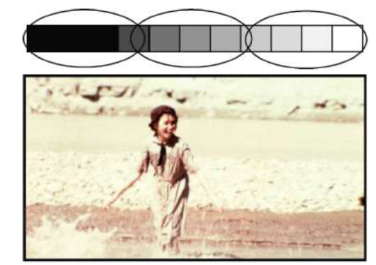
TONAL SEPARATION in flat space. Maintaining flat space requires a reduction of the gray scale range within the picture. Remember, brighter objects usually appear closer and darker objects seem farther away.
To use tonal separation to flatten the space you will need to keep the tones in a limited range.
#WSFVEClass02#flat space#tonal separation#tonal separation in flat space#tonal separation depth cue#depth cue
1 note
·
View note
Photo
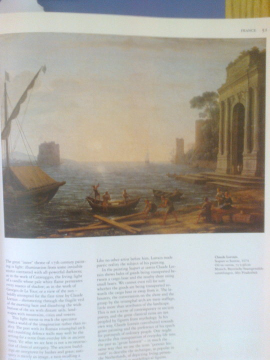
Contextual Research. Depth Cues in Deep Space. Claude Lorrain- Use of Aerial Diffusion, Textural Diffusion, Tonal Separation and Overlapping
1 note
·
View note
Photo
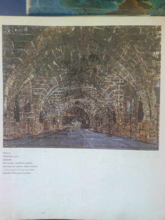
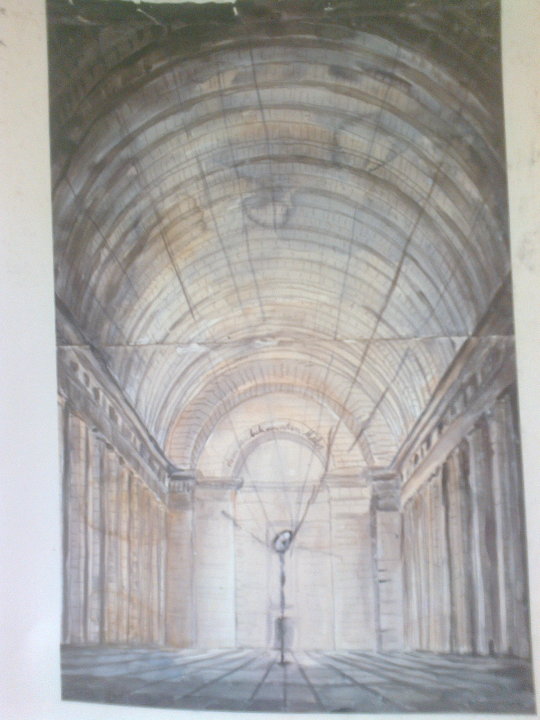
Contextual Research. Depth Cues in Deep Space. Anselm Kiefur- Use of Convergence, Overlapping and Tonal Separation
1 note
·
View note