Photo
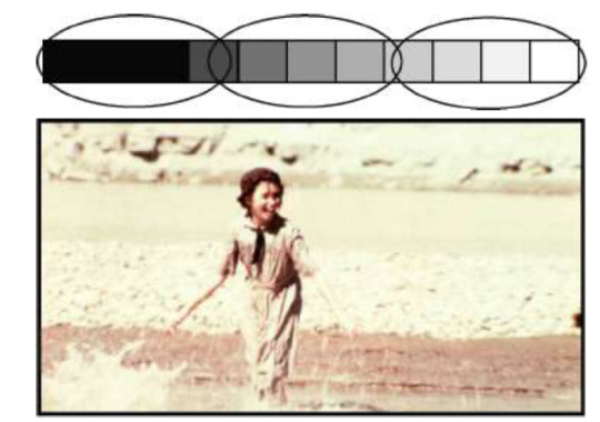
TONAL SEPARATION in flat space. Maintaining flat space requires a reduction of the gray scale range within the picture. Remember, brighter objects usually appear closer and darker objects seem farther away.
To use tonal separation to flatten the space you will need to keep the tones in a limited range.
#WSFVEClass02#flat space#tonal separation#tonal separation in flat space#tonal separation depth cue#depth cue
1 note
·
View note
Photo
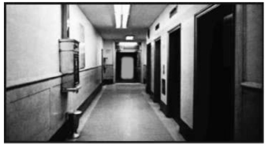
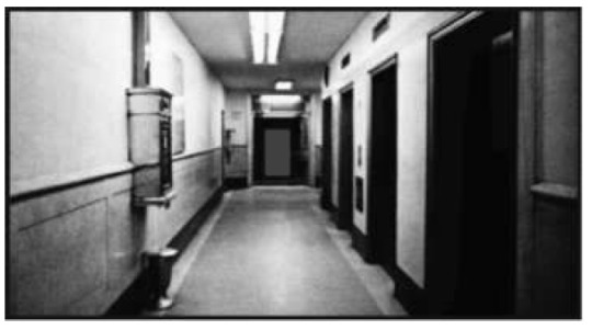
Tonal Separation. Tone refers to black and white and the gray scale.
Tonal separation deals with a viewer’s perception of depth due to the brightness of objects.
Usually, lighter objects appear closer and darker objects appear farther away.
To use tonal separation as a deep space cue you would need to make sure that darker objects are father away and brighter objects are closer.
In the photos above, the door is brighter and appears closer in the first shot and darker and appear farther away in the second shot. So the photographer has used tonal separation in the second photo (darker colors in the background) to enhance the illusion of depth.
1 note
·
View note
Photo

COLORS have psychological implications, but they are difficult to categorize because of personal and cultural differences. Be mindful of the context of your film and take care to avoid cliches and stereotypes -- of course you may want to highlight or subvert these stereotypes, but in that case you need to be aware of them.
1 note
·
View note
Photo
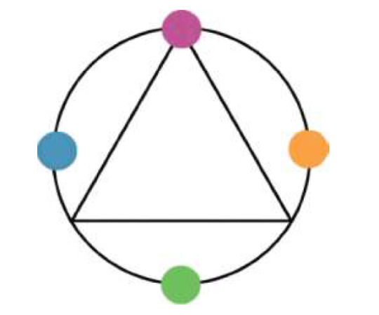

FOUR-WAY SPLIT COLOR SCHEME. This scheme involves four hues, usually equidistant around the color wheel. Af four-way split is an extremely complex scheme that has to be carefully managed.
0 notes
Photo


SPLIT COMPLEMENTARY Color Schemes start with a hue such as cyan and then add analogous pairs of complementary or near-complementary hues such as yellow and orange.
0 notes
Photo
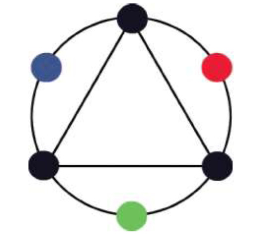

A TRIADIC COLOR SCHEME uses three colors, usually equidistant or nearly so on the color wheel such as
Red, Green, and Blue
Red, Yellow, and Blue.
0 notes
Photo
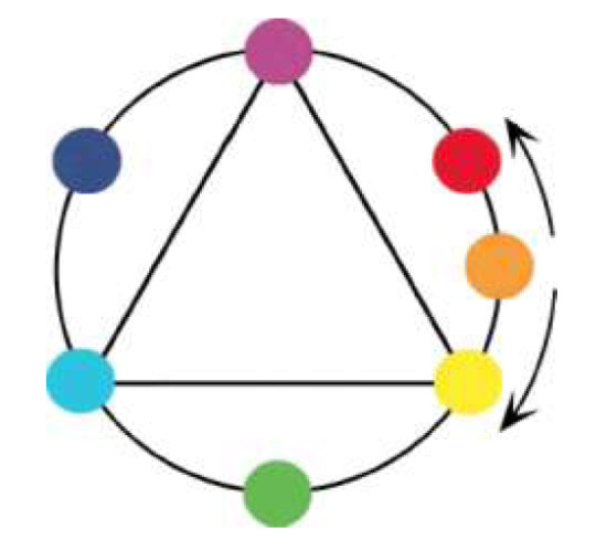
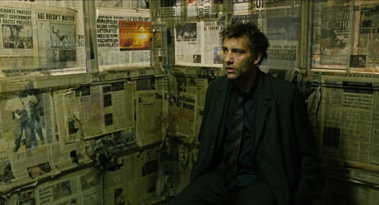
ANALOGOUS COLOR SCHEME involves colors that are close together or analogous on the color wheel. The above example uses Yellow and Green.
0 notes
Photo
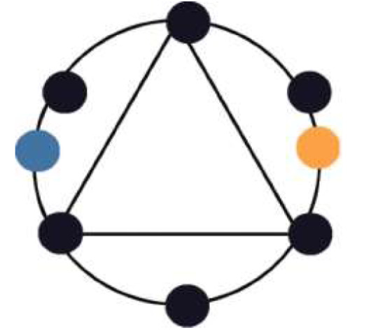


COMPLEMENTARY COLOR SCHEME utilizes colors that are opposite on the color wheel -- these are complementary colors. Examples are Orange-Blue or Yellow-Purple or Magenta-Green.
1 note
·
View note
Photo
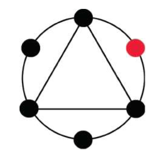

MONOCHROMATIC Color scheme involves one color throughout the entire scene, sequence, or film.
1 note
·
View note
Photo

COLOR INTERACTION: The analogous effect.
Analogous colors are neighbors on the color wheel. The third rule of color interaction states that when analogous colors are placed next to one another, they appear to push apart, or separate, in their position on the color wheel. They will seem more different in hue than they are.
0 notes
Photo

COLOR INTERACTION: Complementary color effect.
Complementary colors are opposite one another on the color wheel.
When complementary colors are placed next to one another, their saturation increases. Thus the cyan in the above example looks more saturation when it is placed again red than it does when places against an analogous color (green).
0 notes
Photo

COLOR INTERACTION: Black and whit affect.
Color interaction occurs when black or white is placed next to a color, but the results vary depending on the proportions. This example uses cyan as the susceptible color and black or white as the neighbor. When cyan is surrounded by white, the cyan looks darker. Surrounding the same cyan with black makes the cyan look lighter.
0 notes
Photo
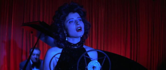

CONTRAST OF WARM/COOL hues is represented in the first shot. Red is warm. Blue is cool. Thus a contrast.
AFFINITY OF WARM/COOL hues is shown in the second shot. Green is cool. Blue is cool. Thus an affinity.
0 notes
Photo
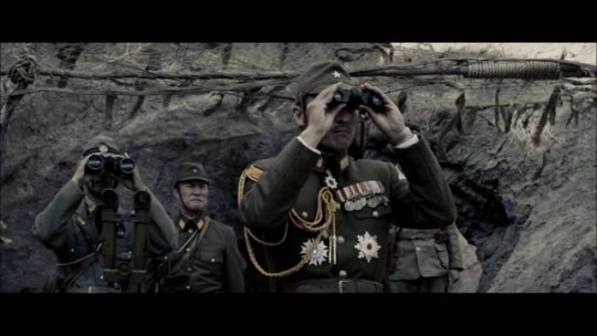
AFFINITY OF SATURATION WITHIN A SHOT. In this shot all the colors are desaturated. The saturation of all the objects is the same. Thus affinity.
0 notes
Photo
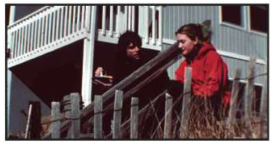
CONTRAST OF SATURATION WITHIN A SHOT. In this shot we have both saturated (red jacket) and unsaturated (fence, house) colors. These are different saturations, thus a contrast.
0 notes
Photo
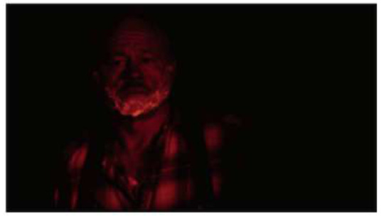
AFFINITY OF BRIGHTNESS WITHIN A SHOT. In this shot all the hues are red. All the tones are dark. All dark tones=all same tones.
0 notes
Photo
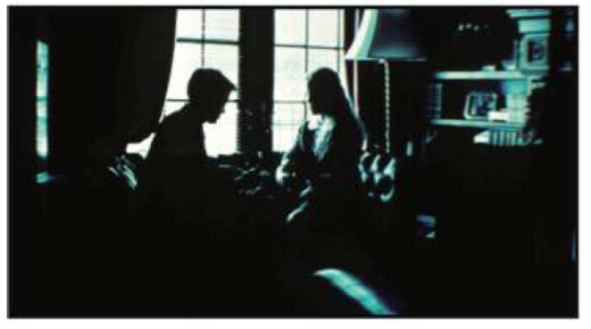
CONTRAST OF BRIGHTNESS WITHIN A SHOT. The hue is the same (Cyan). The brightness is different. There are bright cyan tones and dark cyan tones.
0 notes