#split complementary color scheme
Explore tagged Tumblr posts
Text

[id: a screenshot of the google fonts page for the font libre barcode 39, which just looks like a barcode. end id]
buddy you dont even know
I just found the funniest font ever
Like. What is this. Why is this. Who is the target audience of this?
#every so often i remember that i tried to make a website and become annoying about it#last time was me guessing something was a split complementary color scheme off the top of my head
111K notes
·
View notes
Text
Color is a powerful tool in fashion. It has the ability to influence mood, make a statement, and highlight personal style. Understanding color schemes and how to effectively use the color wheel in women’s clothing can elevate any wardrobe. In this blog, we will explore the basics of color theory, how to use the color wheel, and practical tips for creating stunning outfits using different color schemes.
#color schemes#color wheel#women's clothing#monochromatic color scheme#analogous color scheme#complementary color scheme#split-complementary color scheme#triadic color scheme#tetradic color scheme#everyday wear#work attire#evening wear#seasonal fashion#skin tone#personal style#fashion tips#outfit ideas#fashion combinations#wardrobe tips#clothing colors#color theory#mastering color theory#best color grading combinations#color schemes color wheel#color schemes clothes#colour scheme in fashion design#color schemes in clothing#color palette for clothing#color scheme of clothing#color combinations of clothes
0 notes
Text
Color schemes and palettes for interior design guide
"Color schemes and palettes for interior design: Discover designer-approved color combinations to create a stylish look for your home
1 note
·
View note
Text
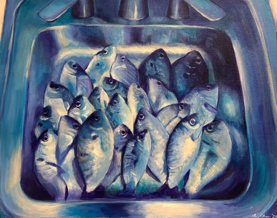
fish in a sink || acrylic on 16x20 canvas panel
for class i had an assignment to paint my alter ego, whatever that means, and i ended up painting this
sometimes i feel like im suffocating in an environment in which i could hypothetically survive, and i dont think im alone in that feeling
i tried to do a split complementary color scheme of purple, cyan, and orange, but i dont think the orange really worked. probably shouldnt have used burnt sienna as a replacement for mixing orange
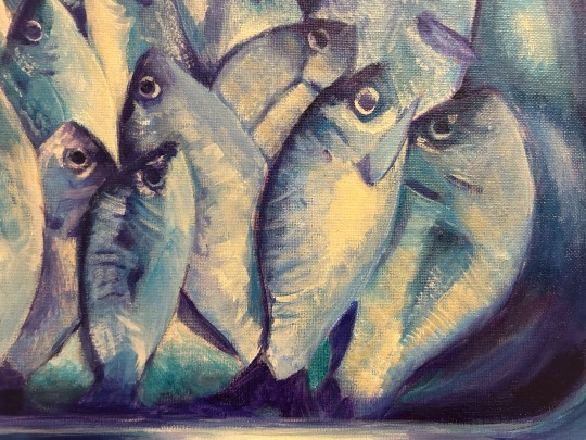
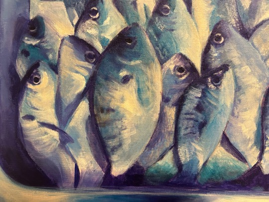
fish close ups
28 notes
·
View notes
Text
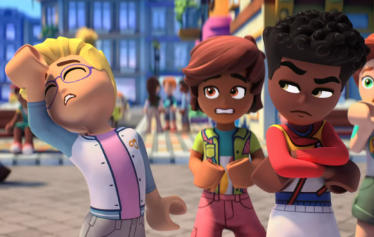
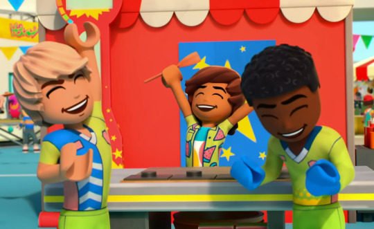
Leo's character design is one of my favorites from The Next Chapter's main cast, as it accurately reflects his character and the new series in an appealing way. Let's analyze it.
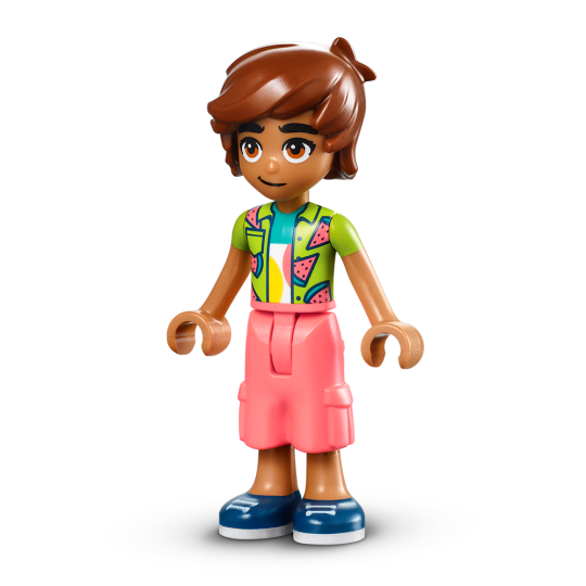
Starting with the colors, the design's most prominent ones are tan, green, and pink, loosely following a split complementary color scheme. Tan is a versatile ingredient here: it conveys Leo's kindness and dependability, its association with the outdoors reflect his athletic hobbies, and it's visual shorthand for him being Latino (if you're concerned about all Latinx Friends characters looking like this, Leo's little sister and abuelita have diverse skin tones and hair colors). The green on his shirt reinforces his kindness and connection to nature while introducing a positive, lively color to the mix. It all comes together with a generous helping of watermelon pink, tying into his overshirt's motif alongside the green. It associates Leo with lighthearted summertime fun and all but yells at the viewer that Leo has a sweet personality. Already, this color scheme is giving us solid and informative visual design.
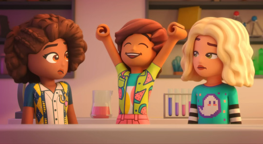
It also hints at how the rest of Leo's design plays with traditional gender expression. While an overshirt and cargo shorts typically read as men's clothes, the colors on said clothes say otherwise. His hair is just long enough on the sides and back that you could put it on a female minidoll and pass it off as a messy bob cut, and he's the only male Friends character with visible eyelashes. This balance of masculine vs. feminine is Leo's core conceit.

His key art, one of the first things a child would see on a Friends box, conveys one of Leo's central conflicts though his body language. While he might be smiling here, notice how Leo keeps his legs close to each other and arms inside his silhouette:
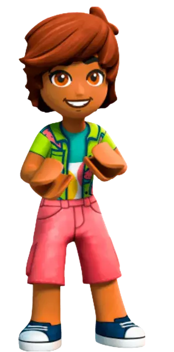
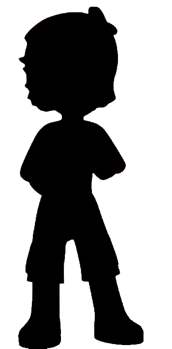
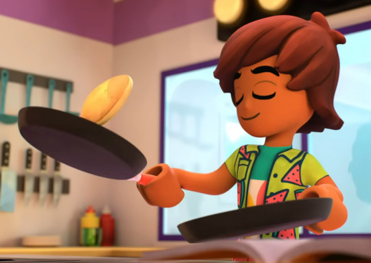
It suggests apprehension despite Leo's friendly demeanor, like he's keeping something to himself. Sure enough, that's exactly what's happening: Leo is hesitant to share his baking talents in the cartoon's pilot, and in some episodes, he learns to be more open about his thoughts and feelings.
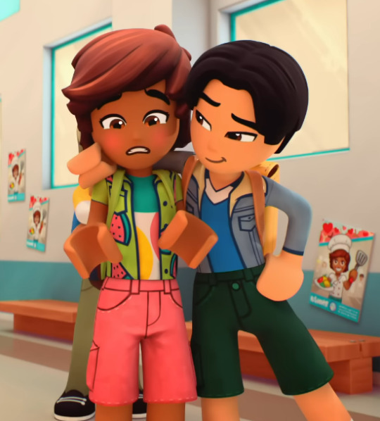
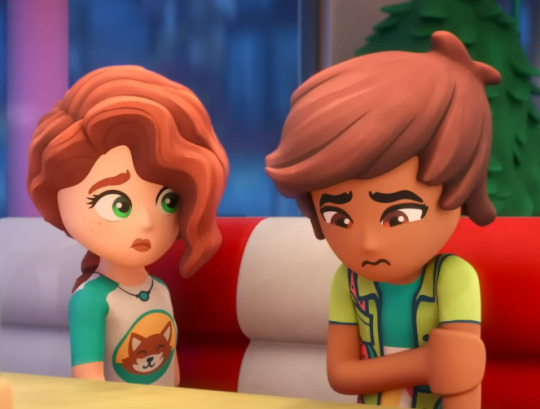
Having a distinct personality is crucial for characters in Friends; character interaction is part of its appeal, and not everyone will watch the cartoon or read the magazine for further context. Yet through Leo's design alone, a child with no prior knowledge could get the gist of who he is, what he might do in a set, and what conflicts could arise between him and the other minidolls.
That's all fine and dandy, but what does Leo's design say about The Next Chapter?
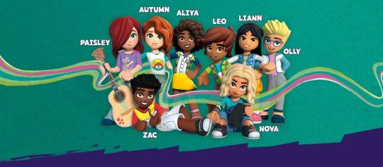
In an interview with Brickset, the Friends design team explained how the relaunch represented all kinds of young builders. This included boys who wanted to try Friends' relationship-based play but might have felt alienated by the original run's presentation.
Leo's design fulfills two of The Next Chapter's objectives in a single minidoll: representing diverse ethnicities (he's the first Latino main character) and representing boys in the main cast (alongside his comrades Zac and Olly). While the trio explore masculinity and femininity in their own ways, Leo strikes me as the perfect middle ground: his design has more masculine elements than Olly while being more outwardly feminine than Zac.
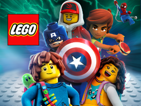
This balance makes Leo an excellent choice to sell Friends to a new demographic while staying true to the theme's feminine foundation, and if you don't believe me, believe the marketing. When the whole octet isn't needed but a boy is, Leo is often the series' rep. LEGO Channel's old Roku icon deserves a shout-out, as it juxtaposes him with Captain America and Spider-Man in front of a neon electricity backdrop; he's the only Friends rep in this mostly masculine image.
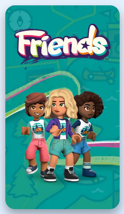
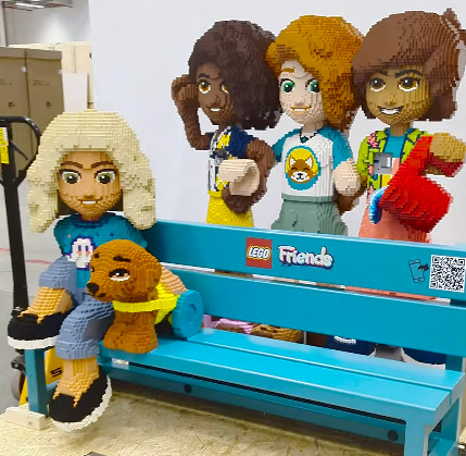
While I'm past the age range of The Next Chapter's core demographic and can't speak from firsthand experience, I'd be shocked if Leo wasn't resonating with boys at all. With how well the character design's fundamentals convey his personality while reflecting masculine and feminine traits, I'd say his place in marketing alongside the relaunch's actual mascot, Aliya, is warranted.
Friends sets are fantastic. If Leo helps more people build and play with the sets, even better.
Author's Note: Thanks for reading my first character design analysis! Friends is one of my favorite themes to dissect because of all the details and emphasis on characters, plus it's great that more people are being represented through the minidolls. Making this essay was a journey and I've learned a lot so far, and I can't wait to learn more.
Comments, critiques, and requests are all appreciated. The next analysis probably won't be about the same theme for variety's sake, but I'll certainly talk about Friends in the future.
35 notes
·
View notes
Note
Tasty Wretch color keys, very nice!! Would you say it's a split complementary, or a broken color key? Or a secret third thing?
(Ftr one of my profs describes broken color key as analogous and something from the other side of the color wheel but I have a different professor who disagrees with the name "broken color key" lol)
Eeee thank you thank you!! I’m so so so excited to talk about this (and actually, I go into the colour choice I use in the final book, which I’ll release not too long from now :3 so if u want to look into that when it’s out, by all means)
I didn’t really focus on colour schemes in like a theory kinda sense when I was picking (which may be to my detriment or qualification or whatever, but I’ve just been going off instinct for so long when it comes to design, it felt right), it’s more like I went in with my mind set on a general mood and tone, then going scene by scene design + brand colours. So it’s hard to say I’m one or the other with both? I guess what your prof calls a broken colour scheme is the closest to what I did for these keys, with the accent colour being teal and the rest being warm.
The colours of red yellow and teal are the ones the original comic focused on, they represent like fear anger and like an unnatural state, with purple used for detailing but I got rid of that (purple) for this version of the project. I also had a lot more orange this time round just to give it some atmosphere, so yeah, I’ll cast my vote to the broken colour scheme.

#wretch comic#I’m so SO SO HAPPY TO TALK ABOUT THIS PROJECT YAYYY YAYAYAH#wretch#colour keys#colour#color theory
5 notes
·
View notes
Text
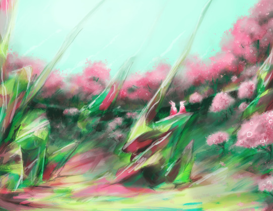
And Forever
Color schemes assignment part 5 of 6: Split Complementary
Previous || Next
Timelapse:
#art#artists on tumblr#my art#UpsideDownSmore's art#cw flashing#cw eyestrain#this one was the biggest struggle as i was trying to rush to get this done for a deadline (that i missed lol) and so i could play wf 1999#glad i was able to pull it together at the end#this was also actually the last drawing i made#the drawing for part 6 was done like a week ago cause it was originally going to be complementary but then i added more colors lol#you guys will see that soon#maybe tonight or tomorrow#i wanna space these posts out a bit lol
10 notes
·
View notes
Text
Color Harmony
This is inspired by a post I wrote answering an ask about the triadic color scheme. So, let's dive into color harmonies.
There are a couple of ways to create color harmony, and some of the most common are:
Analogous color scheme (which I usually refer to as "related colors")
Monochromatic color scheme
Complementary/contrasting color scheme
Split complementary color scheme
Triadic color scheme
There are also other color harmonies like the tetradic color scheme (which forms a rectangle across the color wheel and includes 4 colors) and the square color scheme (which forms a square across the color wheel and also includes 4 colors) to name a few. But I'm keeping it (somewhat) basic in this post.
Value (dark/light) and intensity (saturated/muted) also play a role in color harmonies, but I'm keeping it simple in this post by just focusing on color combinations.
As always when explaining these things, I need this visual aid to help me:
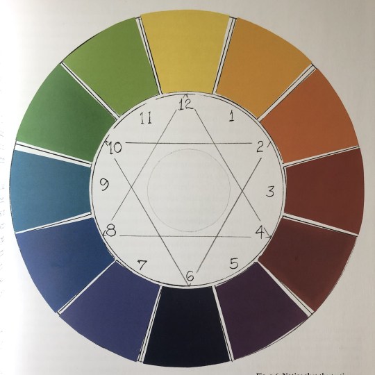
(This is a photo I took of a color-wheel illustration in Betty Edwards' book "Color".)
This is a traditional color wheel with 3 primary colors, 3 secondary colors, and 6 tertiary colors.
(I'm putting their numbers in the list below so you'll know which color I'm referring to on the color wheel.)
The colors are:
12: Yellow (primary)
1: Yellow-Orange (tertiary)
2: Orange (secondary)
3: Red-Orange (tertiary)
4: Red (primary)
5: Red-Purple (tertiary)
6: Purple (secondary)
7: Blue-Purple (tertiary)
8: Blue (primary)
9: Blue-Green (tertiary)
10: Green (secondary)
11: Yellow-Green (tertiary)
(Not that this will matter to the post, but if you're interested: The primary colors can't be created by mixing other colors/pigments. These are the basic colors you need to create the other colors on the color wheel. The secondary colors are those you get by mixing two of the primaries together. The tertiary colors are those you get by mixing the primary color with the secondary color that's on either side of it.)
(Also, the tertiary colors usually have different names in everyday language (like magenta, indigo, or turquoise). But I'm coming from a painter's perspective when naming the tertiary colors because this was how I learned how to identify hues and mix them properly.)
With that sorted, let's dive into the different color harmonies.
Analogous Color Scheme
These colors are inherently harmonious because they share the same space on the color wheel and reflect similar light waves.
Usually, they include 3 colors, but a 4th and 5th could potentially work as well.
If you think of the color wheel as a cake, the analogous colors are all included in a small/mid slice of it. They are all next to each other.
An example could be purple, blue-purple, and blue since these 3 colors are right next to each other on the color wheel.
The analogous color scheme is often used with characters that are color-coded with a secondary (or tertiary) color. Secondary (and tertiary) colors are more difficult to distinguish than primary colors since they're produced by mixing at least two other colors. So, there is always more than one color at play in the secondary (and tertiary) ones.
This is why we often see, for example, orange color-coded characters in QLs use a spectrum of orange where they sometimes verge towards yellow and/or red.
But, this color scheme can be used in the set design as well, as it was in the background in this scene from House of Stars:
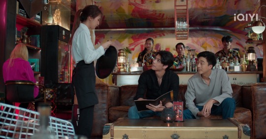
There's yellow, orange, and red (which incorporates a spectrum of 5 colors on the color wheel), and makes an analogous color scheme. There's some pink in there as well, which, if we want to be basic, is pretty much just a light red (red mixed with white). (There's also some green, which is a complementary color to red, but I'll get to that below.)
Monochromatic Color Scheme
This color scheme is basically several values (dark/light) of the same color.
A simple way to think about it is to think about a black-and-white photo. There's everything in there from black to the gray midtones to white.
Or this frame from Bed Friend:
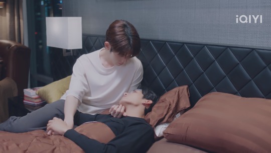
If we just focus on the white-to-black color spectrum, there's the white of the lampshade and Uea's shirt, the gray on the wall, the gray of Uea's pants, the darker gray/black on the headboard and King's shirt, and the black of the nightstand.
If another color was used, the black would still be black and the white would be white, but the midtones in between would be different values of the color of choice (for example purple, blue, or green).
Obviously, it doesn't have to go all the way to the ends of the spectrum (to the black and the white) to create color harmony. Using the midtones also works well, like these harmonious blues in Ji's bedroom in To Be Continued:

(I know this might look gray to a lot of people. But, trust me, there's blue in there.)
Complementary/Contrasting Color Scheme
I've already written about complementary/contrasting colors before, so I won't explain it in detail in this post. However, the core principle is that the complementary colors sit on the opposite sides of the color wheel.
The basic (primary + secondary) examples are:
Yellow + purple
Red + green
Blue + orange
And we also have black/white (or dark/light).
I would say that this is the most commonly used color harmony in the QLs I've watched. It's an easy way to make the colors stand out, it's a great way to show contrasts in characters, but it's also very easily and universally used with the black and white, dark and light contrasts in particular.
There are a lot of options to choose from when it comes to the black and white contrasts, but I'm choosing Lee Hyun and Kim An in Love Class Season 2 because their lives and personalities contrast just as much as their black and white colors.

I also want to add Chen Yi and Ai Di from Kiseki: Dear to Me who are matching each other:

It's a bonus that they're matching on all three colors (black, white, and red).
If I were to choose two of the colors from the color wheel and a QL that used them well, I would choose red and green and I Told Sunset About You:

They used these contrasting/complementary colors everywhere and it was so well done that everything from the set design to the characters was unforgettable. It was divine.
Split Complementary Color Scheme
This is also a way to use color on the opposite side of the color wheel. But, instead of the complete opposite, you select the two colors adjacent to the complement.
Instead of yellow being used with purple, yellow is used with red-purple and blue-purple, or purple is used with yellow-green and yellow-orange.
This is where we get into complicated territory, especially when trying to find examples of this in QLs. I don't think this is used very much (I can't remember having seen a representation of this) because sticking to the primary and secondary colors is easier.
Tertiary colors are used (I would say they're used more as a hue of a secondary or primary color, like I mentioned with orange in the part about the analogous color scheme above, rather than a color on its own) but are difficult to distinguish from the primary and secondary colors that produce them.
Every split complementary combination includes at least one tertiary color, so this might be why this color harmony isn't used as often in QLs.
If you have any examples, feel free to share them.
Triadic Color Scheme
I've already written about the triadic color scheme before, so I won't explain it in detail here. However, the core principle is that this color scheme is depicted with a triangle (there are two examples in the image of the color wheel above). Each point of the triangle points to a color that harmonizes with the other two.
The basic examples are:
The 3 primary colors together (yellow, red, and blue)
The 3 secondary colors together (orange, purple, and green)
An example of this can be Ji's bedroom in To Be Continued (the image I showed above), where there are yellow candles on the nightstands, a red balloon dog to the left (I can't really see if this is a Jeff Koons' figurine, but I doubt it), and the blue surrounding them (as well as their clothes).
There's also the living room in Knock Knock, Boys!, which includes the yellow, red, and blue (I love how all three of those colors pop):

But there are also the secondary colors in combination:

The orange pillow and posters, the purple light in the background to the right, and the green beer bottles. This is just another reason for me to absolutely love this series.
And then there's Secret Crush on You who wants to have all the primary and secondary colors in one frame at the same time (considering this is a colorful show, I'm not surprised):

The yellow, red-ish, and blue straws, the red backpack, the blue on Toh's shirt and the pillow behind Nuea, the orange on Nuea's clothes, the purple on Toh's shirt, and the green on Toh's shirt as well as the plants behind them.
And in this frame:

Where all three primary and all three secondary colors exist on those condom packages. Iconic!
And what a way to finish off this post, lol.
So, there you have it. 5 different ways to create color harmony with some examples from a couple of QLs.
#iq color post#color harmony#analogous colors#monochromatic colors#complementary colors#contrasting colors#split complementary colors#triadic colors#color theory#the colors mean things#house of stars#bed friend#bed friend the series#to be continued#to be continued the series#love class 2#kiseki: dear to me#i told sunset about you#itsay#knock knock boys the series#secret crush on you#my shit
18 notes
·
View notes
Text
Since the TETOCU designs are, in my opinion, kinda bad, I thought I’d go about redesigning the characters. Starting with my favorite character, Dressy.
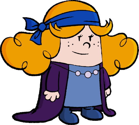
Original here, ripped straight from the model sheets:
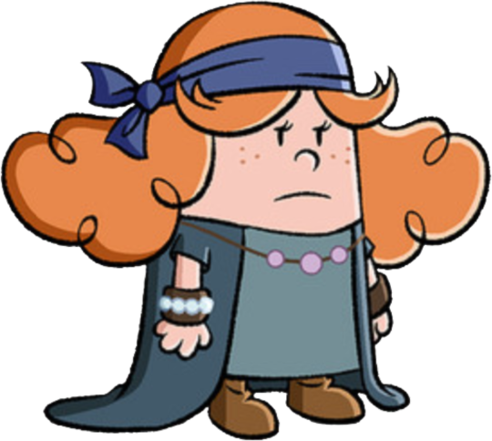
focused on value and contrast especially because these things are important
those things on her wrist kinda throw off the visual heirarchy and don’t really do anything, so i got rid of them
meanwhile, I don’t know why they gave her robe short sleeves, so I made em long- and had them end where her wristbands used to. Clever!
Pearls and strings have black outlines instead of colored ones, and the freckles are black. All in the name of BOOK ACCURACY
NEW COLOR SCHEME. Goodbye grey and brown, why would a hippie wear those colors anyway? I liked the complementary split between the orange of her hair and the blue of her headband, but as the new primary color scheme, I altered it a bit. Now it’s a SPLIT complementary scheme with blue, a more yellow-ish orange for the hair (turning her from a ginger to strawberry blonde), and a new addition- PURPLE. Also thinking with color MEANINGS here- orange is enthusiastic and spontaneous, while blue is calm and deep. The new purple adds an air of mystery (spoiler alert, Dressy is going to be taking on a lot of Erica’s traits, like being an enigma- though she’s not going to be a carbon copy, thank god), while also complementing the meaning of the other colors- purple and orange are both creative colors (fitting for someone who loves to sing and dance), and purple and blue both communicate wisdom (I was thinking this Dressy would also take Erica’s place as the boys’ big sister/mentor figure, though unlike Erica, she has her own flaws and eccentricities that keep her from being a Mary Sue).
Tried to emulate the show’s style of shadows and highlights (though ironically I didn’t just copy the shadows and highlights on the original picture… maybe I should have)
Made her shoes blue SPECIFICALLY as a reference to Elvis Presley’s “Blue Suede Shoes”. You know, because she likes music and stuff.
Valve’s Dota 2 character design write up was a big help:
As was this video, which also references the Dota 2 write up and was the primarily inspiration on looking into the TETOCU designs and finding out just how bad they were.
youtube
#the epic tales of captain underpants#captain underpants#dressy killman#character design#redesign#character redesign#Youtube
11 notes
·
View notes
Note
Also. In your opinion, what makes a good color palette?
A split complementary color scheme is my favorite of all time because you get a bit of variety while also getting some analogous colors that make it more cohesive ie. My last M0ck1ng B1rd piece is yellow, purple and blue, the fo1 Master piece is yellow-green, purple and red (I think it’s more triadic tbh, but the yellow was supposed to be more green than yellow and I just didn't fix. So. Whatever. There's also a more obvious yellow there too so it’s actually more like a squished quadratic. Uhm. Bad example). I feel like no matter what combination of colors you choose it looks good. You get warm and cool colors, contrasting colors that aren’t too contrasting/perfect contrasts (imo it can be kind of jarring. Depends on what you're going for really but not usually what I want in my own work).
Weirdly I don’t ever consciously think “yes I will choose [insert colors] because they are split complementary” but I somehow manage to do it FREQUENTLY on accident so I think my brain is just wired to find it pleasing
2 notes
·
View notes
Note
if you have any desire to talk about your thought processes while making those atla giftsets I would genuinely love to hear about them. I feel like each choice was so intentional and you just did such a beautiful job of capturing each character.
thanks so much for your kind words!
with every gifset, I start out in notepad. I write down a few quotes I like and look for a throughline. I make a list of significant scenes and a list of episodes I want to rewatch. I'm thinking about what colors I want to use, as that influences my clip selection. for each character, I wrote a list of episodes I wanted to rewatch.
when selecting scenes and quotes for these sets, I theme around a core aspect of the character. aang's grief and displacement, katara's courage and resilience, sokka's need to protect those close to him (and, relatedly, to prove himself as a warrior), zuko's quest for redemption.
but I wanted to include a spectrum of emotions and have both parallels and contrast, e.g. moments of katara rallying herself in the midst of a hard fight contrasted with her giggling about penguin-sledding; aang's grief paired with moments of wonder and beauty.
I also tried to create tension between the written text and the scenes chosen. sokka talking about yue's death paired with a happy moment between them; zuko's speech in 3.12 paired with a scene of him at his worst; katara's call to arms and valor paired with her at her most helpless.
for the captions, I wanted to pick quotes that were as close to a character thesis as I could muster :) katara was a bit of struggle because I didn't want to quote pakku because I don't like him #confession
(sometimes I just pick scenes because they're easier to color than other scenes I wanted to use. I wanted to use the scene of sokka talking to toph about kya, but I couldn't get the yellow sky to look right.)
as for color schemes, I decided to go with split-complementary schemes with muted cool tones (mostly blue and purple--except for the aang set, which uses gray instead of blue but "looks" blue in context) and bright, saturated warm tones (mostly red and orange). I had started on suki and toph and had gone with green/blue with pops of red for suki and green/blue/yellow with mostly black/white neutral tones (had originally thought of doing brown neutrals but decided to focus on her seismic sense)...
I also tried to be mindful of the way I used negative space and preferred scenes that were faceless or mostly negative space! I don't remember exactly why, other than thinking this was a cool effect.
I also redrew aang's eyes and (I think??) his fingers in one of the gifs and deleted in-betweens that I didn't like because I was really petty about the style of that animation studio when I was a kid and carried that feeling inside me forever.
EDIT SEVERAL MONTHS LATER: ok this has been sitting in my inbox for literal months because I wanted to add more to this and include screenshots of photoshop showing how I arrange my workspace and look at color composition, but I could NOT find the storage drives my old .psds are on or think of what to say!!
I thought you might appreciate what I had already written, so wanted to share. thanks again for your kindness and your interest in my process @jamesunderwater! ♥
2 notes
·
View notes
Note
hiii i love your flags so much i was wondering how you come up with the designs? i want to coin genders and such but i feel like every flag i come up with is really bland and i LOVE how you do yours
thank you !! first time anyones said anything like that.. :] the designs? well, its a bit of a complicated process to explain how we think but we can try our best and we'll give some tips. we have some years of experience (since 2022) for flag making so hopefully something here will help. here comes the wall of text
dont be afraid to go wacky go wild with your flags. like really. they dont all need to follow the "traditional" means of pride flags. you can add vertical lines, spikes, waves, triangles, squares, etc.
if we're making a flag based off of something like a picture or character we try to color pick from an image of it
SYMBOLS!!! we LOVE adding symbols to our flags.. either we look up "_ transparent background" or an image of a symbol we think will go great with a flag and manually crop out the background ourselves
we also sometimes just straight up add pictures too!
making a monochrome template version of a flag works whenever we make a series of flags based under one thing
oh yes yes colors are a big part of the flag making process- we love to use darker colors but thats just us. colors are a massive part of the process. looking at color schemes helps. complementary, analogous, split complementary, etc.
when you go to make it based off of something, like a concept, feeling, animal, etc. think- "what colors are this thing or what colors does this give off"? ex. whenever we made those angelian flags we made them based off of the colors we associate with the seasons (although we didnt do a very good job at it!)
dont know if this is really related but its smarter to come up with a name and definition for your term first before making a flag for it, you get better outcomes since you now have a base and prompt in mind when youre making your flag
also unrelated but we use krita (desktop drawing program) and photopea for our flags! we have a link to resources we use on our pinned but we havent updated it to how we use photopea for it yet though, but we might make a separate post for that soon
uhh other than that thats pretty much all we can think of.. honestly we've been making flags so long that its really kind of hard to describe how we do it. like our thought process. once you start getting into rhythm of making flags and stuff it starts to feel natural. its like that whole finding your own art style thing as an artist- because we're an artist too and that also influences us too.
also.. we dont do it too often, but. sometimes we have to make sketches before starting a flag. its REALLY rare of us to do since we barely need to do it like heres this shitty sketch we drew with our mouse for our angelian labels! you can barely tell what its supposed to be but we used it as a guideline when making those flags
-Natasha/Angel and Alpha Guardian
#corporatecoinings#tips#mogai tips#liom tips#qai tips#flag making tips#flag tips#flag making#xenogender making tips
2 notes
·
View notes
Note
hi me again
question abt your vampy bois: what do the tetradic things mean? do they symbolize something or are they part of the pallet for each character? I noticed they are all slightly different, red and vio's especially so

You aren't dumb, it's fine!! XD
Tetradic is the color scheme I use! By that, I mean I mostly use two pairs of complementary colors to choose my flat colors, varying lightness and saturation but not hue. (Until time comes to shade them!) There are other schemes you've probably heard of like split complementary and analogous. I tend to use paletton.com, though there are actually a bunch of different ways to organize hues across a wheel and not all of them will be the same.
I usually pick two pairs of complementary colors—not always in a square, though sometimes they are—and choose one from each pair to be dominant.
In terms of the vampire lords au boys, I used the same orange/blue combo for all of them (mostly for skin and eyes, then later for any white-blues and orange-browns), as well as a pair for their other colors. For Red, I'll use a pure red and cyan, sometimes altering it just a tad to make his red a bit more pink. The system means that Vio gets his purple but also some greenish yellow. Green gets his green but also a bit of magenta. Blue gets blue but also needs some orange or yellow in there.
It isn't anything that complicated really!

10 notes
·
View notes
Text
Been watching a couple of videos of people creating DnD characters using dice rolls, so I wanted to try and see what I got with the rules I made for myself.
Basically, I can roll for the character's DnD race, class, background, sex / gender (which includes whether they're trans or not, and what pronouns they use), which way their physical appearance leans towards, their clothing preference, what kind of color theory I would use for them, and extra appearance details. So with these, I've written down three results that I may or may not create at some point :']
The first one ended up being a [trans] female Sea Elf- who uses she/they pronouns- that's a Monk and a Charlatan. Her appearance leans more towards the masculine side (BUTCH BUTCH BUTCH BUTC--) and she prefers more gym bro light clothing. They've got a lot of tattoos, heterochromia eyes, and their color scheme would revolve around the split complementary color theory.
The second one ended up being a genderfluid Tabaxi- who's pronouns change to whatever they feel like- that's a Ranger and a Sage. Their appearance leans more towards the feminine side and they prefer more casual yet practical clothing. They've got some tattoos, a beauty mark (to which I'll probably make them some feline species that doesn't already have spots on them), and their color scheme would revolve around the analogous color theory.
And the last one ended up being a [cis] male [green] Dragonborn- who uses they/it pronouns- that's a Rogue and a Soldier. It's appearance leans more towards being androgynous and it doesn't really care what kind of clothes it wears (or if any of it actually looks good together). They've got some freckled scales, gapped front teeth, and their color scheme would revolve around the complementary color theory.
#Still slowly working on my Ryan drawing btw.#tho' I might just do the top 2 results from the poll I did 'cause my energy do be low.#Just wanted to take a break and do this 'cause it looked fun#my thoughts
2 notes
·
View notes
Note
((From: Person behind Visitor
What is your favorite color palette
Achromatic/Greyislife
Polychromatic/rainbowvomit
Monochromatic/shadesandvalues
Anologous/Reallyhardtomessup
Complementary/Rightacross
Triadic/Triangle
Split Complementary/Rightacrossbutsplit
Doublesplit Complementary scheme
Tetradic scheme
Discordant scheme
((OOC: monochrome don’t even have to read the rest. I’ve had about 6 personas over the years and they only have 3 colors between all of them. All of which are on a single persona and none of which I use currently))
> [2/5]
2 notes
·
View notes
Text
2D INTRO TO COLOR THEORY- 10/16/2023
Quick intro into Color Theory.
I will refer to this blog entry during the class lecture that will start at 9:20 am on Monday 10/16/23 . The class assignment and homework will be at the end of the blog for today.
MDC offers a course which can be taken after this one that delves further in Color .
Brief introduction in to Color Theory -
The Color wheel is made up of 12 colors composed by the following:
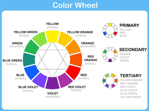
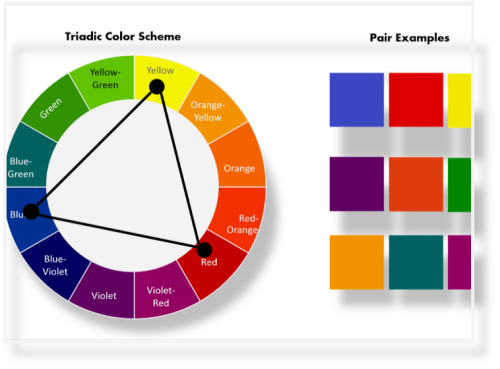
3 Primary Colors -
RED YELLOW BLUE
3 Secondary -
ORANGE GREEN PURPLE
6 Tertiary Colors -
Y-O O-R R-P P-B B-G G-Y
All together they compose the color wheel.
When Primary Colors are mixed together these colors create Secondary Colors. .
When Primary Colors are mixed with Secondary Colors they create Tertiary colors .
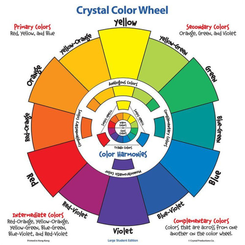
Color schemes
Monochromatic :
Color gradation using only one color and adding black or white to darken (shade) or lighten (tint) the color.
Red can be made to be pink vs brick color , from darkest hue to lightest hue.
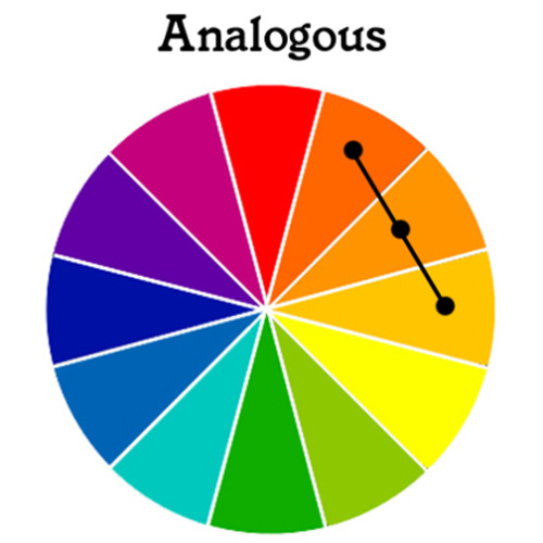
Analogous :
Using one color in the color wheel and the color adjacent to it .
Y + YO + YG R + OR + RP B + GB + BP
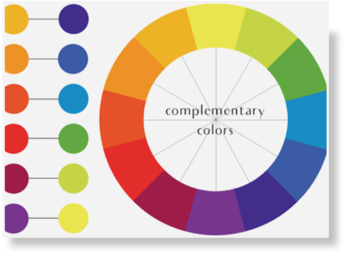
Complementary :
In any given color the color directly across it in the color wheel .
Yellow + Purple Red + Green Blue + Orange
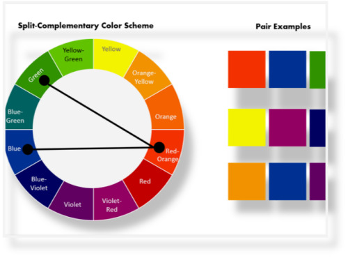
Split Complementary:
In any given color, the color adjacent to its complementary.
examples:
Purple and YO + YG Blue and YO + OR
Triadic :
Any set of three colors at equal distance from each other on the color wheel .
Primary , secondary and Tertiary colors used together compose a Triadic Composition.
Warm :
The following colors Yellow to Purple-Red are warm hues.
Warm colors create the illusion of objects being closer and up front in a composition .
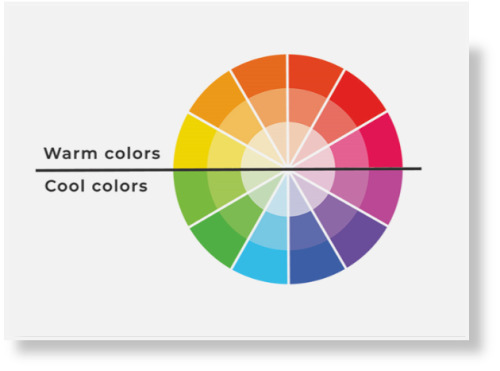
Cool :
All colors in the color wheel from Yellow-Green to purple are cool colors .
Cool colors give the illusion of distance.
Things look far away when we use cool colors .
Space appears to move away when cool color schemes are used.
Note :
ALL colors in the color wheel can be made to be bright or opaque, lighter (high key) vs. darker (low key) thereby changing the temperature from warm to cold.
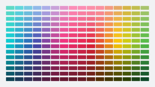
Example:
Blue is a cool color in the color wheel . Neon Blue which is brighter and lighter is a warm hue.
Final Note:
Black, White, Gray and Brown are Neutral Colors and as such they are not found in the color wheel .
Class Assignment for today is below:
1) COLOR THEORY CHARTS - MONDAY ( 10 /16/23 )
Students will work color theory charts as follows:
a) Color Studies
b) This will be done in your sketchbook
c) Using 2.5 inch squares with a 1 inch inserts create color combinations using various color schemes discussed in class lecture.
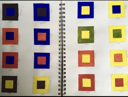
student examples above and below
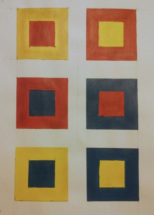
Create color combinations side by side .
For Example:
1) Red square with blue insert , blue square with red insert.
2) Yellow square with purple insert , purple square with
yellow insert.
3) Orange square with green insert , green square with orange insert.
As you can see , I am combining colors as seen in the color wheel starting with Primaries and so on.
Primary Secondary Tertiary
How does it change when we put blue inside red vs. red inside blue?
Students will do about 24 color combinations in the sketchbook.
A) Use a ruler to do your boxes.
B) Align color combination next to each other.
Example : R+B next to B+R.
You are doing a scientific experiment to understand color in the spirit of Joseph Albers.
Look him up on google for reference, he’s one of the founding fathers of color theory.
You can also add some color combinations from the color schemes mentioned during the lecture.
Color Schemes:
1) Monochromatic 2) Analogous 3) Complementary 4) Split Complementary 5) Triadic 6) Cool 7) Warm
HOMEWORK -
(to be completed by Friday 10/20/2023)
The Personal Color Wheel will be inspired by your own Color Chart.
Looking at your color studies that you created on Monday , create an Abstract composition using your choice of twelve colors (12) on a Bristol paper measuring 8 x 10 .
The end result should be a harmonious and engaging Non Objective Art Work.
Look at the way the color wheel is created and build your own color combinations.
Do not create a wheel .
Instead, break up space through a series of abstract shapes that can create a balanced composition.
Remember your options for balancing space:
Variety, Repetition, Balance.
Variety of size or shape.
Repetition of the same.
This should be second nature by now.
Use only 12 shapes for your choice of twelve colors.
When finished make a black border to each color within the composition and to also frame the work.
Do not use black, white , grey or brown as color.
This wheel needs to be completed by Thursday in preparation for the midterm.
See Below a couple of student examples:
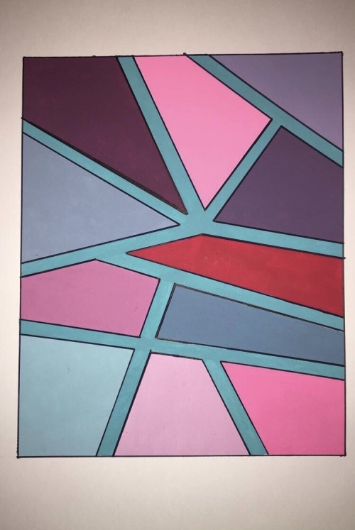
A
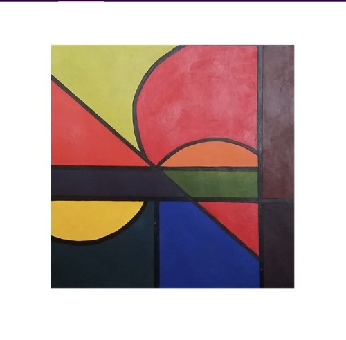
B
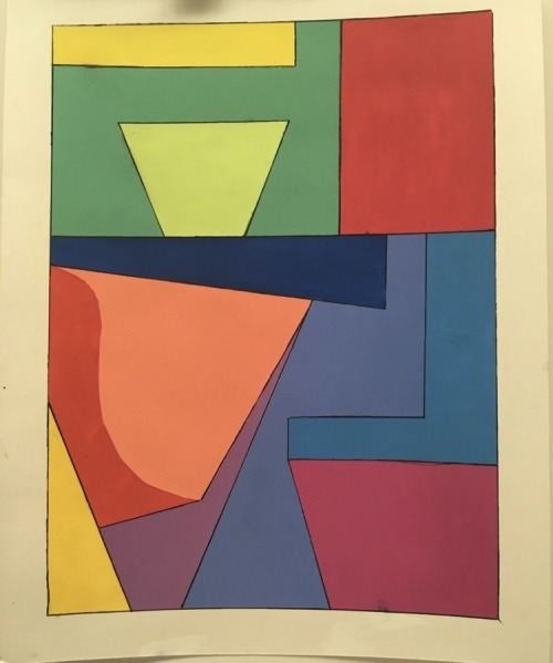
C
Post work completed will be posted on your class blog.
On weds students will work on new assignments in preparation for the midterm in two weeks.
2 notes
·
View notes