#today sports news
Explore tagged Tumblr posts
Text
Inter Miami suffers its first loss of the season in the presence of Lionel Messi.
Lionel Messi scored once more, but it was the only highlight for Inter Miami CF, whose 10-match unbeaten streak in Major League Soccer was terminated by a nearly two-month-long league victory by Atlanta United. Wednesday night in Major League Soccer, Atlanta United ended a nine-match losing streak and defeated Lokomotiv Zagrebze 1–0. Jamal Thiare assisted in putting the game away with a goal in…
View On WordPress
0 notes
Text
Hey, just wanna say thanks for being cool about the new roommate. Being 5 frilled sharks inhabiting an astronaut suit makes finding a job really hard for them and I think they enjoyed how chill you were. Said they'd love to do hotpot sometime with ya
#GOOD EVENING good weekened again! Ancient Fish abound on you today!!!#Isn't it fun how many animals just never evolved because they had no problems? Isn't that nice?#Even if they can't change though maybe we can give them new experiences too. like sports
223 notes
·
View notes
Text
Marta Eterna 💚
#wwc 2023#marta#brazil wnt#bunny shaw#jamaica wnt#i'm trying to put together the words to express how much of womens football exists today because of marta and formiga and i literally can't#this woman put not just a country but a sport on her shoulders; and now here are her descendants doing the same for theirs#bunny and jamaica are changing what's possible for the women's game; and they'll inspire a new generation to manifest things we can't even#imagine; and on and on; and like that marta eterna will always be true#anyway; i'm extra sentimental because of the complete lack of sleep but; chorar no começo para sorrir no fim
594 notes
·
View notes
Text
What happens in Vegas, stays in Vegas, ok red boys?
#i know it's been a while since they start their “i'm the the first driver” “no i am” situation but today we reached something new#my dear toxic sport#charles leclerc#carlos sainz#carlos sainz jr#scuderia ferrari#las vegas gp 2024#formula 1#f1
20 notes
·
View notes
Text
My life expectancy increases by decades whenever YinWar discuss their brand of fanservice and their boundaries on that matter. These men never mince words to remind their own fandom and media alike that whatever fanservice crumbs they drop are nothing but a performance, and that their off-camera relationship is nobody's business but theirs since they're a lot closer than they'll ever let the public see.
#this entire video is very insightful and enjoyable#today i love yw greatly tomorrow maybe even more so#engfa waraha#yin anan#war wanarat#yinwar#it's so entertaining to watch them shoot down your average clownery bc they're always so witty and classy abt it though#you can make a sport out of pinpointing the times they realise they're abt to touch casually#and they immediately pull away in the most awkward way imaginable (lol)#bc they refuse to give anything that could be mistaken for fanservice when they don't want to#i've nothing but respect for the way they treasure their friendship and thus keep most of it private#or how they went against industry standards as a new bl couple back in 2020#that being said one of my favourite moments will forever be war yeeting himself off yin's lap as soon as he noticed a camera 😂
343 notes
·
View notes
Text
*this poll was submitted to us and we simply posted it so people could vote and discuss their opinions on the matter. if you’d like for us to ask the internet a question for you, feel free to drop the poll of your choice in our inbox and we’ll post them anonymously (for more info, please check our pinned post)
#oj simpson#o.j. simpson#news#today on tumblr#incognito polls#memes#meme#poll#polls#sports#sport#politics#tumblr#football#happening right now#humor#comedy#funny#happening rn#football player#football players#tumblr polls#tumblr poll
77 notes
·
View notes
Text
so i'm about to dive into college basketball in addition to pwhl in addition to wnbl [sydney only] in addition to nwsl playoffs bc my brain needs to be fed constantly
#i was looking at all the conferences in ncaa today after the michican sc game#there's a lot of information there#obviously unrivaled will come as well and tbh probably au#and if i'm really bored in the mornings on weekends i'll turn on wsl#bc what i can't do is see an instagram picture and say off the top of my head the 3 other times someone's worn the same shorts#that is a waste of my energy#what i need is information on new coaches and protected players lists [i know they are private but i want them still]#and to do more with the expansion draft and for unrivaled to announce these players#i hope they aren't waiting “out of respect” for the election that would be rude to me#though i will probably pay a lot of attention to returns tomorrow as that will be something interesting#and i'm behind in my reading challenge so i should probably do that instead of speculate on sports#also part of the cbb is keeping my eyes peeled for merc draft prospects#given that we have 2 picks and nothing that early#but i think we can get a steal#again draft needs really depend on certain circumstances ...
20 notes
·
View notes
Text
i am such a clown. decided to make stickers for my siblings even though i have ZERO design skills or knowledge of any programs that allow you to rotate text except for powerpoint. so i made them in powerpoint. (this took, mmmm, maybe 6-8 hours btw.) then had to find a website that would print and mail these stickers to me. no i don't want 50 stickers. i want one circle sticker and one rectangle sticker. oh that's not an option anybody wants to give me? okay then i guess i will buy 16 circle stickers (the least offered) and 50 rectangle stickers (the least offered. why not 16 also? a mystery). one of the designs is for my sibling's band, so if they like it theoretically they could use the stickers as merch or something lol. but i'm not holding my breath, on account of the aforementioned lack of design skills. i get away with a lot among my family because they're all so willing to react to my questionable creations with aww look, she Tried! but that probably doesn't work for strangers who are fans of my sibling's band. so i guess they will just have 49 extra stickers that they can idk stick to streetlight poles or something. not my problem.
#i originally designed them on graph paper. with like a compass and everything#i learned something new today!! apparently you can curve a text box around a circle!!!!!! that saved me some time#this all came about because my sister was telling me how sad she was that she lost her water bottle because it had a sticker on it#that she had gotten from her travels. and i was like awesome i'll just make her a new one#girl what! you don't know how to do that!!! CLOWNNNNNN#also i don't actually know what the original sticker looked like lol which is probably for the best so i can't 1) plagiarize#or 2) compare my shoddy workmanship to that of an actual professional#i thought about commissioning an actual graphic designer to do this but i quickly got overwhelmed with logistics#and it's so close to christmas i didn't really want to deal with the timeline issue#i really should have done this three months ago but of course i procrastinated#anyway. the website kept being like are you SURE you positioned that image correctly?#and i was like nope! but i don't know what else to do so let's just try it and see what happens :)#it looked fine in the preview. living on the edge over here. the extreme sport of sticker designing
33 notes
·
View notes
Text
This is how we live now
Tents ⛺️ through this winter
Tents through this cold
Our little children is starving and cold
We need the world help
Your support always matters ❤️
Link to Donate in my bio
Thank you 🙏🏽
#palestine#art#black and white#design#fashion#japan#history#science#kpop#programming#save palestine#save gaza#vintage#blog#north gaza#halloween#gif#gravity falls#digital art#sports#advertising#quotes#tumblr fyp#architecture#artwork#original character#x reader#zelda#news#today
7 notes
·
View notes
Text
No aces threepeat i breathed a sigh of relief
#im sorry to anyone who likes them but id like a new team to win it all#no comment on how other sports are going today#falcons game is enough to keep me happy but the bengals being 1-4 means i must work on longfic#at some point tho… im busy#wnba
15 notes
·
View notes
Text
Apparently I do like sporting events now. Disregard everything I’ve said in the past.
#this popped up on my photos app today#my new favorite sport - eras tour#and I don’t hate sports I’m just not usually a huge fan of going to sporting events#it depends on the sport and the atmosphere and who I’m with
7 notes
·
View notes
Note
from the reddit discussion about the newest isu communication:
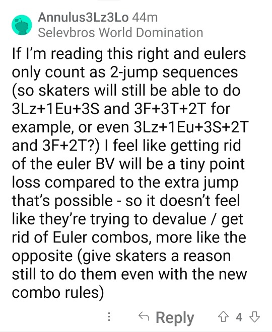
do you happen to know a bit more about it? and maybe in the end it's an addition (towards increasing base value), not exactly a loss (again, only about base value)?
but well. the fs jumps layout are about to look pretty differently, aren't they?..
To be honest my ISU hating posting had nothing to do with the Euler thing lmao but rather with the choreo spin since I hate choreo elements in general. That is I hate their judging because of the fixed BV and ridiculous GOE scale since it opens the door to an even more lax judging.
About the Euler, this is actually correct. Bear in mind that this decision is still pending, but it will 90% go through since it's already in the guideline. As per the phrasing in the guidline combinations such as 2A+1Eu+3S+3T will now be allowed counting as a three jumps jumping pass. This can be a quite interesting change, bringing some variety to the jumping layout we're used to right now. I think seeing a program with let's say 3Lz+1Eu+3S and then a 2A+3T+2T could be fun to see in one program. This is of course ignoring that most skaters make the Euler look like an ugly step out rather than a half-Loop...
The change in BV wouldn't be significant given the small value it had before in my opinion.
#btw i haven't been on an isu seminar since july#got my minimal quota so i can upgrade to tech specialist/controller and fucked off for the rest of the year#also i am not really required to attend them since i am a national level judge and i only have to attend national seminars#and national seminars don't discuss pending rules or potential ideas for new rules we just get to them when they're already approved#so this was my first time seeing this today too#tbh this looks like an another step to making fs a jump fest#it's like they're embarrassed that the sport is called 'artistic skating' in a number of languages#figure skating
11 notes
·
View notes
Note
This isn't the usual kind of ask you answer, but I've been working my way through the videopass archive sequentially and have been thinking about the historic/vintage livery that the teams are going to be using in Silverstone after the summer break quite a bit. Personally I'm very fond of the West Honda Pons' black and white livery especially with how they had the names of the riders on one side and the team name on the other, and obviously the gauloises and camel yamahas are iconic. But you've obviously watched a lot of the older seasons, so are there any liveries you'd like to see/which ones would you personally pick for the teams?
I too have been having thoughts about this! I do have some of my faves in a wee folder, and initially my picks were a bit limited in terms of range of years and teams. BUT let's do this properly. all eleven teams. my hot take for each and every one of them
CAVEAT NUMBER ONE look I don't know how 'design' or 'colour theory' or even 'taste' work. most of my reasoning doesn't extend beyond 'I thought this looks nice'
CAVEAT NUMBER TWO I also don't... quite know how this works in terms of who's allowed to use which livery? like not just the sponsor stuff, but would teams be able to use liveries from... idk, a different satellite outfit that was in the sport before they were? this ask mentions the pons liveries.... could honda teams actually use those? what if you don't have a lot of history? is anyone allowed to use mv agusta liveries? would teams go for special liveries, or just the regular ones? how strict are the rules for what you can use?
so. y'know. I'm really just guessing here what's even possible, which meant that for... uh. some of these teams. I did have to reach a bit to come up with a viable livery. let's just make clear this is all vibes and go from here
HONDA
they should have no problem with coming up with plenty of options. let's start with the west honda pons, which the ask references:
excellent pick, anon. if they can use this one, I'd very much support it! we're missing black bikes on the grid currently... this one's simple, it's classy, it's got a little bit of identity with the name written on the side. the dark red highlights work nicely. it's also a livery that, unlike some of the ones to follow, should still work well on the current bikes without losing its identity too much - though maybe you'd have to put some thought into how you'd place the actual name. should still be plenty of space though! and it'd be easily recognisable to fans who are familiar with the old livery, which I reckon is also an important metric
while we're on pons, shout out to the ducados honda pons livery:
nice shade of blue! nice design of the leathers! pleasing shape of the numbers! just has a lot of character and charm to it
anyhow, let's get to the factory honda team. the VERY first pick that popped into my head was the special livery for aragon 2011:
so I get that sense that plenty of people hate this livery and think it looks 'childish' and I'm sorry, but if you think that, congratulations on having bad taste. it's cute! honda barely ever has fun! look at how orange it is! look at the stars! there's a star on the leathers too! I'm fond of the way the front of the bike looks too, how the numbers are placed kinda messily on the star. this one's just, y'know, a bit more creative, something that's just different from how we usually expect liveries to look. screw classy and stylish, give me something with a bit of charm
moving back in time a little further, here's the valencia 2003 livery (valentino's last race with honda):
isn't she gorgeous?? I'd put that bike in my bedroom. lovely from every angle. if you look it up, you can find more photos to show it off properly - just see the sun on the top of the bike. really nice mix of the traditional repsol orange with the yellow, it all just works together. bright like the sun
and one more special livery from the early noughties (if not from the factory team), here's mugello 2001:
hardly a controversial choice, people love this one for a reason. it's pretty!! blue flowers!! this one should work reasonably well on the modern bikes too and obviously most fans should be able to recognise it. again, I don't know what the stance is on special liveries - but hey, it'd be fun to give a certain someone in your factory team a livery from this era
and going back further still, here's eddie lawson 1989:
yes, it's rothmann's honda, yes, I've decided not to care. this is my personal top pick for honda. it should be recognisable even on the current bikes, it pays tribute to honda's long history by not just sticking to something from this century, and it looks cool. clean cut colours that are nicely separated out - I really like the yellow highlights on either side of the bike, plus the way the separation of the blue and white is handled on both the bike and the leathers. it's all quite clearly demarcated, but with nice details to give it character - those stripes on the front of the bike and on the the leathers. the touches of gold. the rider's name on the side of the screen. the number on the back of the bike. cool bit of history, too, like they stole that man away from yamaha and it certainly worked out for them. it's fun!
and one more jump to the past to hailwood's late sixties honda:
this one is proper honda #heritage and I'd totally get if they go with that. my main issue is... I'm not quite sure how it'd work on today's bike, shape-wise? like, the charm here is really the simplicity, the way the orange-gold spreads over the silver. does that work if you have all the bits sticking out everywhere? maybe somebody with a better understanding of design than me can figure it out, and I do like this one. the numbers look nice. idk. it's neat
LCR
well. I guess you'd want to go with one of the cecchinello liveries here? my problem with lcr is that they seem to generally be pretty big on their retro liveries anyway - the first one I thought of... basically looks like the 2021 lcr livery anyway? boring! done that! then there's a few years that are like... silvery, but, and I know this is an unfair way to go about this, I kind of feel I've already gone silvery with a few of my other picks and they're all nicer. so, here's my pick from 2000:
it's a bit busy, but that's kinda the fun of some of these older liveries. big chunk of red, some blue, the nice bright yellow number, even all the logos are kinda fun... I like the weird shape of the white line that separates the red and the black. I don't know, it just works for me as a complete package in a way some of the other lcr liveries don't
YAMAHA
yes, gauloises yamaha. my beloved. everyone's a fan for a reason
can't not mention it!! I do think valentino's version specifically works the best because of the extra bit of flare the yellow highlights provide here. but also the GO!!!!!! thing works on every version. it's fun! sometimes it's okay to go overboard with exclamation mark numbers! this one kinda hits the sweet spot as being proper classy but also joyous, enthusiastic. just overall very much a vibe
on camel yamaha, I do like the livery, but personally I do just associate it more strongly with camel honda? which was literally the same livery. that might not have been the factory team, but those were still serious frontrunners during the early noughties... and, well, it just doesn't feel specifically yamaha to me idk
okay, I'm going to restrain myself here on the valentino livery front. yes, I too liked laguna and valencia 2005. I have only 30 images to play with here and I'm not going to blow half of them on valentino special liveries, so I'm going to stick to my two faves. assen 2007 and catalunya 2008:
they're just! fun! when it comes to liveries in general, my basic criteria are a) can I easily figure out who's riding them, and b) do they make me smile. elegance is boring, give me something more quirky and memorable and FUN. assen is just. a lot. lots of colours, such a bright and cheerful livery that still works as a complete package. the bike's fun, the livery's fun, fabio would look fantastic in this one. and catalunya (in honour of the italian national team) is just a cool idea! the football helmet! the mock shirts! the pink sleeves! there's a real creativity and charm to this one - and at the same time, the base design of the bike is actually really lovely and stylish. also I associated both of these liveries with extremely fun valentino races that I'd definitely recommend (literally two of the top six vale/casey duels), which... well you can't say that about the two 2005 liveries I mentioned above is what I'd say
now, I know I just said forget laguna 2005, but of course laguna 2005 was in itself a reference to a past yamaha livery. so cut out 2005 and just pay direct homage to the iconic late seventies design, feat kenny roberts:
another one everyone loves for a reason! it's a nice shade of yellow, it works well with the white and black... the black dashed line thingies are of course iconic and they just make the whole thing quite dynamic and snazzy
and one more. marlboro liveries do unfortunately slap, plenty of them are fan favourites... look at this red one, feat. eddie lawson 1984:
it's very. blocky. you've got the red bits the white bits the yellow bits. they have nice shapes. nice lines. the yellow bits where one's a circle type thingy and the other one's whatever you call that shape and then you've got the numbers on them. please don't read these descriptions. there's plenty of the marlboro liveries over the course of yamaha's time, but this one's my favourite. and it's the one I'd choose! I know it's super iconic but we already did a tribute to the 70s one back at laguna 2005. do this one instead! it's very yamaha but also a little more creative than the most obvious picks
DUCATI
well. if we're talking marlboro, then yes, of course the old marlboro ducati livery is very memorable:
this is a bike that looks good. there's not much more to say about it (or, well, there probably is, but again it should be obvious I don't know how design works). it's a nice shade of red, I really like how the front looks... my issue with this one is that low key it is the marlboro logo that makes it particularly distinctive. kinda feels against the spirit of the whole thing, damn those tobacco companies and their lovely bike designs
here's mugello 2006, which in itself is a retro livery. I'll allow this one and I do think it's just?? very nice??
really pleasing dull colours, three shades that work together well, got something old fashioned to it. my main problem with this one is... I don't feel like it'd look as good on the current bikes? I don't know, this one works because of the kind of... soft curves of the front of the bike. I do also think quirky and a bit in your face just suit the current bikes better than trying to keep things too classy?
my general problem is that ducati history in motogp is like... we're working with a limited sample size. and when I go through the options I do find them a bit. meh. the thing is, right, the red bikes are nice, I do like the marlboro design, but it's also still essentially a red bike. and if you translate these designs to the current bike shape, it's not going to look THAT different to the bike they're riding any other week. the mugello 2006 probably does better on that account, but I don't know. I think I am kind of committed to making them all actually switch around colours here
so I was wondering if maybe you could delve into the superbikes archive? you could go for the 2001 livery, feat. bayliss (also a motogp race winner):
I think the silver pairs quite nicely with the black leathers... also I like it whenever the bit on the front where they put the number on has a slightly quirky shape. I'm not going to pretend like this is my all time favourite livery, but I do like it well enough! it'd translate well to the current bikes, would give us a proper switch-up, works quite nicely imo
and one more from superbikes, this from 2012:
this one isn't happening for a bunch of reasons, not least because I doubt the effenbert team is one that's remembered particularly fondly by ducati. still, it passes the 'does it look distinctive' test to me, making a 'what if you threw a pint of beer over a motorcycle' livery is at the very least something different
PRAMAC
there's a few different ways you could go here, but I'd just keep it simple and go for one of the years where the pramac logo is big on one side of the bike. here's harada in 2002:
not a bad logo! you've got the arrows and everything! you've also got another more subtle silver arrow in the middle of all the white, makes the whole thing feel quite dynamic. simple colours, very pramac. bold and brash
(you could go for the 2018 mugello livery too but I philosophically reject having a 'retro' livery from 2018)
GRESINI
another satellite team that's been around for a while, and my suspicion is they'll go for one of fausto gresini's liveries. none of those... really appeal to me... so I wanted to suggest one from their telefonica movistar days back in the mid noughties. that's right: I'm talking sete's livery:
in practise, this livery does deeply annoy me in 2004 to 2005 because - despite not being in the same factories - you've somehow managed to get both title rivals in pretty damn similar liveries. like, can I tell them apart? sure. but especially with the poorer video quality, is it really necessary to make it this tricky? well! no! but also sete had this livery before his title rival switched to yamaha, so he came first. I like this one a lot! I like the way the yellow is integrated, the chequered bits around the telefonica movistar logo, good helmet too. slightly unusual patterns for the win - there's quite a lot going on with the lines on this design but it all kinda comes together. I actually think you could make this one look really good on the modern bikes, and it has a real spark and flare to it. also I would find it narratively pleasing if marc rides with sete's livery
but if gresini wants to go another way, shout out to their 2010 livery (several of the early 2010s look quite similar):
I'm not the biggest fan in the world of white liveries, but the style of this one pleases me idk. there's a slightly unusual shape on the side of this one, which I've already said I approve of. it's a nice shade of red to pair with the white. not my first pick, but I'd settle for this one
VR46
right, this is one where I really have questions. ... are they allowed to use just any of valentino's old liveries? what are the rules here? I think to maybe keep things straightforward here, I'll avoid his actual honda and yamaha liveries (those kids are not getting the gp11/12 let's be real) and stick to the lower class ones. now... those are aprilia liveries, and if aprilia wants to use some of those then please have at it. otherwise: vr46, lads, this is the way you want to go. here's 1999 (though 1998 also looks lovely):
one where the leathers and helmet really feels like a part of the design, like that's the bit that really completes the look. the dark grey base tone works as something you can layer all the fun stuff on. the font of the numbers! the warm reds and yellows! the stickers! this one's just FUN, it has a real adolescent verve and joy to it
and of course there's the mugello 1999 special livery:
she's so pretty!! recognisable! I don't even know what to say about this one apart from. look. it's fun. just something youthful and joyous and energetic to the whole thing... keeps things pretty straightforward on the colour front, the dark orange-brown highlights really brings it all together. or something
APRILIA
so. here's another question. are we just stuck with premier class liveries here? because if so, it's pretty slim pickings... but look, thirty images, we're not getting into everything they've been up to in the lower classes
luckily, aprilia do have quite a nice 2002 entry in the premier class:
dark colours are fun sometimes!! I like the shape of the ms logo! it's a bit chaotic, but in a fun way! it feels very aprilia, somehow. this would be my pick I think, I could easily transpose this to the current bikes in my mind's eye. aprilia kinda feels like it's supposed to be a bit chaotic, all those bits sticking off. love the red sleeves of the leathers
you could also go for the 2004 livery:
I'm not personally? super into the white and gold as a combination? definitely prefer the darker base colour of 2002. but it's quite distinctive - the red sleeves actually pop out more in this one. it's neat!
TRACKHOUSE
uh. um. uh. are they... allowed to run petronas colours? I mean it's basically still the same team? maybe they can borrow some aprilia ones? if not, then well they're the rahh rahh america team. I would ask ducati very nicely if maybe they could use this indianapolis 2009 livery in honour of the late nicky hayden:
I know you probably can't do that, but well! if you could, that'd be my pick for them! I like stars, america has stars on their flags, this is very rahh rahh america. the helmet and liveries are also fun and have stars on them. that's all I've got, sorry
KTM
okay, we've got an even bigger problem than aprilia here. these guys have NOT been in motogp long enough. my idea here was... so obviously ktm just do not have a suitable back catalogue of liveries, but aren't they like basically red bull? and red bull did like. a one off partnership with suzuki for laguna 2005, and suzuki isn't even in the sport any more so it's not like there's a CLASH there. I don't know how this works! whatever. I think it's nice!
it's not the most exciting thing I've ever seen in my life, but the red bull logo works well on the black. looks classy! and if suzuki gets mad then well red bull can just chuck money at them idk
the other option is... doesn't ktm own mv agusta now? go for one of those! they look quite similar for much of a decade, so I could have included another hailwood photo here - but I'm just going to use the early seventies mv agusta instead:
it's very simple, very basic. I'm not... sure this works on bikes these days. anyway I chose this one over its predecessor because I do like the stripes on the leathers, very adidas coded. if you can figure out how to make this whole design look good for the more complex bikes of today, then this would be a good pick imo. I like quirky shapes to put my numbers on... but sometimes circles are also good
TECH3
so. for a while, these are running the gauloises yamaha liveries, which we've already covered. maybe they could take the fortuna yamaha liveries instead that they used, especially if the factory yamaha squad doesn't want the kinda similar ones they ran at certain points. basically they're the red yamahas in the noughties. I'd go for 2004 tech3, which... y'know, the fortuna font is just quite nice, they're stylish liveries, they're just bikes you look at and go 'wow that sure is a nice bike'. and yes, we do need to at this point also mention the estoril 2004 spiderman livery
all I'm saying, if pedro acosta does not show up to silverstone on the spiderman bike. a part of me will be disappointed
otherwise, I thought the dunlops in 2007 were quite nice?
yes, yes, it's another yellow and black yamaha livery. but hey, it's a bit different from the one they referenced at laguna 2005, keeps things fresh. wouldn't mind this one
IN CONCLUSION
might add to these at some point, but those are kinda the first picks that come to mind! a lot of these are annoyingly recent, because most teams on the grid aren't that old. not quite sure what the rules of the game are here! which does mean that, as much as I enjoy the recent designs, I kinda hope honda and yamaha don't go for liveries from this century and dig a bit deeper in the archives
basically, what I'm looking for from the teams is a retro livery that a) is clearly recognisable to anyone familiar with said past livery, b) works with the actual shape of the current bike, c) looks different enough from their current livery, I want colour swaps, and d) looks cool. also, they should coordinate. istg if half of the grid shows up in white liveries... hopefully at least some of the teams will go for the fun ones!
#i don't feel like with old streams i ever SEE the liveries particularly clearly so some of them are a bit wasted on me#BUT my twitter for you page shoves like. so many photos of old liveries at me. so i've basically developed my takes through that#oh and obviously i know all the valentino ones. partly because i have my very nice reference book with very nice photos#also there's been a reddit thread on this like. once every two months for the past decade. that'll help#some of these are a REACH. ktm and trackhouse in particular but look that's all I could come up with#if ONLY suzuki were still in the sport#motogp#//#brr brr#batsplat responds#collected my photos during the race today which was nicely calming#anon icl I'm not sure there really is a type of question I usually answer. a wide range of stuff hits my inbox#I LOVE rating things even when I don't have like. sophisticated opinions. I'm just going colours pretty!!#I hate myself for this but when I saw the news I immediately went!! sete + marc livery!! gresini heritage!!#get that man in blue and yellow!!#also if anyone wants to add their own faves please feel more than free to. the thirty image limit really hurt with this one
9 notes
·
View notes
Text
To-do list today.... in order of neccesity
eat lunch
clean room/pack (we leave tomorrow)
research Buddhism (i'm going to do a bunch of research on a google doc so I can work on the presentation on the plane)
write (I have ideas and motivation but no timeeeee)
possibly re-do my masterlist again because it's out of date and I want to do it a little differently. I might make separate posts for each section (one-shots, multi-chaps, smut, etc) and then just link them to the big masterlist. idk.
fix cosplays (after we get back, and with my dad's help because finding out the Cloak is not washable due to some details was really discouraging)
#to do list#to do today#packing for a trip#I want to bring my binder#but i'll also be around my parents 24/7 for the next 2 weeks#sports bras it is then#Buddhism#i'm really excited because I love religion and also thailand-- Buddhist capital of the world--#but there's so much stuff online and I don't want to misinform my family about Buddhism#any reliable sources would be great#presentation#religion#I love studying religions#writing#author problems#writer problems#cosplays#the washer absolutely destroyed the hemming on the bottom of the Cloak#and the lapels#so I need to make new ones#and redo the magnet situation#and resew half the stitching#from now on it's probably only hand washed#or dry-cleaned#which means if I want to wash my robes they'll also have to be dry cleaned#whooo#cosplay problems
7 notes
·
View notes
Text
hey
#it's been a while hasn't it!#so long it's almost the end of q1#anyways. unexpected 3-day weekend coinciding with inspiration is unexpected#if you want me to respond to old things i'm happy to do so?#if you want new things i'm even happier to oblige#taking advantage of today by doing a deep clean#but i'll have time later#and i'm being hopeful about going to a game tomorrow. which means i'll have a long car ride to write if you are so inclined#and with the return of live sports i'm sure you can imagine where my head's at#so! discord if you want to talk through anything#either way. hey it's good to see you
4 notes
·
View notes
Text
😅
#Feeling down for no real reason#So this is me reminding myself that God had given me a day!#He answered my prayers that some stuff would go well#And I got to hang out with people which was fun#And I have lots of energy unexpectedly so I’m going to go to my brother’s sports game#I asked for prayer about that earlier today actually#Cause it’s rough choosing whether or not to go when I really need to be working on grad school things#But hey God is good and I can both go and work a little today!#anyway the sad thing is probably mainly my hormones#But also one of my new friends asked for prayer about being really sad but she wasn’t able or willing to talk more about it?#So I’m sad for her but also worried#And obviously the solution is just to pray for her so I’m gonna do that and trust it to God#And the other thing (which feels too silly to share) is that lowkey one of my other new friends hinted that my crush might like someone?#She wasn’t hinting to me but to someone else while I was also in the room but only sort of part of the conversation#Plus she doesn’t know I like him#And like I don’t t have a serious crush on him or know him super well even#But still :(#It’s sad girl hours#Cause I do kinda like him and I have been interested for a while#How do I feel peaceful about being single?#And other questions I’m waiting for God to answer for me lol#Anyway!!!#I’m going to read a little of my book on the trinity and relax now that my real job is done#And then I’m going to do grad school stuff#And then I’m gonna go to my brother’s game#And then I’m going to go home
6 notes
·
View notes