#to guide the viewer to certain conclusions
Explore tagged Tumblr posts
Text
2am musings:
how established/couple pairings (CPs) in bl function similarly to ships in fanfiction
both work by allowing the creators to capitalize on an ingrained love for the actors/characters and an understanding of their personalities and interactions. AUs ask us to examine (or play with) how these characters we know would work in a new setting, under new circumstances, relying on a shared understanding of certain fundamental character traits.
both work as shortcuts. you don't have to spell out all the details and you don't have to spend as much time fleshing out the characters because there is an implicit understanding that if you're engaging with the show/fic, you're there because you're already somewhat into the pairing and you like (at least something about) them.
basically, CPs = OTPs
tl;dr: we make assumptions about how the characters will be and act, both in relationship to each other and the core aspects of their personalities. as a creator, you can choose to use these preconceived notions to lean into or to subvert expectations.
#only friends the series#thai bl#thai drama#asianlgbtqdramas#bl couples#bl actors#fanfic#couple pairings#established pairings#meta#in the marketing of only friends#they leaned into the use of CPs to subvert expectations#but ultimately it seems like they're going to land on#a more traditional ending for the CPs#and throughout the show they've leaned on the CPs#almost as an unspoken narrative device#to guide the viewer to certain conclusions#i know someone wrote an excellent post about CPs in OF#that i can't remember if i reblogged or just liked#so just imagine me linking to it
0 notes
Photo

happy bomb in a tribble tuesday
#STAR TREK: DEEP SPACE 9#BEST LINE FROM BEST EPISODE#I started it and then when I saw what they were doing I GASPED ALOUD was like pointing at the screen and going oooh woahhhh so cool!!!!#and then I immediately went back and watched The Trouble With Tribbles so I would get what was going on lol#I love DS9 but sometimes there is like. pre-work u have to do before viewing certain episodes. and nobody warns u about it#somebody should put together a guide or sth for those of us who don't wanna watch all of TOS and TNG beforehand#Starky's Original Posts#can't imagine how lost I'd be if I hadn't watched a couple hours-long Star Trek video essays before starting the show omfg#DS9 is so fucking funny bc they will catch u up to speed if u forgot sth from last season but if u didn't see TNG ur on ur own#Miles out of nowhere: well Worf that's just because you hardly see your son!#Hapless DS9-only viewer: WORF HAS A SON????? WH--#also I love how much DS9 hates its companion shows. Picard killed Sisko's son. The doctor from Voyager ruined Julian's life.#STAR TREK ON STAR TREK HOSTILITY#it fucking loves TOS though as seen from this episode#which is just the perfect punchline to it all. perfect no notes.#in conclusion society if Garak got to see Julian in that little TOS uniform getup..............
51 notes
·
View notes
Text
So, because I am incurably, morbidly curious, I watched Jessie Gender's four-hour-and-seventeen-minute-long video on . . . well, the title suggests "Zionism, Antisemitism, and the Left." To her credit, Gender does touch on all three of these topics, though not with the same degree of skill, graciousness, or understanding of the topics at hand. I've just had a very nice dinner, and I'm feeling generous, so let's see how this video stacks up. Strap in. This is going to get long.
I should admit right off the bat that I'm only a casual, occasional watcher of Jessie Gender. I'm not a deep fan, and I'm sure there is Jessie Gender Lore™ out there that I'm not aware of, but I think I've seen enough of her videos to get a general sense of her house style. This video hits a lot of the hallmarks of her style. She speaks very fast and very passionately, occasionally trips over her own words (something that I've done many a time, so I really do feel that), and is inordinately fond of nominalizations. She's especially fond of the word "ostracization," for some reason, which drives me nuts because "ostracism" is right there. So, in style, it appears to hew to the Jessie Gender House Style pretty well.
On to the video itself. The first thing I will observe about it is that it is in every possible way a meeting that could have been an email. There was no need for this to be the same length as the Extended Edition of The Lord of the Rings: The Return of the King (2003). There's a lot of padding, significant digressions, and a certain degree of repetition. It's easy to forget the beginning of the video by the time you're an hour into the thing.
The major question that hangs over this opus is: Why, and for whom, was it made? I'm honestly not sure who the intended audience for this thing is, nor why Gender felt that she had to make it. She alludes in the first half hour to feeling like she's lost the trust and support of some of her Jewish fans/friends/acquaintances/Patreon patrons, and she chalks it up to a previous video that she made (which I have not seen, and which I am not inclined to seek out). But neither the structure nor the thesis nor the conclusion of the video seem like they would win back any of these folks.
I don't think that Jewish viewers are her intended audience -- certainly not with the way she talks about Jews throughout the video. I'm also having a hard time believing that really committed leftists are her audience, either, since I don't think she's really saying much that leftists haven't already heard, or offering new perspectives on her topic(s). And anyone who has made it this far into the year of 5784 and is still undecided about the contemporary iteration of The Jewish Question is probably not going to be interested in sitting through nearly four and a half hours of relentless lecture. So I'm still left wondering why, and for whom, did Jessie Gender make this video?
Gender assures us, her viewers, of several things that are meant to be reassuring. She's done lots and lots of research, for one thing. And she's asked some-of-her-best-friends-who-are-Jewish to be sensitivity readers. We're given to understand that we are hearing the nitpicked, edited, and polished version of the script. I'd hate to see what the first draft looked like . . .
She also tells us that there are going to be lots of Foreign Words And Names, and that she and her mouth-hole have A Hard Time pronouncing Foreign Words And Names. Her loyal staff have made her a pronunciation guide -- which appears to have been used perhaps as a drinks coaster, since there are some howlers here. The Jews originating from the MENA regions are the "Misrai" (Mizrahi) Jews, the first Prime Minister of Israel was "David Ben-Gron" (David Ben-Gurion), the Revisionist Zionist leader was "Zeeeeeeeeev Zarbinsky" (Ze'ev Jabotinsky), and the Palestinian uprisings of 1987 - 1993 and 2000 - 2005 go by the name "Infitada" (Intifada).
You know that phrase "If white people can learn to say Tchaikovsky and Schwarzenegger, they can learn to say [your name from an African or Asian language]?" I agree completely with the conclusion, but I question the premise. Jessie Gender makes me question the premise harder. If she had any real interest in the topic, she would have practiced those names, but I don't think she does, so she didn't.
Moving on to the actual content of the video. It's . . . weird. Jessie Gender begins the video believing that Zionism is an evil force for colonialism, White supremacy, oppression, and genocide. She ends the video believing that Zionism is an evil force for colonialism, White supremacy, oppression, and genocide. But along the way, she's confronted with quite a lot of inconvenient facts that threaten to complicate this perspective.
Gender devotes roughly two hours and fifteen minutes of her video, a smidge over half of the runtime, on three segments that offer a history of Zionism, the iterations of Zionism as a political ideology, and what she calls "Zionism as emotion," which is a condescending way to refer to the importance of Zionism to Jews. I'd guess that her research for these segments might have surprised her. It turns out, per Jessie Gender, that there is both a reason behind and a context for nineteenth-century Zionism, quite a lot of logic behind why the Jews wanted to go to Israel, and ample evidence that a majority of Jews have some kind of stake in both Israel and some variation of Zionism.
The reason I think that this research might have surprised her is that she ends each of these segments with a small diatribe about the evil colonialist, capitalist, oppressive, genocidal force that is Zionism, even as the segments suggest nuance, logic, and reason behind the philosophy. We can't have that on a good lefty video, though, can we? The more Gender confronts evidence that there is more to Zionism than meets her eyes, the more she doubles down, digs in her heels, and refuses to accept even the barest shreds of non-negativity about Zionism. Every now and then, she comes up with a lovely sentence or two that shows some understanding of a Jewish perspective on the world, but then furiously backpedals -- we mustn't forget that this Jewish perspective of oppression, mass murder, and international blame has only led to the Evil Of Zionism, after all.
What's really fascinating is how hard she works to avoid blaming actual Jews for all of this evil. I think she's doing this with the best of intentions. A for effort. C for effect. She wants to make a distinction between "Zionism" and "Judaism," in the sense of "Zionism does not equate to Judaism, so being antisemitic to Judaism because you hate Zionism is bad." She tries so hard that she loses sight of the actual people involved. There are a lot of places where she talks about "Judaism" where what she actually means is "the Jews." Or, as she calls us, "Jewish people." Which isn't bad, and it isn't really wrong, but it doesn't quite communicate the sense of Am Yisrael that is at the heart of Zionism.
In fact, she's so desperate to separate Zionism from Jewish people that she starts to talk about it almost as an individual character in the story, with agency, desires, wishes, and goals of its own, totally disconnected from the people who created it. Zionism demands the genocide of Palestinians, Zionism needs colonialism, Zionism has a nice lunch date with neoliberalism and spends the afternoon browsing department stores with capitalism. In effect, Zionism becomes the dragon, and Gender really wishes that the passive, easily-led Jewish people would unite behind some White Knight and slay the dragon so everyone could be happy and free and leftist. Despite the two hours she spent on her deep dive into the history and meaning of Zionism, she cannot fathom why the Jewish people don't just do this.
I said earlier that quite a lot of this video consists of padding. Gender identifies herself as a lefty anarchist, opposed to nation-states, capitalism, neoliberalism, the United States, the British Empire, Israel, Joe Biden, "Ka-MAH-la" Harris, transphobia in Western societies . . . the usual suspects. Frequently, especially in the back half of the video, she'll wander off into long fantasias about the crimes against liberty perpetrated by the West at large, as well as their character Capitalism, and then remember that this is supposed to be a video about Zionism, and then finish with the equivalent of "Peter Rabbit did sort of that kind of thing, too."
One of the alleged purposes of this video is to discuss Antisemitism On The Left, but Gender . . . pretty much elides doing that. She gets close a couple of times, and she does grudgingly admit that some leftists coming from some branches of leftism might sometimes say things that might be antisemitic, and that's Bad, and it makes Jewish people feel Unsafe and Not Inclined To Agree With Leftists that The Dragon Known As Zionism Must Be Slain Heroically. But don't stress about it. The important thing is that Israel Must Stop Its Genocide and Palestinians Should Have Self-Determination (which is only withheld from them by Israel -- excuse me, by Zionism -- and certainly not by those eminently-justified-if-a-little-uncouth plucky fighters, Hamas.
There are quite a lot of lengthy quotes from Sources, read by guest stars, which is a nice touch to break up the video. The vast majority of these Sources -- especially the ones in the "history of Zionism" segment -- are not actually written by Zionists. You get a lot of academic pontificating about the failures, shortcomings, and nefarious activities of Zionism, but you hear almost nothing from actual Zionists, especially contemporary Zionists. This does not look nearly as good or as well-researched as it's meant to look.
So what do we get in the end, after four hours and seventeen minutes of watching this? Honestly . . . not much. Gender gives enough background on the history of Zionism, antisemitism, and Jewish attitudes toward Israel that hardcore leftists watching will be more annoyed than convinced. She condescends to both Jews and Arabs, mentioning repeatedly that she, as a White Gentile, really doesn't have any business butting in on these complex questions -- but that's not going to stop her from butting in like the lefty shiksa she is! She's too mealy-mouthed to come right out and say anything blatantly antisemitic, but disdain for Jewish concepts of homeland, belonging, origin, and self-determination pervade the whole thing.
I don't think that Jessie Gender is an idiot -- she seems to be pretty smart, and has both a firm sense of her own political philosophy and the stick-to-it-ive-ness to do far more research into things like the development of Zionism and the history of antisemitism than one might expect. But the video really is, to bring up a playwright from the hated West, "full of sound and fury, signifying nothing."
507 notes
·
View notes
Text
What We Do in the Shadows / tv show review.

This is a not so spoiler free review of the fifth and sixth season of What We Do in the Shadows.
The endlessly quotable TV series that What We Do in the Shadows is has now reach its final destination somewhat unscathed, but it's usually difficult to come to a satisfactory conclusion to a story like this one that has fans and a cult-like following on the internet like this show seems to have.
There is a certain cartoonish-ness to the comedy and humor of What We Do in the Shadows, which is also rather sarcastic, crude and dark. The series really plays with its own absurdity and yet the series manages or allows itself to treat many of the relationships and character moments between the vampires and humans in the series with some seriousness when needed. There is certainly a lot of heart going on there, which makes the series a rather cozy, yet amusing watching experience.
When it comes to sitcoms like this, it's quite common for the characters, although they learn something in each series, but don't change too much since we need their standardized character flaws to bring out the comedy and for all the different dynamics to work. The one who really goes through the most changes and development is Guillermo, who is also the heart of the show and the emotional core for the undead, as the only human in the group.
Having the human or a human element in a science or fantasy show be the guide of the audience and the heart of the show is very common, as they are the connection not only for viewer but of the other characters to the real world, and I think What We Do in the Shadows manages to use that anchor extremely well.
This final season does a good enough job of exploring all of these different dynamics and allowing each character to have one last time with each other, even though the plot of What We Do in the Shadows has always been rather fast-paced and silly side-quests.
I was concerned that the depth of Guillermo's relationship with the vampire would not be explored enough. And throughout the final series I felt that there was a certain hesitation to take the relationship that Nandor and Guillermo have been developing throughout the show all the way and really explore the depth of it. Also, Guillermo's relationship with not only the house but also the group of characters, and my worry about the final series rushing through that storyline for sake of the comedy, leaving us a little bit in the dark or the way things have always been sort of come true.
In the first half of the final series, Nandor and Guillermo's relationship was more tense than before, as well as more complex than ever, but as we got towards the end, I expected them to do more of with that and really hone in on the emotions that were present in the last two seasons. Guillermo is trying to step away from his previous duties, yet he always keeps one foot indoors, so to speak, almost like an audience who has to say goodbye but is reluctant to do so.
The final season has been entertaining with all sorts of side-quests and funny moments from these delightfully weird characters, but at the same time significantly aimless and without a theme or a point. Something that, for example, the last season managed to have, as well as many other seasons that came before, like Guillermo coming to terms with him not wanting to be a vampire.
The series tries its best to be very on the nose about it at the very end, pointing out how nothing changes for these immortal beings even though six years have passed and how the characters grow little or change. It's on par with this comedy formula of the show, where the humor is a bit about these characters not changing too much, but usually there are a little more reflection, or conclusions going on even when sitcoms like these ends.
And while the fact that the vampires will only continue as they have always done is demonstrated in the final half hour, things will just keep happening on their terms, which is really what has made What We Do in the Shadows such an enjoyable piece of television for all these years. But one would have hoped that the series had happened bold enough to give Guillermo, the human part of the story and the character that can change, better closure of this final chapter in the story of the vampires. Because he is the heart of the show.
4 notes
·
View notes
Text
Structuralism and Semiotics
youtube
The music video for a-ha's "Take On Me" was released in 1985 and and utilized a groundbreaking blend of live-action and animation, specifically rotoscoping. The video's most striking feature is its unique visual style. It begins with a live-action sequence, set in a cafe where the use of lighting and cinematography sets a nostalgic and somewhat romantic tone.The most memorable aspect of the video especially during this time is its use of rotoscoping animation. This technique involves tracing over live-action footage frame by frame to create a stylized animated look. The animation transports the protagonist, into a comic book world filled with action and adventure. The video tells a narrative of a young woman, who becomes absorbed into a comic book and embarks on a thrilling adventure with the protagonist. It's the classic boy meets girl story but with a twist. The comic book setting symbolizes the power of storytelling and the ability to create one's own narrative. The video for had a significant impact on popular culture and set a new standard for music videos. Its innovative use of animation inspired countless artists and filmmakers, and it remains a beloved and frequently referenced cultural touchstone decades after its release.
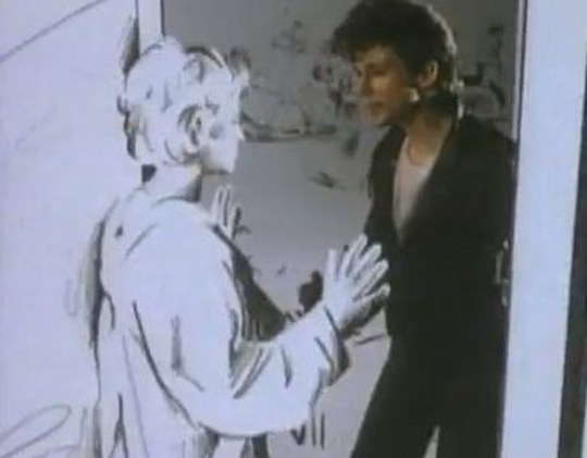
Taking a deeper analysis into the video Saussurean concepts of sign, signifier, and signified are present. In the music video, various signs are presented visually (such as characters, settings, and actions) alongside the auditory signifiers: the music and lyrics. The sketches shown throughout the video represent a signifier that conveys the concept of the protagonist imagined world or desires (signified). Analyzing this through Metz’s lens, the signifier of the animated characters entering the comic book world signifies a journey into fantasy or escapism. Escapism is a present theme in this video as it follows a narrative arc in which the protagonist transitions between the real world and the animated world representing the transition between reality and fantasy, echoing the themes of the song itself. The theme of escapism is also represented through the paradigmatic relation that is created with the contrast between the real-world setting and the animated world. Syntagmatic relations is also present in this video as the sequence of visual and auditory elements creates a syntagmatic structure.The progression of scenes, transitions, and actions forms a narrative sequence that guides the viewer through the story depicted in the video.
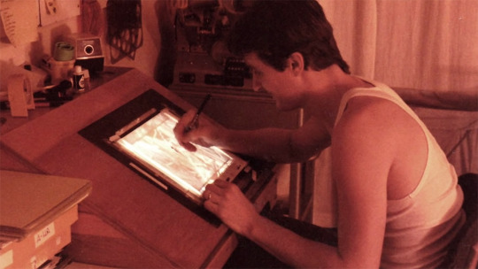
Analyzing through the lens of Roland Barthes the video might be perceived as selling the idea of transcending reality through love and imagination, much like how detergent ads sell the idea of transcending dirt to achieve cleanliness. In the video the animated world serves as a guide to a fantastical realm, inviting viewers to explore new possibilities and perspectives while guiding them through a journey of romance and adventure which can be connected to Barthes discussion on the cultural significance of travel guides. Barthes discusses the manipulation of historical narratives in films to convey certain ideologies which can be seen in the music video as it presents a narrative reminiscent of a romance or adventure film. The transformation of entering the comic book world can be seen as a modern interpretation of historical narratives, where the past is reimagined and romanticized for contemporary audiences. The romantic relationship depicted in the video can be interpreted as emblematic of idealized love or romanticized partnerships, reflecting societal norms and expectations surrounding relationships. Barthes discusses how modern myths are constructed and perpetuated through various forms of media and the music video constructs a myth around love, adventure, and escapism. The video perpetuates these myths through its visuals and narrative, reinforcing cultural ideals and values associated with romance and fantasy. In conclusion, analyzing the music video through different lenses reveals how the video constructs and perpetuates cultural myths surrounding love, adventure, and escapism. These lenses help us delve into the videos semiotic dimensions, exploring how the use of narrative, imagery, symbolism, signs and signifiers serves to create meaning within the visual and auditory text and reinforce societal norms.
youtube
The music video for "Nothing's Gonna Stop Us Now" by Starship was released in 1987 and played a significant role in the song's success. The video primarily takes place in a movie studio, reflecting the theme of the song being featured in the film “Mannequin.” This setting allows for various backdrops and sets to be utilized, adding visual interest and diversity to the video. The video follows a narrative that intertwines scenes from the movie “Mannequin” with footage of the band performing the song. The storyline of the movie, which revolves around a mannequin that comes to life, complements the message of the song about love overcoming obstacles. Throughout the video, shots of the band performing the song are interspersed with the narrative scenes. The band members are shown singing and playing their instruments with energy and enthusiasm, adding to the overall excitement of the video. The video includes romantic scenes between the characters from the movie, emphasizing the theme of love and connection. These scenes enhance the emotional impact of the song and reinforce its message of resilience and devotion. The video incorporates various visual effects, including transitions between scenes, lighting effects, and overlays, to enhance the overall aesthetic appeal. These effects contribute to the video's polished and professional look, aligning with the high production values of the song and its accompanying movie. The video features dynamic camera work and creative framing, capturing the energy of the band's performance and the emotional moments of the storyline.
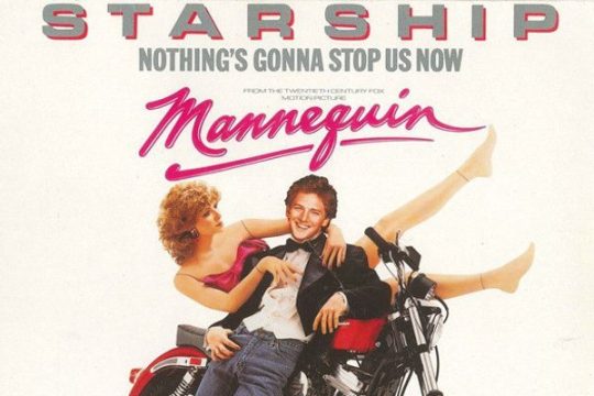
Analyzing the music video through the lens of Roland Barthes' essays from “Mythologies” offers an opportunity to deconstruct the cultural symbols and myths embedded within both the song and its visual representation. Barthes discussion of the manipulation of historical narratives to convey certain ideologies which can be seen in the video through elements such as the portrayal of the band members and use of dramatic backdrops that convey a sense of epic scale and evoke grandeur, triumph, and romance reminiscent of classical narratives. In the music video, themes of cleanliness, purity, and renewal, are symbolized through imagery such as bright, pristine settings, or the use of light and color to convey a sense of freshness and vitality. In the music video, their are references to travel and exploration, as the protagonists embark on a journey together against various scenic backdrops. These settings could serve as symbolic landscapes representing the adventure and possibilities inherent in love and partnership. The intimate moments portrayed between the protagonists represent domestic bliss and reinforce the narrative of enduring love and commitment which connects to Barthes values of stability, responsibility, and domesticity.

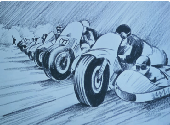
Metz discusses how cinema uses various codes and signs to convey meaning which is shown in the video as there are several codes such as visual imagery, music, lyrics, and performance. These codes work together to create a narrative and evoke emotions. The video follows a narrative structure that complements the song's lyrics. Based on the title and lyrics of the song it could be depicting a story of love, perseverance, or triumph over obstacles. The video utilizes cinematic techniques such as camera angles, editing, lighting, and choreography to convey its message. An example of this is the close-up shots that are used to emphasize emotions, while fast editing may create a sense of energy and excitement. Applying Metz's framework to the video allows for a deeper understanding of how its various elements work together to create meaning and evoke emotions in the viewer. In the video the facial expressions and body language of the performers, as well as the imagery used in the video to represent themes of love, determination, and overcoming obstacles. Saussure's theory of binary oppositions suggests that meaning is often constructed through the contrast between opposing concepts. Instances of binary oppositions are shown in the music video, such as contrasts in lighting, color palette, or visual motifs, which contribute to the overall message of the song. This lens gives us insights into how visual signs and symbols are used to convey meaning, emotion, and narrative in the context of popular culture and media production.

Discussion Questions:
Are there instances where the visuals seem to contradict the lyrical content?
What similarities can be drawn from both of these music videos? What about the actual songs? Is there any differences?
Do you think that the music videos represent the music correctly?
Why do you think love is portrayed the way it is in these music videos?
Do you think that semiotics were a present part when these videos were made?
Ferdinand de Saussure, Course in General Linguistics, trans. Wade Baskin (New York: McGraw-Hill Book Company, 1915)
Roland Barthes, Mythologies, trans. Annette Lavers (New York: The Noonday Press, 1972)
Metz, Christian,“Some Points in the Semiotics of Cinema. In Film Theory and Criticism, 65-77. Edited by Leo Braudy and Marshall Cohen (New York/Oxford: Oxford University Press, 2009)
10 notes
·
View notes
Note
!!!!! ROSSI! i feel like! at some point! you mentioned that hoyo made certain choices with wriothesley's character model and outfit that contribute to how BEEG he looks, etc. and i was wondering! if you'd like to elaborate on that? 🎤👀
Oh gosh I can certainly try! No promises on how much sense I'll make. Let me just -pulls up a picture of him-

Now you just stand there and look handsome. Amazing job. So Genshin uses set character models and they come in different categories. For male playable characters they come in "Tall" and "Short" but the models themselves don really contain body variation. It's all about the clothes and how they use colors and patterns to break up their shape! Wriothesely is arguably the largest male appearance wise. (while neuvi might be the tallest looking of the tall models)
(full breakdown under the cut)
The seams in Wrio's vest do a lot of the heavy lifting here in how they guide your eyes up and out toward his shoulders. Same for the lapels of the vest. Not only that but the dark panels of the vest on his side give an illusion of even more weight and thickness. There looks like there's somthing to grab onto there. Also note the extra bit of dark paneling between the deltoid of his shoulder and the space leading to his neck. This further pushes your eye outward. Those slight breaks of darker color do a lot of heavy lifting of informing how we take in his form. The collar of his shirt and cuffs of his sleeves once again draw your eye outward.
This of course doesn't even touch on the extra layer they added with the coat draped over his shoulders that does actually bulk out his figure more but it's not really the point of this post since i'm talking more about how the clothes close to his body are what really make him feel large. Moving downward his pants utilize similar visual cues to make him feel wider. Those like grey splits leading down to the seems that vanish into the top of his boots work the same as the paneling in his vest. breaking it up visually makes it feel like there's more there.
I'll get to his boots in a second but i had to pause to take a couple pictures of him from different angles that made me feel very rude. they're terrible pictures from my phone so i apologize
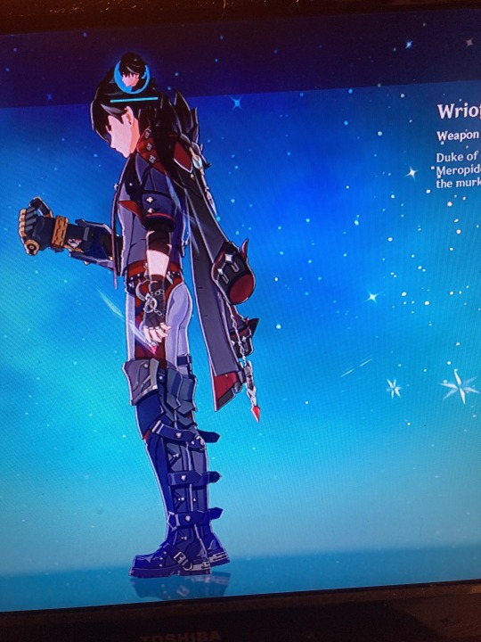
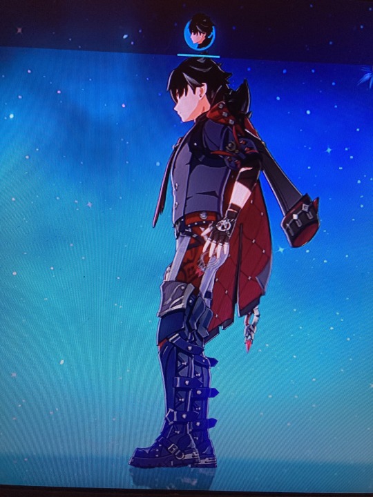
Man has a great ass. No denying that. And a part of it is once again how colors are used to break things up, along with the lighter color of his pants allowing for more depth with how they have the shadows cast on him. It's like they framed his ass essentially.
-coughs-
Now if you'll look at the first image of him again i'll get back to his boots. The armor cuffs at the top of them once again splay outward somewhat and as you go down the leg you'll notice that mot of the detailing is done in such a way to keep forcing your eyes outward. Then the main part of the boot really is just chunky.
In conclusion hoyoverse does a really good job useing shape language and color to add variation to their character models despite using a limited range of actual models. I could probably do a similar rundown with Al haitham, who while not as big looking as wriothesley also feels bigger than say Kaveh or Kaeya despite all the characters i mentioned here using the same base model. Seriously though the take away should be that even if you have limited resources or are trying to reduce them while making something with a ton of characters there are lots of subtle tricks you can use to trick the eye of your viewer (positive)
I'm sure there's someone with a more professional background in character design who could give a more in depth and better articulated run down of all this. I'm pretty much all self taught and just really love art and character design. I could talk about this at length still though with a bit of back and forth since there are definitely things i glazed over.
Thank you so much for getting my brain going Amira! (I've talked my non artist roomate's ear off about this before and they just politely listen so i can get it out of my system)
2 notes
·
View notes
Text
Benefits of Starting a Faceless YouTube Channel ( YouTube Automation )
Introduction
Have you ever considered starting a YouTube channel, but found yourself hesitant because of the idea of putting your face on camera? Or maybe you're someone who values their privacy and doesn't want to share personal information with the world. Whatever your reason, starting a faceless YouTube channel or youtube automation might just be the solution you're looking for. Here are some of the benefits of starting a faceless YouTube Automation :
Greater Privacy
One of the most obvious benefits of starting a YouTube Automation channel is that it can provide greater privacy. By not showing your face on camera, you can protect your identity and personal information. This can be especially important if you have a high-profile job or if you want to share sensitive information. You can still create engaging and informative content without revealing your identity.More
Focus on Content
Another benefit of starting a faceless YouTube Automation channel is that it can shift the focus onto your content. When you're not on camera, viewers are more likely to pay attention to what you're saying rather than what you look like. This can be beneficial for people who may not feel comfortable being on camera or who don't want their appearance to distract from the message they're trying to convey.

More Inclusive
YouTube Automation channel can also be more inclusive. By not requiring a certain look or appearance, anyone can create content without fear of discrimination based on their appearance. This can be especially important for people who may face discrimination based on their race, gender, or other personal characteristics. A faceless channel can help level the playing field and ensure that everyone's voice is heard.
Easier to Produce Content
Not having to worry about being on camera can make it easier to produce content. You can create videos without having to worry about your appearance or finding the perfect angle. This can be beneficial for people who have limited time or resources, as it can help streamline the content creation process.
More Creative Freedom
Finally, not showing your face can give you more creative freedom in terms of content creation. You can experiment with different types of content without feeling constrained by your appearance or how you think you might be perceived on camera. Youtube Automation Business can help you explore new topics and styles of content that you may not have otherwise considered.
Conclusion
if you're looking to start a successful YouTube channel and monetize your content, I highly recommend checking out the course Tube Mastery and Monetization by Matt Par. This course provides a step-by-step guide on how to start a profitable YouTube Automation channel, from finding a niche to creating engaging content and building an audience.
👉Click here 👈
With over 50 hours of video content, the course covers everything you need to know about YouTube and how to grow your channel. You'll learn about SEO, video production, analytics, and much more. Plus, the course provides exclusive access to a private Facebook group where you can connect with other aspiring YouTubers and get support and feedback on your content.If you're serious about starting a successful YouTube channel and turning your passion into a career, Tube Mastery and Monetization is the perfect course for to solve your problem on how to make faceless youtube videos. Don't miss out on this opportunity to learn from an expert and take your YouTube channel to the next level. Click here . Tube Mastery and Monetization to learn more and start your journey to becoming a successful YouTuber today!
2 notes
·
View notes
Text
Sound in Animation: How Music and Effects Enhance Perception
Sound plays a key role in animation, adding depth and expressiveness to the visual elements. Animation itself can be bright and exciting, but it is the sound design that can make it truly memorable. In this article, we will discuss how music and sound effects enrich animated works, creating a holistic and emotionally charged experience for the viewer.

Music: The Foundation of Emotional Perception
Music in animation is more than just background sound; it sets the mood and enhances emotions. For example, comic scenes often use fast, light melodies that emphasize humor, while dramatic moments can have slow, melancholy music, evoking empathy in the viewer. A well-chosen composition enhances the impact of animation, allowing viewers to delve deeper into the story and feel the emotions of the characters.
An example of the successful use of music in animation is the work of Pixar, where original soundtracks become an integral part of the storytelling and enhance the visuals. For more detailed information about the works of this studio, you can visit their official website Pixar Animation Studios https://www.pixar.com
Sound effects: creating atmosphere and realism
Sound effects (SE) play an important role in creating atmosphere and adding realism to animation. Every character’s step, rustling leaves, sounds of nature and city bustle — all this creates a unique sound palette that enriches the visual component. SE help viewers feel like they are part of the animation world, making it more alive and convincing.
For example, well-executed sound effects of character actions, such as blows or magic spells, can significantly increase the sense of dynamics and interactivity of a scene. They also help to emphasize certain moments and guide the viewer’s emotions, which makes the perception of animation more complete.
Interaction of sound and image
Sound and image in animation do not exist separately from each other — they interact and complement each other, creating a synergistic effect. Music can foreshadow developments or emphasize key moments, while sound effects can accentuate visual accents.
This interaction is especially noticeable in adaptations of classic works, where music and sound effects are used to create new interpretations and reimaginings of the original plots. This allows animators to develop familiar stories by introducing new emotions and sensations through sound.
Conclusion
Thus, sound in animation is a powerful tool that can significantly enhance the perception of a work. Music creates emotions and mood, while sound effects enrich the atmosphere and add realism. The synergy of these elements makes animation more expressive and memorable, allowing viewers to immerse themselves in a world of fantasy and emotion.
You can check out the playlists designed by our visuals on our channels:
OUR LINKS: https://www.youtube.com/@4VOICES.Studio https://www.instagram.com/4voices.studio/ https://ru.pinterest.com/4voicesstudio/
#drawing#youtube#animation#animationart#2danimation#animationproduction#artists on tumblr#animatedshort#playlist#3danimation#soundtrack#audio#video#soundcloud
1 note
·
View note
Text
Font Variations and Typography: Exploring the Art of Text Design
Typography is more than just choosing a font; it is an art form that communicates mood, personality, and function through the arrangement of type. One of the most fascinating aspects of typography is the vast array of font variations available.
These variations, from serif to sans-serif, bold to italic, can significantly affect how a message is perceived. In this article, we explore the importance of font variations and how they impact design and readability.
What Are Font Variations?
Font variations refer to the different styles, weights, and sizes that a single typeface can offer. For example, within a type family, you might find regular, bold, italic, and light versions, each with its own unique characteristics. Some fonts even come with additional variations such as condensed or extended forms, which can alter the width and structure of the letters.
The two primary categories of fonts are:
Serif Fonts – These fonts have small lines or decorations at the ends of their letters. They are often considered more traditional and are commonly used in print media like newspapers and books. Examples include Times New Roman and Georgia.
Sans-Serif Fonts – Sans-serif fonts lack the decorative lines found in serif fonts. They offer a cleaner, modern look and are widely used in digital media and on websites. Examples include Helvetica and Arial.
Importance of Font Variations
Font variations enhance readability and convey a certain style or emotion that aligns with the purpose of the text. For instance, bold fonts are often used to highlight key points or to create emphasis, while italicized text can indicate quotes, foreign words, or titles. Meanwhile, light fonts can provide a more elegant, understated look, often seen in luxury branding.
Additionally, font variations are integral to establishing a hierarchy in design. Designers can use different font weights and sizes to guide the viewer's eye and indicate which pieces of information are most important. For example, headings are usually in a larger, bolder font to catch attention, while body text is smaller and easier to read.
The Role of Typography in Branding
Typography plays a crucial role in branding because it helps create a consistent and recognizable identity. By choosing the right combination of fonts, companies can communicate their values, personality, and target audience. A tech company might opt for a sleek, sans-serif typeface to represent innovation, while a luxury brand may choose an elegant serif font to convey sophistication.
Conclusion
Font variations and typography are vital tools in visual communication. They go beyond aesthetic appeal and influence how information is perceived and understood. By carefully selecting and using different fonts and styles, designers can effectively convey messages, enhance readability, and create memorable experiences for their audience.
FAQs
1. What is the difference between serif and sans-serif fonts?
Serif fonts have small decorative lines at the ends of the letters, giving them a more traditional and formal appearance. Sans-serif fonts do not have these lines, making them cleaner and more modern, often preferred for digital content.
2. Why are font variations important in design?
Font variations help establish a visual hierarchy, making it easier for readers to navigate content. They also enhance readability and can convey different emotions or messages, supporting the overall theme of the design.
3. Can typography influence the way we perceive a brand?
Yes, typography plays a significant role in shaping the perception of a brand. The choice of fonts helps communicate the brand's personality, values, and tone, influencing how consumers connect with the brand.
0 notes
Text
Vehicle Graphics and Van Wraps: A Comprehensive Guide
vehicle graphics and van wraps are becoming an increasingly popular advertising medium for businesses of all sizes. These wraps turn vehicles into mobile billboards, promoting a brand or service wherever they travel. With the potential to reach up to 100,000 viewers per week, a well-designed van wrap ensures maximum exposure. This makes vehicle wraps one of the most cost-effective advertising strategies, especially when compared to traditional methods like online pay-per-click campaigns or printed media. Design Options for Vehicle Graphics One of the greatest advantages of vehicle wraps is the wide range of design possibilities available. From full wraps that cover the entire vehicle, including windows, to partial wraps that highlight specific areas, businesses can choose a style that aligns with their marketing goals and budget. Full wraps provide the most impact, enveloping the vehicle with a cohesive message that can’t be missed. Partial wraps, on the other hand, offer a more affordable option while still delivering a striking visual. In addition to full and partial wraps, businesses can opt for spot graphics. These smaller decals can include the company’s logo, contact details, or key information, offering a subtle but effective way to brand a vehicle. Many wraps also feature perforated vinyl on the windows, allowing the driver to see out while continuing the wrap’s design. Choosing the right design is key to the success of a vehicle wrap campaign. The wrap should prominently feature the company’s name, logo, and contact details, ensuring that passersby can quickly understand the brand’s message. Material Choices for Van Wraps Another factor that makes vehicle wraps so versatile is the range of materials available. The most common material used is weather-resistant adhesive vinyl, known for its durability and resistance to the elements. This vinyl can withstand harsh weather conditions, making it ideal for long-term use on vehicles. For businesses seeking more eye-catching effects, specialty vinyl materials like reflective, carbon fiber, or even color-changing vinyl can be used. Reflective vinyl ensures visibility even at night, while carbon fiber vinyl adds a sleek, textured finish. Color-changing wraps create dynamic, attention-grabbing effects as the vehicle moves under different lighting conditions. The flexibility in material choice allows businesses to customize their vehicle wraps according to their specific needs and desired visual impact. Flexibility and Customization of Vehicle Wraps Vehicle wraps offer a high level of flexibility, allowing businesses to tailor their wraps to their specific needs. Full wraps can transform an entire fleet of vehicles into cohesive mobile advertisements, while partial wraps and spot graphics provide more budget-friendly options for smaller companies or businesses with a single vehicle. Another unique advantage of vehicle wraps is their ability to target specific audiences based on location. By driving through certain neighborhoods or parking in strategic spots, businesses can ensure their brand is seen by their target demographic. For instance, a plumbing service may attract new clients simply by parking their wrapped van in a residential area while on a job. This flexibility gives businesses more control over who sees their advertisement. In conclusion, vehicle graphics and van wraps offer businesses a dynamic, flexible, and cost-effective way to advertise their services. With endless design possibilities, protective benefits, and the ability to reach a vast audience, they provide an unmatched opportunity for brand visibility.
0 notes
Text
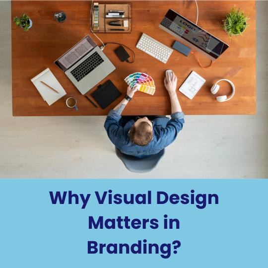
The Essential Elements of Effective Visual Design in Modern Branding
Strong visual design is crucial for brands today. It requires creating a visual language that resonates with audiences and conveys core values. Brands must embrace innovative design techniques that align with current aesthetic trends. Effective visual design encompasses elements like typography, color theory, imagery, and layout to construct cohesive visual narratives that bolster brand recognition. Additionally, digital platforms influence design strategies, necessitating adaptability and consistency across various media channels. By grasping these key components, brands can craft compelling identities that captivate attention and sustain consumer interest.
Cohesive colour palettes enhance brand recognition and emotional connection with target audiences.
In visual design, cohesive color palettes are crucial for creating a consistent brand identity that resonates with audiences. A unified color scheme improves brand visibility and recall, making it easier for consumers to associate certain colors with specific brands. This consistency enhances brand recognition and reinforces its personality and values, making it more relatable to consumers. Colors also evoke emotions and can impact consumer behavior. By choosing a color palette that aligns with their message, companies can foster a deeper emotional connection with their audience, ultimately boosting customer loyalty and engagement. In conclusion, well-chosen colors are vital for building strong brand recognition and fostering lasting customer relationships.
Consistent typography establishes brand identity and improves readability across various visual platforms.
Consistent typography in visual design is key for establishing a brand's identity and readability. By using the same typeface and font hierarchy, brands create a cohesive visual style that helps with brand recognition and loyalty. This uniformity ensures clear messaging and accessibility for effective audience engagement on various platforms. Good typography enhances readability and user experience by guiding the reader's eye and reducing visual clutter. Overall, investing in consistent typography improves the impact of visual design and reinforces a brand's voice.
Strategic layout guides viewer attention, ensuring key messages are effectively communicated and understood.
Strategic layout in visual design is essential for directing viewer attention towards important messages and creating a clear visual hierarchy. Principles like balance, alignment, and proximity help organize elements effectively, while whitespace and visuals support the text to make the message clearer and more impactful. A well-designed layout strengthens brand messaging by providing a cohesive visual experience that resonates with the audience, leading to a lasting impression. Prioritizing viewer attention through careful arrangement helps brands communicate their key messages effectively.
Effective visual design is essential for modern branding as it helps create a strong identity that appeals to the audience. Consistency in colors, fonts, images, and layouts is key for building this identity. In the digital world, adaptability and consistency are vital for improving visibility and forming stronger bonds with consumers. Investing in smart visual design is crucial for standing out and succeeding in today's fast-paced environment, leading to greater loyalty and engagement.
Visit: VS Website See: VS Portfolio
0 notes
Text
Food Photography: The Art of Making Meals Irresistible
Food photography has become an essential aspect of culinary presentation, whether for blogs, cookbooks, or social media. The challenge lies in transforming simple meals into mouthwatering

visuals that captivate viewers. This article explores styling and shooting techniques that can make food look delectable and inviting.
Understanding the Essentials
To create stunning food photography, you need to start with the right ingredients—literally and figuratively. Choose fresh, vibrant ingredients that are visually appealing. The quality of the food will shine through in the final image, so opt for seasonal produce and high-quality ingredients whenever possible.
Composition and Styling
1. Create a Focal Point: Establish a focal point in your composition. This could be the main dish or a specific ingredient that adds color or texture. Use the rule of thirds to guide the placement of your focal point, allowing for a more dynamic composition.
2. Layering and Height: Adding height and layers to your food arrangement can create depth and interest. Use props like bowls, plates, and utensils to elevate certain elements of the dish. This not only enhances the visual appeal but also draws the viewer’s eye throughout the frame.
3. Color Coordination: Colors can evoke emotions and influence perception. Choose a color palette that complements the dish. For example, a fresh salad might benefit from earthy tones in the background, while a rich dessert could pop against a dark plate. Remember that contrast can enhance the visual impact.
Lighting Techniques
1. Natural Light: Whenever possible, shoot with natural light. Soft, diffused sunlight can create a warm, inviting atmosphere. Position your setup near a window and avoid harsh direct light, which can cast unflattering shadows.
2. Experiment with Angles: The angle from which you shoot can dramatically affect the outcome. Overhead shots work well for flat-lay arrangements, while a 45-degree angle is great for dishes with height. Don’t hesitate to try multiple angles to find the most appetizing view.
Props and Backgrounds
1. Choosing the Right Background: Select backgrounds that enhance your dish without overwhelming it. Simple, textured surfaces (like wooden tables or marble countertops) can add interest without distracting from the food.
2. Use Props Wisely: Incorporate props such as utensils, napkins, and ingredients to create a story around your food. However, be careful not to clutter the scene. Each element should serve a purpose and contribute to the overall composition.
Post-Processing
After capturing your images, consider some light post-processing to enhance colors and contrast. Adjusting brightness, sharpness, and saturation can make a significant difference in how appetizing the food appears. Just be cautious not to over-edit; the goal is to make the food look as natural and enticing as possible.
Conclusion
Food photography is an art that combines technical skills with creativity. By focusing on styling, lighting, and composition, you can create images that not only showcase the beauty of food but also inspire cravings. Whether you’re a budding photographer or a seasoned pro, these techniques can help elevate your culinary photography to new heights.
And if you're ever in need of inspiration, remember that even the top 10 wedding photographer in Dehradun can show you the power of capturing moments, just as you can capture the beauty of food on your plate. So grab your camera, and start making those meals irresistible!
1 note
·
View note
Text
The Role of Light in Photography
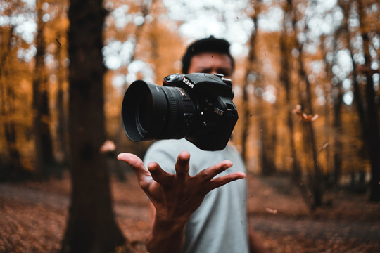
Light is the cornerstone of photography. In fact, the word "photography" itself is derived from Greek, meaning "drawing with light." Every photograph, regardless of its subject, relies on light to create an image, and understanding how to work with light is what sets great photographers apart from average ones.
Natural light is often considered the best source of illumination, particularly for outdoor photography. Sunlight offers a wide range of lighting conditions depending on the time of day. For example, the soft, warm tones of the "golden hour," which occurs just after sunrise or before sunset, are ideal for creating a magical atmosphere in photographs. During this time, shadows are softer, and the light is more diffused, making it a favorite of many photographers for portraits and landscapes alike.
In contrast, the harsh light of midday, when the sun is directly overhead, creates strong shadows and high contrast. While some photographers avoid shooting at this time, others embrace it to create dramatic, high-contrast images. The direction and quality of natural light can drastically change the mood of a photograph, and skilled photographers know how to use these changes to their advantage.
Artificial light also plays a significant role in photography, especially in studio settings or low-light environments. Studio lighting allows photographers to have complete control over the intensity, direction, and color of the light. By manipulating these variables, photographers can highlight certain features of their subject or create specific moods. Softboxes, strobes, and LED lights are common tools used to shape artificial light to the photographer’s desired effect.
For night photography or indoor shoots, the absence of natural light requires creative use of artificial sources. Long exposure techniques can capture the beauty of a night sky filled with stars or the bustling energy of a cityscape illuminated by streetlights. In such cases, the ability to manipulate light becomes even more critical to achieving a stunning result.
Beyond its technical importance, light has an emotional and symbolic role in photography. Light can create warmth or coldness, intimacy or distance, and even evoke certain psychological responses. By playing with light, photographers can guide viewers’ emotions and focus, making it a crucial storytelling element in visual art.
In conclusion, mastering light is one of the most important skills in photography. Whether using natural sunlight or artificial setups, understanding how to control and manipulate light opens up endless possibilities for creative expression in the art of photography.
1 note
·
View note
Text
Language of the street
I’ve decided to explore and create my design poster on the chosen area Ahuntsic-Cartiervill. This location is well known for its exciting culture rich history and lively scenery. Cartiervill is located towards the end of the northern part of the city of Montreal. It is situated near the Rivière des Prairies to the north and the city of Montreal to the south. Its origin traces back to when it was occupied by the indigenous before it became a French settlement in the 17th century. Today, it’s known as one of the oldest villages of Montreal, known for its historical background, I captured most of my images on the street La Promenade Fleury the street is popular for it’s tourist attraction natural scenery, local shops and restaurants such as Chez Clementine, La Petite Flore, Style Petales, and places for residents. And significant historical buildings built from the late 19th century; Moreover the area is surrounded by public art, such as the sculpture The Little Purple Boxes" by artist Pierre Piché. Which was created for the community and local residence.
I have decided to focus the content of my poster based on the history and specific art elements of public art I have photographed. Color is a key design element that shapes the overall concept of my poster I used an off-white color to create an old-time aesthetic and vintage timeless look given its historical context and color scheme of the public art. I used turquoise, blue, and red within the typography and shapes to create contrast within the creation that creates a more dynamic look, and lastly, I used yellow in the window to really emphasize and draw the viewers’ attention to make the window stand out and create a warm inviting feeling to describe the community. My poster also consists of an image of the residence building where I cropped out windows to create repetition, giving the sense of a visual rhythm and unity with its repeated patterns. Additionally Shape is also used to frame certain parts of my poster, such as the typography and visual elements in relation to the structure of the windows. for example I tried to illustrate on my poster the structure The little purple box by Piché. I wanted to add shapes in my poster in a similar way to the structure, stacked and overlapped to create this real-life structure. Finally, movement of the road creates a crucial role in guiding the viewer’s eyes through the composition the movement of the road creates a visual flow and path towards the center of the poster the curved road allows the viewers eyes to explore the different elements used along the path and draw them to the main part of the poster. For the typography I used I used old-style text to create the timeless depth. I emphasize in big at the top of my poster the Molson dry text to create the connection between Canadians oldest bear and the Cartiervilles oldest village. In conclusion Ahuntsic-Cartierville is full of a lot's of history and art, so I aimed to incorporated all those elements I captured in my photographs and design elements, making it both visually appealing and representing its rich history

0 notes
Text
Common Photo Editing Mistakes and How to Avoid Them
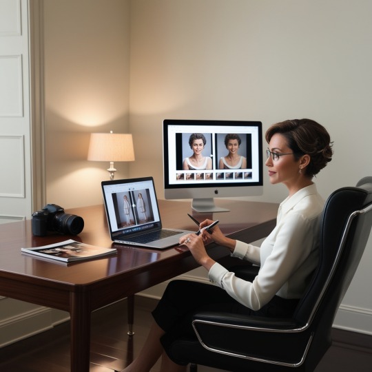
However, even with the most experienced editors, mistakes still creep into their work and compromise the impression made by the edited work. The article below will guide you through some of the most common photo editing errors and how they can be avoided, thus ensuring that there is always a minimum level of error in the final results provided by your photo editing services.
1. Over-Saturation of Colors
One of the most common photo editing errors is to oversaturate color. Nice and strong colors can make an image striking, high-intensity color can make photos turn out very unrealistic and unattractive. This will often result in common ground of skin tones looking like they are too orange or red, and other landscapes looking entirely far too overbright.
How to Avoid
Subtle Adjustments: Start by making these very subtle changes to the saturation levels. Low intensities of color are better in intensities, as it can be quite easy to adjust the intensity to high later. Most of the time, increasing the intensity afterwards is easier than dialing back if you have gone too far.
2. Over-smoothing of the Skin
Now, smoothing skin is popular in portrait editing, but the same could be overdone very easily. Just overdoing it will make the model look like a plastic doll, the skin texture gone, and yielding a very unrealistic look altogether.
How to Avoid
Use Frequency Separation: This method separates color in the skin from texture, such as skin pores, thus allowing one to smooth blemishes without losing the natural texture of the skin.
3. Overlooking the Background
It’s quite easy to zone in on your subject and bypass everything else other than the background. However, a distracting background is something that takes away all the impact of the image. Whether it’s some unwanted object, a cluttered scene, or bad lighting, a bad background can be a huge destruction for your viewer.
How to Avoid
Clone Stamp Tool: Remove unwanted distractions in the back using tools such as the clone stamp or healing brush tools.
4. Over-Sharpening
While sharpness is essential for making that which you are looking at clear and highly detailed, over-sharpening actually creates irresistible, harsh edges — effectively giving the result a granulated look — and the photo appears to be too rough and unpolished.
How to Avoid:
A Little Sharpening: Start at a lower sharpness setting and keep increasing it slightly until a good effect is realized. Watch the edges of the objects within an image; they should not be turning too harsh.
Conclusion
Photo editing is an art that requires a proper balance between enhancement and restraint. When these common errors are avoided in the editing of a photograph, you will do quite well in making certain that your photo editing services are high quality and professionally maintained at all times.
Do not forget — first and foremost, the key to successful editing is subtlety and precision. Always aim at enhancing the natural beauty of the photograph, rather than overshadowing it with effort. If you’re able to master these best practices, you’ve done almost all you could to create visually gorgeous images in the competitive market of our generation.
Visit here: https://www.newspostonline.com/tech/common-photo-editing-mistakes-and-how-to-avoid-them/
0 notes
Text
Title: Mastering SEO: A Comprehensive Guide for Contractors Introduction The realm of contracting is, without a doubt, a competitive landscape teeming with high-quality service providers. Today, going digital has become the new normal, and to shine above the competition, a robust online presence plays a significant part. That's where SEO, Search Engine Optimization, comes into the picture. This is a comprehensive guide to mastering SEO for contractors and contractor workers, emphasizing its remarkable impact. Understanding SEO In the simplest terms, SEO is the innovative approach towards making your online content viewer-friendly and easily discoverable on search engines. For contractors, mastering SEO involves using certain strategic keywords that potential clients might search for, such as "reliable contractor," "professional builder," or "seasoned construction expert". Incorporating these keywords seamlessly into your website's text ensures search engines can identify and rank your website effectively, bringing your contractor services to the forefront. The Significance of SEO for Contractors Gone are the days when clients relied solely on word-of-mouth recommendations or yellow pages to find contractors. Today, they are more likely to turn to a quick Google search to find local contractors and contractor workers, making SEO all the more significant. By skillfully using SEO best practices, contractors can significantly boost their online visibility, reputation, and, ultimately, business growth. A well-optimized website not only ranks higher on search engine result pages (SERPs) but also attracts more valuable organic traffic – a venture undoubtedly resulting in higher conversion rates. Optimal SEO Strategies for Contractors As a contractor aiming to master SEO, you need to appreciate the value of relevant and quality content. Engage your visitor with informative material about the services you offer, the latest construction techniques, hands-on renovation tips, or comprehensive home maintenance guides. Integrate relevant keywords naturally to all sections of your site, ranging from the home page, about us section, to blog posts and service pages. Another effective SEO strategy is local SEO. As most contracting jobs are location-specific, optimizing your website for local searches is paramount. Make sure your business name, address, and phone number (NAP) are consistently listed across all online platforms. Encouraging online reviews and implementing schema markup can further boost your local SEO efforts. Responsive website design is equally vital. As a substantial number of online searches are conducted on mobile devices, a mobile-optimized site greatly enhances user experience, boosting your SEO ranking. To truly master SEO, keeping track of your website's performance is crucial. There are various SEO tools, like Google Analytics or SEMRush, that allow you to monitor your rankings, traffic, and other valuable metrics. This way, you can continually adjust and enhance your SEO strategy. Conclusion Mastering SEO is integral for contractors who wish to elevate their online presence and achieve business success. By implementing these SEO strategies, contractors can reach their target audience, increase their website's visibility and traffic, and gain a competitive edge. While mastering SEO might seem daunting initially, with consistent efforts and staying updated about SEO trends, the benefits are undeniably far-reaching. Be it project bids or brand recognition; a well-optimized website can be the linchpin to your contracting business's growth. Case Study: How a Local HVAC Contractor Boosted Traffic and Leads by Mastering SEO As part of our comprehensive guide for contractors on mastering SEO, we'll investigate a real-world example of an HVAC contractor who successfully amplified his online visibility and customer inquiries by implementing SEO best practices. John, a local HVAC contractor, operated in a highly competitive market.
Despite delivering exceptional service, his business wasn't attracting new customers via the internet. He soon realized he needed to optimize his online presence and decided to invest time and resources into SEO. Here's a breakdown of the steps John adapted to master SEO: Website Optimization: John started by re-evaluating his website. He improved its responsiveness, ensuring it worked flawlessly on all devices. Moreover, he optimized the site speed to enhance the user experience. Content Creation: Understanding that content is king in SEO, John started a blog on HVAC maintenance and repair. Using keyword research tools, he identified commonly searched terms and phrases within his industry and used these for his content creation. On-Page SEO: Next, John optimized the meta tags and descriptions on each page of his website, integrating the previously identified keywords. He made sure that these meta descriptions were concise and descriptive. Local SEO: Recognizing most of his clients would come from local search, John optimized his website for local SEO. He created a Google My Business profile and regularly updated it with client reviews, photos and new service introductions. Link Building: John then focused on gaining genuine backlinks, partnering with local businesses, and guest blogging on reputable industry-specific platforms to increase domain authority. After around six months of consistent focus on SEO optimization, John started witnessing remarkable improvements. His website traffic increased by 120%, phone inquiries grew by 70%, and his business began ranking in the top five for several critical keywords. Today, over 60% of John’s new business comes from organic searches, and his enterprise continues to grow. Key Takeaways: SEO is a slow process and requires continuous effort, but the ROI can be significant. Make use of SEO tools for keyword research and track your site performance consistently. Optimize your website for local SEO as contractors usually serve a localized customer base. Regularly maintaining your Google My Business profile can contribute significantly to local SEO. Valuable content is vital; it drives organic traffic, builds customer trust, and increases the chance of customer engagement. Through John's example, we can see that mastering SEO is an ongoing process, but when done correctly, it provides an essential resource for attracting new customers and growing a contractor's business. "Ready to elevate your contracting business to the next level? Don't miss out on our comprehensive guide to mastering SEO. Claim your guide today and start attracting your ideal clients effortlessly!" Start Your Digital Transformation Now! "According to a recent survey, 70% of consumers said they first research online when looking for services like those offered by contractors, highlighting the importance of effective SEO strategies for contractors to increase their online visibility and attract more customers."
0 notes