#to design the cover art... much to think about
Explore tagged Tumblr posts
Visit Tumblr Blog
Explore Tumblr blogs with no restrictions, modern design and the best experience.
Last Seen Tumblr Blogs


Fun Fact
Tumblr was attacked by a cross-site scripting worm deployed by the Internet troll group GNAA on Dec 3, 2012.
Text
Each week (or so), we'll highlight the relevant (and sometimes rage-inducing) news adjacent to writing and freedom of expression. This week:
Inkitt’s AI-powered fiction factory
Inkitt started in the mid-2010s as a cozy platform where anyone could share their writing. Fast forward twenty twenty-fuckkkkk, and like most startups, it’s pivoted hard into AI-fueled content production with the soul of an algorithm.
Pictured: Inkitt preparing human-generated work for an AI-powered flume ride to The Unknown.
Here’s how it works: Inkitt monitors reader engagement with tracking software, then picks popular stories to publish on its premium app, Galatea. From there, stories can get spun into sequels, spinoffs, or adapted for GalateaTV… often with minimal author involvement. Authors get an undisclosed cut of revenue, but for most, it’s a fraction of what they’d earn with a traditional publisher (let alone self-publishing).
“'They prey on new writers who have no idea what they’re doing,' said the writer of one popular Galatea series."
Many, many authors have side-eyed or outright decried the platform as inherently predatory for years, due to nebulous payout promises. And much of the concern centers on contracts that don’t require authors’ consent for editorial changes or AI-generated “additions” to the original text.
Now, Inkitt has gone full DiSrUpTiOn, leaning heavily on generative AI to ghostwrite, edit, generate audiobook narration, and design covers, under the banner of “democratizing storytelling.” (AI? In my democratized storytelling platform? It’s more likely than you think.)

Pictured: Inkitt’s CEO looking at the most-read stories.
But Inkitt’s CEO doesn’t seem too concerned about what authors think: “His business model doesn’t need them.”

The company recently raised $37 million, with backers including former CEOs of Sony, Penguin, and HarperCollins, proving once again that publishing loves a disruptor… as long as it disrupts creatives, not capital. And more AI companies are mushrooming up to chase the same vision: “a vision of human-created art becoming the raw material for AI-powered, corporate-owned content-production machines���a scenario in which humans would play an ever-shrinking role.”
(Not to say we predicted this, but…)
Welcome to the creator-industrial complex.

Publishers to AI: Stop stealing our stuff (please?)
Major publishers—including The New York Times, The Washington Post, The Guardian, and Vox Media—have launched a "Support Responsible AI" campaign, urging the U.S. government to regulate AI's use of copyrighted content.
Like last month's campaigns by the Authors Guild and the UK's Society of Authors, there's a website where where you can (and should!) contact your representatives to say, “Hey, maybe stop letting billion-dollar tech giants strip-mine journalism.”
The campaign’s ads carry slogans like “Stop AI Theft” and “AI Steals From You Too” and call for legislation that would force AI companies to pay for the content they train on and clearly label AI-generated content with attribution. This follows lobbying by OpenAI and Google to make it legal to scrape and train on copyrighted material without consent.
The publishers assert they are not explicitly anti-AI, but advocate for a “fair” system that respects intellectual property and supports journalism.
But… awkward, The Washington Post—now owned by Jeff Bezos—has reportedly already struck a deal with OpenAI to license and summarize its content. So, mixed signals.
Still, as the campaign reminds us: “Stealing is un-American.”
(Unless it’s profitable.)

#WarForever
We at Ellipsus love a good meme-turned-megaproject. Back in January, the-app-formerly-known-as-Twitter user @lolt64 tweeted a cryptic line about "the frozen wastes of europa,” the earliest reference to the never-ending war on Jupiter’s icy moon.
A slew of bleak dispatches from weary, doomed soldiers entrenched on Europa’s ice fields snowballed (iceberged?) into a sprawling saga, yes-and-ing with fan art, vignettes, and memes under the hashtag #WarForever.
It’s not quite X’s answer to Goncharov: It turns out WarForever is some flavor of viral marketing for a tabletop RPG zine. But the internet ran with it anyway, with NASA playing the Scorcese of the stars.

In a digital hellworld increasingly dominated by AI slopification, data harvesting, and “content at scale,” projects like WarForever are a blessed reminder that creativity—actual, human creativity—perseveres.
Even on a frozen moon. Even here.

Let us know if you find something other writers should know about, (or join our Discord and share it there!)
- The Ellipsus Team xo
#ellipsus#writblr#writers on tumblr#writing#creative writing#anti ai#writing community#fanfic#fanfiction#fiction#inkitt#us politics
252 notes
·
View notes
Text
The Bad Armor Drinking Game
In the digital art dep't...
So, having just sorted out the new figure for Queen Eftgan in the Middle Kingdoms books, I spent most of last week (while continuing to recover from the household upper respiratory infection) doing preliminary planning for the visual of a scene from The Door Into Sunset in which all the MCs are out on the battlefield. The big battle (or the final one of a sequence) will be the next day, and last-minute tweaks are being made to strategy and tactics. Which means putting most of the our-side protagonists together in a command tent, bent over a table covered with maps. (The "sketch" for this scene is over here.)
But sweet Goddess in a bucket, the shopping I had to do to make sure I had those guys' armor the way I wanted nearly drove me around the bend. From the digital artist's POV, the main problem with this is realistically arming the female characters. And the reason for this is simple: Almost all of it that's currently available from Daz is crap.
There are a very few notable exceptions. In Eftgan's case, for example: she's wearing the female-fighter version of the male-fighter harness that Herewiss has on. Sickleyield and Moonscape Graphics have done good work here.
But almost all the other female-use armors available at the moment? Argh. It had been ...a few years, I guess? since I last went armor-shopping. Last week I'd hoped there might at least be some new possibilities in the Daz shop. But instead I found so much more useless crap than before that I was tempted to start day drinking. And by evening, there were enough drink-triggers to start my very own drinking game.
I am not going to illustrate the triggers enumerated below, as I don't want to embarrass the artists. But if you look at the items turned up by this search, you'll have little trouble finding the things that would have left me in a drunken stupor within an hour or two.
My baseline: if I'm going to buy digital armor, either for male or female characters, it has to be something that I myself wouldn't be embarrassed to show up wearing at a swordfight. Otherwise, I start hitting the virtual bottle.
So I'd drink when I see:
Armor that fails to cover or at least protect vital vulnerable areas. Not just vital organs, but seriously important places like the insides of thighs and arms, the throat area, etc. (And yeah, I know and enjoy the various webcomics that illustrate, for humor's sake, the idea that the more bare flesh a female warrior displays, the safer they somehow are. But I'm dealing with the "realistic" side of combat here. Yes, some of my characters are magic workers, but the reason they go out and get themselves armor is so they don't have to waste precious magical ability dealing with something that steel will manage perfectly well without them having to think about it.)
Armor that should serve a useful protective purpose but nonetheless doesn't because it's been twisted by the armor maker, for design purposes, into a shape that means it's now essentially useless. Drink, for example, on seeing an example of "Silly Pauldron Syndrome:" i.e., shoulder pieces that will not only not protect you from a shoulder cut, but will direct it toward the space between neck and shoulder. ...Drink again if the pauldron also somehow blocks your view of what's going on around you. Another drink for pauldrons, gorgets or neck pieces that poke your eye out when you turn your head.
Armor covered with decorative doodads that do nothing but get in your way or serve as something for your adversaries' weapons to catch on. The proper purpose of armor is to deflect blows away from vulnerable areas, not to catch and keep them there. No one is going to waste expensive metal (and armourers' labor time) on decorations that are a liability. Anything that would catch a thrusting sword? Drink. Drink twice if spikes are involved.
Poorly thought-out attachments to armor (loincloths, capes, etc), Drink if these would inevitably trip you or otherwise interfere with you if you tried to run in them: or that would make it easier for an attacker—especially from behind—to pull/knock you down and kill you. Two drinks if the attachments are asymmetrical. (Because, what, this is supposed to help somehow?) And drink for loincloths in general, because, FFS, why.
Boob armor. If you're a woman who's fought with the sword at all, you know that unless you're absolutely dead flat in front, you bind up somehow to get the frontage safely restrained before the action begins. Armor that purports to separate your breasts into two different casings is simply idiotic. All that it does do is signal that you're female. (And you're doing this why, exactly? On a this-world battlefield, this strikes me as nothing but a recipe for trouble.) One drink for boob armor. Another drink for conical boob armor that would make even early!Madonna look askance. Two drinks for boob armor that covers only the tops of the boobs. Honestly, WTF!!
And: Armor that just looks silly. Armor that makes you go "Oh FFS, give me a break now" and look away. Two drinks (or more) for armor that covers hardly any of your character, but for which the designer is possibly charging you even more than for an intricately made and well thought-out piece of work with a lot more protective real estate.
...(sigh) So many drinks. And so little armor worth having. ...Anyway, I got away from that series of shopping sessions with my sobriety intact. Small mercies.
But let me show you something hilarious that came up along the way.
Very, very few of the people making and selling armors on Daz betray any sign of a sense of humor in their marketing images. The rig below, though, popped up suddenly and reduced me to gasps of helpless laughter.
This, I kid you not, will come up in that "armor" search above. Let's be charitable and refer to it for the time being as "fighting gear".
I haven't shown you the best of this, though. These two figures weren't alone. There was another.
This guy should be an example to us all. He's thinking, "They're gonna make me go out there wearing some stick-on leather nipple straps and half a rug from IKEA? Fine. I'm gonna make it work." ...And he not only owns it: he rocks it. This is a badass of some kind or another, and he has my sword, or axe, or whatever.
All I can say is: Good on the product designer for doing something genuinely funny for a change: because at that point, I seriously needed it.
(sigh) And now back to work.
ETA: A quick note per various recommendations of others online doing this kind of analysis: Thanks, but I don't need to go outside the household for more of the same. I'll just yell up the stairs to @petermorwood, who probably has some that's way more acerbic than mine. :)
194 notes
·
View notes
Text
Does anyone have a moment to talk about my boy Usagi? He's very important. To me.

Look at him! Happiest 4ft Ronin on earth,

But also filled with, just so much affront at the world. Look at these faces!


Sweet mercy he's so adorable in this art style.

But let's look at some other takes:

Very cool, very dark and serious. I love 12 and 03 Usagi so much. 03 Usagi a little better but only because he had more time. They're both such great guys.


Now, keep all that you just saw in mind. We had this...
And someone made this!!?!


Lemme rephrase that.
This character existed, horrendously underused...

AND THEY MADE THIS??!?!!!!

BRO, WHUT?! What is this???
I am NOT against different takes on characters from the norm, okay? I'm not a comic purist. I watch rottmnt right next to other 2d and 3d shows and enjoy them all. But who on earth made these character design choices? His lips are so creepy man! And the eyes? "Illumination" called, they want their disconcerting background character back. And the way he has this hyper rendered hair-fringe-thing but it's a solid thick mass just makes me think he has a fleshy, fur covered lobe on his forehead! EWWW!
I don't normally pick things out to specifically hate on them. But to see my man Usagi, a most honorable, skilled, and wise warrior, turned into a candy colored, uncertain, form fitting clothes wearin'-!
Also, I don't know if this matters that much 'cause he's a rabbit an all, but, he doesn't look Asian. With the other guys it was mostly the vibe anyway, but you've taken his swooshy clothes, and made his face the most American looking thing imagineable.
I'm not actually accusing the creators of Westwashing him, but his vibe isn't there and I'm SAD!
#enough now#usagi#usagi yojimbo#tmnt usagi#my wonderful character who deserves more than to just be shipped#usagi miyamoto#miyamoto usagi#stan sakai#tmnt#tmnt comics#not my art#beautiful art#samurai rabbit#the usagi chronicles#his face brings out the hater in me sorry
36 notes
·
View notes
Text
researching bookbinding... this is the year i finally bind a smutfic for my bestie. the one i was reading out loud to her and my partner when a deer hit our car in the national forest. and another deer almost hit the ranger car that came to pick us up. the three of us had to stay in a shady forest hotel but at least we got to read about bisexual threeways together. and eat soup out of a tupperware <3
#i will not drop the fic title <3 bc it's problematic soz#but it is very horny. the deer might have been a sign from god but who can say#anyway this is an accountability post. i am going to fucking Do It. somehow#currently learning about how to print a cover on homemade bookcloth. and i'm going to commission an artist (who has also resd the fic lmao)#to design the cover art... much to think about#abbey.txt
19 notes
·
View notes
Text
ARLIGHT PEOPLE, AFTER A TON OF HARD WORK AND HAIR PULLING, i present to thee....

My designs for Calypso and Circe!!
#artists on tumblr#art#digital art#artwork#fanart#Character Design#Epic the Musical#epic the circe saga#circe saga#circe epic the musical#circe#Circe design#calypso#Calypso wisdom Saga#I am so so happy with the final designs of the two HEHEHEHEHE#I THINK THEY BOTH LOOK VERY LOVELY!! AND I AM PROUD#ESPECIALLY CIRCE'S#I popped off with her#AND I DID SAY SHE WAS GONNA HAVE ONE TIT OUT#Just covered with her hair for that family-friendliness for the blog lol#I would ramble about my thoughts behind tge designs but. it's night. I am not putting myself through that LOL#And you mightnbe thinking...#Where js my design for Odysseus??#i SWEAR I HAVE A DESIGN FOR HUM. IT'S ALMOST DONE. I JUST NEED TO FINALLY SOME SMALL TPUCHES BEFORE I SHOW HIM#AND AND#WOMEN ARE MUCH EASIER TO DESIGN FOR ME- SO THAT'S WHY I FINISHED DESIGNING HIM AND NOT ODYSSEUS...#he's coming i swear#← What Pénelope tells herself while waiting for Odysseus LOL#I also want give a shoutout to Gigi because MAAAAN#THEIR DESIGNS ARE SO SO GOOD THEY INSPIRE ME A LOT WITJ MY CHARACTER DESIGNING
228 notes
·
View notes
Text
♱ 4. Bat Wings ♱ #vamptober
#50% of this challenge will be castlevania help me#astarion will cover the 30%#and the rest depends on what im thinking about#nylil art#its not a doodle but its also not finished hmmmm#a finoodle#vamptober#castlevania fanart#castlevania nocturne#drolta tzuentes#i loveeeeee her design so much
386 notes
·
View notes
Text

I was complaining about not being able to draw him properly today so @ultrainfinitepit dared me to draw him seriously crying. Are you happy? He's sad now!!
#wake of the clash#character art#webcomic#oc#this one stays on tumblr lol#I think about ghostie crying a lot waahaha!#he had a face designed to cry waahah!#back when i was a youngin' and didn't have confidence i could make a more interesting looking character portray a range of emotions#he's the type to hold back as much as possible until he can't and then he just GOES for it aaahah!#every day we get closer to making him cry in the comic lol aaagggg scary!#siiigh... i'm crazy behind on comic stuff... but i'm like half way through the cover now so i'm hyped!#its a pretty gutsy design for this comic i think... i'm excited and nervous to show it off eehehe#trying something i normally wouldn't with it#oh! but it worked ultra... by golly it is my boy...
35 notes
·
View notes
Text

they are going to mehnahnaroo
#my art#mission to zyxx#C-53#pleck decksetter#dar mtz#ok time for some of my appearance headcanons#i was just gonna give c little dot eyes but i was goofing around with the doodle#and i was like. oh actually little light up ocular sensors that look like 👁️👁️ are kinda funny#i'm kinda trying to hit the space where the juck bot frame could conceivably have the same inner workings as the c frame#but it's got more like. idk plating and synthetic skin and stuff#i also think that ideally this type of frame is supposed to be more fully covered? with skin. less visible joints#and is supposed to have a cooler better looking face#but they got it at a discount store that sorta refurbished it juuuuuuust well enough to sell#they also mention in the show that the eyes glow and the jaw comes off#if there were any other details i forgot about them#i like tellurians to be Pretty Much Human#but I do like the pointy ears interpretation for one main reason:#i can put perfect little pointy ones on tellurians that are the Standard for good looks (rolphus etc.)#and give pleck ones that are slightly larger and a little bent. i just think that's fun#i'm also a short pleck truther and do not believe he is skinny. that man is at least midsized. actually probably just midsized#cause if he were too big he would be too cool#ohh and first time drawing the k'hekk eye yayyyy. it should probably be nastier but i can only do so much#dar i really imagine round cause it's like the classic Big Guy shape and they have no bones in their head so it can't be that structured#bodywise my design is def inspired by tikkitronictonic and snuffysbox's designs#i was at a total loss on how to interpret the talons and chutes and flaps when I was listening and this is easy and smooth#maybe the only major difference is that i imagine dar is pretty hygienic and furry scales feel like they'd be hard to keep clean#with all the uh. goings on#so i've got those across the chest and arms and then the torso is smoother in my mind#also ik dar is supposed to be like twice pleck's size but it's hard to stand these people next to each other#my brother said they made up a thing called mass shifting in transformers g1 to excuse the scale issues. so i'll do it too. get off my case
24 notes
·
View notes
Text
As I said I would, I drew my oc with yours my beloved @clawdouobit
My pretty girl likes to infodump your pretty girl about the smallest things. She's like a reel, talks a lot but most of it is meaningless.
Close ups and more info because I can't shut up ehtier under the cut <3

20 years old and engaged to a half-foot. They're waiting to gain some more money to get married and leave the dungeon. Note: they're best friends but idk if what they have going on is truly romantic love or just a very good friendship.
Quite skilled at upper levels, but wouldn't go to lesser levels. She isn't skilled enough to make her party survive there.
Her race is a mix between gnome and half-foot. Idk if that's possible but I don't think it's not.
If I had to guess, she's 13/14 on half-foot standars. It's unclear whether she's an adult or not, but she's preety mature most of the time. Most.
Flushed cheeks always. Also very pale.
She's 109 cms tall, a lot more than avarage on haflings, but lot less than avarage on gnomes. Since she hangs out mostly with haflings, she's a giant woman. This gives her some problems with traps so her BMI is 18 due to diet.
Fwens with Shahad. Who knows why tho. We gotta figure that out ;}
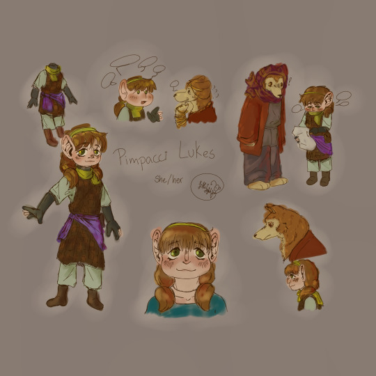
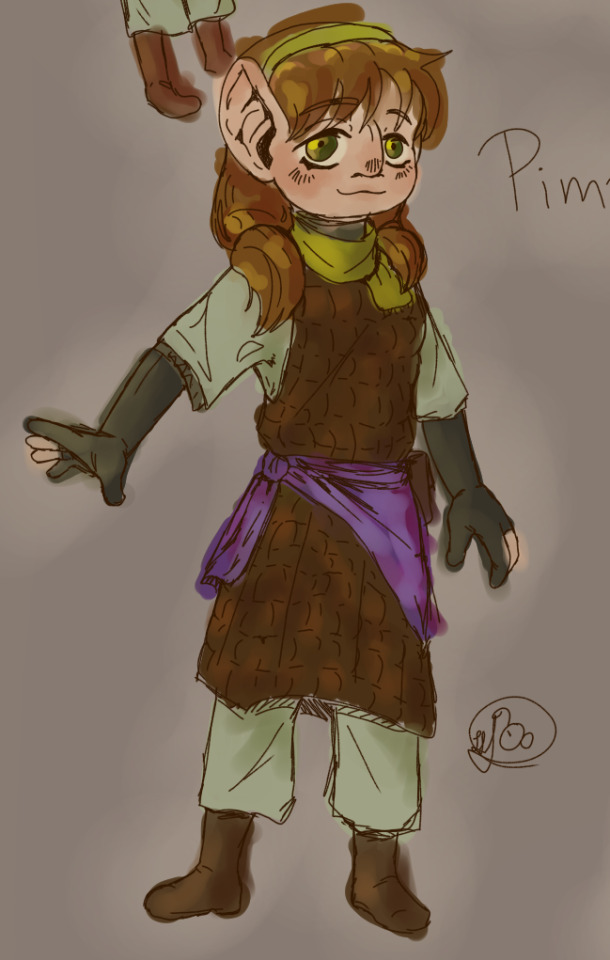
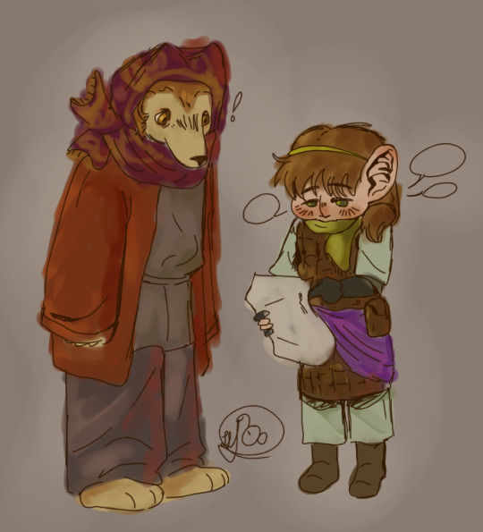
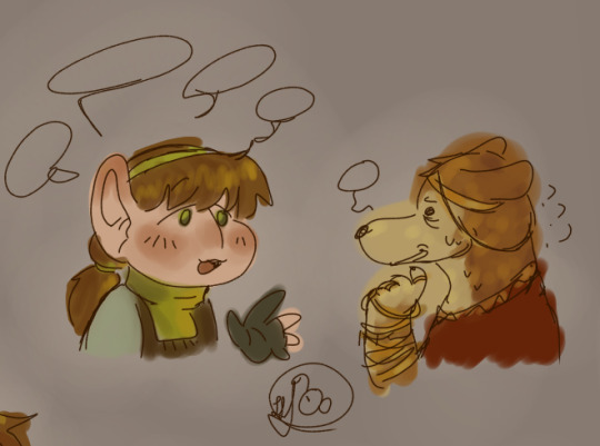
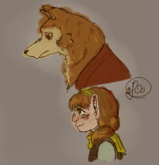
#dungeon meshi#dunmeshi#delicious in dungeon#dunmeshi oc#dungeon meshi oc#never thought i'd make an oc for a fandom again but here am i#shahad is so cool#she wears pretty jewlery#i love her design so much#but i hate drawing kobolds ooouugh i struggled but did it :')#they're so fwens#the divorced traumatized kobold and the little to-be braid she found while dungeoning#pimpacci can shut up when asked. for about 10 minutes at least.#i have 2 other dunmeshi ocs i made alongside her but i think Shaad would get along better with Pimpacci#because she's really kind and caring. but doesnt realizes her talking can get tyring/annoying.#while making her i noticed all haflings cover their necks on the dungeon. i wonder why. i gave her a scarf to match the thing#shaad#pimpacci lukes#i had so many trouble coming up with her name#i had to make it sound like two names mended together that don't tire the tounge because its too long to say it..#she gets really annoyed when someone calls her “Pim” because of cultural things.#also. she's often infintilized. many hafling don't know she's a mixed race. so she just looks taller and more childish than others her age#it doesn't bother her. she doesn't realizes most of the time. she doesnt infintilizes herself on purpose. she's just younger on perspective#yay#i need shahad and pim to have late night hours talks. it would be so interesting..#i should be asleep lol#my oc#my art#i've made a mistake on shahad eye colour... too late but... grr ...
32 notes
·
View notes
Text

desperately trying to remember the graphic part of graphic design (full drawing below cut!)
introducing my pop disaster, Marnie Williams Daydream! she's upbeat and cheery on stage but a nervous wreck behind the scenes, pining after her manager and wishing things could go back to how they used to be with her ex-best-friend... oh honey, you've got a big storm coming.

this was meant to just be a quick sketch to unwind so I started out using a base by @/albanenechi but then decided I wanted to change what the arms and feetsies were doing :3 then I realised that the sketch was actually pretty good already so I cleaned it up and went straight to colouring. I love skipping the lineart stage so much.
#infamous if#honestly figuring out the layout was pretty hard for me#since my classes focused on graphic design as far as it pertains to game art and assets which#well magazines don't come into that much#but I KNOW I covered a bit about magazines in Creative Writing and Business Studies when I was like.... 15-17#but it was fun! I mostly looked at Kerrang covers for inspiration but then went for a more colourful / less edgy look#since VeDa are pop aligned with bright cheerful vibes#I don't think it really looks like a *music* magazine but it definitely looks like a magazine of some sort i think#also don't talk to me about the headlines/featured articles. i was drawing a blank since chronologically idk where this would be#also I was never planning to use purple in the beginning. i just knew i wanted green stripey trousers.#and for the top i wasn't sure what to go with so I experimented with a few things and nothing looked Right until I hit purple#SORRY FOR THE TAG RAMBLINGS I JUST. I HAVE THOUGHTS Y'KNOW???#amy thank you for infamous happy two year milestone! i'm finally doing my first O run in celebration#sorry for that time i said scout's honour wasn't truly brit accurate. i did not expect you to see that post let alone the tag dkjghdkjgd
14 notes
·
View notes
Text
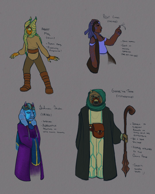
a handful of oc concepts
#hm i should make an original art tag#star wars#star wars oc#sw ocs#my ocs#togruta#tholothian#chagrian#tusken#ahkat mal#pelot lamin#sahnaa deven#ghaar'ak'tatoo#i. had fun with sahnaa's colors#i wasn't even gonna give her so much detail but then i thought what if she had a thing to mimic a long head tail.#and then i thought what if the thing included a veil to cover her eyes. for no reason just to look fancy. and then. there we are.#for the record her eyes are the same color as the base of her horns#also. she's the only one who is not (explicitly) a force-sensitive here..... sorry girl. you got fancy clothes as compensation.#i have been thinking about the concept of a tusken space nomad for a while which is why ghaar' is the most detailed of these#its metals are bronze because i think it looks prettier. also the blue rust goes well with the rest of its design#and it collects sands because sand art is a big tourist attraction where i live and i think it's cool and pretty#i'm filling their bedroom with bottles of sand in every color possible. i'm giving them a beautiful wall of sand. <3#pelot is. a manifestation of my love of blue accent in dark colors. and brown eyes <3#ahkat.... is just because i think togrutas look fun to draw. so i drew one#i have no idea what to do of him tbh. which is why the question mark. he looks too impulsive to stay a jedi
29 notes
·
View notes
Text

IMPORTANT UPDATE FOR BATMAN AND ROBIN (2023) FANS!!!...he eat a burger [ID in alt]
(taken from Nicola Cizmesija's insta, who's on art for B&R issues #5 and #6)
#ramblings of a lunatic#batman and robin#damian wayne#dc comics#''ladel are you gonna get obsessive about the character again and hunt down any and all official art of them-'' no what makes u say that#nikola cizmesija was the artist on the recent red hood gotham wars tie-ins btw! same colourist as those issues too#...idk how much dc tumblr is actually in to the production side of comics. i know i am but i have a feeling that's not universal#anyway i actually really like to know the individual artists colourists and inkers on stuff if i can it's fun!#anyway i quite liked the art in those red hood issues so i am :] excited for issues 5 and 6!#there was also a cover(?) defs done by cizmesija that has damian and bruce in like underwater batsuits? like they're wet suits#and they're fighting orca on it! and cizmesija mentioned getting to design new suits so! it seems like we're getting an underwater adventure#for that arc at least! the writer joshua williamson said that he's trying to focus the structure more around shorter arcs this time#so it seems like in the shorter breather arcs we might get little artist changes to break it up?? neat imo#i like a book w consistent art if I'm really vibing w the art but i get that a lot of ppl have mixed feelings on di meos art for b&r#so I'm interested to see what the reception will be to cizmesijas when it comes out in...i think January? same month as the annual#i saw a solicit that said the art for the annual was by Howard Porter but i could be wrong#god this got way off track. ANYWAY! he eat a burger#(also williamson has said before that damians a vegetarian so I'm assuming it's a veggie burger)
65 notes
·
View notes
Text

I had an idea in math today that I know will go nowhere but you never know

Plus a silly lil thing that I’m considering for a story of some kind
#art#X’s art#traditional art#AVE#a verbal equinox#cheska colombo#The idea is like a mix of the newest fnaf game cuphead and deltarune but it’s about getting lost in a spooky forest#And finding a circus that’s probably cursed (being based off of the cover and the theme of circus-punk)#It has references to the band everywhere and stuff referencing their later works#Like for will. the Tapeworms for Cheska. Unattractive for Mario. Enox (which I still have to listen to fake fan I know) Jon and#Whatever Jon does idk much about him lol#I need to earn pixel art asap#Also how to code#There would be different endings and all kind of creepy shit#Scared to post this on insta bc Cheska is there and she follows me and i think she sees everything lol#I need to make character designs!!!
8 notes
·
View notes
Text

Hey everyone go read seasons of change by @zscyber if you like long fics. Seriously.
I realize this is not for the last chapter but if I drew anything for that it would be me punching the lights out of Xanders so let's not
I already ranted about it in a different post but by God is the fic great! I can't wait for TDAD. Mostly because of James but there's going to be so much angst in general.
#nexomon#nexomon spoilers#nexomon extinction#nexomon extinction spoilers#fanart#art#my art#loving seasons of change#fic fanart#cybers#also to rant for a bit#man.#i loved this series so much#i used to not care about some of these characters#now i would murder for Nolan#i would kill for everyone actually#minus Xanders. Ziegler and Ulzar#(Amelie is unclear atm)#but seriously.#go read it if you like long fics#my favorite is still probably chapter 4 by principle#if one hasn't noticed i have a favorite and Nadine#(seasons spoilers)#and Nadine and Grunda helping her??? and her talking with her siblings??#100000/10 would recommend#Regina is also great#even if i want to throw that letter in a forest fire#she needs more hugs than she gets#also i put a shameless cameo of my n1 design/sona but finn covered it up which i think is objectively funny#nexomon extinction fanfic
13 notes
·
View notes
Text


The end of Quantum Foam Latte work!!!
The first slide is the first sketch I did coming back to this project, I kind of love how wacky they all look. The next slides have some of the first drawings ever of these characters when I began this project last year, for my final semester. I noodled around with the two girls alone at first, but Dr Allax found is way in as I tried to worldbuild. The silly draw-the-squad piece at the very end LITERALLY helped me create the story that I finally settled on HAHA. Never underestimate creating memes for the fandom population of 1 (yourself) when making OCs and stories.
#and with that we are done and i can stop remembering them LOL#get back in the back of my brain until i want to revisit you ~5-10 years from now#quantum foam latte#visdev#visual development#character design#original art#2024#i know these are ocs so nobody reallly cares about them? but i learned a ton from this project and the deadlines and constraints it set#and it confirmed that this is what I want to do with my life#AND ALSO im already I think sooo much better than these images show#obv especially these dumb sketches but even the polished pieces#maybe save for the cover i KNOW i can do better#ive been forcing myself to upload these so people can see them but i dont like them anymore#theyre just up to look at and to look back on#i am already leveled up from these BECAUSE of these. yeah#my art
5 notes
·
View notes
Text
on one hand I swore off throwing my hat into the ring of dndads drama after 2020 but on the other hand as a guy who had many many similar thoughts and feelings about the close family...yeah. obviously its not the same situation but I feel like a lot of people use 'its an audio medium' to excuse whitewashing which is like, fair to an extent but it is also not that hard to just change a character design when you find out or. idk. use common sense.
#sometimes I think about the link design I saw where he had like...straight hair....#like guys. the audio medium excuse works for Erin or whatever not the characters who are literally on the cover art#can we please be so serious here#also ignoring album cover designs is like when we wanna draw scary with different hair NOT ignoring an entire character is black#can we PLEASE be so serious#like you can change his design but you can't change his race like what are you on about#dndads whitewashing is part of why I dont talk much with fans of it online lol
16 notes
·
View notes