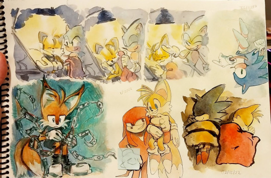
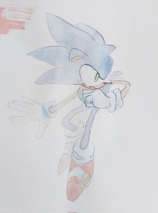
#this was first page in my canson sketchbook
Explore tagged Tumblr posts
Visit Tumblr Blog
Explore Tumblr blogs with no restrictions, modern design and the best experience.
Last Seen Tumblr Blogs


Fun Fact
In 2020, 44% of users from Denmark used Tumblr daily.
Text

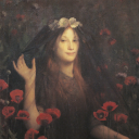
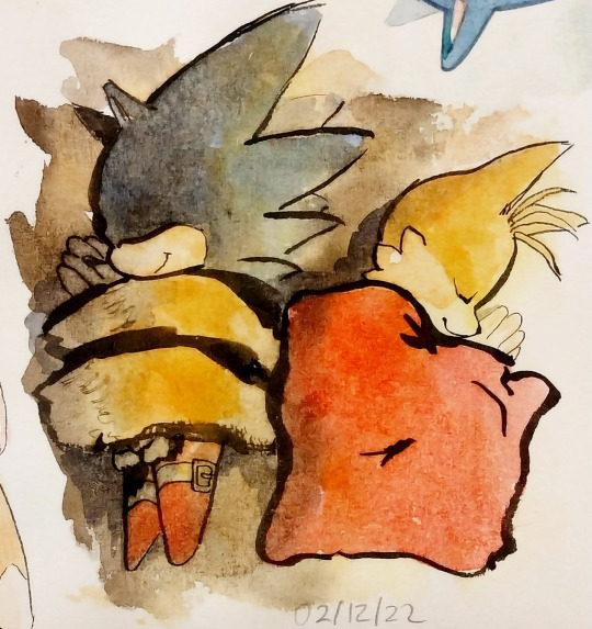
Another stillife.
Original photo by Svetlava Lebedeva (if I remember correctly)
#this was first page in my canson sketchbook#now I don't like it really much but still want to share#maybe bc I want to keep this page alive that's it#traditional art#amentet draws#artists on tumblr#colored pencils#sketchbook#traditional sketch#art study#stillife#still life#traditional drawing#sketch
16 notes
·
View notes
Text


my new sketchbook & the first page. i thrifted this book from the 40s, all the pencil on the cover has probably been there since before i was born. i learned bookbinding so i could fill it with canson graduate mixed media paper! the sticker on the cover i got at the farmers market from a local artist- Three Goblin Art! also the flowers were picked by my boyfriend's sister from their mom's garden so they're imbued with love <3 !
36 notes
·
View notes
Text
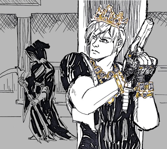
inkvent day 1
i’ve always enjoyed the idea that the reason loot doesn’t take up space in the briefcase is that Leon wears his wealth like a pirate.
(supplies talk after the break)

of course the first day of this calendar is some special effects ink that is impossible to photograph properly afffghhdddddcffffff
today’s ink, fortunes gold, is labeled as “chameleon”, which i guess means the shimmer in it is color shifting? if so the effect is very subtle, an orange yellow to green-ish shift depending on the angle.
while the chameleon effect does very little for me, i do really love the color. yellows are always difficult because they can be illegible, so i love a shading yellow-brown that reads as yellow but isn’t a strain to see.
BUT i was not going to try to ink the whole thing in this color. lololz no way. especially not with the sparkle.
so i went with an extra fine pilot desk pen and pilot parallel for the blacks and an uni emott pencil in yellow for the under sketch. i normally lightbox my sketch but these are supposed to be simple little sketches to test out the inks and not super involved…. i say as i plot out a full ass background. don’t expect this again if there are more of these!
i am so ready for this sketchbook from hell to be finished. i hate this canson ‘pen and ink’ paper so much. two or three more pages and i will be free. when your “no feathering” paper feathers all over the place when using an extra fine nib, you know you done fucked up.
#my fanart#leon kennedy#resident evil#diamine inkvent 2023#diamine ink advent#inkventspoilers#re4remake#you do not want to know where he is keeping the depraved idol#diamine fortunes gold#pilot extra fine nib
126 notes
·
View notes
Text

"Welcome to my world"
So, testing out some new black pens, and decided to experiment as a result. Making it the SECOND TIME OB Riddle was my test subject (first time coming to this blog soon)
Materials used:
Paper: Canson Graduate Mixed Media, A5 70 pages sketchbook
Black pens: Stabilo Creative Tips (most important two being the 0.2 mm one for the lineart and the brush pen to cover large areas such as the blot puddle)
White pen: uni-ball Signo
Red pen: Craft Sensations 48 dual fineliner brush pens
24 notes
·
View notes
Note
Hi! I saw your Hades journal and was immediately hit by Aphrodite, because I think I'm in love!!
Unfortunately, I'm not very familiar with journals, because I'm more of an artist than a writer. I have many questions. I hope that's alright.
On bindings: will the reusable cover lie flat without breaking the spine? Do coptic bindings always lie flat on the table, or only when using the center pages?
I've found that finished pencil drawings are much less likely to smear over time in bound notebooks than spiraled. Do you have any experience with this in coptic notebooks?
Finally, I haven't worked with the paper weight you use. Do you have any bleed tests? (pen, sharpie, highlighter). I'm assuming it wouldn't take alcohol markers or watercolors well.
Sorry for the long ask!
Hi there! I hope you don't mind me answering this publicly, but you had some great questions and I thought the answers might benefit other people as well.
So both the reusable journal and the coptic journals lay flat. That was a big deal for me - I hate fighting with a journal to get it to stay open. The exposed stitching means that they open completely at the spine no matter where in the journal you open it. Flat is subjective because if there is only a few sheets on one side and the rest of the journal on the other it's going to lean slightly. See the photo below of the coptic journal.

As far as smearing, I don't have a conclusive answer to that as I don't personally use them for art. I will say that because of the stitching, the pages don't shift up and down like they would with a spiral bound books. They are much closer to a hardback sketchbook than a spiral bound sketchbook in how solid they feel.
Finally, I use Canson Sketch paper in most of my journals. It's 65lb/96gsm with a very slight tooth. I chose it specifically because it has a good balance both for writing and drawing, has a good hand feel (texture is important to me), and doesn't break the bank so I don't have to charge an arm and a leg for my journals. You're right, it's not rated for wet mediums like alcohol markers or watercolors. Here are two photos of a quick pen test. The first is the front, the second is the reverse side so you can see the bleed/ghosting when the pages are stacked.


That being said, I'm always willing to make custom changes. So if you're looking for a thicker paper that's something we can do, just for a little extra cost.
I hope that helps!
And to anyone else, my asks are always open. I'm here to make sure you get the journal that is just right for your needs!
7 notes
·
View notes
Text
First Year Sketchbook Part 1
Sarah, #oncampusartnews, wraps up her sketchbook journey for her first semester as an art major, sharing the joy of completing one and the excitement for the next. #ArtMajor ❄️🎨 #MarywoodArt #FoundationYear #SketchbookJoy
Throughout my first semester here at Marywood University, I have been working on a sketchbook that I just finished. It is a 60-page, 5×8.5 Canson mixed-media book that allowed me ample space to explore and grow throughout the year’s first half. I included several things in this sketchbook, including fanart, original characters, and statue studies from my trip to the MET in November. Looking back…

View On WordPress
#Art#Charcoal#creativity#fanart#Foundation Year#Illustration#inspiration#Marywood Art#Marywood Art Department#Marywood University#Marywood University Art Department#original character#pen drawing#sketch#sketchbook#Where Creativity Works
0 notes
Note
Hi! I actually am wondering about trying watercolors for the first time but feel a little anxious haha.. how you go about drawing on the paper with confidence? Like, watercolor paper isn’t exactly cheap. I think I got the cheapest one avaible from Canson but still the anxiety is real… do you pick very light pencils like 2B so you can sketch veryyy lightly, or before sketching on the paper itself you do a planning sketch in another paper?
Im asking this cos I really love your art and it’s so cool that it’s mostly traditional! And the way you draw Tails is too adorable and consistent while being in your style, it always feels like you have confidence when you draw him.
oh i think this is gonna be a long one
all in all?i have the same anxiety as you. but i've confidense that i can make something good sometimes, but not that i will get it right every time. So i keep trying, but heres some stuff that helped
a warning though, i keep going on and on in this reply and can get pretty negative at times
my watercolor paper i use costs 2 dollars and has 20 sheets so that's 10 cents per sheet. which i feel helps with my anxiety... it's the canson multimedia block too, 140 msg .....
watercolor sketchbooks i'd find online were around 80 or more BRL, and then 20 BRL shipping.... that's 20 USD in total...
but a block of this plus getting it binded costs me 4 USD.....so i think that one [price] helps alot lol.....
as for the confidence.....

i've had enough time to do quite a bit of trad art, specifically ink and watercolors so im USED to the material and now quite as scared to "mess up" as when i first started it.... [hint, i still am] this is one example of a sketch page, they vary in size, and how "done" they are... i dont really worry too much about maintaining a rule of "everything in this sketchbook must be fully rendered " bc it ended up stunting my creativity

i did try the "sketch it onto a sketchbook and then pass it to watercolor paper" approach and tbh...? not really my thing... i've found that to me the first sketch always end up being looser than when i pass it on... i'm always more focused on getting the flow, composition and pose there than i am getting the right details or right lines or colors etc....
like this one, im more happy with the sketch, it's mroe dynamic, mroe fun
i DO sketch stuff on cheaper paper first when it's for trad art commissions though, just bc there i HAVE to make sure the client is getting what they asked
and i do use 2b pencils AND a "soft lead" mechanical pencil, btu tbh it's mroe bc of the feeling of it on paper than for the look of it...
here for example you can see the circle i used to have a basis on where tails would be.. i didnt erase it as i continued painting bc tbh it was just the sketch. i ended up liking it tho
i actually got quite MAD and angry at myself recently bc i noticed how much my sketches were looser in the sketchbooks when i did try the passing onto watercolors thing and i had a full on discussion with a fellow artist about daring myself to be bolder in the future, it has been working well

I sadly have to say though, that figuring out how to build confidense is more of a personal journey, and i cant claim that what worked for me [trusting my first sketch] would work for you.....
It's time, practice, trial and error....
OH, one thing though that DID help me. is:
-There's no art wasted, even if it doesnt turn out how you wanted it, you still learned something.
-Makins these personal art/fanarts isn't some school paper you have to hand it to be graded and then not get it back. You can re-do a piece as many times as you want until you get it right! I have quite a queue of pieces i plan on re-doing in the future bc i didnt like the first ones i did. im not perfect on confidence and i get scared of fully committing to drawings alot, many of them are pale not for choice bc bc i got scared of making my art too saturated and overworking it
i am about to get negative now so stop reading if you dont want to see that.
HERE NOW i's a alot of pieces i made that im unsatisfied with and plan on re-doing one day: too dull, simply way too watered
which led me to make THIS piece and do better colors
i hATE the way i did the lineart here. it's boring, the anatomies are wonky. it's a good concept but i didnt excecuted it as well as i wanted. but this piece has made me just go and try inking MORE so i could make up for it
which lead to this piece here eventually
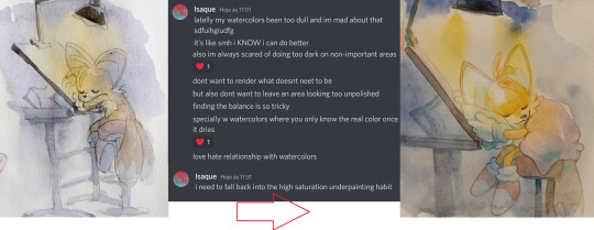
This one here.... the colors look so muddy it just makes me SAD, bc i had been so scared to use high saturation that i went with the muddier colors by choice, if i had allowed myself to experiment i wonder how happier i'd be about it
which led me to make THIS piece with softer in value and more saturated colors
The colors and blending of this one are too soft and not bold enough for what i had envisioned it, i made it as fanart of a friends fic and it made me feel like i failed my friend and insulted her fic when i finished this. I dont think the piece looks bAD, mind you. i know it looks cute. and good even. But i had such high hopes for it.

which led me to make this one
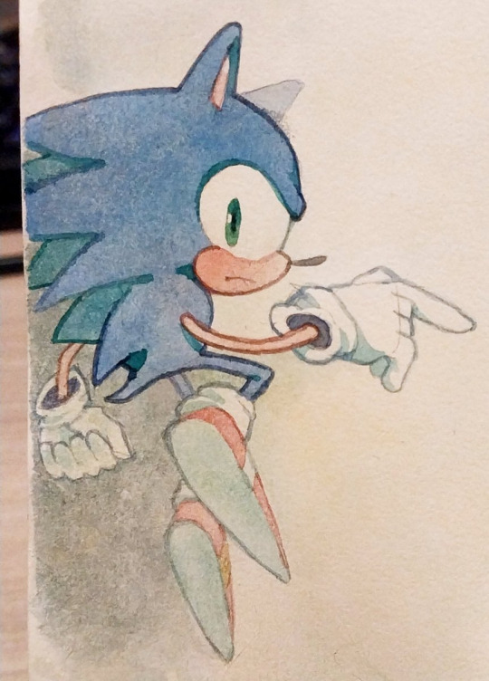
THIS ONE OH MY GOD HOW I HATE IT. sonics expression is SO creepy hes like a horror movie weirdo , honestly not my best work when it comes to anatomy

so i've been doodlin sonic now and then as practice so that i could make this one eventually

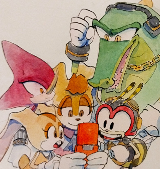
The perspective on knuckles could be better and the characters look out of place on this scene, the background is ok

but in this piece here i was able to get a better harmony between colors, background and whatever sparse linework i threw in

Theres so many more haha but i'll stop for now....
Dont get me wrong i dont ACTUALLY think those pieces are HORRIBLE horrible,,,, i see the flaws in them yes, but theres always something i like too, and i know people like them, and that people wont throw away a whole piece over one small detail that in the end doesnt even affect the overall thing....
i've just been getting into the headspace of "ok. at least this one is done, onto the next"
plus the whole thing i told you of realising my first sketches are looser....
sorry im not too good at talking about this and my points arent very clear, i dont think this is going to be quite the help you expected it to be because the truth is that the struggle with your art is soemthign that doesnt go away no matter what skill you have...
at times to me it feels more like a mentality practice than skill, reasurring myself that it's ok to get it wrong and try again, etc etc....
i used to go to therapy and one of the things we talked about was my perfectionism, how i used to be so scared to mess up a piece. that i wouldnt even start, and wouldnt draw for months. this has been going for years now and hey i've gotten better.
but..... yeah im in the same boat as you.... except mine is no longer just about the paper quality!
Sorry this got so personal now, i hope that this hasnt killed your hopes on getting better at the anxiety. it does get way better haha... trying to force your brain to not judge yourself so harshly is half the battle in my opinion, the practice of drawing is the other half....
good luck i hope you have fun painting, i know i do, i love the process even when i dont like the result, good night and thank you for the question
23 notes
·
View notes
Text


okay! not a catastrophe!
this is my first (complete*) attempt at bookbinding; a sketchbook/pad for my older brother, made out of a russian language dragonlance novel. you can see one mistake on the row of stitches; kinda hard to explain, but basically i went through the same area twice instead of moving up one like i should've. doesn't seem like it ruined anything though, and hopefully it all comes together okay in the end. 🤞🤞 i have a coat of glue drying on the spine, then it's time to begin the process of gluing this to the cover.
the paper is canson multimedia (the white pages) and strathmore artagain toned drawing paper in a few colors (grey, blue, pink, and yellow).
the little alabaster owl paperweight is named Piccolino. if you wanted to know.
*- i started a sketchbook for myself but that was shelved because a) i wanted to finish this one first, bc xmas and b) i stitched the individual signatures (the bundles of pages) together with the pamphlet stitch, as opposed to this technique which sewed all the signatures together at once, and i have yet to find a technique to sew the pamphlet stitched signatures together into a text block. so we shall see what i do with that.
#dig my tmnt work surface which is protecting the table#there's so much nerdery going on here#blogging on my blog#bookbinding
5 notes
·
View notes
Text
Sketchbook! My primitive first attempt at bookbinding:


If I attempted to make straight pages I knew I would want to set it all on fire, so I went with the deckle edge. Took apart a $2 hardcover book from the library book sale, and covered it in leather scraps. Paper is Canson mixed media 98 lb.
I was really proud of those ridges on the spine, whatever they're called, but I have now since learned how to actually do all this properly and I'm ready for round 2. However, I still adore this ugly child and I'm gonna fill it up with sketches.
#crafts#bookbinding#sketchbook#diy#craft#leather#deckle edge#canson paper#upcycle#The book I took apart was a glowing review of the Iraq war#shed no tears for it#dark academia#my crafts
6 notes
·
View notes
Note
Hey I can't find this in your FAQ so sorry if it's been asked before! Your traditional art is so stunning and vibrant, would you happen to have any brand recommendations for people trying to get into painting? Maybe specific gouche paint, brushes, papers etc. Thank you so much and have a nice day!
no one has ever asked me this before because this is like the first time ive started putting traditional art on my blog! LOL umm to be honest I’m very far from pro on this front, most of my knowledge comes from a handful of classes I didn’t pay a lot of attention to and lots of youtube videos but here’s my recommendations:
Paint

A lot of my paints are winsor newton designer’s gouache because this is what my teachers made me buy when I was a freshman at art school LOL. it’s definitely kind of pricey, I think it’s like $10.99 for a tube which I was NOT a fan of as a college student and is still not my favorite thing now. But they’re overall worth the price if you really want solid, high quality opaque paints. Though I’ve heard their student grade winton paints are decent as well?
I’ve heard less good things about brands like reeves and artist loft... but I think turner is alright? m.graham is supposedly great.
I also bought a set of holbein acryla gouache when it was discounted on amazon a while ago and have found it very solid. One thing you have to know about acryla gouache is that it uses a binder more like acrylic paint (hence the name acryla). Paints are made out of pigment + binder and most gouache is essentially watercolor but with extra pigment/chalk to make it opaque - the binder is water soluble so these paints can be reactivated with water. Acryla gouache is NOT water soluble when dry and it dries pretty fast so it’s overall less flexible. But other than that you can pretty much treat it like any other gouache and I find they keep a little better too, less likely to get gunky or stiff.
All paint brands have a handful of starter packs which are slightly discounted but if you want to build your own starting palette I’d say get a warm and cool tint of all the primaries, get a lot of white (working with gouache somehow involves a lot of mixing with white lol), and get a brown, maybe like burnt sienna or raw umber for underpaintings. No need to get a black, mixing darks builds character, looks better, and having one out of the tube can become a crutch. If you find a white watercolor paint tube that’s cheaper you can buy that instead of a gouache white. Again, they have pretty much the same make-up. And white paints are generally opaque enough that the composition between gouache/watercolor shouldn’t matter too much.
I’ve never used a block tray of gouache. Like those paints that come in little blocks in a tray? I know there's a bunch out there but I’ve never used them and I don’t know anyone else who does so I have no opinion on them.
Brushes
I’ve been kind of exploring this myself. I recently bought a cheap set of flat brushes off amazon LOL and I like them a lot?
Theyre probably not The Best or anything but I found flat brushes suit gouache plein air painting really well because its suits the kind of color blocking shapes I want to make. Also these had the right handle length to fit in my painting bag. That’s like the main reason I chose them tbh.
Honestly a lot of my art supplies philosophy is “give it a whirl with whatever you have lying around and when it feels like you're missing something specific keep an eye out for when that stuff goes on sale”
Paper
GOTTA BE HONEST I’m using cheapo paper. Because I’m making these paintings half for study and half to give my parents something to hang in the living room.
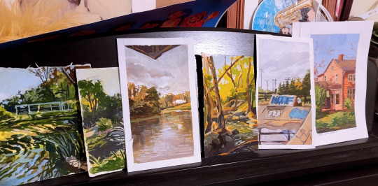
You can actually see some of them curling in on themselves here lol. If you’ve seen the sketchbook I’m holding in any of my pics of paintings it’s one of the canson mixed media books.

and its FINE... I wouldn’t necessarily recommend it lol.. I like that the texture is very fine but it doesn’t hold a lot of water and definitely distorts. Also I keep ripping off the surface with painters tape but that might just be on me. Oh buy artist tape. Just because its so satisfying to have clean edges.
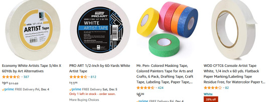
I’m using painters tape instead of artist tape because I found it in the basement but if youre buying supplies buy artist tape because it’ll be kinder to your paper.
SPEAKING OF PAPER.
I guess anything heavyweight for watercolor/mixed media will be fine? some people like a lot of texture but if you’re painting small you might want to avoid it and pick hot press over cold press. Honestly I feel like a lot of this is going to depend on what your specific needs are.. how big do you want the paper to be.. do you want a sketchbook or would you rather carry around loose paper... etc. Maybe go to an art store and touch all their paper. I feel like its easier to understand sizes and texture when you’re seeing it physically.
When I go on a trip, I normally bring a softcover heavyweight stillman & birn sketchbook because I tend to obliterate metal spiral books in my bag LOL. Also I don’t rip any pages out of my travel sketchbooks so I don’t need perforation or anything. Also they go on sale a lot in the art store I go to haha. I havent used gouache extensively in it but it takes inkwash/maker pretty well.

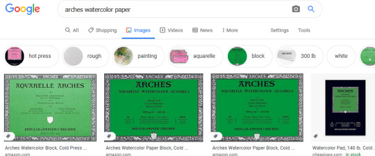
On the higher end, I personally haven’t used it that much but my friends who do traditional illustration professionally swear by arches watercolor paper. It comes in lots of different sizes.
Whatever you use, if you really want it to lie flat you’re gonna want to soak and stretch it on a board but I don’t bother with that because I am lazy.
Palette
You didn’t ask about palette but I’m taking the opportunity to be a shill because I personally use a sta-wet palette and I LOVE it.

One of the biggest frustrations about gouache for me was how quickly it dries after it leaves the tube. And even if you can reawaken it with water its not quite the same? and consistency is SO important when it comes to applying gouache so I don’t want to be over-watering my paint.. ugh. Anyways, I don’t have to worry about that with the sta-wet palette and really its been a game changer for me. sta-wet is a brand name but there are a bunch of other wet palettes not by masterson that I’m sure are just as good. I mean, it’s just a box with a sponge basically, that can’t be hard to replicate.
The only thing - and I personally have not had this issue but I have friends who have - is that if you leave it wet for too long it could grow mold? or a mouldy smell? Just wash your palette with soap and don’t leave it for weeks on end and it should be fine.
If you’re not feeling a palette that’s always moist, the best palette I used in school was a simple glass palette. you can buy one I guess but it’s so easy to DIY, I think the way we did it in school is getting a piece of glass and mdf from the hardware store cut the same size and then duct taped them together on the sides so it wouldn’t be sharp.
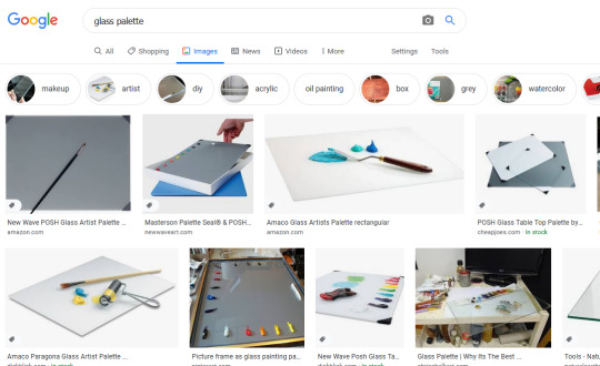
costs like nothing.
what else...get a palette knife if you like to mix paints? and like to save paints... mixing with the brush means you lose paint in your brush in the mixing process so a knife is a good way to maximize that process. I don’t use it much but sometime if I have to mix a lot of one color I’ll pull it out of my bag.
I don’t know anything about easels, I sit on the dirty ground like a gremlin when I paint.
Ok yeah that’s all the supplies tips I have. hope some of it was helpful! always try to save money with art supplies, I think. Especially if you’re just starting out - it’s less stressful to use cheap supplies too lol. Good luck! Happy painting!
89 notes
·
View notes
Text
Art Tips with Hawk 🦅🎨
Markers!
I guess I’m starting a new series! This is brought to you by @thedancingfobby who asked me if I had any tips for drawing with markers, so I did an all-marker drawing to show my process.
So in general, I only use alcohol based markers. For this piece I only used Artist’s Loft and Shuttle Art markers. I do sometimes use Copic but I don’t have many because they art ✨expensive✨ and honestly I only really like them for coloring skin.
Artist’s Loft markers have chisel and brush tips, Shuttle Art has a point tip and a chisel tip. I really only use the chisel side because it lays the most color down at once and is easier to blend with.
It also depends what type of paper you’re using. This is a Canson Mix-Media sketchbook, so the paper is thicker and a bit textured, so it will absorb lots of marker layers. Depending on the shade of color you use, you can sometimes see the pattern reflected in the ink. I do also have marker-specific paper by Copic which is very smooth, I just didn’t use it because it is much smaller. But on that, it’s a bit harder to blend for me because the paper doesn’t absorb as much ink.
So here’s the initial lineart:


I started off with Fox’s blacks because they were the largest section so easiest to do first. I didn’t actually use a black color though: I try to use a color that when layered several times will give shadows that match the darkest section. So your base single layer would be the highlights essentially.
The same goes for Riyo’s hair, although you’ll see I have to do something different later for her because I only have a limited amount of colors.


My advice with any markers you have: use a spare sheet and test what different colors are like when you layer them after different drying times. For Fox’s blacks, I waited a few minutes, so the shadow lines would be more stark since the layer beneath was more dried.
For Riyo’s hair, though, I needed to blend it all to make a new shade of purple/pink. So as it was still wet, I started coloring over it all with a bright pink.
The same with her face: the color of her arms is the basic base of her skin. I then use a lighter gray-blue shade to create the lighter blended section on her face. (It looks a bit wonky because it is still wet).
Then after letting her hair dry a bit, I took the same base color of purple for her hair and created the darkened shadows to her hair.

After that dried, I took the same purple and colored over all the hair to bring it to the mid-tone purple/pink I wanted.
For her arms and Fox’s skin I did the same technique as with Fox’s blacks. The blending is essentially just blocked gradients.

And then I just finished up with Fox’s skin and Riyo’s dress! (Fox’s hair I had to shadow with colored pencils on top of a brown marker base because my brown marker died.)
I also took my Sharpie pen and went back over the lines to make them bolder. (I like Sharpies as my liner because they don’t bleed against the alcohol markers! And they line well on top of the wax Prismacolor pencils too).
And here’s the finished art!

And just to show how much ink I’m using/layering: here’s a picture of the back of the page. Always make sure to have scrap layer underneath to keep it from bleeding further into your sketchbook!

So I hope that helped a bit! I’ve never really tried explaining my process or tips so this was challenging but fun🥰🎨
#art tips with hawk#hawk’s art#foxiyo#art techniques#step by step#alcohol markers#star wars#the clone wars#clone trooper art#riyo chuchi#commander fox#fanart#blending#skin tones#swpocweek2020
74 notes
·
View notes
Text
Thrifty Art Tips for Broke Artists
Hello! I’ve learned a lot about what works and doesn’t work in my four years seriously making art, so I thought I’d share some tips for any newer, broke artists out there. Feel free to add your own, and let me know if you disagree with any of these. I hope this will be of use and become a living document/reference for saving money when it comes to art supplies.
1. First of all, yogurt lids make fantastic palettes. Like, seriously. I might say they’re even better than what you can buy.
2. Ask your art friends for supplies they don’t use anymore before going out to buy them!
3. Particleboard, wood, and practically anything else you can find is cheaper than canvasses. Get creative!! You could also buy some more affordable canvas boards online, or paint over old art from Goodwill.
4. Try to find an art store in your area that sells used supplies. You can get some superb old brushes and whatnot in solid condition.
5. Don’t buy Copics. If you really want that specific brand and can afford it, go for it! However, there are lots of other alcohol markers that you can get for cheaper that don’t dry out as fast. You can get refills for them, but I’ve found that to be frustrating and not worth the money. A brand I’ve found to work well is Le Plume.
6. A good tubed watercolor set such as Holbein will get you many more colors and last you much longer. squeeze them into a palette and let them dry out before reactivating them with water. They will last you a really long time, and when you run out of a color you can just refill it.
7. DON’T USE TUBED WATERCOLORS STRAIGHT OUT OF THE TUBE. Let them dry out!! Please!! I swear, if I see one more person wasting their precious money this way...
8. Ink! a bottle of ink and a nib will last you much longer than Microns, and you can get a wider variety of tips. It also comes in many colors, is waterproof, and you can do some neat, creative stuff with it. If you really prefer pens, Copic inking pens don’t seem to dry up as fast as Microns. I’ve had one for a solid three or four years that is just now beginning to dry up.
9. Only buy a tablet if you’re absolutely sure it’s worth the money. I know some folks that bought them and only used them a few times. The iPad Pro is a fine tablet, but if you already have one that works, only get it if you have done your research and are absolutely sure it would improve your digital art. As for first-timer digital artists, try someone else’s tablet before buying your own. Make sure you like the style of digital art and are willing to put in the time to adjust to it.
10. Sketchbooks! You seriously do not need a hardcover sketchbook. Do not hoard them! Promise yourself you won’t buy any more until you have used up what’s in your stash. My personal favorite is the Canson XL Mix Media, simply because it’s versatile, has a good amount of pages, and is reasonably priced.
11. Don’t worry too much about having the best art supplies. I’m not saying go out and buy kid’s materials, but you don’t need a $20 pen to make some beautiful art. Get creative with what you have. Middle-of-the-road stuff that will last you and prevent frustration is often the best choice.
54 notes
·
View notes
Note
hey katz! what brands/kinds of sketchbooks did you use in your sketchbook tour videos? the pages don't seem to bleed through at all! thanks in advance :-)
I don't remember what the brand in my first sketchbook video is but I know it was just drawing paper and therefore very bad for painting-- the second sketchbook video is of a canson XL mix media sketchbook which I was Very fond of!!! it bleeds though if you use alcohol based markers but acrylics or watercolor is totally opaque. currently I'm using a Strathmore vision mixed media book which is the same for bleedthrough as the canson but I don't like it very much because of its floppy cover and ivory-colored pages.. the canson is one of the only sketchbooks I've found that is practically SNOW WHITE which I like a lot. so overall I rec the canson XL mix media-- alcohol will bleed but the rest should not. in my 2nd sketchbook if it looks like stuff hasn't bled through that's because I've cut and pasted a lot over the bleedthroughs or other imperfections lol! it's more of a scrapbook than a sketchbook -__-
17 notes
·
View notes
Text

Face #7
As I mentioned in my previous post in this series (I can't believe it's a series now), I'm attempting Ahmed Aldoori's 100 heads challenge. I'm very new to drawing faces, so I'm not putting myself on a time limit as the original challenge requires.
I also have a new sketchbook! This one is nothing special, just a Canson drawing sketchbook given out by the professor of my design 101 class at university on the first day. Apparently anyone who completely fills their sketchbook will receive a "special prize" (I'm guessing extra credit) at the end of the semester. If we count both sides of the paper, I have 120 pages to fill before mid-May, so wish me luck!
Materials
conté crayons
Faber Castell sepia india ink pens
pencil
eraser
Prismacolor firm pastels
This is the reference I used.
Self Critique
Positive: my boyfriend (a professional freelance artist who is much more skilled than I) says that I have a good grasp of value, which is encouraging. I think I got the shape of the nose pretty well-defined this time, and the subject's lips actually look like lips! Also, I like the shell of the singular ear I drew before I got too tired to continue (I "finished" this around eleven o'clock at night, if I remember right) and the dark spot between the brows. I'm getting better at adding highlights.
Constructive: I forgot to erase the pencil-marks around the eyes, and the eyes themselves aren't aligned properly; I don't know how to correct for the latter issue. In addition, under the right eye is this weird patch that's way more well-blended than anywhere else on the face, and I have no idea how that happened. The facial hair and lips aren't aligned correctly either, but that's something I can correct in the future with practice. I only rendered one of the ears. The highlight on the right side of the face just did not come out at all; I couldn't erase well enough to make them show up as brightly as they did in the reference - actually, none of the highlights are as bright/stark in this portrait as they are in the photo. I'll need to work on that in the future; I can try just not adding color to highlighted areas rather than going back and erasing color to create the highlight. I should attempt some sort of background next time.
#traditional art#conte crayon#scrawler jay's art#scrawler jay's 100 heads#sketchbook#medium: hard pastels
0 notes
Text
Sketchbooks
*Update 21/07/2018: Finally delivering this, sorry it took so long
This is part of the collection of sketchbooks I’ve got.
I have at least twenty sketchbooks for drawing and writing, and I gotta admit I’m very much of a sketchbook hoarder. This right here are the ones I’m using the most, recently, but If I’m ever to restart work on the others, I’ll submit it as part of this post. I’ll put a link to a drawing example to each one of them I don’t have plenty of fancy materials, just now that I’ve started getting extra income have I decided to invest in other papers, but still I’m all about saving and don’t allow myself to do silly work on quality paper, hah. Having expensive stuff doesn’t really do much if you haven’t learned stuff before, though of course, you should totally stop working with watercolors on 90gr bond paper, unless you want me to hit you, lol.

Leuchtturm1917 and Moleskine
I got the Leuchtturm while on my trip to Spain. Paper has a slightly creamy color, this particular sketchbook has very thin, kind of a book paper (80gr acid-free according to its label), but can endure ink (high ink compatibility in their words lol) rapidograph and even acrylic without bleeding through the page. Still with such thin paper I wouldn’t recommend to use ink/acrylic on both sides of a sheet. I think it’s more fitted for color pencils, pencils, charcoal, even pens and ink. But I love acrylics hah. Also, it’s thread-bound, like a book, which allows to open it wide, great if you like having your drawings scanned This is an example of the kind of drawing I make in this one.
You all know Moleskine probably so who am I to talk about it hah. I’ve used it very little and sadly forgot to take it with me to my trip, would’ve been a great companion hence the portability of its size. Paper is creamy as well and a bit thicker than the Leuchtturm, allowing to paint with acrylics or even oils (the one I’ve got doesn’t have grainy paper, it’s the soft acid free you get on the regular ones, but I think there’s a branch of the brand that’s fit for watercolor, not sure though). It’s also thread bound but it’s a little more spread-resistant, haven’t tried to get it scanned so far. This is an example of this sketchbook

I haven’t worked on Arches yet. It’s the most expensive “sketchbook” of the ones I’ve got, even with the discount I got from the store I bought it from (yas for Madrid and Tienda del Artista’s discounts lol). I got myself the “cold pressed” which is a finer grain, hence I like having some texture but not too much! On my papers. Great grammage, you can use this paper for just about anything, and one charming thing about this brand is that the sheets come pressed in kind of a black elastic thingy (great description right there huh) that prevents the paper from getting wavy with the wet layers you apply to it.

Only used this one once and I didn’t publish the drawing of it. Having said that, I’ve used canson and its XL bland plenty of times. This is a spiral sketchbook which can be tricky but this particular one has microperforation, allowing you to rip off the drawing without major problems or having to disarm the sketchbook all together. 300gr, cold pressed, fine grain, all things good. Watercolor runs free on this one (there are some papers you have to be careful with because once you’ve applied the color and it has dried a little bit, it’s d-o-n-e and layers will be visible af). Also great to be used with ink brush pens and markers, though it will absorb a lot of the ink.
I also have another one of this XL sketchbooks, which has the “d-o-n-e” problem, but I mostly use it with markers, and I recently finished the sheets. It’s thinner and has a different paper texture that I don’t particularly adore, but it works fine. This is an example

This one is a sketchbook I bought in a Florence museum. Doesn’t have paper description and it kills me because I love this paper. Slightly creamy, I use it with markers, it works great for layers though it’ll bleed, so it’s better to either put a thick paper sheet under the drawing while you work on it or rip the sheet (which is very smooth to do, they’re only attached by a thin gooey layer on the top, much like a post-it block. This is one of the many I’ve done so far

This was a gift from a work partner. It’s a Met museum gift sketchbook, 90gr bond paper, I work with ink and rapidograph on this one and it bleeds but not enough to get to the other sheet, which is weird hah, I like it though it doesn’t work as good with inks since the bond paper absorbs the wetness way too well and makes the edges look kinda “hairy” still, good one to practice slightly detailed stuff, and since it’s a beautiful sketchbook indeed (with a Monet as cover), I love it. This is an example

I’ve already used a whole one of these. Love everything about it Great grammage, enough texture for it to work pleasantly with, won’t “wave” too much if you don’t prepare your paper first (Like I do ‘cause I’m lazy with that kind of processes), works wonderful with plenty of techniques even though it says it’s meant for watercolor. Only thing is you gotta ..un-spiral? haha the whole sketchbook if you wanna get your drawings out of it. First time I just broke the damn thing and kept the sheets in a desk but you do as you wish. My manifestation series and this recent one are made on this paper}
This is it so far, I wouldn’t know what else to say right now, but thanks for bearing with me ♥
43 notes
·
View notes
Text


I have a nightwing flipcard commission to do... so as a cool down warmup exercise i tried out a new sketchbook by Faber Castell. Overall opinion? Do nooooooot use with col erase leads. Pens work okay, marker okay, and today... i discovered works best with an H type lead between 4hand 6h. Guess that makes sense.
In order of production breakdowns.
1.Middle picture was the costume breakdowns. I focused 100 percent on breaking down the costumes and not proportional accuracy, and did not erase the purple col erase. I also did colors before i did any inking. In the end made it very odd tones due to purple... but again this was tester page...figuring out how the paper responds.
2. First picture was done shortly after as cool down art. Significant difference. This time i went lighter on pencil and did all inks before i did any color (see last pic). Faber castell paper is crap with all erasers in my opinion and experience so far. Colors are less evident to see difference in due to this process.
3. Third pic was next mornings warmup. Very stiff, but again...focusing on 2 Nightwing costumes as a breakdown. This time. Pencils, then base outline inks... then colors. Then blacks after. Did my best to lighten col erase...but again on this paper not evident.
Overall results? I prefer pencil to ink.. because worst scenario i have a finished piece I can scan and utilize. The 3rd process overall is my go to for at comicon shows or personal commissions...even color testing. Because ive focused on color more im less inclined to put as much black... and creates a friendlier piece.
Wish B&N still were making the punctuate brand sketchbooks. Maybe ill try Canson sketchbook when this one is done.
Done artnerding. As you were.

1 note
·
View note