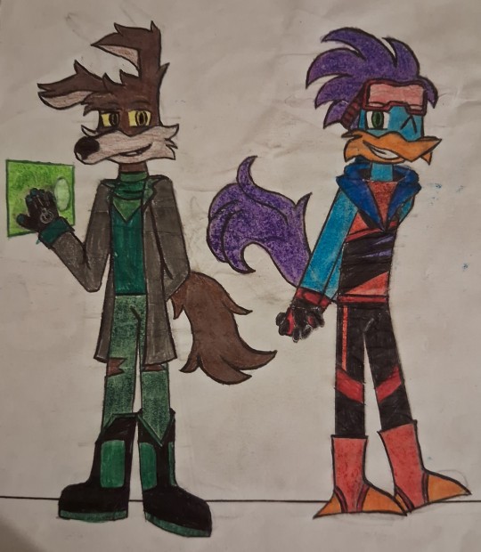
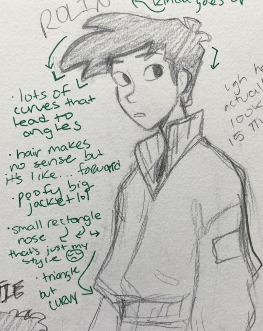
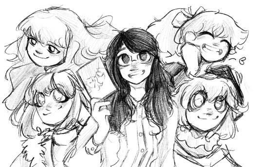
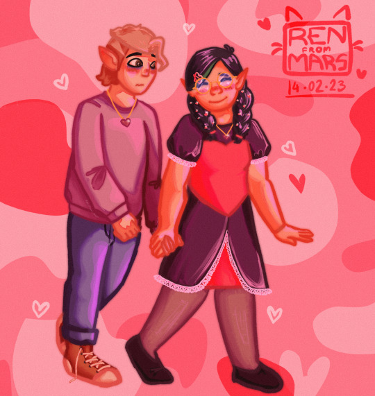
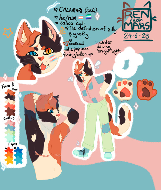
#this was a lot of fun and even though the sketch proportions are a bit flawed in raph it’s fine I’ve learnt some
Explore tagged Tumblr posts
Visit Tumblr Blog
Explore Tumblr blogs with no restrictions, modern design and the best experience.
Last Seen Tumblr Blogs


Fun Fact
Tumblr has a 66 index score for customer satisfaction in the US.
Text
You're out of touch
<prev [4/7] next >
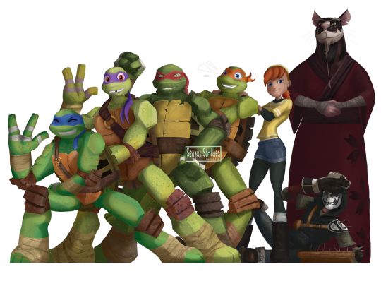
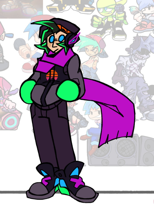
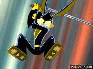
#TMNT#tmnt 2012#out of touch turts day#leonardo homato#donatello hamato#raphael homato#michaelangelo hamato#april o'neil#casey jones#hamato yoshi#master splinter#oh no theyve starting to evolve anime features! quick! SOMEBODY SAVE THEM#this was very fun to colour but strangely harder than the previous ones#its taken me over 18 hours ro do this one#with 13 hours being the shading alone#is this was a comission it have cost £133 but if i was paid minimum wage for my time it be £187.56#so £50 less.... may need to change my prices a bit#this was a lot of fun and even though the sketch proportions are a bit flawed in raph it’s fine I’ve learnt some#and I’m super happy with all the colours especially Donatello#I kinda rushed Casey a bit but he looks alright#any guess who’s next weeks version?
855 notes
·
View notes
Text
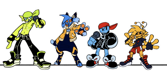
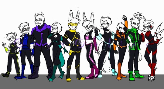
FNF CONNECTED UNIVERSE LINE UP Part 1: The Boyfriends
Chat. I spent 34 hours in this canvas. I am so tired.

Anyways, when I began working on Connected Universe AU, I already knew I'd be making line ups. Cuz I love making line ups and I also love suffering.
Close-ups and lots of yapping under the cut
THIS IS ABOUT TO BE A LOT OF READING IM SO SORRY-
Alternate Universe Boyfriends
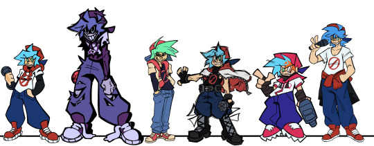
So all these guys, unlike the other BFs present on this line up, are actually BF but from different universes. They're the same dude.
I thought it'd be neat to display the fact that they're from different universes by drawing them all in different art styles. It was also a fun exercise to test my art style range.
So starting from the left, we got Base Game BF. The main universe one. He's drawn in my usual art style. Not much special about him. Boyfriend.XML my beloved. I will note here though that I did take some of the elements form my own BF design and threw them onto the AU BFs. So that's why they all have some sort of jacket/hoodie etc.
Then we got Yourself. I reverted to old tactics and used my sketch for his line art, which results in him having thicker line art in general. I also further distinguished him by giving him harsh black shading. He always has that. He already had it on his face, so I just gave it to the rest of his body too. Cuz silly. You. You could even say. Silly Billy- 💥💥💥
Then we have Funkadelix. Him and a few other BFs make use of the Blackburn brush for their line art, cuz idk I like that brush. I referenced the Mutant Mayhem style when making him, since in the Connected Universe, he's in the same universe as those turtles. His colors are mostly yoinked from the actual Funkadelix sprite. I think. I may have tweaked them a bit/eyeballed them idk. I prolly eyeballed them.
Then we got Monday Dusk Monolith (MDM). I really went with the mentality of "NO ROUND SHAPES" with this fucker. Just wanted him to look super sharp and scratchy, since that AU is literally dealing with an apocalypse. So sharp shapes just made sense in my brain.
I had a lot of issues settling on a style for Mix, so I just chose to take inspiration from the FNF loading screens, cuz it just fit in my brain, idk. His design also features present in my Pico design, like the stupid cleat shoes and stray hair lines. Yknow, since he's literally a mix of BF and Pico. He also uses Blackburn
Finally, HD. I decided to try and go for a semi realistic style for him, proportion wise at least. Cuz. Yknow. HD. He also uses the blackburn brush, but I also pulled an old tactic for him and made his sketch visible over his coloring. Cuz idk, I think it lends towards the vibe.
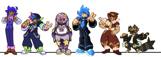
"Side" BFs
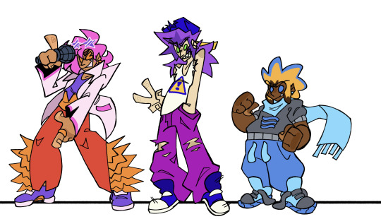
Okay, now we're REALLY getting into AU territory.
So from here on out, all the BFs are separate people from THE BF, and have their own names and shit.
So staring off, we got Blake. I was reading through his wiki trivia and saw them say his style was more "radical and funky" than base BF's. I saw the word funky and ran with it dawg. So that explains this clothes. I also tried my darndest to get rid of a lot of the BFs caps, cuz dude, I can't have that many fuckers having cubic backwards caps. So I gave Blake a pair of star shaped sunglasses cuz funky, chat, FUNKY. We decided that his stage name is Love Bird, and he chose that cuz that's a pet name his GF has for him, and if he had a band it'd be called The Birds of Paradise.
Then we got .XML. I immediately knew I wanted to give him a mullet. Look at this man and tell me he wouldn't have a mullet. Besides that, not much changed. Since he kept the name of .XML, I imagine he is actually related to BF in some way, and he just goes by his last name. They might be cousins or brothers or something idk. There's also more dumbass info on him here:
Then there's River, or G-Sides BF. I took a lot of inspiration from his teaser designs, cuz they were silly. Literally named his river after the dumbass river design on his sweater. I don't got much info on him besides that. I can't talk about River without including this image so here:

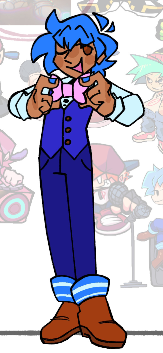
The New Yorkers
This group is literally named after the fact that they all live in NY in my AU. Technically, the Minus BFs should also be here, but they're their own group.
Starting with Bartholomew, or B3, I just took the shape of his glasses and ran with it. Chat I needed to get that shape language from somewhere. I actually drew him twice, since the first time around I really was not digging how I drew him. He's fine now tho. His ass only got brim, cuz he had to be different somehow. Other than that. not much changed for him.
Now Evan.. Evan gave me so many issues. Like, dawg I drew him three times. I kept on trying to make the orange in his upcoming design WORK but I just COULDNT chat i COULDNT
So, per @braveboiart 's request, I ended up getting rid of it entirely and replacing it with his blues and grays. They also gave me the advice of brightening the colors a bit, which was very easy for me to do, I love bright ass colors. I also touched up his design shape wise, since that was also lacking the first time around. So boom, zippers on the pants and baggy ass sleeves. I'm content with how he came out. Chat I did all his design touch ups while I was exhausted out of my mind. Sometimes you gotta be delirious with sleep deprivation in order to cook, kids, trust me (please do not be like me-)
Benjamin was pretty simple. Kept him soft, kept him round, kept him pastel. Got rid of the caution sign on his hoodie since .XML already had that, and just replaced it with paint splatters. Not much more to say.
With X's design, I got a lot of help from my good good friend @minxtheeenby , mainly when figuring out his hair style. Those braids are not actually his hair, and are fuckass cords that connect to his headphones and can move independently. Don't ask about the logic, I will not be thinking about it. He was born in Philly cuz of his fuckass white eyes. White eyes means Philly, I don't make the rules here.
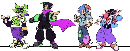
Minus BFs
The colorful critters, these guys are.
So. Beta. I had actually drawn him before this point, and he didn't change much from then

He has arrow shaped top surgery scars cuz I love giving constantly shirtless characters top scars and I just. HAD TO once I had the idea to make them arrow shaped. Main things to change since that drawing are some details on his pants and some of his colors; notedly the fact that his hat is a darker color compared to his skin to further distinguish it. Also Brave kept trying to get me to make parts of his design the same color as his nipples. So that happened /lh
Chat. I let my furry show with Blue. BUT CHAT HEAR ME OUT. On the wiki it's stated that he's a "Dog??". You think I could look at that and not go all the way? So yeah. Dog. He's silly and he got his weird ear ring things from his sister (Minus Miku).
Not much to say on Mean, he barely changed. I just drew him in my style and added a few details. He might also be an alien, idk.
Now, I posted about Golden a bit, but for those who didn't see that insanity: I made him an Alien Hominid. Cuz small yellow alien=Alien Hominid in my brain. Flawless logic. (Don't worry chat, I sat down and extensively researched the AH series to the best of my ability to check if it made sense. And I didn't see anything that would make it not make sense?) But yeah, silly. Him and Otis might be buddies, cuz goofy.
Who Fuckin Knows
These guys are just all the guys I had nowhere else to put. Miscellaneous group.
So first we have Bonnie, or Saturday Night Swappin' BF. He's another one that I had to go back and touch up. I actually touched him up the same night/morning as Evan. He ended up turning purple. The name we assigned him was an omen /j Chat I swear he was originally blue, I don't know what happened
HC that he just got really into FNaF when he was younger and has just been cosplaying a humanized Bonnie the Bunny ever since /hj
BIDU GAVE ME SO MANY ISSUES AND IDK WHY. It's prolly cuz by the time I got to him I was getting SUPER burnt. But I prospered and was able to finish him. And I don't hate how he came out, so bonus points there. Main change was replacing the prohibition sign on his shirt with a lightning bolt, cuz no one but BF is allowed to have that symbol, and Bidu already had lightning bolt imagery, so eh why not. His eyebrows being green, at least in my style, implies his hair is naturally green, and he just added the blue and pink, and I find that slightly humorous, idk.
Keith (StarCatcher) was another one I had to go back and touch up, but that's due to the fact that I was informed that him and his GF got a redesign before the creator deleted their FNF stuff. So I had to go back and fix my design according to that. I also leaned into the scape suit direction cuz SHAPE.
Now, you might be wondering, why is Flippin BF here and not with the other alternates? He was grouped with him in a previous post? Well, that's because after more assessment, I decided that Friday Night Flippin' is in fact, in the same universe as Base FNF and not an alternate universe like I had previously decided. So I changed his design a bit (mainly just getting rid of his hat and changing the color of his shoes) and boom. Different guy. He is staying pixel art tho. I do still need to come up with a different name for him tho.
Now this next one, Heath, is not from a currently existing mod, but from an FNF AU my friend Minx is making.

I decided to include him cuz he's silly and I love him. Their AU is canon to the Connected Universe.
Okay, so Cam (Hellbeats BF) changed A LOT. I let my furry slip out again. BUT I HAVE ANOTHER REASON FOR IT. See, in this connected universe, it's not just Newgrounds stuff that is canon. I also made other fandoms I'm in canon. So that means the Hellaverse is canon (specifically my rewritten version of it), and Hellbeats has to fit in with that. So I had to assign the characters species from that universe as well. So I made Cam a cherub, cuz I wanted him to stay short as fuck. He's also a raccoon cuz he's a lil shit and I thought it'd fit If ur curious, this is what everyone else is:

Okay I'm done yapping now. Gonna be doing the GFs next.
#CHAT IM SO SORRY THIS POST IS SO LONG#My insanity strikes again#ashedwings post#ashedwings art#fnf#friday night funkin#friday night funkin’#fnf boyfriend#fnf bf#bf fnf#boyfriend friday night funkin#fnf au#fnf mod#fnf mods#fnf headcanons#Ashedwings ramble#long post#ashedwings design
70 notes
·
View notes
Note
G'day, I hope you're doing well on this fine Saturday!
A while ago, I began writing and sketching a Dungeon Meshi OC by basing him/her (haven't decided, though I might take the liberty of making it a guy) on my own characteristics, continent of residence and my play style in games like D&D to see what race, country and occupation would best fit that description in the world of good ol' Dungeons & Diners. In all honesty, the parallels I drew are somewhat superficial, so I could technically bullshit my way into being one of many things, but it's been a very fun way to kind of craft an OC that I think fits me the most regardless.
BUT, I have run into an epiphany! I need a hero, a guiding light, an archiver of Dungeon Meshi trivia! I need someone to save me! Super Meshi, will you answer my call for help?!
You see, I settled on making my OC an elf as I drew the most parallels with them on all fields and so far my characteristics are translating over quite well, but the problem lies in the fact that I'm above average in terms of tallness, but I don't really know how much I'd need to shorten this feller to make him pass as a right proper elf, y'know? I have dark hair too, I suppose, but you already answered a question regarding that a while ago. However, I can't find anything here on tallness other than a chart for every story character's height and that Mithrun's teammates are all taller than average, which... well, almost answers my question! Almost.
I guess I could just wing it, but with how much thought I already put into this character, I felt it was a good idea to ask you this; how tall can the average elf reasonably be based on all the information we have? Is it at all possible for them to reach or exceed tall-man heights or would that be far too unusual? Lycion is roughly 170cm, but I can't remember if any elf is taller than that, and while I've perused a great many ancient scriptures in search of precious knowledge, I believe you might be the hero I need to solve this relatively minor conundrum that may not even have a clear answer! I think the question might be a bit silly, but I hope you'll indulge me regardless. You'd have my infinite gratitude! I uh, I prolly coulda and shoulda condensed this ask into a single sentence. Pleasedon'tkillmethanks-
TL;DR: How tall can elves reasonably be based on what we know?
Oh, while I'm at it—and I say this every time I'm here and will continue to do so 'til the cows come home—your blog is a blessing. A wonderful, nice-looking, tidy blessing. The fact you're maintaining all of this is a boon to all of us. Thank you so much for keeping this up! I hope you have a delightful weekend!
Hello! That's really cool! I thought about making a Dungeon Meshi oc based on myself too before (a dunmeshisona?) but then I didn't lmao. Making characters is hard
Anyway I think "how tall can an elf be" is pretty subjective cause even irl humans vary a lot. I think one way to guess would be to do what people tend to do with their ages and compare the average proportions??
Average Male elf is 155 and Average Female Elf is 150 Average Male Tallman is 180 and average Female Tallman is 170
I did some doubtful math and came up with *0,86 for male and *0,88 for female (that's for tallmen height to elf height, if you want to calculate from elf to tallman it would be *1,16 for male and *1,13 for female, both of them you can round up the result)
I don't think that's very correct tho cause using that math on the tallest elves, Lycion who is 170cm and Cithis who is 165cm, it puts him at 197cm and Cithis at 186cm as tallmen that doesn't sound right but maybe it is. (Edit: I got flamela's height wrong she's 140cm I was still asleep I guess, changing it to cithis who IS 165cm I double checked)
It probably doesn't really work cause tallmen average in dungeon meshi is WAY taller than irl human average (google tells me the global average is 171 for men, and the average where I live is even shorter than that) and also cause the height difference between male and female elves is really small, which fits with how androgynous they are in general, there's not much difference between male and females so as a tallmen might be way taller than you'd expect for a woman but for elves Cithis and Lycion being so tall is probably about the same amount of striking.
I ended up rambling but this might help somehow? or just make you even more confused. Anyway I wouldn't worry too much about how tall to make your elf, if I were to make one I'd just make it like a bit taller than average cause that's what I am irl. I'm really bad at explaining math but if you need me to I can try (I tried and ended up making the post double the size and I don't think it made any sense LMAO)
And thanks! I love reading your comments it's very encouraging!
#too bad we don't know how much taller/shorter they get with the changeling transformations#Height#longpost#long post#mahajio#barely woke up and I'm doing math am I back in school#oc reference#edit: I mixed flamela's age with her height I'm a little dyslexic so even when I recheck info like 3 times I still get it wrong
32 notes
·
View notes
Note
Hi yago! I read your tags! And I just wanted to take a moment to say: it is good that you're drawing things you both like and don't like! I know it's a bit discouraging, especially when you want to make weirder or more cartoony things, but part of building your art style is finding out what you dislike, just as much as finding out what you do like.
I love seeing your experiments. I love seeing how other artists think, and grapple with shapes and expressions and points of view. I realized recently I don't sketch very often? I don't draw a lot just for the sake of playing around. I normally draw as a means to a larger piece, and watching your sketches always makes me want to try to sketch more often myself.
Goodness, this turned into a ramble. Whoops.
In short: I'm sorry you're struggling with your art style! But I love seeing your thoughts, and I think your thoughts are stepping stones to something greater. I hope you continue having fun experimenting, and playing around with your art.
Stay awesome Yago 💜
AUGH THANK YOU 🥺
and i very much agree with everything you said. it's not a bad thing if you like some drawings less than the other, every one of them still helps to move you forward in way. even though it sucks when a drawing is not as cool as you hoped it would be x) we learn from our mistakes and stuff! not that a bad drawing is a mistake, but you know what i mean. every experience is a learning opportunity! sometimes it just takes a bit of time to realize that you're moving in a different direction. and it takes time to change course as well.
i dont think it's bad that im drawing things more "realistically" or at least with more uhm, normal proportions idk. generally it's a norm for artists to have many different styles they can switch between, and both realistic and cartoony styles are part of me and my skill pool. i just sometimes forget that i can do more than one thing and get hang up on stuff, and it feels like im trapped in one style even though I really am not.
about the sketches actually! yknow i noticed some time ago that i developed a habit of coloring every sketch i do? and it's not a bad thing, but it's certainly odd, and it used to upset me if i couldn't color something, it felt unfinished and not good enough. and I've been slowly trying to break out of this habit and sketch more and try to... loosen up? i guess? maybe to lower my standards or expectations for myself, something like that. it's very hard still but i can say im definitely enjoying drawing a lot more right now!
and im really happy that my sketches make you want to sketch too, i definitely know the feeling of seeing a drawing and just wanting to draw something yourself, so its very flattering :3
we should hang out in magma or something like that some time, just to sketch together! ive seen a lot of artists organizing those but they're always in the middle of the night for me hdhjdhs
thanks for the message Silver, you're super cool >:D
29 notes
·
View notes
Text
My version of Loonatics Unleashed (Part 3)
This is just my interpretation of this universe of "Loonatics Unleashed", don't take it as a summary of the series or as absolute truth to interpret your version. NO! It's just MY view and you have every right to disagree. Furthermore, there will be low-level words (even though I censor some) and there may be sensitive topics for certain people. Besides, this refers to the universe of Loonatics Unleashed, so for those who don't care, you can skip this blog, but for those who are a fan or if this interests you, you can continue reading. Part one of this blog is at the link below if you want to see it.
Part 1
Part 2
Hi I came back! And this time with bombastic news (And I hope no one has forgotten me at this point-). This time it's going to be a simpler blog because today, I'm finally going to show the Redesigns of the protagonists of my version of Loonatics Unleashed! For those who want, the links to see my journey through this madness are there at the beginning, I don't want to go into detail here because I'm really, like... VERY excited to show them soon! So, let's go!
Credits again to @drakepad-luv-200, who was the person who inspired me to make this crazy saga!
Protagonists' Visuals (Reinvented/Redesigned)
Let's go, I wanted to start by saying that this was one of the parts where procrastination came STRONG... Because, first... I had to consider their new personality, think about the pose that would represent this, the clothes that would have a heroic look and, at the same time, is minimally simple to draw... And that's not easy...TuT
So I had to get a lot... But A LOT OF REFERENCES!!! And in this I have to talk about two artists who inspired me and who I NEED to give credit to thank them for how incredible they are! The first is @onyxonline, who is currently making a Smilling Crittens AU called Space Riders AU (I highly recommend reading it). She also has her Loonatics AU and her visuals are AMAZING! I really like her style, something very Anime and such. She helped me a lot with some clothes.
The second is @theangrycomet-art, he, in this case, helped me a lot with the proportions and also with the bodies of some characters. His art is very clean and he made sketches of how they would look. I also highly recommend checking out his blogs!
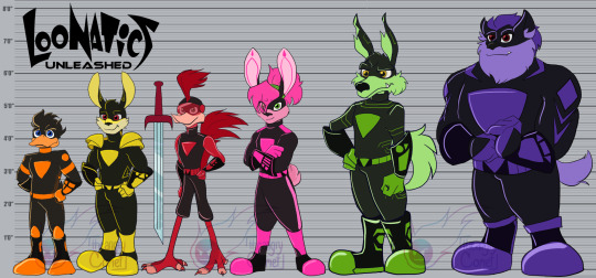
But now... Time to talk about MY Redesigns! Let's start with the Bunny brothers: Ace and Lexi!
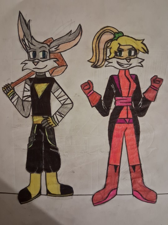
For Ace's design, I wanted to give him a pose of a somewhat inexperienced leader, "mainly protagonist" and who is good at fighting (even on the street), I put looser clothes and bands on his arms to symbolize him as a fighter.
As for Lexi, I gave her a cuter look that could show a heroine power. I gave them very long clothes and some extra accessories. This was one of the easiest.
Danger Duck
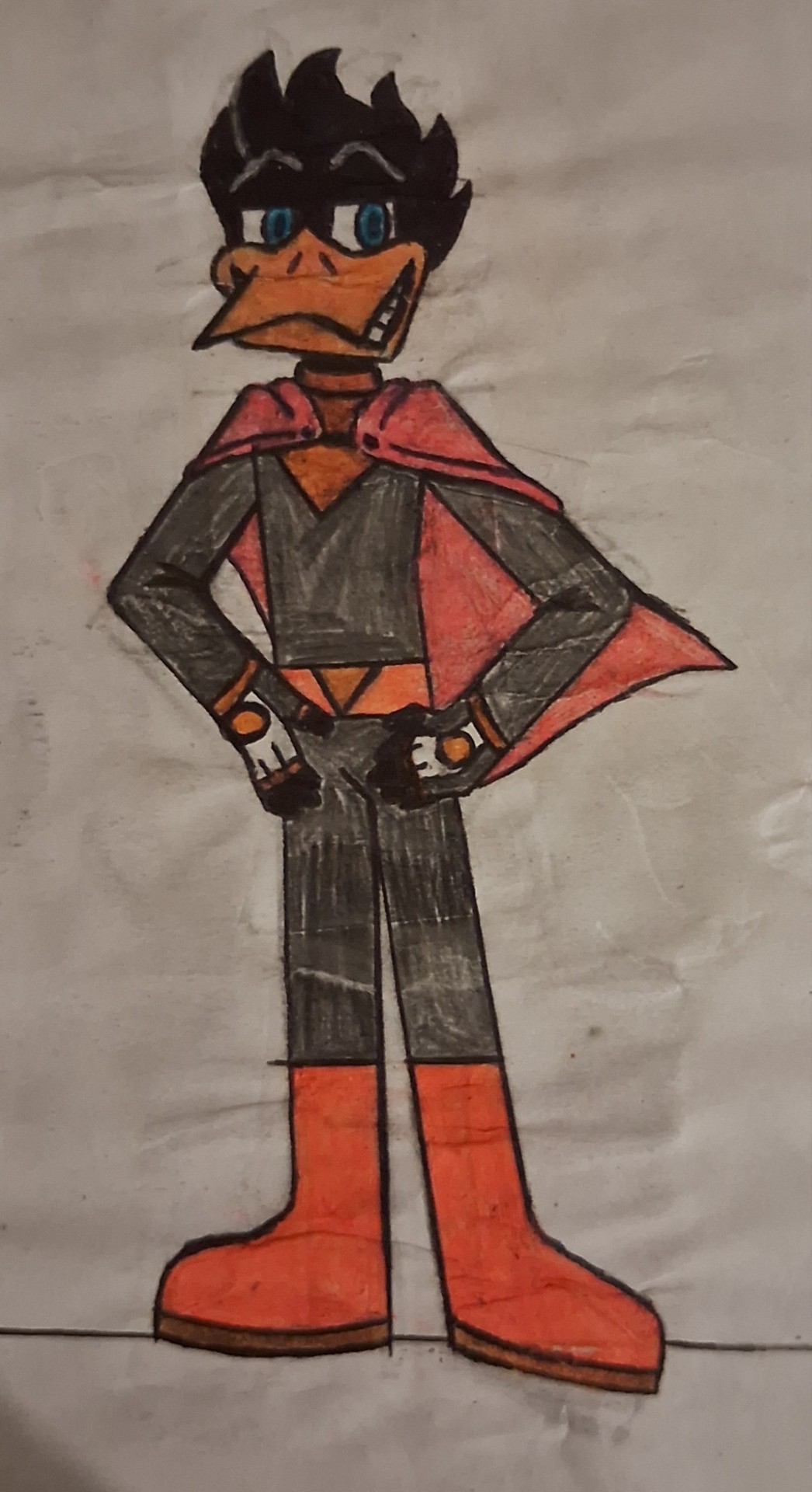
Danger Duck was also reasonably easy (the pose was difficult, but ok-), I took a lot of inspiration from Darkwing Duck (because the personalities even match and are really similar), a very arrogant pose, a calm one to symbolize that he is the "most incredible hero of all time". The beak wasn't difficult, because... I draw a lot of ducks...-3-)
Tech E. Coyote and Rev Runner
MY GOD!!! TECH'S MUZZLE AND REV'S HAIR WAS HARD!!!! But it was worth it, I think... The Rev wasn't too difficult, I picked up some references from marathon runners and a scarf and glasses to add some charm. Tech I mixed a bit of scientists, but also a more "Mad Max" look with the torn shorts and scarf around his neck, I also took the opportunity to show him wearing the glove and projecting a holographic screen.
And finally, Slam Tasmanian.
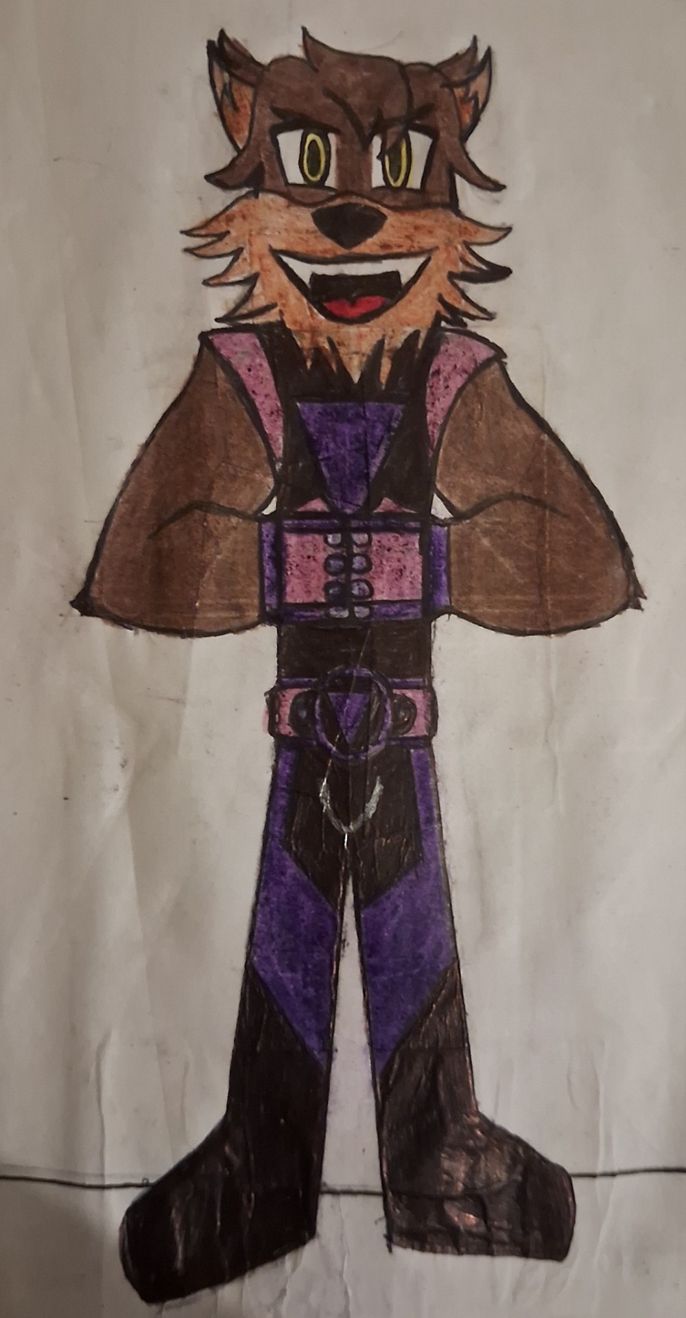
This one was difficult, but it was one of the most fun. I got the fighter vibe and also made sure he had a muscular physique, I made his fur simulate a beard to make him look older and I gave him some stylized gloves to give him something similar to boxing gloves.
Final Considerations
Well... That's it, folks! It was actually shorter because I wanted to talk about the redesigns (and because my life is pretty busy these days-). I'll still work on Zadavia and us villains, I'll also show two of my OCs that will be relevant to the plot, but that's for another day. I hope you enjoyed it and I’ll see you in the next blog! BYE!!!!
#looney tunes#loonatics unleashed#loonatics#lexi bunny#ace bunny#danger duck#tech e. coyote#tech e coyote#slam tasmanian#rev runner#redesign#alternate universe
46 notes
·
View notes
Text
The amount of stuff I’ve drawn last month could probably be counted on one hand.. </3 ah well. Also I need to get out of the habit of posting at odd hours.
Here are some Shadow the Hedgehog and Amy Rose design concept things I made like… 3 weeks ago. I like how I drew Amy! Shadow? I think I need more practice with him. His quills look too long to me and proportions look awkward. I’ll finalize his look eventually! I really love the idea of Shadow having some pretty wicked fangs but idk. I don’t like how they look here shape wise! I think I made them too thin! Anthro characters are a bit more of a struggle for me only because I tend to default to humanoids! Just gotta keep practicing!


Next is actually NOT Shadow! Well.. he is Shadow but not default Shadow. This is XHAOS, my Shadow-Kinsona! He is… incomplete. This was only an initial idea sketch. Not at all the finished product. Only things I will keep are the quills, the 7 limiters that are scattered around her design, and the multiple eyes. (2 on her wrists, 2 on his biceps, 2 on his ankles, and 1 on his neck.)
You may have noticed the terminology change by now! That is not an accident! XHAOS goes by He/She, though I tend to default to he/him due to his nature as a Shadow kinsona. Others can use either terms interchangeably or exclusively, idm!
I will def be taking off the eye-patch. I gave him an eye-patch for two reasons! The first was as a small nod to when I was little, needing to wear patches due to my impaired vision in one eye. The second was that XHAOS felt uncomfortable showing his face around others due to all the extra eyes! I found the eye-patch idea to be a bit silly tho since it makes him look like a pirate/gives him the wrong aesthetic and it doesn’t even do its job. You can still see his extra eyes. Plus he has eyes all across his body, making the eye-patch just not make sense. Instead!!! I’ll likely be giving him a mask of some sort and I will definitely be giving him clothes!! For an idea on clothing think Edward Scissorhands or the Magician of Black Chaos from Yu-Gi-Oh: Duel Monsters! So all black, full coverage, and a lot of belts/buckles! Dw tho!! He’ll get his air shoes too!
Fun fact, yes! He does have black arm abilities, like the doom wings! Though they are a little different than in canon! (Aka he has 6 wings instead of just 2)

#shadow the hedgehog#shadow#shadow the ultimate lifeform#Amy rose#sonic the hedgehog#shadow kinsona#XHAOS#I tend to pronounce it ‘zay-os’ but realistically it would be just ‘chaos’#either pronunciation is fine! both are canon!#his name is also in all caps usually as it’s the name of the government project#but lowercase Xhaos is also acceptable!!#gender wise—he is yes.#thought it would be fitting if The Ultimate Lifeform was both male and female!#the ultimate life form#the ultimate lifeform#oc#he is taller than canon Shadow btw!#like.. think Boom!Knuckles height or a smidge bigger#original character
16 notes
·
View notes
Text
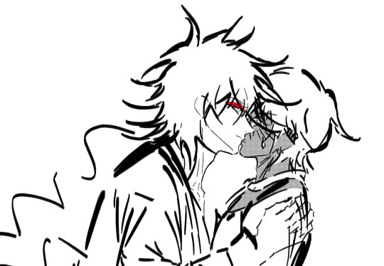
【Magi】 Judar and JuAli 🐈⬛🖤 ❤️ 💛
JuAli WIP doodles 🖤 ❤️ 💛
Quick doodles before I head back to my assignments
Been a while since I drew Judar and Alibaba together… I missed them!!! I hope to draw them more~
You can see the rest under the cut~
I wasn't sure if I should post my sketches here since they're so messy but I thought I might as well
I'll copy paste my old rambles too since I have more to add this time
2024 vs. 2022
(2024)

Comparison (2022 ~ 2023)
(2024)

Comparison (November 2022)
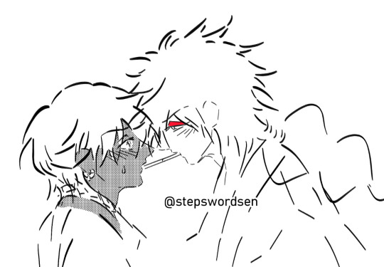
For the kissy one:
Wasn't sure which one I liked more tbh
1st one fits more...
Though for the 2nd one, I think Judar looks more efforted ADHSHDHSH
Since I excel at drawing meow meow mf charas
3rd one I drew in November 2022. The expressions are still cute in this one so I still like it, but my brush strokes improved a lot since then
For the hanfu Judar one:
Recent versions (+ the old one from 2022)
I've been playing around with the eyes~ I like these ones best. The eyes are bigger in the 1st one, and the others have them a bit smaller. The 1st one has a more innocent look. The 2nd has more slitted eyes and a "seductive" look?
Judar has sharp (tsurime) eyes and rings in his eyes, which are really fun to draw hehe 🤗
I'll redraw the hair soon! I just drew it quickly in like 5 minutes. It's finals season for me. I'm not fully free from this semester so I'm still quite busy, but you'll probably see small doodles from me 🙏
I'm definitely seeing art improvement (improvement in brush strokes and anatomy and proportions)
Ohtaka deliberately draws hatched lines near Judar's eyes to represent his eyeshadow 🤭 ❤️
I drew the hair quickly, so I didn't pay much attention to the shapes of the hair spikes so it's not as soft. But even with the quick doodle, the hair has better weight now. Once I get to refine things properly, I'll actually pay attention to the way his hair spikes are drawn.
I was recently rereading my old dialogue scripts from my JuAli AU and revamping them! I doodled Judar and Alibaba SO much in 2022. It's the Fire/Ice duality and Black Cat x Golden Retriever ship dynamic 🖤💛🐈⬛🐕
I wanna draw JuAli again soon and redraw my old doodles. JuAli is my main Magi ship so ofc I wanna draw lots of them~ I haven't gotten the time yet, but I want to draw my ships like AliHaku, SinJa, and KouMor eventually, too 🙏✨
Inspiration
Based on this black and red (Judar colours) hanfu I got~
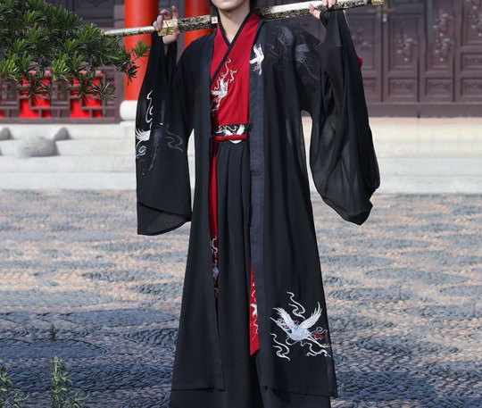
Judar rambles
I originally drew Judar wearing hanfu in 2022! Still one of my personal fave doodles ❤️ Judar is my fave (no one is surprised, I have the most obvious predictable tastes in the world LMAO). A meow meow mf perfect for my tastes.
Judar fits perfectly into the highly specific Sen-core niche that my top faves all tend to fall under - Meow meow mf. C*nty sen-core bastard cat who's violent, threatens people, and ok with murder. Bloodthirsty. Monochrome aesthetic colour palette.
Manga Judar has red eyeliner (?) and anime Judar has purple eyeshadow? Both are good, but I like Judar with red eyeliner since black and red are his theme colours! 🖤❤️ I like how the colours pop, the contrast against his design, and how it matches his red eyes.
In my HCs, Judar wears a type of hanfu called Ruqun (襦裙). Ru (襦) is the cross-collared top of a hanfu, and the wrap-around skirt is called Qun (裙). The coat jacket is called Da Xiu Shan (大袖衫).
I want him to wear black, white, red, gold, hanfu & hanfu earrings, with red eyeliner and black painted nails 🤗
I still need to pick my headcanon hanfu earrings for Judar... I imagine they'd be gold with red accessories.
I just have to refine the eyes, redraw the hair and hanfu, and then start doing the lineart for it! I love the expression tbh
Additional rambles
I miss my sons, I wanna draw my HC designs of JuAli (with Judar wearing hanfu and Alibaba with tanner skin, wearing traditional Arabic clothes), as a fix-it for the obvious colourism going on in Magi's character designs of SWANA and South Asian inspired characters
I bought black and red hanfu back in 2023. I based my Judar hanfu doodles on it 🥺❤️ It's in Judar colours. Black red and white 🖤❤️🤍 I'm so HAPPY to get something that reminds me of my fave 🥰🤭❤️✨ I got it from the Hanfu Story~ They have such a large selection of hanfu and they're all so gorgeous~
Basically Judar themed hanfu~ I love traditional clothes, so it's my dream to collect them! Now I can use it as refs to draw him with the poses and lighting I want teehee. Hanfu & huafu look GORGEOUS to me. I also have Việt Phục like áo dài and áo tấc~
The colours are amazing!! I love black and red combo 😭💖 It's way too easy to fall into the fashion hole and collecting traditional clothes but I definitely want more in the future!
Magi: Ch. 110 - 111, Ch. 196 - 197, Ch. 239, Ch. 288
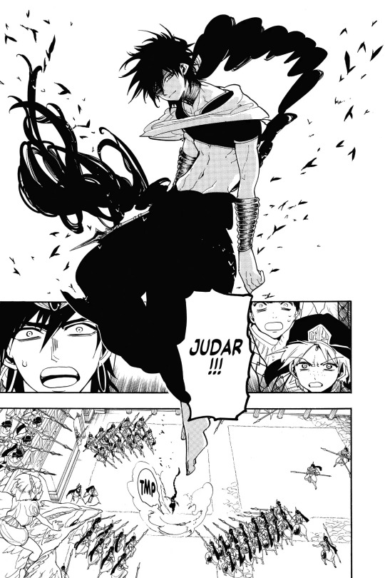
I love how Ohtaka stylizes and draws the shape of Judar's hair and braids. It's so clever how she simplifies the shapes. It just looks so good. It looks galaxy/tornado shaped… I love how the hatched lines above his eyes in Ohtaka's inking represents his eyeliner... ❤️
Judar's expressions from Ch. 110 - 111 are so unhinged… The Ch. 288 omake Judar is iconic. Fucking crazy ass LMAO 😭😂 Love you tho! 💞🫶
I'll be honest. I've thought about changing my PFP to this Judar again from the Magi omakes, like I thought of doing it as an April Fool's joke before, but I feel like no one would bat an eye cuz of how my faves are like LMFAO
Sen-core faves: Murderous, bloodthirsty, violent (or at the very least, has a disposition for violence), MAY eat people and/or their innards 🙌
JuAli core ship posts
And while you're at it, have the meme edit of them I made (1st image)
Anyways I made the 1st image's meme edit myself <33
Alibaba with tanner skin has such great visual contrast against his earrings~
I also wanna commission arts of JuAli at one point but I'd want to do it with my headcanon designs of them (Judar wearing hanfu and Alibaba with tanner skin wearing traditional Arabic clothes)
Art rambles
When I sketch, I draw out the expressions and decide which ones looks best (I either do it once or a few ~ several times) depending on whether I'm satisfied with it. I like the two most recent 2024 versions I showed~ The old ones are still nice... But I prefer the recent versions, because I think it shows how my art style and proportions improved.
These sketches are super messy right now so when I get the time I'll refine them more! It's just to make it consistent with my current style. I'm a little insecure about my sketches, so I prefer to keep most of them on priv for mutuals.
Since I'm not really a fan of the idea of my sketches/WIPs getting posted around when I'm bound to fix/refine/improve on them later when I get the chance to refine them. Though thankfully with my 2022+ lining style, my sketches look more "aesthetically nice" or "post worthy" to me...
Perhaps in the future... I do genuinely like my art style and I'm very happy with my art improvement, but I want to keep growing as an artist first. I want to reach the point where I manage to become more technically skilled and confident about my works (even my sketches)
Though since I posted the rest of the sketches under the cut, feel free to reblog them if you want!
#magi#magi: the labyrinth of magic#juali#judar#alibaba saluja#magi fanart#magi alibaba#magi judar#judal#magi judal#alibaba#aliju#judali#judaali#judar x alibaba#judal x alibaba#alibaba x judar#alibaba x judal#マギ#ジュダル#アリババ#アリババサルージャ#ジュダアリ#アリジュダ#stepswordsen#my art#stepswordsen art#doodle#wip
23 notes
·
View notes
Note
Heyyyy I just wanted to say not to care what that anon said about how you drew Grace's body because despite whether or not you intended to make it fetishy it made me happy cry when I first saw it.
Ive always been really large chested, and when I was a teenager it was an especially large insecurity of mine. I know it sounds stupid, but i actually got bullied a lot when i was younger and my large chestedness became yet anoyher yhing the other kids could poke fun of. It left me with a lot of issues, and though I've been getting over it now as an adult i almost never see my exact build in art and stuff in a way that's meant to look normal and not really fetishy. And even though its a little silly it always makes me a bit sad because it makes me feel like I look too weird to really be represented in that way. But I saw the sketch you did of grace, and she looked EXACTLY like me - it was kinda uncanny ngl. And I cried a little because seeing that my favorite artist ever drew a character I loved as also large chested with a super similar build to mine really made my day. I didn't see that sketch as fetishy because it represented myself, in my eyes. All of your art has really realistic bodies and bodily proportions, and that was just another way for me to see that you see people and bodies like mine as normal and worthy of being drawn and idk I was just so happy that whole day bc of it.
So yeah, I love your art and I know that making someone cry definitely wasn't your intention when u drew grace but I wanted you to know that!!!! Your art always brings me so much joy, and that's just an example :)
Have a great day and thank you so much ❤
Hey! This message made me feel so happy, thank you so much for leaving this here. And despite what that anon thought, me giving Grace "huge milkers" (a joke I did once and the anon didn't like it lol) wasn't based on fetichization, but more on my own body aswell! Something I clarified at that moment. The only difference within my body and hers is that her nipples are inverted!
People with these type of bodies exists, like you and like me. And maybe a hot take, but people lately have been using the word "fetishization" too loosely. Finding something attractive doesn't mean you're fetishizing it, I like big tits, I find them hot as fuck! That doesn't mean I will fetishize a person that has big tits, they're a human being that deserves respect and decency like anyone else, they just posses a physical quality that make them attractive to me.
I'm so happy you like my art and that you feel represented by Grace's body, really, these type of comments mean a lot to me dude!
11 notes
·
View notes
Note
I have a species in one of my stories that is essentially a humanoid, carnivorous pursuit predator. They have digitigrade legs with a large dewclaw used in hunting (think almost raptor like), long forearms, long tails and tusks/fangs. They're meant to hunt in small groups for long distances. Size and health of tusks and dewclaws also tend to be a status symbol within their species- with larger and sharper tusks and claws being a symbol of good health.
I don't think my design is the most realistic in the world, just because I like how my characters look as they are but I do enjoy trying to play with a more realistic version of them. I've been trying to separate them a little more from just standard humanoid monsters like tieflings (just as an example, they're not for D&D). Cause I'd like them to look very similar to humans while also being uncanny in proportion. My inspirations were cheetahs and extinct dromaeosaurids. I would love to know your take on something like this- and if you have any suggestions?
it sounds like a really fun design! I can't offer much in the way of specific critique without seeing it myself, but I can talk a bit about the matter of "looking similar to humans, but Different". first, let's identify the visuals that make humans look Human.

(image description: two simple sketches of a human. one from the side, one from the front. the sketches are labeled to point out various human features. flat face, short torso, upright posture, round butt, long legs, expressive brows and mouth, broad shoulders, dexterous hands, and flat feet with small toes. end description)
in order to have your fantasy people species "look human" they need to retain some of these traits. the easiest thing to retain is the expressive face, which is why even a cartoon animal can feel "human" without actually being human. dexterous hands also means very gestural hands. humans tend to gesture as we communicate, though the level varies by culture. this is why cartoon birds will move their wings like hands, it gives them that human-like expressive body language (though it often comes with the very unrealistic effect of having their feathers curl like fingers and personally I absolutely hate that. stop doing that. I understand why it's done but it still bothers me.)
The other thing of course is the skin. humans have little body hair and no scales or feathers, so if you want a design to look more "human" it helps to leave a lot of bare skin.
with all of that in mind, it's up to you to decide how many human-like features you want to keep and how far away from human you want your design to look. you can also check out my guide on making humanoids less human.
and for a little bonus example: here are a few of my own fantasy designs compared to a human.

(image description: four sketches of people comparing their different bodies. from left to right: human, elf, gnome, and quetzalin. the elf is the most human-like, with features more like a monkey, including a long tail. the gnome has a human-like posture but their features are more pig-like, including four-digit hooved hands and feet, as well as a snout. the quetzalin has a posture more similar to a raptorial dinosaur, with both wings and human-like arms, as well as a protruding beak tooth and a stiff tail. end description.)
i hope that helps!
10 notes
·
View notes
Note
hi hi! I really do love your art, but I would like to ask how you break down the body…? If that isn’t too much to ask!
Your work is a joy to find appear on-screen, and I like seeing it lots. I hope you have a nice time of day, upon seeing this.
Hello hello! Thank you sooo much for the kind words-seeing people genuinely enjoy my art means the world to me :D
Breaking down the body, huh? This is a fun complex question that I’ll answer aspects of so hopefully you’ll find this helpful ^^
Firstly, the most important step for me (and the one that plenty of artists get sick of hearing) would be references. By this I generally mean becoming accustomed to making your own references; references online work for plenty of people and that’s great! For me though, I like being able to shape exactly what the character is doing. Even if I don’t have time to snag/take a good reference photo, I’ll still use little aspects of myself while I’m drawing. Aka, flipping myself off for the purposes of making a better drawing of a character flipping someone off LMAO.
Another thing I recommend for those early stages of shaping the body would be thinking of every aspect as it relates back to the others. How far down does my arm go in relation to my torso? How big is my hand compared to my face? This is another reason why having your own body rocks because you can check these things pretty fast. Once you have the basic proportions down, it’s easier to shape each characters body type individually.
Speaking of body type, it can also be helpful to draw all the littleeee aspects of the character’s body type in the sketch-even if it might get covered up by clothing later. Things like hip dips, color bones, or anything that gives the character shape! Sometimes it can be a bit frustrating to draw something only to have to cover it up, but it helps me figure out how the anatomy of a specific character will look or how clothing with go over it!
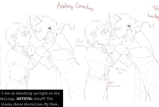
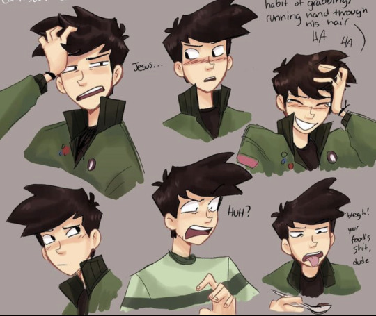
Luckily because I have to do a bunch of progress explanations for class I’ve got examples! Here’s one of me thinking about proportions as I mentioned earlier. John’s shoulder is also a really good example of me going “hey I think he would have sharper shoulders, lemme make sure I include that in the sketch” which actually ended up affecting the final result since his jacket is fitting enough to show that shape :]
And hereeee is an in-depth breakdown of some processes I did while making a piece! Arthur’s pose is a good example of me using a reference. A friend did it for me, I took the shapes of each part to create guidelines all around, and then I could play around with them to get it where I wanted it!
Welp, hopefully I didn’t bore you too much with my long winded explanations! I love yapping about this stuff and have tons of progress photos in my album,, but I think that’s where I should leave it off :]
Feel free to lmk if you have any questions!!
#sighhh. yeah I ended up using malevolent to help me explain myself#what else could you expect from me honestly#art stuff#ask
3 notes
·
View notes
Note
Hi! Sorry for all the notification spamming, I just really really adore your art & the way you draw characters. It's so cool how recognizable all the characters you draw are, like their features/proportions/style idk its amazing. Do you have any tips for how to make a character consistently recognizable in drawings? Also, methinks Tim as Stray would be so much fun in a TimKon relationship, would you maybe pretty please consider doodling a bit of what you think that would look like?
Your brain is galaxy sized, your art is fantastic, and I hope you have a wonderful day<3
Ty! I’m just going to answer your first question, even though you asked forever ago 😭 I’ve drawn stray Tim before but we’ll see if I’m up for drawing it again
Anyways, as for making characters consistently recognizable, I think it helps to make character sheets.
Using my ocs for example, when I redesigned Rolin in my new style, I knew I wanted to have a very Shapey look, so I’d write notes on things such as: how the cheek should curve, what the nose shape is like or how many Fronds in his hair he should have lol
As you can see, I even have arrows indicating the motion of the lines. If you’ve seen some of my posts of my redesigns for the dc characters, sometimes you can see notes in them too. Sometimes I write them, and sometimes I just catalogue the set of “rules” I create for a character in my head.
So yeah, for further example, I knew keiko had to have softer shapes to contrast her with rolin’s personality. I can’t find it, but I have a page in my sketchbook just working out the shape of her hair, which was initially supposed to resemble a butterfly 🦋 but then I made it have boxy angles. Whenever I draw them, I guess I go through their Individual checklists in my head.
Like for rolin:
-more sharp eyes, in an almond like shape. Check
-cheek is curved but “steeper” and leads to a somewhat sharper chin. check
- I usually have to redo the nose a lot but once it’s in the right spot for me I check that off ig
Or for keiko:
- rounder, bigger, more oval like eyes. Check
- hair bangs should start a little to the left of the middle of her forehead line, then to the edge of her ear. Check
- her cheeks should be squishy and round, and she should have a smaller face with her features more closer together. Check
And so on and so on, and the character sheets help because then you get into the practice of doing those same lines over and over, and at different angles or expressions. So even though I want to stretch their face as they contort their facial expressions, I still follow the same structure and adjust accordingly to keep their form, if that makes sense, I’m not perfect at it but I like to think my designs are at least distinct from one another and consistently recognizable
And this is a recent example, which I haven’t posted on tumblr yet bc I have yet to color it, but this is me trying to explore barts design and making sure I could still make it look On Model despite the different facial expressions.

So in summary my strategy would be to
1. Sketch and explore the character design, write notes and study what lines or elements work or don’t work
2. Create a list or repository of the essential elements or a set of steps to recreate the same design
3. Practice and make a sheet where all you do is actually recreate that design over and over again, until your hand can just do it without your brain having to recall the steps one by one , if that makes sense
Of course, I like to redesign all the time as well but I try to at least capture the character’s essence 😗
95 notes
·
View notes
Text
Harrier's short guide to drawing
Hi!! My name is Harry and I've been drawing consistently for about 5-6 years. And uh- I wanna show a basic overveiw of my process!!! then here ya go https://www.tumblr.com/bloomburnweepwilt/758926600395980800/oh-look-its-ameliedoree-her-videos-slap-go?source=share
Also go watch Amelie Doree- thats who this drawing is a fanart of.
1- Getting your rough down
The first and most foundational step is getting a basic layout of your drawing, before you do anything you have to make sure you get a good idea of what exactly you're drawing. This is one of the few parts of drawing that you don't just have to ram yourself into the wall with practice to get good at. You just have to play around and have a fun time and look at the art you like to see what compositions they use.
My roughs are relatively clean because I have a lot of experience with this art style I use and I don't need a lot of guidelines. If I was doing furry art, realism, a western comic book style, or even something more simple like a gravity falls or owl house inspired style I would need a lot more guidelines because I'm not used to the parameters of the style. Though if you're just starting out then no matter what you do you're gonna hafta build up a lot no matter what style you go for.
2- Sketching/Lineart
For me my process has evolved to where I carve out my lineart from the sketch directly. But this is where you have to just put in the hard work and time into building your skill. I don't have any particular advice on this end besides follow your bliss, do gesture drawings, and make sure you have measurable goals.
If you want to take inspiration from my artistic inclinations specifically, then keep your lines loose, try to have decently realistic proportions but don't stick too hard to them. Especially if you're drawing a fictional stylized character and not a character or person with a real flesh face where you have more room for conveying likeness. Also sketchy loose lines are pretty much always look better, it allows your art to look more lively!
3- Get background colors down
Nothing much to say here, you just need to do this so you get an idea of what the rest of the colors will feel like. It doesn't have to stay the same color but getting the vibe down is important.
*also normally I wouldn't use bright white for a masking color, but because I want the art to be very bright and colorful so I decided to go with white.
4- Flats
Another thing you kinda just have to learn and get used to. If you feel like your colors are just a bit too disonant, use your programs hue slider and move it just slightly left or right. Its a really good way to get everything feel cohesive while also not loosing the core pallete.
6- Linessssssss~~~~~~
For me this is where all of the life of my art comes from, its where i get to be super loose and impressionistic with my stuff and I get to color up the thing. A lot I'll go with "unexpected colors" in places because those unexpected colors can add a lot of texture and life to your art but this is meant to be pastely and fun so i decided to go wit more conventional colors.
7- Add coloring layers on top for final adjustments
these don't have to be super obvious and noticeable, but often the right mix of overlay and multiply layers can make a piece look better.

And thats basically the whole process. Add and remove what you want, I just wanted to share since Baby artists sometimes don't have a realistic idea of how art gets made and having a step by step can be useful.
#art#harrier du art#art tutorial#amelie doree#art education#artist#digital art#youtuber fanart#this took an hour and a half but dont expect your art process to take that short a time quickness is a skill#ayayo san#gore screaming show#16 bit sensation
3 notes
·
View notes
Note
Hey! I'm a really big fan of your art and I have a question. Do you have a certain process for drawing hands? I've been trying to get better at it since forever and maybe you have some tips bc yours are awesome for a beginner :D
:O THANK YOU SO MUCH! Hands are like one of my only artistic talents that I just had beforehand so I'm more than happy to show you my process! I have no official training by the way, everything I'm telling you is just stuff that I've learned from drawing them and observing them.
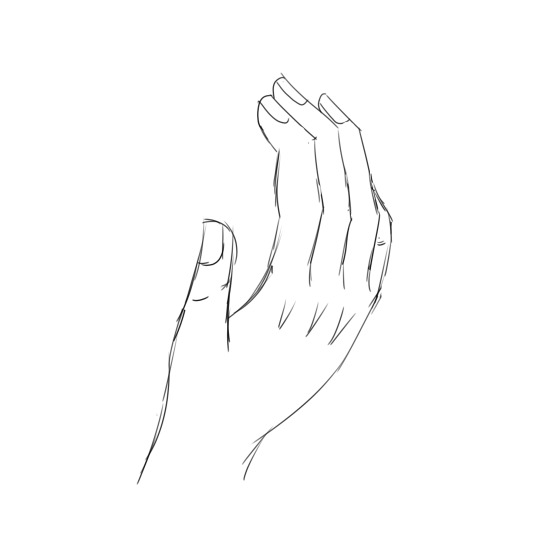
This is a simple sketch that is eventually going to turn into something for Taddy, but it will do for right now! I'm going to walk you through how I sketched this.
First step: ALWAYS ALWAYS START with the outline of the three big fingers. These determine the proportions of the rest of the hand. Where you might be getting tripped up is trying to draw the whole pointer finger first, and you should not do that. Doing one finger and then another one messes with the proportions; it's much easier to fix three lines than it is to redraw the whole finger. Make sure you curve for the knuckles!
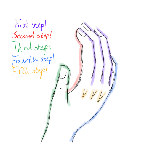
Second step: In this picture, only the index finger and thumb are fully visible, but if the others were to be visible this is where you would draw the rest of them. You should have three distinct sections, and those sections should be CURVED. Your fingertips have a very unique curve to them and it can take a few tries to get it right.
Third step: the thumb. I hate doing the thumb. This one might take you a bit because the thumb is always smaller than people think it is. The tip of the thumb should come out to just below the first joint in your index finger. The line going across the back of the hand should always be over the one coming down from the fingers. Your thumb is also not flat; it curves inwards and then back out as it goes down to your wrist. It should only have two sections!
Fourth step: the pinkie and the "back" of the hand. PINKIES SUCK EVEN MORE THAN THUMBS! I normally choose hand positions that don't feature the pinky because I hate drawing it. But cheat sheet: the pinky never extends past the second joint of your ring finger! Your pinky still has three sections, just smaller than the rest, so the second joint of your pinky is roughly level with the first joint of your ring finger. The "back" of your hand also has a slight bump to it: the pinky curves out and then it curves back in at the wrist. The transition from back of hand to wrist isn't supposed to be smooth like it is from the thumb.
Fifth step: knuckles! This one can be ignored if your art style doesn't do knuckles. I choose to do little v-shapes like that or just bumpy lines whenever I feel like being extra, but they're always pointing downwards and they're bigger than you think!
Some extra details that might be helpful:
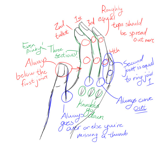
A bunch of the stuff above I already mentioned, but for the ones I haven't mentioned...
-The skeleton lines you drew at the beginning should always curve away from the thumb. Not by a lot, just a little!
-The top joints for the three fingers are roughly equal with the index and ring, but the middle finger top joint is higher up. The second joints are all roughly level with each other
-Middle is tallest, than index, than ring and finally pinky. The thumb is shorter than the pinky
I think that's it? I've never really done an art tutorial before so let me know if I need to explain anything else! This was pretty fun though :D
9 notes
·
View notes
Text
I’ve been doing some reflecting on this past year, and I really truly think it is the most artistic improvement I have made in any span of time. Of course, I’m going to be completely insufferable about it and have collected my best piece from each month with a few personal notes, so why don’t we go on a sprint down memory highway together?
January
At the start of the year, I was both adrift between fandoms and art styles. I was mostly aiming to find which style I could keep using, finish pieces quickly yet still feel proud of. It certainly worked in the moment, but as I pushed my boundaries more it didn't stick. Still, I look back on this style fondly! also proper throwback to my old username that i had for far too long
February
This was the start of me working on colour palettes. I lay down my main colour in the background and fit the rest of my colours around that. It was a good way to start experimenting!
March
Then the shift back to finding my style- I particularly like how the hair turned out in this piece! I also started trying more interesting poses here, and actually properly attempting hands.
April
I didn't finish any pieces in april as I had started working more hours and didn't quite know how to balance myself creatively at that point. I did lean into this style of sketch much more, which was good fun while it stuck around but ive leant away from it in more recent times.
May
Not much to say about may in particular, lots of the same things as the past few months with improvements here and there! just some steady progress :)
June
Cue the crunch of getting character refs done before artfight, and then only actually finishing one (which isn't actually complete, even to this day). But hey, more solid reference for My Guy ! I also leaned into drawing furries a lot more and have improved heaps in the difference of proportions!
July
artfight baybee!! no artistic differences, but it was a lot of fun scouting out other peoples character designs! I do hope to participate more this year :3
August
back to colours, though this month felt like a bit of a backtrack. Don't get me wrong, I do quite like this piece, but contrast-wise it doesn't have as much visual clarity as I would like. Regardless, a good learning opportunity!
September
Fun fact, I rendered this one entirely in greyscale! This was the start of me getting back into hatchetfield after being reminded of NPMDs release, and lets be real this part of black friday was chilling so I had to do something about it! I consider this piece a landmark in terms of my art journey.
October
Once again no real finished pieces, I was too busy watching nightmare time while waiting for the group watch of npmd. I did do a lot of studies of star wars characters from their live-action shows though, which was a fun learning experience!
November
This was the piece where I applied pretty much everything I had learnt throughout the year. contrast, colour themes, interactive environments and poses, the lot! and also. its them. how could i not
December
A perfect piece to wrap up the year with! Another step up from november, this applied lots of what I had learnt and pushed my boundaries even more. I have been aiming for more realism to actor's faces and body types, not out of it-has-to-be-canon-sake, but rather learning how to accurately depict someone's likeness from a few photo references. good practice for both live-action and animated characters!
Overall last year was absolutely wild. I can't wait to share my journey with you all as we go into 2024 strong!
#art#my art#art journey#art progress#the owl house#nerdy prudes must die#black friday#hatchetfield#artfight#fnaf sb#furry#oc art
6 notes
·
View notes
Text
I think the main thing with drawing smut for me is that... I just lack so much of what is needed for that lol
You need to be at least somewhat secure with drawing anatomy. And I'm not. Not at all. Even with pose references it's kinda hard for me to pull off. Especially if you have somewhat dynamic poses with shortened limbs due to perspective. I always feel like it looks weird.
And finding pose references for smut is a whole different can of worms LMAO.
Like for one, finding them already is difficult, and then I always run into the same problem: in drawn references, the proportions are almost always ... off. They're usually exaggerated, long limbs, broad shoulders, tiny waist, you know your "typical" anime style. And while I don't think my style is anywhere CLOSE to realistic, I still think my proportions are usually... well, at least CLOSER to realism than your typical anime. I don't (or try not to) draw the legs as 2/3 of the body. I don't mind when other people do it, don't get me wrong, but I just am not personally able to do it in a way that I think looks good. So I already have to adjust for that and we loop back to problem number one, my not-really-that-great knowledge of anatomy...
The other thing I notice in a lot of drawn references: the characters have very different proportions to each other. Usually you have a broad, muscular top and a slender, more fragile bottom. Idc if this is because people have a certain preference in their BL or because they provide a pose that is for your "typical" male/female look, but it is not helpful for me, because I AGAIN have to adjust this, because I often have ships with very similar body-build (even though I often see people change that to fit their need, but well, that's a different topic lol).
Recent example:

Pose by mold_19, sadly not on twitter anymore and I have no idea where they moved to SOB
"Do it badly!" I'm TRYING. Okay? I really am. But it's no fun if I struggle so much! I love drawing, and I don't often care for the mistakes I make, I've mostly left my perfectionism behind when I started drawing again 3 years ago, but if I struggle so much with even getting the base sketch down because everything just looks BAD and WRONG, it sucks all the fun out of me.
And then there is the other thing...
I struggle with drawing expressive characters, idk why it is so difficult for me, but well, here I am. I tried getting better with that Emoji-Drawing-Challenge, but even that is difficult to me because I have problems adjusting the very over-the-top expressions into my own style.
And oh boy, do I struggle with smut-expressions ^^' it is SO HARD for me to get the expressions somewhat right...? I drew some smut a bit ago and when I shared it, the first question was "is he enjoying himself?" because, well, he's supposed to, but I agree his face didn't really convey that.
Needless to say, that sketch is still a sketch because I cannot for the life of me get that stupid face of him to look RIGHT. I don't want him to look like he's about to cry, I don't want him to look like he's in pain, I want him to look like he's having a lot of fun actually. 🙃
"Do it badly", yeah, but I don't want to draw stuff that will be misinterpreted in such a way. ^^'
And then... though, admittedly, this is the least of my problems, just a matter of fact:
Drawing smut is kinda... fruitless. I mean. You have to find a platform where you're even allowed to upload it to begin with. And while it used to be "sex sells", I don't think this is the case anymore lol
I mean, there are people that still pull great numbers with nsfw art, but I'm certainly not one of them. Not that I pull great numbers with my regular art either, which might already be the core of the problem, but my smut just gets maybe a handful of likes and that's that. And yeah yeah, numbers don't count, and all that, hence why none of you will ever get to see the smut sketches I do and discard, but if I share stuff, I want it to be seen, and since people obviously don't like my smut, why even share it in the first place?
I don't even know where I'm going with this rant at this point. Just needed to vent in the hopes my brain would finally let it go, realise I'm not made for drawing smut, and stop making me try lol
let me draw fluff instead, I think I'm kinda okay with that.
#venting#long post don't bother reading#using tumblr as my diary lol#I want to draw my blorbos having fun with each other#why is it so hard#DO IT BADLY#listen I wish I could but it's just no fun this way
1 note
·
View note
Text
Y'know, I was planning on redesigning the Jasmin World characters as sketches for the AV style, before using that as a base for their new artwork.
Unfortunately, I encountered a massive issue, the sketches looked horrible...
So, I decided instead of sketching a redesign, then drawing from scratch, I'd sketch a redesign, then edit their current artwork.
Currently, I only have Jasmin and Quinton done, who are the only two I sketched the redesigns of. Those sketches might've looked bad, but they gave me an idea of what I wanted to change, so they weren't a complete waste.
Anyway, without further ado, here's Jasmin's AV Style artwork! (Old artwork is on the right for comparison

Jasmin was COMPLETELY redrawn, heavily using her original artwork as a reference. I did this because her proportions were messed up originally, and her head wasn't symmetrical, as well as her overall design just being incredibly old, cause fun fact! Her artwork was originally made in the Ski-Z Style! And simply lazily updated to the JWatt style!
This meant my abilities have improved considerably since she was drawn, which is best seen by comparing her to Quinton or Elizabeth, who're far newer in comparison.
Anyway, I changed her hairstyle to actually make sense in 3D space, which is something that's been bugging me a lot! I also gave her an eyebrow, but it's unfortunately quite hard to notice. I was gonna give her a more natural skin tone, but I decided against it, since it just removed something from her, if that makes sense. Fortunately, since the shading is now separate from the color, I can easily change that if I decided against it!
I also decided against giving her ears, cause they just looked weird on her...
-
Anyway, next up is Quinton! (Old artwork on the right again)


Pretty massive difference... don't know how much I like the face shading...
Anyway, Quinton reuses most of his previous linework, notably however, I moved his left arm closer! It's been bugging me to no end, and I fortunately kept his posing armature in his project file! So I quickly redrew it, and edited his hand to fit!
A far more noticeable change however, is his eyes!!
I'm not joking, I nearly cried while designing his new eyes! You might not have noticed it in his original artwork, but he's supposed to be terrified!!! That's why he's hugging his arm!!! He barely fucking looks like it though! And that has annoyed me to no end! So I spent 20 minutes redesigning his eyes so he looks like he's on the verge of tears! He was already a bit of a scaredy cat prior to being shrunken, and he was already incredibly weak, to the point his friends made fun of him for it! Suddenly, he's 4 inches tall! EVERYONE can kill, or at the very least, hurt him! And he can't do anything to stop it! Especially since he freezes when scared! So he's terrified of angering everyone! Even Jasmin and Sophia! His adoptive family!
So, I ensured his eyes SHOWED that fear! Those eyes are what I thought his eyes on his original artwork looked like originally!
Anyway, I also gave him ears, since he looked very awkward without them, making him the first character I wanted to put ears on.
Oh yeah, one last thing about Quinton, all of his shading was done on 1 layer! This only excludes his eyes, which are on a 2nd layer, specifically so I can swap them out if I want.
-
Anyway, that's 2 out of 11 characters done, so 9 more left.
Next, I'm gonna do Elizabeth, with her 2 outfits. I'm probably just gonna give her an ear, but more importantly, she's gonna get her eyebrows back!!!!
After her are Sophia and Rossel (Jasmin's mother and aunt), the Trisha and Tithon, who I'll probably actually redesign, cause I still hate their current ones. After that, I only have characters I know I'll procrastinate on...
Those are, Hellen, Gunther, Child Jasmin, Child Trisha, and Bridget. Not characters I talk about very often, which is ironic with Hellen, since she's an extremely important character, and literally the main character of Quinton's story.
-
Anyway, that's all for now. I probably won't make updates whenever I finish a character, so the next post'll likely have Elizabeth, Sophia, Rossel, Trisha, and Tithon done, cause I already know I'm procrastinating on those other ones! (Child Jasmin is still in the Ski-Z style, and also the only character to not be at 4K resolution)
0 notes