#this thumbnail is 100% accurate
Explore tagged Tumblr posts
Text
Please, if you haven’t seen this it’s SUPER FUNNY. And even if you’re not interested just appreciate the thumbnail.
youtube
#lcposts#fitmc tag#sneegsnag#ranboo#moonzy#this thumbnail is 100% accurate#all you need to do is that imagine that fit does have half his head and it’s just the void#if the beginning isn’t your thing#skip to the part they start messing with the green screen#that’s where the fun is#Youtube
29 notes
·
View notes
Text
I would like to present to you my favourite youtube video of all time
+20 psych damage to anyone you manage to coerce into watching
+5 psych damage for each time you send it to your friends with 0 explanation
youtube
this is a 100% serious video (/srs, genuinely.) and i love it.
Perfect ammunition.
7 notes
·
View notes
Note
Looking at your recent commissions, those backgrounds are soo pretty!! Do you have any tips for backgrounds? I always struggle with them :>
aAA many many thanks!!
backgrounds can absolutely be a struggle but they don't have to be! they just require a little more creative planning~!
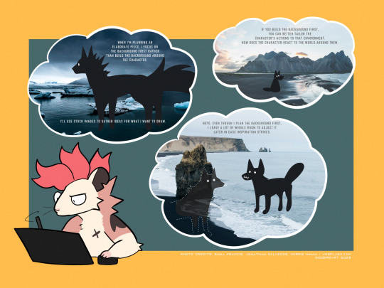
whether it be a commission or a personal drawing, if I'm building an elaborate art piece i focus on establishing the background First.
the background is the stage for your character! planning the background first will make it easier to tailor the character's actions and how they interact with the environment around them.
planning the background first can be the difference between your character standing awkwardly front and center with the setting going on behind them, or actually participating in their environment.

if i'm super stumped for background ideas, i browse stock image sites to get inspiration. sometimes it helps to doodle on an image to generate some ideas - kinda like you're playing with JPEGs like dolls.
that said - while i'm pinpointing WHAT i want to draw, i keep the ideas loose. i don't want to focus on the itty-bitty details until i've got the overall aesthetic and layout in mind, as i might get inspired to add something in later!
THUMBNAILING
if you're planning a big piece it can be helpful to break it down into something bite-sized before you go all in and start lining or painting. these are "thumbnails" - fast little sketches that establish the scene in a way that doesn't consume a lot of time or effort. it's also great as a little perspective exercise as a treat.
here i decided i want to draw a character walking home in a back alley street. with these photo references in mind, i can plan a layout and how the character will act in the scene. is this a candid shot? are they posing cutely? are they looking down at us in a tense way? there are many ideas to be had!
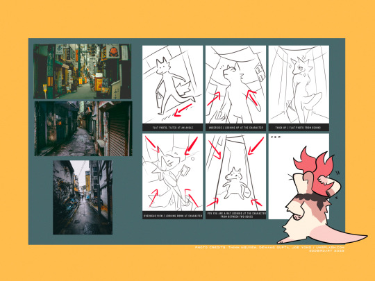
after you've chosen the layout / vibe for your idea, you can scale up your thumbnail to your preferred canvas size and start fleshing out the details. be sure to keep referring to your reference images to get additional ideas, such as storefronts, items, props etc!
3D MODELS
If you're trying to create a unique environment that photo references simply cannot help you visualize, 3D models exist! This gives you that ability to rotate / scale things for better visualization. Clip Studio has a vast catalogue of 3D models to download For Free that you can fiddle around with. i know there are many 3D builder sites out there as well, though i've never made use of them so i'm afraid i cannot recommend any off the top of my head. hell, you can even use the Sims game to design a setting and go from there!
also if anyone is going to come into my house and say 3D models are cheating: they are not. using a 3D model to better grasp an angle or get a better idea for perspective is not cheating. using 3D models to help plan the environment in your art is not cheating. they are no different than brushes; these are tools made to HELP YOU. use them!
PERSPECTIVE
perspective and angles can make a HUGE difference in the art piece. there's nothing wrong with static long shots! if that's what you want to draw, do it!! there's no right and wrong here!
but if you're finding your work to be a little robotic and stiff, slap an angle in there. consider an overhead view. these same techniques are applied to photography and film! nothing wrong with wide shots, but every once in a while it can help to throw in a dutch angle.
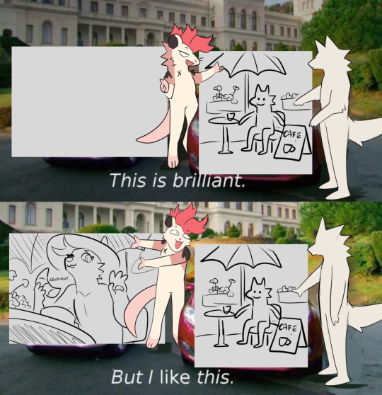
if there is one note i'd like to leave off on, it's that your backgrounds do not have to be 100% accurate-to-life to be Good. unless realism is something you're really striving for in your style, don't feel compelled to nitpick every brick and leaf in your art. us artists can tend to over-prune our work until our art looks a little bare and soulless. flaws can give your work character, and that's often a lot more appealing than how accurate the scale ratio between background building A and building B are [again, unless you WANT to go for that realistic look then you can fuss over those details all you like].
i hope this helped a little! MY APOLOGIES FOR MAKING IT SO LONG AH
625 notes
·
View notes
Text
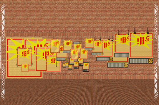
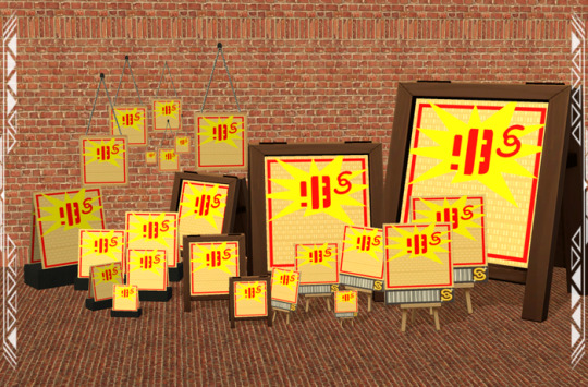
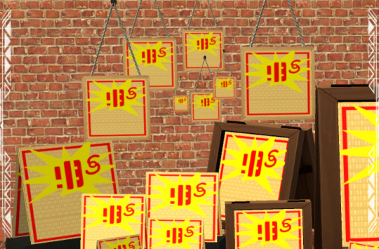
OFB Props: Signs 001 Mix
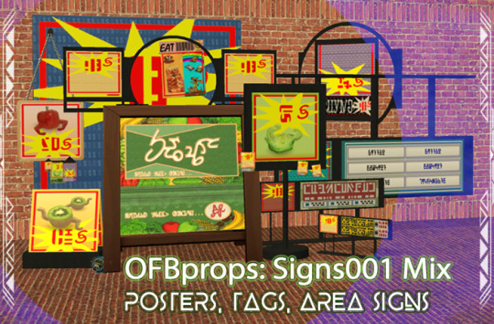
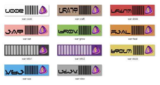
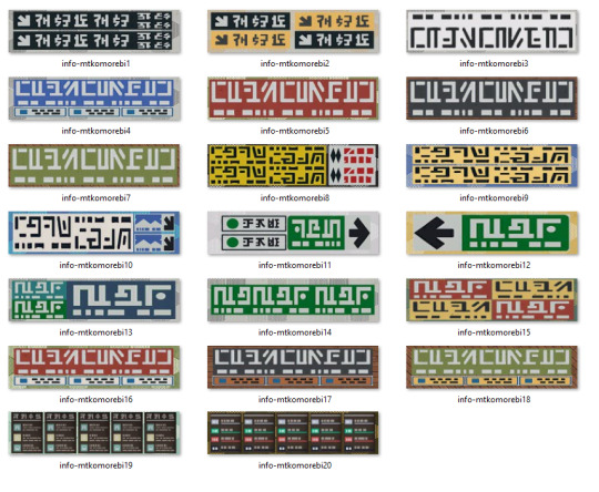
Published: 7-14-2024 | Updated: N/A SUMMARY 100 posters, tags, and area signs to organize sale items on your commercial lots. Customize poster images, infographics, and barcodes/currency labels. Labels are color-coded in Simlish and English to make sorting objects easier: COOK (white label/for cookables, ingredients), DRINK (red label/ for edible beverages), EAT (pink label/for edible foods), GROW (green label/ for harvestables), HEAL (orange label/for functional medicines, motive boosters), CRAFT (brown label/for craftables, ingredients), STOCK (yellow label/for stockable foods, supplies), USE (blue label/for all other functional items), VIEW (gray label/for deco only items), and “other” (black and purple/barcode). These are general deco items, so you don’t have to sort by function/color unless you want to.
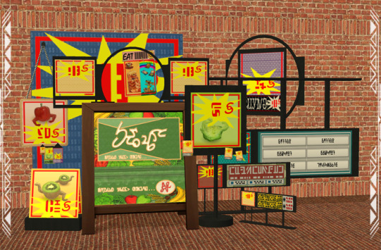


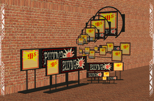

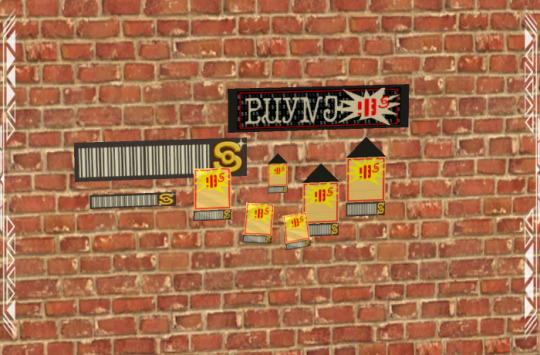
DETAILS Pets EP or higher. Cost: $3 | Environment: +1 | Buy > Deco > Wall Hangings/Sculptures (some signs don’t have to be placed on walls) You need my Poster Pack (Simmons, 2024) for all poster recolors. Sale Poster 7 (barcodes/currencies), and Ceiling Sign Info 4 (infographics) – are also REQUIRED. Recommended textures sizes for new recolors are 512x512 (poster graphics) and 512x128 (bar codes/currencies, infographics). Simlish text is ideal since images may be reversed on the back side of some objects, or slightly stretched. *Thumbnails for the BACK side of the posters may not generate accurately in the catalog (default game quirk). Make sure you can see the back side onscreen when recoloring. Finally, you’ll likely need “moveobjects on/off” and “snaptogrid on/off” cheats when placing some items.
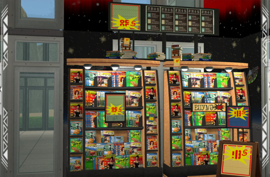
ITEMS 11 ceiling signs (160-440 poly, poster images on signs 1-6 appear on back side). 11 standing signs (188-440 poly) 3 curved standing signs (548 poly) 10 wall signs (220-224 poly) 5 curved wall signs (874-876 poly) 3 curved/winged signs (1072 poly) 7 hanging signs (269 poly) 6 Instore Mini Billboards (4t2 conversion by NekoSayuri, 2018; EA; 116 poly) 5 Lil’ Business Chalkboards (4t2 conversion by itsnotdissimilar, 2016; EA; 128 poly) 7 framed posters (64 poly) 5 unframed posters (12 poly) 4 taped, unframed posters (108 poly) 3 unframed, wrinkled posters (18 poly) 3 wrinkled tags (34 poly) 3 smooth tags (155 poly, poster images appear reversed on back side) 3 info/barcode tags (4-60 poly) 6 easel signs (512 poly) 6 sales card on stands (card mesh by Cathee, 2008; 40 poly).
DOWNLOAD (choose one) from SFS | from MEGA *collection file included


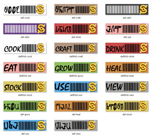

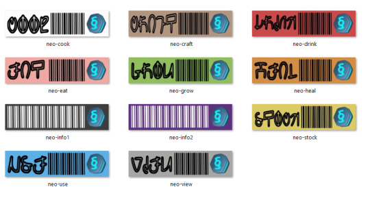
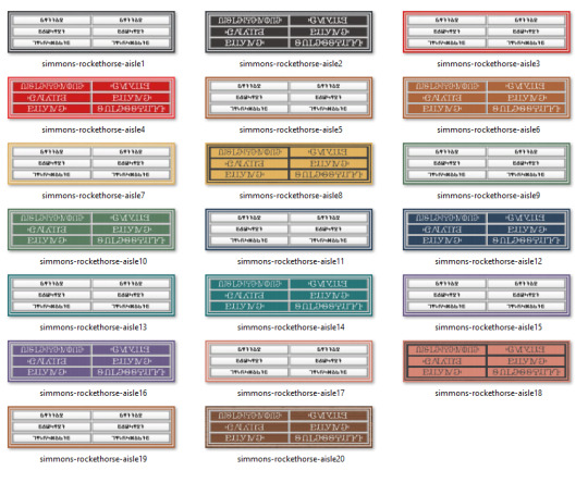
COMPATIBILITY I recommend using Shift Everything (Lamare, 2022) or Object Freedom 1.02 (Fway, 2023) to enable floor-to-ceiling shiftability for all objects. This will also minimize shadow issues when shifting the signs. Some signs show a small gap between the frame and poster when viewed at close range. CREDITS Thanks: Sim Crafters, ChocolateCitySim. Sources: Beyno (Korn via BBFonts), EA/Maxis, Offuturistic Infographic (Freepik), Fonts (Gazifu, 2013; Ajaysims), Sims 3 (EA, 2009; 2012), Sims 4 (EA, 2014; 2020), Sims Mobile (EA, 2018), Supermarket Aisle Signs (Rockethorse, 2014), Synapticsims, Vector_Corp.
118 notes
·
View notes
Text
Just cried laughing at a youtube thumbnail of someone who read Flowers in the Attic, and the text on the thumbnail was "PEOPLE LIKE THIS??"
Yes. I fucking LOVE IT.
But also, honey, I get that you hate it. I'm not going to watch the video because I don't trust you won't claim that my loving the best incest fuckery in the whole world makes me a dangerous degenerate, but I respect that you gave it a shot.
100% here for hating Flowers in the Attic, but in this house, we have that shit in hardback and are forever mad there isn't a single fucking accurate swan bed in ANY of the adaptations. INCLUDING THE ONE WHERE THEY CARVED THE WHOLE FUCKING BED.
IT'S A ROUND BED GODDAMNIT WITH WINGS AS FUCK COVER AND GAUZY CURTAINS LET ME SET DESIGN THIS SHIT WITH JOHN WATERS TO DIRECT
#flowers in the attic#vc andrews#my biggest problem with the series is that whatever book happens right before the garden of shadows prequel#chris and cathy are dumb as rocks about what could possibly be making their child act so strange#i dunno the fact you don't tell him jack shit and there's a creepy old lady down the lane#you cunts know not to trust creepy old ladies#what the fuck
106 notes
·
View notes
Text
IMPORTANT FANDOM ANNOUNCEMENT!!!
Thumbnail artists don't know what exactly will happen in episodes..
They only know presumably the title and who to draw.. and probably only some details..
Even laes thumbnail artist (Meg) said that they have freedom on what to add to thumbnails.. and that they don't know the lore..
I think it's just that most of thumbnail artists think like most of people in this fandom think that Nexus only cared about Solar and he doesn't care about others anymore.. hence why he has Solar's goggles in thumbnails..
Solarnexus isn't a thing.. it's not canon.. and what thumbnail artists do isn't always 100% accurate.. hence why it's important to be wary about it.. that thumbnail artists don't know the lore..
The only people who know everything are Davis and EC cause Davis himself said so.. that only two people work on these three shows - sams, laes, mgafs now eaps..
Even if thumbnail artists are probably friends with VAs it doesn't mean that they know more lore than others or that they can decide about stuff in the show..
#sun and moon show#sams#sams fandom#announcement#laes#lunar and earth show#eaps#eclipse and puppet show#mgafs#monty and foxy show#thumbnails
68 notes
·
View notes
Text
THE LOST SIMS OF THE SIMS (FOR CONSOLE) • Part 2
A while ago I wrote a post about previously unknown sims that existed within the files of The Sims for console by way of leftovers in Bustin’ Out. In that post I had mentioned that there were entries for even more sims in ALLCHARACTERS.rsp.
For further context and elaboration on the process surrounding this, please read my previous post on this here.
So now, here are the remaining lost sims of The Sims for console!
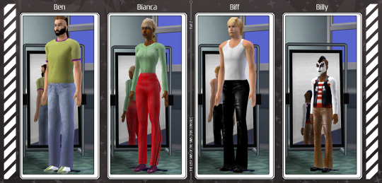
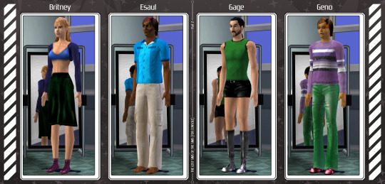
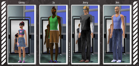
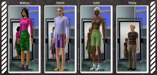
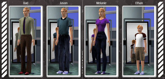
There are still more remaining unused sims though, four as a matter of fact! However…
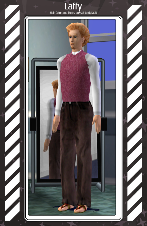
All four of these remaining unused sims either use CAS parts or colors that don’t seem to exist in the game anymore. When I first started trying to piece these sims together, I thought they were intended for Bustin’ Out, given that there were also a few sims for Bustin’ Out in the same file, but putting them (mostly) together in the original game yielded surprisingly comprehensible results. Like Calen here, who looks pretty great even though the pants he is meant to wear do not exist in the game anymore;
The entries for these four in ALLCHARACTERS also don’t seem to follow the same patterns as other sims that were certainly intended for Bustin’ Out either. The sims intended for Bustin’ Out almost entirely call for the ‘placeholder’ thumbnail, which looks like this:
They also typically call for mesh indexes that number in their thirties as opposed to sims from the original console game who only go up their mid-twenties at most! And their color indexes are typically set at either 1 or 0.
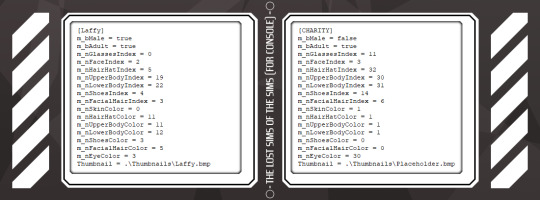
These other four unused sims have fully defined thumbnails (albeit ones that don’t seem to exist anymore🙁), and their indexes only exceed what is known to be in the game by a factor of one. Which leads me to believe that these sims were intended for the original console game, and not Bustin’ Out, and simply used meshes or colors that were removed from the game some time during development.
Circling back to the remaining four unused sims however, here are the rest of them! But please note that these recreations will not be 100% accurate.
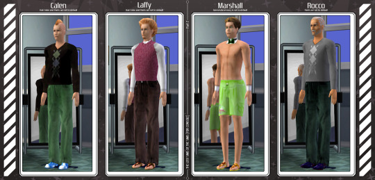
For Calen, Laffy, and Rocco, whose lower body mesh no longer exists in the game, I used default pants with the color index listed in their respective entries. While Laffy’s hair color and Marshall’s accessory were left as default.
72 notes
·
View notes
Note
OP I can’t even lie the new Red-Flags post makes me want to make a playlist off these two SO BADLY AGH
But I am totally a normal person so I will ask: do you mind if I make a Spotify playlist based your Timatello? (Bc there isn’t one I already checked) It probably won’t be accurate to the vibes your currently curating with these two but I want to so badly.
That being said if you don’t want me to I’ll respect that.
As you can tell I am TOTALLY a normal person about your Timothy. Totally. 100%
(Also with this being asked if I can make a playlist can I use one of the panels from the Red-Flag-inspired post for a thumbnail? Totally understand if I can’t)
*throws approximately five million heart emojis at you* okay bye
Hey TheJadeCount!
There IS actually a Don&Tim playlist! I made it myself!
However, if it doesn’t suit your vibe, go right ahead and make another one 👊👊👊👊💕💕💋
143 notes
·
View notes
Text
List of programs and stuff I use
[pt: List of programs and stuff I use ./end pt]
Disclaimer: This is in no way trying to say I have the best setup of all time or anything. The point of this post is mostly to introduce people to cool things they may not know about, or a place to point to when someone asks what I use!
(Last updated: 6/28/24)
Browser
[pt: browser ./end pt]
Firefox (Windows/Linux/MacOS/Android/IOS) - Obviously I recommend Firefox above all else, especially with chromium-based browsers moving onto manifest V3.
Bitwarden (Windows/Linux/MacOS/Android/IOS) - Good password manager! Used it for years with no complaints!
AdNauseam (Firefox/Chrome) - My adblocker. It's built upon uBlock Origin and has all the same features, but it actively clicks on the ads to waste advertiser money. If that's not up your alley, uBlock Origin is fantastic too!
Wayback Machine extension (Firefox/Chrome/Safari) - Allows you to make snapshots of pages, or view old snapshots if a page isn't loading correctly!
XKit ReWritten (Firefox/Chrome) - Pretty much a must-have for Tumblr. Has a ton of features to make navigating this site much better. Full feature list here!
Discord
[pt: Discord ./end pt]
Vencord (Windows/Linux/MacOS) - A modified Discord client that adds support for plugins and themes. Basically allows you to install plugins from a massive list that improves Discord. (Technically against ToS. Basically, don't post that you're using it in big servers, and turn off your themes before sharing screenshots.)
Bunny (Android/IOS) - If you miss Vendetta for Discord, Bunny is an actively maintained fork of Vendetta! Basically the same as above, but for Android/IOS instead of desktop. Same warnings about ToS apply.
Aliucord (Android) - Miss the old Android app feel, and still want to have plugins/themes? Pretty cool but has a less impressive theme/plugin selection. Same warnings about ToS apply.
Bluecord (Android) - Another Discord modification without the new Discord UI!
Youtube
[pt: Youtube ./end pt]
Freetube (Windows/Linux/MacOS) - A desktop Youtube client with adblock and sponsorblock built in. Still in beta, but very good.
Sponsorblock (Firefox/Chrome) - Pretty much a must-have for watching Youtube these days. Automatically skips over sponsors, self-promos, interaction bait, outros, intros, etc. Highly configurable!
Dearrow (Firefox/Chrome) - Haven't used this very long but I love it. Gets rid of vague or clickbait titles/thumbnails and replaces it with descriptive and more accurate thumbnails. Also built into Freetube now!
Newpipe (Android) - Lightweight Youtube client. I haven't used it myself much but people swear by it!
ReVanced (Android) - Modded Youtube client with Sponsorblock, Return Youtube Dislike, and Youtube Premium features. Doesn't support Dearrow as of 6/25/24 :( (PLEASE BE CAREFUL INSTALLING THIS. If you don't know what you're doing, you can cause some damage!)
Spotify
[pt: spotify ./end pt]
Spicetify (Windows/Linux/MacOS) - Spotify modded client. Has adblock, themes, etc! Think Vencord, but for Spotify.
Misc.
[pt: Misc ./End pt]
Obsidian (Windows/Linux/MacOS/Android/IOS) - Basically a personal wiki for notetaking! A bit of a learning curve. Fanfic writers and worldbuilders... go feral.
Notepad++ (Windows) - A must-have text editor. Might be on more platforms but can't confirm?
Mullvad VPN (Windows/Android) - The only VPN I can 100% recommend. Cheap, fast, and really cares about your privacy. It's a little under $6 USD a month!
NVDA (Windows) - A free screenreader I use for reading large blocks of text. (Notice: I am not visually impaired to the point I rely on a screenreader to navigate my PC. I use it on occasion to read text to me because I have a hard time reading. If you're looking for advice on screenreaders for the visually impaired unfortunately I'm not a good source! Maybe check out the #visually impaired, #blind, or #accessibility?)
Syncthing (Windows/Linux/MacOS/Android) - Lets you sync folders across devices. It's especially good with Obsidian.
"Tequito, I didn't find what I wanted!"
[pt: "Tequito, I didn't find what I wanted!" ./end pt]
I'm sorry. :( If you're looking for a program I have personally mentioned using in the past, feel free to shoot me an ask or DM! Or hey... maybe try searching the letters "FMHY" and having a look around? *wink*
26 notes
·
View notes
Note
Have u ever posted your comic or animation workflow anywhere? Im super curious on how you tackle the process, especially not using a drawing tablet. I know you have a very simple (and adorable) style so that probably helps in terms of workflow -- Im just curious about the steps you take.
Thank you! With both comics and animation my key thing is to not spend too much time on any particular thing, just draw loose and fast. Honestly the only downside to drawing with a mouse is that I can tell my arm has extremely specific muscle memory regarding it- if my mouse breaks and I get a new one I have to spend a good month or so just letting my hand get used to it again lol. Same with if my setup gets readjusted too much- right now my setup is my mouse on one of those padded mousepads, on top of 2 books, with my elbow resting on my 3DS case (I'll get an actual pillow or something for it eventually lol). But luckily thanks to this I suffer very minimal wrist pain 👍
(...Okay I started to go really in depth in my process here, so sorry if this is way more than what you were asking. Putting it under a readmore just to save space lol)
With MFM in particular, I start by writing out the entire script for the next story arc, which really is just all of the dialogue and vague notes about any important actions. Then I do the paneling with very loose stick-figure like sketches of where the characters are and what they're doing. I prefer having very little planning when it comes to character poses and panel shapes, coming up with those on the fly makes things much more exciting and faster to make. But it's the opposite with dialogue... it needs to be 100% FINAL before I draw a single line lol.


That's part of my script for my most recent chapter, as well as what my extremely loose goofy thumbnail sketching is like. I write the script as one big thing and don't separate it into pages until I actually start drawing- then I go and color change it just to keep track of what dialogue goes on each page
After that, I go back and do the ACTUAL sketch, as well as the lettering (I don't believe this is how it's done professionally. I used to do lettering as the very last step in the process... but then found it hard to cram speech bubbles in the right places lmao.) After that is lineart, coloring, background flat colors, then shading/rendering for all of it. I do each step in batches, as in I sketch out ALL pages of a chapter before moving to lineart, I line ALL pages before starting coloring, etc. I find it way easier to be productive when it's broken up like that, though when I first started the comic I used to draw each page to completion before starting the next (but also, the comic's style was DRASTICALLY simpler back then haha)
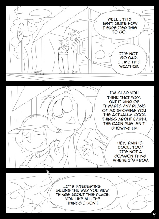
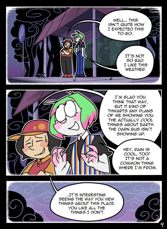
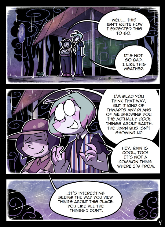
(Unfortunately I merged some of the shading to the background flat colors so it's not entirely accurate... oops) FireAlpaca has a sand texture feature that I only found out about last year- adding that to the backgrounds makes them look 10x better with WAY less effort.
With animation, it depends on the project. For simple 5-10 second animation I make for fun, there's very little planning lol. I skip some steps in the process- I'll sketch out the keyframes (and maybe any difficult inbetweens if necessary), line those, then go straight into making linework inbetweens. I'm not a cleanup artist and have no experience in that, so I always find trying to line my rough animation makes everything jittery and wobbly. If I do it with a clean line from the start then I can avoid that and save a lot of time 👍
For my bigger projects (such as the Parvey cartoon and the MFM Kickstarter trailer), I do the whole animatic with final audio first and foremost, with the animatic being almost like the keyframes. I split them up into individual shots, .mp4 files anywhere between 1-30 seconds usually, and animate those one at a time. I'm a huge fan of free to use programs and try to use them as much as I possibly can, here's a list of the ones I use:
FireAlpaca- for the actual drawing part itself (storyboarding/animating/etc). FireAlpaca has a feature that lets you export every frame as it's own drawing, as well as an onion skin mode
Windows Movie Maker- for compiling all of those frames into video format, creating individual shots. If you upload all of your frames and set them to around 0.08 seconds, it equals about 12fps (I usually animate at 0.10 seconds/10fps, its a bit slower but looks nice)
Onlinesequencer.net- for making music. It's the place I've made all of my songs on, like the timeloop song, hyperworkaholic, and the background music for the MFM Kickstarter trailer.
Audacity- for editing audio/music. Also great for recording things directly from your desktop
DaVinci Resolve- for editing and putting together all of the shots into one big video. Can get kind of intensive on the computer during rendering, so watch out.
YouCut (app)- also for editing and compiling shots, I used this one a lot a couple years back but I'm not sure how well it holds up. Doesn't need much phone storage to download but needs a lot to render videos.
MS Paint (yes really)- for typing up text. FireAlpaca has a text option but I don't like it as much as Paint's.
...The only thing I genuinely can't do alone is voice acting. Luckily there's a big voice acting community on Twitter and they're all amazing to work with!
This got... way more in depth than I planned for it to be, so sorry if this is way more than what you were asking lol. But that's my general process when it comes to my art 👍
32 notes
·
View notes
Photo

Lucca x Ayla
Huh so this is what they do while waiting at the End of Time when they aren't in the party.
Okay -holds Masamune- before the Chrono Trigger fans come after me, remember this is all in good fun and I am fully aware Ayla ends up with Kino. This is just for fun and haha okay folks. -puts sword away- OKAY NOW So! I am currently doing a play though of Chrono Trigger, And with me and my friends are voicing it, and well...Lucca is into women now, sorry but how she reacts to Marle, how she really reacts to Alya, sorry can't make the rules, she is into women, is she also into men? Maybe. Also fun fun fact, Lucca (which if you look at my thumbnails of my videos https://www.youtube.com/playlist?list=PLGtkNg8MVofPA6W9051ljFR4kXWIRV1vE Is my friend Ginger, and their partner Kore is voicing Ayla...aka big strong lady. So I think there is an extra layer of fun for it and we are all here for fun right? And before anyone goes "Why doesn't it look like Akira Toriyama's art style? Well the main reason...and this is me going to wipe the board. My Ex is the main reason, fucker is a big Toriyama fan boy (I will be honest shocked his fan boy behavior didn't make me hate chrono trigger or never get into it again) and when we were together, he went on how I could make a big following copying art styles, especially Akira Toriyama, Even goes how easy it is to copy his art style. Now I don't know why but when he said I just...was super offended, like partly insulting Toriyama calling his art easy...not saying it's impossible but saying you can full on mimic just using the curve tool in photo shop which is not true folks. He also made it sound like the only way I can be popular is just copying art styles, and while yes its great to have multiple styles in your pocket, the way he worded it was more or less "Your art sucks, copy someone else." I am fine. I just think yes I can reference something but not 100% copy something to still convay the thing, yes fan art that is near accurate is kinda more popular won't deny that, but like those arts get more hyper critical from folks if it looks "Wrong" even in a tiny detail, if I am style inspired I think less so. Maybe that's just me over thinking...who knows.
#artists on tumblr#digital art#small artist#art#artist#chrono trigger#lucca#ayla#shipping#lucca x ayla#chrono trigger art#retro game#fanart#end of time#rpg
16 notes
·
View notes
Text
Recap for Vod 10 — Combinandinho
youtube
for a quick summary about this vod: chatting with quel + starting to tackle the cube project with Meiaum \o/ as well as some theorising as they go along
(quick reminder that everything in quotes—unless it was written in a book that felps reads—is not a verbatim transcript or translation. I try to be as accurate as possible, but I’m just doing it quickly so please don’t take it as 100% accurate)
full recap under the cut \o/
-woke up! Smelting some of the gold + iron he got as well as upgrading and organising his backpacks
-(Felps has very organised backpacks/inventory/chests)
-he notices himaru and quel’s name tags nearby and crouches so they won’t find him + the base
-he tries to listen in on them but can’t get close enough without giving away where he is (he suggests they should have an emergency exit pfft)
-himaru and quel leave without noticing him and he decides to grab his things and leave
-he starts whistling “casually” as he walks away and runs into quel (she has a base nearby)
-He circles a creeper hole or something for a bit and continues to whistle ignoring that she’s said hi. in general just continues to walk (around her base) and whistle without acknowledging her even though she’s trying to get his attention a little
-finally says hello like he’s just noticed her
-they talk a little—very casual stuff
“you’re living here?”-F
“Temporarily. I stole it”-Q
“Ah okay—it’s easier right?”-F (then I think he continues on to say: “I know what it’s like—no actually I don’t know what it’s like, I don’t know what it’s like”)
-Felps mentions the fact they met before and now they’re talking about how the island is a little scary (quel doesn’t know some of the examples Felps is talking about and asks him to explain pfft. Although she has met some rats)
-Felps offers to take her to the cube and she accepts
-while they walk Felps mentions they also need to find Meiaum
-they run into Meiaum, Choke, Cleber and Gomez)
-meiaum and quel go off to talk together and Felps waits
-he walks up to himaru and Alice talking neaby. himaru says he needs to show Felps something—which is a skateboard pfft
-Himaru points out that Felps and Alice have the same ears \o/ he takes a photo of them \o/!! (The image on the vod thumbnail)
-they talk a bit about being busy + the renovations in the city
-Alice starts using signs to talk when Felps confirms he still can’t read the bubbles
-himaru says he was hearing voices and then tells Felps he’ll tell him about it later
-choke and cleber join them
-I think cleber apologises for forgetting that Felps can’t read the bubbles
-felps shows off his magic cloak thing and cleber takes a photo for him
-choke distracts them with skateboarding skills
-Felps suggests choke and himaru race \o/!!
-“I’m going to be the hot girl who does the countdown”-F
-a bit more chatting and then Felps leaves to look for Meiaum
-he finds Meiaum and quel easily enough right at the end of their conversation and takes them both to the cube
-Felps stops halfway through to ask if Meiaum first saw the cube in a vision like he did. Meiaum did not have a vision of the cube
-just before they get there: “Wait—who are you?”-Meiaum to quel. Despite having a conversation before this they just now introduce themselves and talk briefly about how they both ended up at Valigma
-apparently Jota took Meiaum to the cube and just told him that it’s something for him and Felps and they have to resolve it pfft
-Felps shows Meiaum the sign and then they realise quel didn’t follow them up
-while Meiaum is looking down trying to see her Felps hits him off the cube
-quel comes into render distance again and immediately dies… she drowned in the water stream that takes you up to the cube
-Meiaum gets up and immediately hits Felps off in revenge
-Felps and Meiaum talk about quel—her mask + the theory about her being bia but not remembering
-Meiaum changes the subject and now they’re talking about trying to get equipment from Jota or Alice so they can break the cube
-before they do this Meiaum irl goes to get food and Felps waits for him. Quel still hasn’t come to get her items and Felps is worried they’ll disappear
-they leave the cube and while running from monsters Felps loses Meiaum, but finds quel (and Alice) and tells her to get her items
-quel leaves to get her items and Felps asks Alice for another phone because his is gone
-Felps goes back to the cube to try and find Meiaum and complains about the fact Meiaum isn’t looking at his phone. probably unrelated but as he’s doing this the sky unnaturally turns to sunset
-Felps recalls the situation with Matt from the previous vod—how it was night until they got rid of that thing
-he finds quel at the cube \o/
-Felps tells quel a bit about the cube (the things he knows about it at least)
-quel says she doesn’t like the mayor and Felps agrees there’s something (implied: weird/bad) about him
-Felps tells her to be careful and keep an eye + ear out for things
-Felps notices that the moon isn’t moving and is stuck at midnight. Lightning strikes when he talks about this with quel and he immediately changes conversation tracks away from stuff like that and back to mundane stuff (needing to find Meiaum)
-Meiaum messages Felps telling him he talked to Alice and she isn’t going to give them any equipment—Felps thinks it’s because Jota didn’t tell her about the cube and tells Meiaum to come to the city hall
-Felps tries to exchange numbers with quel but she is struggling to put his number in correctly (65 becomes 6x5, etc)
-she gets his number in correctly as Alice and Meiaum appear then leaves
-Felps tries asking for equipment to break the cube again, mentioning it’s a mission from the mayor and (lying) that he promised to give them incredibly valuable things
-Felps (whispering) points out the night being stuck at midnight to Alice and Meiaum
-they start blaming Matt and saying it’s his fault pfft (since it’s connected to him). Meiaum says they (Matt + others maybe?) are going to resolve it though
-Alice says she’ll look for equipment for them. they chat a bit while they’re waiting + the day comes back
-Meiaum asks about quel again then says he needs to tell Felps something but Wuant and Gomez appear so he doesn’t
-Alice comes back and gives them 3 so so so close to broken diamond pickaxes
-quel joins them again and says that bira disappeared—that she went to the bar and he wasn’t there—but Felps says it was because he has back pain (Cleber had already mentioned to Felps he wouldn’t be at the bar because of this)
-felps also tells her that the night being stuck is due to Matt and that Matt can explain it better
-Meiaum says he needs to talk to quel but he needs to talk to Felps first pfft and asks her to wait for them to talk
-Meiaum is talking to Felps about quel—they go to the house she first appeared at. Meiaum was apparently there before anyone else and took what was in the chest—a book that he reads out to Felps (1:25:00)
-Felps tells Meiaum about Guaxi going to the other island + finding the captain + the entity that spoke to felps
-Felps doesn’t remember anything really about the boat. he doesn’t remember what happened before (I’m assuming he means just before the boat, not that he doesn’t remember anything at all). He just remembers going to the room with the captain and then they crashed. he doesn’t remember why he went there or what exactly happened which is why he wants to talk to the captain (except he doesn’t want to go to the island where the captain is staying because the entity told him not to)
-Meiaum also had someone talking to him but he isn’t sure who it was
-they’re wondering if there’s some way they can jog Quel’s memory
-Felps brings up the fact he had a vision of the cube and suggests maybe there’s things here that can manipulate their memories, but he isn’t sure
-Meiaum brings up the conversation he overheard with Fe and Jota—about how Fe apparently has a kid he doesn’t remember having and how maybe this is Quel?
-they decide to talk to her and ask her about her family, then go to the cube
-Felps realises Matt sent him a message about how he went to some coordinates and found something important
-they go to Julia’s store while they wait for Matt to give more information. He contacts them via walkie talkie and recaps the endless night situation + an update \o/
-this is the information about the book telling Matt that Mike is a werewolf
“I only interacted once with Mike, he doesn’t trust me”-Matt
“Me too, me too”-F (maybe on the interacting once, more than the not trusting him?)
-Matt is going to come to Julia’s store and Felps updates Meiaum
-they try looking for garlic to repel a werewolf…
-there’s no garlic, but there is silver \o/
-Matt appears right at the end of this vod, next one continues on from here
9 notes
·
View notes
Text
Voiceplay-adjacent Visuals: Jack's Lament
Can you feel me practically vibrating out of my skin???
On one hand, I'm a little sad because this is the last video I'll probably be making a post about for a while (though by the time you see this, Geoff might have uploaded a new video that I can actually talk about the visuals for (EDIT from future me: he did!), and if so, you'll be seeing a post for that one tomorrow), but on the other hand, this is my third (though in no particular order/ranking) favourite Geoff video on his channel so far, and I am so excited to finally be able to make a post for it!
Geoff's cover of Jack's Lament debuted on the 8th of October, 2023, though I didn't see it pop up in my YouTube recommended until the 29th (if you remember from my Hellfire post, I wasn't initially subscribed to Geoff or Voiceplay, and both channels somehow ended up dropping off my radar for a while. Jack's Lament was the first from either channel that I had seen in at least a year, and as soon as I saw that thumbnail, I knew it was going to be amazing, but oh my GOD it was even better (and with me stumbling upon Hellfire the very next day, well let's just say I was pulled even deeper down the Geoff/Voiceplay rabbithole than I had been the first time around 😅).
Anyway, I'm not sure if I'll hit image limit on this one, or how much actual commentary I may have, but regardless, let's freaking go!
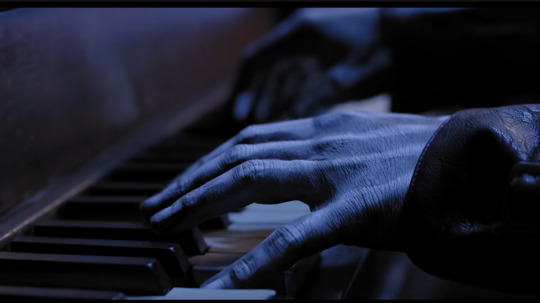
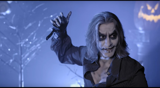
One hell of an opening shot, not gonna lie. Geoff's very-skeletal-looking hands playing the piano (in a beautiful way, might I add), immediately sets a very spooky/eerie vibe!
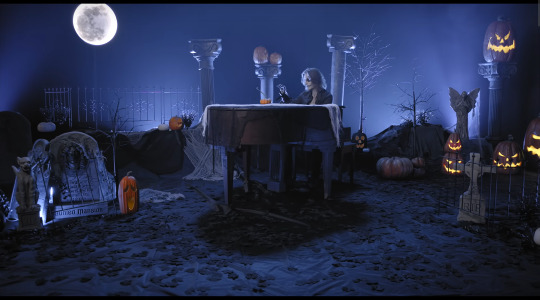
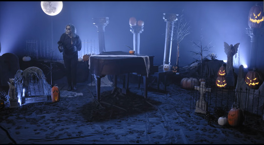
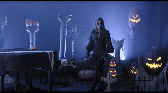
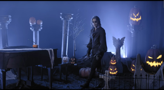
And this is one hell of an establishing shot! I mean goddamn there is a lot to take in here! Though one thing I will point out (that I actually only just noticed myself ^^;) is the Haunted Mansion headstone on the left, memorialising Madame Leota!
(Also shoutout to Pattycake Production Studios where this was filmed!)
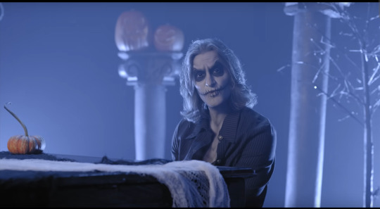
I of course have to give a MASSIVE shoutout and kudos to Rick Underwood for the makeup job in this one, like holy christ he really outdid himself here! (and I can't thank him enough)
Ngl, if I don't come up with any other ideas between now and October, then I kinda wanna dress as "Jack Skellington Geoff" (Geoff Caskellington? 🤔), makeup and all (or just attempt the face makeup at least)
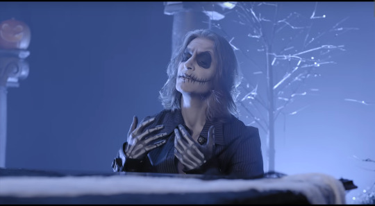
And seriously take a look at his hands! If it weren't for the super-high-definition closeup of his hands on the piano at the start, you'd be forgiven for thinking those are just really well-fitting gloves, but nope! An amazing airbrush job from Mr Underwood!
Also, if you look at his neck and chest in both this image and the previous one, you'll notice that he's got airbrushing going on there too, highlighting (or more accurately, shading) his ribs and other bones!
Finally, on the subject of the body paint job, if you've been paying attention to some of my other Geoff posts (and some of my Voiceplay posts), you might notice what's missing...
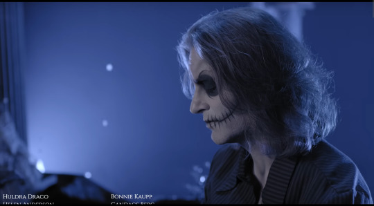
No necklace, and no rings! Had to remove them for costume/makeup/character purposes, rip. Must have felt a bit weird without them, but all that paint must have felt weird too, so maybe the weird feelings cancelled each other out? 😅
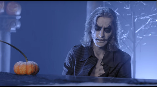
(His acting in this is of course 10/10 👌)
This video is one that I do actually know involved Geoff deliberately colouring his hair to make it grey, and it still looks as lovely as ever!
(Also this picture is a better one to check out the airbrushed detailing on his chest! (if you're gonna leave a couple of shirt buttons undone and your chest exposed, might as well take advantage of it! 😁))
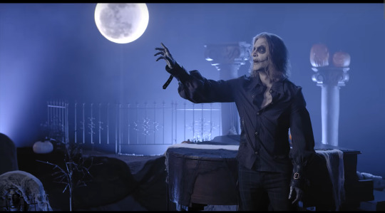
The "moon" in this video is apparently just some big spotlight with a moon cover on it or something? Apparently you can fairly easily find them online or something, and you can in fact see the pole it's attached to underneath in this image here, but you likely wouldn't notice the pole if you weren't looking for it, and the usage of the moon is 100% perfect! (I've seen/heard one or two people wishing the moon was yellow like in the movie, but eh, it probably wouldn't have fitted the overall colour scheme of the video as much)

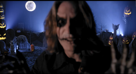
I had to include the "jumpscare" of course I had to! 😁
Also I can't get any good screencaps of it, but the way Geoff shifts from sombre on "a longing that I've never known," to more theatric/dramatic on "I'm a master of fright, and a demon of light" is so good, and the acting/choreography is absolute chefs kiss
"Bonjour!"
(For those of you not familiar with the original, the line "and I'm know throughout England and France" is part of the original song, but the "bonjour!" bit is not 😆)
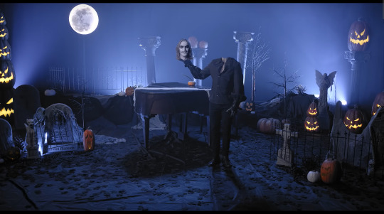
A Geoff head not connected to the body! It's happened again! 😂
Also it's cool the way Geoff is quickly jumping/flashing from one point to another, reminds me of his Headless Horseman video
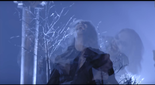
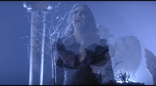
"No animal, nor man, can SCREAM like I can!"
What can I say, it's a very cool effect! Really ups the "oomph" factor of the little belt moment!
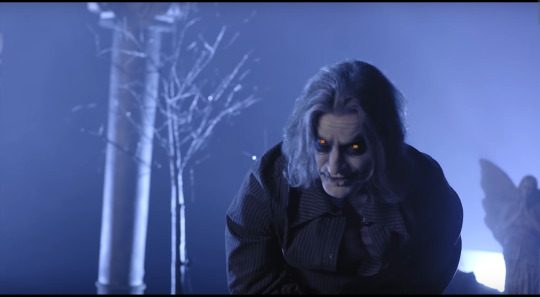
Tiny pumpkins/jack-o-lanterns in his eyes!!
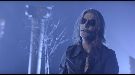
"But who here, would ever understand..."
(I'm not even at half the maximum image limit yet, so I'm 100% just throwing in an extra screencap (or two) just because 😁)
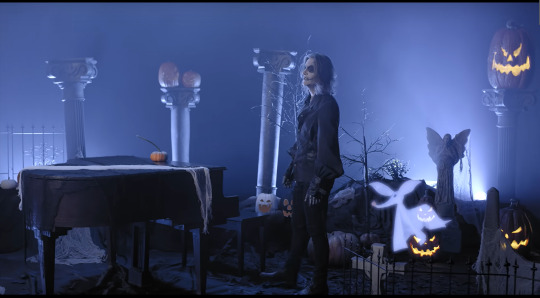
Geoff pats the side of his leg to call for Zero the ghost dog, just in in the scene in the movie! (Also shoutout to Kathy, who I believe helped with puppeteering for this bit?)
"...that the pumpkin king, with the skeleton grin,"
(Freaking obsessed with this video, I tell ya!)
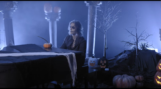
"The fame and praise, come year after year, does nothing for these empty tears"
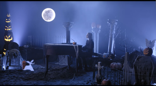
This is the last shot before we see the gramophone logo (a very gorgeous shot btw), but there's a little bit of a bonus bit for those who stick around for the Patron credits!!
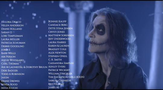
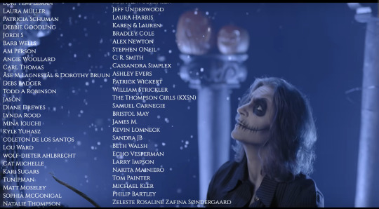
It starts to snow! Like at the end of the movie! It's a sign of hope and good things to come! <3
The original song is good for the movie, sure, but Geoff's cover feels like it has so much more depth (in more ways than one!) and emotion! And his vocal range is ugh god absolutely stunning and mindblowing! I cannot get enough, can never get enough!
But anyway, I hope you've been enjoying my Voiceplay/Voiceplay-adjacent posts! If there are any videos I've skipped over that you actually would like me to make a post on, please let me know! (And don't worry, I am planning to do all the 2017-onwards Christmas videos for both channels eventually - maybe as a Christmas In July thing?) I'm typing this on the 22nd of February, and if Voiceplay uploads a video in March that I wanna make a post on (nope), well you reading this will have already seen that post, and if Geoff uploads something in March that I wanna talk about (he did), then you'll see that post tomorrow (you will!). But otherwise, thanks for reading!
8 notes
·
View notes
Text

1. Understanding YouTube SEO
YouTube SEO is the process of optimizing your videos to rank higher in YouTube’s search results. Like Google, YouTube uses an algorithm to determine which videos are most relevant to users’ searches. The key ranking factors include:
Watch Time: The total time viewers spend watching your video.
Engagement: Likes, comments, shares, and subscriptions.
Relevancy: How well your video matches a user’s search query.
2. Keyword Research for YouTube
Keyword research is the foundation of YouTube SEO. It helps you understand what terms people are using to search for content similar to yours.
Use Tools: Tools like TubeBuddy, vidIQ, or YouTube’s auto-suggest can help find the right keywords.
Focus on Long-Tail Keywords: These are specific, less competitive phrases that help your content rank faster. For example, instead of "yoga," you might use "beginner yoga for back pain."
Analyze Competitors: Look at the top-performing videos in your niche to find keywords you can use.
3. Optimizing Video Titles
Your title is the first thing viewers see. It must be both engaging and SEO-friendly.
Include Keywords: Your primary keyword should appear naturally in the title. Example: "Yoga for Beginners: Relax and Strengthen with This 20-Minute Routine."
Be Concise: Keep it under 60 characters to ensure it's fully visible.
Create Curiosity: Titles that promise value or solve a problem encourage clicks.
4. Creating SEO-Friendly Descriptions
Video descriptions help YouTube understand your content, making it easier to rank.
Write Detailed Descriptions: Aim for 250-500 words. Include your target keyword in the first 100 characters and sprinkle it naturally throughout the text.
Include Secondary Keywords: Use related keywords to further improve SEO.
Add Timestamps: Break down your video into sections with timestamps to improve user experience and help with ranking.
5. The Power of Tags and Hashtags
Tags and hashtags are a hidden gem for YouTube SEO.
Use Relevant Tags: Add 10-25 tags, including your primary keyword and variations of it. Example: "beginner yoga," "yoga for back pain," "morning yoga."
Leverage Hashtags: You can add hashtags in your title or description to improve discoverability. Ensure they’re relevant to the content, e.g., #YogaForBeginners.
6. Custom Thumbnails for Higher CTR
Your thumbnail is like a billboard for your video. A custom, high-quality thumbnail increases the click-through rate (CTR).
Use Bright Colors: Bright, contrasting colors grab attention.
Include Faces and Emotions: Thumbnails showing human faces tend to get more clicks.
Add Text Sparingly: If you add text, make sure it’s short, bold, and readable even on small devices.
7. Enhancing Viewer Engagement
Engagement signals are critical for boosting rankings.
Encourage Interaction: Ask viewers to like, comment, and subscribe at key moments in your video.
Use End Screens and Cards: These features allow you to promote other videos or playlists, increasing watch time and session duration.
Polls and Questions: Use YouTube’s interactive features like polls to engage your audience.
8. Optimizing Closed Captions and Transcripts
Closed captions and transcripts enhance SEO and accessibility.
Closed Captions: They help non-native speakers and those with hearing impairments. YouTube’s automatic captions aren’t always accurate, so upload your own if possible.
Transcripts: Post the transcript of your video in the description. This makes your content more searchable and helps with keyword relevance.
9. Utilizing Playlists for SEO
Playlists group related videos, improving watch time and SEO.
Create Keyword-Rich Playlists: Organize your videos into playlists using relevant keywords. Example: “Yoga for Beginners,” “Advanced Yoga Poses,” etc.
Boost Engagement: Playlists encourage viewers to continue watching your content, thus improving session time and video ranking.
10. Boosting Watch Time and Session Time
Watch time is one of the most significant factors for YouTube rankings.
Hook Viewers Early: The first 15 seconds of your video are crucial. Use an engaging intro to capture attention right away.
Deliver Value Consistently: Keep your content informative and engaging throughout. Aim for 5-15 minute videos, depending on your topic.
Maintain Session Time: Session time refers to how long a user stays on YouTube after watching your video. Encourage viewers to explore your other content using playlists and end screens.
11. Promoting Your YouTube Videos
Even with SEO, promotion is essential for gaining traction.
Share on Social Media: Post your videos across platforms like Facebook, Instagram, Twitter, and LinkedIn.
Embed on Websites and Blogs: Embed your videos in relevant blog posts to drive traffic from your website.
Collaborate with Other Creators: Partnering with YouTubers in your niche can expand your reach and introduce you to new audiences.
12. Analyzing and Improving with YouTube Analytics
YouTube Analytics is your best friend for tracking performance and making improvements.
Monitor Key Metrics: Track watch time, CTR, audience retention, and traffic sources. These give insights into what’s working and what needs improvement.
Adjust Keywords and Content: If a video isn’t performing well, consider revising your title, tags, or description, or try promoting it again.
Experiment with Different Content Types: Use analytics to identify which video formats (tutorials, vlogs, etc.) resonate most with your audience.
YouTube SEO is an ongoing process, but when done correctly, it can significantly boost your video rankings and channel growth. By focusing on keyword optimization, engagement, and promoting your videos across platforms, you can increase visibility and watch time. Start implementing these strategies today, and watch your YouTube channel thrive!
#youtube#seo#youtube seo#digital marketing#search engine optimization#seo services#youtube video#video promotion#video seo
3 notes
·
View notes
Note
What are your thoughts on "genetically accurate premades"? IMHO fun idea. Except for PV/ST/VV. Most of their founders are deadly dead with no character data remaining. Folks attempted to remake them (ranging from pretty good and accurate to laughably terrible and inaccurate) but rarely anything 100% perfect and who knows if the thumbnail pics used as base for them really represented their last breath, as half of VeronaVille cast didn't even look like their thumbnail pics anyway... so?

I don't have much thoughts on it. I remix all their faces or keep the originals with any premade I play.
3 notes
·
View notes
Note
I usually get a skin tone via taking all the colors and then smudging the living shit out of them because the actual blending tool on the app I use is kind of shit
my rule of thumb is never ever color pick directly off minecraft screenshots bc they are never 100% accurate (ESPECIALLY episodes with shaders). not even the models in the early thumbnails are 100% safe as the artist's thumbnails uses AO and what looks like c4d viewport shading and also photoshop(and hey if he sees this i'd kindly love to see the og skins files if still available ;-; <3) aaand also their cube shaped bodies give a super slim window of where you see the accurate diffuse color anyways


still you can find an accurate-enough skin tone if you try hard enough but its annoying HAHA i just eyeball it and that's usually enough. there are allegedly canon skin textures uploaded by jess herself on the wiki but i have zero sources confirming that and also some of the said skins have been compressed to hell and are unusable anyways. by the way i'm just talking 100% accurate to the hex code colors, i trust everyone can eyeball colors :3
14 notes
·
View notes