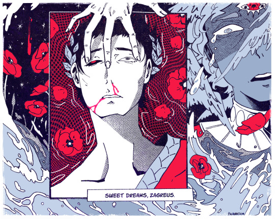
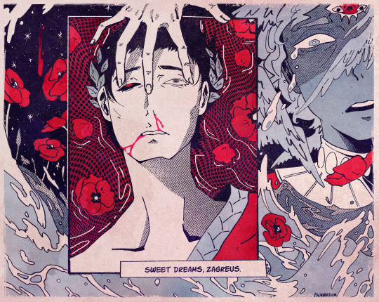
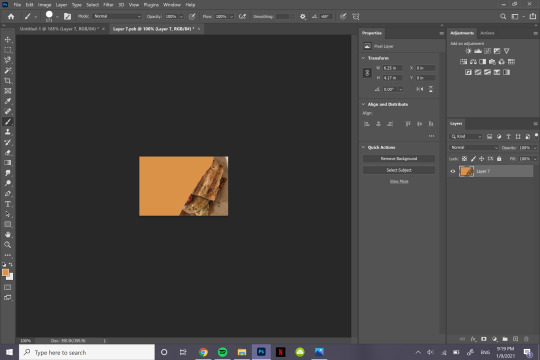
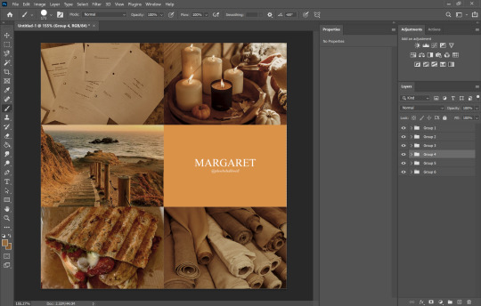
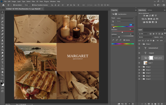
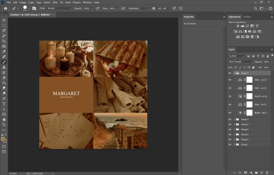
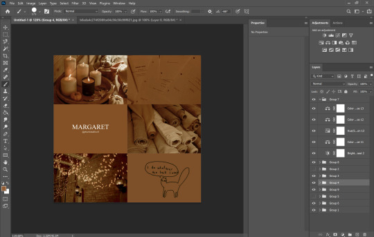
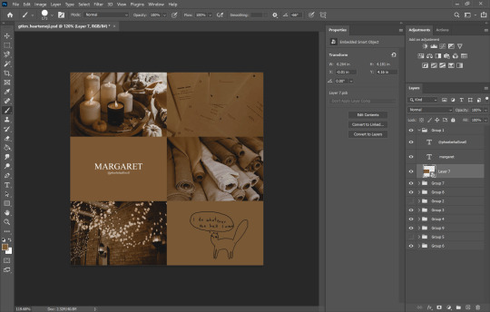
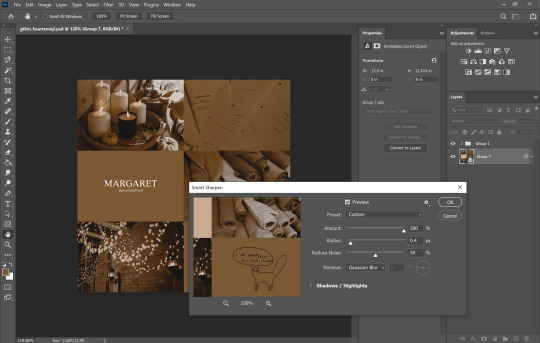
#this psd tho .... nice stuff
Explore tagged Tumblr posts
Visit Tumblr Blog
Explore Tumblr blogs with no restrictions, modern design and the best experience.
Last Seen Tumblr Blogs


Fun Fact
In Q3 of 2020, 31% of US users access the Tumblr app daily.
Text

# 𝐏𝐎𝐒𝐓𝐌𝐎𝐑𝐓𝐈𝐄𝐌 , an independent , selective & crossover friendly RP blog for original companion 𝐊𝐈𝐊𝐈 — Specialization: Reaper, from Dragon Age [ TV ] , Mun & Muse +25 , taxidermied by Fungi [ she/her; they/them ] , heavy topics, gore, potential nsfw warning , personals DNI

𝐋𝐀𝗕 𝐑𝐀𝗕𝗕𝐈𝐓𝐒 : @spitecrow , @fadedmemoria

𝐈. 𝐆𝐔𝐈𝐃𝐄𝐋𝐈𝐍𝐄𝐒 + 𝐌𝐔𝐒𝐄 𝐈𝐍𝐅𝐎. 𝐈𝐈. 𝐑𝐏 𝐏𝐑𝐎𝐌𝐏𝐓𝐒. 𝐈𝐈𝐈. 𝐏𝐑𝐎𝐌𝐎 .

-> blog resources made by @ilithid-psds <-
𝐑𝐔𝐋𝐄𝐒 :
I. Mun ≠ Muse ; I think that much is clear. Any statements that come up ic are not specifically my own. II. No God modding ; Small liberties like change of scene and such are totally fine and do not have to be discussed. You can hurt her, shove her or whatever, just keep in mind that my muse will react accordingly. Do not assume reactions and write my muses actions. III. You can always message me for plotting or headcanons if we are mutuals. ; However, I prefer if things play out naturally. We do not necessarily have to plot out every thread till the end. I am more than happy writing and see how things develop. IV. You can always send a starter, no need to ask! ; Again, if we are mutuals. Same goes for sending me rp prompts to my inbox, memes, or whatnot. You are also free to tag me in dashgames! My prompts have no expiration date. Just make sure you link the post if it was a meme from a while ago (so I do not lose the last bit of sanity) V. OC friendly of course. Just be sure to have a little bit of information ready and visible on your blog, so I can look it up before we interact. We stan OCs in this household. VI. Post trimming. ; I use XKit Rewritten to trim my posts. It is not a MUST, but I would be thankful if you have a way to trim your posts. Just to keep it nice and clean on the dash. Other than that, I use the small text, cursive, bold text edits, colored text and double-spacing. Don't feel like you have to format in order to write with me. I just like having an aesthetic and enjoy going crazy in my posts :3 VII. I won’t write NSFW with minors. Mun or muse. Please make sure to have the age somewhere on your blog before interacting. If smut happens, it will be under 'keep reading'. VIII. Shipping: I am a huge sucker for ships. If said thing happens, keep in mind my muses are multiship, means that every ship takes place in its own universe. I do have to see chemistry between muses tho, let it be through rp or just nerding about them. I would like to have at least a thread or interaction beforehand ♥ IX. No racism, homophobia, transphobia and so on. Don’t be an ass. I can definitely tolerate ic biased opinions on that in threads, just don't bring it into the real world. X. Please refrain from reblogging art you are not involved in. I feel honored people enjoy my silly sketches, I truly do, just please let me remind you that this is still a roleplay blog and having a clustered box is sadly very stressful. If I want my stuff reblogged, you will most likely find it on my art blog @fvngus . You can always ask me beforehand, should you be unsure about reblogging my artwork ♥
5 notes
·
View notes
Text

# 𝗕𝐋𝐎𝐎𝐃𝐘𝐀𝐑𝐍 , an independent , selective & crossover friendly RP blog for original companion 𝗕𝐀𝗕𝐄𝐓𝐓𝐄 — the Hexed Seamstress of Baldur's Gate 3 [ not to be mistaken with Tav ] , Mun & Muse +21 , stitched together by Fungi [ she/her; they/them ] , heavy topics, gore, potential nsfw warning , personals DNI

𝗕𝐋𝐎𝐆𝐑𝐎𝐋𝐋: @sleetkissed , @swarmcall , @yourfavoritetiefling 𝐓𝐑𝐀𝐕𝐄𝐋𝐋𝐈𝐍𝐆 𝐖𝐈𝐓𝐇: @bloodtwin , @bolyde

𝐈. 𝐂𝐀𝐑𝐑𝐃. 𝐈𝐈. 𝐑𝐏 𝐏𝐑𝐎𝐌𝐏𝐓𝐒. 𝐈𝐈𝐈. 𝐈𝐍𝐓𝐄𝐑𝐄𝐒𝐓 𝐓𝐑𝐀𝐂𝐊𝐄𝐑. 𝐈𝐕. 𝐖𝐀𝐋𝐋. 𝐕. 𝐕𝐄𝐑𝐒𝐄𝐒.

-> blog resources made by @ilithid-psds <-
𝐑𝐔𝐋𝐄𝐒 :
[ Hey, I'm Fungi [she/her], 25 years old and living in Germany. [GMT+1] ]
⟡ Mun ≠ Muse ; I think that much is clear. Any statements that come up ic are not specifically my own. ⟡ No God modding ; Small liberties like change of scene and such are totally fine and do not have to be discussed. You can hurt her, shove her or whatever, just keep in mind that my muse will react accordingly. Do not assume reactions and write my muses actions. ⟡ You can always message me for plotting or headcanons if we are mutuals. ; However, I prefer if things play out naturally. We do not necessarily have to plot out every thread till the end. I am more than happy writing and see how things develop. ⟡ You can always send a starter, no need to ask! ; Again, if we are mutuals. Same goes for sending me rp prompts to my inbox, memes or whatnot. You are also free to tag me in dashgames! ⟡ OC - and Tav friendly of course. Just be sure to have a little bit of information ready and visible on your blog so I can look it up before we interact. We stan OCs in this household. ⟡ Post trimming. ; I use XKit Rewritten to trim my posts. It is not a MUST but I would be thankful if you have a way to trim your posts. Just to keep it nice and clean on the dash. Other than that, I use the usual small text, cursive and bold text edits. Rarely colored text. You do not have to match my writing or editing style, as soon as everything is nicely readable. ⟡ I won’t write NSFW with minors. Mun or muse. Please make sure to have the age somewhere on your blog before interacting. If smut happens, it will be tagged and under 'keep reading'. ⟡ Shipping: I am a huge sucker for ships. If said thing happens, keep in mind Babsi is multiship, means that every ship takes place in its own universe. I do have to see chemistry between muses tho, let it be through rp or just nerding about them. ⟡ No racism, homophobia, transphobia and so on. Don’t be an ass. I can definitely tolerate ic biased opinions on that in threads, just don't bring it into the real world. ⟡ Please refrain from reblogging my art on here if you/your muse is not involved. I am thankful should you find the little sketches & stuff reblog-worthy, but Tumblr notifications can be confusing. It quickly floods my notifs & my threads might drown. I have an art blog ( @ fvngus ) where I mirror post everything I am fine with reblogging :3
4 notes
·
View notes
Text
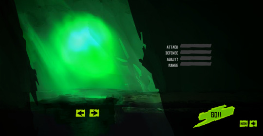
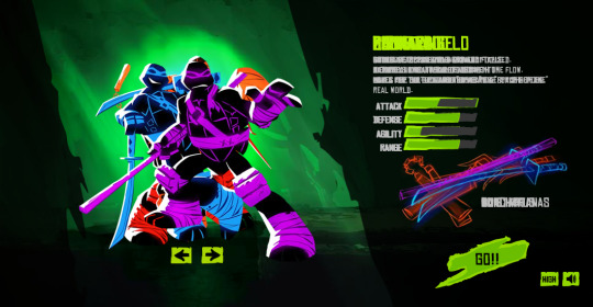
HAPPY TURTLE TUESDAYYY TMNT FANDOMMM!!!! I have a treat for y'all artists who love to make TMNT OCs!!! If you love the 2012 era, you're gonna love this one too!!!
A FREE TO USE TMNT DARK HORIZONS FLASH GAME CHARACTER SELECT TEMPLATE, MADE FROM THE ACTUAL GAME SPRITES!!! (Scroll below for the Google Drive of the files, credits first to the artist though sorry! :D)
(ft also the fancy animation particles for when you get to this menu, for those who wanna add it too! (( the GIF is the raw version, without the effect settings/scripts added in Flash tho.)))
PLEASE KEEP IN MIND!! I DID NOT CREATE THESE ASSETS, NOR HAVE I DRAWN THEM
(I am an artist posting this, who has replicated the game's art as a fan, so I want to disclose clearly, that these are NOT MY WORKS HERE.)
PLEASE PLEASE PLEASE give all the credit to the SENIOR ART DIRECTOR working on this Flash game, Damian Aliberti and his team of artists from Quadramma (I could not find sources online that confirm who are said artists unfortunately, so I can only credit the art-director for now)!!!
He even made a page about this project, for his portfolio! Check it out, it's AWESOME!! (CLICK MEE / TAP MEEE)
^I didn't know they planned to bring this to mobile, so you can predict that I'm happy, that this game is still seemingly loved by the Italian studio that made it seemingly. x) (I can only assume they're Italian, due to the file-names, don't quote me on this though, barely any info exists on this Flash game as you can predict LOL)
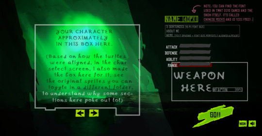

GOOD NOW THAT YOU HOPEFULLY READ WHO MADE THE PRETTY ART: CLICK ME OR TAP ME FOR THE GOOGLE DRIVEE (drive provides the GIF, a PSD, SAI2, PNG and MDP file!! [the joys of owning several art programs, making this much more accessible to people :v])
btw, also like..Maybe not use this for commercial/profit purposes though, that'd be profiting off resources you didn't make, and that are copyrighted. I don't think that's legal. :"v
NO CREDIT REQUIRED. COMPLETELY F2U. I did not after all make the assets, nor will claim so. :V as I mentioned, I extracted these from the actual game, which is why these are all so crisp and nice looking, instead of me using a snipping tool like 2 yrs ago for my fun challenge of recreating the game's artstyle LOL
I do NOT claim these assets or the art I've extracted as my own, this is all purely from the game, and very obviously, these are I guess, owned by Nickelodeon, so I ask you ofc do not...Do some legally questionable things w/ this stuff sdfklsd, pls behave fans, I'd rather not get reported for something I didn't do for providing this to the internet. xD
--
Whilst credit would be nice, and linking back to this would be even nicer for other fans who might just like me,, wanna replicate this cool game's aesthetic sdfskldglk, it's optional, completely LOL. It did only take like 2 hrs to piece this stuff together, to look like a real screenshot thank god. xD
FEEL FREE TO SHOW ME IF YOU ALSO DRAW IN THE GAME'S STYLE OR WANNA BANTER ABOUT TMNT OCS OROROR YKNOW USED THE THING AND WANT ME TO SEE ITTTT I GLADLY STARE AT TMNT POSTS NO MATTER WHAT ERAAAAA~
I JUST WANT PEOPLE TO APPRECIATE THIS GAME'S ARTSTYLE NGL. THAT'S ALL I WANT. And if more ppl also would wanna draw in it it'd make me so happy. I am like...The most acoustic TMNT fan out there man, I have the weirdest wishes in mind xD
Hope anyone wants this orrr like needs it orr dreamt of doing this too orrrr just never thought about doing it, but now that a free template is out there, someone might also wanna do it!! I love whenever like- fandom templates and stuff is made. I plan to maybe make this a Toyhou.se code too, since I do have the raw files of the games and could try to see if I can replicate the animations and stuff and make it non-premium and premium!
(Maybe I should make fandom codes more often in general tho at the topic of that, did it before for Terraria and helped out w/ a Monster High code, to give it a mobile compatible version LMAO)
If anyone or me figures out the artists behind the sprites, I'd gladly show them too, bc GORGEOUS GAME MAN!!!! THEY DESERVE ANY PRAISE THEY GET FOR THE ART AND THE GAME ITSELF ANSAHSHAJS, here I go again I swear, I'm done yapping now. I should participate in internet olympics when it comes to writing essays in every post I ever made. xD
#free to use#f2u#tmnt base#tmnt#tmnt 2012#teenage mutant ninja turtles#flash games#f2u base#base#template#free template#oc template#art template#character template#fake screenshot base#no credit needed#art base#fainthed#fainthed cherry#o0cherrypie0o#o0fainthedcherry0o#dew it#draw some stuff w/ this hellyea
5 notes
·
View notes
Note
What actions and settings do you use for your gifs? They look so nice and clear, without any grain or static!
oh thank you! honestly I don't use any actions at this point, I just make sure I make gifs from the highest quality files I can find so they look good for those 540 px gifs. then I try to adjust my psd to fit the scene I'm giffing and in a way that the colors aren't too different from each other to help keep it cohesive with the limit of 256 colors on ps, the more colors you have on your gif the harder it will be for it to be clean because of the 256 limit. also tumblr has a 10mb limit but gifs with a lot of frames and closer to 10mb tend to be more grainy (can't really tell you why tho it's just something I've noticed) so if you do want to make more colorful gifs it's a good idea to keep them as light as possible on the number of frames. oh and before saving the gif I usually sharpen it a bit with smart sharpen to help it be a bit more clear (but this REALLY depends on the file you're using, but def something I've used while giffing xena and buffy).
other than that I use vapoursynth to help me cut the scenes I want etc prior to importing it to ps, you can find a tutorial for it here. it's the fastest method I've found for scene selection and what I've been using for the past 4(?) years or so, it's pretty intuitive once you get used to it and you can resize your scene on it before importing it to ps which saves a lot of time. but keep in mind that this isn't a magical tool and without the stuff above it will be hard to make clearer gifs.
so to recap:
make sure the file you're giffing is the highest quality you can find (specially if you plan to do 540px gifs)
make sure the colors are cohesive in your gifs since 256 colors is the max for gifs (2 major colors that contrast each other is fine btw, more than that can become too noisy though.) I can't stress this one enough! to me it's even more important than highest quality files because most of the time if the colors are nice people won't notice if it's grainy or not, but nice colors also make the gifs look higher quality than they really are (this can be tricky depending on the scenes you're giffing tho and I hate to say it but it's something that comes with practice, color theory helps a lot tho)
if possible, try to avoid making heavy gifs (close to 10mb) as it can compromise the quality of your gif (sometimes you just gotta say fuck it tho bc the gif won't work with less frames)
try using smart sharpen and see if it improves your gif! (my usual settings are | Amount: (varies depending of the scene) | Radius: 0,3 (I never change this one) | Reduce Noise: 0 (really don't recommend using this because it will blur out your details but it's up to you)
#I wish I could give more tips when it comes to coloring but it's something that it's very intuitive for me at this point and it's hard to#explain for me because I don't think about my thought process when I'm doing it I just do it yk askdjh#but it's definitely something that came with practice! also painting etc is something that improved that for me because I know which colors#go well together and which ones should be toned down for the most part - I still make mistakes sometimes but yeah#sorry that's very long but I hope it's helpful! if you want me to explain anything in more detail lmk#ask
8 notes
·
View notes
Text
I hate trying to figure out how to make nice rp promos using only what I have available to me on my phone because even tho medibang supports psd files, a lot of the more intricate settings in a psd file aren't supported by the program anyway. I just wanna learn how to make cool graphics and stuff why isn't there a mobile app for that yet...
1 note
·
View note
Text


may // february
#i was looking for a psd and foung this again.......#all this magenta..........DISGUSTING 🤢🤢🤢🤢🤢🤢#also dont rb this omg its just for me 😭😭😭 people have been rbing the othr stuff i posted but its not real gifs 😭😭#i like doing this tho omg even if my old gifs were terrible its nice to c the improvement#mp#b.a
22 notes
·
View notes
Text

@goldenreign sent : 👑 + jar jar binks, our true king » WHO SHOULD I WRITE ?
would i : yes / maybe ( but only as a joke ) / no have i ever before : yes / no / kinda icon and writing sample :

i’m ,, not actually going to write him though .
13 notes
·
View notes
Note
Do you have any advice on figuring out photoshop and templates? I’m new to all of this and I’m really struggling :(((((
Oh gosh I’m so sorry anon, life’s been so chaotic that I completely forgot about your ask! But I am here now to help :)
I will say off the bat that I’m v much a trial and error kinda gal/look things up on YouTube lmao so I’m self taught in pretty much everything I know with photoshop (aside from a few helpful tips while at uni) so I’ll try and list some things that I find quick and easy to use when editing:
Templates in general tend to come pretty organised with layers names etc so it’s easier to navigate, but I also always recommend NAMING YOUR LAYERS!!! It saves SO much time and even grouping them into relevant sections (groups) can really help navigate the layers panel (especially when you get to 200+ layers like me lmao)
I always edit the resolution of my documents when creating them to be at least 100px (pixels) because then the final design is higher quality! That being said; that’ll depend on your computers RAM capacity and how much of it is used by photoshop - my desktop has A LOT of RAM cus it was custom built, but laptops etc have a lot less (otherwise it’ll make the app glitch and crash essentially)
I use the magic wand tool religiously lmao - it may not be the most perfect outline but if I’m gonna edit the image more afterwards, just getting the background out the way first helps a lot! (Using the layer effect drop down will also give you options of ‘multiply’, ‘screen’ and ‘overlay’ plus a bunch more to add effects to your layers, but a quick way of removing a white bg from a layer is to use ‘screen’ and it’ll auto remove it! Careful tho cus sometimes it removes TOO MUCH of the image aha)
If that tool doesn’t work for you then the ‘colour select’ option in one of the drop downs will do the same thing but will select every bit of colour on the document that you select - ie if you click on the white background, it’ll also pick up every other bit of white on the document so keep that in mind (I apologise that I’m not more specific, I’m writing this on my phone and haven’t got photoshop open)
For text layers, I ALWAYS turn off the ‘hyphenate’ tick box in the text box settings! Hyphenate is more for professional documentation/printed work, so for template edits and personal use I always turn it off cus it makes it look weird imo (the text box settings will open up on the right when you click on your text, so just scroll down a little until you get to the paragraph settings and there’ll be a little ‘…’ to show more options and it’ll be in there!)
CLIPPING MASKS ARE A LIFE SAVER!! On your layers panel, if you have a shape drawn out (ie a square for example) and you add an image/colour layer/literally any kind of layer on top and move the mouse to the line between the 2 layers and click ALT, it’ll add the clipping mask so the layer on top is only visible within the shape underneath! Works for filter layers as well as images in general etc PLUS they stack!
For templates specifically it’s a lot of fiddling until things sit nicely with one another for me, but one thing I use often is PSD filter packs that you can download! Lots are on tumblr and deviantart etc but you should always credit who you use, unless you make them yourself! They help tie a design together so all the colours match!
I also like using the ‘blending mode’ options on the layers panel. So when you right click a layer - it’ll give you the ‘blending mode’ option at the top and that allows you to add shadows/gradients/texture and a bunch of other stuff to that specific layer!! Including ‘stroke’ outlines around the edge of your layer!
I ALWAYS save my PSD files separate to the final product in case I wanna edit them, and I will export any final designs as an image!! For highest quality in your exports use PNGs!! JPEGs reduce the quality SO much so always go with PNGs but if you don’t want a transparent background, make sure you untick ‘transparent’ in the export window!
There’s plenty more tools to use on photoshop, but I recommend just creating a blank document, adding a bit of text and an image and just playing around with it!! You’ll discover so many new ways of doing things and ways that suit you!
If you ever want more specific advice for something then pls ask! I have 8+ years of experience and a graphic design degree so I like to think I know some things haha!
I hope that helps🤍
#misc: asks#misc: anonymous#I’m sorry I couldn’t be more specific!#I’ll probably think of a bunch more tips down the line so I’ll reblog this if I do#for now that’s a good start
2 notes
·
View notes
Text
my answers to simblr asks v1 because i don’t think i did a mass post like this.
1. how big is your mods folder? 15 gb, i don’t have my giant hair folder in rn
2. how would you describe your style? maxis-match, reshade/cartoony/dof aesthetic
3. what is your favorite challenge? 100bc obviously. and those completionist ones that take 400 years to finish
4. do you make cc? if so, what kind? age conversions of hair and recolors. and once in a blue moon i convert earrings or something
5. what type of cc do you hoard? hair, always and forever. my hair folder is sooo organized but i dont keep it in my game because it is very hard to find anything; there’s literally over 1000 items in the catalogue. also this is just female hair, for kids/toddler i use my own stuff and there’s really not enough male hair for me to mass hoard
6. what default eyes and skin do you use? intoxicated v2 - i’ll use this for the rest of my life emerald eyes by forgottengrotto
7. how many urls have you had, and what are the meanings behind them?
i have had 4:
celeschul - a play on “celestial” because that’s how you pronounce it an0nymousghost - the 8th level of the criminal: oracle career stardze - relating to astrology (star daze) teauke - sounds cool i guess; also i really wanted a short name
i don’t think i’ll change my url anytime in the future because it would be very annoying with all the broken links. i personally hate it when blogs have broken links so i don’t want to add to the problem. also, an0nymousghost is such a nice simblr url, it’s actually got a connection to the actual game. it is already confusing enough with the an0nymousghost/celeschul thing, but that’s mainly just because an0nymousghost is a long url and doesn’t really fit on package titles or thumbnails
8. who is your favorite gameplay blog? i have a personal blog and on there i only follow my faves: @leafykii, solarlemonade, ratboysims, @simprising, myshunos, @aridridge, @whimsyblue.
9. who is your favorite storytelling blog? idk i dont follow stories
10. who is your favorite cc creator? im not super involved in cc rn but aharris00britney and clumsyalienn who does those beautiful hair strands. oh yes and myself of course
11. how do you edit your photos? reshade + action + psd. it’s complicated but the reshade takes 0 effort and ive struggled with editing forEVER im happy with this one
12. what is the last screenshot you took? idk im on my macbook
this is the last screenshot on my mac LUL. rip to this hair which has been a wip for 10 million years.
13. what do you do when you are unmotivated? nothing; right now is a good example. i have a queue so you probably can’t tell, but i’m super unmotivated to do anything. like i could make cc or play ts4 but i really just don’t want to (that’s why im writing this). idk why, but either it’ll pass or my blog will be dead forever. xo
14. who is your current favorite sim? i said the fae sisters for my other post but i really like noelle’s husband claye! i think my female sims are always wayyy more attractive than my male sims, but claye might pull in front of noelle tbh. he looks much better with the emerald eyes (the cartoony ones)
also i consider all my sims to be good people, and claye’s kindness comes from him always taking care of leila and israel because noelle is off at work and such. oh and noelle’s way more...experienced than him when it comes to relationships
15. who is your current favorite sim that is not by you? no one really comes to mind, i haven’t been focused on like one specific sim lately
16. recreate someone else’s sim in your style. nah
17. do you talk about sims with people in real life? yeah. i don’t want to keep secrets from my friends (i used to have a secret ig account and it was a cause of major stress) so i just mention it in passing. honestly if they’re not cool with me having a sims blog, we can’t be friends. none of my irl friends play sims tho :(
18. how many of the packs do you own? 23/38 or something along those lines
19. how many posts do you have on your blog currently? 1665. i have more followers than posts, something that i never achieved ever on my old blog because i had like 4 gazillion posts
20. how many drafts do you have on your blog currently? 7, they’re all just shitposts or asks
21. how many posts are in your queue currently? 17
22. have you ever moved blogs? 2 times. celeschul -> stardze -> an0nymousghost. also i moved my multifandom sideblog once but that url has changed soo many times
23. are you in any sims related discord servers? yeah. though, i cant stand discord for a totally-unrelated-to-sims reason
24. what are your thoughts on the most recent pack? (paranormal) this is an outdated question but i still do not care about this pack. lol
25. how many hours have you played sims? 1039 hours
26. if you play gameplay, do you play with mods? yes, a lot
27. what’s the farthest you’ve gotten in a challenge? 100bc, i got to like 56/100 kids in my first attempt. this is TECHNICALLY farther than random nightmares, which i feel like i completed more of but i only did 50% of that challenge. i wrote on my blog that i completed random nightmares but in my heart, it’s not complete until 10 generations. so i just said that to make myself feel better. i’ll do a season 2 sometime...sometime
#replies#replying to MYSELF#simblr asks#ask game#i copy pasted some answers#also to clarify 24#i have no idea what to say bout paranormal#it's just a pack that's it
20 notes
·
View notes
Note
hiya, I really love your art, and how you make your latest stuff look really vintage and aged, it’s really super cool and I was wondering if you’d be willing to share your process for that?? thank you so much and I hope you have a wonderful day!!! :D
aww thanks so much! and of course i can share my process, no prob!! ^^
i’ll be using this piece as an example, and uh, for the context of it u might have to look on twitter lol. but whatever

it’ll be a bit long so everything is under the cut
(this is just based on my process, and i know its weird and csp specific.
feel free to pick and choose pieces from my process!)
and also the programs i used were procreate and csp and i have a mac. u could probably do this with other set ups, but this tutorial might not be super helpful near the end
i usually make my lineart in procreate and import it into csp as a .psd file

for this, in procreate, select the file you want to export and click PSD and then I airdrop it to my mac.
i think the only thing about the lineart i have tips on is to keep it toothy/gritty if that makes sense?
i use the 6B pencil in procreate with a bunch of tweaks to the pressure sensitivity and opacity/size change.
but anything with a good size jitter should do the job!
in csp i shade and color the piece.
picking out the colors is a whole other mess
feel free to ask about it but ill skip for now ;v;

flat colors

csp has a lot of nice halftone options!
group up ur lineart and everything thats black rn in a folder and above them set a clipping layer to add
fill it with a color lighter than black; the less pure blacks and white u have on a piece the better
feel free to go to town w the grunge or noise texture of ur choosing! the grittier the better bc during this step i try to get the feel of worn off ink. just make sure the linearts still visible, though. u went through all the trouble to make it after all! ^^
(i have specific brushes but again thats something else u can ask me about)
above all the layers, make a multiply layer and do something similar.
same advice as above

this is ur “paper” texture, tho, so try to keep it more even in tone so things don’t get too messy
(but if it works for u, feel free to do it! find what works is my advice!)
ok time for some super csp-specific steps (sorry to non-csp users)
the csp asset store/website(?) has a lot of nice textures and brushes available.
look through it if u haven't
it will make ur life so much easier
theres a really nice tileable watercolor texture set there
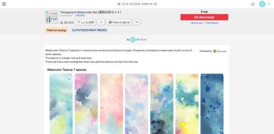
(this one specifically)
(it also had some really good paper texture bc whoever made this is a godsend)
i slap that over the color layer, set it to clipping, and mess with the blending modes
its usually a tossup between soft light, overlay, multiply, and the overlay texture effect tho
theres another optional step of using the overlay texture effect on a paper texture
i didn’t do it on this example sorry :’(
i think i used another watercolor texture set to soft light on this piece?
after that, if u want, i like setting a noise texture at a v low opacity over everything for extra jitter

(i use this one. u can just make it in csp and probably any other drawing software but im lazy lmao)
save it as a png/jpg/etc.
and ur done!
i do some extra stuff to the final image like scale everything down and add a bit of a 3D effect for a bit of extra kick
(but again thats a bit complex and specific so feel free to ask but ill keep it short
for your sanity’s sake)
(and once again, the final image! ta-da!)
some tips to keep in mind i guess
jitter, grit and noise textures are very good things when u want something to look rough
avoid pure blacks and whites; most paper isn’t printed pure black or white and it only gets more faded and colored with time
if ur super lost, look at reference!! theres a lot of good artists and media out there to get inspiration from, and looking at scans of actual old comics is a nice way to see if ur work looks aged
(also u don’t have to use old comics as reference; i like looking at old vcr footage for reference bc of the texture!! :D)
that’s all i have for my general process
uhh for specifics feel free to ask
i can make more tutorials but this one is a general overview, i just didn’t to take up too much of ur time….
but i really hope it helped! and im very sorry if it didn’t
i’ve never made a tutorial so im sorry if it didn’t answer ur question and also im sorry if this one’s not very useful
thank you for reading!!!
and thank you to whoever asked! :D
54 notes
·
View notes
Note
oh!!! i appreciate your offer but instead of the edit, can you please share with us tutorials or tips, idk to editing on ps? i used to edit a long time ago but now i don't know anything </3 and i'm also upgrading my laptop so i think it would be nice. only if you can, of course!
ᓚᘏᗢ : hdjhd should i make tutorial posts in the future? 😆 i'm really bad at teaching though and my editing process is allover the place. like for gfx. gifmaking is a little neater bc i just have to get the frames through vapoursynth and load them into photoshop cc ( i use 2021 now hsjhd i've upgraded ugh i feel renewed ) and add adjustments to colour the gif ( which is usually v easy bc i have like a psd now that i use in all of my gifs, i just adjust them according to the video lighting ( s/o to my psd saved as heehee.psd you are the loml ))

^ heehee.psd my beloved
gfx is a lot harder 😩 i used to make like lots of gfx before in my prev blog and i stopped bc it's sooo much work but i'm kinda getting back to gfx making. what tutorial should i do? lemme just enumerate a few habits i do when making gfx
nothing. i'm a mess.
jk. i avoid it a little by grouping the layers. i still can't avoid having some layers out of layer groups tho but that's okay...😬.
i don't remember stuff i do as a habit when making gfx anymore shjhd i just like to group things that's all ;-; i just honestly go with the flow sometimes i just open ps and like slap things onto a canvas shjhdjs but if there's any gfx i make in the future that i could make a tutorial of, i woulddddd
also like i used to have for example two tabs open, i edit a photo on the second tab, like put adjustments, select all and then copy and paste on the first tab which is my canvas. these days i like to merge down the whole thing in tab two first or save the edited / colored / filtered content if it's a gif first and then re open it before copy-pasting it onto the canvas bECAUSE it's annoying when you paste the unmerged thing on the canvas and the adjustments cover the whole thing and changes the background colour ( eg. white becomes reddish or grayish etc )
you see how i explain things now i'm like all over the place fr HJSHJD i think i could explain better if i screen recorded my process. aki youtube channel when? jk ahjdhjs anyway this didn't even help i just rambled ;A; i'll make a tutorial of something more specific next time, or like maybe make temlate psds yk those cute things those cute blogs make ( are those rp blogs? idek sjhd )
#( mail . ✼ )#( anon . ʚɞ )#i don't understand my own explanations here LMAO SHHAJHS#my verbal skills: 0
4 notes
·
View notes
Note
I need some kind of a photoshop lesson for this aesthetic of yours
okay i’m gonna do a tutorial real time for a picspam type aesthetic that will look like this ⇣ a photo i will put here once i make it.
step one. open ps : )

welcome : )
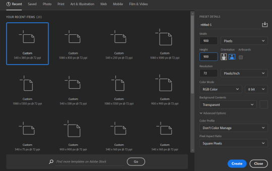
okay so dimensions r a thing tumblr compresses photos like hella so i do all my still img aesthetics 900x900 is you’re trying to do this for say insta i would actually recommend jumping up to 1080x1080. pixels, obviously. idk if i have to clarify that.
so click ctrl+n or create new i’ll be doing 900x900
these r the rest of my settings i personally do not think they matter my resolution stays at 72 the only thing i’ve detected this affecting is font size. (side note notice how this pic looks all fuzzy? that’s bc it’s a ss with a boatload of pixels. and if there’s one thing tumblr hates. it’s pixels. and then it’s users. but who’s counting? tumblr is. i recommend keeping ur still images 900x900♥)
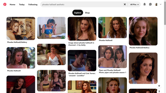
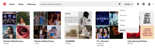
step two is collecting ur images i personally use pinterest for these bc quite frankly it’s really nice & easy to find these types of photos esp if you’re looking for a canon character bc if you type in [character name] aesthetic you’ll get stuff if you don’t quite frankly even just type in aesthetic you can scroll until you find an image you like click on that and go through like images underneath it and keep burning thru. like u probably know how to work pinterest. but i am being thorough and covering my bases. searching [color] aesthetic is also nice or even searching a character that isn’t the character you’re doing this for but who’s kind of similar that also works. i recommend esp for charmed bc their pinterest gets bogged down with screencaps and then like. charms like jewelry searching “charmed aesthetic” or “phoebe halliwell aesthetic” really just doesn’t cut it so what i’d recommend is instead of going through pins, go through boards.
bc like. big difference. other pro tips if you see a board you like, go to the person’s profile and check out their other boards bc odds are you’ll find more you like. another protip if you’re specifically doing ocs typing in oc aesthetic will get you a lot even going to the boards on that as well. yields.
so. you’ve gathered ur images. u need five. open em. i’m making an aesthetic 4 myself which you’ve probably already guessed from the fact i’m putting the finished piece at the top, but it’s not ready yet so it’s still a surprise for me.
cropping. if ur doing a 900x900, use these setting exactly. 1080x1080 use 1080/2 x 1080/3. i’m not doing the math 4 u ♥

most important part? Delete Cropped Pixels. otherwise ur not really doing anything. crop all five images.

but them in ur document. document? psd? ur thing ♥ place them places. u do not have to commit now. leave one middle one blank. it does not matter which one. i personally like to alternate my text pieces if i’m doing a long post like what i did on my ncwotng set. some people keep them all on the same side. this lowkey bugs me i feel like it throws off the Balance but i imagine some people like The Consistency. i don’t. but w/e. it’s up to u as this is gonna be ur set. also like. as you’ve cropped these to x/2,x/3 settings they should fit nice like puzzle pieces : )

the next step i personally like doing is creating by text box with The Color™ do this bc simply duplicating one of ur images, shoving it in the empty slot, and converting into a sharp object. edit contents.


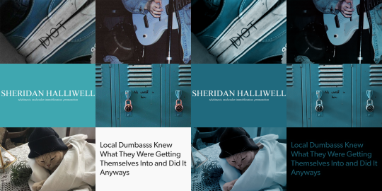
now. obvi i selected these images w a color scheme in mid. i recommend u do the same. even if it’s just vague. they don’t all have 2 fit. this is my example of my sheridan piece b4 or after. tweaking is possible. layers w masks r ur friend. i can talk about them more if need be.
But. back 2 the smart object. brush tool. paint it.
♥
the text i used was times new roman all caps 40pt font 0 spacing for the title and times new roman 14pt font 0 spacing italics for the subheading. here’s my dency b4 and after for comparison

next step is after you have your text in alright, shove everything into groups. mode on “normal”


then you can start editing. the groups let you edit things like lighting and color without touching any of the layers below it 👍
i’m not gonna do a Major coloring tutorial, for lighting i’ll usually tinker with exposure, levels, sometimes brightness/contrast. for colors, color balance + hue/saturation. i rarely touch anything else.
i’ll bring u along 4 the coloring of this one bc i’m gonna add a layer mask.
so the first thing i’m going to do bc the paper itself is already close to the vibe is i’m going to color it normal and just ignore the background

something like that. then i’m going to add a layer mask (square button w the plus sign)
and then i’m going to eye dropper a color off from somewhere else
now i was talking about the “normal” blend mode stops ur color settings from bleeding over onto other images? does not apply to painting on layers but you’re already masking this bad boy, so it doesn’t matter. just don’t say i didn’t warn u
i’d recommend using a really ridiculous blend mode to clean up ur thing at first, i’m using darken which isn’t that wild but like whatevs.
add a layer mask using this button.

select and mask
use this thing to clean up ur mask
okay so i did a lot since we last spoke

but if i impart any lesson to u. it’s: fuck around. find out. that’s literally how i’ve basically done everything. nothing’s ever really gone horribly wrong. click things. see what happens.
okay so now that you’ve kinda gotten everything figured out. change ur text box color again. i’m introducing u to ye ol trick that is not the paint brush. but. hue/saturation on colorize more yeah babyyyyy
ahaha yes. love this bad boy.
Now. Trick To Make Everything Super Cohesive™. put things above All of your groups.

yeah boy.
reorganize ur thing bc u don’t like how it looks.
fuck around w a lot of stuff.
it’s still cluttered.
fuck it. grab a new image.
something like that. never let the fear of striking out keep u from playing the game : )
fuck around a bit more.

vibes♥
save ur image bc u literally Have Not Done That Yet

& then remember the other thing u forgot to do
eyedropper what ur text box looks like move the whole thing to the tippity top and recolor

this is just bc u’ve fuck around a lot w a lot f different settings. this ensures that the text stays the same color u set it as.
okay final step.
turn The Whole Thing into a smart object, smart sharpen
leave out the text box tho. the sharpened text can look weird. it’s ur choice, but with these settings,, cronch.
and wallah. ctrl+shift+s save as png and bada bing bada boom baby. aesthetic
#like i cannot stress how much of this simply is. fuck around. find out.#like just have fun click on things#go ape#like there's no right or wrong way to do this#anyways i used to make these for harry potter on canva ♥ remember ur roots#tutorials#ps tutorial#aesthetic tutorial#ogwork
39 notes
·
View notes
Photo


my gifs pre/post coloring - sorta tagged by @ninzied
i don’t usually do tagged stuff (too freaking lazy not because i don’t like it) but this one seemed pretty fun. colouring is one of my favourite parts of making gifs. sure it makes me swear up and down but the result is always so satisfying. i selected kastle scenes because (1) kastle and (2) i keep all my kastle psds because once i get it right i never stray away from it in future gifs. i don’t usually share my psds tho because i think everybody colours differently, but this is a nice way to show the work me thinks.
tagging - @stevenrogered, @frankcastle, @frank-kastle, @quicksiluers (sorry if you guys have already done it and i haven’t seen it) and anybody else interested!
51 notes
·
View notes
Note
Hi! I noticed that you usually make a custom background on your themes, do you have any tips for doing this? about the code in the html to do it right/if changes according to the theme you use, thank you in advance~
Hey dear anon!! :D Well what I normally do is have my usual background measures, which is the size of my screen then add the render of the characters and experiment with lots of stuff. I like to always add the background with the most symbolic style that the anime has. In my case now, I added the background of a official image of Jujutsu Kaisen anime which has a super creepy and dark background image so I tho it was perf for my theme. So I cut the image in various parts and add on the places where I found it would look cool. It's an example hon ;) Another example, in my BNHA themes I always used vibrant colors and some stuff on the comic side which was a thing that the anime represents, heroes and stuff. I always make a research on the net and get ideas for my themes too! The colors I experiment a lot too, it depends on the anime really so I always try something new with colors, I have a psd but I'm always changing colors so I don't have any specific psd for all of them. With the codes, it depends on theme and for what I'm looking for. Sometimes I change the codes a bit for what I want to look like, most of the times I have a vision of what I want my theme to look like. I search for some themes and change a bit to what I want. Most of the times is the size or the positions of the headers and sidebars :) Or when I want the background to be more highlighted and have more of simple theme. For this theme I din’t change anything of the codes since I love the way it is for my actual Jujutsu theme. So it really depends of what I want for a theme. The theme of the anime helps a lot too, I’m always thinking of the style of the anime and then I want to do a theme exactly how the anime represents :D You’re welcome hon! Have a nice day!! :D
2 notes
·
View notes
Text
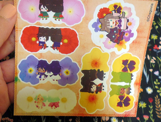
Vograce stickers review
I don’t usually make reviews here but I felt it would be opportune since there isn’t any out there and if you are looking for options and you can’t find any soul talking about it, then you would rather avoid that option, right?
When it comes to stickers, I always print them locally. It’s pretty much a hit and miss here, the people who print here are very casual and take little care of their machines. One day the prints can be nice and the other a total mess. Since the designs I was doing required kiss cutting(So you can peel off the sticker out of the sheet) and I don’t have a plotter like a machine like a silhouette or a cricut I decided I wanted this time my stickers to be made by a company.
First I contacted a company in the US which I heard good things about(Mind you, I’m from Peru) But they were taking a while to reply. I don’t want to comment on them much since I never fully tried their service. The thing was, time passed by and the stickers were on a void of no progress.
I recalled then Vograce(Which is a known company based in China for making acrylic charms)was making stickers and sticker sheets(Vinyl/PVC and washi like paper) They replied very fast which make me feel things would be done on time. Here I’m posting my experience with making stickers(I had done charms with them before)
Communication:
Speed: Fast! Yet pay in mind because of timezones the exchange could be delayed.
Language barrier: This must be the massive Vograce downside of them all. As someone who speaks English as a second language, I have a hard time to make myself understandable. Vograce reps are pretty much the same. I think it’s best to keep messages short and simple if you can. If you need things to be fixed, then try to illustrate them so they can understand it better.
Fixing stuff: Another Vograce downside and for a moment I felt like I was talking with two different people. The first two days of exchanges went smoothly and the rep which was attending me was very nice. I sent my files via Google Drive and there were no issues at all. Yet the third day where there was another thing to fix, the rep(Which was supposed to be the same person) approached me in a rather rude manner or at least that was the impression I had. Also, they refused to check my files via Google Drive when the previous days they had any issue? This plus the fact of the timezones, the exchange was becoming really slow and tedious.
Sticker formatting:
There is no way to know how exactly they need their stickers to be formatted unless you ask them, and they are a little vague about it. I’m going to give a bit of advice here:
The way you need to format your sticker sheet is similar to how Zap Creatives request it as far as I know. You have a PSD file with a layer called “background” where the non-cut art goes. and a layer called “art” where your sticker pieces go. I had a big issue here because of the following sticker sheet:
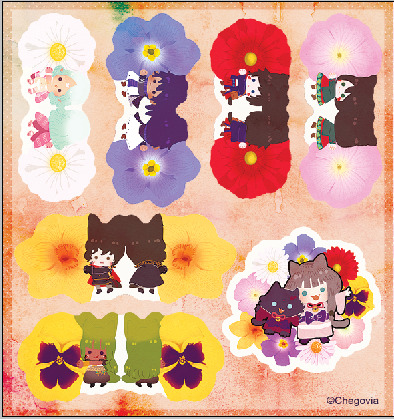
As you can see, the borders are different colored, not just one color.
Vograce then replied to me with a preview of all the sticker sheets that looked like this. The pink line is the cut line:
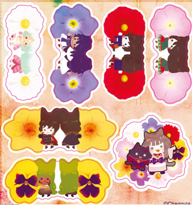
So I thought “Welp, I fucked it up, it looks like they need a bigger bleed border just in case the cut line moves a little” I requested if it was possible to change the artwork to this one I did according to the thick white bleeding they added:
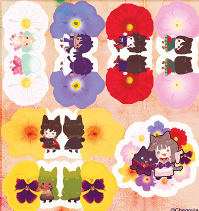
This is when things got difficult and it’s the change they were refusing to do. They told me because the stickers were very close to each other, they needed that white border. But my issue wasn’t the border but the color of it so I was clueless on why they were so against on changing it? Perhaps I’m ignoring the fact that their plotter program is different from Photoshop when it comes to replacing the artwork, but after a very very tedious exchange, the artwork remained as the preview they sent at first. So pay in mind there is a big big chance your artwork gets a white border instead of the color you requested. If anything, when printing with Vograce, avoid the nuisance and make your borders white. This may save you some headaches when sending and fixing your files.
Price:
Vograce by no means is the cheaper option if you consider shipping. The US sticker company I approached before was 20 cents less for one A6 sheet and had a flat rate of $20 of shipping for a certain amount of stickers. Vograce only ships via express(EMS) or private couriers so the shipping could be as much as the item itself depending on where you live.
Shipping:
Again, since you are paying for express shipping, things are meant to arrive quickly to your place. I knew they had a holiday so I requested if it was possible to ship it before it. Their rep promised they would, and so they did. After the previous headaches, I was relieved they kept their promise and did the effort to have them on time considering how hectic things can be before holidays.
Sticker quality:
After all the struggle I on the process the stickers finally got here. I don’t have a wide reference on how other companies make their stickers, but to me, these are very nice:
I was afraid that white border would show up but it wasn’t the case:
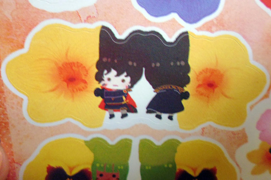
It’s a very precise cut.
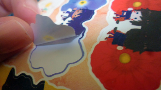
The stickers are very thin tho! Yet they are very sticky.
The back of the sticker paper looks like this, which might be a turn off to some people but since I’ve been printing locally, the stickers here look kinda similar with the manufacturer name so I don’t really mind.
The colors are accurate on what I sent them. Maybe they lean a liitle bit to the yellow side but that’s me being super picky because they are very close to what it looked in the screen(In CMYK) You can choose between glossy or matte finish. I knew that glossy makes your colors pop even more but I felt it could be a little jarring to have a sticker that reflective if you pasted it in your laptop or such. I’m glad the matte finish didn't dull the colors up.
How they will stand:
I have no idea yet lol. I stuck some in my most used journal and see how it will go. So far they have stuck to it well considering it’s a fabric cover.
Final thoughts:
While the end result was pleasant, I think I will try and search for another sticker company next time. Perhaps go for Vograce if you are already making a big order of something else with them. I felt the issues with communication and fixing were a turn off to me. Maybe if they had their formatting info in a PSD or in a video they would avoid so many problems with people like me who are clueless which honestly it’s a massive waste of time from both sides.
36 notes
·
View notes
Photo
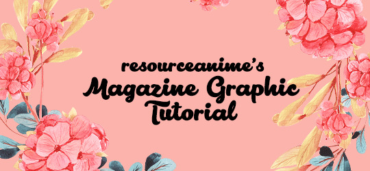

RESOURCEANIME’S: MAGAZINE GRAPHIC TUTORIAL
Hi guys! I’ve had a lot of fun making these magazine covers (and inside features) so I thought it would be cool to do a lil tutorial on the whole process. I will be going into detail for all the steps to create both the covers and the inside features, as well as giving helpful tips and ideas such as font suggestions.
Difficulty: Easy/Medium (depends on complexity)
Likes/Reblogs appreciated if you found this helpful!
First let’s do the main magazine cover. I will go over the inside features afterward.
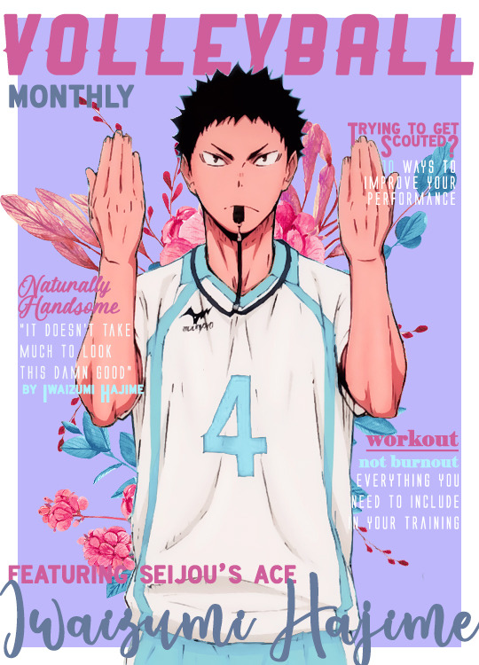
I will be using this edit as an example for this tutorial.

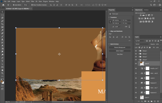
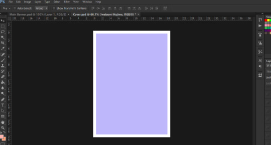
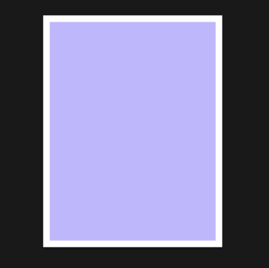
Step 1: Creating the Base Cover
Going by Tumblr sizes, I’ve done all my covers at 540px x 750px (or 800px - this is the maximum length you can do). Select File >> New and create your canvas at the sizes suggested. Go ahead and fill it with a background colour of your choice.
💡Tip: I used colour palettes to help me create my covers so that they all have some variation of colours that will look good together in text while also complimenting the cover itself. Try to choose at least one light colour and one dark colour for contrast. This will help you later on when you write headliners on the cover.
For the Iwaizumi cover, I simply used the box tool to create a box and filled it in with the light purple colour that you see. This allows a white border around the edges of the cover.
Step 2: Name the Magazine
Generally, you see the title on the top more often than not, but please feel free to put that title wherever you see fit. The thing with these covers is that you have a lot of freedom on how you place things, the main thing to be cautious about is readability and style.
I believe that the magazine title is one of the focal points of the cover itself. Graphic viewers should be able to decipher that this is a magazine cover edit immediately when they see it - that’s kind of the whole point. So, font choice for the title is pretty important.
💡Tip: use fonts that are easy to read - doesn’t need to be plain, but it does have to be simple in my opinion.
💡Tip: Avoid using Script fonts as they are harder to read. As mentioned before, the title is a focal point.
💡Tip: Be wary of Decorative types of fonts. If you can find one that is not hard to read, then by all means use it!
👍Font Recommendations for Magazine Titles:
Croco
Ginebra
Muara
Groce
Almonte
Salvalyn
Aliens & Cows
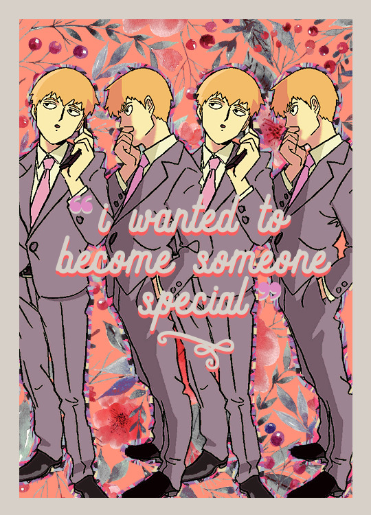
Bohem Press (used for the Reigen cover shown above)
Ranger (not free, used for the Iwaizumi cover shown above)
Now I have something small that is written as a subtitle below the actual title like “monthly” or “magazine”. This is totally optional! If you do end up using it:
💡Tip: I recommend you use a different font just to add some variation. For example, if you used a thick, bolded font, try contrasting it with a thin font. Script fonts would definitely work here if you so choose to use one.
💡Tip: If you’d rather use the same font - which is totally ok - try changing the colour of the subtitle or play around with italicizing/underlining it, etc.
💡Tip: As for what the subtitle should be....maybe showing what kind of magazine it is. I was being simple and used just “magazine” for the Reigen one, but I used “monthly” for the Iwaizumi. You could try weekly, daily, or even point out the city which the character is from (i.e. Vogue: India)
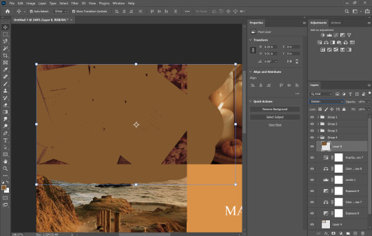
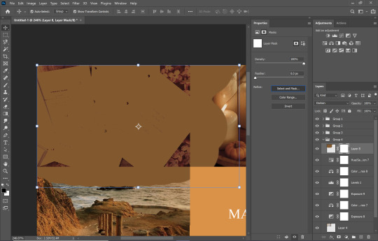
Step 3: Add Render of Character
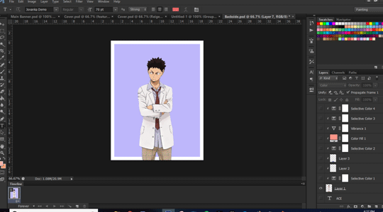
I will not be showing how to render a character for this tutorial, but please feel free to refer to Step 1 of this Graphic Tutorial to see! Essentially, please be sure to have a render that is somewhat large in size. You want the character to take up as much of the space on the cover as possible. You don’t have to feel like they gotta be in the middle, arrange them however you please! But, they are the focal point of the cover itself, so be sure to have them cover the space as much as possible.
And at this stage I will be adding a psd colouring to Iwaizumi.
Step 4: Add a Background (optional)
I like being Extra with my edits so I usually add something in the background, whether it be a png or a pattern. This is totally optional, if you’re not into filling up spaces as much then by all means skip the step!
For the example cover, I put some floral pngs behind Iwaizumi to add more to the empty space in the background.
I also added a psd colouring to it so that the flowers adhere to the kind of colours I was using.
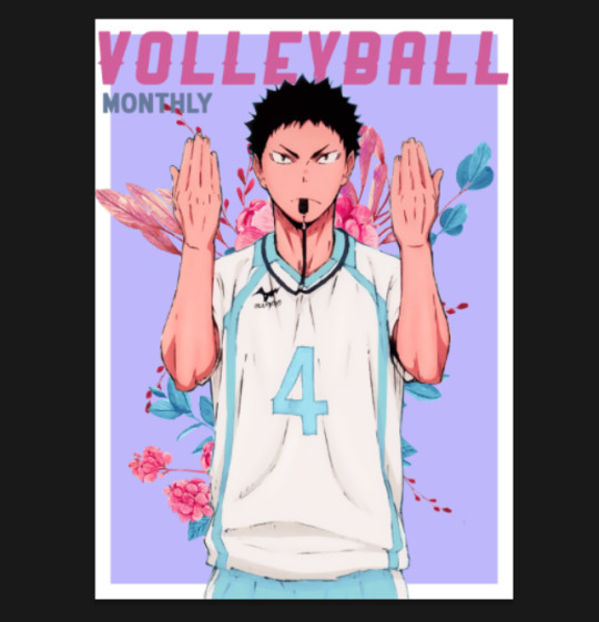
Step 5: Headliners and Features
This is the part where you will showcase exactly who is being featured and what are some of the contents you will be reading about inside the magazine. This is also the part where you get to play with fonts a lot! Again, readability is key, but you have lots of ways you can work around it.
Here is what I came up with at the end:

This anime was about volleyball so I centered a lot of content around working out and training. At this stage I can only really give tips as this is something you will have to experiment with, but I hope these help!
For Headliners & Subheadings:
💡Tip: I used about 4-5 fonts for the headlines/subheading. I recommend that you do the same thing, but just vary the format/arrangement. For example, I used the same font for “Trying to Get Scouted?” headline and “by Iwaizumi Hajime” subheading. They’re both the same font, but they’re in different sizes, different colours, one is a title while the other is subheading.
💡Tip: Use smaller/thinner font for the descriptions as they are not as important as the headlines. For headlines, use eye-catching stuff - bold, contrasting, even use script if you have to.
💡Tip: As shown in my example, I think varying the colours also helps.
💡Tip: As for the actual content, as I mentioned before, go with a theme like I did since my character plays volleyball. But don’t feel like you can only have lines that need to hook! You can always make like a little sticker that says “poster inside!” or write a quote from the character.
👍Font Recommendations for Headlines & Subheadings:
Krinkes
Coyote
Black Jack
Elephant (see: “workout, not burnout” on Iwaizumi cover)
Alien League (see: all thin subheadings on Iwaizumi cover)
Almyra (see: “Naturally Handsome” on Iwaizumi cover)
Ever After (see: all subheadings on Reigen cover)
For Features & Names:
💡Tip: This is another focal point of the cover, so be sure to make it BIG, make it bold, and make it P O P.
💡Tip: I tend to use script fonts for this because making the size bigger helps with readability so it seems appropriate. Don’t feel obligated to use script here tho!
👍Font Recommendations for Features & Names:
Bebas
Lactosa
Balqis
Sant’Elia
Valairya (see: “Iwaizumi Hajime” name)
Roadway (see: “featuring seijou’s ace” on Iwaizumi cover)
Jovanka (see: “Reigen Arataka” name)
Step 6: Create Base for Inside Cover
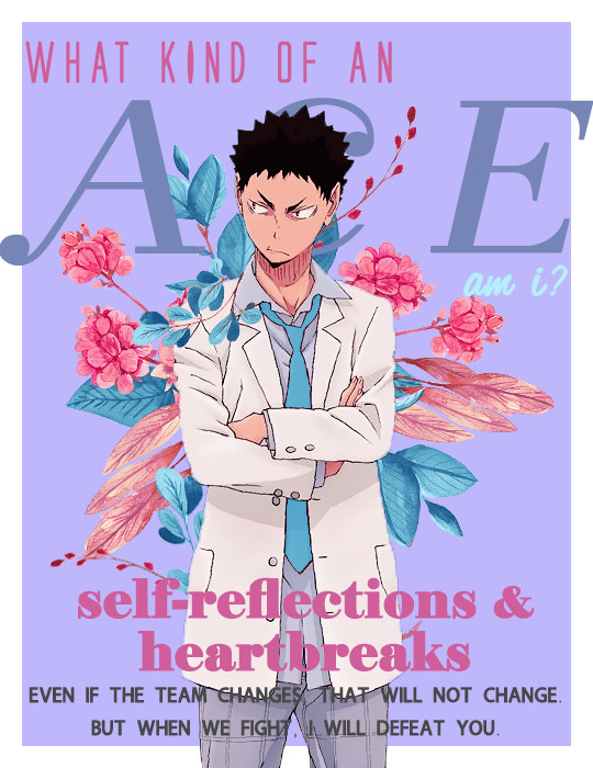
For the inside cover, I find that this can literally be anything. I’ve normally just stuck a quote in there but be as creative as you like! Go to File >> New at the same size as your cover. I would honestly just duplicate your background (and border if you had one) from the cover onto this new file. Starting back here again:
Step 7: Add Render of Character
Just like before, try to make sure that the character takes up as much space as possible. Place them where you like and add a psd colouring to them!
Step 8: Add a Background (again, optional)
So again, I like filling up the spaces so I added another floral png in the background with a psd colouring. This is optional!
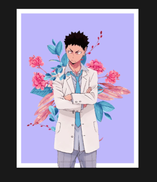
Step 9: Adding Content
Now this part is more so dependent on how you want to do things. I like filling up spaces and playing around with typography, so that’s basically what I did here. I used two character quotes and formatted them in such a way that they take up a lot of the space.

Again, this all depends on the theme and style you’re going for. I can’t really help you at this stage as this is more so about how you would like to go about it, but I am happy to give some tips:
💡Tip: I would recommend trying to fill up the space as much as possible again. Maybe make a section that actually has an “article” or do a photo collage of the character, or even just a quote, whatever works!
💡Tip: Try using eye-catching headlines and have subheadings just like before on the cover.
💡Tip: Use varying colours and fonts again! Keep things consistent by using the same 4-5 fonts and colours, but try playing around with the arrangement and formatting of them just like we discussed earlier for the cover.
Step 10: Save!!
And you’re done! Nice work!!
Final Thoughts
So, I think the main takeaway from this is that you’ve got a lot of room to be creative, but you end up having to play around and experiment a lot in order to make things work. The best tip I can give you is to prioritize readability over aesthetics (even I am guilty of trying to choose aesthetics over readability lol).
Hope you guys found this helpful!!
{ Iwaizumi Magazine Edit } ~ { Reigen Magazine Edit }
#tutorials#sibylresources#chaoticresources#resourcemarket#yeahps#tut:mine#tut:graphic#haaaa this took me so long i didnt even realize the time go by heck
359 notes
·
View notes