#tut:graphic
Explore tagged Tumblr posts
Visit Tumblr Blog
Explore Tumblr blogs with no restrictions, modern design and the best experience.
Last Seen Tumblr Blogs


Fun Fact
1,644 Tumblr posts in 1 second.
Photo

RESOURCEANIME’S: MAGAZINE GRAPHIC TUTORIAL
Hi guys! I’ve had a lot of fun making these magazine covers (and inside features) so I thought it would be cool to do a lil tutorial on the whole process. I will be going into detail for all the steps to create both the covers and the inside features, as well as giving helpful tips and ideas such as font suggestions.
Difficulty: Easy/Medium (depends on complexity)
Likes/Reblogs appreciated if you found this helpful!
First let’s do the main magazine cover. I will go over the inside features afterward.
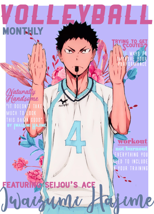
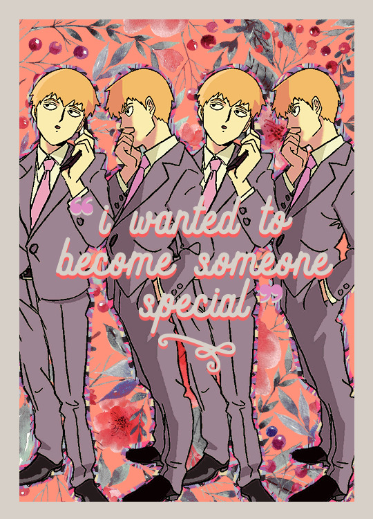
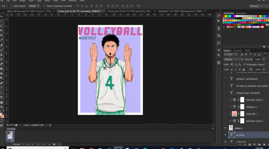
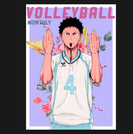
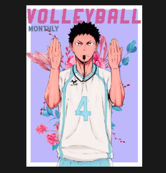
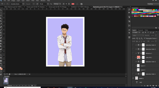
I will be using this edit as an example for this tutorial.

Step 1: Creating the Base Cover
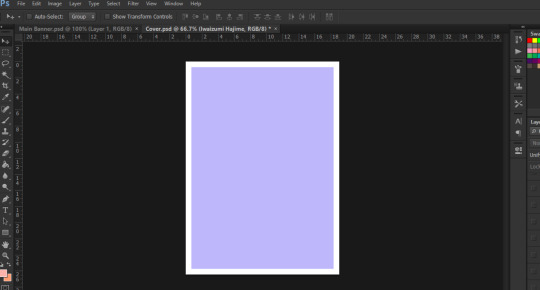
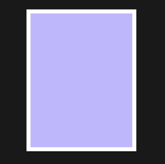
Going by Tumblr sizes, I’ve done all my covers at 540px x 750px (or 800px - this is the maximum length you can do). Select File >> New and create your canvas at the sizes suggested. Go ahead and fill it with a background colour of your choice.
💡Tip: I used colour palettes to help me create my covers so that they all have some variation of colours that will look good together in text while also complimenting the cover itself. Try to choose at least one light colour and one dark colour for contrast. This will help you later on when you write headliners on the cover.
For the Iwaizumi cover, I simply used the box tool to create a box and filled it in with the light purple colour that you see. This allows a white border around the edges of the cover.
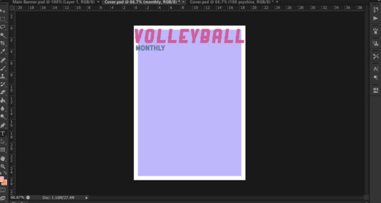
Step 2: Name the Magazine
Generally, you see the title on the top more often than not, but please feel free to put that title wherever you see fit. The thing with these covers is that you have a lot of freedom on how you place things, the main thing to be cautious about is readability and style.
I believe that the magazine title is one of the focal points of the cover itself. Graphic viewers should be able to decipher that this is a magazine cover edit immediately when they see it - that’s kind of the whole point. So, font choice for the title is pretty important.
💡Tip: use fonts that are easy to read - doesn’t need to be plain, but it does have to be simple in my opinion.
💡Tip: Avoid using Script fonts as they are harder to read. As mentioned before, the title is a focal point.
💡Tip: Be wary of Decorative types of fonts. If you can find one that is not hard to read, then by all means use it!
👍Font Recommendations for Magazine Titles:
Croco
Ginebra
Muara
Groce
Almonte
Salvalyn
Aliens & Cows
Bohem Press (used for the Reigen cover shown above)
Ranger (not free, used for the Iwaizumi cover shown above)
Now I have something small that is written as a subtitle below the actual title like “monthly” or “magazine”. This is totally optional! If you do end up using it:
💡Tip: I recommend you use a different font just to add some variation. For example, if you used a thick, bolded font, try contrasting it with a thin font. Script fonts would definitely work here if you so choose to use one.
💡Tip: If you’d rather use the same font - which is totally ok - try changing the colour of the subtitle or play around with italicizing/underlining it, etc.
💡Tip: As for what the subtitle should be....maybe showing what kind of magazine it is. I was being simple and used just “magazine” for the Reigen one, but I used “monthly” for the Iwaizumi. You could try weekly, daily, or even point out the city which the character is from (i.e. Vogue: India)
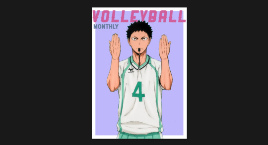
Step 3: Add Render of Character
I will not be showing how to render a character for this tutorial, but please feel free to refer to Step 1 of this Graphic Tutorial to see! Essentially, please be sure to have a render that is somewhat large in size. You want the character to take up as much of the space on the cover as possible. You don’t have to feel like they gotta be in the middle, arrange them however you please! But, they are the focal point of the cover itself, so be sure to have them cover the space as much as possible.
And at this stage I will be adding a psd colouring to Iwaizumi.
Step 4: Add a Background (optional)
I like being Extra with my edits so I usually add something in the background, whether it be a png or a pattern. This is totally optional, if you’re not into filling up spaces as much then by all means skip the step!
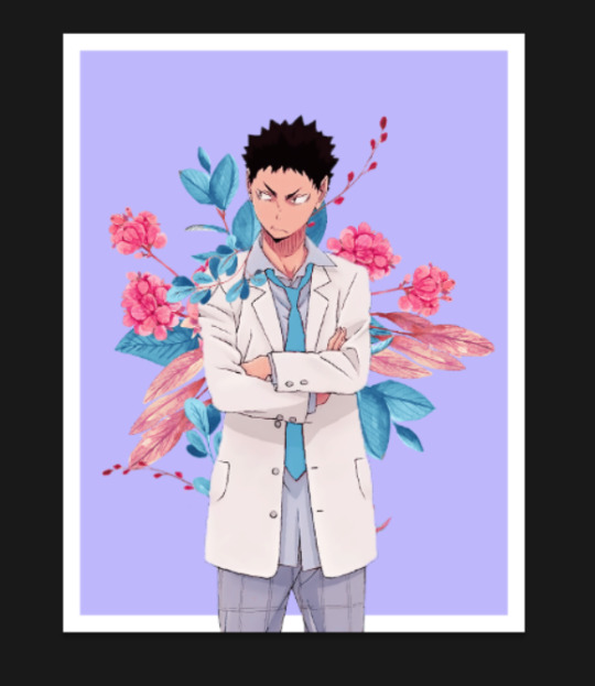
For the example cover, I put some floral pngs behind Iwaizumi to add more to the empty space in the background.
I also added a psd colouring to it so that the flowers adhere to the kind of colours I was using.
Step 5: Headliners and Features
This is the part where you will showcase exactly who is being featured and what are some of the contents you will be reading about inside the magazine. This is also the part where you get to play with fonts a lot! Again, readability is key, but you have lots of ways you can work around it.
Here is what I came up with at the end:

This anime was about volleyball so I centered a lot of content around working out and training. At this stage I can only really give tips as this is something you will have to experiment with, but I hope these help!
For Headliners & Subheadings:
💡Tip: I used about 4-5 fonts for the headlines/subheading. I recommend that you do the same thing, but just vary the format/arrangement. For example, I used the same font for “Trying to Get Scouted?” headline and “by Iwaizumi Hajime” subheading. They’re both the same font, but they’re in different sizes, different colours, one is a title while the other is subheading.
💡Tip: Use smaller/thinner font for the descriptions as they are not as important as the headlines. For headlines, use eye-catching stuff - bold, contrasting, even use script if you have to.
💡Tip: As shown in my example, I think varying the colours also helps.
💡Tip: As for the actual content, as I mentioned before, go with a theme like I did since my character plays volleyball. But don’t feel like you can only have lines that need to hook! You can always make like a little sticker that says “poster inside!” or write a quote from the character.
👍Font Recommendations for Headlines & Subheadings:
Krinkes
Coyote
Black Jack
Elephant (see: “workout, not burnout” on Iwaizumi cover)
Alien League (see: all thin subheadings on Iwaizumi cover)
Almyra (see: “Naturally Handsome” on Iwaizumi cover)
Ever After (see: all subheadings on Reigen cover)
For Features & Names:
💡Tip: This is another focal point of the cover, so be sure to make it BIG, make it bold, and make it P O P.
💡Tip: I tend to use script fonts for this because making the size bigger helps with readability so it seems appropriate. Don’t feel obligated to use script here tho!
👍Font Recommendations for Features & Names:
Bebas
Lactosa
Balqis
Sant’Elia
Valairya (see: “Iwaizumi Hajime” name)
Roadway (see: “featuring seijou’s ace” on Iwaizumi cover)
Jovanka (see: “Reigen Arataka” name)
Step 6: Create Base for Inside Cover
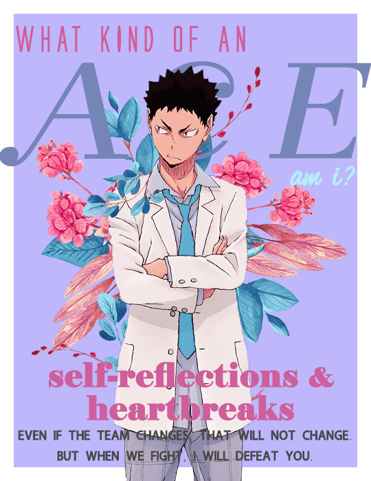
For the inside cover, I find that this can literally be anything. I’ve normally just stuck a quote in there but be as creative as you like! Go to File >> New at the same size as your cover. I would honestly just duplicate your background (and border if you had one) from the cover onto this new file. Starting back here again:
Step 7: Add Render of Character
Just like before, try to make sure that the character takes up as much space as possible. Place them where you like and add a psd colouring to them!
Step 8: Add a Background (again, optional)
So again, I like filling up the spaces so I added another floral png in the background with a psd colouring. This is optional!
Step 9: Adding Content
Now this part is more so dependent on how you want to do things. I like filling up spaces and playing around with typography, so that’s basically what I did here. I used two character quotes and formatted them in such a way that they take up a lot of the space.

Again, this all depends on the theme and style you’re going for. I can’t really help you at this stage as this is more so about how you would like to go about it, but I am happy to give some tips:
💡Tip: I would recommend trying to fill up the space as much as possible again. Maybe make a section that actually has an “article” or do a photo collage of the character, or even just a quote, whatever works!
💡Tip: Try using eye-catching headlines and have subheadings just like before on the cover.
💡Tip: Use varying colours and fonts again! Keep things consistent by using the same 4-5 fonts and colours, but try playing around with the arrangement and formatting of them just like we discussed earlier for the cover.
Step 10: Save!!
And you’re done! Nice work!!
Final Thoughts
So, I think the main takeaway from this is that you’ve got a lot of room to be creative, but you end up having to play around and experiment a lot in order to make things work. The best tip I can give you is to prioritize readability over aesthetics (even I am guilty of trying to choose aesthetics over readability lol).
Hope you guys found this helpful!!
{ Iwaizumi Magazine Edit } ~ { Reigen Magazine Edit }
#tutorials#sibylresources#chaoticresources#resourcemarket#yeahps#tut:mine#tut:graphic#haaaa this took me so long i didnt even realize the time go by heck
363 notes
·
View notes
Note
Hey!! Do you think you could make a tutorial on rendering? With the magic wand? Because sometimes it doesn't work for me so I wonder what you do to get good renders
Hiya! Sorry this took so long, but here it is! Bear with me I’m no expert in using the magic wand tool but I hope I can show you the basics of what from what I’ve learned!
TUTORIAL: HOW TO RENDER WITH THE MAGIC WAND TOOL
Difficulty: Easy/MediumTime Allocation: ~1 hour (depends on the complexity of the image)No Prior Understanding Required
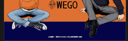
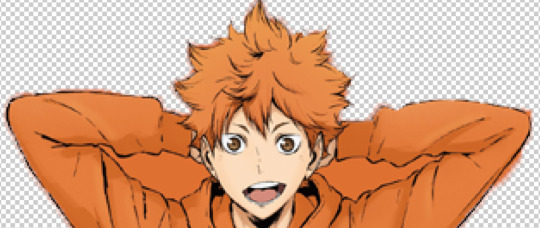
Step 1: Alright so first let’s open up the image we’re going to be rendering. I’ll be rendering Hinata and Kageyama out of this image:
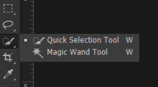
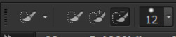
For those of you that don’t know where it’s located, the magic wand tool has to be switched to because the default will be the quick selection tool.
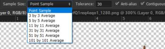
The highlighted option below is the quick selection tool, left click and hold onto the quick selection tool to get the option of switching over to the magic wand tool instead.
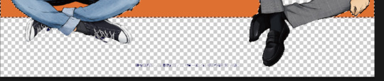
Step 2: Now that you have it selected, click the areas around the character for them to be selected. You will see dotted lines go around certain areas that it picks up by itself. This is based on similar colours (so here, it’s picking up the dark blues).
If you hit delete, you should see it start to become transparent from those areas.
You can manipulate the areas to select using the magic wand tool’s options above. As the sample size grows, the larger the area it will select. Tolerance will give you control on the range of colours it will select - so for example, if I had low tolerance it was selecting all the light shades of orange that were the same in an area. If I switched my tolerance to like 40 it was selecting essentially most if not all shades of oranges. By checking Ant-Alias, it is supposed to make your edges smoother (though I feel like I don’t see much of a different at least for this image despite having it selected). I’m kinda iffy on what Contiguous means so I’m not entirely sure about that one. Sample All Layers seems to apply these settings onto all visible layers.
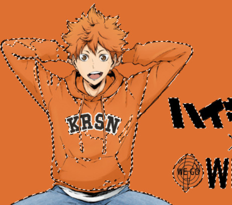
Step 3: If you encounter issues like it selecting weird areas, this is where you will be switched back to quick selection tool to deselect those areas. For example, in my image I have parts of Hinata’s sweater being selected:
If I switch back to quick selection tool and use the subtract from selection option, I can deselct those areas of the sweater.
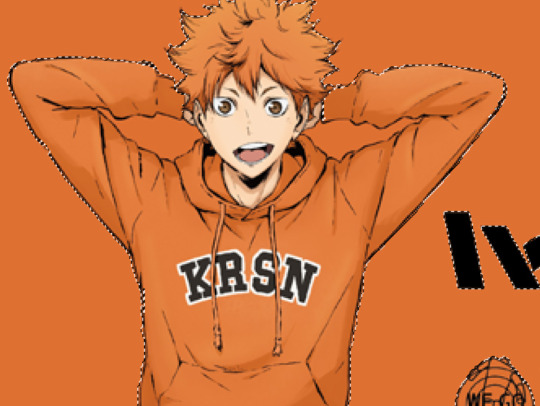
And then hit delete to get rid of the background areas.
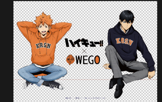
NOTES: My only complaint about the magic wand tool is that sometimes it takes up areas that it’s not supposed to. So for the one above, I found that parts of the outline of Hinata’s sweater was being taken off, so I had to keep redoing the deletion process over and over to make sure the lines stay smooth. I would essentially recommend this method for more quick rendering with images that have defined lines. When I used this method on the below image, it turned out smooth and perfect, but the one I’m showing above it’s kinda quirky with because the lines aren’t defined and once you’ve deleted areas, some parts are really pixelated and I have to redraw areas.
See how the Kuroo in the above image is smooth? There are certain parts of the image of Hinata and Kageyama that aren’t smooth, in particular like Hinata’s hair and sweater:
I deselected certain areas outside of the outlines of Hinata on purpose because I was finding that the lines were getting erased by the tool. So yeah that’s something I find you gotta be really careful of. If you have a very defined image it will make rendering with the magic wand tool super easy:
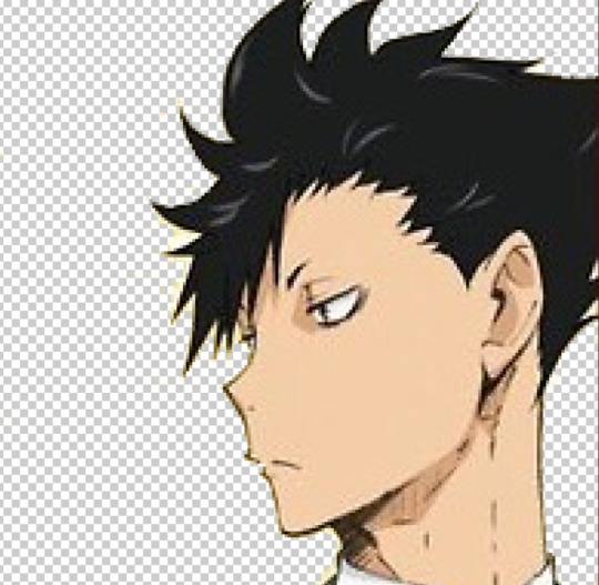
Here all the lines of the character were dark and defined, the magic wand tool had no issues picking up the correct areas without making the outline of the character blurry or erasing strange areas.
So as a summary of tips I have:
Use Magic Wand Tool when you have clearly defined outlines of characters
Try using Magic Wand Tool and Quick Selection Tool interchangeably
Be prepared to potentially redraw some areas
Try playing around with the options of the tool to see if it gives you smoother results
I hope this helps you at least a little bit! Again sorry, I’m no expert in this and I haven’t really found a tutorial that explains all the details either. Best of luck!! I think for neatness I still prefer using the Quick Mask method if you wanna check that out!
33 notes
·
View notes