#this post been in my drafts for a while
Explore tagged Tumblr posts
Text


Look at this elf
LOOK AT HIM


(I might've drawn in some eye sparkles in the last one-)

The character creator was a bit wonky due the lightning, but I pictured Sparrow to be somewhat more tan than he is in the game.
Hopefully Dragon age 2 doesn't have this problem, but it'll be a while before I finish Origins.

He has a sexie toyhouse profile now
A dalish elf, born and raised in his clan. Doesn't know a thing about his parents, only that he was never given a proper name by them. His name was essentially a nickname given to him, because he was resilient and capable of adapting to difficult situations.
Unknown to his clan, Sparrow deeply struggles with honesty and sharing his true feelings. He suppresses his emotions and focusses hard on coping strategies to look independent and tough. He's rarely seen crying.
When Duncan ultimately takes him away to become a grey warden, Sparrow struggles with the loss of Tamlen. Unable to express his romantic feelings for his best friend in time due his demise. The loss made him focus on helping others because he couldn't save Tamlen, even if he doesn't really care much for strangers most of the time. There's a drive to undo Tamlen's death somehow by preventing others from meeting a similar fate. Sparrow easily bonds with Alistair due his casual and joking attitude, feeling an immediate connection with him.
#Sparrow isn't my new hyper fixation i swear#just a cute in-between thing during the weekends#ive been streaming dragon age origins#modded of course else it would suck the fun out for me#very old game#when i made sparrow it was very difficult to enjoy the character creator#luckily older games have very much all the modding figured out already so i could edit him#the guides were easy to follow#Crushing hard on alistair#why didn't i play games like this in my childhood#I didn't even have a gameboy until I was like .. I don't remember tbh but we didn't have a proper pc ever#this game came out when I was 9 wtf#oh well at least theres a mod to make alistair bi wooh#twitch.tv/actualevil#this post been in my drafts for a while#Dragon Age Origins#Dragon Age#OC#original character#grey warden#da origins#I haven't finished this game yet do not spoiler me
3 notes
·
View notes
Text
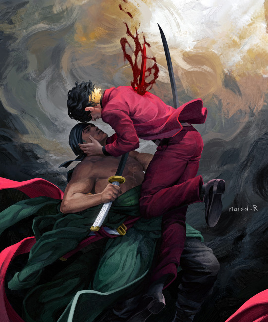
Cage me like an animal A crown with gems and gold Eat me like a cannibal Chase the neon throne If I could only let go
Death pact, fulfilled.
#zosan#roronoa zoro#blackleg sanji#one piece#my art#tw blood#tw stabbing#this only took me *checks date of first draft* eight months#been a while since i posted anything here#but this art had to go up everywhere i love it a lot
6K notes
·
View notes
Text
worst feeling ever is when i agree with 99% of a post but then there's that 1% that makes me want to set fire to op's blog
#this has been in my drafts for a while so i dont even remember what post prompted this. it was about st i remember that much#yelling
21K notes
·
View notes
Text
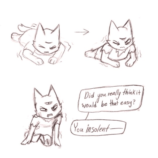
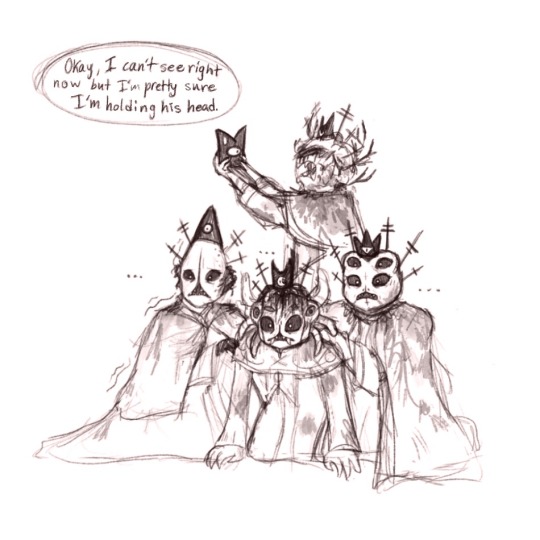
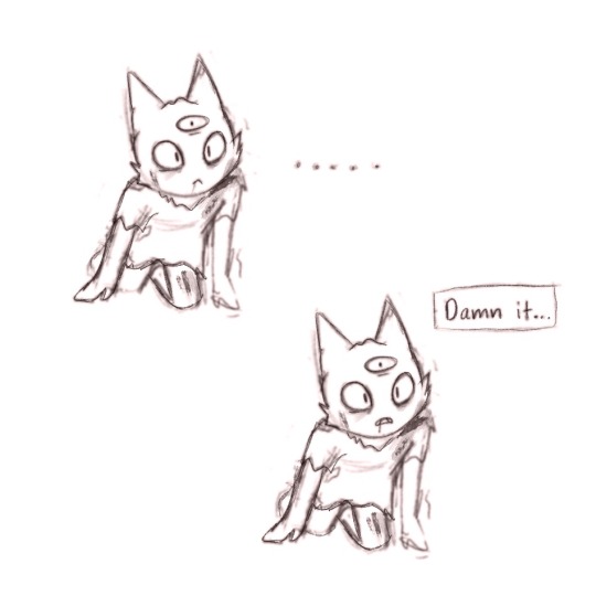
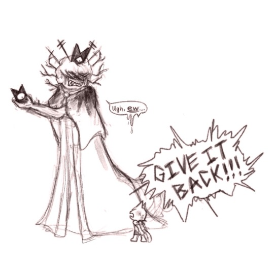
AU type thing where instead of imprisoning him, the Bishops somehow manage to wrestle the red crown off of Narinder and he is reduced to his mortal form.
#cult of the lamb#my post#cotl narinder#cotl shamura#cotl kallamar#cotl heket#cotl leshy#bishops of the old faith#cotl fanart#has this been done yet#OK this is kinda random but while I was drafting this I got a vision of Leshy trapping his tiny brother in an oversized salt shaker#and then when Shamura forces him to take Narinder out he's all shriveled up dehydrated and making that face people do when they eat a lemon#idk it made me laugh a little#im pretty sure this couldn't happen in the actual lore tho#the wrestling the crown off him thing#the thing with the salt shaker could definitely happen they just need to find a lot of salt#The red crown always just flies back to the lambs head what I mean is the bishops manage to sever his connection with it without killing hi
1K notes
·
View notes
Text
“Delicious Little Secret”

Thanks to the endlessly creative @sacrificecage for supplying the original idea!
#Kirby#Kirby series#Bandanna Waddle Dee#Been a while since I’ve drawn Kirby himself XD#Friendship Divorce Arc /jk#Dess Art Post#This one was sitting half-complete in my drafts for months! Glad I got to finish it!
640 notes
·
View notes
Text


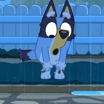


Bluey Rain Stimboard!
#this has been in my drafts for a while! decided to finally post it#i'll credit if ppl ask sorry ;w;#bluey#stimboard#agere#age regression
1K notes
·
View notes
Text


Don’t you ever get tired of being second place?
#railao#art#my art#doodles#mortal Kombat#mk1#mortal Kombat 1#liulao#what do you expect#liu kang#kung Lao#raiden#mk1 raiden#this has been sittin in drafts for a while now#I kinda forgot about it#and I didn’t know when to post it#so I guess now
466 notes
·
View notes
Text
Sabo analysis time!!!!
Do you guys ever think about how Sabo didn't visit Dressrosa to see Luffy again? And him meeting up with Luffy was probably his very last option to secure the fruit, otherwise he would probably avoid it? Cuz i do…
Let me elaborate.
So here's what we know from the source material:
We know Sabo and the other revolutionaries were there since the early morning since Hack was already inside the coliseum for RevArmy snooping reasons.
The prize of the Tournament was revealed after the Revs were already there.
Sabo/Koala were not in contact with Robin to know if the straw hats were anywhere near Dressrosa as seen by Koala saying "I hear Robin-san’s here in this country, too."
Sabo confronted Luffy about getting the Mera-Mera No Mi only after Hack lost during Block B and Luffy got out of his own block.
I had always assumed that Sabo showed up to Dressrosa for the Mera-Mera No Mi and meeting Luffy, but that really isn't the case. Idk why it took me so long to figure that out, it’s literally shown in the Episode of Sabo (EOS) explicitly. Although, the EOS isn't exactly source material. I cant find anywhere stating whether its canon or not, but I cant find anything that would have it conflict with the original plot so i see no reason why it wouldn’t be. All that evidence from before is canon though so even without the EOS, this claim still holds water.
Speaking more of the evidence we have from of the episode of Sabo, we see him snooping around the Colosseum during the tournament, we see the moment he realizes that Luffy is participating in the event, and we see the moment he realizes that Luffy cant participate any further.

Like look at him here. He looks absolutely unprepared for what he knows he has to do. And after this in the scene right before he starts talking with Luffy, he’s like literally walking to him as slowly as he possibly can. Taking pauses in his stride to probably think about how much of a bad idea this is.
Plus, at the beginning of the episode when he’s visiting Ace’s grave, he says “I guess both you and Luffy are both mad at me.”
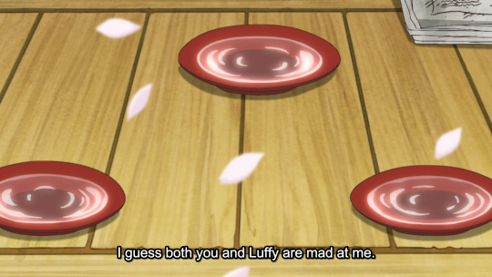
Sabo has had so many opportunities to meet up with Luffy before he actually does, both in Dressrosa and since he regains his memory. But he doesnt. Because he cant. Because he’s terrified of being met with scorn, anger, or even violence from his beloved little brother.
Finally, we see him plucking up the courage to walk over to luffy. All surroundings are silent besides the loud footsteps coming from his approach echoing in the hallway.
Step. Step. Step. Step. Step. Step. Step. Step.
Then he stops.
Its dead quiet.
Sabo has been pretty much deadpan this entire time, but he then smiles before he says
“I wont let you have the Mera Mera No Mi, ‘Straw hat’ Luffy.”
This is a fairly serious thing that he’s saying to this man in a fake beard and outrageous helmet, and he’s terrified of this meeting with his brother, but he cant help but smile when he’s talking with him.
The conversation that continues is very confrontational, but suddenly something clicks in Luffy’s mind. His body relaxes from it’s tense posture, he starts to tear up, his speech slows,
Then he starts to scream with recognition.
That’s his big brother.
He’s alive…
He’s Alive!!!
He’s here! Right here! Right where he should be!
Alive. Living. Free!
Luffy GRABS Sabo’s face and propels himself towards him. Suffocating and probably giving his brother whiplash in that second within that assault-hug.
All of a sudden, Sabo’s fears of scorn, anger and violence all wash away.
Luffy loves him.
They have each other now.
And now, Sabo is on his way to get that god damn fruit.
Sabo absolutely didn’t think he was ready for this re-connection, but he’s so glad he went through with it.
He has his brother back, his other brother’s powers, and the bragging rights of being able to flaunt both.
This is what I'm sayin with the "seems like fire favors these brothers" post I made. The fact that both the mera mera no mi and Luffy and Sabo were all in the same place to come together at once is a crazy coincidence. How many coincidences does it take, for a happenstance to be Fate? Probably that amount.
In conclusion:
Get this man a therapist. Please.
Heres another sabo analysis if you wanna hear more
Thank you for reading my ramblings about a fictional man. I think about him a completely average amount.
#this has been in my drafts for a while so i cleaned it up and added pictures n junk#whery thoughts#one piece#sabo#monkey d. luffy#asl brothers#one piece fan art#portgas d. ace#sabo the revolutionary#long post
712 notes
·
View notes
Text

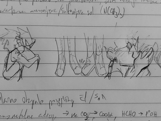


jakey + dirkjake sandwiched between my organic chem notes. a poem in there somewhere
#homestuck#hom3stuck#home24uck#home2t4ck#jake english#dirk strider#erisolsprite#brobot#dirkjake#admin draws#fanart#ok so the latter two are. a bit old and drawn in a rush because as usual i had thoughts about dirkjake and hair BUT ALSO#while reading the post-timeskip chatlogs i was like hm jake's hair looks kinda long here. i might be crazy tho#and then i continued thinking. because Ive had jakes haircut and t has to be trimmed often and i dont trust his ass to competently do that#so i think brobot helped out there and post entry it fell on dirk to trim it#and i think as their relationship worsened the first thing to properly go was the haircuts. because jake couldnt be assed to sit in dirk's#company for the duration of a haircut. direct line of strider word vomit while ur held captive basically (massive overdramatization)#so. its a good thing he got interrupted after trying to cover the tattoo up. because i guarantee you he wouldve been waking up on that#quest bed with breakup bangs.#finally formatted this one in drafts to post so im not leaving yall too high and dry again#i see my askbox and i appreciate it btw! its terraria night but i hope to be drawing tomorrow :]
818 notes
·
View notes
Text
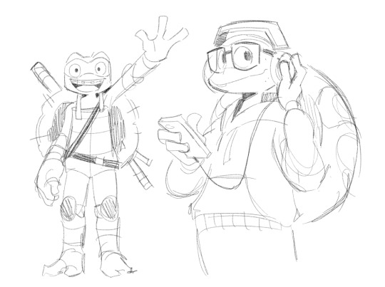
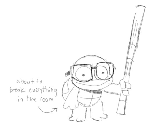
turtle sketches
2K notes
·
View notes
Text
TW: ABUSE, CHILD ABUSE
“He wants to air this dirty laundry to the world does he…? Dabi, you fiend…you’ve been waiting for this moment…when they couldn’t prevent mass destruction…and faith in heroes is wavering.” - chapter 292
I truly, wholeheartedly, believe that MHA as a story upholds the myth of the perfect victim. I do not want to discuss if Horikoshi did that on purpose, or subconsciously because of inner bias – I find no meaning in doing so. For me the execution of an idea, in the grand scheme of the narrative, holds more value than the intention of the author. I’ve also had my fair share of people infantilizing Asian authors in the anime community for their poor writing decisions for one lifetime. It’s patronizing to both the author and the people reading it. Whether or not Horikoshi intended for his themes of abuse to paint the picture they did does not matter, because that’s how it reads as.
MHA puts victims of abuse in narrow boxes and softly dictates what’s an acceptable reaction to said abuse. Victims are continuously walking a tightrope between being deserving of compassion and sympathy and being unredeemable monsters who are too far gone and are only good for martyrdom after being put down.
Eri fits the clean cut depiction of abuse victims that media usually gears towards. She is untouched by the cruelty around her - she preserves her innocence and kindness. She isn't assertive, but rather meek and passive. She doesn't fight back with force. And when offered help, she is receptive to it. That is not to say that Eri's depiction doesn't have a place in fiction, or that her portrayal can't be representative of the experiences of some - as we all deal with trauma and the inhumanity people throw at us differently. We see the same thing in the portrayal of Fuyumi, who shares many of the qualities discussed above. The same thing applies to her - i personally love the idea of all the siblings having different reaction to their childhood trauma and abuse. It shows that victims are not some type of monolith.
But the narrative treats the "forgiving" or "receptive to help/support" victims of abuse with more grace and with much more kindness. if you are willing to forgive, or the very least be quietly tolerant, the story grants you a happy ending. Forgiveness isn't a bad thing, it is an individual choice - but an abuse victim shouldn't have to do it for them to have a happy ending.
In a vacuum Eri and Fuyumi's character arcs and depictions of abuse are good but it becomes a problem when that's the only experience and type of victim we ever hold in high value or recognize as valid and deserving of compassion. Which the story reinforces.
Touya and Tenko's backstories aren't pretty nor comfortable or easy to sit through. Their responses to abuse aren't either. Reactive abuse is very much real.
#tw abuse mention#tw trauma#tw child abuse#this is unfinished#i just don't have enough time to expand upon it cause of uni#maybe some day i will reread mha and revisit this#posting it cause it has been sitting in my drafts for a while#other thoughts are very much welcomed :)#mha critical#bnha critical#my hero academia#mha analysis#anti mha#league of villains#anti endeavor#anti enji todoroki#media analysis#anti best jeanist#i hate him#he stinks up the place#i cant tag all the characters in mha that ignore abuse in mha#unfortunately#calling abuse dirty laundry is very bad very stinky#touya todoroki#tomura shigaraki#mha dabi#discussion#personal essay#essay writing
350 notes
·
View notes
Text

what if a duck and an alien were lesbians together
[ID: a drawing of della duck and penumbra from ducktales. penumbra looks surprised as della wraps around her waist for a hug. end ID]
#this has been sitting in my drafts for a while now so I thought I'd post it#ducktales#ducktales 2017#della duck#penumbra#fan art#lesbian#sketches#digital art#art#gay#lieutenant penumbra#dellumbra#<- is that their ship name?
447 notes
·
View notes
Text


#🤨📸 you sure about that taylor?
#.gif#**#taylor swift#taylorswiftedit#tswiftedit#userdiya#userjake#userelena#hauntedbythelook#THIS HAS BEEN IN MY DRAFTS SINCE MARCH 😭#posting now while the americans are asleep
457 notes
·
View notes
Text
chapter cards for thirteen: november - april
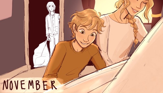
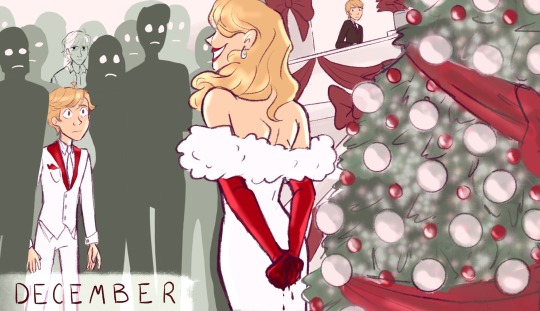
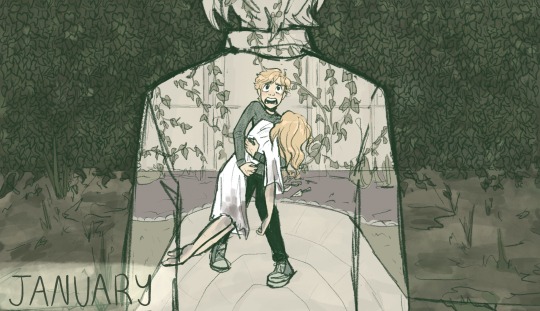
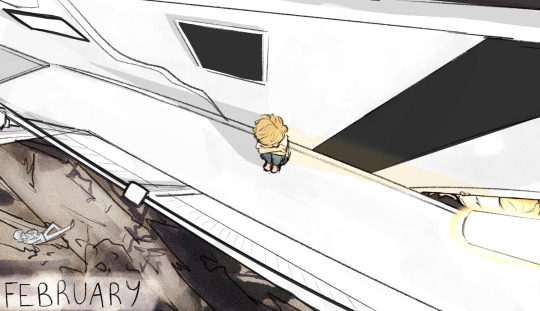
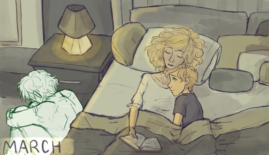
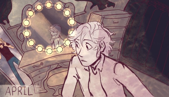
read on ao3
#I did want to post this bc it's been in my drafts for a while and I do like these#it's fun seeing them all together like this#like my metamorphosis covers master post that was so fun#it does feel a little bit like. I dont know.#meta or ironic or something#that I had to stick a hiatus right down the middle of the chapters#and right at the moment where [redacted] happened#it feels a little bit poetic for there to be a chasm there#watch me like get really inspired next week and write all of may and then none of this means anything lol#who knows#but anyway I like these#april in particular feels so fun and spooky#I love emilie agreste she scares me#autumn asukiess I know you now what im talking about#ml#miraculous ladybug#miraculous#my art#adrien agreste#emilie agreste#ml fic
918 notes
·
View notes
Text
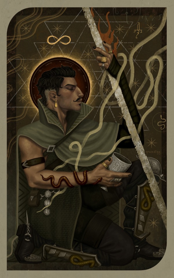
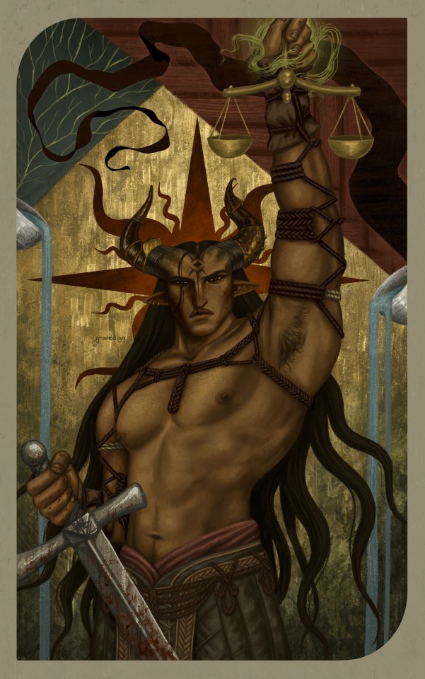
The Magician / Justice
#made this draft a while ago and forgot to ever post it#so heres a gift#dragon age#dragon age inquisition#dai#dorian pavus#inquisitor adaar#adaar#da tarot#my art#i think they look quite handsome next to each other#i think i never posted this cause i was gonna include the one for iron bull but its been a while and i still havent finished it yet so
499 notes
·
View notes
Text
imagine being a shy little intern at jujutsu high and getting the fattest crush on gojo because he’s just. so strong and cool. you idolize him. you want to be his friend. and he seems to take a liking to you; he’s cheery and encouraging and sweet in a roundabout way. you feel like you’ve grown pretty close to him.
imagine him falling asleep right next to you on a sofa in the cafeteria. you can barely tell, with his blindfold still on. but you scurry away to find a blanket, happy that he trusts you enough to rest in your proximity, ready to wrap it around him —
only for it to slip right off. rejected by his infinity.
(he never turns it off, around you.)
#throws up blood#thinking about how gojo’s infinity is both a very real power and a metaphor for the barrier between him and the world#he’s sooo guarded and it breaks my heart#this is kind of part of a drabble im planning on writing for him……#i like the idea of him with a reader who idolizes him. while he never quite views them as important#not at all in a mean way . you just don’t have a chance of breaking into his heart.#he might act friendly but he’ll never let you in#…. he’s so stray cat coded#ari noises ✩#gojo x reader#anyway don’t mind me posting this rq i’ll post a full gojo fic tmrw this has just been rotting in my drafts for a bit 😭
588 notes
·
View notes