#this part of the video was the first gif i made after getting photoshop actually
Explore tagged Tumblr posts
Text
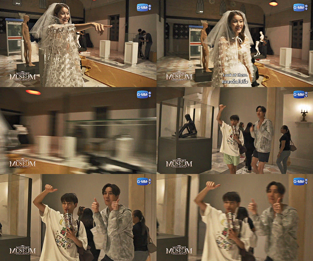
mm episode 1 bts x tor & gun, #1 namtan supporters
#midnight museum#this was me figuring out gif subtitles!#i originally had namtan's 'pan the camera over there' also but the file size was too big. :(#this part of the video was the first gif i made after getting photoshop actually#so. here. a nice version of that#relatively low effort once i sorted my text settings so no elaborate tags#rowan gifs#mmbtsgifs
53 notes
·
View notes
Text
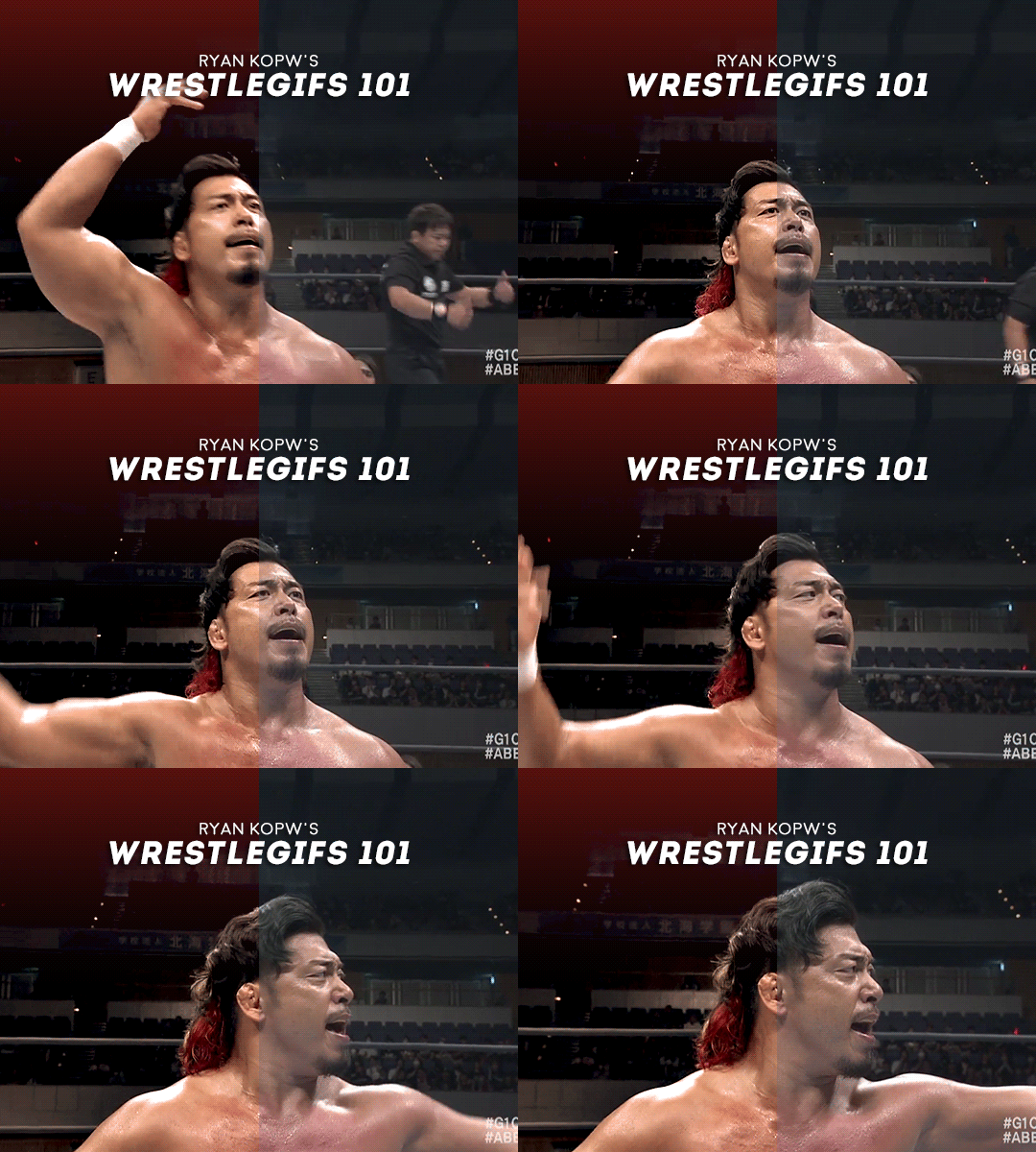
g1 season is upon us! i'm too lazy to gif every match myself! the world needs gifmakers like you! yes you!
this guide includes: basic gifmaking, actions, how to blur on-screen graphics, coloring tips catered specifically to wrestling footage (mainly aew and njpw), how to add subtitles, what tags to use
what you will need:
photoshop (i currently use cc 2017 for windows which you can grab from this post by birdysources)
kmplayer (for extracting frames)
what you might need depending on what you're looking to gif:
4k video downloader (for downloading videos off youtube)
vkopt (browser extension that lets you download videos off vk)
step 1: getting the footage
if you're directly downloading from a site this step is super easy. just make sure to always go for the highest quality of footage available (for njpw this is nowhere near 1080p, and even aew's 1080p footage is pixelated in places—but don't let this deter you!)
if you plan on giffing something off a ppv, chances are you might need to torrent the event. if you can, look for versions off fite with either web or webrip in the title for the best quality. this applies to weekly television too (fite doesn't have picture-in-picture). always seed your torrents. yes, even that one match from 2012. especially that one
you can also get recent shows off watchprowrestling dot co (previously org) which includes njpw tour shows and indie events as well. check out indy★wrestling★group on vk for smaller promotions and japanese promotions outside of njpw (tjpw, stardom, noah...)
step 2: choosing a clip
wrestling footage quality is not consistent. entrances with too many flashing lights or small particles will have huge quality drops, so unless it's something really special, don't put yourself through that. close-ups are generally your best friend but don't shy away from clips with lots of movement (you do sometimes want to gif the wrestling parts of wrestling too)
step 3: extracting frames
open your video in kmplayer. go to the part that you want to gif (though, i suggest leaving a bit of fodder before and after the actual clip. you can always trim the frames down later and it's better to start off with more). then, press ctrl + g
this should bring up this window:
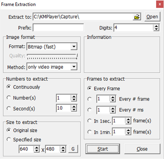
your settings might be different if it's your first time downloading the app so just copy what you see here
kmplayer automatically captures into its own folder, which you can change if you want, but i just left it as is. i recommend pinning the folder you regularly use to the quick access menu in your file explorer
hit start, start the video, let it capture frames for however long, and then hit stop on both the extractor and the video itself. and now you have a bunch of frames in a folder. cool!
step four: converting frames to layers
open photoshop. this will take ages but open it. go to file -> scripts -> load files into stack...
this will bring up this window:
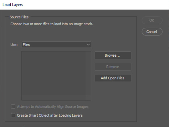
click browse... and select all the frames you just extracted. depending on the number of frames, this might take you a bit. then hit ok and let your layers load into photoshop. this will take a long time (saying this as someone whose laptop tends to heat up to the temperature of an egg pan at this point in the process)
step five: actions
i use actions (user-built series of recorded commands, meaning you don't have to click everything manually) for everything except coloring. i use a mishmash of like three different actions that i never bothered to organize. these are the two most important ones:
actionpack #1 by giulia (i use the setup and save portions from this one)
squishmoon actions by lildohnut (i use the hd sharpening from here, first layer on 0.3 for close-ups and 0.2 otherwise, and the second layer at the suggested 50%)*
*most sharpening settings you'll find are made for current films and tv shows so you do have to make some adjustment to fit your crunchy wrestling footage
step six: sizing
pick a size for your gif! here is a handy chart:
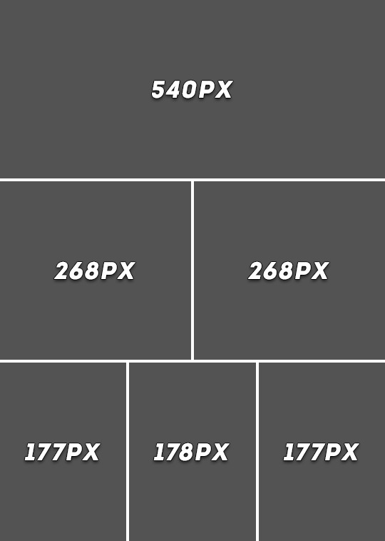
as for height, it can range anywhere from 300px-540px and beyond. most people go for 350px-450px. 400px is the sweet spot
personal preference: adjust canvas size not image size and fit your footage accordingly. some footage (looking at you aew) can have an odd black bar at the bottom, and manual resizing can help getting rid of it. if you just resize the whole image that will stay there and bother you
additional tip: guidelines
9/10 times you will leave your footage centered. however, there are times when this can look a bit awkward, depending on the framing, in which case i like bringing in a few guidelines. go to view -> new guide layout...

rule of thirds is generally good for drawing the eye to certain places. these settings will divide your canvas into nine squares that help you reposition your main gif layer
optional step: blurring pop-up graphics and banners
so, you have your sharpened, resized gif... but the sharpening made the small text and other unwanted elements on your screen shrivel up like raisins. you can leave it as is, people won't mind, it's a wrestling gif, who cares. but, if you want, you can just blur it out
i'm at least a little bit certain that i'm personally the guy who brought this over from k-pop tumblr (not saying i invented the concept, i just love being a trendsetter) and so i can give you a few reasons as to why people do this. such as:
adding subtitles over pre-existing, burnt subtitles (example: njpw post-match comments off njpwworld and not youtube)
getting rid of elements that might distract people from the focal point of the gif (the hotties... and the moves. mostly the hotties)
it makes your otherwise milquetoast sharpening look a little better in contrast
it's gonna be ugly either way so it's a pick your poison type of situation. if you do want to try the blurring method, you will need a basic knowledge of filters and layer masks
step-by-step blurring process:
duplicate your gif layer
blur the layer on top (i typically go for a 4.0 gaussian blur; for this, go to filter -> blur -> gaussian blur...)
apply a layer mask to the blurred layer and make the layer mask black (this will remove the blur effect, don't be scared). to access the layer mask just click on it. you can press alt before clicking to "enter" the layer mask (though you won't see your gif this way)
go in with a soft round brush (or any brush) with white and draw over the bits you want blurred. this is the tedious part
profit?
here's a comparison:

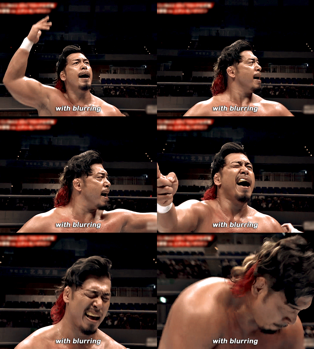
it's really down to personal preference ٩(ˊᗜˋ*)و
i convert my base gif layer and the blurred layer into a smart object before moving on with my process because sometimes photoshop likes to do this thing where it only applies the blur to the frame you're on. you can avoid this by combining the layers manually
if you're working with njpw footage and your clip plus coloring combination allows you to, you can also just go over the banner with black and blend it into the background. it's by far the best option but there's so rarely an opportunity to utilize it (i did it in the little header i made... go back and look at how beautiful she is)
step six: coloring
the big one. oh boy. prefacing this with: you can just skip coloring if you want. the sharpening settings i recommended earlier give a nice contrast to the gifs as is, so if it looks fine like that, you don't need any fancy colors. that being said...
my thought process going into coloring is to focus on skin tones and adjust everything around them. i don't tend to use psds, i always just manually color correct based on the actual footage i'm working with (venues differ, lighting differs, hues differ... incredibly hard to plan for all of it in advance). if i plan on making multiple gifsets of the same event/match, i do re-use settings, but sometimes minor adjustments are still needed
to begin coloring, you will need to use adjustment layers. you will pretty much need a basic knowledge of all of them (to the extent of knowing what the sliders and values do)
[1] i always begin with an exposure layer. this will remain above all of your layers (unless you plan on adding subtitles). here are my settings:
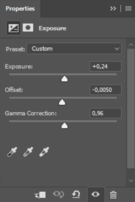
again, every layer you add after this will go below your exposure layer
[2] i add a selective color layer to further adjust the blacks. this will vary gif to gif but keep your adjustments small
[3] i add a vibrance layer. wrestling footage has major saturation problems that you can manage early on to make your life easier. take back a tiny bit (usually from -3 to -5) of vibrance before you begin your other color adjustments
[4] this is the big skin tone adjustment step using a curves layer. it does most of the heavy-lifting in my process. here is a video tutorial that explains the technique i use. it works the same with gifs as it does with images. the key differences are:
the image you are color picking off of shouldn't be a limited skin tone chart but rather an image of the wrestler(s) in natural (or as close to natural as you can find) lighting. i just go for renders used on the roster page. fan photography is way too edited to use here
try picking from a darker area of skin (shadows, midtones). it fits better with match lighting
this step will most likely correct color tints, but keep in mind that different promotions/shows/venues have different lighting. here are my personal observations:
aew dynamite and rampage have strong magenta tints
aew collision and roh honor club have strong red tints
njpw has a washed out blue tint
impact has a strong green tint
you can either lean into these (play around with making them really vibrant) or cancel them out using opposites on the color wheel (for example: to get rid of the magenta tint on dynamite, either decrease the magenta slider in your neutrals using selective color or add more green using color balance)
you will almost always have to add more cyan as well (either using color balance or channel mixer; channel mixer can also help you fine-tune skin tones with its blue tab—don't get rid of yellow undertones!)
[5] here is where i start fiddling around with manual adjustments that i seriously can't help you with... just add layers and change colors until you think it feels right. don't be afraid to start over if needed
[6] finishing touches! if you're like me you will have overcolored in the previous step. don't be afraid to add a saturation layer and decrease specifically the saturation of the reds (this will affect the skin tone; if you feel like you're on the right track but it's just too orange-looking, it's a saturation issue)
i also tend to add a black & white layer below the exposure layer up top set to soft light and lowered to 10% opacity. this gives you a bit of additional contrast that pulls the final gif together in my opinion
optional step: adding subtitles and watermarks
always add text layers above your coloring!
[1] subtitles
the font i use for subtitles is arial rounded mt bold, which you can download for free here. the point of subtitles is for them to be readable, so feel free to use any other font as long as it can be read with ease (nothing too thin or too blocky). if you plan on using the font i use, make sure to set it on faux bold and faux italics
font size differs based on the size of your gif, but it should normally be between 17pt and 23pt. i like to keep my tracking (letter-spacing) the same as my font size (so for 21pt subtitles i would have the tracking also at 21). i keep leading (the space between multiple lines of text) 3pt or 4pt
if there are two people speaking, i like setting the second speaker's text color to #ffd300. this is a generic yellow caption color that is still easy to read
after you have your basic text done, right click on your layer to add blending options. adding a stroke and a drop shadow can further help bring your text to the foreground. I keep my stroke (hah) at a simple 1px black. here are my drop shadow settings:

here is a more detailed guide about subtitles by clubgif
as for placement i add a horizontal guide at 95% and put my text on top of the line (while also keeping it centered vertically)
[2] watermarks
i personally don't use watermarks because i just don't care to, but if you want to add one, the same general ideas apply. just lower the opacity of your text layer at the end (if you want... again, a watermark is personalized)
step seven: timing
this is where you'll have to convert your video timeline back to a frame animation!
delete the frames that you don't need and then set a consistent timing (click on your first frame and shift + click on your last one to select all of your frames before adjusting). i like my gifs at 0.04, but depending on the footage you can go for 0.03 (newer bte episodes) or 0.05 (this also works if you don't have enough frames and want your gif a bit slower)
step eight: exporting
go to file -> export -> save for web (legacy)...
here are my export settings:
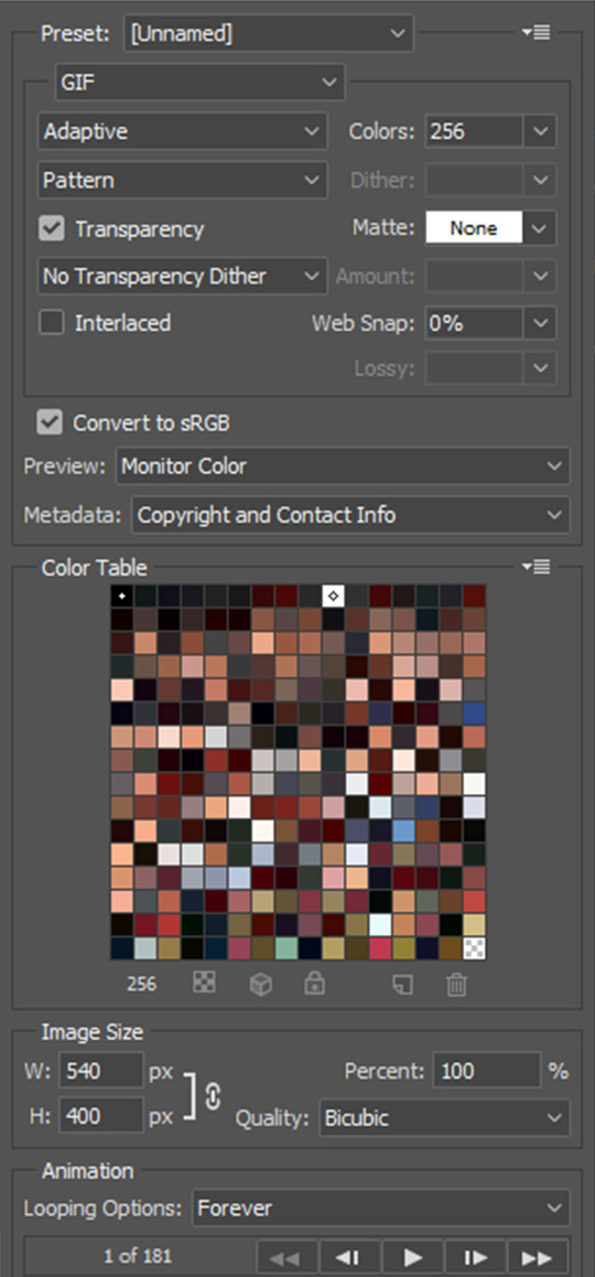
make sure to keep your gif under 10mb! if your file exceeds 10mb, you can't upload it to tumblr. you either have to cut some more frames or add compression to your gif (something i would never do, i always just cut frames)
additional tip: tagging
you have your gif! but how do you get people to actually look at it?
i always tag wrestlers* (full name, for both searchability and tag filtering purposes), promotions (initialisms like #aew over #all elite wrestling; if it's a more generic promotion name i.e. impact, go for #impact wrestling), tracked edit tags (#aewedit, #njpwedit; this not only helps source blogs find your posts and give them a bigger reach but it lets you browse other people's works). if you want to go the extra mile you can also include which event/video the gifset is from somewhere in your tags (if it's not already in the caption)
*even if you feel like it personally hurts you to tag that one wrestler you can't stand who happens to be in a match with your fave: do try tagging all wrestlers involved for ease of filtering, especially if you don't add image descriptions to your gifsets (tumblr's post content filtering system picks up on those)
general tumblr etiquette but don't cross-tag (i.e. tag a wwe gifset as #aew). no one likes cross-taggers. crossover events are exempt from this rule of course (forbidden door, multiverse united...)
additional tip: accessibility
don't use gradient text in your captions. screen readers can't read them!
if you can, include an image description. no matter how basic. this not only helps people with screen readers but the alt text of your gif is what's going to be displayed in case the gif isn't loading properly. here's a guide on how to caption gifsets by shangs
and you're done! all that's left to do is get silly with it. once you have the basics down you can virtually do anything. you can make those pretty graphics with blending. you can gif every single match of your fave in chronological order. sky's the limit
don't be discouraged if your gifs are not "perfect" from the get-go. this is a hobby just like any other hobby, and with time you'll get better at it. don't compare yourself to others and don't put your efforts down. only you can make the exact gifs you want to see
200 notes
·
View notes
Note
Hi! I was wondering if you would be willing to share how do you make this pattern thingy over your gifs? I was trying to learn how to do this for awhile now, but I couldn’t find any tutorials. It’s okay if you don’t wanna share. Love your gifs, have a nice day ✌️
Hi, anon! I don't really mind sharing how I apply patterns to my GIFs. It's easy to do and quite fun once you get the hang of it. And thank you! I really appreciate it. I'm glad you love my GIFs. (°◡°♡)
I use Photoshop 2021 but I think this applies to older versions too. Also, just a disclaimer that I am not a PS expert. This is just how I prefer to edit my GIFs so take whatever I will say here with a grain of salt. Lastly, I apologize if my English is bad and my explanation is lengthy. This is my first time making a tutorial of some sort. (⌒_⌒;)
Please check the steps under the cut.
Find a pattern that you want to apply to your GIF.
I don't know the link anymore to the actual pattern I am using so I will use a different one that has the same style. So for this example, I will be using Halftone Patterns by EDFTeam that I found from DeviantArt. To download the file, you need to log in to the site. If you want a different pattern but with the same style, just search for halftone patterns.]
Import the .PAT file on PS.
Make sure that Pattern is enabled [Windows > Pattern]. On Patterns tab, click Import Patterns. Find the folder where you saved the .pat file, select the file, and then load it. If loaded successfully, the patterns should appear at the bottom of the list:
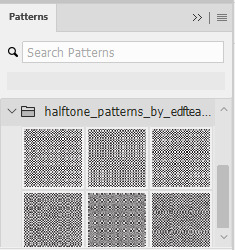
Apply one of the patterns above your GIF layer.
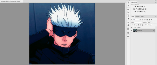
In this example, I made sure that my GIF layer was selected before choosing a pattern. So that when I clicked the pattern, it would automatically be clipped to the GIF layer.
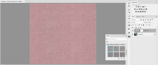
This is how it will look like once you click one of the patterns. In my case, I selected the first one. It looks reddish because of my coloring. This is another reason why I prefer the Pattern layer right after the GIF layer so the pattern will also adopt my coloring.
If you are using Video Timeline mode, make sure to adjust the Pattern Fill layer to the other layers to avoid blank layers when saving the GIF file. If you are using Frame Timeline mode, then there's no need to do this.
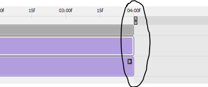
Change the blend mode of the Pattern Fill to your preferred style.
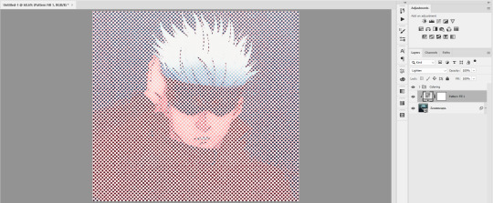
I typically use Darken or Multiply to add a darker shade of pattern fill to my GIF. And if I want to lighten, I use Lighten or Screen. But feel free to explore other blend modes as well. In this example, I used Lighten.
Decrease the opacity of the Pattern Fill.
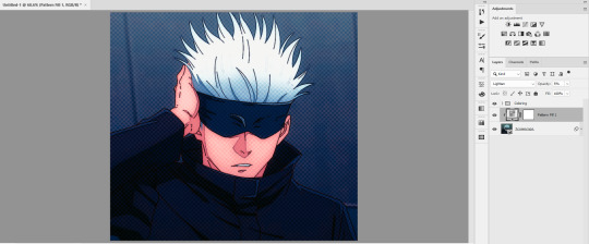
For Lighten/Screen blend mode, I typically set the opacity to 5%. And for Darken/Multiply, I set it to 10%. [This is just my preference though since I want to add a subtle pattern texture that does not interfere with my coloring.]
Make necessary adjustments to your coloring layers (optional).
This is only optional, but if you think your GIF already looks good without readjusting any of the other layers, then you're good to go. In my case, I would make slight changes to the Brightness/Contrast and Levels Adjustment layers.
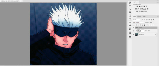
Posting the GIFs here without and with patterns for comparison:
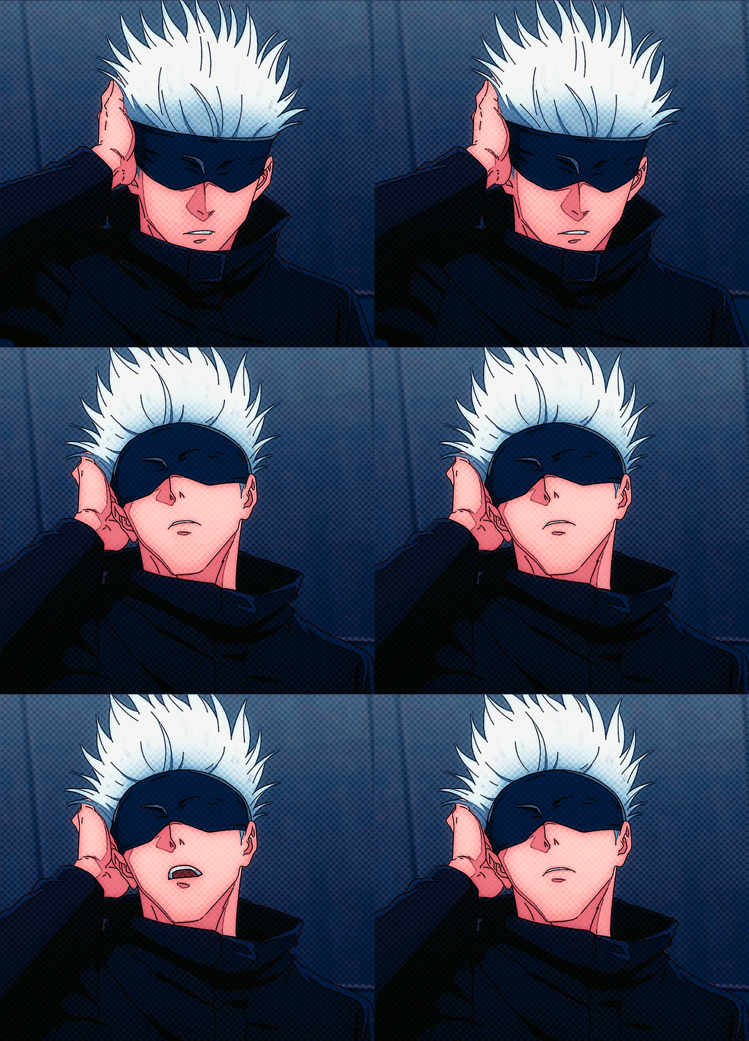
ADDITIONAL TIPS:
You can also adjust the size of your pattern.

Double-click the layer thumbnail of the pattern fill layer. Then change the percentage and click OK. You can go beyond 100% if you want to make the pattern bigger.

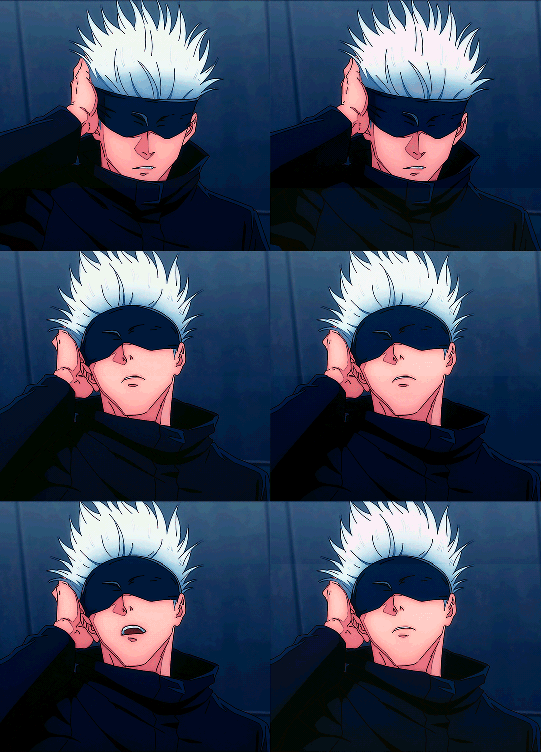
This is just my observation but if you are planning to use the GIF as part of a photo set with more than 1 column, you might want to enlarge the pattern so it will still be noticeable.
With 100%, this is how your set GIF is gonna look:


With 150%, this is how your set is gonna look:


As you can see, the pattern is not noticeable at 100% if positioned in 2 columns but it becomes apparent at 150%. So basically, my rule here is a larger pattern size for a smaller GIF display.
You can also clip patterns to shapes and other smart objects other than your GIF layer.
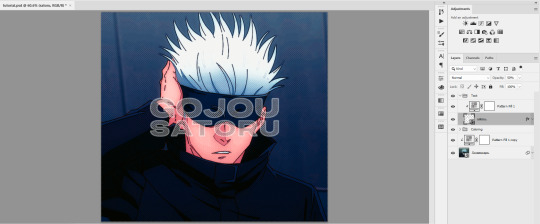
In this example, I chose a heavy font type for the clipping mask so the patterns are visible which I then converted to a smart object. And since the pattern is applied to the text, you can have these layers above your coloring. [I haven't done this before but I thought of including this because it's also a nice way of using patterns.]
And this will be the output:

You can also modify the mask of the pattern where it is being applied.

The white space signifies that the entire space of the GIF layer is filled with patterns. You can change this by using the brush tool [set the color to black] to erase the parts you didn't want to be filled with patterns. Make sure the layer mask thumbnail is selected and not the layer thumbnail. You can switch back to white color if you want to erase the result of your brush.
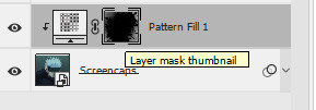
In this example, I tried to erase a lot of white spaces to make it look like a frame. With this, I can go wilder with the pattern. I select Overlay as blend mode and set opacity to 100%.
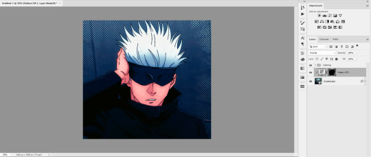
So this is what the actual GIF looks like:
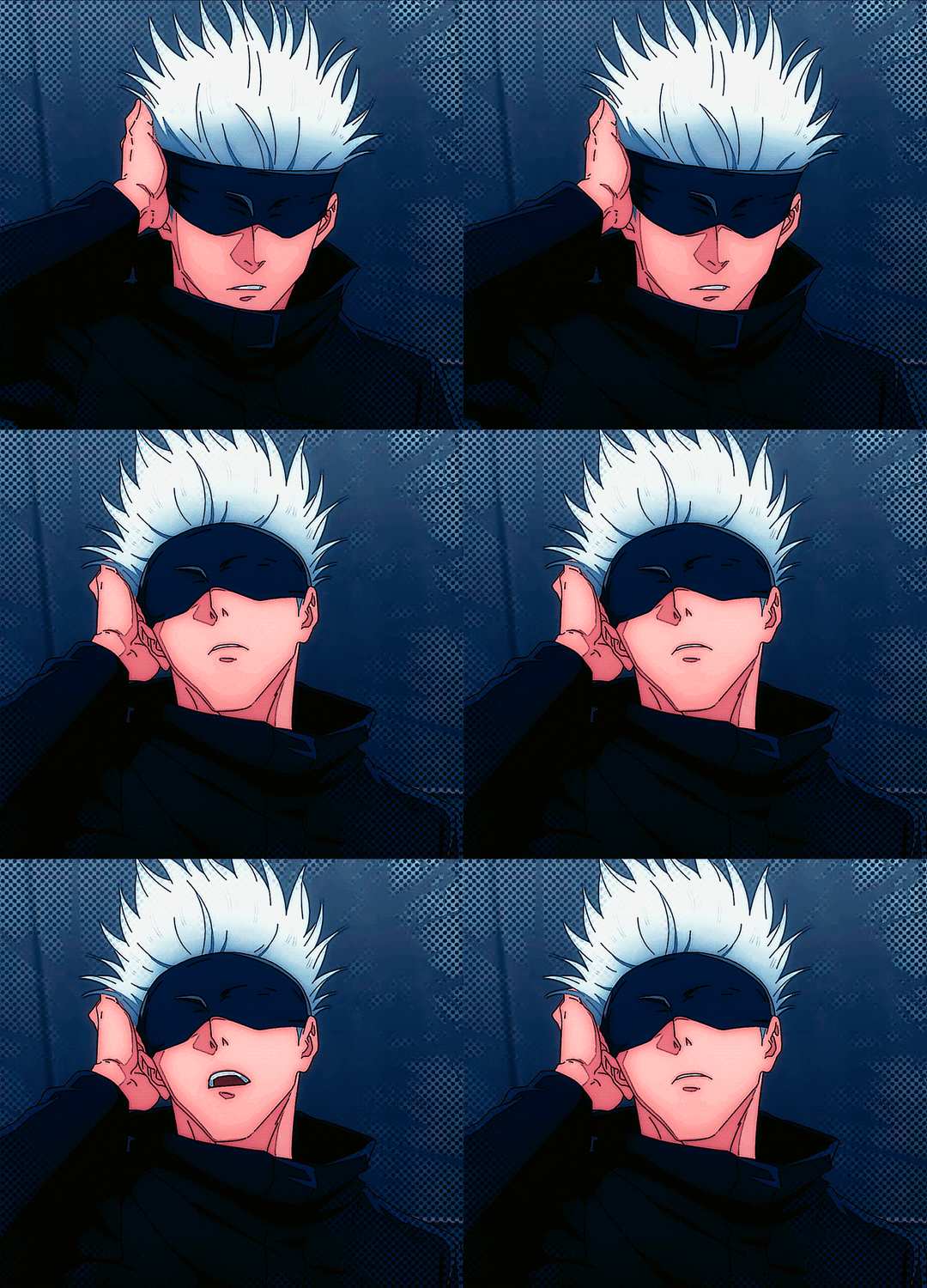
You can also check this post where I used this method.
Again, sorry if the explanation is too lengthy and my English is bad. And I do hope that you are seeing this post my dear anon! And I hope it helps! ( ̄▽ ̄*)ゞ
#art answers#reply#anon#applying patterns in gif#gif tutorial#halftone patterns#using patterns in photoshop#artless#artsresources
27 notes
·
View notes
Text

Ok so here's how it looks to me:
If Megan🐷/Chris' agency had control over his social media accounts....
She would have been the one doing the trail of likes ❤️ on IG to set this SMA up to begin with and having professionals drop the "tea" on fan forums, possibly even setting some of them up by sending messages to people using his IG account posing as him and leaking the screenshots
Other people's teams may have even been participating in it as well to help set up the narratives a lá the Kelly rumour/the Scott friend texts etc
This may also actually mean that the SMA is decided on much earlier than anyone admits if you count the date of his original anxiety tweet the year before, meaning they had a year to set up the PR campaign for "his other half" but because he wasn't actually serious about anyone and was just dating around it became a sh*tight between competing teams, hence the dumpster fire rumour sh*tshow fed to the fans
Did the highest bidder win? Which contract won out? The SMA campaign is completely buyable and able to be manipulated and the winner is established well in advance?
Hack the fans, steal their images and chase them off, then have the paid for accounts posing as fan accounts post the images as part of the next narrative push at New York ComiCon?
The team did the scrubbing on her other background info, only to release it all later on to mess with Christopher when he decided he wanted to fire Megan🐷/his team after the backlash from the papwalk and SMA release? Is any of that info even legitimate or has that been photoshopped too?
Was the info edited in or edited out?
Fake texts anyone? Not to mention targeting and scamming fans to scare them off? What about the pic in the doorway with Dodger and the trainer from the valentine's day dump? I heard the trainer wasn't happy about her likeness being used....
Remember the woman in the papwalk video on twitter also showing up at the Premiere of Ghosted?
That was weird...(Was that an assistant from Marla's/🐟 team?)
Megan🐷/his team had the means and ability to spin the story to Deuxmoi given that she probably has her number in order to spin the narrative that 🐟 did it on purpose, how much of this fake narrative has been fed to DeuxMoi?
But then because Chris' IG account was the only one still active and he wanted to fire Megan etc, she took the money backing 🐟 and posted the story dumps to his IG
Weird how the Black Raven account deactivated right after 🐟 lost her IG account......did he almost have control back, and his team🐷 took the money and went with the paid for narrative (by Netflix? CAA? People Mag?) to run him into the ground since he refused to be held hostage by her antics?
Weird how his twitter account "accidentally" liked that tweet one time by Black Raven and brought attention to it....
Makes me wonder just how long Megan🐷 etc could have been planning all of this, and how long Chris has really been trying to get away from her, does she believe in future planning? I hope she has a retirement fund....
Does it go back to his time with Jim? Did he want to leave and go with him but made the mistake of staying with 🐷? Or was she or someone else holding something over him to keep him there? And why?
Who's really responsible for the dick pic leak? Was that even Chris'? The ankles look too skinny to me?
Was that only the first time someone tried to sabotage him?
If they are hiring trolls at both ends then just how many of the rumours throughout the years have been put out just to get him to pay them to put out the fire for him
All of this just to push a fake wedding rumour? Fake pregnancy rumours?
White knight syndrome?
Did we finally find the spiders that spun the webs? 🕷️
Why so jealous Megan🐷?
Did you shoot your shot and get turned down? Sounds like inappropriate conduct for a client relationship to me!
Are you the blonde on the plane sitting behind him going to Disney?
More importantly who's paying?
And how many other artists are they doing this to?
Sounds like a work trip.....
and about time Chris Evans hired a lawyer

🤍🪽✨
#chris evans#cevans#fandom#pr shitshow#cevanstan#angelstardust#chris and alba pr#chris evans pr#narrative pr#fuck megan#fuck caa#fuck capitalism#hollywood#celebrity gossip#public relations#Netflix#chris evans disneyland#the gray man#red one#pain hustlers#warrior nun#sag aftra strike#sag strong#wga strike#wga strong#sagaftrastrike#sag aftra#nycc 2023#alba baptista#chris and scott evans
17 notes
·
View notes
Photo
💜 HOW TO MAKE A GIF WITH PHOTOPEA 💜
Hey everyone! I recently got asked to do a tutorial on how I make my gifs. I know that many people (such as myself) don’t have access to Photoshop for various reasons but they’d like to get into gif making. When I started making gifs, I only had a free trial of Photoshop, but when that ran out, I had to find another way to make gifs. Enter Photopea! A free, web-based software that you can use anywhere and that works just like Photoshop!
In this tutorial, I’ll teach you how to make a basic gif like the one I did above. I use a macbook air, but it should be doable on a regular pc too!
If you found this helpful, feel free to share it with your friends! The tutorial can be found under the cut below 💜
THINGS YOU’LL NEED
A browser (I switch between Safari and Chrome, more about this later)
A screencapping software (like MPlayer OSX Extended) or, alternatively, a presentation program like Keynote or Powerpoint.
A program to screenrecord or a program that let’s you download from YouTube
Lots of patience bc gifs are annoying little shits <3
1. GETTING A VIDEO BY SCREENRECORDING
First things first, you need to have the clip you want make a gif out of. There are plenty of ways that you can get them. I’ve seen some gifmakers say that they torrent entire movies and gif from that. The way I do is I screenrecord the part I want to gif directly from where I’m watching the movie or show (like Disney+ or Netflix [or something like 123movies if you’re a pirate 🏴☠️)]). That way, I don’t have to download the entire movie and I have just the part that I want.
To screenrecord, I use my macbook’s built-in program called Screenshot.
Open the program by pressing ctrl + command + 5 on your keyboard and you get these funny little buttons.

Click on the button that says record entire screen. The program is now recording your screen. Play the scene and make sure you expand the video into full screen so you get a full resolution. When you’re done, click the stop button that is at the top right of your screen (next to the wifi and battery symbols.)

If you don’t have Mac, I suggest you look into how to screenrecord on your computer, as I don’t know how other operating systems work. Sorry!
1B. GETTING A VIDEO FROM YOUTUBE WITH CLIPGRAB
Another way you can get videos is from Youtube. I use a program called ClipGrab for this. Download and open the program. You’ll get this window

Simply paste the link and chose the highest quality, then click ‘grab this clip!’. Done!
2. SCREENCAPPING
After we’ve obtained the clip we wanted, we can do this two ways. The first way is to use the program MPlayer OSX Extended. Here’s a tutorial on how to set it up, make sure you do this if it’s your first time using the program. Make sure that you have a special screenshot folder!
Open MPlayer, then go to file > open and find the video of the scene you screenrecorded or downloaded. MPlayer will now play the video. Use the left and right keys (< and >) to go go backwards or forwards 1 minute, but try not to move around too much because the software crashes if you do. If that happens, just click the reopen button when the popup comes on, and reload the video again.
When you’ve gotten to the point you want in the video, press the command + shift + s buttons at the same time and the program will now take a screencap of every single frame until you stop.
If everything goes smoothly, you should find all your frames in your screenshot folder that you’ve made before when setting up the program!
2B. USING A PRESENTATION SOFTWARE TO MAKE A GIF
If you want to skip the screencapping part and you want to have a fully completed gif, you can do the second option. That’s what I used to do before I got MPlayer. In my experience, it’s a really fast way to make a gif, but the quality isn’t really good.
Here’s a tutorial on how to turn a slide into a gif in Keynote.
Here’s a similar tutorial on how to make a gif on PowerPoint.
Basically, you make sure that the size of your presentation is the same as your video, and that you make sure to export one slide into a gif. Also make sure that you export in the highest quality!
3. LOADING THE FRAMES IN PHOTOPEA
Finally, we can start giffing! As I said at the start, Photopea can be used anywhere, but I switch between Safari and Chrome. The reason why is that if I upload the frames in Chrome, the frames will be out of order. In Safari, that doesn’t happen, but the downside is that once I start editing, Safari will reload the page because it takes up too much memory.
So, first I go to photopea.com on Safari. I click New Project and put in the same dimensions as the screencaps (in my case, they are 1440x900 px). You’ll get an empty project.
Then click file > open & place and select your screenshots. Wait until Photopea has loaded all the frames, then, at the speed of light, quickly click file > save as psd before Safari reloads! You’ll find it in your folder where all your downloads are.
Next, I open Chrome (I use the incognito window because I have adblock on my usual Chrome, the program won’t work as usual if you have it enabled) and I click Open From Computer, locate your saved .psd file that you saved from Safari.
Now, you’ll see all the frames as individual layers. Select everything by clicking on the first layer, then golding the shift button and clicking on the last layer. Press command + G to group the frames into a folder. Here’s how everything should look after you’ve grouped the layers.
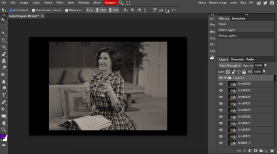
^^ See how Agnes approves! Agnes things you’re going a great job!
Now, it’s time to crop the gif and get rid of the black borders. Making sure that the folder is selected, click on the crop tool (or press C) and click on Fixed Size

W is Width and H is Height, write in your sizing here. Tumblr’s max width is 540, so I put the width as such. For the height, I use 405. Then you just drag the corners until you’ve selected the part that you want, like this
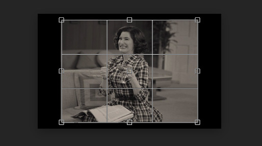
Press enter and the image will be sized down 540x405 px.
Now, our gif looks like this after cropping!
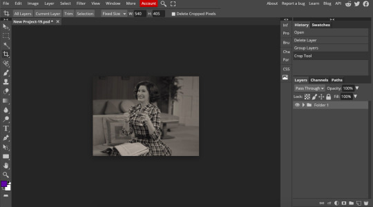
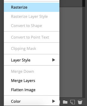
Open the folder so you can see all the layers. Select all your layers and right click on them, then click rasterize.
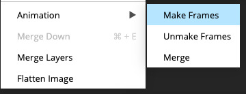
Then, go to layer > animation > make frames. You’ll now see that each layer begins with _a_ - this is crucial because this is how Photopea knows that the layers are part of a gif. If your layers don’t begin with _a_, then it will not play as a gif
If you instead already have a gif done, all you have to do instead is simply click open from computer when you first open Photopea and load your already finished gif and it’ll have the _a_ at the start of every layer. You won’t have to go through the steps of loading your frames into a new project to make your gif as it’s already done and in a folder :) Just start cropping once you load it
You can preview your work by going to file > export as > gif. Make sure to change the speed in the preview window until your gif plays the way you want it! I put my speed at 500%
4. SHARPENING
Hooray, we now have our gif! But to make it look a little nicer, it’s good to sharpen it. I always use Smart Sharpen when I sharpen my gifs, and many other gifmakers use that too. It’s really good :D
To sharpen your gif, again, make sure that all your layers are selected. Go to filter > sharpen > smart sharpen. I use two different settings for my gifs, it really depends on the gif.
Setting 1 (which is the default setting)
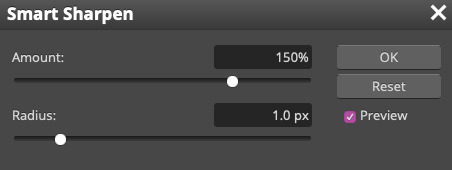
Setting 2
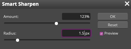
Again, it depends on the gif, play around until it looks good to you!
Here’s our gif after sharpening it
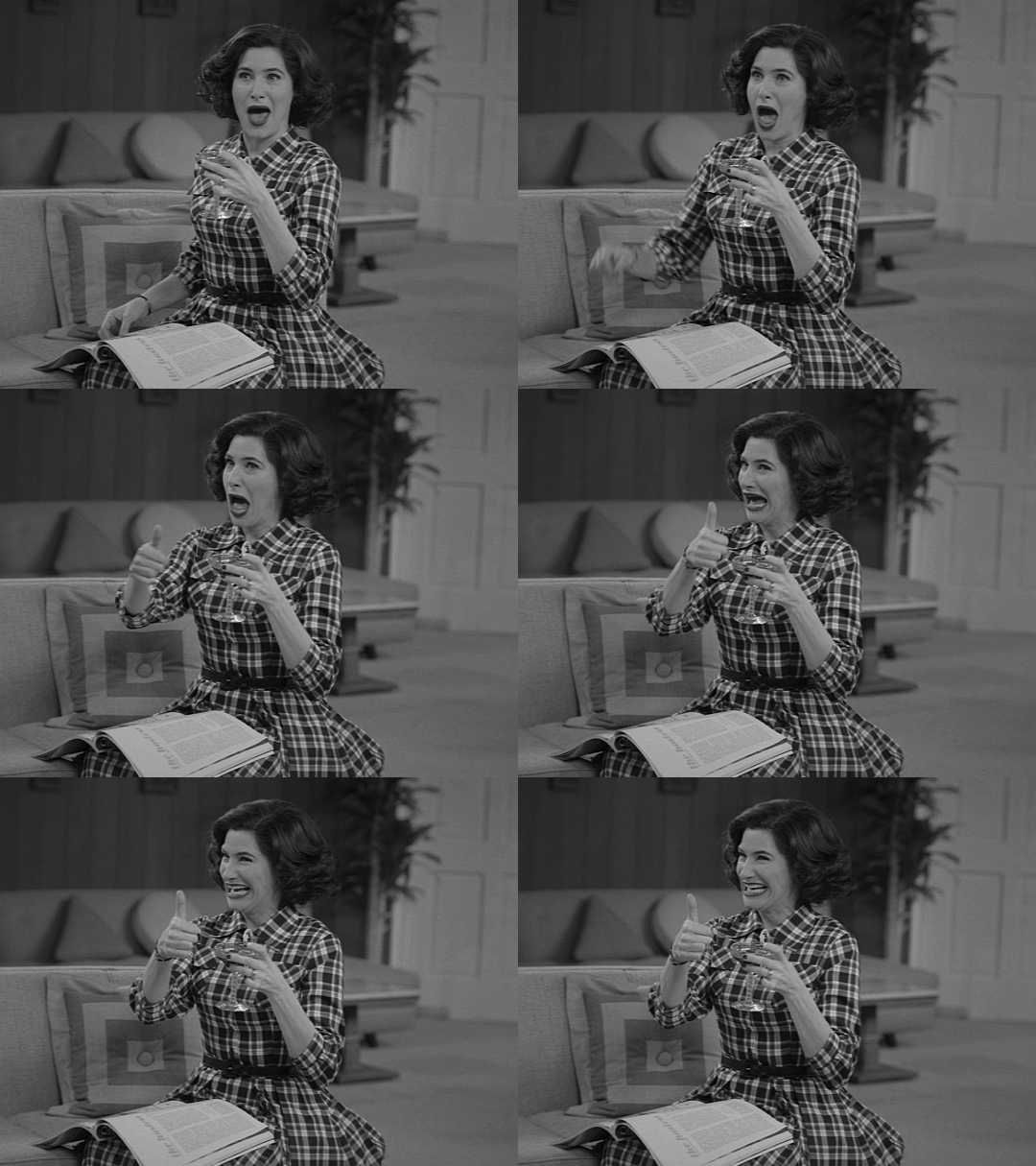
I ended up deleting the last few layers as the gif got bigger than 10mb (that’s Tumblr’s file limit, it your file is bigger than 10mb, it won’t upload). I also added a gradient map and it made the file size smaller, more about that in the next segment!
5. COLORING
Here’s the fun part! Now we get to play around with the gif, making it brighter and look Extra Nice™! Since this is a black and white scene, I make sure that the blacks and the whites really pop.
Notice how in the original scene it’s not actually b&w, it has a slight sepia tint to it. I want to remove this, so I add a gradient map by clicking on the white square with a black circle (I want to point out that we’ll be clicking on this button a lot in this step)

and I change the blending mode to Saturation
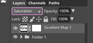
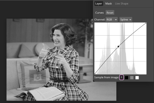
Then I add a curves layer using these settings
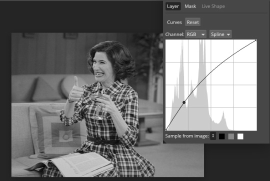
Then a second curves layer
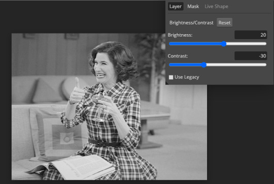
Brightness/contrast
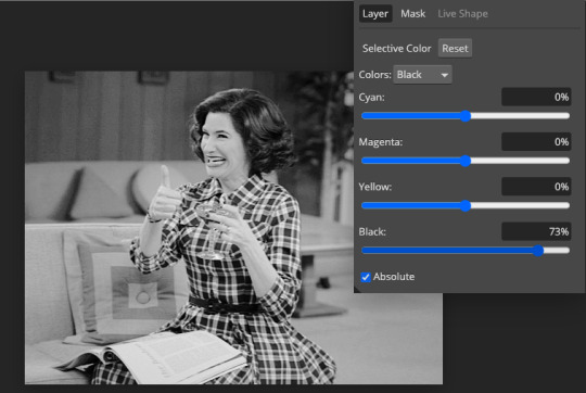
Then my favourite! Selective color! First layer, I deepen up the blacks
Then another selective color layer, this time the whites
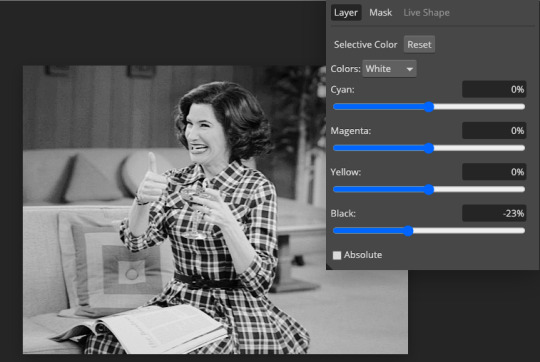
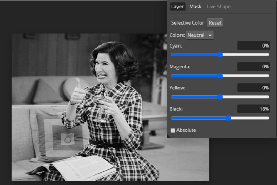
Lastly the neutrals
Here we have the final results!
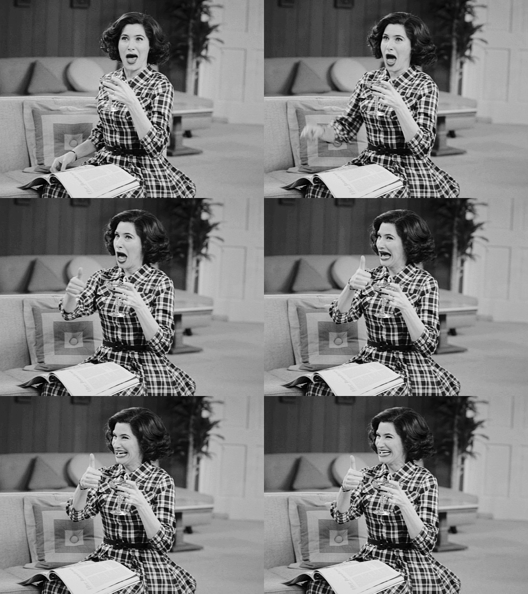
Wasn’t this a gas! I hope this helped you out, let me know if you want to know anything else about gifmaking, I’m happy to help! Also, sorry if I wasn’t very clear, I’m bad at explaining 🙈
MORE RESOURCES:
Here are some other tutorials that are really helpful in making gifs. These users use Photoshop, but you can still use their tips most of the time in Photopea too, you just need to play around and see what works for you!
Gifmaking for beginners by @chloezhao (this one saved my life)
Pale coloring tutorial by @itsphotoshop
Two-Toned Gif Background by @clubgif
Text with white outline tutorial by @anya-chalotra
#resources#tutorial#gif tutorial#photopea#photoshop tutorial#photopea tutorial#tuserfran#userlaur#userlaura#usermirna#(tagging mutuals if you wanna share :P)#my tutorials
1K notes
·
View notes
Text
I always wanted to make a giffing + colouring tutorial.
So, Welcome to my long and somewhat helpful guide that no one asked for <3
For starters, i use VaporSynth (links for installation compiled by @soonhoonsol <hi bestie3 which has a guide ). Photoshop 2021 version for making the gif and colouring it . Install PS from this site. it’s free and cracked ver ;)
STEP 1 : the video for giffing
i don’t need .ts files cause my gifs can be made with normal .mp4 file which i either download from a 4k downloader or screen record on my laptop (windows key + alt + R), which is actually pretty convenient since it allows you to record even 4K resolution videos with perfect quality. the only downside it that, it take a lot more space than a normal downloaded video. but you can always delete the videos after you’re done giffing.
STEP 2: using VS to make & sharpen your gif
(i will be giffing and colouring Dongmyeong from ONEWE since their mv's are very monotonous but not fully black and white. We need to have some colours present in the video/gif so that we have some colours to manipulate in the first place.)
After you decide what part you want to gif, note down the timestamps. After installing and setting up VS, you’ll have a .bat file on which you have to drag your .ts or .mp4 file which will open a timestamp window which looks like this :
And will open a resizing tab in your default search engine after you press enter after entering the timestamp and gif duration. Use settings: qtgmc 60p cause it saves it at a better quality and has 60 frames per second so it’s smoother and small gif size.
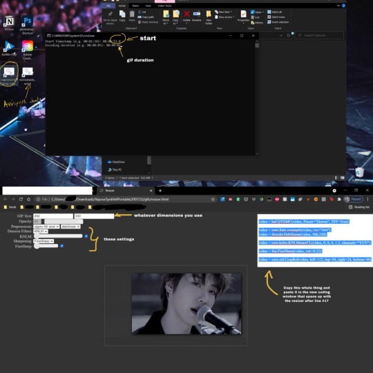
Simultaneously, a vapousynth script will open. Remove whatever there is from line #17 to #26. paste what you copied from the resizer on line #17. Enter your sharpening settings on line #24 and your denoise settings on line #22. After entering your numbers, remove the # before cache size command so it doesn’t hang your laptop. Mine does when I don’t do that. Save that setting, file > save script. Then you won’t have to remove it everytime you make a gif. Your final script before encoding should look like this (refer to the script in the 3rd photo of the collage):
after that, follow these steps:
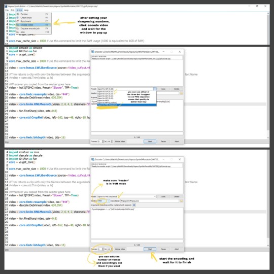
i personally like to use PNG SEQUENCE for my gifs cause one, it’s compatible; two, the quality of the gif turns out good. For me, normal gif output is pretty dithered which i don’t like.
you can close the script after you see green bar in encode window that says '100%. video has finished encoding'
STEP 3: accessing your output png frames / gif
after you close all the vs .html windows, you’ll find your gif/png fames under your VaporSynth folder that you have extracted under VapourSynth64Portable(200722)> gifs>output. i have separate folder where i cut and paste these frames so that they’re easily accessible later.
imp!!!(this may only be my problem): either rename or change the location of the output PNGs before you start with a new one. if not, they will get replaced with the new one since vs automatic name system is 'output00001' for each new batch of encode. Same goes if you decide to encode to gif cause it will be saved as 'output' and be replaced by new one.
after you're done with accessing your output PNGs, close all the windows and repeat the same for a new set of PNGs for another gif.
STEP 4: loading your frames into Photoshop
if you have made an output gif, then you can just open it. File > Open and select all from where you saved it and it’ll load in frames.
after you’ve opened your PS, make sure your Timeline mode is on (window > timeline) then go to File > Scripts > Load Files into Stack. click Browse and it’ll open your file manager; select where you’ve pasted your output frames. select them all and press enter, let them load and press okay.
After PS is done loading your frames, it’ll look something like this. After that click create frame animation. It’s show only one frame so you have to click this ≡ symbol on the top right of the timeline. Then click Create Frames from layers and it’ll make all frames. Then click ≡ again and click “reverse frames” because ps loads frames in reverse so you have to un-reverse it.
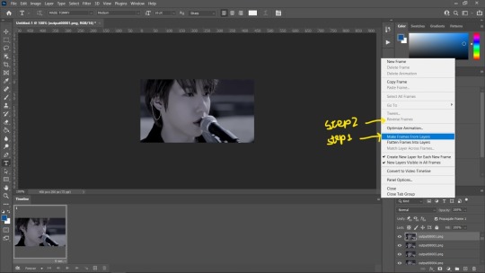
then click bottom left Switch to Video Timeline.

Then select all your layers from the side panel and convert it into a smart object so that you can sharpen it and add other filters.
STEP 5: Colouring. Turning dull/monotone gifs into natural colour (not total b&w gifs)
again, we need to have some colour in the gif that we can manipulate. this tutorial won’t be helpful for b&w gifs.
without colouring you can see some faint reds and blues there.
Here’s the colouring tutorial !
A TIP : If you want to dull out a certain colour, use the opposite colour of it. For example of red you can use green/cyan. For blue you can use orange.
A TIP: If you want to add more colour to the skin, you can use gradient map (taught by @scoupsy <33) esp for pale skin. here is her awesome tutorial !
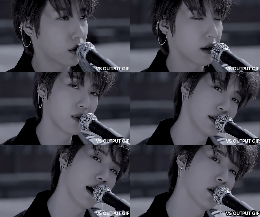
A TIP: direct output gif from vs will be faster than a png sequence created gif. png sequence loads in 0.02 sec delay between each frame but that you can change by selecting all frames in timeline and right clicking them and change it to “no delay”

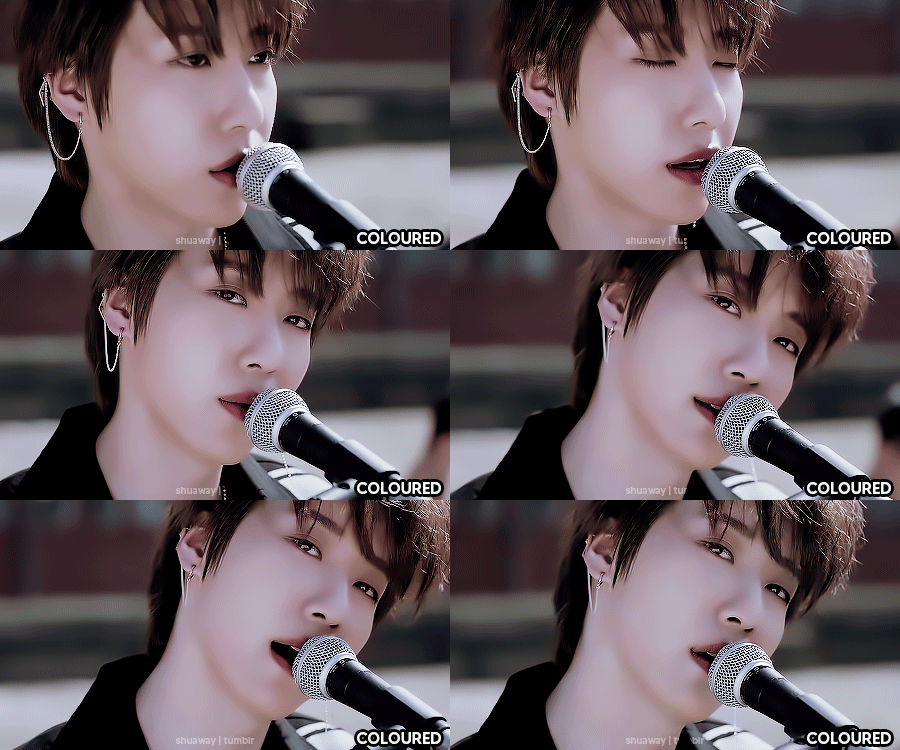
idk why there are bigass pixels on the monotonous gifs on mobile, ignore that pls
i read tags on my cc game and saw many of you wondered how i coloured this, so:
adjustments layers used for this:
Brightness / Contrast
Vibrance / Saturation
Colour Balance
Photo Filter (Sepia)
Selective Colour 1 (red, blue, magenta, white, neutrals, blacks)
Selective Colour 2 ( red, yellow, green)
Curves
i hope this tutorial was little helpful ! for any problem, you can always reach out to me <3 i tried my best with all the things i know about giffing.
#lee.guide#svt#onewe#kpopccc#colouring guide#colouring tutorial#giffing guide#giffing tutorial#ps#photoshop#gyukwans#vs#lee.gif.gfx#vapoursyth guide#vapoursynth gifs#gif tutorial#gif guide#gif tumblr#allresources
191 notes
·
View notes
Text
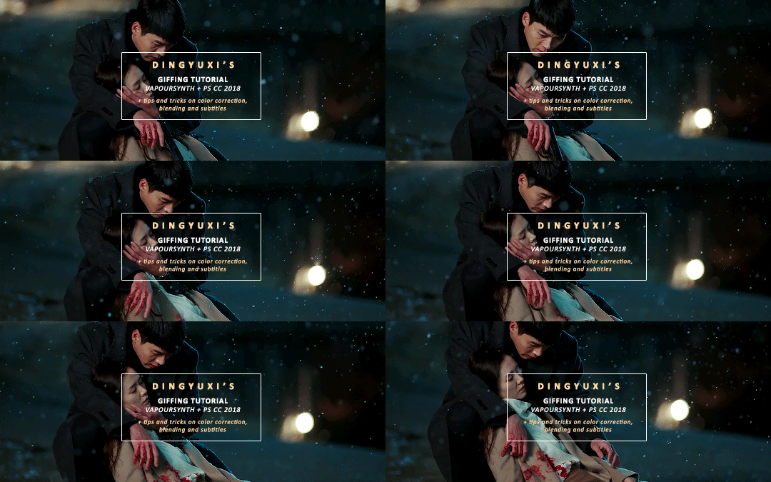
COMPREHENSIVE GIFFING TUTORIAL (vapoursynth + ps cc 2018) + some tips and tricks on color correction, blending and subtitles
You guys asked for it, so here we are! This is by no means the gold standard to giffing. Rather, this is simply my process and my own preferences. Take it as you will. Additionally since I use a mac some of my controls/panels may look different than what you would see for windows users.
DOWNLOADING YOUR SOURCE
This step is extremely important to the quality of your gifset. If you want high-quality gifs I would recommend giffing sources in 1080p whenever possible (especially if you’re going for larger dimensions). You may get away with 720p for smaller gifs. For kdramas, your go-to source would be dr*maday or torrents. (you can search my faq tag if you’d like to know specifics on finding and downloading torrents).
IMPORTING + PROCESSING YOUR FILES WITH VAPOURSYNTH (VS)
Please note that this tutorial does not cover basic installation and set-up of vs. If you would like to know how to download and set-up vapoursynth (it works for both mac and pc) along with some of it’s basics you can find more information at: https://hackmd.io/@nibreon/vapoursynth-book/%2F%40nibreon%2Fvapoursynth-book
Once you’ve identified what portion of your video you’d like to gif, simply drag your video file into VS. Specify the start time and duration of the clip you’d like to import. Typically you’ll be aiming for ~3-8 second clip depending on how big your gifs will be. I am very lazy when it comes to importing. The less of it I have to do, the better. Therefore, I often import clips that are 10-15 seconds long, sometimes even up to 20 seconds. I wouldn’t recommend going over 15 seconds most of the time though, because this will usually bring you over the 500 frames photoshop allows you to import at once. (when I do go over, I will sometimes import the processed VS file into PS in segments). You can also choose to import the VS output as segments if you want all your gifs on separate canvases. (I'll go into more detail on this later)
Once you’ve imported the clip into VS your screen should roughly look like this once the resizer pops up:
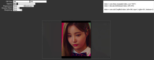
In the top left is where you will be applying your cropping, sharpening and denoising filters. Cropping: Keep in mind the Tumblr dimensions: 540px for full-width gifs and 268px for half size gifs, 177/178/177px for 3 gifs across. The height is completely up to your own preference. Usually I work in 540x300px. Once you edit those parameters you can drag/resize your video file to fit your new canvas. Sharpening + Denoising: You can choose to skip this if you would rather sharpen in ps. I personally do all my cropping, denoising and sharpening in vs. I use finesharp and KNML for sharpening and denoising respectively. Once you select those two filters from their drop down menus, be sure the select the checkbox as well. You should now notice 2 additional lines of code in the top right box. The line that reads: video = core.knlm.KNLMeansCL(video, 0, 6, 4, 1.2, channels="YUV") is where you will adjust your denoising parameters. You will only be adjusting those 4 numbers. I usually use: 0, 1, 0, 1.2. Now find the line that reads: video = hnw.FineSharp(video, sstr=0.22). These are your sharpening parameters. once again we’re only adjusting the number at the end. I typically use somewhere between 0.33-0.55. Depending on the quality of your source and preferences these parameters may change.
Here is a breakdown of the KNML parameters (source: @/nibreon HackMD):
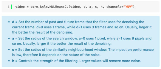
Once you have finalized your parameters, copy all the code in that top right box and paste it into your vapoursynth editor. Note: you can ‘inactivate’ certain lines of code by adding the # symbol at the start the line. That line of code will then be greyed-out. This is what your code should now look like (the highlighted section is the part I just copy and pasted):
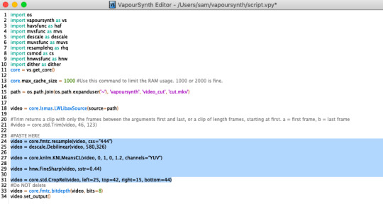
If you would like to preview your filters and see if you need to make any adjustments, simply navigate to the top bar and select script > preview. If you like what you see, great! If not, you can adjust the parameters directly in the editor until you see a result you’re happy with. Once you’re happy you can move onto the final step in vs: processing.
Processing: Once again, navigate to the top bar and select script > encode video. Another window should pop up. Make sure you set ‘header’ to ‘Y4M’ then click ‘start’. Patiently wait for that to finish processing. The longer your clip is and the more filters you add, the longer it will take.
IMPORTING YOUR CLIP INTO PHOTOSHOP (PS)
Now you’re done with the vapoursynth section! Not too hard, right? I use the timeline method when I gif. To import your video file into ps navigate to file > import > video frames to layers. Here you can use the sliders to further specify what range you would like to import. Make sure the ‘make frame animation’ box is checked. To optimize smoothness of your gif, avoid checking the ‘limit to every _ frames’ box. Hit ‘OK’ and wait for the frames to import. Depending on the size of your clip, ps may notify you that you are importing a large file and it may take a long time to process, simply say ‘ok’ to this. UNLESS you get a message saying it will limit to 500 frames. This means your clips contained more than 500 frames and you should select a smaller section to avoid cutting out any critical parts. (Note: you can always go back and repeat this process to select a smaller range of frames from the same video clip until you’ve imported all the frames you need).
Timing: You can adjust the timing of your gifs before converting to timeline. Select all the frames (Navigate to the icon with the 4 bars at the bottom right of you screen. Select “select all frames”). Click the drop down next to the timing of any of the frames. Select ‘other’ and input a your preferred timing. I personally use ‘0.04′ but I've seen people use anywhere from 0.4-0.8ms. Also as a note: when you convert your gif to timeline it has a tendency to mess up your timing so even if you input 0.04 or 0.05 it won’t actually be that timing later. If you want the true frame rate you can set your timing right before saving. You can also adjust timing at the end. (see export/saving gif section for more info)
Now the next part can be tedious and for that reason I’ve created numerous actions to speed up this process. But for the sake of this tutorial I will walk you through the steps. At the bottom of your screen is your timeline. As you can see, it defaults to frames, but we want to convert this into a smart object so that all your coloring/edits are made to all of the layers. To do this: 1) Navigate to the icon with the 4 bars at the bottom right of you screen. Select “select all frames” 2) Now select all your layers in your layer panel. On mac you can use cmd + option + A as a shortcut. 3) Back to the icon with the 4 bars, select “convert to video timeline” 4) Right click on all layers (which should still all be selected) and find “convert to smart object”
(Aside: Actions) actions are SUPER helpful to streamlining your giffing process. you can find actions people have made available on resource blogs like itsphotoshop OR you can choose to make your own custom actions. To do this, all you need to do is locate your action panel. Then from the controls at the bottom of the panel select the one that looks like a sheet of paper to “create a new action” Once you’ve named it and hit ‘ok’ the record icon should now be red. PS will now basically ‘record’ whatever you do. To stop recording hit the square icon. Now whenever you want ps to execute the same set of steps you just did, you can locate the action you just made and ‘play’ it by selecting the triangle icon. I highly recommend making an action for the steps I just outlined above to convert your gif into a smart object timeline. It will make your process much faster and more painless.
COLORING
Now the fun part! I focus on emphasizing the colors already present in the video source or getting rid of some less-than desirable overtones when I color. It gives the gif a natural look, but makes everything pop a little more. We will be working with selective color, curves, levels, and brightness/contrast mostly. This is the original gif I will be using to demonstrate coloring:
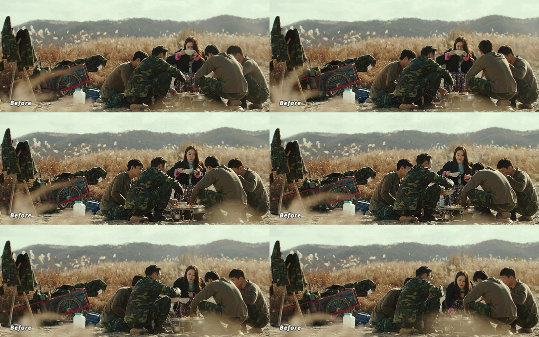
Curves: I always start with curves. The first curve layer I use to set a desirable black point. To do this, locate the top dropper icon from the curves panel and select the darkest point of your image. This will set that section to “true black” Feel free to play around with this until you find a desirable outcome. Now add another curves layer. This one we will be using to adjust the brightness/contrast. First, I always start off with ‘auto’ and see where that takes me. If you like the outcome, great! If you don’t play around with the different curve points until you get an outcome you like.

Selective Color: This adjustment layer will be your best friend. For me, I will typically work with reds, yellows, and black. If the source has a lot of blue/cyan I will use those too. Basically look at your source and determine which base colors you’d like to emphasize/alter. For blacks I usually up the black by +1-5 depending on the source. For reds, it also depends on the source. But I will typically either decrease cyan (to make red stand out more) or increase cyan (to make the red not look so overexposed). You want to be careful here. Overexposing the red can make your skin tones look like red tomatoes! And for my content base, where most of the actors are of asian descent, we should be emphasizing the yellows and NOT the reds (see aside on color correction + skin tones for more info). After altering the reds to my liking, I do the same process for the yellows. To bring back natural skin tones and color, you will likely want to darken the yellows, expose them a bit more and maybe even up the yellow slider. A common rule of thumb: if you want to make any of the colors less exposed, increase the cyan. If you want to increase exposure on any of the colors, decrease the cyan. If you want a color to appear more strongly or prominently, increase the black. The magentas and yellows I use more to adjust hues. You can add multiple selective color layers to further emphasize your changes.
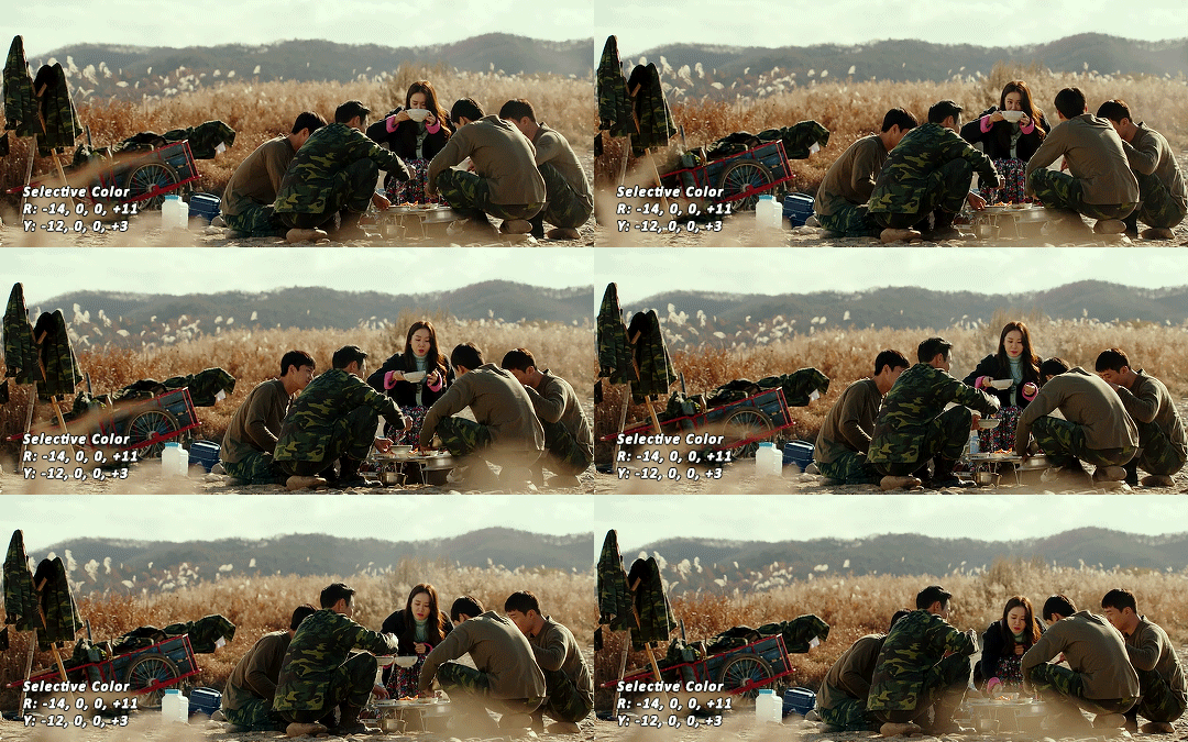
Levels: Now we will work on the lighting some more. This creates more contrast and depth to your gif, often making them look ‘crisper’ To emphasize the bright parts, move the right-hand slider to the left. The emphasize the dark parts, move the left-hand slider to the right. You may also choose to move the middle slider to adjust more neutral lighting. Do so until you find a setting to your liking.
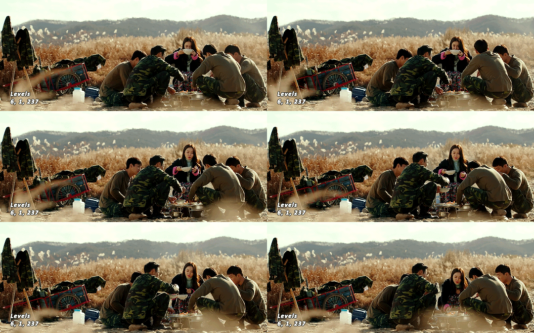
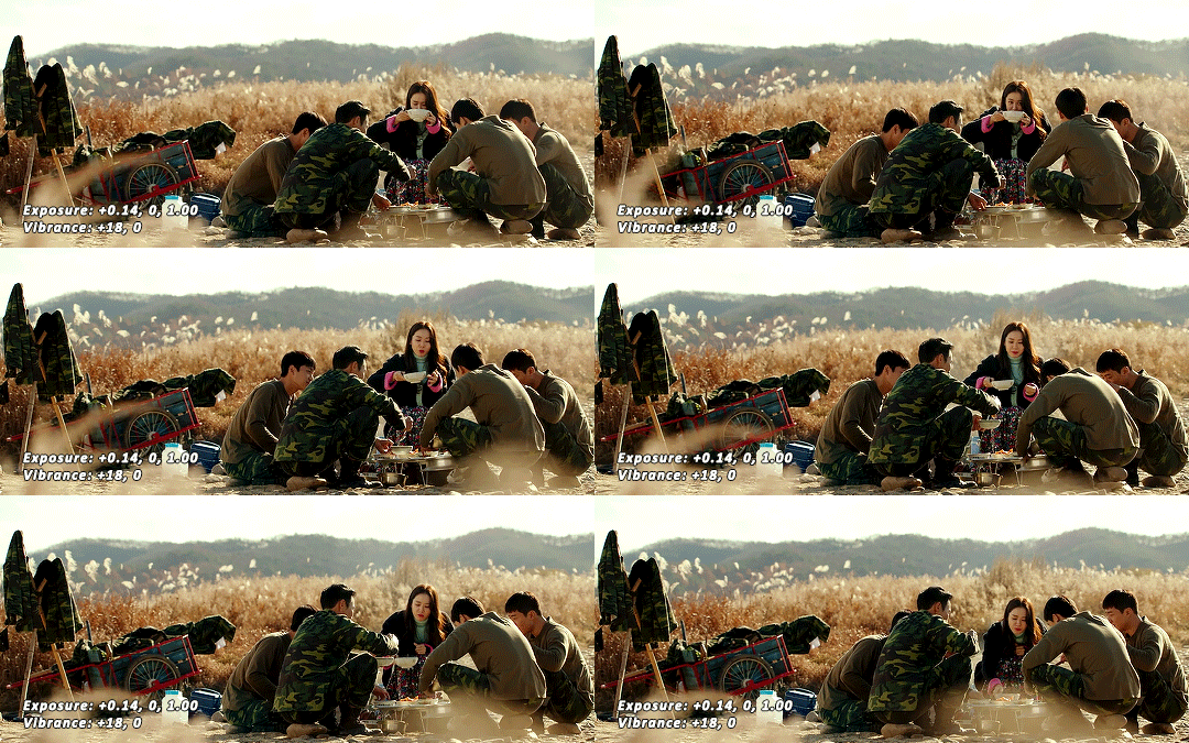
Miscellaneous: Depending on your gif you may need to play with other adjustment layers. Some other ones I often use are the brightness/contrast and exposure to adjust lighting and add more dimension to the gif. For additional color correction I use color balance and to a lesser extent hue/saturation and vibrance.
(Aside: Color correction + skin tones): We are anti-whitewashing and anti-redwashing when it comes to asian media. Like I mentioned earlier, natural asian skin tones have yellow undertones, not red/pink. Therefore when you’re bringing in color you should be mindful of this delicate balance. Adding more red does NOT equal un-whiteashing. Be VERY careful how you balance the yellows with selective color/hues/color balance.
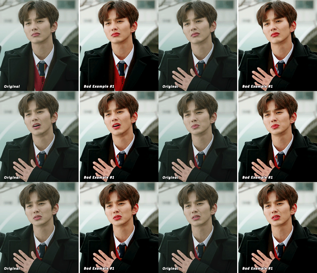
^^ Here is an example of what I mean by overexposing the reds. Poor seungho is looking as sunburnt as a cherry tomato. Note: if your original source is already overexposed with red, fix it! You can do this by applying the same basic principles I explained earlier. Try upping the cyan on the reds in selective color, or shifting the color balance to favor cyan over red with the color balance adjustment layer. You may also choose to favor the yellow over blue.
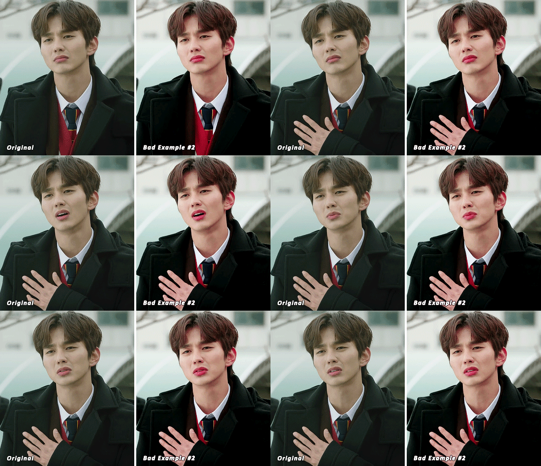
^^ Now this is straight-up whitewashing. This is what happens when you are not careful with your correction of yellow. I’m not saying you can’t touch the yellow slider or get rid of some yellow form the overall image (because sometimes it is very much needed), but you should be very mindful how your corrections can affect skin tones. If you decide to decrease saturation of yellows, or decrease yellow in the selective color section of the reds, do so with caution. If your reds are looking too pink, add some yellow in the red selective color, up the yellow and black of the yellow selective color.
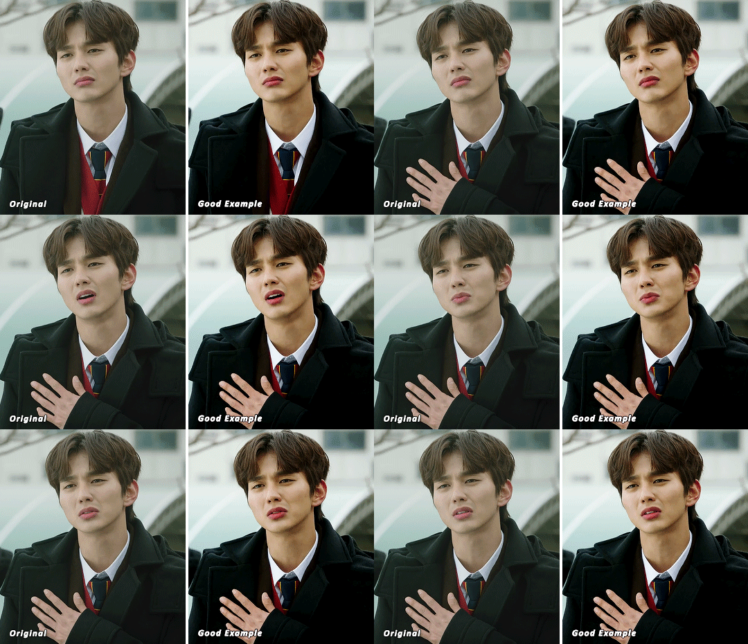
^^ If you hit that happy medium, you can emphasize the natural skin tones without overexposure. Here the underlying tones are very much still in the yellow range.
(Aside: Blending): I will very briefly talk about how to blend two gifs together. First make sure you’ve imported both your gifs into ps and converted them into the timeline format. On one of the gifs, right click the gif layer in the layer panel > duplicate layer > select the canvas of the gif you’d like to blend the gif with. On the canvas you just copied your second gif to, you can now drag the two layers around the on the canvas to get your desired positioning. On the top gif apply a layer mask. This can be found in your layers panel at the bottom, and is indicated by the white rectangle with the circle. Next, make sure you select the mask in the layer panel (it will show up as a white rectangle on the layer you applied the mask). Grab your paintbrush tool and make sure your color is set to black. Now you can effectively ‘erase’ the part of the top gif you don’t want to show anymore. I recommend setting your brush hardness to 0% to get a smoother transition. You can also play with the opacity settings. If you want to add back in a part you erased, just switch to a white paintbrush and you will be able to undo what you had just ‘erased’ with the black. When you merge the gifs, they will play the same number of frames. This means your blended gif length is limited by the gif with the fewer number of frames. You can move around your timeline layer and shorten the included portion by dragging either end of the timeline layer in until you get both gifs to play the parts you want.

CAPTIONS/SUBTITLES
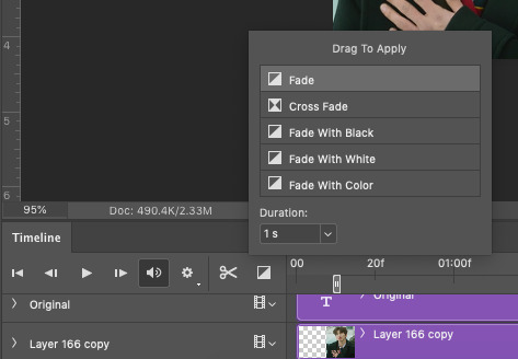
I often get asked about my subtitle font/styling settings. Personally I find the best fonts for subtitles are calibri and arial. I use calibri with the following settings: 12-14px, bold italic plus faux bold, 1px black stroke (optional: drop shadow set to ‘multiply’ at around 85% opacity), and tracking (VA) set to 75. If you would like your subtitles to fade-in or fade-out you can apply the ‘fade effect’. Locate the b/w square icon in your timeline panel. Select fade and drag it onto your text layer in your timeline. You can then right click on the wedge shape to adjust your fade duration. I usually use 0.35s. If you drag and drop the effect towards the beginning of your text you can get the fade-in effect. To get the fade-out, simply drag and drop your fade towards the end of your text layer.
SAVING/EXPORTING YOUR GIF
We’ve reached the final stretch! If you need to adjust your frame rate timing: you will need to revert your timeline to frames. To do this: 1) Navigate to the icon of 4 bars at the right of your timeline panel. Select convert frames > flatten frames into clips. 2) Navigate to the icon of 4 bars at the right of your timeline panel. Select convert frames > convert to frame animation > when promoted hit ’ok’. If at this point you see more than one frame in your timeline panel, delete the frames until only one is left. In the example below I would delete the first frame by hitting the trash icon from the timeline panel.

If there is only one frame, leave it as is. 3) Navigate to the icon of 4 bars at the right of your timeline panel. Select ‘make frames from layers’ You will most likely need to delete the first frame in your timeline panel (it won’t have your coloring). Sometimes ps adds in some ‘blank’ frames as well, delete those too. Now you can adjust your timing.
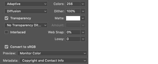
Once your timing is set: When you’re saving your gif, just keep in mind it must be under 10mb. Navigate to file > export > save for web. When it comes to your save settings I typically use either selective diffusion or adaptive diffusion. I also also occasionally use adaptive pattern (I find this is best for dark scenes without a lot of contrast). Set colors to 256, quality to bicubic and looping options to forever. If you want to preview your gif, hit the preview button in the bottom left. Otherwise, go ahead a hit ‘save’ and you’re DONE!

ADDITIONAL RESOURCES
Feel free to check out my ‘ps things’ tag for more photoshop stuff/mini tutorials. Additionally @/nibreon and the hackmd site I linked previously are your best resources for vs questions. If you would like to see my giffing process in motion feel free to check out this video. It’s sped up but you can slow down the playback. Additionally be sure to check out resource blogs like itsphotoshop for more helpful tutorials and resources.
If you reached the end of this beast, kudos to you! I hope this helps and never be afraid to reach out with any questions.
542 notes
·
View notes
Photo
Finding high quality film/tv rips, saving the large files, and screencapping them are half the battle for gifmakers when setting out to make a gifset. Here’s a little guide on this process, including my advice on
Where to download stuff
Where to store your movies/shows
Screencapping programs
Making gifs as HQ as possible, including tips for picking out what to download when you have multiple options (not all 1080p rips of the same movie or tv episode are the same quality and I explain why)
Why screencaps of 4k movies can look weird and washed out and how to fix that
and more
✨ You can find my gifmaking 101 tutorial here and the rest of my tutorials here.
Where can I download movies and shows?
First off, I prefer direct downloading rather than torrenting stuff because it’s faster and with torrenting, there’s more of a risk. Other people downloading the same torrent can see your IP address. This means movie studios can find out you’re downloading their content and can send you a warning letter. The download speed also varies depending on how many other people are seeding it. I would only do it if it’s your only option and you have a VPN or something.
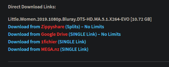
This is THE best guide for pirating I’ve ever seen. I use it for finding sites for books, music, you name it. The part of the guide you’d want to look at is where it says Direct Downloads Link (DDL) sites. My favorite place is Snahp. These ddl sites will have links to their movie/tv rips that are typically hosted on one of these two sites: google drive or mega.nz. You can download stuff from both of those sites for free, but with mega, they have a 5GB file download limit unless you have a premium account. I personally pay the $5 a month membership for mega because it’s worth it imo. You can buy a subscription through the mega app found on the iphone app store (so you’re billed through apple and it’s less scary than giving a random site your credit card info lmao) and as for androids I think mega has an app on there too.
So basically, if you go to http://snahp.it, they’ll have rips for different movies and shows.
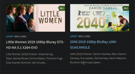
You click on the movie title and it’ll take you to a page where they have links for the video which they have uploaded on a variety of sites (including mega).
How do I make my gifs as HQ as possible?
It’s best to gif things that are 1080p. And usually the higher the file size, the better. A really important thing to note is that not all 1080p bluray rips are the same. The piracy groups that rip these files take uncompressed .mkv rips from discs that are anywhere from 10gb to like 50gb, and then run that through video converters to compress the file down so that they’re 2-8gb. Sometimes when that happens, the video quality goes down a LOT. The same goes for TV episodes. One rip could be 800mb, the other could be 3gb and both could claim to be “1080p” but the quality would be NOTICEABLY different. Your best bet is to always pick the rip with the highest file size.
I’ll show you an example with this scene from You’ve Got Mail.

I downloaded 2 different 1080p rip versions of the film. Both claim to be 1080p, but one is 2.41 GB and the other is 9.75 GB. After taking screencaps, it’s obvious that there’s a BIG difference in quality.
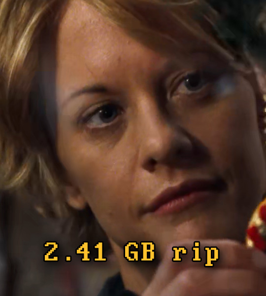
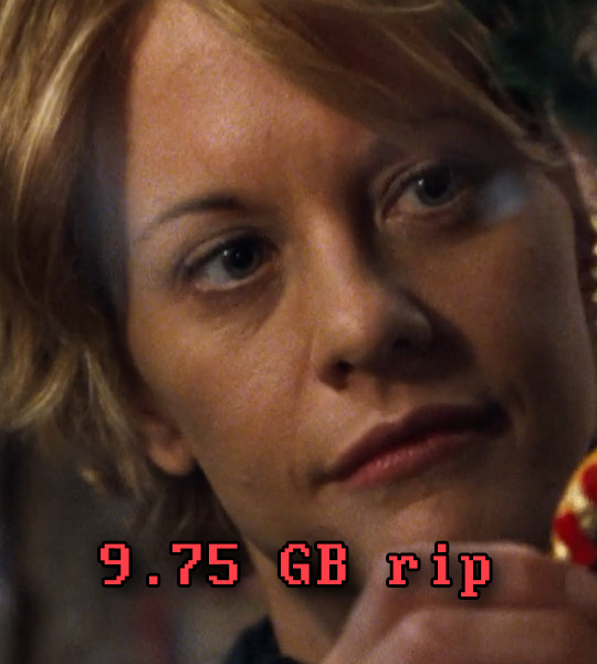
(these pictures are best viewed on desktop tumblr)
When it comes to Blu-ray rips, download remux versions of films and shows if possible. Remux means .mkv files that are uncompressed and straight from a Blu-Ray disc. Giffing remux rips cuts down on the possibility of seeing pixel-y effects a LOT in my experience. It’ll take a bit longer to download than typical 1080p rips but it’s worth it imo.
For TV episodes, if you can’t find a Blu-Ray rip, uploads with the word AMZN in it are usually the highest quality and your best bet (unless you see another upload that’s higher in file size - again: always try to pick the highest file size). 'AMZN’ means they’re from a person that ripped the episode from Amazon Prime Video.
Also, even better than 1080p is 4k (2160p). I only really recommend this though if you know you’re going to gif something up close and crop it a lot - like if it’s a big 540x540px close-up gif of a person. You’ll REALLY see the difference if it’s a 1080p vs 4k rip in that situation. I usually don’t bother with giffing 4k files unless it’s the case above because my laptop lags when taking 4k screencaps and it takes longer to load them into photoshop (4k screencaps are usually about 60mb each!)
⭐️ Another thing that’s important is making sure that when you actually make your gifs, you set them to the correct speed (.05 for movies and most shows, and .04 sometimes for reality tv and live broadcasts). Here’s my gif speed guide. Having the right gif speed is really important for making a gifset HQ. You don’t want it to look too slow or too fast.
What’s your favorite video player to take screenshots with?
MPV player, hands down. And I’ve tried a TON of programs over the years. I’ve tried KMPlayer and found that it added duplicate frames (and even missing frames) which is horrible, and I’ve tried GomPlayer which is.....I’m just gonna say it, I’m not the biggest fan of it. It’s a little overly complicated in my opinion and it has ads. If you like these programs, more power to you! Use whatever you’re comfortable using. I just like MPV the most because it doesn’t have ads, it’s simple, you can take sequential screencaps with a keyboard shortcut, and it can play 4k movies.
Screencaps I take of 4k 2160p movies look so dull and washed out, like the colors aren’t right. Why is that?
That’s because your computer can’t handle HDR 4k video files. It probably can handle SDR 4k video files, but unfortunately, 99% of 4k rips out there are HDR.

[picture source]
Now, HDR displays just fine on computers that have 4k-HDR capabilities, but most older computers don’t have this ability. Having said that, MPV - the video player I mentioned above can take a 4K-HDR video and fix the colors/lighting in real time so it displays correctly AND take screenshots of it with the fixed colors. If you have an older version of MPV, make sure you download the newest update for this. In my general gifmaking tutorial, there’s a portion on how to install this program on macs. I also just made a video tutorial on how to install it on pcs here!
High quality TV and Movie rips can take up a LOT of space on my computer. Where do you store your files?
I store them on external hard drives. External hard drives are like flash drives but they have a MUCH higher storage capacity. You just plug them into your computer via a usb cord when you need access to the files and it’s that easy. I have two of these Seagate 4TB hard drives in different colors so I can easily pick out whichever one I need. I have silver for my movies (because it makes me think of “silver screen” lmao and it’s easier for me to remember) and then I just have a blue for shows. Now, external hard drives of this size can be $$$$ but it’s worth it imo. Look out for when they’re on sale.
What’s the size limit for gifs now?
It’s 10mb! It used to be 3mb and then last year Tumblr upped it to 5mb. Some gifs initially had distortion because of Tumblr’s switch from the .gif to .gifv format, but they’ve fixed the problem AND increased the upload limit to 10mb. Just make sure not to add any lossy to a gif.
Lossy is basically a grain you can add to a gif to lower the file size down. Gifmakers (including myself) used to use this as a trick to get the file size down under 3mb. However, since the .gifv update on Tumblr, any gifs with Lossy added will look distorted like it’s a gif made on a phone app or something.
_________________________________
That’s it for this guide! Again, feel free to check out my other tutorials on photoshop, how to center subtitles, download hq movie trailers, and more ✌️
UPDATE 6/23/20 ⚠️
I’ve gotten an ask about this problem 3 times since I’ve uploaded this tutorial, so I thought I’d add this in. If you are experiencing duplicate and/or missing frames in mpv, it is a glitch with the latest version of mpv. download an older version like 0.29.0. this happened to me on my mac and downloading an older version fixed the problem.
3K notes
·
View notes
Note
hi so i saw you comment on someone's post a way to get photoshop for free and i installed it and everything so i have now managed to download it for free! but whenever i try to make gifs it just doesn't really work? like after saving the gif, when i try to open them they're stuck on one frame and aren't moving. so idk maybe you'd know why or if i did something wrong?
Hello! There could be many different reasons as to why this is happening to you, so I'll just give you a brief run down of my gifmaking process, and show you where you could've made a mistake. It helps to show me your layer settings and export settings when you're asking me these questions, since it would be easier to detect where you went wrong. If you want a good giffing tutorial (the one I learned from), check this out!
under the cut!
disclaimer: i am in no way any sort of experienced gifmaker, and many of the methods i use might have an easier way to go through it, so if anyone wants to correct me on these methods, feel free to add the post!
so here's basically how i make my gifs:
↠ Okay, so first of, make sure that the clip you're using to make a gif in in .mov format. I use vaporsynth to sharpen and denoise my video clip and export it into .mov format, the process of how to do so you can see in that tutorial i've linked above.
↠ I’m unsure of what method you used to import your frames, so i’ll just tell you how I do mine:
1) go to file > import > video frames to layers 2) select the file you want to import (in .mov format ! .mp4 does not work for this.) 3) so basically use the sliding bars things to select the part of the clip you wanna gif (if there’s any extra bit that came by, if not just import from beginning to end.) check image:
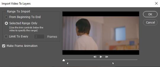
↠ now that your frames are imported, it’s time for the actual coloring and exporting part, in which you might’ve made a mistake. So basically go to window > timeline, and make sure the timeline is visible. On the right side, you’ll see a layers panel, having each frame as a layer. make sure that the “make frame animation” is checked! Next, select all the frames from the timeline and all the layers from the layers panel:
↠ right click on that timecode > other... > and then set your delay to whatever you prefer. I usually set the delay to 0.05 since i prefer slow gifs, but if you prefer faster ones, you can use 0.03. check image (this is called a frame animation):

↠ now select that little symbol in the bottom that i’ve circled, and then right click on your layers (make sure that they are all selected !) and select “convert to smart object). This is a common area on mistake! People tend to convert into smart object first and then click the small button thingy (which is called changing to video timeline from frame animation), which could be one of the reasons for why your gif appeared as a still image.
You may ask me, dawn why do we need to do this? Isn’t it easier to simply color using the frame animation timeline. Well, yes. Technically you don’t have to do this step, but i’ve found that i tend to make a lot of mistakes in frame animation, and it’s harder to overlap layers on each other in the frame animation, especially if you’re coloring and use multiple adjustment layers.

↠ So now your timeline will look like this. Now that the base gif has been adjusted. it’s time to add our other adjustments, aka coloring.

↠ Another mistake: check the layers panel and make SURE that your layer is a smart object and NOT a rasterized layer. A smart object looks like the above image, while a rasterized layer looks like this:
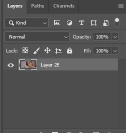
Rasterizing will change the gif into a still image, which might lead to your mentioned “gif appearing as a still image”.
↠ Now that that’s done, simply add all your adjustment layers (aka coloring). It should look like this.
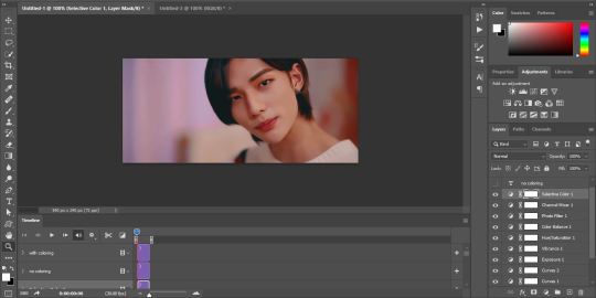
↠ It’s time to save the gif. so now go to file > export > save for web (legacy). so now you’ll find a popup window like this:
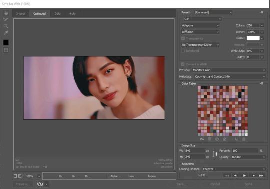
take a good look at the settings i’ve used. Another reason your gif may not be playing is because you didn’t switch the mode to gif or you used a different export method. You can choose between selective and adaptive diffusion, both of them have different looks to it, but personally, i prefer adaptive diffusion. Then what else, click save, and select a folder to save it to.
but wait! The gif looks like this:

see that white delay at the end? (I’m only explaining this since i told you to convert your frames into a video timeline, so this part is an important one.) I don’t want that. The reason why it’s going white at the end is because of:

this. see how the gif layer only occupies a small area between those two placeholders and the adjustment layers occupy a bigger area? That’s the reason of the delay, which is why i will adjust it to:

this, in simple words, make sure that the two placeholders are perfectly touching the ends of the base gif, so that it doesn’t show that white bit at the end. So now our gif looks like this:
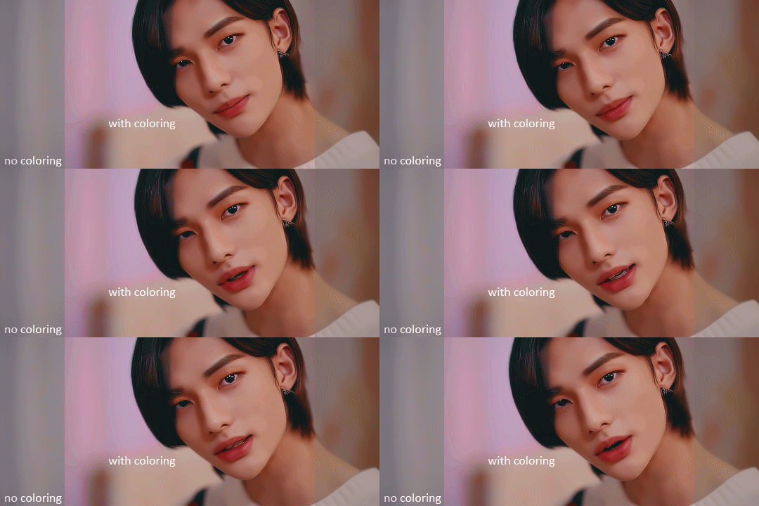
see? Now there’s no white bit in the end, since our gif duration is exactly same as our base gif duration. You can also see how much of a different coloring makes!
There you go! I’ve basically run you down on how to use photoshop, since you said you just installed it and are probably a beginner. Photoshop does take some time to master, but keep trying ! Next time if you do wanna ask anything though, please do attach a screenshot of how your canvas looks, since that way it’s easier for me to understand what kind of problem you’re facing.
There’s a lot of complicated wording in this, so if you don’t understand it, feel free to a) ask me or b) check that tutorial i linked in the introductory paragraph! It goes into a lot more detail and explains very well along with use of vaporsynth if you’re interested in that, so give it a go and tell me how it goes !
25 notes
·
View notes
Text
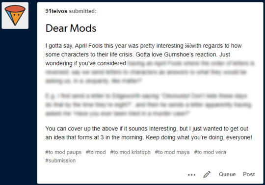
Dear 91teivos,
Mod Vera: Thanks! Everyone in the world is going through some kind of existential crisis, so it made sense for the AA characters to join the party! (And since it was another follower who gave us the idea, we might just keep that idea in the think that after all...)
Dear dawsongfg,
Mod Vera: No need to apologize! We like to space out letters from specific people a little, but we’ll answer as many as we can!
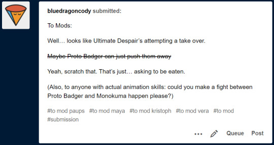
(Referenced Letter)
Dear Bluedragoncody,
Co-Mod: Don’t worry. I doubt they’ll have much luck against the Ace Attorney crew, even without the Proto Badger. They have the ultimate weapon against despair in their arsenal, after all.

...They’re doomed, aren’t they?
I can’t make any promises, but if I ever gain enough skill in the art of animation (which has been a dream of mine for a long time, it turns out), I’ll keep that idea in mind.

Dear skibot99,
Mod Vera: Probably Tumblr bein’ weird. (What else is new?)
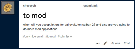
Dear sheeeesh,
Mod Vera: Mods get brought on as needed, as you can see with the arrival of Mod Edgeworth! Also, DGS2 is one of the few AA titles I’ve never played, but rest assured. Where there’s a letter, there’s a Mod who can answer it!
Mod Edgeworth: To add to Mod Vera, even if you weren’t accepted during any mod applications, that doesn’t mean you have lost all chances. I applied early January and lost to Mod Vera. Regardless, Co-Mod informed me that, even though I was rejected, he saw my potential and kept me in mind for if I was ever needed. Now, here I am.
Just because you get rejected, that doesn’t mean it’s game over. Show that you have potential and make yourself known by sending letters to us. That is what I did, after being rejected. I made myself known to the mods by sending letters. We do read them and they tell us how much you know the characters and games of AA more than any application. Of course, you must also follow the guidelines. That just goes without saying.
Co-Mod: I think my actual words were something like “Don’t tell anyone, but you were my second choice.” But yeah, what they said is true -- becoming a Mod here, like many things, may or may not happen to you, but you can definitely increase your chances by waiting patiently and demonstrating your potential.
As for DGS2 letters, I’m afraid those are still off-limits unless you know of a way to play or watch the game in its entirety, translated into English. I guess I could check to see if the Dai Gyakuten Saiban 2 channel finished translating...
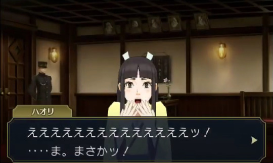
(Translation: Whaaaaaaaaaaaat?! ...D-Don’t tell me?!)
...Okay, looks like I have some watching to do. Don’t know how I missed that.
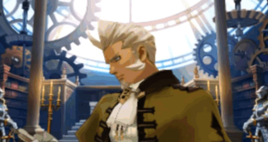
So, uh... That part in bold was what I was going to say. Now that both games are finally getting an official English version, all I can say is, hang tight!
(Previous Post)
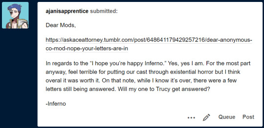
Dear Inferno again,
Co-Mod: Yeah, I agree. I was just joking around. For anyone who didn’t catch it, that was a reference to Sbemail #108.
The event’s technically over, but we’ll answer the rest of the April Fools’ Day letters when they reach the bottom of the queue. I’m as eager to see Trucy’s reaction to the news (after the stunned silence) as anyone else, after all.
(Video in Letter -- Strong Language Warning)
Dear Ella,
Mod Edgeworth:

I can’t see the first link and....

How did you find this masterpiece and where can I play this game?
Co-Mod: We don’t check for direct messages on Tumblr, if that’s what you’re referring to, so it wouldn’t have made any difference anyway. You can always send links in your letters, of course.
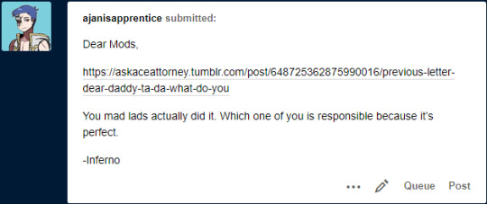
(Previous Post)
Dear Inferno,
Mod Edgeworth: That mad lad would be me and thank you.

I like to put my heart and effort when answering these letters. With this one, I figured you wanted to see Trucy in costume, so I just searched up an image on Google for the Ancient One’s costume, a sprite of Trucy and a bald head to put on her. The rest I photoshopped on GIMP.
We’re still going through letters from January. Hopefully we will get the rest of yours soon enough.
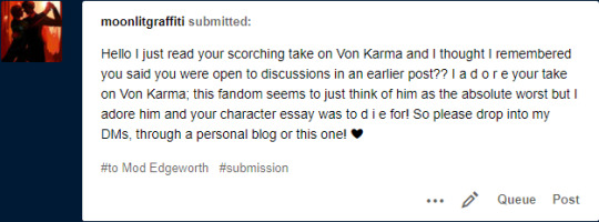
Mod Edgeworth: Thank you very much. Your support and the others’ support that have liked, commented and reblogged it mean a lot. As you have stated, a majority of the fandom seem to consider him the worst. I’d like to think it’s because how AA had created this villain of a character to be universally hated was pure genius. Not even the Phantom gets this much hate… and that’s saying something.

Unfortunately, I’d like to keep my real identity outside this blog a secret. I write a lot of letters here and I don’t want to break the spell for anyone. Think of it like a Disney theme park. The cast that play the characters will never admit their true identities, outside of family and close friends, to prevent the experience from being ruined. I want to do the same as a Mod. I don’t want to break the spell of writing to your favorite AA characters. This blog had helped me through my tough times and I want to help everyone else as a mod.
However, I will answer your letters and, if you post anything on your account, a mysterious friend I know may linger and give you a like ;)

(Previous Letter)
Dear Ali S. Fakenamington,
Co-Mod: Beautifully so.
(Previous Letter)
Dear Sinyove,
Mod Edgeworth: That letter was made in 2012 before AA5 and AA6, which was WAY before I became a part of the AA fandom. I’m certain a lot of us were not here when this letter was made, except maybe Co-Mod, but you’ll have to speak with him about this. I will say that the mod that answered this is no longer working here... I think. At the very least, I haven’t heard from him.
That being said, AA4 or Apollo Justice was the first AA game I’ve ever played. Despite all of the hate I saw towards that game, I still loved it regardless. Though, having not played the trilogy, playing the tutorial of AJ was a pain in the ass. I remember going to YouTube to find out how to beat it, because it was so hard. I also played it on PC.
I do see where The Mod was coming from. Had the two sequel games never existed, Apollo Justice would have more holes than my brothers’ socks. My only critique is that Phoenix wasn’t any better either with having Mia babysitting him during almost every trial AND investigations. Hell, Phoenix needed Mia to know how to talk to a kid, talk to a perverted old man, almost gave up in most of his trials in the first game and never conducted a trial without Mia until Turnabout Goodbyes when Maya literally couldn’t summon her. For the most part, Apollo was doing fine on his own without Phoenix, with only Trucy assisting him for the two middle trials, only almost giving up once and Phoenix having assisted him during times when Apollo was not in a normal situation (like when the criminal turned out to be his own co-council/mentor or when he had to lead a trial that included the Jury System). That’s more than Phoenix ever did on his own in the first two games and I think Apollo deserves more credit than he got in that letter in my opinion.

For me, Apollo Justice is one of those games you either like or you hate. I love it for what it is. My least favorite AA game would have to be Ace Attorney Investigations, the first game. The second one is my absolute favorite.
Co-Mod: Sadly, I haven’t seen or heard from the Mod in a while, so it may be time for us to declare him MIA again.
Erm... Sorry, poor choice of words.
I’m fairly certain I wasn’t around 5 years long ago, but I have to say, Capcom did a great job of making Apollo and his story more interesting over time. He may not be Phoenix, but he certainly carried his legacy forward pretty well, both as an attorney and as an Ace Attorney protagonist.
Now, WHAT ABOUT ATHENA ALREADY!?

Dear BDC,
Co-Mod: It fits like a glove, if you ask me...although it also kind of reminds me of 101 Dalmatians. And thanks for that bit of info! I never get tired of watching people enjoying the fun dialogue and plot twists of Ace Attorney, so I might have to look him up.
I’m not sure I feel the same about watching Dahlia’s voice actress, though. I’m sure she’s a nice person and all, but the thought of hearing that voice for so long... *shudder*
(Previous Letter)
Dear dawsongfg again,
Co-Mod: I wasn’t trying to say that natural deaths can’t happen in the Ace Attorney universe, just that most deaths aren’t what they seem. I knew right away that Archie Buff’s death was no accident, for one thing. Waaaaay too much of a coincidence, know what I mean?
-The Mods
#91teivos#dawsongfg#bluedragoncody#ajanisapprentice#skibot99#sheeeesh#Ella#moonlitgraffiti#Ali S. Fakenamington#sinyove#Mod Post#Mod Vera#Co Mod#Mod Edgeworth
15 notes
·
View notes
Photo

So, since I got a couple of asks about making a manip tutorial, I’m going to walk you guys through how I made the Sofia Martinez x Diego Hargreeves gif that you see above! I use photoshop on mac for all of my gifs, so it may look different on other computers, but the theory is the same (I don’t know what version of photoshop it is lmao, I got it free through school)
This is admittedly not my best gif ever but it was less complicated than a lot of what I make so it seemed like a good one to make a tutorial for! Details are below the cut since this is super long
1. So first I start by loading the first of the two gifs! If you’ve never used photoshop before, you can do that in “file”
NOTE: If you already know how to get a gif loaded then you can skip ahead to step 4, and if you know how to get the gif to only include the frames that you want then you can skip to 6!
(Ik most people will use premade gifs but I make all of mine from scratch so I included that in this)
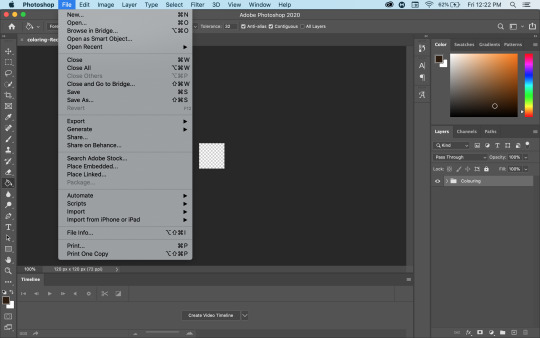
2. So I know that different people load gifs differently, but I always go with import video frame to layer! It opens my files and I find the mp4/mov file that I want to load from!
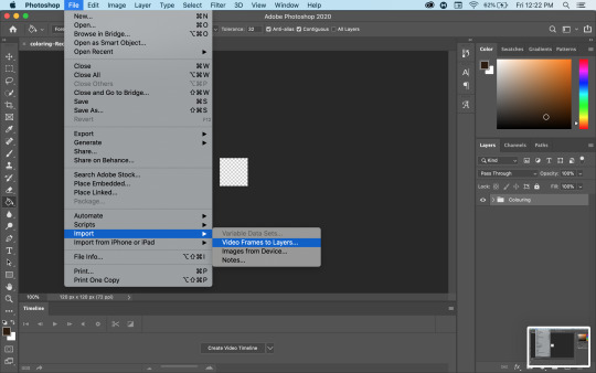
3. So I forgot to screenshot this originally which is why you can sort see the final result lmao but anyways then I go and select what part of the file I want! Now I’ve used this Diego scene in a lot of edits so I know exactly where I want it, but finding the exact moment sometimes takes a bit more time/attempts before you get exactly what you want!
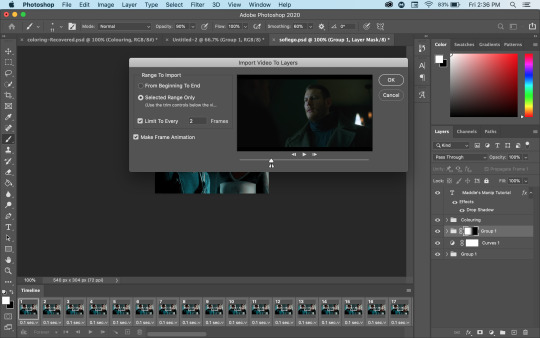
4. So now that I have a gif, you can see my timeline at the bottom! The first step to making an actual gif is to go through the timeline and delete all of the frames that you don’t want! In my case, that includes all of the Luther frames that came before this scene! And I decided to make this a 50 frame gif, so once I had 50 frames of Diego, I also deleted everything after that!

5. So once you get just the frames that you want, go to your layers on the side and delete all of the layers that are no longer in your gif! After that I make the remaining layers into a group because I find gif making a lot easier when everything is in groups lmao!
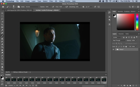
6. Then I like to create the curve layer! This may look different on pcs but on mac you go to the layers dropdown into new adjustment layer to curves!

7. For creating the curves that I want, use the highlight (circled pink) and lowlight (circled yellow) eyedrops! I start with the highlight and I click on what I want to have as the lightest point of the gif (in this case, Diego’s neck), then I use the lowlight and click on what I want to be the darkest point (in this case, his harness)

7b. Now, if you want to change any of the curves from there, you can click on where it says RGB and choose which colour to adjust! If I want the entire thing to be brighter then I’ll go through each colour and increase them all by the same amount; if I want to make one colour stronger or weaker then I only change that one!
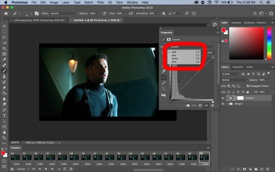
7c. in this closeup you can see where the numbers are on the bottom! I only ever adjust the input number, I don’t touch the output at all! Once you’re on a specific colour, click on the square at the top (highlight) or bottom (lowlight) of the curve to determine what you’re adjusting!

NOTE: Don’t assume that these will be your final settings! Once you combine the gifs and we get to the real colouring, they will definitely be changing! But I personally prefer having the base curves already done and then adjusting things later rather than trying to start it later!
After that, I repeat the process to make the second gif, and now we get to making the manip!
So my Diego gif is bigger (1920x1080) than my Sofia gif (1280x720), so I’m going to be moving his gif onto hers!
8. So to copy the gif you’ve made, select all of your frames and then click the three little lines on the bottom right of your timeline! Make sure you’ve selected all of the frames
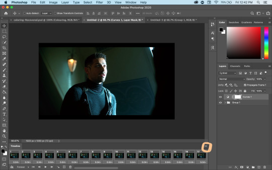
9. Then, you can choose the copy frames option!!
Note: I should have done it sooner but I forgot; at this point make sure that your curves layer has been moved into the group so that it copies with everything else!

10. So then we move to our other gif, and again we make sure that we’ve selected all the layers, and we click the three little lines again! Make sure that you’ve selected the top layer of the gif so that the layers from the other gif will go on top of it!

11. This time, we’re going to choose to paste frames, and when the pop up appears, make sure to select “Paste Over Selection”! That’s what will put the gif you copied on top of the gif you have selected!
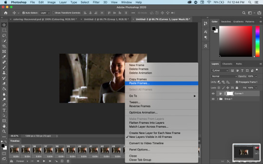
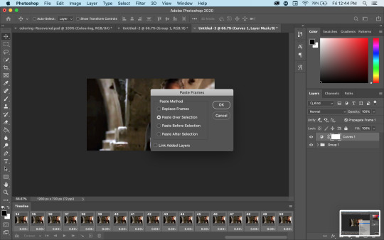
12. so now we this! At this point I can’t see the gif underneath it, so we’re going to create a layer mask (circled in orange in the second screenshot) and get to really making the manip!
NOTE: this will actually say add layer mask, but when I press the command key to take a screenshot it switches to vector, sorry about that!


12b. Circled in orange here is the layer mask! This is the layer that we’re going to do all of the editing on now to make the other gif visible!
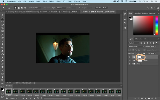
13. Now, because of the size difference between the two gifs, I decided to move the Diego gif to be fully centred to start! So I used the free transform tool and just dragged it over! This won’t be its final size or position, but it means that when I go back to editing the layer mask, I’ll be able to see more of the Sofia gif to know what I want to change!
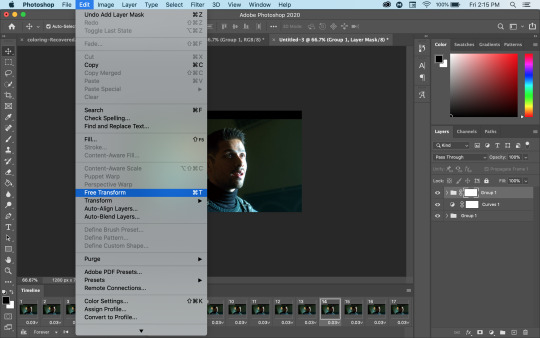
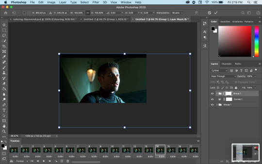

14. So now that it’s more or less where I want it for now, it’s time to get my brush! I always start off with a big brush (better for the fast, imprecise work that I do to start) with 0% hardness! I almost always use 0% hardness unless I need a really defined edge. Make sure that your foreground colour is black and then just paint on the layer mask until you can see the bottom group! If you accidentally hide more than you meant to, just switch your foreground colour to white and paint over it, which will re-reveal it


15. So now that I can actually see the entire Sofia (Lindsey) gif, I’m going to go back to the free transform tool and resize/move the Diego gif until they’re roughly the same size! Then I’ll go back to my layer mask (still with black as my foreground colour) and paint over the mask until it’s as visible as I want!
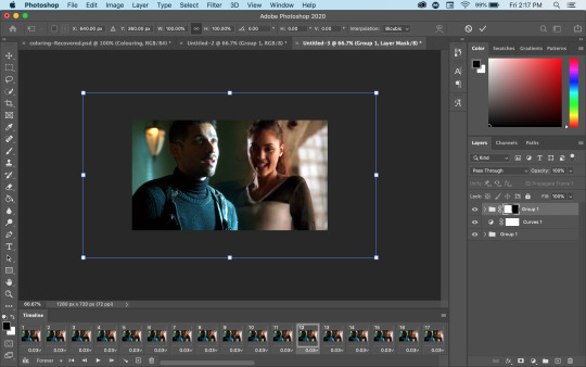

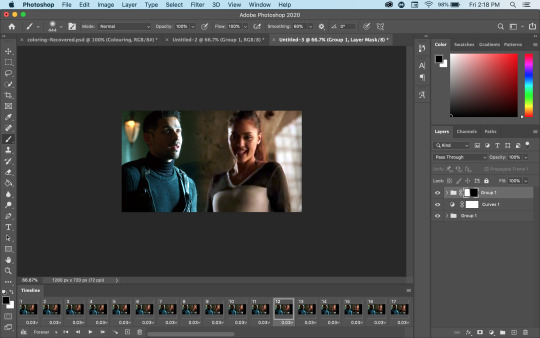
15b. Now I found the entire gif was too far to the left for my liking, so I selected both groups and went back to the free transform tool and just moved everything to the right until it was more centred!

16. So now I have a manip that I like, but the lines are still harsher than I want them to be!! So I go and right click on the layer mask and choose the Select And Mask function!

17. Now this brings us to a new menu, where we can work more on the mask! I like to use the feather function (you can see where the box is highlighted blue) to soften the edges of the manip! I usually start with 50px and either lower or increase the number until I like the way it looks! I can’t describe exactly what it does but it makes the edge softer and the manip looks more blended
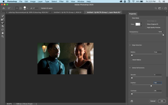
18: Now it’s time to colour the gif! So I have my psd open here, so I right click on the group and choose duplicate group, and then for the destination, I choose my manip (untitled 3, in this case!)
NOTE: I use a colouring PSD that was shared with me, but you can find colourings all over tumblr and deviantart — you don’t even need a psd, you can make your own or just play around with different adjustment layers until you like it!


19. Now I go back to my manip file and oof, if looks way worse like this! So I go back to those curve layers from the beginning and adjust things until it looks better and matches better! For Sofia, I made the green and blue curves stronger, and for Diego I made the red stronger! For Diego I also added a brightness/contrast layer to lessen the harsh contrast!

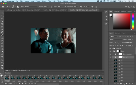
20. Now it’s time to resize the gif! Tumblr limitations don’t allow gifs wider than 540px (no height limit that I know of), so that’s what I set mine to! Then it automatically changes the height to keep the ratio the same!
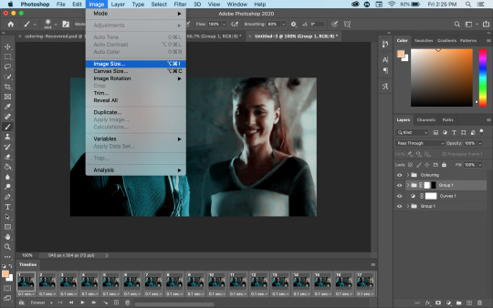
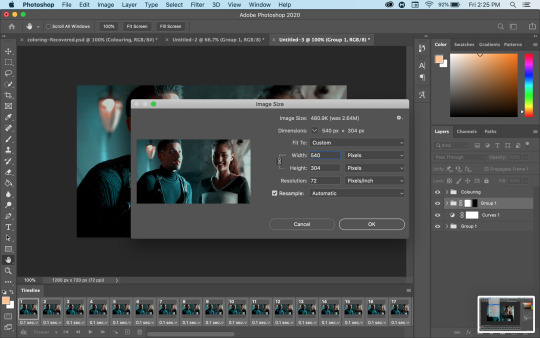
21. Now when I make my gifs smaller, I always end up with this awkward little empty space on the edge, so we go back to our layer mask, now with white as our foreground colour, and just using a small brush we will that in again so it looks normal!


22. then we save!!! Go to file > export > save for web, and then you’ll get the first save popup (the big one), click save, and then you get the smaller one and you can name it whatever you want!

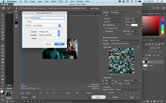
23. and now we have a gif!!!!

I really hope this tutorial helps at all! If you ever have any questions about this tutorial, feel free to shoot me a DM or an ask and I’ll try to clarify; and if you’d ever like to know how I do another type of edit or a specific edit, shoot me an ask and I’ll try to put together a tutorial!
Happy creating y’all!!!
84 notes
·
View notes
Photo
so here’s my disclaimer: I hardly know what I'm doing. This is my glued together homemade giffing method that I’ve created over months of just random experimentation and bits and pieces from all kinds of tutorials. there are probably better or more correct ways to do a lot of these things! this also isn’t a completely universal tutorial, some of the specifics are geared towards giffing skam, specifically skam france.
I gif in photoshop cc 2020 on a macbook. Some things like keyboard shortcuts and little things about the photoshop interface will probably vary if you are on a pc/ other version of photoshop!
this is very long and very unprofessional, but I hope there is something in here that someone will find helpful!
we’ll be going from this:
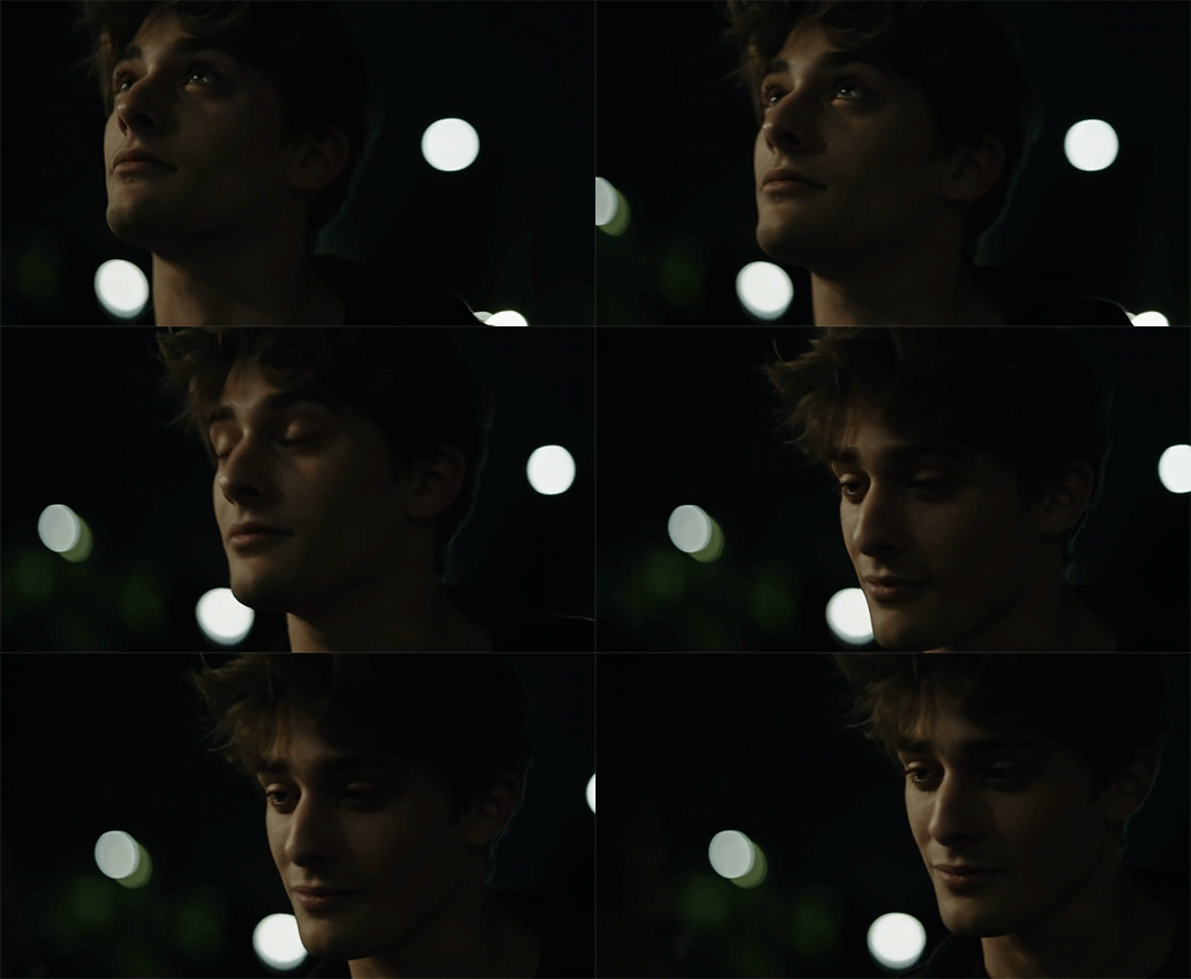
to this:

up to date as of October 25, 2020
downloading clips
selecting what part you’re going to gif
cropping
my action for resizing, converting to a smart object, and sharpening
coloring
exporting and setting the delay
tldr tips
1. downloading clips
4k video downloader (which you can get for mac or pc here) is great for things posted to youtube, especially from skam france because all the clips are on their youtube with no weird geoblocks or anything! it’s really easy, you just have to open the clip in youtube, copy the link, and go into the program and hit paste link. I like to put on smart mode first and set the destination folder so all my clips go into the place I want.
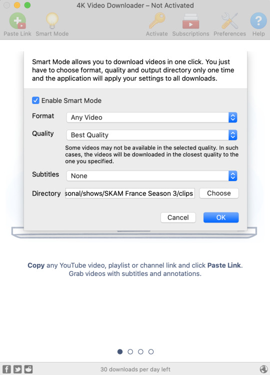
There is a 30 video per day download limit, so if you’re thinking you really want to gif lots of stuff from the show, and want a big chunk or a full season it’s definitely worth hunting for a mega or google drive with full episodes to download because it’s just less hassle! I might come back to this post later and compile a list of all of those, but for now if you type “[remake] no subs google drive” or “[remake] no subs mega” into a google search, you’ll probably find something! the all of skam website has no subs for several remakes, but not all!
If you don’t have enough space on your computer to be keeping full seasons, I know there are methods to get screencaps without having to download (generally for giffing movies and regular tv I think this is a common method), but I’ve never done it so I’ll redirect you to this tutorial that explains it! you should probably just go there for the whole thing tbh it’s much more coherent than this, but I digress.
2. selecting the piece of the video you want to gif
now that you’ve got your episode or clip you’ll want to just open it in photoshop! if you go the screen capping route the way to do that is a bit wonky, so you can keep following the tutorial I linked above and join back in here at coloring if you like!
if the timeline at the bottom doesn’t pop up automatically you can go to window > timeline and turn it on! now you can use the scrubber bar thing to find the moment you want to gif!
The advantage of this over screen capping is you can scrub with more precision. the arrows circled in blue below let you jump only one frame, where in screen capping I'm pretty sure you can only go by ten second or one minute intervals.
I usually drag the scrubber as close as I can to the start of the shot/moment I want to use, fiddle with the arrows circled in blue below to jump forward or back one frame at a time until I'm at the first frame I want. I move the left grey handle to the scrubber and then I hit the play button and let the whole shot/moment play. Pause and repeat the shuffling with the arrows until you’ve landed on the last frame you want to use and move the other grey handle.
the moment you want to use should be between your handles (it’ll look like what I have circled in red), and if you hit play, you should see the thing you want to gif playing on loop above the timeline. the speed will probably be weird, but we’ll deal with that at the end.

now I recommend doing command or control + s to save your gif as a psd (photoshop document). this is a working, editable file which means if photoshop crashes you can open your file right back up and keep working as long as you’re hitting command or control + s at regular intervals as you work. later we’ll go through exporting in gif format that can actually be uploaded to tumblr.
3. cropping
next I crop out any logos or black space at the top and bottom. Just click on the crop tool on the lefthand side of the screen, drag the edges and hit enter when you’re done. you can of course crop out more than just that, but regardless of what you crop out, now is the time to do it.
you can set an aspect ratio for your crop at the top of the screen if you’d like to be positive that all the gifs in your set will be the same:

4. my trusty action: resizing, converting to a smart object, and sharpening with one click
Now is when I use an action I made that does all the resizing, converts to a smart object, and sharpens. I’ll take you through the steps so you can conceptually get what’s going on, but I highly recommend using the actions window to record your process as you follow along so you have this action as well. It easily shaves at least 5-10 minutes off of the whole process, and these steps will be the same every time.
here’s how you make an action: go to window > action and open the action panel. click the plus symbol to start recording a new action:
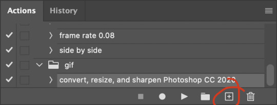
in the window that pops up, give it a name and hit record:

now just continue with the steps below, and it will save them!
first you flatten frames to clips (I think it says flatten to layers on older versions of photoshop). this is in the menu at the top right corner of your timeline:
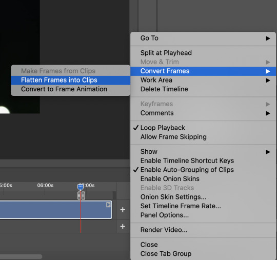
next you convert to frame animation by clicking on the symbol in the bottom left, circled in red:
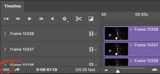
if there is more than one thing in the frame animation, delete the extra one. you don’t need to keep the last one but it won’t let you remove it until there are other frames in there. also go into your layers and delete video group 1 and its contents. don’t ask me why these steps are necessary, I don’t really know, but I’ve noticed it sometimes gets wonky if you don’t do this:
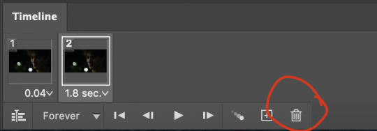

now you want to make frames from layers and delete that first frame that was there before:
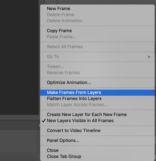
then we return to the timeline:
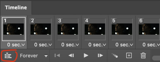
use command + option + a (control + alt + a for pc I'm pretty sure) to select all layers and then right click within your layers window and select convert to smart object. It’s important to convert to smart object after you go back to the timeline, or the gif won’t move:
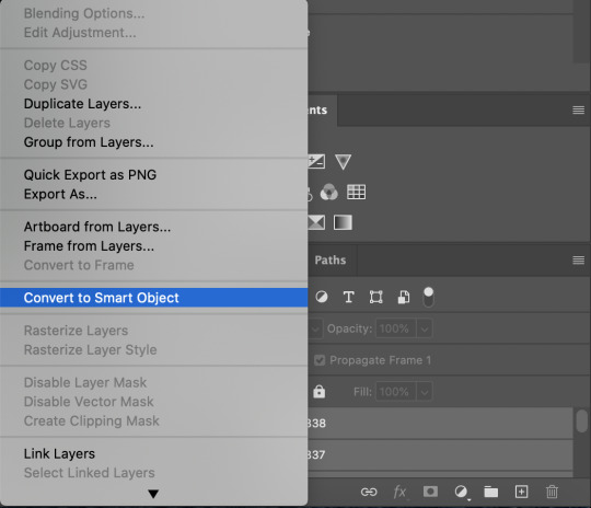
next I resize. gifs for tumblr should be 540 pixels wide. for recording your action you should just go into image > image size and only change the width to 540 in case you ever have gifs cropped to different aspect ratios. don’t touch the height, let constrain proportions figure it out!

now, here’s what our base gif looks like, no sharpening, no coloring:

now to sharpen. go to filter > sharpen > smart sharpen. this is up to personal preference, but my go to settings are:
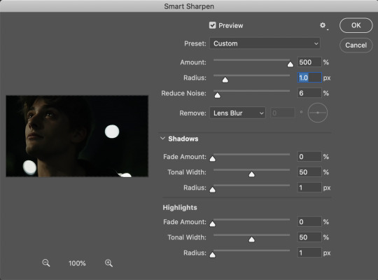
this is what we have after sharpening:

now is when you can stop recording your action.
just press the stop button in the action window:
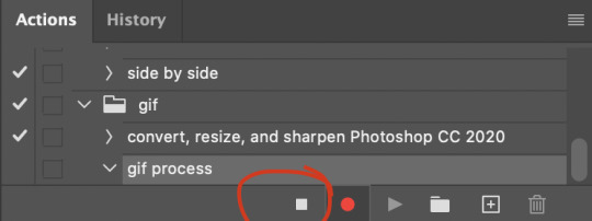
this action is pretty much universal and after I select the moment the gif will be and crop however I want, I use it on every gif I make! so although this initial setup is tedious, now you’ll never have to do these steps again, and the process is magically much quicker.
5. it’s time to jump into coloring!
I typically start with exposure and sometimes some brightness/contrast. with really dark gifs like this, you kind of have to make it worse before you make it better. I did this:
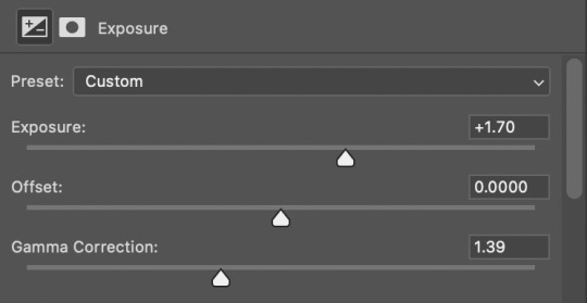
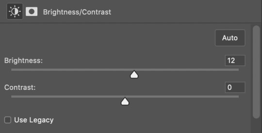
now the gif looks like this:
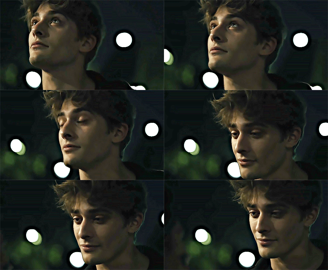
we have some static and some ugly bits, and this is where selective color comes in to fix it! boost blacks like this:
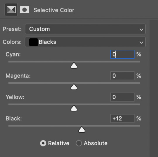
and now your gif looks like this:

the skin tone is looking a little sickly and weird, so I go into the yellows and reds in my selective color layer to fix it! I also messed with the greens here because I didn't want color in the background (that part is totally optional and just up to your preference):

now we have this:
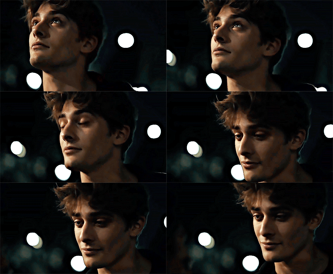
to really take the color 100% out of the background, I did one more separate selective color layer for cyan (again, I just felt like it but this is optional!):
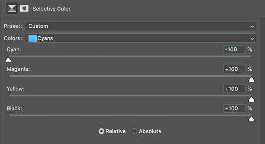
and now the finished gif:

there’s lots of fun extra things you can add like text and tints and overlays and all that I won’t get into, but feel free to reach out for help on those types of things!
this gif was certainly not the most complicated to color. some ridonkulously dark clips (*cough cough* vendredi 20h27 *cough cough*) take tons and tons more effort than this and a lot of the time you’ll want to use color balance layers and vibrance layers and all of that to mess with your coloring.
with all of this coloring business, I really just learned by doing. I don’t know all the technical purposes of each type of adjustment layer, and I tend to stay away from curves just because I find them confusing and annoying. The bottom line is that you should always experiment and find out whatever coloring works for you and run with it! I’m sure every gif maker you talk to does things at least a little differently!
I highly recommend taking the time to go through all the types of adjustment layers and just move the sliders around to see what they do! That’s honestly one of the best ways to learn and decide what you like!
6. now to export and adjust the delay!
the keyboard shortcut for exporting on mac is command + option + shift + s, control + alt + shift + s for pc, otherwise you can go to file > export > save for web
my settings are here:
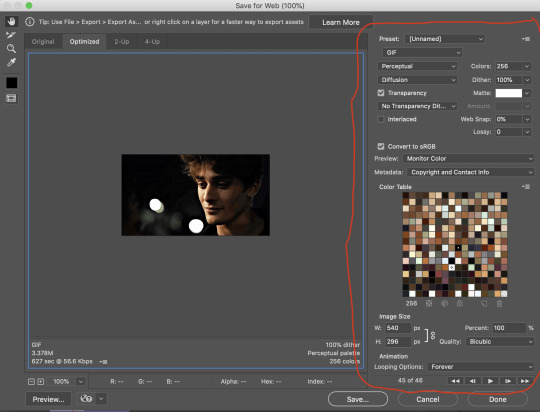
the settings only need to be configured once! otherwise just hit save and follow the pop ups to choose where to save and what name you want to give your gif. Since you saved as a psd way back, that will be the name it’s automatically given, but call it whatever you want!
then I adjust my delay by opening the gif I just exported (not the psd, the .gif file) and using one of my delay actions. I’ve made an action for each delay between 0.05 (real time) and 0.08 (really slow mo for certain super short shots, typically for more ~artsy~ sets).
all my action does is select all frames:
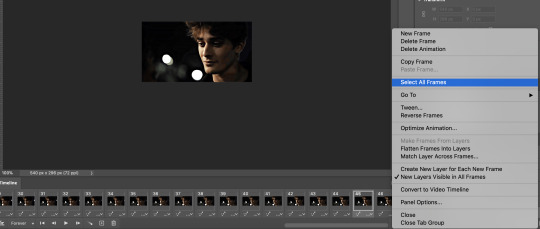
adjust the delay (which will differ based on whether you want them slowed down and by how much):

for reference, this is a 0.05 delay:

and this is a 0.08 delay
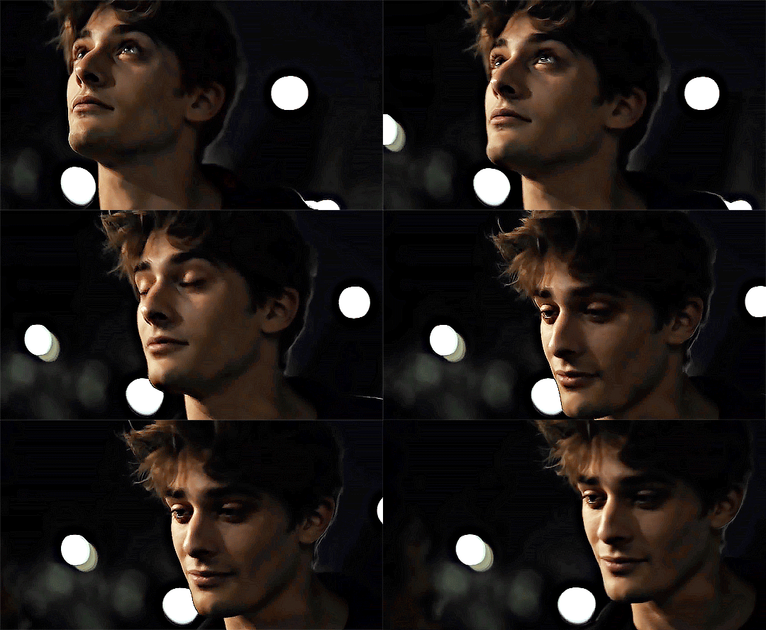
now you just export the same way you did before!
remember if you’re recording this as an action, you don’t want to touch the file name, just say yes when it asks if you want to replace the file. if you always save your gifs to the same place, your action will now enable you to override any gif with the incorrect delay with the correct one with one click!
7. tldr: the main tips
for downloading 4k video downloader works well for non geoblocked youtube videos, the all of skam website is another place you can look to download with no subs, here’s the screen capping method if you don’t want to download
The main way I combat dark lighting is to bump exposure to the right, gamma correction to the left, and then enhance black in a selective color layer. The amount of these three adjustments will vary gif to gif. I know lots of people use curves, but I find them really confusing for some reason, so this is my method! As my graphics teacher likes to say: there are always at least 3 different ways to reach the same result!
there’s a little bit of additional coloring on this one, but here’s another before and after example so you can get an idea of how those steps get you a better lit result without making the lighter parts super over exposed:

besides those three steps, you have free rein to use the other selective color channels, as well as color balance, vibrance, hue/saturation, etc. to restore color that was lost or to change the colors altogether! mess around with it and have fun experimenting!
7a. bonus coloring tip:
sometimes you can make use of selective color to completely alter an isolated color in your gif. You can get very adventurous with this, but here's a simple example of changing blue tones to teal (I got away with these gifs being longer because they were in rows of two in the set I posted them in. I'm too lazy to trim frames so I can put them here at 540 px without going over the 10mb limit so just ignore the quality ok):
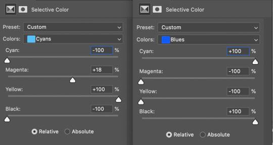
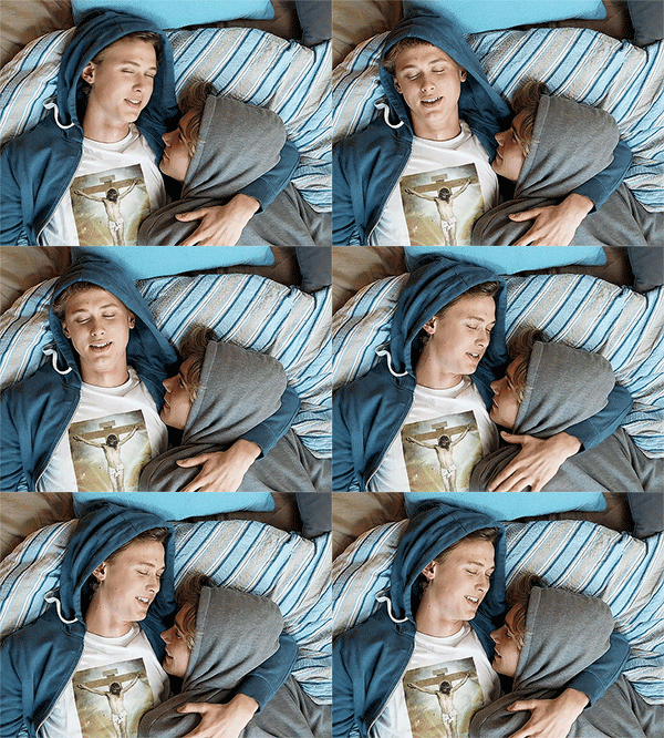
7b. actions, actions, actions!
if you find yourself doing a certain thing over and over, always record it as an action. the amount of time they will save you is honestly really impressive.
You can duplicate actions, so, for example, if you have different sharpening preferences for different shows or scenes, you can duplicate your gif process action and go into the steps, double click smart sharpen, and alter it however you want!
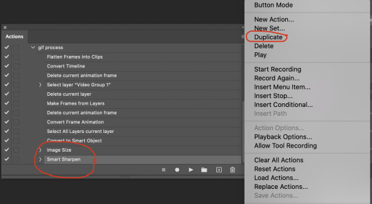
This could also be good to do for the different widths for tumblr if you ever do sets with rows of two or three! Duplicate actions is also how I made my actions that set delay at 0.05, 0.06, 0.07, and 0.08!
when in doubt, always make an action! it’s worth minimizing the tedious bits of the process as much as possible so you can focus on the fun part of seeing your awesome gifs come to life! any little task you find yourself doing often, make an action!
and for now that’s all I have. if any of this made no sense, if you want to suggest a correction or addition I could make, if you’re ever curious how I did something on any gifs I post, or if you have any other sort of questions, feel free to send me an ask or a dm! if I can’t answer your questions I’ll be happy to try to direct you to someone who can or a tutorial to help! again, I'm no expert, not even close, but I hope at least one person will find one thing in this mess that helps.
#this got . so long omg#mystuff#mytutorial#gif tutorial#tutorial#resources#fellow gif making peeps feel free to correct me or give input on how to improve or add to this tutorial!
31 notes
·
View notes
Note
Hi! Can I ask how you make your gifsets? (program, process)? Hope you have an amazing day, your Daisy gifs are gorgeous btw ❤️💔
hello!! hope you also have a great day, and thank you!! and sorry this took a little longer to put together than i thought it would!!
i'll try to explain my process as best i can, and hopefully it makes sense.
program(s)
first, i use photoshop 2021 to make gifs, and i use mplayer osx extended for screencaps. also, i try to avoid using clips from YouTube because the quality usually isn't as good, but if I do have to use that I use 4k video downloader
process
first, first thing you need is the clip that you want to make gif from. the easiest way to find this (in my opinion) is just to search "[...] scene pack" or "[...] mega link." I usually try to make sure the clips i use are 1080p because anything less than that is lower in quality and the gifs aren't as sharp.
second, i open the clip in mplayer to get the screencaps ill use to make the gif. i do this by pausing the video right before the part i want to gif, then pressing and holding command+shift+s (for mac) until ive got the full scene. if you want, you can create a folder on your desktop for screencaps, but I usually just leave them there and delete them once im done.
the next step is when i actually open photoshop. to start, go to file>script>load files into stack
this is where you're going to load in the screencaps you just took. go to browse, then select the first screencap and hold down shift until you select the last screencap, then hit ok
after that i usually crop my gifs. in general, i use 540px x 400px, but that changes based on what exactly im giffing. the way i crop gifs is by clicking the crop icon on the left side, then, above the workspace, selecting W x H x Resolution > 540 px x 400 px > px/in
the next parts so the most complicated part to explain so im gonna use a picture for reference
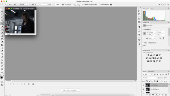
click create frame animation

next, go to the three horizontal lines across from the word “timeline” at the bottom. once that menu opens, click “make frames from layers” at this point the gif is backwards, so you’ll want to go back to that same menu and click “reverse frames.”
now that your gif’s frames in the correct order, you can set frame delay. select all the frames in the timeline, then right click so get a box that looks like this:

i almost always set frame delay to .05, but if i have less than ~20 frames ill set it to 0.06
next, click the symbol in the bottom left corner (you can see it in the photo above) to convert the frames to a video timeline
after this, on the bottom right side, select each layer of the gif under the “layers” tab. right click, then select “convert to smart object.” this will allow you to sharpen your gifs. to do that, at the top of the screen go to filter>sharpen>smart sharpen. the settings i use are 500% at 0.4px, then i sharpen again 10% at 10px
here's the gif before sharpening:
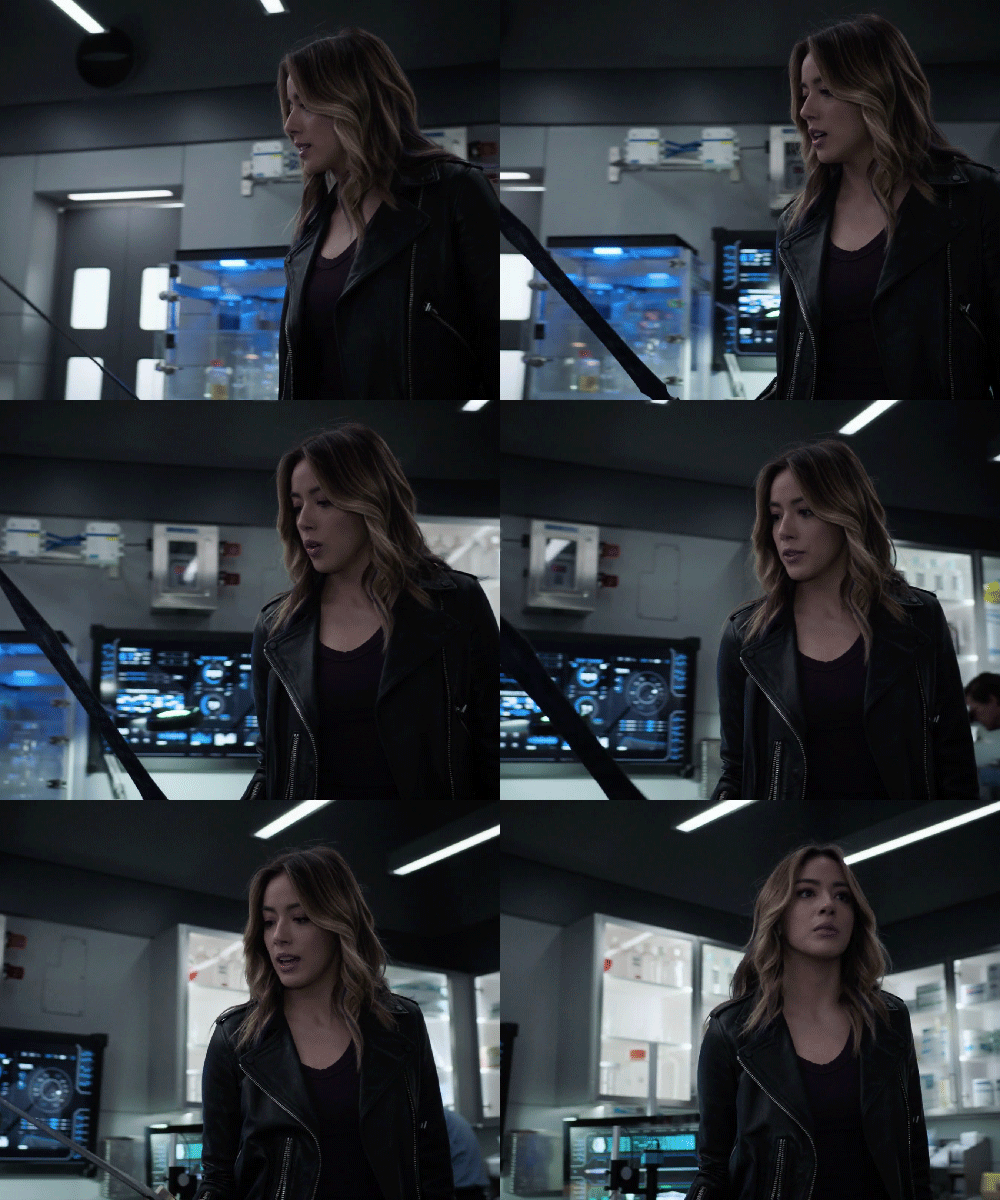
sharpened 500% at 0.4px:
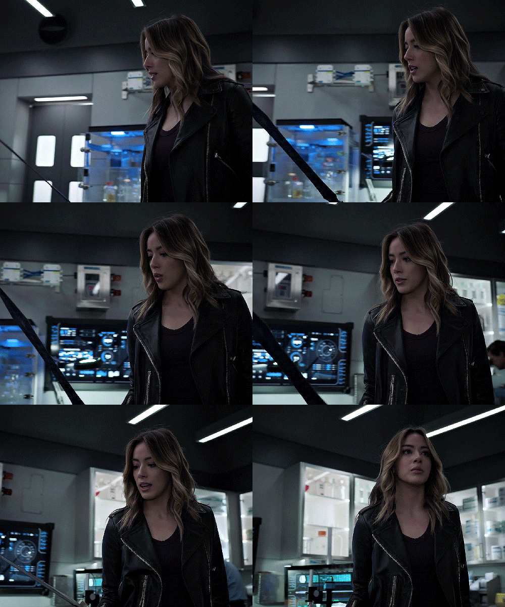
sharpened 500% at 0.4px then 10% at 10px
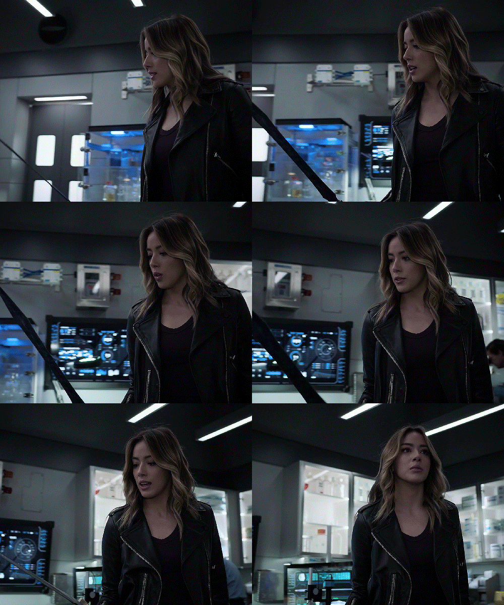
coloring
once this parts done you can start coloring your gifs/adding adjustment layers. the main ones I typically use, in order, are curves, brightness, levels, selective color, and vibrance. the first three adjust the lighting of the gif and the last two adjust the color. other layers i use are saturation, color balance, and photo filter, which all adjust color.
to add adjustment layers, you can either 1. go to layer>add adjustment layer>select the layer type 2. pick a layer type from the icons on the right side (above the layer list)
honestly, the easiest way to do this part is to just select “auto” and photoshop will automatically adjust curves, brightness, and levels, but i usually slightly tweak it from here until im happy with it.
curves: use the white dropper to select the lightest part of the gif and the black dropper to select the darkest part. you can manually adjust the curve within the little graph too, but typically you don't need to (i only do when the actual scene the gifs from has a tint i don't like, ex. if its really green ill go to the dropbar, go to green, then adjust it until ive mostly neutralized it)
brightness/contrast: brightening too much will sometimes decrease the quality, where increasing the contrast will sometimes help increase the quality
levels: honestly you can almost always get away with not using this unless the lighting in a scene is really bad/weird. use auto then adjust as needed
this is what the gif looks like after adding adjustment layers: curves: input 85, output 92 brightness: brightness 19, contrast-32 levels: 0,1.11,255

now you can get to actually playing around with colors!
the first thing i do is add a layer of selective color, go to black, then increase black. this is one of the last ways to increase quality slightly, as it can make the gifs look a little sharper.
next i add vibrance. typically, unless the scene itself is already pretty colorful, ill increase vibrance almost fully, and slightly increase saturation. the issue with increasing saturation too much, especially when your giffing people, is the colors start to look really unnatural
for this particular gif, i added a hue/saturation layer, then decreased red and increase blue and cyan, because there was a lot of both of those colors in the background and i wanted it to stand out more. i then added another selective color layer and increased cyan for both blue and cyan.
these are the specific adjustments i made: selective color: black>black +9% vibrance: vibrance +76, saturation +10 hue/saturation: red -15 selective color: blue>cyan +75%, cyan>cyan 49% hue/saturation: blue +4, cyan +5
saving
once you're done coloring, you can save your gif. to do this, go to file>export>save for web (legacy)
these are the save settings i use:
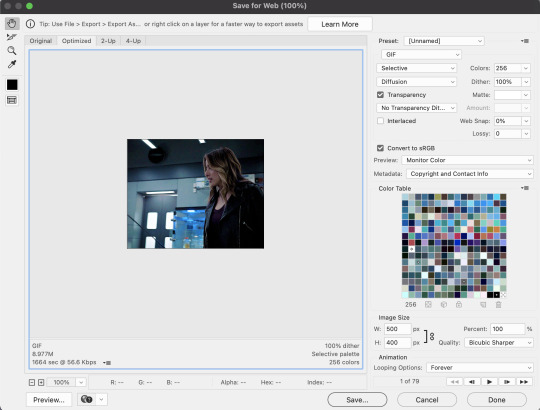
also, the gif size limit for tumblr is 10M, so make sure your gifs are all under that size. if they're too big, you can either adjust the image size on the save page (or while making the gif) or shorten the gif
and here's the final product!
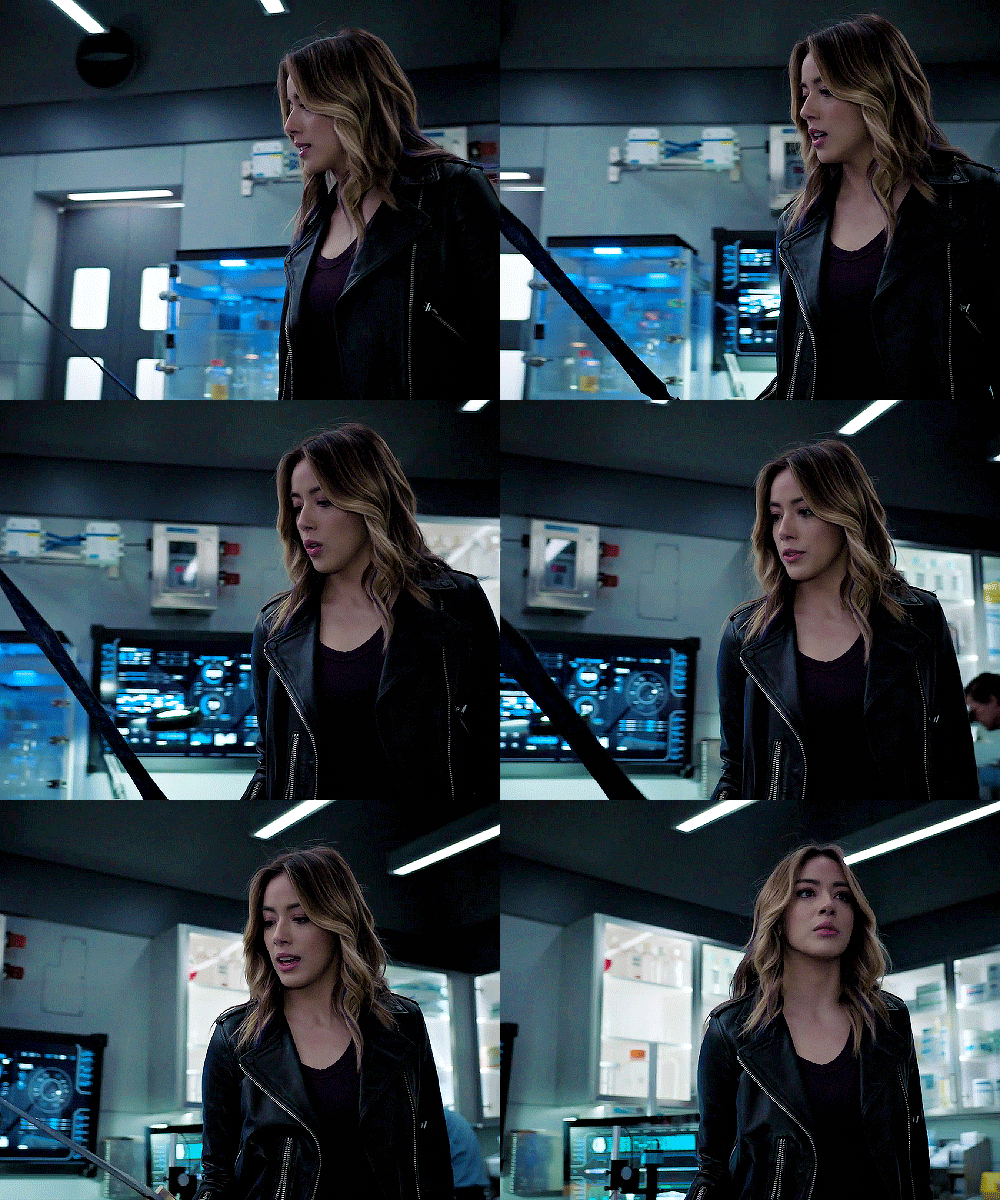
i hope this was helpful :)
5 notes
·
View notes
Photo

Soph’s Header + Doodle Tutorial (requested by anonymous)
Hi! I’m back again with the sequel to my icon + colouring tutorial, this time with headers and doodles! 🥰 You will need:
I’m using Photoshop CC 2018 to make these headers and doodles, but you could easily make them with earlier/other versions.
Basic gif making knowledge.
A screencap you want to use, some fun textures, and some time and patience!
I always start off with my headers as size 500 by 281 pixels. It doesn’t really matter necessarily, as long as the size is in line with the tumblr dimensions and fits. I find these sizes work to keep a gif or header small, so you can make it a bit longer without going over the tumblr size limit. I know technically tumblr doesn’t have a size limit any more, but I do still try to stick to the 3 MB limit when I can. This is because sometimes gifs lose their quality if you go over. In my opinion, you can afford to go over a bit, but if you go too far, the quality of the gif gets destroyed, and sometimes for me even on 4 MB they just don't play, so 6 MB or 8 MB doesn’t stand a chance. Not sure if anyone else has run into this problem, but you can read more about what I mean here and here.
Okay, so. Making simple headers is actually pretty easy, it’s just a lot of layering of the right things. Once you have your base size, pick a nice gradient to put on it. For me, I’m going with a light purple to a slightly darker purple:
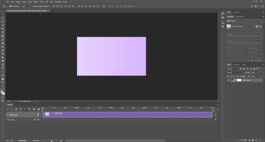
It’s important that you have video timeline turned on for this. If you are not familiar with frame animation and video timeline, I suggest you take a look at this, since we are going to be using both quite a lot in this tutorial.
Next, you want a nice background texture for your header. You don’t have to, but I think it just gives it a little something extra. You can find some textures here they have A LOT to choose from.
Once you have your texture, make it black and white and set it to soft light (unless the texture is the same colour as your background, then sometimes leaving it in colour can enhance the whole thing). Then you should have something that looks like this:

Now add your cap, coloured + smart sharpened and whatever other adjustments you want to make, on top of these layers. If you don’t know how to do this, please see my icon tutorial, where I explain how to do these steps in depth.

Obviously in this instance, Steve is much larger than if this was an icon. Make the picture proportional to the header size, but it’s up to you how big or small you want that to be! So, you could just save the header like that, if you wanted to. BUT, since we’re going to be adding gifs + doodles, I’ve had to make some special adjustments. As you can see down the right-hand side in the layers tab, I’ve added some purple colour over and under Steve (set to soft light, opacity anywhere between 5-30%, whatever suits you) and also lightened the background A LOT. There is a reason for this, which you wouldn’t need to do if you weren’t going to add gifs (unless you wanted the background to be lighter, of course).
So, for the gifs underneath your cap. Here is a pack of gif overlays that I love and adore, once you have chosen one of those, you want to put it underneath your cap. To do this, open the overlay gif, it will look like this:

And you can just drag it across from one file to another, underneath your cap.

I turned off all the layers above the gif, temporarily, so I could move it into place. Once it’s in your header file, make sure to change the gif to “overlay”, which will then bring back your nice background colour. Setting something to overlay makes everything underneath it look darker, hence why we lightened the background before, as I personally didn’t want it to look too dark for the overall header. (You could also put your cap underneath it if you wanted the gif to go over the person, but you’ll have to do extra editing to make sure the cap isn’t too dark if you do so).
Now you should have something that looks like this:

You want to make sure you end the header where the gif ends, even if your layers are “longer”, as you can see above. Again, this is a perfectly acceptable place to leave your header and save it, but this is where I tend to add the doodles!
Open a new file, I usually make them quite big say 800 by 400 px, as you can scale the doodle down later on, rather than starting small and working in a small space, which makes things unnecessarily difficult. If you would like to add some premade doodles onto your gifs, you can find some here, but I will show you how to make your own below!
You could draw the doodles yourself, probably making your life a lot easier, but if you’re like me and you don’t want to do that (for me it’s because I suck at drawing on ps, LMAO) you can use a picture too. Find a picture of what you want, I usually just google it, so here I’ve got a simple crown:
I used the magic wand tool to cut it out, and now we have this:
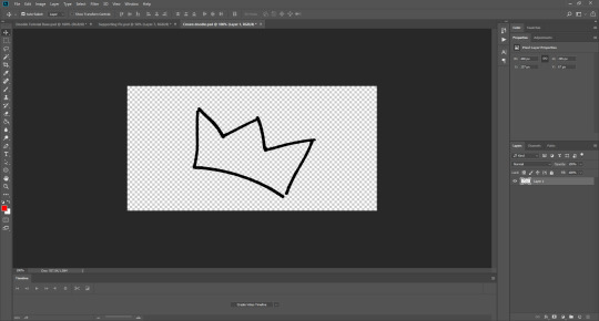
Now what you want to do is change the video timeline to frame animation. Click the “creative video timeline” button if video timeline isn’t already displayed, then the three dots in the left-hand corner to convert to frame animation, and you should get something like this:


Now, here’s the long-winded bit. It’s slightly odd and a bit complicated, so if this doesn’t make sense, please feel free to message me and ask further questions.
So, we want the doodle to look like it draws itself, right? What you want to do is crop the image so bits of it are added as the frames go on, thus achieving that effect. The key to this is turning layers on and off on the right-hand side, so only certain parts of the image show themselves one after the other.
Firstly, duplicate Layer 1 and turn the original image off. This is a safety in case we mess something up later and need to revert to the original image. Now, crop out the first part of your picture. I’m going to start on the bottom of the crown and work my way around clockwise. Use the marquee tool (I’m using the elliptical one) to cut out one section of the image, then right click and select ‘layer via cut’.

Then turn off the rest of the layer, so you’re only left with this tiny piece:
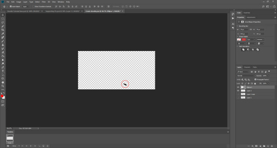
Now, add a new frame. On the bottom bar there is a button, next to the bin/trash, that looks like a sheet of paper, which says “duplicate frame” if you click on it. Do that. Now is where the turning off and on part comes in. Each layer on the right-hand side corresponds to a frame on the bottom, and you want to build up what is shown in each frame every time.
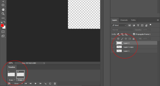
This is going to involve a lot of duplicating and merging of layers, because I haven’t found a better way to do it currently.
First you want to turn off all the layers when you have Frame 2 selected. When you’re on Frame 1 your tiny piece (Layer 2) should be turned on (you turn layers on and off on the right-hand side, toggling the little eye icon). Like so:

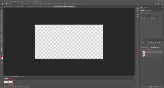
You want to be working with Frame 2 selected for these next parts. Then you want to duplicate the tiny piece layer (so now we have Layer 2 copy). By turning the Layer 1 copy on briefly, you can cut out the next part of your image, so use the marquee tool again to cut out the next little piece. Make sure you have the layer with the rest of the image selected when you do this, otherwise you could be cropping nothing, since the other layers should still be turned off. Once you’ve done that (once again using layer via cut!) you should now have Layer 3. Move this to the top, turn off Layer 1 copy, and turn on Layer 2 copy, like so:
You may not be able to see in the picture, but the two layers aren’t quite touching. Since it doesn’t matter what the original image looks like for the end result of the doodle, you can move Layer 3 in line with your first piece. DO NOT move the original small layer, Layer 2, as then it will be in a different place on Frame 1 and Frame 2, and you’ll have to try to move it back, and that will be a mess. Always adjust the newest layer in line with the previously existing layers so this doesn’t happen.
When you’ve done that, select both Layer 2 copy and Layer 3 at the same time. I usually use the ctrl key to do this, which I think is command on macs, then when you’ve done that, right click on those layers and select merge layers from the menu that appears. They should now be one layer called Layer 3.
The problem is, when you do this in the second frame, it usually turns itself on in the first frame too, which you don’t want. So click on Frame 1, and make sure to toggle Layer 3 off for Frame 1, and on for Frame 2. And the opposite with Layer 2: make sure it is on for Frame 1, and off for Frame 2, like this:
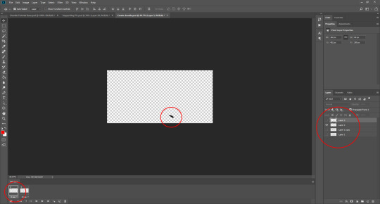

Now, you want to repeat the process. So, add a new frame at the bottom, so you have three frames. Turn all the layers off when Frame 3 is selected. Duplicate Layer 3. Cut out the next piece from Layer 1 copy, and make sure it aligns with the other layers without moving the previous pieces. Merge Layer 3 copy and Layer 4. Make sure Layer 4 is turned off in Frame 1, because the newest layer WILL turn itself on there every time. Go back to Frame 3, and turn Layer 4 on again.
You should have something that is looking like this:
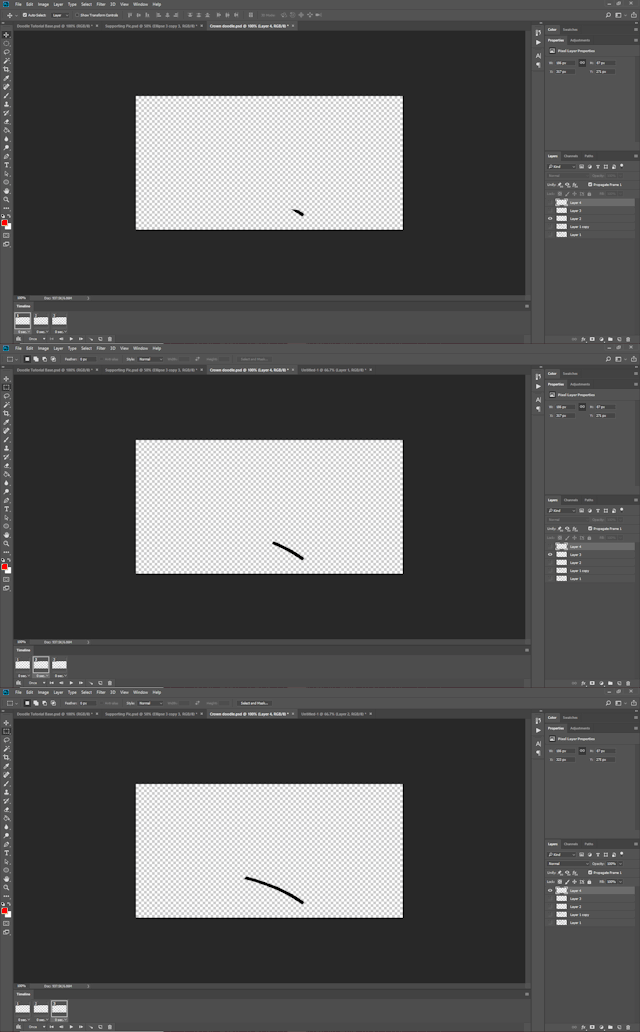
Can you see how all the different layers are corresponding to the different frames? I don’t mean to be patronising at all, so I hope it doesn’t come across that way. I just know that some people don’t understand how frame animation works, so I’m trying to be as clear as possible.
It doesn’t matter if your doodle is moving away from your original image, because you won’t be seeing the original image when the doodle is done, only the doodle. As long as the layers that correspond to your frames aren’t moved during the process, then don’t worry.
Continue to do this until the whole doodle is made, like so:

I ended up with 15 frames, and 16 layers. You can set this to whatever speed you think is best by highlighting all the Frames. If you click the thee little lines on the right-hand side of the frame animation window, a little menu pops up, and there you can select all frames (or hold shift and click on the first and the last frame). From there, you click on the time underneath the frames and adjust it whatever looks best for your gif, 0.05 usually works well.
Now, you want to convert the doodle into one object that you can move. To do this, click on the little lines in the left-hand corner (where the frame animation dots were before), and all the framers will turn into layers in video timeline. Then, to make them all one object, select all the layers at once on the right-hand side, and go to filter > convert for smart filters.
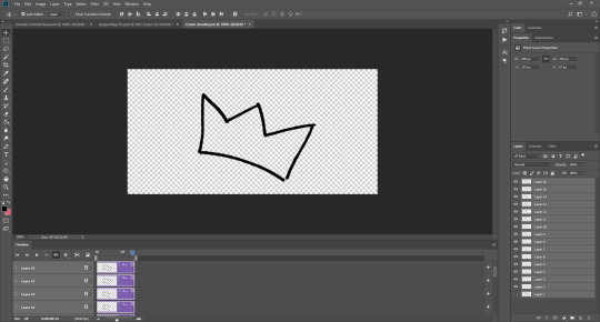
You should now be able to drag your doodle into your header file! Like so:
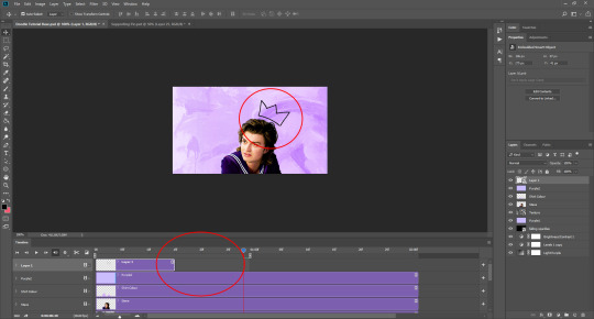
As you can see, sometimes the doodle isn’t as long as the loop of your gif, but that’s okay. What you can do is use the marquee tool and right click when you’ve selected the doodle, choosing layer via copy. This will create a still image of your doodle, which you can place after it ends to ensure it stays on the header until your gif is ready to loop again, as you can see here:
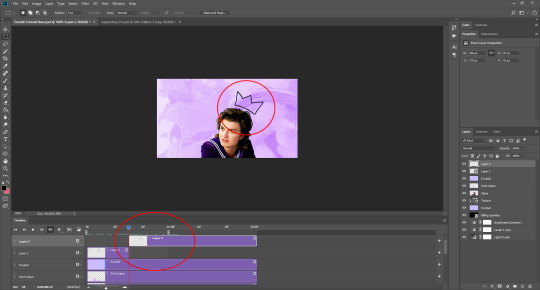
As you can see here, I decided to make the crown white, since I felt it fit better with the header’s aesthetic. To do that, I inverted the gif and the still shape, and set them both to lighten. I also added a white stroke of 1px just to make it stand out (double click your layer on th right-hand side, and find stroke in the pop up that appears, adjust to your liking!)

I also added another doodle to mine, using the same process as before. Spelling out ‘king steve’ had a lot more layers and frames, but it was the same process. Then I dragged it over, and copied the layer just before it re-looped so I could have it as a still image for a portion of the gif. You may need to duplicate your overlay gif underneath the cap to ensure eveything has enough time to loop properly, like so:
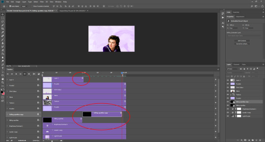
And that’s it really! If you would like to add a divider on top of your header AKA a header template, these are the ones I use (one, two). To add it, open the file and drag it onto your gif file, then place it where you want it to be. Once you’ve done that, set the layer to screen (here is a tutorial from the op) if you want it to be white, or invert the image (image > adjustments > invert) and then set it to darken if you want it to be black. If you want it to be a different colour, you’ll have to cut out the divider from the background image, and then double click the layer to get the style menu. In layer style, you can select ‘colour overlay’ and make it whatever colour you want!
To save your gif, go to file > export > save for web (legacy). It may take a while, so just let ps do its thing until the bar has loaded. You can preview the gif by clicking preview in the bottom left-hand corner, in case you want to cancel and make some changes to your gif before you save it. These are my settings:
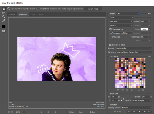
And voilà, you have a bright and shiny new gif, doodle, header! If you’d like to use this, you can find it here 💜
#tutorial#header tutorial#tutorial*#resources#headers#chaoticresources#completeresources#yeahps#i hope this helps!!!#thank you to ally @siriusblacks for reading this over for me 🥰
190 notes
·
View notes
Photo
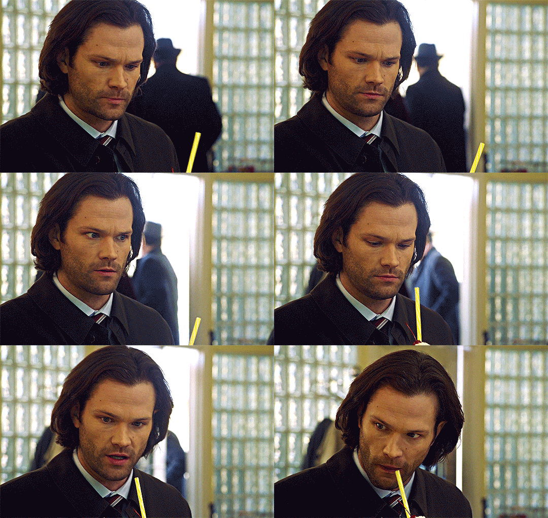
i’ve been absolutely SLACKING on talking about my gifsets so i will discuss them here <3 this gif was made a week ago to test out new settings and to color this was ATROCIOUS because the scene has a yellow filter (to probably make the scene be set “in the past” because of where sam and cas are at) so....everyone big round of applause for ME because i think i did a solid mf job here <3 kissing a mirror after i hit post.
anyways! i’ve already talked about my bucky vs. lucky cat gifset, right? anyways, so the next gifset i made was actually a set i didn’t release because, again, i’m trying out new settings and they weren’t working the way i wanted them to until i figured it out MUCH later (even after the gif above). it was a zemo gifset where we first get introduced to him in tfatws where he’s in his jail cell. i wanted to drop it but i just did NOT like how it turned out so....that set is in the vault :(
the next set i made was the zemo dance (extended cut) !! that was very fun to make. when i saw that mcu direct said that marvel dropped the #zemocut i was like HOLD UP!! and i couldn’t stop laughing at it ajskdsjakldsa there was so much pure joy there....then i saw that the only footage they had that wasn’t in a square format was the hour long extended cut....and that took CENTURIES to download just 25 seconds of the video. before i knew it, as i was making the set, somebody already put out their own gifset and it raked in a lot of notes so i was super insecure to keep going. i was unsure of how to color it, i still didn’t have the sharpening settings that i wanted on lock...gosh, making that set was so damn messy and anxiety-inducing because i was just all over the place :/ y’all know i’m a zemogirl so i wanted this to be made with love and well-crafted so of course i was extra harsh on myself. anyways, like i said before, i still didn’t get my settings all down so there was a lot of old methods i had to resort to that i hadn’t resorted to since 2013....I WENT OLD SCHOOL ON THIS SET. the scenes were easy to make into sections and i didn’t gif EVERY single move that he made because some were like a second short and i was like...i can’t really make this into a solid gif. anyways! i actually used a coloring that i used to make my discord pfp when we only had the original dance move so i really liked how that coloring came out and thought it could easily transfer to the other gifs. it needed a little tweaking on some of the “lighter” scenes where there is a bunch of lights all about his face but overall i really like the coloring and i am glad to y’all did as well!! <3
when i came to making the caption, i was SO stumped because i wanted to be funny but at the same time, i remember when i tried to be funny on a caption and i got thesis papers of tags on the gifset...so i didn’t want a repeat of that. i was asking the asteroids for their opinions on what i should make it and GOSH, the way i laughed so mf hard at what they replied asjdkasjkdlsak what a bummer that i ended up captioning it pretty generically because their messages were gold xx hours after i posted the set, i took a bath and realized that i could’ve used the quote daniel bruhl said about how he improvised the dance and i was like....MISSED OPPORTUNITY :(( but i do like the caption and i do like my own tags that i put on there like MWAHHH my mind :3c
the other gifset is the chilling john walker scene. wyatt did not have to snap the way that he did but thank you, sir <33 i had the idea to do make everything black and white and only the red stand out while i was in the bathroom?? SO funny like all my ideas come from silly little places. anyways, so i hopped on and grabbed the scene then the rest is just easy. it’s a psd that i use that i sadly do not remember who made it :// but their legacy lives on wherever their new blog name is! anyways, my photoshop actually....stopped when i tried to make the second gif and i was like NAURRR because i didn’t remember exactly where i cut the second part from....messy xx but i had to restart my entire computer then make it all over again. still, i actually did have my sharpen atn settings down to a T so what you have is what the sharpen atn does without me messing with it. the zemo one is me trying to work with the atn and reverse engineering that shit. i actually don’t like the speed that the john walker set is at because i think it’s a bit slow but i know that a lot of gifsets on here are actually taking a slower approach? which, that’s great! but it’s simply not for me miss. speedy gonzalez and all. anyways, easy gifset where i left that sharpen atn do it’s thing and let the psd do it’s thing (with minor adjustments). overall, i really do like the coloring in this!! super mf sexy.
and that is IT! what a busy little bee i’ve been. i’ve also made some other gifs on the side for myself and for friends so even if i’m not actually posting that much, i am still trying to work on my skills on being a better content creator. one big thing that i mastered is the sharpen atn and though i feel like it takes some time to do, it really is worth it in the end. still debating whether to make gifs at a .04 speed o a .05 speed because sometimes gifs do far better with a faster speed than a slower one. all my gifs are set at a .05 and not sure if i should venture off into creating more....faster speeds that result in something a bit more “crisper” as some will say.
mwahh!! i love y’all for letting me ramble here!!
#also b4 y'all think sumn this gif is switzerland and has nothing to do with what happened in the past 24 hours#gif making can be soooooooooooooo time consuming like parker almost convinced me to actually pay for photoshop since my cr@cked one#is SOOO damn slow and is super laggy like HELLO does anybody have a ps6 cr@cked download i have the 2017 one :(
4 notes
·
View notes
Text
I'm going to make a response to a SU video made a few years ago by @robobuddies, who goes by "Red Van Buskirk" the video is called "The Steven universe rant." The video was uploaded in 8 Sep in 2017.
Keep the date in mind because is going to become important later.
I going to refer to Red Van Buskirk as "they/them" since they prefer these pronouns and "Red Van" for short.
And don't harass this person in social media! This is supossed to be a response. Nothing else. I'm saying this because i know how things work. So, don't bully them. OK?
I'm not going to make a rebuttal of every single tiny detail because the video is 40 minutes long and the creator of the video sometimes jumps from one point to another and loses focus on what they are talking about:
First they start the video with a Disclaimer: "I'm going to be harsh and hyperbolic for the sake of entertainment".
Now here's my problem: i get sometimes youtube critics want to play a "persona" but sometimes comes off more as an lazy excuse to avoid criticism. This has happened before with Cinema Sins many times. It's not exactly a very good way of starting your video, specially if you want to be considered a profesional or be taken seriously.
Like if i'm going to give my opinion about something, i do it, i don't say "It's just my persona", i want to honest with my mutuals and people who like my content.
They also mention how the SU fandom can't take criticism and sometimes consider everything a personal attack. While i agree this fandom can be a living nightmare, the reason of why we sometimes get so mad is because people who sometimes do these types of rants don't do their research about the show, the video gets millions of views and well..
Which goes to my next point:
-Red Van, you need to do your research.
A huge part of the video they talk about the animation behind the show and mention "Motorcity" as a good example of composition.
Here's the thing: They barely mention which programs the creators use to create these shows or the animation studios which is quite a problem if you are going to talk about animation for half of your video.
"Motorcity is animated with a combination of Flash, Maya and After Effects – with backgrounds and other elements created in Photoshop."
"Created by Chris Prynoski, Motorcity is produced by Robin Red Breast, Inc. (a subsidiary of Titmouse, Inc.) and Disney Television Animation."
Link (X)
Steven universe was animated by two korean studios: Summin and Rough Draft
Link (X)
The programs the crewniverse used to animate Steven universe Link: (X)
They mention how the animators of Steven universe were "lazy" for not making the scene of "Mr.Greg"- Is over, isn't it? More interesting..
Here's the thing.. they wanted to:
This was the original concept but they didn't have time to animate it into the show. They were time restraints to animate it.
Link that talks about the episode Mr.Greg and the animatic: (X)
Now this episode "Mr.Greg" came out in 2016, and Red Van's SU video rant was uploaded in September 2017. That's like an year to find that post.. so why didn't they search for it?
They complain about the writers forgeting about the powers of the characters.. So, i'm just going to leave this right here from a SU reddit AMA:
The writers kinda came up with some powers but they also had a list of what powers they could do.
Now to be fair to Red Van, this AMA was made in way after their video, so i can't blame them for not knowing this detail.
They also mention how the gems don't use their powers to catch Peridot: The issue with this argument is that the gems had no idea how Gem Homeworld technology had changed and Peridot had tons of tricks to get the upper hand. And the gems only fight Peridot two times in season 2 before they catch her in "Catch and Release". That's why they catch her quickly in "Catch and Release" they already know her tricks and catch her by surprise.
"Peridot is coming.And we don't know who or what she'll be coming with. She's a modern gem with modern gem technology that's bound to overpower us." -Garnet Political Power
They also complain about Amethyst not using her shapeshifting powers to catch Peridot.. but later in "Message received" Amethyst shapeshifts into a helicopter to stop Peridot and her robot.. why they don't mention this?
Amethyst also used her shapeshifting powers in other battles (Ocean gem, Steven vs Amethyst).. they brieftly mention this for a second but don't go into much detail in their video.
In one part of their video they talk about the writing..they fail to mention how the process works.
Here's is how it works:
"As some of you know, Steven Universe is a storyboard driven show, meaning a team of storyboard artists are given an outline off of which they write all of the dialogue and storyboard the episode. The job of the outline, and my job, is to give them the basic framework for the episode - the story."
Link to Ben Levin post (X).
Here's is another one about Ian talking about the writing process: (X)
Now the Ben Levin post about writing is from 11 sep 2015. I think with 10-15 minutes you can find the post. And if i remember correctly it was even in the SU subreddit. And is from the episode "Lion 3"
They also mention Adventure time several times in their rant to compare it to Steven universe.
Now wasn't Adventure Time a storyboard driven show like Steven universe?
Well, yes.
"Each episode of Adventure Time takes about nine months to produce and begins in a writer’s room with series creator Ward, producers Adam Muto and Kent Osborne, and staff writer Jack Pendarvis. From that meeting, they generate a barebones, two-page outline. Those outlines are handed over to one of four storyboard teams who have two weeks to visually outline the episode. “They’re basically directing,” says Osborne. “They’re writing all the jokes, editing the outline, picking all the camera shots… what the episode is going to look like.”
Link
https://www.thedailybeast.com/this-is-how-an-episode-of-cartoon-networks-adventure-time-is-made#:~:text=Each%20episode%20of%20Adventure%20Time,barebones%2C%20two-page%20outline.&text=“They're%20basically%20directing%2C”%20says%20Osborne.
It's also worth of mentioning that Rebecca Sugar worked previously on Adventure time.. i think Red Van doesn't mention this detail in their video.
Rebecca Sugar was nominated for the episodes : "It Came from the Nightosphere" and "Simon and Marcy". She storyboarded " I Remember you" which has one of the most iconic moments in modern western animation. ( People who complain about Steven universe but like Adventure time rarely seem to mention this detail).
Link (X) (Episodes she storyboarded in Adventure time)
There is also one point they just start nitpicking and tearing down the show, which reminds me of Cinema sins, except is not as funny.
Red Van, what you are doing here in this part can be done with any other show and is a very easy thing to do. I could also make a 30 minute rant of MotorCity or tmnt 2012 nitpicking every tiny detail but it's not exactly good criticism.
They later complain about the Steven universe perspective..
I leave this here,is from that same SU AMA reddit i mentioned earlier in the post which explains the Steven's perspective.
Now, i didn't have a problem with the Steven only perspective. In many ways its what makes the story of SU work. We learn about the world as Steven learns. The more Steven grows, the more we learn things aren't as simple as they seemed to be.
Characters sometimes will hold information about X person from Steven, so he's forced to ask other characters about it.
It seems to be suggestive since i only actually started paying attention to it when people brought it up. Like, it wasn't such a big deal for me.
Now i could go on and on with this response but i would like to leave it here.
What do i think of this video? If i was a teacher and a student tried to show me a video like this for my class, i would probably ask the student to make it again. Not because it complains about Steven universe, is just is poorly organized in some parts and lacks proper research.
As someone who likes analyzing media is quite difficult for me to take this rant seriously. It has issues and is like those Cinema sins videos but isn't that funny.
And there's one more thing:
I found this youtube comment in which Red Van admitted that they should have done more research into the show production and animation. At least is good to know they are honest and say they made some mistakes in their video.
The problem is that.. well.. since their Steven universe rant many others have cited their work and their video has 1 million of views... even though it contain a few errors that the creator admitted.
I wouldn't call Red Van a bad person, they actually are nice. However.. Their SU video is a bit misguided and somewhat problematic. But is not the worst thing ever.
#steven universe#animation#rebecca sugar#crewniverse#bad takes#SU youtube#media analysis#western animation#response#long long post
9 notes
·
View notes