#this one was tricky because it was just midtones and shadows but it was also really fun!
Explore tagged Tumblr posts
Note
Could I request a Ferdinand in “black coffee”? <3

but the question is.... is that coffee or tea?
[ID: digital drawing of timeskip Ferdinand from Fire Emblem: Three Houses, drawn in an orange, brown, and black color scheme and drinking an unseen liquid from a small cup /End ID]
#thanks for the ask!#my art#fire emblem#fire emblem three houses#fe16#ferdinand von aegir#this one was tricky because it was just midtones and shadows but it was also really fun!
109 notes
·
View notes
Note
Hi! I was wondering if you had any tips on how to color the flashbacks in the begins episodes, because they have that weird green tint that's so hard to get rid of? Would really appreciate any advice you had! Love all your gifs :)
hellooo! that is really nice of you to say, thank you <3
yeah flashback scenes in 911 can be tricky to color. i don't know why they made the el paso flashbacks look so drab, or the hershey flashbacks so glowy and green lol. anyway, i have two flashback examples on how to go from this:
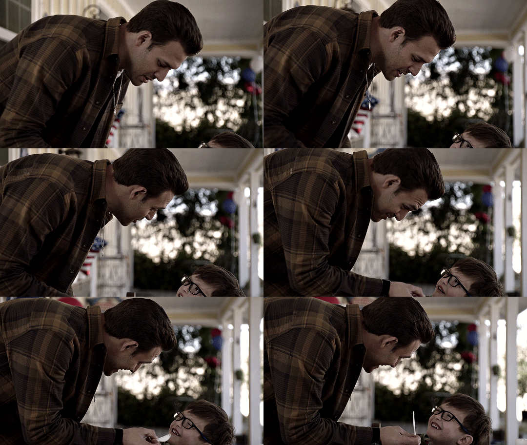

to this


steps under the cut (:
CURVES
the first thing i always do is usually use a curves layer to white balance the colors automatically. it can be quite handy, but it's usually not enough. it can be a great place to start though. on the top right you can click the 3 lines menu and choose "auto options..."


then you can play around with the different settings in the algorithms section, and the snap neutral midtones. there's usually one that's better, so i just toggle between them and choose which one looks best.

if the auto settings don't work well for your shot, you can always do this manually with the black and white droppers with a curves or levels layer. becca/@yenvengerberg did a great tutorial on it here (in the step one: curves section)
both gifs with curves auto color correction:
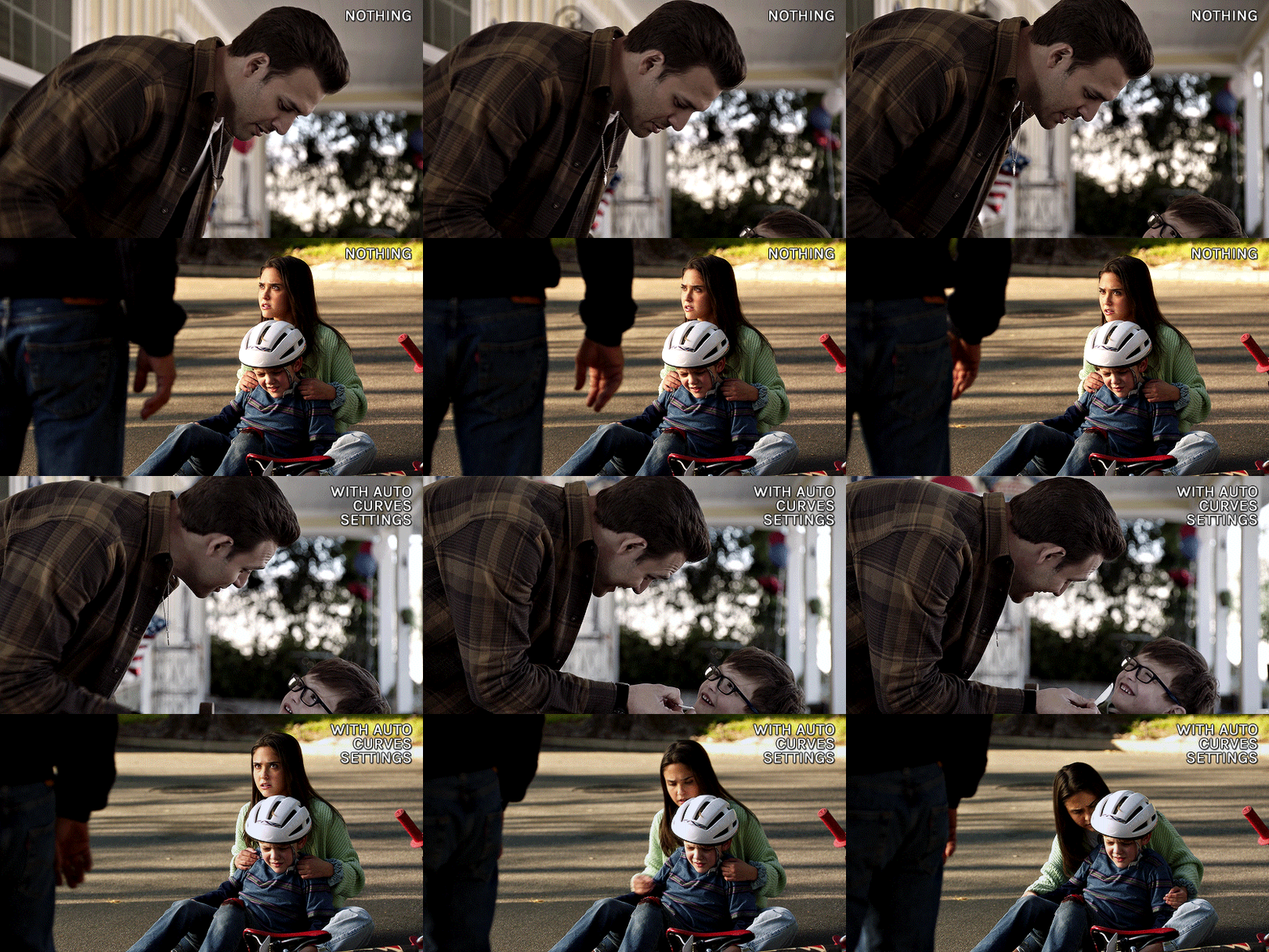
as you can see it brings the colors in a more neutral zone and less saturated, but the coloring still needs more editing.
COLOR BALANCE
i used a color balance layer to bring back some warmth into the eddie gif. i started by giving it a bit of red in the shadows, then with midtones and highlights, i simply played with the sliders until i got something i liked (knowing i'll grade the colors more specifically later).

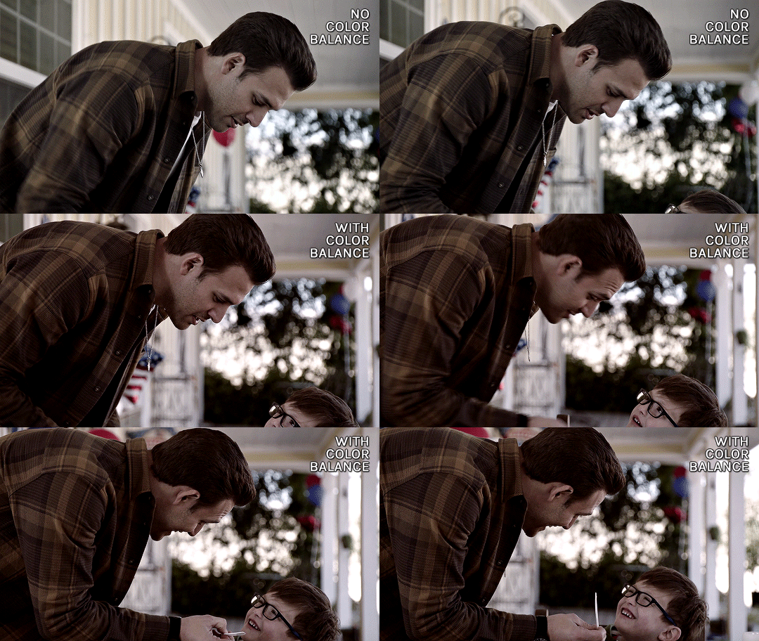
CHANNEL MIXER
for the maddie & buck gif, i wanted to reduce the yellow/green tint. i needed to add some blue to counter the yellow and channel mixer worked better than color balance for this one. this channel mixer tutorial by kate/@aubrey-plaza goes into so much depth, much better than i ever could, but here's how i did it:
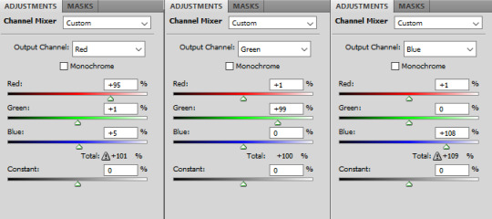
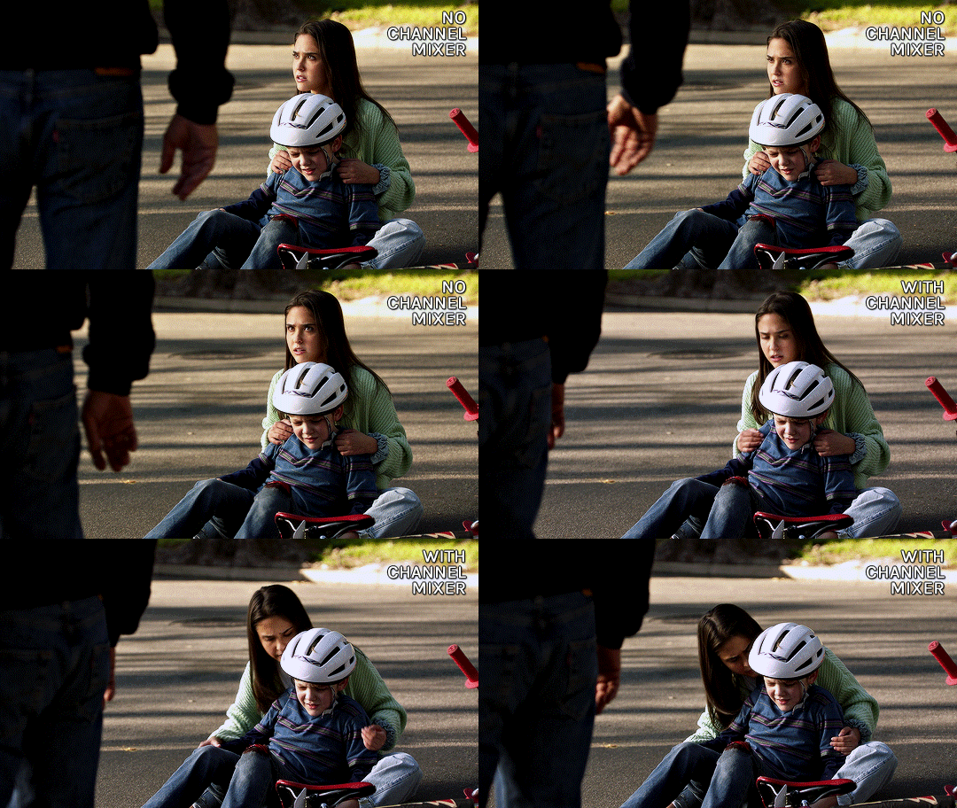
SELECTIVE COLOR
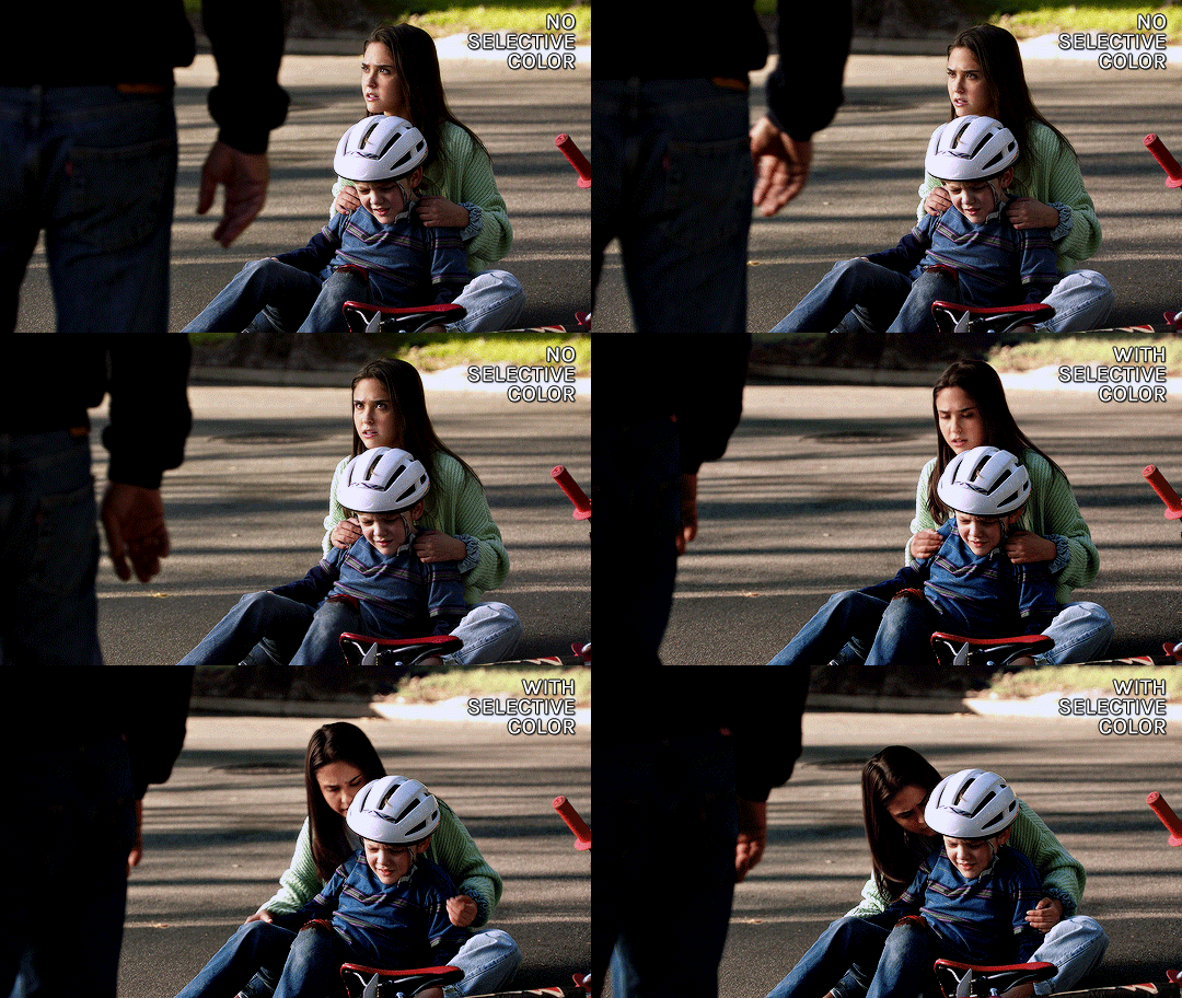
my favorite and most used layer! i use it all the time. for the eddie gif, i wanted to make it warmer and less drab. i always start with deepening the blacks, then i want to make sure the skintones are good with the reds and yellows.

then the rest is mostly small adjustments to my liking, especially with cyans, blues, neutrals. this particular gif doesn't have a lot of blue tones so it doesn't change a lot tho haha

selective color results for eddie:

then for the maddie & buck gif, i went pretty much in the same order: blacks, skintones (reds and yellows)
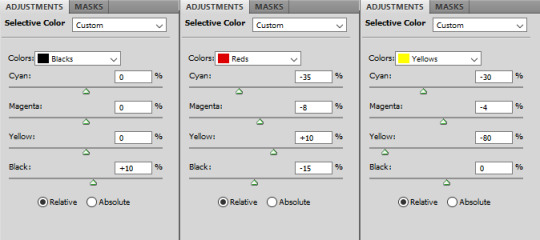
then blues, cyans, neutrals:

maddie & buck selective color results:
FINAL TOUCHES
now that the gifs are color graded, what's left is to add final touches, aka more vibrance, contrast, exposure, etc etc.
for the eddie gif i added these layers
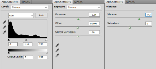
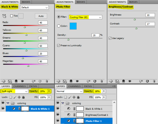
here's the layer order and final result:
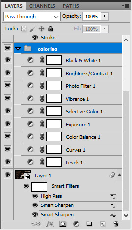
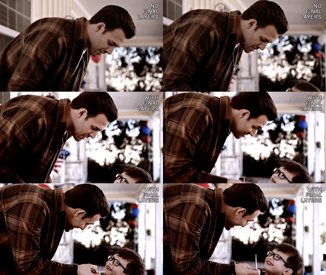

for the maddie & buck gif, these are the layers i added:

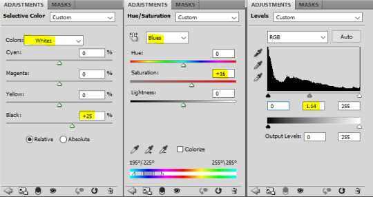
and the layers order and final result for that one:
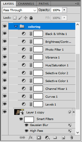

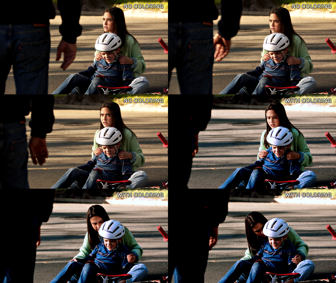
that's it, i hope that helps a little!
there's also this great tutorial by ace/@ajusnice on how to color yellow tinted shots, it's a great reference.
#alie replies#tutorial#*ps help#photoshop#completeresources#usermoonchild#userdena#uservivaldi#userisaiah#userace#userchibi#userraffa#userdean#usercharisse#usershreyu#userpjo#useraish#allresources#resourcemarket#userrebekah#Anonymous
143 notes
·
View notes
Text
@magicstar16
How do you color like that?
Hi there! I will try to answer this as best I can.
If the question is how to mimic Yuji Uekawa's style I'm sure there's much better guides out there than I can make, basically you want the area right next to your highlight to be the darkest part so it really pops.
If the question is how to colour like this using wax crayons, the bad news is I don't have any on me at the moment so I can't demo it. The good news is
1. I saved a few work in progress shots of this piece and can try to explain what I did and
2. the same principles usually apply to pencil crayons (coloured pencils for the americans) and you can find lots of tutorials on blending pencil crayons that are very similar. This is one that I like that uses prismacolours, which are wax based and very soft like crayons.
The basic idea is, you want to start with very light pressure and build up layers. Use mid range and darker colours first, and then blend lighter colours on top of them. You want to "burnish" the colours by rubbing the lighter colour on top of the others in circles, you can also try using your finger, a q-tip or a paper towel for this although it might lift some of the colour off. Be careful though, because you can only do a limited number of layers before it's too difficult to add more!

I started with pencil and then used yellow to start with any area that is warm coloured. yellow is very light so it's a good colour to start with in case you make mistakes. It also is the base of the highlight for yellow/gold as well as orange, red, etc.

big jump, i know!
you can see i have started gently and lightly layering orange on top of the peachy and red parts, and then a red-brown colour for shadows.
I've also started the darker parts of the white areas, leaving the highlights as bare paper and then lightly pressing a purple or a grey to create the dark shadows.

here i have VEEEERY lightly started going in with a bit of purple and grey where the dark parts on shadow are going to be. You can also see I have started to blend out some of the orange and the white gloves. I've also started to make the reds more red.

getting a little bit darker now, i'm being very careful to keep light on the midtone and then press really hard where the shadows are.

to be honest i didn't really know what i was doing with the background, I just chose some colours i liked and started to throw them in here and there to create the space background. Again, I started with yellow for the highlights in the green chaos emerald and then started adding the darker tones before going in with the yellow again on top to blend it.

i've added more bright colours to the background and started messing around trying to draw the moon, it was tricky! You can't see in this shot but after this, for the stars, I think i actually took the edge of a ruler to "scratch" them in. out of the darkest parts of the background.
that's all the photos I have! I hope that helps, I can try to clarify what I did. My only other advice is to be patient - i actually find crayons REALLY DIFFICULT to work with compared to pencil crayons because it's really hard to get the details and very easy to accidentally blend colours you don't want to and make a mess. It also takes a long time to layer things up, i think I did this over a few days while I was home for the holidays.
Let me know if you have any questions and I can try my best! (;~;)b
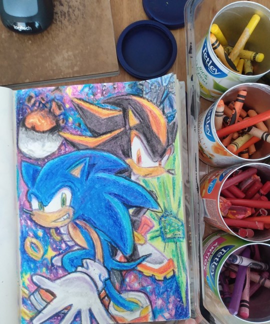
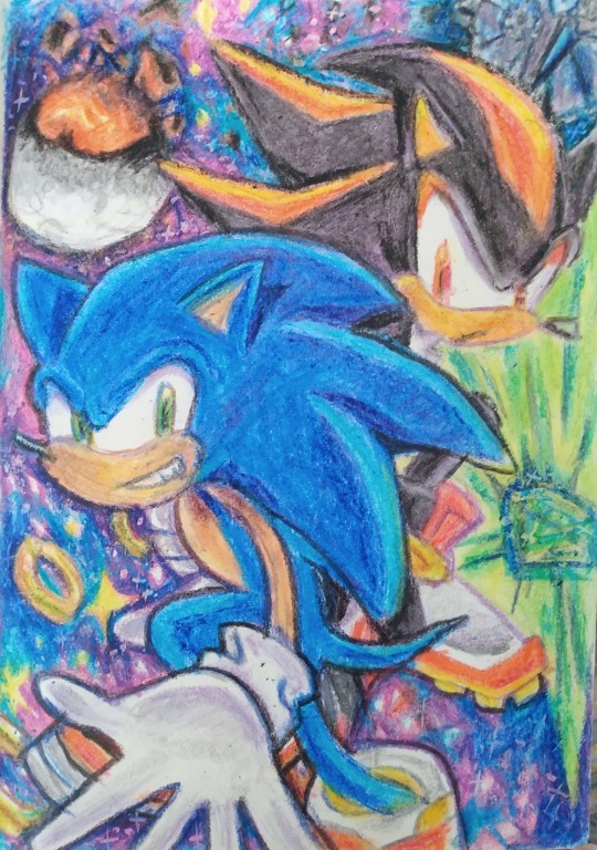
What did you do after getting snowed in Hapo? Oh you know decided to draw my favourite game ever in crayon for some reason.
Always do stuff for your younger self.
#hapo replies#art tutorial#hapo rambles#magicstar16#also this is mildly textured paper#its a dollar store sketchbook#but you would have a rougher time using smooth copy paper i think
40 notes
·
View notes
Text
When To Use A LUT And How To Customize It In ON1 Effects
If you are trying ON1 Photo RAW, the ON1 plug-ins like ON1 Effects or ON1 HDR, or upgrading your ON1 software to a newer version, please consider using my affiliate link. There is no extra cost to you and it helps support ON1 tutorials like this one. Ready to buy? Use the offer code SDP20 at checkout and SAVE 20%!
Photo editing tools give you a lot of choices to adjust the color and tonality of your images. ON1 Effects has a host of filters to enrich, tint, and color grade an image - there’s the Color Adjustment, Color Balance, Photo Filter, and Split Tone just to name a few. Another option is the LUT Filter. LUTs are both interesting and unique because a LUT can subtly or drastically alter the mood of an image with just a single click.
Step 1 - Audition The LUTs
First, apply the LUT filter and choose a LUT category. Or, you can also import LUTs you've downloaded from other sources. Once you have selected a category, you can audition each LUT. LUTs can be tricky and you can’t always predict how it will look on every photo.
Open the LUT list and use your keyboard to arrow up and down in the LUT list keeping your eyes on your photo. When you see a look you like – pause and make a note of the LUT that’s selected. Remember the LUT controls the color and luminance shifts. You can’t directly change those effects, though you can influence them after the LUT is applied. Aim to find a LUT that broadly suits the mood and color palette you want for your photo.
Related: Color Grading With The LUT Filter
Step 2 - Refine Your LUT Look With Blending Options
If the LUT looks great right away, you’re all set. However, if the LUT is too strong in certain tonal regions, you have control over that. Open the blending options of the LUT filter and use the Shadows, Highlights, and Skin sliders to limit the impact of the LUT to those tonal regions. (Skin is a rough equivalent to midtones in most photos.) For example, to reduce the color grading in darker areas, push the Shadows slider to the right.
Pro tip: You can also reduce the overall impact of the LUT using the Opacity slider of the LUT Filter.
Step 3 - Customize Your LUT Look With Luminosity Masks
Want more control? Using a luminosity mask is another approach to control how strongly a LUT is applied to various tonal regions.
A luminosity mask hides the impact of a filter based on the tonal properties of your photo. Open the masking area of the filter and click the Lumen button to apply a luminosity masks. By default, the LUT is reduced in the shadows. Inverting the mask limits the impact in the highlights. Also explore the Density slider to add some but not all of the LUT to the entire photo.
Luminosity masks are more nuanced and offer more control over blending options. Use the masks for greater influence over how intensely various tonal regions are or are not affected by the LUT.
Pro tip: Nudge the Feather slider up a little for smooth blending of the LUT among tonal regions.
Conclusion
You can also combine the luminosity masks with the blending options. After applying the luminosity masks, if the LUT is too strong in the shadows, midtones, or highlights, use the protection slides in the blending options to temper the LUT in those areas.
While you may not have control over the color mapping the LUT itself provides, you are not without control. Temper the impact of the LUT using the additional controls in the ON1 LUT Filter.
0 notes
Text
Painting Tutorial!
Hello and welcome to a kind-of tutorial for my colouring technique! I’d like to preface this by admitting that my art style is a mess of actual things I learned in art school mixed with ‘things that look good but idk why lol’ and some lazy shortcuts thrown in for good measure. If something doesn’t make sense it’s probably because it was never meant to, and I’m just winging most of this with no coherent plan. Cool? Cool.
Program used: Procreate (I use the same techniques in Photoshop, so they should work in programs like CSP, Krita and Sai)
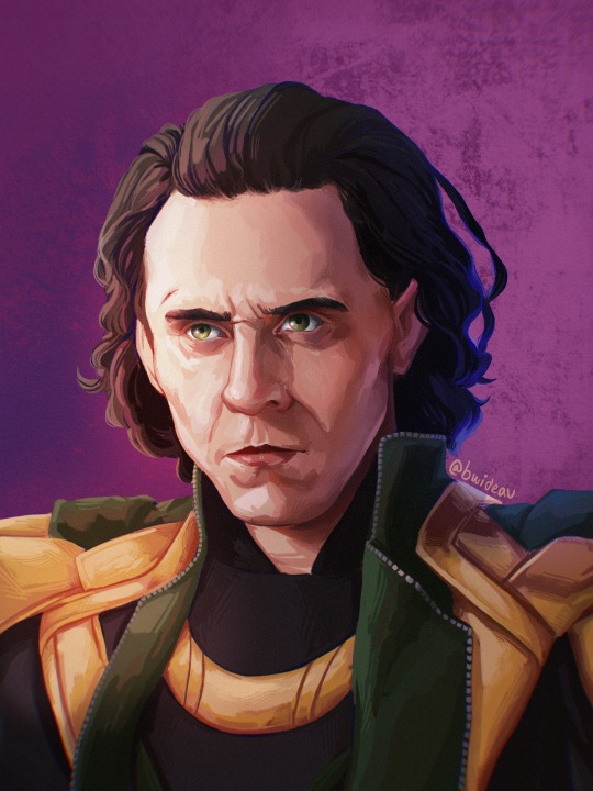
Brushes:
-Derwent for sketching (Procreate default) or your favourite sketching brush
-GvW Elder 2. 0 1 for shading (from Georg’s free ink set)
-Basic round brush
-Basic airbrush
Step 1: The sketch (Derwent Brush)
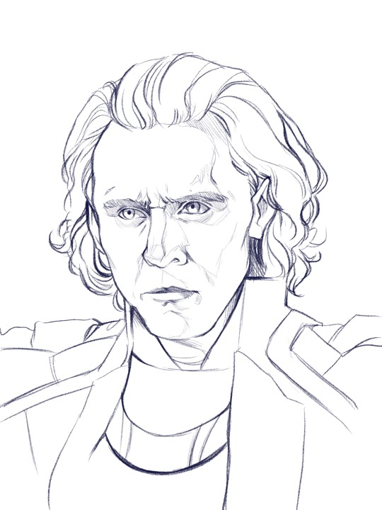
Today we’re painting my favourite murder boy, Loki! I won’t go into much detail about the sketch, because this is about colouring, not sketching. Make sure you have a solid sketch before starting on your colours. I know it gets frustrating to work on a sketch for so long, but anything you fix in this stage won’t need to be fixed later.
Use references for anything you’re not 100% sure about, and flip your canvas often to make sure nothing’s wonky. Your brain gets used to staring at the drawing, so flipping it lets you see mistakes you might otherwise miss.
I like sketching in colour because black just feels daunting to me. We’re gonna change the colour later anyway, so just pick any favourite!
Step 2: Clipping Layer
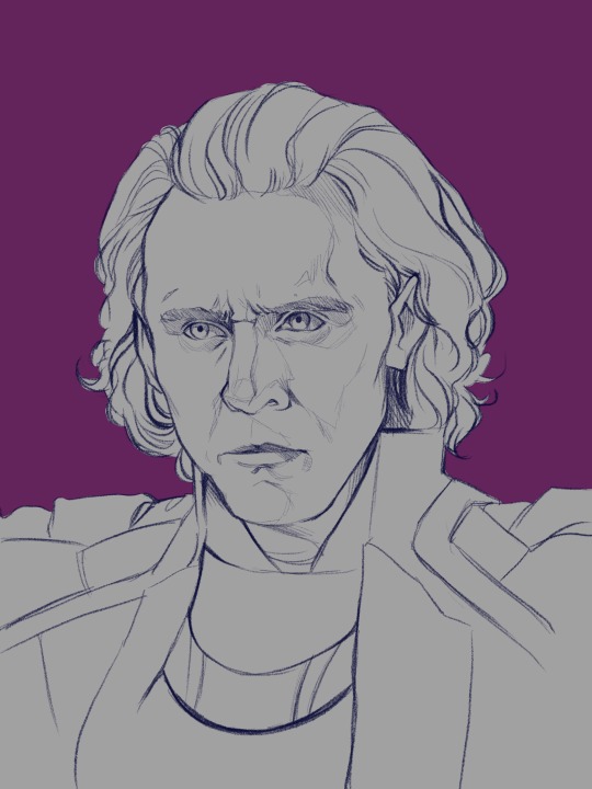
This is one of the most important stages. All your colour layers for the character will be clipped to this one so you don’t have to worry about going outside the sketch. I usually have a single clipping layer for organic portraits, but my lined pieces will have a layer for each section. We’ll be painting over the sketch eventually, so go ahead and clip the sketch to the base layer as well. It’s also time to pick your base background colour. I decided to go in a completely different direction than the reference image, so I’ll mostly be making the colours up.
Step 3: Base Shading (Elder Brush)
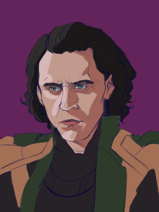
I know this looks like a big jump, but bear with me! All I’ve done is add basic shadows to the form. I’ve picked a midtone for each section of colour, and added a basic shadow and light.
Go ahead and start by locking your sketch layer and changing its colour. I’ve used dark reddish tones in the face, and left the rest blue. I like how the blue pops up here and there when I get to painting over the sketch.
To pick your light and shadow tones, look at the colours you’re using in the background. Something useful to remember is that warm lighting will cast cool shadows, and cool lighting will cast warm shadows. In this case, since the background has a cool tone, the shadows in the face will be warmer in comparison.
Always remember that your character and your background exist in the same environment; the colour of the background will influence the character. Here, the light source has a pinkish tinge to reflect the character’s environment.
Look at your reference to see where light hits, and squint your eyes to determine the big geometric shapes of the light and shadows. At this stage, stick to three tones maximum: a base, a shadow, and a light.
Step 4: The Shit Stage
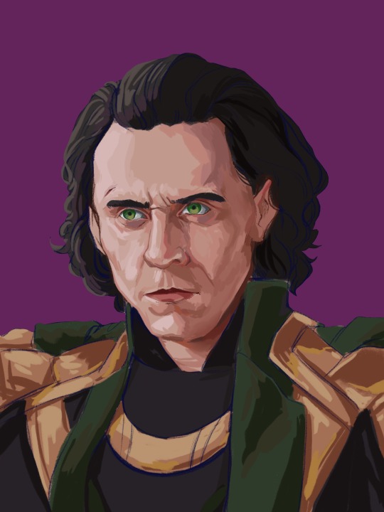
This is when the feeling of ‘oh no this looks like garbage and I hate myself’ will hit. Don’t let it fool you! Paintings look like trash before they get better. In the early stages, you’re just laying in the foundation for the details that will come in later. Just push through!
Here, I’ve started adding tones in-between the light and shadows to make the shapes blend into each other and look rounded and softer. This is all done on a layer over the sketch, still clipped to the base layer.
I pick my midtones by zooming in and colour-picking at the border between two shades I’ve already laid down. It’s a little tricky since the brush I use doesn’t have an opacity setting, but I like the sharp chunky look it gives my pieces.
Remember: Skin is not one uniform colour, and light will peek through in some places. This is called sub-surface scattering, and it’s the key to beautiful, alive-looking skin. Light will scatter under the surface of the skin, and certain parts neighbouring the shadows will look more saturated because the blood vessels under the skin are illuminated. This piece doesn’t use bright sunlight, so it’s more subtle but still visible.
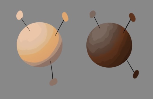
Notice the strip of warm saturation right before the shadow? It’s going to look orange under sunlight, but for Loki I’ve gone with a pink since the light is cool.
Step 5: Slightly Less Chunky
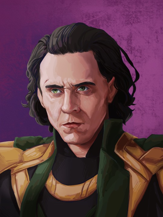
I like the chunky look in my paintings, but if everything is equally as sharp, nothing really stands out. A wise tip from one of my painting professors is to smooth out the shadows, but keep the lights sharp.
Use a mixture of more colour-picking and the blending tool to round out shapes. You can also use the airbrush if you’re more familiar with it.
Be careful of overblending! Blending too much is a common mistake in digital art, and can make a face look flat and off-putting. Blend some areas, and colour-pick them before going back over them in with your solid brush. This will make your shadows look softer, but not too soft.
Texture is extremely important and often forgotten. It gives your eye something to look at, even in a seemingly smooth space. Remember: Unlike in traditional art, digital media has no surface texture.
A smooth gradient on a cotton canvas is never completely smooth, it will always have the canvas texture underneath it that keeps it from looking too unnatural. In digital, you’re working from nothing. When working digitally, any texture you want, you need to create yourself. This is why depending too much on the blending tool will make skin look unnatural; you need to compensate for the lack of interesting surface underneath.
Step 6: Lighting
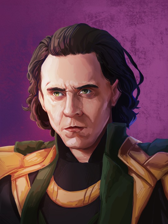
Interesting lighting can go a long way to make your painting spectacular. Note that the light source was chosen in the third step; this step simply enhances what you’ve already done.
In this piece, I’ve picked a primary light source (where the majority of the light is coming from) and a secondary light source to keep things interesting. Since the background is cool-toned, I picked a warm orange for the main light source to contrast it. The secondary light source is a cool blue, so it doesn’t quite have as much contrast. I want the secondary light source to be noticeable, but I don��t want it to be fighting for dominance with the main light source.
I clip a colour dodge layer on top of the colour layers, and put another unclipped colour dodge layer over it.
The clipped layer is the secondary light source, because I don’t want it to bleed into the background. Leaving the primary light source unclipped will give a glowy effect to the lighting, since the area around the character will also be affected. I use a large airbrush for this step.
If there are areas that need more contrast, you can deepen the shadows with a clipped multiply layer underneath both colour dodge layers.
Step 7: Details
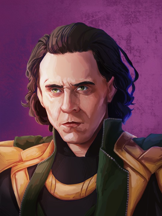
This is the time to add little things like a more refined eye shine or little flyaway hairs. The eyes also looked a bit wonky to me, so I fixed them up. Not much else to say about this stage, just add little things that will tie the piece together.
Since the face is the focal point, it’s painted in more detail than the armour. If the piece was equally detailed everywhere, the viewer’s eye wouldn’t know where to look! You don’t have to slave away over details in areas where they won’t be noticed or would be distracting.
Step 8: Finishing Touches

This is the final step! Once the painting itself is done, I like to merge all my layers and apply a bit of noise to the whole image. I find it adds a bit of grain and texture that makes the piece even more cohesive. Don’t add too much though, or it will grey out your colours.
In certain pieces, I also add a slight chromatic aberration. I don’t add it to all my pieces, and I use it differently every time. Be careful though, it can become an eyesore if you overdo it! Keep it away from the focal point of the image (in this case, Loki’s eyes) or it can actually make the painting off-putting and difficult to look at.
Since my drawing program has a dark background, I like to export the image as a test and see if it still looks good in my photo gallery with a white interface. Sometimes things look really bright against a dark interface, but will look dull and too dark when put against white. If your piece needs adjusting, use the curves tool to adjust the contrast.
All that’s left to do is sign your artwork on a separate layer (so it can be moved or removed if need be), and voilà! A lovely portrait!
—
I hope you found this tutorial helpful! If you have any questions or comments, feel free to leave them in the notes or message me! If you’d like to chat about art, (or anything really) my ask box and messages are always open to new friends!
129 notes
·
View notes
Photo


In this tutorial I’ll explain how I colour gifs from postmortem episodes & how to:
use and adjust the psd I made for this
fix the colouring on your own
You may have followed this tutorial and now have a gif but it’s basically blue and you want to fix that. In general when I colour post mortem episodes I try to make sure that certain colours stay the colour they should (keep the table white, check what colour the books are etc.), try to make sure the boys look alive and try not to whitewash Ryan. The last one can be tricky because the postmortem colouring/lighting often already does that.
NOTE: This is the way I prefer to colour postmortem gifs, you may prefer them with more contrast, more desaturated or more vibrant, and that’s cool! There is no one correct way to do this!
Using the psd:
This psd should fix the biggest colouring problems with the postmortem episodes. Duplicate the group to your gif document and place it over the gif layers but under possible text layers.
In the case this gif the colouring needs some tweaking. This is the gif without any changes to colour or brightness:

The gif is fairly dark and very blue. This is after applying the psd:

The psd turns the gif darker (the folds on Shane’s jacket are much less visible) but at the same time Ryan’s right arm is looking very pale.
I add a selective colour layer with these settings:

and place it under the psd group. I’m going to use this as a main colour corrector. With the selective color layer under the psd group the gif now looks like this:

Because of the selective colour layer there are now two layers to add yellow so I’ll have to make adjustments to the layers in the psd group:
I hide the exposure layer because Ryan’s right arm is essentially white.
I already have a colour corrector layer so I hide the main colour corrector of the psd group (Color Balance 1).
I drop the opacity of the Color Balance 3 from 30% to 7%
Then I change the group opacity to 100% and the gif now looks like this:

Shane’s jacket is still looking a bit dark so I add an exposure layer and a brightness/contrast layer. I only look at the lower left corner of the gif that is the darkest. When I’m happy with the brightness of that, I add a layer mask to the exposure and the brightness layers, and using the gradient tool I blend them into the the rest of the gif:

Finally I add another color balance layer, mainly to add yellow, and just to tweak the colour a bit

And we have this:

The boys look a lot less dead and it doesn’t look like a deleted scene from The Little Mermaid
Colouring on your own:
If you want to do the colouring completely by yourself, there are two adjustment layers that I have found out work well: color balance and selective color. In general I would say try both of them and see which one works the best. Use that to do the basic colour correction and then tweak the colouring with another layer, again try both adjustment layers and see which one you like the most.
This episode was fairly blue but this time the lighting was more favourable for Ryan, his skin is darker than Shane’s even with the blue:

1. The first thing I do is to add a selective color layer and select neutrals from the options. Usually the episodes are blue so you add yellow, but in this case the colour is actually closer to cyan, so I add red first. I also add yellow and magenta. Adding those three works essentially always. I also select blacks from the the options and boost it by +4. Here’s what the gif with the selective color layer looks like:

It already looks pretty good but I’m not done.
2. Next I add a color balance layer. This is to decrease the remaining blue. I usually start with shadows, do the midtones after that, and the highlights last.

This is what the gif looks like with the color balance layer added:

3. I add a gradient map. I don’t always end up using one but I like to play with one to see if it would improve the colouring. If I use it to improve skintone I usually have three colours: black, some shade of brown, and white. I set the opacity somewhere between 8% and 15%. From the blending options I try overlay and soft light and just choose the one I prefer. In this case it was overlay. I play around with the stops and the brown/red/yellow shades. This was the gradient map I ended up using for this gif:

And here’s the gif with the gradient map:

The gradient map brings a little contrast and adds a little colour overall.
4. Next I adjust the vibrance. With this adjustment Ryan’s hair colour changes a bit, the books in the background become more vibrant, and the upper right corner becomes less grey:

5: The final step for this gif is to add a hue/saturation layer to remove some of the remaining cyan. I’m mainly looking at the horse statue to adjust the colour.
These are the settings for the hue/saturation layer that I used:

And here’s the final version:

If there’s something that’s unclear or you’re having trouble with something, you can send me a ask or message me!
- Will
82 notes
·
View notes
Text
Congratulations to Monique Castellani-Kraan for winning Best in Show at the UKCPS Keswick Exhibition 2021.
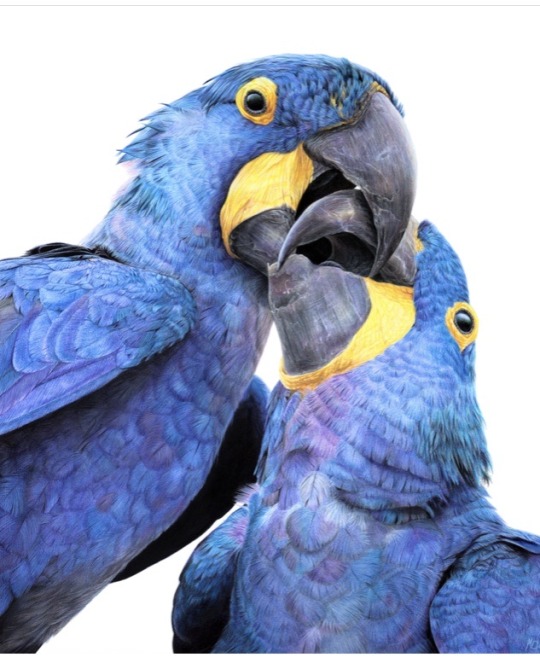
Monique has kindly share some background information on her wonderful piece Kisses in Blue.
I drew my first hyacinth macaw back in 2015, and it was wonderful being able to revisit the same subject again with “Kisses in Blue”. Parrots are honestly such a delight to draw. Their colours are bright and happy, and they have so much character. I will also always jump at the chance to get out my blue coloured pencils!
I started work on this piece back in January. After a long spate of only making miniature pet commissions over the Christmas period, which was slowly sending me into a spiral of madness, I decided to overcompensate by starting my largest drawing to date, at 40 x 50cm (16 x 20 inches approx).
As someone with a background in digital painting, I like to do all of my sketches and compositions digitally nowadays to transfer to paper. That way my expensive watercolour paper stays free of eraser marks and errant sketch lines. It saves a lot of time in the long run, and if I mess up I can very easily just print out the sketch again to start over. I don't know what I'd do without my iPad!
This drawing proved to be a little intimidating because of the size I was working at. I ended up setting it aside for a few months. You know that famous "fear of the blank canvas" we've all experienced? This one hit me hard. I got a tiny section of the eye and surrounding feathers done and then proceeded to swiftly run away, back to the safety of drawing miniatures! A few months later, I finally decided to stop hiding and to give this piece a proper go. As I got into the rhythm of it I quickly felt myself being sucked into that "zone" of intense focus - where time just slips away until it's suddenly dark outside and you've skipped a meal!
Now that I had finally got my toes wet, I was gaining confidence. Art is a bit like exercise - it takes effort and routine to get into the swing of it - but once I do, I feel like I'm flying! With every new drawing I'm reminded of just how much I adore coloured pencils and how fun the process is.
Translating the reference photo’s feathers on the left macaw’s cheek was proving to be a bit of a challenge. I could only stare for so long at the complicated mess of shadows without going cross-eyed - so I decided to treat myself to tackling the beak first instead. If ever you find yourself in a rut with a painting, look for the deepest, darkest shadows in your reference, and block those in first. You will have a much easier time once they're there. Here, the darkest shadows were the inside of the macaws' mouths, so I put my much-loved Polychromos black to work, blending with paint thinner in between each layer and tinting it with Luminance Dark Indigo to get it nice and deep. Now that the darkest shadows were blocked in, I would have a much easier time in the areas surrounding it. That shadow became my reference point for judging the values for the beak, skin and feathers nearby.
I used Daler Rowney Low Odour Thinner to blend my pencils in between layers, with a flat taklon brush. I primarily used it in the first few layers of the underpainting. The yellow skin on the beak was a tricky customer with this - my blending brushes had to be impeccably clean, or else I would end up turning it green with the blues being so close by. In addition, I didn't want the very pale yellows getting contaminated by the oranges that are in the shadows. I made sure to carefully wipe my brush off thoroughly on some paper towel before blending in small areas at a time.
Beaks are so much fun to draw! They have a lot going on, from subtle colour shifts, to chips and cracks and ridges. The texture is a treat for the eyes! Here, I started by creating a gradient of soft earthy purples, greys and creams in the underpainting. At this stage I used mostly a mix of Luminance and Polychromos pencils. For underpaintings, I like to go darker than what the final result will be - though some would say I go a little TOO dark (coloured pencil is technically a light to dark workflow because they are mostly transparent).
After blending it with OMS, and making sure it's still a little damp, I go in with my pale tones from the Derwent Lightfast, Caran d'Ache Luminance and Holbein lines. These brands are soft and have more wax than oil in them, making them very creamy and more opaque than brands like Polychromos. Because the paper is still saturated with paint thinner, the pencil melts as it makes contact with the paper, making it go on super thick, even though I'm only pressing gently. This is my dirty little secret for how I work from dark to light in all of my coloured pencil pieces. The paper you're using, of course, is paramount for this technique too. If you're not using a good paper, you're going to run out of tooth extremely quickly using this technique. This piece was drawn on Saunders Waterford Hot Pressed 300gsm- and I wholeheartedly recommend it!
However, I just want to add that if you have an area or texture you want to keep REALLY light, for example a large white crack in the beak, you should draw that in first before doing anything else. That way, when you put your underpainting over it and blend with paint thinner, the white detail you added first will show through, clear as day! (This is great for whiskers on cats and dogs for example) You can also use a ceramic cutter to do this afterwards instead, though personally I have yet to use one myself.
After finishing the beaks, it was time to face the feathers on the birds’ bodies head-on. As always, I block in my darkest shadows first and then my underpainting, giving it a good blend out with plenty of OMS. This is so that I don't get lost in a sea of repeating shapes. Without doing this, I find it's very easy for your artwork to end up all the same value with not enough contrast between the highlights and shadows. I also rough in where I want each contour feather to be on the bird’s chest with a dark blue, though I only very gently line them in with my pencil so I can still move things around if needed while I build on the textures and detail.
Once the underpainting is done I am free to start pulling out those details. I went feather-by-feather, preferring to go in with my lighter coloured pencils first, gently pulling out each feather’s barbs. After that, staying mindful of how the lighting is hitting each feather, I used my mid tone and darker pencils to work in between each barb, gradually building up shadows. I also glazed in shadows over this with a very gentle hand to give the overall shape of the feather form and depth.
It can be tempting to rush through areas like this where there is lots of uniform texture, but it’s important to stay patient and take your time. Body feathers especially can become indecipherable after a certain point, because they all overlap and merge into each other. Sometimes even though the reference photo is sharp as a tack and super clear, there is just so much going on that it wouldn't 'read' well as an artwork. So I used my reference to help me with the general structure and composition, and to inform me on how the shapes and textures should look. But I didn’t stress about getting it exact.
Once you have good knowledge of a subject, after doing study sketches and looking at lots of different references, you can be a lot freer with how you approach your final artwork. A lot of the colours, textures and feather placement in ‘Kisses in Blue’ were not there in the reference. I opted to go for a much warmer, cheerful blue. The reference I was using was also fairly flat as it was taken on an overcast day, meaning the lighting was quite diffused. I made my artwork brighter than my reference material, pushing the overall contrast between the midtones and the deepest shadows. I also found myself intermingling soft lilac hues and subtle teal with my Polychromos and Luminance pencils, almost over-exaggerating the birds’ vibrancy. I tried not to stress too much about feathers either - while getting the shape and placement of feathers right on wings can be paramount to a realistic piece, the same does not apply for contour feathers and down feathers. As long as you stick to the right shapes and sizes, paying attention to the bird’s form, you don’t need to get it looking exactly like your reference.
I try my best to bring myself out of my comfort zone with each new drawing. This piece was my biggest challenge yet – quite literally. I’m glad I pushed myself to draw larger than I am used to and I can see why a lot of coloured pencil artists like working at this size – while it is more time-consuming, you have much more room to breathe and fit details in, that would normally get lost in a smaller piece. With my choice of composition and lighting, I wanted to convey a feeling of intimacy and closeness with the birds that I don’t think I would have been able to achieve were this drawing smaller.
1 note
·
View note
Note
How do you make your palette gif sets so clean and not grainy? When i try to change the colors with the hue setting it doesn't turn out how i want and it gets mad grainy
it’s very tricky sometimes but what i mostly do is pick scenes that have the color that i’m going to use. for example if i’m doing a green palette i’m going to pick clips where that color is prominent, even if just a little, and use selective color to play with the tone and vibrance.
if the green in the clip is not that much then i play with color balance (shadows go to the tone of your palette, midtones stay as they are, and highlights go to the tone of any object of the clip that you don’t want to turn) and i use the hue/saturation setting to change other colors that don’t affect what makes the scene natural. color balance helps hue so it doesn’t look weird. don’t touch the saturation and vibrance setting past from 5, that’s what makes it very grainy and use clips that are 1080p or higher.
also if the colors you are looking for are very bright then use well-lit scenes because dark ones aren’t going to come out well (unless there’s a black background and the object you’re going to color is bright) and vice versa. so yeah that’s mostly it, i hope it was helpful!
0 notes
Text
how to make gifs from videos and dvds + coloring
I was requested to make a gif + coloring tutorial. I’m not very good at making these so it may turn out to be terrible, but I’m gonna give it a try. P.S: IT’S GOING TO BE LONG.
This tutorial contains:
HOW TO MAKE GIFs FROM VIDEOS
HOW TO MAKE GIFs FROM DVDs
HOW TO COLOR GIFs
FROM THIS:

TO THIS:

TO THIS:

And you’re going to need:
PHOTOSHOP CS5.1 or updated versions (CC, CS6)
KMPLAYER (this time it works better if it’s an old version, but I think the usual one is okay.)
1080P or 720P videos (can be downloaded here)
OR DVDs
DOWNLOAD THIS ACTION (CREDITS)
YOU CAN DOWNLOAD ANY PSD HERE
UNDERCUT
HOW TO MAKE GIFS FROM VIDEOS
Open your video and decide what part you want to gif. Then press CTRL + G at the beginning of it and get your settings exactly like mine:

Press start and capture until the part you want the gif to end. Press CTRL + G again and click to stop the capturing. P.S: Pay attention to where you’re extracting to, because it must be an empty folder.
Once it’s done, you’re going to open your Photoshop and go for FILE > SCRIPTS > LOAD MULTIPLE DICOM FILES
YOU’RE GOING TO COPY THE PLACE WHERE YOU EXTRACTED YOUR CAPTURES:

AND PASTE WHERE “FOLDER” IS LOCATED:

Once you’ve opened your files, they’re going to be like this in your timeline. (IF YOU DON’T HAVE YOUR TIMELINE YET, GO WINDOW > ANIMATION/TIMELINE)

Then you’re going to click on the small arrow and click on “Make Frames From Layers”
After you did it, it’s time to decide what size you want your gif. The most common ones are:
245px X 245px (4 gifs)

245px X 150px (8 gifs)

160px X 160px (9 gifs)

The bolded sizes can be changed, but 245px is the regular size for a gifset of two gifs and 160px is the regular size for a gifset of three gifs. Other than that, they’re going to be pretty blurry.
To crop, you’re going to go here:

And change the sizes to the ones you want here:

Once you’ve cropped it, it’s time to sharpen!
WINDOW > ACTIONS and it’s going to open this small square:

And then you upload the action you previously downloaded.
When it’s done, you’re going to flatten your gif by clicking here:

After that, you’re going to delete EVERYTHING under “Frame 1″ and select the “Frame 1″ and the first animation frame.

With both selected, you press play on the action you previously uploaded to your Photoshop. P.S: this action is up to ONLY 130 frames. If you have less than that, it’s going to show a small square with both CONTINUE or STOP and you’re going to click STOP.
Your gif is going to look like this:

To change its speed, you select every frame and click on the small arrow.


And you’ll have this:

You’ll add your coloring or psd and it’s done!
Then you go FILE > SAVE FOR WEB & DEVICES and have your settings like this:

HOW TO MAKE VIDEOS FROM DVDs
Open your KMPlayer and press FN + F2. You’re going to make sure all of your settings look like mine:


Then you’re going to exit KMPlayer (so it won’t work) and open it again. You’ll go OPEN > OPEN DVD
If you try to make a gif right after, it’s going to look like this:

So you’ll have to change your KMPlayer settings to this:

And it’s going to look like this:

COLORING
I usually use my base psd and I just change a bit of the settings - which is exactly what I did, but I’m gonna explain step by step anyway. This is going to look pretty messy because I’m always going back and forth! Don’t worry because I’m going to put the exactly order that I used the layers.
The first thing I always do is add a high level of Brightness/Contrast so I can change it later and my gif is still going to look nice.

Everything is going to be found here.
Ok, you select Brightness/Contrast and mine’s going to be like this:

After you get a nice view of your gif and its flaws, it’s time to use Selective Color! I mostly use this one to take away the redish of my gifs and also to color porn. But it’s also good to emphasize the colors a bit or get it darker.
Selective Color has a lot of colors, so this is going to be a bit boring. But it’s worth it, I promise!
First: REDS (It’s the one I use the most)

(I usually use on the relative mode when I want to get the colors darker and absolute when I’m color porn, but it’s up to you!)
Must be careful not to let your gif way too red!
YELLOW

Be careful not to let your gif or too yellow or too magenta! The “yellow” line can be very tricky.
BLACK

I use this one to get things darker because the color black gives a contrast to everything else.
I add a bit of Vibrance to make it colorful.

Be careful when using these because it can damage your gif pretty badly.
Once I did it, I add a Curves layer to get it as bright as it can be. I usually put it in between Selective Color and Brightness/Contrast, but it’s up to you.
FIRST CIRCLE

SECOND CIRCLE

After doing that, I noticed my gif was a bit yellow, so I’m gonna use Channel Mixer. You could also use Color Balance because Channel Mixer can be very damaging if used wrongly.
This layer goes UNDER everything we’ve done so far.
RED

GREEN

BLUE

After that, I noticed my gif was now too magenta. (Going back and forth, what did I say?) So I’m gonna add a Color Balance layer. When using the Color Balance, you must be careful because there are three things to use: Midtones (most commonly used), Shadows and Highlights.
Midtones can be used when you want to change the whole aspect of your gif, All of its colors.
Shadows are great to get dark tones even more darker or just get the gif darker - based on a color.
Highlights must be used carefully because they change the “white” parts of your gif. Especially faces when it’s with too much brightening.
That said, we’re only going to use Midtones and Shadows.


Over the Color Balance layer, in between Vibrance, we’re going to add a Levels one! I use it to add a basic contrast to the gif with brightness and darker colors. I almost never use the middle arrow, I prefer to use the Exposure layer that has the almost same effect. There are RGB, Red, Green and Blue but I’m very used to the RGB one and it’s the only one I use when I’m not doing a color porn.

And just because I’m a mess, right after we’re going to add another Levels layer.

And now we’re going to give a contrast to our gif with Selective Color - this is the messy part because I’m a Selective Color lover.
REDS

BLACK

Well, as I said, we’re going to add ANOTHER Selective Color layer.
Focusing on the REDS and only reds this time.

After that, we’re going to add another Levels layer until it’s REALLY bright.

And then, focusing on making everything less yellowish, we’re going to open Selective Colors, yellow icon. This time Absolute because I want to take all the yellow from the scene.

Now, we’re going UNDER everything we’ve done so far to fix everything.
Add a Levels layer.

Add an Exposure layer. I usually use Exposure to fix everything I fucked up with Brightness/Contrast or Levels.
The Exposure bar has the same effect as a Brightness/Contrast one and the Gemma Correction is similar to the middle arrow from Levels.

Add Color Balance to take away the magenta you left when used Selective Color.

Add soft curves - not really necessary, though.

And this is what it should look like:
SELECTIVE COLOR - PINK
LEVELS - ORANGE
VIBRANCE - YELLOW
COLOR BALANCE - GREEN
CURVES - BLUE
BRIGHTNESS/CONTRAST - VIOLET
CHANNEL MIXER - NORMAL
EXPOSURE - GREY
And this is how it should look like:


And the exact order:


And step by step:

COLOR PORN - BASIC
To change the color, I’m used to really highlighting it at first. To do so, I use the Hue/Saturation or Selective Color. In this case, to make things faster, I’m gonna use Hue/Saturation.
As you can see, both the wall and Jake’s t-shirt are cyan/blue, so I’m just gonna focus on these two. You should focus on your gifs’ color.
I’m gonna add a Hue/Saturation layer to make everything Cyany. I like these because I can just mess up with the arrows, it’s very fun to do so.


And it’s going to look like this:

Over the Hue/Saturation layer I’m gonna add another Hue/Saturation layer, this time to fix the blurry blue up there and change to purple.

And it’s going to look like this:

Then it’s done!
But you can also add text if you want. Like, my settings are:


It’s going to be like this:

NOW it’s done!
1K notes
·
View notes