#this is a render of one of the last sketches i posted!
Explore tagged Tumblr posts
Text

lonely games for lonely children
#[.art]#toh#the owl house#collector toh#the collector#they're a bit growing on me. Shared experience of being a young child and being very alone + the abandonment issues flaring up in ftf#this is a render of one of the last sketches i posted!
2K notes
·
View notes
Text

Another, zzz
#wip#queue à la queue leu leu u.u#last suguru sketch i shared made me think of this one (because of the pose ig? symbolic(???) back hug from gojo tipa deal??? uh)#kinda exited to see the final of this ? idk when ill be in the mood to work on my idea of the type of rendering this should get#but in my head 'it will look pretty 😌'#not in the mood to do those kind of details tho so.. ciao#satosugu#呪術廻戦#jjk#jjk fanart#jujutsu kaisen fanart#stsg#gojo satoru#gojo satoru fanart#getou suguru#getou suguru fanart#夏油傑#jujutsu kaisen#五条悟#stsg fanart#i feel like this drawing will get modified (as in 'this is no good ; ERASE. REDO !) A loOOoooot when i next work on it#but slay ig#(i do know that atm there are uh.... i mean... gojo has two set of hands (because i was sleepy. got distracted. coulnd pick a set of hands..#i dont know. ALL OF THE ABOVE... something something... but you have to understand..! im a dumbass!!!#things happen!!!! happy little accidents.. !!!)#im outing myself as a distracted mess rn#“no no no!” i continue into the mic “youve got me wrong... there isnt even proof SINCE THE CROP OF THIS POST HIDES THE EVIDENCE” i singsong
167 notes
·
View notes
Text
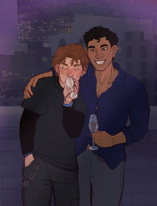
They agreed to let Anathema take ONE photo with their polaroid camera. And they got tipsy enough to forget their jacket somewhere so Ortega's helping them keep warm, that's all. Don't make it weird.
Sequel to this post
Gonna start dropping links to songs from Corey's playlist that match the vibe of the art so here's Sugar by Sleep Token
#don't imagine ortega clinging to this photo of them like a lifeline post-heartbreak#its too sad#slightly less lazy on the rendering than the last one#the arm around corey looks weird but i referenced a photo of my own arm for it so maybe IM just shaped wonky oh well lmao#I love these two I have so many sketches of them that need finishing#plenty of them with julia instead of ricardo#gotta draw her next#my art#fallen hero#fallen hero rebirth#fallen hero retribution#sidestep#corey rook#ortega#ricardo ortega#chargestep
75 notes
·
View notes
Text
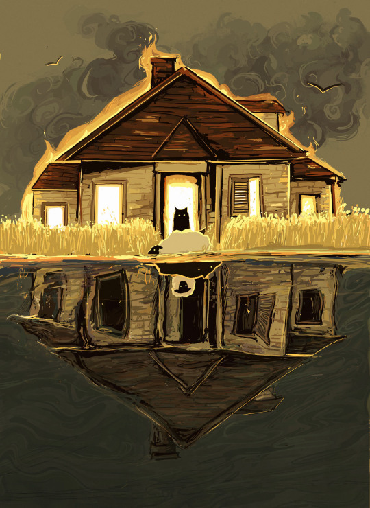
ghost story premiere day! check @melliotwrites for more info

#*there's less than a day left* me: does this count as a prediction :33 sorry it's vague i just predict Vibes. stream sheep in wolf country#last several hours i can post this before it comes across as a Reading Comprehension Cringefail! due to the new update (premiere)#which is also to say i've rushed it in the last 24h after cc told me ''go for it''. i haven't digitally rendered like this since i was 15#in lieu of character designs falling into my lap from above i give you wolf & sheep & wolf & sheep. also House. also fire and water concept#brought to you by (1) general excitement i've been swept up in // (2) cc; who i messaged yesterday with a sketch on a half-wet receipt#and was an enabler of this nonsense // (3) copious usage of the procreate liquify tool and eyedropping colours from the pinterest boards#(4) '' rotatable 👍 '' from cc which means that the house in water isn't beset by reflections and vague. and this work is rotatable.#bonus points if you treat both sides as a spot the difference game.#tempted to print this out as like a6 merch. lowkey. // (4) me rendering last minute on the last possible day [art proj flashbacks] //#(5) ghost story art draft 1 i did like dec last year involving a shelf; incense sticks; peeling paint; spilled cup; the whole shebang -#if you look at the water house there's incense sticks in the window. yippee! had fun with that... it never made it out of sketch.#and then i lost the paper. alas. sorry i guess that was fated to never be. here's attempt 2.0 with months of hindsight#anyways let's talk really quick about song assocs! water imagery @idk you anymore // sheep in wolf country!! pretty obv. above#there's a house & there isn't a house. much House. idk how else to put it. // also that one timeline (not a song) saying <house burns down>#incense sticks mentioned in i breathe in you breathe out // the lighting for the field of grass comes from there's a house:#'where the grass looks like fire sick with anticipation'. also in the same song: pond mentioned 💥💥 body of water moment //#also also the house in this work is like. if you took the ghost story header & the ghost story programme houses and smushed them tgt#except i was lazy to render wood that clearly. and last note here is that the smoke was kinda insp from how clouds are done in chinese art.#ghost story musical
69 notes
·
View notes
Text

[insert my 11k essays about how aiyuu is so married]
#aiyuu#shibasaki aizou#someya yuujirou#lipxlip#confession executive committee#they're married your honor#tbh i have a lot more aiyuu drawings but i don't wanna post all of them in one go...#maybe ill compile the sketches but the rendered one deserve their own post#i drew this after i drew the comics#i can't believe aizo forgot about this#uggghhh last stage is so cute#they broke up and get together again in one mv#they're so married ughhhhh#aiyuu divorce is real aiyuu remarriage is realll#i hv a love hate relationship with last stage outfit#they're cute but the fur and half skirt whatever that is is just ugly sorry#aizo's braid is sooo cute tho
45 notes
·
View notes
Text
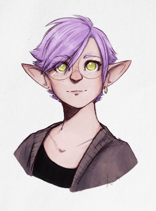
Oh, bookstore girl I wonder what your name is
#ffxiv#lalafell#Ninira Nira#Bookshop AU#work doodle#trying to keep that rough sketch render thing going#this one ended up cleaner tho by virtue of needing to be redrawn from the photo of the one in my notebook#it feels like less atmosphere and emotion than my last one but that's okay I guess#maybe it's not less and just different#touches her face ilu#bookshop au bc I didn't know what to draw her in and slapped a cardigan on her but something about the expression too#anyway posting art at 1am on a thursday 👍#art: mine
93 notes
·
View notes
Text
Had some free time and did a quick 15 minute efnisien sketch

Efnisien at some point near the beggining of utb probably
Pale, scruffy, feral boy
#efnisien doodles#lol an actual doodle instead of a rendered art piece for once#i imagine hed actually be a lot skinner probably but this was a quick one for today so oh well#also im sorry for the sudden drop in quality compared to the last few posts#since ill be posting anything and everything utb related i make in here#from sketches to fully finished drawings and such#it IS an art dump after all#but rest assured theyre all drawn with love#utb fanart
8 notes
·
View notes
Text


sorry i'm no match for strong women

this is them to me
#sketch#i'm married to them i'm sorry#genuinely amanda is my new crush of the week i'm so embarrassed i'm giggling so hard#the last one i'm considering rendering and actually posting to main lmfao#does anyone even do l&o fanart or fan content. am i insane#...i may be insane for drawing them as furries already though#kess
0 notes
Text
Submas Sketchdump Vol. 4 July 2022 Part 2!!
I knew that particular month beat my all time record for productivity multifold but I had forgotten SO MANY PIECES from the original collection!! I think I finally got them all?? More stuff under the cut!!
BREAKMAS!! WIP of the first piece I posted of them, here's the link to the final version! I tried coloring this first but the black & white had ultimately more impact so I went with that!
TRAINS!! I like this base color version too! Link to the final version!

The top sketch is a direct reference to Cluedo! A spinoff game, "Missingo", starring certain familiar characters trying to figure out what happened to Ingo/trying to prove their innocence in the case! Also WIP sketches for these two Breakmas comic pages!
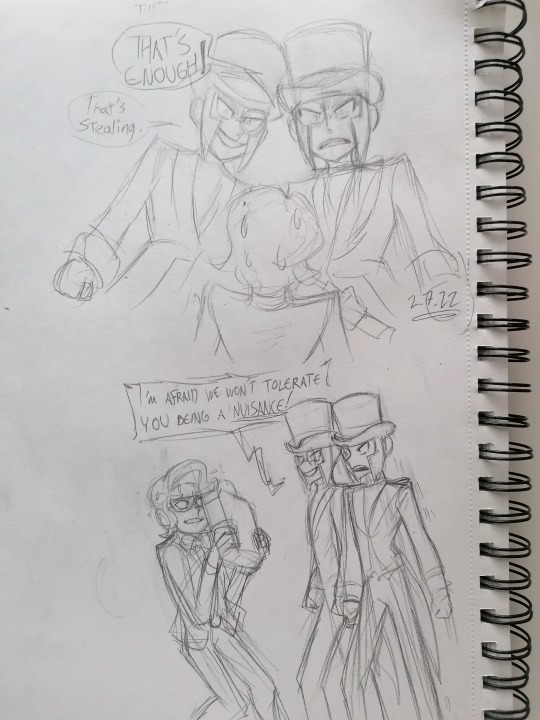
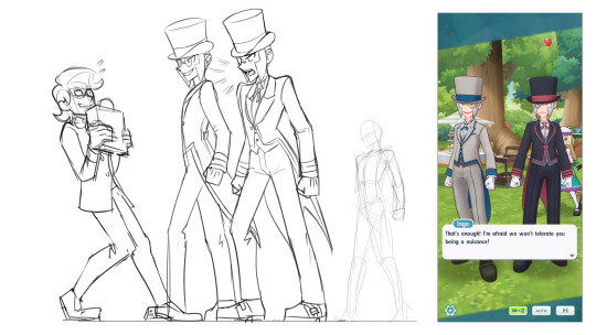
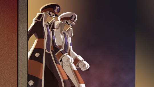
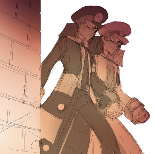
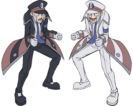
As you may know I adore butlermas! For the classy and stylish look which appeals to me in general, and coincidentally I had played PLA & got hit by submas train only one week before butler Ingo's banner rolled out! The pure bliss of finally meeting both twins in a game I felt was incomparable!! This moment in the Curious Tea Party event was really entertaining to me! We got to see submas get serious and stand up against this selfish collector thief! Two towering train twinks with commanding voices looming over the unfortunate guy was enough to make him change his mind ahah! They truly are the protectors
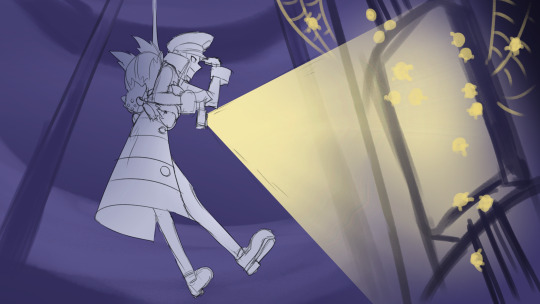
1-hour submas challenge prompt "Descend"! This is the actual one hour result before I continued rendering this!
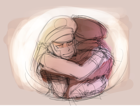
Mmmmm not my first attempt at drawing them hug and definitely not my best OR last. I want to make that moment something very special when I finally go all out on it!!
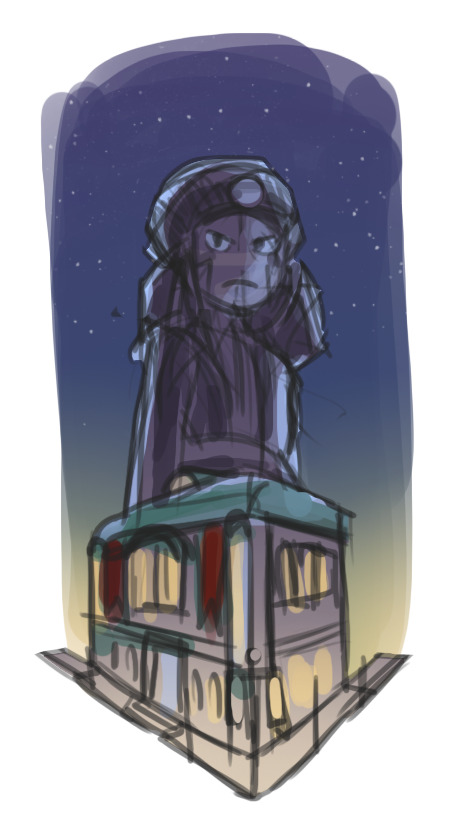
Comic cover vibing~
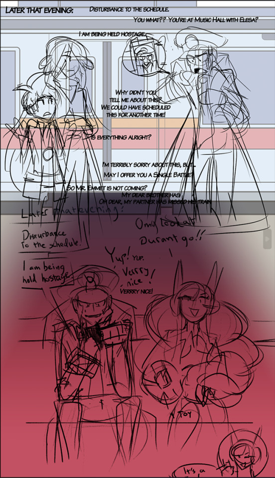


The scrapped last page for this silly comic! Sorry the dialogue is all over the place on the first piece, might be hard to read! I wasn't happy with how I presented Elesa, I wasn't familiar enough with her character back then so I thought of her carrying a toy taser to threat her friend even as a joke was too much and I couldn't come up with anything else for it. This held me back from posting the other three pages for another 5 months! In the last panel
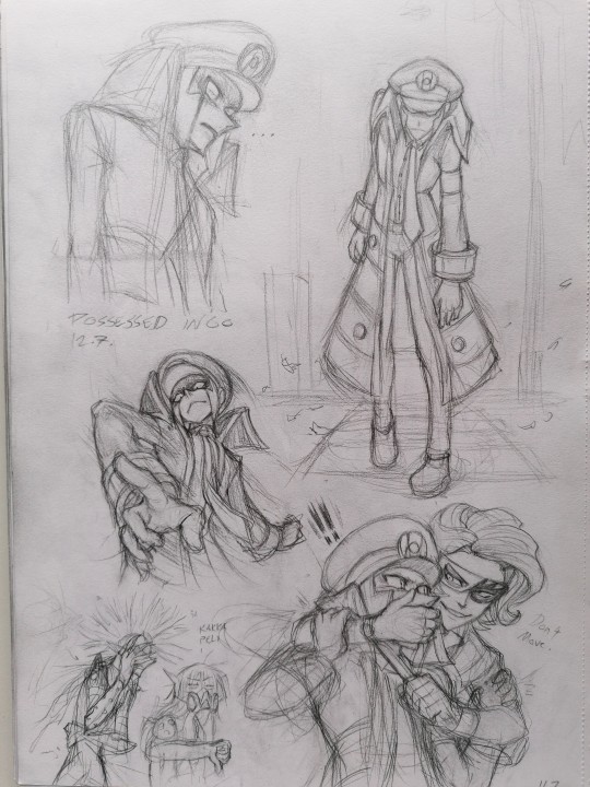
I prefer to not mess up the twins too much but my brain is still very curious and conjures some peculiar stuff like this sometimes.. I think I may have broken his arms there looking at the anatomy, ooops! I hope you don't mind the photo quality or the two weird guys in the corner, they escaped containment!
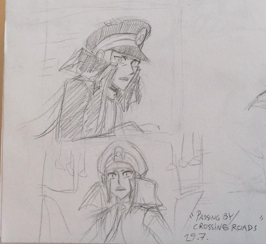
Idea of warden Ingo, being projected to modern era by his Alakazam, walking through crowd on a train platform & Emmet standing inside a passing train. Their eyes meet for just a few seconds...
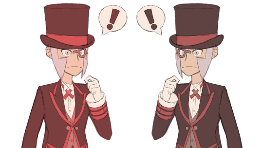
Pokemas Ingo practise!

Another WIP of a piece I posted! I started this piece like this but then later I decided to flip the whole thing.
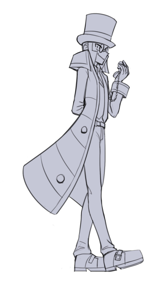
YET another WIP of something I already posted! No idea why I went and mixed up his suits but I like this sketch! They rarely end up looking this clean haha

Sketch version of the self-defense practise piece! I love getting creative with action stuff! I barely ever think of how difficult they are to draw, I just get so excited and fixated on visualising the scenes in my mind I just keep at it, pull out refs and pose in front of mirrors until it looks good to me! I want to draw more action scenes but besides being challenging to draw my brain comes up with more silly and cute ideas than cool ones unfortunately ahah

One more WIP, here's the link to the final results!! I really like how genuine their expressions look here even if the faces are a little off. I recall spending a long time figuring out this perspective. I thought it would be fun to you to see how all these pieces started and... looking at the sketch above and the stuff before that, you can compare some range of my style!

RANDOM SUBMAS MISSILES GO
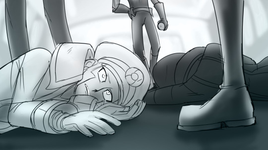
OHHH looks like some nasty passengers got the best of them!! If I recall correctly there was no fight because they managed to paralyse the two before they could act. Fully awake yet completely helpless... how convenient unfortunate. Thank you so much for checking these out!! Not every sketch is that exciting but I'm always happy to hear your thoughts on these!
Previous posts: Sketch dump Vol. 1: April-June 2022 Sketch dump Vol. 2: July 2022 Sketch dump Vol. 3: August 2022
#tw holding at knife point#submas#subway bosses#subway boss ingo#pokemon ingo#submas ingo#warden ingo#subway boss emmet#pokemon emmet#submas emmet#butlermas#submas butlers#team break#breakmas#team break submas#pokemon elesa#elesa#ingo#emmet#team plasma#galvantula#joltik#sketch dump#pokemas
543 notes
·
View notes
Text
SMG34: LIPBITE COMIC WIP UPDATE
oh boy... i know a bunch of folks are hyped for this comic... and boy oh boy are ya'll's prayers going to be heard... kind of... butt for the celebration milestone, and granted majority are from this comic, i thought it was best to give EVERYTHING that i have currently.


starting off STRONG with what you freaks most want: the completed pages. andddd yep that's it that all that i have done LMAO. i've been fixated on my own smg4 oc: tsb, and during the end of my summer was unfortunately fucked over by some personal issues that fortunately got resolved last minute good grief the anxiety prevented me from drawing the gays sigh... aNYWAYS LINEART WIPS!!!!


here are linearts i have completed / in the progress of!! want to aim like i did in the past by finishing up lineart first, and then speed through with color + minor rendering. the reason i have a few colored is to test out what it would look polished and my god... i have improved A LOT. THESE GAY PEOPLE GIVE POWER I AM NOT KIDDING BELIEVE ME IM NOT CRAY- anyways onto wip pages!


jumpscare: tsb stickman sketches. oh yeah. this is how i sketch and i blame sensei eiichiro oda /j. and in case anyone is unable to understand it {i don't blame u LMAO}, smg4 wakes up from the dream and is startled to see mario by his bed. they have a short convo before mario leaves, and we get a job to smg4 in the bathroom trying to put up a brave face. until the moment he leaves he's stunned due to seeing smg3 at his front door. will i elaborate more on specifics or unwritten dialogue? NOPE! gotta keep secrets to make it even more enjoyable at the end!!
currently at 13 sketched pages total, but this is probably gonna be reaching towards 20-ish pages, surpassing part two, but it will depend on how i come up with how to end it. additionally to confirm there will be a PART FOUR / chapter 3, to end this story. my goal is to have it done before i finish my senior year, or at least during the summer after i graduate bc good lord who knows whats gonna happen.
and lastly, before i end this crazy update, SCRAPPED PAGESSS!!!!!
CONTENT WARNING : NSFW SKETCHES !!!! PLEASE LOOK AWAY IF YOU ARE A MINOR OR DON'T LIKE THIS TYPE OF STUFF!!!


oh boy... dont draw comics while sleep-deprived at 6am... idek what i was even aiming with this ngl other than just for fun, but i scrapped it due to not being what i had in mind for the story. if it doesn't serve a purpose or narrative, its bye bye YEAH BYE BYE THIS IS THE CLOSEST NSFW UR GONNA GET FROM ME HAHAHAHAHA- i say that despite writing a nsfw jojo wattpad smh im only confident doing it in words good lord. btw not watermarking these bc i gen don't care since they're legit scrapped {left top part was kept and completed} so idk what to do with these. im just throwing it and walkin away
now to end with this update, i can hear your question, "when will this be done?" and to answer that question: i'm not entirely sure due to my heavy focus on my smg4 oc: tsb, but my best chance is postponing my oc lore a bit and complete this before november UOIYGJDSIUHJKDWSXYUGHJKCS but we shall have too see...
if you want to join the ping list comment on this post LMAO [click]
ignore below if you're not from the tsb birthday partydddjdhdhdjd
...
...
...
thurs: smg34 is canon in the tsb universe / au. though most of their encounters are platonic or best-friendy-way, they eventually express their feelings to one another and start dating 3/4’s way of the tsb storyline arc. tsb is a supporter of his friend's relationship and admires and takes inspiration from their relationship heavily to input his future love life. yearning to be in a similar position... to learn what is to really love someone... or what it's truly like to be loved...
#smg34#smg4#smg3#smg4 smg3#smg43#smg3 x smg4#smg4 x smg3#smg4 fanart#smg3 fanart#smg4 comic#smg34 comic#sketches#comic wip#comic#tsb 1k birthday party#tsb official
594 notes
·
View notes
Text

Obscenely late hermitaday day #23 & 25! - Impulse & Tango
Was this meant to be a simple cel shaded drawing on the 30th? Yeah, yeah it was lmao but somehow the power of fire excels at overtaking the rendering capabilities.
But since it's late I'll use this as excuse to ramble below about well, the headcanons and the process down yonder. Also there's variations.
(Also just realized that the compression is high with this one, please click on it to see the details pretty pleasee)


So! Let's talk about that haircut shall we? First off Tango's haircut is basically just me slapping my very neglected oc's haircut onto him lol. There's no function usage or any other lore about it, literally just I wanted to use that haircut more. But Miners and Crafters that's not all! The intensity of the flame actually has meaning believe it or not.
Since Tango in the headcanons is already a nether born blaze hybrid the redstone kinda didn't have an effect on him. This is because blazes produce glowstone which is a power source onto itself. He gets minor effects instead which is a mild (there's literally no other word) high, a intensified hair flame and a brighter eye night shine. Negative effects include mild joint & jaw pain, and a small localized headache behind the left eye.
I like to imagine that other blaze hybrids' hair flame aren't normally that intense, not white-hot heat but rather more red n orange hot similar to the flats. Mainly due to the fact that glowstone is not as powerful as redstone and it's also dependent on how strong a blaze is. Now imagine with me that blazes determine how strong each other are via the color they're emitting. Now remember the blaze boss Minecraft had a vote on to add or not to add? What if Tango is constantly mistaken as a high ranking blaze because of how intense his fire is and he doesn't get attacked a whole lot except for the few that want to challenge him. Meanwhile Tango is just highly infused with redstone like all the other redstoners and he doesn't know what's happening half time as seen by his terrified scream-laughs /hj
He's also semi modified with redstone for the pure purpose of comms just like the other redstoners minus mumbo. I also would've leaned into the steampunk aspect of this season but I figured I'd do a character sheet like etho for all of the redstoners and finalize the aspects on those.
Onto Impulse!
I like to imagine that Impulse was a regular human and over the course of redstone exposure he gained pointed ears and horns. For what reasons? I have no idea but redstone works in mysterious ways and mutates on whatever happens to be in their system. You may see that he has purple lines across his face but then red pupils, why is that? Well since he's cyperpunk themed this season he modified his redstone implants to be rgb. He can change everything else except his pupils because those are deeply affected by redstone and would require surgery to remove the build up of redstone. Will any of the redstoners ever actually get rid of it? No but you can beg all day.
You also might be wondering what's happening in their ears? Well those are the advanced comms that are actually used across all hermits except the ones who've opted out for glowstone variants. They kinda work like bluetooth except more hermit-magic way. I haven't had time to fully think of how it'd work down to the circuitry (that's my usual process for headcanons before I ship them out) but I'll post about it when I think of the full layout. Other design aspects on impulse are derived from his skin and the poster design by applestruda!
Process wise for this piece was kinda a rollercoaster heh. I had started this piece a while ago (can't remember the day on the dot) and then I got insanely busy during the last week of hermitaday. I had done sketch, refined sketch and flats in two days. Then events proceeded forth and we arrive on the 4th which I tried for an entire day to figure out how to render this piece. I then gave up and tried again the day after and pulled up references this round on Pinterest. Tango was surprisingly easy to paint with ref and went rather fast. I will admit the entire time I was rendering him I did say every minute or so "I love you man" because he was turning out so good. Halfway through I then realized I still had to render Impulse. That's when I pretty much ended that night because it was already 5 am working on Tango and demotivation was setting in fast. The next day I was able to continue with hesitancy on Impulse but I managed to keep on keeping on and in the early hours of today I finished up the piece. Where I'm now writing about it close to 2 pm in a restaurant. Man though it was kinda hard to make Impulse and Tango look like cohesive and as if they were painted together.
Enjoy!
(Side note I applied for inprint and if I am to be accepted this will be available along side the three different eefs I've drawn and doc.)
#hermitaday#(by the gods this is late)#hermitcraft#impulsesv#impulse fanart#hermitcraft impulse#tangotek#tango fanart#hermitcraft tango#par art
666 notes
·
View notes
Text

[Click for better quality]
Ok yay I'm back from my vacation yipeeeeeee. I started this drawing of Keiki before I left and I was half considering just giving up on it.... until I did a short study of facial planes and then got motivated to work on this again! I'm glad I didn't give up on it though, as I'm actually really happy with this one!
Artist's Notes;
So as I mentioned in my last post about Touhou 17, I wanted to finish this by the game's five year anniversary but with how progress was going I didn't want to rush this so I decided to take a long break from it. Mainly because of the face. For a while now I was kind of feeling like I was stagnating with my drawings, not really in the clothing but in the bodies. There was something about the way I was rendering them that I just wasn't happy with, and after talking with someone else about this issue, I realized that the reason I felt this way was because the faces were too flat and didn't match the rest of the drawing and that I needed to find a way to make the rendering of the face feel consistent with everything else. So after doing a short study of the plains of the face (I used this 3D head model from art station as a reference for my short study, please go give this person some love as they are a lifesaver) I went back into this drawing and applied what I learned here. It was only after that that I finally became motivated to finish the piece, and while it started off as just a simple character sketch like Saki and Yachie's were, the moment I added in Keiki's little fire dragon I knew I had gotten in too deep and now here we are with a full on background. OK it's not super crazy or anything, but it gets the job done and it's better than there just being an empty void behind her. It's rare moments like this when I use brushes other than the Clip Studio Default Charcoal Brush and use the Clip Studio Default Paint Brushes as well (god bless the oil paint and dry gouache clip studio brushes, they were amazing). I don't know why but painting fire has always been really fun for me, there's something oddly satisfying about it y'know? I do think that another reason for this problem was because I was drawing faces like I would in my more sketchy style that didn't mesh well with my lineless style, so I'm glad I've started remedying that.
After adding in the fire dragon I had an idea to kinda make it feel like splash art in the way the composition works... probably because I have been playing Reverse 1999 again and it has taken over my brain. I do feel like Keiki's tools get a little lost in the composition, and I didn't fully render the metal parts of them mainly because I didn't feel like they needed it, but that's just something for me to improve on later down the line.
If you guys are wondering where I went for my vacation, I went to New York and got to go to the MET and the Museum of Natural History. In both places I found Kofun period stuff and I was so happy to see it you have no idea. I remember one of the Haniwa I saw had some neat face paint under the eyes that I tried to replicate with the makeup under Keiki's eyes in my drawing, though I think I'll gave to figure out how to draw makeup on characters because this reads more like blush to me than anything. While drawing this I also looked up some references of Kofun period jewelry and really liked the stuff I found, which also meant that now she has proper Kofun earrings instead of earrings shaped like Kofun tombs. I put some of the things I referenced with a closeup of Keiki's face as well down below. I made her outfit more reminiscent of the outfit I gave her at the beginning of the year with the buttons and all, though I do want to try and draw her in some more period accurate clothing like the Haniwa I took a picture of at the Museum of Natural History. I wish I could find a way to make her handercheif look better though as I wish I made it a little bit bigger, though I think I'm saying this because I've looked at this drawing for too long lmao. Once again something to work on for when I next draw her. Also want to get better at rendering hair, as some details (like the little strands in front of her ears) kinda got unreadable due to the similarities in colour lol.

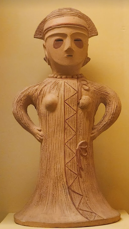


Now you may have also noticed the little cracks I added onto Keiki's face, and that's because I have fallen in love with the idea of Keiki's body being made from ceramic and that she crafted her body herself. While they aren't very visible I also tried to add some doll joints to her body, which is an idea I played around with in the past but never went to far with. I also want to get better at rendering cracks in ceramic, porcelain, etc, as I'm not sure how those read in the drawing. I also have a headcanon where the cracks in Keiki's face show up because of heightened emotions, and while Keiki is aware of this and does her best to make sure her face doesn't break off.... she will still end up with at least a few cracks during any given day, and she can often forget to repair her own body quite frequently so Mayumi has to remind her quite a lot. Mayumi even taught herself some basic sculpting techniques to help repair parts of her body that are so badly damaged to the point where Keiki can't repair them herself, i.e. if both her arms broke off, Mayumi would put them back together for her so Keiki can at least have something to repair herself with rather than nothing. I also like to imagine that if Keiki created her own body, if you took a look at Keiki from the beginning of her life she would look completely different compared to now.
BTW If you guys are wondering what a very very angry Keiki looks like....ok in order for this to make sense have any of you read volume 11 of Land of The Lustrous? Am I bringing back some memories for those of you that have? Ok good, glad we all got that mental image brewing in our minds, I'll probably draw a version of Keiki that is somewhat inspired by that one day as it's an idea I've had for a little while now. And to those who haven't gotten to that volume yet and are confused.... don't worry about it, just keep reading :)
#touhou project#art#fanart#touhou fanart#touhou 17#keiki haniyasushin#wily beast and weakest creature#touhou#東方project#own art
192 notes
·
View notes
Note
Hello :D
I have been following you for the last year or so (a few days after I got my Tumblr lmao) and I absolutely love your art!
I have been wanting to study your art style for a while but don't really know where to start,,,
Could you please show me a small portion of your art process, if it isn't too much trouble of course. Thank you and have a nice day!
hello. oh my god. this took forever to find.
im sorry it took 2 WHOLE FUCKING MONTHS for me to respond to this but i wanted to put it off until i felt happy with my art process again, so here it is
my fall 2024 rendering tutorial!
(this will be very very long)

FLATS AND WHATEVER YOU WANNA DO WITH LINES GIRL. then make sure to recolor the lineart to better match your base. trust me it helps, bold dark lines are Not your best friend when rendering. wait for that post-rendering
i start off with a doodle or a sketch, and then filling it in with flats and other details such as blush

FIGURE OUT YOUR LIGHT SOURCE. FIGURE IT OUT GIRL YOU CAN DO IT you can make it as simple as possible, make it as big as possible, dont even THINK about the details.........just make it really fucking big so you at least know where the shadows and the light goes THEN add smaller shading details LISTEN TO ME. LISTEN TO ME OKAY!!!!!!!!
my key point with this is for you to learn lighting fundamentals.
it's SOOO ANNOYING but alas......they are all correct. it helps a lot.
one thing i also really want to point out is that i like creating a big shadow shape first before fixing up the little details (such as folds and whatever) because it helps me focus on the way the lighting actually works instead of tunnel vision-ing into making the shading make sense on the clothing.

contact shadows (i dont remember if thats what theyre called okay) theyre fucking ugly because im not actually thinking sorry 💔
okay so basically:
contact shadows (if that's what they're called) are the spots in shading and lighting where light will NEVER hit.
shadows are still influenced by the colors and lights around it (it's why a blue shadow and a yellow shadow feel completely different, despite both being shadows) so it's not always COMPLETELY dark.
BUT! there are small points in shadows where light never hits, and they're almost always super dark or pitch black.
it's hard to explain shadow and light so briefly for a tutorial, but you'll notice it when watching fundamental studies and when trying it out for yourself


YES i unclipped the multiply layer YES its ugly and terrifying but it makes coloring the multiply layer easier okay the colors merged w multiply so now it looks cool and has depth overlaying colors that actually make sense
so basically what i did was color the multiply layer that i used to shade the overall drawing
adding a band of red/orange/yellow around where the light hits, and blue where the shadows get big and wide, gives it a fake ambient occlusion effect in the way that a person would get if they stood under the sun with a clear blue sky
the colors don't have to make sense, especially because i never draw backgrounds, but coloring the shadows really help it give a sense of depth and extra subtle detail and effect that just helps make the painting look nicer
around the end, i also put in colors (in an overlay layer with a low opacity brush) that actually make sense in context of the drawing, which is the lit cigarette and the yellow eyelights
mostly because none of the colors were making sense and i needed to actually make use of the lighting that DOES exist in the drawing lol

adding a muddy golden yellow pin light layer (opacity turned down to like 40-50%) to make the light colors less ugly lol
i SWEAR by the fucking pin light layer style. it's so useful and so so underrated.
i used an almost brown-ish gold color on stop of all the layers, and with the pin light layer, it helped make the bright (almost blue-ish) white colors more warm and more yellow. it just helps make things more warm (something i prefer)
i could probably show what it looks like without adjusting the layer opacity to truly show off what i mean (like in the coming section) but i sadly forgot to do that lol


make a layer on top of your drawing with this color in these ranges YES the drawing is fully merged NO don't be afraid, the base was fucking ugly anyway 💔 make this layer into an exclude/exclusion layer style TRUST turn down your exclusion layer opacity from a range of 10% to 40% literally until you're happy with the contrast and the way the color over the drawing. use your eyeballs. i know you can do it im so proud of you
this is pretty self-explanatory instruction-wise, so i'll go into why i do this instead
i really like art that seems like it has low contrast, with almost mid-gray shading and lines. i don't personally use dark and bold lines and shading, unless i find it necessary for the tone of the piece, so using this method helps lower the contrast of the art and make it look "pleasantly muddy" in the way that it's easier and softer on the eyes.
the inverted blue color also helps makes things warmer!
the exclusion layer style is still a bit of a mystery to me but i really like the effect it gives, even if i don't completely get how it works lol
if you want an alternative method to this, and if you have access to it (because i primarily use sai and sai only),
i absolutely encourage you to play around and experiment with gradient maps.
there are so many out there you can make yourself or even get from others that just give the painting an extra amount of depth and color variation. they're SO fun.
personally, if sai2 gets a gradient map update, it's over for y'all it will literally be so over no one will be able to stop me


then i merged everything and actually adjusted the contrast back up because it was looking too muddy for me 💔 but the color adjustments are still there so all hope is not lost here's a comparison of the adjusted contrast in black and white (adjusted on the left) (newly merged layer without adjusting the contrast on the right)
as you can see, i actually turned the contrast back up (despite talking all about how i liked things with less contrast lol)
i wanted to demonstrate that doing adjustments should be done in moderation, and is why i adjust layer opacity often when making color effects
you are free to play around with colors to help your style, but don't lose your initial idea and colors along the way.
you still need to trust your own colors and intuition!
along with that, i just want to say that it's completely okay to change your mind mid-painting, and it's okay to make somewhat drastic changes.
don't be afraid to change things you don't like or change your mind about certain aspects way later on
that's basically the whole thing of this!!! don't be scared!!!

now im gonna hold your hand when i say this..........but you need to learn how to render by yourself. it seems like i can teach you but i literally can't, because rendering is different on every piece and depending on how clean your base is. i have to render A LOT because of how fucking ugly my sketches are LMAO to simplify it, think of it as obsessively cleaning up every detail you can see, but with a color picker and a clean, hard edged brush. if you have shit lineart, you don't have to redraw it cleanly over and over, just paint over it. that's basically what rendering is
THIS especially is where you need to be brave and stop being scared.
like i said, i can't teach you how to render, and it's something you have to discover yourself because rendering is something that will always be personal to every single piece you make. the way you render on every piece is different.
on one piece, you will barely need to render, and on another, rendering is more than half of your ENTIRE process.
don't be afraid to paint over your old art.
rendering is a process that's both very perfectionist yet also very careless.
find your balance and just go for it.

and then that's it……..u did it………..now yuo know how to paint and render. it's literally just layering shading and lighting knowledge until you think it makes sense and looks okay lol additional note: since i render in only one layer (you don't HAVE to do this, but it'll be harder for you…), i also made slight adjustments with the transform (and liquify, if you have it) tool to make things more proportionate. (i drew the head too big lol)

if you compare the finished piece to the final unrendered base, you can see that a LOT changed, including a bit of subtle proportion adjustment.
particularly, the sleeves changed A LOT (because i really didn't like them)
but it's also over all cleaner and more coherent, instead of having haphazard colors and shading just thrown about.
rendering is when you finally use all 100% of your brain to finalize and figure out where the shading should go, where to clean up your lines, where to ERASE or ADD BACK in lines, and make sure all your colors look coherent.
it's not as intimidating as it seems, i only use a hard edged brush with a little bit of color mixing and my color picker.
it's like dragging and dropping colors to cover up mistakes, it's really quite fun when you get used to it
i wish i could explain it clearer but it's hard to describe without visuals!
i hope this helped, and i hope all my yapping isn't annoying (art as a special interest beloved)
have fun studying and trying to render in my art style!
#long post#art tutorial#rendering tutorial#art help#art tips#tutorial#kia doodles shit#artxstic-scr1bbles#tutoriel
168 notes
·
View notes
Text
Art Raffle for Shaima and Mohammad
update 8/15/24 Shaima and Mohammad have reached their goal!!
since this raffle got two entries and i can take more sketch requests, I’m going to keep it open until September 4th and spotlight another campaign that needs support. Nour’s fundraiser for herself and her family in gaza is currently far from its goal (link here). for a $5 donation to her gofundme you can enter the raffle for a full color comic or a fully rendered illustration, and get a sketch from me per entry (each $5 is 1 entry, so $10 is 2 entries, $15 is 3)
Her gofundme has been verified by @/90-ghost here.
original post below
-
i'm holding another art commission raffle for a full color comic or illustration for donations to Shaima and Mohammad's gofundme (link here). they've reached their goal but need to raise $5,000 more to account for fees for gofundme and internationally transferring the money (link to a post that has more information on their situation and the increase in the goal).
each entry is $5 (for example $10 is 2 entries, $15 is 3). donate and send me the receipt dated 8/14/24 or later through DM or ask and i'll enter you into the raffle, and for each entry i'll draw you a sketch of whatever character you'd like (OCs included).


[ID: a comic page with yoo mia and yoo joonghyuk at a petting zoo, and an illustration of han sooyoung holding papers that spiral away from her. End ID]
example of one of my sketches for the last raffle:

[ID: a sketch of yoo joonghyuk reaching for a star. End ID]
you can also donate to their gofundme and commission me through my commissions for Palestine post here instead if you want a more rendered art piece without having to win.
If you would like to donate to them but aren't interested in an art commission from me, there's also raffles for a magikarp plush and custom made tote bag being run for the same fundraiser.
180 notes
·
View notes
Text
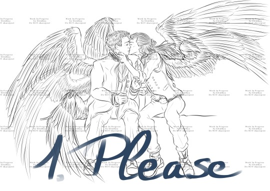
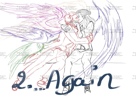
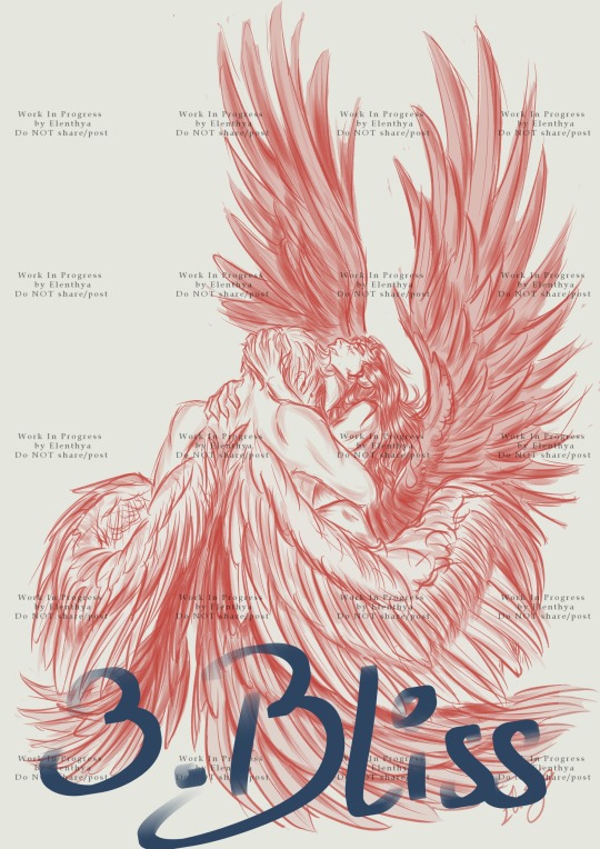
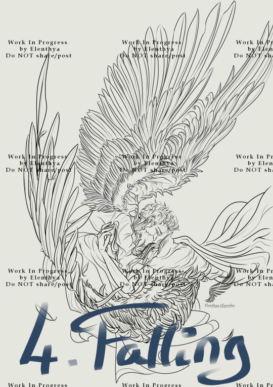
I couldn't decide on where to begin, so thank you all by advance for your help! Please reblog so everyone can see it! The winner of this poll will become one of my top priorities during November.
↓LONG POST under the cut! I describe each WIP with pictures and I explain what I would like to do.↓
Tell me in comments/reblogs what you would like to see for these WIPs!
Num. 1: "Please", inspired by David Tennant Richard II Kiss

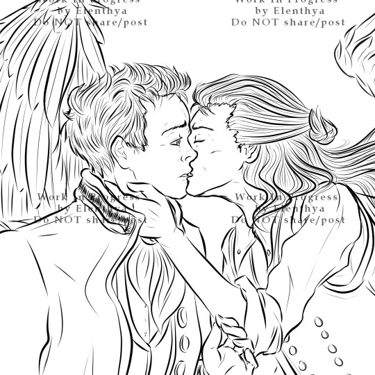
"Please" is the first part of a diptych. Published as a simple WIP in December 2023, it became for no apparent reason (lol) one of my most famous posts on Tumblr. I have always wanted to full-colour it, but I was feeling so much pressure about this one that I didn't dare to try. And then Time has passed...
I have changed a lot of things in my art practice. Different brushes, different lines, and so when I'll work again on "Please", I already know that I'll have to redo all the lineart - that's ok, it's one of my favorite tasks. I will improve Aziraphale's expression and draw more details on his Archangel suit. Crowley with his dark waistcoat (ngk) and his gorgeous black wings will probably stay the same, even if I'll redo all his lineart so they'll complete each other perfectly. And, of course, full-colour... Teehee.
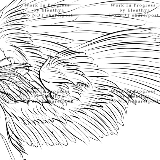
Num. 2: "...Again." (inspired by David Tennant Richard II Kiss)

"...Again" is the second part of my "Richard II Kiss" diptych. So much potential in Aziraphale's wings, as he literaly lauches himself into Crowley's arms! And how I love the way Crowley embraces him like nothing else matters. I'll have to do all the lineart for this one, and I'm so glad about it, because I guess I have changed and improved my lineart skills these last months, and "Again" is the perfect challenge for proving it to myself.
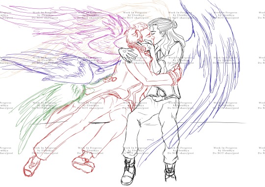
Num. 3 "Bliss", one of my favourite Red Art Sketches! But...

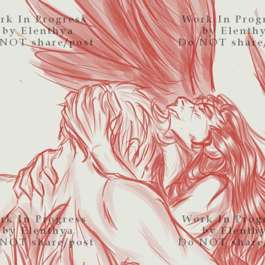
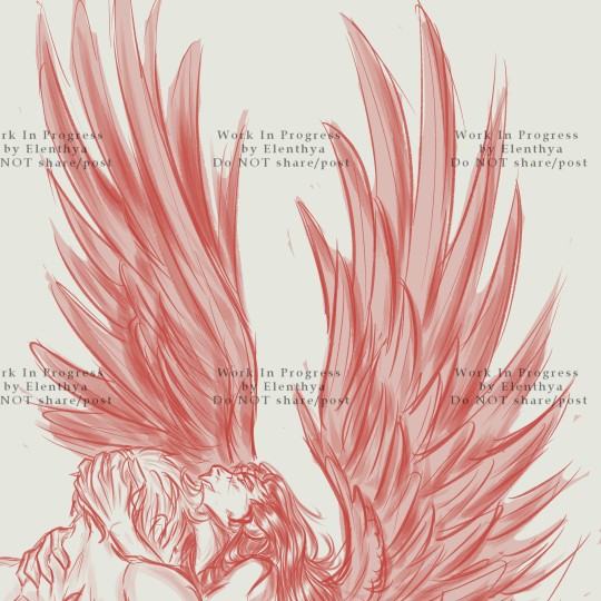
Achieved on the 29 of January, 2024, "Bliss" is a Daily Challenge sketch, so time completion = less than 2 hours. I love the emotion and the movement in this one, but I have always wanted to come back to it and take my time, in order to draw a cleaner and more detailed version, probably in full-colour. The potential of Crowley's wings is phenomenal (I'm so much more skilled now about drawing wings), and his expression is wonderful. Maybe I'll change a little bit the lineart so we could see Aziraphale's embrace on Crowley - tenderness and passion all the way, always.
Num. 4 "Falling Starmaker" - "If Only I could have been there for you"
"Aziraphale saw the Starmaker's Fall, but didn't (couldn't) intervene. 6 thousand years later, he still regrets. He should have been there for him."

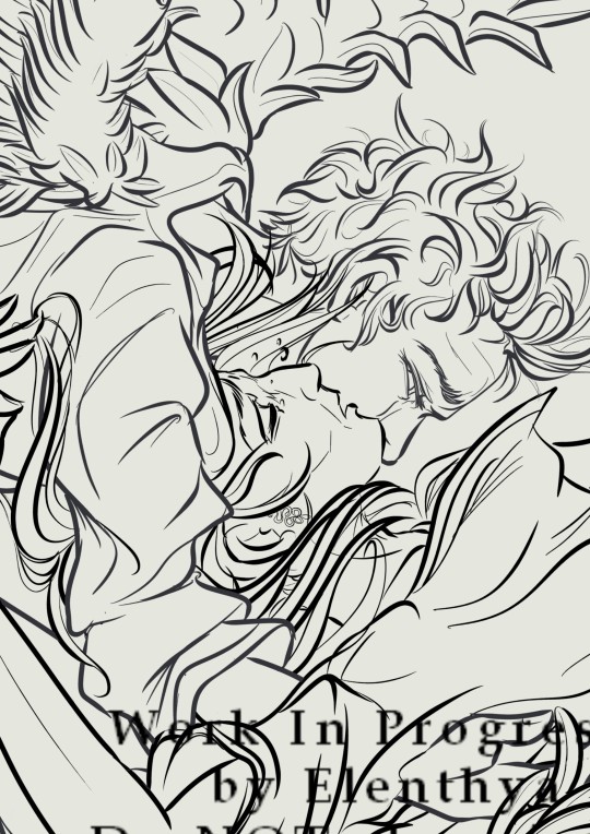
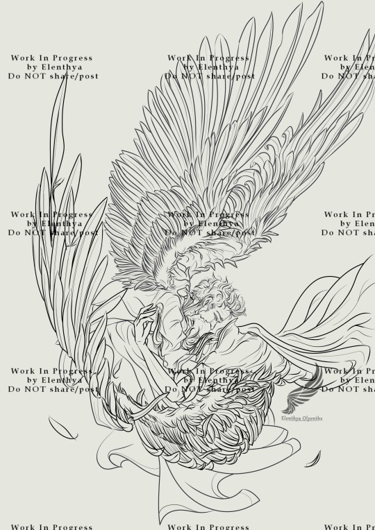
I dearly love this headcanon about Aziraphale, and I like to imagine that he would still dream about saving the Starmaker from his Fall. Not because he prefers Crowley as an angel (Damn, NO), but because he learnt to know Crowley throught the ages. And since he saw how much Crowley has suffered, after 6000 years, Aziraphale would do anything for relieving Crowley of thepast and the pain.
The lineart here is quite ok but needs to be redone so it would be more appropriate for a full-colour rendering. I really want to work on highlights and rendering effects for this one, so the movement of the Fall would be preserved. And I'll work on details like burnt feathers, Crowley's hair and Aziraphale's saddened eye.
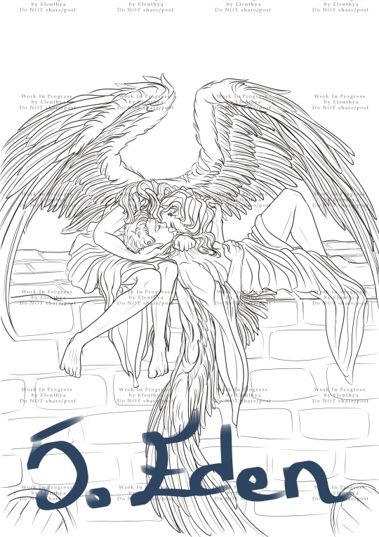
Num. 5: "Eden" or "Take me back to Eden"

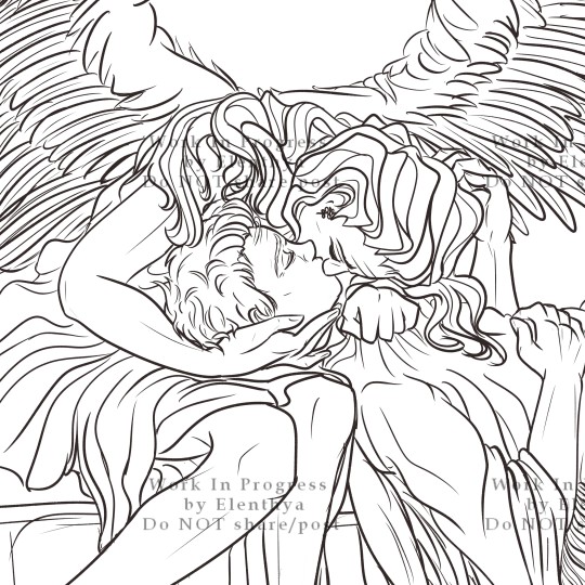
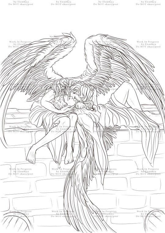
Since my first reading of "Anatomy 1.0.1", a Rating E fanfiction written by Fyre, I have a thing for them already together in the Garden of Eden. So of course, a kiss on the wall (again), but with their wings apparent this time!!!
I gave up this one in April after trying to full-colour it (that was... hideous.) Now that I have a better idea of how to handle full-colour, I need to come back to it. This one will be a peaceful, innocent fluffy scene. With Crowley's proud wings casting a soft shadow on them, probably, and his gorgeous hair flowing like fire and gold over Aziraphale. A lazy and tender moment in the Garden of Eden, when everything seemed simpler...
Ooooouf you did it! You know everything! So, which one you prefer? What would you want to see in it when it's achieved? Reblog/comment and tell me everything, I'm curious!!!
Thanks to you all, love you!!!
Linktree - Tumblr Masterpost
♥ Tag-List below (tell me if you want to be in or out)♥
@goodomensafterdark ;
@floscrap-blog ; @demonsandpieohmy ; @amagnificentobsession ; @captainblou
@ineffable-hyperfixation ; @itsscottiesstark ; @moralsofanalleycatsposts
@fearandhatred ; @eybefioro ; @crowleys-bentley-and-plants ; @ashfae ; @crowleys-hips;
@paperclipninja ; @silverdphantom ; @neverlet ; @naturallyteal
@mad-aims ; @daisydimple20092 ; @seraphhiim ; @rebeccakatmauri
#good omens#artists on tumblr#31daysofgoodomens#good omens fandom#art challenge#crowley#my art#poll time#elenthyaandgoodomens#Red art#or not?#Aziraphale#aziraphale x crowley#crowley x aziraphale#ineffable husbands#ineffable lovers#31DOGO#archangel#archangel aziraphale
118 notes
·
View notes
Text
My obsession with Yennefer (long post!)
Yennefer was ALWAYS my favourite character from an entire Witcher franchise and easily my favourite character from any fictional story. I drew her, sketched her, wrote about her obsessively since I first read the Witcher in 2013.
Let's give it a try and gather all of the Yennefer pieces and sketches I ever did, because I had a Witcher brainrot for many, many years. Spoler alert: all of my Yens are totally different!
This one from 2014 was probably inspired by the The Bounds of Reason.
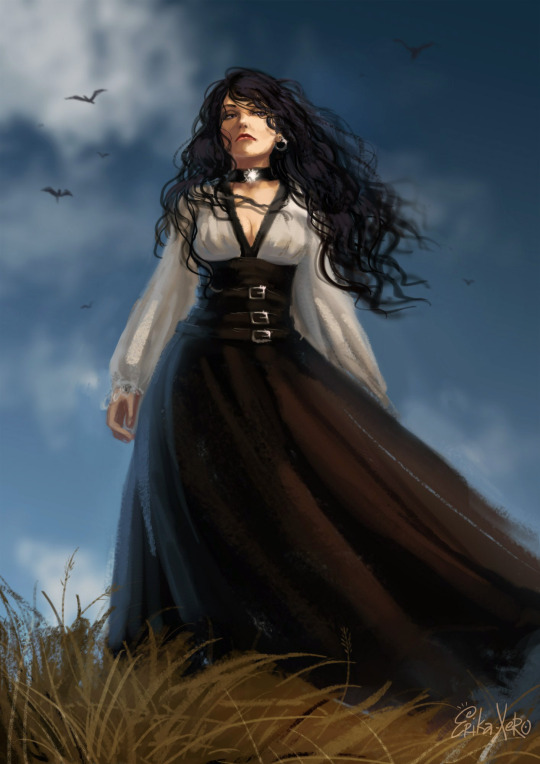
The one that was inspired by the very first Yennefer render from CDProjektRed.

The weird one. I don't really like her.

2015! The Shard of Ice Yennefer:
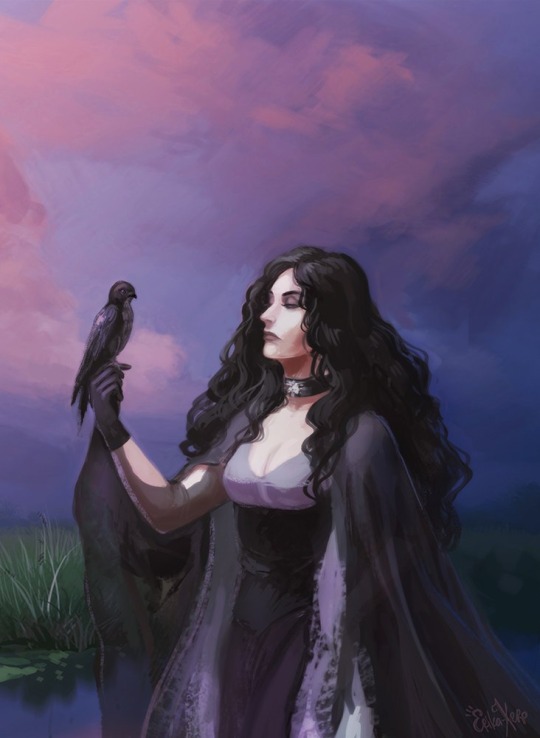
Don't have much to say about this one either, I guess it was an experiment.

The one I don't remember drawing. Somehow I predicted the Netflix!Yen having these exact eyeshadows.

Oh I love this one! This is a mix of game!Yen and book!Yen:
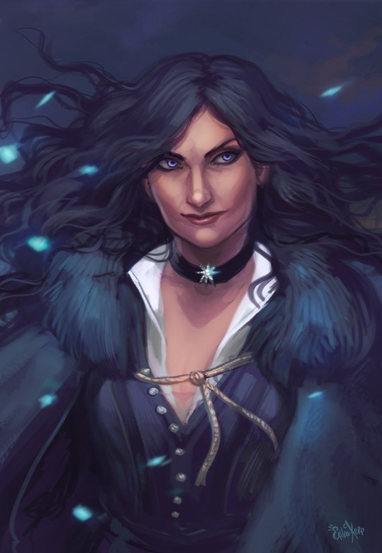
The next one is pure game!Yennefer, even though I never liked her in-game design (especially the bangs, the small nose and the lips):
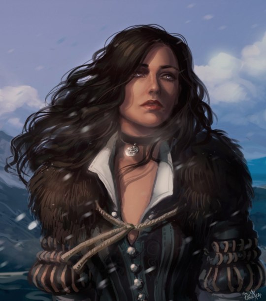
Basically, this is how I saw it: game!Yen meeting the book!Yen.
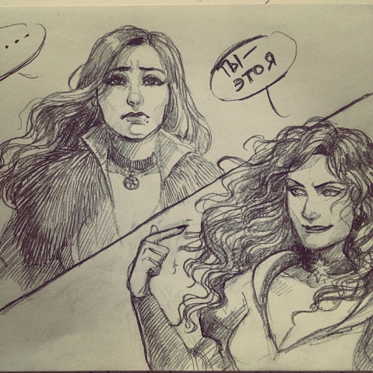
Late 2015/early 2016 traditional sketches (yes, the second one is Yen from the Hexer):


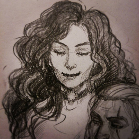
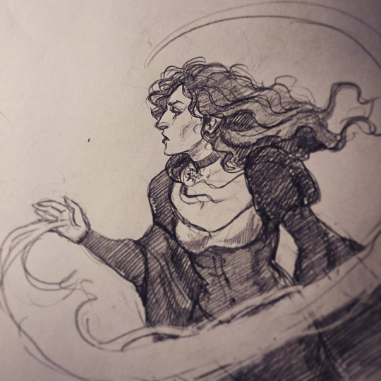

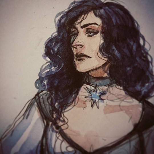
THE FAVOURITE ONE. I haven't watched Farscape until 2018 and when I first saw Claudia Black I GASPED, because to me she looked exactly like this Yen version I drew back in 2016 and still is madly in love with.
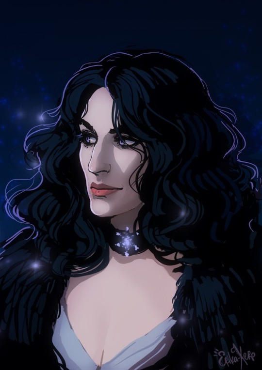
Apparently there was an infinished second piece of this exact Yen design but I never posted the high resolution of it which is kinda sad.
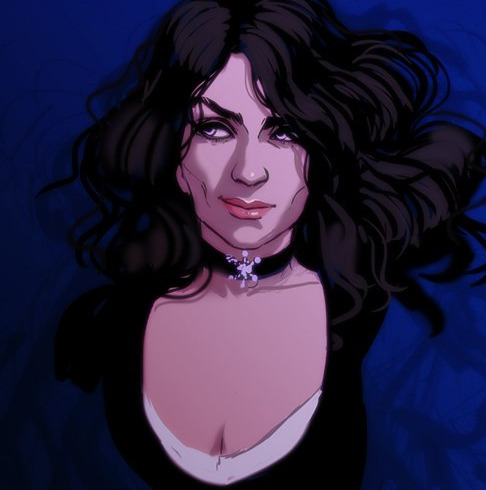
2017! I saw early game!Yen designs and did a sketchy portrait of her. And then I decided to make the second version with the book!Yen:
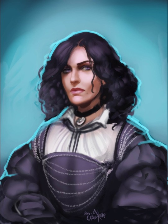

Finally, Yennefer from 2022 (original sketch and the colored sketch). This design seems the most book accurate to me, but I still love all the previous ones I did (except the weird one, she is creepy).
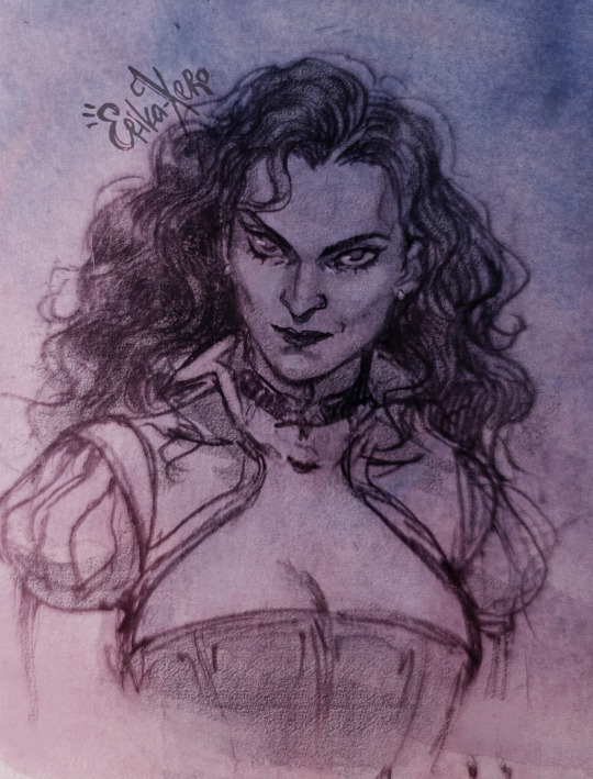
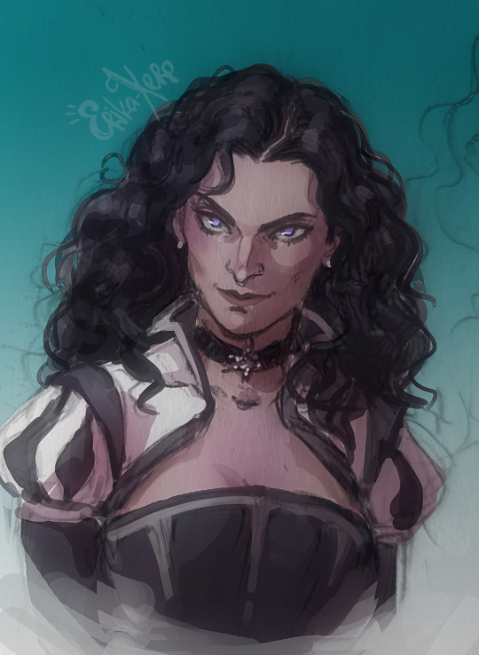
And the last, but not the least: my own Thanedd ball outfit for Netflix!Yen, portrayed by Anya Chalotra.

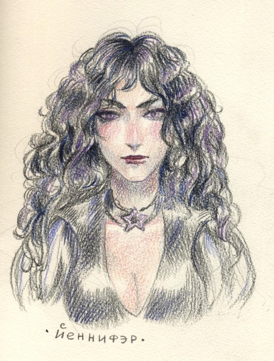
And a small bonus! The very first Yennefer sketch I ever did (2013!)
#fantasy#yennefer#the witcher#yennefer z vengerbergu#yennefer the witcher#netflix yennefer#game!yennefer#book!yennefer#traditional art#digital art#art progress#sketch#favourite character#i was fucking obsessed with this woman#I wanted to be her#witcher brainrot
579 notes
·
View notes