#this composition was a little tricky tho
Explore tagged Tumblr posts
Text

some fanart for @callmehere-iwillappear ‘s fic new phone who dis (it’s rlly cool go check it out!) based on their poster. this was a bit outside my comfort zone but super fun to draw :)
tap/click for better quality, and no text version under the cut :)

#this composition was a little tricky tho#i had so much empty space i couldn’t figure out how to fill#also tried smth new with my lineart :)#and finally did lighting on smth woooo#art#digital art#illustration#rottmnt#rottmnt fanart#rise of the tmnt#rise of the teenage mutant ninja turtles#new phone who dis#i hope it’s alg for me to tag that#crow does art
239 notes
·
View notes
Text
Artists Process Vid, Music Brother Let Me Be Your Shelter . (The art post on its own)
My Process: Migraines are not fun. Mostly I like to ‘trust the process’ and keep painting but this composition had several challenges that would be tricky at the best of times let alone with a marching band doing its best to pulverise my brain. So there are a fewl things I’d do differently if I did this again but I really liked the concept for this one so I thought I’d post the process vid and explain what gave me trouble.
I wanted this to be a dark moody picture lit by key highlights. It’s inspired by Sam in the cage in the Benders episode. But all the shadows and the cage bars obscured the shapes I rely on while drawing. (Things like head sizes, hair flow, jaw lines etc.) My initial sketch without any of the surroundings was fine. But you can see in my vid that once I start painting I move the hands and change the body shapes several times. Half way through I also have to flip my canvas. This was because I had lost sight of the shapes that I was aiming for in Sam’s head and features. So flipping the canvas makes my brain see the image from a new perspective and allowed me to correct some of the problems. (If you want to use this trick with traditional art, try looking at your wip in a mirror or taking a snap with your phone and flipping the photo.) It wasn’t just the shadows that were giving me problems with shaping the correct anatomy here though: Sam is also at a crouched angle and for Dean to be looking at him, Dean needed to be hunched over but looking up and away from the audience. These are both pretty unusual angles to draw from and even though I had an okay layout for the boys in my initial sketch, I lost several key lines as I was painting and so by the end their noses and chins are a little wonky. However I was so zoned in and hyper focused on the minute details that didn’t spot that until I had gone firm on my shadows and lighting and could see what the finished piece would look like. (Top tip: zoom out from your canvas or step back from you sketchbook every 5 or 10 mins to keep an overview of the big picture.) But that aside: I was busy ‘trusting the process’. Often a picture looks odd until all the shading is in the right place and even zooming out you can end up fussing over minor details when a bit more detail to the surrounding image will resolve the issue. So sometimes it best to just keep going. Sometimes not tho 😂 - Art is an art, not a science. In this case my trust was misplaced 🤷🏻♂️. By this time though my brain was dribbling out my ears and I didn’t have the will power to start over. Hopefully you can just enjoy the atmosphere and intent of this painting and forgive any anatomy issues. And we can all repeat together: “art doesn’t have to be perfect!” (And we will keep repeating that until we believe it! 👍🏻😁) ( - *Edit added a few hours later: actually it’s really not that bad a pic. No more issues than the rest of my art. Migraines make you cranky and frustrated and overly self critical. So don’t listen to the voices! This time I’m not going to repeat: art doesn’t have to be perfect. Instead I’m going to say: well done self! You made a new thing. Congrats! You rule. 😁)
Happy Arting my friends and have some heartfelt wishes for good health!
#supernatural#spn fanart#MidnightSilver#dean winchester#sam winchester#artists process#process video#digital painting#procreate
19 notes
·
View notes
Note
Hello Miss Chaikachi, I just wanted to tell you that I love your art, It is always very cute, and I want to ask how in the world can you draw so fast? Like it take me a full day to draw half a sketch. You don't need to answer this if you don't want to. I just want to let you know that I appreciate your art, and It's a little bit scary with the speed you can draw.
Awwwwe thank you so much! 🥺🌸
To be fair, I think different pieces take different amounts of time. The recent bee drawings were relatively quick because they're not super detailed and I had a clear reference to work off of for both of them. But original compositions with full backgrounds can take me AGES (especially because I don't use a lot of fancy brushes that would make things like leaves easier to put on the canvas).
The recent Oscar one I'd been chipping away at very slowly for weeks before posting aha. (process shots under the cut)
First sketched it back during v9c2 (you can tell because the other rough Ruby sketch is right next to it).
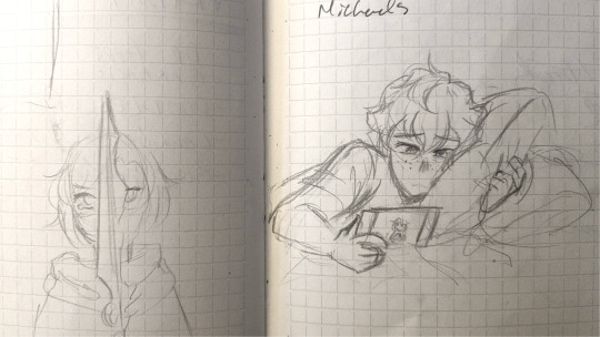
And I redrew it, no joke, four times before I was satisfied enough to start colouring 💀
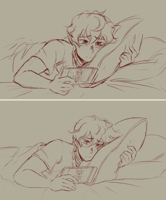

the second one was close, but i tried to line it differently than usual and it just Did Not look how I wanted it to so I had to go back and try a different way. Am currently in a style shift phase which makes it very tricky aha.
The only other big thing that helps with speed is practice. Which is everyone's least favourite word, I know. I've been drawing for a long time so I'm very familiar with both my tools (shortcuts and program) and how to draw the things I most often do. So the biggest hurdles I run into now are just if I am trying to do something new or that I don't quite know how to execute. But even in those instances, I have habits for what to look for and how to approach so I usually can overcome them fairly easily.
Being borderline obsessed with something you wanna draw also helps tho. I started drawing fanart for RWBY at the end of 2020 and drew more than 60 fully rendered pieces in 2021 alone. Which is something I'd never done before. Not just your style improves with that amount of practice.

But even if you're not super fast, there's nothing wrong with that!!! We live in a time where art is seen more as content than it is art which makes it seem like speed is something to prioritize... makes me sad.
What people post and how often they post it isn't necessarily indicative of how quickly they work. A lot of styles, especially more painterly types, can't even be created that quickly. And most artists have lots of unfinished WIPs and things they struggle with too that their audiences never see. There's no one right way to do anything. In my opinion, the most important part is just to make sure you enjoy the process. Any reward that comes outside of that is just a bonus 💕
21 notes
·
View notes
Text
Full one by one pics and ✨commentary ✨:

George has the most challenging pose. Seriously. I had to look up so many things. He was one of the easiest to design with how simple the skin looks, a lottttt of creative freedom. The idea was to give him mad scientist vibes, it just goes with the goggles. The glasses being red tint is a ref to the colorblind video.

Dream is entirely green. Green man is green what can I say. Still Wild how the fluffy af hair actually look Somewhat similar to irl Dream. I gave him shorts and cloak to highlight(AHA) how he’s fast, agile and tricky. Kept the color scheme as small as possible. He is so green. I love him.

Sapnap was my MAIN back in the days and the bias is pretttttty clear to see. His pose was not hard but sketching this one especially made me realize I gotta be careful with the composition. This guy hold the entire pic together seriously. The lace up and bow thingy is my fav part. Had to change the color cause it was near invisible.

Badboyhalo was surprisingly hard to draw. Like damn I redo the legs about 3 times and kinda just gave up on perfecting the hands. He was 100% the easiest to color tho. Wonder why 😂. I’m really proud of how the face came out, this man just sparks joy I gotta capture that!! The blue thingy is. Intentional.

Antfrost brings a silly smile to my face when I drew him. Decided to change his head shape from the original design, now he looks Extra Fluffy and SOFT. Yes I looked up cats references, yes it look almost half an hour, no I was definitely not distracted with cute cat pictures— AND THE VELVET PIN. I’m kinda sad it’s not visible in the pic? The pose is Perfect for Ant and I wasn’t sure where to move the pin. It’s still hella cute here anyway look at himmmm

AwesamDude I have Beef with. Major beef. Actually with 2021 me. What is with the design? Why are there so many things going on? How does the chest plate work? Why is the crown thingy so detailed? Wtf were you trying to do with the hair? Seriously the actual sketch looks almost nothing like the header. I spent So Long trying to figure Something out. Ended up looking at Vergil pics, as you do. Was a little confused with the hands too but that’s old news. I mean, yeah I’m hella proud of this one it Somehow turned out fine but I straight up lose sanity figuring this one out.
Bonus : first first rough draft


MANHUNT CREW!
Pose from Ressha Sentai ToQger
Designs by me of 2021
Look at them they’re so cute. I miss manhunt something fierce.
#AHHHHHHHHH seriously it took me 19 days! i started on the 31#usually I ramble in the tags of the post but there’s So Much to say#and the one by one pics too#if you wanna shade this for practice contact me#I can give you the png#I do not have enough energy left to render#this has been soooooo fun tho
139 notes
·
View notes
Note
what kind of things do you consider for new designs?
i keep a little ongoing note open with random skirt ideas i have. sometimes this is a subject, sometimes it’s a color palette or a general vibe or some combination of the three.
then i usually try to mockup a really simple version of the idea, which i sometimes share with y’all. it’s at this point that i consider things like composition and wearability, which are SUPER important with skirts and play a huge role in whether or not i decide to create a design
here are the rough sketches of my bluebonnet and desert sunset skirts vs. the finished products
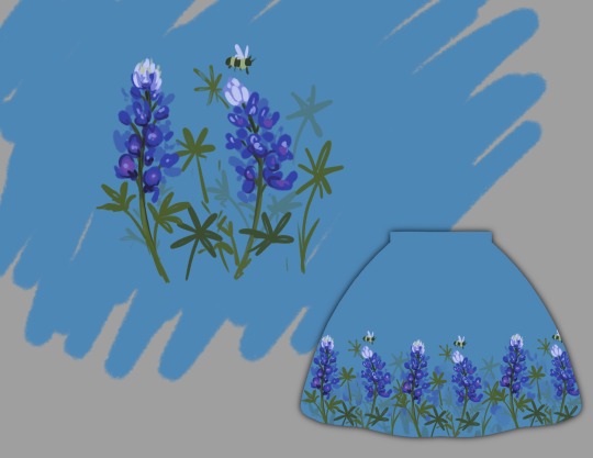


sometimes my initial concepts work great right off the bat and sometimes they need a little workshopping.
here’s a couple of the designs that have hit the concept stage but that i’m not quite ready to take to completion.
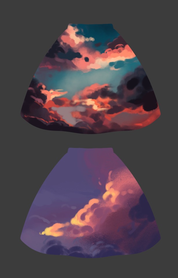
the cloud designs are tricky because skirts are drawn on a circular template so mapping out that composition in a way that is interesting and wearable is going to be a hassle. i think the top cloud skirt has a more interesting and unique color palette and composition that are compelling to ME, while the bottom one has a more wearable color palette that will probably sell better, tho i’m not sure composition will work on an actual 3D garment. also i need to do more studies of clouds because i’m not yet confident in my ability to draw them on a large scale (and the skirt templates are LARGE)
the book skirt is just taunting me personally. i don’t think any of these compositions are successful and at this point i’m not even sure i like this color palette. i’ll have to do another round of concept sketches when i feel up to is
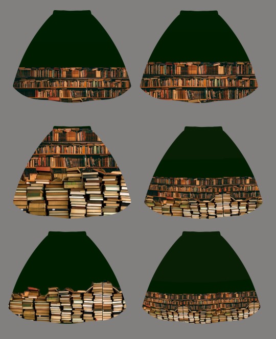
aaand the last thing i consider is whether or not i actually want to draw something. a lot of my skirt concepts die before or after the ideation phase simply because while i think the idea is cool, i have no desire to draw it.
[eta] also, as a general rule, i try not to design things that could be found at a larger retailer, since i could never match their prices. and i also try not to follow any short lived or seasonal trends. i want my garments to be worn for years and years. just because they’re synthetic fiber doesn’t mean they have to be fast fashion. that’s entirely up to how they are used and loved and worn.
399 notes
·
View notes
Note
Do you have any advice for artists trying to teach themselves how to draw?
Hi dear!!
My advices may be not very useful, but I think what is important to do when you want to start drawing, is to cast aside any ideas of you reaching certain level and "being as good as someone". You're starting something new, maybe absolutely from scratch or ypu already have some sort of experience, but anyhow - this is a huge step and you should carry the pride of having strength teaching yourself something new throughout your artist journey!
So with this being said - support yourself and encourage yourself. No one is starting good, but like with any new skill, or a skill you've already developed, the practice is the key!
To the practical advices!
I'll try to list down a couple of things you can do as a newbie, but please keep in mind that those methods may not fit you and your comfort and that is completely okay. The thing is - I've been drawing my whole life, that's why most of I developed came naturally because one day I've started and never stopped since.
But what can actually help you "feel the soil" is:
- for any media, try watching speedpaints, or just drawing videos on Youtube!
-there is a site called skillshare, I've seen a lot of influencers advertising it, BUT I have no experience to actually suggest it is a trustworthy platform, but I've seen some interesting drawing courses.
- the site Quickposes is a great place with many human and landscapes references for studying, well, a lot of things! Be it learning how to capture a dynamic silhouette, learning anatomy, learning lighting, shadows, composition.
- if you're more into theory - I'd still suggest YouTube. No particular content maker, because myself I didn't stick to one video, and watched a bunch of them
-Tumblr! There're great art tips that you can find, even links to books and useful sites C:
-And, this may come off as a little tricky, but do look up to other artists! Try to point out certain details in their style that you like, try them out, teaach yourselves the process. It's not copying, more like studying from the more experienced person. There was one saying I saw on this site actually. It said something like: "You can't do good if you don't know what is good." I did point out in the beginning that you shouldn't look at someone else and wishing to be as good as them, and I still stand by it, however you need an example of different styles, different approaches to create an image in your head, to catch the interest in learning different techniques.
Tho, it's more of the latter "problem". Finding your style and your comfort zone, I mean.
For now - start drawing, capture anything you want. Let yourself draw for the sake of drawing, make the process be pleasant, joyful, fun. Share your drawing with people who you trust and who will support you. Boosting your confidence and being in a comfortable environment is the key for you to grow quickly and love what you create no matter what skill you have. You'll always progress if you practice, even if the progress didn't fit your expectations.
Hope this mishmash of information helped you! If not, it's absolutely okay, but do still keep in mind the last paragraph. It is addressed to any kind of creator, actually, and is a general advice that myself I understood only some time later in my artist journey.
And here's a funny pic for you all

#support the artists#artist help#artists on tumblr#art tips#tips#drawing tips#levikra wholesome stuff
63 notes
·
View notes
Text

short answer: planning definitely makes my life easier with comics! i do messy thumbs on paper where i get issues sorted->digital sketches->finals. taking advantage of the comic format helps me convey mood clearly - stuff like page turns, adding/breaking/removing panel borders, panel size, bubbles...all are unique to this medium! i try to be aware of how i can use those as tools to control the way a reader will move through the comic, and how things are paced. if you utilize them well, it’ll read correctly!
an excessively longer answer after the cut ! v
some artists are great at working more stream-of-conscious, but if you struggle w it then spend more time in your thumbnailing phase. personally, i try to solve all my writing/composition problems in the thumb stage and then, when penciling, make changes spontaneously if it feels right - i like to go with the flow a bit. (Check It Twice was 23 pages in thumbnail form, then became 18 as i consolidated the story in the finals!) that’s just me tho - some people are more rigid, some more freeform ... knowing yourself will help, so do experiment! but definitely spend time in the thumbnails! map out everything you need there, including word balloon placement.
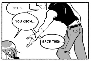
speech bubbles are part of page composition AND a storytelling element! bubbles don’t have to be fancy and you don’t have to constantly be doing tricky things with them, but your page will turn out better if you consider their placement when you plan; how can your bubble position further the emotion the characters are feeling? (example: when i want characters to feel tense or insecure about each other, i’ll place the balloons between them - a literal wall that only the reader can see; if i want them to feel close or intimate, i’ll place the bubbles on either side of them - to push them together, visually. or if someone is ashamed and wants to hide, maybe the bubble hides part of their face, etc etc. you can be clever w it!) and how can they tell the reader where to look next? it’s taking into account both panel composition and page composition, and unifying them for your purposes!
paneling doesn’t have to be wild to convey every feeling, but considering the mood you wanna make will help. if someone is frantic and confused, i’d angle the panels so things feel off-kilter and quick. if it’s a moment of introspection, maybe a few big, wide panels will slow things down. here’s an example from the dance scene in Capriccio!! the first page was the original sketch. the second page is the final sketch - i went from 5 panels of the dance to just 2. adding less panels that are wider slow down time, whereas the moment-to-moment panels in the first page feel fast and like the dance is over in just a second! but the larger, close-up frame in junction with a distant shot are meant to make them feel like they’ve lost track of time to each other, and then this moment. (at least.. that’s what i was going for LOL you tell me if it worked HAHA)
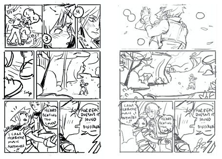
so that’s sort of how i think about that! i organize things with emotion and technical efficiency (aka how little can i get away w drawing bc theres so many drawings to make LOLLL) as my priority! and try to do things with intention... like, does zooming out in a frame have a purpose or did i just run out of ideas of what to show? (i.e. will it make the character feel isolated, or breath-taken, or change the passage of time, etc. if i’m not trying to say any of those things, can i show something more appropriate instead of just changing angle/panning around/drawing extra stuff purposelessly?) anyway... sorry that’s a lot of words!! these are just some of my thoughts abt it! while i do work on comics professionally, i’m absolutely still learning too! i’m not an expert, but this is a glimpse into my thinking while i work; everybody has a diff approach to paneling and balloons. at the least, i hope this will lend itself to helping you figure out how to do you !! if you wanna study more panelling stuff, i honestly recommend reading shoujo manga - it taught me a lot haha!
you can do anything you want in comics, so go wild!!
339 notes
·
View notes
Note
Hey raf can you make a tutorial on how you made the the last edit?
Oh the zodiac one? Sure! Alright so this might be a slightly long post so I am outting this under the cut!
Okay so first of all, yoou new to make a new composition/file on photoshop. I am making mine 540x800px but you can use whichever size you want with the background color of your choice. I chose white.
Now, step two. Open a transparent png image in a new file

(this is how the background should look like of the file on you open it)
Now, click ctrl+j (for windows. I think for Mac its command+j) and drag the file into the previous composition you created.

should look like this.
Create a new folder clicking on the little folder option in the layers panel.

Select the image layer and drag it inside the group layer. Add colorings like you wish but remember to add a clipping mask to all the coloring layer. The colorings should should look something like this:

NOTE: if you’re gonna use a psd coloring from a resource blog, just add a clipping mask (by right clicking on the coloring layer > create a clippng mask) to all the layers on it.
My file looks this with the coloring right now:

Now here comes the tricky parts.
(before that, I would suggest you left click on the layers folders and make sure that not all the layers are clogging the layer panel.)
so.. create a text layer under the folder you put your image into. I am gonna use the font showcard gothic font size 30 in full black.
it looks looks like this rn:

now, I am gonna go to windows > animation > frame animation.

Now, I want to highlight the “talk” parts of this image. Here, the talk text shows up 5 times. So I am gonna create 5 frames.

Now, I am gonna duplicate the text layers 4 times so I have the same text layer 5 times (or according to the number of frames I have). If you have 6 frames, then duplicate 5 times so you have 6 text layers in total.

Now, select all the frames on the animation panel.

right click and select do not dispose and set the frame rate to 0.2.

. Should look like this:

Now select just the first frame. Go back to the text layers and make all but the first text layer invisible. Something like this:

click on the text layer with the text tool and change the font color for the text you want to change in the first frame. Like I want to change the first talk to red. So I will do that.

Now I am gonna duplicate the frame once so that the frame is displayed for a bit longer when the gif is made. The duplicate frame should be automatically turned into frame 2.

So now, go to the third frame and go back to the text layers and make all but the second text invisible. Like this.

Now change the color of the part of the text you want, I changed the second talk part to red again.

Now duplicate the 3rd frame again! Keep repeating this process till the last frame and text layer.
After all that s done, create another folder on the layers panel. Select all the text layers and drag them inside the folder. Select all the frames again and now Lower the opacity of the layer as you like.

(I am gonna lower it a bit more to suit my preferrences)
for me, the animation bar is already set to forever, but if yours isnt, click on the little drop down menu beside the once in the bottom of the animation panel and select forever. Tht will make the gif loop.
If you want Dan to have a shadow, click on the folder icon on the layers panel in which the image of dan is in.. Now select the dan layer. Click on the little the fx icon . drop shadow. Use this exact proportions if you want one like ine:

now you’ll notice that even tho I have all the layers selected, the drop shadow didn’t occur on all the frames. So to fix that, you’ll select each layer individually then select the dan layer and add the exact same settings for the drop shadow that you used at first.
Thats pretty much about it. If you want to, you can go to the time-frame animation panel and turn all the layers in to a smart object and use over laying gifs on it like fading stars is s0mething.
I’ll post the end result!
36 notes
·
View notes
Photo

A Pyro from TF2, obviously the best character in the game because he/she wears a gasmask and has a flamethrower! And a Balloonicorn!
animated turnaround
This was a gift from Neonwo to Zelendur and I was so eager to make this because Zelee asked me to sculpt this a long time ago and I never really had time for it. So being able to surprise her with that now was just fun! :D It’s her custom pyro, that’s why he’s wearing the broiler and hat and that’s why everything is pink. I had a blast with this! Extremely fun scene to sculpt, I just enjoyed it a lot. The fire is made of plasticard again, which I'm starting to get quite fond of! I tried to make the color of the fire bounce off a bit of the surrounding because I really like that in figures but I think it's kinda tricky. You can see how the fire reflects on his head and the horse a bit tho and I'm pretty happy with that little effect. The commissioner also gave me the chance to work with glow-in-the-dark pigments for the the first time ever. Hopefully I can practice this more and do a lot of cool stuff with it in the future. This is also the first time ever I did a composite shot so that foreground and background would be in focus instead of just one of them. I need to find an easier way to do this because I had to do it all manually and that was quite a bit of work. Happy holidays ya'll! <3
#pyro#tf2#team fortress 2#balloonicorn#pink#heart#flamethrower#chibi#fanart#finished#figurine#figure#sculpey#clay#acrylics#commission#glow in the dark
258 notes
·
View notes
Text
plgdwndevd|xviii
oy. My brain is jelly. Got a complete vocal take for Monday, using the mc909 to drive the bansh. A/Bing it with the SY35 vox on Tuesday, though, I’m finding the SY is a little more interesting. Perhaps I was just too gentle with the 909-- I’m interesting in re-recording that take with higher volume (which will be easy af because it’s all saved as MIDI in the 909) and then perhaps again with the SY35 and comparing them directly. Prob not today, as I am so immersed in these two songs atm that I am hearing them all night long, on the descent into sleep and every time a cat or bladder wakes me up, and again when I wake up. I think I need a bit of space.
Sent both to three more friends, although listening back to the files I sent, seems like the vox may be annoyingly quiet on these mixdowns. ALSO contacted the famous engineer I have been hoping to throw Covidcash at for a pro mix/master treatment and they said complimentary things about the tracks. I’m at a weird place with them now-- definitely over some kind of hump, having finally achieved the goal of having all the elements in place, feeling a bit freed in a sense. Freed enough to maybe start on a new cycle, applying all the lessons about accuracy and density and order-of-operations etc to whole new compositions, instead of digging back in and nickel-and-diming the remaining 5 of the melo7. I really like those other 5, and I think they make most sense all together as a set, but there doesn’t really seem to be a point to trying to make them any more persuasive than they already are. I think I have to get out from under them for a spell... take a day or two, try the Monday rerecording strats mentioned above, do a final pass of polish on both Mon/Tues, then send them off to the engineer and uncork the next cycle. When I get mastered Mon+Tues back, I’ll cast them about and hopefully someone will be interested in the full set and I’ll go back invigorated and blast through the vox recordings. And in the meantime, conjure a few new compositions which apply the lessons I’ve learned in the past 3 months, so that if nobody exhibits interest in bankrolling the mix/master of the remaining 5, I’ll have newer, meaner babies to self-release into the wild.
Starting a new cycle at this point is tricky because when the m7 were first born, there was only possibility, things just fell out/through my hands with nothing but nothing to be judged against. Now the possibilities exist on the other side of a little jumble of ideas and attempts that have been crystallized-- there’s basically a chaotic labyrinth between me and the coming songs. Somehow I have to resist the urge to start editing the moment they arrive. It’s funny because as much as I feel empowered and (potentially) improved by what I’ve learned in from the efforts with the m7, and excited/eager to build on that foundation, it is only by deliberately casting into the unknown that I can really protect myself from immediately over-managing the inspiration on my next foray. Without a big chunk of unknown, nothing can flow, nothing arrives as itself, and the unconscious becomes unfairly dominated by the ego far too early for a truly fruitful collaboration. Emptying my mind or putting the brakes on over analyzing the initial steps of the next go-round would be most desirable, but I have still never really found the “emptying” switch for my own chattering eeg. Traditionally, some untried idea about gear or workflow or constraint-generation serves to provide the BCOU. I had long intended to try and lean “orchestral” on the next cycle but if the next step past the m7 involves Less Mess (re:density,+ rhythmic precision) than perhaps the distinct plucky strings of the world SRX are the place to go? Kinda blows that the mc909 can’t take 2 SRX cards at a time like the xv5050 could, because I would like to be able to invoke the bright plucks of that world set with the deep Wind bench of the orch card.
The time of day makes such a huge difference on my attitude towards creating as well as on the specific creations. It is tempting to wonder why this is, tho I don’t think anything useful can really come of such speculations.
0 notes
Text
Final Design
After following the YouTube tutorial I decided to Ed more information about the album and shapes to fill in the white void and the huge gaps my work seemed to have.
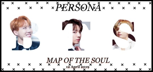
My first try was with BTS Leader RM, on the left side you can see how empty the poster seemed at the beginning and I was on the verge of adding the shake and pattern.
What I also decided to add was a subtle coloured shadow on “Map Of The Soul” as it looked more completed and it made it a bit more aesthetically pleasing and to make sure everything was aligned in the middle I used the alignment tool so all the words and image would align in the middle of the page.
For the hair sticking out of the letter B, I used the Japanese flag tool and used a brush to cancel out the areas of the hair I did not want and to make it pore precise I used the magnetic lasso tool to go over it and create a selection, which I used to get rid of unwanted areas.
After making this I got feedback by Sophie and she said she enjoyed the look of it much more than the original plan and was simple and the most good looking poster.
So after the feedback I went on and created the rest with the other members.
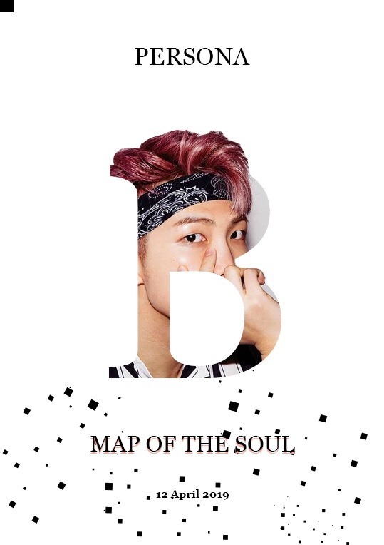
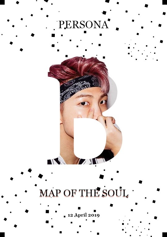
After trying to recreate some more of these Letter Potrait using other characters and letters, I asked for another feedback from my peers to see if it was working and if my final idea would work out and to see if they liked the way it was coming out.
The format of the pages was A3 on Photoshop and I decided that I’d make a big conjoined poster instead of different ones with different letters, so it would form like a big poster or even a billboard.
To make this I opened a new file on Photoshop and increased the inches A3 x 3 only for the width tho so they’d all have equal spacing between them as well.
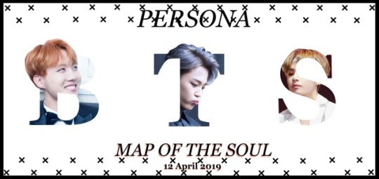
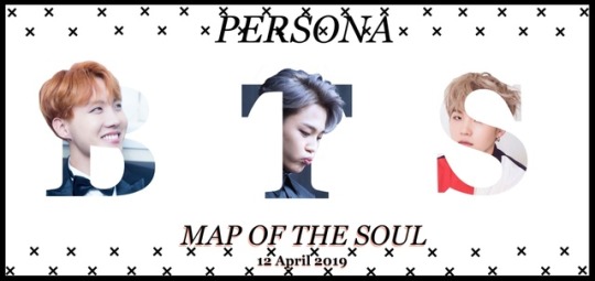
As you can see below the second poster is different from the first, my idea behind it was to make 2 slightly different ones to see which one would work the best but I like both of them so let’s say someone was about to buy this product, they would have the choice to choose their favourite, so I decided that I’ll be making them all a little bit different.

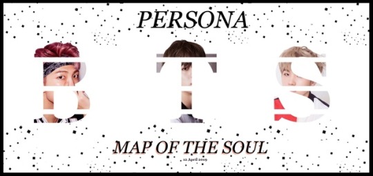
For the rest of them I changed the shapes,the patterns and added the remaining characters. A struggle that I went through with this was with the hair for the letter ‘S’ because I formed a unique pattern that only the hair would be mainly coming out of the composition and with the letter as it was a bit more tricky as you can see even tho I used the ruler setting to match the hair tol with the others so they all have the same height the letter S where I added Suga in it is a bit lower as this technique doesn’t particularly suit the letter and the font but it did not look bad so I stuck with it.
With the second version of the poster I used x’s to make a pattern the idea of making all the members look at the camera didn’t work as I wished as it was hard to find images of them looking directly in the camera and with hair that would be sticking out of the Letter Portrait but it still looks very pleasing as an end product.
0 notes
Text
1. BASICS NAME: Hannah PRONOUNS: She/Her SEXUALITY: Tis I, the Bitchiest Bi ZODIAC SIGN: Sagittarius TAKEN OR SINGLE: Single pringle THREE FACTS: -I have never been in a romantic relationship -I have been trying to write a book since I was in the fourth grade (lol) -My dad died (extremely unexpectedly) of a heart attack on January 3rd, 2014 and tbh I’m not sure I’ve really recovered from that but ¯\_(ツ)_/¯
2. EXPERIENCE HOW LONG (MONTHS / YEARS?): So many years (at least 8 or 9, though I’ve always been writing stories and building worlds with my friends so?? It kind of just feels like something I’ve literally always been doing y’know?) PLATFORMS YOU’VE USED: IMVU (#yikes) facebook, twitter, forums, tumblr, i think possibly deviantart?? who knows, all the things BEST EXPERIENCE: This is sort of a tricky question because I’m not really so sure I’ve ever had an experience that I would necessarily label bad? I’ve had some issues here and there, and disagreed with people plenty of times, ye, but I wouldn’t go so far as to call them bad overall experiences, just some sour notes in a much bigger, brighter composition, because when it boils down to it I’ve always learned from the experiences and they’ve all worked to shape me into a better writer (and person.) So what I’m getting at is that it’s always the best experience because it’s experience, even when it’s not particularly fun.
3. MUSE PREFERENCES FEMALE OR MALE: If you went over all my muse history ever I’m pretty sure(?) I’ve written more boys than girls but I honestly don’t really have a preference that I’m aware of? At least not a gender specific one. MULTI OR SINGLE: Single for the most part - however, if all the muses are directly connected it makes sense to put them all on one blog (i.e. the Haven and the indie url I’ve saved for a modern AU of a good handful of my killjoys.)
4. WRITING PREFERENCES FLUFF, ANGST OR SMUT: I do love the fluff, but everybody knows a good angst thread is great. I’ve never written a direct smut thread with another person but I’m definitely not opposed?? I’d have to be pretty freaking comfortable with the other writer tho, just because it’s sort of a taboo thing kinda? PLOTS OR MEMES: *insert ‘why not have both’ taco girl here* LONG OR SHORT REPLIES: I’m cool with a nice little short reply thing but I’ve also been know to write literal 2000-3000 word replies before so ... both again? BEST TIME TO WRITE: Whenever that muse hits (which could be anywhere from three seconds after seeing it to three weeks later tbh) ARE YOU LIKE YOUR MUSE(S): Some of them a little bit, yeah. Less now than they used to be (both Tech and the original version of her mom started out as self inserts if I’m going to be totally honest, so, that’s a thing. Obviously they’ve both greatly deviated since then and become their own characters but that doesn’t change the fact that that’s how they started..)
TAGGED BY: @jediiwrites TAGGING: ¯\_(ツ)_/¯
2 notes
·
View notes
Text
kinda wanna make a kh tarot so have some rambling:
first off I think with the Minor suits I’d keep Swords and Wands but make Pentacles Shields (or munny but I really want to evoke the Sword Wand Shield choice of KH1′s awakening) and Cups Charms
Kinda wanna make the Minor Court Cards stray from those to be Dusk(Swords?) Dawn(Cups?) Shadow(Pentacles?) and Light(Wands?) after seeing an oracle deck tho so we have things like “Queen of Dawn” and “King of Shadow” cuz yanno hella cool (might also convert Page and Knight to Princess and Prince becuz of royalty motifs in KH)
but this theoretical setup is not only confusing from a perspective of suddenly changing the suits and forcing the reader to learn which court cards go with which previously established suit, it’s also tricky for interpretations because it can lead to some counter-intuitive things! To get into some slightly nitty gritty about Tarot symbology:
say King of Wands becomes King of Light and that is INSTANTLY a Sora concept right from the get-go King of Light=Sora DUH but in this theoretical situation when you get down to meanings someone more in line with the maturer perspective of a King (traditionally the court cards are Page Knight Queen King and this reflects a person getting older and maturing so Page and Knight are girl and boy where Queen and King are woman and man if that makes sense??? also sorry for the gender-normativeness) and the wild charisma and inspiration of Wands (this is my opinion) would be Axel/Lea, and Sora is more a Knight (or in this theoretical case Prince) of Wands. whoops.
Or say Roxas ends up as part of the Cups court cards since his character is so much about intuition and exploring himself and emotions- well those look like they’d be Dawn in our theoretical set up, for a character primarily associated with Dusk, which is going to the Swords suit, which while Roxas can also fit the search for truth found in Swords, I think it’s a little too clear and damaging to fit Roxas himself.
Or Kairi becomes Queen of Shadows since Shadows may be Pentacles and to reflect her warm and generous nature, but the title directly and absolutely makes no sense when she is a Princess of Heart and especially when there’s the potential for a Page/Princess of Light which sounds more in line with Kairi.
that mess aside, also I feel there’d be more of a focus on the Original characters over Disney and Squeenix because I feel they fit the feel more. Maybe a Disney of FF character here and there, but definitely a focus on the original characters because they’re more KH I suppose??? reasons??? eh.
I already have some idea for card scenes and meanings, though not all of them and not to mention making the card composition work in traditional Tarot size (which feels weirdly narrow to me) and designing a reversible back (because even if that’s a controversial topic it’s not that hard to keep ur cards in proper order and it should be an option for those who want) and also like. making sure everything’s carefully considered and makes sense in convoluted KH lore and from brief impression as well as working with traditional meanings.
tbh I might just make a Majors only thing, put the files out there free to print, depending on reception make Minors and kickstart for fancier deck printing and all that.
IDK I just rly wanna make a KH tarot deck.
#Katie rambles#REALLY BIG AND PROBABLY BORING WORDBARF BELOW#at least I didn't work through all my ideas for the cards I am thinking of
8 notes
·
View notes