#i used cs5
Explore tagged Tumblr posts
Text


Let me go with you. Eh? I haven’t invited you yet. So, you're leaving your boyfriend alone here, Peem? I’ll help Auntie Pui cook. What? Call me nicely and promise me you’ll introduce me to your family.
WE ARE | EP14
#we are the series#we are#we are series#phumpeem#pondphuwin#phuwin tangsakyuen#pond naravit#my edits#weareedit#hmmm i haven't been using cs5 for these gifs and idk if i like them lol
312 notes
·
View notes
Note
can i ask how you get the realistic oil paint buildup/layered effect in your art?
it's really easy to make in photoshop as long as you have a bunch of textured brushes; what i do is i create a new layer on top of everything else and set it to multiply mode along with a bevel and emboss layer effect, like this:

then set the brush to a pure #ffffff white. This makes the brush strokes not have any color of their own but the emboss effect remains without messing with the colors on your piece. I play around a lot with the settings shown in the picture above, depending on how i want the texture to look. Add on the highlights and color burn on the shadows make the embossing look deeper
I also set the eraser to use a texture like the brushes so if the embossing gets in the way of a detail or anything i don't particularly want to be textured i can just erase a little bit and it won't look unnatural
#ask#i um only really use ps cs5 so that's how it works for me but i suppose other versions of ps have this as well...they gotta#and for csp and other software... i have no clue how to help but perhaps csp has an equivalent
23 notes
·
View notes
Text
Teto Territory :3

#The Artstyle in the Video is so Cute#I couldn't help myself but draw it (ㅠ v ㅠ)#I used the Flash Cs5 Brush and Yellow ish shading for a more Nostalgic effect! :)#Drawing Her Eyes was the Best Part :3#This is My Favourite Song <3#Kasane Teto#Utauloid#Teto Territory
22 notes
·
View notes
Text
“Please help me find a doctor. He’s still warm.”
#pitbabe the series#pitbabeedit#pit babe bl#charliebabe#babecharlie#thai bl#Thai bl edits#bl edits#thai actors#thai series#pavel phoom#pooh krittin#pavelpooh#asiandramaedit#asiandramasource#dramasource#Steph edits#i can’t believe the abo show is what got me back into giffing after 8 years#also…. this is my first time giffing in 8 years so sorry for quality lol#last time I touched photoshop I was using cs5#now I’m using 2023 😶#it’s a learning curve
113 notes
·
View notes
Text


buffy + friends | stake throwing
#btvs#btvsedit#btvs gifs#btvs edit#buffy summers#buffy the vampire slayer#buffy x oz#buffy + friends#[mine]#i could maybe make this a running thing#i love buffy and her friends#sorry these look very bad#the way i used to sharpen in cs5 does not work as well in this version of photoshop#ID IN ALT#oz osbourne
39 notes
·
View notes
Note
hiii sorry to ask but what do ya make ur gifs with? i like how they turn outtt
Heyaa! Pls don't be sorry!! I'm always happy to talk about gifmaking stuff 🫶🏼 for my gifs I use Photoshop and i try to get always the highest quality video content ☺️
Edit: I also forgot to mention that for som stage gifs I use vapoursynth before opening Photoshop since the videos need a little pre-processing
#i use a little older version of Photoshop but it gets the work done#most of the older photoshops had the most pretty gifs#cs5 will be forever the superior one it had a flawless sharpen setting#i use cs6 bc i like to do fun animations on typography sometimes but yea
11 notes
·
View notes
Text

Fellow artist friends. I have a very important question!

What program for drawing do y'all use that is free?
#screaming internally all day everyday (ooc)#ooc#//trying to get my family's restaurant logo done before they open#i haven't done digital art in ages gsjvgkfd#i use to use paint tool sai tho but it seems we gotta pay for that now i think though it has a 31 day trial#i use to draw on photoshop cs5 but it doesn't seem to have done my art any good#it's also been along while since i've actually drawn...
2 notes
·
View notes
Text
sometimes i look into modern gif making tutorials and im ???? my brothers and sisters in photoshop has the art of the open image sequence been lost. have we evolved backwards. why are you loading images into stacks and reversing and setting speed manually and having to use sharpening actions (for up to 250 frames, wowza!) when, in fact, you could do none of that and easily work on a smart object. society has evolved past the need for loading images into stacks!!!!!!!!!!!!!!!!!
#photoshop#gifs#i remember when we all realized theres a better way#and the cs3 vs cs5 wars lmao#disclaimers in the psd download that it was made for CS5 because it uses vibrance as an adjustment#and that it will NOT work in plebs cs3#or god forbid cs2
2 notes
·
View notes
Text

#mine (as in my work i made this in photoshop cs5 it sucked)#fob8#fall out boy#so much (for) stardust#SMFS#icon#free to use#blinkies#(kind of...?)#2000s#(im only writing that because i tried to imitate the icons we had all over LJ and myspace lol)#(also ps cs5 sucks i wish we still had avatarmagic)#emo#old emo#(as if!)#my art
15 notes
·
View notes
Photo

This is still the best, most stupid thing I ever did with my photo editing software powers.
#haikyuu!!#iwaizumi hajime#bokuto kotaro#asahi azumane#wakatoshi ushijima#the ABSOLUTE SHAME that i feel that i had to look up asahi and ushijima's names >.>#i remembered that oh shit i also made bungo stray doges buuuuuuut#this is totally stupider since it was an exercise#from some photoshop cs5 elements? book that we used in class#'spell out aces with aces (playing cards)'#aces??? you mean like my volleyball boys??? they're aces too ya know???#i want to draw some stuff but i think i'm going to be busy#so i'm just gonna repost or newly post? some pretty old stuff in the meantime
8 notes
·
View notes
Note
heyy, sorry to bother you. what app do you use to make your gifs?
Hi, it's no problem at all! I use Adobe Photoshop CC
#Ask#Anonymous#idk what actual version of cc i'm on but the gif-making format i use has been pretty much the same since cs5#i have it thru my school/work but if you need *links* i know several resource blogs that could help
0 notes
Text
god I just don't have the security to risk turning off my laptop security just to get adobe animate 2021, flash cs5 it is
(if anyone happens to have safely downloaded the adobe animate 2021 file from archive.org lmk)
#lanomin says#listen i fully accept that its most likely fine but i just don't want to risk it#and cs5 was a good year i still use ps cs5 and it fucks
0 notes
Text
Ahm, hello Life is Strange fandom- I got an announcement
I have been working on my own LiS fan visual novel

This is VortexVN,
You play as Victoria waking up from a hangover with no memory of the week prior, you are tasked with piecing together what happened between her and one of the 4 love interests.

And of course the love interests are:
-Chloe (Chaseprice)
-Max (Chasefield)
-Kate (Chasemarsh)
-Rachel (Amberchase)


The game starts with a quiz; you unlock a route by picking answers related to the character you wanna romance (they are very obvious)
It takes place in an AU where the events of LiS1 and BtS didn't really happen and there are no special powers, Victoria's still a bi tch- I guess that's her special powers.
Think of this game as a spiritual successor to Love is Strange by Team Rumblebee rather than Life is Strange 1


Gameplay so far is your typical point and click visual novel affair, you will be given options to explore rooms, examine objects and talk to other characters- the interactions will play a crucial part in how the game ends,
You can win the girl or get rejected or worse... It will depend on how Victoria carried herself throughout the game,
Mistreating certain characters may prove to be a dealbreaker for the love interest,
Each girl has two close friends in the dorm that you should not upset (I'll reveal who in the guide pdf)
This game is also perfect for Victoria haters as you can ruin her life

The game has its own journal system that will be different depending on who you're romancing, it also comes with a read button (I blurred most of the text so you can get curious and play the game)
Read button will display the journal content in Open Dyslexic font
In the demo you'll only get to explore Victoria's room and the dorm hallways and you'll get two encounters from Juliet (Showers) and Alyssa (Hallway)

VortexVN is still in development, I have finished part.1 of the project and will start polishing it soon- the initial build of part.1 will be available to play as a demo!
The cutscenes lack color and proper shading at the moment and you will find placeholders as well, the art style is all over the place- this will change after the polishing phase
Download links:
Mac and Windows
Web browser ver (I don't recommend that you play it on mobile, also the web version lacks animation and takes forever to load graphics)
programs used:
-Renpy (visual novel engine)
-Photoshop CS5 (Drawing/rendering/animating/designing)
-Clips studio (Texturing)
-tablet: XP-Pen Artist 13
Note: I'm not monetizing this project nor do I claim ownership of the Life is Strange ip, all materials and assets presented in this visual novel were either created by me or are royalty free- I did not lift anything from the games via data mining or by leaks
This game is not a response to or a gotcha at Life is Strange Double Exposure or Deck Nine, I didn't really dislike the game
Besides, I've had the idea of a Victoria centric fan game since the first LiS back in 2015
I'm open for feedbacks! You can DM me or reblog this with a review or something- maybe write a comment.
#life is strange#lis#victoria chase#chloe price#max caulfield#kate marsh#rachel amber#chasemarsh#chaseprice#chasefield#amberchase#life is strange before the storm#lis bts#alyssa anderson#juliet watson#VortexVN
686 notes
·
View notes
Note
Hi! Can I ask how you did the double exposure gifs for your merlin set? They're beautiful btw!
heyy, thank you!! of course!
it's actually not very hard, the trick is to find the right shots for this. here's how i did it (reference gifset), under the cut.

for this tutorial i will be: — using photoshop cs5 on windows — assuming you know how to make gifs using the timeline — have basic coloring, sharpening, groups, and layer masks knowledge
I. CHOOSING THE RIGHT SHOTS
the ultimate trick to pull this off is to choose the right image. in order to do the double exposure, you need a silhouette shot that has these:
a defined and dark silhouette with a background that is not too busy
enough contrast between the silhouette and the background
the silhouette should take at least 50% of the space
not too much movement
here are a few examples of why they work and why they won't:
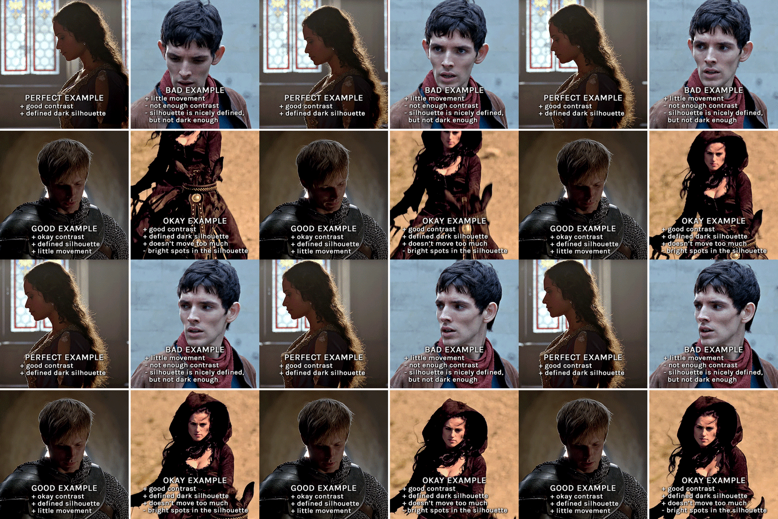
gwen: perfect example since this shot is already quite contrasted with a defined silhouette. there won't be a lot of work needed to make this one work.
merlin: not a great example because even tho there's a somewhat good contrast between him and the background, the silhouette is just too bright, not dark enough.
arthur: another good example, even if there are some bright spots on his face and armor. since he's not moving too much, you can definitely brush some black over him to make his silhouette darker (i'll explain/show later)
morgana: this one could work because the contrast is great, but of course her skintone is very bright against the black clothing. that being said, since the movement is not too bad, it could be possible to brush some black over her and move these layers with keyframes (as mentioned for arthur's example). i haven't tried it tho, but i think it would work well enough.
once you have your silhouette shot, you need another gif for the double exposure. what works best, in my opinion, are:
wide, large shots
shots with no to little camera movement (no pan, zoom, etc), but the subjects in the shot can have little movement of course
pretty cinematography/scenery shots
i find these are easier to find and make it work, it's not as "precise" as with silhouette shots. it's mostly just trial and error to see what works best with the silhouettes.
II. PREPPING THE SILHOUETTE
for the effect to work, we want a silhouette that's dark as possible. i'm gonna use the gwen and arthur shots as examples.
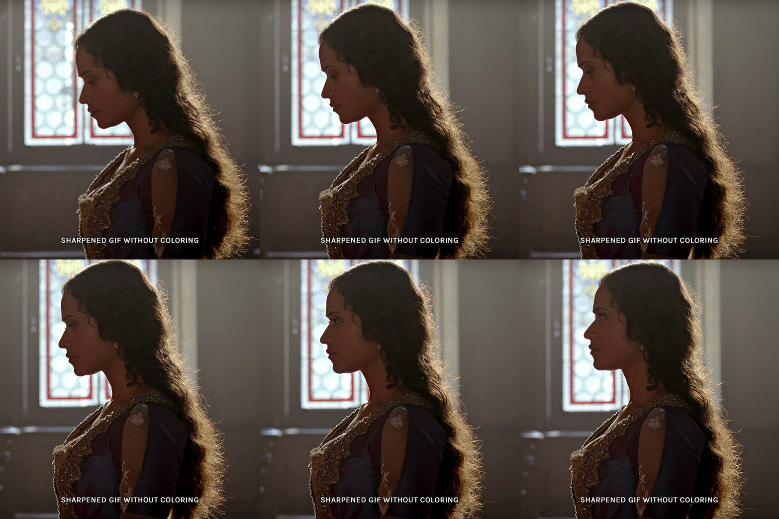
for the gwen gif, i started by sharpening, and then upped the contrast by quite a lot so her silhouette is mostly black, while retaining some nice details. i've used only 3 layers here:

selective color layer: in the blacks tab, playing with the black slider (value: +10)
brightness/contrast layer: added a lot of contrast (+61) and a bit of brightness (+10)
black and white layer: on top, its blending mode set to soft light and at 20% opacity. gives a bit more depth and contrast

then for the arthur example, i've also sharpened it first, and added contrast layers in this order (the skintone looks horrible, but it won't matter soon lol):
levels layer: black slider at 0, grey slider at 0.76, white slider at 104
selective color layer: in the blacks tab, black slider at +10
brightness/contrast layer: brightness at +1-, contrast at +47
black and white layer: on top, its blending mode set to soft light and at 20% opacity. gives a bit more depth and contrast
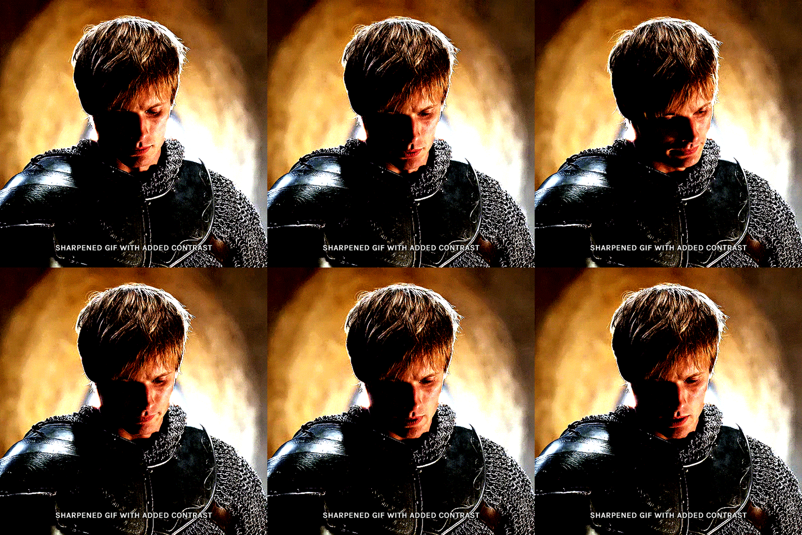
as you can see, half of his face is still quite bright. to correct that, create a new empty layer and put it between the gif and the coloring layers.
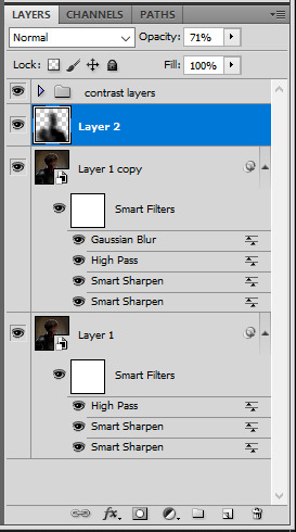
using a really soft brush and the black color, brush some black over his face and body on that new empty layer. you can edit the layer's opacity if you want, i've set mine to 71%. since arthur doesn't move much here, there's no need to keyframe this layer's position. for the morgana example, this is where you'd need to play with keyframes to make it work. here's where i'm at now after this:
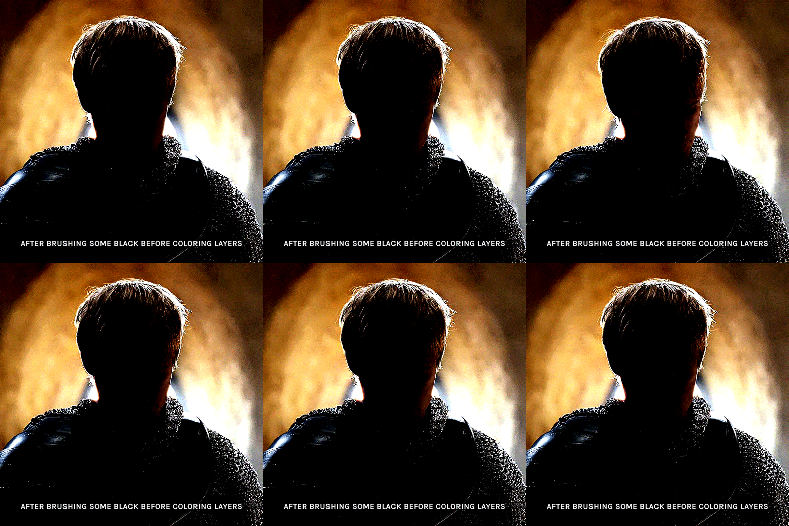
you can always edit this layer later if you need, after doing the double exposure blending.
once the silhouette is all ready, you can put all layers in a group and rename it (i've renamed mine silhouette).
III. BLENDING
now the fun part! import the wide/scenery shot in photoshop, then resize it to the same height of your silhouette gif. make sure the gif is a smart object layer, and sharpen it. finally, bring this gif onto the silhouette canvas (by right clicking the smart object > duplicate layer). once you have both gifs onto your canvas, put the wide shot gif layer in a group, and set this group's blending option to screen.

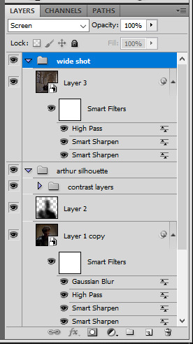
you can then position the wide/scenery gif the way you like it in the canvas. this is how it looks for both examples after i've done that:

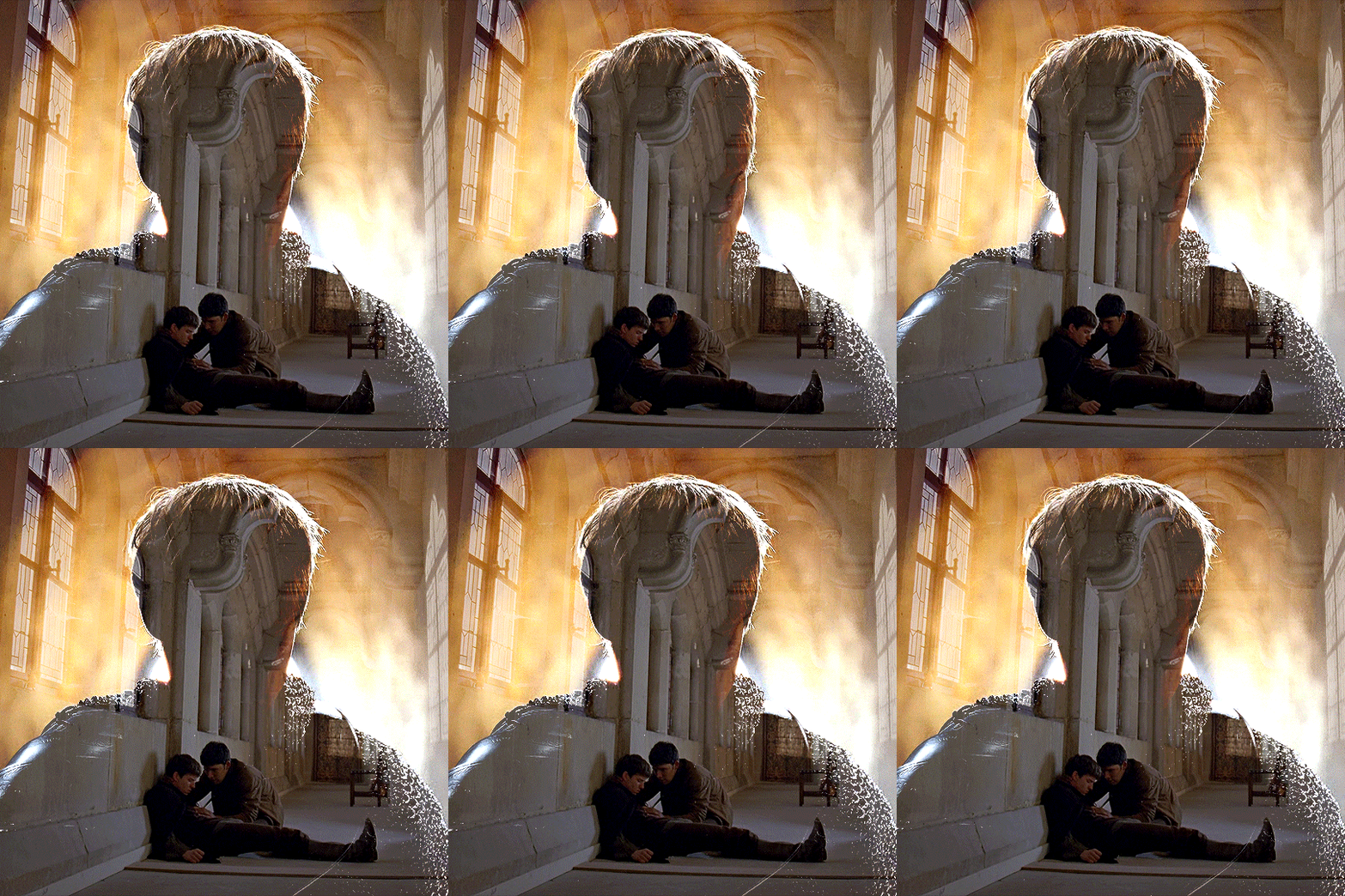
if the blending mode screen doesn't give you the best result, so you can play around with other blending modes (such as lighten and linear dodge in these particular cases), but generally speaking, screen is the real mvp here haha.
IV. COLORING
now that the double exposure effect is done, we need to color the gifs to bring them together. i went with simple coloring here, simply enhancing the colors that were already there. just make sure that the coloring layers for each gif are in their respective groups. here's how i've colored both examples:
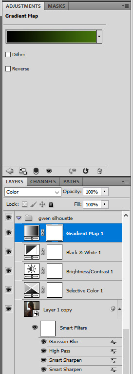
gwen silhouette group: i added a gradient map layer on top of the contrast layers in black to green and set the blending mode to color
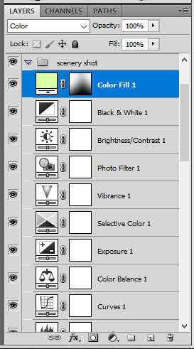
scenery shot group: multiple coloring layers, with a green color fill layer (blending mode set to color), with a layer mask so it only affects the top half of the gif
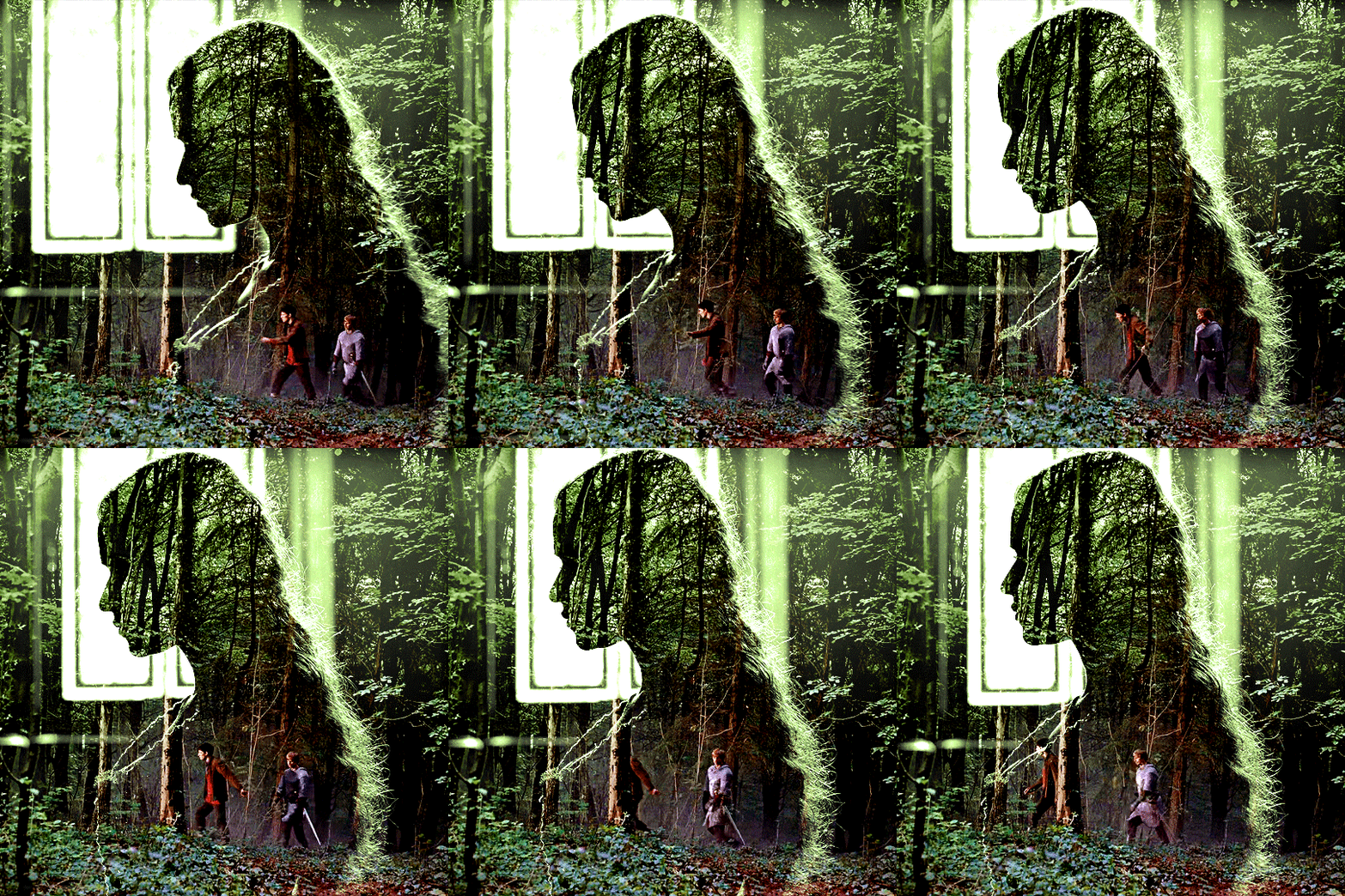
for the arthur gif, i did something very similar but with warmer colors. i didn't use a gradient map for arthur though:
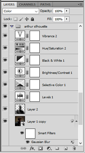
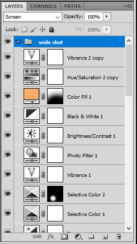
arthur silhouette group: i made the yellow warmer, closer to orange/red, with a hue/saturation layer, and added more vibrance. didn't feel like it needed a gradient map layer here though.
wide shot group: basic coloring layers to enhance colors from the merlin & daegal shot, and an orange color fill layer set to the color blending mode.
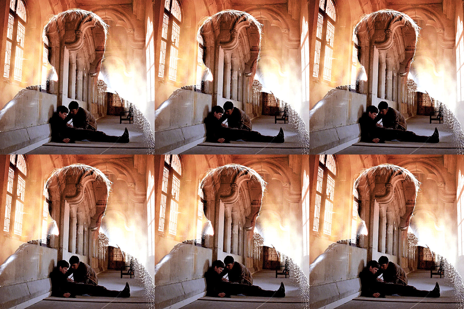
at this point you're pretty much done. just need to add some final touches and typography (if you want).
V. FINAL TOUCHES
a small and completely optional detail, but i wanted to soften the edges of the wide gifs. to do so i've duplicated the smart object gif layer and removed the sharpening filters (right click on smart filter > clear smart filters). put this layer on top of the other smart object layers (but still below the coloring).
then with this same layer still selected, go to filter > blur > gaussian blur... > 10px. this will give you a very blurry gif, but we only want the edges of the canvas to be softer. so add a layer mask to this layer. with a very large and soft brush (mine was at 0% hardness and about 800px size), brush some black onto the layer mask to remove the blur in the middle of the gif.

you can play with this layer's opacity or gaussian blur amount if you want (by double clicking on the gaussian blur smart layer filter). here how both examples look with this gaussian blur layer:
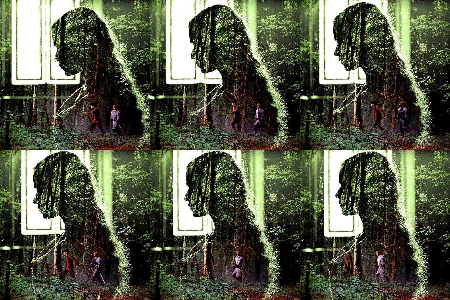

you can also mask some of wide/scenery gifs if you'd prefer, so it shows less outside of the silhouette. just put a layer mask on that whole wide shot group and brush some black or grey on the layer mask. it's what i did for the gwen gif, with a very soft brush and i set the mask density to 72% (i kept the arthur one as is tho):

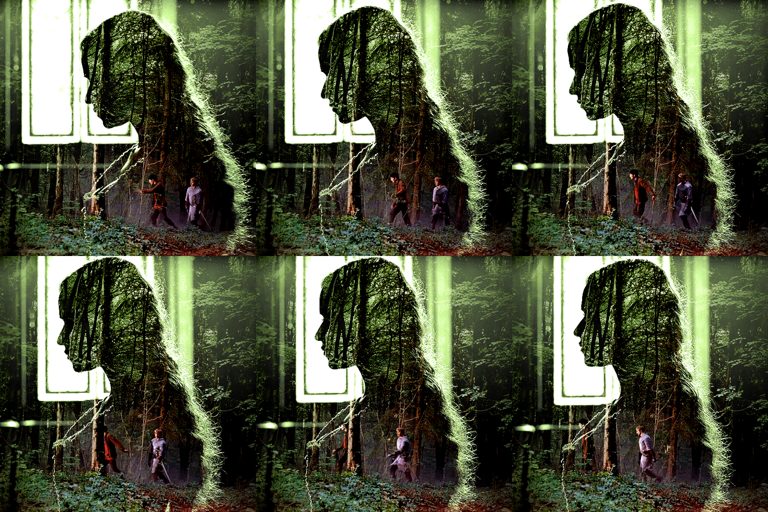
and that's how i did it! hopefully that was clear enough :)
#alie replies#*ps help#resource#tutorial#allresources#*gfx#usercats#usersmia#userrobin#userfaiths#usertina#usermoonchild#userchibi#uservivaldi#usertreena#userraffa#userriel#userelio#usermadita#usersmblmn
1K notes
·
View notes
Note
I really love your art style c: What app/brushes do you use? The colours look so nice and soft
Hello and thank you so much!! I used a few apps whenever I draw :)
-Procreate/Ibispaint for sketch
Brushes:
Procreate: Hard brush (It’s a default procreate brush)
Ibispaint: (This brush is so so good!!)
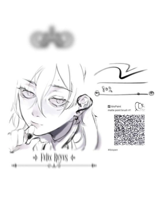
Coloring: Paint Tool Sai
Brushes: for this I mainly use the default brushes! They’re easier to use for me than the custom ones ^.^
Color Adjustments etc: Photoshop CS5 (For this you can use Procreate of Ibispaint as well, as I mainly use the color adjustment tools such as the curve tool and blur filters!)
I hope this helps, feel free to ask me anything else :D❤️
68 notes
·
View notes
Text
how i do my visual novel filtered photo backgrouds
ive had some questions about this so i figured i'd put together a quick post on my process and what goes into it.
this isnt really a tutorial and instead is just a ramble of how i do stuff with a ton of examples and pictures lol
read more below. this is a long post and you probably want to be looking at these images on your computer instead of your phone
step one is that i find CC0 photos or otherwise easy licenses to use because I'm lazy and don't want to have a list of credits of random photographers caue i used one of their images but also i don't want to use stuff without crediting
because they have a general lincese that just wants you to mention the site i prefer unsplash or pixabay but there's other public domain type photo sites too obviously
so like okay heres a random picture

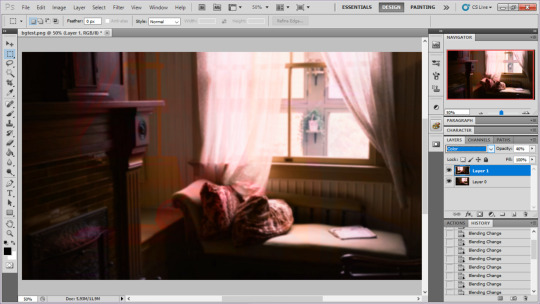
i have a photoshop CS5 from 10 years ago. but these can be done with gimp or krita and whatever. theres even photopea that has photoshop in the browser
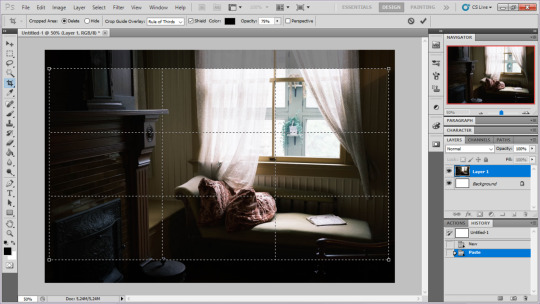
basic stuff is that i start by cropping my bg into my renpy resolution (i use 1920x1080) this is also the part where sometimes i might rotate a bg. it is a good way to add some chaos vibes to a scene
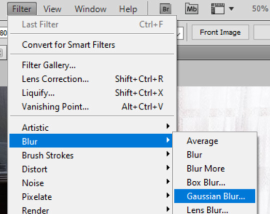
i tend to add some mild blur effect since i find that having too sharp photos as backgrounds clashes with the artstyle of my sprites. like just a couple pixels worth of blur tends to do it
the next part is called fuck around and find out

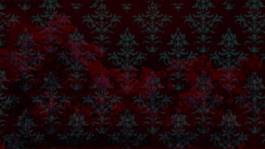
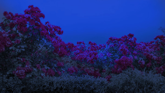
i like to play with the values to just get random results. hue/saturation for tinting the picture, messing with the curves to get some really sharp effects, or channel mixer to add more of a color
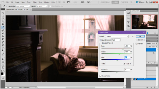
this part is just purely vibes based but i personally think reducing the colors of the background is the simplest way to create something that feels coherent. especially if you make backgrounds based on moods. like having a blue tinted bedroom vs a red tinted one really changes the atmosphere
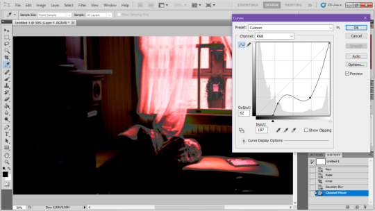
you can get some pretty intense effects but its always important to remember that its meant to be a background and there's a risk it distracts from the sprites
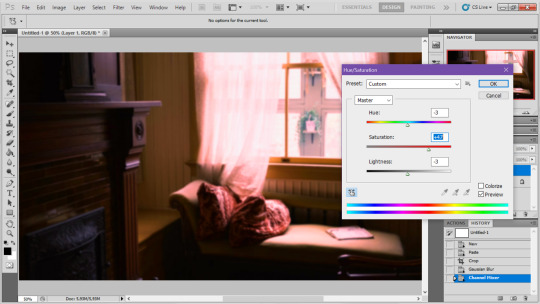
in this case im not including the effect for the curves. after the colours look fine the final step i tend to have is apply some sort of effect.

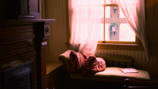
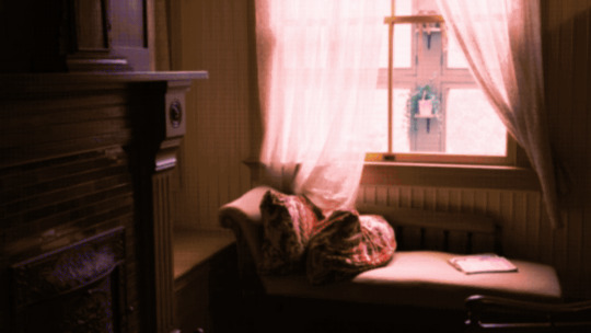
i really like changing the colour mode to indexed colour since i like crunchy pixels. (had to zoom in to 100% to show the actual effect) downside of indexed is that it doesn't look ideal unless its displayed in the exact resolution it was made in but i like it
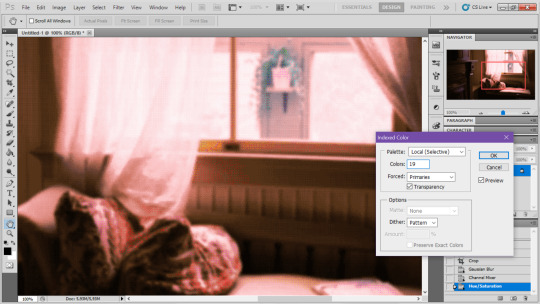
here is the images before indexed mode:
after indexed mode(i think you have to click the image and open it in full to see the actual effect):
another thing ive been playing with recently has been grain+chromatic aberration combo. it makes things feel surprisingly lively with just this simple thing so you'll probably see me overusing this effect in the future

you have to mess with the numbers to get the effect you want but for me these were the parameters I've been using
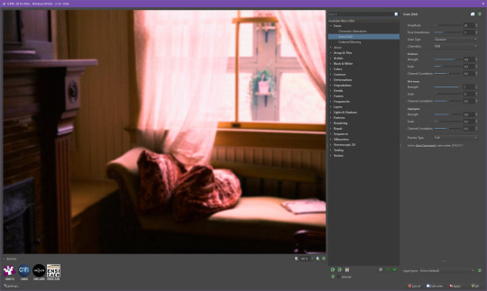

ignore the preview missing idk why it does that.
heres the image (the non indexed version) after these krita effects
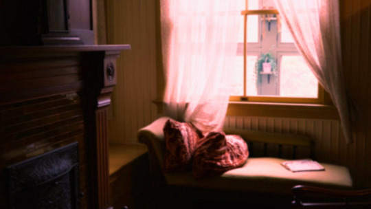
one random special mention i have is that playing with layer blend modes is great
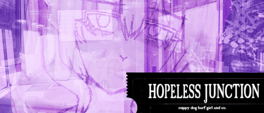
in this example i just copied the same background, mirrored it horizontally and set the layer blend mode to color and it lowered the layer opacity slightly. it just adds some.... idk what to call it visual noise? itj just fucks it up a bit. i used overlapping images and screen modes in some of the hopeless junction images i did for some pretty nice effects
i dont really know waht the blend modes do i just scroll until something looks good lmao
theres a ton you can do with these. like for example just adding a single air brush dot of a bright color on a separate layer and setting it to some blend mode to add a tint to a background
i used these both in malmaid and in the second one i just brushed on some color on a separate layer to give it a moodier vibe
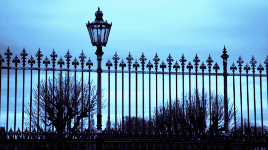
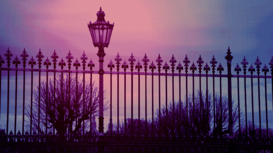
i think having variations of the same background is an extremely easy way to add some life to the bgs without having to do new stuff. like here was the hotel lobby when entering, and here is the hotel lobby when they ran away from the place. i added a radial blur with photoshop
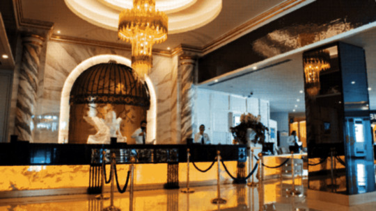
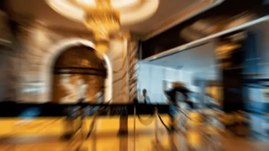
i think theres some beaty in artifacts that come from low resolution images too. sometimes i intentionally use images that have clear compression artifacts cause i think it looks neat. i don't really worry about the details too much as the vibe is the most important thing
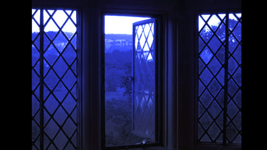
its honestly just a matter of knowing these tools exist and just fidgeting around with combinations to find what you want. it also helps to look at other backgrounds or images in general that you come across and just be curious. how was this done? how could i recreate it? that's the type of experimenting that has led me to these.
idk thats all i have to say. ty for reading and play malmaid on steam like and subscribe for more gay puppies

137 notes
·
View notes