jahdaiheadley
19 posts
Jahdai • she/her • Illustration @ USW
Don't wanna be here? Send us removal request.
Text
This session was all about scanning in traditionally drawn artwork and combining it with digital processes using Photoshop. This is something I found really useful to learn especially as we have started working on our self-directed brief and needed to combine elements of traditional and digital in our final outcomes. I took some drawings I did for my brief’s research in black fineliner pen, which was the perfect candidate for a technique like this. I scanned it and then we learned how to quickly remove the background of the image so the lines were isolated but still intact to the way they were when first drawn. I think something I didn’t know about back when I wanted to try this for myself years ago was the levels feature to help eliminate the grey and get the cleanest line-work I could get.


We made colour palettes based off some images we liked online and used them to fill in the lines we had cleaned up, which was useful to me not only as a practical skill but also counted towards my material tests for my self-directed brief as this is one of the avenues I have been thinking of going down with my final piece.
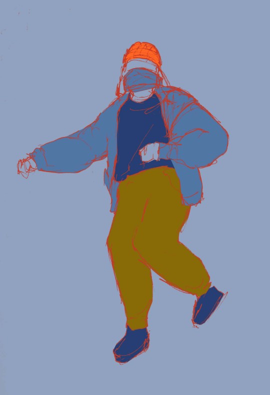
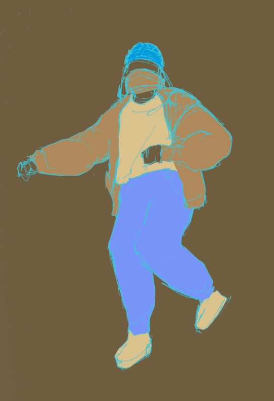
I tried colouring the lines and altering the colours overall, such as inverting them, to see what other outcomes I could get. It was fun to experiment here and get a better idea of what I wanted my final outcome to look like.
1 note
·
View note
Text
Week 2 - Self-directed brief
This week I went further into exploring materials and making decisions on the direction I wanted this outcome to go. I decided I wanted my illustration to be one that you might see in a local magazine/newsletter sharing something that's happening in the community. For this I was inspired by the small newspapers we have in Oxford that do articles on smaller scale things such as a charity event or local workshops/classes. I wanted to create an illustration that might be used for something like that, potentially with text giving some insight on how the classes make the participants feel and what keeps them coming back. So with this in mind I set out to do another session of research, this time talking to others in the class about how they felt and also trying to draw people as they were dancing.
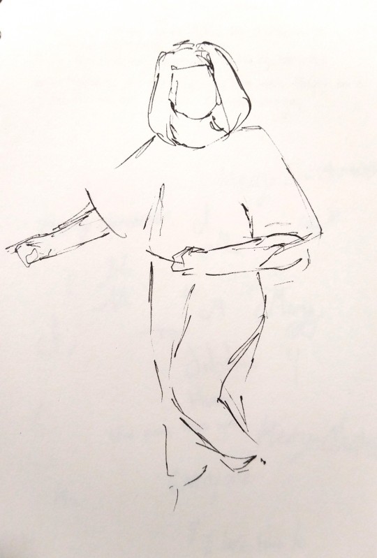
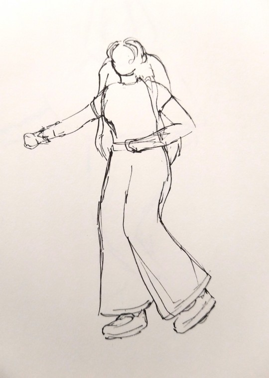
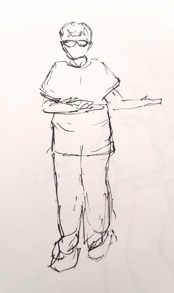
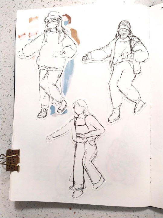
I did some research online on what might be the best approach for capturing a moving subject.
https://www.creativebloq.com/advice/10-tips-for-sketching-moving-subjects
I tried the 'Flash-glance' technique the article discussed where you briefly shut your eyes in order to retain the last moment you saw in your short term memory a little longer. I found it to be fairly effective for remembering the poses in which I could build the rest of the details up after. Though it was fairly successful the outcome was still quite messy.
1 note
·
View note
Text
Week 1 - Self-directed brief

To begin my self directed brief I was required to make 2 moodboards to explore the directions I could take the project and the location I chose to base the project on. I decided to record my dance class in the most effective way I can come up with. At this point I don't know where exactly I want it to end up so I'm doing as much research as I can in the form of photos and observational drawing so I can see what I have to work with.

For the artist moodboard I tried to get a variety of images to help me get an idea of the styles I might want to work in and start thinking about how I can convey movement in my lines. At this point I knew I'd need to think about my line confidence and making it loose, I knew I wanted to work with a fairly bold material like fineliner where there's no room to overthink the lines.
1 note
·
View note
Text
18/11/21 - Analysis of existing composition at Cardiff Museum.
This week we went to the museum to seek out good examples of composition from existing work. I looked for artwork that was visually appealing to me to help me decide which pieces I wanted to record in my sketchbook. I kept in mind the different rules of composition as I looked around too, as identifying the use of them in the artwork would help me explain why I thought a particular piece was effective.
We were asked to find three pieces of art that we thought had a good use of composition.
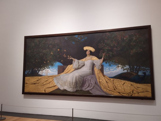
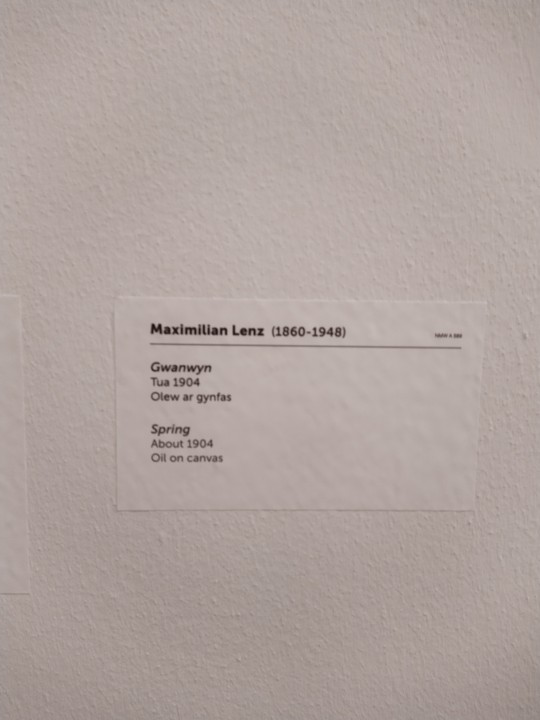
The first of which I chose was this large painting called ‘Spring’ by Maximilian Lenz. Instantly I was drawn in by the composition of this piece, being unusually wide compared to the rest of the paintings in the gallery already tells you that this was an intentional choice from the artist. One thing I noticed after I took the time to look at this piece was the amount of overlapping shown in the work, many elements are hidden behind the larger subjects so you only get a peek at what is going on. I also noticed that the viewpoint that it’s painted from is somewhat low, exaggerating the dominant quality of the character which also takes up a large portion of the image. The robes take up roughly a third of the image, with the darker contrasting coloured background occupying the remainder of the canvas. I liked how the lines of the things around the person lead your eye out into the environment, while the robes lead you back into the middle. I found that it helps you circulate the entire image, and with how many details there are I appreciate that guidance as it almost tells you to look again to see what else is painted there.
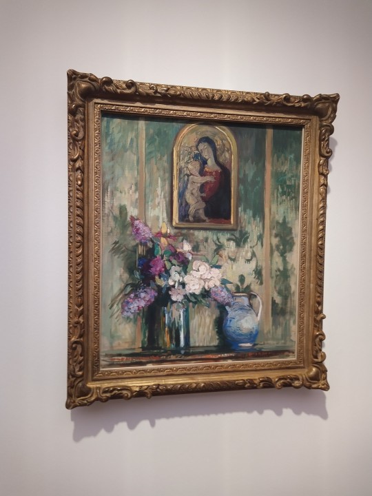
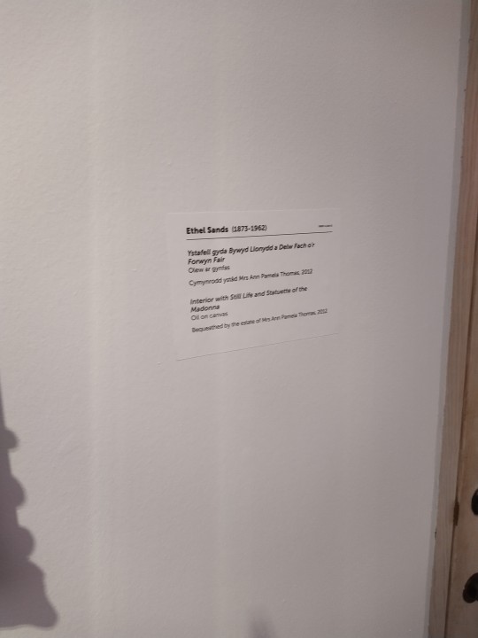
Artwork number 2 - Interior with still life and statuette of the Madonna by Ethel Sands - was simpler, I didn’t see a large number of things to talk about here. First thing that came to mind was of course the rule of odds in the number of objects to capture in the painting, creating a triangular shape between each focal point. I thought the vertical lines on the wall created an interesting sense of structure and ties the 3 different pieces together in the space. Simple but effective.
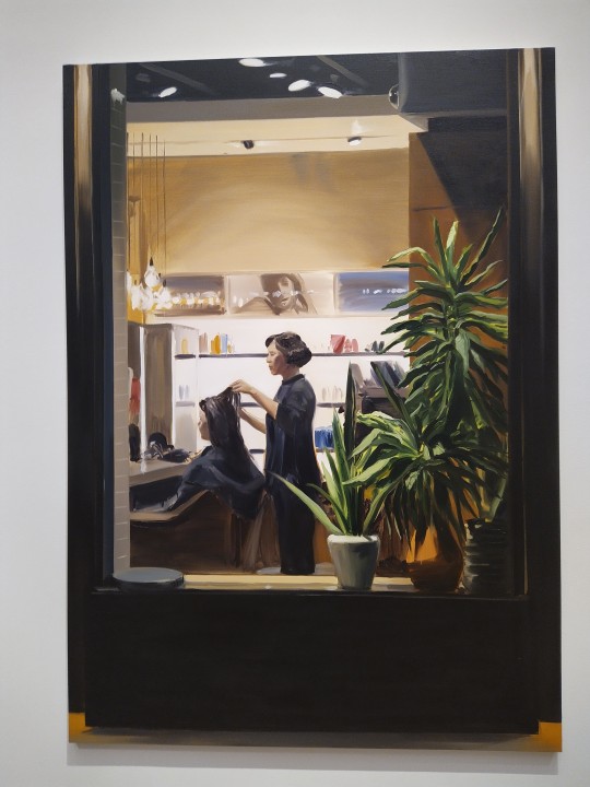
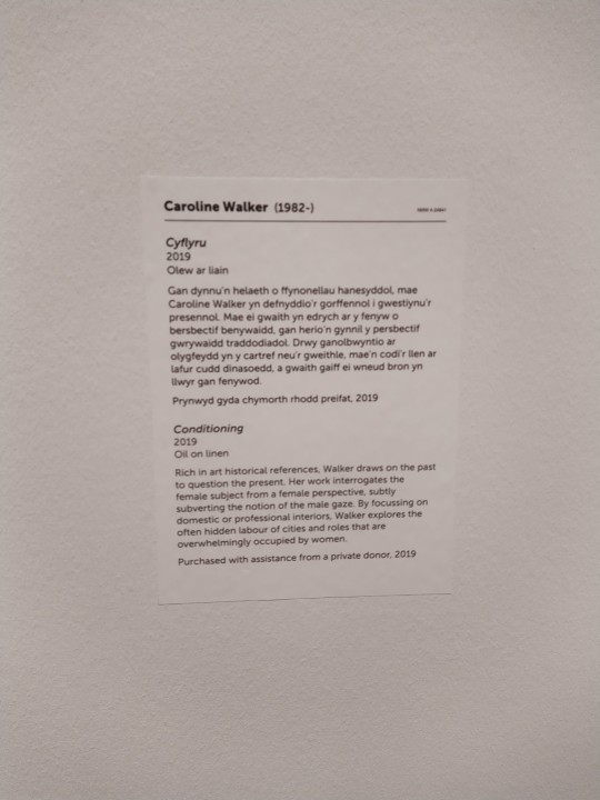
The last piece I found, also being my favourite, is this painting by Caroline Walker called ‘Conditioning’. I always find it particularly interesting to see more modern pieces of artwork in museums and galleries and I absolutely loved this work that I just had to include it. The framing first of all has been done in a way to convey the message she aimed to communicate with this piece, as if you are just a person walking by a random window. There is a domestic feel to the image from the point of view that’s captured. After a little more time looking at the work I noticed there’s a lot of horizontal lines, neatness from all the sharp lines, but the plants in the foreground break up that dull rhythm which I really liked. The brushstrokes in particular you can see are a lot less precise and gives more character that I really appreciate in this work.
0 notes
Text
For this post I've been asked to improve on the composition of a piece I've done within my time at USW. I've picked a piece I did in response to a task where I had to work with a limited colour palette and a word prompt.
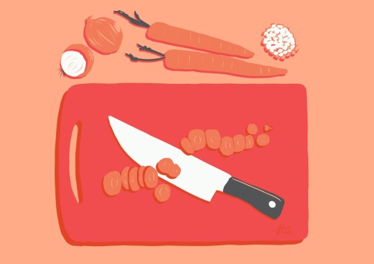
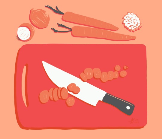
The first image is the original illustration. I wasnt happy with the extra space on the sides, especially with how close together I placed all the objects within the image.
When drawing this image, I wasn't consciously using the rules of composition to come up with the layout. The original idea for this piece was to have it from the point of view of someone during their cooking process, but I ended up simplifying it to a bird's eye view because I thought I'd be able to execute it more effectively this way.
I cropped the sides to bring more focus to the items and also allowed the chopping board to divide the image following the rule of thirds.
I wanted to make sure the items looked organised but scattered enough to show that it's within the cooking process and not just set up for a photo. This is particularly evident in the way the carrot slices at organised. They are roughly in a straight line to show that the carrot was originally long and straight, but I intentionally drew stray pieces of carrot to break up the rhythm near the knife and at the end of the carrot.
1 note
·
View note
Text

15/11/21 - I've chosen to analyse the composition of this artwork by Ross Tran. The first thing that strikes me when looking at this piece is the way that colour is used alongside the compositional elements to create an immersive and awe-inspiring environment piece.
To unpack the range of compositional rules used within this piece, I'm first looking at where my eye is initially drawn to. To me the focus starts where the character is drawn, I look around the foreground and my eye then moves up towards the upper-right corner of the piece due to the direction of the lines in the clouds.
I found it interesting how the clouds served that use while also supporting many of the other angles in creating leading lines toward the character.
I can see that the foreground is taking up roughly one third of the image, with the character in one of the intersections following the rule of thirds. The other 2 thirds are mostly sky. That combined with the low angled viewpoint gives the viewer an idea of what the character is seeing, while still showing that the character is the one fully immersed in the environment and we are viewing from a distance.
You can also see the rule of thirds present in the way the crescents in the sky are broken.
The rule of odds are also visible here, as seen in the larger dark rocks in the middle-ground. I find that it makes the piece more visually interesting to have more bold elements at the bottom, by adding texture and somewhat framing the character.
Overall I find that this artist uses compositional elements well to create a well balanced fantasy piece that I really enjoy looking at.
1 note
·
View note
Text
11/11/21 - Reportage artist analysis

This week we looked into reportage illustration and in order to investigate further I've chosen to look at the work of Owen Mathers. I like his work because of how effectively he captures the subjects with minimal lines. He is able to keep the lines fluid and precise, the confidence stands out to me as the lines don't overlap very much but the subjects are drawn fairly accurately. I can see that the level of detail is reduced in areas that aren't in focus, which helps guide the viewer to the event in the image. In places where he's had to draw crowds of people, the outlines are vague to suggest there's a lot of people without having to go into too much detail.

When going out and doing my own version of reportage illustration, I tried to keep this artist's work in mind for inspiration and to remind me that I don't need to include every small detail.
I also appreciate his use of colour, usually bright and makes what would probably be more dull in person look vibrant and colourful. I'd like to go over my reportage drawings with colour and attempt a similar approach.
1 note
·
View note
Text
8/11/21 - Lino printmaking
Today we made linocuts from one pencil drawing from within our sketchbooks that we had made earlier in the semester.
I picked one of my continuous line drawings that I did last week and transferred the image onto a piece of A6 linoleum.
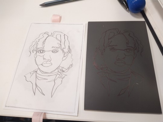
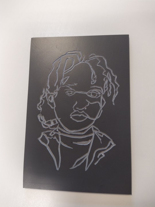
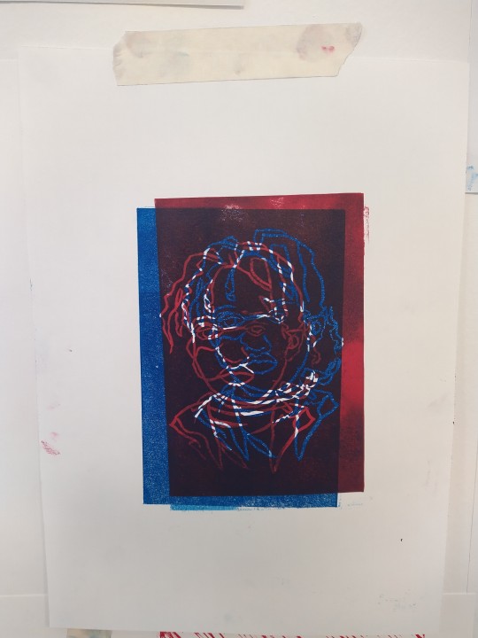
I printed mainly in blue in because I liked how the colour looked on the paper. I also tried to create a 3D style print by printing with blue ink and then printing red ink over the top with a slight shift in the placement.
I was worried that my design would come out slightly messy, as I wasn't sure whether I cut curved deep enough.
It was also quite difficult to make sure the print came out opaque and clean as you can't see where you have how is going to turn out until after you remove the paper, but I was pleased with the results.
1 note
·
View note
Text
1/11/21 - Portraiture
We start of this week's portraiture session with three warm up drawings with some fun techniques. The results were interesting and I like that it helped get me ready for the more difficult drawing tasks to come.
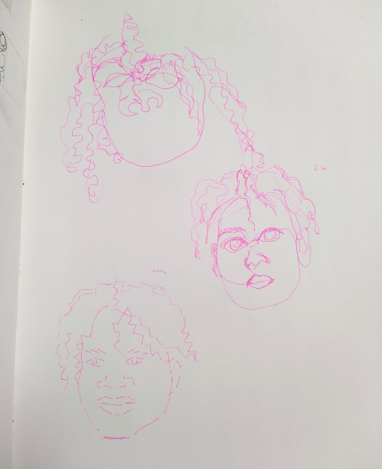
This session we spent doing 3 portraits: The first being a self-portrait where we looked in the mirror, second being the same but with some rules to help with proportions of the face.
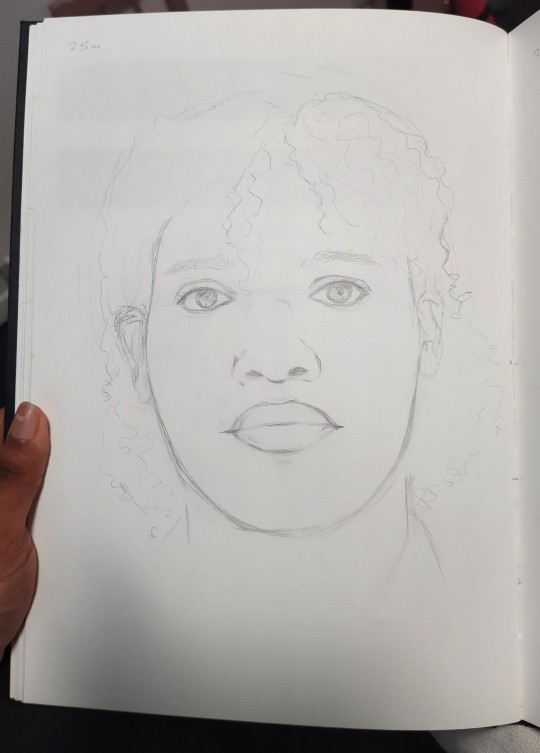
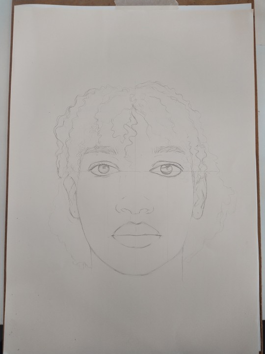
I spent 25 minutes on my first portrait I think it looks fairly accurate, I didn't see anything that majorly stands out as an issue besides maybe the spacing between the two eyes. When comparing the first drawing to the second one done with the guidelines I feel like they were both similar in quality but with distortions in different areas. In the first, the space between the eyes were a little too wide. I had a similar issue with the second one where the eyes were spaced better but in my attempt to make the right I look accurate I brought it down slightly too far on the face. I used the rules to roughly map where it should be but in my attempt to make it more accurate to my own face, I made a mistake there.
I think the face shape in the second is better than the first but the nose was brought down the too far.
I spent the rest of the lesson with a classmate, drawing eachother's faces. I think mine came out fairly well, though we both kept our masks on despite being able to distance so we didn't get to draw some of the features, mouth being the facial feature I struggle most with.
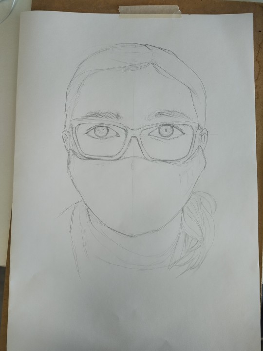
Despite this, I like that the rules helped correct some mistakes I would have made without using it, though I also found that they make it easier to accidentally draw the face too symmetrically if you don't pay enough attention.
Overall it went well, it's a huge improvement from the last time I did a self-portrait, which was about 5 years ago now and it's much more accurate to what I produced back then so I'm happy with the outcome.
1 note
·
View note
Text
27/10/21 - Mark making
This week was spent focusing on textural drawing and Mark making. I was unable to attend this session so I worked on this independently instead of with the rest of the class. I looked around my home to find objects with different textures and picked a few to do studies from.
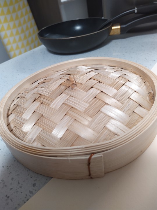
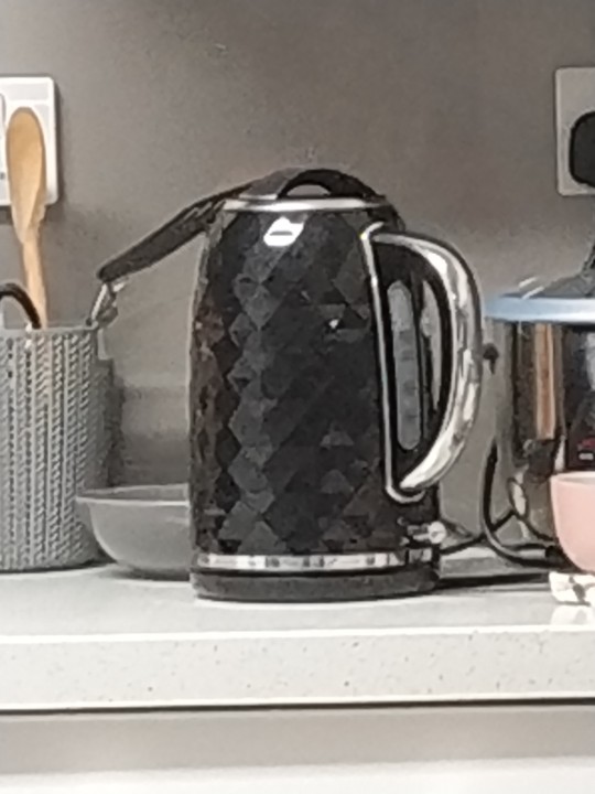
I used a bamboo steamer lid with an overlapping weaved texture and I used a fork to to create the lines within each strip of Bamboo to do this. I also used a hair dyeing brush to replicate the surface of a crocheted toy I own. I then used a palette knife to replicate the surface of an avocado and our kettle had an interesting triangle texture around it so I tried to replicate that with different shades of acrylic paint and a palette knife. I also used my hair as a reference for one of the textures and the surface of a paper towel.
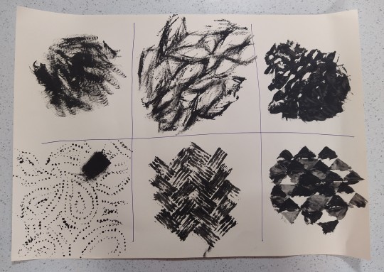
I did those all on an A2 piece of paper, and in my sketchbook I also played around with the tools a little bit. I used a scrunched up paper towel and practiced using the hair dyeing brush on it before doing the studies.
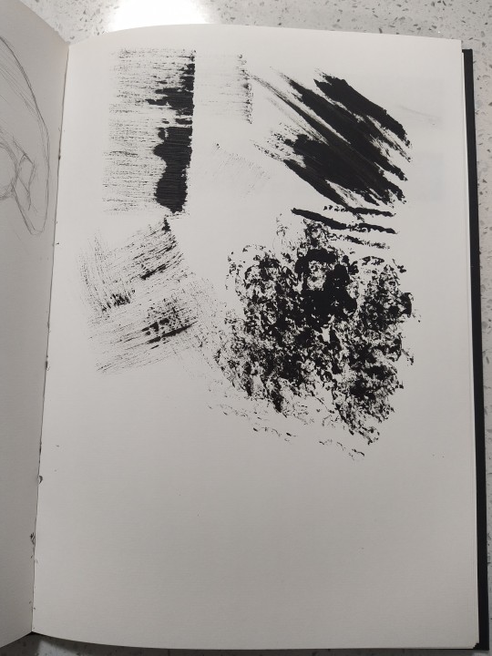
I like how the different textures turned out, particularly the crocheted one as I like that it accurately replicated the soft wool that was used in the toy. I felt like it was a good way to practice working with texture in illustration and it allowed me to think more creatively about what tools to use when creating artwork.
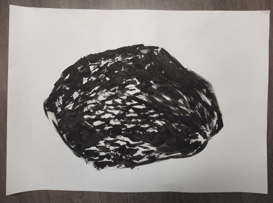
Afterwards I painted an avocado from life on an A1 piece of paper using a combination of 2 shapes of palette knives and a paintbrush. This was in black acrylic paint just like the smaller studies.
I also did a study of a half wilted pak choi using the same tools.
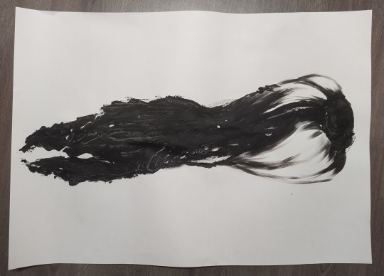
I feel like the the study is of the avocado and the pak choi was successful as I was able to replicate the textures fairly accurately, I struggled more with the pak choi as the tools I was using wasn't creating the texture I wanted at first and as a result I ended up getting the leaves a lot darker than I intended. I wanted to get a wider range of values in that area so I would probably vuse white acrylic paint to create more variation in the tones there if I was to go back and work on it further.
1 note
·
View note
Text
21/10/21 - Directed task: Rework of a pencil drawing from the museum
This week's directed task required me to think about a medium from our Monday class that I would like to recreate an existing pencil drawing in. I chose collage and fineliner as I felt it would suit my squirrel drawing best, though was also my favourite technique I used that day.
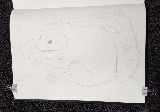
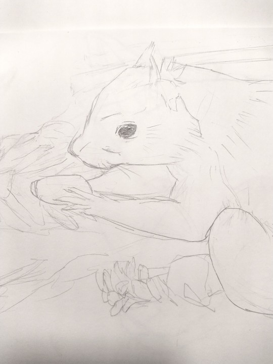
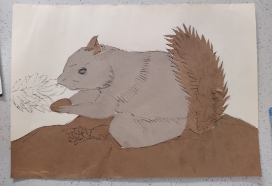
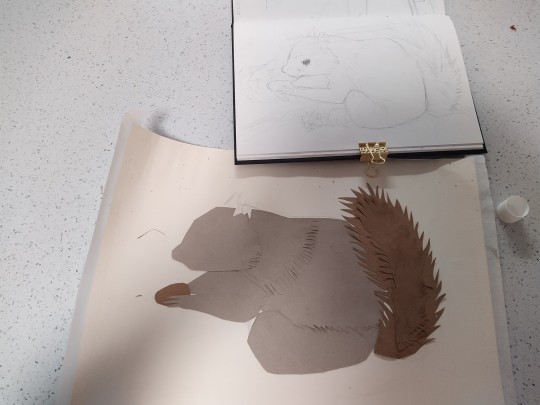
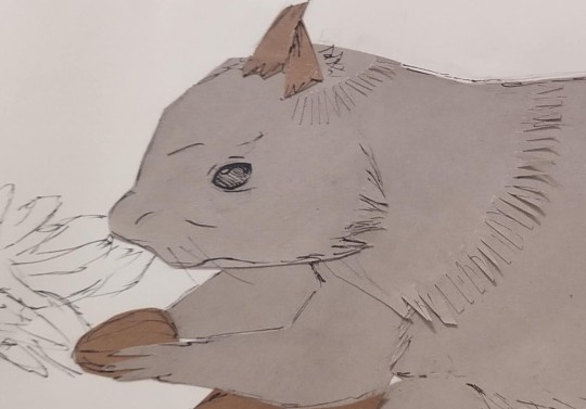
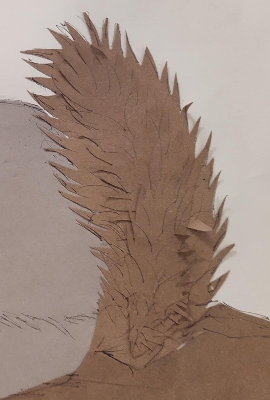
I feel like I captured the drawing well with the paper, I intentionally cut shapes to layer where there was overlap of limbs and fur. I found that it was easier to create the fluffiness in the tail with the paper than when I was doing the contour drawing of it. At the end I used a fineliner for details, which helped bring out the same style as the original drawing. Overall I think it was a successful outcome.
1 note
·
View note
Text
This week was fun, I got to experiment with different mediums and work a bit looser than previous weeks. We played a game called exquisite corpse, each round changing the tools used and the scale. We worked with pencil, fineliner, collage, ink and acrylic paint.
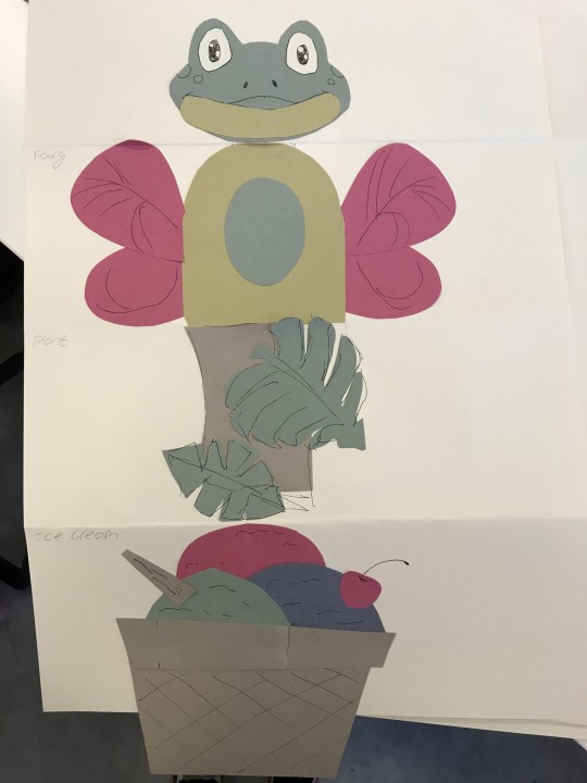
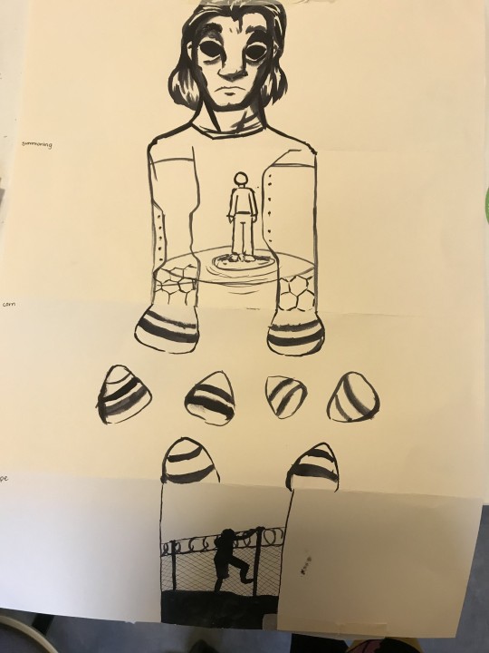
The hardest part for me was coming up with ideas based on the word prompts and the connecting lines from the previous drawing. I enjoyed working with collage and fineliner the most, with ink and brush being a close second.
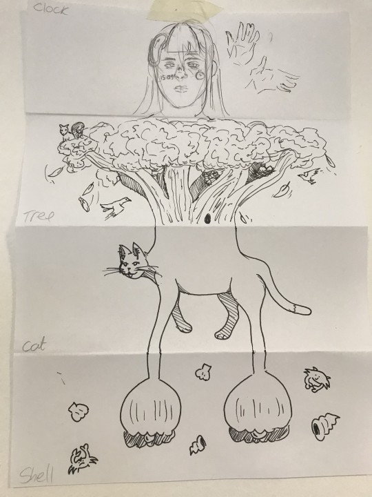
I also liked working with fineliner because we were encouraged to add texture and shading with it and I enjoyed making my drawings more interesting with cross-hatching.
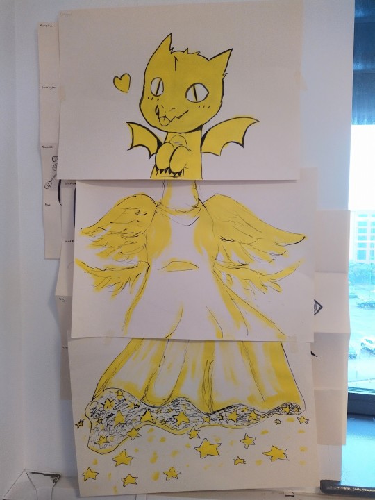
Our last piece of work was made up of multiple pieces of A2 paper, which we painted our part of the character with a colour of acrylic paint, and then used a stick and drew lines with ink for detail.
I tried not to worry too much about the outcome of the work that came from this session, as it's more about exploring the medium and playing with creative ideas than drawing anything accurate from life like what we've done previously.
1 note
·
View note
Text
16/10/21 - Use of perspective by an artist I admire

This piece by Ronald "Seerlight" on Instagram called 'Nook's Cranny Alley'. In this illustration the artist uses 2 point perspective to create a scene inspired by a popular video game. I like how the perspective is accurate to that of real life, with little distortion. Effectively creating a sense of physical space within the artwork. I find that the use of 2 point perspective rather than 3 point was particularly well thought out because it brings the viewer down closer to what's going on within the building, almost as if you were watching from another piece of land out of frame.
4 notes
·
View notes
Text
14/10/21 - Perspective drawing at Principality stadium
This week's location was at Principality stadium. I'd never visited a stadium before so this was an interesting new experience for me.
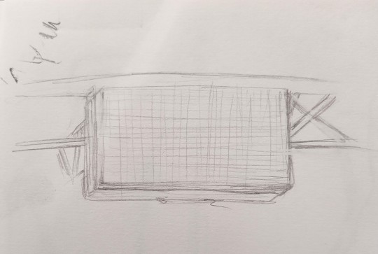
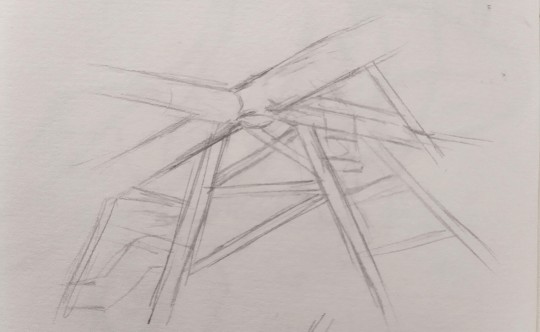
We were asked to do some warm up sketches, focusing on places where we could capture different examples of perspective. At first I found this to be a little overwhelming because there were so many places I could have picked but I ended up choosing this large screen looking thing and a corner of the stadium where you could see the different poles interwoven with eachother. It was good to take the time to really look at the details of the structure and try to sketch them accurately.
I then attempted to draw a larger scale drawing on a piece of A2 paper, of the stadium. I tried to pick a composition that contained interesting shapes to hopefully create a strong sense of depth in the drawing.
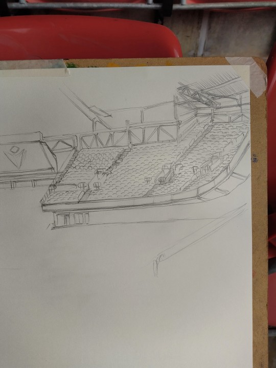
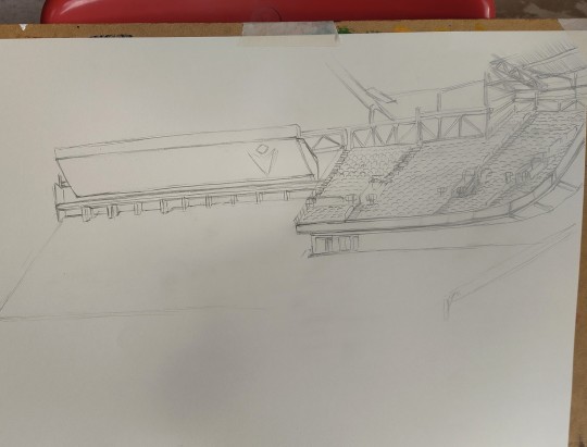
The initial composition was going to be on a larger scale than what I ended up with, as I tried to use a measuring technique using my pencil that I had never tried before. I'm glad I used it because the outcome came out really accurate and detailed, but I was a little disappointed that I couldn't fill up the page to the same quality as I didn't have enough time in the stadium to work any longer. When I realised I was running out of time I decided to just focus on making the corner where I had the most progress done as good as possible, so I could at least look at that area of the page as if it was a complete piece of work.
To conclude for this week, I really enjoyed working in a new environment again. Working on perspective at a large scale from observation was challenging but I am happy with the outcome for today.
1 note
·
View note
Text
11/10/21 - Perspective drawing
This week was all about perspective in drawing. After learning the basics of 1 point, 2 point, and 3 point perspective, we spent time putting them into practice.
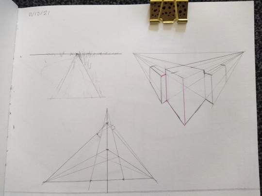
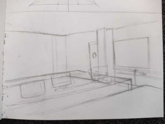
We attempted to draw the room from a corner, which would have created a 2 point perspective view. I found this task quite difficult. The walls and objects close or part of the wall was the easiest, but I really struggled with getting the tables and objects to fit into the same perspective. Drawing the right angles was also difficult, especially as I had the sketchbook on my lap instead of on any kind of surface, and I'm better drawing accurate lines on a surface.
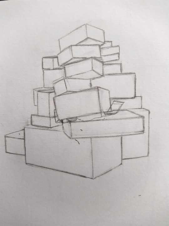
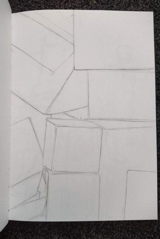
We then piled up some cardboard boxes to use as our next subject to draw. The first drawing was of the entire pile, which was fairly easy for me. There was a few minor issues with the proportions but that was easily fixed.
The second box drawing was a close up of the boxes after they were rearranged. I used a viewfinder to find an interesting composition and then filled an entire sketchbook page with that. I liked that it filled the sketchbook page but it made it a little more difficult to ensure everything was accurate, as I had to keep the viewfinder in the same spot when I plotted my marks around the edge of the page to tell me where the edges of the boxes should be. It was a bit of a challenge getting it all right and I didn't clean it up as much as I wanted to before we had to move on but I don't think it's bad.
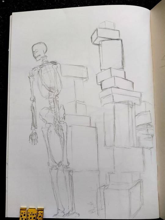
Lastly we built a really tall tower out of the boxes, and brought in a model skeleton. I decided to sit on the floor for all of them but this one I had particularly thought about because I wanted to draw it from a low angle.
I found this one challenging too but slightly easier than the close up because for me it's easier to fit a whole object into my page than it is to do a zoomed in close up. The boxes also helped with getting the proportions of the skeleton right, which was nice because it also meant I noticed any mistakes as I was working rather than at the end where it's harder to fix them.
0 notes
Text
07/10/21 - Cardiff museum drawings
- contour drawing, approx. 5 minutes each -
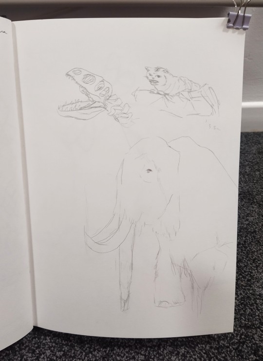
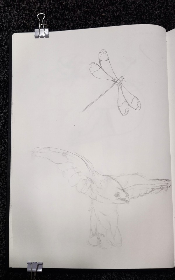
These are some 5 minute contour drawings that I completed while at Cardiff museum this week. The activity of finding things to draw was fun, though I feel like this was an off day for my drawing skills.
From drawing the mammoth I found that I don't always know how to draw fur, especially when it comes to trying to keep it as a line drawing. Adding multiple lines for the appearance of fur made me wonder if I would technically be shading in the form of hatching.
I also really struggled with the size and placement of things that day. I'm not sure why but everything I drew turned out to be smaller than I would have liked. It was a bit frustrating to have so many gaps in my pages, but that's something I can keep in mind for the future.
- Hawk drawing, 5 minutes -
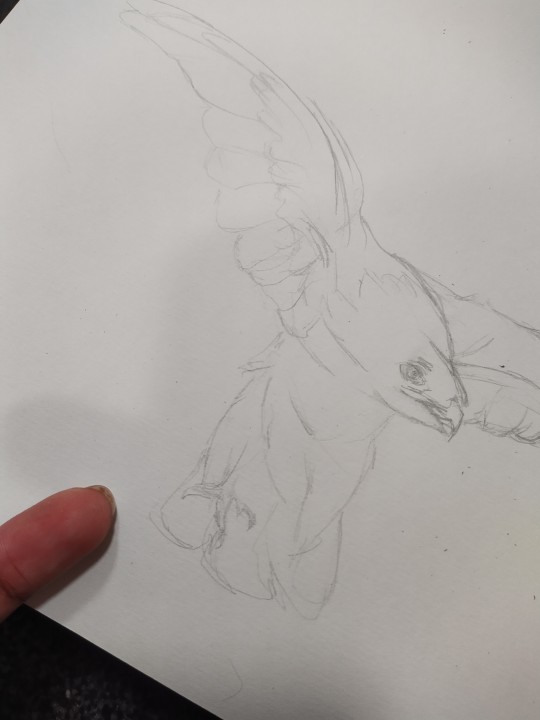
While not my greatest drawing of the day, I was still somewhat happy with how this one turned out. I did forget to draw the second foot which was odd but we will allow it.
- Squirrel contour drawing, approx. 20 minutes -


My favourite drawing of the day, this contour drawing of a squirrel in the exhibition. Here I had the chance to try again with producing the effect of fur without using any shading. Like my longer drawing on Monday's session, I laid down a few loose sketches just to help keep things in proportion. I also am much happier with the composition of the drawing, I like it a lot. The most challenging part was the tail though, with so many fine hairs it was difficult to showcase the fullness of the tail with only lines.
Overall I think it was a good day. I have never thought of using a museum to find realistic still life drawing subjects of animals but it was a really useful exercise and I may come back for future practice.
1 note
·
View note
Text
04/10/21 - Contour line drawing, 25 minutes.
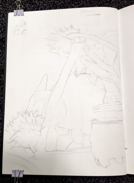
This week we did some contour still life drawings, this one being made up of several items arranged together. I think it was a good exercise for me to work on proportion and composition.
We did a series of thumbnail drawings while using a viewfinder to experiment with different compositions before deciding on my favourite, which is shown above as a full sized drawing. I ended up changing one of my thumbnails to be drawn in portrait rather than landscape because I liked it better that way up. Though instead of turning the actual thumbnail 90° I turned the viewfinder and redrew it.
It was challenging to draw all the different shapes in proportion, but the viewfinder helped a lot with keeping things consistent. Looking back at it I feel like I struggled to get a lot of depth in the drawing, as every time I look at it I find it hard to know where to look and what I'm looking at.
However, this is a line drawing and a lot of objects are overlapping, so I think it would be difficult to capture a lot of depth anyway. I also feel like I could have been more bold with my lines, as that may have helped.
- Viewfinder thumbnail sketches -
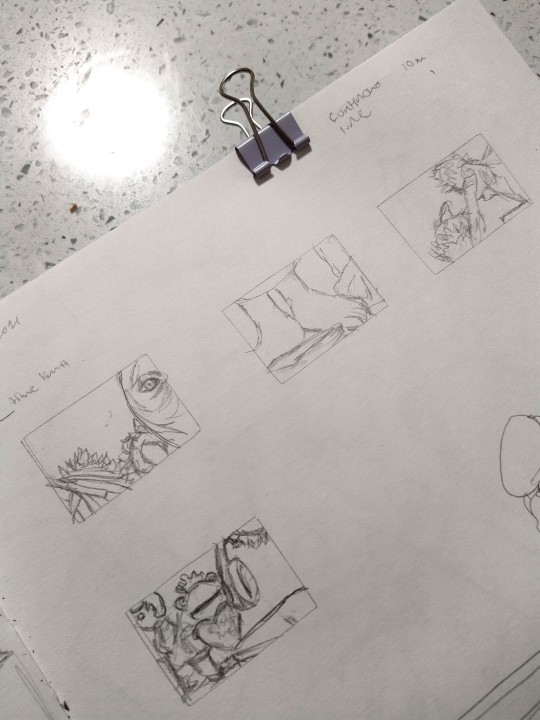
Next we did a similar thing but from a different angle to the objects in front of us. Once we had decided on what area we wanted to draw, we had to fill up a double page spread in our sketchbooks with it.
- Contour line drawing, 1 hour -
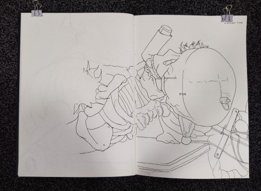
This is the result after an hour of work. This time I used pencil to map out the shapes of what I was going to draw, then took a break before going over with a fineliner pen. I'm pleased with how my lines look and the proportions, especially as I usually struggle with proportions on a large scale. There is definitely room for improvement but this was a good attempt.
I would have liked to see how it would look if I managed to use the pen over all my sketch lines but I didn't want to go back and do that so I can see how my speed improves over time.
We completed less individual drawings than last week but it was good to try some longer timed drawings of higher quality.
1 note
·
View note