just a small account for my college work.game design:)
Don't wanna be here? Send us removal request.
Text
This is the finished product of my game, full gameplay including deaths. I think it turned out very good and I'm impressed with how it turned out.
0 notes
Text
research TO DO
Waneella
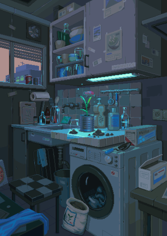
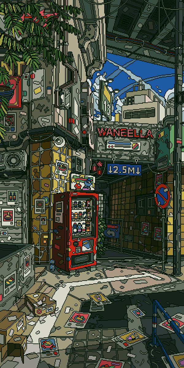
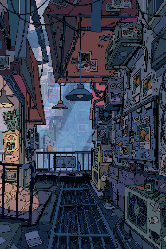
Paul Robertson
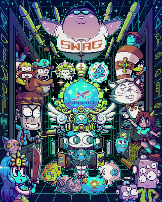

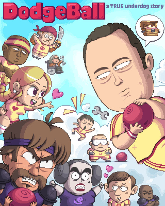
Ivan Dixon
youtube
Pedro Medieros


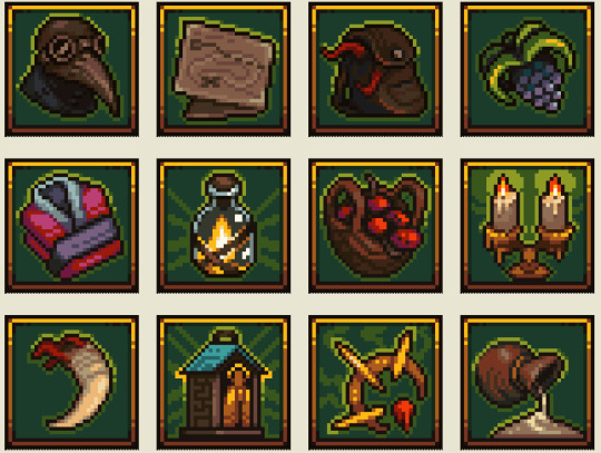
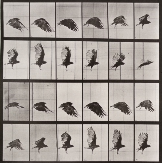
eadweard muybridge


0 notes
Text
Final product
This is the final product of my game, this is what both levels look like


0 notes
Text
Fixing character
at the start of playing my game the character was invisible as the character was facing a different direction and having to press a button to get the character to move to where it should be, for this to work properly now i added a new input.

0 notes
Text
second level

Here i started working on my second level, doing the same as what i did for the first one.
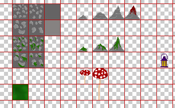
This is the tile map so far, I'm going to add some more textures to it so it doesn't look so empty.
I also created a sideways profile for my enemy character as well as adding a walking animation.

0 notes
Text
Adding an enemy
I added my enemy to my game, to do this i had to import my characters animation and make a flipbook out of it.
Next i had to create a new blueprint class and select character, then I added my characters flipbook and resized it.
I also had to make a patrol point which is another blueprint, but this time as an actor, I added a sphere to this then added a collision and then made it invisible.

This is the code of the enemy, this is in the event graph for the enemy.

I also added damage to my enemy so that the player can die.
0 notes
Text
research
Sword and Sworcery
youtube
I think that the detailing of this game is perfect for the game, it's not over detailed and it's not just a few pixels, I do like how this game looks. There is a limited colour pallet like one zone is all different shades of green and another zone is all different shades of purple I think this adds to the game and makes it unique as you don't really see many games like that. The different colour zones all have a different feeling to them, the green zone is quite dark which makes it feel quite spooky and dull, where as the purple zone is very bright, upbeat, calm and cozy. Each different zone has its own colour but there are 3 main colours green, purple and beige they are the main 3 zone colours. I could also use that idea of it being one colour but different shades in my next level.
Terraria - Use of Biomes
youtube
I think that some of the biomes are quite simple for what they are where as others are detailed, I don't particularly enjoy this type of game. I don't think there is much of a limited colour pallet, although in the desert it is mostly yellow for sand. I don't believe that the colours create a particular feeling to them although some parts like in a cave or at night it gets spooky and very dull. Each biome looks its own way but there is some that look similar but you can tell they are all different.
Dave the Diver - Underwater Exploration
youtube
I think that this is very detailed. There isn't much of a limited colour pallet but there is one in certain places, when the character is underwater and in a cave the colour pallet is mostly dark greens and dark blues. In the darker caves where all the colours are dark green and dark blue its quite dull and ominous, but apart from that i don't think it has much of a feel to it. I don't think I will take anything away from this game I don't think it would relate to my game at all.
Eternal Castle - Limited colours and use of photo
youtube
I don't think that the setting is very detailed, but i think it works for the type of game that it is. This game only has 7 colours red, blue, pink, black, green, yellow. I don't think that the colours create a particular atmosphere to it as there isnt many colours. The different zones are different colours but they all have black in them as the floor.
0 notes
Text
characters
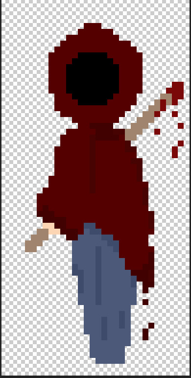
I have created a boss like character for my game, as i had to make a death screen and a start screen.
I have also produced a death screen and a start screen for my game.
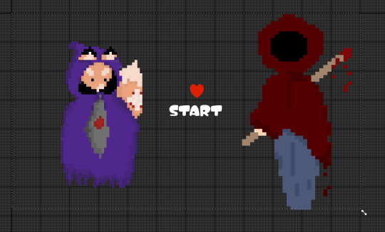

Which they look like this in the game,

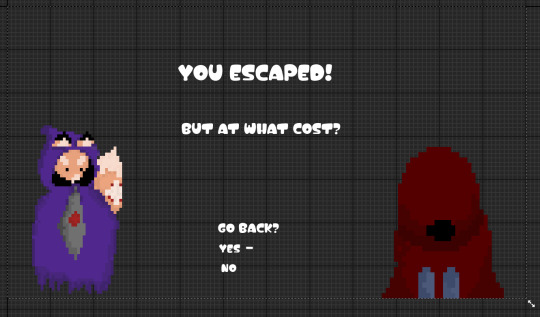
this is my win screen at the end of the game, after that it takes you back to the start.
0 notes
Text
creating a start screen
I had to make a whole new level, then I made a game mode which controls everything.
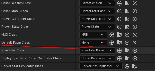
I had to remove the default pawn class which removes the player from the world, i did the same on the lose screen.
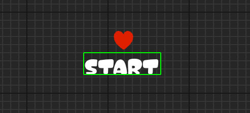
I made a small start menu.
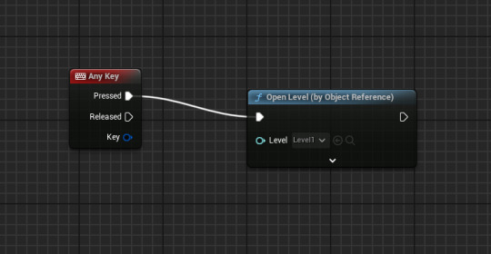
this is the code, you can use any key to start the level.
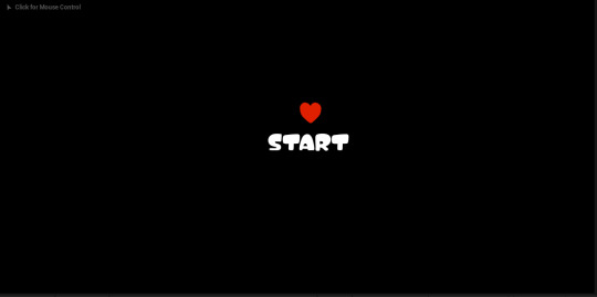
this is what my start screen ended up looking like in my game.
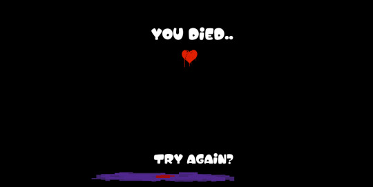
and this is what my death/ lose screen looks like, i think I'm gonna add a bit more to both of them as they are a bit plain.
What is a widget?
It elevates and displays a small amount of timely, relevant information from your app or game so people can see it at a glance in addition contexts.
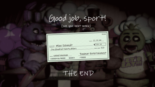
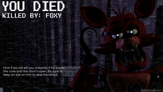
Win and lose screen inspiration
0 notes
Text
creating a HUD
first I start of by creating a widget blueprint and naming it HUD, then I added a canvas panel which is needed to be able to add anything else.
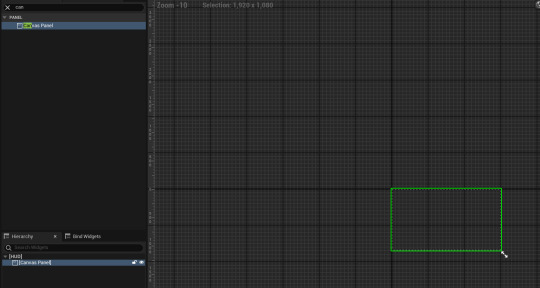
I then added two text blocks, one I've changed to score and the other to a random number. To change the text it's on the right under content. I then did the same for HP and also sized it up.


This is the code for adding it to the game.

I had to move the anchor point so that the health doesn't move around the screen.

Here is the code for the health, this prevents the health from just staying one random number, this makes it so the number will change with the health. I did the same with score as well.
Health Systems: Investigate these games and describe what the HUD is displaying:
Health Bar - Owlboy

This shows the health bar in the top left, i really like the colours and how the game is displayed, i also like how the health bar is tucked away but not so much you cant see it.
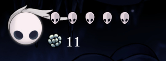
Hearts/Icons - Hollow Knight

This shows the health of the character in the top left, I like the colour pallet on this whole game and how the game functions. I like he idea of the health being the characters face and slowly drains when the character gets injured i think its quite a unique feature that aren't in a lot of games.
Health bar inspiration.


0 notes
Text
HUD research
dead space

This part of the HUD is showing the player their inventory and the items in it, its also showing weapons and med pack. I do like the look of this HUD and how it is actually in the game, I do also think this is effective as it shows everything the player needs in a small area.
persona 5

This part of the HUD is showing the attack with multiple other things that are available to do. I do like the HUD design although it is quite a lot on the screen, its not something I would take reference from as i think its to much and almost looks messy.
Mirrors Edge (Limited or No HUD)

This just shows the game, there is only a very limited HUD on this game which is very rarely seen. I don't like this very much and wouldn't take reference from this as I think its a bit boring.
CrisTales

This is showing the fighting part if the game, I quite enjoy hope most of it is set to one colour just different shades of it. I think teh HUD is quite effective for the game as it relates to it, I really enjoy this and hope to be able to take reference from it at some point.
Dead Cells
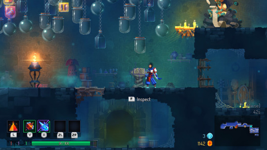
This shows part of the game, I quite like the colours and how they are all similar, I don't like how cramped it feels with all the HUD. I don't think i would like to take reference from the HUD on this one.
Chrono Trigger
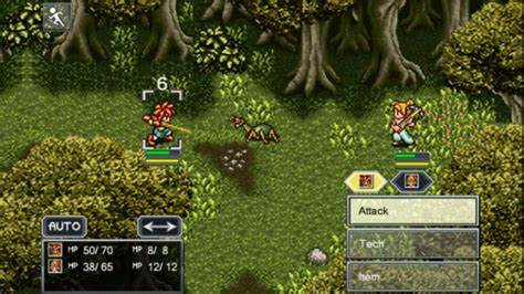
This shows the attack part of the game, I do like the colouring of this game and the attention to detail. I don't particularly like the HUD of this though as i think its quite plain and its all around the same colour.
Cuphead (game screens)
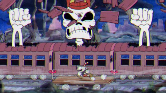
This part shows part of the game where the characters are defeating a boss, I really enjoy the colour pallet in this scene its very gloomy.
0 notes
Text
Tile map

This is almost the end result of my tile map, I'm going to add a few more little details to the underground as it looks plain, and also I need to change the collision point on the bridge because part of it doesn't have a point and the character falls through.

This the result of the tile map in my game, as you can see it needs more detail underground as it's still a little plain, I am also going to create a cave entrance for my win so the character goes through the cave entrance to enter the cave.
0 notes
Text
death sequence
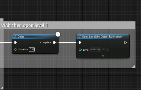
Here I had to change the death sequence a little so my character would start at the new map not the old map.
0 notes
Text
my tile map
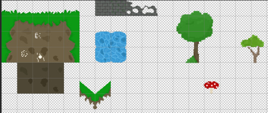
Here is some progression of my tile map, I am eventually going to add more buildings and nature items and expand it a lot more.
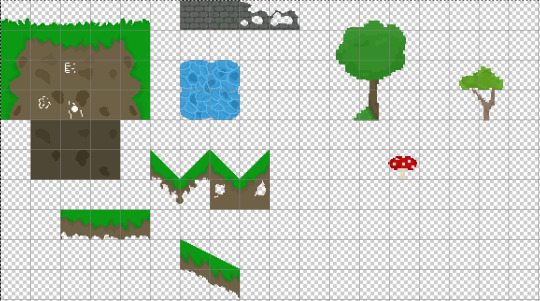
I added some slopes so my character could go underground in the burrows.
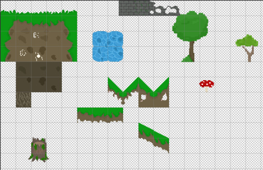
Here I added some roots to go into the burrow and a tree stump to go near the entrance.

this is how my world looks by the end of the session, there was a few things i still needed to add.
0 notes
Text
State Machine
Death

Jump
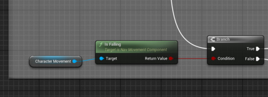
for the jump we are using the character movement component, as we are trying to find out something about the character movement. In this sense we are checking for the player being in the air AKA Falling.
Walk
First of all we need to know if the player has velocity, this means that the player is moving. As this is a 2D game we only need x or y so I right click the highlighted Pin and SPLIT STRUCT PIN.
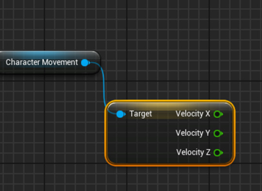
We need to split this or the walk will work if we jump.

To check this instead of asking if its above 0 we need to find out if its both 1 or -1 depending on what direction I am moving in.
So the best way to do this is to ask if the value is NOT 0.

From this I can then add the Walk animation.
This will also give a False meaning the player is stood still for the Idle Animation instead.
0 notes
Text
Sequence Node

the sequence node will allow for the tick to execute multiple strands of code at the same time rather than 1 after the other.
This is good for keeping track of multiple things at the same time.
0 notes
Text
tile map

I started working on my own tile map for my game.
for my first level I have gone with a forest theme, I'm going to add more trees and little bits like that as I think it might look a bit bland.

This is how my tile map ended up looking like, i do think i will add to it as there isn't a lot.
0 notes