#they have an alt black & white palette too ...
Explore tagged Tumblr posts
Text

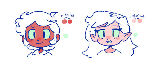
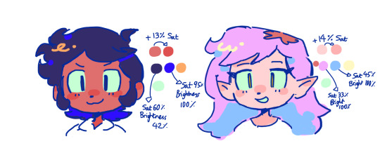
mimi twotone ! (they/them) a toon inspired mime who lives in buzzhuzz - follower of huzzle mug, lover of most! :) lines by my partner colors by me. they came to me in an ideal vision of the game mechanic they'd be based around - of which you give them quotes, to get them to pantomime items you need! they dont speak aloud and more that their reactions and visuals share how they need outside of game mechanic i think as a toon they'd use sign language. in the toon sense - as pictured here. doesn't like bizzyboys very much..
#splash draws#my art#collab#my ocs#mimi#ggg#great god grove#ggg oc#great god grove oc#mime#mime oc#toon#toon oc#sorry for the really obnoxious tagging i just leik making sure everything is covered#helo i love them sososososo much i hope you guys do too#they have an alt black & white palette too ...
53 notes
·
View notes
Text
eaudera's detailed tutorial for skin rendering
okay loves i've put together a tutorial in text form detailing my step by step process of shading darker skin + the brushes and techniques I use and why I use them. you will be following along as we shade a piece together, you can find the lineart to the piece here. *turn off your true tone and night shift displays for the most objective viewing.
i wrote a lot on the preview pictures, if you find spelling errors (which you def will) or are unable to read my handwriting, you'll find the typed out version of the writing in the alt text feature.
disclaimer: i'm not an art professor nor am i academically/classically trained in art. a lot of the verbiage and techniques i'm using to teach you all here are from my current self taught and observed understanding of art, light, and anatomy
support me: kofi / ig / twt / commissions
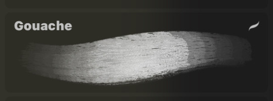
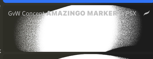
firstly, here are my two staple brushes. you can find the second brush here, i modified it by making it larger.
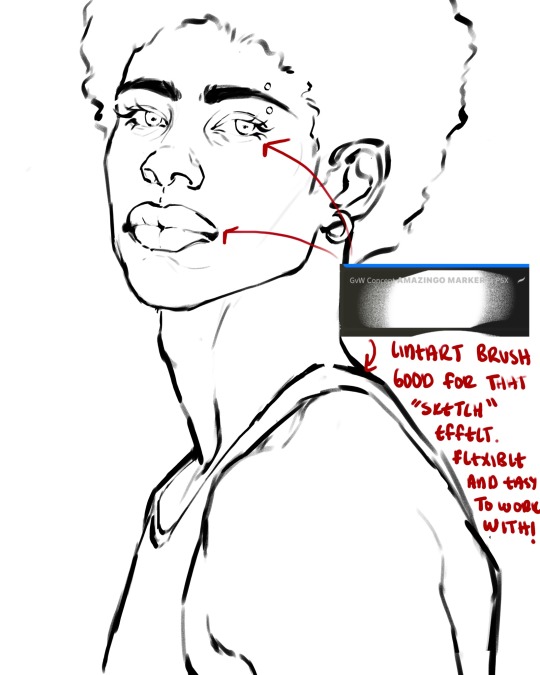
the lineart brush is very good for easy sketching and simultaneously cleaning up that sketch to produce the final lineart you'll be using in your piece. the diffusion from the erased parts/the diffusion created by lowering the pressure of your pen creates a light graphite effect which i enjoy! give it a shot.
you'll notice quickly that there are lighter strokes throughout this lineart, these are simply acting as rendering guides for me in order to remember certain placements. i erase/draw over these lines a lot.
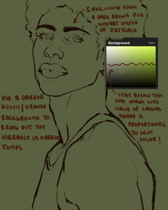
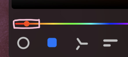
i initially learned to shade skin on a completely grey background with very slight orange undertones, and for a while this was very helpful in providing the most objective view of the base colors you're using (objective as in free of being effected by colors of different values). as you might know, using a white background for dark skin will seemingly darken the value and dim the vibrancy of your base colors, and using a black background will do the opposite. if you're using a darker skin tone, you want your canvas shade to be of a value that is proportional to your skin tone to avoid the same problems created by colors with too light or dark of a value. now if you're using a screened device to draw, you have the extra burden of screen reflections/wavering color output on different screens, so you're never really sure if the exact color you're using will be consistent across the board. priming your canvas with neutral colors will help with that. whereas priming with more vibrant colors will slightly change the undertone of your skintone (especially if you're using a low opacity brush), but it makes for a funner canvas and more creativity with your color palette imo. if you're a beginner i recommend you stay below the wavy line to avoid too light of a canvas shade.
for these same reasons i avoid keeping my lineart jet black. when you lay down the base colors under a black lineart it can look very unfavorable.
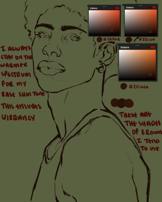
here are some skin tone variants that i tend to use the most, peep how i never wander off too far to the left of the spectrum where the reds are. i definitely favor red-oranges as compared to green-oranges for my skin tones, however, because i stay primarily on the left side of the color spectrum for my rendering, red can quickly become too much too fast. so i make sure to use a skin tone that can work very well with green-orange shadows. for this specific piece i will use the third shade (#2d1606).
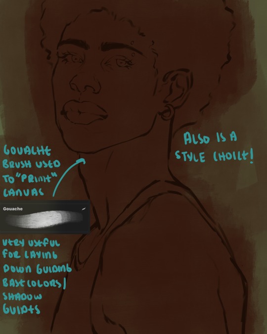
heres where the gouache brush comes in handy. i use it very loosely to "prime" the canvas almost. if you've ever done oil painting you'll realize very few artists draw directly onto a completely white canvas, though i've already primed my canvas essentially by changing the background color, i loosely shade over it with the skin tone color using the gouache brush. i find this gives me a better grasp on the composition of the piece due to increased harmony between the canvas and the skin color. it also looks really cool to me and resembles a real canvas almost.
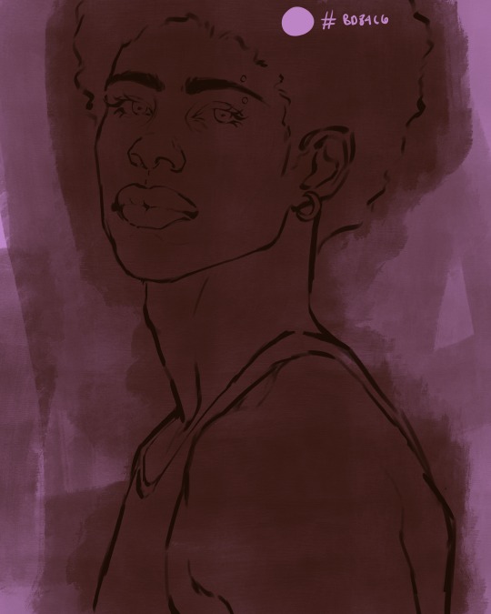
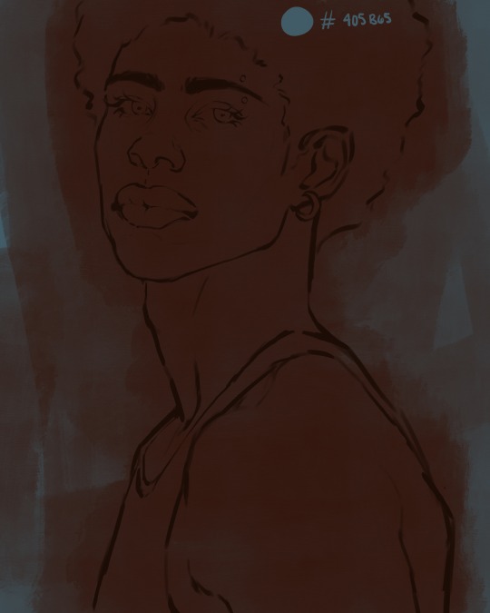
as stated before, priming your canvas with neutral colors (grey) can help give you a more consistent view of your base colors, when you get the hang of understanding the colors you most often use (i.e, how they interact with other colors), you can start using more vibrant and fun colors to color your canvas with! the gouache brush changes opacity depending on the pressure exerted by the pen, if you zoom in you'll notice patchy areas where the canvas color bleeds through the layer more prominently than it does in other areas. for some people this might throw off the consistency of the shadows, but you should be fine as long as you're using a consistently opaque brush (which we will be doing)
i know i recommended beginners use a grey canvas like i did, but since this tutorial is using my techniques i figured i'd also teach you guys how to use variantly opaque brushes to your advantage. we will be drawing on the pink canvas from here on out.
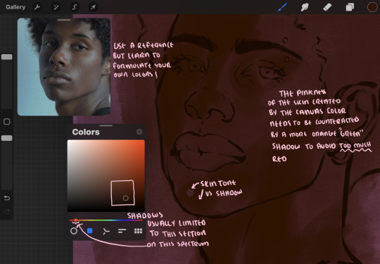
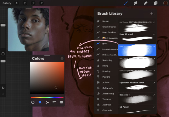
a reference is so helpful, i still rely on references to guide my shadows/lights. i'm past the point of relying on references for exact coordinates for rendering or lineart, but they are still incredibly helpful. in most references of darker skintones you come across, color dropping directly from the picture will give you very grey colors! we want to prioritize vibrancy in this case, so attempt to formulate your own colors or colordrop and increase the vibrancy :)! keep in mind i'm now using the lineart brush to shade. the diffuse/soft corners of this brush allows fewer pixels to be scattered wherever you lessen the pressure, this is perfect for color dropping medium colors to blend two colors together. you'll see how i blend colors later on.
as mentioned previously, red can become too much too fast- so i avoid monochrome rendering as much as possible by using shadows of different undertones. my most frequent combination is using a red-orange skin tone and then using a green-orange shadow.
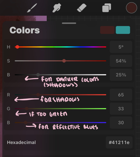
the value spectrum will be your best friend in mixing values and undertones, i use it all the time to formulate the best less saturated darker shadow that is proportional (not too dark, not too grey) to my skintone value. if the shadow is too green simply increase the magenta, if you're looking for a "reflective" shadow, increase the blue.
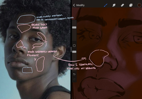
when i begin shading, i always slide the curser to a truer orange color on the spectrum and increase the saturation (slide towards the right) while i decrease the brightness (slide down). heres how it looks when i'm jumping between shadows and highlights while trying to keep my colors proportional (but not identical) to whats happening in the reference ^. i most often times will rely on the value tool, however.
you will notice that a lot of darker skin tones have patches of orange vibrancy, these areas are most common on the nose and cheeks. this is only a detail to pay attention to if you're going for more of a realism rendering style :)
now onto how i prefer to bridge/blend colors together by utilizing the blend tool.
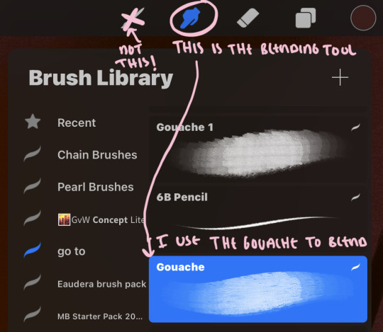
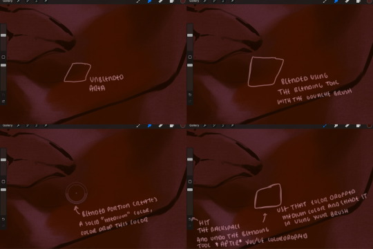
i do not like simply blurring colors in order to blend colors together, it can lead to overblending which can make your portrait look heavily gaussian blurred (think 2010 deviantart art... yea that). the brilliant thing about procreate is you can utilize brushes really efficiently, which include changing the brushes you use for blending. so in reality, artists who use the blending tool on its own can still have portraits that don't look it! there also exists plenty of brushes that have properties allowing it to blend into its surrounding colors are you draw. but in my case, the above photo is 99% of the times how i will bridge two colors together. doing this allows me to keep pretty consistent brushstrokes across the whole portrait, which i enjoy. it also gives me better control of the shapes i use in my rendering, an aspect that is pretty easy to lose when you're using the blending tool directly and solely.
in case the blending process is a bit hard too see, heres that same process recreated with different more visible colors:
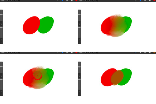
now once you've placed your shadows where they generally tend to be (according to the reference photo), let's make those shapes a bit more specific and pick up on smaller details to make your rendering look more complete.
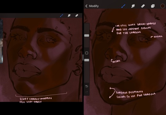
your base colors will never be as dark or as light as you need them to be when you begin rendering, making sure you have a decent contrast between your lightsource highlights and the shadows is key to capturing the essence of a light being cast on your character. it's much easier to keep building upon your shadows before rendering the highlights, i laid down the highlights only to create a guide/help me map my shadows better. do not darken the entirety of the areas affected by shadow, you'll find that shadows are rarely ever the same value, it's a gradual process affected by things like position, height, etc. so make sure the darkest of your shadow colors are preserved only in areas where the shadows are the or should be the darkest.
you'll notice i labeled some areas as "detail", adding very specific shadow placements is a detail. in the reference, the model has a pretty prominent brow bone, creating a shadow over where his eyelid creases just above his lash line, paying attention to feature details like this help enhance the rendering and its realism.
now that i've mapped my shadows i'm going to move onto to rendering my highlights and the region of the face where the lightsource is most prominent.
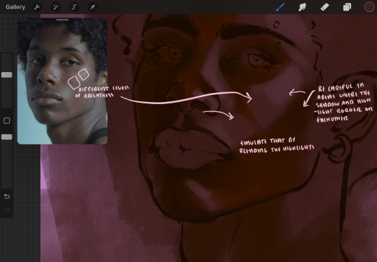
i described shadows as a gradual process earlier, this is because of the lightsource. light tends to spread when its further from the affected surface, creating a larger area affected by the light. of course, this varies depending on how intense and how close/far the light source is. in this case, the light is being casted above him further to the other side of his face, but again, remember that the face is not 2d and more prominent areas are affected more by light. it's due to this that there still exists a, albeit very minimal, shadow beneath his cheekbone. i exaggerate the shadow here for stylistic purposes, but it also helps in keeping me uphold that contrast between the highlight and shadow once again. so i refrain from blending the light into this area like i did in other areas.
midtones are the areas most unaffected by the light source, they're neither shadows nor highlights. and because light spreads, it is brighter in certain areas and darker in others. it is most easiest to blend the darker ends of the highights into the midtones of your portrait. you can emulate this by once again using your blend tool. blend the outer areas of the light and colordrop this color and use it as the darker light more proportional to the midtones. note that before i add even lighter shades to the areas where light is most concentrated, i blend what highlight placements i currently have there.
we're going to switch gears now and focus on the reflective shadow occurring on the darker half of his face.
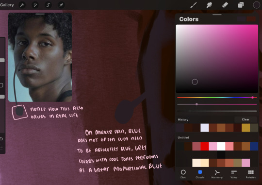
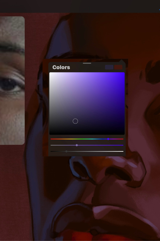
this shadow is a reflection from the lighter background the model is up against, the light being casted above him is allowing for some bounce back from his surroundings, leading to very faint light visible in areas primarily affected by shadows. hence why i'm referring to these colors as "reflective shadows".
in this case, the reflective shadows are blue, or appear to our eyes as blue. on darker skin, "true" blues (blue-purple) are not often times present. what is present rather, is a very grey tone with cool undertones/a grey tone on the blue side of the spectrum, which creates a blue that is much more proportional to the value of the skintone than a true blue. in this case i used a deeper grey on the pink color spectrum, which is more purple. this was intentional, and was done in order to create some sort of color harmony between the contrasted deep oranges im using for the bordering shadows and the blue-grey i'm attempting to emulate.
while i utilize this blue-grey, out've a purely stylistic choice, i still introduce true blues to my rendering. in fact i love using blue/purple reflective shadows in my art, it creates a stunning and colorful render. in this case, i used the blue-grey as a stepping stool to introduce that trueer blue more naturally. you'll see this happening in the second picture above, where i used a slightly more vibrant and slightly more brighter blue, and used it on areas where this reflection was more prominent (and therefore brighter).
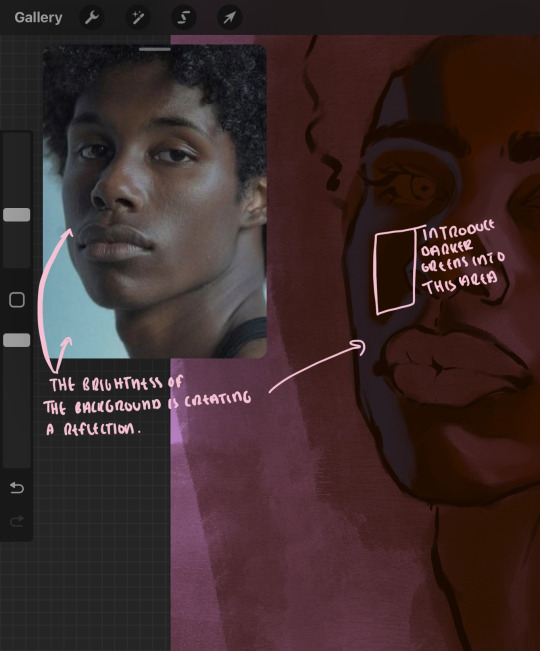
you'll notice how the shadows that border on these reflective colors are less saturated and darker than the shadows on his chin. introduce a darker and less saturated (more green) shadow to that area on his cheek and the darkest shadow of this photo, the sunken area near his nose bridge and inner eye corner. i emphasize this line in the lineart so you can follow this shadow more accurately:
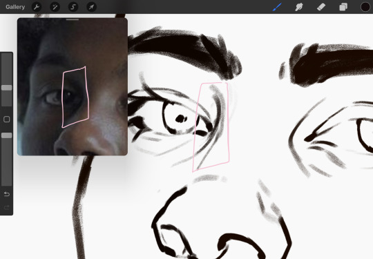
this is also a detail in my opinion and can make your portrait more realistic if you include.
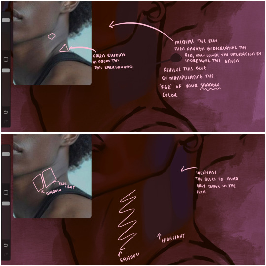
we're going to pivot to his neck area before continuing. you'll find the area of his neck with the most light is also the least vibrant, i laid down a grey base color to emphasize this detail in the portrait. afterwards i added key details. i wanted to stay at least somewhat true to the color dynamics occurring in the reference hence why i used the grey, but i'm not a very big fan of using blatant grey directly on the skin, so i made it more blue.
moving forward, the outer eye and the nose can be some of the most "detail focused" areas of the face when it comes to rendering. due to their more "bulbous" anatomy, light tends to curve around them in more complex ways than the flatter parameters of the face.
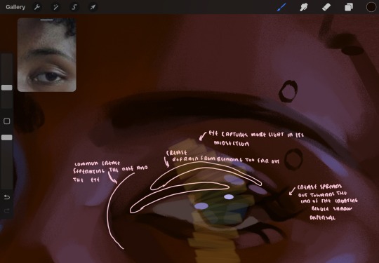
when it comes to the many creases that surround the eye, the skin folding over itself creates a very thin shadow from between the folds. the key to rendering this crease is to concentrate the blending to a very small scale, do not overblend the area because the hill created by the crease very easily captures light, creating an area where the shadow and highlight meet in very close proximity. slight blending is needed for this area, you can deepen the shadows in both horizontal corners of the eye for more accuracy. the midsection of the total eye area (eyeball and socket) tends to capture the most light, remember this is due to how bulbous rounder shapes tend to capture light from whichever direction its coming from.
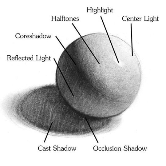
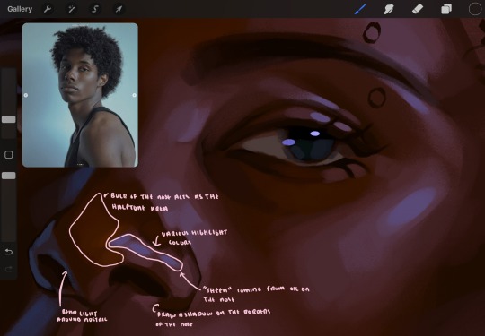
this is of course the case for the nose as well. highlights are typically placed as a dot on the outermost part of the nose by artists, but highlights also spread on either side of the tip of the nose. the nose tends to collect a lot of oil, creating a sort of sheen on the upper parts of the nostril. when rendering a portrait where the position of the head is more cast to the side, the highlight of the nose changes from the bulb of the nose, to the upper nostril. in this case, the highlight spreads, causing a "half tone", or the remnants of the light on the bulb of the nose. this is the easiest place to blend highlights and shadows together. now for the shadow detailing on the nose, i'm actually drawing on top of the lineart on a separate layer. which i'll go into detail about in the next part. you want to focus the shadow on where your lineart is, the outermost part of the nose.
now were going to really detail your portrait by introducing a new layer, the detail layer! this isn't technically apart of the skin rendering, so i'm gonna keep it very brief. this is the layer you're going to render the lips, eyeballs, and eyebrows. more specifically, the purpose of this layer is to reduce the reliance on lineart. in terms of order, it goes above the lineart layer. we're going to soften and even erase the lineart in certain aspects. i use bolder/thicker lines when creating my lineart, but this can become a nuisance/hinderance when rendering.
starting out with the lips:
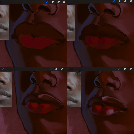
people w brown skin tend to have two toned lips, with the top lip resembling the same skin tone as the face and the bottom lip being redder/pinker and lighter than the upper lip. in my case, i prefer a more vibrant red for the bottom lip. once i lay down these base colors, i begin shading on the second layer.
i personally enjoy the look of a poutier lip shape, this includes emphasizing the middles of the lips as opposed to the ends. i've highlighted the shapes that this lip shape often entails. the small circles on the corner of the lip line are just pockets that occur when the mouth is closed and become emphasized by the fat around the mouth. the parameters of the lip lines do not often meet these round corners, theres often times a "double lip line", that exists around these areas. i love including that in the art, its very easy to emphasize by simply drawing a highlight from the corner of the lips along the curvature of the bottom lip towards the middle.
shadow mapping on the lips tend to go: highlight, shadow, highlight, shadow. the top lip going inward creates a highlight on the most outward part: the top of the lip. and the bottom lip curving outward thus creates a shadow on the bottom of the lip.
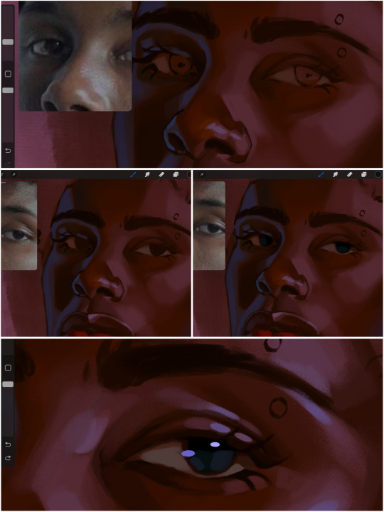
when it comes to the eyeball, i don't draw the white parts as solid white, nor do i make them too bright most of the time. they're most often times an orange grey, i also dont spread this color out if you can notice the uncolored white part of the eye. i do this intentionally to keep some of the shadows that are naturally present on the eye. very specifically right where the upper eyelid sits on the eyeball, it tends to create a small shadow that follows the curvature of the eye. this shadow is crucial, if you can see the first and second picture do not have this shadow, making the iris look more exposed and the eye appears to be held wider.
when it comes to the iris, i do very little. if i'm drawing a dark colored eye i will cover the entire iris brown, before darkening it with an almost black color. i leave the brown sides of the iris exposed to aid in bridging the values between the whiter parts of the eye and the very dark iris. this blended ring also appears on all eyes in real life. lastly, dark eyes tend to show light reflections much easier than lighter eyes. these reflections can be any color in art, in this case i kept it blue-green. i bend these reflections around where the pupil would most likely be depending on the drawing.
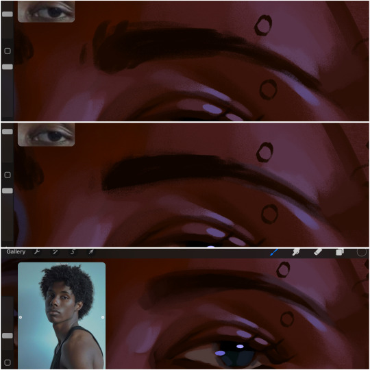
next, the eyebrow. i find it tedious to draw individual eyebrow strands when it comes to rendering, i actually prefer to blend the parameters of the eyebrows to create cohesiveness. sparse and fine eyebrow hairs are penetrated by light and shadows more than what you'd find on the scalp. it's harder to see light on someones scalp due to the bulk of hair crowding the scalp, whereas as its easier to see such light on the eyebrow. to introduce this concept to my art, i will initially draw the entire shape of the brow. then when rendering, i erase the parameters, leaving the darkest part of the brow. then i blend. the lower brow bone will be blended the least, whereas the area of the eyebrow connected to the T zone will be the most blended thanks to the shadow following the nose bridge. the far end of the brow by the hairline tends to be the lightest given the light source.
and lastly, i loosely draw a white border around the portrait for stylistic purposes. then i combine the layers (group together your layers, then duplicate and compress the duplicate group so that you still retain your individual layers) to edit. i typically add noise and play with the curve setting. and heres the finished image:
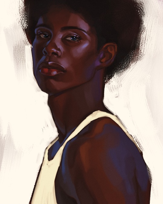
i hope you enjoyed!!
#i didnt proofread this if u find spelling errors pls lmk#black artists on tumblr#digital art#illustration#painting#black art#commissions#tutorial#art tutorial#how to shade#rendering tutorial#brushes
270 notes
·
View notes
Text
ty! \(^_^)/ feelin good so ill try answer in detail for ya!!!!
most of the time i just do basic cell shading. here ill explain my rendering process after i choose my base colours, ill try keep it short & sweet!! nvm warning buckle up its really super long.
flat colours -> fully shaded!!


⭐️Picking shading colours!
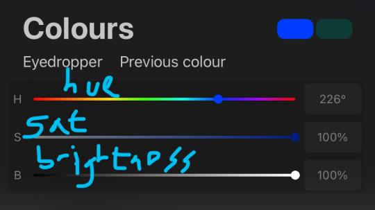
usually it's just the base colour with +saturation OR a hue shift! i dont really lower brightness.
This is what i mean by HSB, i never use the colour wheel i prefer the sliders!!!
i like my art to look super colourful so i do things like shading pink with blue instead of with a darker pink or red, as shown in the above callie piece.
examples ft lumity:
skin: i always keep it very simple & cartoony! over the nose, below the eyes, the neck & sometimes the tips of the ears is where i'll put shading
hair: as u can See, it's not darker than the base colour at all!! for dark hair like luz's, i brighten & saturate the colour, and for light hair like amity's i just shift the hue a little!
⭐️more kewl tips:
colourpick from yourself!!!! instead of making a new colour for everything, try using a colour u already have down!!!! like below: by limiting my colour palette, it looks more harmonious
really messy image but i hope u get what i mean. also the "off white / black" thing is a separate choosing base colours thing!! i can expand on that if anyone's interested 😙

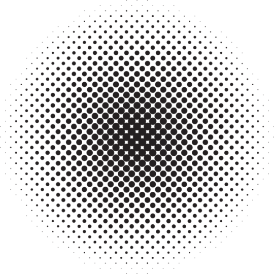
shove halftones in wherever they fit. here are the 2 pngs i use!! there a rlly good alt to gradients, i used a LOT of them in that callie piece!!! clipping mask over where u want it & alpha lock to change colour.

⭐️here's a WHERE i put the shading:
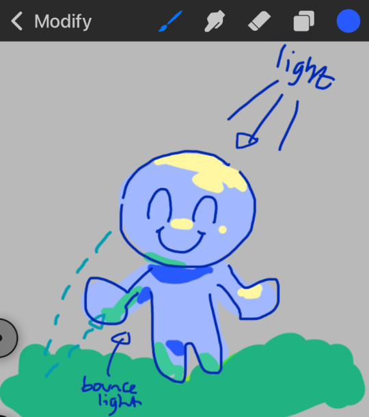
look st the environment ur guy is in!! pick where your light source is coming from & look where that light will hit and where it is blocked by something.
bounce light: the sun's light is also shining on the grass! so powerful the green reflects right back!
this is kinda more realistic lighting now.
i kinda just put a circle wherever theres a corner!
and i put that Beautiful Shape a lot wherever. i change it a little depending on the character, sometimes its triangular or squarey but thats the base shape! i dont even know what its called but i love it.
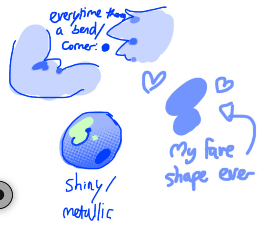
look at this hello weird shape guy!!!
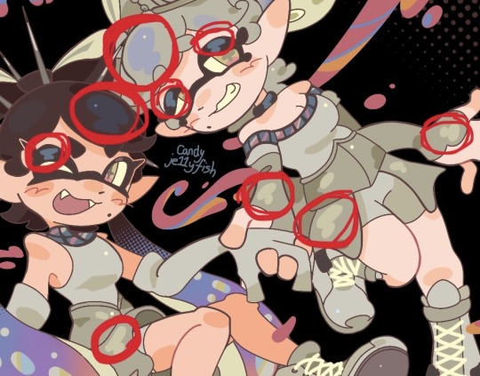
actually, my grandfest art are probably some of the most detailed art i have! u can see urself where i put shading & stuff - they do have more desaturated colour palettes though:

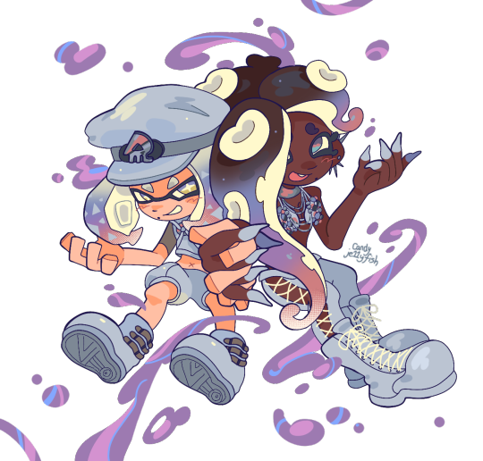
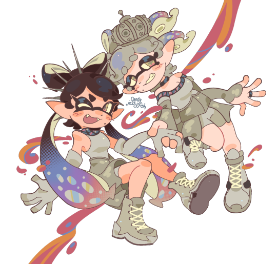
& here are some additional examples ^_^ flat colour -> shaded -> multiply layer -> lighting


in this one u can see the hand & leg at the back are completely in shadow too :)

anyway i think that's kinda it? i dont really know how to explain it, i just do what feels & looks right to me??? remember that im Not an expert & this is just how i do things :)
i will always repeat my no1 tips tho: keep drawing!!! and copy ur fave artists!!!!!! it really will hell u find what u like!!!!!!!!!!!!
i hope this post helps a little & answers ur question😇 never be shy to ask me anything cuz i love answering & chattin w u guys!!!!
EDIT: just saying these arent set rules or anything!!!! u can see just how many times i Dont follow my own advice LOL. my artstyle is super inconsistent, i rarely draw things the same every time
177 notes
·
View notes
Text

Well I also did this today. Sketches so I could try and figure out that skystar fankid since as mentioned earlier, I’ve been trying to think about him
I’ve been trying to draw other stuff today, but honestly after drawing Jazz, my creative juices have not been flowing as much. I tried to do more color palette drawings, but Megatron’s shoulders give me so much trouble I couldn’t figure them out, and I tried to draw Ironhide but he wasn’t turning out right proportion wise and I realized by them I was kind of just forcing it
But then I was bored and needed something to do creatively, so I tried to at least attempt some amount of designing this kid. Though first I needed to try and draw Starscream and Skyfire’s helms (since that’s on of the main things that don’t rely on alt mode) to see how I could combine them
I mean, I think I did all right. It is very much still a work in progress though
Probably shouldn’t have even posted it, just kept it to myself for future reference, but I have a problem of wanting to share literally everything I make with very few exceptions, so here we are
I have multiple alternate color schemes here as well because I just didn’t know what to pick


Honestly my biggest problem here for me is that Skyfire doesn’t have any design in Transformers One, at least not as far as I can tell. And he doesn’t really appear in much outside of that, so I’m really just stuck with his g1 design to base off of. So most of what I do have to work with comes from Starscream and the other Seekers
So like, I feel like this kid looks too much like Starscream, but I don’t know how to fix it
By the way, while I haven’t settled on a name for him yet, the one floating around for me right now is Overdrive? I don’t really know why, and it unfortunately is already a character’s name, but shush
It may change, but for now, in this post, his name is Overdrive
There’s also the problem of the color scheme for him here. Because like, Skyfire and Starscream technically have almost the same color schemes, just that Starscream also has black/grey and they’re dispersed differently. So I’m trying to find a balance here that works without looking too much like one or the other
I had a brief idea to base Overdrive’s color scheme on the original Jetfire toy, and honestly I do think it could work, with the mainly white with red and black accents, it's just that for whatever reason, I don't like how it looks when I make his middle part red. Maybe I've been watching too much g1, because there's a lot of red Autobots, and characters having white and red on their helms isn't that uncommon either. So I just keep it blue so he looks distinct in my head. I might switch it over to the Jetfire color scheme later though
Also you see that for one of the visors I toyed with him having green eyes (his eye and visor color match btw, the eye's only there so you can see it), because some people decide that pre-betrayal Starscream had non red optics. But I didn't just want to stick with plain blue, and I knew that we see a number of miners with green eyes, so why not green? I changed it because I thought maybe he didn't look Starscream enough, but eh
Oh yeah, I do have a few other notes on his design here, since I'm realizing I've mostly just been complaining
Why did I give him a visor? Eh, why not, Skyfire and Starscream don't have them. But I based it on how it looks on Thundercracker and Skywarp
As for his side vents, I wasn't really sure how to do them, but I didn't want them to be the same as Starscream. I tried to base them off of Slipstream's, but the way the vents folded looked weird to me, and I ended up cutting them off and making his face into what you see in the bottom left there. It didn't turn out exactly the way I wanted in the colored version though, and I think I ended up circling back to Starscream's vent shape. But oh well, things to change later
Oh yeah, pictures of Thundercracker, Skywarp and Slipstream to know what I’m talking about. Or more accurately, this is what I used
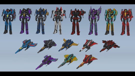
Also those things on his sides? They were supposed to be like Skyfire's side cheek things he has in g1, but I also made them puff out for some reason. I don't know why. I'll probably tweak it, but I want to keep some aspect of it I think
*sigh* to be honest, I really don't know what I think of this design. It really isn't finished at all. I'm really not even sure why I'm showing it, other than to say I'm working on it and I didn't just abandon it? But I mean, we'll see how long that lasts
Do I have anything I added on to Overdrive's character at least? Well no, not really. By this afternoon I think I had mostly creatively drained myself, I mostly just wrote what I had originally again
Namely that he came to be after Sentinel's betrayal, and as such Starscream doesn't know he exists and Skyfire thinks Starscream's dead. Overdrive still has his cog, it never got stolen, either because Sentinel hadn't thought of it yet or he didn't have a believable means to have it taken without it being suspicious. All I really know is he's a jet, but isn't outfitted for military work of any kind, his profession probably being closer to Skyfire's
As for Skyfire, I'm stealing his role here from another fanfic I read, where he's a scientist who was trying to figure out the cause of the Energon shortage and the lack of the miners' cogs (unaware that latter part is a lie, but he was growing suspicious with the discouragement of that line of research), though he also races occasionally. So maybe Overdrive's a scientist too? I don't know, I don't think he needs to be, but I don't know what to make him
Also a note that isn't new to me but I don't think I ever mentioned, due to Skyfire's research, he's met the miners plenty of times and was generally considered one of the nicer cogged bots to them. Overdrive has by proxy met them on occasion as well, including D-16. So as it happens, Megatron does in fact know about Overdrive and the fact that he's Starscream's kid (Skyfire probably mentioned his former conjunx at some point), but he doesn't know that Starscream doesn't. So he hasn't told anyone because he assumes everyone already knows
But yeah, I have Overdrive's backstory, but I really don't have anything about his actual job or personality. To be honest, I think some of it's me being paranoid I recreate Locket in some way, since I like seeing stuff on the Locket AU. I suppose I try making him closer to Skyfire's personality? But for whatever reason, my brain can't rectify that in my head. I don't know
Still don't have an answer on his alt mode either. And it gets even trickier now because they don't have Earth alt modes, they're Cybertronian (even if they don't all look the most different from Earth vehicles here). I did learn about the existence of triple engine jets today, and I kind of want to do that, but I don't know if I will. I also don't know how to draw planes yet, or how they entirely translate to robot mode
But yeah, I think I'm done here, just updating you on what I've been up to this latter half of the day
#I don't really know what to put here#it's a work in progress that's what he is#transformers#transformers one#transformers oc#skyfire#starscream#skystar#my art#fankid#I guess#I feel like I'm tagging my requests right now tbh#overdrive#my OCs
60 notes
·
View notes
Text
What if the LADS Boys were "alternative"?
Which alt aesthetic would they be?
Moodboard and Blurb♡
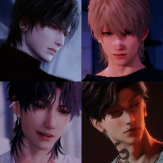
As someone who dresses alternatively and loves exploring new types of fashion, I think it's fun to imagine what kind of styles the boys would into. This is going off my current knowledge of trends and communities I've seen over the years, so don't take this too literally. As always, leave a like and I hope you enjoy!
Xavier
Punk + Grunge + Hipster
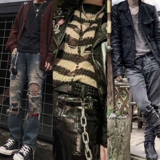
From the beanies to the ripped up skinny jeans, Xavier would love the story he could tell through his clothes. Tons of pins, chains, patches, and belts. Since he likes wandering off on adventures, he wouldn't be afraid to get his clothes dirty or torn. He would wear leather boots that could tough out any terrain or converse that are way beyond repair. Lots of ear piercings, but none on the face. His hair would be long because he'd forget to get it cut (and if it was short, it'd be jagged cause he did it himself). Since Xavier (Lumiere) is older, he doesn't feel the need to buy the latest clothes or follow trends. What he has is good enough for him! Plus, he still thinks he's "super hip" either way.
Rafayel
Soft Boy + Art Hoe + Beatnik
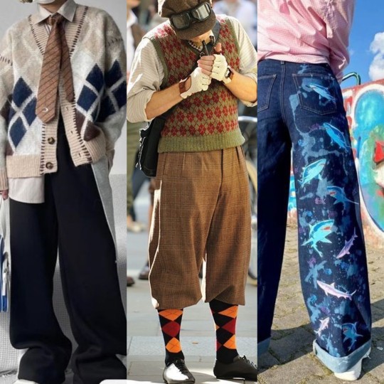
Splashes of colors across vintage patterns. Rafayel would enjoy dressing like it's the 50s whilst adding his own twist. Lots of layers and retro elements that make you question whether he's crazy or a genius. He'd definitely paint/create his own designs on his clothes or make his own jewelry. Lots of piercings on the ears with some on his face, maybe the lips or nose. Besides his signature purple hair, he'd definitely try experimenting with other colors or even colored contacts. On some days, he'd dress more sophisticated, but on others, he'd add a bit more whimsy. You'd know he's a poet from a mile away.
Zayne
Dark Academia + Mori Kei + Cyberpunk
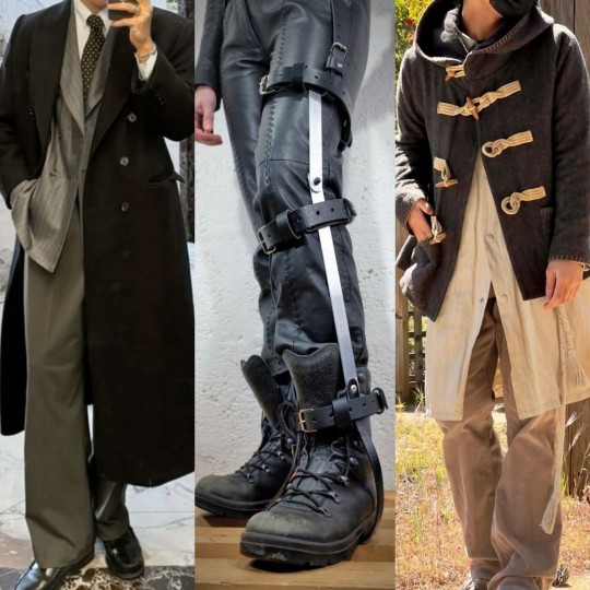
Some would think Zayne prefers function over aesthetic. However, I think for him, they go hand in hand. Rising in popularity, especially in the cyberpunk community, is mobility aids as fashion pieces. As a doctor, Zayne would encourage his patients to embrace their disabilities and help them feel empowered through customization. For himself, he would prefer down-to-earth styles with lots of layers from the cold. Earth tones, fleece, and wide silhouettes. He would not have facial piercings, as they'd be inconvenient for his line of work. If he had tattoos, they'd be dainty ones that could be hidden with clothes. Zayne loves a sentimental look as if he's the love interest in a drama!
Sylus
J-rock + Techwear + Motomami/N.E.E.T.
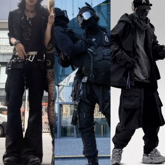
Leather, studded biker. Sylus would be into the "faceless" look, seemingly always wearing a mask or helmet. His outfits would be very accessory heavy, featuring belts, chains, chokers, glasses, hats, bracelets, gloves, etc. His main color palette would be black and white, with pops of red or yellow. If Sylus did have tattoos, they'd be large and meaningful. He'd definitely be rocking piercings or dyed hair and constantly be changing something new about his look to keep you on your toes. I think he'd lean into the flirtatious, degenerate nature of the N.E.E.T. aesthetic, especially with Luke and Kieran by his side.
Since these aesthetics vary in depth, I had to pair down the pictures to what I think would best suit the boys. However, if you're unfamiliar with the aesthetic, I suggest looking it up because there's definitely more variety to the outfits than what is shown here. Let me know what you guys think!
#imagine#lads#love and deepspace#zayne#sylus#rafayel#xavier#xavier love and deepspace#rafayel love and deepspace#sylus love and deepspace#zayne love and deepspace#l&ds#lnds#lads fic#love and deepspace fic#smut#nsft#ask blog#mori kei#dark academia#punk#goth#aesthetic#moodboard#outfits#vintage#cyberpunk
44 notes
·
View notes
Text
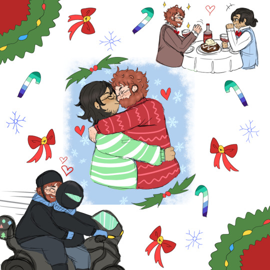
Grant and Marco secret santa gift for @cha1cedony
Participated in a little server gift exchange and wanted to share the art here too :D Image description in Alt and more detailed one below
[ID: Digital art of Grant and Marco from the Dungeons and Daddies podcast. Grant is drawn with freckled pale skin, short curly red hair, and a full beard. Marco has shoulder length black hair, light brown skin, and some facial hair. Both have ear piercings and glasses. The art shows three different scenes in a diagonal from the top right to the bottom left. The top drawing shows the two men in suits having a date night at a white clothed table. Grant has a brown suit while Marco has a blue vest and white long sleeved shirt on. The center shows the husbands holding each other and kissing under a mistletoe. Marco is hugging Grant while his partner has his arms resting on Marco's shoulders. Marco has a green sweater with white stripes while Grant has a red sweater with pink flat stripes and alternating wavy ones. There is a small blue background with snowflakes behind them. The last scene shows Grant holding onto Marco as the two ride Marco's motorcycle. The couple wears matching black coats, blue scarves, and blue gloves. The overall background of the art is white and has two wreaths decorating the top left corner and the bottom right corner. Blue snowflakes, red ribbons, and candy canes colored with the gay pride flag palette decorate the canvas. End ID.]
#marco li wilson#marco li#grant wilson#grant li wilson#dndads#dndads fanart#art#fanart#abeinginsand art tag
56 notes
·
View notes
Text
My Yoyo Design(s)!!!!

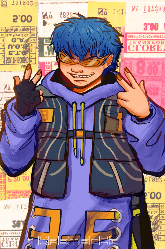

While messing around w/ the Yoyo doodle from my last blog post, I found that adjusting the hue by 25% to the right gets you his jsrf palette. Coincidence or not, I ran with that logic and thought of creating a new Yoyo design with what I got from sliding the hue adjustor all the way to the right : purple and blue.

But before running with purple jacket blue hair Yoyo just like dat, I wanted to try n analyze his canon looks n take note of the constants in both desoigns which are : red ractangular shades, baggy clothing, hanging belt, hooded upper wear, dark-colored bottom wear, bigger (compared to others) round yellow hued skates, and ofc his smug ass grin.

More importantly, his character color palette utilizes red, orange, yellow, green, and blue only which made this redesign thing a little challenging,,,

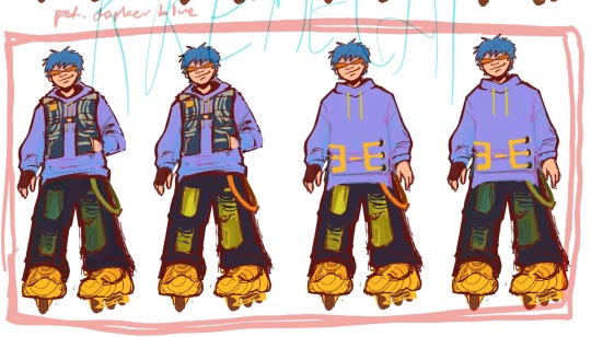
,,,and challenging it was 😵💫 i wanted to try pushing a 7 hue palette on him to sort of break from his usual scheme and make the look more ‘new’ buut obviously it didn’t work out. so i stuck with the usual 5 hue limit and wowers it works!!!
As for the design itself i wanted to go for a layered look. Gave him a cargo vest cus i thought it’d look sick on em + gives off the same tactical look his “bullet sling” looking sash from his future design does. Instead of a hanging belt, I went with a hanging suspender (?) similar to what tripp pants have. Double layer ripped jeans for a way to add color to the usual dark bottom wear, also to have (lime) green stand out in his overall look similarly with his canon designs. As for the skates…they’re not exactly skates. He’s wearing sneakers but with this chunky round skates sole that’s removable so he can wear/show off his counterfeit sneaker collection while being able to skate around town. For the sake of this design, I wanted the sneakers and soles to have a similar yellowish hue to counter the usual yellow skates with black/navy grey design. Similar to future, his hair is exposed but it’s messy and unkempt like what i assume his og hair is. Lastly, the shades are all-red and sport-like in shape.
In the end, I am satisfied with how he looks but I still wanted to make a Yoyo design based on my own tastes and color scheme. So here’s anotha wan!!!!!!!!


Originally just an alt color palette, I turned it into its own design cus why not.
This time I’m following the idea that instead of a hue adjustment, his hair is the color of the previous design’s jacket which is turquoise! 5 hue rule applies here too.
Kept the same idea for the shoes, but now his socks can be seen. His hair roots are grown out (though i personally think it’s just bleached). He’s got a headband keeping his bangs away, orange fingerless arm warmers, and lime ish olive green cargo pants. Jacket is now royal blue going indigo cus i’ve always thought it’s his favorite color n i really just wanted to see it as a main color in his design from just his og skate wheels color. Instead of a belt, the open rings in his jacket have three ribbons hanging made to look like an arrow, in reference to the arrow designs on his og skates as well. Aaand lastly the shades, kinda wanted to stick with all red again but what if red frames and white/transparent lens 🧐 an inversion of his og sunglasses. It’s asymmetrical in shape to form a silly eye expression.
Anyway that iz all, designing these were an inch resting experience. Considering doing other character redesigns as well but not anytime soon, i got other stuff going on.
#jet set radio#jsr#jsr yoyo#yoyo jsr#character redesign#redesign#if sega wont do blue hair yoyo in the new jsr ion wannit!!
133 notes
·
View notes
Text
By the way, I'll make a neat version of this in the future, but more people have been using my alternative palette - even if only occasionally - and it makes me very very happy so
Here is a guide of my personal 'rules' for it, but since it is a palette literally born from 50% of the intent 'I just want trolls to look nice and more colourful', nothing is completely solid and you can use this as a base or just take what you like or anything.
Alt Palette Rough Guide

uhhh my hand hurts so my writing is a bit jank so transcript and further explanation under cut
Hair becomes blood colour
Sclera becomes white or pale grey
Horns and nails become completely desaturated and have slightly more contrast with the darkest shade replacing the base/root being almost black
-
Dyeing hair black is normal and socially acceptable, (probably more so among lowbloods but anyone who doesn't really want to be PARADING their caste too loud), not suspicious, although a little bit unusual/alternative
-
Fins and girls get the same gradient as horns, and usually, I use this as an excuse to add thematic patterns like bubbles or lusus print/colouration between the colour shifts
-
Sometimes when converting the normal palette to the new palette, I adjust the colours of the clothes close to the hair to increase/decrease contrast, as sometimes there are already elements in the same colour as the hair becomes and so it ends up blending in.
9 notes
·
View notes
Note
can you tell us more about the monastery au :O
UPD: no longer relevant. New Attica lore post…anytime soon!
“You’re asking me about my AUs??? I’VE WAITED YEARS FOR SOMEONE TO ASK ME ABOUT MY AUS!!!!!!!”
Honestly…I’m so honored and grateful for your interest!!!! Like thank you so much
TW! Mention of SA, violence and other Billy’s stuff. AND ALSO PLEASE CHECK ALT FOR TRANSLATION
I also want to apologize if my English negotiation skills are unsatisfying, I’m not a native speaker-

So, as I said earlier, my au is about Billy not being broken into a sorority house, but into a monastery. Although I changed his backstory and gave him certain motivation for killing girls, I tried to keep Billy’s personality and character cuz these funny things are the reason why we love him!:)
Backstory!
You know…Simping over a bastard who sexually assaulted his own little sister is kinda dubious if we talk about the 1974 black Christmas and the sister-daughter story is too nasty, speaking of the remake, so…
In my AU Billy is raised in a strict, religious and kinda poor family, as all the money go to the church. He is raised by his mother and a stepfather, who is actually guilty for the religious fanaticism in his family. Poor Billy was also molested as a child and teenager by saint fathers (i hope i called them right cuz I literally have no idea what name do they have…)
These conditions formed three things in Billy: love for rock and rebellion, hatred for religion and sociopathy.
Here’s a little chibi art I made a month ago for article, where I explained my setting’s lore! The article is in Russian tho, so unfortunately I can’t show it to you. CHECK ALT!!!


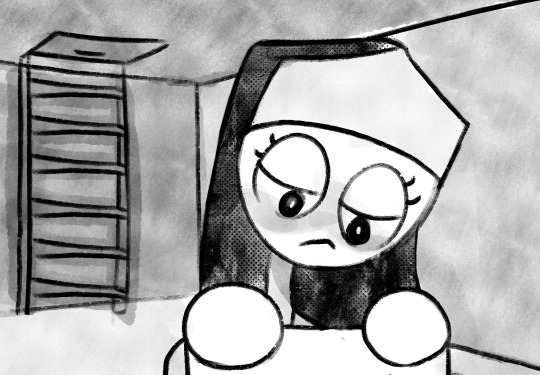
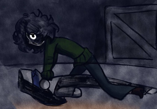
So, remember that part from remake where Billy was in asylum? The same thing happens here too, but why he got in there?
When Billy’s mother got pregnant by his stepfather, Billy was terrified. He really loved with all his heart the little tiny girl who was ready to see the world. The problem is, the world was too cruel. He didn’t want her to be molested, he didn’t want her to be pressured by strict rules of religion. So, one day, he made an attempt on the life of his stepfather. In any case, unsuccessful. He survived and Billy was sent to the asylum, from where he later escaped. After the runaway, Billy found his new home in the attic in one of the most big Canadian monastery.
With wounds on his heart from the duplicity of religions, since then he has taken revenge on the hypocritical nuns. He sent threats, made obscene calls, did nasty things, and even killed with impunity, until one day he was caught by a nun.



Who’s that girl?

The second main character! Her name is Martyr Efsevís! But everyone prefers call her Martha, as she’s not a martyr at all.
A long time ago, a nun lived in this monastery. One day an incubus came to her and defiled her. She bore him a child, who was Martha. This nun was expelled, but Marta herself was left in the monastery for education, as they wanted to raise a pious nun from her. Fun fact! Her color palette only contains black and white, these are her natural colors: white skin, black hair.
When she found out about Billy…She was charmed. Billy’s actions, manners, presence…Everything about him seemed like another world to her. She really wanted him to show her the world of darkness. The world that best suits her true nature. That's why she won’t tell anyone about him.
He was still worried and annoyed by her tho- their relationship will develop, but now he just hates her.
OOF. FINALLY.
It was really fun, but complicated. Hope I could handle the challenge to tell about them properly. I still a little bit worried cuz I think my description of Martha shows her like a Gacha demonic Mary Sue, BUT SHES NOT LIKE THAT I SWEAR😭😭😭 I’m also planning adding more side characters, so I’ll keep you in touch!
I ALSO REALLY WANT TO APOLOGIZE IF THIS POST IS TOO BIG!!! Still hope you enjoyed reading about these dummies! Love y’all❤️
#billy lenz#black christmas#black christmas 1974#art#artwork#Black Christmas au#yippie someone is interested in my dummies#I’m so happy happy happy:3#attica
10 notes
·
View notes
Text


Old OCs reboots because my irls can't draw animals for the life of them (/lh i love them but im the odd one out for even having animal ocs in the first place) so I drew these fuckers back from limbo and remade their reference sheets
SSO OC Skyler, bffs and colleagues with Mariana. She is the devil on the shoulder
and old old original OC with an alt design for my friends to pick from in case it was too much furry for them to handle (Completely revamped their design, the only thing they have in common with the old one is the yellow, black and white palette and a tail). Calm serene Joyce, but empty headed recluse Joyce
#you can tell i redesigned them in the same day because-#design a character who's palette isn't teal and gold challenge : FAILED#ocs of mine#sso#ocs#star stable online#ssoblr#reference sheet#my art#both these bitches ride horses because i cannot conceive a world without horses#Skyler
8 notes
·
View notes
Text
Opinions on MagiReco outfits, Puella Historia edition
It's been a while since I last did this. Also renamed it because it sounds less harsh than 'judging'. Since Puella Historia is complete (at least it seems so for now), I felt like it'd be a good moment. I know I technically already looked at Tsuyu and Chizuru, but I'll include them just because this is supposed to be going over all of Puella Historia's new characters.
Tsuyu Mizuna

A simple and to the point outfit that does convey her aesthetic and gives me an idea of what kind of character she is personality-wise. The color palette fits nicely together and even the little bit of gold isn't out of place thanks to that. Previously I expressed wanting to see a back view to see how her hair is constructed as I was interested in that, the best I've got is a side view. It seems like what I assumed was a bun is more like a ponytail, huh.
Chizuru

Chizuru looks like she's mixing old with new. The vest over her arm feels a little peculiar to me, I'm not sure if it is just me but it reminds me of a winter jacket. The inner outfit itself gives me more summer-y vibes, though, leaving me a little bit confused. The headpiece brings me back to her actual era. Her exposed thighs feel a little bit like they just had to put gaps there though.
Kuro

Now, does Kuro belong to this arc or not? She was a non-alt character who had her playable debut during it, but even though she isn't technically from the Puella Historia, I'm including her anyway. She's also the second girl whose design is based on Iroha, which is very visible from the way her hood is colored and built up. I don't really have an opinion on this though, it's just...fine. For a background character, she's fine. Nothing too special or anything else that stands out though.
Ebony
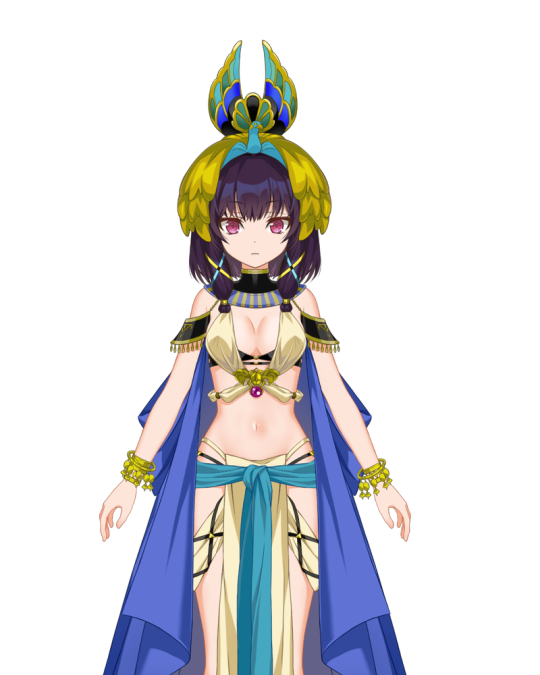
Now I won't be kind, but if anyone expected me to, they don't know me. My biggest gripe with it is that it doesn't actually convey anything about her. It's all just...exposed (pale) skin for the sake of exotification. That's it. She's an assassin, and at least her weapon being a damn censer does its job of being unexpected. And while there were people who were less dark during that time, I heavily doubt they'd be this pale.
Olga

Olga takes mixing the old with the new to a different extent, and I'm not sure if it's working. What I do like is the cloak hanging from her belt but green makes for a very difficult kind of palette if it's the main color. Just like here, I chose to combine it with gold but the grey mesh is what throws me off, sorta. As well as the exposed midriff with the downwards cut in the mesh.
Gunhild

This reminds me of like. The thing where designers seemingly use the lasso tool and then they color in along to where the lasso tool made gaps. That's the vibe I get here. It's kind of an edgy mess of huge demon horns, Norse motifs and of course, showing skin for apparently no reason.
Also, two girls leading a war with one having blonde hair and being light-themed, the other having black hair and darkness-themed, in a Europe of the past, designed by Masugitsune. That's definitely original.
Heruka
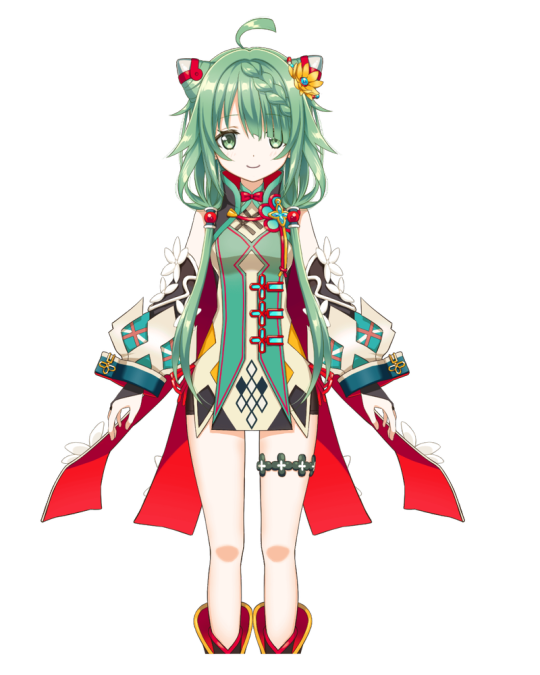
She's fine, if a little overdesigned (her artist likes to do that). The endless knot on her outfit is a nice touch (it's how I called her origin). If the garb it is on was a bit longer I would've probably liked it better, but I appreciate the artist combining green with red and avoiding that X-massy feeling you get with that combo. As a side note, having skin this pale is a beauty goal for many people who live in the area of Tibet I visited (Gansu), pretty much every person I've met has darker skin than you'd expect.
Toyo
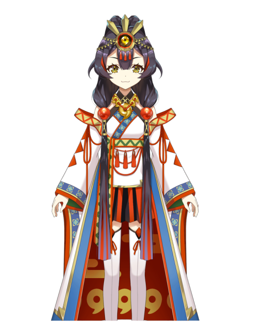
She's actually rather fine. I can tell where she's from and what kind of position she has in the scheme of things. The only slight difficulty I have is with seeing her hair at first glance, i.e where it droops down along the outfit. It does nicely break up the white of the sleeves with the white of the main outfit, but also obscures where the cloak that goes down from her waist comes from. Overall, I like the use of the magatama (it's one of the three regalia of Japan and no, you can't see the real stuff) in the outfit and it's actually kinda funny how GAN was asked to backpedal before he made this.
Amaryllis

In a vacuum, I really like this. I love the classic combination of purple and black, because they just go so well together. The veil and the way her dress poofs up gives me that 'mystic' kind of vibe, and the white is there to aid the gold that is in there with the purple. However, I would have never guessed that she's from ancient Italy. The only thing that does clue me in about that are the shape of her shoes. She's really pretty, she just doesn't clue me in about her era at all.
7 notes
·
View notes
Note
Okay so I have a lot of questions but the main one that's pegging me at the moment is Noah's alt modes and his design like did you completely scrap the police design or is it still going to be in a very later part of the story PS make sure to drink some water and take a very good break
So Noah's design in general is a real hit or miss. He's gone through a LOT of design changes ranging from a mock up of the Black Ghost Challenger with a single alt mode to even going as far as having an idea of a Wyvern Cybertronian Dragon (bc who doesn't love dragons!!??) . Basically I have one design then my brain says "oooh what about this instead" then I change it and see if I like it and if not, I either revert back to the previous or tweakil that one a bit
The whole police car thing came from a private server on Discord as a huge "what if" joke scenario tying in with Mirages love for racing and speeding + breaking rules in general and Noah basically being the complete opposite. Plus the whole blue + white stripes color scheme was just super easy to get down on "paper" without having to do much
However as time went on, I wanted to go back to the previous Dark Green + Dark Red design because
1) the design inspiration was already based in his jacket
2) it fit his character better (I see Noah being related to the color green a lot and wanted to keep that theme
3) seperate color pallets between characters. Mirage is Silver and Blue. The whole fake cop car facade is Blue and White. Too similar of a color palette IMO and it blended too much together. The green and red (and then the addition of deep blue arms provided a nice balance)
So yes, the whole police car disguise is scrapped and will not be returning. Basically I'm pretending it never happened :D
Noah's secondary Alt mode (he's always had the Challenger as a primary so that never changed) kept changing mainly bc I couldny ever decide if I liked a helicopter or a plane better lmao but later I leaned more towards my interest with small aircraft and the Cessna then kept :)
Tbh, over time, he may get a few tweaks in design here and there if I suddenly decide smth needs to be changed or added but so far, I don't personally feel like anything is "wrong" with it
TLDR: I'm super indecisive and can never keep things constant bc my silly brain finds interests with other things :)
Also tysm about the water and break!! 💙
6 notes
·
View notes
Note
✨ Self-appreciation time~! List five of your favorite works, be it in the form of pieces of writing, graphics, icons, drawings, code, and so on. Then, if you're feeling up to it, pass this on to five more blogs! ✨
i have actually received TWO of these, but not entirely sure how i wanted to answer it with. XD but uhm... i'll try! this is in no particular order btw...
1)
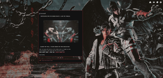
the current theme for this blog! i dunno how many ppl bother looking at the web themes anymore. but i'm still very proud of this. i dunno why! it's simpler than what i usually do. but it's so pleasing to look at. it's not as tackled down with PSDs as my older graphics used to be, and it made me realize not every RP graphic has to be deepfried to look good. i also like how the colors look on it, too. it came out rly nice, and sometimes i just like to look at it to admire the work. also jin's TK8 design goes well with DJ's TK7 design because they both have the same color palettes (white, red, and black)
2)
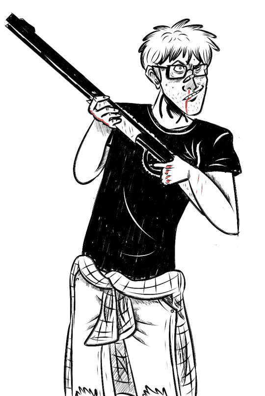
this piece of art is nearly 4 years old, but yet it's still one of my most favorite arts i've ever drawn. it's of an older muse of mine, bill dickey from the eltingville club! (a very obscure comic and a pilot from adult swim that never picked up. i wouldn't be surprised if y'all don't know him sdjfndsfjndsf) for some reason, despite being from a very obscure ip - i had quite a few followers and attention on that blog. from time to time, i do miss him!
3)
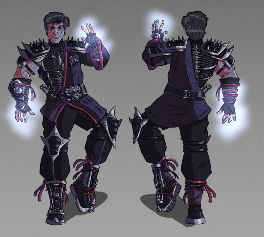
another old muse,,, haha,,,,, this one's from 3 years ago! which is a revenant design of sub-zero / kuai for MK11. bc i was kinda let down we never got a revenant alt skin for him in that game. i'm really proud of this design i've made for him! in fact, it may be my favorite fan design i've ever made.
4)

uhh, don't feel like searching for the op post of this. but from my other blog @brokentoys - i believe i was pretty upset when i made this, so it really comes from the heart haha. it looks awesome, too. really, i should continue these old web edits.
5)
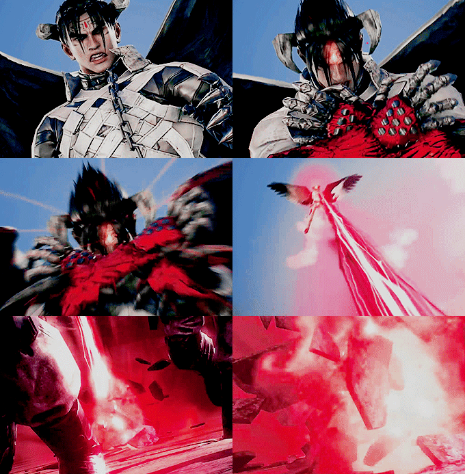
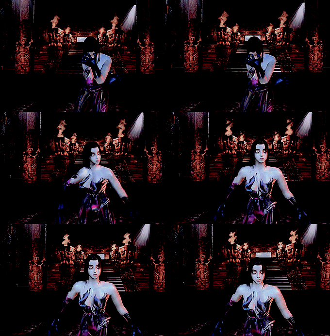
and i guess last i'll this gif set! just 'cos i'm often not happy with my gifs i make - despite the fact i make many, and have been making many for years. i just always feel the colors look off, or their quality sucks. these actually look really nice, not fuzzy, clear and crisp with vibrant colors. the gif set just looks awesome in general.
as a writer, i probs should've put an exerpt of something from my writing. but honestly... surprisingly, my writing is what i'm most insecure about. and really? i'm not too proud of most of it. i always feel my writing is too clunky, and not paced well - also, sometimes i feel it's a bit disinteresting.
1 note
·
View note
Note
Joining in on the ask game because why not?
18.what’s your clothing colour palette?
Happy to have you leo 🫶😊💕💕💕
18. All my clothes are mostly black/red (alt kid) + white and pink if I'm feeling particularly femme lol
My partner steals my clothes all the time too
Ask game
3 notes
·
View notes
Text
My opinion on the Arc suits: What. The. Fuck.
First, the logic behind it. Like, the connection between each character and Arceus, and whether the character needs the alt or not. An alt needs to be relevant to the focal point of the design.
It has been four(?) years since the last Lance alt in this five year old game. Meanwhile, Steven is getting alts like no one’s business! Cynthia got some great treatment too. She got the Giratina suit, the Alola pseudo-legendary alt. Also, she has three themes across the board. Most of the champions have a decisive theme. Most…
Hm…I guess who doesn’t have a decisive theme out of the Champions. HM…
Seriously, why does Giovanni get a decisive theme instead of Lance? All the other champions get a decisive theme(to my knowledge)! So why can’t he?
The only way for Lance to get an alt is to be tied with Steven and Cynthia. Why can’t he and Clair get alts together? They’re literal cousins! Silver is also another alternative solution. Do I see/understand the dad!Lance son!Silver head cannon so famous in the Lance fandom? No not at all. But at least it’s something.
Moving on to Steven, what significance does Steven have with Arceus? I know this applies with Lance, but at least he’s from Johto which has some connective tissue with Acreus and Sinnoh, but Steven? He doesn’t have any connective tissue that links him with Arceus (to my knowledge). He has more connections to Rayquaza or the Lati duo more than anything. Besides, Hoenn’s husband would relate to Regigigas or Heatran than anything. Steven doesn’t have anything that can connect himself to Sinnoh other than that one place in Sinnoh in the post-game(?).
As for Cynthia, uh… I have nothing to really bitch about. She has a strong connection to Arceus, especially with her bloodline. She obviously has interest with Arceus since she’s a history nerd (and she’s proud). If anything, Cynthia really fits the bill with the Arc suit idea. I can’t really complain here…which is great!
Secondly, the characters’ synergy with each other. A character alt should have a good connection with the other characters receiving the same alt. For example, Feh’s choice for who gets an alt makes sense. Marth’s bridal alt is paired with Caeda’s bridal alt because they are canonical husband and wife.
The whole Steven/Cynthia/Lance connection is shown in Masters. They’re the final boss of the main story I think. I didn’t finish it because I was wrapped up in getting characters I actually liked. Their relationship in the mainline games is… nonexistent. However, Steven and Cynthia share similar interests that being geology and archeology. That’s it. The whole crux of the trio is that they’re powerful trainers who got to Champion level and help you defeat the evil team. That’s it.
Now another principle in what I’m going to call “Alt/Skin Law in Video Games” is the designs. Do they have a common theme? Do they have some unique details that sets each design apart? Does each design carry the essence of each character as individuals and as a whole group?
The arc suits DO fit the principle. Do they look good? Not really. I had just played Xenoblade Chronicles and when I saw arc suit Cynthia, I mistook her for Mythra. I’m not kidding. I wish they made all the clothes white. It’s annoying it doesn’t. Lance with a white cape would look good. The orange could change to purple or gold to match Arceus. The underside would be a light grey. Steven’s design is weird. Why aren’t the pants white? Make the pants white. It’s so annoying. His original color palette is just perfect. Just invert the black. Simple as that. Anyway, back to Cynthia, why are the hair accessories green? Make them whatever color Cynthia is supposed to represent for the Arceus form. I get Lance is dragon. That’s just common sense. Steven Stone being steel Arceus makes sense too. Cynthia? Make her ??? type or Stellar type. Makes sense. She isn’t a type specialist, or a triple type specialist in Steven’s case (which leads me into a head cannon I just thought of just now). This also helps with the foreshadowing with Volo and the champions.
Anyways, that’s all. I know I said Wally was gonna be soon, which he will, but it that takes time because he’s my favorite rival, and this doesn’t take as much time for me
#arc suit lance#arc suit cynthia#arc suit steven#these are just my thoughts#stupid designs#love the music for the trailer tho#i need a wallace and lance event stat#give me my watamiku stuff#also watacarne#both is good
0 notes
Text
How To Style a Shirt for Men in 2024

Dressing according to our aesthetic and body type is just as important for men as it is for women!
In 2024, men’s shirt styles emphasize versatility and personal expression. Popular trends include oversized silhouettes, relaxed fits, and bold patterns like florals or abstract prints.
Even with basic clothing items like cotton shirts and biker jackets, you can indeed create a stunning outfit simply by using unique ways to style your wardrobe!

Flannel Shirt on Graphic Tee
Pair your favorite graphic t-shirt with luxurious custom flannel shirts and create hundreds of different outfits in a jiffy!
Flannel shirts are not only comfortable but also quite visually attractive. They are a popular choice for those who follow alt, grunge or downtown aesthetics because they give a dark and edgy look to the overall outfit. This is one of the most popular outfit choices for musicians of today!
Dark-coloured jeans and trousers along with silver jewelry and sneakers complement this style.
Minimalist Button Up
Custom button-up shirts are tailored or made-to-measure according to an individual’s unique body shape and preferences like fabric, collar style, cuff design, and other details.
Because of this classy fitting and finishing, individuals who wear custom-made shirts don’t need a lot to complete the look. In this case, less is more!
In 2024, minimalism is all about a clean, dewy look with a monochrome color palette to complete the outfit. Men’s golden jewelry like chains and bracelets are also big contributors to this amazing look.
Beach Shirt and Shorts
Brightly patterned custom camp shirts are a dream come true for those who like to dress boldly. These shirts usually contain enlarged images of plants, fruits, flowers, ferns etc. Beach shirts are usually half-sleeved and made of lightweight, natural materials that can absorb the sun and heat.
Popular for a weekend outfit, these shirts are usually paired with lightweight shorts of cream, beige or denim color. Chunky sandals and oversized goggles are perfect companions on this day.
And if you want to upgrade your look another notch, you can select some shell jewelry and straw hats for the day.
Formal Shirt for Summers
Formal shirts are usually solid in color and slightly loose on the body. They have proper spread-out colors and tight cuffs that you can choose to roll up if you want to look more relaxed and confident.
The most popular colors for formal shirts in 2024 are white, black, green and dark blue. Stripes of pink and grey on a white background are also in trend at the moment!
Formal shirts are best paired with relaxed, formal palazzo trousers. Layering with vests or lightweight jackets can add a unique element to your outfit while maintaining the formal look, too.
Final Words
Men’s fashion has changed a lot in the last ten years. Dressing up in attractive and fashionable clothing can help us present our true personality in front of others and gain their favor at first glance. Further, customized shirts make use of creative patterns and prints to make unique looks possible. Lastly, never forget to accessorize with the right chains, badges and some good quality shoes!
0 notes