#these are all manga redraws except for the first one
Explore tagged Tumblr posts
Text
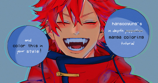
hansooyung's coloring tutorial & ctiys: alma time! 🍒
hello everyone! though i've been meaning to for a while, i've finally gotten around to making my first manga coloring tutorial! i'll be going over cleaning panels and screentones, choosing base colors, and finally shading and lighting.
this will also be a color this in your style challenge, so if you're willing, feel free to post your colored panel and tag me in it!! i'd love to see all the results :)
find details under the cut! 🦋
DISCLAIMERS:
this is just how i personally color! i know for a fact that some of my other friends follow other methods and have such beautiful colorings <33
for colors specifically, i play around a LOT. if you don't like your color scheme for the time being, mess around with it! i don't use psds since i like to mess around by hand with color palettes, but maybe i'll look into it for the future.
i explain a lot just bear with me gang 🙏
TECHNICAL STUFF:
software: ibis paint x (on iphone). i use ibis since it is FREE for all phones and it worked on my chromebook as well.
while this tutorial is made for ibis paint x, everything works on other softwares except the brushes, which i've provided alternatives for below.
brushes: i will be using dip pen (hard) which is automatically included with ibis, and two other brushes i made myself which you can find here and here. for more brushes, @/bkdkdh was incredibly helpful and posted her awesome set here!
for other softwares, you can use similar brushes. dip pen (hard) can just be the default brush, while wet edges is just the default brush on lowered opacity (and more of a rectangle/marker shape?). watercolor pencil is a watercolor brush in the rectangle/marker shape as well. if you can't get the shape, you can always smudge your lines into shape as well, so don't fret too much! a bunch of people only use one brush for coloring everything (which is insane to me, personally, they are so talented!)
fun fact: the first brush listed that i made was originally called "aki tao watercolor smooth" 👍
ok here we go guys!!
STEP ONE: CLEANING THE PANEL
i think of this part as setting up the panel for coloring! usually it's pretty exhausting cuz it's all b&w but it's all worth it i swear. the panel i'll be coloring is this beautiful one of alma from chapter 2:
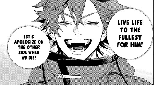
imgur link here (x)
a lot of people redraw their lines to avoid screentones, which is extremely helpful. however, i work on a phone and my fingers are not steady even with the stabilizer turned all the way up T~T. i do it this way, but a different (possibly easier) way may work for you!!!
your first step will be to remove all the white, giving us a transparent background to work with. THIS IS THE NUMBER ONE REASON WHY I USE IBIS PAINT X.
when you upload the image to ibis, a popup comes asking if you would like to "extract line drawing". this creates a lineart of your image. click yes, and your work is like 90% done.
if you're not on ibis, you can redraw your panel, put lineart layer on screen, etc. or you can just extract line drawing from ibis and upload to software of your choice
for those of you not on ibis, i've included the line drawing here (x) if it looks black, don't worry and set your background to white.
omg i was not kidding when i said i explained a lot. ok now onto the three main steps of cleaning the panel:
cleaning background
removing screentones
repainting black lines
for cleaning the background, we're going to clear off all the extraneous stuff. this includes the text in the speech bubble, the gradient screentones behind alma, and the panel line on the left side. just use your eraser tool and go crazy! (i forgot to save the panel at this point of the coloring OTL)
for removing screentones, we're going to remove all those "dots" that mangakas use for shading. these are used to show value for b&w art, but since we're coloring we don't need them—a lot of people have really cool ways of incorporating screentones in their colorings though, and it looks amazing! i used it on nana's hand in my bnha coloring.
remove the screentones from alma's hair and jacket with your eraser tool. this will take time, but it's worth it in the end!
for portions with a bunch of lines, you can create A NEW LAYER and redraw some of the lines. that way, you can erase indiscriminately from the original layer but the lines you drew are still there. again, like i said, my hand is really shaky so i don't do it a lot, but it's extremely helpful for smaller parts where i have control! i used this on alma's jacket, and here's a screenshot of the process:

(i made his jacket purple so i could distinguish between layers easily).
it should look like this when you're done:
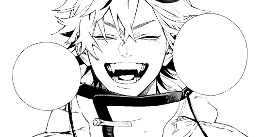
for the final step of cleaning, i like to erase all the things colored black (the collar and strings of the jacket, along with the back part of his hair). that way, i can color them in with dark colors and it adds to the whole look of the coloring.
i've circled the parts i'm going to erase below:

and it should look like this when you're done!
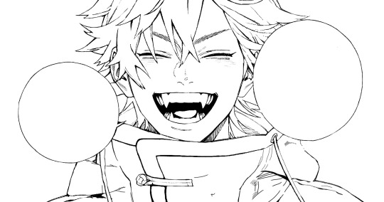
ok everyone cheer we're ready to color now!!!!
STEP TWO: BASE COLORS
CROWD CHEERS ok lets go!
this part is the most important to me, because it sets the tone for the whole coloring. i like to use three-four main colors in my colorings, and it's usually background, skintone, hair, and the secret fourth color. the secret fourth color is usually whatever color fits the character's vibe, or if the character's color is the bg, it'll be an accent color.
for example, with my nagi coloring, i used white for the hair, i had my skintone, i had blue as the main coloring vibe (as nagi's color), and black as the accent color.
for alma, i chose his main color to be red! it's the color of his hair and his jacket, so i wanted it to be vibrant and stand out. since blue contrasts red, i went for a greyish-blue shade for the background. (i went for grey rather than solely blue because then it would clash rather than complement).
disclaimer please please please take your device off night mode warm mode f.lux whatever you have. this has screwed me over more times than you may think :(
i like to make my vibrant colors closer to the right end of the color square. for alma's hair, i chose this color:

i dragged it down from the corner a bit but kept the saturation since his hair is kind of dark. we can use vibrant colors to shade it though, so don't worry!
here's his hair and the background together:
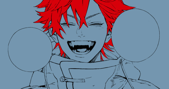
now from here, play around with skintones until you find one that matches the hair!
i usually drag around the wheel to the orange-red intersection, and have it on the lighter, more saturated side. here's the color i chose for alma's skintone.
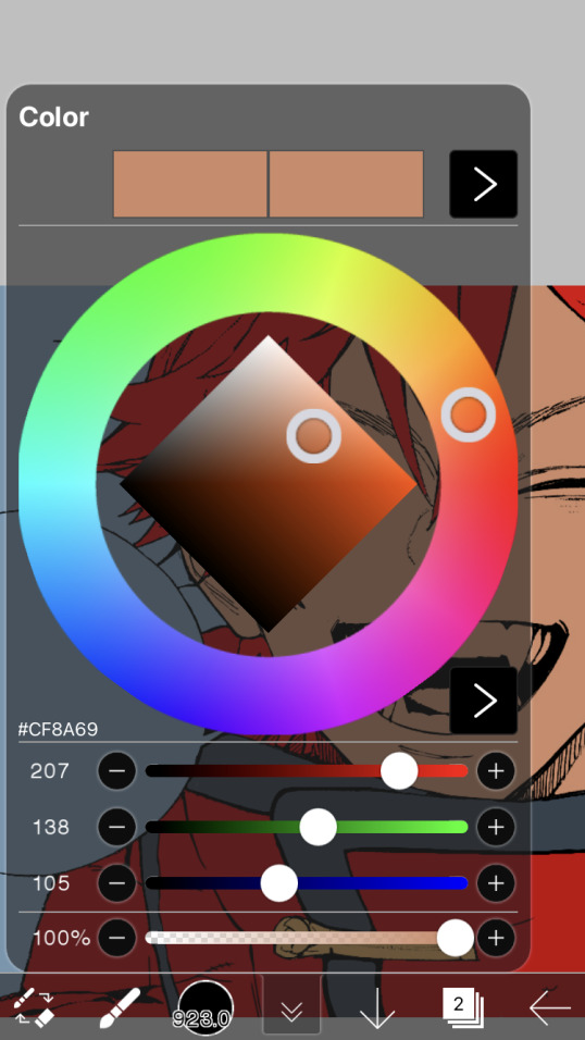
i thought his original skintone looked a bit too orange, so i pulled the saturation back a little bit (moved closer to the left side of the square).
after that, color in his jacket with a bit darker red than hair, choose a gold color for the accents on his jacket, and color in the black parts with a grey-ish color (we will change that later).
here's the base colors!
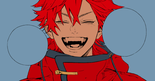
if it looks a bit bright, don't worry! we can change that with shading. or you might just have to. accept the light.
STEP THREE: SHADING AND LIGHTING
wooo we made it!!!!!!! ok now i lied, we have a bit more of base colors to go. on a layer above the skin, color in your teeth and tongue. for pieces that have a more red feel (like this one), i like to make the teeth and the shading a more vibrant blue color. (for blue pieces, i make it a purple!).
IMPORTANT NOTE: ALL SHADING AND ALL COLORS SHOULD BE DONE ON NEW, CLIPPED LAYER.

i'll then go in and do some light shading with my wet edges brush. i'll use a darker color for hard shadows and then a lighter, more vibrant color to accentuate it.
next up we have blush! a lot of people do this in very different ways but i like to do it directly under the eyes, in a vibrant red shade. make a new layer above the skin and clip it on. color pick alma's hair and drag it to the most saturated shade (red corner). then using the watercolor pencil brush, lower the opacity of the brush and drag a line under the eyes on both sides.
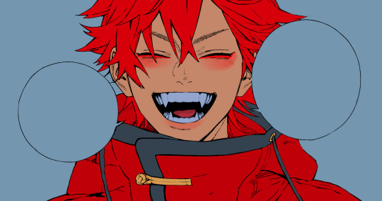
make sure to erase the portion of blush that goes above the eyeline. i also added some lips for alma as you can see, and then added a red line under the eyes! this was back to the regular dip pen (hard) brush on 100% opacity. it may take a few tries to get your blush to the way you want it, so don't worry too much.
now we can start our actual shading!
i break this part up into three steps: skin shading, blue shading, and light shading (highlights?)
for all of them, think about where the light is falling and how it will look on alma.
quick interlude about brushes: i use the watercolor pencil brush for softer, bouncy looks (like blush and noses) and i use the wet edges brush for more hard lines in shading.
again, make a new layer above the skin and clip it on. (i like to have it below the blush, so it doesn't cover it). for skin shading, i take the vibrant red and lower the opacity of the wet edges brush by a significant amount (specifics don't really matter, as long as you're happy with it). i'll trace his neck, from the shadow of his face, shadows of his hair falling on his face, ears, and nose. (for the nose i used the watercolor pencil brush for a softer look).

this is what i have once i'm done!
next we have skin shading part two, where we basically make a new layer on top of our first shading, lower the opacity further, and trace outside whatever we just did to blend it in more.

i used the watercolor pencil brush since it's more softer shading meant for blending! i also added it around the eyebrows for depth.
next up we have our blue shading! this is a technique that i learned from @/bkdkdh's colorings, but adding blue as a shadow really adds to the whole coloring. using the watercolor pencil brush, select a light-ish blue shade (a bit more saturated than background color) and use it to shadow a few more areas than your skin shading. i always make sure to hit the underside of the nose, cuz i think it adds depth!
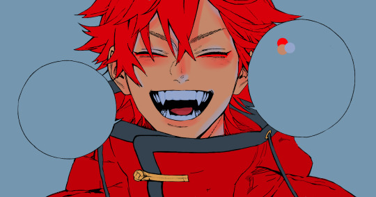
finally, to wrap up our skin shading we have our lights. i use an orange-ish yellow color, which i set pretty light to not blend into the skin. using the watercolor pencil brush, i'll basically highlight any areas opposite to where the blue was, and highlight different parts. i always highlight one side of the nose as well.
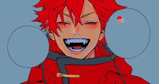
i erased the line around the nose since we now have shading there, and added a darker shade to the teeth since i felt it wasn't shaded enough.
now onto the hair!!! (guys we're almost done bear with me, skin and hair are the two main things and then you can half-ass the clothes)
color pick alma's hair color, then drag the red a bit further down to get a darker yet still saturated color. here's mine:

then, using the wet edges brush, draw lines of shadow wherever clumps of his hair fall or overlap with each other. you can have the opacity set to whatever level you want, i just went with around 90. just try to follow the natural lines and patterns of the original line drawing, and everything should work out fine.

here's how mine looks! then, just like we did for skin shading, place a layer on top and lower the opacity to around 50%. place some more shading to blend it in. you can also shade more parts with this shade for some softer shading. i actually forgot to take a screenshot of this step but you'll see it in the next one!
for our (almost) last part of hair shading, take a layer and place it below both of your shading layers. this is going to be our highlight layer! you can see it below, labeled 49%.

remember how we set alma's hair a bit darker from the corner color? now select that corner color and draw highlights in the center of each hair clump.

lightly visible but it's there!
now here i skipped around a bit bc i was having fun and forgot i was doing a tutorial, but repeat the shading (not highlighting) steps with darker colors for alma's jacket. you should have your base layer, a dark shading, and a softer shading for blending.
we're almost there guys!!!
for the pretty much final step of shading, select a light blue color and do some blue shading with the watercolor pencil brush opposite to wherever your darker shading falls (just like we did on the face). make sure to do it to both your hair and your jacket! here's mine:
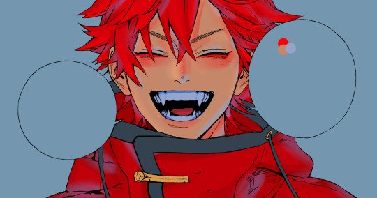
now for the black portions, we're going to color the whole thing in a dark blue color. just alpha lock your layer and make a big stroke of dark blue, almost black. for our black shading, we're actually going to go lighter.
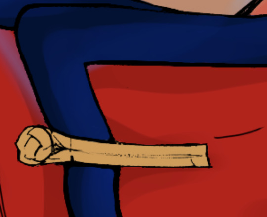
select a lighter (but still dark) color and place highlights on the base layer, then take an even more vibrant, lighter blue and place it on the very outside for highlights. a better example of this would be nagi's legs in his blue lock uniform here. then, choose a shade to apply shading to the gold accents on alma's jacket and we're done!
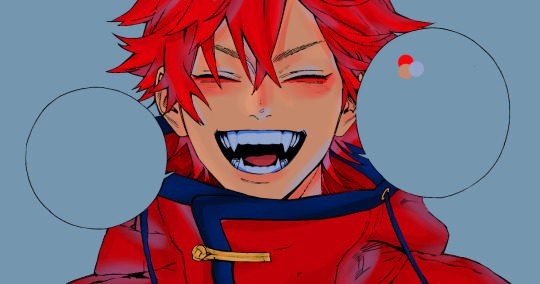
CROWD CHEERS!!!!!
STEP FOUR: FINISHING TOUCHES

we made it guys!!!! for finishing touches, i'll usually do background effects or text or that kind of stuff.
step one is coloring your lines. you can add a new layer and clip it to your lineart, or simply alpha lock your lineart and color directly on top. for hair i like to add vibrant blue/purple lines, along with a few red ones. for skin lines i try to do dark brownish purples, but leaving some black is good too bc it adds flavor!
i colored in the text boxes and added shadows using the wet edge feature, then added some text. for the glitch effect, i duplicated the lineart, dragged the layer below all of my colors (including speech bubbles) and then used the glitch effect with height full from ibis. if you don't have ibis, you can look into features on your software, or you can also just drag your lineart layer a bit to either side and color it in. i also applied just the tiniest bit of noise on top of everything
and there we go!!!!! we made it to the end :)
if you've read all the way til here, thank you so much! if you decide to color this panel of alma (or any other panels!) don't be afraid to post them and tag me for a color this in your style type of thing! (you can also put it in my tracked tag, #user.roy) i'd love to see everyone's works :)
here's the full timelapse: (it stalls for a bit at some times but hey we can't have everything)
#roy colors#tutorials#manga coloring tutorial#useraki#usergojoana#usermica#usernikiforova#tagging some friends <3#alma#gokurakugai
89 notes
·
View notes
Note
I love your work critiquing the anime’s art style because it’s so weird and needed to be pointed out!!!
I have some thoughts on it that I think might kinda help?
I think the anime’s art style is in the uncanny valley were it’s not the mangas art style but it’s not far enough away that the general fandom will critique it but it’s far enough away to be weird.
Like for example: can you imagine the anime models of Akane and Aoi in chapter 69? Isn’t that weird to picture??
The anime is like the manga except the color palette is lightened (which affects some characters more than others). And the edges are less sharp? Like look at Kou, Teru and Akanes hair for example it’s rounded compared to there manga counter parts. Also the eyes on all the characters are just larger and some of them just straight up different from the manga counter parts. Also I don’t really know how to discribe this but there hair just looks thicker, and less wavy, namely in Aoi and Nene. Mostly Aoi however, I just feel like her hair looks stiff in the anime.
And this needs to be spoken about because it plays a big part in lightening the overall tone of the anime! Which is one of its big issues and why I’m a firm believer in reboot over just season two! The lighter colors and rounded edges just come across as more childish, and with the cut arcs and added humour tbhks tone is very different in the anime and manga.
I used the example of chapter 69, because Akanes the most clearly changed in the anime, and because of the gory bits of that with him being injured, but think about can you really imagine any of the more serious scenes from the manga in the anime art style? The severance, Nenes death reveal? It looks off doesn’t it? Is this just me?
Anyway in conclusion I hate the anime’s art choices and the manga is very pretty and I love you for calling the anime out on this bs
●・○・●・○・●・○・●・○・●
First of all, thank you for asking and supporting me! This genuinely made my day :`D.
The anime's art style looks the way it does because it's and amalgamation of the different art styles through the manga, which sounds fine and normal until you realize that they choose selectively.
The eyes at the start to the manga are simpler, with less sparkles and complicated shading, so the anime choose those.
The hair as of right now in the manga is simpler, the fine strands are rounded (+there are fewer) and the line art is thicker, so it's the anime's favorite.
Actually, as you pointed out, the hair looking as it does is probably most to blame on the budget. With higher budget anime, such as Oshi no Ko, Demon Slayer, or Komi can't Communicate, the animation studio has the money to animate individual strands of hair, and really bring it to life, a privilege the tbhk anime does not have. The only other choice is to "group the hair together", making it look thick and stiff, only "flowing" at two fps in the *really* important scenes.
This is also true for the shading, we'll never truly get the anime as if it was beautifully animated official art:


(Yeah the hair thing looks worse then even I remembered, there was meant to be wind in this scene, which the anime did not like)
It's painful for me to imagine the rest of the manga with the anime's current art style, but at least we can look forward to the voice acting (;-;).
After I make sure tbhk characters get the respect they deserve, I'll probably move on to redrawing screenshots from the anime, wish me luck 〒▽〒
Thanks again!
●・○・●・○・●・○・●・○・●
23 notes
·
View notes
Text
All of this art except for one is from 2021 and which is when I just started learning how to do digital art fhdsjkfnsdjk
First is the piece i do a yearly digital redraw of (I need to work on this years ooopsies)
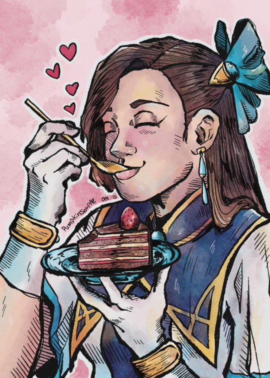
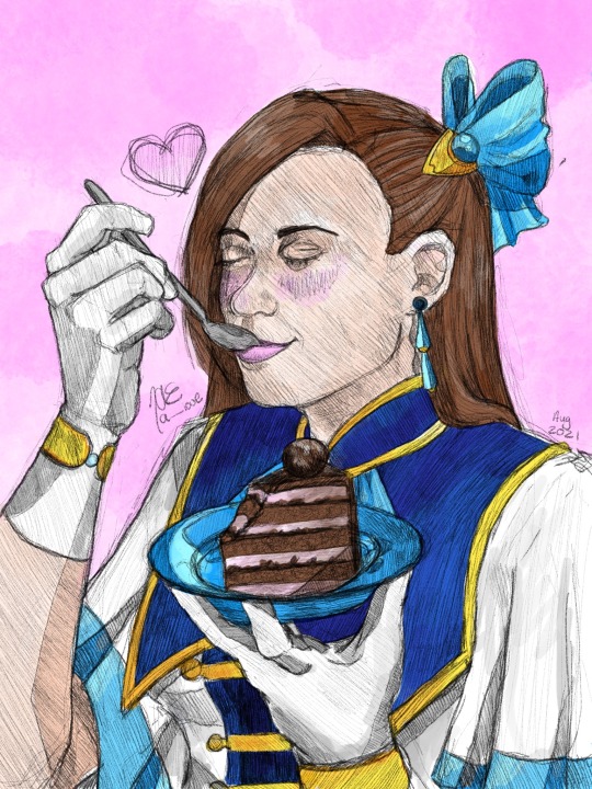
Next I believe the first is an anime screenshot redraw and the second is a light novel artwork redraw (I need to get back into reading the light novels) I also forgot the guys name is Jord/Geordo what the fuck is that name fejkfnde
I find Katarina x Geordo so amusing because it makes so many of the characters mad 😭😭😭 although I think my personal favorite ship is with Alan or Maria
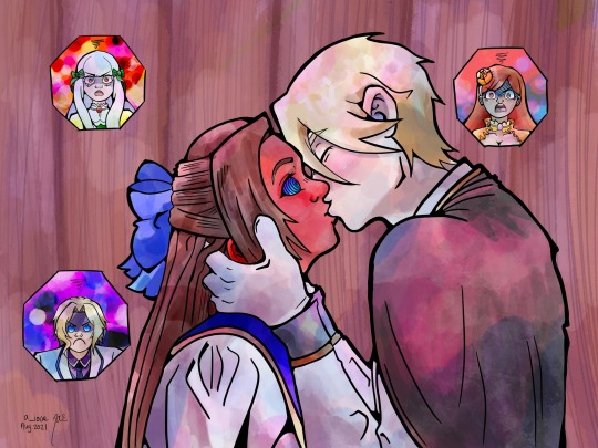

And last is just a sketch of Katarina

I should also make on the verge of doom art I absolutely loved that mini manga spinoff
#she’s like one of my favorite characters still I love Katarina so much you don’t understand#biggest comfort show of all time#my next life as a villainess#my next life as a villianess all routes lead to doom#katarina claes#catarina claes#PumpkinSouppe#I CANNOT WAIT FOR HTE GAME ANS MOVIE 😭😭😭😭😭😭
24 notes
·
View notes
Photo


being a wlw in college is just like *redraws hot pants to recuperate from doing a single math problem* *redraws hot pants* *redraws hot pa
#steel ball run#jjba#diego brando#hot pants#JoJo's Bizarre Adventure#these are all manga redraws except for the first one#which is busy.bumble.bee.art's dtiys on instagram!#legacy draws: jjba#legacy draws
94 notes
·
View notes
Text
Deemo -Sakura Note- Chapter 1 Part 1 English translation
The first part of chapter 1 of -Sakura Note- is now available on Mangadex... and thank you again to @seidooreiki for doing the cleaning and redrawing for me.
Anyway.
This unfortunately may be the last manga chapter of Deemo -Sakura Note- that I post publicly on account of the mangareader.to website.
As stated before, I do not take particular issue with my manga translations ending up on aggregate websites that aren’t mangadex, but in this case, not only did they remove my credits page, they also went and stuck their watermark on top of a number of pages that I had cleaned... which crosses some extremely hard lines for me.
Although I have mentioned that if someone stole my Hakuoki translations, I would make my translations very difficult to access (i.e.: would likely require the answering some very specific Bronze Age comic book trivia questions though it’d still remain free), I simply do not have the same attachments to Deemo to care to do the same for the manga.

So, while I will continue to translate Sakura Note because I myself want the series translated into English so that I can read it without problems lest someone else wants to pick it up, if I see some aggregate website post this chapter and remove my credits pages again, I will not be updating another chapter onto Mangadex and will instead be uploading it to mega, with the link for the chapter being made solely through both Patren and ko-fi once I get to translating whatever the next chapter is (I plan on just having one linked folder - where said link does not change, and uploading all future translations into it... should it come to that).
The only exceptions to this will be for:
Other translators who intend to translate Deemo -Sakura Note- from English into another language (however I will require evidence that you have an interest in translating Deemo, have translated in the past, and will expect to see some chapters of -Prelude- translated if I have not conversed with you before given that -Prelude- comes before -Sakura Note-)
Anyone who has gotten me raws
People who either currently assist or have assisted me with cleaning/redrawing (though I will say that I’m not looking for help from anyone else)
Certain tumblr users I recognize (dm me? this is mostly for people helped me with something before, people who have donated, and the others that like my translations who happen to have an interest in Deemo as I sorta do pay some attention to my activity feed)
I’ve mentioned this before, but despite how I am willing to tolerate a lot of things, I am not forgiving once those boundaries have been exceeded.
12 notes
·
View notes
Photo
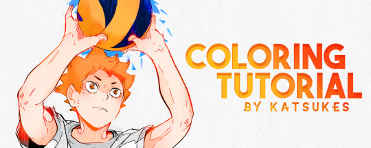
hey everyone! as asked by some people, here's a tutorial and how i colour manga! thank you to anyone who's ever liked my creations, i really appreciate it ♡
1. BACKGROUND
i use adobe photoshop and my laptop's trackpad
i was initially inspired to start colouring manga by other creators on here! some tutorials i used when getting started were angie's (@sugawaras) colouring tutorial here, and ana's (@aizawashoutta) tutorial here!
this is just how i colour manga personally (and i haven't been colouring for long), and i am still improving! remember to have fun and be proud of what you make!
2. CLEANING AND REDRAWING
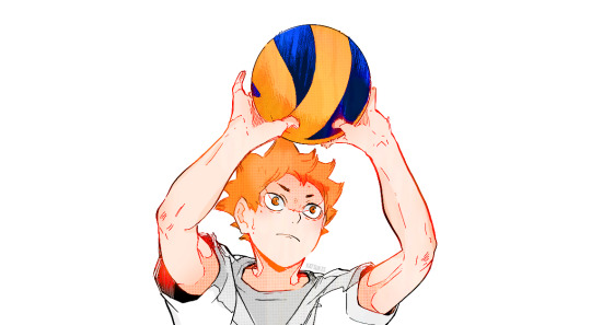
i'll be using this panel from haikyuu!! chapter 210 that i posted here
first, i'll delete the background using the eraser tool

as you can see from the panel, hinata's arm has been cut off, so i'll redraw anything that seems to be out of the frame
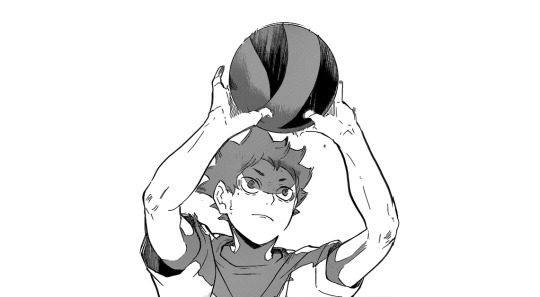
the shadows in the panel are too dark for me, so i make a grey fill layer on top of the panel and set it to divide
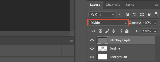

this makes the lines (and the shadows) lighter, and i save this as a .png and insert it back into the .psd file
when the .png is inserted back into the file, i erase the white background off the picture using the background eraser tool, so the image above should now be transparent, with the exception of the lines
3. COLOURS AND SHADING
i work in parts, where i'll colour the base layer for one part (eg. hair) and shade that part completely before moving on to the next part
normally, i start with the skin colour base layer:

i use three shade types on the skin base: (1) blush, (2) soft brush shading, (3) hard brush shading
all shade layers are set to "clipping mask" on top of it's base colour

i'll do the above for the rest of the panel (eg. hair, clothes, items, etc.), with the exception of the blush layer
if there's already some shading on the original panel, i'll just do a base colour and no shading!
i'll also normally add some sort of texture on top of my colouring here, and i'll set that layer mode to soft light, and change the opacity to low (15%–30%)
i put the texture layer on top of everything, including the outline

this is how it looks like after all the base colour/shading + texture:

4. LIGHT EFFECTS (LIGHTEN, SCREEN, ETC.)
as you can see from above, the outline is all black
on top of the outline layer, i'll add light effect layers (i don't know the actual name of these layers sorry)
an example how one of these layers look like before making the layer mode lighten
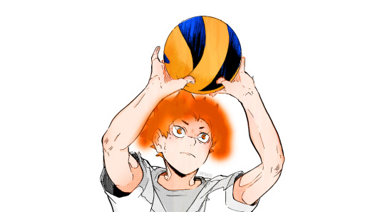
this is how it looks like after i change the layer mode to lighten:


i'll add lighten/screen layers where i see fit: normally these layers are in the hues of red/orange, but if a character has black hair i might add some lighten/screen layers with some blue tones instead
this is how it looks like with all those layers added:
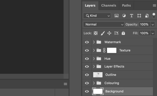
this is the final order of my layer/groups:
the hue group is any adjustment layers i will add (eg. hue/saturation, selective colour) to adjust the colours of my colouring if need be!
5. NOISE AND BACKGROUND
i'll normally add noise to the finished coloured panel (around 2%-5%)
this is when i'll add a background/any other effects i want
and this is the final look!

and that's it! thank you if you got this far, and i hope this was somewhat helpful! ♡
#tutorials#manga coloring tutorial#coloring#manga#m#m: tutorial#i hope this makes sense ;-;#feel free to send a msg/ask if you have any questions!
1K notes
·
View notes
Text
A totally self indulgent compilation of my favorite works on this blog of the year June 13, 2020 - June 13, 2021
2019-2020
The following lists are all in chronological order according to the date each post was first published.
Top 10 panel edits:
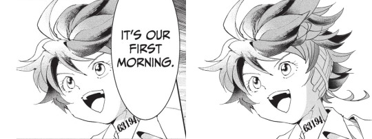
#1: It's our first morning
Date: Aug 20th, 2020 Time: ~ 2:18 h I really like how this one turned out!!! The 2020 Emma b-day edit has a lot of major panel redraws, but this is probably my favorite. I I really enjoy how I made the shadows work!! And the ear banfage looks pretty neat. Nice!!! Immagine
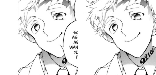
#2: Norman birthday edit 2021
Date: Mar 20th, 2021 Time: ~ 2:21 h Awww, soft Norman :') There was a bit to redraw, but I think everything turned out pretty neat!!! I believe everything works out fine. Though looking back at it, the part of the ID I added is definitely top small :')
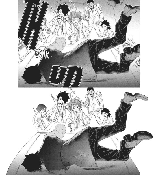
#3: Manga dub: Yuugo gets knocked out
Date: Mar 27th, 2021 Time: ~ 5:05 h Here start the Manga Dub redraws to which I gave my everything ahah. This one turned out nice! I think the shoes turned out particularly good eheh. I like how Yuugo's clothing lineart- for the texture, I wanted to go for something heterogeneous, but I'm not fully confident in the final result. Gilda looks very rushed but ¯\_(ツ)_/¯
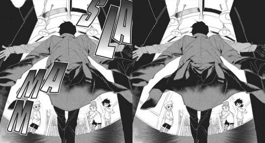
#4: Manga dub: Yuugo makes his dramatic entrance
Date: Apr 5th, 2021 Time: ~ 4:02 h This is pretty cool!!!! The coat took ages to redraw, but sis it turned out perfect!!! I'm very proud of this.
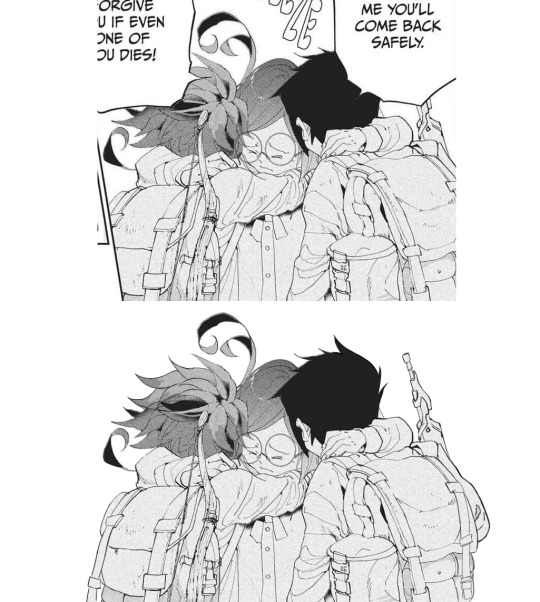
#5: Manga dub: RayGildEmma hug!!!
Date: Apr 9th, 2021 Time: ~ 1:31 h Awww, a beautiful panel I was really happy to have the chance to redraw. Taking into account what there was to redraw, I'm actually surprised with how little this took! Ray's backpack was a pain to make, but I think it turned out fine. I'm very happy with Emma and Ray's heads!!
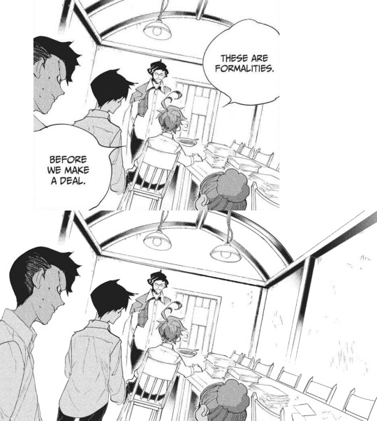
#6: Manga dub: Formalities
Date: Apr 12th, 2021 Time: ~ 5:31 h It is not always easy to give sense to Demizu's perspective, but I do my best!!! In this I am *so* happy with how Don and Ray turned out, they look neat! The background on the other hand... It took hours to make ahah. I'm not fully confident in the perspective, but I'm happy with the details I've added- I really did my best to make it look like athe other manga panels and I think it paid off!!!
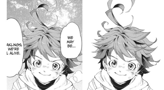
#7: Manga dub: We may be weaklings, but we're still alive
Date: Apr 30th, 2021 Time: ~ 1:37 h This little Emma is so cute!!!!!! I think the redraw turned out pretty perfect. I'm really satisfied with how this one turned out, and it's such a cute little Emma!!!! She's so brave and optimistic, I love her. It's a shame this panel didn't make it to the episode :')
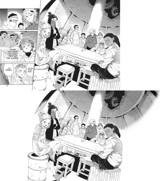
#8: Manga dub: Goldy Pond Gang
Date: May 7th, 2021 Time: ~ 8:44 h lmao This is probably the panel redraw I'm the most proud of ever :') Just think everyone turned out very nice!! The ceiling is not exactly perfect, but it still works somehow. I'm very happy with how Gillian's back turned out!! I don't really like the fading effect on the right, but 8h in I got pretty tired of working on this ahah
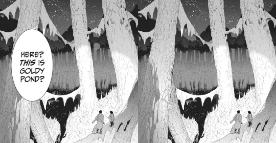
#9: Manga dub: This is Goldy Pond
Date: May 21st, 2021 Time: ~ 1:29 h I'm very glad for how the Manga dub has been challenging me to learn to redraw backgrounds, something I had quite literally never tried before. It can be a little frustrating, but it's so satisfying to see the final cleaned piece!! With this panel, I also learnt to use copy and paste, which is something I had never done before beyond texture
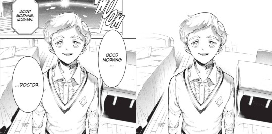
#10: Manga dub: Good morning doctor
Date: May 21st, 2021 Time: ~ 3:42 h This is another background that turned out pretty good!! That one Norman is one I knew I would have had to fully redraw sooner or lager- the background was a bonus ahah. I'm very happy with the final result!!
Top 5 edits as whole:
#1: The Promised Neverland manga ending edit
Date: Jun 14th 2020 Time: ~ 12h 41min (5h 45min of cleaning panels in the edit + 5h 37min of cleaning panels that didn't make it to the edit + 1h 19min of resizing) + time spent cleaning panels I've deleted the file of so I can't see lmao This is overall very nice!!! The concept of an Emma evolution through her back is cool, and I think overall the edit turned out very aesthetically pleasing. The concept idea came to me while I was working on the 2019 Emma's birthday edit, a long time before the manga ending announcement- back then I wouldn't have imagined using it in occasion of the manga ending, but I think it ended up making a nice tribute. The colors add a nice touch, since so far my edits had always been black and white- it makes a sweet closure. To make that edit I selected 76 panels of Emma framed from her back; I plan to make other versions of that edit using the discarded panels eventually!
#2: Emma - Chapter 181: Beyond Destiny
Date: Jul 12th 2020 Time: 2h 57min My last edit for the manga 🥺🥺 I think this one is my very "manga ending edit" because to me it really signed the ending of weekly chapters and their weekly chapter edits. It makes me a little sad to look at it, but it's also, I don't know, kinda sweet to see how I grew both in my panel cleaning and as a person since I first started my blog. I'm glad I got into TPN!
#3: Emma birthday edit 2020
Date: Aug 22nd 2020 Time: 8h 54min This one turned out so well!!! Though I used the same concept for all the trio edits, I think this one is the best one. The two panels on the left / two panels on the right alternation combo never fails ahah. The colors are nice (shout-out to my sister for making me a palette), despite the fact that it was hard for the lighter ones to make them work with the images without having those disappear. I'm very satisfied with the panels I chose for this, I think they work really good together! Also, it got me very happy to read everyone's comments saying they liked the fading effect in the last panel :)
#4: Emma + Eyes Close Ups [1/?]
Date: Jan 24th 2021 Time: 5h 55min This one was really nice!! Another idea I got when working on the 2019 Emma birthday edit I was glad to finally execute. Started the edit in September, finished it in December. I'm overall very happy with how it turned out... I hope I will be able to make more in the future!
#5: The Promised Neverland Parallels → (9/?) » 114 // 122
Date: Feb 23th 2021 Time: 5h 7min (panel cleaning only) Aaaaahh I really like this one!!!! A parallel I love very much, and I'm really happy with how the edit turned out. All the hair redrawing looks neat!!!! The gif is maybe a little excessive, but I think overall it's a nice edit. I like it!!! Fun fact, I completed it on August 26th 2020, but I couldn't find the right moment to post it ahah.
Honorable mention: The Promised Neverland Parallels → (5/?) » 08 // 16
Date: Aug 30th 2020 Time: 2h 52min (Second picture cleaning only; I deleted the first picture art file so ¯\_(ツ)_/¯ ) I don't have much to say about this one except!! It turned out very nice!!!!! Love the pen lmao.
Top 10 analysis:
Too many analysis,,
#1: Post chapter 181 Emma analysis
Date: Jul 9th 2020 Mmmh a nice analysis. I think it was important for me to put down in words what I think of Emma's characterization and the manga ending, so I'm happy I did it!
#2: A long Oliver analysis because I love him very much
Date: Dec 6th 2020 What can I say I just love Oliver tons 😔😔💕💕 This was very fun to make!!!
#3: TPN s2 previsions
Date: Jan 14th 2021 Really love the effort that went into this + me proving that 11 episodes GP could have possibly worked + it's just a lot of fun to read again after s2 ended pffft
#4: More s2 delusional previsions lmao
Date: Jan 27th 2021 I think the points and previsions I made where pretty neat!! In my defense, it was pretty impossible to predict the anime would have ended with this season. I always feel honoured when friends and Anon ask for my opinion, I'm like "you wanna know what I think? Wow. I'm flattered (◍•ᴗ•◍) " Thank you to anyone who ever sent me an ask!!
#5: Why Emma not wearing pants is 𝕨𝕣𝕠𝕟𝕘
Date: Jan 29th 2021 Really proud of this!!! Pants Emma is important!!!!!
#6: Post episode 5 manga Emma analysis
Date: Feb 4th 2021 A depressed analysis, but a necessary one 😔
#7: Norman analysis
Date: Feb 12th 2021 I love him!!!! And I'm happy I eventually got to put down in words what I love about his character. The day I posted this ww3.readneverland was in maintenance so I couldn't use the volume scans for it- the thought of that post having fan edited and fan translated scans still haunts me
#8: RayDon rambles
Date: May 12th 2021 I had a blast writing this and like. It's likely the post of mine I reread more often of them all. I love this ship tons!!!!! I'm satisfied with how I put down in words what I like about them. I LOVE THIS SHIP
#9: Chapter 58 analysis
Date: May 23th 2021 I've wanted to express this concept since like the first time reading the manga- I'm so happy I finally did!!!! This concept is one of my absolute favorite things about tpn- the feelings that people are good. The concept that kids who got to live in an healthy and supportive environment will always be inclined to kindness and altruism, because humans are just inherently good. From the Three Character Classic: “people at birth are inherently good”. I want to have faith and courage to hold on the goodness in myself, and to hold on the goodness in the world, no matter how difficult it to do that (Chloé Zhao).
#10: Norman and Lambda squad relationship analysis
Date: May 24th 2021 I think this was a pretty sharp analysis and I like what I did with it!!
Other stuff:
#1: Krone birthday edit
Date: Jul 15th 2020 This edit is so good ;; Like not perfect since it was my first attempt at coloring gifs but still I believe it turned out so good ;;;;;; The time and effort that went unto this is crazy, but... Maybe I'm happy to have dedicated time to something I like for a satisfying result.
#2: Get to know my ship- Wolfpack Trio
Date: Aug 24th 2020 Uuuh a good post. A good ship.
#3: Gilda + blank glasses
Date: Aug 27th 2020 This is such a cute nice compilation!!! I love looking at it. A few panels are missing but still :')
#4: Apollo Ray AU
Date: Sep 7th 2020 (Though it was written Sep 2nd 2019 lmao) I'm so happy I finally gathered the courage to post this 😭😭 I really enjoy what I did with this AU, so this one and its other installments are all posts I have a lot of fun rereading. More than everything, I was astounded and overjoyed by the positive response it got: that gave me tons of confidence to put my ideas out there, no matter how unique they sound!!! Here's to hoping I will be able to post my RayEmma Hadestown AU, by other big AU from late summer 2019 :')
#5: TPN timeline project
Date: Dec 2nd 2020 This is like. I don't know it's a lot ahah. Arguably the project I'm the most proud of ever making. I'm just so happy of all the months long hard work and of the final result!! The post didn't receive much response (though the ones I got were extremely kind and sweethearted so that totally makes up for it), but in the end I don't really mind? I'm just so proud I accomplished that idea :')
#6: TPN calendar
Date: Jan 4th 2021 A nice sum of the tpn timeline + everyone's birth dates!!! I really like how it turned out visually. It's a cute little tpn calendar!!!
#7: Ray smiles compilation
Date: Jan 17th 2021 Ray's smile. That's it that's the post :')
#8: Trans Oliver headcanons
Date: Jan 24th 2021 MMMH really like this headcanon I think about it a lot
#9: Thoma and Lani theory
Date: Jan 28th 2021 I really don't want to brag but this is the best joke I've ever made :')
#10: My TPN AUs
Date: May 10th 2021 Ok you gotta admit those are very good AUs, I'm glad to have made a list out of them!!!
#11: Ranking Emma promotional art outfits
Date: May 16th 2021 This is one people seem to have liked a lot which makes me happy ahah. I'm glad to know we can all agree Emma deserves more pants outfits!! Please stop it with the gendered clothing :') This is the post I want to be remembered for
#12: TPN musicals AU part 2
Date: May 20th 2021 A GREAT POST I can't stretch enough how happy I am with those character-song associations. I hope I have time to make a part 3 in the future!!
#13: TPN Drive folder
Date: May 30th 2021 This was born as a way for me to have all the tpn extra contents easily accessible, but I'm happy to have shared it with people- I hope it will turn out to be useful to others too!
#14: TPN s2 recolorings
Date: Jun 12th 2021 A more diverse children cast is good for the soul :')
That's it, this year was really fun!! Thank you to everyone who supported me through it, I can't express how grateful I am for all the kindness and validation I received. Here's to many more months in the fandom!!! (ノ◕ヮ◕)ノ*.✧
#mine#tpn#the promised neverland#tpn manga spoilers#Tumblr: *literally refuses to let me open the post*#Me: *Turns on my computer* B*TCH YOU THOUGHT I'M POSTING THIS TODAY AND NOTHING IS GOING TO STOP ME#Been working on this for four hours now.. I'm literally dead...#Also thank you Tutu for deleting the other post you're the sweetest :')#Once again this is just a personal report you don't have to read all (or any) of it unless you want to :)#Ok to reblog btw#I'll click the post button now I don't want to hear anyrhing else
27 notes
·
View notes
Text
KAITO HAS OCD
Okay, a breakdown of OCD behaviors let’s go:
COMPULSIVE BEHAVIOR
He immediately fixates on finding pandora+getting vengeance, cannot be convinced to do anything else to get to this goal except be Kaitou Kid as soon as he decides that’s the path he’ll take. He’s already got his plan, he’s NOT gonna deviate from it.
And he goes after gems that he already knows aren’t Pandora because he’s compelled to complete Kaitou Kid’s MO/rise to challenges.
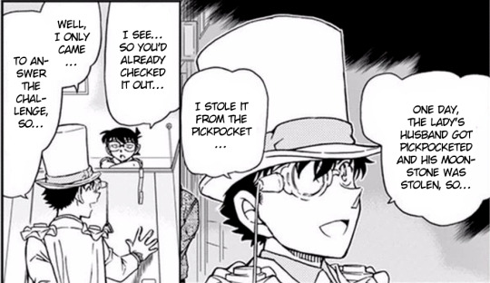
(from DC ch.965, I pasted the panels together for the relevant bits)
He also goes after targets when OTHER people send notices. (see: chapters 11 and 14 of Magic Kaito.) Yeah he wasn’t the one who started it, but he WILL finish it.
There’s absolutely no rule that says he has to go through with every single heist notice that he or someone else sends! It’s just his own compulsion.
OVER-PLANNING: BACKUP PLANS OF BACKUP PLANS
OCD makes you doubt yourself: what you do, your surroundings, so you have to over-plan to make sure everything goes Just Right, or else there will be consequences. And with heists, there really will be! But assuming he’s got OCD then he feels like *everything* he does has consequences if it doesn’t go the way he planned.
So he’s over-prepared always!
Even when going to school, have you seen all the tricks he keeps up his sleeves just for casual pranks with his classmates? He’s always *always* ready to toss confetti everywhere! To disappear with a smoke bomb! To put a mask of his own face on a classmate to get away! He just carries these things around In Case he needs it!
He just has an entire magic arsenal with him at all times for no good reason, school and other mundane situations.
WAY MORE EXAMPLES AND ANALYSIS UNDER THE CUT:
So here’s some over-preparedness on heists:

(DC ch.1019)
He’s got calling cards made ahead of time to go along with whatever plan he ends up using-- and even though they say he “spontaneously” decided to act, having all those cards there means he DID have every single plan laid out for whichever he decided to do. He figured out which plan he needed to do, and acted accordingly.
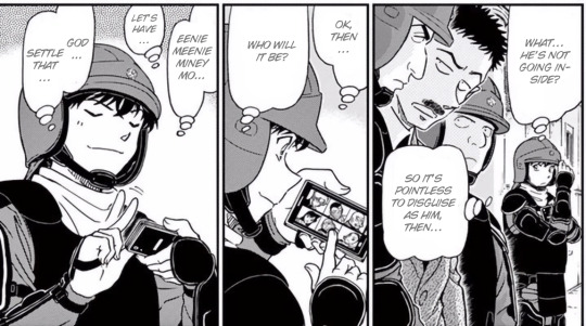
(DC ch.963)
This is the one that really gets me. He brought enough disguises to be able to pick someone AT RANDOM to disguise as, and then he has an entire heist planned around the person he picked on a whim.
You could say he just improvises, but a lot of what Kaito does *has* to be planned out in advance. Yes he can knock someone out and steal their clothes for an impromptu disguise, but he still needs masks prepared-- and for disguising as Agasa which he does in this chapter, that’s a whole costume to get the body shape right! He just HAD THAT PREPARED. JUST IN CASE.

(MK ch.23)
Kaito for the love of God what on earth would you ever need to memorize this man’s driver’s license number for. This is a new level of over-prepared. Kaito how did you even memorize that number along with all the other nonsense you need to remember for heists and disguises.
And in the manga we see several times that when his plans go awry, his first reaction isn’t usually to improvise a new plan, but rather to yeet as fast as possible because his brain can’t deal with a plan being ruined. (like above)
AND OKAY MEMORIZING ALL THOSE NUMBERS ACTUALLY BRINGS ME TO MY NEXT POINT:
COUNTING
The above example isn’t technically counting, but it does lend to an obsession with numbers and being hardwired to just have them in the back of his mind without thinking about it.
Alternately, he may have just glanced at the drivers license while handing it over and memorized it on the spot! Counting it without even thinking about it! (Either way, holy shit.)
He can also quickly and accurately count how many people and objects are in a room-- or you know an entire building-- in a matter of seconds. And he remembers all of it!
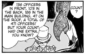
(MK ch.28)
Okay I think that’s all of the canon examples I’ve got on hand?
So with all that, some OCD headcanons about the boy:
-He over-plans even in mundane situations like deciding what kind of ice cream to get at the store. He’s gotta think about what if his favorite and second favorite and third favorite flavors are out of stock, and how much each brand costs, and if he’s willing to go to another store to get his favorite flavor if they don’t have it, and how long it will take to go to another store and the different prices there-- he over-plans for everything *just in case*.
-He obsessively re-checks and over-checks plans. Gotta make sure everything is right for heists.
-Counts things repeatedly/on a loop when left alone with his thoughts, and often taps along with his counting which outwardly looks like fidgeting or boredom. (I also headcanon that he has ADHD as well, so the tapping looks like a stimmy adhd thing)
-Pretty bad anxiety about messing up/consequences/break in routine, but hey live and die by the poker face, so no one knows it.
-He’s got rituals/routines to calm himself down that he doesn’t even realize are rituals: mindlessly shuffling or counting cards; tracing the scars/creases/etc on his hands, tapping/counting. (more things that just look like stimming basically)
-He also has a rewriting/redrawing habit. Mostly with his Kaitou Kid doodle, but he’ll do it with words too. His school notes have a lot of repetition because sometimes a word feels wrong so he’ll just rewrite it (sometimes several times) before he moves on with the rest of his notes.
-He plans his entire days ahead of time with a list in his head down to really stupid details.
-Yes this includes branching possibilities for different things that might happen that day. Backup plans of backup plans!
-On days where he’s feeling bad or can’t get his thoughts in order, he’ll take the list to paper so he can double check it as the day goes on. He always feels better if he has a plan he can check back on, mental or physical.
-Most importantly, he has absolutely no idea he’s got OCD. He assumes all of this is just normal behavior for an entertainer and a thief. Of course he pays attention to how many people are in a room and how it’s laid out, he’s in the habit of casing places. Of course he’s got 143 plans laid out for the day, it’s only practical that he knows what he’s gonna do. Of course he checks his heist plans two dozen times in the same night, he can’t afford to mess this up!
Anyway that’s all I’ve got for now love y’all byyye.
278 notes
·
View notes
Text
10 Dance Vol. 6 Special Edition overview
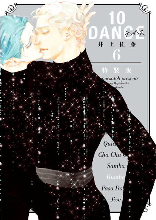
Volume 6 of the 10 Dance manga was released in Japan on March 18th, 2021. As with volumes 4 and 5, there are both regular and special editions available. In this post, I will provide an overview of the release, including observations on changes that were made to the chapters compared to how they were printed in the magazine, plus summaries and select scans of content from the special edition booklet.
It is often the case that when chapters come out in the manga magazines, they aren't always fully polished, and since I became highly familiar with this run of chapters from the summaries I made, several things immediately jumped out at me as I went through the book. First of all, though chapter 29 was split into two parts and released in subsequent months in the magazine, these two halves were combined into one chapter, with no indication they had ever been separate. I assume that they were always intended to be one chapter, but since the full chapter was not completed before the deadline (and it was a month when 10 Dance was being given the cover image, so not possible to delay its release), it was simply split over two months instead.
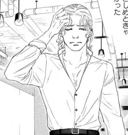
For visual changes, the most common alteration was scenes that originally had little or no screentone having it added in:

There were also some instances of either slight panel redraws, or complete replacements with new panels. None of these were from particularly important scenes, so it could just be Inouesatoh or someone on her team didn't like the look of the original panels and wanted to change them. The following example has a bit of both, with Suzuki in the upper left corner being replaced, and his eyes being redrawn in the lower panel:
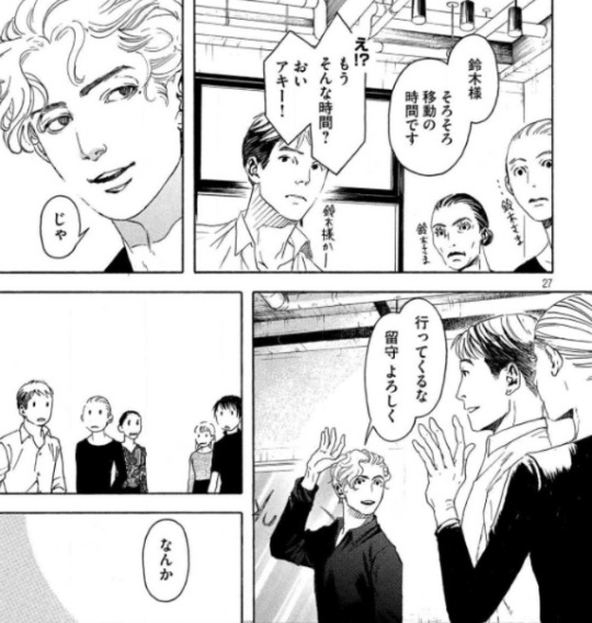
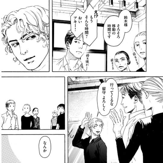
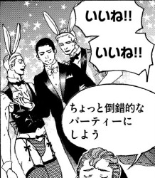
Personally, the most amusing addition I noticed was when Max was thinking about throwing a party. Originally, we didn't see what he was envisioning, but in the volume, an addition has been made in the background: the New Year's piece Inouesatoh drew with sexy men dressed as cows, except now they're bunnies!

As for dialogue, it appeared to be almost the same in both versions throughout. Some minor exceptions include a spot I found where the dialogue was put in a different order, swapping Sugiki’s lines between this panel and his first line on the following page (in addition to another altered panel example):

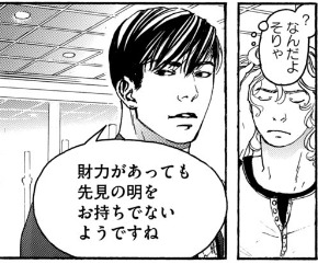
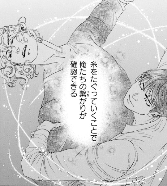
As well as in this shot of Suzuki describing how they tug at the thread that connects them through their dance. Whereas before it put the word “dance” next to the part about tugging on the thread to specify what was meant by that, it was deleted in the volume. And while it was originally described as “affirming that we’re connected”, this was also tweaked a bit to be, “affirming our connection”.

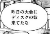
There were a couple instances of character names being different from when they appeared earlier in the story. In this volume, two characters who were last mentioned back in volume 2 (Lucas Calvo, one of the champions at the table in Blackpool, and Deeks, who Ernie said hated Sugiki because he "stole" his girlfriend), either from typos or intentional changes, weren't the same as before. Lucas' last name was written with a 'g' sound (ガルボ) instead of a 'c' (カルボ), and this change carried over to the volume. On the other hand, Deeks' (ディクス) name got transposed as Disc (ディスク) in the magazine, but was fixed in the volume.

There was a typo that unfortunately made it through to the volume (but could perhaps be fixed in future printings). In chapter 34, when Norman is testing Suzuki's skills, he flashes back to Sugiki taking the national title from him several years earlier. The text in this scene, written in English, incorrectly states that Suzuki won the championship, rather than Sugiki.

The volume also includes the usual additions that are not present in the magazine, such as the under the cover flap comic, and Inouesatoh’s notes about each chapter.
The cover flap comic (which looks very much like a sketch, compared to previous ones that have had more complete art), features the Shinyas during a practice session earlier on in the series in December, where Suzuki complains that Sugiki’s Latin just isn’t sexy. Sugiki suggests that he can practice being sexy by wiggling his butt around to write a message in the air. Suzuki worries that if he starts writing out “love” or something, he’ll have to run away and escape. Sugiki gets started, and Suzuki calls out each letter that he can make out from his elegant butt bouncing. After figuring out he’s written “M-E-R-R-Y”, Suzuki guesses that he’s writing “Merry Christmas”. Sugiki gets mad that he said it aloud before he finished writing his message, and says he’s going to leave. Suzuki says, “Wait, I love you,” as narrative text says that this somehow turned into a love story in one panel.
And here are some tidbits I found interesting/amusing from the chapter notes:
She thinks readers who are fans of pecs will like Saichi.
She’s not sure if readers will love Max or hate him, but she personally likes him (sorry Sensei, I kinda hate him lol)
As of chapter 32, a portion of the art is now done digitally.
The epic “last dance” scene from 33 was something that she had planned since the beginning of the series, and it ended up being 8 times the cost for a typical chapter.
Special edition booklet:
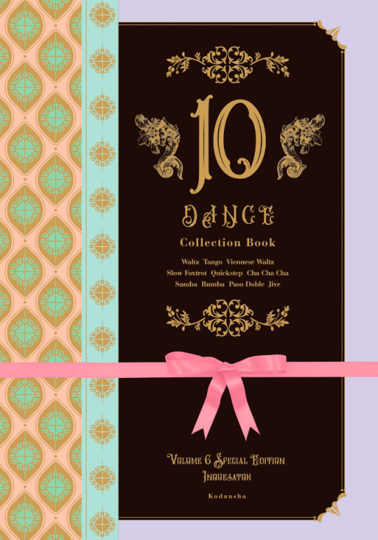
The special edition comes with a 48 page hardcover booklet that includes a variety of different extras, divided into 8 sections called “heats”.
Heat 1 is a newly drawn, 12 page parody manga. Back in September 2020, Inouesatoh put out a request on Twitter for fans to send in their suggestions for an erotic side story. Putting the characters in a high school setting was the most requested scenario, so she chose this idea as the basis for the story. The title is “And All That Jazz” (the premise makes this somewhat confusing to summarize, so keep in mind that I’ll mostly be describing their actions based on the soul rather than the body, but will use quotation marks if it’s about other characters and who they think they’re addressing. It’ll all make sense, I promise...I think :P)
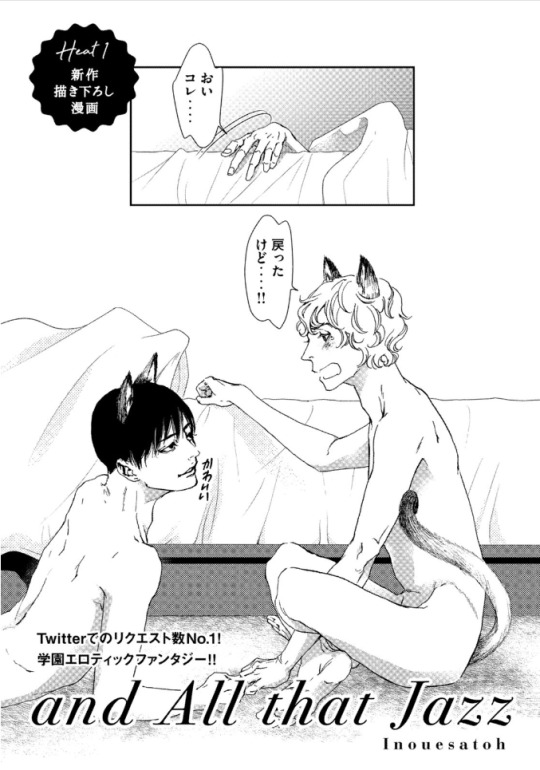
(The title page actually depicts the ending of the story, so I’ll come back to it later). It starts with Suzuki narrating his introduction, saying that he’s a transfer student to the Standard Academy. He really doesn’t get along with a guy named Sugiki, but for some reason, the two have now switched bodies with each other. Sugiki opens his shirt and inspects his new physique in front of other students, as Suzuki yells out asking what the hell he’s doing to his body. They look at themselves wearing each other’s expressions, Sugiki seeming surprised his mouth can gape open like that, and Suzuki wondering what happened to his body’s facial expression muscles. The bell rings and Sugiki heads off to class, as Suzuki is baffled that he can act so calm about this.

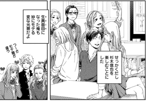
Sugiki perfectly reads a passage aloud in English class, something everyone (including the teacher, who looks like Norman) find unusual coming from “Suzuki”, as they wonder where his usual hearts are. Suzuki makes the decision to enjoy living as Sugiki for a bit, and is shown getting flirty with several girls. He notes that the more serious personality in his regular body is also strangely popular, though with a very different crowd.
A student named Alberko (Alberto in a girl’s uniform) shows up and says that “Sugiki” was supposed to have lunch with her(?) today. Suzuki says that he thought Alberko was going out with Dorou (a masculine alteration to Dolores’ name). Ernie and Suzuki watch as his harem falls apart with Alberko running amok. Ernie comments that both “Sugiki” and that transfer student have been acting weird all week, and he asks if something happened. Suzuki internally reflects back to one week earlier, when he was relaxing in bed in the infirmary. Sugiki comes in and accuses him of skipping class, and Suzuki tells him to mind his own business. He thought this would turn into one of their usual fights, but he can’t believe that actually happened instead...

After school, Sugiki asks Suzuki if they can go home together today. As they’re walking, Suzuki asks if Sugiki realizes what it was that made them switch places, and Sugiki says he does. Suzuki says that in that case, they know how they need to fix it, and they should go over to his house. Sugiki asks for clarification of whose house exactly he means by that.
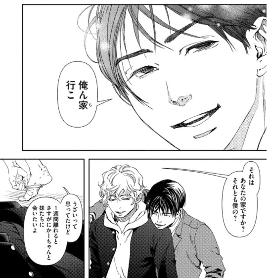
As they start to get undressed, Suzuki says that he always thought his mom and sisters were annoying, but after a week apart he really misses them. Sugiki promises that he’ll make sure he can see them soon. Suzuki claims that he’ll be the one making Sugiki come, and Sugiki asks how he can talk like that when he was the one who looked like he was about to cry when Sugiki first touched him in the infirmary.
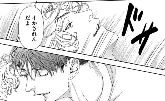
Sugiki peeks into Suzuki’s pants and wonders if he won’t get hard unless he touches him. Suzuki thinks it’d be weirder if he could get hard while looking at his own face, and wonders if Sugiki has AI in his crotch or something (Sugiki contends that it’s not his body). They fool around with each other until they finish, and Suzuki wonders why they didn’t change back yet. Sugiki suggests that maybe it needs to be just like the last time to count as a complete set, when they went at it until they fell off the bed, so both agree that they need to go for one more round. This then ties back to the title page, where they’ve finally managed to get back into their old bodies, but have now sprouted cat ears and tails.
Heat 2 of the booklet is 8 pages long, and contains short comics and illustrations that were not previously included in the volume releases. The comics include “How to 10 Dance”, a one-page comic with the Shinyas demonstrating the tango. Their privates end up touching, and Sugiki seems highly amused, gleefully asking Suzuki how it feels. Suzuki says that he was the one who got all bent out of shape over that back in volume 1, and tells him to lay off the sadist mode since they’re not dancing Latin right now. The second comic is “2nd Step”, and shows a glimpse of how the Shinyas were with each other after Suzuki gave the go-ahead for kissing. In fact, Sugiki ends up kissing him so much that Suzuki’s lips get sore and swollen. Sugiki then tries to kiss his neck as an alternative, but Suzuki’s not having it. The third comic depicts Suzuki’s first time in a public bath, where he realizes that Japanese people aren’t fully shaved everywhere like he is. Some of the old guys talk to him and slap their balls with their towels, and Suzuki, seeming a bit confused, gives his own balls a slap, too. After the comics are a selection of illustrations that were never used in the volumes, including this one from a Real 10 Dance event in 2018:

Heat 3 is 18 pages, and contains a variety of colored versions of both chapter covers and scenes from the manga, a couple of which I’ll share below:
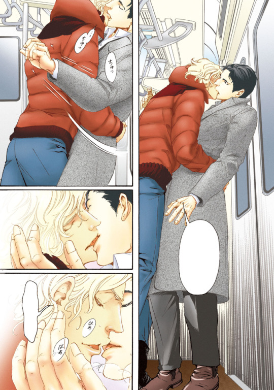

Heat 4 includes 3 pages of insight from the professional dancers who consult for the manga, in which they explain the moves shown in specific panels.
Heat 5 is a single page look at Inouesatoh’s work space.
Heat 6 is 3 pages worth of advertisements that have been used to promote the series, including things like ads that were posted in subway stations:

Heat 7 is a single page look at the storyboard for chapter 1 of the manga.
Heat 8 is a single page showing the covers for foreign editions of the manga (Taiwanese, Korean, North American, and French).
Finally, there’s one last page with a thank you message from Inouesatoh, including an absolutely precious illustration of the Shinyas in happier times.
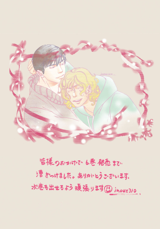
And that’s that! This really is an incredible release, and I’d definitely recommend picking up the special edition if you can. CD Japan offers direct international shipping, and I’ve also seen that Kinokuniya lists it as “available to order” currently (though they don’t appear to have stock on hand, so might take longer).
33 notes
·
View notes
Text
Most anime is bad.
It's fair to say anime's success in the West, starting in the 80s-90s but gaining mass recognition and appeal in the 2000s, mostly comes from a wide range of premises for stories told, and how emotional payoffs are (for the most part) earned by the writing, be it hype moments, shocking scenes, or the often-expected bittersweet finale.
However, in spite of these positives, it's very frequent that the story for an anime/manga/novel/game/etc. ends up being bad; and for the longest time, I couldn't figure out exactly why. Even a decade ago, when I was far more lenient and forgiving to the content I consumed (because I had yet to achieve the jaded, joyless state I find myself in <current year>), I could tell something was amiss.
Think I first took notice of this when the era of the Big Three was coming to an end, with One Piece carrying on as Fairy Tail instead took the shovel to the head. Alongside Bleach and Naruto, these three manga series all suffered major issues in their final arcs, so blatant that it became too difficult to accept. Something stank in Denmark Japan, and it made no sense why these (supposedly) good series where floundering as they neared the finish line.
A few years later, with more media under my belt, out came Black Clover. Both my weeb cousin and a good friend had spoken highly of the series, alongside many of the places I used to check for animus, so I watched the OVA... and hated it. There wasn't anything inherently wrong with the pilot for the story, mind you, at that point it was only the screeching from the protagonist that bothered me. When the series proper began, I made the conscious effort to try and power through in spite of the awful first impression, to see what the hype had been about... and I still wasn't seeing it. In fact, the story's erratic and hyperactive pacing, alongside its cheap animation, made it almost impossible for me to watch. Only by virtue of the previously aforementioned hype moments on occasion and the catchy OPs did I stick around long enough for the story to get interesting and for me to have any investment in the characters. It didn't get good, but it had at least become tolerable. Lucky for me AND it, I was still at a point where I wouldn't drop shows as easily.
It wasn't looking good for my outlook in regards to japanese entertainment. Even if I would end up consuming more anime than any western shows (at least animes don't fucking despise their audiences), my eye kept getting more critical, and I kept getting less adventurous, due to several shows disappointing. But I still couldn't figure out why this was. If anime and manga were appealing to me still, why was I less inclined to give 'em a pass, why was I more and more dissatisfied. And then I got my answer in 2021, thanks to two shows: Jujutsu Kaisen and the second anime adaptation of Shaman King.
A story's quality can generally be quantified based on three things: characters, world, and plot. Each informs the other two, and a good story never has one of these working against the others. But it can also happen that all three work in their own right, but not in tandem. A fourth, rarely-considered factor for evaluating story is EXECUTION. So when it comes to anime, manga, novels, games, etc, the problem usually is in execution. You could argue that there are different cultural sensibilities for storytelling in Japan, or corporate factors interjecting themselves in the process; but that would be an explanation, not an excuse. And nowadays, enough japanese creators quote some of their influences as not just being other japanese creators, but also creators from around the globe (past and present). There's not this magical bubble keeping the Land of the Rising Sun ignorant of other types of storytelling and development processes.
So how did I arrive at this conclusion thanks to Jujutsu Kaisen and Shaman King 2021? Both shows suffer terribly when it comes to execution of their stories, although in different ways:
-With Jujutsu Kaisen (at least the anime, I've not read the whole manga), there were several instances where I found myself asking "Did I miss an episode or something?", because you frequently had characters reacting and conducting themselves with one another as if there was a deluge of development between them off-screen. No better example than EmoBangs McGee, who becomes BFFs with the protagonist in less than 5min, later having a fight that was probably meant to be very heart-wrenching, except there was no development for their relation (and powers), so it made no sense for them to act in that fashion (if this is different in the manga, by all means let me know);
-With Shaman King 2021, meanwhile, I was well-familiarized with the characters, the world, and the plot. I knew the main elements of the story, I had in fact rewatched the show in the past decade, and in spite of filler content and Black Sabbath cameos, still remembered it strongly. But as I am watching the new show, the word that comes to mind is "cheap": cheap animation and rushed pacing. Maybe this is due to certain events, or the studio trying to rush past the initial stages of the story, but still. All it had to do was clear the filler, give each scene and character the love and care they needed to make their moments the best they could, and let it go from there. It's been twelve years since FMA Brotherhood, if you're going to be a greedy bitch and redo an anime adaptation, there's no excuse for it to be of such low quality.
As you can see, both failed in execution, with the latter in its new adaptation and the former (possibly) in its original format. When I realized this, suddenly the fog dissipated, and I could see why all those stories had failed: Bleach failed because its power creep and character conflicts were executed horribly; Naruto's atrocious pacing (in both manga and anime) was done solely to extend the story needlessly; Fairy Tail's final arcs (although not only that) dropped the ball because Hiro Mashima was actively trying to ensure there were no sad elements to the story or the end of his characters' arcs; Black Clover‘s poor execution came in how its first few arcs play out, trying to speed up through the world-building, which left most characters too anemic and underdeveloped until far later into the story.
But of course, this is an issue that exists in far more IPs than just the ones I’ve mentioned so far and others of the same caliber. It happens with the cream of the crop as well: Boku no Hero Academia's more recent decisions have been executed very poorly, when they were just a single step away from being done very well; post-timeskip One Piece has relied too heavily on characters having skills and forms that we aren't familiarized with, and fights that don't resolve in a smart fashion, but due to nakama power fueling Luffy; season fucking 2 of One-Punch Man is the poster child for terrible execution of anime adaptations, considering the original webcomic, the manga, and season 1. This issue is (almost) everywhere, and yeah, I get it: anime and manga are produced through such a hellish process, that a lot of times the authors or production staff don't have the time to go through their stories to make sure everything's on the up-and-up. Yusuke Murata is not exactly a common example, of someone that's allowed to go back to both redraw and rewrite entire chapters; and I am somewhat glad that, at least when it comes to JUMP, they seem to be getting slightly more lenient with the talent and their teams if it means better results in the long run.
However, the issue persists. I neither know nor think that anything can be resolved even if the extremely demanding workload of manga/anime production were to be alleviated (we've had plenty of examples in the West, of media that has all the time and money in the world, still imploding and salting the earth around it), but at the very least, it can be something that creators who are not under those retraints to take into account, so as not to make those same mistakes.
Do not try to subvert conversations that SHOULD be happening, just because in anime there's a stereotype of scenes where everything stops in its tracks just so characters can have a conversation, be it executed well or poorly (an aspect I'd wager stems from when the source material is manga or a novel). Don't think that because a character's power level let's them blow up the moon from orbit, that immersion can't be broken if you don't justify how they might struggle against another on the same tier. Be wary of the very common issue with 'Wanime' (Western animation using the anime style), where creators completely put aside depth for spectacle, to the point that it becomes indistinguishable from a parody show such as Megas XLR.
Always remember, execution is the be-all and end-all to every character development, emotional payoff, hype moment, world building, and plot progression. Think about every scene, and if it actually informs the audience of what should be happening. If it doesn't, then you'll have to try and fix it before, not after. And if you can't do it (which is fine, most of us are fucking dumbasses), now you understand why even a lot of shonen action series have a bunch of slice-of-life, semi-filler scenes interjected in-between big events, so that you can have context and weight to what will transpire.
6 notes
·
View notes
Photo


“My eyes are so puffy… I’m glad Abeno-san and the others weren’t around.”
so i heard this scene – one of fukimono’s best scenes – was cut from the anime? bad move. first of all, it’s a good subplot. secondly, let the boy cry? he needs it?? it’s cathartic and emotional and really just an all-around good character building moment??? why wouldn’t you include it???
so yeah, i guess here’s some more colored pages? kappa scene, commemorated. only flat colors this time bc im not ready to die yet, thanks
#fukigen na mononokean#the morose mononokean#fukimono#ashiya hanae#abeno haruitsuki#took some liberty with panel placement#for the ~~effect~~#i would have done more but#i amn just... a litle creacher#art isnt even my strong suit#im just... compelled to create#fukimono needs more love and i heed its calls#ummm... kappas are green ya?#color choices here were ~waves hands~ completely random!#long post#gosh i hope there are no typos
2K notes
·
View notes
Text
you know, i don’t usually care when ppl dislike something i enjoy, but when people call mob psycho 100’s art style ugly or say that the aesthetic is what keeps them from starting or continuing the series, i think my heart breaks a little bit. mp100 is such a good example of what happens when you just go out there and create with sincerity. the mob psycho 100 manga (and really all of ONE’s work) is an incredible study in visual storytelling, paneling, page composition, etc, and ONE has a really amazing sense of how to boil a visual down to its essentials. realistic rendering is definitely an admirable skill, but in comics, it isn’t even close to being as important as communicating a story. ONE’s visuals may not be as realistic or cute or pleasing to the eye as the industry standard, but they’re creative, evocative, expressive, atmospheric, downright terrifying at times, heart wrenchingly sincere at others. not to mention the story itself is so well written and thoughtfully crafted and soothing like a balm.
and the anime oh my god, the anime is like... pure joy. pure creative joy. so many different talents brought on to the show and given complete freedom, so many different mediums of animation utilized, so much love for the source material poured into every frame. the one punch man redraw/anime are stunning too, but there’s something about the way that studio bones honed in on exactly what makes ONE’s art so charming and evocative and funny and scary and good and then put their own creative spin on it to make it into something new without losing sight of ONE’s original vision, instead of remaking it to fit the industry standard that just... man. you can’t even compare the two. every second of mp100 is like comfort food. wholesome and indulgent and just as delicious the seventh time you enjoy it as it was the first.
i’m not really one to recommend ppl to watch something that they don’t want to, if something just isn’t your cup of tea, then why force yourself? but... i make an exception for mob psycho 100. even if it looks like nothing that interests you, i recommend giving it a shot. especially if you’re a creator of any kind. it’ll make you question how you judge media, it may even make you question just what is most important to you in developing your own art. and even if it does none of these things, even if you dislike the series, there’s still something to be said for the simple courage and ambition that ONE had to just put himself out there and create, regardless of whether his art met a certain aesthetic standard. it’s really heartwarming to see how he’s been rewarded for it. and looking at the difference between the early days of one punch man and the final chapters of mob psycho, it’s pretty clear that “learn by doing” works. ONE’s scribbles have touched so many people’s hearts, inspired the absolutely gorgeous work of art that is the mp100 anime, inspired many other burgeoning artists to be braver and more ambitious. if nothing else, i hope you watch/read the series and walk away from it feeling like, “i could do that.”
and if none of this applies to you, then, well... maybe just don’t rain on people’s parades with snide comments about the art style. if mp100 teaches us anything, it should probably be to encourage artists rather than to put them down and commend people who have the courage to try something new.
#mob psycho 100#mp100#i........ love mp100 i needed this off my chest#ONE is a good artist you guys are just mean.jpeg
2K notes
·
View notes
Text
LAST CHANCE!!

Hey everyone! Last chance to send in your nominations for The Guild Awards, First Period 2021!!
How to nominate:
- Submit your nominations to the blog using the nomination formats, which are already conveniently copied & pasted to the submission form. Your submission(s) will be anonymous, only to be seen by the moderators!
- You can send in multiple nominations in one submission, but please use the nomination format for each nomination, as this makes it easier for the mods to process them.
- For fanfiction nominations, please choose carefully. Spelling and grammar play a big part!
- When the nomination period is complete, the list of accepted nominations will be posted for viewing/reading before the voting period begins.
Here are the current categories (bolded categories need some extra love!):
Fanfiction:
Best Action/Adventure Best AU/AR Best Canon Best Canon Divergent Best Angst Best Dark Best Drama Best Humor/Parody Best NSFW Best Oneshot Best Character Portrayal Best Romance Best LGBTQ+ Romance* Best Serial Best Ficlet Best Completed
Fanart:
Best Action/Adventure Best AU/AR Best Canon Best Angst Best Dark Best Humor/Parody Best Kiss Best Romance Best LGBTQ+ Romance Best NSFW Best Character Best Duo/Pairing Best Group Depiction Best Manga Coloring Best Redraw Best Overall
*Please note that LGBTQ+ pairings can be nominated into all categories (except Best Romance). The Best LGBTQ+ Romance categories are just to show love to the romance between LGBTQ+ pairings specifically <3
Have questions?
Check out our:
FAQ Rules of Eligibility Categories (definitions included)
Reach out to one of the mods: @sassybratt9791 @phoenix-before-the-flame @phoneboxfairy @rougescribe @ratretro
Nominations will be accepted until the end of the day on August 31st, 12am PST! Please make sure to send in your nominations as soon as possible to make sure they're eligible!
To see all current nominations, please head on over to our Nomination's page (available on desktop only).
14 notes
·
View notes
Text
INFJarts’ art tutorial #1: screenshot redraw/collab
Hey! I’ve been getting a lot of people interested in my drawing process, so I’m just gonna go ahead and start making some tutorials on my process! This one is a collab by myself and @as-you-doodle of a screenshot redraw from Underverse 0.4 by @jakei95. I use Autodesk Sketchbook, so that’s the program I’ll be showing.
The first thing I do is open up a new canvas of a good size for the piece. I insert the sketch sent by as-you-doodle with the Add Image tool. That’s the first layer.

Next I do line art on a new layer over the sketch. I may fix a few things while looking at the original screenshot. My line style isn’t really much to brag about, I just use the manga line art ink pen as the brush in black with full opacity and 10.0 size. I make sure it’s smaller with less pressure to add some variety to the line art.

That’s pretty much it for line settings. There are some exceptions, and those are usually for specific aesthetic purposes. In this piece I had to use a blue glow brush for Error’s strings because they’re so thin. My lines aren’t super neat, in some places they won’t meet and in others they’ll cross over each other.

Then I do the background to establish a light source. The background color will change depending on the piece, and for this one I used a dark purple. I then used a pink glow airbrush on the soft glow layer setting to lay down the shapes first.


Then I add some extra glow (also on soft glow, I really like this layer setting) with a regular pink soft airbrush.

Next I hide the background glow and make a new layer for color. There are usually several color layers, but they’ll be combined when they’re done. I’ll usually take a bigger brush and fill in the piece, not caring about coloring outside the lines. When all the colors are down, I’ll erase the extra stuff outside the lines so it’s nice and neat like this:

WARNING: NEVER USE BLACK, WHITE, OR COLORS THAT ARE TOO SATURATED FOR YOUR BASE COLORS. IT NEVER LOOKS GOOD. You can use very very light and dark colors, but don’t use black and white unless you really know what you’re doing. I used black and white for Ink’s eyes, but that’s it. Error’s black bones are actually a very dark blue and Ink’s white bones are an off-white.
Now for the fun part: shading! I start with primary shadows first on a new layer using cell shading. AGAIN: DON’T USE BLACK. I use varying shades of purple on the multiply layer setting with varying opacity depending on how dark I want the shadows to be.


Next I use a soft airbrush for secondary shadows on a new layer!

Then I move onto highlighting! DON’T USE WHITE. Use very light colors. These can be more saturated than base colors. The color I use depends on the piece, but you can never go wrong with light yellow on a layer setting that’s good for highlights like glow, soft glow, soft light and hard light. In this one I used light red because of the environment. I usually make a new layer on the soft glow setting with full opacity. It makes things stand out.


All of these layers are underneath the line art. But sometimes I’ll add environmental lighting if lighting is more complex like in this piece, and those go over the line art layer. I used a salmon pink soft airbrush on soft glow layer setting for these. Don’t use the glow setting or the black line art will look like it’s over this layer anyways.

I make sure the shading is in the right spots using the select tool as a mask on the different base colors on the piece. It takes longer but makes shading look cleaner. It’s also important to make sure that you know where your light source is. This piece has complex lighting with sources all around Ink and Error, but it’s largely coming from the ground and behind Ink, so I shade accordingly. I’ll unhide the background layers for reference from time to time.
Then, to make everything pop, I make a new layer and put a fill over the entire piece on color burn at 50% opacity. Using a fill on the whole work can add unity or contrast depending on what color and setting you put the layer on. Don’t be afraid to play with it to see what happens.


And then if there’s anything I REALLY want to stand out, I’ll put it in front of the fill layer, like the bones in the front. I used a glow airbrush for this.

And that’s it! The last step is signatures and then it’s done! The piece took 5 hours with the sketch already done by Asyoudoodle.

Basically, never underestimate the power of layers and layer settings. Make sure you play with them a lot, and if you like a more soft look with more unity, try going for highlights on soft light and a fill on multiply and play with the opacity. Hope this helps someone out there!
#art tips#art#art tutorials#art tutorial#digital art#art help#shading tips#drawing tips#drawing tutorial#drawing tutorials#digital art tutorial#autodesk sketchbook#sketchbook tutorial#collab#screenshot redraw#underverse#ink!sans#error!sans#inktale#errortale#undertale#undertale au#my art tutorials
142 notes
·
View notes
Note
what are some head canons you have about the main cast (not gender or sexuality related)?
-Ritsu frequently lurkedaround Reigen’s office when Mob first asked Reigen for help, because he didn’ttrust him at all.
· Onthat note, Ritsu “I can hide behind a couch in plain sight and think I’m beingsneaky” Kageyama was spotted by Reigen multiple times on these endeavours butwas never told off for sneaking around the building because Reigen thought hewas just having some fun.
· Mobspots Ritsu one time and offers him to come with them on an exorcism request. Onceritsu sees that Reigen doesn’t mean any harm (though is a bit of con at thevery least from what little he knows), he stops stalking the office.
-Ritsu did remember the car hood incident, he just repressedit from his memories because it quite frankly was that disgusting
-Tome owns a Wii and plays Wii Sports on a single-player basis,specifically Tennis
-Tome actually has a good singing voice but has never oncetried to sing properly before bursting out into giggles. Part of her can’timagine ever singing properly and the other half has contempt for being likethe others anyways.
· After the events of the Reigen Manga, Tomestarts to sing more, and with more sincerity. She takes the other girls to karaokeand they’re all shocked by how much more there is to tome.
-Mob has and will say shit all the time, has said the f wordonce accidentally in front of Reigen and almost sent Reigen into meltdown, sohe avoids that around him. Even when not around Reigen mob doesn’t swear much,he doesn’t have any reason to.
-Reigen has and will say fuck, never says bitch, and hasnever cursed above hell, crap, and shit in front of mob. He does it quite a lot though.
-Shou addresses everyone in a room like they’re all 13-year-oldkids. Regardless of who they are.
- “What’sup gamers it’s ya boi Shou”
- “Oh no he’sdead, press F. Anyways here’s the plan.”
- “Hey,Reigen, has anyone ever told you how much you look like Peter Spiderverse”
· However, he drops this act in front of Ritsu andhis own squad. He speaks concisely and with a lot of enthusiasm, instead ofmanic chaos when around others. He’ll still use phrases ironically but it’s allin good fun.
-Everyone is aware of redraw reigen except reigen, and they willnever tell him the tag exists. Serizawa even follows the tag on tumblr to see what new accurate take the internet has on reigen, and reblogs them all on a private account.
139 notes
·
View notes
Text

[RELEASE] HANAKOI TSURANE CH14
Title: Hanakoi Tsurane | Dance of Love | 花恋 つらね Author/Artist: Natsume Isaku Rating: PG
Summary: The self-destructive type, Sougorou is the heir of one of the well-known families in Kabuki world. He has no interests in other actors his age with the exception of Gensuke who he recognizes as his rival and never wants to lose to no matter what. However, fate plays a cruel trick on him and the two of them end up as classmates... How will their relationship develop...?!
Download/Read Online: Here
Note: Hello! Nice to meet you, I'm Minyaré. I'm a cleaner/redrawer at Canis Major. When Ika (our admin) had her computer die on her, the group suffered a slow death, with no releases at all. Some time ago, I cleaned chapter 14 and 15 of Hanakoi Tsurane. I love this manga and this project a lot, and I don't wanna see my cleans, and the translation that my colleagues did (and this cute pair), abandoned and forgotten. So, even if I have close to no idea of typesetting, uploading, wordpress... I decided to take on this at least for Hanakoi Tsurane.
I only created a mega account for this and the online reader will be open tomorrow. If not, be patient, cause I may have done something wrong when uploading the pages (it's my first time!). And if you have any problem with the mega link, comment and I'll try to solve it as soon as I can (it's my first time with mega as well!!)
Be merciful, I'm a noob at this and I did my best to maintain the quality of the typesetting of the previous chapters. I'll try to do the following chapters as well if I find a raw provider.
Cheers!! ;)
@cm-scans - @ikahomine
144 notes
·
View notes