#these are all SO awesome i love them
Explore tagged Tumblr posts
Note
Hi! I have no idea if your okay with random requests but I just have some Sanders Sides ideas that I think would look adorable in art form. The ships are Prinxiety, Mociet and Intrulogical.
Prinxiety: bat Virgil. This has two different flavours; Virgil having bat wings he likes to wrap around Roman during cuddle sessions all protective like or Virgil in a tiny bat form just hiding in Roman's shirt, just his head poking out looking at Roman as the prince just stares in absolute awe.
Mociet: Patton and Janus just making breakfast together, no huss no fuss, one's cooking eggs and bacon while the other makes sets out the drinks or makes some toast or something. Basically just domestic Mociet. Either that or Janus being a flirty little mischif while dressed like a goth Lady Dimitrescu (with the hight to match) and Patton being flustard as hell, you choose.
Intrulogical: I love the idea of Remus making Logan gifts hidden inside organs Logan can dissect. Like Remus just gives Logan a deer heart to dissect and when Logan does he finds a book shaped locket with both their pictures or some heartfelt message. Feel free to draw the aftermath if your not comfortable drawing a dissected heart.
It's fine if you don't wanna do this, I just feel like it's be adorable and your art is great!
okay i absolutely love all of these but oh my STARS THE INTRULOGICAL ONE

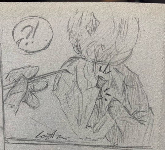

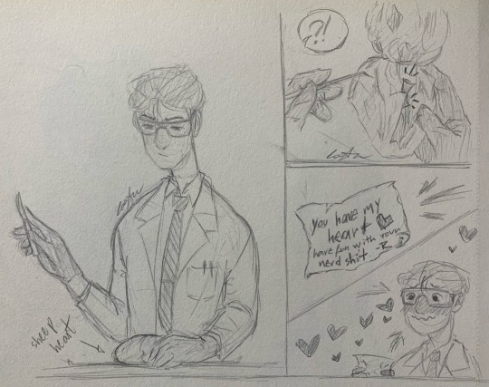
(btw the note says “you have my heart <3 have fun with your nerd shit. -R”)
#these are all SO awesome i love them#thanks for the ask!!!#my art#drawing#art#sketch#sanders sides#log’s art#sanders sides fanart#tw organs#cw organs#cw heart#tw heart#tw body parts#cw body parts#tw gore#not exactly gore but just to be sure#if i need to tag anything else let me know#logan sanders sides#logan sanders#ts logan#tss logan#intrulogical#romantic intrulogical#logan x remus#remus x logan#remus sanders#remus sanders sides#ts remus#tss remus
90 notes
·
View notes
Text
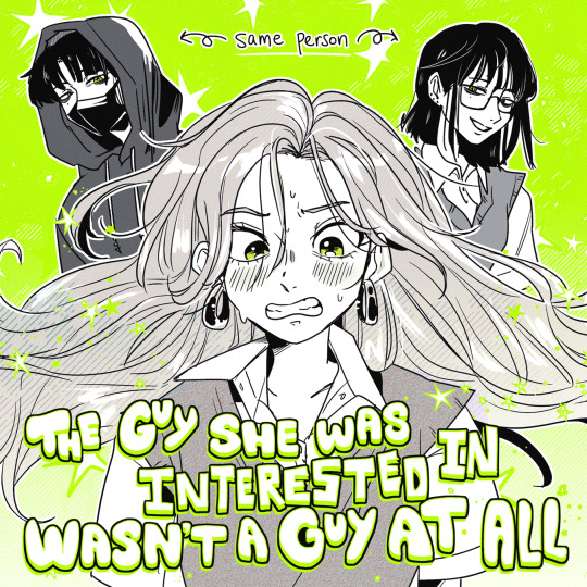
yuri month day 12: I want you to find me ♡
(femslashfeb prompt list)
#minifemslashfeb2025#GREEN YURI.... AWESOME#the guy she was interested in wasn't a guy at all#tgswiiwagaa#oosawa aya#koga mitsuki#mitsuaya#i love them so much and I think the green is iconic#so this entire piece is just an homage to the style#GREEN YURI WIN!!!!!!!!!!!#genuinely iconic sapphic media to me. it's so good#I am not able to singlehandedly capture how gorgeous the art is so y'all should definitely check it out!! WINK!!!!!!!!#they're both so beautiful... sniffs...
1K notes
·
View notes
Text


infinitely funnier visuals in my head, likely because they werent subject to my actual skill level in art
#he read space facts book and found out the sun is a star and nearly got them all killed#dont ask how they didnt notice sooner i ignored that for comedic value#i dont know how to communicate that the sun is supposed to be out in the second panel#well i do but i didnt feel like coloring#i had this awesome visual earlier i was like “im gonna like color and shade in a painting style and its gonna look awesome”#and then i realized i dont know how to do any of that#so here we are#i read requiem and made like a mental plan in my head of what their home looks like and have not been able to fix it since#im too tired to tag more and i want this out of my sight before i start despising it for realsies#art#murder drones#murder drones uzi#uzi doorman#murder drones n#serial designation n#murder drones v#serial designation v#nuvi#violentbitingbiscuits#i love me some nuvi. favorite ship right now#second place is jessa but like i dont know how to draw humans so itll be a while before ya see that#oh i forgot#murder drones cyn#if im being totally honest this entire thing was just an excuse to draw uzi in that second panel
2K notes
·
View notes
Text
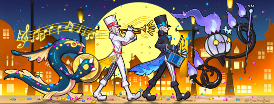
Sygna parade!
Alt version!
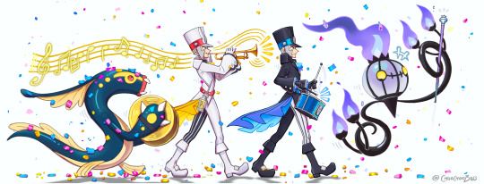
Ok first, I need to scream:
I LOVE THE SYGNA SUITS
THE FRILLS!! THE FASHION!! THE NOD TO OLD FASHIONED TRAIN CONDUCTOR SUITS FROM 1800’S!!THE ELECTRIC LANTERNS ARE SO CLEVER!!
POKEMAS EMBRACED THE YELLOW AND PURPLE WE LOVE TO ASSOCIATE THEM WITH AND IT MAKES ME SO HAPPY!!
THE BOOTS! THE FLOWER SLEEVES! THE BLACK COLLAR SHIRT ON EMMET! THE STRIPED TIGHTS!
*ahem*
The designs fast drew my mind into marching bands so I went for this idea first ahah! At some point I watched a ton of marching band videos, they cheered me up with the exciting and very complex perfomances and the players enthusiam was so catchy!! Also watching the 1st person POVs of i.e. the trumpet and drum players are super fun ahaha! Combined with the striking costumes all this directly reminded me of submas, and now it’s a thing!!!
#They’re going to have so much fun removing all that confetti off their slimey electric beast ahaha#I LOVE THEIR SYGNA SUITS#submas#subway bosses#sygna suit#chandelure#eelektross#subway boss ingo#sygna suit ingo#pokemon ingo#subway boss emmet#sygna suit emmet#pokemon emmet#marching bands are awesome!!#poor haxorus though#i dont they’re going to be paired with them
2K notes
·
View notes
Text


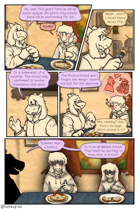

Eimmet High...temmiE high. OMG!
Part 28 || First || Previous || Next
--Full Series--
Next update may take...much longer! I have finals and an internship and not to mention I have to draw- A LOT :')
#Golly!#this is a shorter update but I wanted it to be that way. We've been in the house for a while. It's time to change some scenery!!#Chara using their game narrator voice like “golly!” and “amazing!”#Eimmet high :)) i was really hoping to be able to reference Temmie Chang here. An integral part of UT/DR!! She's awesome!#WE ARE OFFICIALLY ON Day 2 BABY#yes- there is still a little everyman easter egg as well as some other things... ;)#I tried so many new and different things for these panels. I was a little nervous implementing them. But im having a lot of fun with it!#i try to put my own artistic enjoyment above all other things :) its what I strive for.#Angle's landing day! excited for the festivities!#Chara is feeling stabby :)#loved detailing Chara's hand in the last page. When I detail the hands- just know shits getting real#I'm really happy with how I was able to redraw Toriel here. She showed up in the second part and that was it for 2 years -w-#so even if she's not a major character- I wanted to give her some good screen time <3#I did not make the Darkworld “Mayor” just for that one joke....but dang did it fit perfectly.#these 4 pages took longer than I wanted. I got burnt out with school and then finals came!!! AND ALSO EMAILS q-q#deltarune chara timeline#deltarune chara timeline comic#chara#asriel#kris#susie#toriel#tw cursing#cw cursing
2K notes
·
View notes
Text
i think one of the biggest scams i've seen in my lifetime is the idea that it looks better to have to have all matching mugs, preferably that match your dishes
reblog and tell me about your coffee mug
#i never want to see a dish set come with mugs again#(actually i change my mind i just realized i could give them away as gifts#and my friends would have mugs that match my dishes#but only for fancy dish sets not the soulless ones from walmart)#i trend minimalism and matching aesthetics in real life so i AM the target audience for that kind of thing#and theres honestly nothing i love more than asking my friends about their unique things#and you lose that when you all have soulless matching mugs#my favourite mug is a 20oz thats half glazed and unglazed pottery#reminds me of living in yellowknife with miles and the coffees we made during covid#my previous favourite mug was a gift from my mom#an awesome 20oz mug with a cute downward dog with dog drawing
364 notes
·
View notes
Text
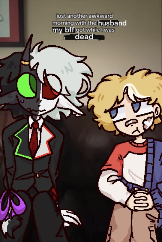
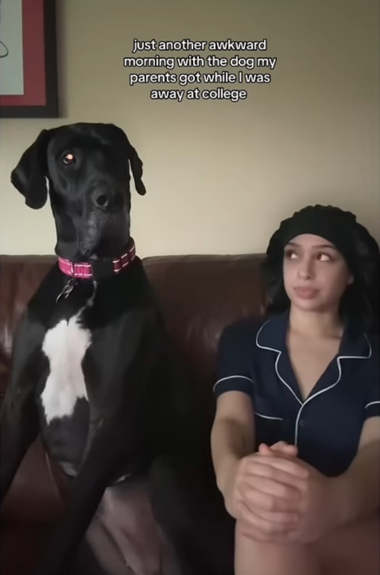
i really like that one tiktok
#Hi guys its me Beeduoo on tumblr#alliumduo#cranboo#ctommy#i actually saw the tiktok on youtube shorts first im an unironic youtube shorts user😭😭#I IMMEDIATLEY THOUGHT OF THEM TOO Dream smp you will never leave my mind#Sorry i was gone for like twenty years i got really into aphmau for like the fourth time in my life I'm rewatching mystreet in school with#my friend Chronologically its going awesom we're on Llp Bro pdh was Insane#I FW EIN AND KAI IDGAF idk WHAT THE HELL EIN DOES later but i still like him AND KAI WAS A VICTIM OF BAD WRITING OMFGG IT MAKES ME SO MAD#That migbt be a hot take idk i only ever see Hate for them but like Kai especially i feel like jess just wrote them to be Stupid and weird#out of nowhere just to give aph a reason to go back to aaron the date thing WAS SO STUPID ok sorry for the side tangent#that was part of it but its mainly im just a Senior im Eighteen years old now and it sucksss when u get to this age i didnt draw for MOTNHS#in general bc of college apps all of that ughhh so ANNOYING imma be real im not even done yet i still have to do fafsa scholarships oh my#Damn god I STILL LOVE MY FAVS i would like to draw More again thank u i Love tumblr love these Tags i love to talk bye
373 notes
·
View notes
Text
beautiful orc girl leed helllOOOOO beautiful leed alert oh my GOD she's so cool WOOAHHHH beautiful siilly girl she was really pretty and awesome and so kind i think shes wonderful and there should be a statue made just for her thats really big and in the center of everything and she should get anything she wants ever smile face

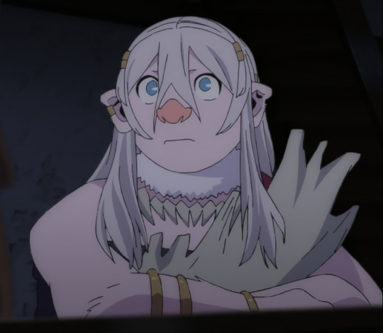


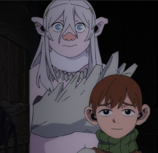
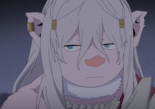

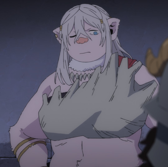


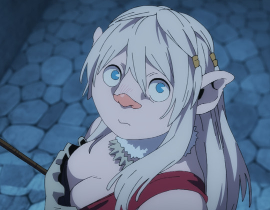
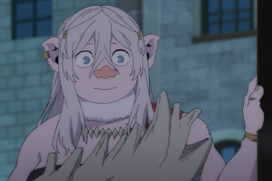

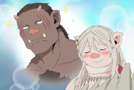
#LEED LEED LEED!!!!#thank u for being s pussy chilchuck mouse man so she could yell at you#okay u wermnt being a pussy you just watn your friends to be okay i get it#i think its funny to call you a pussy#and mosue man#im sorry your're divorced i get it#this istn about YOU this is about LEED#LEED ORC LEADER#LEEEDDDD#GOD SHES SO COOL#AND AWESOME AND GREAT#yesterday i played dnd for the first time#and i got bonked in the head with a stone club#and now id like to imagine that was her she did that#wow#shes so cool#and shes really cute too awww awww#wonderful girl everyonme should love her#gonna be honest i wish she had eaten all of them#i support and encourage and endorse and urge women to eat people#leed dungeon meshi#leed delicious in dungeon#dungeon meshi#dunmeshi#delicious in dungeon#dungeon meshi spoilers#delicious in dungeon spoilers#dunmeshi spoilers
1K notes
·
View notes
Text
im a child of divorce

#the bit is over when i say its over and even when its so joever for these two its not over for me!!! (once again i am on heavy copium)#anyway. thoughts behind the spoiler tags#gempearl#shiny duo#wild life smp#life series spoilers#wild life spoilers#i feel like. i actually was expecting that#no but its so funny the one time the negative consequences of something does actually get acknowledged its the SL finale ‘betrayal’/j#like cmon fuck me i guess/j (BIG EMPHASIS. ON THE SLASH J. OKAY.)#but honestly though i did expect Gem to hold a grudge over the 2v1 in SL. and. its good that there are consequences???#it IS a ‘betrayal’ in Gem’s eyes. they were friends. they were murder besties for the last two sessions and then Pearl chose Scar over her#and its awesome man. [through gritted teeth] this is awesome man this will be good for character development ok ok ok. ok?#its also got something to do with Pearl having the red creep in. i think#because during SL Gem was like. nearly idolising the Scarlet Pearl persona while vaguely aware that her own reputation has a similar effect#and yknow. the horrors. the fact that their image is so heavily built on what others deem them to be and they can only play into it#but by the end of SL Gem gets ‘betrayed’ by this persona that she looked up to#and also her own ‘GeminiSlay’ intimidating image is also starting to fall apart. partly of her own will#and now shes watching Pearl slowly turn red again. and this time she knows its not good for her or Pearl#so shes distancing herself from it. shes ‘trying to fix her reputation’. she sees Pearl falling into it again and just. no. i dont love you#you betrayed me last season#but on Pearl’s end of things she’s already deep into the idea that as long as you say you ‘forgive’ someone then everything thats happened#in the past doesn’t matter and they can all be friends. and nooo absolutely no grudges will be held. no emotional repression here#so. because thats happened to her in her own team she thinks the same can happen with her and Gem#and thats so. im going to blow myself up now
235 notes
·
View notes
Text

THIS THING IS SCUUUFFED AS HELL & ITS ALSO THE BEST THING I HAVE ANIMATED THUS FAR. IM SO IN LOVE WITH EMIZEL. JUST WISH I GAVE HIM MORE STUPID TATTOOS. NEXT TIME THO. NEXT TIME. I ALSO LOVE VEX&VIV SOOOO MUCH. charlies flavor of Deranged is my FAVORITE!!
#cw gore#jrwi fanart#THE SQUIRMING IMAGE#jrwi suckening#jrwi suckening spoilers#ACTULY FINISHED THIS A WHILE AGO. kept going back n forth between trying to work on it more or call it done#in the end i chose DONE!! i worked on this for a full day n a half. NO idea what possesed me but it is NOT happenin again anytime soon#i shall do better NEXT TIME!! in the meantime tho OH MY GOOOOOD WHO WANTS TO SCREAM ABT THE SUCKENING WITH ME#THE FUCKINNN THE FUCKIN THING WITH VEX N VIV BEING THE SHADOW LEADERS OF THE FANGS/DEMONS#OH MMYY GOOOODDD THATS THEIR LIL MEAT GENERATOR... THTS SO FUCKED UP AND COOL UUUGHHH I LOVE THEM...#THEIR FLAVORE IS SO WONDERFUL. I LOOOVE HOW SILLY THEY ARE. MAKING PUNS WHILE PULLIN A SCREAMING VICTIM APART#vex n his lil fashiony art workshop and viv n her sterile n clean doctors office#i bet she doesnt even HAVE a medical liscense. it would be funny if vex did tho. could u imagine#they main MEDIC in tf2 together. viv is the battlemedic while vex only pocket medics for her. COULD U IMAGINE#guh i could go on abt these two forever n ever n ever i LOVE THEMM i gotta draw em more....#OH ALSO before i run outa room. i should say. i took inspiration from a tf2 animation called POOTIS ENGAGED#the animator. Ceno0. uses black bars in the action sequences in SUCH A COOL WAYYY everytime i watch that video i feel inspired#oneday ill make more complex fight scenes... one day....#in the meantime UGHHH I LOVE THE SUCKENING SO MUUUCH CAN I JUST FUCKIN SAAAYY THAT I THINK EMIZEL IS A SMART COOKIE!!#THESE PPL FUCKING FEAR HIM NOW!!! 'SHAMIA SHAMI' IS NOW THEIR MORTAL ENEMY!! POWERFUL ILLUSIONIST. CANT DIE.#THAT PART AT THE END THERE WHERE HE FUCKIN. KILLS HIMSELF INFRONTA THEM. THATS SO AWESOME. THATS SO METAL. AND THEN HE COMES BACK!!#I WATCHED EP 7 ASWELL BUT I WONT SPOIL IT HERE. BUT OMYGOD. EMIZEL IS SO COOL AND CAPABLE N SMART N FUNNY N UGHHHHHH I LOVE HIMMMMM#OKAY THATS MY RAMBLE FOR THE DAY THANKYOU FOR READING. I READ ALL TAGS SO YOU SHOULD RAMBLE TOO. IF YOU WANT. IF YOU CAN.
772 notes
·
View notes
Text

Clownzy mini-commission for my good friend @z3r0luvsu !
#art#clownzy#branzycraft#branzy fanart#branzypierce#lifestealblr#clownpierce#clownpierce fanart#lifesteal smp#lifesteal fanart#i know nothing about them#but they make my friends happy#so i love them all the same#shoutout to zero for being stinkin awesome#and talking about gas every 2 seconds#milo art
242 notes
·
View notes
Text

Huzzah! It's birthday time! I'm slowly accumulating more and more things I like (latest additions this vest I made and a travel typewriter! Still need to fix the latter one though)
Sure has been a year.
#terri#niart#got my wisdom toofies out#well 2 out of 4#still got stitches#idk if this removal lowkey fixed my fear of the dentist?#it was so easy and painless#also finally i'm on anxiety meds jkahsdjash#i also got depression meds but i haven't tested them yet#I'm going to see the love of my life soon again!!!#only 2 more months to go....#i've also finally found awesome friends who don't make me feel like i'm insane for wanting to be cared for#the difference is like night and day#old friends saying hey let's surprise another friend of ours oh also i think it's your birthday on that day#new friends reminding me to pick a brunch place for us to go on my special day#i am sobbing#the right people are out there#don't lose hope#i've never felt this platonically loved honestly#also yes i'm working on the next dragon's lair aksjdhasjkd#just#a lot of things happening and i'm sooo burnt out#this piece was such a strain and i just#don't have patience for art rn#this is photobashed btw there's an actual photo of my typewriter under all those layers#i'm not about to spend 300 hours just to draw a typewriter from this angle kajshdjkasdh#ALSO ONE MORE THING CAN I JUST GUSH ABOUT THE ANASTASIA BROADWAY OKAY?!?!?!#I didn't realise until now that they made it way more historically inspired and i mean bruh BRUH#i have been having a recording of it playing on the background nonstop for like 3 days now#Vladimir Popov I want to inject you straight into my veins holy shit he is a perfect man
275 notes
·
View notes
Text
Thinking of them hjhhhhhhhhhh… ignore how lowkey doo doo it is, it was rushed 😓💔

FIRST (real) POST HOORAY 🥳
#deadpool and wolverine#Deadpool#deadclaws#they def had say gex I just can’t prove it#gay#poolverine#Wolverine#X-men#xmen#worst Logan#I’m just a girl tbh#they’re so awesome sauce#logan howlett#in all honesty I can’t get them out of my brain#they’re like parasites#specifically logan#he’s stuck like glue#hes locked away in my brain#sighs with love
357 notes
·
View notes
Text

SHRRGFFFF... OUUUUUEUEUUUUUU PROFESSOR BOXLEITNER NOOO DONT CRY WAAHH anyways og under the cut

#wordgirl#dr two brains#steven boxleitner#wordgirl fanart#wordgirl pbs#pbs kids#pastrami sandwiches#fanart#dr. two brains#amazo guy#amazing cheese#NOOO PROFESSOR AAAA#-i say as i make his face redder and deepen the bags under his eyes#do you like making your comfort characters suffer or are you normal#HAHA SORRY FOR BEING GONE GUYS....#I PLAN TO POST MORE#(me making fake promises for the 17th time)WOAH WHO SAID THAT NO CMON CHAT TRUST ME#headcanon they used to make each other cookies often but but now amazo's gone so its just steveAHAHA NORMAL ABOUT THIS#blame user nomoretumbler#didnt know what to do for his apron i gave him wordgirl merch#hashtag what supportive mentor!!😎#i had no other options if you want a good laugh look up 'science apron' and see all the.. awesome options..#ME WHEN AMAZING CHEESE OHHH OH GOD OHHH UHGHGHGJHGHHHR#:(((#I HATE THEM I HATE THEM#OPENS SPOTIFY#ADDS 7 SONGS TO THE AMAZING CHEESE PLAYLIST#I HATE THEM I HATE THEM I HATE THEM#just kidding guys i love them thank you user djsadbean🛐#woah reached tag limit again K BYE GUYS
148 notes
·
View notes
Text

Sneak peek of this stupid comic because maybe if I talk about it, it’ll motivate me to finish faster 😭
#kelperambles#dawg I’ve taken so long on this already that I can see the differences in my line work GRRRRR#DONT PISS ME OFF!!! /sillay#in all seriousness this comic is soooo personal to me it’s my love letter to dog man and Petey’s awesomely weird relationship#also I projected onto them a bunch so uh that explains everything#love this panel though#he’s so happy like don’t worry that’ll change 😋#crashout incoming 1….2���3….#dog man#dogman
145 notes
·
View notes
Text
why Aurora's art is genius
It's break for me, and I've been meaning to sit down and read the Aurora webcomic (https://comicaurora.com/, @comicaurora on Tumblr) for quite a bit. So I did that over the last few days.
And… y'know. I can't actually say "I should've read this earlier," because otherwise I would've been up at 2:30-3am when I had responsibilities in the morning and I couldn't have properly enjoyed it, but. Holy shit guys THIS COMIC.
I intended to just do a generalized "hello this is all the things I love about this story," and I wrote a paragraph or two about art style. …and then another. And another. And I realized I needed to actually reference things so I would stop being too vague. I was reading the comic on my tablet or phone, because I wanted to stay curled up in my chair, but I type at a big monitor and so I saw more details… aaaaaand it turned into its own giant-ass post.
SO. Enjoy a few thousand words of me nerding out about this insanely cool art style and how fucking gorgeous this comic is? (There are screenshots, I promise it isn't just a wall of text.) In my defense, I just spent two semesters in graphic design classes focusing on the Adobe Suite, so… I get to be a nerd about pretty things…???
All positive feedback btw! No downers here. <3
---
I cannot emphasize enough how much I love the beautiful, simple stylistic method of drawing characters and figures. It is absolutely stunning and effortless and utterly graceful—it is so hard to capture the sheer beauty and fluidity of the human form in such a fashion. Even a simple outline of a character feels dynamic! It's gorgeous!
Though I do have a love-hate relationship with this, because my artistic side looks at that lovely simplicity, goes "I CAN DO THAT!" and then I sit down and go to the paper and realize that no, in fact, I cannot do that yet, because that simplicity is born of a hell of a lot of practice and understanding of bodies and actually is really hard to do. It's a very developed style that only looks simple because the artist knows what they're doing. The human body is hard to pull off, and this comic does so beautifully and makes it look effortless.
Also: line weight line weight line weight. It's especially important in simplified shapes and figures like this, and hoo boy is it used excellently. It's especially apparent the newer the pages get—I love watching that improvement over time—but with simpler figures and lines, you get nice light lines to emphasize both smaller details, like in the draping of clothing and the curls of hair—which, hello, yes—and thicker lines to emphasize bigger and more important details and silhouettes. It's the sort of thing that's essential to most illustrations, but I wanted to make a note of it because it's so vital to this art style.
THE USE OF LAYER BLENDING MODES OH MY GODS. (...uhhh, apologies to the people who don't know what that means, it's a digital art program thing? This article explains it for beginners.)
Bear with me, I just finished my second Photoshop course, I spent months and months working on projects with this shit so I see the genius use of Screen and/or its siblings (of which there are many—if I say "Screen" here, assume I mean the entire umbrella of Screen blending modes and possibly Overlay) and go nuts, but seriously it's so clever and also fucking gorgeous:
Firstly: the use of screened-on sound effect words over an action? A "CRACK" written over a branch and then put on Screen in glowy green so that it's subtle enough that it doesn't disrupt the visual flow, but still sticks out enough to make itself heard? Little "scritches" that are transparent where they're laid on without outlines to emphasize the sound without disrupting the underlying image? FUCK YES. I haven't seen this done literally anywhere else—granted, I haven't read a massive amount of comics, but I've read enough—and it is so clever and I adore it. Examples:


Secondly: The beautiful lighting effects. The curling leaves, all the magic, the various glowing eyes, the fog, the way it's all so vividly colored but doesn't burn your eyeballs out—a balance that's way harder to achieve than you'd think—and the soft glows around them, eeeee it's so pretty so pretty SO PRETTY. Not sure if some of these are Outer/Inner Glow/Shadow layer effects or if it's entirely hand-drawn, but major kudos either way; I can see the beautiful use of blending modes and I SALUTE YOUR GENIUS.
I keep looking at some of this stuff and go "is that a layer effect or is it done by hand?" Because you can make some similar things with the Satin layer effect in Photoshop (I don't know if other programs have this? I'm gonna have to find out since I won't have access to PS for much longer ;-;) that resembles some of the swirly inner bits on some of the lit effects, but I'm not sure if it is that or not. Or you could mask over textures? There's... many ways to do it.
If done by hand: oh my gods the patience, how. If done with layer effects: really clever work that knows how to stop said effects from looking wonky, because ugh those things get temperamental. If done with a layer of texture that's been masked over: very, very good masking work. No matter the method, pretty shimmers and swirly bits inside the bigger pretty swirls!
Next: The way color contrast is used! I will never be over the glowy green-on-black Primordial Life vibes when Alinua gets dropped into that… unconscious space?? with Life, for example, and the sharp contrast of vines and crack and branches and leaves against pitch black is just visually stunning. The way the roots sink into the ground and the three-dimensional sensation of it is particularly badass here:

Friggin. How does this imply depth like that. HOW. IT'S SO FREAKING COOL.
A huge point here is also color language and use! Everybody has their own particular shade, generally matching their eyes, magic, and personality, and I adore how this is used to make it clear who's talking or who's doing an action. That was especially apparent to me with Dainix and Falst in the caves—their colors are both fairly warm, but quite distinct, and I love how this clarifies who's doing what in panels with a lot of action from both of them. There is a particular bit that stuck out to me, so I dug up the panels (see this page and the following one https://comicaurora.com/aurora/1-20-30/):

(Gods it looks even prettier now that I put it against a plain background. Also, appreciation to Falst for managing a bridal-carry midair, damn.)
The way that their colors MERGE here! And the immense attention to detail in doing so—Dainix is higher up than Falst is in the first panel, so Dainix's orange fades into Falst's orange at the base. The next panel has gold up top and orange on bottom; we can't really tell in that panel where each of them are, but that's carried over to the next panel—
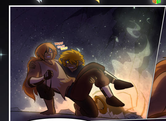
—where we now see that Falst's position is raised above Dainix's due to the way he's carrying him. (Points for continuity!) And, of course, we see the little "huffs" flowing from orange to yellow over their heads (where Dainix's head is higher than Falst's) to merge the sound of their breathing, which is absurdly clever because it emphasizes to the viewer how we hear two sets of huffing overlaying each other, not one. Absolutely brilliant.
(A few other notes of appreciation to that panel: beautiful glows around them, the sparks, the jagged silhouette of the spider legs, the lovely colors that have no right to make the area around a spider corpse that pretty, the excellent texturing on the cave walls plus perspective, the way Falst's movements imply Dainix's hefty weight, the natural posing of the characters, their on-point expressions that convey exactly how fuckin terrifying everything is right now, the slight glows to their eyes, and also they're just handsome boys <3)
Next up: Rain!!!! So well done! It's subtle enough that it never ever disrupts the impact of the focal point, but evident enough you can tell! And more importantly: THE MIST OFF THE CHARACTERS. Rain does this irl, it has that little vapor that comes off you and makes that little misty effect that plays with lighting, it's so cool-looking and here it's used to such pretty effect!
One of the panel captions says something about it blurring out all the injuries on the characters but like THAT AIN'T TOO BIG OF A PROBLEM when it gets across the environmental vibes, and also that'd be how it would look in real life too so like… outside viewer's angle is the same as the characters', mostly? my point is: that's the environment!!! that's the vibes, that's the feel! It gets it across and it does so in the most pretty way possible!
And another thing re: rain, the use of it to establish perspective, particularly in panels like this—

—where we can tell we're looking down at Tynan due to the perspective on the rain and where it's pointing. Excellent. (Also, kudos for looking down and emphasizing how Tynan's losing his advantage—lovely use of visual storytelling.)
Additionally, the misting here:
We see it most heavily in the leftmost panel, where it's quite foggy as you would expect in a rainstorm, especially in an environment with a lot of heat, but it's also lightly powdered on in the following two panels and tends to follow light sources, which makes complete sense given how light bounces off particles in the air.
A major point of strength in these too is a thorough understanding of lighting, like rim lighting, the various hues and shades, and an intricate understanding of how light bounces off surfaces even when they're in shadow (we'll see a faint glow in spots where characters are half in shadow, but that's how it would work in real life, because of how light bounces around).
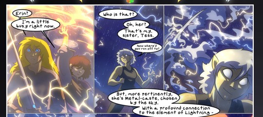
Bringing some of these points together: the fluidity of the lines in magic, and the way simple glowing lines are used to emphasize motion and the magic itself, is deeply clever. I'm basically pulling at random from panels and there's definitely even better examples, but here's one (see this page https://comicaurora.com/aurora/1-16-33/):

First panel, listed in numbers because these build on each other:
The tension of the lines in Tess's magic here. This works on a couple levels: first, the way she's holding her fists, as if she's pulling a rope taut.
The way there's one primary line, emphasizing the rope feeling, accompanied by smaller ones.
The additional lines starbursting around her hands, to indicate the energy crackling in her hands and how she's doing a good bit more than just holding it. (That combined with the fists suggests some tension to the magic, too.) Also the variations in brightness, a feature you'll find in actual lightning. :D Additional kudos for how the lightning sparks and breaks off the metal of the sword.
A handful of miscellaneous notes on the second panel:
The reflection of the flames in Erin's typically dark blue eyes (which bears a remarkable resemblance to Dainix, incidentally—almost a thematic sort of parallel given Erin's using the same magic Dainix specializes in?)
The flowing of fabric in the wind and associated variation in the lineart
The way Erin's tattoos interact with the fire he's pulling to his hand
The way the rain overlays some of the fainter areas of fire (attention! to! detail! hell yeah!)
I could go on. I won't because this is a lot of writing already.
Third panel gets paragraphs, not bullets:
Erin's giant-ass "FWOOM" of fire there, and the way the outline of the word is puffy-edged and gradated to feel almost three-dimensional, plus once again using Screen or a variation on it so that the stars show up in the background. All this against that stunning plume of fire, which ripples and sparks so gorgeously, and the ending "om" of the onomatopoeia is emphasized incredibly brightly against that, adding to the punch of it and making the plume feel even brighter.
Also, once again, rain helping establish perspective, especially in how it's very angular in the left side of the panel and then slowly becomes more like a point to the right to indicate it's falling directly down on the viewer. Add in the bright, beautiful glow effects, fainter but no less important black lines beneath them to emphasize the sky and smoke and the like, and the stunningly beautiful lighting and gradated glows surrounding Erin plus the lightning jagging up at him from below, and you get one hell of an impactful panel right there. (And there is definitely more in there I could break down, this is just a lot already.)
And in general: The colors in this? Incredible. The blues and purples and oranges and golds compliment so well, and it's all so rich.
Like, seriously, just throughout the whole comic, the use of gradients, blending modes, color balance and hues, all the things, all the things, it makes for the most beautiful effects and glows and such a rich environment. There's a very distinct style to this comic in its simplified backgrounds (which I recognize are done partly because it's way easier and also backgrounds are so time-consuming dear gods but lemme say this) and vivid, smoothly drawn characters; the simplicity lets them come to the front and gives room for those beautiful, richly saturated focal points, letting the stylized designs of the magic and characters shine. The use of distinct silhouettes is insanely good. Honestly, complex backgrounds might run the risk of making everything too visually busy in this case. It's just, augh, so GORGEOUS.
Another bit, take a look at this page (https://comicaurora.com/aurora/1-15-28/):
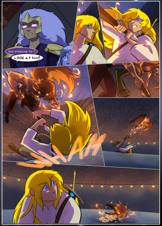
It's not quite as evident here as it is in the next page, but this one does some other fun things so I'm grabbing it. Points:
Once again, using different colors to represent different character actions. The "WHAM" of Kendal hitting the ground is caused by Dainix's force, so it's orange (and kudos for doubling the word over to add a shake effect). But we see blue layered underneath, which could be an environmental choice, but might also be because it's Kendal, whose color is blue.
And speaking off, take a look at the right-most panel on top, where Kendal grabs the spear: his motion is, again, illustrated in bright blue, versus the atmospheric screened-on orange lines that point toward him around the whole panel (I'm sure these have a name, I think they might be more of a manga thing though and the only experience I have in manga is reading a bit of Fullmetal Alchemist). Those lines emphasize the weight of the spear being shoved at him, and their color tells us Dainix is responsible for it.
One of my all-time favorite effects in this comic is the way cracks manifest across Dainix's body to represent when he starts to lose control; it is utterly gorgeous and wonderfully thematic. These are more evident in the page before and after this one, but you get a decent idea here. I love the way they glow softly, the way the fire juuuust flickers through at the start and then becomes more evident over time, and the cracks feel so realistic, like his skin is made of pottery. Additional points for how fire begins to creep into his hair.
A small detail that's generally consistent across the comic, but which I want to make note of here because you can see it pretty well: Kendal's eyes glow about the same as the jewel in his sword, mirroring his connection to said sword and calling back to how the jewel became Vash's eye temporarily and thus was once Kendal's eye. You can always see this connection (though there might be some spots where this also changes in a symbolic manner; I went through it quickly on the first time around, so I'll pay more attention when I inevitably reread this), where Kendal's always got that little shine of blue in his eyes the same as the jewel. It's a beautiful visual parallel that encourages the reader to subconsciously link them together, especially since the lines used to illustrate character movements typically mirror their eye color. It's an extension of Kendal.
Did I mention how ABSOLUTELY BEAUTIFUL the colors in this are?
Also, the mythological/legend-type scenes are illustrated in familiar style often used for that type of story, a simple and heavily symbolic two-dimensional cave-painting-like look. They are absolutely beautiful on many levels, employing simple, lovely gradients, slightly rougher and thicker lineart that is nonetheless smoothly beautiful, and working with clear silhouettes (a major strength of this art style, but also a strength in the comic overall). But in particular, I wanted to call attention to a particular thing (see this page https://comicaurora.com/aurora/1-12-4/):
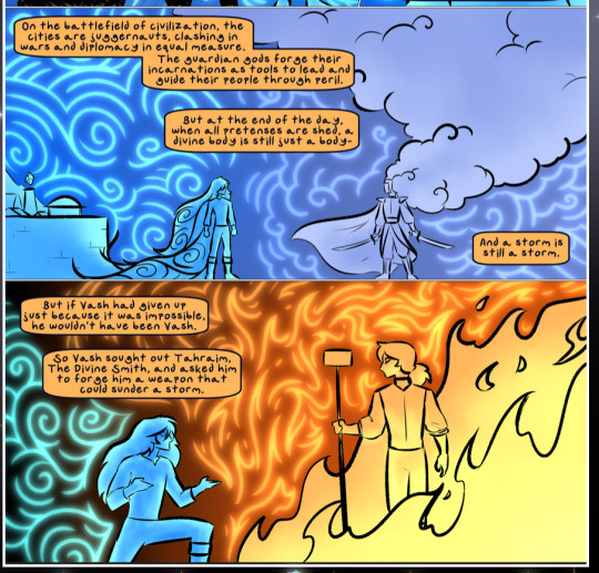
The flowing symbolic lineart surrounding each character. This is actually quite consistent across characters—see also Life's typical lines and how they curl:
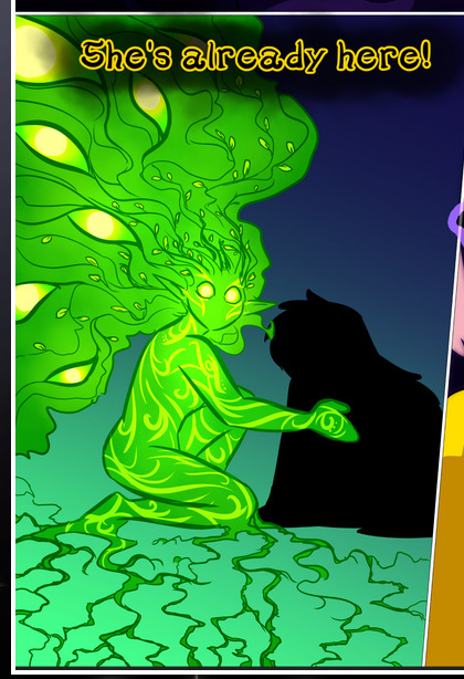
What's particularly interesting here is how these symbols are often similar, but not the same. Vash's lines are always smooth, clean curls, often playing off each other and echoing one another like ripples in a pond. You'd think they'd look too similar to Life's—but they don't. Life's curl like vines, and they remain connected; where one curve might echo another but exist entirely detached from each other in Vash's, Life's lines still remain wound together, because vines are continuous and don't float around. :P
Tahraim's are less continuous, often breaking up with significantly smaller bits and pieces floating around like—of course—sparks, and come to sharper points. These are also constants: we see the vines repeated over and over in Alinua's dreams of Life, and the echoing ripples of Vash are consistent wherever we encounter him. Kendal's dream of the ghost citizens of the city of Vash in the last few chapters is filled with these rippling, echoing patterns, to beautiful effect (https://comicaurora.com/aurora/1-20-14/):
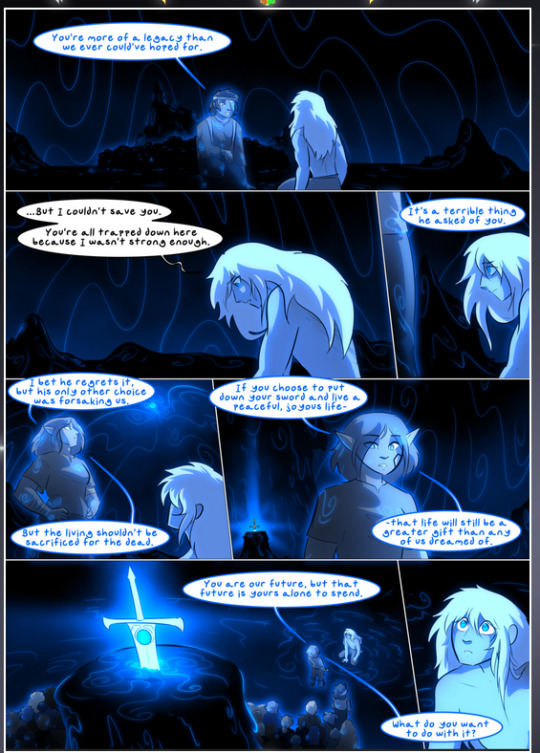
They ripple and spiral, often in long, sinuous curves, with smooth elegance. It reminds me a great deal of images of space and sine waves and the like. This establishes a definite feel to these different characters and their magic. And the thing is, that's not something that had to be done—the colors are good at emphasizing who's who. But it was done, and it adds a whole other dimension to the story. Whenever you're in a deity's domain, you know whose it is no matter the color.
Regarding that shape language, I wanted to make another note, too—Vash is sometimes described as chaotic and doing what he likes, which is interesting to me, because smooth, elegant curves and the color blue aren't generally associated with chaos. So while Vash might behave like that on the surface, I'm guessing he's got a lot more going on underneath; he's probably much more intentional in his actions than you'd think at a glance, and he is certainly quite caring with his city. The other thing is that this suits Kendal perfectly. He's a paragon character; he is kind, virtuous, and self-sacrificing, and often we see him aiming to calm others and keep them safe. Blue is such a good color for him. There is… probably more to this, but I'm not deep enough in yet to say.
And here's the thing: I'm only scratching the surface. There is so much more here I'm not covering (color palettes! outfits! character design! environment! the deities! so much more!) and a lot more I can't cover, because I don't have the experience; this is me as a hobbyist artist who happened to take a couple design classes because I wanted to. The art style to this comic is so clever and creative and beautiful, though, I just had to go off about it. <3
...brownie points for getting all the way down here? Have a cookie.
#aurora comic#aurora webcomic#comicaurora#art analysis#...I hope those are the right tags???#new fandom new tagging practices to learn ig#much thanks for something to read while I try to rest my wrists. carpal tunnel BAD. (ignore that I wrote this I've got braces ok it's fine)#anyway! I HAVE. MANY MORE THOUGHTS. ON THE STORY ITSELF. THIS LOVELY STORY#also a collection of reactions to a chunk of the comic before I hit the point where I was too busy reading to write anything down#idk how to format those tho#...yeet them into one post...???#eh I usually don't go off this much these days but this seems like a smaller tight-knit fandom so... might as well help build it?#and I have a little more time thanks to break so#oh yes also shoutout to my insanely awesome professor for teaching me all the technical stuff from this he is LOVELY#made an incredibly complex program into something comprehensible <3#synapse talks
785 notes
·
View notes