#then wanted us to come up with our own storyboard and animatics
Explore tagged Tumblr posts
Text
Watching a video of an animation student in other country made me realize how fucking deficient my university is, por la gran puta...
#zagreus rambling#like. my degree is a double one so first half you're supposed to learn animation#the other half videogame development#wanna know why yall never see me do ANYTHING related to actual animation?#we didnt learn shit#the key classes for animations were NOTHING#they were either given by someone who DOES NOT work in animation or has a “similar” work#storyboard? given by a guy who doesnt work in animation#just gave us a wikipedia explanation all semester#animation workshop? one of the fucking few classes done by someone who knoes#only showed us pixar shorts and BTS's of said shorts#then wanted us to come up with our own storyboard and animatics#no explanations as HOW DO THEY FUCKING WORK IN THE ACTUAL INDUSTRY#I dont even wanna talk about stop motion#shit was a disaster#and by younger classmates I'm learning they are having it even worse than me#god Im so pissed#THIS IS THE ONLY UNIVERSITY THAT HOLDS THIS FUCKING DEGREE IN THE COUNTRY YOU WOULD EXPECT THEM TO IDK AT LEAST HAVE SOMETHING FOR US??#LIKE CONFERENXES WITH ANIMATORS AND BETTER EDUCATION OF ANIMATION??#si son de aqui de san salvador y alguna vez han ido a uno de esos eventos que hacen en el Ricaldone que los bichos hasta ponen sus cortos#esos majes de seguro recibieron MEJOR educacion que uno en la universidad en 5 años man#me emputa de plano. me emputa todo#ALSO “Digital Animation” WHY THE FUCK WERE WE LEARNING STOPMOTION
3 notes
·
View notes
Text
Okay... so I'm pretty sure the "Play My Way" song is canon considering its an official Amanda 2 song and it's listed in the games credits.
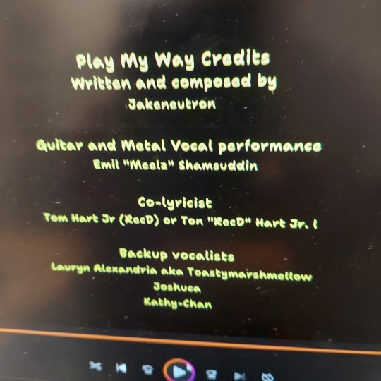
So I'm also gonna consider the two animations the song is based on as canon, too. Bear with me.
If we consider all 3 videos canon then things get really interesting.
Timeline wise, I think all three videos take place before the first game.
The first where everything in the Hide and Seek tape goes smoothly where it's just a storyboard happens before Amanda and Wooly got trapped. I think this may have been a pilot to the animated series. It feels like it sets up what Amanda The Adventurer was supposed to be like. Amanda and Wooly are super friendly with each other, plus Wooly is missing his ears just like the games original pilot.
The second version might be sometime after they got trapped. Supposedly Amanda didn't originally remember her life as Rebecca in the first game right? I think this might be where she started to notice something off. When they replay the Hide and Seek tape, Amanda clearly gets the feeling they've done this before. I'm so sure about Wooly here tho.
Now let's talk about the song on its own, ignoring the timeline and just acknowledging that the characters find this tape familiar.
By the third time (the song), Amanda clearly notices that they've done this before and freaks out. And I think here if Wooly didn't notice something off before, he does when his part comes when he's repeating the lines from the animatics he sounds really unsure? "Right, you're the best... you must play this a lot." Like there's a weird sense of unease in his voice when he says this.
The chorus to me feels really interesting because I feel like we're getting Amanda's true feelings about this situation.
"Now watch us play our part. Now watch us dance and sing. Don't want to fall apart like kids who never seem to scream."
I love the puppet-like vibes these lyrics give off.
After this it seems like the tape resets cuz it's suddenly Amanda's turn again. And Wooly seems like he's really frustrated that he's not getting his turn. But Woolys verse is the most interesting to me.
"Now watch us play our part. Now watch us dance and sing. Don't let it break your heart just play along and-" He gets cut off.
This almost sounds equally passive aggressive as Amanda's chorus. There seems to be an equal amount of resentment. But the "just play along" part seems very fitting for Wooly. One thing I think about Wooly is he seems very avoidant of things that upset him. And it got me wondering if the reason he's always trying to redirect things isn't because it's some "job" of his, instead he simply doesn't like it. He doesn't like tragic stories he doesn't like talking about death or people you trust hurting you. But a lot of these things seem like things that Hameln intentionally wanted in the show so I'm really starting to belive that Wooly himself is the one who doesn't want to talk about it.
Another thing I find weird is how adamant Wooly was about wanting a turn and then how the moment Amanda was gone, he started to panic. As his verse continues after Amanda's chorus, he sounds more and more upset. I can't wait till the animation for this comes out because I really wanna know what Wooly was talking about when he says, " I don't wanna go in there." Omg. Didn't Amanda say that once?
Now, when he finds the "cat under the box," this time it's Mr. Fox? And then Amanda sings about killing someone. I don't think it's Wooly because, continuity wise, that doesn't make sense. We found out that killing Wooly does nothing he just comes back. So Amanda wouldn't try it twice, right? So I think it's Mr. Fox before the first game. Maybe Mr. Fox was a character similar to the opossum? Idk why Amanda would kill Mr. Fox unless if he was in their way. Actually, I know it isn't Wooly because Wooly is still alive at the end of the song- (imagine the music video comes out and makes me look like a fool)
I also wonder what Amanda's "it's you" is supposed to mean. Maybe Kate was the one watching this tape?
Anyway, these are my observations and theories. They are kinda messy and subject to change, but what do you think?
#amanda the adventurer#amanda the adventurer 2#wooly the sheep#amanda the adventurer wooly#amanda the adventurer theory#maddykpost
32 notes
·
View notes
Text
Animation Brief 02 - Re-Invention in Storytelling 02

Having finalized the character designs it was up to me to put together the finished storyboard. Me, Summer and Zu had already collaborated on the storyboard and knew what we wanted, my job was just to polish those ideas into something tangible. Being the slacker team, we were a bit behind going into the weekend and with Summer and Zu busy I volunteered to finish the storyboard myself.
This is also where a key flaw in my college career comes into play. I cannot fucking read. Or at the very least I can't communicate cause my idea of what the final animatic needed to be was way off of what was expected of us. Honestly for a long time I thought we needed to create a full, finished animation. And while that might sound like a humblebrag about working extra hard, the reality is a lot stupider.
If you have two weeks to create a polished animatic and pitch, you'll probably create a pretty great animatic and pitch it well. But if you spend half that time believing you need to create a full animation, not only are you going to rush the pre-production, but your priorities will differ massively. I don't really mean to sound too negative, I just want to note that while I greatly enjoyed the project and I'm happy with my work, my initial misunderstanding of the project was a mistake entirely of my own making and the overall quality of the project suffered as a result.
Anyway, here's the storyboard lol


Above: The abyss staring back...
Ultimately I broke the storyboard down into eight scenes and about 90 shots. The process was great fun, incorporating elements from all three previous boards and smoothing out the continuity with new scenes was exactly what I love about storyboarding; refining ideas and polishing them to as best a shine as you can.
As I alluded to above, I think had I managed my time better and actually understood the project from word go, I could've made something better. To me a storyboard is all about continuity, if you create a good flow of scenes you can refine the visual flair later in the rough or layout stage. There's simply an element of confusion throughout my storyboard.
In a way it's a lot like the last project with the mini-me and parallax background. I really learned the importance of pre-production, because whether you like your foundation or not, you're gonna have to live with it.
Anyway here's the animatic lol
Above: Now with music!
The music was a last minute request from Zu. I didn't have time to really sync it up all that well but I knew in general I wanted Night on Bald Mountain to open with for the villain introduction and inciting incident, then silence during the death of spoon, and a slow fade in on Bolero for Dish's journey. I think having put it all together, I've watched so many times now I can't see it objectively anymore lol, I need to rest my eyes for a week.
I could ramble for a long time about every shot in the animatic and the how's and why's of them but I might leave that off for another post when I'm less tired. If nothing else, these slides from our pitch should give you an idea of where my head was at when making the thing in terms of visual influence and overall direction.


I'd also like to give a thank you to Zu and Summer who were a great team to work with, and made the whole project easy and fun, where it could've been difficult and miserable. A lot of my work is directly visible in the final product but all three of us contributed an equal amount to achieve the final result. In a real sense I couldn't have done it without them.
5 notes
·
View notes
Text
Wyrm Runner Blog #10 (5/9/25)
For my individual experience with this this project and my work for this semester, this was definitely the hardest semester to work through personally just because my mental health had dropped to the lowest that it has ever been and I have been making active efforts to try and steer it back on track with medication and counseling due to how severe it was getting. However, I would say that I've grown a lot this semester as an artist because I got to storyboard on a larger scale than I have in the past, and I got to use my past experience of storyboarding and 2D animation to mock up some quick panels so that we could get a basic idea of how some of the scenes would look before they became official. I've also modeled again for the first time in a year since modeling isn't something that I keep up with when it comes to what I do outside of school so I had to relearn some of the hot keys that I found very useful when I did model a lot. I think for this semester, I probably could have been more involved in the 3D aspects of the film since I mostly did 2D work, but I'll be one of the animators for next semester which will be nice. Some personal goals that I want to have for the next two semesters is to get better at animating because, at least when it comes to 3D, I'm not the best at but I do want to get better and have a bit more patience when it comes to animating in 3D so that we can have a film that looks and moves nicely.
For the group experience with this project, I would say that this semester was definitely a learning experience because although we have worked in small groups to create smaller scaled projects, this is a group where I didn't really have other members of the group in my other teams so we kind of had to learn how we work and adapt to each other's work flow. However, I would say that we were pretty good with communication which helped immensely with adjusting to our work flow and we did our best to accommodate for everyone's strengths. Our group luckily didn't have any personal or interpersonal issues that came up and we talked a lot of things over which is something that probably helped that. The work could be split a little evenly because there are people who take on more work than others, but we do try our best to mitigate that the best we can by offering to take some work off of each other's shoulders. I think if we worked together to organize a bit better, it would've helped increase the amount of time we had to work on our 3D animatic and we didn't communicate that much when we were working on our own parts of the 3D animatic so I think for the next two semesters, really communicating with one another and getting shots to line up better so that they're not so detached would be super helpful in making the film look smoother.
0 notes
Text
Group Project
Our final assignment for first year was to create six animated shorts, twenty five seconds in length each, for a local film festival to use as idents before their showreels. To accomplish this, we were split into several groups (stop motion, cutout, smudge and click, 3D and compositing) to tackle storyboarding, making assets, animating said assets and then editing all of the footage and mediums together into a final product.
I was placed in the compositing team. This meant that for a large portion of the project, I didn't have any work to do, so in order to combat that I was put on standby for the 3D team as well as helped the cutout group with making a few of their assets, more specifically the sun, the moon and parts of a walrus yawning. I did not animate these but helped with cutting them out and colouring them.
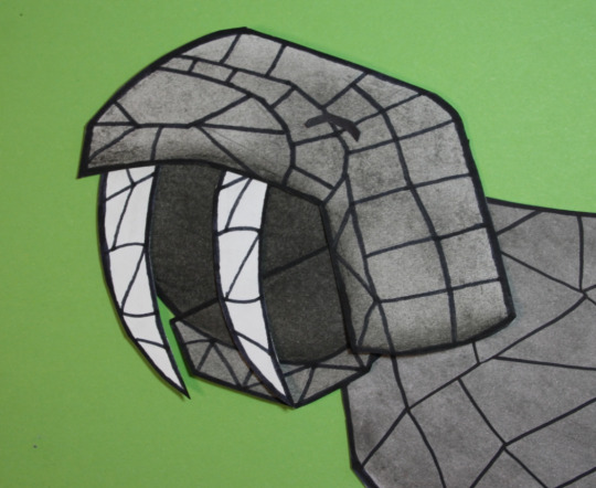

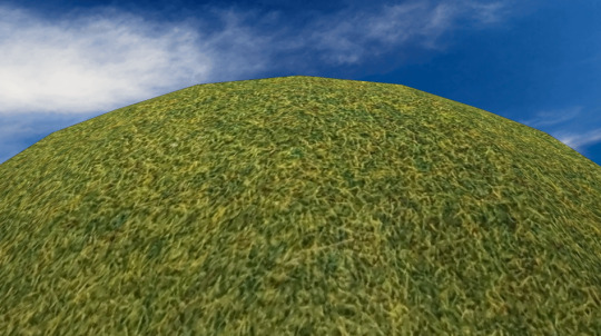
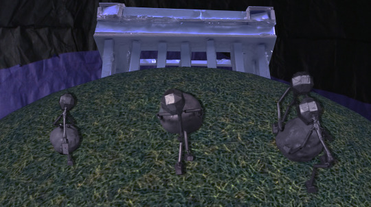
Once the footage was handed over to the compositing team, I was able to get started. I'd been assigned to the Sisyphus animation, in which several statue men pushed boulders up a hill and then sat at the top, turned on a projector and the film festival logo would come into view. The ident in question is composed of three shots, so I decided to work on the middle one first as I felt that this would be the easiest to tackle first. The shot would be from behind the statues as they walked up the hill, using a rotating 3D ball to give the impression of motion. The Penshaw Monument would gradually come into view.
I started by laying out where I wanted the backdrop to be and how much sky was to be visible. For this, I used a stock image of a blue sky as a placeholder and then imported the rotating 3D ball.
This was moving as intended, so I then started to add in some of the figures. The original footage for these was shot against a green screen, so I started to isolate them by masking around them loosely and then used a keylight filter to remove the green background. I quickly encountered a problem with this, however. As the figures were painted metallic silver, they were reflecting some of the green and therefore parts of them were being lost in the keylight. To fix this, I set the keylight so that all of the model would be visible and then subtract masked over parts of the green screen that also became visible to hide them. I repeated this for every frame of the walk cycle and then duplicated it to have all three figures cleanly walking up the hill.
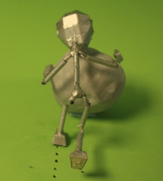


I also had some difficulties with one of the models in particular. Whilst in the other footage the models all walked in place, one of them moved forward, which didn't fit the moving hill. To fix this, I keyframed in scale and position transformations to keep every frame of the model as close to the same position as I could get. This made it look like the character was walking in place.

I then added the Penshaw Monument in. To do this, I took a photo of the model made by the stop motion team and removed the background using masks. I then placed it behind the rotating hill layer and keyframed a position transformation with a slow-in to the final keyframe so that it would gradually come into view.
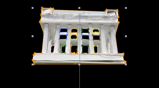
For now, I opted to keep the stock image of the sky in the composition as I wanted to complete all three shots before adding it so that the time of day would be consistent across each of them.
There were some issues with this shot. A lot of back-and-forth was spent on the models, as the animators wanted there to be five characters going up the hill, two of which worked as a duo. This was added in, however I was unable to see the footage for the fifth character in the first shot on OneDrive. This may have been entirely my own error and I likely missed it despite checking, however because of this I cut the fifth character out of the other shots. The ending shot was what I tackled next. I knew from the reference animatic that this shot would definitely take place at night, so I was confident using the cutout footage for the night sky for this straight away. I also took a photo of the Penshaw Monument model on top of the hill model that the stop motion team had made, then keylit out the blue screen background and masked out any stray pieces that weren't meant to be there.
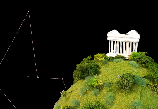
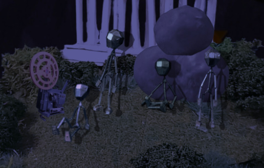
I then started to add in the statue characters from footage, using the aforementioned method of keylight and masking to clean the footage up. These characters were then positioned on top of the hill.
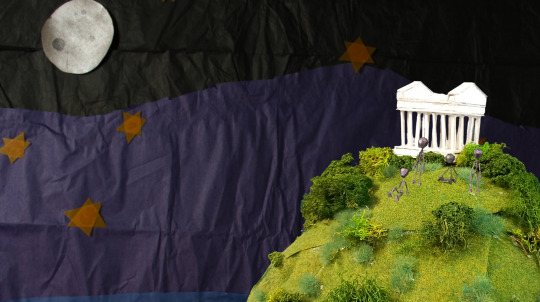
The sky background animation was moving very fast, so I also added a time stretch effect of 800 to it to extend it and slow it down, which had the desired effect. This was where I left the final shot for now. The last shot I tackled was the opening one. I knew that this would start with the sun up, so I imported that background and the sunset straight away. I also added a time stretch of 200 to slow the descent of the sun slightly. The ground, however, was where I ran into my first issue. I was unable to find any flooring for this section within the shared OneDrive folder as presumably one had not been made. To fix this, I used the photo I'd reviously taken of the hill and monument for the final shot, turned it onto its side and then zoomed in to give the look of a gentler slope. I then keylit and masked around the edges to remove the background. This solution was far lower quality than I would have liked, especially up close, however given that there was no alternative flooring I couldn't see another way forward.
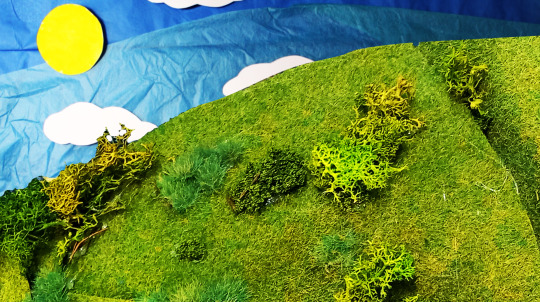
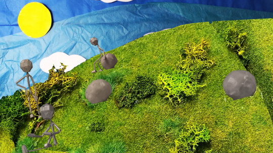
I then added in the statue men walking up the hill and used the same keylighting and masking method as before to remove the background from each bit of footage.
Now that I'd finished a basic first pass for all three shots, I started to go back through and refine them with things like colour grading and redoing the keylight in places to make it cleaner (patches of the figures were missing in some sections, which needed fixing. I also wanted to fix some of the model colours, as I'd colour range adjusted them to clumsily remove the green reflections, however had since learned of a simpler way to do this). The first one I sorted out the colour grading for was the ending shot. The scene was set at night but the separate assets were filmed with during the day, so to fix this I would need to darken them, lower the saturation and make everything more blue toned. I first worked this out on the hill, on which I used a combination of curves, colour balance and colorize - moonshadows to achieve a darker, nighttime look.
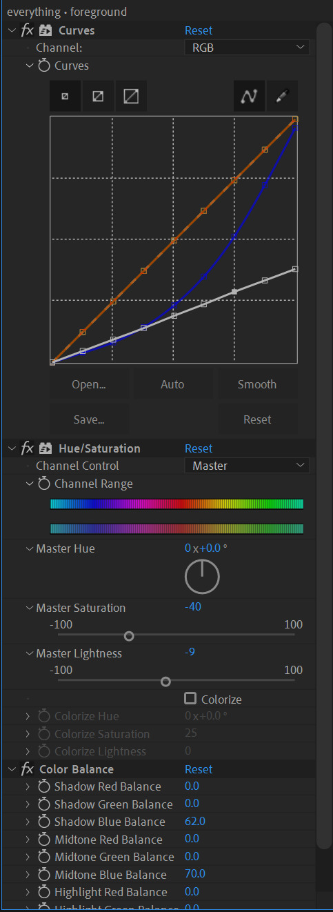
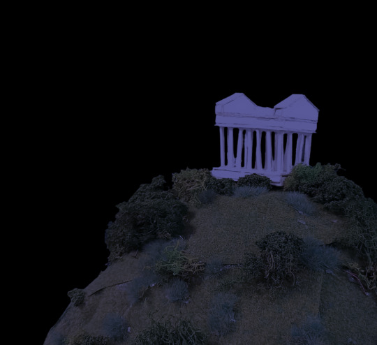
I then repeated a similar process on the sky and the characters so that they fit in with the rest of the environment. A glow effect was added onto the moon in the background as well to give the impression of light.
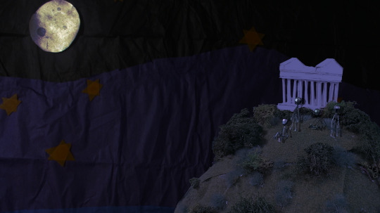
Additionally, upon checking the reference animatic I realised that boulders and a projector were supposed to be present in this shot. The projector photos were quickly provided by part of the stop motion team, which I was able to cut out and then colour grade to fit. For the boulders, however, I was unable to find any photos of them on OneDrive so I instead took screenshots of footage for the first shot and cut them out in Photoshop, then saved them as transparent images and imported them into After Effects. This allowed me to place and colour grade them in with the rest of the scene.

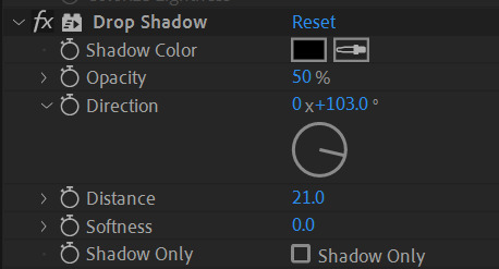
At one point, there was a fifth figure sat on top of the boulders added in after they were, however this was later removed due to the previously mentioned continuity issue. Some of the final visual tuning for this scene included adding shadows and a light beam to the projector. As there was no footage that could be used to make accurate shadows for the figures and time constraints prevented me from making some, I instead used the drop shadow effect to add some in, which were not as accurate as I'd hoped but still helped to add some depth and detail to the scene.
For the light beam, I used the pen tool to create a light yellow cone shape starting at the projector. Using keyframing, I was able to make the opacity flicker as it turned on. Following feedback, I also decreased the opacity of the beam closer to the projector using a subrtract mask with the feather transformation, which allowed for a transparency gradient.
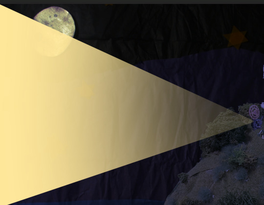
Lastly, at the end of the beam was supposed to be the logo, which the camera would pan over to. To do this, I pre-composed all of the footage into one folder, the shape for the light beam and a flat yellow background into another and then added in two versions of the logo on top. On one version of the logo, I used keylight to remove the background and then used an invert filter to make the text on it black. The other I left alone.
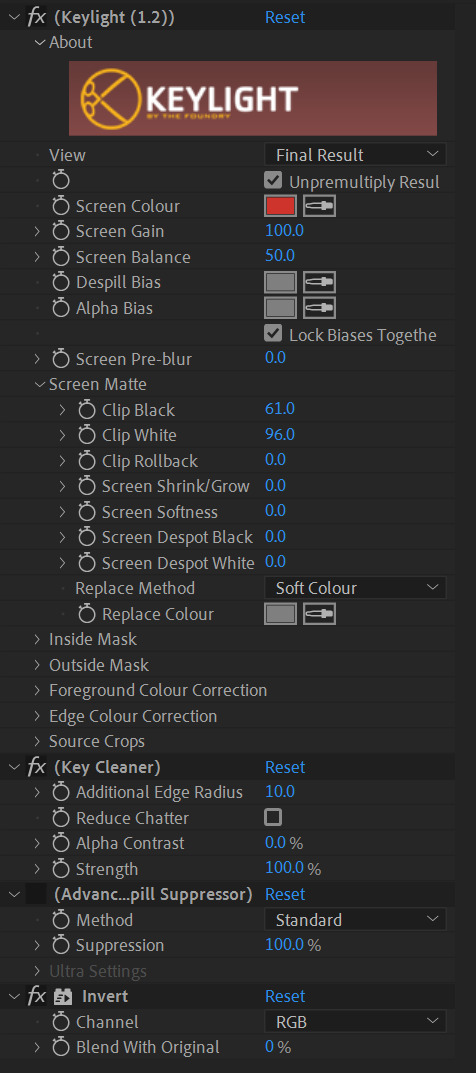
I used keyframing and position transformations to have the animated section move off screen to the right while the logo would glide into frame, giving the effect of a camera panning over. Following feedback, I added in slow-ins and outs to the movement to make it look less robotic. The final thing I did for this shot was to add in a fade between the black text logo and the official logo using keyframed opacity transformations. The next shot I adjusted was the middle one. This took far less time as there was a lot less to add. Having already done the nighttime colour grading for the final shot, I had more confidence in what I was doing and was able to complete this a lot faster using a similar combination of curves adjustments, colour balance editing and brightness/contrast effects.
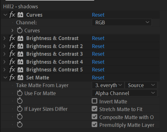
One issue I ran into was with the drop shadows on the models, as I wasn't sure how to make the effect clip to the hill and it would occasionally spill out onto the sky. To fix this, I avoided using drop shadows entirely for this shot and duplicated the pre-comp of the figures moving. I then used several brightness/contrast layers to silhouette them, lowered their opacity and then moved them to sit underneath the figures like shadows. I was then able to use a set matte layer to clip the shadows to the hill. With some small adjustments to the sizing of the monument, this shot was complete.
The last shot I had left to tackle was the opening one. This was set during the day which would make colour grading easier, however also included a sunset, which would make things slightly more difficult.
I found that I was struggling to use the same colour grading method I'd used before as it didn't allow for transitioning between colours smoothly, at least not in a way that I was able to see. Instead, I opted to use the gradient ramp effect, which allowed the colour grading to shift from one colour to another. This quickly created the desired effect on the grass, so I copied it across to the sky and the colour grading for this scene was quickly complete. Following feedback, I adjusted the boulder men masks in this shot so that they would appear to go behind the bushes. I used subtract masks to achieve this. I also added shadows - as the footage was taken from the side this time, I was able to duplicate the footage, flip it upside down, darken them into silhouettes and then reduce the opacity to create more realistic shadows than drop shadows would allow for. I also used subtract masks with the feathering transformation to cut out the spaces where the bushes were so that the shadows wouldn't go over them. This was the last thing needed to complete the shot.

The final thing that was needed was to add in sound. All of the required sound effects had been recorded by other members of the compositing team and were available on OneDrive, so all that was needed was to put them in order in After Effects. For the first shot, I layered some leafy sounds for the grass and some birdsong that I keyframed using an audio levels transformation to fade out as the sun set. For the second shot, I added the same leaf sound effect although slightly quieter as well as a wind sound. For the final shot, the characters were still so no leaf sounds were needed and the wind was quieter. Cricket sounds were also added, as was the hum of a microwave to mimic the sound of the projector turning on and running. I cut the audio for this and made some minor volume edits in order to match the flickering. With some final adjustments to the sound, the ident was finished.
This project was a good learning experience and I feel significantly more confident with After Effects afterwards. Were I to do this again, I'd likely try to work faster, which would be possible as I have more knowledge of the program now and how to find solutions to problems that I encounter.
0 notes
Note
📓 tell me about Temeraire fanfiction!
Ok so first i’m very [flailing hands, excited noises] about getting an ask! Second, I’m so so Sorry for being slow to answer. And third i also realized I have l less fic thought out than it feels like, its mostly little loose details and questions rattling around…
I have recently been thinking about something that would be Very outsider pov: a series of conversations that is basically different distant acquaintances discussing/reacting to news about laurence. Just some scenes with different people at different times during the story (or alternatively, different people reacting to the same thing?). Thoughts so far:
- the crew of the Reliant - some seaman later serving on a different ship and telling others about how he was there at temeraire’s hatching and confidently sharing his “expertise” about dragons. Or just something like:
”How come you are so unafraid(?) of dragons, mr ——?”
”I was on the reliant, sir, when temeraire hatched. And himself was polite as any could want and even saved —— when he went over in a storm. He never woulda et none of us sir.” (Spose theres some sense to it, captain laurence had everybody mind their manners. Us and the officers too. Made sure the little gentlemen understood the ship and didnt abuse us for no good reason)
[excuse my attempt at writing some unspecified accent, english is not my first language]
- some of the correspondence that laurence is pretty good at remembering when things are only a little bit crazy. Like - Hello dear friend, it is good to hear from you again - I Assure you I am not Offended by this recent Unfortunate pause in our correspondence, but it really has been a Long while since I last had Word from you. My family is well, as is [some mutual friend] who I was happy to catch last month at a Dinner. Now I must Ask, what Pray Tell is this I Hear about you having been Made a Prince?? ….something something
- some of the abolitionist politicians talking to each other like “so have you heard the classified part of what went down in brazil?” I feel they would be interestingly conflicted about it since it is a win towards stopping slavery, but they probably had a different vision for how they thought that should happen and they also probably didnt want portugal weakened at that time so… Also: “That’s our friend’s chaos son doing things again. Should we send him congratulation or condolences? Or perhaps just never mention it?” “Never mentioning it would likely be best I think.”
———
Something i have managed more specific thoughts about is actually animatics. I barely know anything about making any kind of video, but i have two ideas that will not let me go to such a degree that i have detailed notes for one of them and a full storyboard for the other. Actually the reason i started making Temeraire fanart beyond little margin doodles is because i needed to figure out the characters for these animatics.
The song i have a storyboard for is The trial of Lancelot by Heather Dale. Not every line fits perfectly, but a lot of it goes very well with Laurence's own trial.
The other one would be mostly pre canon Laurence set to How far i'll go from Moana. (It works ok)
I realize that while i love pretty much every character in the series Laurence is the one im most focused on. I think its partly because empathy is something i have to do very much On Purpose which means i generally get most attached to main characters whose feelings are more explained in the story. But also partly because I’m fascinated both by the specific way 19th century brits are fucked up and by the struggle of figuring out your own set of morals when the system you belived in fails you.
#temeraire#ask#!!#again im vibrating about getting an ask#and sorry for taking so long#lots of chaotic words…#i hope you get some little joy from something in this
0 notes
Text
ProjectReSpooted Announcement!!!
🚨 ATTENTION EVERYONE!!! 🚨
Me and other groups of people are at the early stages of making our own fan produced Angry Beavers:ReSpooted!
Mitch Schauer originally pitched Angry Beavers:ReSpooted to Nickelodeon but so far no luck and he said there won’t be any Angry Beavers revival for quite some time or not at all. Thankfully, us fans are not going to give up so easily! On Twitter,I made a group page called ProjectReSpooted.
At ProjectReSpooted,it’s our goal to create our own Angry Beavers ReSpooted series for the internet!
This is a Non-Profit fan based animated project that the fans of Angry Beavers will come together and revive the show ourselves!
Angry Beavers:ReSpooted is about Norbert and Daggett now adults and Norbert and Treeflower get married and raise 2 beaver daughters named Lily and Petunia together. Daggett will still be single and he will visit Norbert and Treeflower often.
So far we only got
2 voices,which is for Norbert and Daggett,Chase Beck and Marcus Shaw respectively,a Background artist,concept artist,a storyboarder,songwriter,3 writers,2 animators,and someone to do the animatics. We still need to find the voices for Treeflower,Norbert and Treeflower’s daughters Lily and Petunia,Bing,Barry,Truckee,Wanda,Wolffe,Norb and Dag’s Parents,Treeflower’s parents,Oxnard Montalvo and Toluca Lake,Bill Licking,El Grapadura,the other Next Gen characters and some other side characters. We also hope to get more professional writers,a main composer that can make music like Charlie Brissette,animators,storyboarders,etc for this project!
Mitch,Chelsea Schauer and Stacy Schauer,I hope you guys will approve of this project since well,its never coming back offically or at least anytime soon. Also Stacy,Chelsea? I hope you guys can hopefully join this project as your older character selves cause,no can do Stacy and Chelsea than you two.
Whos wants to join? 🖐🏻
If anyone wants to join,please let ProjectReSpooted know.
Heres the link to the Twitter page :
Angry Beavers:ReSpooted may never come out officially by Nick and Paramount but us fans will make sure it happens,even if its fanmade! And we will make it first before Nick might have 2nd thoughts and bring it back themselves
Together,we will bring our beavers back and get the show the comeback it rightfully deserves!
Me and the crew don’t care what Nick and Paramount might do with this project! If they don’t care and make Angry Beavers ReSpooted themselves, we will do it for them!
Who’s in on the project?
34 notes
·
View notes
Photo
Nic Smal and Lucy Heavens Talk About Their Path From Cape Town To Disney’s First South African Creators.
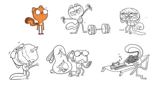
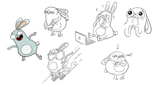
South African creators and executive producers, Lucy Heavens and Nic Smal are behind Disney Television Animation’s upcoming animated buddy-comedy, Kiff, which follows an optimistic squirrel whose best intentions often lead to complete chaos, and her best friend, a sweet and mellow bunny, and was inspired by the people and places the creators experienced growing up in Cape Town.
They gave some details for the series such as that the show uses a hybrid Toon Boom Harmony and hand-drawn animation
Animation Magazine had a chance to speak with this talented duo during a recent interview:
Can you tell us a little bit about the development history of your new show?
Lucy Heavens: We both always dreamed of having our own show, but it also seemed kind of outlandish and impossible for such a thing to happen to a pair of self-taught South Africans. It wasn’t that long ago that we just had no idea how to pitch a show — to who, where? It was always something reserved for people far away, over there in the U.S.A. But when we met, we were both so desperate for a creative outlet, that working on the idea was wonderful whether it got picked up for development or not. It was its own reward.
Nic Smal: When the series was optioned by Disney (only five short months after we created it) no one was more surprised than us! Development can always be a long road, so we really appreciated the fact that we each had a co-creator to walk that road with, and we poured ourselves into a pilot animatic and animation test. It has been, and continues to be so, so fun! Throughout the process we have found a very collaborative way to work, and the voice of the show really comes alive when we are working together. We have always enjoyed feeding into each other’s primary disciplines in a really productive way. Lucy is a writer who’s an art person.
Lucy: And Nic is an artist (and comedian and musician!) who’s really great at story
When did you two begin working together?
Nic: We met at an animation studio in Cape Town in 2017 and quickly realized we spoke the same comedy language. We have quite different sensibilities, but a very similar sense of humor. There aren’t really any opportunities to work on this kind of comedy in South Africa (as yet!), so we just decided to create a series that would be the most free, fun world for us to sink our teeth into in terms of story and comedy — and just enjoy that process.
What was the inspiration for the show?
Lucy: We really wanted to create a world and a tone that was very free to tell all kinds of stories about being a human; friendships, family, society, frustrations, joys! Ultimately we wanted it to be extremely universal and relatable, filled with rich, flawed characters where we can explore human nature (with talking animals, obviously)! So really the inspiration was: What’s the most perfect vehicle for us to tell endless, and (hopefully) very funny stories? Kiff is the result.
Where is the animation being produced and how many people are working on it?
Nic: Titmouse is the wonderful and amazing studio producing the show.
Lucy: We have a number of team members in both L.A. and New York
Which animation tools are being used by the studio?
Nic: Toon Boom, Storyboard Pro etc. The show uses a hybrid Toon Boom Harmony and hand-drawn animation style, so we can be efficient but also have those sublime, unique moments by pushing key poses and expressions.
Tell us what you love about this show!
Lucy: Every aspect of the show is a joy and a pleasure. Visually, we have poured our love of nature and the natural world surrounding Cape Town into the geography and design. Tonally, it’s a very free space for all kinds of stories to be told. Musically, it is so fun to write songs and play with every musical genre imaginable, and in a way that doesn’t speak down to kids (we write the songs together but Nic is the really accomplished musician). And of course our characters are hilarious to us. We sort of see them as different parts of the human psyche; the lust for life, the sensitive and vulnerable parts of ourselves, the self-centered, ego-driven parts of ourselves — they are all represented, and intersect in interesting ways.
What is your biggest challenge right now?
Nic: Working across three time zones isn’t the most sustainable way to work as showrunners. We’re based in Cape Town and production is happening between L.A. and New York. It is such a collaborative medium; there aren’t enough meeting hours in the day.
What is your take on the global animation scene in 2021?
Lucy: We’ve never been in a more rad time for animation; important, real, existential, funny, rich and beautiful shows for all ages are coming out. There also seems to be a breakdown of the more rigid genres and age groups that you had to target previously, and an understanding that the right audience will be able to find your show on streaming platforms.
Nic: It’s also a time where big broadcasters are taking risks on outsiders like ourselves — thank goodness (and Disney) for that.
Who are your biggest animation heroes/influences?
Lucy: We’re millennials, so we communicate solely via Simpsons references. But we’re also children of 1990s Disney films, TV and (not animation but) Monty Python as well.
What kind of advice can you offer animation newbies who dream about creating their own show?
Nic: Persistence is the lesson of our lives. Don’t wait for other people to create opportunities for you — just make, create, do!
Lucy: Development is a long road, so make sure you’re making a show that you really want to watch.
Kiff is slated to premiere on Disney Channel in 2023.
.
31 notes
·
View notes
Text
ZFAW Fan Content Creator Interviews: HayleyNFoster
Hey everyone! We hope you’re all excited for ZFAW, and to honor (ha!) ZFAW’s commitment to supporting and celebrating fan content creators in the Zutara fandom, we’re going to be rolling out a series of interviews with well-known and widely-beloved content creators over the next few weeks. We’ve got artists and fanfiction authors, some names you recognize as well as a few phenomenal up-and-coming talents, and we can’t wait for you to meet them all!
For the second interview in this cycle, we have our best propaganda creator and this fandom’s hottest new artist/undisputed queen of the animatic, @hayleynfoster!
1. Tell us about how you came to ship Zutara. What does this ship mean to you?
When I was around 14 or 15 and caught Avatar: The Last Airbender on television, I was drawn in by the art style, the humor, and the wonderful characters. I caught the episodes out of order, and the first one I saw and wasn’t prepared to be sucked in by was The Waterbending Scroll. It intrigued me at that age, and the line “I’ll save you from the pirates” combined with the tension between Katara and Zuko in that whole scene was electrifying. I remember my teenage self thinking these two have so much chemistry! And when I saw a commercial on Nickelodeon that featured fanart submitted by fellow Avatar fans, I realized that I could do that to! So I set about making Zutara fanart for myself. I stumbled onto Youtube, practically in its infancy, and discovered that people set clips of Zuko and Katara set to music (And this was still in season 1 days… so people who made these amvs were the real mvps because they were able to make compelling narratives in their amvs with like practically nothing to work with!). The AMVs really spurred my interest in this couple, I remember distinctly one Zutara AMV using the Dido song White Flag utterly capturing my imagination. I found fandom shortly after, getting into deviantart and forums. But the ship really began to mean something to me when, as I was working on my drawings in the computer lab at school, a buoyant presence hovered over my shoulder noticing my Zutara art on the computer screen. The girl was someone I had never really talked to and had only seen from afar but she immediately started excitedly saying she shipped Zuko and Katara too! In this simple shared obsession, I made one of the best friends I’ve ever had and we’re still friends to this day. We would theorize and fangirl over Avatar like it was nobody’s business; we poured over bootleg San Diego Comic Con footage that showed spoilers for season 2 before it aired; we lost our freaking minds when we finally saw The Crossroads of Destiny. We had watch parties every week as Season 3 of A:TLA aired, and comforted each other when the show ended as it did (much ranting was shared). Those are some of my happiest memories from high school… all because this one pairing from this wonderful show. Even though Zutara didn’t happen, we still chat every now and then about it. Zutara will probably be a lifelong obsession, always bubbling under the surface. And without it, I would have never realized that animation was a viable career path. It really did inspire everything including the work I’m doing to this day in the animation industry. I owe a lot to this ship and to Avatar: the Last Airbender.
2. What inspires you to create zutara fanworks?
The resurgence of Avatar: The Last Airbender this year really helped sort of spark that dormant love I had for Zutara. The show’s ending still disappointed me on the rewatch, but Zuko and Katara’s relationship arc was as captivating as ever, so I turned to some fanfiction and looking at people’s pretty Zutara art and AMVs to just revel in fanon instead of getting to hung up on the actual ending of the show. But then I realized, with quarantine and my work load being pretty light, I had time to actually make all new Zutara art for myself, art I was never fully capable of making as a kid, but now could do with my 7 years of industry experience and just… life experience. And I was inspired to do some corrective animatics to satisfy my own desire for a different ending. I just really like exploring these two characters, doing different and interesting things with them, and frankly I’m inspired to make cute, fluffy, romantic art simply by virtue of living in a really sad and depressing world. Things are so crazy right now, creating art about two characters I love being in love, is comforting. And it helps to have inspiring music and amazing Zutara amvs to just sort of stir up my emotions and imagery in my head to make into animatics and art.
3. Be selfish - if you could request one fanwork based on your own art/fanfic, what would it be? What would you absolutely love to see someone create?
Ohhhh… Well, It’s always nice to have people write fanfiction that puts words to my animatics. I am not that great at coming up with dialog myself, so I’ve just chosen to indulge in visuals and emotions for my boards. But when I read things like RideBoldlyRide’s take on my Reunion Animatic, it makes me pretty giddy. (They finally have voices!) :) And this is the MOST selfish thing I could request, but I’m not shy about saying how much I love well done amvs, so I will literally kill for someone to make Zutara AMVs to songs I like… Like, most of AURORA’s songs but especially Exist for Love, Sunseeker by The Naked and Famous, Promises or Take Me by Aly & AJ, Adore You by Harry Styles, Human Enough by ONR, Never Let Me Go by Florence + The Machine, and/or Almost (Sweet Music) by Hozier just… I can see the AMVs so clearly to any of these songs in my head, but I don’t have the tools or skill set at my disposal to make a compelling fan video. When I was in high school, I originally thought I wanted to go into video editing simply because I loved making very crappy AMVs (they were so bad you guys), but I figured out being a storyboard artist was more in my wheelhouse. haha
4. Any words for people who are new to the fandom and/or nervous about sharing their work for the first time?
If you’re new to the Zutara fandom, just have a good time! Don’t waste too much time arguing with people over your shipping preferences. I wasted so much of my teen years having pointless shipping wars with people on DeviantArt, and I’m just so much happier nowadays because I’m just making Zutara art in my little corner of the internet, and honestly, in the politest of ways, I don’t give a shit if people don’t like my art or Zutara. haha I think that’s sort of a key thing for people thinking of posting creative works here in the fandom, just make art for yourself, satisfy your own desires for the pairing, get your creative sparks flying, and create just for the joy of creating. It’s always nice to get comments and such, but simply making the art should be what spurs you on, not the external validation. And have a good time, don’t worry too much - I say as someone who worries about EVERYTHING. But honestly, making art for A:TLA is some of the most relaxed I’ve been because I make it just for me. I’m lucky others seem to like it too!
5. What’s an idea for a fanwork that you have but haven't gotten around to making?
I have an idea for a second generation storyline with my Zutara kids that involves Kya (the eldest firebending daughter) falling in love with an airbender boy (tentatively named Gora in my headcanon who’s a bit of a rabble rouser and one of Aang’s kids he had with a Kyoshi Warrior), and then they start a socialist revolution in the Fire Nation in order to dismantle all of the hierarchical societies across the Avatar world… Together Kya and Gora Fan the Flames of revolution… ehhhhh... Get it?? Oh! Oh, and then Katara, who had put in legit liberal reforms in her time as Fire Lady listens to her daughter after resisting in the first part of the story, but then realizes she can actually play a part in the dissolution of the royalty and is also active in the revolution realizing that moderate liberal reforms are no substitute for a society free of serving royalty (which she had always been uncomfortable with but had rationalized with herself that she was doing good in her capacity as Fire Lady.) I just feel like there’s a lot of cool potential for discussing these ideas and also having some aspirational change in the Avatar world. lol For aesthetics and just happy fluffy times, I can indulge in Fire Lady and Fire Lord Zuko stuff, but really at the end of the day, I take issue with the structures in a society that have to exist for monarchies to exist. Soooo, I kind of want to do my own corrective story for that… if I ever have the time or guts. On a less ambitious note, I would love to do a Zutara sparring animatic to practice doing action, but I need a good story; I am not good at doing fights just for fighting’s sake. Those are just some things I have rattling around in my head.
6. Are you participating in ZFAW? If so want to give us a hint as to your plans?
Yes! The most I can say is I have one animatic almost finished and one that’s still being thumbnailed. The rest are probably going to be comics or emotive single pieces based on the fanfics I really like right now. :)
300 notes
·
View notes
Text
Aniplex Online Fest - How to Produce an Anime - Notes!
1:00 PM - 2:00 PM (PDT) | Aniplex Live Stream | Sunday 5 July 2020
Panel Description: Anime producers will talk about behind the scenes of anime production. Master of Ceremonies/Host: Hisanori Yoshida Guests: Shizuka Kurosaki (Aniplex, Producer) Masami Niwa (Aniplex, Producer), Atsushi Kaneko (A-1 Pictures, Producer), Toshikazu Tsuji (CloverWorks, Producer)
_
Credit: Casea Mhtar | @madamekrow & Peggy Wood | @peggyseditorial
How Do You Produce An Anime?
Here’s the process for an anime: first proposal, the script, the storyboard, the key animation, painting, compositing, editing, and recording and that’s when it’s ready to be shown.
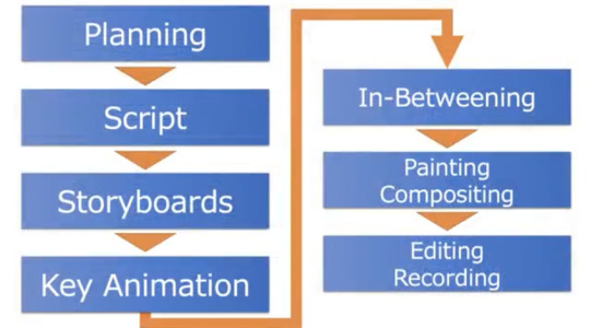
Step 1: Planning
There are mainly three different ways that proposals tend to come in during this planning stage. The first is when the publisher tells us about one of their hit products (games, a manga, etc.) and they ask us about adapting it into an anime. The second is when we find a series we like from a light novel or manga we’re reading already. Like, “Hey, this is cool!” Then we ask the publisher/get their permission to make the anime. The third is when a producer from an anime studio, or a director, or a staff member brings us something that they personally want to do. These are the most likely ways we come to a proposal for a new series and, of them, the third probably happens the most often.
Next comes the decision stage. A few more patterns emerge when we’re discussing whether to adapt or create an original series.
With originals, you are starting from scratch so the project is much more involved and time-consuming. Generally, a lot of staff members are involved and all of them want different things and, on top of that, the producer’s job is to make sure it does well. That it sells well, that it’s received well, that the team feels good or great about the project, and so on. So we have to find a way to respect everyone’s vision, while also guiding the project to profitability, which is pretty demanding. This also includes what I want to do as a producer. It’s fun to create something from scratch, but it also comes with so much risk. For example, originals don’t have a built-in fanbase, they don’t have the same support.
Shizuka Kurosaki provides an anecdotal example of a series he started 8 years ago that he is still working on from time to time. According to him, the series is still nowhere close to being produced. It’s just a sign of how hard it is to get it all to come together, especially when things change as time goes on.
Adaptations are different but still tough and demanding. First, you have great source material. Naturally, there are fans of the source material with what they want for the original. When we depict it through anime, there are things that were fine in the source but have to be changed for animation. We are pretty sensitive about how the original’s fans would see the results of our decision-making. Needless to say, that is a struggle that we don’t face when creating an original anime.
One of the hardest parts about adaptations is that novels and manga, which are largely still images and text, as opposed to anime, which is video, all have different rules of depiction. And when the time comes for us to make changes, we’re presented with options. Depending on what the scene is, certainly, some viewers will say, “Why couldn’t you just stay faithful to the original?” However, there are also times when changing it to be more anime-like gives it a shot of energy absent from the printed version. There's really no right answer so the process is like groping around in the dark and hoping that you find what works.
Producers don’t tend to have a lot of free time and when they do, like Masami Niwa mentioned, it’s mostly spent on things that will help at work. For example, reading what’s trending in novels or manga, watching movies, and even other animes from other companies. While it may seem like entertainment and is often enjoyable, these all serve one’s work as a producer in the field.
Step 2: Scripting
Generally, a “scenario meeting” or script meeting is held first. It’s when we look at what a writer has come up with and plan out some “book reading time.” For adaptations, it means reading the source text(s). Additionally, the planning producers and animation producers hold these meetings where the discussions start with talking about the potential series and gathering the team/assembling our staff. We already have a director in place by the time we have the first script meeting. The script is only done once the staff, including the director, gathers and is written.
Live-action scripts have hardly any screen direction when compared to anime scripts. Anime scripts are packed full of exposition. In the case of live-action scripts, if it’s like an ordinary office story. You pretty much recreate normal life. Whereas in an anime script, even if it’s an ordinary office story, there might be an employee with mind-blowing supernatural abilities. To depict something that doesn’t exist in real life, you need screen direction. And in the eyes of someone from another industry, I think it would seem like a really complex script because of the sheer amount of detail regarding action, layout, and such.
Step 3: Storyboarding
The storyboard is drawn from the script. Normally, the director draws the storyboards. But since the number of episodes keeps increasing for TV series, lately we’re seeing several storyboard artists dividing the labor.
Here are some samples of storyboards from Saekano the Movie: Finale, one of Toshikazu Tsuji’s past projects shared with the panel:
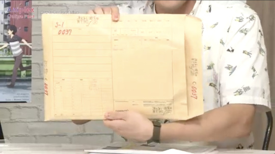
Envelopes like these, sometimes referred to as “shot envelopes” contain the layout drawings and artwork that become the key animations and in-betweens of individual scenes. By the end, all the materials that make up each scene and the finished ones are all inside one of these envelopes.
This is what storyboards look like:
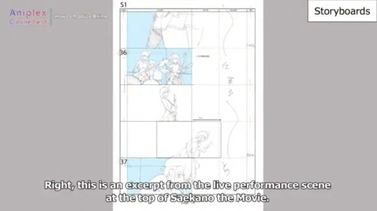
This is an excerpt from the live performance scene at the top of Saekano the Movie.
Using Saekano the Movie as an example--it was a tad difficult to associate the “live scene” of the script to the animation. In the script, the directors and team have endless discussions of what they want to see within however many seconds of the animation. This is described to the animators, the people who is actually drawing the actions/storyboards/etc., who only remember parts of the conversation or only get a few words and they have to create these complex drawings after hearing the phrase “live scene.” Sometimes there is a lot of direction in those discussions while in the original novel it may just say, “they fought, they won,” but the battle leads into an epic space war.
Producers are always excited to see the storyboards. They know it must be a lot of work, hard work, to get them but they’re amazing. Animators sometimes get mad at the scripts and the different “grammar” of the adaptations between the novel and the anime script, but they do great work. To the producers, it's almost the same feeling as a fan seeing the anime for the first time.
Back to the Saekano the Movie example, in the live performance scene above, the animator that was asked to draw the scene knew how to use the instruments being played. That experience is indispensable in some cases as it helps make the movements more accurate and realistic. In the worst case scenario, producers sometimes go with motion capture or use recordings of live performances that are then 3-D rendered for the key animations.
Step 4: Key Animations
Key animations are a part of the storyboard. They are often more detailed images used to depict specifics in individual scenes, with other frames used for movements happening in between. They are often discussed and detailed during and post conversations between the animator, director, super director, and the producer.
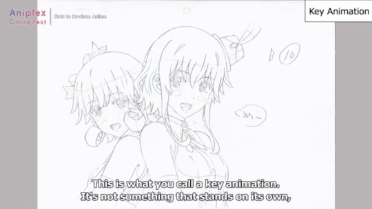
The above is an example of a key animation. It’s not something that stands on its own, rather, they’re made out of multiple drawings. This is where she utters the “meee” from the lyrics (Saekano the Movie). This key animation is to clarify that she’s saying “meee” from the lyrics as the shape of her mouth changes. The words on the page are helpful, but not necessary.
Next we see a sample of timesheets (image below).
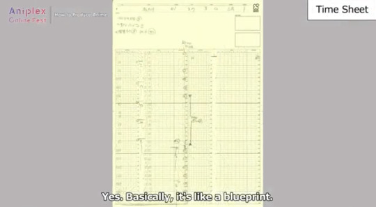
Time sheets are like a blueprint. This is a 3-second shot described in a timesheet and it contains all of the information going into that 3 seconds.
At the top of the timesheets are numbers and that’s where they write where they want the key animation positions to be. Since this is a live performance scene, it ends on a unique shot, and for normal shots, they’d insert some dialogue, or time a movement there. There are also instructions for Compositing. The timesheet is filled with all these details.
There are all kinds of key animations, and a key animation that’s cleared every step in the process is what we call an in-between.
Step 5: In-Betweening
In-betweening is creating the materials that fill up the spaces between the key animation positions. Since anime is all about movement from point a to point b, we have several pages to make characters and items move in-between the two points.

(Image from: https://boords.com/animatic/what-is-the-definition-of-an-animatic-storyboard)
The above is an example. On the left, you see and anamitc--which is essentially a storyboard shown in order to create the story. The frozen frames make up the key animations prior to details. On the right, you have the fully animated piece. All of the movement seen in-between those key animations seen on the left, come together to create the moving animation seen on the right is an example of the in-betweening discussed here.
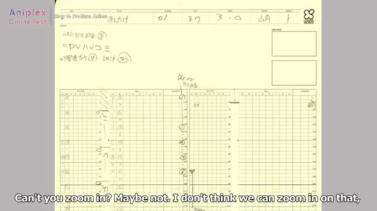
Going back to the time sheet--if you look closely you can see numbers going vertically which say 1-2-3-4 etc. Those are key animations. And the tiny dots you see in between, those are in-between animations. So drawing between the first and second key animations is the job of the in-between animator for this scene.
Step 5: Painting & Compositing
Next comes painting and composition--it’s where all the colors are applied. Years ago, this used to be done with real paint. Today though, this process is usually done digitally and it’s done for every frame (all of the in-betweens, key animations, etc.). The painting process includes Compositing. It’s not until after it’s been Composited that it’s truly finished.
During compositing, all of the different piece of paper shown in this panel so far are transformed into the animation you later see. Compositing gets the timesheet you just saw, with the materials for the backgrounds and cells, the animations and such, and then they work from that blueprint to create the full animation.
In the images seen above from the Saekano the Movie example, what you’ve seen is less than a single second but it took that much work to get there. As the producer, sometimes it’s your job to step in and help if the animators taking on that workload get overwhelmed.
Animators probably leave their personal mark somewhere on the key animations they create, something that only they know about. So if that storyboard can be thought of as a blueprint for drawing, then the key animations have their character settings, and they’re drawn by diverse people with unique intentions. That’s what we try to go for, and it’s really great to be able to see it all before anyone else as a producer. Like a character who’s never made a gesture like that in such a situation in the original story, but then when a certain animator draws that character, you’ll see that gesture and it will bring life to the image. If you start looking, it’s pretty endless. But seeing all these personal stamps is what makes it so intriguing. As long as it doesn’t stray far from the story, it’s not usually a problem for the producer. It what makes anime adaptation so enjoyable for one of the panelists.
Final Step (6): Recording & Editing
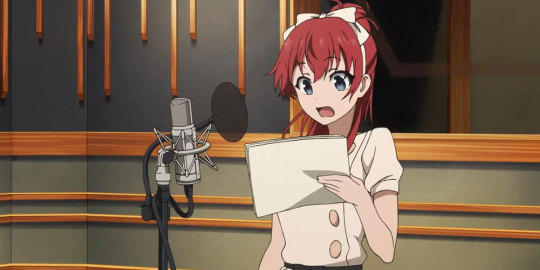
After the visuals are done, comes the sound production and voice actors. Once you find the people for the roles needed, they move onto recording, and then background music is added, and finally you get the finished product that viewers see. Editing happens then too, though it also happens throughout the process as things are added and taken out over the course of production.
An example of the finished product:
youtube
The producer can change the whole feel of the show as they often make executive decisions on music, editing, marketing, etc. They have to oversee the process, as we’ve seen throughout the panelists’ discussion on the production process. It’s worth understanding from an analytic point of view as you see how their styles, focuses, and insight can influence the creation of a series.
3 notes
·
View notes
Text
From Castlevania to Boruto: Spencer Wan Interview
I myself had all sorts of questions after watching Castlevania, and seeing that Spencer Wan was so active on Twitter I thought I might try asking him, what resulted in a long interview. The scene he is best known for is the abstract black-lines-only part of the opening, but he had remarkable participations in many other known projects despite his young age. Other than Castlevania, where he animated, AD’ed and directed episodes even, he also worked on Boruto and Invader Zim among others. My notes are in bold. Conducted on behalf of AnimeTherapy and originally posted on their website.
First tell me a bit about yourself and how you started with animation.
Spencer: You know, that might be the only question I wasn’t prepared to answer. I’m not great at talking about myself. Okay, I’m 25 years old and I’m from a small town in the Deep South. I got into animation after seeing Norio Matsumoto’s work on Naruto. I used to watch it with my friends in high school and I’d never seen anything like it before. I’d intended to major in illustration when I got into college, but I ended up swapping to animation at the last second because I couldn’t get his work out of my head. I thought maybe I could learn how to make animation like that at school.
Where did you start your professional career and how?
Spencer: So after I dropped out of school I spent a year sort of just wandering around and doing very little with my life. I was having a hard time finding any sort of work, let alone artistic work. I ended up working in a tire shop for a while, actually. Dana Terrace was the one who dragged me out of that. She’s the creator of the show I’m working on now(The Owl House). I’d helped her with one of her student films when we were in school, and she was doing way better than me as a professional artist. She gave me a sort of a pep talk and told me about this animation studio called Animation Domination High Def that was looking for animators.
It's worth mentioning that there aren't very many studios in the United States that hire traditional(hand-drawn) animators anymore. We were even told in school not to pursue traditional animation as a career because those jobs didn't exist. Anyway, I applied the next day, they had me do an animation test, and few weeks later I moved across the country to work for them.
The work I did there was very different from the work people expect from me now. It was mostly parody cartoons, and we had to animate 2-3 scenes a day so it was hard to make anything look very good. It was a difficult job, and it wasn't what I wanted to be doing with animation, but it taught me how to draw very fast.
An interesting backstory, really. So you stuck with traditional animation because you wanted to create something like what Matsumoto makes?
Spencer: That's how I started anyway, but he was just my first exposure to this sort of animation. When I got older I came across the work of Yutaka Nakamura, Mitsuo Iso, Toshiyuki Inoue, etc. They're all incredible in different ways, but I could feel that they were also drawing on something similar. There's a sort of feeling I used to get looking at the work of a really talented Japanese animator, and I really wanted my work to illicit that same feeling.
It would've been a lot easier to change tracks to storyboarding or design. I had enough technical skill to do it, and there were many more opportunities available, but I stuck with traditional animation because I was chasing that feeling. I knew I couldn't be satisfied as an artist until I understood it.
Alright, now to more specific stuff. How did you get involved in Castlevania?
Spencer: Well after working at ADHD, I ended up moving away from LA because I couldn't find anyone who wanted to hire me for animation. I went back to my hometown and spent a year freelancing for scraps. I actually tried to go to Japan for work at one point, but my visa was rejected because I'm a college dropout. It was around this time that Sam(Samuel Deats), the future director of Castlevania, had been emailing me to try to get me to work for Powerhouse. Actually, I rejected him the first time and tried to get my visa through again…
Obviously that didn't work out, so I told Sam I'd changed my mind and I moved to Texas to work for Powerhouse. He'd been telling me the whole time about this awesome secret project the studio might acquire soon. I completely wrote him off because as a freelancer you hear that sort of thing all the time and it's never as good as it sounds. That project was Castlevania. It ended up getting greenlit after I'd been working at the studio for a couple months. Sam plucked me off the animation team to work on it and I started storyboarding on the first episode. It was actually my first time storyboarding, so naturally I was given the scene where the crowd gets attacked by an army of creatures in an elaborate gothic city.
I see. Then can you give me a quick overview of the workflow the staff followed while working on Castlevania? From finished storyboards to finished scenes. I'm interested in the workflow you followed since Castlevania is obviously not your run-of-the-mill project.
Spencer: *laughs* Well in season one it was a constantly changing process. Powerhouse had never handled a TV show before, and so we were sort of creating the process as the show went on. We didn't even manage to standardize our storyboarding process until episode 4. Our background team doubled as our incidental and prop design team, with one of the background artists serving as a part time storyboarder. Sam was the director, but he was also storyboarding and designing all the main characters. His brother Adam, who's meant to be supervising compositor, became our editor. It was all over the place, but it allowed for a lot of experimentation. That's how I came to animate on the show instead of just storyboarding.
I'm getting kind of off topic though- the way it would usually work is that we'd receive an approved script and we'd have a few weeks to storyboard it. We didn't have any revisionists working with us, so if there was a problem, we'd address it ourselves and then Adam would cut together an animatic and add sound. It's worth mentioning that we didn't have any voice acting to work with in season 1, so we sort of had to guess at how the actors would read their lines.
After the animatic was approved we would ship it along with the designs and key backgrounds to MUA Film, our outsourcing studio in Korea. And then in some specific instances we would leave a note telling them to exclude a sequence, because Sam or I had planned to animate it ourselves. After storyboarding was done I jumped right onto animation. We were working with a pencil and paper animation studio, so even though I work digitally, I would have to write x-sheets(equivalent to time sheets in anime) for my work as if I'd drawn it on paper. At some point in the process we decided we wanted to do a much more specific compositing job on the show, and so we had the studio ship us back their cleaned and colored animation, and our in house compositing team would polish it with a mountain of after effects work. A lot of why the show looks so cinematic is because of them.
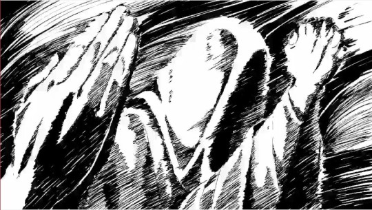
So I take it this is how it went with the average scene. But your scene in the OP, that got a lot of attention, is clearly exceptional. Can you tell me more about how you came up with this style and scene? Personally I have to admit, it’s one of the best and most striking animation pieces I have seen in a while.
Spencer: Thanks! We really slaved over that opening. It actually wasn't meant to exist- there was no time or budget set aside for it. Sam had done the storyboards for it in his free time and pitched them to the producers. They said we could do it if we could somehow find time for it. I think Sam originally intended to handle the entire thing himself, but when the time came to animate it, I was the only one available. So Sam pulled me into his office and showed me the storyboards, specifically the part at the end. He said something to the effect of, "I know I want this to look like fire. You can do it in whatever style you come up with, as long as it's done quickly." Never in my career had someone put so much trust in me. A lot of people like to compare the sequence to the music video for Take On Me, but when I was trying to come up with the style, the first thing that came to mind was one of Yutaka Nakamura's animations. It's from an anime I watched in high school called Soul Eater where the character goes to draw his sword, and the entire scene turns into this abstract looking sort of river of pencil lines on a red background(this scene). I thought maybe I could do something similar to that. It took me about an hour to realize I couldn't do it the same way, and my imitation of it was coming out far too abstract to tell what was going on. I ended up doing another pass on it, but instead of trying to copy Nakamura's abstract linework, I tightened up the drawings focused on the shadows. I thought I could try to mimic the look of how light shifts around on an ember, and that's where I got the shadows that constantly roll across the characters. The finished result still bears a lot of his influence, but I think I managed to put my own spin on it.
I remember that Soul Eater scene! Now that you mention it, I can definitely see similarities. But the Take on Me? Not really. How much time did you spend on that scene, if I may ask?
Spencer: It was something like two weeks? I don't remember that well anymore. I worked entirely through the last four nights, so it felt longer than that. I remember losing an hour to daylight savings time, and that put me in a really foul mood.
I've never mentioned this before, but it's unfinished. I ran out of time in the end, and so the part with Trevor and Sypha is just my rough first pass. I was devastated when we shipped it that way. At the time I considered it to be my biggest failure as an artist. Ironically it's the piece of work I'm known best for now.
youtube
Sypha's scene in the 2nd season is also yours right? Glad to see the same style made it into the show.
Spencer: Adam had wanted to have it in the show for a while, and I really didn’t want to do it. I was so upset about the opening before it aired that I swore I would never draw in that style again. But then the opportunity presented itself and I thought, “Well I guess it would only be for a second or so”. I felt the second time I did it it was a lot less inspired though.
Can't complain myself, it was pretty cool.
Spencer: Well I had more experience the second time *laughs*. I didn’t have to feel around for what the style was.
So moving on. The problem with your Alucard fight scene, that you had problems translating your digital motion guides into paper, you said that also happened for the Cyclops sequences. How widespread was this problem then? Did it only affect your work or the work of other animators as well?
Spencer: It would only affect animations that had large camera movements, that we sent overseas for clean up. It was a problem born from the fact that we don’t really do paper animation in America anymore.
When the camera moves around a lot, the field has to get bigger. You have to use something called panning paper in order for the drawings to maintain a proper size for clean up. But there was no one that I could learn that from. I had to teach everything to myself, and so my first instinct was to make the drawings smaller to fit them on the page. The clean up artists overseas fixed this by scaling the drawings up, but then they had to recreate my spacing from scratch and they didn’t have enough time to do it the same way. The result was that drawings would pop anywhere from a few pixels to a few millimeters out of position all the time. Adam ended up respacing everything, but it wasn’t a perfect match to the original, so drawings tend to pop around. Most people don’t notice it though.
Actually I’ve had a similar issue with other productions where if my spacing gets too tight, there’s a chance a drawing could pop out of place too. I’m still learning how to solve some of those problems.
I see! Shame you found yourself in this situation, but this is a nice segue to another traditional project I want to ask you about, Boruto. You worked on Boruto a few months ago, episode #65 specifically. How did you get involved in this project? You were an interesting case because you are not affiliated with studio LAN like most of other foreign animators in that episode, as far as I know at least.
Spencer Wan: *laughs* I could see why it seemed a little out of nowhere. It's because Chengxi and I had already been talking on twitter for a while. I consider him a close friend. He asked me to animate for him and I agreed. It was as simple as that.
Looking at your original work and the final version in Boruto, I see that it went mostly uncorrected. Why is that? Were you just given a lot of freedom in that episode? Because of Chengxi and your aforementioned good relation with him?
Spencer: Oh, it was nothing like that. I was a lot more concerned with doing the work properly than trying to stand out or show off. Chengxi's storyboards and the model sheets for Boruto were very clear. I followed them to the best of my ability, and my work ended up going uncorrected aside from a light fill being added. I should've anticipated the need for that light fill, actually. I wasn't thinking about how it would look in color.
Boruto is more of a traditional animation(paper) show, right? Didn't you have problems with that this time? I'm not too knowledgeable when it comes to Boruto specifically, so I don't know how much of its production is digitalized.
Spencer: The process was actually very similar to what I used on Castlevania, only this time there was no complicated camera movement to worry about, and I had Chengxi to help me with parts of the paper process that I didn't fully grasp yet. Some of the other foreign animators helped me out too- namely Guzzu. It was my first time not having to figure it all out on my own, and I was really grateful for that. I feel I learned a lot.
You are right, the nature of this scene is different. I thought maybe it was the Japanese industry being more used to this dual nature of digital and paper. So generally working on Boruto, although a Japanese show, wasn’t different from Castlevania and other shows you worked on before?
Spencer: There are differences in style when it comes to x-sheets. For example, the Korean x-sheets I've written list the layer order completely backward from the Japanese ones used on Boruto. Americans will write "truck out" when they want the camera to pull out, but the Japanese shorthand is apparently T.B for "track back" instead. It's a lot of differences like that, but the idea behind them is mostly the same. It was an adjustment, but not a very big one, and I was told I did an alright job writing them... I hope they weren't just being nice.
I was just watching Castlevania and now that you mentioned him, Chengxi did some animation! Also others such as Hero. Were you the one who invited them this time?
Spencer: I was the one who invited Chengxi. Sam invited the others after I’d left the production.
And you inviting Chengxi and working on #7 was after boruto, I suppose?
Spencer: Actually it was beforehand! He had to cut his work short to start working on Boruto. He did such a brilliant job regardless. That guy is a genius.
Aha, interesting. That was the last of my questions, I'm very grateful for the chance you gave me and for your amazing, detailed answers!
Spencer: No problem! I hope my answers weren’t too boring. That technical stuff can get dense.
180 notes
·
View notes
Text
Form Podcast: A New Defender Transcript
A transcript of the Form Podcast episode covering VLD season 4 episode 6 “A New Defender” with Nora Lewis-Borbely, Alex Eby, Lauren Guerard, and Lika Leung interviewing with Kyle Anderson.
Vrepit Sa!
[Chimes]
Female voiceover: Now entering Nerdist.com
[Intro music - VLD opening theme]
Shiro’s voice: Paladins, welcome to Form Podcast.
[Intro music continues for a few more bars, then fades out]
KA: Hello, everybody, welcome to another episode of Form Podcast, the official Voltron commentary podcast. My name is Kyle Anderson, thank you again for joining us. We are here at the end of season 4, everybody. It’s “A New Defender”, season 4 episode 6, and I’m here with four people who help make Voltron happen. And they’re going to go around the room and introduce themselves. They are:
NLB: Hi, I’m Nora Lewis-Borbely, I’m the production manager on Voltron.
LG: I’m Lauren Guerard, I’m one of the production coordinators on Voltron.
AE: I’m Alex Eby, I’m a production assistant on Voltron.
LL: I’m Lika Leung and I’m also a production coordinator on Voltron.
KA: Alright, we will talk about what that means once we get started on the episode. So everybody at home, get your, uh, Netflix episodes all queued up to 0:00, and we will hit ‘play’ in 3, 2, 1, play. [pause] And we’re off and running, everybody. Thanks for joining us. [laughter] So what do you--yeah, what does--what does that mean, “p-production coordinator”, w-what does, for people who don’t know, uh, the ins and outs of animation and television-making? What does that mean?
NLB: So, uh, in short as a production manager, basically I work with a line producer to oversee the crew, to oversee the budget, and then to oversee the overarcing schedule from pre-production all the way to post-production and delivery. And then our production team are really the kind of the unsung heroes of our show because they do a lot of--they’re kind of the core of our team and they do a lot of facilitating.
LG: So basically, when you’re looking at these shots, sort of everything that you’re seeing of the screen is an individual design. So a lot of our jobs are tracking those designs. Um, I think right now in our database there’s something like 13,000 total designs? Um, so, it’s a lot to keep track of. Enough to--enough to warrant a job.
KA: Sure.
AE: Uh, and then as the assistant, I just help all the coordinators in any way that they need it, and then I also have a little bit of coordinating things, as well. Um, just… yeah. [laughter]
KA: Sounds like you got a lot to, uh, l-lot on your plate at any given moment.
NLB: Yeah. The tasks are coming from a lot of different directions because, like, we work with Studio Mir in Korea, so, like, it’s a lot of back and forth with them, like, trading designs back and forth, making sure they’re approved or if they’re noted, like, um, that they know what needs to be addressed. Uh, and then we also do CG designs in-house, so, like, and with a different studio, so going back and forth with that, like it’s a completely different group of people who are working on the CG-specific designs. Um… Yeah, it’s a lot.
LG: Yeah, and then I think the other thing to kind of note is that every single stage of production basically has to be tracked and make sure we’re on schedule, and everything’s on time. As you move through different drafts of a script, or, uh, different variations of a storyboard. All of that information needs to be tracked. And that is a lot of what our production team does. It’s really helping the artists make sure that they have everything they need to be able to create this amazing show.
KA: Mm. Is everything s--very, uh, detailed and color-coordinated?
LL: Yes.
[laughter]
KA: It has to be.
LG: Yeah, I mean, like each lighting environment, that’s the thing, there are, like, hundreds and hundreds of variations of our main characters because it’s every single different lighting situation that they’re in. Um, each time a character changes costume, that’s considered a brand-new design, so that’s why we get to a number like 13,000. [laughter]
KA: Is that high? I mean, I don’t know, have you worked on programs that are much lower than that?
NLB: It’s very high.
KA: Okay.
LG: Uh, yeah, it’s a very high number.
KA: It sounds super high.
LG: Yeah, it is.
NLB: It is a high number. Um, there’s a lot of detail that goes into a show like Voltron that is kind of unique to a show like this. Um, as Lauren briefly hit upon, every single character is colored to that environment and it’s something that’s a really, really special touch that our artists do because what that does is it makes the character feel like they’re actually in that environment. Opposed to if they just have the same color scheme in any location, uh, they don’t blend into the world quite as well. But, that means that every single character that goes to every single location, not only do you need a design for that location and that character, then you also need a color design of that character in that location.
LG: And then, also a thing I think that’s--I have, like, I’ve worked on shows where I haven’t seen this level of detail where I’ve worked on another show where, like, you’d make a design and it’d be for a chair. And that’s the chair you have in that show. Every time you see a chair.
KA: [laughter] That’s the chair.
LG: That’s the chair. And in this show, it’s like, “Well this is an Altean chair and you really need to think about how the Alteans would, like, go about designing a chair.” And so it’s, like, different from the Galra chair. It’s--
KA: Right.
LG: --a lot. [laughter]
AE: But you know, it’s that level of detail that really makes the show special.
KA: Mm-hm.
AE: It’s something that Joaquim and Lauren and Ryu and Christine and [Beyond? I know that’s wrong but the name isn’t familiar and sounds like that so I’m going with that for now], uh, as well as Kristy Sang and Anthony Wu. Um, all of those producers and design supervisors care a lot about all of those little minute details. And that’s what really makes the environments as, uh, I mean, as immersive and encompassing as they are.
KA: Yeah. And as we’re seeing here, the Galra--every-everything in each of the, uh, different species even has their own specific set of colors and designs, too, which… yeah. Which, I guess, y’know, viewers can almost take that for granted because it is such an immersive show, but that’s, you know, that’s why--it’s good you guys are here to tell me all this stuff because I’m just like, “Aw, fun! Spaceships!” LL: I think the other fun tidbit about our show is how unique compared to other 2D shows is the technology on the screens. There’s a lot of--oh! There’s a screen right there, actually. Yeah, that screen has its own design. Every screen, every UI that shows up in their cockpits, that has--oh, there’s one, too--has its own design attached to it. And it’s a unique design. And every single one of these screens, not only do we have to call it out, which means we make note of when it appears in that scene, we also have to design it.
KA: Mm.
LG: Yes, that’s a pretty interesting thing that I think Lika has to deal with in particular is, uh, so she does the initial phase of looking at the storyboard animatic, which is just when they put all the storyboards together to make basically a rough version of the episode. She watches that and calls out every single object and character that is in each in--like each individual shot, and then particularly with the screens it’s just, “Okay here’s this screen and here’s the specific thing happening on the screen.” Sh-she does it all the time. [laughter]
KA: She’s nodding.
NLB: She’s nodding.
[laughter]
KA: She agrees.
NLB: She’s nodding.
KA: So do you get--did you get a chance to--like, do you still watch it and-and as a “fan”, quote-unquote? Because everybody who’s come in here so far has been like, they love working on the show but they also enjoy watching the show. But do you--do you just sit there and go, “Well there’s this element, and this element, and this element”, like, ‘cuz you’re the one who knows, like, all that stuff. You’re like the-the keymaster of all that.
NLB: I think for me in particular it’s super fun when we do the, um, crew screenings together. Like that’s the first time we’ll watch it all put together. So, like, we’ll see all these individual designs and then, like, it’s its own unique fun thing to get to see it all animated. Like, we don’t get to see that until much later in the process.
LL: Yeah, I think a little-known fact is, uh, when we’re dealing with production or pre-production is actually what our stage is, we’re doing all of these design call-outs off of that animatic. So we’re dealing with a black-and-white or very rudi-rudimentary colored, um, animatic, and while our animatics are beautiful ‘cuz our artists put a lot of effort into them, they’re not--they don’t look like the final show. So, when you are dealing with day-in and day-out with that black-and-white animatic and then you actually get to see those designs appear in the show and everything animated for the first time, it’s--it’s really amazing because I know our team, like I said, we deal with the black-and-white animatic and then we see the designs come in and out. So that design of Naxzela we just saw, we got to see the planet getting designed, the actual design for the planet, but we’ve never seen it animated until the actual show came out.
KA: Mm.
AE: I personally get very excited to hear the sound effects and the music because that’s not something we get to experience until the very end.
KA: Mm-hm.
AE: So yeah. Not watching silence is pretty cool. [laughter]
[laughter]
KA: And it’s such a--like a--I got to host the panel at Comic-Con this year. We watched the first episode of season 3 in a huge room with like big, booming bass and everything like that I’m like, “Yeah, that’s how you want to watch a Voltron episode, I think.” Um… AE: I do miss the scratch, though.
[laughter]
LG: So, uh, to those who don’t know, when we have to do our storyboards, our actors record all of their lines. They record all the lines in the script. And sometimes if a line gets changed, or if, um, an actor was unable to come in and record at that point, we do what’s called a scratch record, where somebody on our team is assigned to voice that character for temporarily just so that we have the lines for rough timing. And some of our crew are particularl--particularly talented at scratch. And, uh, they’re always really fun lines, so that--we always get to deal with those in the animatics. They’re not in the final episode, though.
KA: But do you keep those? [stammering, others laugh] Also, could you then go back and, like, re-- “I’m gonna put the scratch track over the finished episode.”
LG: Oh, totally.
KA: That… yeah. [laughter]
LG: That would be amazing.
AE: I should do that.
LG: You should do that.
[laughter]
LL: It would be wonderful and awful.
[laughter]
AE: Gonna do it.
KA: Uh, have there been episodes--because you deal with so many elements in each episode, uh, I don’t know--do you know offhand the episode that had the most amount of individual--or what number that might’ve been?
LL: I always feel like I take special note of the ones that have less because I’m so excited about it.
[laughter]
KA: Because you’re like, “Look at that!”
LL: I know those episodes. [laughter]
KA: What if there was an episode where it was just like, “Eh, there’s a bunch of people in a room talking, no lights on or anything.”
LG: Oh, wow.
[laughter]
AE: That would be... whoo.
[laughter]
NLB: Sorry, I just got really excited because that’s a really nice low design-count episode. Um, no, I would say the episodes that have the highest design count are gonna be the ones where you go to a new location for the first time.
KA: Mm-hm.
NLB: Because all of that is new, so all of that needs to be designed. Uh, episodes where you’re seeing lots of people, new people, those also need to get designed.
KA: Mm-hm.
NLB: So those are going to be really high episode countsa--er, high design counts, sorry. The--these finale episodes, uh, interestingly enough, tend to be low design counts because, for example, in this episode, uh, a lot of these locations we’ve already been to in the previous episode. And there’s a lot of fighting in space and it’s very exciting to watch it, but a lot of those designs we’ve seen in other episodes, so it’s actually lower new design count, but there’s still plenty of designs being used in that episode.
KA: Sure. Yeah, it’s not like there’s four.
[laughter]
LG: The mermaid episode has already come out, right?
AE: Yes.
LG: Okay. Because that was a high count ‘cuz that was like a new environment, lots of new characters, they all had food.
AE: All underwater.
LG: All underwater.
KA: Yeah. Then there would’ve had to been designs for Hunk and Lance.
LG: Mm-hm.
KA: Things that I’m sure if they’re--if they’re done properly people don’t notice these new changes and things like that, but maybe people don’t know that that’s what goes into it.
LL: Yeah, I--before I actually joined this industry, I had no idea how much work went into these.
KA: Yeah.
LL: And I didn’t realize that every single one of these scenes you see, there is somebody who has to call out every single design that’s in that scene, and then every single one of those designs has to be drawn and created.
KA: Mm-hm.
LL: And you kind of don’t think about that as a viewer sometimes.
KA: No. And that’s good, that is a good thing.
LL: [laughter] That’s the goal right?
KA: That is the goal. If you wanna be invisible, it’s like sound effects, too. You don’t want to notice the sound effects, unless it’s, like, the silly stuff.
[laughter]
KA: Allura’s hand magic, that’s a different element. Now all I’m gonna do when I watch the show is count all the different things.
AE: Yeah. Would that be a comp element?
NLB: I know, that was the one thing I was thinking, like, “I think that was comp.” So, like, there are certain things that we’ll call out, like, that we just, like, say, “Hey, animator, we trust you, like, go for it.” Most of it we don’t because that’s just way too much responsibility, like, then you’d get so far into the process and be like, “We have to redo this entire sequence.” It’s ridiculous, so--that’s sort of the thing is like, you’re--you’re calling these things out and you’re designing these in advance so, like, they have that to start animation. And animation is such an involved process, like if you’re waiting ‘til after it’s already animated to realize you didn’t like the color for that, then it’s way too late.
KA: And since you guys--most of what [stammering] you said what your job does at the beginning of the process of an episode, how long is it from what you’ve done your job to when you get to see even a mostly-finished episode?
LG: There’s…
[laughter]
LL: Lauren’s doing calculations.
LG: I am doing calculations. Um...
KA: We’ll add a sound effect for that.
[laughter]
LG: It’s a lot of months.
KA: Okay.
LG: Um, I mean--I mean I can, yeah, I don’t know how much detail I can truly kinda go into for the schedule for that, um, but it’s--we’re talking several months between the time that we send that design, um, set overseas for them to actually start--for Studio Mir to start animating the product, ‘til we actually see the final product come back here. So, a lot of months.
KA: A lot of months. And i-in the interim time you’re working on an episode, you know, several more episodes, do you ever find yourself being like, “Oh yeah, I forgot about that” when you--
All: Oh yeah, all the time.
NLB: I mean, you’ll definitely go, like--especially when you’re dealing with an episode that’s in storyboards versus all, like, sort of, like, at the point of color designs, even though that’s all pre-production, that’s all pre-animation, those are so far apart in the process that they can be, I mean, [laughter] you’re like, you go from one meeting to the next and you’re like, “What’s this episode?”
KA: [laughter]
NLB: Like, what is this?
AE: Yeah, it’s even--it’s really fun, kind of, seeing the fan response for things and actually kind of watching the episode when the fans get to see it. But sometimes it gets confusing because uh-- our story, events happen and things change. And someone will talk about something, and then you’re just like, “wait a second.” Uh- as an example when uh- when seasons one and two came out where Keith was piloting the Red Lion, and then the uh change happens where Keith gets into the Black Lion. There was a period of time where we had associated Keith with the Black Lion, and fans had only seen Keith in the Red Lion. KA: Mmm
AE: So it kinda-- Sometimes you get confused.
KA: Yeah, yeah. [Laughing] As it would. Because you’re so far ahead and the fan [laughing] reac-- yeah it means you’re having to remember what people are talking about online like “what is this?”
NLB: I think that there are things that fans assume were put in the show because they’re like “aww they saw we responded to this in Season 1.” And we’re like, dude, no. [laughing]
KA: You have no idea.
NLB: It’s been there. KA: You predicted it.
AE: Our fans are really great at predictions. [Laughing] Um yeah after season 1 came out there were some great predictions and then season 2 came out. I mean, they were true, they came to fruition and it was--it was fun to, kind of, see some of the fandom predictions sometimes.
LG: Yeah. We read them all.
KA: You do?
LG: Oh yeah. [laughter] I hound for fanart and, like, reactions when it comes out on Netflix I’m just on the internet reading all the Voltron tags to see what people are saying.
AE: And then she’ll post it onto our group chat so the whole crew gets to see
LG: I do. And there’s a whole board dedicated to fanart that I have picked out that we just hang up so everyone can see it. So we do see the things that fans post a lot.
KA: But it in no way impacts how the show is made, everybody.
[laughter]
LG: It’s true.
KA: Way too far in advance.
LG: We do enjoy it, though. We absolutely love to see fanart, and it, um--and i-it’s just so great that the show is appreciated and the show is loved, and it makes us feel really great to see that, so, we--yeah--we look for it, we seek it out, we see it, and we-we love it.
KA: Do you--do you all have favorite characters?
AE: Yes.
[laughter]
LG: Uh, mine’s Pidge. I always try to voice her in scratch recordings.
[laughter]
NLB: Of the main… I think probably Hunk. Yeah, Hunk is pretty solid.
KA: Mm-hm.
AE: Ooh, that’s hard. I really like Allura. I mean she is just such a powerful female character and I love that about her, but Lance is also a ton of fun. So… [laughter]
KA: Whoever’s piloting that Blue Lion, that’s all you really care about.
[laughter]
AE: Yeah, I mean, really, I’m just attached to the Blue Lion.
[laughter]
LL: Oh yeah, I just, you know, go for the comic relief, so Coran is definitely my favorite.
KA: Yeah, yeah, yeah, yeah.
NLB: I know, can we shoutout, like, Bii-boh-bi?
KA: Yeah.
LL: Oh, Bii-boh-bi’s so good. Definitely.
KA: Bii-boh-bi is the noise of anyone who if anybody does swear--
NLB: That’s what we--oh, fabulous.
[laughter]
KA: This is a particularly beautiful episode, I think, visually because, I mean, it’s a culmination of so many things, but it is so… it has such a unique style, I think, to it.
LG: Yeah, I really love seeing these fight sequences with the ship and I think--I think it’s because I really… So, Voltron is a CG design, and I think it’s… you know, that decision was made for a multitude of reasons, but I love the fact that our team at Studio Mir is so talented that they can take the CG design and, uh, basically integrate it flawlessly into a 2D show where if I hadn’t been told that Voltron was CG, I probably wouldn’t have assumed it. So, seeing these fight sequences involve a lot of these CG elements mixed with our 2D elements, and I think that’s--it’s--from a production standpoint it’s really special to watch that happen.
KA: Mm-hm. Well it’s very singular in terms of, uh, animated programming to have that kind of integration. But yeah, I remember the first time y-you see the new design or updated design of Voltron it’s like, “Oh my god it’s so cool”.
[laughter]
NLB: And then you’re just like, “And I’m working with those people every day, so… the people who made that. That’s neat.” [laughter]
KA: Now we’re just watching the episode. This is what happens sometimes.
NLB: Yeah. It’s definitely like watching that shot and knowing like, “Is that Haggar’s phase 1 or 2 in the background?” Like--
KA: [laughter]
NLB: That’s Keith with his helmet off.
LL: Yeah! Oh, that’s right, so every time a character has a helmet on or helmet off, that’s a new design.
KA: Mm.
[laughter]
KA: Helmet on, but with--er, helmet off, but with suit on is diff--
LG: Yup, 100% different for sure.
[laughter]
LG: Yeah, I mean we have sheets and part of our job is we have these sheets that we’ll say, “Okay, this is scene, you know, 100”, and every single design that’s in that scene from background to character to prop to all the different color variations, they all get called out just for that scene. So pretty much we go through these episodes with a fine-tooth comb, decide, writing down every single design and color design that happens in that--in each individual scene.
LL: So it’s like, if you like Excel, or databases, a career in production might be for you.
[laughter]
AE: We’re all organizational nerds. [laughter]
KA: Which isn’t what I--yes. That’s a fun--it’s a fun thing to be. I don’t have the patience to be one of those, but I always want to be. I was--I was in college I was always like, “God, if I could just have, like, the perfect spreadsheet.”
[laughter]
AE: Lots of folders. So many.
LL: It’s true.
LG: I don’t know. I think it’s fun and satisfying. [laughter] But that’s a true sign that I’m an organizational nerd, so…
NLB: It is, like, probably one of the favorite parts of my job because I keep a lot of, like, physical paper from, like, the Excel spreadsheets that we print out and stuff, and when I get to, like, move one to my “done” folder, like, physically take a piece of paper from one folder to the next folder. It’s like, “We finished all the designs,” and it’s the best.
KA: Do you--what do you do with all the, like, the finished ones? Do they eventually go into an even bigger drawer?
NLB: I just keep them forever. I just keep them, and I look at them, I’m like, “I don’t have to think about that anymore.”
[laughter]
NLB: Like, “Look at that paper. That’s obsolete now.”
KA: Do you all still have all your old school papers, too?
LL: I do.
[laughter]
LG: Wow.
LL: Yeah, they’re in the closet.
NLB: That’s impressive. How many boxes?
LL: It’s like two boxes, I kept it from my favorite classes, but I was like, “We paid for this.”
[laughter]
NLB: That’s true.
LG: That’s very true.
LL: This is what I have left of college.
[laughter]
KA: An old en--old textbooks that are way out of date now.
LL: Yeah. Exactly.
KA: So we’ve reached the end of the episode, and I feel like we barely scratched the surface of you guys’ jobs.
[laughter]
KA: So, we’ll have to have you guys come back, uh, later on, if you would like once we get into season five, which as we record this does not exist yet. As far as we know.
[laughter]
KA: You guys are on, like, season 28 probably. But anyway, um, thank you guys for joining us on the podcast. If you have social media you would like to plug, feel free to do so now. If you want people to follow you on Twitter or Instagram or anything.
AE: Do I. [laughter]
NLB: I know, it’s like, well that’s the thing, is I’m like, well I have artist friends that I know. I mean I could plug their stuff. I’m not… [laughter]
KA: Alright. Well that’s okay. You can follow me on Twitter, everybody, if you want to, because I’m, ya know, a dumb [Bii-boh-bi] who talks a lot at @funcitonalnerd, um, and thanks for watching and listening along with us, uh, and we will see you once season 5’s around here on Form Podcast. Thanks, everybody.
NLB: Bye!
LL: Thank you.
AE: Thank you.
LG: Thanks!
[outro music, the rest of the VLD theme]
Female voiceover: Now leaving Nerdist.com
[chimes]
#TeamPurpleLion#voltron#vld#strafe#executive meddling#voltron legendary defender#animation#cartoons#transcript
6 notes
·
View notes
Text
BA2a Project Introductions
This week consisted of briefings into the projects we would be focusing on for the rest of 2019. Overall this week has been more introductory over anything else rather than mass amounts of progress, just digesting the information given to myself and the rest of the class.
Film Language
Firstly the, Film language project; this has consisted of going through and analysing scenes from films this week as well as the requirements for the project as a whole. The second year started with a briefing and introduction to film language and the 1000 word essay we would be starting on said topic.” Any film involves the combination of a huge number of techniques and traditions, used to convey a story or narrative in a manner that an audience hopefully finds compelling.” ~https://www.intofilm.org/films/filmlist/72During the lecture we were shown several examples of the lecturer’s favourite films. Two of which stood out to me the most: Goemon; an Asian feature film which caught my eye as eastern films narrative and presentation style is different to the western equivalents we would be more accustom to. The second film, The Fall, had its narrative told through two parallel stories.
Later into the lecture we analysed the opening scene of Wallace and Gromit The Wrong Trousers in which we looked into the subtle hints and nuances that the opening scenes uses to draw the viewer into what was being presented on screen. For example, in the opening shot the audience is presented with old beige wallpaper accompanied with rocket figures as a throwback to a previous film. From there the camera pans over to a photo in a picture frame of the two main characters, Wallace and Gromit whilst traditional Yorkshire music is played in the background setting a warm and friendly tone to the scene. We then see the shadow of a pair of trousers move up the wall as the camera is tilted and moved downwards. At this point the music is drastically changed to something reminiscent of a 50′s horror movie as the title appears on screen. The low viewpoint of where the camera has been positioned adds to the tone shift of the opening shot.
We were lastly given the task of finding three different films to present the following Thursday. One good, One bad and one film that the class had probably not seen. For the task we were told to talk about why we picked those specific films for those respective categories.
Inanimate Objects
We were briefed into our first animation project of the year this opening week. This would be an 8 week long project in which we would have to create and develop our own ideas for a 10 to 15 second animation surrounding the theme of inanimate objects. One limitation we were also given is that you can only cut between twice throughout the entire sequence, so ways to move between scenes without cutting will need to be taken into account. We were also restricted to using kitchen items also as the kitchen itself would be the setting for our animation sequences. The scenario being portrayed would be set at night and that the objects within the kitchen would come to life. We were also restricted to three different shot compositions: a close up, mid shot and and a wide shot as well as two cuts between these different shots. Camera pans and zoom in within the animation were also allowed so the opportunity to really stretch these rules was viable. A title and end credits card was also mandatory for our final animation as well as the use of squash and stretch was prohibited if the object being animated would not move in that manner. There is also story-boarding, animatics, concept art and development throughout the project I need to show before making the final animation. Over the course of the weekend I at least want to have a few conceptual ideas down on paper whether it be thumbnail sketches or storyboards just to get a loose idea for what I wish to do with my animation.
1 note
·
View note
Photo

The time has come!
In high anticipation, casting has been opened. All information is below the cut. Be sure to check the Master Post periodically for updates, to see if parts are still open. I will add time stamps for every update I do.
POSTED: 7/13/18 - UPDATE: 7/14
~Disclaimer. This is a project that will be in a video, and published for public viewing. It will NOT be monetized, and will fall into the category and shares of fair use, except for when it is taken in for financial gain, in which I will take action against re-posters, and false claimers.- Fire Star Animations will be the official publisher and host.
A song collaboration set into the universe of Miraculous Ladybug. Featuring a recreation of the musical score “Ready As I’ll Ever Be” from TV series adaptation of Disney’s movie; Tangled. The song has mildly been transformed to fit into the narrative I want to convey. But it is relatively the same.
With this collaborative effort, I will set it to an animatic, of which I have already Storyboarded. Though I have made several changes, so that should be a nice surprise. A small Prologue with script, and a fully performed song, I hope to bring Miraculers together, and bring something into the fandom. And get that much needed artistic practice~
Guide: Find a part that interests you, make your recording and send it off to [email protected] With subject Title: MLB Song Collab There are both Acting, and Singing roles. You can send the full role provided, or sample work. If it is the latter and you are chosen, we will continue forward with the full role.
The higher quality your recording, the better chances of being chosen. If you have any questions in regards of the project, do not hesitate to ask. And I look forward to working with you!
Straight text is Speech. Italics mean Singing. ->Lyrics
Chat Blanc/Adrien: Unaltered Singing/Acting role. -Back Up Vocals/Chorus* -Tangled Equivalent to Varian.

Carapace: Unaltered singing role. -Back Up Vocals/Chorus*- Tangled Equivalent to Eugene.
Tom and Sabine: Unaltered Singing Roles. -Back Up Vocals/Chorus* Tangled Equivalents to King Fredric and Rapunzel’s scene.
Nadja Chamack: Acting Role - News Reports Script. _Back Up Vocals/Chorus* if available. This is part of the prologue. -No Tangled Equivalent. "Reports city wide have circulated, and confirmed the worst. The identity of Paris' notorious villain, Hawkmoth, has been revealed to be none other than famed local famed designer, Gabriel Agreste.Worse yet upon these revelations, the boy who has been our very own hero, Chat Noir, has been revealed to be the son of the fashion icon, young Adrien Agreste.Have they been in cohorts the entire time, or has this family been torn apart by these unfortunate turn of events?News of Ladybugs identity have also been confirmed."-
Tikki and Plagg: Acting Roles. -Back up Vocals/Chorus* if available.No Tangled Equivalents. Script provided upon casting. You can send a VA Voice Reel, Example Works, or create a new clip of your voice In Character. Tikki will have a worried tone, but tries to cheer Marinette up in the prologue. And Plagg will be weak and struggling.
Hawkmoth/Gabriel: Minor Acting role in Prologue. No Tangled Equivalent. Script provided upon casting. You can send a VA Voice Reel, Example Works, or create a new clip of your voice In Character. Literally the smallest role. Pre-Prologue.
Back Up Vocals/Chorus*: If you just want to participate, join the chorus!
#ready as I'll ever be#miraculous ladybug collab#chat blanc#marinette#chat noir#rena rouge#carapace#hawkmoth#tikki#plagg#tom#sabine#nadja chamack#animatic#my art#fire star animations#miraculess
280 notes
·
View notes
Photo
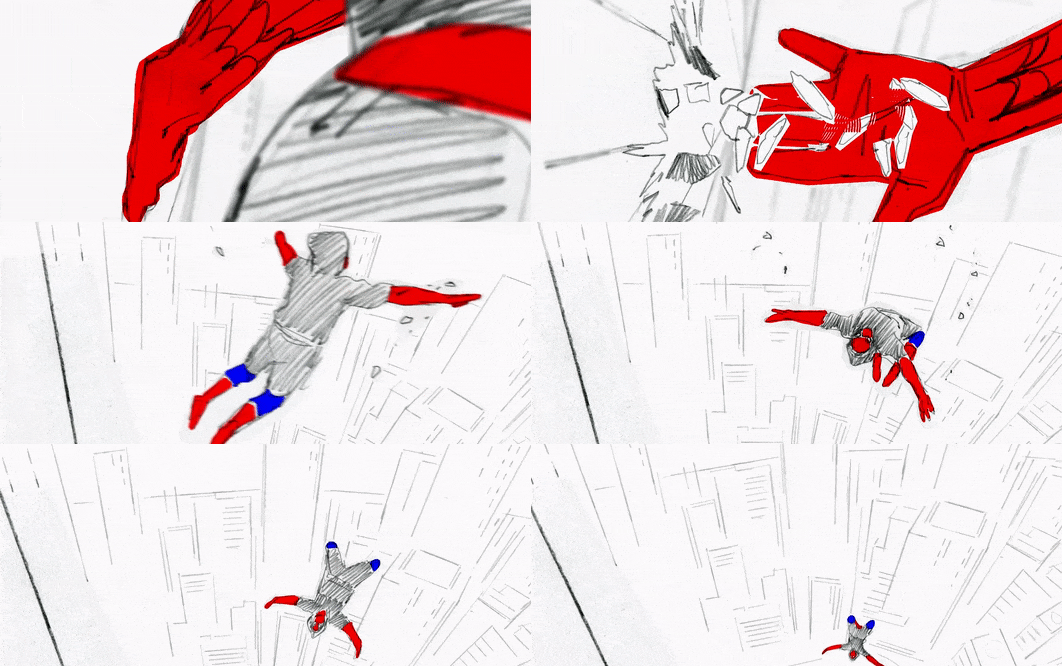
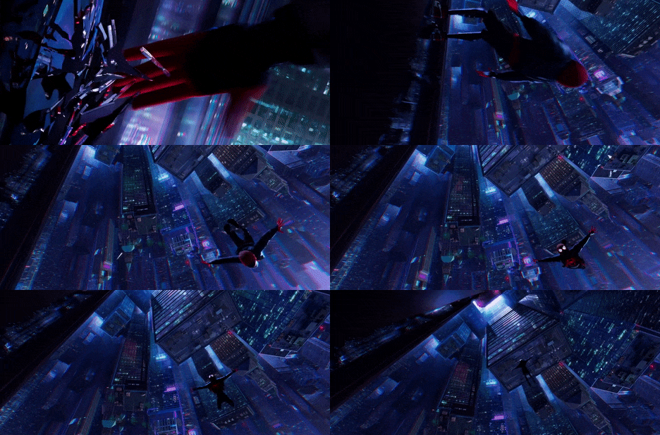

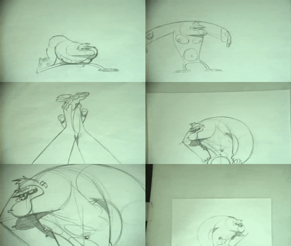
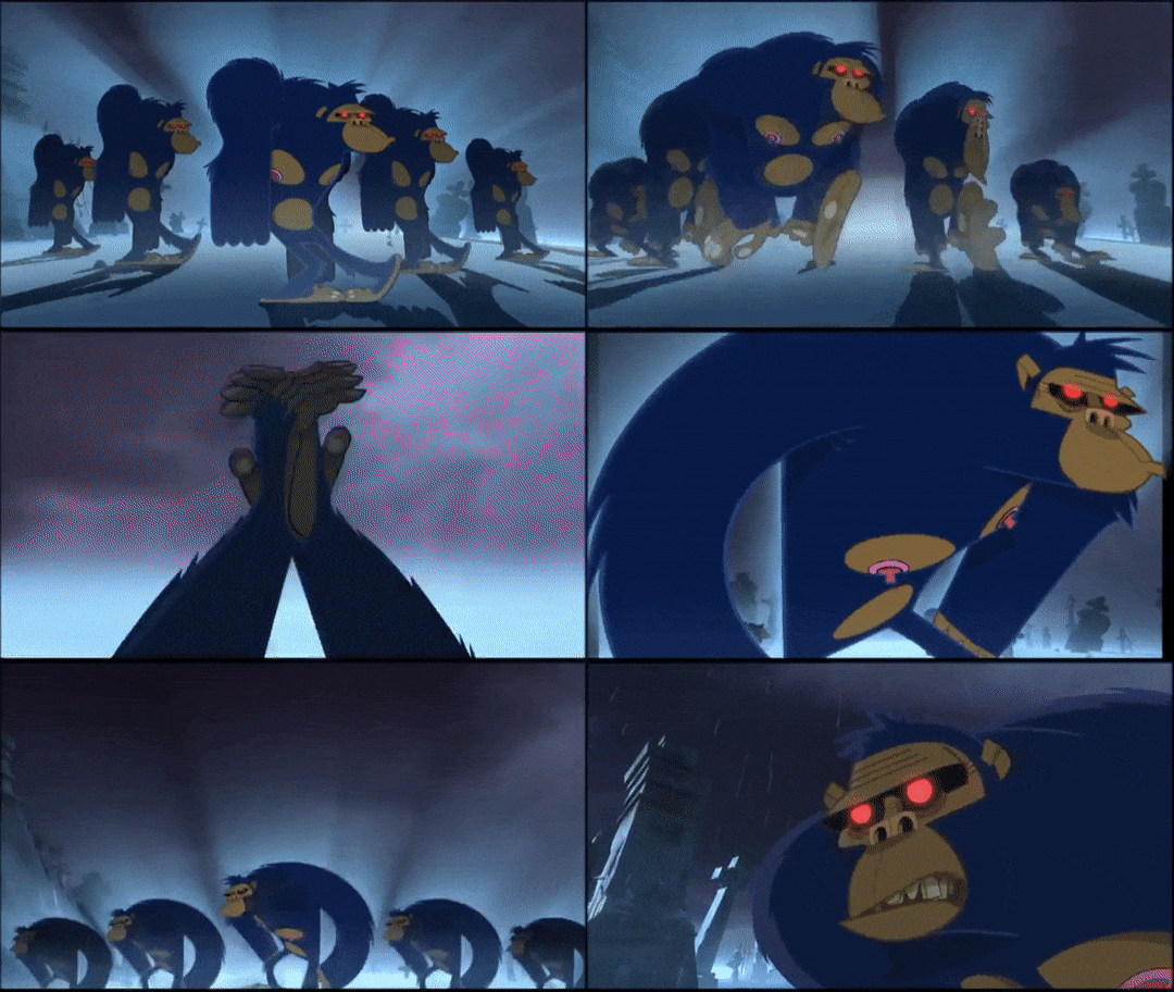

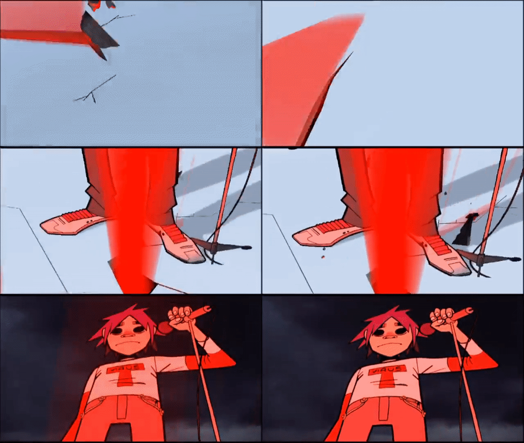
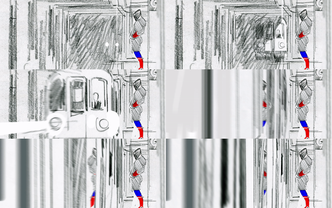

Mystery Box: An Introduction to Animatics
In this week’s animatic masterclass, we were introduced to the idea of an animatic as a way to plan our animations. Whilst we had the opportunity to create our own animatic, I first wanted to delve into the use of animatics in the industry of animation, looking at a few examples and the purpose they serve in the production of an animated sequence. This isn’t in response to any points from Helen herself, who simply gave us the task and how to produce it in the given software, but instead, this post is an opportunity for me to develop my own independent research into the use of animatics in animation.
What is an Animatic? Last week, we explored the idea of storyboards, and how these hand-drawn frames can show the stages of a scene in rough camera placements. Here, issues with the story can be fixed easily, and allow the director/s to tell if the story is clear and works as a visual narrative. However, storyboards cannot tell us the timing or pacing of the sequence. To do that, editors and artists take the storyboard panels and translate them into an animatic.
In its most basic form, an animatic is a collection of static storyboards edited together into a sequence. Using an editing package, we are able to put the storyboards into a timeline and see how the timing works for the animation, even adding cuts and camera movements which are often timed to any dialogue or music that will be used in the final product.
Similar to storyboards, animatics are used to bridge the gap between an idea and a finished animation. We need to see how it might feel, and ‘get more of a grasp’ of the scene. In contrast to storyboards, animatics are very particular to animation. They are a way to layout the timing, pacing and the visuals of the entire thing without having to create it in animation. Animatics are used to get the flow of camera work, pacing and characters interactions. Typically, the sketches in animatics are rough and instead focus on timing and pacing, rather than appealing illustrations.
Industry Practices In an illuminating video revealing the entire CG animation pipeline at Dreamworks Studios, lead editor Nick Fletcher explains the process in a way better than I ever could, simply because it’s his job to create animatics for Dreamworks’ feature films.
‘We take the storyboard panels and build a sequence out of those. Some times, we don’t have any dialogue, so we record ourselves doing the voices. We add a little music, sound effects and whatever is needed to fully tell the story. Try to make it as polished as possible so that the storyboard reel [or animatic] becomes a sort of foundation for the movie.’
Nick Fletcher, Editor and Animatic Creator for Dreamworks
In this early stage, the actors haven’t yet recorded their performances, so the editors effectively produce a rough pass as a way to present a preliminary vision of the film to directors, producers and executives, who will then green light the project to the next stage if they like what they see.
Interestingly, the inclusion of sound is a characteristic of almost every animatic I’ve come across, whether it be for a feature film animation or fan-made short on Youtube. Sound is a key part of producing an exciting and engaging animated film, and it’s not something that I want to disregard for this project either. When filming my own reference, I had the opportunity to verbally act out the performance and as such, I’ve essentially already got a rough audio track for my animatic, if I choose to include it. Despite the fact that sound isn’t mentioned in the brief, I feel like it could only be a good idea to include this aspect as a way to again push the limitations of this assignment and produce a piece of work that is of an industry standard: this is something that I want to consider when creating my own animatic.
With animatics, the drawings are often loose and sketchy: the focus is on telling the story and simply working out the timing and pacing of the sequence. A common industry practice of both storyboards and animatics is the use of spot colours or shading to simply separate the background and foreground, rendering the main characters in a shade of grey different to the background and foreground elements to direct the eye to the most important information and focal points of the shot. In my own animatic, I plan to produce a sketched version using simple line work and develop upon this by adding a grey tonal value to each of the elements as a way to evidence an understanding of key industry practices.
One final aspect to consider when creating an animatic is the program itself. After doing a little bit of digging online, I’ve found that the industry standard for animatic production is a combination of Adobe Photoshop to draw the frames and to sequence them using After Effects or Premiere Pro, both of which allow us to add cinematic touches and camera movements in this early stage. Already, I’ve had the opportunity to explore the use of virtual cameras within After Effects, and I can see the potential for more complex shot types and camera movements to be created simply using this technique of changing 2D illustrations into 3D flat objects that a virtual camera can then move around to give the illusion of depth.
Into the Spider-Verse: A Cinematic Approach This idea of a cinematic approach to animatics, making use of more complex shots even at this early stage in production, can be seen in Alberto Mielgo’s initial animatics for the massively successful Spider-Man: Into the Spider-Verse. Mielgo created the tests using the Adobe Creative Cloud suite, drawing with pencil and digitally in Photoshop, and compositing the sketches in After Effects before doing any final editing in Premiere.
The shots are intensely cinematic, presenting a new vision of a hand-drawn, 3D world. This example represents a more complex approach to an animatic, as Mielgo presents an inherently cinematic, hand-drawn 3D world. Through panning virtual cameras and zooms through converted 2D illustrations, the audience is able to get a sense of the scale of the film and the city of Brooklyn. Looking at these animatics, there’s a clear understanding of editing and cinematography here, with a mix of blurred lenses, fades and cuts that outline the overall look and feel of the final film.
Here, Mielgo was creating key moments and shot compositions that the final film still adheres to, with his initial animatics playing a key role in establishing the film’s stylistic visual language and a new, snappy approach to animation. The idea to use comic book panels, illustrated onomatopoeia and an experimental approach to composition was the work of Mielgo’s early development in the project, and within these, we can see how an animatic can be used to plan out the action not only in terms of layout and timing, but also the visual language of the film and even more editing elements such as how to cut a shot.
Gorilliaz: Animatics in Music Videos Animatics can also be found outside of the realm of animated feature films, however. For example, we can take a look at an animatic from the legendary animated band Gorillaz, an experiment blending animation and a genre-bending array of musical tastes that has become a world-wide hit since they first dropped their debut single in 2001, with ‘Clint Eastwood’. The song and music video are one and the same, each working to build off the other, and exemplifies the band’s use of mixing musical styles: combining hip hop, electronic and dubstep influences to defy musical genre, and instead embrace storytelling.
In the animatic for ‘Clint Eastwood’, we can see how the creators were able to pre-visualise their sequence by moving the camera around the 2D illustrations, which instantly gives the flat designs a sense of depth and cinematic charm. The slow arcing motion of each of the band members is shown clearly in the animatic, a shot that is now iconic to the band itself. It’s important to note that for the more complex moves, still images of the characters are used to act as visual place holders for the animation. With this example, the focus is on getting that smooth arcing camera movement, and focusing on each singular band member, and as such are represented with still frames. This is a common industry practice, and as such, animatics typically have little actual animation. Rather than a series of frames to create the illusion of movement, an animatic presents the action across a series of storyboarded panels that convey the motion through rough drawings.
Something interesting to note about this particular animatic is the varied use of mediums that creates a very tactical effect that hammers home to the audience that these sequences are created by hand. In a music video, one important element is the use of lip-synching early on - and as such, the animatic presents a nearly fully-animated lip-sync, animated traditionally on paper. This allows the animators a more considered and polished visualisation of the sequence to work from, and since it is a focal point of the video, it seems natural to want to develop upon this early on in the project.
Looking at the animatic, we can see how the creators have used a mix of near-fully animated sequences and moving still images to convey the story of the video. With more complex shots including detailed landscapes and multiple characters, only a handful of frames are shown - but it’s enough for the directors and creators to work from. In these more dynamic compositions, the characters are rendered with simple stick-figure bodies, taking the focus away from staying on model and more on sketching the shot and timing correct.
Additionally, the animatic also uses a range of camera effects to give the illusion of depth to these 2D characters, using a shaky cam to demonstrate a character jumping and slamming down onto the ground or arcing pan-up movements that evoke a real sense of cinematic composition and camera work - going beyond the traditional animation approach. It was quite interesting to see how the editors would recycle animations and shots for the video, allowing creators to save time using cycle animations for certain shots. Comparing these animatics to the final shots demonstrates how crucial and helpful the animatic is to a project like this: despite the colours, final polish and smooth animation, the sequence has effectively stayed to the initial compositions and camera movements outlined in the animatic.
Summary In this post, I’ve been able to explore the use of animatics in the animation industry, taking the time to delve into some examples that I personally find inspiring and exciting, and how these ultimately outline the final feature. As an animator, creating an animatic is interestingly something that I’ve never actually done before. However, I can really see a benefit and the purpose of doing so - and with this, my next move is to take the ideas that I’ve found here and apply them in my own creative practice: developing my own animatic based on my final storyboard.
References
Into the Spider-Verse Storyboards. (2019). Alberto Mielgo. https://vimeo.com/311716775.
Clint Eastwood (Animatic). (2010). Gorillaz. https://www.youtube.com/watch?v=JPC0n_ml4kc Clint Eastwood. (2001). Gorillaz. https://www.youtube.com/watch?v=1V_xRb0x9aw
What is an Animatic? (2014). Pluralsight Creative. https://www.youtube.com/watch?v=3sE5ox9kkUg
CGI Dreamworks Animation Studio Pipeline. (2016). CGMeetup. https://www.youtube.com/watch?v=ru0tQRJ4qKs&t=249s
2 notes
·
View notes
Text
REFLECTIONS ON MY LEARNING
The Practice 1 Module and Semester A will be coming to an end in a few days and i just want to take a step back to reflect on my learning and my progress as an animator in these past few months.
I made alot of mistakes, but i also managed to learn from those mistakes and came back stronger and Its safe to say that i've definitely improved in terms of both knowledge and technical skillsets. I will be listing all the new things i learnt in all the 5 briefs and the 2 developed projects this semester,and share how this module changed my way of working overall.
BRIEF 1 : RED VS BLUE -
I still remember this week very clearly because it was my first week into the course and i was very confused on how to approach things. I also never had the habit of storyboarding, concept art and taking references until when i had to work on my portfolio for applying to the course. I would usually dive right into working when it came to my previous projects.
So i was still fairly new to all that and i only had a week and a half to complete the storyboards,concept designs and the animatic. another problem i had was the fact that i couldnt think of a simple concept for the brief. i just kept thinking about complex storylines that were impossible to fit in just 30 seconds. so when alex asked me to redo the whole thing from scratch with a new concept, i was terrified since i only had 3 more days until the submission date.
This is where the fearless hardworker in me started grinding and i got the job done in 3 days with a simple yet efficient animatic with good storyboard, concept art and fairly decent designs compared to the previous one. i was appreciated by the class and alex for picking myself back up so quickly.
I studied animal head movements and looked at some reference material for the wings of the chickens so i can judge how they would move from a certain angle. i also studied the facial expressions of animals in cartoons which was also pretty helpful.
BRIEF 2 : PLACES OF THE MIND -
For this brief, i once again intended to keep the concept very simple but complex at the same time. what i meant by that was the fact that the thought process and coming up with the idea would be simple (since i based it off of my real life experiences and how my mind works sometimes) and the workflow would be complex (2D character with 3D backgrounds, dynamic camera movements and animating 3D objects)
I got some 3D models to help me find some key poses, saving me alot of time. I also looked at and refered to several street layouts until i found the right one. I would say that i learnt to brush up the timing skills since this animatic and the movements of the character were highly dependent on the beat of the soundtrack used.
BRIEF 3 : MEMORY AND NOSTALGIA -
For this brief, Alex advised me not to use any manga styled characters and he wanted me to find my own style of character designing. So i did my research on different styles of character designing and did alot of rough sketching until i found the right one. though the animatic and concept itself didnt achieve what it was intended to, i still got appreciation for trying something new with my character design
BRIEF 4 : OPTICAL SOUND -
For this brief i only had 24 hours to do everything since i was preoccupied and not in a good place mentally during that week due to a family emergency.
My roommate was talking about cleaning our room soon and that sparked the idea in my head. i looked around my room, quickly modelled it in 3D to get the perspectives right and made a simple animatic of someone cleaning thier room when listening to music. that was the simplest concept i could think of and get done within 24 hours. i ended up completing everything on time and the class absolutely loved it to the point where they suggested me to develop it further.
BRIEF 5 : LIGHT AND SHADOW -
For this brief i wanted to use a "Tom and Jerry" (Hanna,Barbera,1980) type concept where a mouse tries to steal a snack and get away with it.
I had to study the positioning of shadows according to different sources and angles of light since this took place in a dark room. I also looked at alot of dark room references so it would help me find the one that fits my environment and lighting placement.
RED VS BLUE : DEVELOPMENT -
I wanted this to have a studio ghibli artstyle but also wanted it to have detailed compositing. So i decided to create an amalgam of different styles i researched ,adjusted it according to my will and added my own touches to it. I inspired my color palette from studio ghibli, did the compositing in my own way until it got a lively and vibrant look. I also learnt a new style when doing my background paintings for this animation
PLACES OF THE MIND : DEVELOPMENT -
This was the most challenging project for me so far because i learnt alot about the value of proportions when working with a 3D environment. I also dove in depth with the compositing since i wanted to make the environments look as vibrant and flashy as possible.
CONCLUSION :
I would say that i have a broader mind now with the capability to think about alot of simple quick ideas rather than lengthy and complex ones. I learnt new things from Sean's workshops and Alex's seminars. I also developed the habit of having a backup plan just as good as the initial one just in case something goes wrong. My backup plans have worked and been recieved well by my tutor and my class 3 times in this semester and its safe to say that i have inherited alot of habits that a professional animator should have and i only intend to fly higher and learn more new things.
0 notes