Don't wanna be here? Send us removal request.
Photo




Overview The week of submission is always a stressful one, and this was no exception. Despite the fact that I’ve managed to stay on track over the entire course of this unit, I found myself rushing to complete and format the work in time for submission. Formatting my work into PDFs, JPEGs and organizing everything into the final folders is something that always takes a considerable amount of time, and my own time management will be something I continue to work on throughout the course. As a whole, however, I am happy with the work I have produced for this submission. Looking back at my work, I feel as if I have improved since the first unit, with me putting in more effort to maintain an up-to-date blog documenting my time on the course and focusing more on iterative development in all of my assignments.
Fantastical Creatures Having produced a finished creature model, my focus this week was on rendering and compositing: exploring various lighting and rendering options in Maya, and completing a final turntable animation of my model. This allows artists to put a 3D model on display, allowing the model to rotate slowly whilst the audience can look at it properly. After experimenting with several iterations in Maya, I was able to produce a final turnaround that matched my initial hopes for the model.
My first iteration was ultimately too flat and fast and lacked a foundation. My main focus for the turnaround sequence was to use a unique light set up to generate some strong contrast in shadows in the model, clearly demonstrating its geometric, low poly and stylised aesthetic. With this, I was able to complete a successful turntable sequence, and compiled the frames into After Effects to complete the process.
Having produced the final turnaround sequence, my next move was to begin the photo compositing process. For this, I chose three photographs from the provided selection that I felt would work best with my model and using the image plane and skydome light in Maya, played around with placing my creature in the image. After this, I rendered the single image and opened up Photoshop.
The actual compositing process was rather straight-forward: having had experience with this before, I found that compositing the images in Photoshop was somewhat faster and more intuitive in comparison to After Effects. Having discussed this with my peers, I found this was a shared feeling. Having enabled shadows in my original Maya render, it was simply a process of adding masks and experimenting with lighting, levels and overlays to achieve the finished result.
Despite this, I would have liked to composite the model with my own background. If I had more time, I would have liked to explore the potential of creating a low poly cave for the Hethronid to lurk in, or simply developed an abstract background illustration that better matches the stylised aesthetic of my model. I feel this would be a more successful final outcome, and it’s something I want to explore in my own time.
Alongside this, my team and I worked to produce a simple cast line up sheet featuring our final 3D rendered models. We were able to discuss how these creatures would survive if thrown into the same ecosystem, which would likely have ended up in a conflict. In comparison to my Hethronid design, my peers had created characters that could interact with each other with various degrees of anthropomorphism.
It hasn’t been a simple process, but I have managed to create a final product that successfully realizes my initial vision for the Hethronid. Looking at my creature model sheet, I feel as if my final model is a successful adaption of this creature and my own ideas. On this blog, I was able to delve deep into the creature design process through iterative development and independent research and have been able to produce an engaging final creature model and turnaround sequence.
Showreel Having completed all of my other assignments, this week I was able to develop a final showreel for submission. As a whole, I feel my final showreel is a success: with a minimal type-based design inspired by a few of my project mood board examples and my own personal touch, I was able to embrace the minimalist clean look to these successful showreels that I was analyzing: as I found, a minimal visual language and design elements can go a long way in the production of a showreel, and demonstrating our maturity as artists and designers. At only a minute and one second in duration, the reel is a good length including the lip sync sequence. The actual showreel itself is only fifty seconds, which is arguably the ideal time for a successful motion design showreel.
Despite this, there are a few things that I would improve with this final showreel. Whilst the animated title cards are appealing, I would have liked to create a small ident. This was in response to my research into Ben Marriot and showreel creation as whole: industry professionals, specifically freelance animators and motion designers, often open or close their reel with a short animated character or object that works to represent them as a personal brand, similar to a logo. The absence of an ident leaves my showreel feeling somewhat devoid of a strong personality, and I would have liked to explore developing an ident for this project.
Through this assignment, I have been able to finalise, present and reflect on all of my project work produced during Units BA1a and BA1b, and developed my understanding of the showreel form. Researching and analysing industry examples has taught me important ideas about how to construct a successful showreel, and I feel this knowledge will help me significantly as I progress through the course. Having had experience with showreel creation in the past, I used this assignment as an opportunity to develop my skills within the post-production process. From this, I’ve also been able to hone in on my own interests within animation and identified my focus and passion for digital 2D animation. As such, this will be my primary focus over the summer and beyond.
Lip Sync Having completed my final lip sync sequence, my focus this week was put towards formatting weekly summaries into reflective journals for submission and writing the final critical evaluation for the project.
0 notes
Photo




Ben Marriott: On Social Media
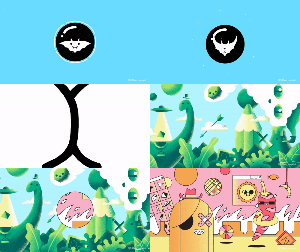
Alongside my research into Golden Wolf Studios, I also reached out to Ben Marriott, a freelance motion designer, and illustrator based in Sydney, Australia. His work primarily consists of short humorous animated videos and gifs that create tiny stories and characters, condensing ideas down to their simplest form. He’s worked with such high-profile clients such as Converse, Dropbox, and Twitter, and represents an established professional working the freelance motion design industry. His focus is primarily on these short motion graphics sequences, created in Illustrator and After Effects, and represents the type of work that I am interested in exploring myself.
Developing on from my research inquiry into Golden Wolf, I was particularly interested in the role of social media in his work. I found that in comparison to his client work, these short looping gifs were more experimental and playful in terms of animation style, design and aesthetic. In a polite email, I asked him if he could discuss the role of social media in his work, and if he could offer any advice in this area of the industry.
Shortly before giving the final presentation, Ben emailed me back with his answer! His response is as follows:
I really appreciate you taking the time to reach out! I don't think it is absolutely necessary to have a social media following, but I do think it helps. Most clients don't care at all how many followers you have or what degree you have. They only want you to do work and deliver on time. Often, they don't even need it to be great work. You can have a long and thriving freelance career without a social media presence at all. Lots of the best motion designers operate this way. Most freelance work I've gotten is through word-of-mouth referrals.
Starting this year I've put a lot more attention on my social media presence because It does give you a lot more options, and with an uncertain economic climate staring down at us - having more options seems like a wise thing to do. A larger audience may bring possibilities for sponsorship, selling digital goods (courses, plug-ins, texture packs etc..) and different jobs with clients that do care about an artists reach.
Social media can be really difficult as well. It can be hard to remember that the amount of likes in no way correlates to the quality of a piece of work or the effort put into it. I can be really discouraging especially starting out. There are some days where It's just too much to open up Instagram or vimeo. It can be a mix of inspiring and soul-crushing to open up the feed and see 30 projects in a row that make you think "damn I'll never be this good." I have to take breaks every now and then.
Those are a few of my general thoughts. Please let me know if you have anything specific you'd like answering :D
As opposed to the studio nature of Golden Wolf, it was excellent to be able to get an insight from a freelance motion designer. It’s a career choice that I’m heavily considering outside of the studio environment, and so speaking out to Ben was an excellent step in the right direction. In particular, it was interesting to hear his opinion on the downside of social media - it’s not something that I’ve considered before, but that intimidating feeling when we see hundreds of amazing pieces of work and compare ourselves to these established professionals is something that I think we all share.
As a whole, this response actually works on the same ideas Henry said to me, how building a social media presence can offer new possibilities for sponsorship, client outreach and diversifying our own brand. From this experience, I was honestly surprised about how important social media is to animators and motion designers. I was surprised to hear how clients can actually contact artists purely from their Instagram feed, as it can effectively work as a constantly updated digital portfolio.
Having completed all of my work for this assignment, this post simply serves as an opportunity for me to evidence my own contact with another industry professional, this time looking at a freelance motion designer and his opinions on the role of social media in his work.
0 notes
Video
vimeo
Showreel: Final Showreel Review
Having completed all of my other assignments, this week I was able to develop a final showreel for submission. Whilst I feel it’s an interesting piece, this is ultimately more of a showcase of our work on the first year on the course, rather than an actual showreel. With minor exceptions, there is nothing on this reel that I would choose to place in a final professional reel. This is simply because it’s our first year on the course, and I really haven’t produced an extensive amount of actual practical work to choose from.
Despite this, I feel my final showreel is a success: with a minimal type-based design inspired by a few of my project moodboard examples and my own personal touch, I was able to embrace the minimalist clean look to these successful showreels that I was analysing: as I found, a minimal visual language and design elements can go a long way in the production of a showreel, and demonstrating our maturity as artists and designers.
Having completed a sample showreel a few weeks ago meant that I already had a blueprint to go with: although I have changed most of the clips used in that first edit, I found the opening shot to work very nicely: a textured version of my Arrival sequence, cut to an engaging beat-heavy electronic score. It’s a striking shot, and I feel represents one of, if not my most, successful sequence so far. The soundtrack itself, Finale, underpins the entire reel and infuses it with a sense of excitement, but also reflection. Unlike the examples I was looking at on Bensound or a similar website, this didn’t feel generic or homogenised and gave my reel a sense of individuality, I feel.
A key part of the showreel creation process is choosing a soundtrack that fits our work, something I learned from industry professional Henry Purrington at Golden Wolf Studios. Looking at my final showreel, I feel that the track does reflect my working practice and the overall aesthetic of my work whilst simultaneously working to engage the audience. The soundtrack’s beat-heavy nature gave me plenty of editing potential, as I attempted to synchronise the music with my animations throughout the reel.
The Selection Process Whilst the beginning jump cuts in my Arrival sequence are a risky move, my peers and I felt they actually work nicely, evidencing an industry practice that elevates the sequence. When I was assembling the reel in Premiere, I was going through an iterative selection process, asking peers their feelings on each shot included and asking myself if this is the most effective sequence to play next. For this, I was considering the smoothness of the actual motion, appealing design or performance and the mediums shown. We are encouraged to try and include work that we enjoyed doing, and would explore again and so I placed a heavy focus on digital 2D animation and stop motion for this reel. The arrangement and order of the shots also changed numerous times, as I was always focusing on how the piece flows as a sequence. Whilst this isn’t an actual showreel, I wanted to put some effort and time into the production of the piece and treat it as its own project.
Having had the opportunity to produce several showreels in the past, for both myself and other people, I enjoyed the editing process and feel as if I was able to make an engaging final edit. With the selection process complete, my next move was to make an intro and outro card. Instead of exploring a hand-drawn aesthetic, I wanted to place a focus on smooth, appealing motion design and a sans-serif font: something that looks more professional, in comparison to an artistic hand-lettered card. Whilst this approach can have an appeal, as an animator I am realising my main interests with animation lie in the digital 2D specialism, exploring fluid motion and appealing graphic design elements in TVPaint and the Adobe suite. By only using a limited colour palette, clean design and bold typography, I’m able to instantly communicate to the viewer what work I want to create - which is a large part of the showreel’s job, to advertise ourselves and what jobs we will take. A successful showreel should include our strongest work, and reflect our future interests in the study of animation.
Adding the Lip Sync After discussing the subject with a few of my peers, they felt that I should definitely include my final lip sync sequence in my reel. Watching it in the preview however, I thought it did not match the fast-paced nature of my reel. As a way to work around this, I had the idea to embrace the news broadcast’ inspired format of my final lip sync iteration, and explored the potential of a retro tv ‘channel switch’ effect that I created entirely through After Effects. This acted as an appealing way to segue into the lip sync, and conclude the reel with one of my most engaging sequences. It’s a risk, but one I feel works well, and is representative of my experimental work ethic, as I often try to challenge any project brief handed to me.
With this, I also took the opportunity to edit the lip sync audio: by adding a minor vocal enhance effect, I was able to further sell the idea that this character is stepping forward to the microphone. Despite this being a minor touch, I actually feel it really adds to the lip synchronisation effect and the reel as a whole.
Despite this, there are a few things that I would improve with this final showreel. Whilst the animated title cards are appealing, I would have liked to created a small ident. This was in response to my research into Ben Marriot and showreel creation as whole: industry professionals, specifically freelance animators and motion designers, often open or close their reel with a short animated character or object that works to represent them as a personal brand, similar to a logo.
The absence of an ident leaves my showreel feeling somewhat devoid of a strong personality, and I would have liked to explore developing an ident for this project. However, due to time constraints, this wasn’t possible and an animated ident represents an opportunity for independent development in my own time. After submission, this will be something that I will actively pursue, as it instantly would elevate my showreel and help to give my work a degree of professionalism.
Summary As a whole, however, I feel like I have managed to produce a successful first-year showreel. With a clean graphic design, fast pacing and engaging electronic soundtrack, the reel flows nicely and represents a showcase of my work created in this first year on the course. Whilst I have placed a focus on digital 2D work, I have also been able to demonstrate a variety of animation mediums that work to demonstrate my generalist skills alongside my specialist interests. At only a minute and one second in duration, the reel is a good length including the lip sync sequence. The actual showreel itself is only fifty seconds, which is arguably the ideal time for a successful motion design showreel. The reel starts strong with the textured Arrival opening sequence, without lingering on a title card: my name is displayed on the screen for around two seconds, and then jumps straight into the animation.
From this process, I’ve also been able to hone in on my own interests within animation and identified my focus and passion for digital 2D animation. Honestly, this wasn’t my perceived direction however after exploring the potential of Illustrator, After Effects and TVPaint, I have developed a passion for motion design and hand-drawn animation. As such, this will be my primary focus over the summer and the next year on this course.
0 notes
Photo


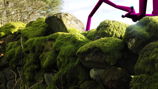
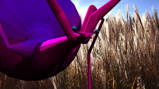
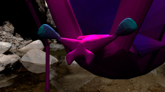
Fantastical Creatures: Final Compositing Review
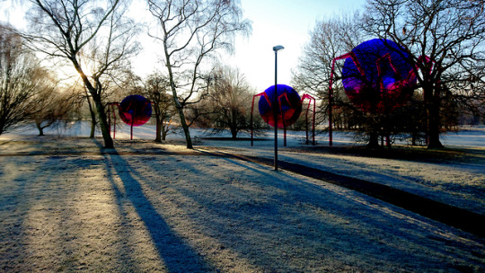
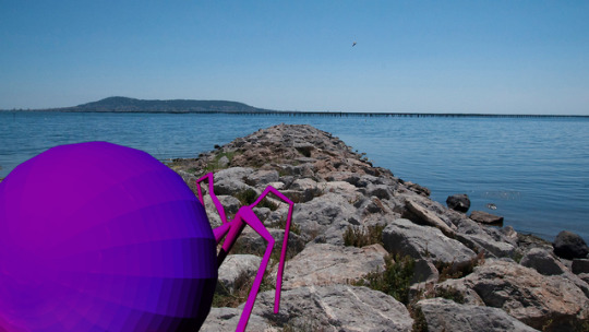
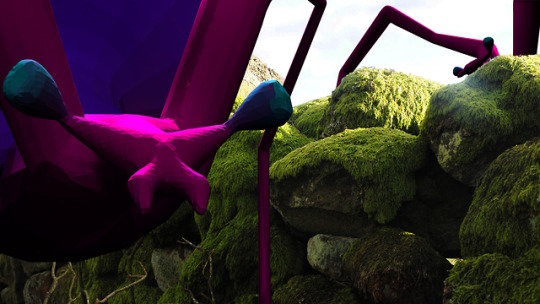
Having produced the final turnaround sequence, my next move was to begin the photo compositing process. For this, I chose three photographs from the provided selection that I felt would work best with my model and using the image plane and skydome light in Maya, played around with placing my creature in the image. After this, I rendered the single image and opened up Photoshop.
The actual compositing process was rather straight-forward: having had experience with this before, I felt that compositing the images in Photoshop was somewhat faster and more intuitive in comparison to After Effects. Having discussed this with my peers, I found this was a shared feeling. Having enabled shadows in my original Maya render, it was simply a process of adding masks and experimenting with lighting, levels and overlays to achieve the finished result. Whilst my model is clearly stylised in comparison to the photographic backgrounds, I actually felt that the finished images looked appealing, and the juxtaposition of the two elements does not look as jarring as I had initially expected.
To my surprise, I actually really enjoyed the process and developed my skills through iteration: producing several composite photographs and choosing the most successful from that selection. My main focus for the session was engaging with the process, and being experimental with my own creature placement. Masking and overlaying parts of the background allowed me to composite my character behind forest and stone structures, something that adds to the image. With these photographs, I wanted to experiment with the expectations of the brief and instead of simply composing the model in the center as shown in class, explore the possibility of actually compositing the model into the world of the photograph. For the green stone photograph, this was done through duplicating the sky, compositing the model on top of the photo and then overlaying my creature to complete the illusion. Looking at the final selection, I felt that this was the most seamless and visually engaging composited outcome.
Despite this, I would have liked to composite the model with my own background. If I had more time, I would have liked to explore the potential of creating a low poly cave for the Hethronid to lurk in, or simply developed an abstract background illustration that better matches the stylised aesthetic of my model. I feel this would be a more successful final outcome, and it’s something that I do want to explore in my own time.
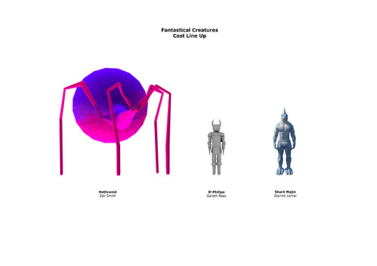
Alongside this, my team and I worked to produce a simple cast line up sheet featuring our final 3D rendered models. We were able to discuss how these creatures would survive if thrown into the same ecosystem, which would likely have ended up in a conflict. In comparison to my Hethronid design, my peers had created characters that could interact with each other with various degrees of anthropomorphism.
Instead of living happily in an ecosystem, these creatures would likely attack one another. The Hethronid is a large creature, which hunts in packs. As a microscopic organism turned ginormous in size, these creatures can reproduce asexually and can sustain themselves through consuming dead creatures and organisms. The sheer size of the creatures means they would likely trample and overwhelm the other beings, and consume the remains. An alien assassin, El Philipe would put up a fight but the sheer amount of Hethronids would quickly overwhelm him. Shark Majin would be the most likely to survive, as he resides in the Earth’s oceans, but it will only be a matter of time before the Hethronids venture into the water.
It hasn’t been a simple process, but I have managed to create a final product that successfully realizes my initial vision for the Hethronid. Looking at my creature model sheet, I feel as if my final model is a successful adaption of this creature and my own ideas. Looking back, I’m happy with the work produced for this assignment. On this blog, I have been able to delve deep into the creature design process through iterative development and independent research, producing an engaging final creature model and turnaround sequence in response.
Through this assignment, I have been able to really explore the craft of creature design, something that I genuinely enjoy. Looking back at the processes I’ve explored for this project, I will likely pursue some of these areas explored within this assignment as a hobby outside of motion design work. Having completed the final outcomes here, my main focus will be to format all of my work for submission and begun writing the final critical evaluation for this project.
0 notes
Photo




Fantastical Creatures: Turntable Animation Review
In the week of submission, my focus turned to rendering and compositing my final creature model. Using Arnold lights and render view, I was able to develop my own skills with the rendering process and produced a few turntable iterations. A turntable animation can be useful when artists want to put a 3D model on display, allowing the model to rotate slowly whilst the audience can look at it properly.
Initially, I imported my model into the turnaround template provided in class and attempted my turn around using this. Whilst this was a simple process, simply parenting the model to the rotating disk, I found the light set up to be too powerful for my model. With a few adjustments, I was able to produce my first Turn Table iteration, using the template. Inspired by my own research into the subject area, I wanted my turntable to be a minimalist approach - with a white backdrop and base. This minimalist approach places the entire focus on the detail of the model itself.
Whilst using this template proved to be effective, I began researching the use of turntable animations for models in more depth and found an arguably more effective approach to the task. Instead of simply putting the object on a rotating plinth, Maya has the inbuilt capability to produce a turn around animation using a virtual camera. Surprisingly, I found this to be a very quick and simple process: and I had a turn around animation after a few clicks.
After selecting ‘Create Turntable’ in the Visualise tool in Maya, a turntable animation is automatically generated by a turntable camera. These are animated by default, and on playback, follows a 360 degree orbit around the model. From the turntable camera’s perspective, the model appears to be rotating 360 degrees.
In comparison, I found this to be a much more effective approach and I was able to create a few iterations exploring different light set ups. These produced various results, but my main intention for this model is to demonstrate its smooth texture as a physical model. As opposed to the hyper-realistic aesthetic of many of my peers, my original plan for this model was to explore a more stylised approach to creature design: inspired by artist Paul Braddock, I wanted to embrace that simplified, exaggerated aesthetic with a bold, limited colour palette and dynamic shapes. Originally, I felt my turntable made my model look too bright: the powerful white lights removed any real depth of the model and took away the appealing contrast and sinister look of my earlier render images.
With this in mind, I went back and began exploring different light setups to produce the final piece that I was hoping for. In comparison to the simple light set up provided in the template, my focus shifted into creating a unique light set up for my model. Whilst I wanted the lighting to be visually appealing, my main focus was to generate some strong contrast in the model and to make the geometric, low poly aesthetic really shine through. Whilst this took extensive experimentation within Maya, and delving into my own research into the topic online, I was able to produce a final turn table sequence that matched my initial hopes for the model.
A key idea of a successful turntable animation is having the time to appreciate the model, and not creating a speedy turnaround sequence. Having the sequence play out over a hundred frames allows the audience to observe and evaluate the model properly.
As a whole, I’m happy with the final turn around sequence and model produced for this assignment. It hasn’t been a simple process, but I’ve managed to create a final product that successfully realizes my initial vision for the Hethronid, and I’m quite proud of the sequence and my work on this assignment.
Having produced the final turn around sequence here, my next move will be to composite my creature into three landscape photographs out of a predefined selection. This will be done using lights in Maya, and After Effects for the actual compositing process.
0 notes
Photo

Overview Having completed all of my research for the various projects, I took this final week before hand-in as an opportunity to complete my lip sync sequence and finish my CG model ready for rendering and compositing next week.
Alongside this, this week we were able to deliver our final Media Roles presentation. We didn’t go drastically over the time limit, and the audience seemed to be interested throughout. As such, I felt we were able to deliver a successful final presentation that we were all happy with. This was an intense week on the course, and whilst I am certainly starting to feel the pressure of a looming deadline, I feel that I’m actually a little more prepared and organized in comparison to my earlier submissions.
Fantastical Creatures This week, I placed a heavy focus on completing my model ready for rendering and compositing. Having produced a final sculpt in ZBrush that I’m happy with, my next move was to explore how to paint my model. My initial idea was to explore a streamlined pipeline without the need for detailed retopology and UV mapping in Maya. This ultimately was not possible due to the high poly count of my model, and I was forced to explore a variety of techniques to complete my final model.
Working on the bright pink and purple colour scheme of my final creature design illustration, I was able to complete the painting process and finalised my model directly within Maya. Whilst this was a completely unexpected direction, this ultimately represented the best approach for my own model. In the process, however, I was able to explore and engage with a variety of different CG modelling techniques and practices that have developed my understanding of the process further than if I had simply remained in Maya and Mudbox. I was able to explore the retopology and UV unwrapping process, whilst also playing around in industry standard programs such as ZBrush and Surface Painter in my own time.
As a whole, I feel like I have been able to produce a successful creature model. Highly stylised in comparison to the textured models of my peers, I wanted to place a focus on simplification and dynamic shapes, with a striking colour palette. Looking at my model sheet and colour illustration, I feel that my CG model is a successful adaption of my design, with an appealing smooth texture and stylised aesthetic.
Moving forward, my next move will be to render a turnaround of my creature model in Maya and composite the Hethronid into three selected photographs. This will be done primarily in Photoshop or After Effects, and I have had experience with compositing, this should not be a difficult task to complete in preparation for submission.
Showreel This week, I was able to develop a project moodboard for the showreel assignment, compiling short clips, colour palettes and other design ideas into a single slide to return to throughout the showreel construction process. Inspired by my own independent research, I plan to approach this assignment as a separate project and allocate the necessary time and effort needed to produce an exciting showreel.
Whilst I will begin the showreel creation process next week, I have already been able to identify a few key ideas for my showreel. Having chosen a beat-heavy electronic soundtrack, I’ve already been able to make a ‘sample’ showreel and I will be using this as a jumping-off point for my final edit. A key idea that I will be returning to is the ability to simply cut work: with a showreel, there is no room for ‘mediocre’ work and I will be applying this concept to my own. Even though my practical output is not extensive, I can (and should) afford to be selective with the work featured and make sure it is the most successful work that I can show from this first year on the course.
Next week, I will complete my final showreel: include the newly rendered sequences of my Mystery Box sequence and creature model turnaround, and explore the possibility of including some of my lip sync animation.
Lip Sync This week, my main aim was to complete my lip sync animated sequence ready for submission and begin experimentation and developments within After Effects. With this, I took the line work completed last week and began the colouring process. This was relatively simple, having done the actual animation work, the focus this week was on refining each illustration with full colour. As opposed to using the block fill tool, I wanted to hand colour each piece, working in layers to cut the workload in half.
After colouring, I managed to complete a final iteration for submission, complete with a white background. This was to ensure a focus on facial acting and the actual lip sync, allowing us to explore the use of backgrounds and further developments in our own time.
With this, I wanted to develop my lip sync sequence further and explore the use of a single background illustration, and my initial news broadcast idea in After Effects. Inspired by my own initial ideas for this project, I wanted to explore the use of virtual cameras within After Effects to simulate the hand-held aesthetic of a news report.
Whilst the lip sync itself works, I would have liked to explore the potential of a fully animated face, rather than working with layers. With this, I could have the jaw and chin open up and close, as opposed to drawn on mouths moving. This would be an interesting development, and allow me to add more fluidity to the mouth movements.
As a whole, however, I’m happy with this final lip sync sequence. I feel that the actual lip synchronisation is successful, and after having shown it to a few peers, I was happy to see that they found the sequence engaging. The added touch of the handheld camera added to that cartoony realism of a news broadcast, and the added news banner seemed to add to the entertainment value too.
Having completed my final lip sync sequence, over the summer I will be continuing to explore this idea in 2D animation, through the use of After Effects and plugins to create efficient lip sync animation with a focus on clean design.
0 notes
Photo




Fantastical Creatures: Final Model Review
This week, I placed a heavy focus on completing my model ready for rendering and compositing. Having produced a final sculpt in ZBrush, my next move was to explore how to paint my model. My initial idea was to explore a streamlined pipeline without the need for detailed retopology and UV mapping in Maya, and try and complete the model entirely in ZBrush. After exporting the model as an ‘obj’ file, however, I found that the model was too large and the poly count was far too high to simply paint in Maya.
With this, I reluctantly began the retopology process in Maya: using the live mesh and grid draw tool to draw out polygons on the model. This was a time consuming process, and I took the opportunity to explore a different approach in ZBrush: paint the model directly in the software using a technique called PolyPaint. Unlike creating texture maps, ZBrush allows us to actually assign the individual polygons a colour and paint on those directly. In ZBrush, I followed a similar purple and pink colour palette as described in my creature design illustration and using the brush tool I was able to paint my model directly.
Whilst this worked within ZBrush, exporting it to Maya resulted in a plain grey model: the polypaint information had not transferred over. Finalising the model proved to be a difficult process, as I had to explore a range of directions to reach the final product. Having tried to paint the model in ZBrush, my next idea was to unwrap the model into UVs. This, however, I could do in ZBrush using the plugin UV Master, which flattened the model into a single UV map. With this basic unwrapping, I exported the model as an ‘obj’ file again, and imported it into Maya to test the UVs.
Using the layout and unwrap tools within the UV Editor, I was able to generate a series of UV shells that represent what my model looks like the flattened, and in pieces. This proved to be a success, allowing me to export my model into 3D painting and texturing package Surface Painter.
After a few experiments, I found this to be a simple process and began painting my model using a few different brushes and experimenting with a variety of materials and colour overlays. My aim for this model is to be a bright red and pink colour, inspired by the colour scheme of microorganisms. The model should be striking and bright, as opposed to the dark browns and blacks of typical arachnids and insects.
Having had the opportunity to experiment in the software in class before, my original plan was to simply paint the model in Surface Painter and export the finished model back into Maya for rendering.
Whilst I was able to paint the model properly, my peers and I found the exporting process back into Maya to be rather complex. This was a subject that we had only briefly discussed in class, and after researching the process further, I felt completely overwhelmed at the idea of shape nodes and alphas. With this, I had to abandon my newly created texture in Surface Painter and attempted another technique: painting the model directly in Maya.
This was a process introduced in the previous assignment, and whilst I felt it was a little limited in application, it worked perfectly for the purposes of my model. Following the bright pink and purple colour scheme of my illustration, I was able to complete the painting process and finalised my model directly within Maya. Whilst this was a completely unexpected direction, it ultimately represented the best approach for my own model. In the process, however, I was able to explore and engage with a variety of different CG modelling techniques and practices that have developed my understanding of the CG modelling process further than if I had simply remained in Maya and Mudbox.
With this, I have been able to complete the CG modelling process. My primary focus now for this assignment is to simply render a turnaround and composite my creature into three predefined photographs in Photoshop or After Effects. Through this assignment, I have been inducted into the basics of CG character design, and developed my skills in modelling and texturing processes. This ultimately serves as a foundation of knowledge that we could then build upon in the following years.
Whilst I found sculpting in ZBrush to be entertaining, I found the actual modelling, retopologising and UV mapping processes in Maya to be rather difficult and time-consuming. Looking back at the process, I haven’t really enjoyed these processes and as a whole, I have found them to be difficult to grasp as opposed to 2D animation and stop motion.
The purpose of this first year is to experiment and explore different approaches to animation, and I wanted to take a chance and explore CG modelling for this assignment. Whilst I’m relatively happy with the Hethronid model I created, this is a process that I likely won’t explore further next year. Despite this, I have found some real value in my work over this assignment: taking the time to produce several creature concepts and extensive research into the creature design process has allowed me to develop my skills with coming up with creature concepts and developed my understanding of an area of the industry that really does interest me on a personal level.
Through this project, I have learnt a range of new techniques and processes within CG character creation that I can develop in my own time. Creating highly detailed creature sculpts in ZBrush is something that I can see myself continuing to explore as a hobby, and I now have the understanding to be able to build both a physical and CG maquette. These both can really help 2D animators and character designers flesh out a design further, and the use of maquettes (whether CG or physical) is something that I will continue to explore throughout my time on the course.
Something that I also wanted to explore is the potential of 3D printing my CG model, but unfortunately I did not get the time to do so for this submission. After a peer suggested I explore the process, I felt this was an excellent idea and would have been an excellent way to conclude this assignment. However, I plan to explore this idea in my own time and will look at the potential of 3D printing my Hethronid model over the summer.
As a whole, I feel like I have been able to produce a successful creature model. Highly stylised in comparison to the textured models of my peers, I wanted to place a focus on simplification and dynamic shapes, with a striking colour palette. Looking at my model sheet and colour illustration, I feel that my CG model is a successful adaption of my design, with an appealing smooth texture and stylised aesthetic. Whilst the path to this final product wasn’t linear, I feel this has actually benefited my understanding of the CG modelling process as I was able to try a variety of techniques before painting the model directly in Maya.
Moving forward, my next move will be to render a turnaround of my creature model in Maya and composite the Hethronid into three selected photographs. This will be done primarily in Photoshop or After Effects, and I have had experience with compositing, this should not be a difficult task to complete in preparation for submission. The entirety of the physical model work has been completed, and I feel ready for the rendering process.
0 notes
Photo




Showreel: Project Moodboard Review This week, I was able to develop a project moodboard for the showreel assignment, compiling short clips, color palettes, and other design ideas into a single slide to return to throughout the showreel construction process. Inspired by my own independent research, I plan to approach this assignment as a separate project and allocate the necessary time and effort needed to produce an exciting showreel.
In particular, I found the minimalist orange and yellow title sequence from short animated film Honour to be a real inspiration to consider. In contrast to this, I found the striking black and white, quick and geometric focused title sequence to the Love Death and Robots reel to be an engaging way to open a showreel. Inspired by the examples presented in the slide, next week I will be exploring animated title cards within After Effects.
Whilst I will begin the showreel creation process next week, I have already been able to identify a few key ideas for my showreel. Having chosen a beat-heavy electronic soundtrack, I’ve already been able to make a ‘sample’ showreel and I will be using this as a jumping-off point for my final edit. A key idea that I will be returning to is the ability to simply cut work: with a showreel, there is no room for ‘mediocre’ work and I will be applying this concept to my own. Even though my practical output is not extensive, I can (and should) afford to be selective with the work featured and make sure it is the most successful work that I can show from this first year on the course.
For my showreel, I hope to be able to animate a small ident. This would be something that begins to explore myself as a personal brand, in response to my research into Ben Marriot and showreel creation. This would no doubt develop and change as I evolve as a creative, but I feel as if it is a little detail that would elevate my showreel and help to give my work a degree of professionalism.
Next week, I will complete my final showreel: include the newly rendered sequences of my Mystery Box sequence and creature model turnaround, and explore the possibility of including some of my lip sync animation.
0 notes
Photo




Lip Sync: Final Touches Review This week, my main aim was to complete my lip sync animated sequence ready for submission and begin experimentation and developments within After Effects. With this, I took the line work completed last week and began the colouring process. This was relatively simple, having done the actual animation work, the focus this week was on refining each illustration with full colour. As opposed to using the block fill tool, I wanted to hand colour each piece, working in layers to cut the work load in half.
This was a much more efficient way of working, allowing me to briefly explore the potential of blur frames throughout. However, my lack of understanding within this area ultimately made this an unsuccessful venture, and I quickly abandoned the concept for the purposes of this assignment. Blur frames are something that I want to explore further in my own time as a way to show fluid, quick motion, but it didn’t really make sense to simply throw them into this dialogue sequence.
After colouring, I managed to complete a final iteration for submission, complete with a white background. This was to ensure a focus on facial acting and the actual lip sync, allowing us to explore the use of backgrounds and further developments in our own time.
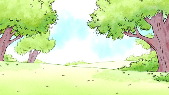
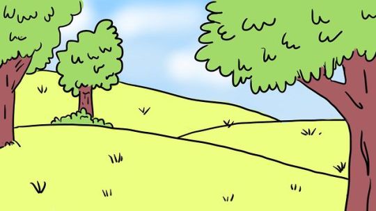
Having completed this simple iteration for submission, I could then turn my attention to developing the piece further: this began through creating a background illustration. For this, I was looking at background art from hit animated series Regular Show for inspiration regarding colours and composition. A series featuring two park groundskeepers, the show features an extensive amount of forest and park backgrounds, and I felt this was a perfect reference source for my sequence.
The final illustration matches the character’s line quality: something that I put a focus on whilst creating it with the pen brush in TVPaint. Its simple design matches the animation style too, with simple block colours.
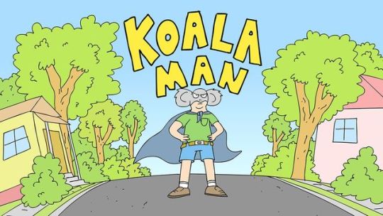
Looking back, I feel this was largely inspired by the online animated series Koala Man, created by Michael Cusack. I feel that this was actually a large influence on my work, something I haven’t mentioned until now. The use of bold, warm colours and a rough, naive art style is something characteristic of Cusack’s work, an artist that I always seem to find myself returning to. Like the lip sync sequences from Regular Show, it’s that idea of limited animation and telling stories with little actual movement. This idea of an economical approach to animation - with a focus on story over fluid movement - is quite a revolutionary concept for me, and I wanted to explore the idea with this assignment.
With this, I wanted to develop my lip sync sequence further and explore my news broadcast idea in After Effects. Inspired by my own initial ideas for this project, I wanted to explore the use of virtual cameras within After Effects to simulate the hand-held aesthetic of a news report. Having explored the technique earlier for my Guess the Film sequence, this wasn’t too difficult and I was able to create a little shaking movement that I feel works nicely. It’s a gamble, but I feel it does add a nice sense of cartoony realism to the sequence.
News Banner My final experiment was to add an animated news banner to the sequence. At this point, my only focus was experimentation and I wasn’t worried about covering parts of the animation with a news banner: it was simply a fun development that I could explore in my own time. Having dedicated a day to complete this assignment, I was able to create an animated news banner and ticker complete with moving text.
Whilst this is ultimately a novelty, I quite liked the aesthetic and the concept itself is appealing: taking small audio bites and creating surreal news broadcast sequences based off these is an idea that I would like to explore further, and could represent an untapped mine for animation ideas. Alongside this, I wanted to try and respond to this dialogue clip in an interesting and original way. The only problem with having many students animate to the same audio clip is the risk of losing a creative identity, and ideas can easily become shared and stale.
With my sequence, I wanted to take the shot in a different way and explore the potential of an animated news interview. Having seen several of my peers’ work, it seems like this was an original idea - something which elevates the sequence, I feel.
Potential Developments Despite this, I would like to explore the use of a hand-written typeface for the news banner. As opposed to the hand-drawn nature of the animation, I can’t help but feel the news banner feels somewhat artificial and I plan to continue to explore this sequence further in my own time. Alongside this, the actual animation itself could be improved, I feel. Whilst the lip sync itself works, I would have liked to explore the potential of a fully animated face, rather than working with layers. With this, I could have the jaw and chin open up and close, as opposed to drawn on mouths moving. This would be an interesting development, and allow me to add more fluidity to the mouth movements.
Following from this, I would also want to return to my initial idea of smear frames and take the time to properly explore this idea in more depth. For this, I would need to research into the technique more and apply it to the ‘it’s a swan’ sequence as the character moves towards the camera and grabs the microphone. The actual microphone grab could also be developed upon, adding anticipation and follow through to the movement would be a good development for this piece.
A final development that I would like to explore for this lip sync sequence is the idea of the hair flopping down. This was an idea taken from my reference footage, and it’s something that I would like to return to. It instantly adds another level of quality and character, and if timed right, would add a light-hearted humour to the sequence. My only problem with this was the timing, however if it was at the end of the shot, I feel it would work nicely.
As a whole, however, I’m happy with this final lip sync sequence. I feel that the actual lip synchronisation is successful, and after having shown it to a few peers, I was happy to see that they found the sequence engaging. The added touch of the handheld camera added to that cartoony realism of a news broadcast, and the added news banner seemed to add to the entertainment value too.
Summary Through this assignment, I’ve been able to explore the idea of lip synchronisation to animation. This is a principle that I’ve never really attempted before, but it is a key industry practice. At the start of this project, I mentioned how I wanted to get a grasp of the process early on. Looking at my sequence, I feel as if I have been able to achieve this goal. From this project, I have been able to develop my understanding of lip synchronisation processes with hand-drawn animation. This was achieved primarily through actually beginning the animation process in TVPaint, but also my extensive research into the area on this blog.
With my own research, I was able to identify a series of key principles that really impacted the success of my final piece. The evidence can be found when we compare my initial response to the task and my final sequence, in which the voice actually synchronises with the animation. Taking the time to research key industry practices has actually really helped my practical work and I was able to learn concepts that I hadn’t considered before, such as the mouth not opening a certain way, and closing the mouth a couple frames after the sound has stopped to aid synchronisation.
Having completed a lip sync sequence for submission, I will continue to explore the lip sync process in 2D animation in my own time. In particular, I am interested in exploring the potential of creating a 2D character face rig in After Effects and looking at how I could create a quick lip sync animation in that software - with a focus on simple shapes and overlapping action such as hair movement, using plugins such as ‘joysticks and sliders’ and ‘rubberhose’ - industry standard practices for motion design and animation.
0 notes
Photo

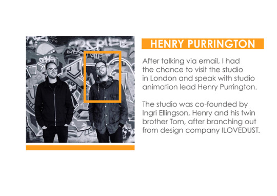
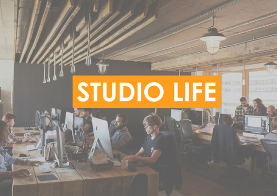
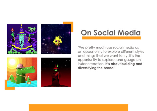
Industry Roles: Final Presentation Review
This week marked the deadline for our final presentations, in which we were to discuss and reflect on our research throughout the assignment in the form of a ten-minute presentation. As mentioned before, presentations aren’t something that I try to shy away from. Through speaking with industry professionals and my own research, I understand that they are an extremely important part of the job, and I have taken every chance I can to present my ideas in front of an audience.
This is an area that I know that I need to develop and work on further, as I’m not the loudest or most confident person in the room. Being able to speak and discuss our work with confidence is ultimately as important as being able to create said work, and that was an idea that I feel like I’ve begun to take on board with this assignment.
With this project, I was able to overlook the entire presentation and play the role of director: helping my teammates with research ideas, setting up and organizing team meetups and designing the final presentation slides. Whilst this meant more work for me, this also resulted in a visually cohesive and appealing presentation that moves beyond the expectations of the brief that everyone in the team was very proud of.
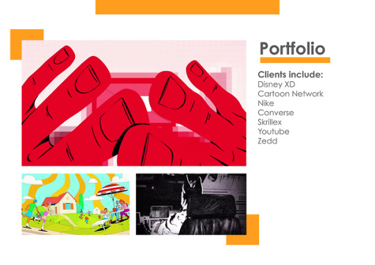
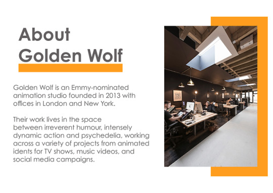
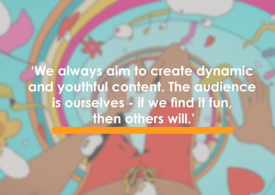
Having had actual industry experience with graphic design, I was able to overlook the design aspect of this project and developed a consistent, appealing and considered visual language of our presentation, working on the orange and grey color theme of Golden Wolf themselves. Design and appealing composition is something that I’m genuinely interested in outside of animation, and I wanted to take this opportunity to develop a professional presentation beyond the requirements of the brief.
Having made a few in the past, I understand that the focus for visual aids should be purely visual: giving the audience something to watch and appreciate whilst I discuss the topic in more depth. It’s important not to have extensive amounts of writing on each slide, and instead, focus on visual imagery and quotes that work to support our visual discussions. Whilst I was able to do this with my own portion of the presentation, I feel as if some of my other teammates’ slides do suffer from this. This was something due to the research I was given to put on each slide, though in retrospect I should have simply taken liberties and broken down their research into more digestible points and quotes for the purpose of the presentation.
Finally, for this presentation, I wanted to prioritize my primary research finding over my own secondary analysis based on existing sources found online. I felt that this was more exciting and engaging to the audience, to bring something entirely new to the table.
In comparison to my peers, I feel as if I was able to give a concise, informational presentation with confidence. My plan was to stick to the three-minute time limit as a way to ensure engagement with my audience and in response to the timed nature of the briefing itself. Something that is crucial to a successful presentation is being able to present information in an interesting and efficient way: the minute the audience is bored by what you are saying, you’ve lost. My focus was to have bold slides with appealing visuals and a minimal design language, which simply act as visuals for my verbal presentation.
Something I was trying to avoid was simply reading off the screen, or my cue cards - which I completely abandoned half way through. We were reminded that reading off a script isn’t a professional practice, and we should try to have a discussion with the audience rather than read to them. This ensured that my presentation was short and sweet, and having introduced the group and our topic before delving into the information, I feel as if we managed to give an engaging presentation.
Despite this, if I were to give another team presentation I would want to rehearse more beforehand, working out timings and orders in a smoother manner. Whilst I feel it like it wasn’t a large problem here, rehearsing as a group beforehand is always a good presentation practice and represents something to improve upon next time. Alongside this, I need to have the confidence to make sure each of my teammates has given me their research ahead of time, allowing me enough time to work on them properly.
Looking back, though, I feel as if we were able to deliver a successful presentation. Our team didn’t go drastically over the time limit, and everyone held their own. The audience seemed to be interested throughout, and the presentation garnered a positive reaction from our tutors too. Having put that extra effort into the construction and design of the slides definitely helped our presentation, and I’m happy with our work on this assignment as a whole.
Summary With this project, I’ve been able to develop my understanding of the creative and animation industries to a new level. Ultimately, we are on this course to develop key skills and industry practices. Clients, employers, and studios are not concerned with our degree level or reflective journals: only our practical portfolio. Through my own research into Golden Wolf and having the opportunity to actually go to the studio and speak to the co-founder about the animation industry, I was able to develop my understanding of the industry to a much more mature level. It’s never too early to begin considering where this course will take us, and going to Golden Wolf cemented my aspirations to work in motion design and an animation studio. From this, I have begun to identify my own interests within animation and moving forward with the course, I will begin solely focusing on this.
Alongside my research into Golden Wolf, I reached out and spoke to motion designer Ben Marriot. I’ve spoken about his work already on this blog and wanted to discuss with him the role of social media in his work. This was a focus of my own presentation exploring Golden Wolf, and I’ve found that reaching out to creative professionals and beginning a conversation is an extremely important process to beginning my journey into the animation industry.
As a result, throughout the summer and my time on my course, I will continue to keep contacting animators and industry professionals to continue to build my understanding of the industry and professional practices.
0 notes
Photo




Overview As opposed to the research-heavy focus of last week, my final Easter week was spent largely on my practical assignments. Having completed most of the research exploration for all of my projects, I am now at the stage where I can solely focus on the practical tasks and was able to make a good start on my lip sync sequence, alongside beginning work on designing the slides for our Media Roles presentation next week.
Fantastical Creatures This week, I was able to begin the modelling process in ZBrush and developed a final sculpt based on my refined design sheets of a four-legged insect creature. In comparison to the box-modelling techniques of Maya, I found this process to be so much more intuitive and engaging, as I could build my model quickly using Z-Spheres and experimenting with a virtual clay approach using the ‘Dynamesh’ tools within the program. Having downloaded a trial for my computer, I was able to do this entirely from my desk and was able to produce an engaging final sculpt, I feel.
This process was not pain-free, however. Simply getting to grips with the software was a time-consuming process, achieving success only through iterative development and producing dozens of throwaway 3D models in the process of reaching this final piece. Searching for online tutorials and reading through several books on the software and creature modelling has been an immense help, as this was a purely independent endeavor outside of Maya and the sculpting tools within Mudbox.
Looking at the final model, however, I feel it was worth the time and effort. Having shown the 3D model to my peers, they all found the design to be a striking creature with an intimidating, ‘creepy’ spider-like silhouette. Something I wanted to put a focus on during this process was the idea of a stylised creature sculpt. Inspired by the work of creature modeller and sculptor Paul Braddock, I wanted my final 3D model to have a clear stylised aesthetic instead of looking realistic, and immensely detailed. With the simplified shapes and overall smoothness of the model, I feel like I was able to achieve this goal with relative success.
Next week, I will begin to explore the potential of painting my model within the software as an alternative to the time-consuming retopology and UV mapping process.
Showreel This week, I placed a heavy focus on my other assignments leading up to submission. As this project is essentially a collection of all my work, I want to continue working on my other practical assignments moving forward and will return to this project closer to submission.
Lip Sync This week, I was able to begin work on my lip sync animated sequence. The first step in this process was working out the main body movements, which will effectively drive the entire performance. For this task, I was working with layers within TVPaint, which worked to allow held keyframes of different body parts, but also to ease the workload. This limited approach to animation was inspired by own observations from animated shows such as Adventure Time and Regular Show, which feature only the mouth and eyes moving on every frame, with the body and limbs moving only every ten frames or so, when the dialogue or scene calls for it.
In comparison to my initial attempt, I had taken the chance to change the character design somewhat and explore a more simple approach. This was informed not only by my research but as a way to allow for smoother head turns as I was basing my character’s head on a simple cylinder shape. This made drawing the character in multiple angles much more easy to grasp, and my peers felt this new design was more appealing.
Alongside the rough animation, I was also able to develop a quick mouth sheet and begin the lip sync process - something that I found relatively simple after researching extensively about the process and key principles of lip synchronization with animation. Whilst this mouth chart was useful, however, it ultimately felt a little rushed and I plan to go back and produce a more refined mouth chart with the same shapes, but with more of a consistent and equal line quality, something more in line with my own research into Adventure Time and Regular Show.
As a whole, however, I’m happy with the animated performance I was able to create here. Given the restrictive nature of the brief, the focus of the shot has to be on the facial performance and body movements. Looking back at my animation, I feel as if it is a successful lip sync sequence. The mouth movements synchronize with the dialogue nicely, and the character performance moves past a simple talking head. After the interviewer asks ‘anything else’, there is a visible change of expression that I feel really works with the timing of the sequence. This change of emotion is simply conveyed through the use of eye movement and a subtle head turn, as the character takes in the ridiculous nature of the question.
Next week, my main aim will be to add in any necessary in-betweens to make the body movements much more fluid and complete the colouring process ready for experimentation in After Effects.
0 notes
Photo






Fantastical Creatures: Sculpting in ZBrush
Having developed a final creature design, my focus this week was to begin the modelling process in ZBrush and produce a final sculpt. In comparison to the box-modelling techniques of Maya, I found this process to be so much more intuitive and engaging, as I could build my model quickly using ZSpheres and begin experimenting with a virtual clay approach using the ‘dynamism’ tools within the program. Having downloaded a trial for my computer, I was able to do this entirely from my desk. This allowed me to take my time with the sculpting process, which was highly iterative.
Modelling with ZSpheres My main focus for this independent session was to take the basic shapes and silhouette from my model sheets and develop a stylised 3D sculpt based off these sketches. My approach to sculpting began with the use of ZSpheres. This is the recommended process for artists new to the software, and I was able to create the model through the composition of virtual spheres. Using the edit tool, I could then move, shape, rotate and manipulate these spheres to build up my model.
In comparison to the box modelling techniques of Maya, I found this process to be more intuitive and responsive. With this, I was able to develop a series of quick creature sculpts exploring a few different approaches to the design, and using the move tool I could pan and move my models around the three-dimensional space. This allowed me to see how the creature was developing in the round, and subsequently develop my own understanding of 3D shapes.
Virtual Clay Alongside this, I wanted to take the time to explore the use of virtual clay within ZBrush. Whilst my final model was made primarily through the use of ZSpheres, and then turning this base model into a ‘dynamesh’ for further sculpting - a popular method for creature modellers is to start with a ball of virtual clay within ZBrush. This behaves just like the real thing, as I could push, pull, squash and manipulate the digital clay. This process is typically used for high-resolution creature models and statues, not often used in the production of the actual rigged model for animation.
This was an alternative technique and resulting in some interesting quick sculpts. 3D modelling in this way has been a very enjoyable experience, and it’s actually something that I would like to continue to explore for my own personal interests outside of this course. The ability to quickly build up a detailed creature is something that I cannot do successfully with physical clay, and having the opportunity to explore a similar process in a virtual workspace has a real appeal to me.
The modelling process itself was rather straight-forward: using ZSpheres, I built up the basic shape of model, and used the move, scale and rotate tools to begin basic sculpting work into these base models. Using the inflate and deflate tool, I could make my model more or less bulky, and using the preview option allowed me to see what the creature looked like as a physical clay model. The ZSphere modelling process is similar to a skeleton - it’s the basic shapes that make up the model, and it’s only when we hit ‘preview’ do we see what the model actually looks like.
Initially, this was actually quite challenging: adding a round sphere to the model did not always result in a rounded final result: often times, the polygons would actually fold in on themselves and it would look deflated. ZSpheres work as a basic starting point, and then we need to work into the models using actual sculpting brushes and tools to produce a finished piece.
Alongside this, simply getting to grips with the software was a time-consuming process: only achieving success through iterative development and producing dozens of throwaway 3D models in the process of reaching this final piece. Searching for online tutorials and reading through several books on the program and creature modelling has been an immense help. Sculpting with ZBrush is a purely independent endeavour outside of Maya and the sculpting tools within Mudbox.
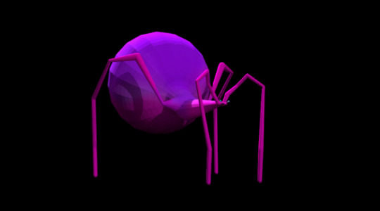
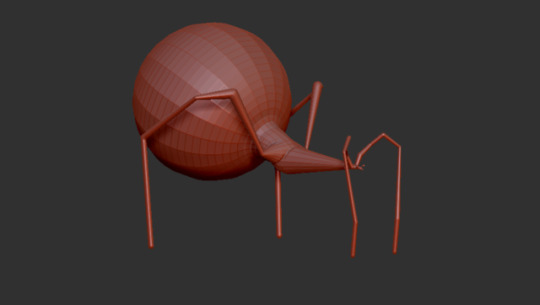
After I was happy with the basic ZSphere model, my next move was to begin smoothing the model down using the smooth brush, and make any minor adjustments necessary back in the Sphere view. Looking at the normal view model, there’s a pleasing low poly stylisation do the model: as the creature’s abdomen is simply a large ZSphere, there is a pleasing geometric quality to the texture. The spindly legs are also thick enough to be visually appealing whilst also remaining reminiscent of a spider.
The Final Model Something that was interesting however, was the model’s loss of the second bulbous ball next to the head. This was something described in my model sheets. Despite this, I found myself actually quite liking this new sharp torso as it provided an appealing visual contrast and worked to instantly give the model a more aggressive and insect-like silhouette.
With this, I have been able to complete the basic sculpting and modelling process of my creature. Whilst not created in Maya, my tutor reminded me that we need to respond to our project briefs in our own way and complete our projects to a standard that we are happy with as creatives ourselves. For me, this meant sculpting it using industry standard software ZBrush.
The final 3D model is an accurate replication of my original idea, and a successful model as a whole. Having shown it to a few of my peers, they all enjoyed the ‘creepy’ and ‘striking’ design and silhouette, with my use of dynamic shapes and minimal details to embrace the visual language associated with stylised creature sculpting.
Whilst the creature model here is an engaging sculpt that I’m ready to take forward, I would have liked to explore this same model in Maya. Whilst I find the modelling process to be difficult in Maya, I feel like having a visual comparison would be an interesting practical development and would develop my own skills within 3D modelling. Despite this, I already have an extensive amount of work to complete juggling all of our projects ready for submission and this will have to be something I explore independently, in my own time.
Summary My original intention for this session was to develop a final 3D model of my creature with a clear stylised aesthetic instead of looking realistic and immensely detailed. With the simplified shapes and overall smoothness of the model, I feel like I was able to achieve this goal with relative success.
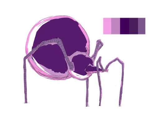
Next week, I will begin to explore the potential of painting my model within the software as an alternative to the time-consuming retopology and UV mapping process. Whilst this was not my initial idea, after speaking with my tutor I realized I should place a focus on exploring and engaging with the creature modelling process as a whole, and follow my own creative direction to reach my desired outcome. For me, this means exploring polypainting within ZBrush to achieve a finished 3D model ready for rendering in Maya. For this, I will be moving forward with my purple and pink colour exploration design described in my model sheet, to evoke the idea of a microorganism in the audience.
0 notes
Photo
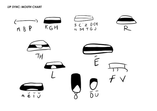
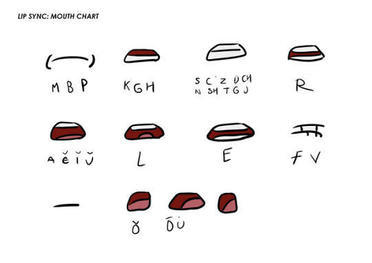


Lip Sync: Mouth Chart & Line Animation Review
This week, I was able to start work on my lip sync animated sequence. The first step in this process was working out the main body movements, which will drive the entire performance. Whilst we are asked to simply animate the head and shoulders, it is crucial to have the character’s body move around whilst they talk in order to give an engaging performance. At this stage, my focus was exploring different ideas on how to add small character details such as the hair falling down, as a way to add a sense of character and life to the animation beyond just a talking head.
Rough Animation As opposed to my initial response to this task, for this rough animation I was working with a series of different layers as a way to not only ease the workload but also allow my animation to have held keyframes at important parts in the dialogue. Inspired by my own research into animated shows such as Adventure Time and Regular Show, I wanted to exercise some creative restraint for this sequence and not have the character move for every frame. Often times, I found that only the eyes and mouth would move quickly, whilst the body would only move every ten frames or so, when the dialogue called for it.
For the actual body movements and facial animation, I was working from my own video reference and observing when I would glance over to the side of the screen, shrug my shoulders or squint my eyes when delivering the lines. This hopefully adds an authenticity to the performance, though I feel as if adding movement of the arms and specifically the hands would have been so much more effective with this sequence. Something from my own personal research into lip sync animation and the industry as a whole is the audience’s visual focus on key areas when watching a lip sync sequence: the face and the hands. These are the key areas that we as an audience gravitate to in order to read the feelings of a performance.
In comparison to my initial attempt, I had taken the chance to change the character design somewhat and explore a more simple approach. This was informed not only by my research but as a way to allow for smoother head turns as I was basing my character’s head on a simple cylinder shape. This made drawing the character in multiple angles much more easy to grasp, and my peers felt this new design was more appealing.
Working with Layers Working in different layers meant that I could purely work on one body part at a time, and not worry about having to redraw each and every frame. This saved an extensive amount of time, and allowed me to work quickly and efficiently. This isn’t really a process I’ve had the opportunity to work with before in detail, but I’ve found that digital 2D animation is something that really interests me as an animation specialism to explore further. Something that has helped extensively throughout this process is simply drawing face construction guidelines, which helped to keep my drawings on-model throughout the sequence.
Mouth Chart Review Having worked on the rough animation, my next step was to begin developing a mouth chart. Looking at both my own video reference and a handful of industry examples, I was able to develop a quick set of mouths showing the full range of mouths used in the sequence. For this, I wanted to pursue a fairly simple approach to the mouths following my own stylised design choices so far, with a bold line quality. Whilst fairly quick in its execution, this mouth chart represented an incredibly useful tool in the lip sync process. As opposed to the drag and drop process of building a custom brush with saved mouth shapes, my own plan for this sequence was to draw each mouth by hand, as the character doesn’t stay standing still for extended periods of time. Whilst this is a little more time consuming, I felt it was much more natural and intuitive rather than dropping pre-drawn mouths onto the character.
However, whilst this initial mouth chart was useful, it ultimately feels a little rushed. With this, I went back and produced a more refined mouth chart with the same shapes, but more of a consistent and equal line quality, something more in line with my own research into Adventure Time and Regular Show. These all have an equal line stroke which helps give the illustrations a clean sense of appeal, whilst still having that hand-drawn quality. Line quality is something that I will continue to explore further, and is an area that I really want to work on moving forward with my studies on this course as a whole.
The Lip Sync Process Having produced a final mouth chart, I then began work on the actual lip sync process: analysing the dialogue, identifying which mouth shapes to use based on the phonetic sounds being heard (as opposed to the words being said) and began drawing the mouths on a separate layer. With my independent research into the process, I actually found this to be quite a simple process and bringing the mouth shapes in a frame or so before the dialogue began allowed the actual lip synchronisation to be much more successful in comparison to my initial attempt.
Isolating just this layer allowed me to work purely on the mouth shapes and getting them to be consistent throughout the sequence, something that I’m actually quite happy with. The jaw does not open in a way that is anatomically impossible, and the synchronisation with the audio is actually somewhat successful. In comparison to my initial straight-ahead attempt, this represents the leap in my understanding of the lip sync process.
Finally, I was able to work back into my animated sequence and create a single layer with more refined, smooth line work using the pen brush and smoothing tool within TVPaint. The smoothing tool was incredibly helpful to this process, allowing me to create a line of equal weight no matter how much pressure I applied to the tablet. Whilst the line quality is still not perfect, this is a great improvement upon my initial attempts and with this, next week I will begin the colouring process.
Something that I will continue to work on, however, is the application of the basic principles to this animated sequence. In particular, I want to make the head swing at the end much more fluid. At the moment, the movement as the character steps forward to grab the microphone feels somewhat stilted. In order to develop upon this, I will be adding several in-between frames to add an arcing motion to the movement. Alongside this, I would also like to explore the potential of adding followthrough motion with hair, however this remains a potential independent development if I get the time.
Summary As a whole, however, I’m happy with the animated performance I was able to create here. Given the restrictive nature of the brief, the focus of the shot has to be on the facial performance and body movements. Looking back at my animation, I feel as if it is a successful lip sync sequence. The mouth movements synchronise with the dialogue nicely, and the character performance moves past a simple talking head. After the interviewer asks ‘anything else’, there is a visible change of expression that I feel really works with the timing of the sequence. This change of emotion is simply conveyed through the use of eye movement and a subtle head turn, as the character takes in the ridiculous nature of the question.
Additionally to my application of the principles, I hope to be able to develop this sequence further in After Effects after being fully coloured. My plan is to explore the use of a virtual camera in this sequence to immerse the viewer further into the idea that is an interview, with the camera moving around subtly whilst the character talks. This would be an independent development, additionally to the sequence for submission.
Next week, my main aim will be to add in any necessary in-betweens to make the body movements much more fluid, and complete the colouring process ready for experimentation in After Effects.
1 note
·
View note
Photo
Week 1 - Overview My first week over the Easter break represented a chance to step away from the work. Having taken this week as an opportunity to take a break from course work, I was able to recharge and refill my own creative bank account of ideas. Whilst this was a refreshing break away, I returned the next week eager to get back to work.
Week 2 - Overview This week was spent largely on gathering research for my assignments: having spoken with co-founder Henry Purrington from Golden Wolf Studios, I was able to have a tour of the studio and speak to Henry extensively about their own practice and the animation industry as a whole. Alongside this, I took the time to research into the principles of a successful animation showreel and analysed several examples of industry showreels as a learning exercise.
Fantastical Creatures This week, I placed a large focus on my other assignments and as a result, I was unable to make significant progress with modelling my creature design in ZBrush. Despite this, I was able to complete my maquette based on an initial idea exploration and continued the sculpting process, adding textural detail that brought the creature to life.
My final maquette is a successful creature model, I feel. As advised by our tutors, I placed a focus on developing an exciting pose that suggests movement through the placement of the arms and legs, something which demonstrates that this creature moves on all fours. Looking back at my original digital illustration, I feel it is a successful adaption of my initial ideas and is now ready for the baking process.
The main challenges faced here was simply how to create the different textures found on the creature’s surface. My intention for this creature was to have a rough, scratched skin and this was only achieved through extensive experimentation with a range of materials. Whilst I’m happy with the maquette made here, I would have also liked to develop a physical 3D model of my final creature design, had I been given the time. For this project, I placed a great deal of focus on the creature design process itself as this was an area that I’m personally interested in, and something that I felt was lacking in my previous submission.
Next week, I hope to begin modelling my final creature design in ZBrush, using my four-legged spider creature illustration as a visual reference.
Showreel This week, I was able to develop my own independent research into showreel creation: establishing a series of key principles for a successful showreel, and analysing several examples of both inspiring (and less inspiring) showreels on my blog. This was important as a way to evidence my own exploration into the subject area, and to get a feel for the type of thing that I will be trying to create myself. With this, I will be taking these principles described here and applying this new understanding to my own practice.
Ultimately, I felt the main takeaway from my research would be to keep the duration short and sweet, and to treat the showreel as its own project. For this assignment, I hope to have the time to develop my own animated ident or title card that begins to explore my own personal branding as a creative professional. With this extensive research here, I feel as if I’m ready to begin work on my final showreel over the next few weeks. As this will be a collection of my work across the other briefs, I will be placing a focus on my other practical assignments moving forward and will return to this project closer to submission.
Lip Sync This week, I heavily prioritised other assignments and as a result, did not make significant progress on this project. Despite this, I will be beginning the lip sync animation process next week. Having purchased TVPaint for my own computer, I will now be able to work on this project independently. Next week, I plan on developing a series of mouth shapes and will begin the animation process.
0 notes
Video
vimeo
Mystery Box: Final Spline Review
This week, I wanted to revisit my Mystery Box animated sequence and continue the process: this time, changing my sequence from a stepped animation to a spline animation. This allows Maya to interpolate between my established keyframes, creating a smooth animation. Whilst I found posing the rigged character rather simple and engaging, this process proved to be more challenging than I had previously expected.
The process was relatively easy, selecting all of the frames in the timeline using the graph editor, and hitting ‘spline’. The problem, then, came from the sheer amount of keyframes I had created on the rigged puppet and the bizarre interpolation movements from Maya. This was a problem that I had showed my tutors earlier on, and we spoke about how adding keyframes would solve the problem. The main issue was that Maya wouldn’t interpolate between my key poses properly, meaning that limbs and arms moved in bizarre directions. This is something native to the program, and not my own doing - as a result, I found it rather challenging to salvage the project.


Despite this, I persevered and gave my best attempt to complete the animation. With this, I worked heavily with the graph editor, adjusting curves and moving entire sets of keyframes around to ‘fix’ the animation.
The final sequence, as presented here, looks clunky, I feel. This was an extensive process of editing the animation with the graph editor, and I think it shows. Using the editor was something we briefly spoke about in class, and I was essentially ‘learning as I went’, experimenting and trying new things with varying results. It was actually quite a taxing process: having never really used the graph editor before in my own animations, I was suddenly thrown in the deep end and tried to salvage the animation as best as I could.
Due to my heavily keyframed step animation, Maya was unable to spline the animation properly and instead of transitioning between poses smoothly, resulted in waving and jolting body parts and limbs. The developed sequence, however, is much more successful than my first iteration and does represent my own challenges and solutions with Maya. It’s not perfect by any means, but there has been a noticeable improvement in the animation that I am happy with.
Despite the problems with the final sequence, it’s important to understand and appreciate the value in this exercise, and what it represents as a learning opportunity for me. Something that we are being kept reminded to do, especially as first years, is simply ‘try everything’. To keep an open mind, and experiment and challenge ourselves with new processes and techniques. The focus should always be on learning the process, rather than worrying about a refined, professional final outcome. Whilst I always place a focus on refining a final piece for each assignment, I feel like this project holds more value as a learning exercise.
Firstly, looking back at my Mystery Box sequence, I can see that it is too ambitious for my current skillset. This project represents my first real foray into CG animation: it’s a complex set of new principles, tools, and ideas to get my head around, and I need to recognize that the successful animations of my peers are a result of personal experience, simply animating within Maya or a similar program.
The sequence lacks any sense of weight and effort, and the exaggerated cartoon-style creep up to the box lacks any exaggeration due to the placement of the keyframes. My main area of improvement would be to simply keep challenging myself to learn Maya, to attempt the sequence again and develop my skills within CG animation through an iterative process. Simply starting from scratch was an idea that I’ve already practiced during this assignment, and I’ve found it to be an effective way of learning a skill quickly. This sequence is definitely something that I want to develop upon in my own time.
Particularly, the first part of the sequence, where the character is lunging and playing ‘peek-a-boo’ is the most successful. In comparison to my reference footage and animatic, this really works and the timing in this part works to convey the sense of enthusiastic play between the father and son. My plan is to render this short sequence to place in my First Year showreel, as this piece of animation alone does represent a successful shot.
There’s a steep learning curve within CG animation, and it’s something that I don’t think I fully appreciated at first. My plan was to produce an exciting animation, and whilst the stepping and blocking process of CG came quite natural to me, jumping into the actual animation and splining the sequence proved to be surprisingly difficult.
As it stands, this is my Mystery Box sequence. Although it isn’t successful, rendered or polished, it does represent my exploration and experimentation within CG animation and a new technique. With several other projects needed to be completed, my focus will be on completing all of my other assignments for submission. This was an entertaining project, and although it hasn’t resulted in a successful final outcome, I have produced an extensive body of work for this assignment and engaged with the process of CG animation.
As a whole, I do find CG animation to be an interesting and fun technique to explore further, but I need to put a focus on my other assignments first. If I do have time, I would like to take the opportunity to simply have another attempt at this Mystery Box task and start completely from scratch, using the same lighting set up and camera angle.
0 notes
Video
vimeo
Showreel Analysis: Emanuele Colombo
The final showreel that I will be discussing is by freelance motion designer Emanuele Colombo. Since starting his career eight years ago, Colombo has gone on to work for some high-profile clients such as MTV, Google, and Discovery Channel. The designer is reluctant to do any actual drawing, and as such, his portfolio explores characters made from vector shapes and textures made in Adobe packages. The focus is always on appealing motion with considered design, something shown through his 2019 reel.
At just under a minute long, Colombo’s reel meets the requirements of the ideal reel length and has a pace to suit. The audience doesn’t feel bored during any of the sequences: there’s enough variety in style that it doesn’t feel stagnated, and there are enough clips to represent a considerable body of work.
Much like Yino Huan, Colombo has dedicated some time to produce his ‘greatest hits’, as the reel opens up with a striking pink and purple animated sequence. It’s a visually appealing shot and an original approach to a title card. The reel doesn’t linger on the name either, we only get three seconds of the title card on screen before the music hits and we dive into a collection of the designer’s best work. The use of this custom title card, created purely for the purpose of this showreel, communicates the artist’s professionalism, but also his love for the craft - something key to being commissioned for any creative job.
Taken at face value, the audience is shown a series of visually exciting motion design sequences that work in tandem with the electronic amalgamation soundtrack with a clear understanding of appealing design and animation. The reel opens up with a striking and original approach to a name credit and then opens with some of the designer’s arguably most exciting and successful work. However, this wasn’t an idea that I was thinking whilst watching it: there doesn’t seem to be a weak piece on show here, something characteristic of a successful showreel.
The idea that we have to put our best work first is a key principle in showreel creation, but the audience shouldn’t be able to immediately notice this. A good, professional showreel will have strong work all the way through - and place the most exciting pieces at the beginning and end of the reel. Interestingly, I actually consider it to be a good sign if the audience cannot instantly tell which is the best piece; it suggests that all of the work shown is exciting, and in which case, they have stayed around to see the entire reel.
Something that I felt actually hindered the reel, however, was the music choice. At first, I feel the retrospective glitch-inspired electronic soundtrack worked nicely with the animations. This was only until the reel was interjected with soundbites from a live-action Disney film, which felt bizarrely out of place for the sequences selected for this reel. Instead of working to support the animations, I actually felt it overshadowed some of the more powerful, dark animated sequences such as the angry character (which, after a bit of research, was made to bring awareness to cyberbullying) with the glitchy audio bites and overly positive, warm atmosphere. It softens the work, and doesn’t blend in an overly successful way, I felt.
Despite this, Colombo’s reel is still a success. The final transition from animation to ending title card was particularly interesting, I felt. Instead of simply cutting to white, the previous animation moves downwards offscreen as the minimalist title card drops down: his website address. It’s such a simple idea, but the actual movement is executed with anticipation and subtle use of easing to soften the motion. It’s an appealing approach to cut to an end title card, something that I hadn’t thought of before analyzing this example.
Analysis Summary Having analysed several examples of showreels here, I’ve been able to discuss a range of examples that I personally find to be inspiring, and some less so. It’s important to do this as a way to evidence my own exploration into showreel creation, and to get a feel for the type of thing that I will be trying to create myself. For this project, we are asked to produce a showreel including some of our best work from our first year on the course, and I will be taking these principles described here and applying this new understanding to my own practice.
The main takeaway from this research would be to treat the showreel as it’s own project: develop animated idents that explore my own personal branding as a creative professional and to remember to ‘keep it short’. This is the number one principle for showreel creation, and it was interesting to see how many examples didn’t follow this rule.
Moving forward, I will be placing a focus on completing my other assignments ready for submission but also developing a personal mood board for my showreel, taking short clips, colour pallettes and design ideas and arranging them into a single slide to return to throughout the assignment. This was an idea inspired by my conversation with Golden Wolf Studios animator Henry Purrington and will represent my first practical exploration into creating my final showreel.
0 notes
Video
Showreel Analysis: Golden Wolf Studios
With this example from Golden Wolf, the studio selected some of their best social media posts and collated them into a reel. Without the restrictions of a brief or clients, the studio was able to produce a series of short animations exploring a variety of different styles, concepts and ideas and present them all here, in a fast-paced, exciting showreel. With this example, I actually got the opportunity to discuss the studio’s intentions for the reel with animation lead Henry Purrington, who actually assembled the reel.
Firstly, with a run-time just under a minute, this represents a successful example of an animation reel. With a short run time, Golden Wolf has chosen to present only their best sequences. Having a short run time goes a long way in making sure the viewer actually stays around for the entire reel, rather than losing interest halfway through. There’s not a weak shot in this entire reel, something achieved through collating a variety of their best work, with varying styles and experimental aesthetics.
‘This is an example of a showreel we did, just a collection of our pieces for social media. It’s just a track that we all liked and felt represented our own work nicely. Think it gives the reel a flow, and we tried to time it so that the animations synchronize with the track and compliment each other, such as the head bobbing crocodile and explosion of fire when the guy starts rapping’. - Showreel creator Henry Purrington
Like Marriot’s, the reel is driven by the soundtrack: an intense electronic, dance and grime track that’s sole purpose is to hype up the audience. Golden Wolf makes excellent use of the house track, with animations that fit the cool, effortless atmosphere the song creates. Little touches such as the afore-mentioned head bobbing crocodile really emphasize this, as the reel presents a more minimal approach to showreel creation. As an established studio, this was simply a collection of their social media work and a fun post-production exercise.
The most important idea to take away from this showreel would be the effective synchronization between the loud house track, and Golden Wolf’s animation. An animation production studio that prides themselves on being exciting, ‘dynamic and youthful’, the blend of music and animation here works to further communicate these ideas to the audience. Just from this reel alone, viewers understand that this studio is contemporary, exciting and experimental: with a clear understanding of design principles and a keen eye for trends. Where possible, I need to look at moments within the track that I can support with my own animations to create an exciting sense of flow for the viewer.
All of the sequences are appealing, whilst representing vastly different visual styles and animation techniques. The reel works to demonstrate the studio’s ‘fun’ and experimental nature, whilst subtly reminding us that this is all just personal work, with no client or brief.
From this, the audience gets a clear understanding of Golden Wolf’s brand: dynamic, youthful and exciting. There’s not a weak piece or moment of downtime in the entire reel: from the start, you are hooked. It’s an impressive example of a motion design showreel, and represents the type of work that I want to create myself.
0 notes