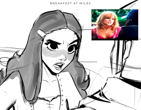
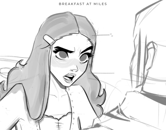
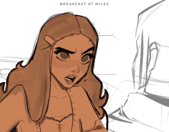
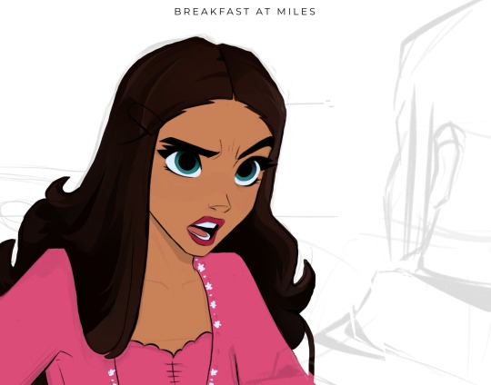
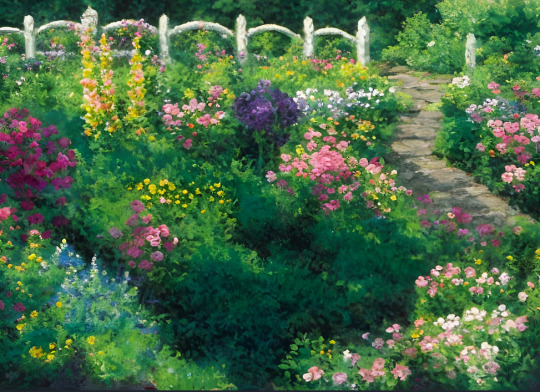
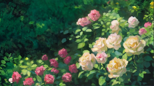
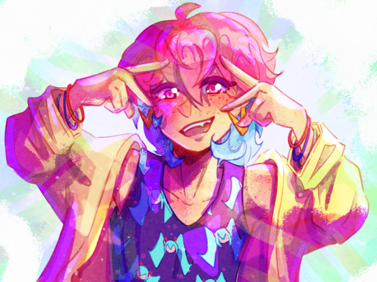
#the rendering looks so different from the flats but I like both a lot
Explore tagged Tumblr posts
Visit Tumblr Blog
Explore Tumblr blogs with no restrictions, modern design and the best experience.
Last Seen Tumblr Blogs


Fun Fact
In Q3 of 2020, 31% of US users access the Tumblr app daily.
Text


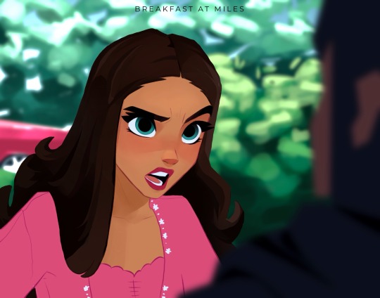
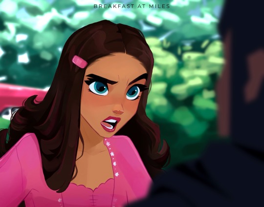
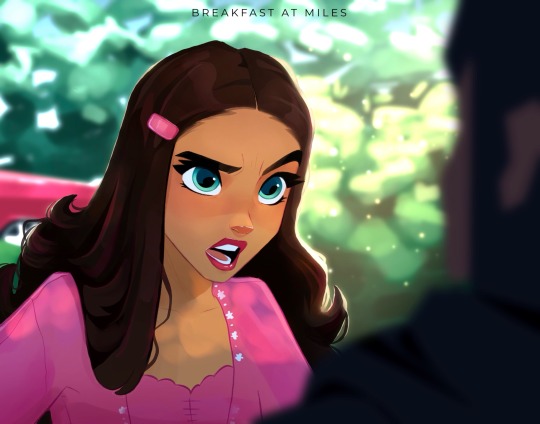
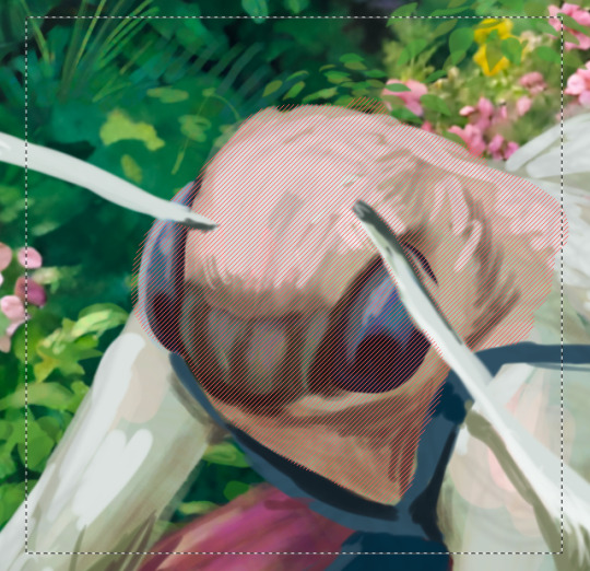
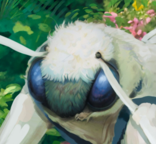
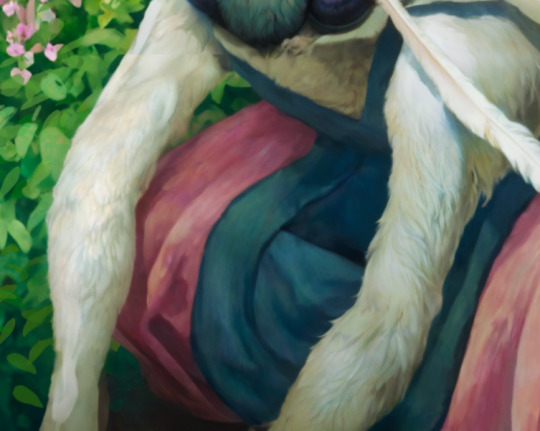
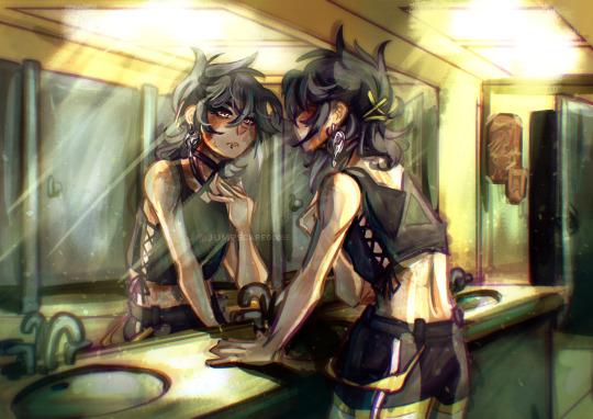
Birthday gift for my super cool sister @concreteclouds of her equally cool water demon Eileen! <3
#original character#mermaid#demon#siren#the rendering looks so different from the flats but I like both a lot#she's actually a ball jointed doll in real life#she's super cool and pretty you guys don't even know#plz rb I worked hard on this one lol
21 notes
·
View notes
Text
Okay, guys, after reading a post by @centrally-unplanned I just took that ACX "AI Turing Test" that Scott Alexander did, and I am screaming, as the kids used to say.
You guys are way, way overthinking this.
I thought I would do better than average, and I guess I did; excluding three pictures I had seen before, I got 31/46 correct.
Not great if you're taking the SAT, but I feel like if I could call a roulette spin correctly 2 times out of 3 I could clean up in Vegas.
So, what is the secret of my amazing, D+ performance?
You have to look at the use of color and composition as tools to draw the eye to points of interest.
AI is really bad at this, when left to its own devices.
For example, here:

Part of the reason to suspect that this is AI is the "AI house style" and the bad hands that I literally only noticed right this exact second as I was typing this sentence. Even if the hands were rendered correctly, I would still clock this as AI.
The focal point of this piece ought to be the face of the woman and the little dragon she is looking at (Just noticed the dragon's wings don't match up either), but take off your glasses or squint at this for a second:
Your eye is being drawn by the bright gold sparkles on the lower right side of the piece. That particular bright gold is only in that spot on the image, but there's no reason to look there, it's just an upper arm and an elbow. The bright light source highlighting the woman's horn separates it out as a point of interest.
Meanwhile, the weird aurora streaming out of the woman's face on the left side means that it is blending in with the background.
In other words, the way the image is composed, and the subject matter suggest that your eye should be drawn here:

But the use of color suggests that you should look here:

That's a senseless place to draw the eye towards! It would be a really weird mistake for a human to make! In fact, I think there's a strong argument that the really close cropped picture of the face of the character is a strong improvement. It's still not a particularly good composition, but at least the color contrast now draws the eye to the proper points.
In fact, I would say that a good reason for my performance not being even better was this alarming statement at the start of the test:
I've tried to crop some pictures of both types into unusual shapes, so it won't be as easy as "everything that's in DALL-E's default aspect ratio is AI".
Uh...
So how about this one:
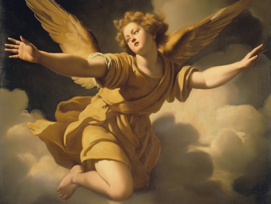
This is a lot better anatomically and in terms of the use of color and light to draw the eye towards sensible parts of the painting. The lighting makes pretty good sense in terms of coming from a particular direction and it also draws the eye to effectively to the face and the outstretched hand of the figure.
It's also a really flat and meaningless composition and subject matter that no renaissance artist would have chosen. What is this angel doing, exactly? Our eye is drawn to the face and hand, and the figure is looking off towards the left side, at, uh, what exactly?
But then I thought, "Well, maybe Scott chopped out a giant chunk of the picture, and this is just a detail from, like, the lower right eighth of some giant painting with three other figures that makes total sense"
This makes sense as a piece of a larger human made artwork, but if you tell me, "Nope, that's the whole thing and this is the original, un-cropped picture" I'd go, "Oh, AI, obviously.
All of the ones I had trouble with were AI art with good composition and use of color, and human ones with bad composition and use of color. For example, this one:

This has three solid points of interest arranged in an interesting relationship with different colors to block them out. I'd say the biggest tells are that the astronauts' feet are out of frame, which is a weird choice, and looking closely now, the landscape and smoke immediately to the right of the ship don't really make sense.
But again; I had to think, "Maybe Scott just cropped it weird and they had feet in the original picture."
Here's another problem:
StableDiffusion being bad at composition is such a known problem that there are a variety of tools which a person can use to manually block out the composition. In fact, let me try something.
I popped open Krita (Which now has a StableDiffusion plugin) and after literally dozens of generations and a couple of different models I landed on ZavyChromaXL with the following prompt:
concept art of two astronauts walking towards a spaceship on an alien planet, with a giant moon in th background, artstation, classic scifi, book cover
And this was the best I could do:

Not great, but Krita has a tool that lets you break an image into regions which each have different prompts, so I quickly blocked something out:

Each of those color blobs has a different part of the prompt, so the green region has "futuristic astronauts" the blue is the spaceship, the orange is the moon, grey is the ground and pink is the sky, which gives us:

Still way too much, so we can use Krita's adaptive patch tool and AI object removal to get:

I'm not saying it's high art, or even any good, but it's better than the stuff I was getting from a pure prompt, because a human did the composition.
But it's still so dominated by AI processes that it's fair to call it "AI Art".
Which makes me wonder how many of the AI pictures I called out as human made because one of the traits I was looking for, good composition, was in fact, actually made by a human.
183 notes
·
View notes
Text
[Click image for better quality]
I FIGURED OUT A WAY TO FUCKING MAKE THE IMAGE SMALLER FOR POSTING ON TUMBLR WITHOUT SACRIFICING THE ACTUAL QUALITY OF THE IMAGE OH MY GOD
Ok so, what I did is go into the clip studio paint file, make a new file, copy and paste the group in the original file, merge everything, get rid of the extra stuff outside of the canvas, and then make the flattened image smaller and crop the canvas. Once you have that, export it and you're done. This helps maintain the actual quality of the image and also helps shrink the file size down to something actually postable (if anyone has a better way of doing this please tell me)
[Edit]: Ok I guess posting something to Tumblr just naturally compresses the image a bit more somehow because I'm looking at it now and zooming in too much makes it a bit blurry so I'm still gonna have to futz around with image quality for future pieces oof
Artist's Note:
I'm so glad I figured out a way to do this because I like working on a big canvas so I can get as much detail in as I possibly can. Only problems are how laggy it gets while drawing lol.
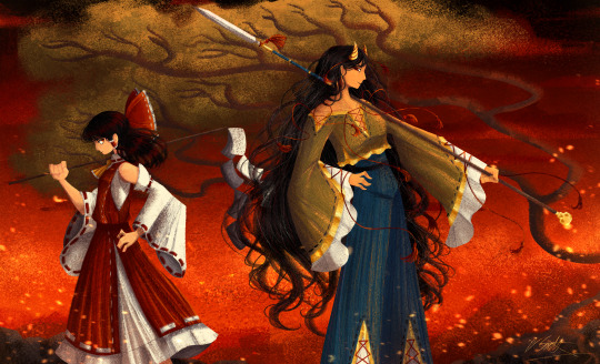
I had an idea for a drawing with Reimu and Zanmu because I really like thinking about their potential dynamic a lot. I also wanted an excuse to draw Zanmu again but in my normal rendering style because last time I drew her she was in my more sketchy style with generally flat colours so I wanted to draw her again. Speaking of, looking at the sketch for this is a jumpscare that I never enjoy seeing, like, man am I glad I didn't use those for my final piece.
Also about her spear. I was originally gonna make it like the ones she had in game, but it kinda threw off the whole piece. It was too big, too blue, and too flat, so I just went "fuck it" and gave her a different one instead. My headcanon justifying this is that the ones she uses in game are for danmaku battles whereas in any other fight she just uses a proper yari, or she still uses the yari and just makes it all glowy to power it up, maybe both lol. I pulled as much inspiration as I could from Sengoku era spears, and even put in some blue into the decorative part of the spear and also added a little skull to pay tribute to the original spear. Also, in my research I saw some art of izanami and izanagi making japan and saw that the yari izanagi has had a little decorative tassley thingy on it so I took some inspo from that and just made it one of Zanmu's tassles (Idk when that art was from or if the spear was still accurate to Sengoku period Japan but hey, probably the same reasons Eirin puts little bow ties on her arrows, it's just for personalization purposes).
I love rendering hair and clothes so much omg, while I like the super curly hair Zanmu, the longer, wavier hair suits her better for this drawing (I imagine it only does that like how Ghibli characters hair moves when they feel angry lol). I love making Zanmu's hair all messy and crazy, as well as giving her grey hairs, this woman has aged like a fine wine. Also, if the hem on the ends of her sleeves, top of her shirt, and her pants look like gold to you, that's because it is! It's fairly light so she's not collapsing under the weight, but it's gold! (I don't care how impractical it is, it's just cool). Not the undershirt though, it's made of a gold fabric. I had a cute idea with Reimu's hair to make it have a red shine to it. I also changed up Reimu's outfit so it isn't just a blob of red. I like it a lot when Reimu's skirt and outfit is segmented into different layers, so I wanted to incorporate that.
I tried to draw their hands differently as well, but IDK how noticeable that is. Also, I am super happy with how the side profiles for the two of them turned out, I used to struggle a lot with how to make the side profile of a character actually look like the character, so I'm really happy that they actually look like themselves.
Also added in the tree and rocks in the background as an homage to Zanmu's character art in Touhou 19, just because I was getting kinda stumped on what to do with the background lol.
In terms of a story idea with Reimu and Zanmu, idk why but the potential plotline of Zanmu wanting to ascend to godhood is so fascinating to me. Like, it is very possible that if she just convinced everyone she was a god (which would be very easy for her to do), she would become one in a heartbeat. Also, if she were to become a god, with her ability to return stuff to nothing, could she hypothetically get similar abilities to (Jojo Part 5 spoiler btw) GER? Like, idk about the death timeloop stuff, but the concept has been haunting me every night as I have been trying to find loopholes in GER's ability for a while now ( for no reason in particular). Back to the main topic, I imagine that she would probably tell Reimu that if she were to become a god she would take over the Hakurei shrine since the god there might as well be dead, and Reimu just says to her, "Over my dead body bitch." Like, I have no idea how to summarize their dynamic but like, it's the type of hero-villain dynamic where the phrase "We're not so different, you and I" would definitely be a phrase said during a fight. I think that if another IN style game were to release, Reimu and Zanmu would be in a team together. They could also have an interesting mentor and pupil kind of dynamic. Can you tell that Zanmu has been charging my mind rent these part few months? Like, instead of living in my head rent free, she kinda just uno reversed the whole situation and now she's the one charging me rent. What happens if I get evicted from my own brain? Actually, scratch that, I don't think I wanna know.
#touhou project#art#fanart#touhou fanart#touhou 19#touhou#東方project#zanmu nippaku#unfinished dream of all living ghost#reimu hakurei#東方
276 notes
·
View notes
Text
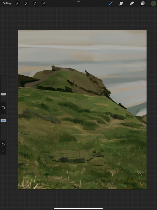
i got a few asks about my process :0 so yea i took some screenshots mid-process of my recent cliff-skk thing just for that
m gonna preface everything by saying that i did have a ref for the environment!! i avoid color dropping from the image and tracing cuz i do want to hone some digital skills. also saying i'm doing an "environment study" when i'm really just drawing skk makes me feel better abt myself
when i don't have a reference, i tend to do some thumbnail sketches in my sketchbook. here's some random stuff of past work, where i rawdogged everything:
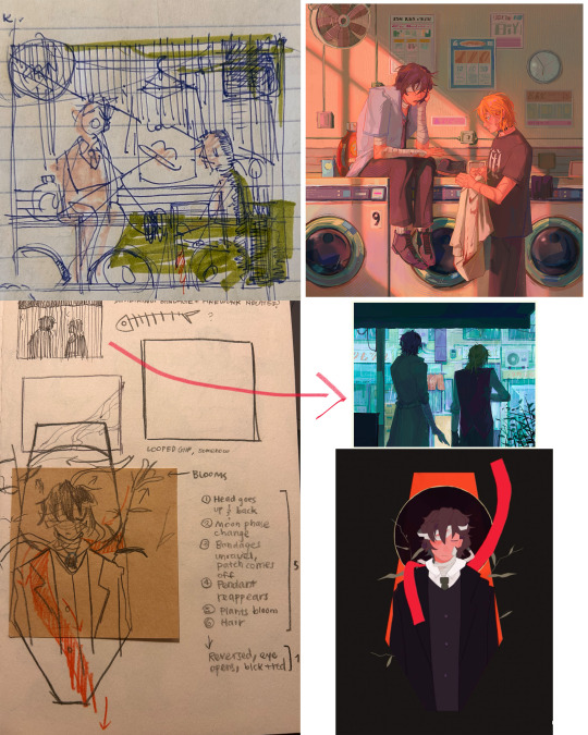
but whatever, back to the cliff-skk. i'll also post a timelapse of it for easy ref, but detailed stuff is under the cut :)
first i did some rough sketches on an orangeish background (underpainting etiquette, i find it helps things feel brighter and keep a stable tone when choosing colors to lay on top), and I quickly lined skk :)


then I laid down some flats for the background, again really eyeballing the reference for hues. afterwards i thought it was a bit bright, and i wanted a more sepia/nostalgia feel to it, so i hue adjusted everything to something more uniform


then i lay down flats for skk + the ocean, which i both had to color adjust a lot (you might see that in the timelapse), and then i jump straight into rendering the background. when i render, i always prefer to do it over something lineless, so i turn the sketch layer off. i rarely do lineart for backgrounds.
i also used to render the characters first, but i've found that it's just not a great approach—especially for art where characters and background are interacting, knowing the hues and shades of the environment is crucial to effective rendering on the character that doesn't make them look out of place.
when i'm rendering, i really try to keep in mind tenants of contrast, perspective, form, and light/shadow. ex, stuff "closer" to us has more detail; the hill in the back is minimalist (in comparison); the shadows lean cool-green while the light leans gray-yellow. rake brushes really carried me here idk... my fav brushstyle forever


eventually i reach a point where i'm satisfied (or bored) with the background. for the last stages i usually have the subjects hidden so i can really perfect the details—but then for super duper final details, like the little leaf specks and grass strands, i unhid skk so the poppy details could work around skk. then i get to rendering the characters :)
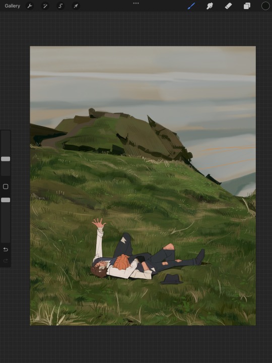
i forgot to take ss of all the stages when i rendered skk, but here's something from... about the middle of the process? i tend to render characters with the lineart hidden as well, sometimes bringing it back just to clarify things, but ultimately i prefer to define things by form than by line. that's just me tho idk, idt it makes or breaks anything, just a preference
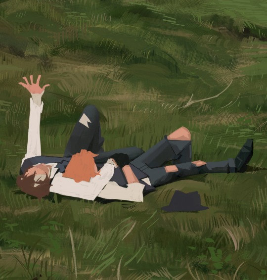
again rlly just thinking about cool/warm, reflective tones (the greenish shadow on chuuya's left inner leg, sky-gray blue on dazai's vest), really just slotting the subject into the environment. after i finish rendering the characters, i usually return to the background and add some stuff—in this one i defined the waves a bit and put some grass around skk
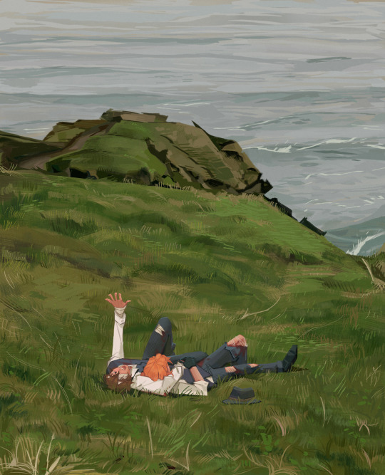
and yeah then we're done idk LOL. sometimes i run the file through camera raw (photoshop) to do some color adjustments—i find that my iPad displays colors super differently, usually making things a lot lighter than they are (u can see how dark the timelapse is...), so i find myself lightening my work a lot. i also sharpen and add noise as needed :)
i think my process has changed a lotttt even in this past year. it's kinda crazy!! it's always fun to do these and just reflect a bit on how i work. mostly just mindless insanity until it kinda works.
thanks for sending in an ask. and if u read all that, thanks to u too lolol
146 notes
·
View notes
Note
Your art is wonderful!!!
A constant inspiration to my own creativity and art work. Could you explain some of your art style to me? I’m interested in looking at a bunch of different ones to try and finally find one for me.
Goodnight!!🌙
Thank you so much! That means the world to me! I’d be happy to share some of my process with you 😄
Keep in mind I’m completely self-taught, so this is just the process of how I make my drawings and not any sort of professional advice 😅 apologies for the long post ahead 😪
Starting with the basics, my biggest influences are Jin Kim and Ami Thompson. Both are amazing character designers and I really admire their stylization and expressions. Whenever I feel stuck on something, I always go back to their drawings for inspiration.
I typically start in Procreate with a canvas size of 3300px x 4200px or 11” x 14” with a DPI of 300.
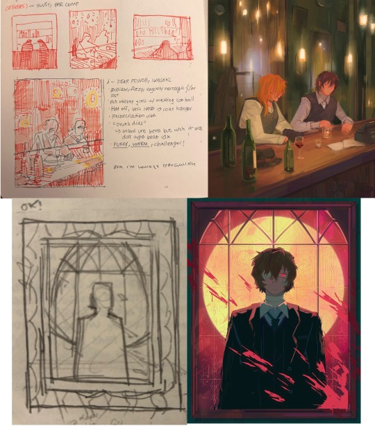
I put my reference in the corner of the canvas (in this case it’s a screenshot from the movie She’s the Man) and I start my rough sketch (emphasis on rough). Sketching is probably the longest part in my drawing process because I’m focusing on expression, composition, proportions, etc. This usually has about two to three passes before I move on.
Then I lower the opacity of the sketch and clean it up with some lineart on a new layer. Lineart doesn’t play a huge part in my style, but I still like to play around with line weight. Since I knew this was going to be a fully rendered piece, I didn’t spend much time on lines that I knew were going to be removed later in the process.
Underneath all of that, I use the skin tone and color the base of the character. I make sure that I color ever so slightly past the lineart, for reasons that will be important later. This part can be tedious, especially because I use a textured brush, so there are a lot of gaps that I fill in later.
Then using new layers with clipping masks, I start the flat colors. Nothing too crazy here.
I’ve made color palettes for characters and backgrounds that I typically draw, so this way it speeds up the process and maintains style consistency. If I need a color that I don’t normally use, I’ll just play around with the colors until I find something that fits well with everything else.

Next, on a multiply layer, I add some basic shading (with the skin tone color) and blush (with an orange-pink color). I also move onto the background. Some are more complex than others. If I’m going for a more cinematic look, I’ll fill the background in with some basic shapes and blur it slightly. Thankfully the background was pretty simple in this reference.
I start checking proportions now that everything has basic colors. Then I duplicate my lineart layer and change it to a pinkish-red and put it on multiply mode and turn down the opacity. This is why the base color layer needs to line up with the lineart, otherwise there’d just be gaps underneath. Instead of erasing my black lineart layer, I put a mask on it and just keep the eyes and eyebrows.

Then I start working on the shading and hair, which is an entire process in itself. Maybe I’ll make a tutorial on that one day 😅
I also use some vivid light and soft light layers and put in some subtle colors for extra pizzazz.

Then I add a hard light layer to the eyes for that glossy look and on a normal layer add some white details just to make some things pop more (like the nose, lips, eyes, sometimes hair, etc.)
I did make an eye tutorial a while back, but my process is still the same!
Lastly, I spend a lot of time playing with different blending modes (multiply, add, soft light, vivid light layers) and really focus on the lighting. I used to focus on adding a lot more details and make the coloring more realistic, but I found that the more simplistic coloring was easier for me to do and fit my style better. Sometimes I still tend to go too far with the details and realize that it looks better when I tone it down a bit.
That’s pretty much it! Let me know if you have any questions! Hope this helps. Have fun making art!
#art#digital art#procreate#art process#danny phantom#fanart#danny fenton#my art#paulina sanchez#tutorial
41 notes
·
View notes
Text
in my shoes ❖ nanami kento


summary: you get severely injured while on one of your first missions with nanami.
wc: 1.1K
tags: jujutsu kaisen, light Nanami x oc/reader, angst, some fluff if you squint, mentions of injure.
notes, etc: just a little drabble i thought about to help me write "toxic endeavors". wound up bigger than expected (and in the collection).
❖ collection of stories: "jujutsu partners au" → masterlist for fics listed in chronological order of events
Why would she ever do this, was all that Nanami could think when he brought you in for Shoko. Your entire body was in disarray, broken bones sprinkled across from head to toe, and his usually neat blue shirt was completely covered in blood — your blood.
Shoko's eyes widened as she saw Nanami carrying you inside, and she pointed at a gurney while asking for an explanation with her glance.
"We were jumped by two different curses we weren't expecting, and she took the hit in my place" was the answer he mustered to say as he laid your unconscious body for Shoko to work her magic.
She hovered her hands on top of you, and Nanami sat back, removing his glasses and pinching the bridge of his nose painfully.
"What's her prognosis?"
"I don't know, Nanami" Shoko replied, already applying RCT on your most critical wounds, both internal and external. "But she can RCT herself, so I figure I just have to do enough for her to wake up, then she can RCT herself too."
Nanami wasn't sure as to what felt worse in this whole situation.
You revealed yourself as a fine colleague, on top of being a good company when you weren't hellbent on your antics at him. The few missions he had gone on by your side were pleasant and allowed the both of you to finish work earlier. Losing a colleague — even one he had barely been working with for two months or so — usually wouldn't hit him that hard. However, not only were you under his guidance, rendering him directly responsible for your wellbeing in the field, he also carried a lot of guilt regarding you, specifically, due to past failures.
It felt like it would be the last nail in the coffin for you to die because of his inability to help you once again.
***
You had been unconscious for about four hours, and Nanami still sat inside that room, staring at you, waiting for any kind of movement or sign you were about to wake up. Frustrating all of his expectations, your body laid flat and unmoving on the gurney, even after Shoko healed you to the extent her RCT could.
"You know, staring won't make her heal any faster" Shoko said, while she leaned against the wall. "She's stable. You can leave, I'll let you know when she wakes up."
He sighed, and remained still, right where he had been sitting ever since he brought you in.
"Soooo, what happened?" Gojo said, coming inside the room unceremoniously. It took one look at you for him to go, "oh. Shit."
Oh shit, indeed, Nanami thought to himself.
"She's stable, we're just waiting for her to wake up" Shoko replied.
"I don't understand why she ever thought that doing this was a good idea" Nanami sighed, pulsing headache around his temples. Nearly every muscle in his body was clearly tense, and Shoko took note of that.
"You really are concerned about her" she said, and it wasn't a question.
Nanami diverted his gaze to face her for a moment, before looking back at you.
"I was given the rare chance to right an old wrong, and it seems I've failed once again. That's all there is to it" he answered.
"She'll be fine. She always finds a way" Gojo replied, hands in his pocket, more relaxed than everyone else in the room. That slightly rubbed Nanami the wrong way, and he became annoyed.
"There is no 'finding a way' in breaking nearly every bone in your body, along with massive internal injuries."
"That is not what I meant," Gojo retorted, pulling his phone from his pocket to casually check on his texts.
"Then, what did you mean?" Nanami asked, irritated.
"What I meant was that if she chose to do this, then she probably had a good reasoning to do so. She's not irresponsible or reckless, much to the contrary," he answered, putting the phone away.
Nanami sighed. Even a broken clock can be right twice a day, and so was Gojo when he said this. You were many things, but reckless was not one of them.
"Hm... What is..."
Nanami got up immediately at the sound of your voice and walked towards your gurney, resting a hand on its side.
Your eyes opened slowly, and you awoke to the sight of a giant blond man looking at you, his impassive chiseled face slightly torn with worry.
You braced yourself for the chastising to come, as you slowly remembered what happened and began to RCT yourself. Every nook and cranny of your body pulsed with pain, and even breathing was a labor-intensive task, diminishing by the second with your own healing.
"Why would you take the hit in my place? That was incredibly irresponsible and put us both in a dire position" Nanami chided, not noticing how hard he was pressing his fingers around the gurney's side support.
Mindlessly, you put your hand over Nanami's, sending pins and needles all over your arm. Bad idea.
You thought you saw him glancing rapidly at both your hands before you began to answer, as his hand softly relaxed under your touch.
"Because healing someone else is only about 40% as effective as healing oneself" you began, "and I knew I couldn't tank both curses in your place if you got injured or knocked out."
You took a moment to breathe before continuing, but just as his hand did, his gaze had softened too.
"I figured that, by taking the hit, you'd be unscathed and able to exorcise both curses, then bring me to Shoko. I began RCT as soon as I got hit, just in case I passed out, and knew that after Shoko woke me up, I'd be able to heal myself properly."
Gojo let out a small chuckle.
"We need to be strategic, right?" You asked, looking directly at Gojo.
"See? I told you," he said, looking at Nanami.
Nanami, on the other hand, was at a loss for words. Your reasoning did make perfect sense, and he wondered.
"If you were in my shoes, what would you have done?" You inquired, hissing slightly at a sudden shooting ache throughout your body.
He sighed and closed his eyes, nodding. "I would've done the same."
You mustered some strength to smile.
"I'm glad you acknowledged it."
"That doesn't mean, however, that you shouldn't be more careful or consider other better options when a similar situation arises again," Nanami replied.
You scoffed. "I will make no such promise, but I will try to be more careful. Does that sound good enough?"
"Not so..." Nanami began speaking, and you twisted your face at him. He sighed. "Fine. Good enough for now."
You smiled at him, winking.
"Thank you. I promise to try to do better next time this happens."
You didn't.
#jjk#jujutsu kaisen#jjk fanfic#nanami kento#jjk nanami#jujutsu nanami#nanami#nanami x reader#kento nanami#nanami kento fluff#jjk fluff#jujutsu fluff#nanami x you#nanami kento x you#kento x reader
87 notes
·
View notes
Text
Denoiser wisdom
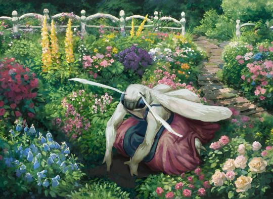
Since a lot of people showed interest in my workflow of using SD like a renderer for existing sketches, I'll be sharing the little tricks I find while exploring the capabilities of SD with Neuroslug. Read the inpainting post to understand this one. When inpainting, the model takes into consideration what is already in the area it regenerates and in the areas around it. How exactly it'll follow these guidelines is determined by denoising strength. At low values it'll stick closely to the areas of color it sees and won't create anything radically different from the base. At high denoising strength it'll gladly insert colors, shapes and silhouettes that weren't there originally. Basically the more you trust your sketch the smaller your denoising strength should be. It doesn't mean you won't need the high denoising at some point. Let me explain it using yesterday's artwork. It all starts with a rough sketch.
Since I have a particular composition in mind and want it to be maintained, I'll be using a low denoising strength to fully regenerate this image.
It means that the algorithm won't have enough freedom to fix my large-scale mistakes, it's simply not allowed to change the areas of color too dramatically. So if you want to do this yourself make sure to set the image to black and white first and check that your values are working and contrast is good.
To make sure the result isn't too cartoony and flat I used brushes with strong color jitter and threw a rather aggressive noise texture over the whole thing. This'll give the denoiser a little wiggle room to sprout details out of thin air.
It kept the composition, the suggested lighting and the majority of flowers kept their intended colors too. This was denoising strength 0f 0.4. To contrast that, same base image with denoising at 0.7:
It's pretty, but it's neither the style nor composition I wanted. Let's refine the newly redrawn base to include the details that were lost in transition. These were intended to be roses.

It's here where I learned a little trick. You can mix and match different models to achieve the look you desire. Neuroslug is good at detailed moths and painterly environments. It's not good at spitting out really detailed flowers, they end up looking very impressionist which is not what I want in foreground. So, I switched to an anime focused model and let it run wild on this bush with high (0.7) denoising strength.
Nice definition, but it looks too smooth and isn't in line with what I want. Switching back to Neuroslug with denoising at 0.5 and letting it work over these roses.
This way, I get both the silhouette and contrast of the anime model (counterfeitV30) and the matching style of Neuroslug. It's also useful in cases where the model doesn't know a particular flower. You can generate an abstract flower cluster with the anime model and use the base model to remind the AI that what you want is in fact a phlox specifically. So I did this to basically every flower cluster on the image to arrive at this:
It's still a bit of a mess but it has taken me about 80% of the way there, the rest I'll be fixing up myself.
My "Lazy Foliage" brush set was really helpful for this. I'll release that one once it accumulates enough brushes to be really versatile. Now we block in the character.
Yes, I left the hands wonky since I intend to be drawing them manually later, same about the foot. There's so much opportunity for the AI to mess them up that I'd rather have all the control on these details.
When it renders the face it can really mess up everything, so I do it with low (0.45) denoising strength to discourage new eyes popping up in inappropriate places. Take note that I kept the antennae out of the mask. AI is easily confused when one subject overlaps the other.

Good, good. Wait. Why are your eyes hairy? Now, mask out the eyes, remove all mention of fur from the prompt and
That's about right. Since the eyes are all one color block I can afford to raise the denoising strength for more wild results. Same for areas of just fluff on the entire body, it's all one texture and having the denoiser at 0.6-0.75 is beneficial because it's going to add locks, stray hairs and other fluffy goodness. Just make sure to not make the mask too tight to the silhouette, it needs some space to add hairs sticking out.
With the skirt it was back to really low denoising. The folds I blocked in make sense with the position oh her legs under it, so I didn't want it to be lost.

Lastly, I drew in a flower that she's planting and ran over it with moderately high denoising to make it match the surrounding style. Ignore the biblically accurate roots there, I'll fix them by hand.

One last pass over the whole thing in Procreate. I draw the hands and add details such as the round pseudopupils, face ridges and wing markings to keep the character consistent with the previous image of her. And a bit of focal blur for a feeling of depth. Phew, even with generous use of AI this whole thing took an entire day of work. In the end what determines quality isn't the tool you use but the attention you choose to pay to finding inconsistencies and fixing them.
#neuroslug#ai assisted art#stable diffusion#anthro#moth#tutorial#I guess it counts as a tutorial at least#what are these long posts even#slug's experiments
132 notes
·
View notes
Text
(Cracks knuckles) Alright folks I remember how to draw
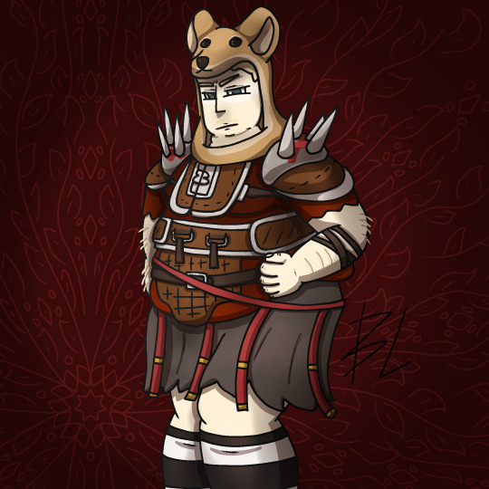
Fat fuck Vulpes by yours truly, Blaze Lander. Inspired by the lovely drawing by @yourmateyoya ,egged on by @legions-top-dog , and because i force you to deal with all my shitty drawings, @noomycatz
Yes, once again, i have put too much effort into a shitpost. Roughly 2 hours as I reused a canvas on ibis paint for a 5th drawing lmao
Yall can burn me at the stake later lol
Process below hehe i like to ramble
And just because i like to talk about my drawing process for characters with complex outfits, this is how my lobotomy brain does it:

First i do silly fun colored sketch. I use different colors to differentiate the "skeleton" from the, euh, fleshy bits, and the clothing. You can see lots of lines that would not be shown in the final product so it makes it confusing to look at.
Next i do a clean sketch.

This is where i clean up everything before doing the final lines. I use one color and a thin brush to make it easier to line over. Here i add any extra bits (like the top football armour) and "render the physics" as i call it, so properly drape cloth and the uhhh squish of stupid fat fuck vulpes' boobs and stomach. I also will balance the drawing here by flipping it and redrawing or using the drag tool.
Next is lining.

For this drawing, i used a 9.0 digital pen with a taper. Its my standard :þ. I kept my pen at the same size for this piece. Sometimes i line the outside darker to make the drawing stand out more. I decided not to as i wanted to give the drawing a more "serious" tone. (How serious can this be though lol-)You may notice on the arms little bits of the lines are missing, thats because i gave him some arm hair. I like make little details like that show over the lines. But since the one shading technique i used works with clipping masks, i had to but the arm hairs on a layer lower than the line art. Next is colour:

I colour in the drawing with midtones. Simple as. I tried to stick with warm colours besides his eyes, which are grey blue. Idc if they arent, im too lazy to google it. I mostly use flat colors but i did make his shirt a gradient. Next is do simple cell shading:

Depending on how i feel i shade with or without the colours in the back. I went with a sorta "non decrepit" light source here. Didnt want too much intensity. I used a deep marronish orange on a multiply layer on 45% opacity. Soft shading/lighting next:

I get intense with the soft shading. I use the airbrush with a deep maroon to add dark gradient and airbrush with a light pink to add a bit more depth. I usually use less light and more dark because im evil i like the intensity. I keep the layer the same amount of opacity and multiply it with the darks and soft light for the lights. Next are the shine highlights:

I use the dip pen hard with a taper to add light highlights of white on shiny bits like metal and eyes. I uses pure white, set the layer to 25% opacity, and use normal blending.
I also shade the lines because it makes the lines softer. I use a clipping layer on the line art, set the whole thing to a dark grey, and airbrush in darker and lighter parts. (I felt like a picture wasnt needed cuz its hard to notice.
For the background, i used a dark red i stole from the cell shaded layer, drew a vine pattern with the kaleidoscope ruler, and added a vignette. Vignettes are my cheat code for background hehe~ it makes the subject stand out while keeping suave, seriousness and formality. To make a subject pop out more, put the vignette behind the character but in front of the background. For more intensity but it on top of both.
Also- I usually draw with a level 10 stabilizer (i got shaky hands) but i drew with a 2 stabilizer so im surprised it came out so smoothly-
Also i gave him goggle tan lines because if i have to have them from playing tennis with sunnies, so does he.
#fallout#fnv#new vegas#drawing#digital art#fallout new vegas#vulpes inculta#shitpost#i put way too much effort into this#dont ask why i draw this type of shit good i swear i will blow up in a million pieces and cry if you do
21 notes
·
View notes
Note
Absolutely love the rendition to the panel of Hades holding Persephone. Lovely to see it rendered as a more mutual act with Perse holding onto Hades instead of just letting Hades hold her, and ofc seeing Persephone actually look like an adult woman. (Not to even mention the colors and rendering because whoaa those were lovely)
And I have a question about this new rendition if I’m allowed to make it! The original had very dramatic and sharp composition with the angles and being off centered which conveyed much of the emotions and style that made early LO very striking. In adapting it, was it a conscious choice to change the composition or what were the deciding factors that made you and banshriek decide centering Perse and Hades worked better in this situation? :0
Ahhh thank you ;w; It took a few rounds of sketching to get the pose just right, the flats thankfully weren't as difficult as I was worried they'd be, but the challenge was definitely in trying to get the pose right while maintaining the height difference that's there.
As for your question, a lot of the posing and sketch composition is something I do, and then Banshriek typically goes wild with the backgrounds while making adjustments to those compositions if necessary, often times I leave the backgrounds up to their discretion as they're 10x more skilled at that sort of thing than I am and they often bring new perspectives to the table. This means that it often ends up being a game of give and take between what we contribute, sometimes I'll have sketches that they feel need to be adjusted, other times I'll have to add little tweaks to their backgrounds if it's missing something. We're both working off a base rough sketch, but we both get to contribute to the final scene in our own ways; splitting it between background and character flats has been a happy middle that's worked well for us :)
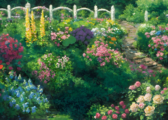
Depending on the scene, sketches can range from minimal to more detailed. Here's the original base sketch for that scene:

So originally there was a larger tree working over the side but I didn't really know how detailed we wanted to be in the actual full background, much of it depended on how complex Banshriek wanted to get. You can also tell that Persephone's face was originally buried into Hades' chest in the original panel, which I originally flatted in, but then wound up changing because I wanted her eyes to be visible to reflect both of their expressions of relief at the same time.
That said, with the pose changing from what it was in the original (from Persephone almost laying on Hades vs. him holding her and lifting her up) the composition had to change with it so I decided to just make them a bit more centered, that way the focus would be fully on them and the balance of the scene wouldn't feel "off" due to the pose change. I tend to follow the Rule of 3 here !


So yeah! That's pretty much why centering it felt a little better in this case. Though part me of does wish I was able to keep the original pose, when breaking that scene down into its bones I found it had to take a lot of liberties with its anatomy and proportions, as many LO scenes do. You can't really tell just on a surface level but Persephone's head is huge and the rest of her body is tiny (her hips literally come up to Hades' sternum and her feet meet at his knees). With the character design changes made in Rekindled to make Persephone a little less tiny and more consistent in her body type (while still maintaining the size difference between them) and to reflect their character arcs at this point (as I'm not rushing them into intimacy quite like the original comic did) certain things have to change to balance it out and accommodate. If you're a math person, think of it like solving algebra equations - what you do to one side of the equation needs to be reflected and adjusted on the other side.
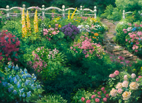
And of course Banshriek did a lot more to really exemplify the mood shift in the almost labrynth-like forest Persephone grew within Tower 4. There are still trees and plant life everywhere, but instead of feeling like an endless maze with its tones of deep red that we saw Hades navigate, it now feels like a soft and gentle meeting point for the two. Like the original scene, the color change is used to change the mood of the scene and reflect the calmness of Hades and Persephone as they've found one another.
At the end of the day we did what we ultimately thought would work best for the way Rekindled is drawn, giving both Banshriek and I the freedom to fully utilize our respective skillsets. That way we were able to pay tribute to that original scene while also creating something new out of it <3
That said, I'm sure @banshriek can also chime in with their own design notes on this episode, if they have a minute to spare! I'm sure they'll have lots to say about the fun they had working with those new brushesヽ(・∀・)ノ
93 notes
·
View notes
Text
"New" Bride first impression
Going under a read more.
So, heads up, this isn't going to be a well thought-out essay. They're just my in "the moment" thoughts.
My thoughts on how it looks: I'm well aware the best low light camera still isn't going to capture things the way the human eye can. So I feel it would be unfair of me to say the effect seems flat when I haven't seen it person. Maybe she is really creepy and convincing under show lighting. Projection mapping for me is a lot like CGI in movies--I think it should be used to enhance what's already there, not be the whole thing when possible. The cemetery looks great with the projection effects helping sell the ethereal quality of the scene. But without the projections, you still have that set and those wonderful figures. If all you're relying on is that projection and the projector goes out, you'll just have a blank space. Hopefully that won't be the case with this. I'm curious if there's a B mode.
I not only quit working at WDW a few years ago but have left Florida entirely, so I no longer keep my ear to the ground and chat with people who are more in the know on upcoming park changes. (Yes, I know this was DL, not WDW, but I feel like that's pertinent information for the conversation.) So this really did take me by surprise. Was not expecting it. If anything, what I thought it would be was an updated Constance figure-- a basic animatronic and some tweaking to the projection. I really think that's all she needed. It would have helped a lot to sell the effect. I was not expecting a total turnaround, especially given that Constance had a lengthy cameo in the 2023 film and sells merchandise. Plus, there were appearances in recent comic books, novels, and cartoons. I figured she'd be there for a while longer. But hey, this is just continuing a long tradition of the attic never staying stagnant for long.
Also she just straight up looks like a character from one of those uncanny point and click/ hidden object games. You could have told me that was a screenshot from Redemption Cemetery, and I would have been like, "Oh yeah."
This is just me, but I'm not into the whole "multiple dead missing husbands" thing they've done with both the new bride and Melanie. It doesn't feel as emotionally poignant as the one true love who's vanished. It works with Connie because she's a serial killer. That's her whole plan. However, with Melanie, for instance, I don't know why she's pining over guy #5, who she barely got to know, to the point where she's wandering in a bridal gown for eternity. At some point, I'd figure you'd be used to the whole "dead groom thing" and try to avoid the situation again. Same with this new bride. If she fell in love so easily and so frequently, she can find another dude. There are a few hundred around that mansion to choose from. In my opinion, it severely weakens the impact of the tragedy of the character. It's sad she never found love in life, but there's a whole afterlife full of bachelors to choose from. (I know that's not the same situation for Melanie, who's been rendered into having no actual agency anymore compared to her original iteration, but they are kind of similar, hence using her as a comparison.)
I really don't know why they kept the portraits if they weren't going to at least make her look like the same person. The face is so different.
What I like: I do prefer the old beating heart brides to Constance, so it's a concept I love. My favorite is the no face, glowing eyes version, because she was so creepy and ambiguous. You never really knew what her deal was. And you could argue the same for this one if you'd like. I think that's a valid response. We don't know how or why the husbands vanished, so there could be multiple interpretations. I would just have preferred an actual figure again, or just a very basic animatronic.
Seeing the One Eyed Black Cat makes me happy. If you've followed my blog for a while, you know how much I love that little demon, despite the fact he never actually made it into the ride as the villain he was supposed to be. I think he's just a cool concept that you could do something interesting with.
My interpretation of the scene:
Emily (or whatever you'd like to call her) is a total cat lady. And every spouse she had has bizarrely died via very mundane kitty actions. Maybe George tripped and fell from the top stair when the cat darted around his feet. Maybe Frank was electrocuted taking a soak when the cat batted an appliance into the tub. Etc, etc. And every time, her response was, "Oh no! ... Kitty, are you okay?!" Never suspecting the little bastard was doing it on purpose. She still loves that cat, and has never assumed anything other than innocent cat shenanigans, and defends him to this day.
For the Connie lovers, she's still in WDW. My prediction is she will be there for a long time. Look how long it took to add Hatbox.
I think that's about it. My opinions may change later, especially if I ever get to see her in person. Thanks for reading my rambling.
11 notes
·
View notes
Text
The making of Knuckles' facial expressions in Kuchizuke.
Hi! Today I want to tell you about the making of facial expressions and how difficult it was for me to come to a satisfactory result. ( •̯́ ₃ •̯̀)

Facial expressions have long been one of the most important elements of my work, to which I pay special attention. I really enjoy conveying characters feelings through their facial expressions and body language too. It's been years since I figured the way to work with expressions of certain characters, like Sonic and Rouge for example. It really helps that the models I use have additional shape keys for the eyebrows, which gives me a lot of freedom. When it comes to work with characters faces, I try my very best to be AS FAR as possible from the official Sonic games cutscenes, because they always lack emotions and keep using eyelids to express anger/sadness. They ended up being a good example for me on "how not to do facial expressions". xD
But the hardest for me was Knuckles. The reason is that he has a unique eyes shape not like any other Sonic character. It's a mix between separated eyes, like with Tails, and stylised "one eye" with the brow in the middle, like Sonic's. The brow in the middle of Knuckle's eyes can't be moved, but thankfully it had 2 shape keys for changing its size and smoothing out, that's in addition to another 18 shape keys. And yet, I kept struggling. Knuckles has the narrowed look by default, but it always felt like I just can't make him angry enough, it just wasn't the right amount.

Also, the eyebrows always felt very thin (that's true even for Sonic or other male hedgehogs current 3d models), so around two years ago I started playing a little more with the brow bones so make them more visible. I always wanted characters to have expressions as close as possible to the official 2d artwork, but with those 3d models it seemed impossible.

In comparison, 3d models facial expressions are pretty flat.
And of course, that's not something that can't be done in 3d, as some great 3d artists have shown otherwise. But I am still not as experienced in 3d modeling and by the time I worked on Kuchizuke, making changes to Knuckles' model wasn't my priority, due to having a deadline of 3 months to make a 5 minute long animation. So, I just kept working with what I have and tried to make the impossible. Actually I kinda enjoy doing that, so it's totally fine. xD
So when I got to the scenes with Rouge's true identity reveal, I once again came to the same issue I had before: I can't make Knuckles angry enough. So, out of curiosity, I tried moving the brow bones closer to the center and playing with their scaling. And what do you know? I was finally satisfied with the results! Here you can clearly see the differences. The left side is the final render and the right side is how the expressions would've (presumably) looked had I not tweaked the bones.

It wasn't an easy thing to do, but at least I was very happy with how it turned out.
Then come the scenes with weakness and fight against passing out. I honestly didn't think that I'll be able to make good expressions for this, but ended up surprising myself.

And the last challenge I had, is that in the last scenes I needed to convey both hatred towards Rouge and the weakness from going numb in his expressions.


And I love the result so much, but it was actually really painful to animate him. Like it just pains me to do this to my boy. o(TヘTo)
So in the end I'm glad that I was able to get better at this. I obviously will be making changes in Knuckles' model somewhere in the future for other parts of "Deluding Moonlight", but for what I could have done at the time it turned out very well.
Thanks for reading! Have a great day. ヾ(^∇^)
#deluding moonlight au#diakitty#behind the scenes#knuckles the echidna#kuchizuke#a sinful kiss#sonic#sth#sth au#animation
13 notes
·
View notes
Text
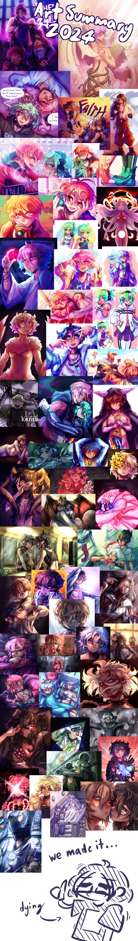
that's a wrap on art posts for 2024!
like what you see? all the art I posted this year is visible on my art tag!
wanted to try something different after last year's formatting disaster, so this is less of a summary and more of an everything-I-made-and-liked collage. as in that's what it is that's what you're looking at
this was a big year for me (I started university and lived away from my parents for the first time, yayyy) and I think you can see that in how my art style evolved in the past 12 months. I'm really happy with where it is now!
last year I picked one piece from each month to talk about, so I'll be doing that again for this year below the cut
january

this is the still version of an after effects animation I did for a design class in my last year of high school. I initially wanted to post this as a gif, but I knew nothing about how gifs worked at the time and it came out both massive and heavily artifacted. I can't even post the gif on tumblr, but the animated version is up in an mp4 format (that does have more colour correction and generally looks better)
february
this is a weird pick to represent february (it wasn't even on the collage image) but this... thing does represent that month to me lol. this doodle took me all of 20 minutes and represents the most important battle of 2024... shaman king flowers stream vs frost's microwave
march
kentareo happened (in earnest, they've been here since the end of january)
april
I don't like anything I drew in april enough to put here
may
march-may was my flop era this year and I blame these two. at the start of the year I was using a LOT of heavy colour overlays to hide my inability to colour good and those really showed their weaknesses when it comes to pieces with strong complementary colour palettes. this one's nice though, I hated drawing kenta's shoes
june
big month for tss news! I really love the colours I got with my tss art from june, you can tell the overlay technique can work when you're not shackled by the kentareo colour palette
july
(wow this is really the same pose again. I promise I drew more things in between)
my first month out of high school! had a lot of fun going into the outfit details with this one
august
the most important change as far as this list goes- I switched programs to clip studio paint! I'd used adobe fresco for almost all of my digital art career, but I got a pc in august and finally made the switch. it took a while to adjust, mostly because my fresco process had emerged basically via natural selection under the program (and hardware) limitations I was working under. a lot of things (like the heavy texture) I had to relearn in csp with more intention (the august piece is a bit smooth, isn't it?)
september
I moved into uni and spent most of the month adjusting to the major life change. I spent most of my drawing time on this piece, trying to figure out techniques and download brushes to get the kind of texture I wanted. this one took absolutely ages
october
clip studio finally clicked for me. I figured out how to speed up the parts of my workflow that sucked (flat colours) and embraced a more paint-heavy, brushstrokey rendering style. the speed increases also meant I suddenly had the energy for backgrounds!
november
I drew the most this month out of any in the year. I also stopped needing the overlays to make my colours look nice, and so the palettes in my art got more diverse. this piece I remember drawing in about an hour at midnight when I had to wake up at 6:45 the next morning for work, and being so happy I finally captured this specific glowing hair effect
december
I drew so many full background pieces this month, but I want to shout out this non-background one for the shattering effect I got with the selection tool
and that's the end! many more things coming in the new year (some I've already drawn, actually)
#goose draws#artists on tumblr#digital art#one year later and I still can't tag these#this is my once annual art yapping post okay
8 notes
·
View notes
Note
i wanna know how you learned how to render, it's so yum 😞💔
thank you!!! I'm glad u like it. I can try my best to explain my process but its very much a 'feel it with my heart' experience. This is gonna be long and incomprehensible but I'm gonna try:


If we're talking about the (above) garth & baby arthur jr pic or the bloody pete pic, I'd say i started to actually render like that in maybe high school art class (they were much worse then ofc because i have years more practice now)? Obviously my process now is different than it was back then, but before I actually started physically painting canvases with acrylics I usually just did line art and color without the blending-painting pizzazz.
Thats actually where I get my weird random interspersed colors in my coloring as well. Acrylics dry super fast and a high school art class is like 45 minutes so I'd have to totally mix a new pallet the next day. Not that I couldn't color match, but its annoying and having variations with colors or just mixing something up to fill in gaps looks neat if you get it right. If it looks bad just paint over it, but its worth it to try.
My process with these is almost exactly like my non painterly rendered ones, just with steps after. Also, you can get away with a lot when not fully rendering, but when i do render PHOTO REFERENCE is to die for. Specifically for the lighting. I can't emphasize this enough. By the time i'm done with a drawing my search history should be like "knees. Knees sitting. Knee anatomy. Harsh light photography. Curly hair. baby. J. C. Leyendecker new year baby" + 8 pictures of u doing whatever pose you're trying to do.
Anyway, the process for me is usually: vague sketch > carve out the lines/neater sketch > flat colors > basic shading/rendering > color adjusting sketch lines (usually from black to dark red) > collapse everything into one layer & get to WORK
I know the 1 layer thing is scary, but thats life. Its easiest to adjust things that way (for me). No need to worry about layers and blending modes cause its all right there. I usually duplicate the layer the drawing is in before I start on something crazy just to reassure myself that if I fuck it up I can go back. So a lot of the time my layers in procreate are progressively more rendered stages of the piece lol.
Now that Im here trying to explain this im blanking on how to actually express it. Lets see. I can run through some general stuff:
For both of those artworks (baby & pete) they're 100% made with HB pencil on procreate (a default brush! I've never downloaded any new brushes cause im lazy). I actually made a brush explanation for someone a few months ago I can put that right here:


hopefully those are readable. sometimes tumblr flops lmk if my writing is illegible
the eraser tool is your BEST FRIEND!!!! The way I get my lines and shapes and whatnot is by making big ass strokes and then erasing until whatever I'm looking for reveals itself. Here's a video of that process from the aquababy pic. Ignore the jerky pauses lol. also there's the reference photo!:
rendering itself is really hard to describe. Basically just throw color at it until it works out. (just tried to add a video but tumblr says only 1 video allowed


I hope this is helpful somehow! Just threw a ton of stuff at you. If you want anything more or the actual video or smth just let me know!
#this is A LOOOT#but there's gotta be something here thats maybe helpful#hope it makes any semblance of sense#asks#chooeychoco#feel free to dm me too for anything else lol#that goes for chooey and anyone reading this. id like to say im chill riiight 😋#and if dming isnt ur thing the ask box is right there#this post my self destruct w that video. hopefully tumblr powers through and can post it#sorry if this is crazy im crazy#*MAY self destruct. Lordy
24 notes
·
View notes
Text
about you | seokgyu
—————————————-
"and there was something about you that now I can't remember
it's the same damn thing that made my heart surrender
and I'll miss you on a train, I'll miss you in the mornin'
i never know what to think about,
i think about you."
--------------------------------------------------------------
dokyeom's laughter fills the room, eliciting a smile from every single member as an automatic response. everybody adores that boy, and they would move mountains for him in a heartbeat. but there's one among them that loves him just a little bit differently.
mingyu has been in love with dokyeom since they walked into the dingy green room that first day during pre-debut. it didn't take much for him to fall head over heels. being born the same year, they got along instantly. dokyeom matches mingyu's energy, but also knows how to push his buttons like no other. they bicker, they laugh, they cry, and they are always each other's safe space. they both know each other like the back of their hands. fast forward to years and years later, and nothing has changed. mingyu's heart beats a million times a minute when he's close to him, which means it's always racing. he has kept his feelings private all these years because the thought of losing his best friend over something like this would not be worth it. he can't imagine his life without the happy boy. if he had to choose between an unrequited love and not having his best friend, he would choose the first one over and over. but honestly, mingyu's not even so sure it's unrequited.
"mingyu literally tripped over his own goddamn feet in the middle of the concert and fell flat on the floor but you're making fun of me?" dokyeom exclaims excitedly, addressing the room in a standing position while in a bickering match with jeonghan.
"hey! i still looked hot while doing it at least" mingyu responds, pulling a jokingly smug look.
"in your dreams, kim mingyu" dokyeom says, plopping down right next to him on the couch with a teasing chuckle. he sits so incredibly close to mingyu that it's suddenly hard to breathe.
"are you insinuating that i didn't look hot when i jumped too high and my pants ripped?" he asks, arching an eyebrow high jokingly at the clearly un-hot situation.
"no. you always look hot" he says, his voice low and suddenly too serious for the conversation at hand. dokyeom rolls his eyes and mumbles a nonchalant "whatever", and tries to turn away nervously. but mingyu catches the small reddish tint spread over his cheeks. he catches him biting his lip in an attempt not to smile. it's little actions like this that give mingyu hope. the two of them have never been awkward with each other. they were peas in a pod after the first minute, and anything goes. they've cuddled, they've spent the night together in a shared bed, they're touchy all the time and it was never anything out of the ordinary. but in the past year or so there's been a shift. it seems intimate when these things happen. mingyu knows he must have not been very subtle with his feelings, despite his effort. surely dokyeom has picked up on something, and it's made things a little different. mingyu tries to keep himself in check. again, he cannot lose his best friend.
but this time it's dokyeom who leaves mingyu's mind whirling. once his cheeks return back to their normal shade he pulls his legs up on the couch to sit criss cross, with his one thigh resting on top of mingyu's. when he sits back, his back is resting on half of mingyu's chest. he's sure that there's no way that the smaller boy cannot feel the thump of his heart.
"can i see the videos you took?" he asks, peering up at the boy who's heart is about to give out. they had so much fun at the concert today, and mingyu took out his phone to record a lot of the moments so that he could keep it forever. he doesn't think twice while he pulls his phone out of his pocket and opens up his camera roll. rendered speechless, mingyu goes through the camera roll not being able to focus on anything but the heat radiating off of dokyeom, and the feeling that this is right. it's just right.
"wait a minute! you did not!" dokyeom suddenly exclaims loudly after realizing mingyu does in fact have a video of the exact moment that his pants ripped.
"you're the one who decided to rip your pants in the middle of my video" he teases. dokyeom reaches out in an attempt to grab the phone from him and delete the video, but mingyu is faster. for a brief moment their hands meet each other in the tussle, both holding onto the phone. mingyu's thumb, with a mind of it's own, strokes dokyeom's hand softly. its' so quiet for a moment, his heart thumping so loud that the chatter from all the other members fades away. dokyeom clears his throat, the familiar shade of pink back on his cheeks as he readjusts himself, sitting properly on the couch this time.
"i'm sorry" he stutters, though neither of them know what he's apologizing for. he tries to immediately skip over what just happened, and takes mingyu's phone from him to keep watching the rest of the videos. mingyu spaces out for a little bit, stuck on the feeling of his hand in his. when a small "oh" escapes from dokyeom's lips, mingyu turns to face him. he notices that everyone else is gone, and suddenly the weight of them being alone is so heavy. dokyeom's lips are parted, and eyes widened as he stares down at the video on the screen. when mingyu peers over to see what he's looking at, he's suddenly in a horror film. it's a video that he completely forgot he took, or else he would have never let him scroll through his camera roll like this. it's a simple moment from during the concert, where they are walking around the stage and interacting with the fans. it starts out with filming the whole group on the B stage, mingyu hanging back to capture it. then he zooms in, clearly and purposefully, right onto the boy he was infatuated with in that moment. dokyeom is staring out into the crowd, looking like an angel who just flew down from the clouds. his eyes are twinkling with that light that only he has, and he's paired with a soft, genuine smile. the fact that nothing in particular is going on in it makes it so obvious what mingyu's intentions were behind it. to add fire to the storm, there's 2 more videos just like it. there's suddenly not enough air left in the world.
neither of them want to speak first. eventually after dokyeom watches them for the 3rd time, just looks up at mingyu with a glossy look and says quitely "why?".
such a simple question, with a simple answer. 'because i love you. i always have' is on the tip of his tongue, but he has to go slower. he can't scare him away, he can't. if these videos haven't already.
"i-" he starts, but can't find the words to finish. he gently takes the phone from him, not wanting to succumb to this humiliation anymore. dokyeom sits patiently, fiddling with his fingers and waiting for him to say something, anything.
"gyu..." he says pleadingly, hating the silence and the anticipation.
"i love you" he blurts out. well, so much for the original plan of going slow.
"i love you too, mingyu. but this is really s-" he starts to say quietly, but is cut off by mingyu.
"no. i'm IN love with you, dokyeom". he adds. his tone deadly serious, his gaze staying on dokyeom's face. he's reading it for clues, for anything at all that could give away what he's possibly thinking right now. the only sound in the room is their nervous breathing.
"mingyu.. stop it. this isn't funny" he says, now deadly serious as well. mingyu slowly reaches out to hold his hand, intertwining their fingers. dokyeom shifts in his seat, but he doesn't make any effort to pull his hand away.
"i'm being serious. i have loved you for as long as i have known you. every day i love you more and more and there's nowhere for it to go. i think about you every second. i miss you even when you are right next to me. it's all about you, kyeom. it's always been about you." he confesses, squeezing his hand for emphasis. this is it. everything could come crashing down now. he could lose everything. he is too afraid to make eye contact, so he stares down at their hands. it's been quiet for way too long. he feels a squeeze back, so he looks up tentatively. dokyeom's eyes are teary, one stray one rolling down his cheek. fuck, he really fucked up. without any warning, dokyeom lunges forward and grips mingyu in the tightest hug he's ever felt. mingyu, as a gut reaction, holds him back and places a gentle hand on his neck, guiding his head into the crook of his neck.
"i'm in love with you too" is whispered into his ear, like he's also been holding it in for years because he was too afraid to lose his best friend also. mingyu's life changes when he hears those words reciprocated. he pulls out of the hug, keeping his hand on his neck. he stares into his eyes and smiles unabashedly. he giggles happily, and they both burst into a fit of unstoppable giggles as they release all the nerves and tension they had built up.
"we're really both fucking idiots, aren't we?" dokyeom laughs, referring to the years they wasted as they could have been dating.
"just a little bit" mingyu laughs back in response. his laughs stop short as he watches dokyeom's face light up, his eyes squinting from smiling too hard. when he notices he's the only one still laughing, he stops and looks at mingyu inquisitively.
"is it alright if i kiss you?" he asks shyly, taking his hand in his again. he leans in so close that their faces are inches apart. he hovers there, waiting for the answer.
"please" dokyeom breaths out, his eyes fixed to mingyu's parted lips. when their lips collide, the years of agony and secrets was all worth it. their hands roam on each others backs as dokyeom places one on the taller one's waist. they are both running out of breath, but they don't care at all. mingyu solemnly swears to never go another day without kissing him.
#seokgyu#seventeen#fanfic#dokyeom#mingyu#dk#k pop#svt#svt x reader#svt carat#lee seokmin#kim mingyu#seventeen fic
8 notes
·
View notes
Note
Hey there, my friend! I saw you reblogging an artist ask game, so please allow me to make you a few questions 🥰
How about 2, 12 (I'm interested if you're willing to share!), 15 and 25? 💖
Sure thing, my friend!
Based on this:
2. How long have you been drawing?
Short answer: for as long as I can remember.
Long answer: I drew a lot as a kid (fun fact: I used to make quick uncolored pencil drawings to tell stories, kinda like storyboards; I would do it for hours and use so much paper that my parents eventually told me to draw on both sides😅). The fact that my older sister was very good at drawing - and I was very competitive - also motivated me to work hard and try to get as good as her. Then I drew less often in high school and in my first college since I had less time and was focused on schoolwork, and then started doing it more often again as I now study graphic design and would like to maybe become an animator if possible - the dream job of my childhood that I gave up on too early. When it comes to digital art specifically... I got my tablet, the very same one I use to this day (Wacom Intuos 4), for Christmas when I was about 15 or 16. Because it was so hard for me to learn how to draw digitally, and like I said I soon started spending less time drawing in general, sometimes I didn't use my tablet for long periods of time. That, of course, eventually changed into using it nearly every day.
12. Is it okay for people to ask you about your process?
Yes, it's okie dokie to ask!
...Or did you mean you wanted to know right now?
In which case, well, it depends on the medium and the specific piece since I don't always do my art the same way. Generally in digital art, for the characters I like to do a rough sketch first, then either a cleaner sketch or lineart (I rarely bother to do both, even in animation - unless my initial rough animation is like... really rough and basic, just to get the feel of the motion). Then I do flat colors, often on separate layers, and then shade/render each part. Or I do the whole character minus the sketch on one layer, it really depends. For example, I did Mario and Luigi both on one layer in my Brothership repaint/wallpaper, other that the yellow glow on their hands. For backgrounds... it really depends, but I usually build them up layer after layer, from general shapes to details, like a normal painting. Of course, I use some sort of sketch for most of them too, unless I don't need it because the BG is very simple or abstract. If I don't want my sketch to be visible, I basically just remove it and refine the parts that look bad without it, sometimes adding some brush strokes imitating lineart in some places. Happens to both characters and backgrounds. I use different brushes to create different effects, but in the majority of my works I've been sharing on here, I only really use a hard round pressure opacity brush for both the final sketch and rendering.
15. How long does an average piece take you to complete?
This one is always tricky to answer (yes, I've been asked this before by some classmates). Uh, several hours? It's really hard to tell exactly simply because I rarely just sit down and complete a whole piece in one go. Unless it's just a simple sketch/doodle. So in reality my average pieces often take me a few days.
25. Do you like to draw in silence, or with music?
There's one piece of advice in Richard Williams' fantastic book The Animator's Survival Kit that I don't think I'll ever be able to heed. It's this one:


Sorry but no, I do almost everything with music. It makes things more enjoyable and ironically makes it easier to focus in the long run. So, definitely drawing with music💯😁
Thank you so much for the ask, @silenzahra!😊
8 notes
·
View notes
Note
(this ask is from @master-kohga-dating-sim btw, i had to send it on anon since sideblogs cant send asks :( ) losing my shit recently trying to learn how to color my stuff recently since i'm trying to develop my style more,,, anyways completely unrelated i swear but haiiiiiiii im curious about how you do your coloring :3 detailed step by step instructional format please /silly
Ohhhh this is kinda hard to explain but most of my coloring comes from the render! Ofcourse a huge thing you’re going to have to look at is the values of the piece, wich especially if you’re looking to start out drawing in greyscale is going to be important.
But the way i personally do it is that i gravitate towards very muted and desaturated colors and start working from there, it helps me take more control over where the focus of the piece is by making the contrast between the vibrant / light colors and my usual dark desaturated flat colors bigger, wich adds more visual interest in my opinion! But there are dozens of ways to do coloring, and I can see how this technique wouldn’t fit every person.
When it comes to deciding colors I’m actually not the best in that wich is why even for my OCs you’re going to see alot of repeating palettes and more desaturated color choices, but one thing to look at is complimentary colors, I do tend to use those! So using the color opposite of the color wheel for balance, there are better videos for this in specific on YouTube though and I don’t really have alot of thought process behind this part I usually just take colors I like and can imagine the character wearing haha.
I keep both of those in mind and then usually just lay down the flat colors first, not really restricting myself to the lines, and I’m going to be completely honest I do not do lineart, cleanup or anything like that I just render over my sketch directly for efficiency, so that’s where most color comes from, I pick a light source and an ambient light and start from there, I pay attention to making the shadows as dark as possible and highlights as light as possible without making it look weird or muddy. That’s all I can really say haha, there are a lot of good videos for this on YouTube though, wich I usually play in the background. I say just do whatever feels right and eventually you’re going to find out what you like and what you don’t!
Also ALOOOT OF GRADIENT MAPS AND COLORING MODES, those are life savers, take a color you like and flip through the different layering modes, eventually after enough trying around you’re gonna find smth that looks good lmao.
Another piece of advice is putting the background of your canvas as a midtone, you’re gonna see this a lot in concept art because it helps with not making colors too dark or too light.
Here’s an image of two of my Minecraft OCs to show an example of what I mean by my favoring of dark desaturated color palettes, since my subnautica art on here usually gets a little more vibrant to match the style of the game!

7 notes
·
View notes