Text

sometimes I overthink the fact sam labels herself as goth when her style in the show is more emo than anything else, so here are my two headcanons in the matter (explained in more detail under the cut).
trad goth sam design was somewhat inspired by these refs by @spookberry
[somewhat modified caption I wrote for Instagram]
Sometimes I overthink the fact sam labels herself as goth even though her style is more akin to the contemporary emo scene of the 2000s. even though goth IS indeed a subculture centered around around the music more than anything else, there’s still a style a lot of people in the scene tend to gravitate to (you know, the way a lot of these goth bands used to dress during the 80s), so I drew a page explaining the two possible headcanons I have for Sam labeling herself as goth 1) she’s a trad goth that dresses in a casual 80s gothic style and listens to mostly goth rock, post-punk and new wave 2) she’s emo and mostly listens to 2000s emo and pop-punk, but doesn’t like to be labeled as emo so she goes with goth instead (never outside the realm of possibility she has some siouxsie or sisters of mercy in her mp3 player though)
I personally prefer depicting here as a trad goth since I’m more familiar with that scene (plus if the show says she’s goth, then I’ll make her a goth). I also really like the idea of Pamela being a goth in the 80s and now being desperate to hide that part of her youth from her daughter, at the end of the day it didn’t work, Sam ended up finding some old vinyls that belonged to her mom and became infatuated with anything goth and post-punk related. Even though I do prefer the first option, her being an emo kid that out right refuses to call herself emo is very funny to me and that’s how I want to view canon from now on.
Either way, I just know these two versions of Sam listen to My Chemical Romance and deny it.
these were my silly little thoughts thank you for reading :p
2K notes
·
View notes
Text
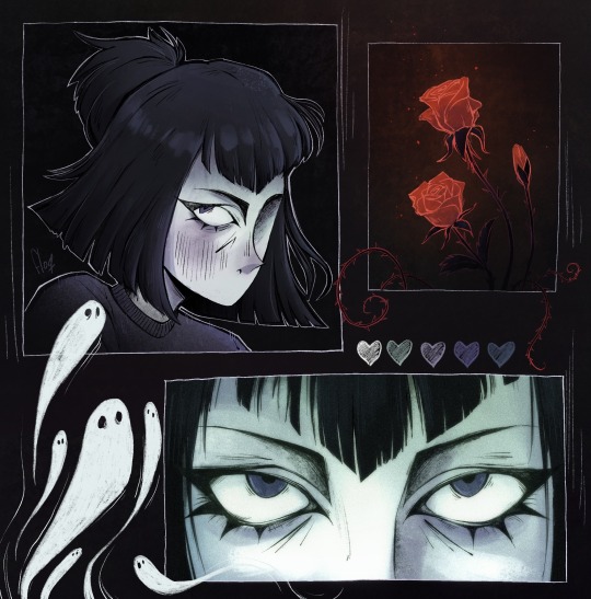
embracing the goth side of Sam’s character 🖤
[ID in alt text]
3K notes
·
View notes
Text
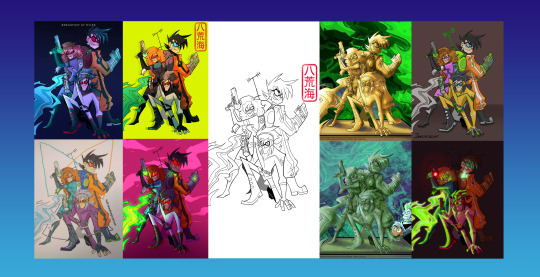
Welcome to our third consecutive year of Green With Envy!
Open for first timers and the obsessed, we welcome all skill levels to this art based event. Just like before, the event comes in two parts with a few minor changes to spice up this year's competition.
Anyone Can Enter a Line Art!
Love to line but hate to color? This side is for you! Part one is the slow build up, where artists create this year's line art. Over the course of two months a form will be open and waiting for anyone to drop a Danny Phantom themed line art in. Crossovers welcome! Unlike our previous years, we will be keeping all the 2025 line art a secret until the drop date!
Color To Compete!
During Part Two of the event, things rev up and turn competitive. If you sign up for this half, you better be ready to color! When the line arts drop, the fighting begins. For those who want nothing more than to go crazy over a brand new, Danny Phantom themed coloring book, this part is for you. The goal is to color as many of the line arts from the first half of the event as physically possible with the rest of your small team. Unlike other DP events, GWE will have 10 whole coloring teams, so expect to get cozy with your new mates while you strategize!
And when we say strategize, we mean it. >:3 Green With Envy is unique in that the points you earn can be snatched away! How many your team gets depends on when you complete a coloring, how you complete a coloring, and to whom the line art was assigned. (Don't worry, you can color any line art, including unassigned ones!) Trickery is just as important as the speed and skill of your artistry here! Drop the ball and your points just may be Poached right from under your pencil tips!
~~~~
GUYS, THE 2024 ZINE IS DOOOOONE!
@englandamericaitaly NEARLY DIED MAKING IT BUT IT WAS SO WORTH IT! Check out the 358 page masterpiece here!
Welcome back to the gremlin enclosure! Thanks everyone in the Phandom for showing the event so much love!
Big shout out to @ecto-stone for letting us use their kick-butt line art from last year's event to make this year's banner! And to @furiarossa, @ovytia-art, @ecto-stone, @breakfastatmiles, @jamiethebeeart, @half-deadmagicperson, @ectoblastfromthepast and @cakeractuallyarts for coloring it!
This year's Links, Info and Important Dates below!
The official hashtag for the event this year is #greenwithenvy2025
In-depth Rules can be found here!
Tutorial can be found here
FAQ can be found here
The discord server for this event is here
~~~~
Line Art and All Sign-ups Due: Friday, February 28th (02/28/25) 11:59 pm, Pacific Time Zone
Coloring Starts: Friday, March 7th (03/07/24) 8:00 pm Pacific Time Zone
Coloring Due: Sunday, April 6th. (04/06/24) 11:59 pm Pacific Time Zone
Sign-ups for line artists are here
Sign-ups for colorists are here
Line artist submissions go here
Colorist submission form can be found in the Discord.
P.S. Remember when looking at the dates to account for your daylight saving's time. What day it happens on depends on where you are in the world!
~~~~
Looking for links to last year's stuff?
2024 Free-To-Color Line Art
2024 Masterpost
#love the zine!#had so much fun last year#had so much fun with this last year!#danny phantom#dp events#greenwithenvy2025#phandom event#danny phantom event#art
165 notes
·
View notes
Text
Thank you so much 🫶🫶
I'm going to be taking a break for a bit. Right now, I'm feeling overwhelmed between art and my personal life, and I need to take time to prioritize that.
The phandom has always held a special place in my heart because of the amazing people and creations within it. As of recently, I haven't had that same feeling of community. I'm a bit heartbroken over some things said about not only my art, but things said about others' creations as well. I put a lot of time, care, and thought into my pieces, and I know other creators in the phandom do too. None of us are getting paid to create anything for the phandom, so when there are demands, negativity, and unsolicited advice, it really makes it hard to find inspiration. I haven't been feeling the same joy that I usually do when drawing for the phandom, or really, creating art in general. Between the negative comments, art theft, and demands… I'm just tired.
I'll be finishing up the projects that I'm working on, but other than that, I'm not sure how much art I'll be making at this time. I'll probably still be checking in here and there, but as of when I'll be making art again… could be a couple weeks, a couple months, possibly longer.
I am so thankful for all the kindness that many of you share and the wonderful friends that I've made through the phandom. You all are the ones that make creating worth it 💖
130 notes
·
View notes
Text
your freak-of-nature boyfriend that we locked up in a high security lab is loose in the fucking facility send help before he kills us all
23K notes
·
View notes
Text

she's just a little gal
93 notes
·
View notes
Text
The ghosts in dp should be allowed to haunt I think

3K notes
·
View notes
Text
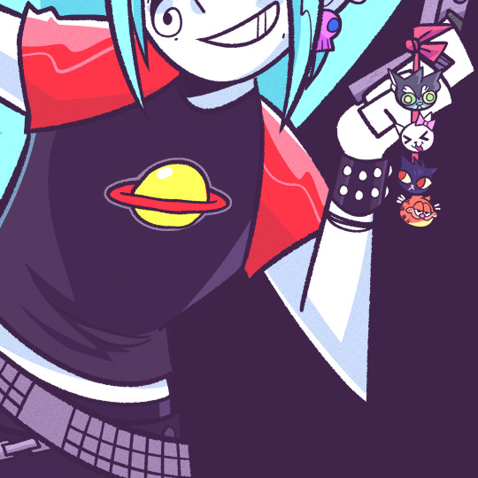
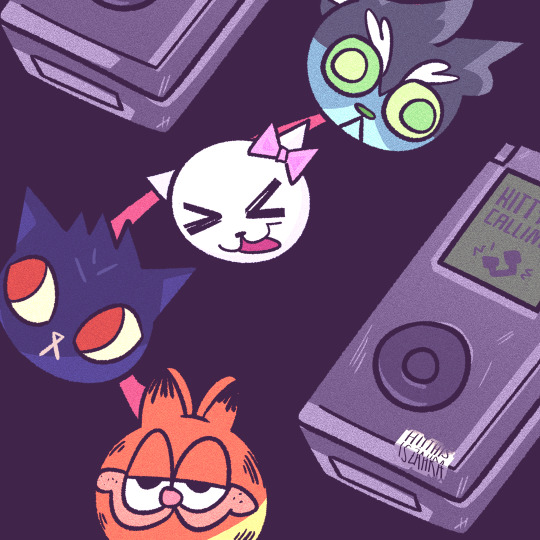

Ember's flip phone keychain, (Plus Aether belongs to @ectospacecadet)
379 notes
·
View notes


