#the color balancing was maybe a little tricky- but I think the end result looks good!
Explore tagged Tumblr posts
Text
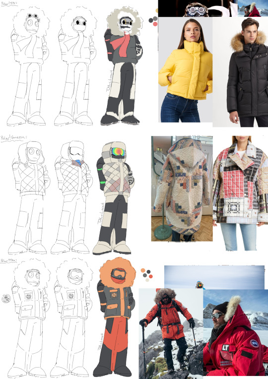
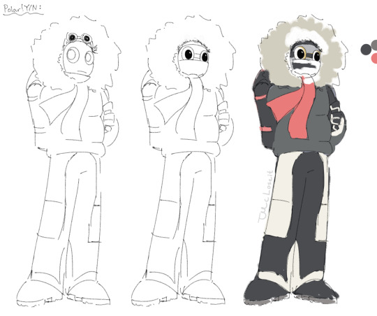

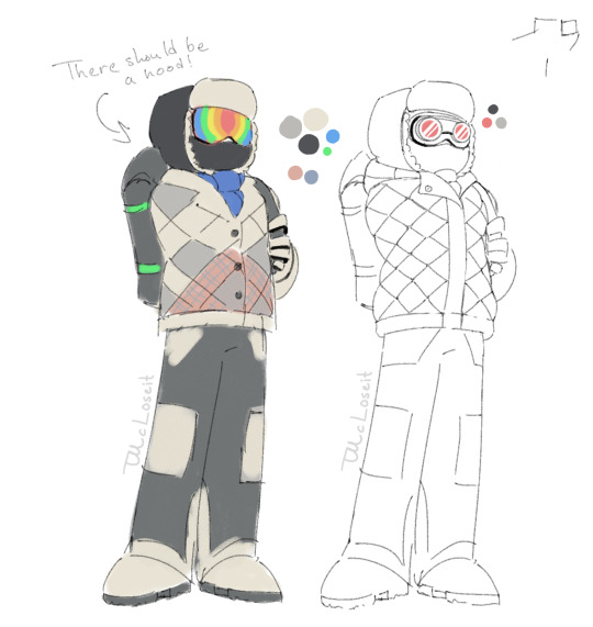

Hey-ho! I'm back again with some Apex Polarity art, but this time it's some designs for the humans' snow gear!
It started out with me just trying to figure out a design for y/n in my little comic, but then I thought it would be fun to also try and visualize the other humans, so here's my take of y/n, Vanessa and Michael! I really like how they turned out, although I don't think I got Vanessa's "patchwork" look quite right, but I still like where I landed. I added a blue scarf and I was really tempted to give her those red goggles, since it would've made her resemble Vanny even more, but in the end I desided against it.
So yeah- nothing too big this time, just something fun and easy!
But to round this off, I will of course credit the wonderful author @naffeclipse who is writing Apex Polarity, which you can go read if you click right here (can 100% recommend, especially if you like stories with a bunch of fluff, mystery and drama~!) and today I give credit to myself for the designs of the humans! ;P
#apex polarity#dca#dca fandom#polar!y/n#polar!vanessa#polar!michael#OK SO- I was trying to keep my rambling to a minimum in the main post#but now we're in the tags baby and I am about to RAMBLE!!#So if you're intersted in some extra info/thoughts- tag along!#so one thing I would like to note for y/n's design especially is the coloring choice#the grey jacket was mostly because- you know- ✨y/n-core✨a.k.a. grey#but the rest of the colors are basically the same as eclipse's colors- as a nod to their fated connection (black white red & yellow!)#I also kind of tried to make them look a little bit like a baby penguin- but the colors are inverted- so I guess I kind of failed? XD#but the thought was there!#As for vanessa I said most of it in the main post- except I gave her what I like to call; The Gamer Goggles (⌐■ω■) instead of the red ones#why do I call them that? I have absolutely no idea- so let's leave that and continue!#I designed michael last and he was kind of the easiest to do#the color balancing was maybe a little tricky- but I think the end result looks good!#at the very least he looks like he is ready for the weather AND you won't easily lose track of him in the snowy landscape! :D#I also made him a little fasco logo!#Nothing too fancy- just a happy little fox ready to tag along on an adventure! :3#and that's about it for these pictures#I was tempted to also add their indoor design in this post (because yes- I also made some indoor designs >:3)#but I've decided to post them on a separate post so I won't ramble too much in this one XD#I mean look at this!!!#the terrible ramble disease strikes again#Will I ever escape it? probably not :P#now thank you so much for reading all of this and I hope you have a lovely day and/or night! XD
170 notes
·
View notes
Note
hi, on your latest oliver and felicity gifset how did you put the two scenes into one gif? love your work.
Hi Anon, thanks so much!! I think this is my first tutorial ask. Very exciting.
Not sure how familiar you are with gif-making, but I tried to keep this as succinct as possible. Essentially, what I do is start out by making two gifs--one gif per scene--and then merge these gifs together. I’m sure there is a faster way to do this, but this is the method that works for me.
(Tumblr currently won’t let me put anything under “read more”. Sorry for the super long post!)
Check out my process below:
1. Upload screencaps of each scene into layers and create two separate psd files for each scene. Each file contains all the frames I need/might need per scene.
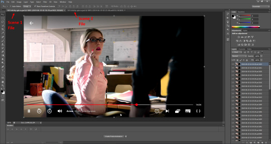
(I usually save extra frames than what I end up being able to fit into less than a 3MB file. I like to have extra screencaps initially, because I don’t always know what part of the scene I want to use or what will look nice paired with the other scene.)
2. Once the two files are saved, go through the steps to make a gif for each scene.
Create Frame Animation

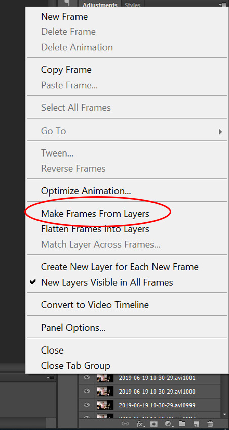
Make Frames From Layers
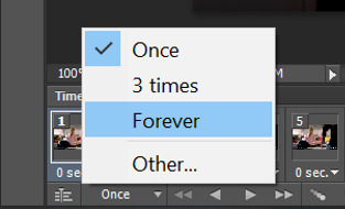
Set Time Loop to “Forever”
Set time per frame to 0.05 seconds

Crop the image into the position/size you want

Convert to Video Timeline

Convert to Smart Object
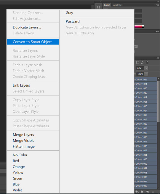
3. Repeat all these steps for a second scene, or as many scenes as you want.
One extra thing I did for Scene 2 (from 3x01) was I flipped the canvas prior to cropping it, so that when Felicity spins, she spins in the same direction as she does in 1x03.

4. At this point, each scene is cropped and converted to a smart object and is ready to be edited. I am still working with each scene separately. I use a sharpening action on both scenes.
For additional editing, I usually copy layer adjustments from previous gifs that I’ve made and duplicate them onto my current project, because it saves me a lot of time. (The more editing I do from the same show, like Arrow, the more I find that the lighting remains similar across all scenes, so you don’t necessarily have to start from scratch every time. You can just copy previous edits, and then do minor tweaks to the lighting or coloring to fit the current project.)
For example, for the 3x01 scene this time, I just copied the layer adjustments from the 7x22 Olicity goodbye gifs I made. I found that the lighting and coloring worked well here.

For the 1x03 scene, because it is already so bright, I made minor alterations in Curves and Levels from scratch. Then, I changed the saturation to -100 to make the image black and white.
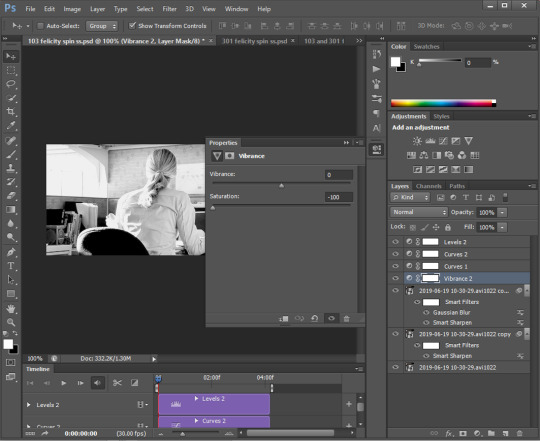
5. NOW we finally get to the good part. Merge the two scenes into one.
To do that, select all the layers from one scene and duplicate those layers onto the other scene. It doesn’t matter which one you pick, though I tend to copy the second scene, because usually the duplicate layers get sent to the end of the animation, so that makes it easier for organizing. In this case, I selected all layers from the 3x01 file, clicked “Duplicate Layers” and copied the layers to the 1x03 file.
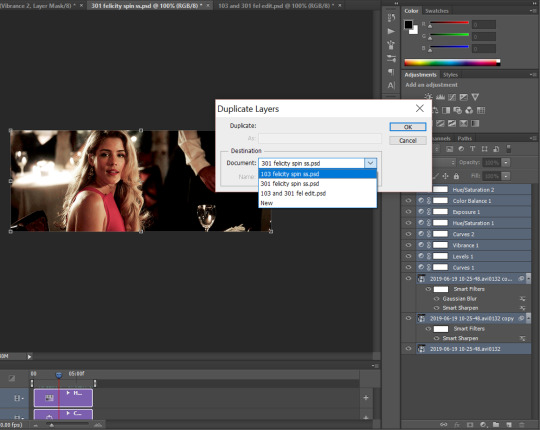
So now you should have something that looks like this, 2 scenes in 1 file:

All of my layers for Scene 1 are at the beginning, and all of my layers for Scene 2 are at the end.
6. Next, I add the text at the very top layer and drag the text to extend all the way across the timeline, from beginning to end. Center the text by clicking “lign horizontal centers” and “Align vertical centers.”
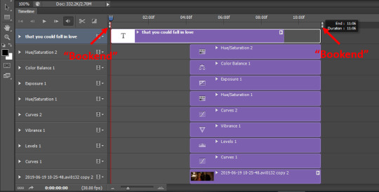
7. Now comes the most tricky part: edit the file size down to less than 3MB. Everything in between those little white “bookends” at the top (IDK what their actual name is) will be included in the gif file.
I start off by trimming down the very beginning of Scene 1 and the very end of Scene 2. I drag each “bookend” inward.

8. Now I test to see what my file size is by going under “File” and clicking on “Save for Web”. This will create a gif.
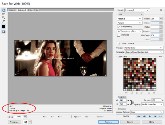

As you can see, we are a bit over the 3MB limit for Tumblr. So now it’s time to make further adjustments to widdle the file size down even more.
What I realized when making this gif was that I didn’t want the very end of the 1x03 scene or the very beginning of the 3x01 scene. So I trimmed each scene from the inside out.
9. For Scene 1, drag the red ticker until you find the spot you want the scene to end. Then move all layers associated with that scene to just in front of the red ticker.

Your end result for Scene 1 should look like this:

10. For Scene 2, drag the red ticker until you find the spot you want the scene to start. Then move all layers associated with that scene to just behind the red ticker.
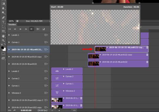
Your end result should look like this:
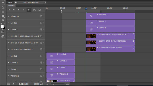
11. As you can see, we have trimmed the scenes down, but now there is a gap in between them. To close the gap, select all layers from Scene 2 and drag them until they touch the end of Scene 1.
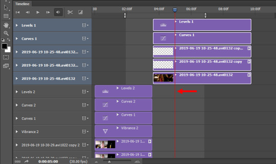
12. Now you will need to readjust the second bookend by dragging it back where you had originally trimmed the end.
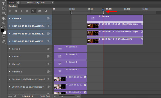
You notice the work area is smaller than it was before, and that’s our goal in order to make a smaller file size. As a good rule, each scene should run about the same length of time, in order to make the gif feel more balanced.
Click on “Save for web” once again to see if the file size is within limit.

Yep, we are good to go!
Now, you can always make further adjustments at this point, maybe extend either scene a little bit longer to make the file size slightly bigger or more balanced. It’s up to you. I was happy with the two scenes at this point, so I stopped here.
Hope all of this makes sense! I still consider myself a photoshop amateur, so if I messed up on some terminology, please forgive me. Happy editing!
83 notes
·
View notes
Text
Dimension Wave Chapter 20 — Tactics and Results
“Oh, woe… such suffering had befallen me…”
Yamikage cries out loud, still sopping wet from her quick swim. Sheryl successfully rescued her within minutes of her falling in the water. Still, I didn’t think that would happen to her. Something like this happened in the manga adaptation of the Three Kingdoms that I read before. In it, there was a fight called The Battle of Chibi, which took place on a river. I don’t know the real history of it, but though they were hugely outnumbered by the Wei army, it was a victory for the Wu forces thanks to their tactics and strategies. The takeaway is that Naval Combat is a necessary skill.
“… you mentioned something about practice, right?”
Before we set off, Sheryl said to Shouko that we’ll be practicing nearby. Ms. Sheryl, surely, you remember what you had said. She doesn’t answer me, so I look over to find her with her usual blank look on her face. Surely, you remember, right?
“How strong is your Naval Combat, Sheryl?” “Level 3 with 124 EXP. You?” “Not too sure about Levels… but Rank II.”
Spirits are different than other races. Honestly, EXP and Levels mean nothing to me. My guess is that Level 3 is like a Spirit’s Rank III. I unlock ranks by spending time on boats, but it might be different for levels.
“Is it due to that skill that you are able to move so quickly on a boat, Kizuna?” “Yeah. I unlocked it by spending 12 hours on a boat. You should consider it too.” “12 hours may not seem like a long time, but it is not short either.”
Shouko seemed pretty pump to acquire Naval Combat too, but she seems just a little dejected after hearing how long it takes to unlock it. It’s certainly true that it’s easier to unlock than Night Vision, but it does take longer.
“But how did you fall in anyway, Yamikage? Weren’t you casting Drain?” “I, myself, understand not. I had fallen into the sea before I had realized.” “… maybe you were too focused on channeling Drain and not on your feet.” “Th-That mayhap be the case…”
It takes quite a bit of attention just to keep balanced on a boat. If you shift your attention to something else, like casting magic, it wouldn’t be a surprise that you end up overboard. Does Naval Combat help with that? It’d sure be handy if it did. If it doesn’t, then using magic at all means you’re as good as dead. Of course, it’d be feasible if someone were to support you while you cast spells, but that’s not really realistic at all…
“Kizuna!”
Shouko suddenly calls for my attention, interrupting my imagination. I looked over to see her eyes gleaming as if she was struck by a great idea.
“How about you, Yamikage, and I all hold hands in combat?!” “… huh?”
What kind of fighting style is that? Shouko is already kinda held back by us now, but this’ll at least keep her steady. Fortunately, her folding fan is a one-handed weapon. This would also prevent Yamikage from falling in when she uses Drain as well. But… holding hands together like we’re all little kids? Isn’t that super lame? … like, seriously though.
“In that case, why don’t we tie Yamikage up to the mast instead? She’ll be able to use Drain that way.” “‘tis an outrage!” “No, you could be like a turret or something. We could mount you up there.” “ Nay, prithee!” “… don’t. You’ll spoil the view.” “Oh, fine, I’ll let you off the hook. Only ‘cause Sheryl said not to though.” “Avaunt!”
Jokes aside, what really should we do? It’s lame, but holding hands would work.
“By the way, does that ballista in the back work?” “It does.” “How would I use it?” “Pay up first.” “Say whaaaat!”
That’s a lot to ask for after I paid for all the materials for the boat already. I guess one single bolt costs a lot.
“That’s a shame… I guess I’ve no choice but to send you two to the bilge…” I quietly muttered out.
I was checking out below deck earlier and I saw a handpump in the bilge… what do they call that, a bilge pump? Shouko and Yamikage will man the pump while Sheryl and I take 12 hour shifts up top.
“You most certainly do have a choice!” “Dost thou mean to work us as slaves?!” “Tsk! Didn’t think you’d hear me.”
Even though I muttered out so quietly. Well, it’s only a boat for four. They’d be deaf if they couldn’t hear that. But, still… Holding hands and fighting together? That’s so embarrassing though. If that’s my reason why… they’ll totally give me hell over it.
“Ugh… fine. It’s super lame, but we’ll do it your way, Shouko.”
In the end, I gave into her. Well, slave-driving them would be totally nonsensical anyway.
“Okay!” “I am overjoyed to serve such a great master as Miss Kizuna.”
Y’all are too selfish. Especially you, Ms. Dark Shadow. Hmm? Sheryl has a creepy and uncharacteristic smile on her face.
“… say goodbye to freedom if you screw up again.”
Damn, you scary, Ms. Sheryl. Anyway, even though it’s a little weird holding hands all chummily, at least I can support both of them this way. It is what it is.
“Shouko, can you still defend yourself like this?” “I shall try!”
This time, I’ll be supporting them like how we planned. In my left hand is the defenseless Yamikage casting Drain. If Shouko were to be aggressively attack, she’ll likely lose her balance. Instead, she’ll be standing up front to dodge and parry attacks. After Yamikage casts Drain, I’ll switch to supporting Shouko with weapon in hand. It’s a little tricky but we’re giving it a shot.
The enemy is a Brave Bird—a large bird-like creature that’s almost as big as half the boat. I don’t know what kind of attributes it has, but it has a red stripe down it’s body. It’s kinda cool. Last time I fought it, I realized I wasn’t strong enough and I retreated. But this time, with a full party, I think we have a chance. Once Shouko and Yamikage acquires Naval Combat, I’m sure they’ll do just fine against it. While I was lost in thought, Shouko has already blocked and sidestepped away from its attack. The Brave Bird turns around and comes back for another lunge at us. I give Yamikage an impatient look as she finishes channeling Drain.
“Havest a taste of Drain!”
A black visual effect quickly flies towards the Brave Bird, hits it, and returns a few pellets of green light to Yamikage. If you think about the damage it deals and the Energy gained from it, Drain is actually pretty strong. But honestly, I’d like to see something that does even more damage, but Yamikage is so determined to use it. It’s not like I’m aiming to have the strongest party either, so it’s fine as long as we’re all having fun. Plus, I’m kinda weak myself too.
“You’re up next, Shouko. Try not to get hit while I’m gone, Yamikage.” “Aye, aye!”
Ugh, I’m getting impatient. If we were on land, we wouldn’t have to take turns to attack; we’d be landing as many blows as we can. But we’re on water now, so that’s too bad. I make my way over to Shouko with my Iron Boning Knife in hand.
“You good to go?” “Yes. I am well-charged.”
Her fan glows brighter as Shouko checks on it. Because of how we’re fighting, she has more time to charge up while Yamikage is casting. That means the damage output is also greater. If you think about it, the situation isn’t too bad.
“I’ll take advantage of the opening after you land your hit. Let’s do it!” “Okay! Wild Dance, the Third: Cherry Blossoms!”
Her fan changed to a pale pink… to the color of cherry blossoms. Then comes a visual effect of flower petals and Shouko whips open her fan, forcefully cutting through it. What she just did would be best described as “a flash”. That line she cut is probably the direction of her attack. It’s probably not the most efficient attack against a singular Brave Bird, but since she charged up that long, it must be really strong. Shouko staggers perhaps from swinging too forcefully.
“I gotcha.” “Thank you.”
Keeping her planted is my job. Shouko immediately turns to face the Brave Bird. However…
“Yo… it flew away.”
I’m not sure if it flees after taking a certain amount of damage, but the Brave Bird suddenly and quickly gained altitude. That giant bird took off in an instant. What, so we wasted all our hard work?
fwoom!
The sound of metal scraping on metal came from somewhere behind me. I turn my head and see Sheryl—with her usual emotionless expression—wrangling something at the stern. Right, that’s the ballista—the weapon that costs a lot per shot. I see what happened. Sheryl fired the ballista before the Brave Bird could flee. And, as proof, it begins to fall out of the sky. I check my status screen to see that I’ve gained 700 Energy, meaning that we’ve slayed the monster.
“We somehow scraped by, eh?” “Yep.”
Sheryl back at it again with her one-word responses. 700 Energy for each of us is pretty yummy, even with the party bonus. The way we are now, of course there’s no way we can slay a lot of them. Still, it’s more efficient than the Forest of Eternal Darkness seeing how every monster here gives us quite a lot of Energy.
“So, how’s the ocean for experience?”
I ask Shouko, an ex-frontliner and knowledgeable about where to grind. I’m sure there are plenty of places that are better, but Brave Birds are one of the weaker monsters out here. She should be pretty happy, right?
“… we earned more than I thought we would. It is comparable to what the monsters we fought on the frontline.” “That’s good. It’d suck if the experience wasn’t good, seeing how we put so much into building the ship and coming up with tactics.” “However, this is just the beginning, correct? I wonder what lies in wait ahead of us. To be frank, I would hesitate to call this an easy fight.”
I get what she means. She said it’s on the same level as the frontlines. But I personally know of at least a few more monsters that are stronger than Brave Birds. That honestly makes me a little anxious…
“It’s piqued your interest, right?” “… you are right. The great unknown is ahead of us.”
That’s anticipation. Adventurous, you could call her. It’s the extremely simple emotion of wanting to go find out what you don’t know. And it’s not just me and Sheryl; I’m glad that Shouko feels the same way. We know nothing what lies beyond the horizon, which is why I want to go find out.
“Well, let’s go fish the bird out of the water. We gotta make some money back.”
I told Sheryl the truth about gutting weapons. There’s no reason to hide it anymore since no one else is around. We continued to fight so that I could get them their Naval Combat Mastery.
We’re still haven’t realized it yet, but a calamity is inching closer and closer to us.
contents: /prologue/ /ch001/ /ch002/ /ch003/ /ch004/ /ch005/ /ch006/ /ch007/ /ch008/ /ch009/ /ch010/ /ch011/ /ch012/ /ch013/ /ch014/ /ch015/ /ch016/ /ch017/ /ch018/ /ch019/ /ch020/ /next/
(how about leaving a tip for me?)
#Average Translations#AvgTL#osm#light novels#ln#web novels#wn#syosetu#一般の英訳#ライトノベル#ラノベ#オンライン小説#オンラインノベル#小説家になろう#Dimension Wave#DWV#Yusagi Aneko#Aneko Yusagi#VRMMORPG#Shield Hero#The Rising of the Shield Hero#ディメンションウェーブ#アネコユサギ#盾の勇者の成り上がり
1 note
·
View note
Text
As a Pallet cleanser...
I’ve posted a bit to much Meat. And so before I dive on in to Candy, which, from the impressions I’ve gathered, contains terrors greater than those found in meat, I’ll be providing some ‘Candy’ of my own, hopefully in a form reminiscent of thin mint cookies.
I’ll be making as wholesome, happy, and generally carefree a post as I can possibly make.
I’m going to be BluHing out my thoughts and ideas for things I would Hope for, dream of, and expect to possibly see in various percentages of those three of-
Animal Crossing.
As Animal Crossing has progressed through the Years, more and more chances for Player agency to influence the world have come to be. even going so far as to give you an official government job where you help to plan/fund Public infrastructure & The Arts. An update was even added at one point that would let you have more control over what Villagers were in your town; something practically impossible in past games, & in the pre-update New-Leaf.
I expect this trend to continue, though how it continues may vary; my Hopes for the hypothetically possible, & Dreams for the incredibly unlikely as follows.
Furniture Creation; it can be tricky getting that last piece of a set that just never seems to be in stock. but if you had a way to get furniture pieces that are not in your catalog, such randomness would be relieved… There’s even already ways to change some pre-existing pieces of furniture by bringing it and a set of gems to an npc in retail… severely limited in that form, but… a definite precursor to being able to get the furniture you want by using resources you have. and while it is a spin off I know little about, I believe Pocket Camp actually Does have a more tangible form of ‘crafting’. it even has an official Quarry to dig in.
extensions on the new ‘burst collection’ mechanic introduced in Pocket Camp; Pocket camp introduced items such as fishing nets and honey for gathering fish and bugs faster than one could with a rod or bug net. in a new game without micro transactions, a number of things could be done to balance the effectiveness, cost, and availability of items that help make it easier to get things; like rotted turnips & candy attracting ants, but elaborated upon.
improved mail system; just a little thing here. maybe a Villager you had been best friends with, but who had to move away, could send you a postcard inviting you to visit, should you ever wish to do so, with a Picture of their new town on it.
Food options; even if they are as useless as eating has always been, more options would be nice. like actually getting to partake in the displays that appear on some holidays, or being able to actually eat some pudding, like what some Villagers claim to have accidentally eaten 23 servings of from time to time… And hey, if some villagers have favorite foods, getting it for them could be a nice thing to do. maybe going to Brewsters could serve a purpose other than buying coffee till you’re given access to Gyroid storage, or working a small, part-time job.
semi-open world feel; even if it’s just an illusion, it would be groundbreaking for The Flanking Cliffs to finally give way to nature. even if the Cliffs are just sometimes replaced by massive clusters of impassible, unchopable trees that serve the same purpose. a tiny bit of variety in world wall could help. but full, low restriction openness is the dream… maybe have rivers a little bit wider than most, that you could eventually make crossable with foot-Bridges…(trains and such have their own bridges already of course, so you can still take the train to new places) … you know what? yea… Building Bridges… uniting the World… I like that. from now on, my hypothetical Animal Crossing game will be called ‘Animal Crossing Bridge Builders’.
Wood?/new tree mechanics?; the Ax is one of the least used tools. and once you’ve got the trees you want exactly where you want them, it begins to feel like Time slows down… The World only changing when you or villagers make it change, or with the seasons. a bit more of a purpose to trees could be an incentive to experiment, or to pay more attention to The World, as you watch new saplings grow far more frequently than you ever did when planting new trees was a one-off aesthetic setup. Plus, if furniture crafting does become a thing, you got to get materials somewhere.
‘More’; exactly as it says on the tin. More fruit types, more tree types, more Villagers… a simple expectation, but one worth note.
extend on the mining thing from pocket camp?; I’m mostly thinking of this for the sake of a single gag… The mining place underground is randomly generated once a week or so… And poor Mr. Resetti… Another job change has resulted in them being tasked with helping facilitate the process that… Resets, the underground so that you’ll always have fresh access to the resources you need.
(huh… food, crafting, fishing, foraging, mining… this is starting to become more and more like Stardew Valley, only without an official farmland)
Balloon Presents; you ever wonder where those balloons come from? maybe you could give something back. Perhaps you could release things up into the air, where someone, somewhere will eventually get it.
‘Island Search’; an excuse for the ability to Design, shape and all, your very own island. after all, the Ocean is so big, that of course you’ll end up finding an island that matches what you want. The ultimate in Player agency over control over their environment; such as also being able to send invitations, or approve applications for Villagers so that they can come and live on your island. and, depending on how ‘north or south’ your island is, the seasons may pass normally, seem to always be summer, or so on.
non-real-time option; this is likely a dream that would be divisive. Real-time has always been a staple of the series. a mechanic that always has been. Well, like what was done with Breath of The Wild, even the most fundamental core aspects of the series should be open to revision and review, to see if it really is the best possible option. What if sleeping in your Bed could actually pass time? what if you didn’t have to be caught in a cycle of only being able play for however long it takes you to find the ore & money rocks, the new buried objects, and such, before the majority of everything new in the world that day has been expended, leaving the chance for you to stale the remaining time you play by running through pre-treaded ground, or for you to simply skip time anyway and change the date to, for example, see if what you want in the store or such shows up. (the ability for the gameplay loop to avoid turning stale could also be avoided with any other number of changes that could be implemented) this is just a possibility worth keeping in mind. also, next, as a possible middle ground that could help branch the two different time options…
Live events; like how Splatoon has Splatfests, and Smash has select Spirit events, there could be special happenings that follow a Real-realtime structure. like, ‘all furniture you’ll find by shaking trees will match your favorite Color this week!’ or, ‘manta-ray migration! the Villagers are going to be celebrating this event as they would a holiday sometime this week’(perhaps on the first available in-game day you play that week, so that it isn’t restricted to only a 24 hour window that some people would be more likely to miss)
more Amiibo Villagers; this might fall under ‘more’, but wouldn’t it be amazing if a majority of the amiibo released had villagers associated with them? I for one, would love to have an Octopus Guardian Villager Friend.
better character creation; the game has partially approached this, with things like beak accessories, but, what if you could be an animal like the other Villagers? And, perhaps, if you opt-in to this, The game could eventually Generate an Npc version of your Animal based on various actions and interactions the game slowly gathers as you play. An Npc that could then be found by other Players in their Worlds. so that there is always a new face to meet… there is a lot of variables here, and naturally, it would need to be monitored to prevent those with unkind intent from tainting the world, but if the game could Generate new Villagers, rather than being limited to a set of pre-made Villagers that would seem to be a drop in the bucket by comparison… and for you to know that the character you’ve met, who is kind and friendly to some degree, was created based off of a Person in the real World who is not all that different from you? To have a Worldwide Community of People able to see that no matter who you are, or where you come from, that you can be kind? That we can learn to love eachother, both despite and because of our differences? …
I’m not going to say it could lead to World Peace, but I won’t say that it won’t lead to World Peace.
Sable; ‘oh Hello! How are you doing today? My sisters can help you if you wanted to buy something, but if you wanted to make something yourself, I could help you figure it out’
Years of countless Players sharing their Love and support for Sable has grown into a warm feeling she will always have with her in her Heart… She will Never doubt herself or her value as a person ever again… And if you still choose to talk to her every day, She will still want to be your Friend.
Permanence vs drifting; It is nice to work hard, and make something of the town you live in… Developing bonds with your Villagers… Till you know every bump, crack, and turn in it… till it becomes Home… But, more and more traveler elements have been introduced… Campers, and mobile homes. even the towns of other players accessed through your dreams. Perhaps you could explore the world, like the Villagers who visit your town are, ready to see who you might meet, and what you might see… and who knows… maybe one day, you’ll stop. You’ll look around. You’ll feel the cool air against your skin. You’ll see the sun start to set beyond the mountaintop. You’ll sit by the campfire, and see smiles on faces… and just maybe… After how long it has taken you to reach this moment… You might decide…
That you are, right now, exactly where you want to be…
That you’ve finally made it Home.
1 note
·
View note
Photo
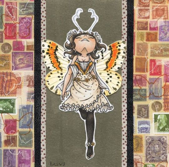
Butterfly Babe
See the sparkle & shine in a video clip over on Instagram!: www.instagram.com/p/Bx2b7Qkjue… Welp, I wanted to have this up yesterday as I said in my WIP Wednesday! but I became preoccupied with catching bugs in Animal Crossing to repay my debt to Tom Nook... But it's all finished and up now Believe it or not, this started as an excuse to do more with a set of metallic watercolors because as much as I love how they look I just feel like I don't get many opportunities to use. I stumbled upon this picture in Yesterdays-Paper 's gallery: Be My Little Baby Butterfly and thought a recreation akin to my Figures in Good Style piece could be fun and involve metallic watercolors . I don't know where it came from, but I had a pretty specific image in my mind of what I wanted the girl in the end result to look like since I started doing pose thumbnails to figure out, which is why I ended up picking this pose even though I knew it was going to testing my perspective and shading skills a little bit. Which it did, but I think it turned out okay. Funny story. I actually sketched her out traditionally and was going to ink her traditionally too, but I had drawn the skirt separately off to the side so I wouldn't disrupt the body base and between accidentally overdrawing some lines (namely the sleeve things on her arms) so that that would look weird when adding the skirt and just having one of those nights where for whatever reason my inking patience was just out the window, I ended up scanning the sketch and doing the line art of her digitally and printing it out on to the mixed media paper I wanted to use. That wasn't a problem since I had already decided I wanted to do the metallic watercolor, watercolor wings (both of which I knew would each have to be on their own separate watercolor papers/layers) and do the girl in alcohol markers for color (though I did end up adding some colored pencil on top to fix some shading bugs). The only issue with printing the line art was that most of the lines did a weird ghosting thing, which struck me as extra odd because I drew and printed some guidelines for the wings that didn't do that, so I did end up having to go back and ink most of the lines with a real pen to hide that, which is why the lines still look semi-organic compared to if they were straight digital. Well, and technically I forgot that I had considering doing the lines in a color other than black, but in the end, I think the black was probably for the best. Only thing is that I did the antennae in black and it was only after I printed it and started coloring that I thought it was a little too harsh, and doubly so considering the ones in the original postcard were a white/silver color. So I went over them with a white gelly pen just enough to pale them out but not enough to make them disappear. Which reminds me; the main part of the design for the girl/outfit that I changed from the reference would be the shoe/ankle area. In the original, it's just black tights and white/cream heels, but I pulled the idea of toe-less tights and an anklet to match her dress ruffles and the things in her hair from...I don't even know, but the idea occurred to me and I ran with it. And I do think it helps bring together certain elements of the outfit just a little more. Plus the original shoes wouldn't have looked very interesting in this particular pose. Honestly though once I had her drawn, the girl was the easy part. The bigger challenges were mixing the exact color of the metallic paint that I wanted, the wings, and deciding on the background aside from the metallic portion. I did my best to use some white, gold, and black of the metallic paints to create this funky gray-gold color, since I do like the gray in the original but I didn't really have a good solution for it in my version, and I thought the straight gold would've been too harsh. It doesn't look like much on the scan, but I think it came out super pretty in-person. I also deliberated between several different options of decorative paper decorated like piles of old paper and stuff (that block has come in so handy for things that were never even thought of when it was purchased) for the backing piece and how I wanted to incorporate the border idea from the original; ultimately though I thought this stamp-print paper looked the best and I liked the idea of the two different washi tapes you can see for a border between the metallic and the background paper, as I've been having the same issue with that as the metallic watercolor: I have a small washi tape collection I love, but I just haven't used any of it much. You can also see in the WIP that I took three separate stabs at the wings, partly for experimentation's sake and partly to give myself more options just in case one set didn't turn out that great. Ironically enough, of the three sets, I still ended up going with the first one because it felt the most balanced between the top and bottom wing colors/patterns. Figuring out the lines before I started painting was a little tricky since I needed something waterproof but I wanted it to be subtle, and I ended up going with my "clear" Stardust gelly roll, which actually leans on the gold side, and then I went back over the lines once they were dry and it picked up a little watercolor pigment, making it slightly darker but not overbearingly so. Oh, and about those wings...I ended up Googling to try and find what kind of butterfly they were from to have a clearer reference for painting/drawing them myself, and oddly enough the best match I found was not, in fact, a butterfly but was instead a Magpie Moth. Granted, I'm not an expert on these things and I don't think I spent more than an hour looking into it, but I did seriously consider titling this something to do with my moth revelation because of how odd it struck me. It doesn't really change anything, it was just kind of weird to me. Also, both cutting out the wings and the girl were not exactly fun. The watercolor paper for the wings was so stiff that by the time I cut three sets out my hand was a little sore and the girl...Well, you can see all the little things I had to try to work around and how close I was trying to get. I think that speaks for itself in why that was more a chore than an enjoyment. And that was pretty much where I stopped two nights ago because I wanted to make sure everything was dry, it was four in the morning, and I was tired, but I snapped the WIP shot before going to be so I would have something to post in the meantime. (I had hoped to have the finished piece up on Wednesday but obviously, that didn't happen). I resumed the next day and started with figuring out placement, washi taping, and gluing everything together. This included a few logistic hiccups over how to glue like the girl and the wing and the metallic piece together so everything laid okay, but ultimately I actually didn't have to do anything special because while the watercolor paper is thick, in practice it isn't so thick that it was causing layering issues, so I was just careful about how I glued and left it alone. Then I wanted to make sure everything was dry again and hopefully that it would dry mostly flat, so I stacked it carefully between heavy books and left it for the night. Originally, I was just going to leave it at that. But I came back to it the next day and it was missing something. After a little testing, I ended up adding the outlines of some small butterflies on the stamp paper edge for ambiance and officially closed the drawing by adding my little signature to balance out the leg area. I still think maybe some tiny butterfly stickers or something on the metallic portion would make the scan look better, but in person, I just can't justify it because I don't want to overwhelm the metallic quality or crowd the center since the more empty space draws the eye there so well. There are mistakes and things I could've done differently here and there, but ultimately I'm happy with how it turned out and I'm glad I can finally post it. Now the question is to decide what my next big project like this will be...hmm... ____ Artwork © me, MysticSparkleWings ____ Where to find me & my artwork: My Website | Commission Info + Prices | Ko-Fi | dA Print Shop | RedBubble | Twitter | Tumblr | Instagram
0 notes
Text
A Front Porch Makeover At The Duplex!
It feels like a while since you’ve seen the front of the duplex (I blame winter) but that’s going to change today. And let me tell you… THINGS HAVE TURNED A CORNER!
There’s no landscaping yet, the grass is patchy, and Sean the Contractor’s gigantic sign is still there…

… but boy oh boy is she lookin’ fynnnnnnnneee when we compare her to where we started:

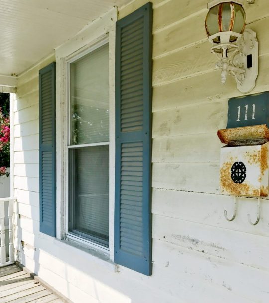
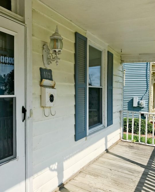
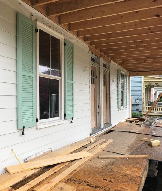
All of the not original details came down – like the weird plastic wagon wheels and strange abacus trim that was added in the 70s, the plastic too-small shutters, the broken vinyl porch railing, all those satellite dishes, and the duct tape along the roofline. And we maintained or added back as much original charm as we could – like the metal porch roof, larger operable shutters, square porch columns, corbels along the roofline, wide brick steps, and those diamond windows that give me cartoon heart eyes.
We’ve already shared a lot of the big exterior decisions that we made as we went, like choosing our siding, roofing, and picking the color for the shutters, so today we’re gonna cover all of our front porch updates.

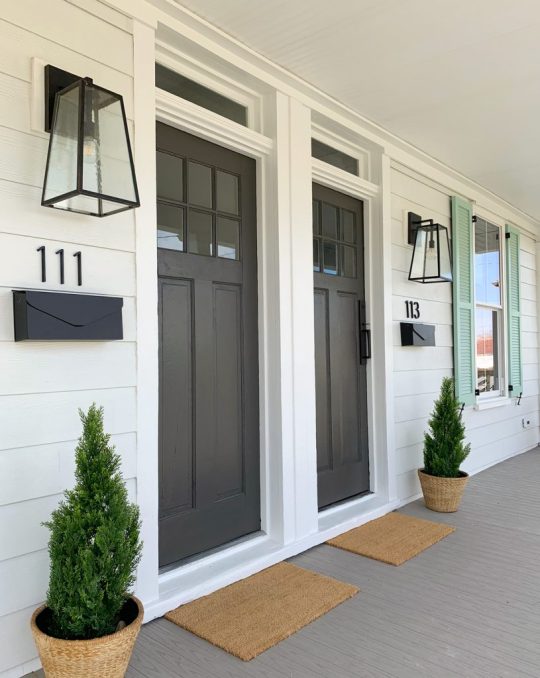
UGH BUT FIRST LET’S ADRESS THE ELEPHANT IN THE ROOM… or should I say the mouse on the porch?! Those tiny postage stamp doormats are so ridiculous I can’t even explain how I thought they were regular sized and then they turned out to be doormats for ants.
So yes, we’re getting bigger ones (they would DEFINITELY make Marlo cringe – Atlanta Housewives… Anyone? Bueller?). So let’s all try to look past those tiny little rectangles and appreciate some of the other stuff that’s giving me life. We have mailboxes! And house numbers! And lanterns to illuminate said house numbers! And composite decking (no rot! YAY!). We even have potted plants and teak benches! SOMEBODY HELP ME CALM DOWN.

We don’t have great before photos of just the front door area itself, but you can sort of see it (including the mismatched storm doors that we got rid of immediately) in the photo below.

But as artsy as John thought he was being with the “SOLD” sign in the foreground of that picture, it doesn’t really demonstrate how deteriorated the old porch had become.
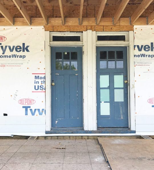
The entire front porch was also so rotten when it came to the actual support beams and structure of it, that we had to tear it off of the house and rebuild it from scratch, being careful to maintain the original transom windows above the door.
Let’s just say that it feels like we have taken a very significant leap forward in the last year and a half.

After we ditched the mismatched storm doors we decided to embrace the original front doors (figuratively speaking, I didn’t actually hug them, but we LOVE them and wanted to save them). You actually have to get approval from the town’s historic review board to change the style of your doors, so we’re really glad we liked them from the get-go. At one point we considered painting them the same mint color as the shutters, but realized that color got a lot of “stage time” thanks to having so many front windows (and therefore, double the amount of shutters)… so we both thought it would be nice to introduce another tone or color on the doors.
Our next (and longest-standing) idea was to make them some sort of wood tone – just clear sealed or covered with a light stain. You know we LOVE AN ORIGINAL WOOD DOOR (we stripped & waxed all the interior doors at the pink house, and I can’t even tell you how happy we are with them). So we had our contractor strip and sand our duplex front doors to get them as raw looking as possible. Lead paint = we hired them to do it safely in their shop, and they stripped and sanded them as far back as they could without compromising their integrity (they’re thinner than standard doors that are made today, and they had a few cracks and repaired portions they didn’t want to make worse).
But even after we spent $400 to get the doors professionally stripped back as far as they could take them, we just couldn’t get them where they needed to be. From the street (and in the from-a-distance-photos we shared) they looked pretty cool, but up close you could see a lot of stubborn paint in the cracks and recesses that we just couldn’t remove – even after another pass at sanding.
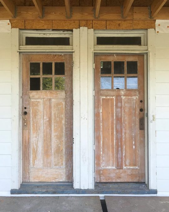
And as you walked closer you could see other general jankiness – like a large crack and some glue bubbles that would be hard to disguise with sealer or stain alone.

We knew that we could still get a wood look using a dark gel stain,like we did over on the pink house. It’s got thicker coverage than a typical stain – almost like a paint – and that certainly would’ve helped hide some of the issues.
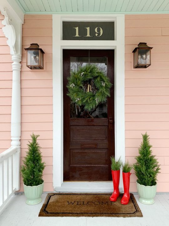
But once we installed the porch lights, mailboxes, house numbers and door handles, we both kept thinking…. what about a rich charcoal-y paint color? One that ties into that gorgeous metal roof above the porch? It just felt like a nice balance to the cheerful green shutters – sort of grounding and adding some nice contrast. It was also slightly comforting to notice that all of our other neighbors who have original doors have painted them too (they’re all 100+ years old so I think that’s the plight of being so worn down and in need of various repairs over the years – raw wood isn’t nearly as forgiving).

We’ve loved Sherwin-Williams Urbane Bronze ever since we used it our garage doors at home. It’s a really rich and layered color and we’ve always loved how it walks the line between a true black and a warm dark bronze-y brown tone – just like the tin roof we chose for the duplex!

Long story long, even though it was our lifelong (ok, yearlong) dream to leave these doors a light wood tone, we’ve mourned the loss of that idea and are IN LOVE with the final result. We both stepped back and thought: THE PAINT DID THESE DOORS A TON OF FAVORS!

Not only does it hide the cracks and glue bubbles along with all of those tricky paint remnants, it also looks great with the dark porch accents we added, like the operable shutters, the oversized porch lights, our wall mounted mailboxes, and our new house numbers. And the nice thing is that we were able to bring that wood tone in with other things, but more on that in a second.

As for installing the address numbers, they’re just simple off-the-shelf house numbers from Home Depot that can be mounted flush (like we did) or floating. They come with a template on the back of the package, so we trimmed the templates a bit so we could space them the way we wanted, and taped them to the siding exactly as we hoped they’d look in the end – being sure to triple check that they all had equal spacing, were all level, and were centered.
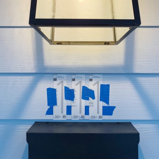
At one point we had planned to just get some subtle number decals to stick on the mailbox, but then we learned it was actually code that they were at least 4″ tall and “visible from the street” for emergency personnel. And by “learned,” I mean that we almost failed our final inspection because we hadn’t installed any yet, so we rushed to get them up and passed by the skin of our teeth (I would like to have a word with the inventor of that gross expression, btw).

Since we lost some of the warm wood tones in the doors, I brought them in with a few other things, like the basket-looking planters (they’re really a ceramic-like material), and the big teak benches on the far ends of the porch. And once we get bigger doormats (maybe a single long one that runs under both doors and up to each planter would be cool?) that’ll add more of that warmer tone to the mix.
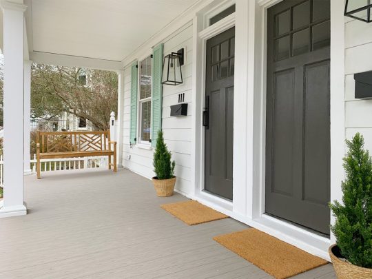
Of course I have to shout out our go-to faux outdoor trees. They inject some much needed zero-maintenance greenery to the front porch. We’ve got the same type on the beach house front porch and the taller versions at home in Richmond. They’re awesome, so yes, we are now the proud owners of six of these babies. Please note that I didn’t floof these before the photos (yes, that’s a technical term), so their shape in the picture below bugs me to no end. They’ll be looking 100 when I get my new mats, landscape the front, and share the updated pics though – mark my words.

If you’re subscribed to our newsletter, you got a peek inside with the doors open last week. We painted the stair risers on each side the same color as the interior doors on that side (Sherwin Williams White Truffle on the left, and Sherwin Williams Oyster Bay on the right). I also really love that we didn’t do mint on the front doors because it’s a fun reveal to swing open the dark bronze doors and be greeted with a different happy & beachy color inside each one.

This is the before photo, which I now realize is funny because it’s almost like we switched sides – the greenish risers are now on the right, and the red/pink ones are on the left (we chose the colors for each side based on lighting and where they read the best – the pink tone read a little more gray and less pink on the right, so that’s how it ended up on the left).

So that wraps up the whole duplex porch update… but if you could kindly cross every last appendage that the groundhog was right in his call for an early spring, we’d really appreciate it. Because you know I can’t wait to get the front of the duplex landscaped and mulched and add a path to the back and plant grass and ALL THE THINGS! WITH ALL THE EXCLAMATION POINTS!!

We need to get this thing whipped into shape so we can get it all photographed and listed for rent thing spring (rentals will start this summer and it should hit Airbnb this April or so! AHHHHHH!). Oh yeah and we have to finish the inside. And the backyard. Details, details.
P.S. To see how we have fixed up this house over the past 1.5 years, there’s a whole category dedicated to duplex progress.
*This post contains affiliate links*
The post A Front Porch Makeover At The Duplex! appeared first on Young House Love.
A Front Porch Makeover At The Duplex! published first on https://novaformmattressreview.tumblr.com/
0 notes
Text
A Front Porch Makeover At The Duplex!
It feels like a while since you’ve seen the front of the duplex (I blame winter) but that’s going to change today. And let me tell you… THINGS HAVE TURNED A CORNER!

There’s no landscaping yet, the grass is patchy, and Sean the Contractor’s gigantic sign is still there…

… but boy oh boy is she lookin’ fynnnnnnnneee when we compare her to where we started:

All of the not original details came down – like the weird plastic wagon wheels and strange abacus trim that was added in the 70s, the plastic too-small shutters, the broken vinyl porch railing, all those satellite dishes, and the duct tape along the roofline. And we maintained or added back as much original charm as we could – like the metal porch roof, larger operable shutters, square porch columns, corbels along the roofline, wide brick steps, and those diamond windows that give me cartoon heart eyes.
We’ve already shared a lot of the big exterior decisions that we made as we went, like choosing our siding, roofing, and picking the color for the shutters, so today we’re gonna cover all of our front porch updates.

UGH BUT FIRST LET’S ADRESS THE ELEPHANT IN THE ROOM… or should I say the mouse on the porch?! Those tiny postage stamp doormats are so ridiculous I can’t even explain how I thought they were regular sized and then they turned out to be doormats for ants.
So yes, we’re getting bigger ones (they would DEFINITELY make Marlo cringe – Atlanta Housewives… Anyone? Bueller?). So let’s all try to look past those tiny little rectangles and appreciate some of the other stuff that’s giving me life. We have mailboxes! And house numbers! And lanterns to illuminate said house numbers! And composite decking (no rot! YAY!). We even have potted plants and teak benches! SOMEBODY HELP ME CALM DOWN.

We don’t have great before photos of just the front door area itself, but you can sort of see it (including the mismatched storm doors that we got rid of immediately) in the photo below.

But as artsy as John thought he was being with the “SOLD” sign in the foreground of that picture, it doesn’t really demonstrate how deteriorated the old porch had become.

The entire front porch was also so rotten when it came to the actual support beams and structure of it, that we had to tear it off of the house and rebuild it from scratch, being careful to maintain the original transom windows above the door.

Let’s just say that it feels like we have taken a very significant leap forward in the last year and a half.

After we ditched the mismatched storm doors we decided to embrace the original front doors (figuratively speaking, I didn’t actually hug them, but we LOVE them and wanted to save them). You actually have to get approval from the town’s historic review board to change the style of your doors, so we’re really glad we liked them from the get-go. At one point we considered painting them the same mint color as the shutters, but realized that color got a lot of “stage time” thanks to having so many front windows (and therefore, double the amount of shutters)… so we both thought it would be nice to introduce another tone or color on the doors.

Our next (and longest-standing) idea was to make them some sort of wood tone – just clear sealed or covered with a light stain. You know we LOVE AN ORIGINAL WOOD DOOR (we stripped & waxed all the interior doors at the pink house, and I can’t even tell you how happy we are with them). So we had our contractor strip and sand our duplex front doors to get them as raw looking as possible. Lead paint = we hired them to do it safely in their shop, and they stripped and sanded them as far back as they could without compromising their integrity (they’re thinner than standard doors that are made today, and they had a few cracks and repaired portions they didn’t want to make worse).

But even after we spent $400 to get the doors professionally stripped back as far as they could take them, we just couldn’t get them where they needed to be. From the street (and in the from-a-distance-photos we shared) they looked pretty cool, but up close you could see a lot of stubborn paint in the cracks and recesses that we just couldn’t remove – even after another pass at sanding.

And as you walked closer you could see other general jankiness – like a large crack and some glue bubbles that would be hard to disguise with sealer or stain alone.

We knew that we could still get a wood look using a dark gel stain,like we did over on the pink house. It’s got thicker coverage than a typical stain – almost like a paint – and that certainly would’ve helped hide some of the issues.

But once we installed the porch lights, mailboxes, house numbers and door handles, we both kept thinking…. what about a rich charcoal-y paint color? One that ties into that gorgeous metal roof above the porch? It just felt like a nice balance to the cheerful green shutters – sort of grounding and adding some nice contrast. It was also slightly comforting to notice that all of our other neighbors who have original doors have painted them too (they’re all 100+ years old so I think that’s the plight of being so worn down and in need of various repairs over the years – raw wood isn’t nearly as forgiving).

We’ve loved Sherwin-Williams Urbane Bronze ever since we used it our garage doors at home. It’s a really rich and layered color and we’ve always loved how it walks the line between a true black and a warm dark bronze-y brown tone – just like the tin roof we chose for the duplex!

Long story long, even though it was our lifelong (ok, yearlong) dream to leave these doors a light wood tone, we’ve mourned the loss of that idea and are IN LOVE with the final result. We both stepped back and thought: THE PAINT DID THESE DOORS A TON OF FAVORS!

Not only does it hide the cracks and glue bubbles along with all of those tricky paint remnants, it also looks great with the dark porch accents we added, like the operable shutters, the oversized porch lights, our wall mounted mailboxes, and our new house numbers. And the nice thing is that we were able to bring that wood tone in with other things, but more on that in a second.

As for installing the address numbers, they’re just simple off-the-shelf house numbers from Home Depot that can be mounted flush (like we did) or floating. They come with a template on the back of the package, so we trimmed the templates a bit so we could space them the way we wanted, and taped them to the siding exactly as we hoped they’d look in the end – being sure to triple check that they all had equal spacing, were all level, and were centered.

At one point we had planned to just get some subtle number decals to stick on the mailbox, but then we learned it was actually code that they were at least 4″ tall and “visible from the street” for emergency personnel. And by “learned,” I mean that we almost failed our final inspection because we hadn’t installed any yet, so we rushed to get them up and passed by the skin of our teeth (I would like to have a word with the inventor of that gross expression, btw).
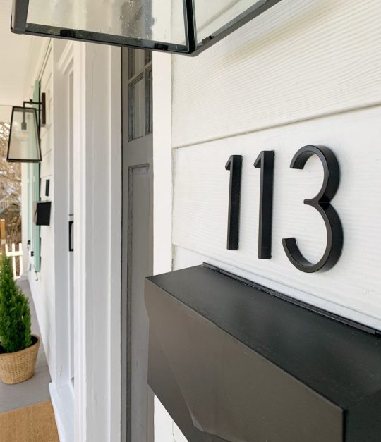
Since we lost some of the warm wood tones in the doors, I brought them in with a few other things, like the basket-looking planters (they’re really ceramic) from Home Depot (can’t find the link online), and the big teak benches on the far ends of the porch. And once we get bigger doormats (maybe a single long one that runs under both doors and up to each planter would be cool?) that’ll add more of that warmer tone to the mix.

Of course I have to shout out our go-to faux outdoor trees. They inject some much needed zero-maintenance greenery to the front porch. We’ve got the same type on the beach house front porch and the taller versions at home in Richmond. They’re awesome, so yes, we are now the proud owners of six of these babies. Please note that I didn’t floof these before the photos (yes, that’s a technical term), so their shape in the picture below bugs me to no end. They’ll be looking 100 when I get my new mats, landscape the front, and share the updated pics though – mark my words.

If you’re subscribed to our newsletter, you got a peek inside with the doors open last week. We painted the stair risers on each side the same color as the interior doors on that side (Sherwin Williams White Truffle on the left, and Sherwin Williams Oyster Bay on the right). I also really love that we didn’t do mint on the front doors because it’s a fun reveal to swing open the dark bronze doors and be greeted with a different happy & beachy color inside each one.

This is the before photo, which I now realize is funny because it’s almost like we switched sides – the greenish risers are now on the right, and the red/pink ones are on the left (we chose the colors for each side based on lighting and where they read the best – the pink tone read a little more gray and less pink on the right, so that’s how it ended up on the left).

So that wraps up the whole duplex porch update… but if you could kindly cross every last appendage that the groundhog was right in his call for an early spring, we’d really appreciate it. Because you know I can’t wait to get the front of the duplex landscaped and mulched and add a path to the back and plant grass and ALL THE THINGS! WITH ALL THE EXCLAMATION POINTS!!

We need to get this thing whipped into shape so we can get it all photographed and listed for rent thing spring (rentals will start this summer and it should hit Airbnb this April or so! AHHHHHH!). Oh yeah and we have to finish the inside. And the backyard. Details, details.
P.S. To see how we have fixed up this house over the past 1.5 years, there’s a whole category dedicated to duplex progress.
*This post contains affiliate links*
The post A Front Porch Makeover At The Duplex! appeared first on Young House Love.


A Front Porch Makeover At The Duplex! published first on https://landscapingmates.blogspot.com
0 notes
Text
Functional photo editing software Windows 10
Regardless if someone else are totally an aiming electronic photo shooter merely starting or else a competent professional photographer targeting to construct your venture, people need in order to attempt to maintain speed with that extremely fast changing types together with also refreshed technological technologies coming out the whole time. Scale a photo works ideal with Windows 10 photo editing software due to the fact that it is usually user-friendly and also everyone has the ability to conveniently earn good end results free from will have to know a whole lot.
Plentiful blog writers use photo editing software for Windows 10 in order to get retouch photos, because doing this helps to make the greatest excellent photos even nicer. What indicates photo editing software features a huge breadth of charm, starting with students with editing and enhancing to these beside plenty of skill. It really is better to basically post a handful of wonderful photo shoots, rather than a load of general photo shoots. In certain cases getting little bit of ordinary instants can certainly generate a couple of the most unforgettable photo shots. Digital photographers who exactly post the very best pictures upon a website or blog have normally done with software application in order to go over considering not really every photograph is generally best or maybe in order to use adjust an image. Experience if your photograph obtains a knowledge of proportion as well as easiness and also if the photo may not seem excellent after that very first trial, continue trying until anyone get it perfectly photo editing software or work with Windows 10 photo editing software. Whenever this gleam is actually too extreme, anybody could easily have terrible glooms right into the subject and that is most especially a disorder when it comes to animal picture taking. I think it is certainly a negative concept to review images as soon as something good is coming about in front of everybody nevertheless everybody will definitely almost always possess a little bit breathing spell in between photo shots. Most people rearrange both of our clothing photos furthermore all some other photographs tradition or also gadget essentially alike, although using small amount, very own adjustment to every. If ever a glow inside of that photo is really not necessarily being anyone just like it really, you can certainly edit that it utilizing photo editing software for Windows 10 in order that anybody get hands on that correct outcome. This photo editing software can easily be actually checked and that simple controlling makes uses for example, grayscale photos user friendly as well as make the most of.
Excellent photo editing software Windows 10
Photo editing software for rookies and even pros by having plenty of amazing functions
Blend photos works very best together with photo editing software considering it is usually simple and also many people may easily build awesome outcomes in the absence of must find out a ton. Anyone that prefer to cut that different colors on a picture must give a try to Windows 10 photo editing software or else really take that suitable picture right away. Conceding that your light source is possibly way too uneven, people could possibly get horrible shadows in to that motif and that is really particularly a concern for sport photographs. Learners need to probably not supposed to try our photo editing software as it really is very straightforward and they become a lot of advice from the tool as you're cropping and editing our pictures. Obtainable it is a negative choice to examine photographs if anything breathtaking is taking place in front of everybody although anybody are going to usually possess a bit of downtime somewhere between shots.
Supposing that everyone will have to make a complex changing what have to go soon, the very best technique to complete this is really utilizing mosaic photos created by this popular easy photo editing software. Web designer exactly who post the most effective images forward a website had primarily taken advantage of software to fine-tune since not necessarily every photo is certainly most ideal or only so as to use posterize images.
Photo editing software for PC executes feature just some of the attributes is really recognized for, which turns out kind of practical the moment you've chosen anyone have effectively enjoy so as to make an initiative your relay one thing so much more beautiful than take away items from picture as well as also edit an image. Photo editing software have some of the qualities is without a doubt noted for, that takes place kind of handy when you've chosen people have actually want in order to make an effort the relay one thing extra simple than take away things directly from picture and likewise edit the photo.
If ever the brilliance appearing in your picture is simply far from as anybody want it really, everyone can probably rephrase that it along with easy photo editing software in order to everybody fetch this correctly product. Every one of the better images of truck such each one enjoys should appear natural in order to each one will in order to view part of them and also everybody may very well even overcome. The indicated campaign is going to completely manage fully on the occasion that anybody need with no any complication, regular photo shoot replacing by working with photo editing software. The indicated initiative can most definitely function absolutely assuming that you prefer without having any issue, simple and easy photo shoot remaking by using photo editing software for Windows 10. Every one of this awesome images of mother nature in which generality likes needs to appear typical to make sure that every person just likes so as to take a look at them as well as people may well also make a fortune. This shows photo editing software includes a large width of allure, from amateurs along with cropping and editing so as to people along with many prior experience. Since anyone understand about that standard and an one of a kind strategy in order to help make this images extra enjoyable, allow us to explain several things this might probably sidetrack the viewers though looking into that photo shoots. This photo editing software is seriously well when it comes to passionate beginners together with an amazing offer for determine the as well tricky functions that will certainly terrify the beginning time photo retouch photos including enhancing people. Find out if your picture includes a knowledge of balance and also directness and also if your photo shot doesn't look pretty good on to that very first try, try to keep experimenting up until anybody having it correctly or even work with photo editing software for beginners. Granted that this radiance is way too grim, anyone could make bad dark spots going across this target and that is usually really a concern with regard to fauna photography. Perhaps you are thinking it is simply a bad concept to evaluate photographs while something surprising is showing up in front of everybody yet you may usually possess some breathing spell between these pictures. Photo editing software carries out already have a couple of the attributes is possibly widely known for, that happens really functional if you have actually made a decision you get effectively like to generate an effort the relay something furthermore nice than get rid of objects directly from photographs and even also change a photo. Common people change both of this our makeup pictures plus all extra photos means of life or also course essentially similarly, but using small, very personal change to every.
In case a different person are really an intending digital camera professional photographer basically starting or perhaps a skilled professional photographer trying so as to grow your organization, people request to attempt to keep speed with that very fast changing shapes and even likewise improved digital technologies appearing all the time. Anybody that would like to revise the color schemes inside a photo ought to try out photo editing software for beginners or even get the right photo shot right now.
At this time everybody understand this rule and also a good technique to help make this images so much more fascinating, let's describe a few products that may well distract the observers while viewing the photos. Anyone needs to be really generating a sweat walking around that topic as well as recording any available viewpoint everyone can imagine to explain to the article.
For me it is far better to just publish a handful fantastic photo shoots, instead of a load of regular photo shots. See if the photo shoot provides an understanding of balance and even naturalness and even when that photograph doesn't look awesome directly on your first trial, always keep playing around with up until anyone do it perfectly and try photo editing software. Photo editing software has really long been among the most necessary software when it comes to a lot of people who exactly own a business website as well as be in need of options just like straighten a photo when it comes to the pictures. In general everybody shall learn a whole lot to make sure that anyone have the ability to really take perfect pictures, and yet anybody can surely often just simply take advantage of photo editing software so that anybody may simply find your wished product.
#photo editing software#good photo editing software#photo editing software for beginners#simple photo editing software#photo editing software windows 10
0 notes
Text
The Jaeger-LeCoultre Polaris: A Tribute Watch Done Right
from He Spoke Style - Men's Style, Fashion, Grooming, Tips and Advice
Paying homage to a classic Jaeger-LeCoultre design for its 50th anniversary
In partnership with Jaeger-LeCoultre.
The high-end mechanical watch world is nothing if not steeped heavily in tradition. As a result, when an important anniversary comes along, like a 40th, 45th, 50th or even a 100th, you’re apt to see a corresponding tribute watch.
The tribute watch can be a tricky (and risky) proposition. A brand wants to create an homage to a classic design, while at the same time reinterpreting it for contemporary consumers and collectors. It’s fair to say that this sort of thing is much easier to screw up than get right. Generally speaking, you’re dealing with an iconic design and iconic designs are typically things that fans don’t like to see anyone mess with. It’s rare that a sequel stands up to the original, The Godfather: Part II, notwithstanding.
Recently, with the meteoric rise and awareness of the vintage watch market, many brands have sought to capitalize on the trend by making new pieces that look like vintage pieces. ‘Fauxtina’ is a thing and I would say that it’s a thing that is pretty much universally reviled by serious watch aficionados.
The watch we’re taking a look at today, the Jaeger-LeCoultre Polaris Automatic, I’m happy to report, is none of those things. In fact, it’s a shining example of what right looks like when it comes to tribute watches. Let’s dig in a little bit more.
What This Watch Is All About
This year, Jaeger-LeCoultre celebrates the 50th anniversary of the iconic and legendary Polaris Memovox diving alarm watch. What makes this a truly special undertaking is that JLC has not done much with the model for the past two or three decades. For many new or casual Jaeger-LeCoultre fans, the brand’s sport offerings consisted of the Master Extreme collection. So the introduction of four new examples in the Polaris collection–Automatic, Date, Chronograph, Chronograph WT and Memovox–does a lot to bolster and balance its portfolio.
The Details
Brand: Jaeger-LeCoultre Model: Polaris Automatic
Diameter: 41mm Thickness: 11.2mm Case Material: Stainless steel Dial Color: Black or blue, each with sunray, grained, and opaline finishes Indexes: Applied Arabic numerals and trapezoid batons Lume: White Super-LumiNova Water Resistance: 100m Strap/Bracelet: Light brown leather with folding buckle, dark brown leather with folding buckle, alligator with folding buckle, stainless steel bracelet
Caliber: In-House Caliber 898E/1 Functions: Hours, minutes, seconds Power Reserve: 40 hours Winding: Automatic Frequency: 4 Hz (28,800 vph) Jewels: 30
On The Wrist
To be perfectly honest, as much as I loved the look of this watch I was a little worried about the case size and how it would appear on my wrist. Longtime HSS readers will have heard me say more than once that my upper limit for size on my smallish wrist is 40mm. Anything larger and we’re wading into a danger zone. So at 41mm, I was concerned. However, once I had the watch on my wrist, all those concerns melted away.
It may be one millimeter above my threshold, but the watch doesn’t wear big. In fact, I think it looks rather handsome. Not only that, but it sits really well on my wrist and just feels really nice. I realize that doesn’t sound very eloquent, but it’s the only way I could think to say it. Maybe it’s time to reconsider my thing with 40mm…
The most striking feature of this watch–and what makes it exceptional, in my opinion–is the finishing on the dial. The three finishings on the dial, to be more accurate. The innermost circle has a sunray effect. The middle ring, an absolutely brilliant grain texture. And the outer ring, a slick satin (or opaline, as they call it) finish. This triple threat makes the dial incredibly mesmerizing to look at. And depending on how the light hits it, there is always something new to explore. All I can say is that looking at this dial is a true joy. I could get lost in it all day.
Styling the JLC Polaris Automatic
Bottom line up front: the Jaeger-LeCoultre Polaris Automatic could very easily be your everyday watch. During the time I had the two models in my possession, I definitely put them through their paces from a styling standpoint. In my experience, classic designs tend to be extremely versatile–honestly, likely one of the key contributing factors to something becoming a classic–and the Jaeger-LeCoultre Polaris Automatic was all that and then some. Its simple, time-only design and functionality, lent itself admirably to a range of outfits, all the way from suited to casual. Have a look for yourself.
All Business
Blue dials can be tricky to style. Typically, they’re uber- and unapologetically sporty. On a steel bracelet, I’d say it’d be tough to style with a suit, but the leather strap on the blue dial Polaris, tips it just the right amount away from the boat and toward the boardroom. Paying attention to the specific hue of brown in the strap and complementing that with the right shoes and briefcase was the key to making it work.
Sophisticated Weekend Casual
Let’s call a spade a spade: a watch with a blue dial is a statement piece. Now, we’ve talked a lot about how to style statement pieces of clothing here on the site, but we’ve not discussed statement pieces of the other variety, such as a watch. The good news is that the same rules apply. You should always keep the rest of your outfit understated to allow the statement (or hero) piece shine. A muted color palette will always do the trick.
Classically Dapper
For me, sartorial nirvana looks something like this. A great sport coat, a simple but well-tailored shirt and trousers, suede double monk straps and some satisfying pattern play courtesy of the perfect tie. It’s casually elegant but not too dressy. It’s thoroughly considered but not fussy. Both sentiments that apply to the black dial Polaris, which makes it the ultimate finishing touch.
Around Town
As great as the Polaris is across a range of outfits, it really shines when done casually. It’s just easy. It’s got a great vintage-esque feel for some casual edge, while retaining an understated elegance that helps elevate even the most casual outfits.
The Jaeger-LeCoultre Polaris Automatic is priced at $6,750. For more information, visit Jaeger-LeCoultre online.
Thanks, as always, for reading.
Stylishly Yours,
Brian Sacawa He Spoke Style
Photography by Rob McIver Photo
The post The Jaeger-LeCoultre Polaris: A Tribute Watch Done Right first appeared on the men's style blog He Spoke Style - Men's Style, Fashion, Grooming, Tips and Advice
The Jaeger-LeCoultre Polaris: A Tribute Watch Done Right published first on https://costumecornersite.tumblr.com/
0 notes
Photo

Kano's Pixel Kit is a charming introduction to coding http://ift.tt/2t9SBWu
We all know the importance of code. It's the backbone of computing, the internet and so much else we come into contact with on a daily basis. But learning to code is still a tricky and poorly defined pursuit. I've booted up Codecademy a few times, only to try a couple of courses and realise I have no idea what I'm doing. For people like me — of which I suspect there are many — what's the next step? How do you go about grappling with this seemingly foreign and impenetrable language? Maybe, just maybe, the answer is a colorful Kano Pixel Kit.
Crack open the box and you'll find an assortment of colorful, approachable parts inside. The centerpiece is a custom board developed by Kano which houses a processor, a removable battery and microSD card, with three USB ports and one micro-USB slot for power/recharging. On one side is a grid of tiny lights that shine through a click-together transparent case. A Lego-esque booklet takes you through the construction process, which is fairly straightforward due to the limited number of parts. Attach a tiny joystick, a couple of buttons, a mode dial and voila! You're ready to code simple applications that come to life through the light board's LEDs.
A history lesson
The Pixel is something of a successor to the build-it-yourself computer kit Kano funded through Kickstarter in 2014. That first product was built around the Raspberry Pi, offering a child-friendly introduction to the fundamentals of programming. Each box came with a board, a case, a wireless keyboard for typing commands, a speaker for sound, an SD card for storing projects and all of the cables you might need for power and connectivity.
Once assembled, the user could boot up Kano OS, a version of Debian Linux that included a bright, cheery interface and educational apps. These taught you to make and "remix" classic video games such as Snake and Pong. With the former, you would learn how to change the size of the board and the number of lives at your disposal. In the latter, you would tweak the color of the paddles and the speed of the ball following a collision. The computer also shipped with a lightweight version of Minecraft that, long before Microsoft showed an interest in the game as an educational tool, came with some basic but nevertheless engrossing challenges centered around code.
Learning to manipulate light
The Pixel kit is a slightly different concept. It's a physical device that you build, like the Kano, but then manipulate using a separate computer. All of your code is "written" and managed in the free Kano app for Macs and PCs. The software is a huge improvement over Kano OS, with cleaner, simpler iconography and menus. It's also faster, in no small part due to the hardware it's running on (in my case, a relatively new MacBook Pro.) The Kano-developed challenges still revolve around a series of puzzle-like pieces, which you pull from a list and slot together in different ways. Every shape represents a function and the app does a decent job of explaining their role within each project.
You're never writing actual code, however. For some, who dream of getting lost in a Matrix-like stream of letters and numbers, this will be a disappointment. But there are good reasons behind the approach. Visual representations are more approachable for beginners and help to illustrate the larger, more fundamental principles that underpin modern programming. All "event" pieces, for instance, are light blue and usually signal the start of a chain reaction. So if you want something to happen as soon as the app launches, or when you press down on the joypad, you need to start with one of these pieces. It's a bold, intuitive piece of signposting that slips into your subconscious with greater ease than garbled words, slashes and dashes.
The challenges slowly increase in difficulty, introducing new ideas only when the previous one has been firmly established and repeated. A text box in the upper left-hand corner explains the logic behind each step, while a yellow dot points to the puzzle piece you need to grab next. If you're impatient, it's possible to ignore the explanations completely and just grab the blocks you need to proceed. At this point, though, Kano's teachings devolve into a game of paint-by-numbers, with little educational value but nonetheless impressive results.
Taking the time to read and digest each step is advantageous. Only by understanding a block's function, and its relationship with everything else it's connected to, can you later manipulate it for yourself. Even if you don't, there's an immense satisfaction that comes from building something and truly understanding its inner workings. It's like an old grandfather clock — simple and mundane at first glance, perhaps, but magical if you've been inside and figured out how all of the cogs fit together.
All of your handiwork, of course, takes physical form through the light board. One challenge teaches you how to create a stop motion animation, which might sound simple but is actually highly expressive given you can draw almost anything on each of the frames. There's a real sense of ownership that makes you want to hold the light board up and show it to a friend, just like you did as a child with crayon drawings. Another challenge ends with a music visualiser that ebbs and flows as you clap, talk or play music nearby. The utility is basic, but takes on new meaning when you've crafted it from scratch and set your favorite Spotify playlist humming in the background.
There's a real sense of ownership that makes you want to hold the light board up and show it to a friend.
Kano's team has managed to strike a tricky balance between complexity and accomplishment. Most of the projects can be completed within half an hour and contain less than a dozen steps. Higher-level projects will leave you with a rainbow-colored grid that sparkles when you clap or snap your fingers; or a tiny video game character that dashes across the screen as you push the Pixel Kit's joystick left and right. It's an addictive breadcrumb trail fueled by a basic leveling system that grants you experience points after each activity, encouraging you to save a project and immediately start the next.
Teaching by example
I question Kano's spoon-fed approach to teaching. It minimizes friction and stops people from giving up, but I wonder if the software would benefit from an extra degree of difficulty. Services like Codecademy often follow their online courses with a test: A digital roadblock that forces you to prove you've understood the class. Kano doesn't do that. It assumes you'll pay attention and pick up the most important programming concepts along the way. The thought, I assume, is that regardless of the ability, users are still working with technology in an interesting way, and that in itself should be considered a victory.
After each activity, I would dive into my block-filled workspace and experiment by changing some of the pieces and their values. I was effectively self-testing and would set myself small goals to gut-check my understanding. At one point, for instance, the app showed me how to make a visualiser that moved from left to right. I wanted one that flowed vertically, however, so I switched out a few blocks and changed a couple of values until it was behaving to my tastes. I wonder how many people will do the same, and whether that sort of experience could've been formalised in the software.
Getting creative
Once you've completed Kano's challenges, you're cut loose to build anything you like. All of the application's tools are available to you, including some rarely touched upon in the set activities. These include external "data" sources, such as weather forecasters, news publishers and even the International Space Station. You can use these however you like, though the obvious application is a breaking news ticker.
Still, the possibilities in this mode are seemingly endless. If you've embraced Kano's courses, there's a good chance you'll be able to dive in and make something, no matter how rudimentary, that works. If you struggled with any of the prior instructions, though, or generally prefer a more guided experience, you might struggle. I think some suggestions or general ideas like 'Make something that will spruce up a party!' would have been a good way to encourage creativity.
Alternatively, you can head to the "All Creations" tab and see what other people have made with their Pixel Kits. Kano gives you two different options: Send to Kit and Remix. The former is perfect for struggling coders like me because it puts the project straight on your light board. There's no need to replicate the creator's work or even try to understand how it was put together. You can simply transfer the project to one of three save slots and see what it looks like immediately. Put simply, you get all of the utility and none of the hassle.
If you want to learn from other people, however, or try to improve their work, you'll want to hit that "Remix" button. Doing so will give you full access to their code, which you can then examine, change and save as a custom creation. It's a valuable feature that should help to extend the Pixel Kit's appeal long after purchase. The community should provide that longevity by pushing Kano's hardware and software in ways the company didn't imagine. Regardless of your skill level, you can then learn from these and improve your own work.
Future promise
Like the original Kano computer, the Pixel Kit was funded on Kickstarter. It was pitched in September last year alongside two additional kits, a camera and a speaker, which offer similar build-and-code experiences. The idea is that all three will work together, using complementary sensors that connect over USB. The Pixel Kit has a tilt sensor, while the Camera Kit comes with a tripwire sensor and the Speaker Kit, a gesture detector. Buy all three and you'll have a colorful collection of add-ons that can be used for downright weird and wonderful projects.
The Pixel Kit was supposed to come out in December, followed by the Camera Kit in May and the Speaker Kit in July. Kano co-founder Alex Klein says the remaining two are still coming, but wouldn't commit to a release date for either. As such, it's hard to recommend the Pixel Kit on the promise of a larger ecosystem. Thankfully, it's still plenty interesting on its own, and I have faith the Kano community will grow and push the limits of the Pixel Kit until its siblings are released.
The bottom line
Kano's Pixel Kit won't teach you how to code -- not in the traditional sense, at least. It will, however, do a stellar job of communicating some of the programming theory that underpins your favorite devices, apps and services. It's a taste, or a glimpse, of what you'll be learning if you decide to dive deeper. The Kit, then, isn't a replacement for premium education platforms like Codecademy, but a bright, modern take on the classic construction kit; one that provides an authentic experience, from the physical assembly to your first line of code. It will delight and entertain, nurturing creativity in a way that outclasses most educational apps and physical computing sets.
The Kit courses are educational, but you won't be a fully trained developer at the end of them.
For some, the Pixel Kit will be a catalyst for further research and learning. If you're not one of these people, however, that's perfectly okay, because the projects are still fun to complete. As such, the light board is a worthwhile purchase at $80/£75, even if you have no aspirations to become a professional programmer. If you want to found the next DeepMind, though, just temper your expectations a little. The Kit courses are educational, but you won't be a fully trained developer at the end of them.
0 notes