#photo editing software for beginners
Explore tagged Tumblr posts
Visit Tumblr Blog
Explore Tumblr blogs with no restrictions, modern design and the best experience.
Last Seen Tumblr Blogs


Fun Fact
Kazakhstan’s Minister of Communications and Informatics has blocked the Tumblr site because it contained 60 sites of terrorism, extremism, and pornography in 2015.
Text
How to Paint on Leather Jackets:
A Relatively beginner friendly guide.

Things you will need:
- A leather jacket.
-Card stock ($6 for 50 sheets at staples, or steal it from work)
-Xacto knife ($12 or wander around an art campus for a few minutes, and you'll find one)
- A surface to cut on (cutting mats are relatively affordable, but a flat piece of glass or ceramic will probably also work fine. The mat I use for this is a tempered glass one)
Paint markers. the main thing is to make sure you are NOT using oil-based paint. Some brands make both oil and water/acrylic based pens, and it can be hard to tell which is which at a glance.
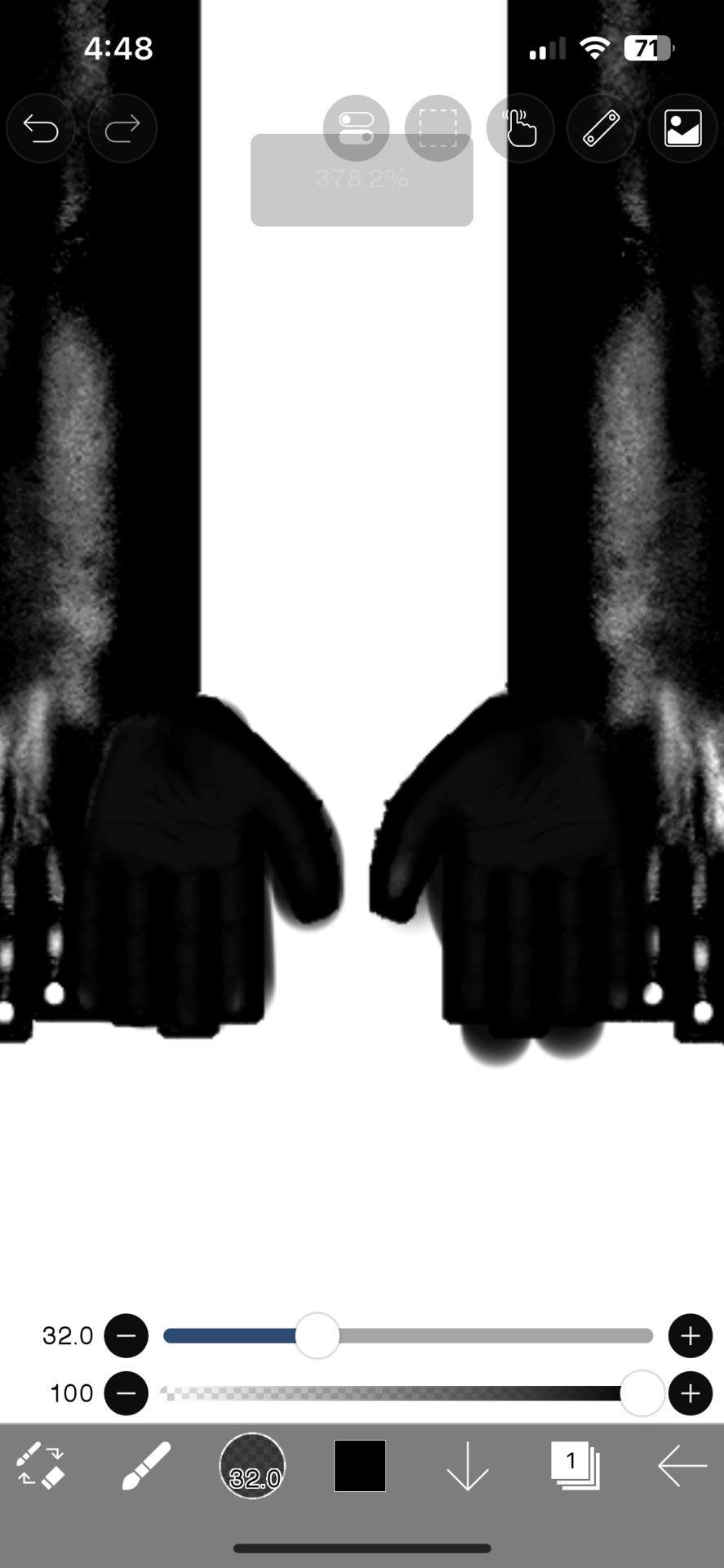
Ok lets start!
Find an image you want to use. Once you get used to it, you can get extremely detailed results with this method, but for now we'll use a more simple example.

Ok, I don't really like the common Mischief Brew patch logo, so were using the twxt from this album instead. I'm doing this all at work, so you can also see that you don't need any fancy software for this. I'm using MS Photos for this whole process.

So crop the image close to your text

Fiddle with the settings in edit if you want, i usually think making it b&w with a higher contrast helps.

Now we're gonna cut. With stencils, start with fine details near the center of the design and work outward. This way you keep as much solid paper around your cuts as possible, which helps prevent ripping or deformation and mis-cuts. I also usualy cut in two stages, all horizontal cuts and vertical cuts.

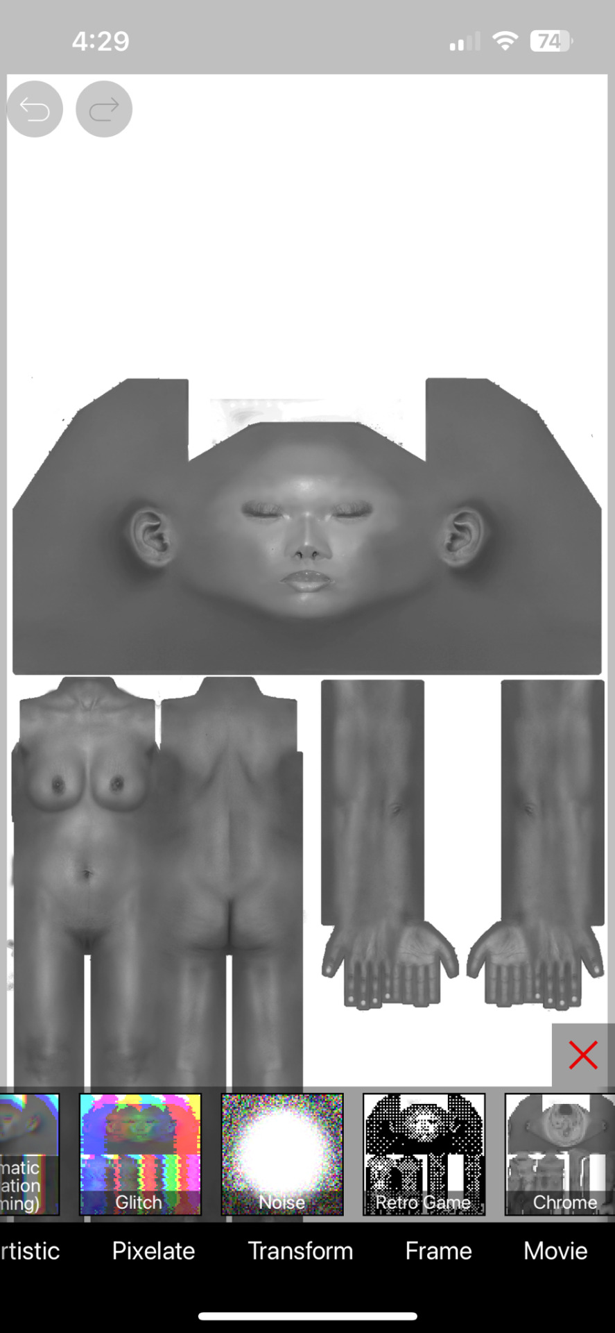
Heres the big difference between what we're doing here and making a regular stencil. We don't care about islands. You see the empty spaces in the B, the e's, the S, etc. We arent cutting that out, we're taking the whole shape and we'll add that shit back in later.
So now we cut it out, we have something like this:

You can see how anything I came across that seemed mildly irritating to cut out, I ignored.
Thin lines connecting parts? We can draw a line. Islands? We can do the basic shape and refine it later. The point is that this stencil will put the right shapes together with the right scale and spacing.
Next we'll put it on the jacket.

Tape that shit down, you don't want if moving more than it's already going to. Next, trace the outline, that's it, then remove the stencil and burn it or something.
Should have somethong like this

Now by hand, fill in the stencil. I advise tracing the outline again as you fill. It helps prevent overflow. If you feel confident, try and build the empty space here instead of later.

So it's filled in and we have a general shape. I recommend at least two layers with 10-15 min dry time between. More layers might look a little better but also run the risk of cracking if it gets too thick (this ended up needing 3 layers).
You may have noticed that the outline looks kinda shit, here's the main thing we're gonna do here, editing.
I hit the photo limit here, so hang on for the next part.
73 notes
·
View notes
Text
Writing Notes: Cookbook

Whether you want to turn your own recipes into a cookbook as a family keepsake, or work with a publisher to get the most viral recipes from your blog onto paper and into bookstores, making a cookbook is often a fun but work-intensive process.
How to Make a Cookbook
The process of making a cookbook will depend on your publishing route, but in general you’ll need to work through the following steps:
Concept: The first step of making a cookbook is to figure out what kind of cookbook this will be. Your cookbook can focus on a single ingredient, meal, region, or culture. It can be an educational tome for beginners, or a slapdash collection of family favorites for your relatives. If you’re looking to get your cookbook published, a book proposal is a necessary step towards getting a book deal, and can also help you pin down your concept.
Compile recipes: If you’ve been dreaming of writing a cookbook, chances are you probably already know some recipes that have to be included. Make a list of those important recipes and use that as a jumping-off point to brainstorm how your cookbook will be organized and what other recipes need to be developed. If you’re compiling a community cookbook, reach out to your community members and assemble their recipes.
Outline: Based on your guiding concept and key recipes, make a rough table of contents. Possibly the most common way to divide a cookbook is into meals (appetizers, breakfast, lunch, dinner) but cookbooks can also be divided by season, raw ingredients (vegetables, fish, beef), cooking techniques, or some other narrative structure.
Recipe development: Flesh out your structure by developing beyond your core recipes, if needed, and fine-tuning those recipes which need a bit more work.
Recipe testing: Hire recipe testers, or enlist your friends and family, to test out your recipes in their home kitchens. Have them let you know what worked and didn’t work, or what was confusing.
Write the surrounding material: Most cookbooks include some writing other than the recipes. This may include chapter introductions and blurbs for each recipe.
Photography and layout: If your book includes photography, at some point there will be photo shoots where the food will have to be prepared and styled for camera. Traditional publishing houses will likely want to hire stylists and photographers who specialize in food photography. Once the images and text are both ready, a book designer will arrange them together and make the cover design, but you can also make your own cookbook design using software like InDesign or old-school DIY-style, with paper, scissors, and a photocopier.
Editing: If you’re working with a publisher, there may be several rounds of back and forth as your editor works with you to fine-tune the recipes and text. The book will then be sent to a copy editor who will go through the entire cookbook looking for grammar and style issues, and indexer for finishing touches. If you’re self-publishing, give a rough draft of your book to friends and family members to proofread.
Printing: After everything is laid out and approved, your cookbook is ready to be printed. If you’re printing your cookbook yourself, you can go to a copy shop to get it spiral bound, or send it off to a printer for more options.
Common Types of Cookbooks
More so than any other kind of nonfiction book, cookbooks lend themselves to self-publishing. Of course, cookbook publishing is also a huge industry, and a professional publisher might be the best route for your book depending on the scope and your reach as a chef.
Self-published: This is a cookbook made of up your own recipes, which you might give as gifts to family and friends. You can easily self-publish a cookbook online as an individual. But if having a print book is important to you, there are many options. You can print and staple together a short cookbook, zine-style. Many copy shops will also offer options for wire-bound cookbooks, and there are resources online that will print bookstore-quality softcover or hard-cover books for a fee.
Community cookbooks: A special subset of self-published cookbook made up of recipes from multiple individuals, usually to raise money for a cause or organization. Working with a group has the advantage of a large pool of recipes and testers, and is a great way to share your recipes with a larger audience while also supporting a cause you believe in.
Through a publishing house: If you think your cookbook has a wider audience, you may want to seek out a mainstream publishing house. Get a literary agent who can to publishers who can connect you with publishers who are interested in your cookbook. Large publishing houses don’t usually accept pitches from individuals, but you can reach out to small, local publishers without an agent as intermediary. To publish a cookbook through a publishing house, you’ll typically need a book proposal outlining your concept, audience, and budget.
Things to Consider Before Making a Cookbook
Before embarking on your cookbook project, it’s a good idea to get organized, and to figure out what kind of cookbook you want to make.
Photography: More so than other texts, cookbooks often include visual accompaniment. Beautiful pages of full-color photos are expensive, which is one reason publishers like to work with bloggers who can style and photograph their own food. Not all cookbooks need photos, however. Some of the most iconic cookbooks rely on illustrations, or words alone. Figure out what role, if any, visuals will play in your book.
Audience: Are you turning recipe cards into a keepsake family cookbook, or selling this cookbook nationwide? Your intended audience will greatly influence how you write and publish your cookbook, whether it’s vegans, college students, or owners of pressure cookers. You’ll need to consider your audience’s cooking skill level, desires, and where they buy their food.
Budget: Once you have a vision for what you want your cookbook to be, budget your time and resources. Do you need help to make this book? The answer is probably yes. Assemble a team of people who understand your vision and know what kind of commitment will be involved.
Source ⚜ More: Notes & References ⚜ Writing Resources PDFs
#cookbook#nonfiction#writing reference#writing tips#writeblr#dark academia#literature#writers on tumblr#spilled ink#writing prompt#light academia#writing ideas#writing inspiration#writing resources
48 notes
·
View notes
Text
✷ Tonk's Art Resources ✷
Hi! No one asked but I wanted to make a big list of art resources I use because I like to try and help people be creative! Not everything I list is free (mostly the books & some PDFs), but I’ll try my best to keep a big portion of it unpaid.
I've also made a carrd with the same links and a set of software links + prices but I'll be updating this with more things I find that I think would be helpful. :)
Drawing
GES DRAW PARTY - Timed model videos
Drawing Tutorials Online - Figure drawing tutorials (& fun SVA student sketchbook videos)
Line of Action - Timed model Photos
3 tips to improve your PEOPLE SKETCHING (fast urban sketching techniques), Sketching Scottie
Creating Backgrounds, Tim Mcburnie
Drawabox
Reference Angle
Kaycem
Colour Theory
Why Color Studies Are So Powerful, Light Ponderings
Marco Bucci
Colour Tips and Tricks, Iniro (PDF)
This post
Animation
The Animator’s Survival Kit, Richard E. Williams (book) - I think this one is a pretty obvious must-have
How to Animate Night In The Woods [Scribble Kibble #103], Crowne Prince - Helped me get a grip on After Effects
Little Miss Hellraiser Toon Boom Harmony Rig, Edu Bruks - Free Toon Boom Harmony rig
Alex Grigg // Animation for Anyone
BaM Animation
Storyboarding
Exploring Storyboarding, Wendy Tumminello (book)
Storyboarding Essentials: SCAD Creative Essentials, David Harland Rousseau & Benjamin Reid Phillips (book)
Storyboard Pro Crash Course/Tips for beginners, OhJeeToriG
A Guide To Storyboards, MagicBunnyArt (PDF)
Character Design
Character Design Crash Course - A huge free course document with assignments you can work through
Delicious in Dungeon - Fundamentals of Character Design, lines in motion
Writing
Writing for Animation, Comics, and Games, Christy Marx (book)
Screenplay: The Foundations of Screenwriting, Syd Field (book) - I have the 1987 edition
Reedsy
How to Plot a Comic From Start to Finish!, McKay & Gray
Portfolio Tips
How to make a Character Design Portfolio, Jackie Droujko
Top Tips on How to Kickstart Your Storyboard Portfolio, Brown Bag Films
25 Tips to Create an Animation Demo Reel, Sir Wade Neistadt
Extras
PuccaNoodles’ Animation/Art Resource Sheet
My Study References Pinterest board
Motivation Station - Playlist of sketchbook videos and some speedpaints that I use to motivate & inspire me
The Illustrated Freelancer’s Guide, Heather Parry & Maria Stoian (PDF) - Really useful for freelancers in the UK
Software substitution chart
Adobe Suite substitute chart
Remember to check out the carrd, it might have a more updated list!
623 notes
·
View notes
Note
hello! i'm not sure if you remember me, a while ago i asked about digital art and if it's possible to do on an ipad or something similar. i was really grateful for your response and i got an ipad over christmas! i didn't realize how expensive the pencils were though and was only able to get one recently. now that i have all of that, i download the first art program i saw (ibispaint x, i don't know how good that is) and feel super overwhelmed by everything, all the tools and brushes and i have no idea where to begin. i know this is a super broad topic, but i don't know if you have any advice for a beginner hoping to become a digital artist? or know of any resources? thank you so much in advance and no worries if this topic is too broad to really get into properly!
Oh hey!! Congrats on getting an iPad! And yeah, shopping for the pens is a big pain in the butt, but I'm glad you finally got it all setup!
So most of the advice I'm gonna give you is very basic, starter advice that can apply to virtually any digital art software, as the vast majority of them are built with the exact same base tools, they just vary in their intended purposes which means they may differ in more advanced settings and what they offer beyond the basics (ex. Photoshop has more colors than Clip Studio because it's built for editing high quality photos whereas Clip Studio is meant to emulate comic art, but Clip Studio offers more in the way of comic-creating tools such as specialized rulers, 3D material support, built-in screentoning, etc. and all of the software available will tend to have different brush engines, meaning it doesn't always 'feel' the same to draw in one software as it does in another).
Your bestest friends:
Layers! This is the biggest pro to going digital, because now you can work with layers! So anything you draw on each layer is preserved and can't touch or affect whatever's on the other ones :3 You can find the layers tab in Ibis Paint X in the bottom right, don't be afraid to make a bunch of them and mess around with what you can do. Play around with the different blending mode settings (in Ibis Paint it's the menu that's labelled 'Normal' in the layers popup) especially Multiply, Color Dodge, and Overlay, as those three are the most commonly used to make coloring more efficient and give your art some extra pop.
Lasso/marquee/magic wand tools! These are basic selection tools that allow you to select an area within the layer you're working on, so that whatever you paint won't travel outside of that area. The Lasso is a free draw tool, the marquee tool is typically 4 sides by default (so squares/rectangles) and the magic wand detects and selects a closed area with one click! (just note that by default it's only on the layer you're on, so if you use it on a layer that has nothing, it will typically select the entire canvas).
Alpha locking! This is a simple button setting you can click to 'lock' the layer you're working on, which basically means that whatever you've drawn on that layer, anything you add can't travel outside of that drawing. So if you want to quickly shade something without going outside the lines, alpha locking is your solution!
Clipping groups/layers! This is a bit more advanced but is basically an even better version of alpha locking that you can use in conjunction with it. Clipping layers are basically additional layers that , when you click the 'clipping group' button, 'attaches' that new layer to the layer that's below it. It performs the same function as the alpha lock by preventing whatever you draw on that layer from travelling outside of it, HOWEVER it comes with the added benefit that it's on an entirely different layer, meaning you can erase and mess with whatever's on that new layer as much as you like and it won't hurt the base layer. It kinda follows the same logic as animation cels !
Masking! Y'know when you're doing a traditional painting, and you put down tape to cover the area so you can paint over it and later remove the tape and everything underneath is untouched? That's basically what masking is! Once you put down a layer mask, using the erase tool on it will 'erase' whatever the mask is applied to, and using the brush will make it magically return! This may sound silly at first, but I find masking is especially helpful if you want to erase something on the layer you're working on without it disappearing forever! It's also really helpful for comic work because you can mask whatever's outside of the panels and voila, nothing you draw will travel outside of those panels!
Stabilization! I don't know how extensive Ibis Paint X is with offering stabilization tools, but many digital art software comes with it and it's a LIFE SAVER for new digital artists adjusting to the feel of digital art. It essentially 'slows down' the output of the ink on the canvas which helps a lot with getting cleaner lines in fewer tries. It's not quite as big of a deal when drawing on iPads because obviously you have more control by default by drawing directly on the screen, but it can still be really helpful when you need to pace your hand ahead of the actual drawing tool to pull cleaner lines!
That's pretty much all I can think of for now! But here are some other commonly asked questions:
1.) There are so many brushes to choose from, which one do I use?
The round brush is small but mighty. Virtually anything can be painted with it, it's simple, but malleable, especially when you start messing around with the hardness and opacity settings. Don't get too lost in the sauce with the brushes that are available to you, it can be very easy to get overwhelmed by all the options and variety. Some artists still work purely with just round brushes, some artists have custom brushes they like to use to speed up their drawing process or achieve certain textures. Play around with them, but don't get too stressed about which one you use because there's no wrong answer, the right brush to use is the one that gets the job done ! <3
2.) What canvas size should I use?
It depends on a variety of factors such as whether or not you're planning to print, where you're going to be posting it, etc. By default I like to work on 8.5 x 11 inch canvases (standard printer paper size) at 350 dpi, which if you want to make that canvas in Ibis Paint X, means you just have to make a canvas with a pixel ratio of 2975 x 3850 pixels! Just note that the lower you go in either pixel count or dpi, the lower the resolution, so it's typically encouraged you work at a minimum of 300 dpi (but you usually don't have to go any higher than 600) to ensure you don't wind up with any blurry low res JPG's/PNG's.
3.) Should I export my final drawing as JPG or PNG?
This is usually just up to personal preference, but like the canvas size, it depends on what you're using the image for. You can always export as both, the biggest difference between them is that PNG is lossless meaning you won't experience image compression like you will with JPG, BUT you're also going to have much larger image sizes. JPG is often fine for any standard posting, PNG is typically recommended if you want to have a drawing with a transparent background for printing (as JPG can't do transparent backgrounds) or if you just want to have a really high res image file for sharing outside of social media sites (as social media sites like FB/IG/etc. will typically compress the hell out of your images anyways)
Here are some other super helpful resources as well if you need some visual and/or audio guides:
Sinix Design - How to Learn Digital Painting (Beginners)
Marc Brunet - The Beginner's Guide to Digital Art
Skynix Art - 50 Digital Art Tips in 5 Minutes
One thing I also like to do is watch speedpaints of digital artists as it can really help pull back the curtain on what they're doing (or at least, it can help you see what they start with which can help you better picture the process of turning a blank canvas into a finished work of art!) And though I don't do it as often, if there's an artist whose work I REALLY like, I'll try and find their actual work files (many bigger artists sell them on their crowdfunding sites/Gumroad/etc.) so that I can actually break the drawings apart layer by layer for the purpose of analysis. Of course, all that is something that you'll grasp better over time as you learn the tools and learn to recognize what artists are doing in their own workflow, so don't worry if you don't glean a whole lot of info from the "big guys" right away, you should always be referencing artists who are higher along the skill ceiling from you but not too high that they're using techniques and tools that are outside of your realm of understanding.
Other than that, just try to have fun, don't stress too much about it, and save often!!! Part of creating art is learning to be at peace with the process, so don't stress too much if it takes you a while to get adjusted to the layouts and tools - at the end of the day, digital art is another medium entirely, so it's not uncommon at all for traditional artists to need a lot of practice to 'switch' to digital, because they both utilize different tools and techniques. Be patient with yourself, always be on the hunt for new resources and guides and references, and don't be afraid to experiment and make mistakes (the best part about digital art? Mistakes don't cost you any paint or materials!)
Good luck!! And congrats again! 🥰
61 notes
·
View notes
Note
sorry i couldn't find out how to ask on your other blog.
that book binding you posted is gorgeous btw !!
I noticed that in one of the photos you included the disclaimer that you also edited it. I just had a question about how you formatted the text.
one of my biggest gripes with AO3 is text formatting (i often feel like i'm reading a legal document vs a novel/story) . Did you change how it is formatted on AO3 compared to printed?
I feel like i'm in the 0.5% that hate AO3 formatting but i thought i might as well ask in case you have any tips for that. >,>
(also how do you decide on the page size, do you just choose a standard size for all your projects? or do you vary it depending on what you are binding?)
thanks so much for taking the time to answer and for sharing your projects :) !!!!!!!!!!!
hey anon! I have asks turned off for the sideblog, but happy to answer here. Thanks very much!
I'm taking this opportunity to info-dump and link a lot of resources. I think they're useful for people new to either typesetting or bookbinding, but not all are directly related to your queries. That said, hope this is of use!
one of my biggest gripes with AO3 is text formatting (i often feel like i'm reading a legal document vs a novel/story) . Did you change how it is formatted on AO3 compared to printed?
I do a fair bit of editing when I'm binding a fic; typesetting is often the longest part of the process. Your mileage will vary depending on your experience with using word processor software, particularly the paragraph style and page style settings. Another factor is how simple/complicated you want your typeset to look. Replicating a published novel in format is difficult but learnable for a complete beginner.
I'm not equipped to give a full tutorial on how to typeset, but I'll point you towards some useful resources for ficbinding then talk about my own process.
ArmouredSuperHeavy has a tutorial on how to make Ao3's HTML downloads into a printable book in Microsoft Word. I use LibreOffice Writer myself, so this adaptation of the same tutorial is what I follow. Both are very helpful to reference as you're learning the typesetting ropes.
Personally, I don't mess around with HTML. I find it easiest to start by doing a Ctrl+A copy of the Entire Work fic view on Ao3 then pasting that into my word processor. This video tutorial by Beautifully Bound runs through how to do this in Microsoft Word using an AO3 fic as an example, including the associated steps needed to make the fic look novel-like. This is probably the best tutorial to address your gripe with AO3 formatting. Other than that, I'd recommend looking into videos or tutorials about typesetting novels for print. Same idea, and you may get more hits than searching for fanbind/ficbind typesetting tutorials.
More under the cut! Once I start yapping, it's hard to shut me up 🤷♀️
As a point of comparison, here's one of my fics on Ao3 and the corresponding typeset side by side:


Beautifully Bound explains this in far better detail than I will, but off the top of my head, the steps involved:
making a new document and setting the default page size to whatever size I want the book's pages to be (A5 or A6 usually). You can also set the margins at this point, taking account of your printer settings.
CTRL+A and copying the entire work's text on AO3 then pasting it into the document.
removing all hyperlinks and AO3 frontmatter, things like the author tags, summary, notes, etc as well as any website text that got copied over alongside the fic.
(optional) running a spell check and ensuring grammar usage is consistent. For me that's substituting em dashes for hyphens between clauses, enforcing curly double quotation marks for dialogue, etc. LibreOffice Writer automates a lot of this with customisable settings, via Tools -> Auto-Correct. Here's also where to make sure character names are all spelled right, convert the text to or from US to UK English, etc.
picking out fonts for the body text, headers, page numbers, etc. This is where you'll want to use paragraph style settings. Page style settings also comes in clutch if, for example, you'd like different headers on alternating pages. I like having the author on the right, the fic title on the left.
setting the body text first line indent to whatever makes sense visually). This in particular helps make the fic feel more like a novel. You can also play around with line spacing and space between paragraphs at this stage. For this A6 typeset, I had a 0.75cm first line indent, 1.15 line spacing, and 0.15 spacing between paragraphs.
(optional) formatting the first line of the work to use small capitals and to add a drop caps to the first letter of the first word. Again, this is a convention in publishing which add a novel-like feeling to a printed fanwork.
Inserting page numbers, adding images, coming up with how I wanted the "copyright" page to look—optional for the most part, but these are details that make a fic appear more like a novel.
For multi-chapter works, there's extra work in formatting chapter titles as headings so that they're referenced correctly in the automatic table of contents word processors can generate.
Once you have a typeset you're happy with, and if you're considering printing and binding it as a book, then you'll need to look into how to create and print signatures. Personally, this is something I had to actually try (and mess up a bunch of times) before I got to grips with it. Understanding how both your printer and your PDF reader work, particularly printer margins and booklet print settings, is key.
I won't go into as much detail on this, but if it's something you have an interest in, I'd recommend starting with DAS Bookbinding's tutorial. DAS has tutorials for everything bookbinding related so when in doubt, check his channel! Plenty of other YouTubers also have good videos on making signatures.
This resource is extremely useful once you've got your head around how to print signatures manually, so here's a link for anyone in that space: GitHub Bookbinding Imposer. Essentially, this does the signature creation for you, removing the need for booklet print settings in your PDF reader.
also how do you decide on the page size, do you just choose a standard size for all your projects? or do you vary it depending on what you are binding?
I have access to both A4 and A5 sized paper and my printer can handle printing on either size. In bookbinding, normally two pages are printed per side of the paper (which are then folded in half as part of a signature). That is, when I print on A4 paper, it's to make an A5 sized book. Printing on A5 paper will yield an A6 sized book.
Before I begin typesetting, I'll usually know what paper I plan to use, so the typeset will be one size down from the paper. So far, I've made softcover pamphlets at A6 size and casebound books in A5. No real method of choice for me, it's whatever I feel most suits the project.
---
If you made it this far anon, thanks for reading! Here's links to a few general resources if bookbinding is something you'd like to explore more:
DAS Bookbinding (YouTube, bookbinding in all forms)
Sea Lemon DIY (YouTube, bookbinding and other crafts)
bitter melon bindery (YouTube, bookbinding, particularly beginner friendly!)
Jess Less (YouTube, demonstrations of fanbinding and re-binding existing novels)
Papercraft Panda (blog, lots of detailed tutorial on bookbinding)
Renegade Bookbinding Guild (collective and website, loads of fanbinding-specific resources from their members and they have a helpful Discord).
24 notes
·
View notes
Text
How to make Tattoos/Skin Textures for Final Fantasy 14
Hi there! I made a video about this a long time ago, essentially it is still the same work flow even though the Textools UI has changed a little bit with the Dawntrail update. Please mind that the video is a little old, recorded with a free software and I personally have zero editing skills. From experience and from what other creators told me it helped them a lot so I would like to bring it to more people and share my wisdom. This is a "beginners guide" for now, I can and will expand on it if necessary. You're always welcome to ask me questions. Join my discord or send me a dm! Let's start with what we need to make a tattoo/skin texture:
- Textools - Final Fantasy 14 with subscribtion - Substance Painter - Any Photo editor (Photopea is a free Photoshop online clone) - Not required but it could help: my videos
Step 1
Open your fbx in Substance Painter by clicking "Open" then "New" or Ctrl + N, with the following settings: PBR Metallic Roughness (Starter Assets) Resolution 2048 You can find the Bibo+, Gen3 and TBSE .fbx file here!
Step 2
Import your assets by dragging and dropping them into the Asset Library, then set them to "Texture" and import into your preferred Asset Library Category.
Step 3
Drawing: You can draw directly onto the 3D model and on the UV/2D planes. For that create a paint layer, select your brush, set your color in "base color". Assets: You can drag and drop your assets onto the 3D model, then select "Base color". This will project the asset in 3D. You can change the projection properties on the right under your layer selection or by right clicking in either of the windows. You can also create a "Paint Layer" and drag and drop the asset into the "Base color" slot. This will replace the fill color with the asset. Please make sure to make linework have a transparent background before using your assets.
Step 4
Whenever you're done arranging your tattoos/textures, it is time to export. Export with the following settings: - Output template: Document channels + Normal + AO (With Alpha) - Size: 2048 is more than enough for skin textures in FF14!! 4096 is almost overkill but will result in better quality, if you're a Mare user, please don't blast others with a 4k tattoo/skin texture unless it's really necessary - Padding: Dilation + Transparent
Step 5
Export the Skin Diffuse Material from Textools by selecting Character then choose your Characters race and gender. Midlanders share their skin material with Miqote and Elezen.
Step 6
Open a photo editor of your choice, open the skin Diffuse png and your Substance Painter Export. Adjust the layers if needeed so your tattoo/skin texture is above the skin texture. Export as png.
Step 7
Replace the Skin Diffuse png with the one you've just created, save to FFXIV to apply your changes to the game files and then launch the game to check the results!
If you have any questions please don't hesitate to DM me here or on discord @arimaemae
#ffxiv tattoos#tutorial#guide#skin texture#tattoo guide#ffxiv tutorial#ffxiv#ffxiv oc#final fantasy xiv#ff14#final fantasy 14#texture
14 notes
·
View notes
Text
Yvette Heiser - Enhance Your Photography with These Pro-Level Photo Editing Techniques
Photography is more than just capturing a moment—it’s about storytelling, emotion, and creativity. However, even the most well-composed shots can benefit from post-processing. Yvette Heiser Painting with Pixels: A Guide to Advanced Photo Editing Techniques explores how professional editing can elevate an ordinary image into a visually stunning masterpiece. Whether you're a beginner or an experienced photographer, mastering these pro-level editing skills will help you refine your photos and bring out their full potential.

1. Start with RAW Editing for Maximum Control
Shooting in RAW format instead of JPEG gives you more flexibility during editing. RAW files retain all the image data, allowing you to adjust exposure, color, and details without losing quality. Most professional photographers use software like Adobe Lightroom, Capture One, or Photoshop to process RAW images.
Quick Tip:
Adjust the white balance first to ensure accurate colors before making other edits.
2. Perfect the Exposure and Contrast
Even with careful shooting, exposure may need fine-tuning. Adjusting brightness, highlights, and shadows can balance an image and add depth. Contrast adjustments help differentiate between light and dark areas, making your photos pop.
Pro Tip:
Use the histogram in your editing software to ensure a well-balanced exposure without losing details in highlights or shadows.
3. Enhance Colors with Precision
Color correction and grading can completely transform the mood of an image. HSL (Hue, Saturation, and Luminance) adjustments allow you to control specific colors, making them richer or more subdued.
Best Practices:
Use split toning to add artistic color effects to highlights and shadows.
Adjust the vibrance instead of saturation for a more natural color boost.
4. Sharpen and Add Clarity for Crisp Details
Clarity and sharpness adjustments enhance textures and bring out intricate details, making your subject stand out. However, excessive sharpening can create an unnatural look, so it’s essential to find the right balance.
Quick Tip:
Use the "masking" feature in Lightroom when sharpening to apply it selectively, avoiding unnecessary noise in smooth areas like skies.
5. Remove Unwanted Elements with Retouching
Even the best photos may have distractions, such as dust spots, stray hairs, or background clutter. Tools like Clone Stamp, Healing Brush, and Content-Aware Fill in Photoshop can seamlessly remove unwanted elements without affecting the overall quality.
Pro Tip:
Use a low-opacity healing brush for subtle and natural-looking touch-ups.
6. Apply Dodging and Burning for Depth
Dodging (lightening) and burning (darkening) are classic darkroom techniques adapted to digital editing. These adjustments help shape the lighting in an image, drawing attention to important areas while adding dimension.
How to Use It:
Dodge the highlights on faces to create a soft glow.
Burn background elements to add depth and guide the viewer’s focus.
7. Use Gradient and Radial Filters for Dramatic Effects
Filters like gradients and radial adjustments help enhance specific parts of an image while keeping the rest untouched. These are particularly useful for improving skies, adding vignettes, or drawing focus to the subject.
Best Use Cases:
Apply a linear gradient to darken overexposed skies naturally.
Use a radial filter to subtly brighten the subject while keeping the edges darker.
8. Final Touch: Add a Signature Style with Presets and LUTs
Professional photographers often develop a signature look using presets (Lightroom) or LUTs (Look-Up Tables for video and photo editing). These tools speed up editing by applying predefined color and tone adjustments.
Pro Tip:
Customize presets to fit each image rather than applying them universally.
Final Thoughts
Editing is an essential part of modern photography, allowing you to refine your images and bring out their full artistic potential. Yvette Heiser, investigating the Transformative Power of Photography, highlights how post-processing can turn ordinary shots into breathtaking visual narratives. By mastering these professional-level editing techniques, you can transform your raw captures into visually stunning works of art. Whether you’re adjusting colors, enhancing sharpness, or removing distractions, the key is to maintain a natural and polished look.
Experiment with these tips and elevate your photography to the next level! Would you like any additional insights or software recommendations?
#wedding#camera#moments#pictures#childphotography#photographer#photography#yvette heiser#photographytips#events
10 notes
·
View notes
Text
Remove Clipping with Just Four "Easy" Steps
(well, remove clipping from a gpose I can't help with anything in-game good luck with that) (ease of steps will vary from person to person)
hello welcome to my random gposing tip tutorial
Tired of clipping? Can't move that hair just right? Asking yourself why on earth did you think the Cryptlurker's Coat of Striking was a good idea for a canonical OC outfit—oh is that last one just me? anyway
So if something is clipping in an obnoxious way (it's usually hair, but sometimes other things!) you can fix this in post-editing. There are technically a few ways to do it; however I am not great photo editing software so I think this version's very beginner friendly :)
Note that this only works with posing tools where you can manipulate appearances within the gpose menu, such as Ktisis.
To start, take the final gpose you want. Get everything set up, choose your shader, lighting, etc and take the pic.

Booo look at all that clipping. So next, you need to make sure you do not move the camera. Not even an inch. Not even a pixel. DO NOT MOVE THE CAMERA—
Go into the posing tool of your choice, edit the character's appearance, and remove the offending item.
Then, take another picture. You didn't move the camera, did you? If you did, you can put the item back on and take another picture, provided you don't move it again. Seriously it's so much more annoying to do this with camera movement, I've certainly learned that from experience
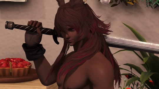
(Yes the hair is clipping into his actual body slightly, but that's because of the pose he's in)
Go into the editing software of your choice, and put the stripped down gpose as the first layer, and the normal gpose as the second, like so:
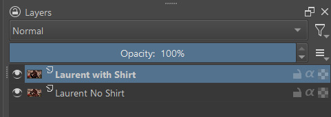
(Sorry for taking off your shirt Laurent but you're the one with the dramatic hair)
Start erasing the clipping bits on the top layer...


...and viola! you'll get a a much cleaner image.

In this example, I still kept some of the clipping—given how the bigger collar works, it makes sense for the hair to clip a bit so that it looks like it's 'falling around' the collar instead of just draping over the shoulder completely. Sometimes clipping can work as a good effect! (We make do with the tools we have)
Regardless of any aesthetic choices, just make sure not to erase too much so that it starts erasing the clothing, too.


(whoops too much erasing)
Also, sometimes items will cast a shadow, which might make too much erasing look odd. This example isn't particularly egregious (I'd go so far to say you can ignore it) but look I only took one set of shots for this tutorial ok

(deleting parts of the outer collar left a wayward shadow behind)
Finally, you can use an eraser with a fade and not at max opacity to "smooth" any left over clipping so it's not so abrupt. However, this is something a bit more advanced and needs some trial and error—so I can't really provide an example. Because I'm bad at it. Give it a try and see how it looks!
Hope this helps :)
13 notes
·
View notes
Text
Adding extra details to your sim!
So any fans of @kikovanitysimmer ‘s renders know that she adds a lot of extra detail to her sim’s skin. Her process has changed since then, but she still hosts her old tutorials on her discord!
We’ve been getting a lot of talk about how hard it can be to follow so I’m providing a text-based step by step tutorial!
Requirements
TheSims4Ripper
Blender 2.9+ (I’ll be using 4.0.0)
Any photo editing software (I’ll be using Ibis Paint) that has these features:
Multiple layers
Adding noise
Changing brightness/contrast and Hue/Saturation/Value
Inverting colours
Sims4studio (optional)
First things first:
You do not need to export a custom skin. Using the _diffuse.png you got from exporting your sim works just fine!
It’s preferable that you export your sim naked. Not a requirement, but makes it a lot easier. Here’s a video tutorial about dressing your sim in blender.
Onto the tutorial!
Displacement Map (Pores and the like)
Import your texture. Here, I’m using Kiegross’s Kiera Skin, edited for personal use.

2. Change the texture to black and white
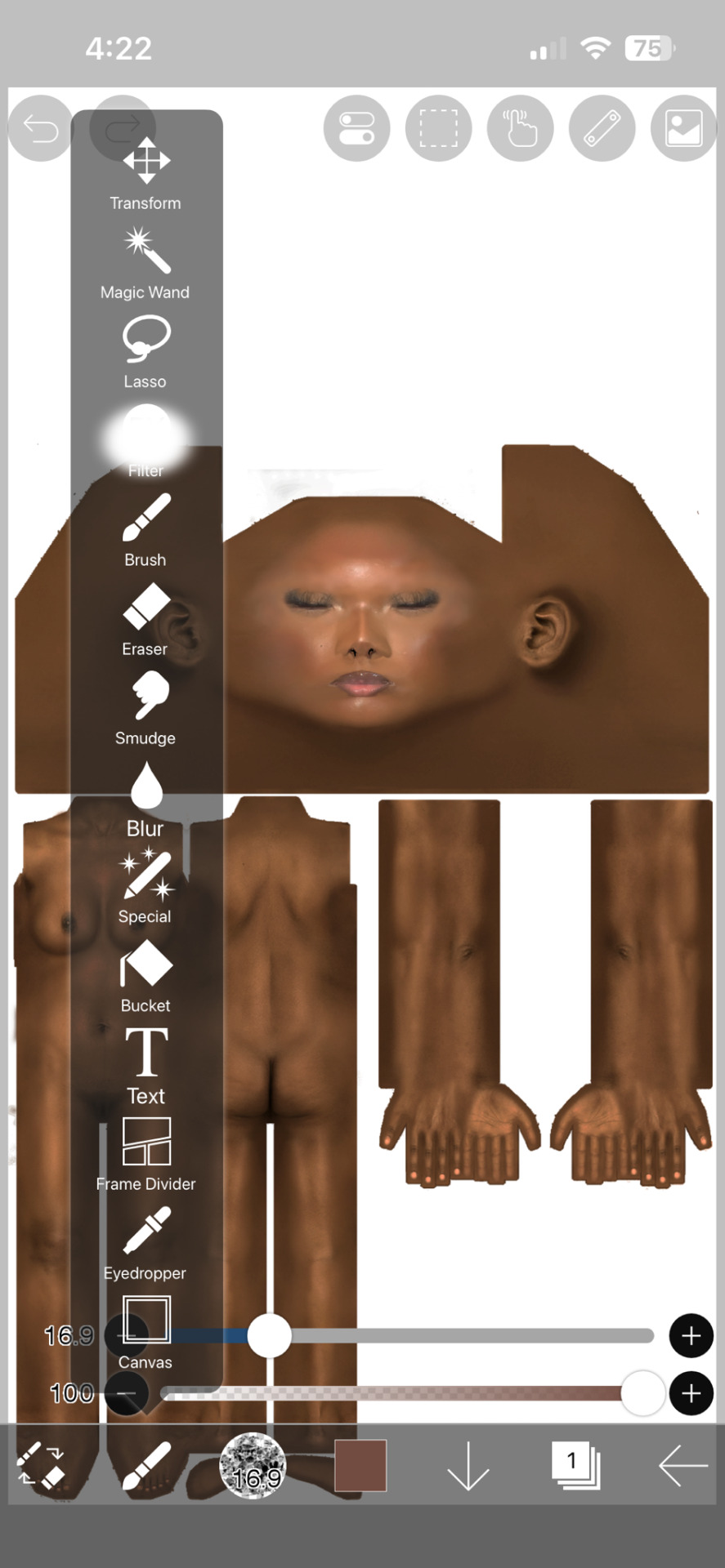


3. Duplicate the layer

4. Edit the Brightness and Contrast to your liking
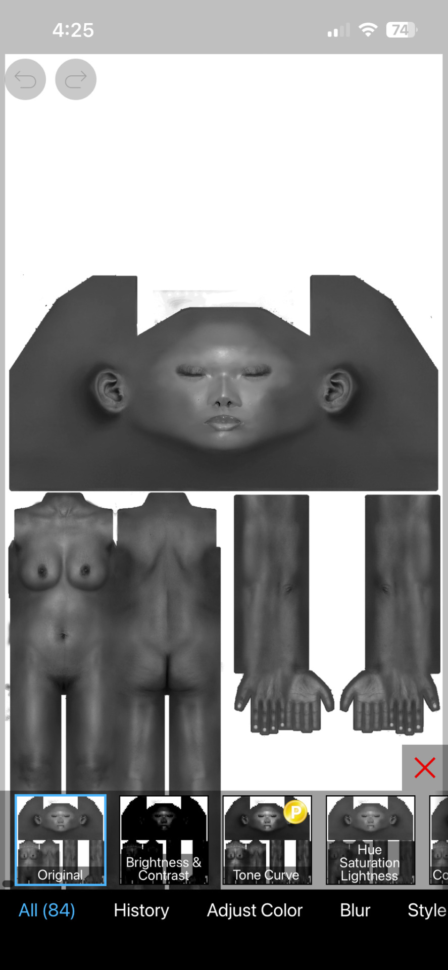

5. Add noise. Pictured here are my personal settings
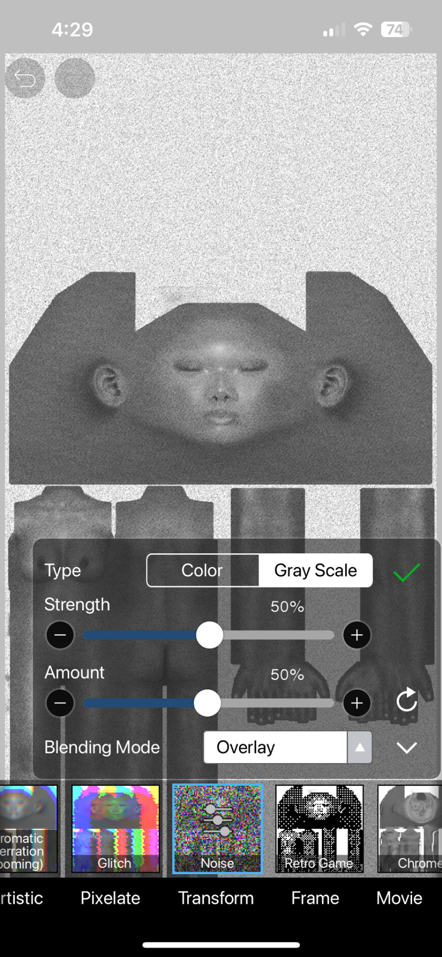
6. Erase parts that realistically would not have a lot of pores, ex. Lips, hands and feet. Kiko suggests putting your eraser hardness or opacity lower as these areas still have texture to them.

7. Save picture as is! You can delete the noisy layer if you wish, but we will need the original black and white layer for everything else.
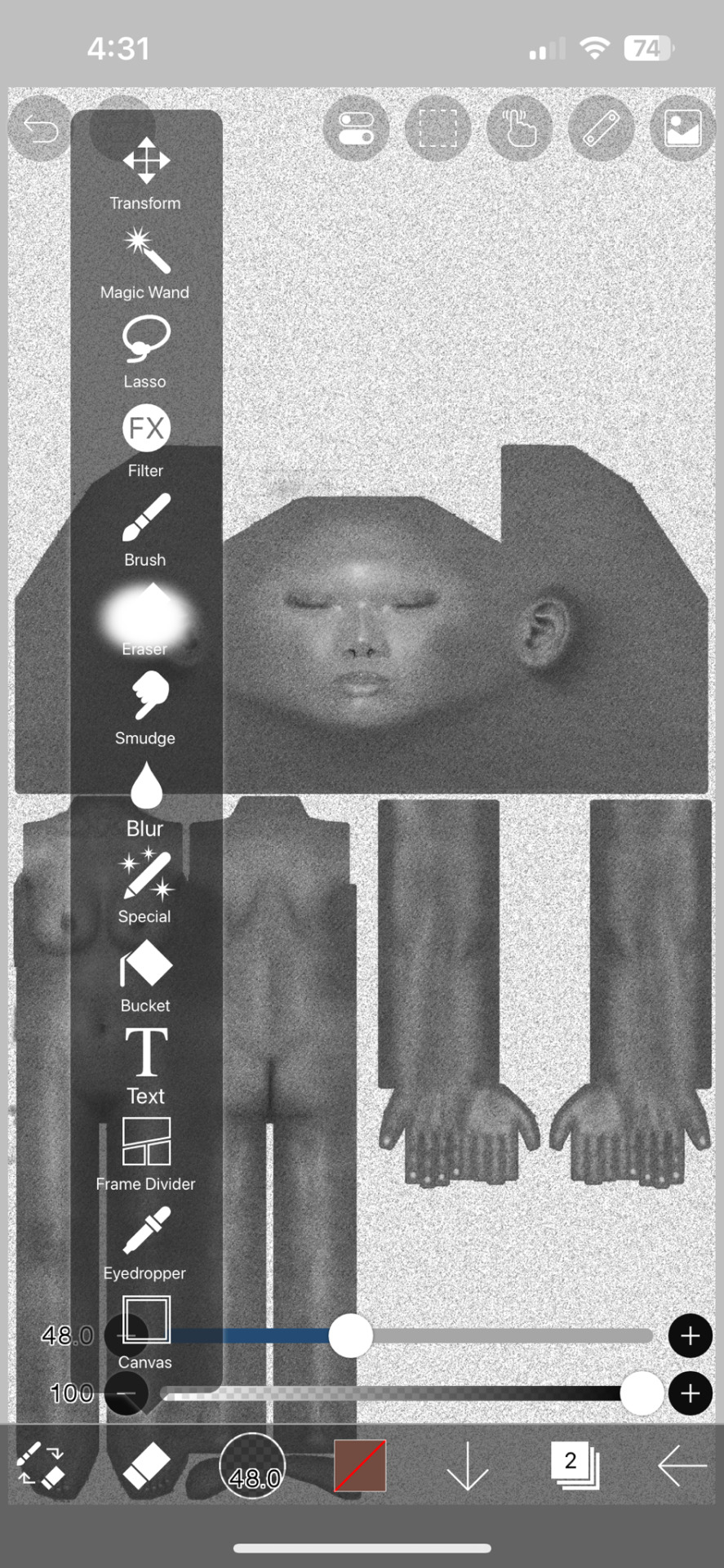
Specular and Roughness Map (Shine)
Creating a new layer is highly recommended so you can backtrack
Using the original layer, edit the brightness and contrast. Pictured here are my preferred settings


2. Take a black brush and colour in areas you don’t want to shine. Realistically, these are the palms of your hands and the soles of your feet and their respective nails. You may also want to take a white brush to the areas you do want to shine, like lips, chest or thighs.
3. Save as is!
Adding to Blender
First things first: Go into the Shading tab. Link your sim's materials using Ctrl+L to make it easier on yourself!

Add your new Displacement and Roughness Map to your material
2. Add a Displacement Node

3. Plug the Displacement Map's colour into the Height. Change the scale to whatever you like (I chose 0.0005)

4. Add two Color Ramp Nodes to your material

5. Plug the Spec + Roughness Map's colour into each Color Ramps' Fac

6. Plug one Color Ramp into the Roughness and another into the Specular/IQR (you may need to roll out the Specular tab to find it)

7. Drag tabs on the Color Ramp to change the strength of them. For the Roughness Color Ramp, you'll need to swap them around to have the desired effect.
And that's how you get the details! There are other ways to get the details, but for beginner renderers, you can start with this!
34 notes
·
View notes
Text
Masterpieces in Pixels: The Best of Digital Photo Artwork
When Technology Meets Imagination
Once, the masterpiece was born of brush and canvas. Today, some of the world's most breathtaking compositions begin with a stylus and screen. Welcome to the world of digital art painting, where creativity knows that there is no limit and pixels do not become poetry.
This article is a celebration of the digital renaissance - showing iconic digital photo artifacts, spotting impressive artists, and revealing how the technique is changing the visual stories.
The Rise of Digital Art: A New Chapter in Art History
The development of art has always been powered by equipment—stone, charcoal, oil, and acrylic. The digital era brought a new set of devices: graphic tablets, photo-editing software, and 3D rendering engines.

Why Digital Art Painting Deserves the Spotlight
Critics once rejected digital art as "less real," but the world of art has moved. Today, digital photo artwork is displayed in major galleries, collected as NFTs, and used in gaming, film, fashion, and advertising.
Here’s what makes it stand out:
Versatility: From photorealism to essence, digital equipment suits every style.
Efficiency: Premous, again, and layers use the experiment risk-free.
Exception: Artists worldwide can cooperate, share, and sell their work.
Digital Masterpieces That Inspire
Let's dive into some standout examples that show the emotional and technical depth of digital art painting.
1. “Portrait of the Future” by Artgerm
A hyper-detailed science-fiction portrait that mixes Eastern aesthetics with the Western comic book effect. The signature of the artgerm is possible with the work of the complex layer in Photoshop.
2. “City of Light” by Beeple
One of the most famous digital artists of our time creates a dystopian world with quality like Bipal cinema. Their daily rendering leads the boundaries of digital storytelling.
3. “Dreams in Bloom” by Ross Tran
This colorful, chaotic, and joyful piece shows how digital equipment can reflect an artist's personality. Ross's bold brushstrokes and unique character design make their work immediately recognizable.
Behind the Scenes: How Digital Art Paintings Are Created
Creating a digital work includes more than just software. It is a process filled with vision, technology, and story.
Step-by-step Process:
Sketching the concept —just like traditional art.
Blocking in shapes and color —using layers for flexibility.
Adding depth and lighting—digital brushes simulate texture and light.
Refining details—highlights, shadows, effects, and final polish.

Meet the Masters: Influential Digital Artists
Loish (Lois van Baarle)
Known for its dreamy characters and expressive brushwork, depiction and animation of bridges in a vibrant digital style.
Feng Zhu
Concept artist for games like Star Wars and Transformers, Feng brings cinematic flair to every digital stroke.
Magdalena Pagowska
Their fantasy-themed digital photo artifacts featured a mixture of realism and imagination, often accompanied by ethereal light and flowing texture.
How to Appreciate Digital Art
It is not certain how to read digital paintings. Here are things to see:
Brush technique: Is it painterly, smooth, or textured?
Lighting: Does it evoke a mood?
Composition: How are the elements balanced?
Emotion: What story is it telling?
Digital does not mean. In fact, with repetition and the ability to use it, digital art often captures deep emotional nuances.
Getting Started: Become a Digital Creator Yourself
Inspired? You can try your hand at digital art painting even as a beginner. Here’s how:
Beginner Tools: Try free apps like Krita or use an iPad with Procreate.
Learn the Basics: Study traditional drawing—digital is just a new medium.
Take Courses: Platforms like Skillshare, Udemy, and YouTube are goldmines.
Join the Community: Reddit, ArtStation, and Discord groups provide support and feedback.
The best way to improve? Just keep creating. Even the best artists started with stick figures.
The Digital Canvas: What's Next?
Technology leads the limits of creativity.
AI-assisted painting tools are helping artists generate ideas faster.
Augmented and virtual reality art is becoming more interactive.
NFTs and blockchain have created new art markets and collector experiences.

Celebrating Creativity in the Digital Age
Digital art painting is proof that artistry is not limited by medium. Whether it is painted on a canvas or prepared on a tablet, what matters is the story that tells it, and it is a feeling.
In Pixel, these works reflect the same passion, technology, and surprise that are hanging any oil painting in a museum. So next time you see a digital artwork, look closely - you can gaze into the future of art.
4 notes
·
View notes
Text
The Ultimate Guide to Online Media Tools: Convert, Compress, and Create with Ease
In the fast-paced digital era, online tools have revolutionized the way we handle multimedia content. From converting videos to compressing large files, and even designing elements for your website, there's a tool available for every task. Whether you're a content creator, a developer, or a business owner, having the right tools at your fingertips is essential for efficiency and creativity. In this blog, we’ll explore the most powerful online tools like Video to Audio Converter Online, Video Compressor Online Free, Postman Online Tool, Eazystudio, and Favicon Generator Online—each playing a unique role in optimizing your digital workflow.
Video to Audio Converter Online – Extract Sound in Seconds
Ever wanted just the audio from a video? Maybe you’re looking to pull music, dialogue, or sound effects for a project. That’s where a Video to Audio Converter Online comes in handy. These tools let you convert video files (MP4, AVI, MOV, etc.) into MP3 or WAV audio files in just a few clicks. No software installation required.
Using a Video to Audio Converter Online is ideal for:
Podcast creators pulling sound from interviews.
Music producers isolating tracks for remixing.
Students or professionals transcribing lectures or meetings.
The beauty lies in its simplicity—upload the video, choose your audio format, and download. It’s as straightforward as that
2. Video Compressor Online Free – Reduce File Size Without Losing Quality
Large video files are a hassle to share or upload. Whether you're sending via email, uploading to a website, or storing in the cloud, a bulky file can be a roadblock. This is where a Video Compressor Online Free service shines.
Key benefits of using a Video Compressor Online Free:
Shrink video size while maintaining quality.
Fast, browser-based compression with no downloads.
Compatible with all major formats (MP4, AVI, MKV, etc.).
If you're managing social media content, YouTube uploads, or email campaigns, compressing videos ensures faster load times and better performance—essential for keeping your audience engaged.
3. Postman Online Tool – Streamline Your API Development
Developers around the world swear by Postman, and the Postman Online Tool brings that power to the cloud. This tool is essential for testing APIs, monitoring responses, and managing endpoints efficiently—all without leaving your browser.
Features of Postman Online Tool include:
Send GET, POST, PUT, DELETE requests with real-time response visualization.
Organize your API collections for collaborative development.
Automate testing and environment management.
Whether you're debugging or building a new application,Postman Online Tool provides a robust platform that simplifies complex API workflows, making it a must-have in every developer's toolkit.
4. Eazystudio – Your Creative Powerhouse
When it comes to content creation and design, Eazystudio is a versatile solution for both beginners and professionals. From editing videos and photos to crafting promotional content, Eazystudio makes it incredibly easy to create high-quality digital assets.
Highlights of Eazystudio:
User-friendly interface for designing graphics, videos, and presentations.
Pre-built templates for social media, websites, and advertising.
Cloud-based platform with drag-and-drop functionality.
Eazystudio is perfect for marketers, influencers, and businesses looking to stand out online. You don't need a background in graphic design—just an idea and a few clicks.
5. Favicon Generator Online – Make Your Website Look Professional
A small icon can make a big difference. The Favicon Generator Online helps you create favicons—the tiny icons that appear next to your site title in a browser tab. They enhance your website’s branding and improve user recognition.
With a Favicon Generator Online, you can:
Convert images (JPG, PNG, SVG) into favicon.ico files.
Generate multiple favicon sizes for different platforms and devices.
Instantly preview how your favicon will look in a browser tab or bookmark list.
For web developers and designers, using a Favicon Generator Online is an easy yet impactful way to polish a website and improve brand presence.
Why These Tools Matter in 2025
The future is online. As remote work, digital content creation, and cloud computing continue to rise, browser-based tools will become even more essential. Whether it's a Video to Audio Converter Online that simplifies sound editing, a Video Compressor Online Freefor seamless sharing, or a robust Postman Online Tool for development, these platforms boost productivity while cutting down on time and costs.
Meanwhile, platforms like Eazystudio empower anyone to become a designer, and tools like Favicon Generator Online ensure your brand always makes a professional first impression.
Conclusion
The right tools can elevate your workflow, save you time, and improve the quality of your digital output. Whether you're managing videos, developing APIs, or enhancing your website’s design, tools like Video to Audio Converter Online, Video Compressor Online Free, Postman Online Tool, Eazystudio, and Favicon Generator Online are indispensable allies in your digital toolbox.
So why wait? Start exploring these tools today and take your digital productivity to the next level
2 notes
·
View notes
Note
Hey, I was wondering what programs you use to create your custom content? Such as photo editing software, etc. Do you have any tips for beginners? I've been trying to figure it out but it's honestly SOOO hard :/ I honestly LOVE your cc, and use it on almost all my sims, at least one item per sim, lol. Especially the male CC. I hope that you have a good day/night, and thank you if you respond!!
Hey! Thanks for the support! I'm sorry I don't know how to shorten my reply but here it goes. For the photo editing software--I'm just using adobe photoshop :) as for the mesh maker--it's Blender. Uuuugh... the first 3 months was sooooo hard for me too! щ(゜ロ゜щ)
I think the first thing to do is getting to know the Blender first--after watching CC tutorials. Blender is a very complex software in my opinion. So, at least you need to know the basic tools in Blender that you're going to need in CC making.
I honestly just went in to CC making with zero knowledge about the Blender tools (just relying on steps from CC tutorial videos). And I continued doing so for 3 or 6 months. The confusion didn't go away. So, I had to backtrack and learn about the Blender itself and make 3D donuts (the recommended step to learn blender). And after that, with some help from sims4studio forum--things got a lot easier! But yea, you need to read and watch tutorials a lot. You'll get better answers on sims4studio(.)com with more about the technical--or coding stuff of the CC. But the most important thing to me was understanding the Blender--just to get the mesh done.
Some of the tutorials recommend you to use Marvelous Designs, I used it for a while. But now I made my mesh directly on Blender (like I said--after knowing your tools, things got a lot easier).
15 notes
·
View notes
Text

The Art of Graphic Design: A Guide for Creatives
Graphic design is everywhere—on the websites we browse, the advertisements we see, and the products we buy. It’s an art form that blends creativity with functionality to communicate messages visually. Whether you're a budding designer or just curious about the field, this article will guide you through the essentials of graphic design.
What is Graphic Design?
Graphic design is the process of creating visual content to communicate information, ideas, or emotions. It involves a combination of typography, imagery, color, and layout to produce eye-catching and effective designs.
Key Elements of Graphic Design
Typography – The style, arrangement, and appearance of text. Choosing the right fonts can set the mood and tone of a design.
Color Theory – Colors evoke emotions and create a visual hierarchy. Understanding complementary and contrasting colors is crucial.
Composition & Layout – The arrangement of elements in a design impacts readability and flow. A well-structured layout ensures clarity and engagement.
Imagery & Icons – Photos, illustrations, and icons add depth and context to a design.
White Space – Also known as negative space, it helps improve readability and creates balance in a design.
Popular Graphic Design Tools
To create stunning visuals, designers use various software and tools, including:
Adobe Photoshop – Best for image editing and manipulation.
Adobe Illustrator – Ideal for vector-based illustrations and logos.
Canva – A user-friendly tool for beginners.
Figma – Popular for UI/UX and web design.
Trends in Graphic Design (2024)
Graphic design evolves with time, and staying updated with trends is essential. Here are some of the current design trends:
Minimalist Aesthetics – Clean, simple, and clutter-free designs are in demand.
Bold Typography – Oversized, eye-catching fonts make a statement.
Retro & Nostalgic Styles – Vintage colors and fonts bring back the charm of past decades.
3D & AI-Generated Designs – Technology is pushing design to new levels.
Final Thoughts
Graphic design is a powerful tool for storytelling and brand identity. Whether you’re creating logos, social media graphics, or web designs, understanding the principles of design can help you create visually appealing and impactful work.
#graphic design#adobe illustrator#design#professional design#professional design services#logo design#creative logo#brand identity#logo designer#logo
2 notes
·
View notes
Text
5 Free Software Tools to Create Stunning Images for Social Media and Blog Posts
Alright, guys, today we're diving into the world of image creation for social media and featured blog posts. Whether you're a seasoned content creator or just starting out on your blogging journey, having eye-catching images is essential for grabbing your audience's attention and driving engagement. But with so many image editing tools out there, which ones should you use? Well, fear not, because I've rounded up the best free software for creating images that will take your social media game to the next level. Let's dive in!
Canva: First up on our list is Canva – the ultimate graphic design tool for beginners and pros alike. With Canva, you can create stunning images for social media, blog posts, presentations, and more, all with drag-and-drop simplicity. Choose from thousands of pre-designed templates, fonts, and graphics, or start from scratch and let your creativity run wild. Canva's intuitive interface and extensive library of assets make it a must-have tool for any content creator.
Adobe Express: Next up, we have Adobe Express – a powerful design tool from the creators of Photoshop and Illustrator. With Adobe Express, you can create stunning graphics, web pages, and video stories in minutes, right from your browser or mobile device. Choose from a variety of professionally designed templates, customize with your own photos and text, and share your creations across all your social media channels with ease. Plus, its seamless integration with other Adobe products makes it a no-brainer for anyone already using Adobe's creative suite.
PicMonkey: Another great option for creating eye-catching images is PicMonkey. With PicMonkey, you can easily edit photos, create graphics, and design collages without any technical know-how. Choose from a wide range of filters, effects, and overlays to give your images that extra pop, or use PicMonkey's powerful design tools to create custom graphics from scratch. Plus, with PicMonkey's user-friendly interface and intuitive features, you'll be creating stunning images in no time.
Pixlr: If you're looking for a free alternative to Photoshop, look no further than Pixlr. With Pixlr, you can edit photos, create collages, and design graphics with ease, all from your web browser or mobile device. Choose from a variety of editing tools, filters, and effects to enhance your images, or start from scratch and let your creativity run wild. Plus, with Pixlr's cloud-based platform, you can access your projects from anywhere and collaborate with others in real-time.
GIMP: Last but not least, we have GIMP – the GNU Image Manipulation Program. While GIMP may not have the most user-friendly interface, it's a powerful open-source alternative to expensive image editing software like Photoshop. With GIMP, you can retouch photos, create custom graphics, and design stunning visuals for your social media and blog posts. Plus, with a little bit of practice, you'll be amazed at what you can accomplish with this free, feature-packed tool.
In conclusion, creating eye-catching images for social media and featured blog posts doesn't have to break the bank. With these free software options, you can easily design stunning visuals that will grab your audience's attention and drive engagement. So why wait? Start creating today and take your content to the next level!
#SocialMediaMarketing#BloggingTips#GraphicDesign#ContentCreation#VisualContent#DigitalMarketing#FreeTools#Canva#AdobeSpark#PicMonkey#Pixlr#GIMP#ContentCreators#VisualMarketing#SocialMediaImages#BlogGraphics#adobeexpress#photoshop alternatives
9 notes
·
View notes
Text
The Biggest Photo Editing Mistakes and How to Fix Them
Common Photo Editing Mistakes in Adobe Photoshop
Common photo editing mistakes in Adobe Photoshop include over-retouching, which makes images look unnatural, excessive use of filters that reduce image quality, and poor background removal that leaves rough edges. Ignoring non-destructive editing techniques can also make it difficult to revert changes and maintain image quality.
If you want to learn more about common photo editing mistakes in Adobe Photoshop, visit our blog for expert insights and tips!
Image editing in Adobe Photoshop has become an essential aspect of today's digital marketing era. However, even professional retouchers can make mistakes. Whether you're new to editing or an experienced retoucher, avoiding common errors is crucial to maintaining the authenticity and appeal of your images. For flawless results, a jewelry retouching service ensures precision in refining details, enhancing brilliance, and preserving the natural beauty of jewelry pieces.
1. Over Processing
Photo editing is as enjoyable as photography itself for many people. With numerous features available in photo retouching services, it's easy to get carried away. Overuse of saturation, contrast, and HDR can make photos look unnatural, turning them into digital illustrations rather than realistic images.
To avoid this mistake, always consider natural colors and contrast while capturing the image. Enhancements should be subtle—aim for authenticity rather than artificial perfection. HDR can be a useful tool but requires skillful execution. Poorly done HDR can ruin a photo instead of enhancing it. If you're using HDR, ensure you take multiple exposures and blend them effectively to achieve a balanced and natural look.
2. Overusing Beauty Treatments
Images are often edited to enhance beauty, whether for fashion, advertising, or personal projects. Jewelry Retouching service and eCommerce photo editing service frequently include skin smoothing, teeth whitening, and eye enhancements. However, excessive use of these treatments can make subjects appear unrealistic.
For example, over-enhancing eyes can make a person look alien-like, and excessive skin smoothing can result in an unnatural, plastic-like texture. Instead, focus on minor refinements, such as removing temporary blemishes while preserving natural skin texture. A few imperfections add personality and realism to the photo.
3. Bad Background Removal
Background distractions can diminish an image’s impact, making Background removal service an essential part of professional editing. However, poorly done background removal can make an image look fake. Light, shadows, and textures must match to ensure seamless integration of a new background.
If you're using a green screen, background removal is easier. However, if you’re removing a background manually, take the time to refine edges carefully using clipping path service and image masking services. Poorly extracted backgrounds can make a photo appear artificial, which is why it's crucial to plan shots properly to minimize unnecessary editing later.
4. Relying on Post-Processing to Fix Shooting Mistakes
A common mistake, especially among beginners, is assuming that editing can fix poor photography. Even experienced photographers sometimes fall into this trap. Instead of focusing on getting the best possible shot during the shoot, they think, "I'll fix it in post-processing."
This approach limits growth and understanding of photography fundamentals. Common post-processing mistakes include selective coloring, which often results in tacky images, and artificial blurring to mimic a shallow depth of field. Instead of faking effects in photo retouching services, capture them naturally by using appropriate camera settings, such as a wider aperture for real background blur.
5. Not Knowing Your Tools
Lack of knowledge about editing software can lead to inefficiency and mistakes. Whether using eCommerce photo editing service tools like Adobe Photoshop or Lightroom, understanding the features and settings is crucial.
Beginners often stick to one feature they recently discovered and overuse it on every image. Instead, continue learning and experimenting with different tools and techniques. Online courses, tutorials, and practice sessions can significantly improve editing skills and help create more refined images.
6. Explore, Learn, and Stay Reasonable
The best way to improve is through continuous learning and experimentation. Every mistake is an opportunity for growth. Use resources like online tutorials, video guides, and professional courses to expand your knowledge in image masking services and clipping path service.
Conclusion
Editing should enhance an image, not overpower it. By avoiding over-processing, excessive beauty treatments, bad background removal, over-reliance on editing, and poor knowledge of tools, you can create high-quality, natural-looking images. Whether working on Jewelry Retouching service, eCommerce photo editing service, or Professional photo retouching, the goal is to maintain realism and visual appeal.
If you're looking for expert editing services, consider our free trial to experience professional-quality photo retouching services firsthand.
1 note
·
View note
Note
hello friend. Take this as an invitation to rant about whatever you want :)
YAYYYYYY :)))
okay so this is completely non fandom related lol I just went on a deep (ish) dive the other day about astrophotography! So as you know I do take pictures of space but I’m like the absolute beginner of beginners lol. My current equipment is a tripod and a decent camera and that’s it for photography, so I wanted to see what I’d have to get or what other techniques I could use to progress further. The biggest problem is exposure time - you need a longer exposure to capture the light needed to show the details of such faint objects as nebulae and galaxies, but a longer exposure creates star trails due to the rotation of the earth (nooooo). Also a higher magnification emphasises star trails. There are two ways to combat this: one is time consuming, the other is expensive. The first way, the one I’m going to try first as i do not have money to spend currently, is to stack photographs. I’m going to have to look more into the specifics of how this works once I have the time to try, but essentially you take a lot of short exposures of the same object then layer them all together in the right software to effectively produce a photograph of a much longer exposure. Luckily for me there are at least two recommended softwares that are free (yay!!!) and seem to work well from what I’ve seen, so I’m going to give it a shot at some point. The main thing that seems complicated is apparently you have to have different types of shots to layer? Dark ones and light ones and all sorts so I’ve got more to learn. I will be relying on the Sky At Night astrophotography explainers for this! For the exposures I am aware of the 500 rule: you divide 500 by your focal length (amount of zoom) times the crop factor (intrinsic to the camera) to get the maximum length of exposure time without trailing. I currently go over this limit sometimes as I don’t mind a small amount of trailing, but if I want sharp photos for layering I’m going to have to pay it more heed, which unfortunately means a larger amount of exposures is required to create the final image. Anyway, the second way to combat star trails is to use a tracking mount - a motorised tripod that tracks the movement of the stars across the sky. These are stupidly fucking expensive but by god do I wish I had one as it means you can almost expose for as long as you like with zero trailing. At that point your enemy becomes keeping the contrast high so, as the Sky At Night magazine highly recommends, most people still stack photos and do editing even with a tracker, but again it is not necessary with a tracker if you get the right settings. Plus less photos to stack. Currently, my plan is to first try stacking with my current equipment, then long term to buy the following equipment: 1) a tracking addition for my telescope tripod, 2) an attachment for said tripod that allows my camera to sit on top instead (ie so then the tracker kills two birds with one stone), and finally 3) an adapter for my camera to attach to the telescope itself, essentially becoming one huge zoom lens. In total this could cost up to £1000 so this is very much long term goals but THINK OF THE PHOTOGRAPHS I COULD TAKE!!!! For now, I’m waiting till the sun finally lessens its grasp on the sky and the nights darken again (as, I cannot emphasise how much it does NOT get dark AT ALL here in summer), then my targets will (probably) be the andromeda galaxy, Orion Nebula, and Pleiades for my first attempts at stacking!
3 notes
·
View notes