#the action and overall design is gorgeous
Explore tagged Tumblr posts
Text
No I mean the Avatar live action isn’t overall GOOD but it’s got its moments and it’s not good in interesting ways and I will certainly watch all 8 episodes
Plus I mean the Zuko and Iroh stuff is wonderful and on some level that’s kinda all I need
#TALES OF BA SING SE MUSICAL THEME REPRISE#GOT ME FUCKED UP!!!#the action and overall design is gorgeous#some of the actors are so good#and some are so very bad#how they’ve chopped up combined rearranged the events of the show is interesting#some of that works better than others#the script really is#phew#I never want to hear the word responsibility again#but alas it’s the only one this writers room knows
22 notes
·
View notes
Text
it’s honestly a shame how bad canaan was, because it’s got pretty cool concepts and ideas
but most importantly… it had her

i’m not even gonna lie she was the most entertaining part of that show for me. queen
#canaan#it’s crazy cause it’s type moon right so i had pretty high expectations and yet#but outside of some little things it doesn’t feel like a type moon thing at all#the designs are gorgeous the action is good there are some interesting things here and there but the way it left no impression overall
0 notes
Text

『♡』 Strawberry Lemonade

♡ featuring: toji x f!reader
♡ synopsis: you plan to make strawberry lemonade for the summer, but life has other plans. wc: 1.7k+
♡ cw/tw: just some fluff, toji kisses :3
notes: idk why i kept thinking about soft cottagecore toji my brain fhioshafiohiaf this was so self indulgent srry for any mistakes ive been sick for a few weeks lol <3 comments and reblogs are appreciated!

After heavy rain showers, sun rolled in and devoured everything beneath it.
Toji doesn’t like summer. He wasn’t exactly fond of the heat rays rippling across the pavement, his black slides bonding like tar if he stood in one place for too long. His bangs would mat to his forehead, and it was overall a hassle to tolerate. He’d much rather laze under air conditioning for the entire season.
Until you came along.
He’d never met someone so delighted over sweat and mosquitos before you. Maybe that’s why he slowly became accustomed to such weather. You weren’t shy about your strange habits. After all, on your third date it poured like no other, and instead of taking cover, you skipped through the rain. It was strange, yet he cracked a smirk at your wide grin.
You’re happy and that’s good enough for him.
You were elated at the promises summer bore, specifically for your plants. Fruitful flowers meandering on branches, the first sign of hibiscus blooming. Every year around that time, you carried your plants outside to bask in her warmth. It was all an invaluable gift from Mother Nature, and you did your best to honor her.
Of course, Toji had to purchase a house with the most sunlight, and a backyard to match—not with you in mind, at least that’s what he’d day as he avoided your gaze. He knew your housewarming gifts would consist of planting tools, but the sheer amount of it was staggering.
It was no surprise you planted your seeds the next day and watched them like a hawk. Toji was sure to mention how much of a “weirdo” you were for spending so much time caring for your perceived babies. A weirdo he loved, because he left marks of his affection in every nook and cranny. Sure, he feigned annoyance over it, but you knew better when he did things you didn’t ask for. Toji isn’t a verbally expressive husband, but his actions make up for the rest.
Like when he built a wooden potting bench to store the inventory accumulating in the corner by your plants. You came home as he was applying the finishing touches and embraced him for what felt like hours. He rolled his eyes, pretending to be unfazed by your gratitude, though you could still see the growing ghost of a smirk; “Don’t thank me, that thing was an eyesore.”
It benefited him, too, to gaze through the screen door in the afternoon and see the gorgeous sun-kissed glow on the apples of your cheeks. He adored your soft eyes that diligently monitored the seeds starting to sprout with a tender smile.
You filed chunky soil into terracotta pots you painted with various designs. The one that resembles a tiny cactus with a face grew a bundle of basil. The other one similar to a tiered strawberry cake grew a fitting crown of strawberries. You weren’t looking to bake an outstanding cake or be the best gardener. For the fruits of your labor, the only thing you wanted was—
A single pitcher of strawberry lemonade.
Toji trudges down the stairs half-asleep and enters the kitchen to pour the usual cup of coffee you make as you wake before him. However, there’s no jug awaiting him. He opens the screen door and finds you kneeling over the pots, sporting a bow knot straw hat and an overall romper in the sweltering heat. Your brows are furrowed, and you pick at the foliage.
He leans against it and scratches his ankle with the tip of his slides. The screen clicks the side, and you turn to him.
“Oh, hey.” There are somber notes in your voice, and something in his body wants to reach out and protect you from whatever’s pulling your face into a frown.
“Hey.” He walks over to you. Your lips are tucked behind your teeth, poking at the strawberry in your palm. He kneels on one knee and you glance at him, flashing a meek smile. He wishes he didn’t have a closer view as your eyes threaten to brim with tears. Oh…his heart, tight and struggling to beat.
Toji was used to loud, ugly love. But you—your love was as gentle as the petals of an orchid, and you’d changed him without even trying. That’s why he adorned your ring finger with precious diamonds. He became a better man and husband in your arms, and in turn he’d give you the world if you desired it. So why were you about to cry?
“What’s up?”
“Nothing…” His eyes follow yours, to the flourishing bunch of basil. And then to the lackluster strawberries.
The ones still hanging from their stems aren’t award-winning. They’re deformed, with multiple nubby ends protruding from every side. They look more like hopeful raspberries than anything else. There’s a considerable pale color washed over half of them. You mold one in your palm.
“Can’t be nothin’.” He picks the strawberry from your hands and observes it with two fingers. It lacks seeds and a deep, rich red. “I just don’t know what went wrong.”
"Who said somethin' went wrong?" You lock eyes, and he pops it in his mouth.
Yours widen, and you cup his face to try and force it out his mouth. “Don’t!”
Toji bites, and in an instant utter sourness prickles his tongue. There’s a strawberry flavor, but not enough to combat. The sting is strong, and when it coats his throat, his tongue contorts to fight the sheer bitterness.
Somehow, he remains stone-faced—a battle with his gut reaction. He can’t bear to break your spirit, not like this, not when you’ve spent months strategizing and waiting for your efforts to ripen. Toji tells the harsh truth, but when it comes to you, he’s willing to be selfish.
He continues to chew while you nervously fiddle with your fingers. You gaze at him, doe-eyed and anticipating his response. The lining of his cheeks excretes copious amounts of saliva, and he finally swallows.
“S’good.”
“R-really?” You’re shocked that they’re edible in this state. He nods and it relieves some of your worry, though you’re unsure about his honesty.
He thumbs the wetness on your lashes away. “Said I like it, so make some of that lemonade ya talked about so much.”
You place a handful of strawberries on the kitchen counter and get to work. You haven’t tried them out for yourself yet, but you don’t want to waste any considering how small they are. Toji stretches out on the chair, black tank riding up as he watches you slice the tips off the strawberries. Your delicate fingers handle them with such care, just so you don’t disappoint with an unpalatable drink. Cute.
When you’re done, the rose-colored liquid fills half the pitcher. You top it with basil and stir it around. You pass a glass to Toji, heart-shaped ice cubes floating on the surface, and sit across from him.
“Let’s try on the count of three.”
“Mhm.”
“Okay! One, two-“ Toji doesn’t stop for the counter and begins to gulp the drink. You take a sip of yours. The tooth-rotting sugar did some to quell the taste, but it was still insanely sour. Your lips purse and you shut your eyes, emitting a tiny squeal. It’s your first attempt and you know you shouldn’t be so critical of yourself, but you can’t help but feel like a failure.
When you open your eyes again, you’re dumbfounded at the empty cup in front of Toji. He licks his lips, “It’s good, baby. Why you look like that?”
“No way.” He tilts his head like he didn’t just consume a liquid jawbreaker. “Hm?”
“It’s…it’s really bad, Toji. You don’t have to lie to me.” You avert your eyes and stare at the condensation running down the glass of your unsuccessful project. He wraps around the table and leans against it while you’re sitting. He cranes your neck with a calloused hand underneath your chin.
“Look at me. I’m here”
“I really wanted it to work. I spent so much time on it.”
“I know, don’t take it so hard. I like it.”
“You just don’t wanna hurt my feelings.” You weren’t entirely wrong.
“It tastes good 'cause you made it.” When you don’t respond, a malicious smirk spreads on his mouth. “Wanna try?”
Toji bends down. He squeezes your face to puckering and plants a deep kiss on your lips. Rough and meaningful, and you melt into it. He releases his grip and follows it with warm plush kisses chasing your contact. His lips are soft but slightly chapped, fleeting hints of cane sugar and just enough basil to notice. Bitter like the descent of a bleeding sunset, the chill of autumn’s return. Silent assurance, that everything was okay, and will be okay.
He parts when you tap his sturdy bicep for fresh air. “Ya done bein’ a baby?” You giggle. Perhaps you overwhelmed yourself obsessing about it for months. He brings you back to Earth, and after the overthinking subsides, you think the outcome isn’t too horrible. A long deserved break is overdue.
“Yea” you sniffle, and he lifts you from the chair into his arms. You lock your legs around his back and bury your face in the crook of his neck.
“Now c’mon, I wanna lay down.” Lay down is his go-to phrase, but he actually means cuddle. He’d never say it, even when lying down quickly became Toji turning on his stomach and shuffling his massive weight onto your chest. It’s what you need right now, and the way his palm rubs up and down your back reduces your mind to mush.
“I’m being a bother” you mutter. He pecks your jaw.
“Nah. Love takin’ care of my little crybaby.”
Laying down becomes cuddling as you predicted, and you massage his scalp until he dozes off in slow breaths. Your favorite weighted blanket traps you between his muscles, and you happily accept.
You’re reminded of his vulnerability, his eagerness to trust without words. He took your problems and made them his. You both surrendered your fears and insecurities to love each other. You traded walls for strawberry kisses, and there’s nothing more you could ask for.
Daylight peaked at its highest point, and as you drift to sleep you wish summer wouldn’t end.
201 notes
·
View notes
Note
im curious of what gabriel/hawkmoth would look like in this au, but with your art style, im sure that it would look gorgeous!!! i love your art!! (人*´∀`)。*゚+
TY!! I try my hardest!! 🥹🩷🙏🫶
I don’t have a final design for Hawkmoth yet, only concepts!!
Gabriel is the character you never see the face of, and has more of a monochrome palette with a hint of purple, but overall he looks very designer-ish!
I decided to make Gabriel faceless because I think it would really show Adrien’s disconnected relationship with his father!
Adrien sees Gabriel as an authority figure that has complete control over his life but no presence in it. It also leaves room for the nature of Gabriel’s intentions towards Adrien for interpretation!!
Does he talk to Adrien with an irritated face, or concerned but too ill-informed to do anything about it? When Adrien was talking about school to him, did he look surprised or bored?? We’ll never know!!
And when do we see the big bad villain who has made everyone in the show’s life miserable? When we finally see the face behind the conflict?
When he’s begging Gimmi to give him his wife back.
It would so cool for it to be the first time we see Gabriel’s face is when he’s vulnerable, desperate, and exhausted. It would humanize him, but raise the question; was everything he did for the love of his family, or the actions of a man driven to insanity by grief?
#I’m delusional AHSJQVSJ#esp with Lila being the devil on his shoulder in season 2#I just really like hyper analyzing motives#when I watch movies I always look for symbolizism it’s so fun to do#Hawkmoth art coming soon!!#chocoau lore#chocoau char#thank you for the ask!! <3#miraculous ladybug#mlb au#mlb#ml#miraculous au#miraculous lb
94 notes
·
View notes
Text
I've taken a bit to try and assemble my thoughts of jwct, and frankly I still don't know how to feel. Not in a "oh that was bad" kinda way, but in a "that was life changing how can I move on" kinda way. So I'm gonna do what I do best and just ramble on here, you know me. Spoilers of course.
Overall thoughts:
Holy cow the animation!! Not to say jwcc was ugly, but you can instantly see the budget differences. The lighting was gorgeous and the sequences were great. It was just so clear how much love was poured into every scene, the thought behind every move was so clear.
The story was so engaging and good. I thought I was gonna get tired of the "picking everyone up" trope, but it worked so well. I think the difference is this show knew how to take it's time. Ben and Darius had a few episodes to themselves, then Sammy and Kenji were given time to express their grievances. Hell we didn't even get to Yaz till ep 6 and I loved that. The dinosaurs were great too, and the overall plot was just amazing. I loved how it all slowly enfolded and how it was clear they had only scratched the surface with what they found out.
The voice acting was great as always, but it did kinda make me emotional at first to hear how much Paul had grown up. Getting used to Kenji and Brooklynn's new VA's was kinda odd, especially for Kenji, but by the end I was mostly cool with them.
The characters (and trust I'm gonna talk about all of them individually in a sec) were just superb. Their overall maturity and growth was outstanding, especially seeing how their trauma really effected them all differently. All of their arcs before and throughout the season were simply breathtaking. I think this season might be the best in terms of balance, it handled it's action, humor, and emotional moments so well.
This kinda relates back to the animation, I can't explain it, but they all just felt so much more human this season. Everyone's body language was so fluid and lifelike. They would talk over each other and mumble, they would hunch and roll their eyes and all of this sounds normal, but it really stood out. I think it's safe to say the animators really popped off this season, the direction was so clear this is truly a masterpiece. Also I felt like all of them were so touchy and I loved that so much. Like yes hug, hold hands, grab shoulders, pat on the back, I LOVE.
Characters:
Darius, my god Darius. Of course I've always loved him, he's an amazing mc and he is just so lovable. That being said I generally couldn't get over how much I loved him this season. He blew me away in ways I couldn't have imagined. His grief is so understandable and the way he shifted his ideology on dinosaurs because of Brooklynn was just heartbreaking. The way his character was handled was amazing, and it was wonderful to see that the writers do know how to let the others shine while still showcasing that he is the mc. I was also so in love with how sassy and witty he was, like when did he become so funny? His vulnerable moments were just as good and I loved how they showed his anger and frustration as well. His arc about learning to accept his grief and his regret was so poignant and beautiful. It's clear he needs a shoulder to cry on and yet he still puts everyone first, god I didn't think I could love him this much. He was easily the best character this season, I feel like they FINALLY showcased how amazing he is, just 10/10 no notes they ate.
I was kinda shocked by how goofy Ben was, but man I'd be lying if I said I didn't love it. Still can't get over how tall he is, and while I hated his design at first, it's really grown on me now. I really don't get how a lot of people are saying he felt like a shell of himself, cause frankly this season just cemented him as one of my favorite characters ever. He was kind, caring, understanding, humorous, he cracked jokes and messed around, but also got emotional and real. Him being a conspiracy theorist and living out of a van just makes sense, and the way he's the opposite of his germaphobe self now is hilarious. It was also interesting to see him as the meditator since he was the only one that got along with everyone else. He tried to help Darius with Kenji, he tried to give advice to Yaz about Sammy. It was just so lovely to see him so content and yet still himself? His scenes with Bumpy were so sweet and sad I can't stand them. Also I'm kinda obsessed with the fact that he's so big yet sucks at fighting and defending himself...king. I loved his mini arc about almost regressing on his fear, and how he grew from that. Ben ily light of my life, still the goat I fear.
Sammy's whole story just felt so heartbreaking. When they found her on the farm all alone it hurt me so bad. The way her family was her whole world and now they aren't on speaking terms? I hope the writers explain a bit cause I just can't fathom why? And Yaz moved away and she was really all alone. The way she approached her grief and her whole life in denial, and how she refused to accept anything was so heartbreaking. It hurt even worse because despite all of that pain she was still her. She was headstrong, kind, and passionate, for people and for dinosaurs. I did love how they still showcased her flaws and weaknesses. She had a hard time treating Yaz differently, but she also just wanted someone to actually be there for her. It's so clear she's tired and wants to be the one taken care of for once. Sammy stories feels heart wrenching in perhaps a more subtle way than the others. I really loved the direction the writers took her in this season. They showcased so much good and left us wanted more and ugh someone just give her another hug please.
If there's one thing the writers can be consistent on is making me despise Kenji. He was annoying me at first because of how he was approaching things, but he really grew on me by the end. He was this season’s punching bag and it was so heartbreaking. Brooklynn died and he blamed Darius and it's like he couldn’t escape his anger. It's interesting to see how him and Darius secluded themselves in different ways, and the way he still calls their mom? Oh I'm gonna cry. Yes Kenji is mad and he has every right to be, but it's clear his anger is misplaced. The whole scene with his father was so sad for so many reasons. Yes Kenji didn't like his father, but he literally watched him die. His breakdown was so painful to watch. I like how we can see Kenji kinda mature again over the season. It's as if he's relearning that not everything is in his control, and he shouldn't dwell on that. Sometimes his VA sounded too uninterested or nonchalant, which is a shame because the thing about Kenji is he pretends not to care but it's really the opposite. I am intrigued to see where this show will take his journey.
We took a while to get to Yaz, but I'd say it was worth the wait. I liked how this series didn't shy away from talking about her ptsd, and it took it even a step further by exploring peoples ways of coping. It's also interesting to see how fear has driven Yaz and how that has effected her relationships with all of them, but particularly Sammy. She's trying so hard to do better, but healing isn't linear and building a glass house around yourself can only do so much. I really hope they'll let us see how all of this is effecting her next season, because for someone is deathly afraid of dinosaurs this season put her through the ringer. That being said, I think there's no denying the bravery she showed. No matter how terrified she was she was always there for her friends. When Sammy needed her she knew how to calm her down, when her friends needed her help she let her instincts drive her. She even learned to let herself enjoy the moment, adding humor to trying to make the best of things. I feel for Yaz and I want to see her find comfort in her friends again, because she also just needs a hug.
Character: five stage of grief
While writing this I stopped and realized that in a way all of them really represented the five stages of grief regarding Brooklynn and just their life in general. So I wanted to take an interlude to talk about that for a moment.
Denial: Sammy - It's clear that Sammy has been trying to deny anything and everything, if only to pretend all of her problems are nonexistent. She doesn't want to believe that her family won't talk to her, and that Yaz won't either, and that her friend is just gone. Denying makes it all of it easier and so she makes herself busy so she won't even have a second to think about it all because then maybe she'd have to accept it.
Anger: Kenji - He's blaming everyone, especially Darius for Brooklynn's death. He blames the Allosaurus and he blames his father and through it all his anger never dwindles. Eventually it's all too much and he lets his anger become sadness, but it's clear his frustration and aggravation are not exactly gone. He can forgive but still feel mad at his situation and I think that's ok.
Bargaining: Yaz - Her's almost borderlines on denial like Sammy, but I think it's a little different. Because unlike Sammy she thinks everything is ok. She's convinced herself that this dino free island is fool proof and if she hides away like this nothing bad could ever happen. Obviously she comes to find out this isn't true and she has to accept the fact that her reassuring herself can only do so much. She has to face her fears, and boy does she.
Depression: Darius - From the get go we knew Darius wasn't doing too good. He's locked himself away in his bunker, cut off everyone, and had just become obsessed with catching the Allosaurus. Loosing Brooklynn was hard on all of them, but it's clear he took it the worst. It also didn't help that Kenji blamed him so much, so he fell into this hole. It's not the typical signs of depression, but his behavior is so different than before. Old Darius would have never cut everyone off and reduced dinosaurs to simple killers.
Acceptance: Ben - He's perhaps the only one that can speak so plainly about Brooklynns death. He constantly reassures Darius that it wasn't his fault and he's the one that rallies all of them together. His acceptance of her death is what allows him to put the pieces together that someone is after them. Of course he still mourns her, but the difference is he wants to get her justice and make sure all of them are safe as well.
Relationships:
To get the elephant out of the room THANK GOD brookenji broke up. I know they have a lot of shooters but I have and will never support or understand them. They just didn't work and had like zero chemistry. I really hope they stay broken up please writers I can't take it anymore. That being said I was pleasantly surprised Kenji's whole character wasn't just about Brooklynn. Yes she was a big factor, but without her there it's like he could be his own character again. That was always my biggest gripe with s4-s5 brookenji. I couple should not be reduced to their partners, they need to be their own person too.
Yasammy you will always be famous. The two of them were absolutely wonderful this season. Their fight was so warranted and valid and I loved that both of them were right in some ways. It's never black and white and it's up to communication to resolve those issues. The two of them are just so in love, they are actual soulmates like I can't. No notes, I think their relationship is proof that you can balance a couple and the individual. Sammy has her problems, Yaz has her problems, and together they can be a mess, but that's what so wonderful about it. The scene with them after they got out of the van was generally so beautiful I LOVE THEM.
Darius "I was in love with Brooklynn" Bowman....I USED TO PRAY FOR TIME LIKE THESE?? When I tell you I screamed I mean it so bad, I almost fell out of my chair. I know a lot of people aren't a fan, and they think it reduces their friendship, but I disagree. I think Darius still would've been heartbroken, but this just adds a layer. I also love it cause it's just so messy, and I think that makes it feel more real. What do you do if you love your brothers ex? I have been a dinostar defender for years, and I think there's no deny how much they mean to each other. I know he said Brooklynn didn't replicate his feelings but until we see the scene I'm gonna deny that. I think she rejected him because she didn't want him to get hurt in her investigation, that or she doesn't want to hurt Kenji. Let me just say writers you have a chance to get this all back on track PLEASEEEEE do not mess it up I can't take the heartbreak again.
Ben and Darius' friendship was kinda the best thing ever and I wasn't expecting it at all? I know they've had a rocky relationship before but this was so playful and I loved it so much. The way they goofed around and got into trouble, the show couldn't handle them together all season I guess. I also love how tender it was. Ben was so patient with Darius and it was clear he only wanted the best for him. Darius was just as patient with Ben and he helped him through his little paranoia relapse. They were such a good time and a blast to watch like the amount of times the two of them had me busting out laughing was insane.
Sammy and Ben duo oh how I've missed you. Another one I really didn't expect but they were so lovely. I loved how much they messed around yet they also dropped everything to commit a few crimes. Ep five was full of them and I loved it so much. Also the way Sammy constantly defended Ben was so special to me, that girl knew how to throw a punch lmao. Nothing too crazy, but so welcome and sweet. Also the way Ben was terrorizing Sammy on the phone with Yaz, peak cinema.
MIGHT AS WELL KILL ME NOW KENJI AND DARIUS. WHY are they always fighting Kenji don't make me mad. I loved their relationship so much. The way Kenji was so angry at Darius and yet Darius held him so close while he had a breakdown? Might just kms. They friendship is so rocky and real and I love that. I also love how Kenji wasn't angry when Darius said he had feelings for Brooklynn. He just listened and the maturity they both have is insane. I'm terrified of Brooklynn coming back and causing a love triangle, but honestly I'd be fine if they all just stayed friends if that means these two end up alright. When the brothers brother >>>
Ben and Yaz bestfriendism back everyone cheered. The way they still call each other by their last names actually kinda tears me to pieces. I love how Ben offers advice to Yaz even if it's in his own silly way. They're both so gentle and yet so playful with each other I love. I love that Yaz just let's Ben go on his side quests like yeah he's got it. They didn't get that many scenes but I still love them so dearly anyways.
The return of the king, Sammy and Darius. I know they didn't get that much but they were always one of my fav limited screen time duos. The way they constantly comfort each other just pulls on the heartstrings. Like when they just hugged in the back of the van? And when Sammy raced to hug him again in the warehouse? Ohh I love them. And despite it all Darius trying his best to defend Sammy? Save me older sister-younger brother duo save me.
Kenji got very limited time with Sammy and Yaz and I can't wait to see more cause those just iconic duos, I also would love to see more of Darius and Yaz since they also didn't meet till the very end. I really hope S2 (I'm pretending like it's already confirmed) let's us see more of this, especially Kenji and Yaz please I've missed them so much.
Ohhhhh Ben and Kenji. Benji nation we're kinda so back, living off crumbs is better than living off nothing. Ok but in all seriousness their relationship is so sweet. Ben trying to make Kenji see reason in the beginning, then letting Kenji hold Bumpy's egg cause it was clear that's what he needed at the moment. Then Kenji helping Ben when he got hurt. It's clear they speak in actions, not words. I need more of them like actually I've missed my pookies so bad.
Lastly I wanna talk about Yaz, Sammy, and Ben with Brooklynn. Their flashbacks broke my heart, and it also showcased how different their love and grief for her was. THE FACT THAT WE FINALLY GOT B DUO AND IT'S AFTER SHE'S GONE...my heart shattered. I love how funny and chill they were, we were so robbed of this in jwcc I swear. It's also kinda sad because the implication that Ben introduced Brooklynn to dark jurassic which subsequently lead her down the path that got her "killed"...I'm done. Also the fact that they were so casual implies that Brooklynn would constantly visit him at college which is just so sweet? I can't stand them bye. Sammy casually having Brooklynns old jacket tells me Brooklynn used to come over a lot, perhaps more when they were younger. Also Sammy seemed shocked to go in that room so I might be reading into this too much, but I see it as maybe that was Brooklynns guest room at one point? I am also a firm believer that Sammy dyed her hair pink for Brooklynn. Like Ben, everything just felt so casual and therefore more heart aching. Sammy wants to pretend like she could open that door and Brooklynn would just be there, researching and chilling. I think Yaz's flashback with Brooklynn is the saddest. All these years later and Yaz still confides and trusts Brooklynn to help her through her struggles. It's hard to believe they used to fight so much. Brooklynn is so understanding and kind, and I also find it interesting that it appears that Brooklynn was the one that really kept up with all of them. She wanted to be there for them, and it makes her supposed death that much sadder.
Random things of note:
I have always been a Benjamin denier AND NOW THEY'RE JUST DROPPING THAT OUT OF NO WHERE?? I can't have anything fr. Whatever, I'm still on my Sammy is short for Samantha box sue me.
Bumpy being a mother is so silly goofy but I'm hear for it, just glad she's ok cause if they actually tried to kill her I would've had to intervene.
I really loved the way they let everyone show emotions this season. Like yes of course they showed emotions before, but this felt so much rawer and realer if that makes any sense. Literally all of them cried once throughout the season and I loved that. But not just that, they let them be frustrated, and angry, and happy, and everything in between. KEEP IT UP.
All of the dinosaurs looked amazing, but man the Allosaurus stole the show. Also I loved the white eye, it made us want to view the dinosaur as evil in a way, and I think that was good for putting us in Darius' shoes.
The flashback sequence with Darius and the Allosaurus was so wicked. The team knew how to kill a dramatic moment oh my lord. This is kinda related to the animation too but so many shots were so cinematic. LIKE LIGHTING AND BLOCKING IS BACK PEOPLE. Brooklynn's apartment was gorgeous, Sammy's ranch during the sunset was beautiful. The scene of the explosion behind the T. Rex was iconic. We're so back
I'm so in love with how this show handled grief and not only that, but grief in a group setting. I think this might one of the only pieces of media I've ever seen that really shows how messy found family can be, and that's ok. It's not supposed to perfect, it's only as good as they make it.
Kenji saying dad in Japanese after having that conversation with his father about not being able to speak it, and the implication that he might've learned that word to try and talk with his father? Someone kill me like actually.
Darius wearing yellow agai- [GUNSHOT]
I could go into the color theory with all of their outfits but I won't cause I'm trying to not go that insane (it's not going well)
Ben's fanny back going across his torso, Yaz's iconic bangs.
The fact that Sammy found the map implies that A. Brooklynn came over right before she died and after Darius' confession, and B. That despite everything she still wanted and needed to talk to him about something.
Microbangs lady was actually scary as hell. I really liked her though, she was menacing and interesting. And she clearly valued her relationship with the raptors, I hope we see more of her.
I'm kinda sus of Mateo but I think that's just the trauma of every adult always betraying them. Hope he was chill and we won't see him again pls.
Sammy being such a great fighter is so random but I love it so much?? Like yes let her kick ass in cowboy boots that's my girl.
Where is Darius' necklace? When did he stop wearing it? It is important to the plot or did the animators just find it unnecessary?
Closing thoughts:
Overall WHAT A SHOW!! I had kinda fallen out of love with this show because s4 and s5 were kinda eh. I've never stopped loving the characters though, so this show was like a dream come true. Finally an amazing story to support these amazing characters again.
The character relationships felt at an all time high and I'm so grateful. These characters literally feel like my family too it's kinda bad how much I'm attached. I just love how much they love each other.
The only thing that kinda confused me was the ending. Why did they have to get on the boat right then and there? Why did no one stop the boat before it left? I'm not sure but I'm very excited to find out.
And lastly surprise surprise Brooklynn is alive. Of course I'm happy to know, but I kinda don't like the circumstances. I thought she was gonna be kidnapped or something so there would be a valid reason why she wasn't reaching out. But she's free and is just choosing to hide from the crew, with a good reason I assume. I think this will make her reunion with them more bitter than sweet, but I did just say I love messy so I'm excited anyway.
Y'all my fault I know I have a habit of rambling and making essays but this is just too much fr. Whatever I LOVE TALKING ABOUT WHAT I LOVE LMAO.
#jurassic world#jurassic world camp cretaceous#jurassic world chaos theory#jwcc#jwct#jwct spoilers#darius bowman#kenji kon#sammy gutierrez#yasmina fadoula#ben pincus#MY FAMILY IS BACK MY HEART IS FULL#Y'all it's like the good old days I wrote so much for no reason#I need them more than I need air#I can't get them off my mind#peak fiction is back#how am I supposed to move on with my life after this#S2 WHEN#but I am terrified of them pulling a s4 and it being bad pls no#WHATEVER I'M RIDING THIS HIGH AS LONG AS I CAN
76 notes
·
View notes
Note
What are your favorite poison ivy series/movies/comics?
Oh I’ve been waiting for this! Buckle up, this is gonna be a long list!
Comics
Gotham city sirens (classic, bonus because harlivy peaked here)
Batman/Poison ivy: cast shadows
All star batman #7
Batman #41-43 (very cool seeing her control the world, including the justice league!)
Joker’s Asylum- Poison ivy
Detective Comics #823 (ivy’s crimes come back to bite her in the ass, scared of oranges at the end)
Harley & Ivy (the one by Paul Dini, so much cuteness and the dynamics between the two are just perfect)
Secret Origins #36
Poison Ivy: thorns
Injustice (she doesn’t appear much but the few times she does, I love it)
The one where she fights a creepy witch in a cabin to save her plant babies but I forgot the name😭 she has a nice leaf cloak at the beginning, art style is also really good
Poison ivy cycle of life and death (planning to read it to refresh my memory!)
A short story set around the holidays that I also forgot the name of. Ivy tries to be nice by using her powers in a villain’s bar to make them feel good, ends up killing a guy who’s overconfident
Dark knights of steel
Her own ongoing comic series, Poison Ivy, of course!
Bonus: not actual comic but any Ivy content by Stjepan Sejic


Animated
Batman the animated series!!! House and garden episode freaked me out then made me sad
Batman the long halloween part 2 (she’s gorgeous, one of my fav ivy designs)
Gotham girls (if you know this series I love you)
Batman assault on arkham (absolutely devoured her 30 seconds of screen time)
Batman hush
Dc super hero girls (she’s the most adorable thing, look at her!!!)


Live action
Batman and Robin because Uma Thurman will forever be iconic!
Bridget Regan also played Ivy pretty well in Batwoman
Games
Lego batman the video game (2008) MY FAVORITEEEEE — I also just found out Grey DeLisle did her grunts and noises a few months ago. Even better!😭
Batman arkham asylum/city/knight (not counting ssktjl bc even tho kid ivy may be cute it’s just what the fuck)
Injustice 2 (probably obvious at this point but I main Ivy😼)


That’s it! I know there are many more lovable Poison ivy content, though they tend to be strongly focused on Harley Quinn. So in my list, I went for the ones where the center of attention is on Ivy!
If you’re asking for my favorite favorite overall, it’s gotta be Batman the animated series! That Ivy along with Diane Pershing as her voice will always have a special place in my heart.
Thanks for the ask! I tried to include as many of my favorites as I can. How about you guys?? Tell me your favorite Ivy!💚
#poison ivy#pamela isley#dc#dc comics#btas#poison ivy comics#i wanted to add more pictures but didn’t know the limit was at 10😔#anyway live laugh love ivy
25 notes
·
View notes
Note
I am adoring all of these polls and gif sets and just being fed so many hot vintage people. As someone who really hasn’t watched very many classics, are there any movies you’d recommend for someone just starting to dip their toes in older media but unsure where to start?
Sure! I don't want to sway any voting, but I'll put an incomplete list of favorites that involve hot men not still in the bracket below the cut.
Something to note that applies to most of these old movies—older movies have different pacing than modern movies, so some of these might seem really slow or weird to start. There are also different ways of framing gender and agency, for better and for worse. I've italicized the ones that I think are the best for starting with, but go with whatever genre/aesthetic sounds best.
The Court Jester (Danny Kaye, Basil Rathbone)—a circus performer working for a quasi-Robin Hood infiltrates the royal court. Fun comedy that's incredibly accessible and still so light on its feet. Swordfighting, glamorous medieval costumes, court intrigues, and silly accents.
Singin' in the Rain (Gene Kelly)—fun polyamorous musical comedy. The dancing is incredible, but so is the sense of joy and camaraderie between Gene Kelly, Donald O'Connor, and Debbie Reynolds. Genuinely captures the feeling of hanging out with your best friends. 1920s Hollywood, big movie studios, backstage drama, goofy hijinks.
The Adventures of Robin Hood (Errol Flynn, Basil Rathbone)—classic swashbuckler/romance. It could read a little slow to modern tastes but the action scenes are absolutely killer, as is the sentiment of seeing little guys pull down big capitalists evil monarchs. Swashbuckling, labor activists merry men hanging out in the woods, hot men in tights, social commentary swords, a Maid Marian who really holds her own and falls in love with the socialist
Charade (Cary Grant)—thriller/romantic comedy. Audrey Hepburn's husband dies and leaves her a hidden inheritance, and she's racing some skeevy characters to find it. A little bit scary but mostly charming and gorgeous, and you can find it high quality virtually anywhere because they fucked up the copyright trademark in the opening credits. Romance, murders, Paris, 1960s fashion, chases in the night.
Chitty Chitty Bang Bang (Dick Van Dyke)—this movie is divisive for some reason—I personally like peace, love, and joy, so it makes the list. This is a James Bond movie if James Bond had two kids, lived in a windmill in the south of England, and was into cottagecore inventions more than martinis and racism. This is very much a kids' movie so go in with that expectation, but enjoy the gorgeous production design, the wonderfully silly performances, and Lionel Jeffries pulling out every stop as an insane old man. Dick Van Dyke has excellent DILF energy. Magical cars, big musical vibes, fun inventions, and romantic fantasy.
To Be Or Not To Be (Jack Benny)—comedy/drama. A ragtag Warsaw theatre troupe stands off against the Gestapo after the invasion of Poland. TW for Nazis, obviously, but overall this is a comedy with some heft, and kind of shocking to be this ballsy about fucking hating Hitler's guts in the 1940s. Hambone actors, Shakespeare, spies, 1930s gowns. It's been a minute since I watched it so I don't think there are any TWs here, but go forth with caution.
Witness for the Prosecution (Tyrone Power)—mystery/legal drama based off an Agatha Christie story. The performances are campy fun and the twist would be at home in something like Knives Out. Big dramatics, hambones, lots of talking, a bit of a mindbender.
The Lady Vanishes (Michael Redgrave)—mystery/suspense/romantic comedy. It's a little slow to start but roll with it—once the action moves to the train the pacing really picks up. This gets slotted as a thriller sometimes but it's much funnier and gentler than that. There's some period-typical snarkiness directed at anyone Foreign™ by some of the British characters; the British characters are also made fun of. Trains, British people, international shenanigans, mystery, and humor.
All About Eve (absolutely none of these hot men, lots of hot women though)—a legendary actress fights for her life against the rising star who supplants her. Big drama, big performances, lots of gasp! and dahling! and vicious little quips. New York, theatre pronounced theahhtah, drama queens and plotting.
The Philadelphia Story (James Stewart, Cary Grant)—talk-heavy comedy, lots of quick banter and period transatlantic accent fun. It's a bit shouty and conflict-heavy at times, but I don't think James or Cary have ever been hotter, and Katherine Hepburn is just wow. Very funny dialogue, relatable characters, incredibly hot across the board. There is one instance of a racial slur (not directed at anyone but still there) and one shove. Some people won't like the discussion of Hepburn's character's choices as a daughter and a wife. With all of these movies you'll see a a range of how female characters are presented and treated, and while some period movies fall hard for sexist tropes, I personally think the performances, direction, and subtext of many of these films actually prioritizes the experiences of the female characters and shows them as living, breathing people, even if they're not framed the way they would be today.
118 notes
·
View notes
Text
Btw this is what I mean when I say if you only watch anime, if you just wait for anime adaptations instead of giving Manga a chance, if you see Manga as just the beta version of something that would be better animated, you're absolutely missing out on some of the best art this planet has to offer.
(This post turned long as all hell so examples under the cut)

vs

(Yashahime)
The limitations of black and white make for some absolutely incredible artistic choices. Despite the lack of colour, the dramatised use of light and shadow is much more pronounced.
The colour versions are beautiful in their own way, but there's just something about black and white that evokes drama that a full colour piece of the same scene often takes for granted.
There is also a lot more care put into detail in individual panels, because you can stop to examine them. In an anime, details (like the legs on this centipede for instance) are often forsaken, understandably, because of time constraint. You're not going to over-detail something you only see for a few frames.
I'm going to use FMA as an example because people love to argue about which anime is better and my answer, for fifteen years, has been: The Manga.


Both scenes gorgeous, but in the manga version the artistic choice to make his eyes the brightest part of the page, even to the point of not shading his irises, draws the viewer's attention to Edwards eyes and his intense emotion, whereas the anime version kind of draws your eye to his hand and the motion of pointing. As yellow is the first colour the human eye tends to notice, I think the fact he's rendered in colour also serves to distract the eye from the most important part -- the determination and emotions in Ed's eye.
Same manga, different scene:

In the manga, a huge part of Lust's character design, and many of the sins in turn, is that they are an inky black blot on the page. They stand out as the darkest part of any given panel they're in. As such, I think their design when rendered in full colour feels markedly less inhuman when next to the rest of the cast.
In the anime, you get the Lust vs Roy scene as below. Good posing and composition, and by all means a great scene overall. This is two people in an arena who have just duked it out, and the dust is clearing:
The manga version looks like this:

There is no obligation to render a background and the scene is all the more intense for it: All it comes down to is these two characters, and the moment that one of them is about to die. The entire universe, for this panel, it just Lust and Roy. She emerges from the smoke like a tumour, like a parasite reaching for a host. She is not simply standing in front of him, she is emerging from obscurity, her strike sudden but his resolve unwavering. You can see from the way the smoke lingers around him that Roy stood stock still, as the smoke on her side whorls with the ferocity of her movement. He waited for her to pounce, knowing he'd kill her now or die trying. Even the sound effect is used as part of the visual experience.
Another FMA example:
This is a beautiful scene where Edward's arm is the focus, showing the way it, and the regret and heartache and loneliness and guilt that it represents, overshadow his life and his actions. Very nice, I like the way it's the shiniest part of the shot, if not necessarily the coldest.

But here's a very similar scene in the manga:

(All Fullmetal Alchemist and its adaptations)
I think again that the lack of obligation to render a background when it would not enhance the scene does so much heavy lifting here. The way his shirt is completely dark and the background is completely bright means that the grey that is Ed slices through the panel. You don't see his eyes, much like the anime example, but the way he's half in shadow and the way he stands in the void makes him feel so, so much more lonely here.
(I'm certain there's a more equivalent moment in the FMA manga but I couldn't find it for a whim post so here we are)

(Kagurabachi)
This one doesn't have an anime yet but the way this artist renders shadow dripping from a blade to form an inky black goldfish makes it difficult to imagine how you could render this in anime format and maintain the same feeling, or even improve on it. The lack of background makes the contrast bold, but anime often can't really leave the background perfectly black without making the scene confused.
Anyway this isn't to say anime can't look fucking awesome because it very often does. But if you're not reading the manga, well, you don't HAVE to. But you're missing out majorly and I'm sick of it being treated as this preliminary, inferior art form that needs a studio to pick it up and "improve" it to make it worthwhile.
19 notes
·
View notes
Text
Ninjago Remastered Designs!

THEY'RE DONE! After months of work!!! They are DOOOOOOOOOOONE. WOOOOOOOOOOO! Lol! Welp, these are my Ninjago designs! Basically, this is my take on the Ninja if they were in a 2d animated cartoon! And yes! I will be drawing more characters. Tumblr butchered the quality, so close ups and design notes are below the cut. They're pretty detailed, so I highly recommend checking them out. Feel free to ask questions about the designs! ⬇️⬇️⬇️ - ✒️🐉

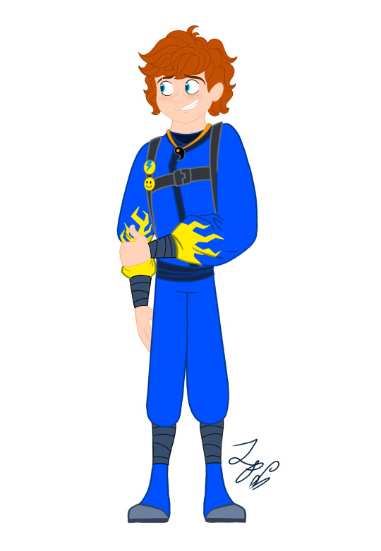


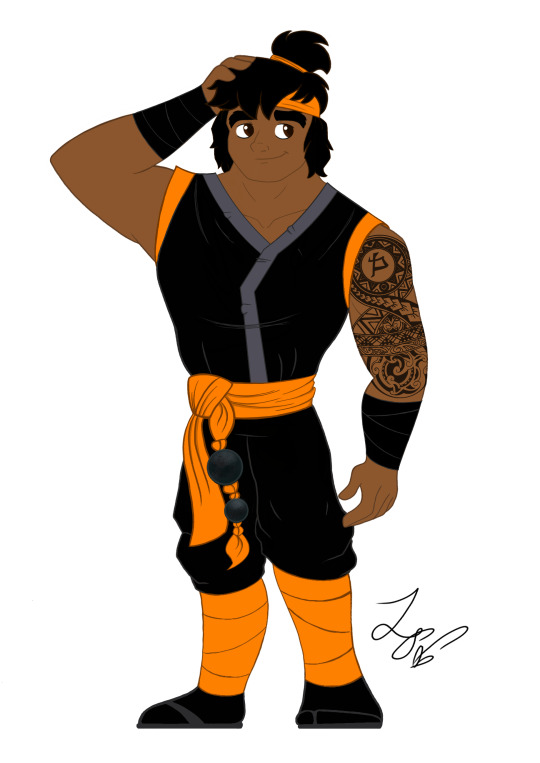
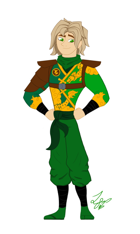
When designing these outfits, I tried to take inspiration from the ones in the show. And in terms of art style, drew inspiration from early 2000s cartoons, (Action Adventure ones specifically,) Anime inspired shows, and even a hint of traditional Disney animation. And while I designed them with a 2d cartoon in mind, most of the designs would most likely have to be simplified for them to be used in animation. So let's get started!
Kai: Kai was a pretty fun to work with. I actually didn't plan on giving him a sleeveless outfit. But it happened! And I like it! If you'll notice, the flame pattern on his vest mirrors the pattern on his sister Nya's outfit. I thought that would be a cool detail to include. It was inspired by their March of The Oni outfits. I also made sure to include his scar and bandaid. And gave him reddish brown eyes to signify his elemental power. Him and sister I imagine being Brazilian/Taiwanese. So I hope I captured their ethnicity properly. I'm pretty happy with this design. Especially his hair, which was hard to replicate.
Jay: Jay was a hard one for sure. I wasn't too sure how to vamp up his outfit. So I started by giving him some lightning patterns on his Gi. (At least I think that's what it's called?) And I decided to make it look a little baggy and soft. It just seemed to suit him. I tried something a little more form fitting and didn't look right. Also! A fun detail I included was his half the Yin Yang pendent around his neck! And of course Nya has her half. I imagine him having Irish ancestry, so I gave him pale, freckled skin. And gorgeous curly red hair. (As a fellow red head, I'm very proud.) Overall, I think he turned out pretty adorable. And his face is spot on.
Nya: Nya I pretty much got right on the first try! I just had a really clear vision of her in my head. I gave her a grey outfit with bright, vibrant blue details. The pattern on her Gi is inspired by Koi Scales. And she has her half of the Yin Yang pendent around her neck. I really like this one, because while it is simple, it's beautiful. And I think it reflects her element nicely. The only thing I missed was to give her a symbol like the rest. But overall, I love it! One more thing is that I wanted to give her and Pixal different hair. So when I finally release my Pixal design, you'll see that while they both have ponytails, I gave them different cut and styled ones. Should be neat!
Zane: Zane was the first one of the Ninjas I redesigned! I love how he turned out. I tried to give him a splintered ice effect on his outfit inspired by his Core minifigure and gave him his faithful falcon companion. Falcon has his old greyish purple feathers, but blue icy eyes to match his owner. I also wanted to give Zane flowing sleeves, that would look very majestic waving about in a blizzard wind. He is also incredibly tall. Taller than Cole even! I was inspired by the giant humanoid robots I'd seen in movies. In his cloaking disguise, I imagine him looking German. With blond hair, blue eyes, and light skin. I also like to think Dr Julian was German. (Was this influenced by my German ancestry? Who knows?)
Cole: You would not believe how many times I had to redraw this man's face. Haha! I just could find that sweet spot! That face that perfectly encapsulated his strong, but gentle personality. But I think I did it! His outfit is based on his Oni Trilogy Gi, with orange detailing. And he has his Island ponytail and bandana. I absolutely loved that hair style on him. So I had to use it! And if you'll notice, he has a beautiful tattoo on his right arm, with his symbol in the center. I imagine him being half Maori, from his mother's side. And the tattoo was inspired by Maori tattoos I saw pictures of. I'm not too sure how accurate those images were. But hopefully I hit the mark.
Lloyd: Finally! Our green Ninja Lloyd! His outfit was inspired by two things. Dragons, and his outfit from the Secrets of Forbidden Spinjitsu seasons. I gave him a beautiful golden dragon and cloud pattern on his clothes, a leather arm guard, and shoulder pads. If you look closer, you'll also see he has cat-like dragon eyes which pays homage to his dragon and Oni heritage. I like to think that depending on his emotions, his eyes will go from slits, to big and wide. So they are good indicators for his mood. I also imagine him being Japanese. But his powers give him his classic blond hair and green eyes. I'm very happy with this design. His hair, eyes, and face all look exactly how I see him in my head.
Well, that's all. I hope you enjoyed these designs and notes! I assure you, you will see more of the them.
Bye! - ✒️🐉
#ninjago#lego ninjago#ninjago lego#ninjago fanart#ninjago lloyd#ninjago jay#ninjago cole#ninjago au#nya smith#lloyd garmadon#lloyd ninjago#lloyd montgomery garmadon#jay ninjago#jay walker#nya ninjago#ninjago nya#cole brookestone#cole ninjago#cole brookstone#ninjago kai#kai jiang#kai ninjago#kai smith#zane ninjago#zane julien#ninjago zane#My art#ink dragon#Ninjago Remastered
78 notes
·
View notes
Text
HOTD season 2 was such a letdown😭
i dislike how the writers blatantly ignored the great source material they had right in front of them and literally turned it into their rhaenyra x alicent fanfic
Rook's Rest and the Red Sowing were amazing but the episode 8 was not a finale. If episode 8 (minus rhaenyra x alicent) was not the final episode, it would've been an alright episode. The writers were afraid of making Team Black look bad in any way that they made them all righteous and "good" and overall, bland. Whenever there was a Team Black scene (especially the council scenes), I couldn't help but want to fall asleep. There was little to no nuance. The writers obviously don't like Team Green, but their scenes had so much more nuance and complex dynamics that made for an enjoyable watch. A lot of writing for character arcs are inconsistent or lacking the season 1 quality. Daemon's character arc is the one that's the most messed up because his slow Harrenhal arc that just ends with the weird vision. Saying "Winter is Coming" just feels so out of place for him to say. I miss season 1 ep6 and ep7 Alicent. Why did the writers turn her into someone that would sell out her sons when she was so fiercely protective of them in season 1? I'm not someone who only wants action in a show. I love long, complex conversations between characters and monologues ... when they are well-written. Season 2 had long conversations, but most of them (especially Team Black's) were just not intriguing enough - they were repeating topics in many episodes without taking any action (except the dragonseed plot). The Season 1 finale promised war and by the end of Season 2, we're still waiting for the actual war. Season 2 was not really worth the 2 year wait (except for Rook's Rest) and now we have to wait for another 2 years before we get any actual "all-out war".
I could go on and on about how underwhelming this season was, but it won't change anything. The fault lies with the writers and HBO for making jarring changes to the plot and stretching out already such a small amount of material.
On a more positive note though, the actors were amazing and really brought their A-game. A lot of the scenes with the minor characters were fantastic. The production design is breathtaking. The cinematography and costumes were absolutely gorgeous. The dragon designs and CGI were AMAZING. I love Ramin Djawadi's soundtracks and was disappointed that the showrunners didn't give him much to do this season. But he still cooked with what he was given. "All Must Choose" is the best ASOIAF song I've heard since "The Night King".
Hopefully, they can turn things around for Season 3, but I don't have much faith because it seems that Ryan Condal and especially Sara Hess are not going anywhere.
#house of the dragon#hotd season 2#hotd#aemond targaryen#asoiaf#game of thrones#got#house of the dragon s2#rheanyra targaryen#alicent hightower#team green#team black#house targaryen#fire and blood
24 notes
·
View notes
Text
ok quick thoughts, spoilers behind the cut.
Pros:
Halle. HALLE. H a l l e. Her voice, her face, her mannerisms. They took what made Ariel special in the animated movie and built on it and she was the perfect person to pull it off.
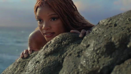
Her beauty was distracting.
So glad they finally got a singer for a live action, I couldn’t take another B&B autotuned disaster.
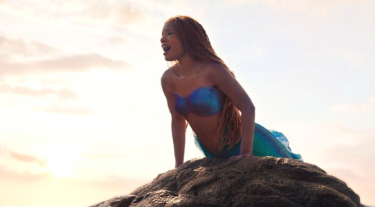
Made me want to get to the nearest rock and play mermaid ngl.
I had my doubts with Jonah but he did a great job with Eric, played the shy, kinda awkward potato prince charming to perfection. Loved that they expanded his backstory and his interest in adventure and the sea. Also A+ for the movie knowing he had a white shirt on while surrounded by water and using every chance it had to drench him.
Eric still being caring and worried about Ariel even under Ursula’s spell? 10/10 no notes.
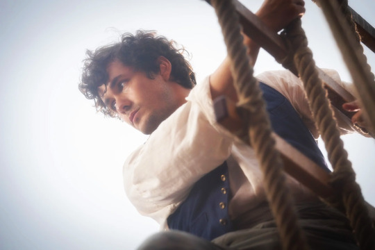
He came to chew bubblegum and be dreamy and he was all out of bubblegum.
Halle and Jonah’s chemistry was insane, I need them to do ten movies making eyes at each other.
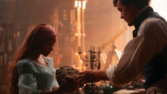
Seriously the movie could have been 2 hours of them interacting in that library and it would have been money well spent.
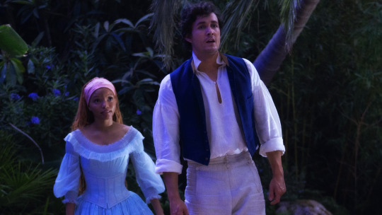
or just two hours of them being cute smol and tol in a boat idc
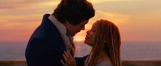
TRUE LOVE INDEED
Can’t wait for this movie to be out in D+ so I can reblog all the gifs.
Part of Your World and all reprises were ofc gorgeous. Vanessa’s Trick is haunting and exactly what one would want for a siren song. For the First Time is gorgeous and underrated, felt very Broadway-esque. Eric’s song was corny but in a good way.
The rest of the songs are adequate but are not as good as the original ones.
Gotta said, song aside, the Kiss the Girl scene was more endearing in this version. When she helps him figure out her name?
Melissa was good as Ursula and made the character her own, though I think she was not as scary as she could have been. Better than I expected, though.
The actress that plays Vanessa knew she had 5 minutes to make an impression and used them to the fullest. Delightful.
Cons:
The CGI felt unfinished and so did the color grading/lighting. I edited all the movie images in this post (just played with the saturation and the contrast) and I’m mediocre at best. HIRE TUMBLR EDITORS, DISNEY.
Halle deserved to wear more outfits, I can't believe Disney missed an opportunity to sell more dolls. Would have given her a dress for each day on land and the water dress. Mouse, I thought you liked money.
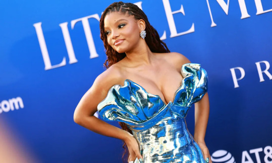
we could have had it all
Wanted more of her sisters tbh. And less Triton, Javier phoned it in imo. I know Triton and Ariel’s relationship is an important part of the original movie but idk if it was his half assed acting or me wanting more of the sisters, but I wasn’t moved.
Flounder's weird character design was saved by his stellar voice actor and Sebastian grew on me, he was hilarious. Scuttlefina was tolerable but gosh she’s always playing the same character, stop casting her in everything.
Less I say about Scuttlebutt the better. Kids are probably gonna love it, though.
The ending was kinda weird? It felt rushed and the battle with Ursula was disappointing. Which is a surprise because the OTHER stormy scene at night was wonderfully done.��
Up to Ursula taking Ariel back to the ocean it felt really cohesive but the second Triton appears to save her it was like they were trying to speed things up and it got... weird.
Didn’t mind Ariel being the one that killed Ursula, after everything she put her through.
Cannot believe the movie robbed us of Jonah screaming “I lost her once, I’m not gonna lose her again!”
Overall it was a well paced (up to the finale), entertaining, charming movie. Despite its faults, the only Disney live action I want to rewatch (outside MAYBE Cinderella).
8/10 Justice for the foam dress.
148 notes
·
View notes
Text
I thought I'd be more coherent if I wrote this in the morning and I was entirely incorrect so get ready for an absolute mess of Ahsoka thoughts!!
I love the palette of the show- I don't think we've ever seen anything in live action quite this colorful and it fits the Rebels look perfectly. Side note Lothal especially is gorgeous and I can't wait for people to make gifsets of it so I can reblog them endlessly
Additionally: the music!! I went feral every time I heard themes from Rebels and burst into sobs listening to the end credits. Kevin Kiner sir you have not lost your touch
Speaking of sound design: I'm so glad they didn't change the iconic loth cat noises. I would die for Sabine's kitty
Now, I miss the voice actors a lot, and I stand by the fact that this would have been better animated, but I do think the live action actors embodied the characters very well. They were well-written and had wonderfully consistent mannerisms
Also all the little Rebels easter eggs! Ryder! Jai!! As soon as I saw the guy standing next to Ryder I was like "is that Jai?" and I literally screeched "YES" when he was introduced as a senator
I wasn't expecting them to mention Ezra as much as they did! I kind of thought he'd be vaguely haunting the narrative like Kanan, at least for the first few episodes, but no- he is driving the story and I love that for him
I am a little confused as to why Sabine and Hera thought he was dead since Rebels never gave off that impression, but as reasons to explain why they didn't look for him for ten years go, I guess that's the most plausible. My thought is that they initially believed he was out there, but assumed he would be the one to find their way back to them, and lost hope when it didn't happen
As much as I'm anticipating Jacen, I actually wasn't too disappointed he wasn't in these episodes. It looks like the vast majority of footage in the promos was from these episodes, so there's plenty of time for him to appear later on
Overall: I'm satisfied! I'm emotional!! And I can't wait to see where the story is going from here
#ahsoka series#ahsoka#star wars rebels#swr#ahsoka spoilers#ezra bridger#sabine wren#hera syndulla#kanan jarrus#ryder azadi#jai kell#jacen syndulla#ray rambles
124 notes
·
View notes
Text


My favorite games that I played in 2024
Shadow of the Erdtree Receiver 2 (2020) Crockpot Indika Northern Journey (2021) Stone Story RPG (2023) Time Bandit (2023) Deadlock The Exit 8 (2023) and Platform 8 Universal Paperclips (2017) Pools #BLUD
The Elden Ring DLC continues the trend of the base game of sprinkling secrets into little corners of these huge plains of nothingness that just gets tedious to explore. But damn if this isn't the prettiest this world has ever been. The layer upon layer design of the world was a treat to explore.
I had started Receiver 2 back in 2021, but never got very far. Rogue-lites do not hold my interest for very long. But mix it with FPS shootin, some lite stealth, and minute gun mechanics that let you interact with every little bit, and I'm so glad to have revisited this to 100% completion.
Crockpot is a joint effort from Blake Andrews and Emily Koonce. A visual novel-esque experience mixed with a variety of little interactive scenes of different parts of two characters hanging out. Very slice-of-life, deeply personal, and delightful. It nailed what it was going for perfectly.
I played Indika with my two housemates on a whim. I love how well the religious trauma of the main character is intertwined with the actions that you take throughout the game. It's just a delightfully surprising experience. You will not be able to guess what it throws at you.

I had started Northern Journey back in 2023 and fell off until picking it back up towards the end of 2024. I'm glad I went back and finished it. It's a love letter to old PC games that were a little before my time. It has gorgeous environments/foliage, a banger soundtrack, and great pacing.
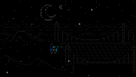
Stone Story RPG is an idle RPG game with the best authentic ASCII art I've seen in a game. The way everything is animated is fantastic. It's very well designed around it being ASCII art on a defined grid. Was a very enjoyable gameplay loop. I stopped when the grind became more predictable/tedious.

I initially got frustrated and almost quit playing Time Bandit, but I stuck it out and got into the habit of playing every day to move one more crate, compact one more pile of trash, and steal one more time crystal from the big corporation. It was a satisfying and slow loop of Sokoban and stealth.


Now for some more rapid fire thoughts.
Played a lot of good games of Deadlock with friends in 2024. First MOBA I've enjoyed playing in a long time. Lots of fun characters, too.
The Exit 8 and Platform 8 are both satisfying find-the-difference horror games. Highly recommend playing with friends.


Played Universal Paperclips for the first time and had a blast. Love a good clicker game with a defined ending.
Pools is filled with fantastic wet liminal vibes and great sound design.
The animation and visual style might carry #BLUD more than its gameplay, but it was still a great experience.
---------------------------------------------
2024 has been an awful year for game developers with so so many layoffs and a turbulent industry overall due to wanton greed and world-wide circumstances. I hope 2025 will see more unions, stability, and worker-owned game studios. Power to the people fighting the good fight out there.
7 notes
·
View notes
Text
midsommar (2019) is an excellent and beautifully done film about isolation—both the state and the action—and its equally terrible opposite. the film opens with a magnificent sequence in which dani, the protagonist, is completely physically isolated within her apartment even as she communicates with others through phone calls; her isolation is juxtaposed sharply against the physical closeness of her boyfriend christian to his friends. it becomes clear that dani is not only isolated, but is isolated by christian and his friends in informal punishment for a wrong they feel she has committed against christian (being too needy). this process of being isolated is reversed when the group arrives at the harga. one by one, christian and his friends are isolated in a comparable, if more rapid and brutal, way to how they isolated dani: each commits what the harga considers a wrong against it, be it being unsupportive of the ättestupa or urinating on their ancestors’ graves, and in response and punishment they are utterly isolated and utterly undone. meanwhile, dani experiences the exact opposite of isolation. the harga experience everything communally, not just physically but emotionally; there is no privacy in sex or death or grief or guilt, and the isolated dani enters unresistingly into this beautiful, claustrophobic, brutal community that provides her the very support she was denied before. the incredible cinematography tracks these separate journeys of isolation and incorporation with incredible clarity. the filming emphasizes lineal framing and geometric shapes, which lend themselves extremely well to showing when a character is incorporated into the symmetry of those around them and when they are not. the use of colors, both in sets and costumes, likewise very clearly sets characters apart from one another or blends them in seamlessly; by and large, the colors of isolation are dark and cool and the colors of incorporation are light and bright, leaving the isolated characters with nowhere to hide and the incorporated characters with no way to differentiate themselves. beyond merely providing these visual markers, the cinematography was absolutely gorgeous overall, and beyond the visual beauty of the film the psychological horror element was well-developed and highly effective. acting, scripting, pacing, soundtracking, visual effects, and set and costume design were all highly effectively done, and i have very little to criticize about this film. midsommar (2019) is an incredibly crafted film that succeeds at everything it sets out to do, and for that reason i highly recommend it
62 notes
·
View notes
Note
We’ve seen your love for Modern Eggman (high key I respect it) but what’s your opinion on Classic Eggman, design wise? I mean it’s literally the doctor just a few years younger(?) do you still simp or do you prefer his modern look?
I guess I do have a slight preference for modern Egg design wise + he's my focus as he has more cutscenes and dialogue to appreciate and analyze. But in my pinned post I have a lot of classic Egg merch too and that's because I actually feel just as much love for him as I do modern! It's really just that modern has more official stuff to simp over overall lol
But both classic and modern Egg play a part in my initial love for him around the same time, as my first lot of games consisted of both. I love classic Egg's perfectly spherical round body compared to modern Eggman's actual egg shaped body, it's super cute. He is a BALL! And he's absolutely just as handsome and sexy as classic as modern Egg
He's cute, handsome, funny, evil, cool, joyful and mischievous as he has a blast being an evil bastard, and he's as round and spherical as the world he wants to conquer... He's perfect in every way 💘


Classic Egg is just as evil and dangerous as modern too but looks like such a cute jolly whimsical fellow in comparison, he could much more often be mistaken for being innocent and nice and I love how he very much isn't despite this. The contrast of his dark actions to his cute design is great and makes him even more charming and lovable
Besides his gorgeous round body I also love the little sea cadet collar inspired yellow "cape" he wears (yeah it's not actually supposed to be a cape)

and how the yellow triangles of it at the front + his mustache when the bottom half of his face is obscured makes him look like a walrus his stache the whiskers and triangles the tusks,


his design just gets cuter with every detail!
I was delighted to see more classic Egg in Superstars most recently, he's such an adorably mischievous and happy giggly guy there when he's scheming and causing trouble gleefully and he has so many fun animations that make me laugh, all of which I GIF'd in my #Sonic Superstars tag but here's some favorite examples of that


He fills my heart with such joy 🥰
So yeah while I'd say I have a slight preference for modern Eggman stuff, I feel like my amount of love for his classic design and everything else about him in general is actually just as big. He is the exact same guy after all, just from the past and possibly a little bit younger but definitely still an old guy himself. He's lovable in all stages of life 💜

I also have a tag specifically dedicated to classic Eggman stuff if you're interested to see me talking about and gushing over him specifically more in general, it's #classic (though I'm probably gonna update it to #classic eggman via tag replaced on PC to make it more specific and easier to find at some point)
19 notes
·
View notes
Text
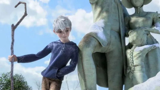
Jen Tortures Herself With Every Dreamworks Animated Movie Ever: Rise of the Guardians

So I vaguely remember watching this movie at a Walmart once while I was waiting on my car to get fixed. Fuck all if I remember anything about it though other than that people ship the ice twink with Elsa or whatever. So I kind of went into this one for my first active watching of it with bare expectations. How did I end up finding it then?
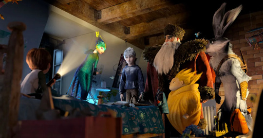
The Guardians are a group of mythical beings composed of North (Santa Claus), the Easter Bunny, the Tooth Fairy, the Sandman, and their newest recruit, Jack Frost. Together, they protect the children of the world from the villainous Pitch Black (the Boogeyman) from spreading fear across the entire world. A pretty solid setup with some good payoff, but... there are problems.
I think my biggest issue with Rise of the Guardians is... well, its ambitious. A bit too ambitious for its own good at times. It has so much it wants to establish with these characters and how their roles and powers work that it sometimes bogs itself down with all of the details and... overcomplicates things a bit too much? Like on its own, we all are familiar with the concept of Santa or the Easter Bunny, and I do appreciate how creative this movie is with executing them and the work that they do. But sometimes, it just... gets in its own way? If that makes any sense?

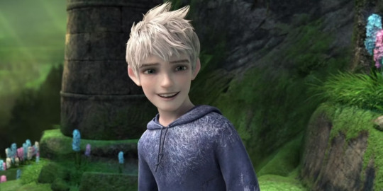
So a simple premise that bogs itself down in the details. Ok, what else is there about this movie to redeem it? Lots, surprisingly! The Guardians are all really fun characters in their own right, and I loved the dynamic developed between them. Jack Frost is our focal point out of all of them, and I really liked him! He's an angsty little ice twink who can't been seen by almost anyone because no one believes him, so he has plenty of baggage for compelling drama. My one issue with him though is that I don't think Chris Pine's voice works for his character design? Like I look at that character and I do not think the voice of a man cresting his mid 40s. Its just a touch weird in terms of casting.
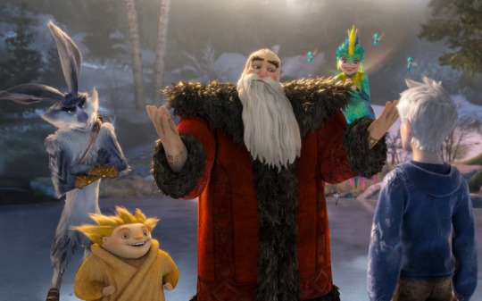
The other Guardians are also really fun and unique takes on characters we all already know. North is a delightfully different take on Santa, still just as jolly as we know him to be, with a slick action-hero element of him to the side. The Tooth Fairy has a very sweet, fast-paced energy to her, while the Easter Bunny brings a great edge of sass to compete with Jack throughout the film. The Sandman, while not saying a word, is probably my favorite of the bunch though. He's just so charming and sweet and while he isn't in much of the movie, he makes such a strong impact every second he's on screen.
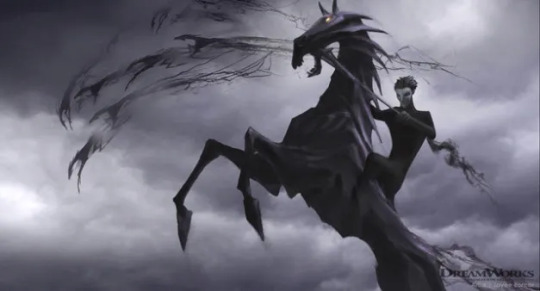
Of course, we also have our villain, Pitch Black. He's sinister and manipulative, if not a bit... predictable? Like we've all seen this kind of villain before, he isn't doing anything new, but he works well as a foil for this team, especially for Jack and I think he's an ok antagonist overall.
Visually, this movie is beautiful, so unlike almost anything Dreamworks has ever made before, with gorgeous effects and fantastically animated action sequences. The character designs are so... un-Dreamworks, but they work so nicely in the world they inhabit. That world itself is beautifully built, especially in its more fantastical setpieces like the Tooth Palace or the North Pole. The score was also lovely to listen to, capturing the sheer creativity of this movie so nicely.
At the end of the day, I think that's the perfect word to describe Rise of the Guardians. It's very creative, with a lot of love and thought clearly poured into it. It really is a shame that it didn't go anywhere further into a series or more sequels because I would have loved to see more of this team and watch them just... be together. They're that fun to watch in action. Same for the movie itself. It's good!
Overall Rating: 8/10
Verdict: All hail the Ice Twink
Previous Review (Madagascar 3: Europe's Most Wanted)
Next Review (The Croods)
#jen watches#dreamworks watch#rise of the guardians#dreamworks#jen tortures herself with every dreamworks animated movie ever
21 notes
·
View notes