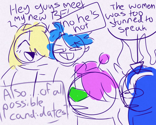
#that being said i like the redesigns and a lot of the animation / design work is gorgeous
Text
mixed feelings on the nimona movie. i think it’s fun and gorgeous but i also think it sacrificed a good bit of itself to fulfill Animated Movie Tropes and i honestly preferred the ambiguity of the original
#I <3 AMBIGUITY patch on all my jackets#i really don’t like the changes to present balthazar and ambrosius as much younger#and especially the removal of ambiguity from nimona’s background and history#like i get where they’re coming from with a big budget movie it’s a lot harder to sell ambiguity and grey areas to execs#especially for a teens movie#that being said i like the redesigns and a lot of the animation / design work is gorgeous#tag edit: why the fuck did i think his name was balthazar
14 notes
·
View notes
Text
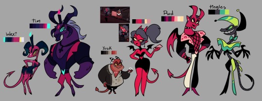
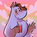
Velvette if she served cunt
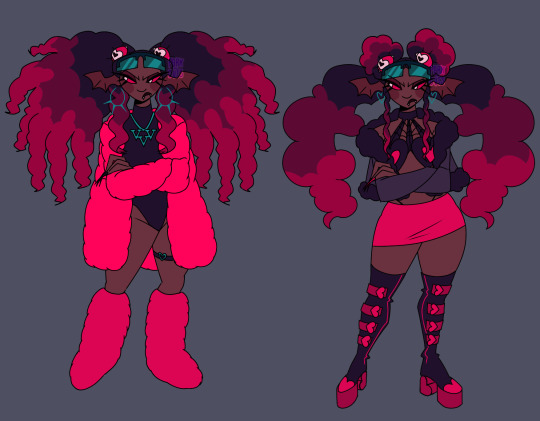
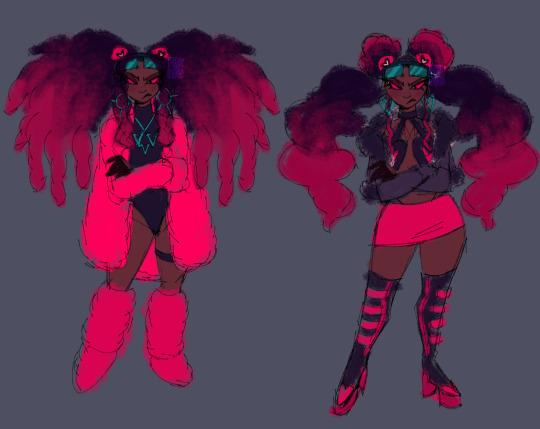
Design breakdown below 👇🏾(BEWARE IT'S VERY LONG)


Alright going into detail about my gripes and edits. Like Velvette but her design is just. Not good to me. None of her (main) outfit details look like they fit to me— pinstripe pants + long fur coat paired with black crop top and scene sleeves? Skull earrings? TINKERBELL HEELS????? Tell me how any of that meshes well or even makes SENSE for the social media influencer persona she's supposed to have going on. Now that I think about it I'm pretty sure she's supposed to be clown themed... But I'm just gonna toss that idea out bc being a revered social media influencer and a clown at the same time just seems a bit oxymoronic to me, and the "clown" details aren't adding shit for me.
And don't think I forgot about her features. Pale ash grey skin and wavy hair at best. If she was supposed to be some type of creature where a nonhuman skin tone would make sense then maybe I could let it go?? But as far as I can tell she doesn't have an object or creature or animal theme like the other V's and if she does I shouldn't need to do detective work to figure it out. There is no reason for *any* of these poc characters to have grey skin, especially since they don't have any other poc features at all.
Sorry that shit gets me heated anyways. Onto my redesign. Gave her a more obviously black skin tone and textured hair bc I love a 30 inch buss down as much as the next girl but considering how there are no significant poc cast members with visibly textured hair I think she deserves to flaunt some coils if no one else will.
Ngl I'm not. A fashion girlie. Idk what's trendy idk what screams "influencer" so a lot of this was just throwing shit at the wall that I've seen around recently but it looks cute enough to me. And there was a bit of inspiration taken from Aliyahcore and ghetto fabulous fashion ❤️
If you can't tell this is shamefully inspired by lovesart23's Velvette reimagining because imo they had some outstanding ideas for Vel. I low-key stole their idea for those floating eyes in her hair that follow her around and help her keep tabs on shit it was just a superb idea for a social media overlord to me. I also took some inspo from @furbtasticworksofart 's redesign because vampire influencer sucking up the souls of her followers in exchange for content??? Too good (also the eyes were supposed to have bat/vamp wings I just forgot 😭) So yeah she's a vampire demon now. Without the features she was looking too human anyhow. Maybe she also feeds off of the energy of her followers through tech like after Vox mind controls them or whatever... Idk idk is that anything
Speaking of Vox, the screen glasses are meant to connect her to him w/ their color and shape while serving the purpose of being like a second phone she can post and check the web with. Like lovesart said in their reimagining vid, Vel doesn't really do more than pose for selfies and scroll on her phone when it comes to social media so in my head she's constantly flipping her shades on and off, using them to scroll and stay active, and they can show when she's not paying attention or respect to something/someone bc scrolling is more worth her time in the moment.
The hearts everywhere are also supposed to kinda represent social media likes + connect her back to Val w/ his heart patterns. That might've been what the hearts in her og design were for but. I just didn't like their placement bc I'm a nitpicker and a hater❕
I have so much more I could say about possible ideas for Velvette because I love evil black girls and I only want them to succeed in my media and I could treat her so much BETTER but I'll refrain bc this is way too long anyway.
Alright for reading/scrolling through all that rambling I offer you the sketches + some alt hair ideas I had
P.S. I'm very open to constructive criticism but if I see anyone just dick riding in my replies or rb's I'm just blocking you on sight ✌🏾
#hazbin hotel#velvette#velvette hazbin hotel#velvette redesign#hazbin hotel redesign#my art#digital art#character design
823 notes
·
View notes
Text
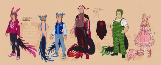
ᐯᗩGGIE ᗩᑎᗪ ᑕᕼᗩᖇᒪIE ᖇEᗪEᔕIGᑎ
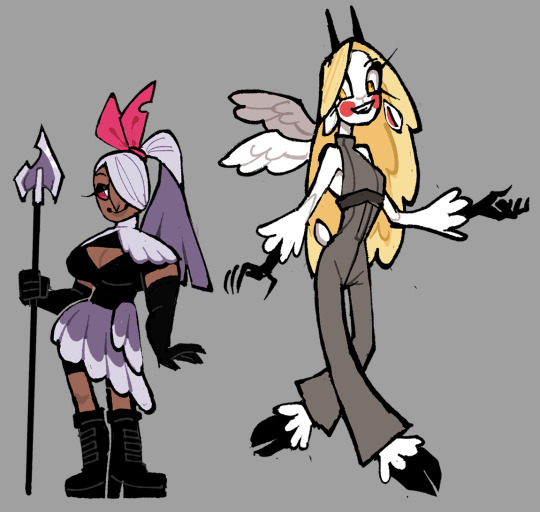
These two are simpler than the angel dust design I did since I didn't have a lot to go off of. Posted on Valentine's Day because yes I can.
I don't think Charlie is significantly different from her Pilot design because I genuinely think it was the best design from the cast (before the redesign).
Thoughts below, though TW for the creepy charlie image at the end:
My issues with their Original designs:
Vaggie:
The giant "X" over her eye is really distracting and even world-breaking because
1. Why had no one put 2 and 2 together that the only character in Hell who has a visible 'X' mark on her face might be related to the angels who also sport that X mark on their faces.
2. Why is it shaped like an X? Her eye was taken out via a single slash.
3. If the hair's purpose was to cover it, why would it show through it? What's the point of the hair then?
The hair that was supposed to cover that wounded eye looked so ugly and confused as to what it should be doing. I mean every shot that showed that thing in a sideview shot of Vaggie felt like the animators had to make their own guesses as to how that was supposed to look like. It was distracting for me personally and I hated it so much.
It's been said over and over again, but her clothes look like she works at McDonalds. I get needing to change her outfit so that she looks like she works at the hotel, but it's just been poorly designed.
Why change her clothes' colors from white to red? the white helped her stand out from Hell and the Hotel's majority red background. (In the finale, she at least has a non-red attire)
She's also one of the very few women in HH and she falls under the skinny stick side of it despite being an angel exterminator.
Her hair is kind of hard to visualize looking at in any way other than what it is when it's static. However, when it changed into a ponytail or a bob, it's actually really nice to look at.
Unsure of what that bow's purpose is for the design.
Charlie:
Charlie is a simple but very confused design. The pilot design was a lot more coherent than the current show design
It's disappointing to see the bouncy Pilot hair go and be replaced by that boring bubble braid of all things.
Her undershirt peaks out of her tuxedo.... why???? to separate the top jacket and the pants? You wouldn't need to do that if her pants were a different color like the pilot design.
Thought about it and was confused, as a demon with an angelic father, why didn't she have wings as well? She didn't need the 6 wings like Lucifer but maybe a pair of one would appear?
Out of all the characters for the show's redesign, Her's was by far the MOST infuriating to me. Her pilot design wasn't perfect but it was good, they had to downgrade her for some reason.
I didn't have much to say about Charlie. it basically sums up to "the Pilot design was better".
On to the thought process for these two:
Valerie the fallen:
Yes, she got a rename. Sue me.
I had to remove the moth aspect of her design because it doesn't seem like it makes sense for a heaven-born to follow the sinner's rule of "gaining features based on the life you lived" since she basically never lived right?
In this redesign (and eventual rewrite), Valerie is not ashamed of her exterminator background. In fact, she was known as the most recent "fallen" in hell. her short stature doesn't make her less of a threat to the demons.
She's also visually thick with muscle because why not let one of the show's women have a body type that isn't stick-thin?
She's using the wings that were torn off of her as both an interesting article of clothing and as a way to remind others and her that she is (or more accurately 'was') an angel who could kill them if she wanted to.
Her clothes are pure black underneath the pale feathers to show that while she is an "angel", deep down, she is far from a good person.
She's also getting an actual skin color because from what I gathered myself from the show's heaven. Most of the souls there still retain a human appearance (Adam, Lute, St. Peter, and the other random human angels up there still look human..... but just don't mind the fact that most of them are white.)
Her hair is that ponytail she had in the finale because as much as I didn't like that episode, some designs looked actually decent.
Also, her hair actually covers the eye scar properly.
I wanted to keep her ribbon as a splash of brightness on her design but the OG ribbon looks a little out of place on a warrior so It became that (Plus it pays homage to her OG moth influence with its shape looking like the fluffy antennas of the moth)
Gave the spearhead a little bit of detail on it plus a chipped side so that it has a bit of charm as an old weapon she still decides to keep around.
A note about Valerie's design is that I haven't tackled the armor of angels yet so I was unsure of what pieces of the undesigned armor to give Valerie as of now.
Charlie:
I honestly actually enjoyed her Pilot hair, so I tried to put it back and also simplify it a bit so there are not a lot of strands for me to keep track of. Plus it was a genuinely cute design for her. (There's a reason that version was used in the Verbalase video.) <- I'M JOKING
Replaced her button nose with a goat's because a friend has commented how it looked like the noses of the women in a Goofy Movie and I will never be able to unsee that.
Her hair is also a lot brighter compared to her washed-out blonde color.
She has the same design thought process as Valerie, Covering the darkness of her true nature with white fluffy fur which is stylized like feathers at its ends. She has pitch-black skin underneath and looks like a proper nightmarish demon like the image below.
I ditched the tuxedo look, since almost all the cast has a similar outfit already, and gave her a jumpersuit instead. (Idk what it's really called but that's what I think it is). It's a light grey because she's a mix of bad and good (though a bright grey because she prefers to be on the good side)
Her horns are there and visible because yeah it's cute but also helps her read as the half-angel/half-demon character she is.
Tiny goat tail because can you imagine every time Valerie holds the rare angel smile of approval, her tail is visibly wagging in glee and excitement???? My heart would die. I love these lesbians with my life.
Has wings from her father.
Anyways, those are my thoughts and redesigns... I wanted to add more details to them but I didn't really know what to add that didn't feel unnecessary.
Also bonus! Concept art of Charlie's true form:

#vivziepop critical#hazbin hotel redesign#hazbin hotel criticism#hazbin hotel critical#deadbeat motel rewrite#deadbeat motel redesign#deadbeat motel charlie#deadbeat motel valerie
525 notes
·
View notes
Note
Hey, so I made this account because I thought it was the best place to reach you for this. I was able to attend EVO2024 and got to talk with a lot of the devs for 2XKO. I thought you'd like some of the insights I found based on your latest Braum trailer reaction.
When asked about the more pastel style for the new beach background, they said they were experimenting with slightly different styles for Bgs and seeing what fits (they also mentioned how the map felt like a breath of fresh air given how little moving parts there were in comparison to the others). They actually have a whole post-processing system in place for backgrounds to quickly adjust color values, shadows, and lights in case visual noise does become a concern.
You were also spot on with the difference in facial bone density between Braum and the other more serious characters like Darius or Illaoi. Braum was specifically modeled for that expressive animation fitting for a strongman.
Interestingly, a lot of the LOR elements from Braum's kit were actually a necessity in redesigning his move-set for a fighting game. Designers needed to come up with new ideas to fill in certain gaps in his playstyle, and looked to LOR and other media for inspiration. This feels a lot more natural then Riot forcing the homogenization of the leauge universes which I do not think was a factor in creating Braum afaik.
A final thing I'd like to add is there are actually very few animators working on the project (around 3-4). Since 4-5 champs are constantly being worked on at the same time, animators are constantly jumping from champ to champ as bits and pieces of each character's kits get finalized-- which I thought was a very cool pipeline structure.
Anyways I hope you found this either informative or enjoyable and wish you a good day!
Oh that is REALLY interesting! Thank you so much for sharing this!
185 notes
·
View notes
Text
Let’s be honest here, the only reason why Viv’s fans attack anyone that draws redesigns is because said redesigns are better than the source material.
Why is that people who don’t work on the show understand that Angel and Vaggie are supposed to have a spider and moth motif, but Viv (The person who created these characters.) doesn’t?
Even the people who don’t know anything about demonology get that Beelzebub makes more sense as a giant bee/fly than a sparkle dog.
Most animated shows have a bunch of character designers on staff, so they can share ideas when it comes to a character’s design.
But not Viv’s shows! Viv is only one who has final say on what the main cast should look like, while the character designers are only allowed to design a bunch of background incidentals, who end up looking a hell of a lot more appealing than the main cast.
If you’re an artist who enjoys drawing redesigns, please don’t let Viv and her fandom’s toxic behavior discourage you from doing what you love.
Yes, there are artists who only draw redesigns because they wanna “Fix” a certain design, and those assholes shouldn’t be given any attention, but most of the people who do redesigns of Viv’s characters do it for fun.
With that being said, if you are an artist who’s thinking about posting your Hazbin/Helluva redesigns online, please be aware that the fans will end up harassing you, so be careful out there.
Also, I don’t blame anyone who says that they don’t want to draw redesigns of Viv’s characters because of how toxic the fanbase is.
#Vivziepop Critical#Hazbin Hotel Critical#Helluva Boss Critical#Spindlehorse Critical#Toxic fans#Toxic fandom
264 notes
·
View notes
Note
Hey there! It's been a while, but I'm the same anon that asked for advice redesigning the Aerialbots (still haven't gotten around to that...)! But I'm here to ask for some more advice, if that's okay...
I wanted to make a fanfic including Sunstreaker, but there's barely any canon content (specifically animated, which I watch the most) on him... any advice on writing him? You're the Sunny expert, after all... 💛
Hello Aerialbot Anon, nice to have you back hehe.
I don't know about being the Sunny expert, all this just started with the brain-rot from @shyspider fanfics and fell into Lambo hell…
But!
I'm happy you sent in an ask and will do my best to help!
I've been thinking hard about how to answer your ask.
Since I'm an artist, I spent a lot of time designing how he looked and worked his personality into his finished design. Writers don't have the luxury of just adding visual cues though, so I scratched around in my head and made up a quick list of the main points I kept in mind that might help you figure out what kind of Sunstreaker you want.

When he manages to show up in canon, he's usually a narcissist and very difficult to get along with, so I made him very confident in his looks and very good at his job while being dismissive of people who don't outright impress him.
I wanted him to have more than one dimension, so I decided that he bases most of his worth around his appearance and competence. He's a little jaded and belittles those around him because he doesn't want attachments that can hurt him later. (Also, I made him sarcastic and difficult to get along with in contrast with Sideswipe as the "friendly" twin.)
He's used to, and dislikes, superficial relationships. Sunny is always getting surface-level compliments and so he's numb to them and actively avoids them. That scene in Guardians of the Galaxy where Drax said "beautiful people never know who to trust"? That's Sunny.
Looking at this list, my Sunstreaker is essentially a beautiful but aggressive shelter cat.
Of course, all of this is just for my interpretation of Sunstreaker. Yours might be a bright-eyed sparkling or a pretty-boy assassin, or a battle-hardened old coot with loads of scars. Who knows?
With so little canon content for the mech, he's almost a blank slate, which can be a little daunting to work with.
If you can find a fanfiction with Sunny that you like, or even a similar character to get ideas from, that'll help too...
I hope I went into enough detail and that this can help you out?
Feel free to drop by my inbox any time if you have any more questions or just want to chat~
#anon ask#sunstreaker#transformers#maccadam#macadam#aerialbot anon#Good luck with Sunstreaker! I hope you enjoy working with him as much as I do ^J^#I gave you an anon tag hope you don't mind
64 notes
·
View notes
Note
Oooh okay okay, permission to be a little petty? This has been eating me up for a minute! On the topic of the helluva/hazbin redesigns: there are a lot of times in the critical side of this fandom where I’ll see people talking about what they would “fix” about the character designs, and like you said- some of the specifics people think they need to fix just…undermine the point of the character?? (I.e making Stolas big and burly) But it also feels like they’re ignoring that these characters look the way they do because they have to be ANIMATED. There’s been a handful of times I’ve seen people with that “fix it” attitude where they just waaaaay over complicate textures and shapes then say it’s so much better. For example some were saying Blitz’s design was bad because you can’t tell his burn scars were burn scars because the edges were too round. So they completely rendered the scars in their redesign and said they fixed it. I absolutely understand wanting to make detailed artwork. I LOVE detailing the hell out of a character in a drawing!! But to animate?? Especially with helluva where the spindle horse team doesn’t often outsource its animation?? I KNOW it’s silly but sometimes in passing I want to be like- ok. YOU animate your incredibly complicated redesign for a 20 minute animation at 24 frames per second. Then you get to handle the budget you’d need to get it finished and add in lighting/effects/etc. Then you ALSO get to handle the complaints from people who say episodes take too long to come out. Animation is a HUUUGE process! I feel like the work it takes to make it look so good is really taken for granted :,)
(I should be in bed so I hope any of this makes sense lmao I’m so sorry in advance!! Love your account your takes are so well thought out and you’re very funny <3)
Yes, thank you for your excellent point, I totally agree!
I mean, I will always defend CGI animation (I'm a firm believer all animation mediums are beautiful and valid), but I feel like it's spoiled people in how detailed a character's design can be. While part of the charm of 2D animation is how simplified lines can still get so much across.
It's been more than a decade since I studied animation and we only really did puppet animation, but even with that I quickly realized my designs could never be as detailed as when I just made a stand alone drawing (also, rip to my old animations that are lost to time, because my hard drive died a few years back...)
I'd honestly argue that for 2D animation standards the designs are really detailed. Maybe not for every character, but that's part of the beauty of it. Just like how in real life not all people dress all fancy and complicated, some people prefer simpler outfits, and they know how to make that come across in the character designs.
Especially Blitz is a prime example of being tailor made for 2D animation, that's also part of why some of the best facial expressions come from him, they know how to play around with his face shape. Regarding the scars, it's not just a 2D thing, it's the fact that imps scar differently than humans. So, again haters claiming they "fixed it" by completely ignoring lore.
(Aw, thank you! I try my best to put my thoughts into words and it helps make sense of whatever the hell is going on up there. I take a lot of pride in it, because my mother complimenting me on "knowing how to word things" was one of our last conversations before she passed.)
#helluva boss#stolas goetia#stolas#blitzø#blitzo#blitz#ozzie#asmodeus#hazbin hotel#lucifer morningstar#charlie morningstar#vaggie#angel dust#husker#niffty#(just tagging some random characters I guess)#hellaverse#my mother#anon#ask
22 notes
·
View notes
Text
Sketch a day 6
Yeah I skipped a whole bunch of days, life is life BEHOLD!!!!
LIZARS!
I designed only few for now, there is more to come (with 13 in total *dies*) But yeah I tried my best and I put a lot of thought into them!
more rambelings about designs and a bit of lore and what character they are under the cut:
---------------------------------
General facts about lizards:
All lizards have tails and antenna (some squshy some not so much)
they are incredibly proud. Just in general and have a big pride in them being strong and dangerous and beiing predators. That's why every single lizard have a danger symbol somwehe on them, will it be neclase, shirt patch, button... and so on.
but even with that they try to have good relationship with other hybrids, after all they all work together for better future of all of them
fuck the pronouns, there is only one pronoun in their language, any pronouns in other languages will be ok
actuall lizards do exist in this universe as well they are just wild animals that are like monkeys to us, and are wel... like crocodiles?? you know
And the ones you see here are just specific characters (even tho they don't have proper names). There are multiple pink, red, cyan, yellow and so on lizards, same as I'm sure there are multiple white, red, blue and other colored slugcats.
Pink one looks like most average character we all made once. it's literally hoodie jeans and sneakers, there in nowhere more avarege to go, pink one really goes Just A Guy™ and that's the whole point. Been doing football since 10 not because they are any good at it. Collage student
Blue one is a bit more interecting, you know it's like when you redesign your first character, and you want to keep the simplisicy but also more detailes and less flat. Two blue 'fins' go al along the spine. Also play foorball with pink but they are actually better at it than pink. Same collage with pink
Red is slay. That-s it. They are the King and the Queen and all above and hot and sexy because I said so. Very tall btw, they are like 2m tall, could kill you with their tail and will not apologize and also wears heels, because being 2m tall isn't enough. Sassy bitch. I love them. Also they have red thingies on the back same as on the tail (that's why their back is open, but cover it with a cloak)
Green is a chill guy, but hits like a truck, so do not anger them (whick is more than possible, it's not like they are an ocean of patience). Also can kill you with a tail and not notice. Also I have not decided fully but probably some kind of armycore or something military is def about them. necklase is made out of bronze
Strawbery is my fanourite cat boy of this groop! They are like actual cat boy!!! Their ears are same shape and same softness as the ears of slugcats, so yeah! certified cat! Cutie doll that will puch you in a face, you know what, from now on they are streamer or something like that, becasue I can. With pink gaming set up, yes.
#my art#rain world#rain world au#rain world gijinka#rain world human au#Lizards#rw pink lizard#rw blue lizard#rw red lizard#rw green lizard#rw strawbery lizard
26 notes
·
View notes
Text
Redesigns Redesigns Redesigns !
And a rename!
🪲☀️🪲☀️🪲☀️🪲☀️🪲

More info below + solo + sketches below cut!
Because I had redesigned cheddar I was looking back at my other two favorite girls, Riley and Boon, and found myself cringing at their designs. They were…okay! But not good anymore! Riley still looked like a sona despite her now being her own character and boon…boon was something else
🐜🐜 Riley Red 🐜🐜
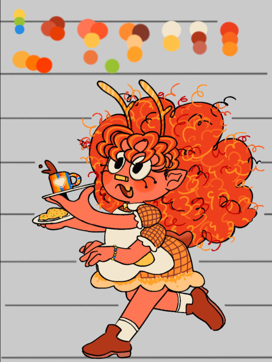
When redoing Riley I wanted her to look super sweet but is surprisingly rude despite her appearance (cliché diner server from the movies). So making her shorter and chubbier instead of mean and lean looking like previously got that part down, all that was left was the hair which was thankfully easy thanks to her design for @/evillillad metal au I realized she look good af with bangs! I also ,add it more everywhere because she only has time to fix her bangs before back to running food! (Also gave her a beaded bracelet that is the same colors as poppy’s neck feathers) (they are gfs cause I said so)
But otherwise Riley is still the same! Same mean lesbian that hates her green bean rival who makes absolutely rancid hot dog combinations across the street
Regarding her diner: still working on an overall design but 85% of the dishware was made by Wally Darling (and friends)! Riley commissioned him for it. The rest she bought from (unfortunately) Howdy!
If she has any merchandise it would likely be similar to those toy kitchen sets or a paint it yourself dish kit for kids
🌧️🌧️ Misty Gloom 🌧️🌧️
For Misty Gloom (Originally Boon Gloon) I wanted them to be something else entirely. I disliked their original designs because while it was fun at the time it got annoying pretty fast. They were originally made for nsfw but I never actually did it! So last night after smoking a bowl with my bestie I came up with the idea: Rain Monster. Rainbow monsters exist, so why can’t a rain monster? So I got to work on making them look as wet as possible- their horns based off sea lettuce and their hair made to look like jelly, I actually got happy with the idea! The bottom of their feet and the palms of their hands I wanted to make it look like and ombré similar to rainbow monsters (I would say they are distant cousins!) for the clothes Rain monsters usually wear loose fitting clothing so I made them wear a caftan dress that was popular in the 70s
Info regarding rain monsters: Rain Monsters are a lot taller than rainbow monsters. They have longer arms fingers and more unique horn shapes and colors (made to look like camouflage). Similar to rainbow monsters when it comes to flowers, rain monsters actually whisper to the clouds and help them collect rain. Think of it like caring for animals and farming! Once the clouds have collected enough water they guide them where to go as a way to keep everything balanced. Throughout the forest and towns they have rain water buckets which they collect after every storm. What they do with it is a mystery. Rain monsters, at least most, are a very reclusive group, often staying away from others that aren’t their own. Of course they will talk to you, but don’t expect them too be excitable like their cousins the rainbow monsters!
Misty would normally be slouched over but for height comparisons I made them stand up straight for this one!
Misty would probably not have any merchandise herself but her species overall the merch would be make your own horns kit or a rain collector bucket
🐭🐭 Cheddar close ups 🐭🐭
#welcome home#welcome home oc#riley red#misty gloom#procreate#my art#rambles#puppet oc#oc artwork#oc concept#squish the goober#i started this yesterday and haven’t stopped till I was finished!#I have a few other characters to do#but for my most frequent flyers these three had to be first!#I wanted to make them look like they belonged in Wh somewhat#also fun fact with Misty’s hair is that it is based off the jellies that you would sticky#on doors but it’s more smooth and less sticky!#rain monster#puppet#welcome home puppet show#cheddar monterey jack#also cheddars height is more closer to Sally’s#and Misty’s height is taller than eddies but short her than howdy poppy Barnaby#bye bye!
36 notes
·
View notes
Text

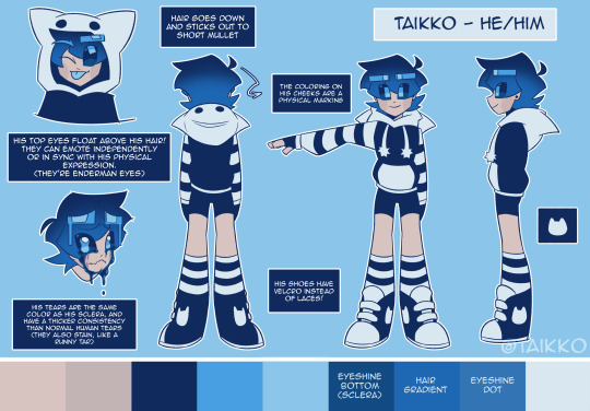
Reference of my current sona :]
Ramble Mcshambles under the cut!!! sorry!!
blehhh he doesn't look like a miscolored enderboy anymore LMAO
he was always originally part enderman. I think those aspects of the design fizzled out till only the eyes remained intact to its Minecraft origins; since I made him to be my Minecraft skin originally (I unfortunately don't have screenshots or copies of the original skin anymore)
He's still an enderman I guess? just not traditionally. He's a mix between these two images I found years ago and I sorta headcanoned them as my sona's parents because I thought it was funny
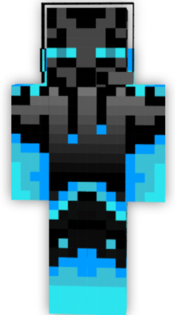
(The blue enderman was uploaded online anonymously and the enderman on the right was presumably uploaded by itofuko on Deviantart but it seems that their account doesn't exist anymore)
He eventually started losing those enderman roots in his design and started becoming his own thing though (like i said earlier) so if anything, him being part enderman is merely just factual and not really the entire point of the design anymore.
I think it's mostly the stripes that took over, the cat hoodie is a separate character. They're morphed by little cat that can phase into and possess objects and become one with them. the old designs had a cat head on Tai's shirt, initially, the creature was supposed to work like a "mini maui". a design that was supposed to become sentient from time to time, except it had the ability to phase out of his shirt (losing the cat head design) and becoming a normal physical creature
I can't find my concept art of them, but there are these screenshots i found of their design used in an old animation :]


Anywayzzzzzz
Here's a few of Taikko's old references!:
Posted on April 14th 2021, Very visibly tall and lanky and heavy on the dark colors
Posted on May 23rd 2021, somehow with the redesign looking younger than the older one. probably went along with the change of artstyle, losing the sketchy style but still keeping it angular.
Created on February 15th 2022, this was the reference for the current redesign. a change in wardrobe and facial anatomy but lacking an update on the palette.
And that brings us to his reappearance in June 20th of this year! implementing more blue and inheriting the eye style and cheek markings that mikyomix had.
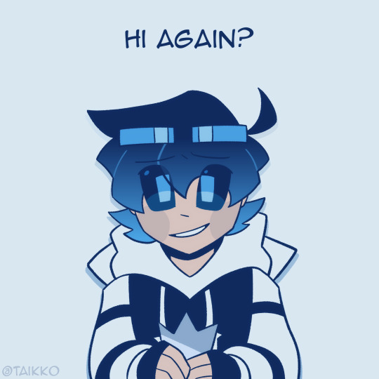
Really happy to exist again with a MUCH BETTER COLOR PALETTE.
Taikko is very special to me since they were the character I've been using to present myself online for a long time and there are a lot of good memories attached to him. He honestly feels like a part of me and I'm just really happy to have him out here again <3
#sorry if the text sounds bad it is 1 am#taikko art#taikkowaikkowo#oc#original character#sona#artsona#persona#oc art#oc artwork#original character art#oc artist#oc design#oc drawing#persona art#artist sona#my sona#self sona#ref sheet#sona art#enderman#minecraft#minecraft oc
79 notes
·
View notes
Text


IDs in alt text!
trips and face-plants and all these fall out of my pockets... no my pyro manifesto... how did that get there haha...
anyways. i have thoughts about him so here they are! somehow this little freak wormed his way into being my favorite x men character and im fine with it. hes SO silly, he is everything, a pulp fiction writer, a journalist, a typical henchman, he's willing to kill kids but draws the line at animals, he's died and come back at least 3 times, he's had his identity stolen and said identity stealer had a thing with iceman that they never brought up again when he came back to life later, his original creator said he intended him to be gay but then he left marvel before they actually did anything with that, he's even australian. And that is just the comics!
In the shows and movies, x men evolution is SO good. He doesn't appear much sadly, and gets taken out with like one hit when he does, but he's very silly goose, he's an absolute delight to watch. And his design is top tier for me. It's SO practical and I love his stupid neon orange fire hair so much. In movies, he's absolutely wonderful, he's just not higher bcuz he's not an aussie :( and that's sad, I love how tragic he is for one, and his whole ex-friends with Bobby is SO good I wish we saw these guys after days of future past but nope. But we see pyro again in Deadpool and Wolverine and he's a minor antagonist yay I literally clapped and cheered when he came up I was the only one in the theater to do so but still. Pryde of the x men, he's main henchman in that and he's pretty good, the show sadly was never greenlit and it's just a pilot but still. X men animated series he's British they massacred my boy I know in his first couple comic appearances he was it they changed it, major L, and wolverine and the x men he's only in like? 2 eps and they could replace him with matchstick that's how much he contributes, then he gets fridged so whatever. And finally, superhero squad, my og superhero show that adapted the comics better than the marvel movies. He's technically in there too I guess.
I've tried to catch all his appearances in adaptations but I might have missed a few, so if I have PLEASE let me know because I'll watch it no matter how bad it is. I'm working my way through his comic appearances, started with Marauders and working back, not an ideal way to do it I can say.
anyways here's the full picture of his redesign i did. i love his regular design a lot but i wanted to make it more Complicated and Fun so.

:3
#xmen#xmen pyro#st john allerdyce#x men#x men pyro#pyro#b.text#:3 my fave littol creature. hesso. silly to me.
11 notes
·
View notes
Text
He's finally done I think. WOAW! Radio demon time!!!

Okay time for comparison + breakdown rant ^ - ^ another SUPER long one I had a lot to say about this silly guy

ALRIGHT. So. Atp all that can be said has been said about Alastor but I'll gloss over it anyhow. Grossly historically inaccurate hair and clothing. Invisible deer theming. One of the main reasons he's got one of the most clowned on designs in the show is bc he's a pretty good representation of the worst it has to offer. He's absurdly red and has the waspiest waist in town. Also gotta zero in on the coat for a second bc I find it incredibly stupid that he went to that tailor bc of his coat being ripped and then left the shop with the exact same torn coat on oh goddd that felt like a complete joke who wrote this
Also his "redesign" was pointless. He stayed pretty much entirely the same except his colors got pinker and grosser and now he has this?? White trim on his lapels??? Even less 1930's accurate and it only serves to hurt the pallate in my eyes. It's the only spot of white on his entire design, it doesn't appear anywhere else so it throws it all off. And it's so bright. Is it supposed to be a focal point?? His tits????
Anyways onto my guy who I love so very deeply. I'm pretty sure sepia film was outdated by the 1930s but I gave him a palette inspired by it to emphasize how dated and stuck in old ways he is. Added blood red accents bc. Well. Cannibal murderer. Also bc I redid the sin colors so red is wrath and it seems like a fitting sin to pair him with.
After looking into 1930's men's fashion a tiny bit (thanks anon, this video was helpful!) and gave him a double breasted coat but wider and pointier so he looks a little less like just some normal guy and really emphasize how prideful and egotistical he is. "Ooo look at me I'm super big and imposing and powerfulll". I think it's a fun character trait of his. Definitely keeping it.
I liked him wearing gloves bc I feel like he wouldn't like getting his hands directly dirty and would always be covered when committing his murders. Maybe he's a germaphobe even. "I can excuse murder but I draw the line at dried blood on my skin". Also the gloves being white would contrast really well with blood so. Love that
I gave him a long tie to free him from the Vivziepop bow tie uniform and a fedora to add to the 1930's vibe and serve as something that can occasionally obscure his face in shadow. His glasses are also opaque and I imagine his eyes would rarely be shown if ever to make him seem more inhuman and off-putting, disconnecting him from personhood a bit. Wanted to add to that with his smiling mouth never opening and just being a static grin that can only occasionally widen or lessen, his voice cracking out of his "speaker" with fuzzy radio static. Seen multiple ppl use that idea and it always eats
I love Alastor's silly theatric nature (primarily in the pilot) and I'd probably keep it, but I'd add a layer of uncanny-ness to him where when he's not putting on his silly jovial facade, he gives off an unnerving vibe. Trying to appear approachable and charming and pleasant to lure people in before he's revealed to be less than human. Loveee thattt
I love Alastor being a deer. Predator becoming prey (animal) + "prey animal" lulling people into a false sense of security before striking. Love it. We should be CAPITALIZING ON IT❗So I gave him deer like legs, visible deer hooves, and more readable deer ears + the ham radio tower antenna antlers (sorry 4 calling them horns 💀)
Tried to make it a little more obvious that he's a mixed man of color by giving him dark wavy hair and the faintest hint of lip definition Viv uses in her style. I think it works. He's still not dark skinned tho
LASTLY the mic. Also not an original idea as I've seen tons of others turn it into a carbon mic but turned into a pentagram shape and I love the idea a lotttt so I joined the crew.
AND THAT DOES IT!!!! hope u like him as much as I do hehe. Just 1 supplemental doodle this time sorry :/ showing off how his face is probably obscured most of the time. He's. So hard to draw. I'm just bad at men but I'm tryinggggg guys

Alsoooo I've already finished the drawings for Niffty, Angel, and Husk! Once I've finished their breakdowns I'll add em right to the queue, and then I'll make a post with all of the main 6 together :3
#my art#digital art#hazbin hotel#alastor#alastor redesign#hazbin hotel redesign#hazbin hotel rewrite
84 notes
·
View notes
Text
recent doodles (in between losing our shit in overcooked so we don't actually lose it)
random bulshit incoming
Pyrhhus
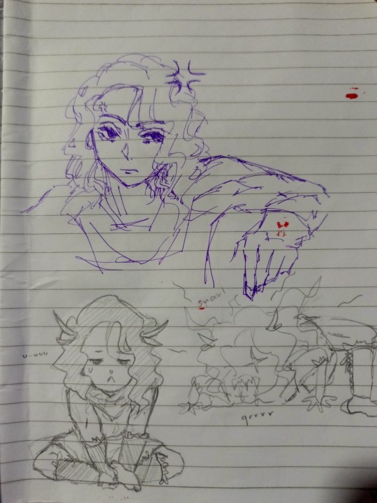
context: we have what we call our own "fanon pyrrhus" based on the idea that he is "an achilles without a patroclus". we play this super random game where we make a story, leave blanks for characters, then randomize. the storyteller improvises depending on these, and what happened was... the demon lord hector was being attacked by pyrrhus, took one look and said "yk what, i'll adopt you. i'm done being a demon lord (because the party sucked so hard he didn't think it was worth it). let's go back to my wife and kid."
and for the first time pyrrhus felt genuine love and care and went from the snarling boy (bottom right) to the cutie on the left. and in our succeeding games he has dissociative identity disorder as a running gag. he turns feral when he feels threatened (words said, things seen, etc.) but generally he's a really sweet guy especially when he has granny (thetis), but a father figure whether isolated or not is essential lest he's just feral.
in one story, his father threw him into the dungeon (yes it's achilles) because he didn't want the child. so little pyrrhus had to eat monsters to survive. his grandfather peleus turns out to be the leader of an orc gang hanging out in there so at least he has a sweet side, but they don't live together because pyrrhus is rebellious and defensive with his autonomy and capability. also, this one plot definitely wasn't a crack rework of dungeon meshi lol-
then here's ANOTHER redesign of
Patroclus
because i can't get him right orz. the "looks like heracles" thing was because he resembled my image of heracles before i tried to salvage his hair. i couldn't erase anything bc we did not have an eraser lmao. i think this will finally work, but i just have to tuck that stray lock of hair away from his face next time. also, i'll attempt facial hair again but in smaller amounts (i put stubble on him in the next pic). i'm just incapable of drawing more "masculine" features rn but i'll practice at some point... 💀
that's achilles below patroclus. the dark left eye was an accident, but honestly it *would* be interesting if he had one pitch black iris from his mother and the other green is from wherever the fuck he got it. i took the headband thing from his hades design too hahaha (idk my ancient greek culture okay)
also, yes, they do have matching ear piercings. i might try to digitalize these again later on when i'm in the mood.
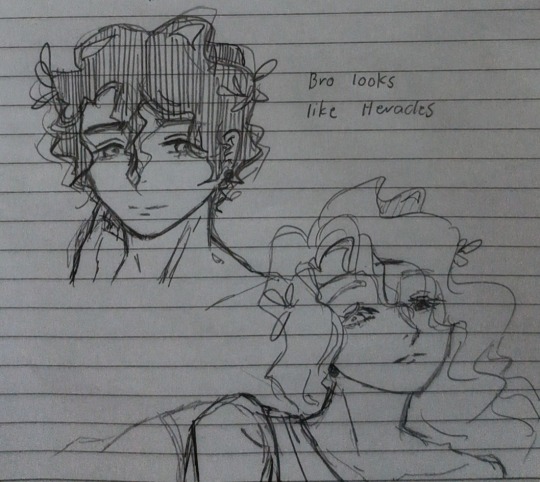
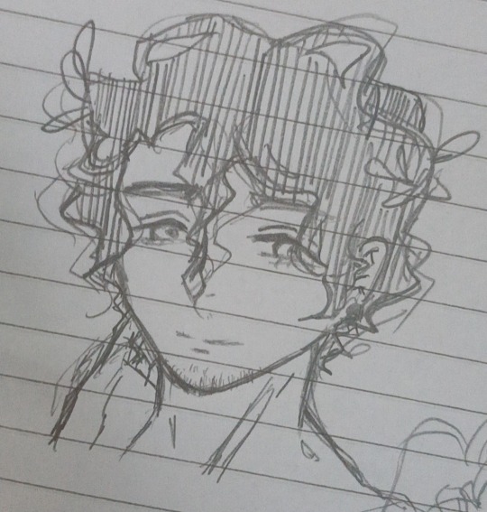
i have to learn how to cartoonize stubble oops
also, curly/wavy hair is so fun to draw with these simple shapes, huh : 0 i'm the type of person to draw hair with fine strands except when i'm deliberately aiming for that anime style (i just want to learn how to color like them help).
i was going to yap about the stories we've done so far but i realized maybe i should turn that into an entire new post. or maybe draw stuff for them 🤣
also, like DnD this game would probably be fun with a lot of people. you could do this for any fandom too so that's the best part of it.
#pyrrhus#achilles#patroclus#doodles#yes we live in our own world#i've been on break recently so yay so much free time#tsoa#homer's iliad
18 notes
·
View notes
Note
it'd absolutely make my day too some makokuu from you (i loved that illustration of them im insane about them)
what about some domestic makokuu 👀 them spending time together at home :3 no pressure ofc
Help I know I asked for saiki k requests TWO months ago and I had a really fun idea for an illustration, but my brain is a smooth cube. so that idea stays up in the air.
For now take a really quick silly crack doodle about one of the many possibilities I think Kusuke/Makoto telling Saiki/Teruhashi would go. Spoiler alert: it’s hilariously horrible.
(Saiki thinks they’re messing with them and Teruhashi is seething. Are they pranking them? Who knows.)
And ya know what? Beneath the cut take my redesigns of these guys and my notes for them because I made several months ago ‘cause I haven’t touched them since :(
Warning: I talk a lot.
A quick note! These designs aren’t meant to say ‘fix’ the original-they’re just for fun! Even if I think elements of mine look better, clearly the original works and are well loved. Also I’m not especially fond of these anyways JAJSJANW
Saiki doesn’t change much other than his palette is a more balanced. Also I really like designing hair, and wanted the idea that Saiki really tries to sleek it down to something very generic and unassuming, but the hairpins get stuck in the way and his hair sorta moves outwards from there. Continuing the idea that his powers make him subtly less normal. It also accidentally made him look A LOT more like his parents, oops.

Also I drew a comparison from his canon hair to his redesign, because I didn’t think it was particularly clear until side by side.
Also I actually gave this one a proper illustration lol.
Teruhashi’s design was actually partly inspired by @lu-kario’s human mlp designs because they’re really good :^ She’s also pretty standard except her hair and color (which I’m not too satisfied with.)
I like the idea of the Teruhashi Siblings being a bit supernatural, so along with weird shine effects, they also get constant wind effects! Like in all the anime where they have flowing hair at just the right times even though it wasn’t windy at all before? Yeah! Except that’s more Makoto’s thing while the shine stays Kokomi’s.
Also what ethnicity are these characters now? To me they’re still Japanese, but I think people don’t ever use a range of skin tones for the same ethnicity. But really these are just fun designs I didn’t really think too hard.

Kusuke! He was the first one I did and an absolute PAIN. He was also the reason I did this, because as much as I love Saiki K and respect the author, I just got to know what is going on with his debut clothes.
Well not like I did that much better… Kusuke is stuck with four alt palettes because I can’t decide which shade of weird yellow and purple to make his head and gown (I’ve resolved to draw his hair a different shade of yellow in every drawing.) His eyes also match Saiki with purple eyes, because I think they look better lmao.
Also, that’s his Cambridge gown he’s wearing. And fun fact-they have a great amount of rules on what color does gowns get an accent of based off what subject people are taking! I decided to not think too hard on that and just gave him a better looking gown.
And I really like the hair I gave him, the original to me just lacks a bit of anime shape style. Also his headgear is shaped like a graduation hat now lol.

He also has a silly little doodle for what he’d look like with his lab coat. It’s not here, but I like to think he always puts a ponytail up!

Last and also least xp, Makoto! He’s uhh about the same with the points I said with Teruhashi. Just very angular now. I swear I tried to design a better fashion for Makoto but I just ended up with the same.
I tried to style his hair how Japanese celebrities would, but I don’t know if I succeeded. His hair as I said is constantly blowing to the left lol. Also he has a hair clip now! In my head Kusuke gives him a telepathy canceller disguised as a hairclip.
Also anyone can draw or get inspired by these designs if you wanted lol Though I don’t really like these, I still use these hairstyle for drawing them cause I think they look cool lol.
#saiki k#pwoodle#kusuke saiki#makoto teruhashi#makokuu#kokomi teruhashi#kusuo saiki#design#help under the cut is LONG.#but if you want to see local pained artist tries to do character design go ahead#ALSo. I still love Makokuu and saiki k.#I bounce from fandom to fandom but my fandoms are still dear to me#and i have a lot of ideas of how Makokuu would work JANANEENE#then telling saiki/saiki finding out is one of my personal favourite tropes for this ship#because it fits so well with canon and has so many possibilities#I have a whole. canon chapter length art idea but. that is too long#I wish I could 😔👌#but if anyone is curious 👀👀??#I may share my headcanon and many ideas#saiki k redesigns#is that a tag??
36 notes
·
View notes
Text


PROPAGANDA
AMY ROSE (SONIC THE HEDGEHOG)
1.) Amy’s characterisation has experienced several generations of misogyny, right from her genesis: She was designed as a girlfriend, but it eas then decided they didn’t want Sonic to have a girlfriend. First instance she’s a damsel in distress that he resents for being there and crushing on him, and this is echoed in the comics. She is then presented as pathetic, chasing and stalkerish, as well as sidelined in the games in favour of other characters despite being very strong. Her stories are often those with the most emotional weight, but the reading is coloured by other characters underestimating her importance there. She then enters a pushy and blind era where she becomes a mockery of her past self. A universe reset rebranded her as a feminist, but that often comes off as a bit pickme, and they frequently failed to hold her femininity and also combat capabilities in hand at once. She is finally getting a bit more stable characterisation and treated a bit better, but I still don’t trust the writers with her. Ultimately, it often felt like the creators didn’t like her, and only had her there because they were made to; and that sucked as a little girl sonic fan.
2.) She started out as the token Girl One in a 90’s property, and her first appearance was as a damsel in distress, which isn’t great to begin with, and she wasn’t playable for a long-ass time outside of spinoffs. The Sonic Adventure games redesigned her, made her playable, let her fight back against her would-be kidnappers, and gave her a major role in saving the world by letting Shadow talk to someone not game with destroying it. Then from Sonic Heroes to Sonic and the Black Knight, and the anime Sonic X, her character was reduced to ‘hehe funny obsessed fangirl is obsessed’ a lot of the time, losing her compassion and a good deal of her social awareness. In Sonic 06, she literally said that she’d sacrifice the rest of the world for Sonic, which, my girl would NEVER in SA2. The Archie comics weren’t kind to her either, as their explanation for the redesign was that Amy wished to become older, so they aged up her body, BUT NOT HER MIND EW EW EW. I’m sure there are other crimes the Archie comics did to her, but that’s not my knowledge base. THEN the writers tried to backpedal in the early 2010’s, but by attempting to undo all the 'crazy’, they took out Amy’s drive and convictions (Sonic Lost World just letting Amy sit and watch Sonic do all the work my beloathed). The Sonic Boom spinoff series tried to pivot and make their version of her a girlboss, but Rise of Lyric was SO BAD. Sonic Boom: Fire and Ice made an alternate version of her a damsel in distress, again, which while technically true to Amy’s roots, does not fit her Boom characterization AT ALL. The Sonic Boom cartoon was a screwball comedy, and they at least lampshaded a lot of Amy’s previous writing problems, but they didn’t give her much to do either, mainly making her 'the sensible one’ whenever Sonic wasn’t available for deadpan responses. They’ve been doing a bit better lately, with Amy usually involved in world-saving matters, and she was prominently featured in Sonic Frontiers, even if she was trapped in Cyberspace. The IDW comics are also treating her wonderfully, from what I’ve seen.
3.) when she was created as a character, she was made solely to be sonic’s love interest. in sonic adventure, they tried to rewrite her and flesh out her character more by making her realize she’s more than her crush on sonic and she finally realizes she’s strong enough to do things without him. sonic team IMMEDIATELY undid that in sonic heroes which came out soon after. they made her entire character in that game obsessed with sonic and based her entire story around him. she was obsessed with him unhealthily in that game because god forbid team sonic let’s a strong female character exist. many of the sonic games took away her quality of being strong without sonic by writing her to only be obsessed with him and not do anything without him. in many modern games, she’s improved more, but misogyny has really screwed her over as a character.
ABBIE MILLS (SLEEPY HOLLOW) (CW: Racism)
1.) Abbie starts out as one of the two protagonists of the show, only to get almost entirely sidelined as early as season 2, getting less and less screen time and allowed no relationships, either platonic or romantic, while the other lead Ichabod Crane has a seemingly infinite amount of them. It got bad enough that her actor wanted to leave the show, which they did by having her sacrifice her soul in the season 3 finale for the male lead to live, and then they ended the show after season 4 anyway, because guess what, it’s a bad idea to entirely sideline and eventually kill off one of your leads!
2.) She was killed by the narrative to advance her white male co-protagonist’s plotline and I’m still mad about it, Abbie deserved so much better. This is an example of racism in the narrative too and it extended to the production of the show, see news coverage:
3.) Look, I only watched the first season but they killed her off the show SHE was a co lead of!! Misogyny AND racism, all rolled into one. I remember seeing the fan reactions and I was so mad on their behalfs. They wrote her off her own show and from what I recall, gave her less and less screentime leading up to that. Truly, she deserved so much better and I will always be upset by this.
34 notes
·
View notes
Text
I’ve been hearing much about Hazbin Hotel coming out this summer except...it didn’t. With news of WGA Strikes and the Actors Guild joining them, it would make a lot of sense for the show to be delayed.
However even that news feels extremely suspect out of these facts.
1. Hazbin Hotel season 1 finished production nearly six months ago - meaning its ready to be marketed with a trailer not far behind it except...
2. It still doesn’t have a platform to air from and...
3. Despite the completion, it had little to no marketing whatsoever which for me, is a VERY BIG red flag. With mini pics, character redesigns, and 1 sec gifs from the show to hype up the audience.
But how the hell does Vivziepop ever expect for her show to be successful on a mainstream platform if she’s only showing teasers and speaking with her little club house of fans that is a very small minority on twitter?
I understand being presumedly gagged by a company you sold your rights too out of fear of violating a contractual legal agreement but come on...
Everyone wants to deny it but I’m gonna say it.
There’s a lot of smoke from this.
It was back in 2020 that A24 bought the rights and property of Hazbin Hotel with the big fallout of the entire VA cast being replaced with those that are a part of a union and with some hoping that the show didn’t need the helping hand of ANY corporate middleman or assistance so the show would remain an indie project from start to finish.
Most projects are marketed at completion with a trailer out at least a season away from release. This level of silence and underexposure and sending just GIFs and design work is just extreme BIZARRE, even more so, from the creator herself!
We should have gotten interviews from the new VAs, a TV opening, a trailer, a soundtrack, ANY SOUND OR HUMAN INVOLVED OR ATTACHED TO A GIF with the project especially with the release date being this summer! None of what is happening with Hazbin Hotel is making sense on any realistic or creative level.
We haven’t even gotten any word of WHO IS VOICING the cast this close to scheduled release with radio silence from both A24 and BentoBoxAnimation about it, that is also a big red flag as its listed as current work but they aren’t bringing attention to it with it so dangerously close to scheduled season release.
Everyone has a right to be concerned about HH by this point but blaming the delay on the strikes seems more like a very convenient excuse and cover by this point as Vivziepop said the season is finished....or is it?
It makes me wonder if all the social media selfies with her merch is covering up a very probable fire involved that she doesn’t want anyone catching on too. The lack of VAs involved or exposed almost makes one wonder if she even managed to hire any union VAs to voice her cast in time, let alone getting voices recorded and OST made for the show. It makes one wonder she only managed to complete the animation part of the season to make room for finding VAs to cast later to finish up at the last minute.
But that would be crazy right? It would be utter batshit on a stick. No creator, let alone a professional production team, would be THIS crazy to do a reckless career and reputation killing move as to do false advertising on a half-finished product to keep the hype and traffic moving on said product and keep moving the goal post on release?
But how else do you explain the near radio silence on HH with barely any real marketing or advertising and with the series still not finding a streaming home?
Now is the time to question Vivziepop’s transparency and credibility as this is truly getting out of hand with the teasers and vagueness and excuses.
This is not about her personal life or past as I’m completely and utterly uninterested in the drama even though half of which is debatable. This is about her transparency and credibility as a creator in her field as this is not the first time she has been dubious and creative with the truth or avoiding it all together when it comes to her work.
I see so many flags that it might as well be a crime scene and it feels like a big scam. If my theory holds any water, then Vivziepop is playing an extremely dangerous game with her own fanbase.
52 notes
·
View notes
Last Seen Blogs

yun-fang-xiii
Anime World

bordboi
Potatoes Have Poisonous Berries

mydrdmind
My Dr.'d Mind
annzybwrites
Annzy B.'s Writing

madokacorpse
ఇׄ ⸸ madoka ׁׅ⛧