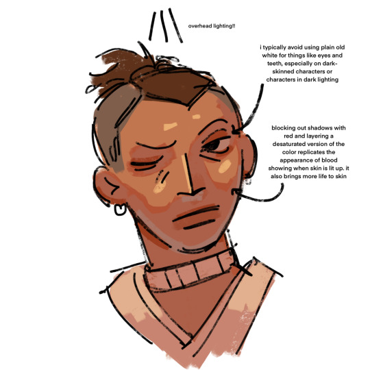
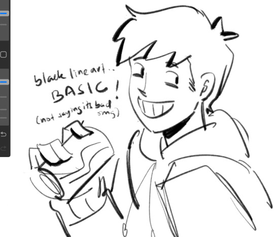
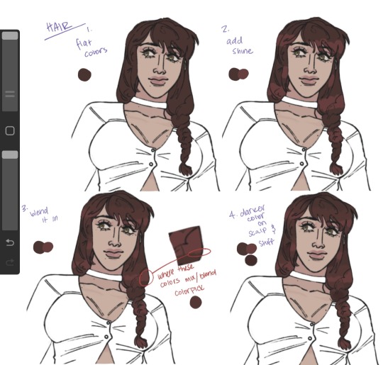
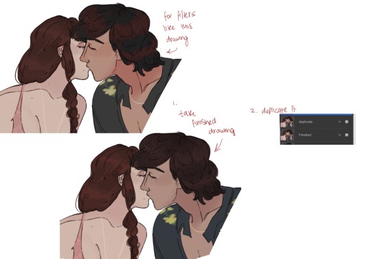
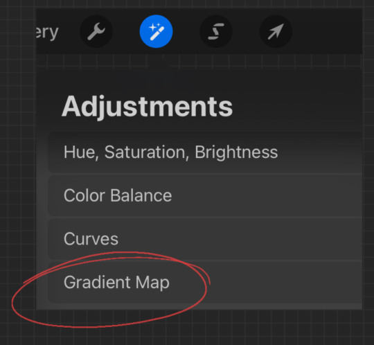
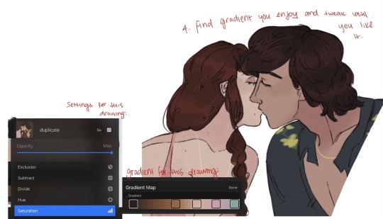
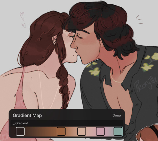
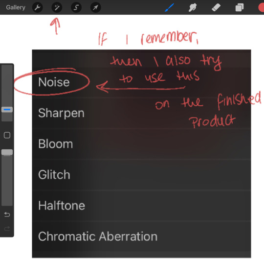
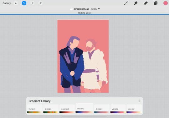
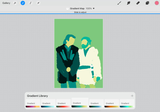
#thank goodness for the gradient map on procreate
Explore tagged Tumblr posts
Visit Tumblr Blog
Explore Tumblr blogs with no restrictions, modern design and the best experience.
Last Seen Tumblr Blogs


Fun Fact
In 2020, 27% of US Tumblr users had an annual household income of over $100,000.
Note
Hi, idk if you’ve answered this before but may I know what program u use and which brushes? Ur art is breathtaking.
Thank you ❤️😭 that’s sweet
I use a combination of Procreate and Photoshop. I render everything in black and white in Procreate and then bring it into Photoshop to add color and noise effects.
For my X-Files stuff, the main brush that I use is called Sugar, and it’s from this Gal Shir texture pack. It’s really good for building up values with pressure, and it’s very soft. Usually I sketch things out with the one of the basic pencil brushes and then render everything over that sketch with that Sugar brush.
There’s also a good default Procreate brush that I like called Lightleak, which is good for adding bursts of light behind heads to make them stand out more, etc.
I also put some texture layers on low opacity over that sketch. The main one I use is a default Procreate brush called Plimsoll. I put it on top of my artwork in black and then bring down the opacity really low so that it makes things look less digital.
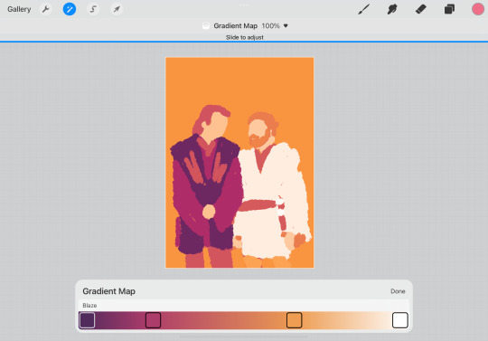
Then I bring the black and white artwork into Photoshop and add color. I don’t really like to think about color that much so I usually just put a Gradient Map over it and play with the blending modes and opacity until I get something I like. Then I might go in with a standard round brush and fill in specific areas (like skin) that might need to be a different color and set those as a blending mode (whichever looks best). I also always add noise in Photoshop to add more texture. And then sometimes effects like Diffuse Glow to bring out light areas more.
14 notes
·
View notes
Note
the way you color things makes me want to commit crimes. any coloring tips for a baby digital artist who doesn’t know how to do the computer things good?
AUGH apologies for taking so long, i was in the middle of writing this answer and the whole thing was deleted as soon as i switched to another tab on my phone, and then the draft didn't save the second time i tried to write it. jfc at least i had it written out in my notes app the second time. anyway, thank you thank you thank you!! this was very nice to recieve, i love getting asks ❤️
i'm not versed in the arts of drawing on a computer, either, so i can't give tips in regards to specific programs (said in chronic procreate user voice) but i can certainly give universal advice keep in mind that i'm not professionally taught in the slightest so i lack much of the vocabulary to describe my methods, and remember that my word is not law!
in case of confusion, everything has been explained. i've added a cut because it got needlessly long. i've also added visual guides for certain tips, and image descriptions for each one
to be honest, much of what i do when picking colors is done with the help of gradient maps (more on that later) but when choosing my base colors i follow these rules:
1. you don't have to cell shade with purple + multiply and an add layer. that's the voice of lavendertowne attempting to take control of your body. stamp it out. (/j i love her)
2. bright, vivid colors!
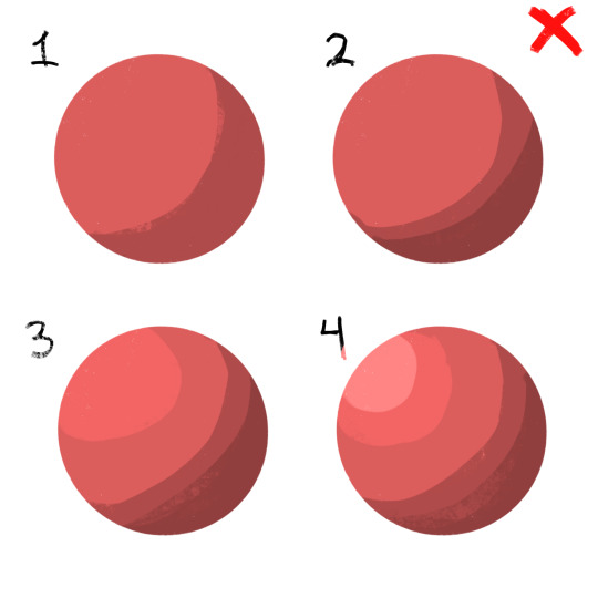
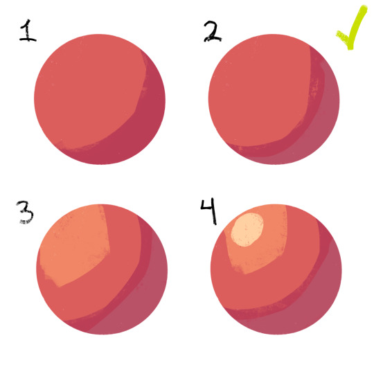
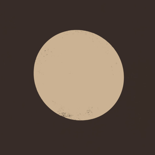
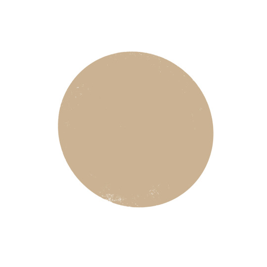
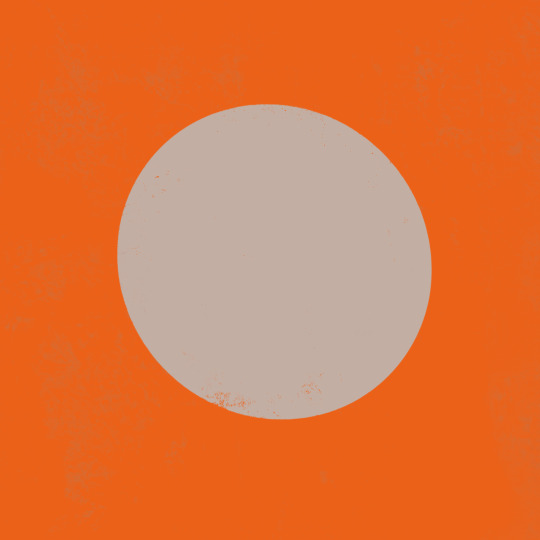
3. instead of shifting just the brightness and saturation when picking colors to shade, shift the hue, too! in the first image, we can see that the circle is dull and boring. in comparison, the second image pops!
4. so, how does this work?
without getting too much into color theory--because while i've studied it before, i don't trust myself to articulate it properly without making a fool of myself--it's all about how colors interact with each other. for example, a beige circle looks lighter when surrounded by a dark background rather than just plain white.
in the same vein, surrounding greys/desaturated colors with warm colors makes them look blue, and vice versa.

5. blue/grey shadows and warm lighting!! or the other way around. actually, you can use any color for shadows and lighting, depending on your light source. is it sunny outside, or are they beneath white light?
6. for color picking, i reccomend avoiding using the wheel, instead opting for the rgb sliders or the hue saturation brightness sliders if you're dumb like me. this allows for precision in the colors you pick, and accuracy when putting together color palettes.
7. and, finally, the actual computer stuff: gradient maps! i looove gradient maps.
as far as i'm aware, procreate and krita have the gradient map tool. ibispaint does not. i am not sure if firealpaca does.
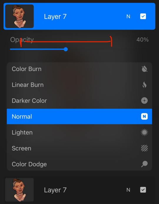
i usually use gradient maps to make my coloring more cohesive, rather than just slapping them on a monochrome drawing (which is also a totally viable method for coloring, but you'll be less precise, as gmaps only recognize values). when using gradient maps, i prefer to duplicate my completed artwork, lower the opacity of the duplicate on top of it (usually between 25 and 50%, depending on how strong i want the effect to be), and use gradient maps on the duplicate.
this makes my colors all nice and pretty!
11. if you use krita, it can be hard to find the right colors to use for your gradient maps. never fear! i'm here to give you the default templates from procreate, as well as a couple of the ones i've made.
if you have any more questions, or you want me to get further into a specific topic, feel free to send me another ask
13 notes
·
View notes
Note
what program do you use to draw? I love that it looks so delicate and your color palettes are exquisite, they completely balance the lineart, what kind of brushes u usually use..


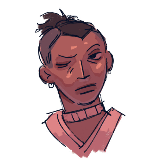
First of all, thank you so much! And second, I use procreate. Color palettes I honestly just eyeball, I've been drawing since I was really young and I guess it gave me some kind of aptitude for that? Anyways I find a good backup measure is, copy the layer (with lineart), gradient map, set the copied layer to lighter color or darker color (whichever looks better) and then change the opacity as needed. As for brushes, I tend to play around with them but consistently for the lineart I use my "dry ink" which I've fenangled into... something, don't remember half the changes but the important one was probably the grain shape, I fed it a white square I found.
#self-taught artist curse I have NO idea what I'm doing#honestly just don't be afraid to mess around and do whatever in the quest to find what works well for you
6 notes
·
View notes
Note
hi, your art style is so cool!! i love it
as a beginner artist, i was wondering if you had any helpful tips for procreate or anything? the art world is kinda daunting lol😅
thank u so much!! ive been feeling down ab my art so seeing this in my inbox was like a sweet treat LMAOO 🎀
so back to the q…. im afraid i dont have any mind blowing tips. its normal to feel overwhelmed as a beginner, but everyone starts somewhere! i say familiarize urself with basic procreate shortcuts (loads of tutorials online) and always play around with their settings! it should be helpful for the learning process along the way.
for eg ermm i used to abuse the gradient maps settings to pretend i know shit ab colouring 😭💀 i still do tbh, except now i understand how it actually works and i can easily get the colours that i want.
some of the things i learned:
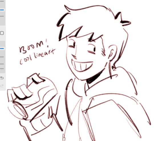
1. cool lineart (i always use this as a part of my render process)
2. art is subjective, pick any that you think suits your preference/is fun to use
for brush, do you prefer it round or textured? lots of pressure sensitivity or none? i like my brushes textured and with a good amount of pressure sensitivity. for blending, do you prefer the transition colour to appear smooth or textured/messy? i sometimes mix between both to give a sense of harmony, but i like it textured more. it all comes down to what feels right to you. pick a few artyles that you like and incorporate it into ur own! pretty basic tip but thats the best way that i know. just pretend ur a mad scientist trying to find cure for like cancer or sumn
3. personal opinion: brush type matters
dont listen when someone says the type of brush u use doesnt matter. yes you can draw with any brush. yes all brushes work the same way 🤯🤯🤯. but theres gotta be that ONE brush that just hits the spot for you, as if its made specially for Your Hands….. unfortunately theres no shortcut to finding Your Brush. it took me 4 years of endless experimenting to find mine.
if ur curious on what brushes i use, i have it listed in my carrd. however i still experiment a lot and dont rly bother to update it, but those should be what i use the most/my top favs !
★ ★ ★ ★ ★ ★
i dont think this covers everything, but this is all i could think of from the top of my head. just lots of trials and errors really, and dont be afraid to make a mess!!! i hope this answers ur question :33 all the best!
9 notes
·
View notes
Note
If you're comfortable, can you make a tutorial on how to draw in your artstyle? I'm very sorry for asking if somebody else have already asked
hello anon, thank you for asking! i will preface all of this by saying i don't mind if anyone takes inspo from my art etc. but i will probably be a little neurotic if i notice it in the wild and there's itches in my head about it. i'm trying not to let personal feelings get in the way of my principle of it here 🏇
i don't really know how to make a tutorial. i tried to draw something that could get concepts across, but it was really hard and i didn't like any of it so instead i'll just put the general process and "rules" i have in mind when i draw. 🙏 sorry if this is less helpful than if i'd use a drawing
the drawing process changes by how much i plan and whatever i feel like, but my general rule of all of this is to keep it as enjoyable for me as much as possible 😊 i start with a sketch.
if i want to shade everything in one layer ("render" even...) i go straight to color after this. this only works if i don't mind it being messy and choppy. i never mind choppy shading i find it charming personally but it will be harder to adjust perspective/proportion/composition mistakes here. i usually color under the sketch layer then i merge it all(with a backup ver out of habit) and just color over the lines and refine things. this way is not very time consuming because i don't care about messiness 🤷♂️
or, if i want to use lineart. i just clean up the sketch usually because my attempts to redo the energy in a sketch suck balls 🤷♂️ if the sketch sucks too i just try to redo it entirely. idk. sketch=lineart etc. my general rule for this is too keep things shaped and simple. i don't think my silhouettes are very good at all but i want to work on it lol. i don't like having to do details so i like avoiding them. sometimes a messy lineart can be more charming to me than a clean proportionate lineart? keep shapes in mind that you find cute ⛹️♂️ details add texture so you have to be careful with how you want that to go. uhhh my mind when doing lineart is too jumbled up i mostly go by intuition based on what i like in other people's art but that applies to any part of drawing
for lineart-related coloring umm ive changed shading styles a couple times here lol. but they can all usually be categorized into two. i'll simplify it with hard to soft shading 🙂 hard is like, "cel shading" i guess? it's solid. it's easier to do but also harder if the colors are too complicated. i usually do this in one layer with the lineart because i use procreate and i'm too lazy to do the selection shit 💢 i like colors a lot in art and i've mentioned how i do them before i think? i always fuck with it with tone curves and gradient maps and posterize if it'd work. just fuck around with anything and you'll start to learn about colors from there 👍 i avoid multiply and add/luminosity layer settings to shade. just because i think it looks bad on my art. and it's annoying to work with too. the hard soft shading thing is a spectrum kind of cause it's really just how many colors are used in one "object"? like skin can vary from one color base and one color shading or a gajillion colors to create texture with blush etc. but there's inbetweens where it's various colors but "hard" but also soft and hard.
soft shading is just straight airbrush. actually not really usually for me it's just me lowering the opacity of my pen as i draw and fucking around with the colors like improvisation. feels like painting but in a too stupid for traditional art way 🤤. but i've also used the airbrush a lot lately. i don't try to use airbrush in "objects" and art that need more texture, like trying to shape with airbrush is fucking hard. but i've done drawings entirely with airbrush tool before just to size it down so it's basically a blurry pen the lol. but for the other way i use the airbrush (where i block out objects and make a flat-ish gradient on it) that one is just exactly what it looks like i just make shapes under the lineart and then clipping-mask a color over it. and always always mess with the tone curve after 🤤 or maybe you can learn color theory for real #up to you
that's all that's really important i think? if you want to ask more you can. sorry if this was less helpful than you'd want i just don't rly know how to give an art tutorial i don't rly have like. a set idea for my artstyle. is not solid
6 notes
·
View notes
Note
Hello! Welcome to the hell webbed site dot com, tumbling! Enjoy your stay.
I was curious what art program you use. I adore your Tma fanart, it’s got such a wonderful dreamy look to it, I really adore it! Is there any cool filters you’re using cause wooahhhh the colors are like looking a kaleidoscope it’s the coolest thing.
Aw thank you!! :))
Also for all of the TMA art i’ve posted, I use Procreate. I often just paint over traditional sketches, so much of the texture and some of the color comes from that! I also tend to use brushes that have color-jitter settings (i dunno if this is just a procreate thing or not,,) so that the colors are always changing in hue just a lil bit!
But when I don���t paint over a tradition sketch, I will usually paint in grayscale and then use gradient maps and a bunch of multiply/overlay layers to do the colors! A good example of this is the “lamb to the slaughter” Jon drawing I did— I actually have a speedpaint for this one if you’d like to see exactly what I did!
youtube
#the magnus pod#tma#tma jon#the magnus archives fanart#the magnus archives#jonathan sims#tma podcast#tma fanart#jon sims#jarchivist#the archivist
35 notes
·
View notes
Note
Alright I've had it and I have to ask: how do you choose your color palettes? Your art looks so good and I need to know! It's just too good! 😤😫
OMGEE THANK YOUUU!! i usually have a very vague idea of what would look good (for example i know neon colors and dark skin look really cool together) so i put down a first pass and it usually looks awful lol so then i play with gradient maps on procreate (usually at 20-25% opacity) to unify the color choices to hopefully look better. i hope this helps and thank you for the ask! <33
3 notes
·
View notes
Note
hi!! i was wondering if we could maybe see some speedpaints of ur art -- it so gorgeous and i'd love to see it come to life!! :3
oh hi anon!!! i did Not get notifications for this so i am so sorry eough
thank you for the compliment!!! :33 its funny because i actually dont think my speedpaints EVER look good because my process is kinda chaotic lmao and i have been going thru a bit of a bad phase (ma is NOT arting like they used to folks.) so all i can offer is a sketch .. of a kpop girly.... that i tried (and failed) to do greyscale n then used procreate's gradient map!! :3 anyway.
i promise if i ever have anything better ready i'll be sure to post !! <33
6 notes
·
View notes
Note
Hi! I love your art style! What art program do you use and what sort of brushes are your favorites? Would you ever consider posting a coloring tutorial bc i think one of my favorite aspects of your art is how you put colors together! I hope you have a good day !
haiii thank u!! i use procreate !!
i’m really bad at explaining things, especially my process since i’m not a professional artist or anything and i just draw on autopilot 😭 but under the cut i tried to put some stuff together that i hope will make sense to u !!
ill put stuff in the alt text in case my handwriting is hard to read ‘^_^
first of all, these are the main brushes i use:
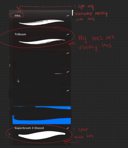
i’m sorry but unfortunately i can’t remember where i got any of them, so hopefully if you google it u can find ones that are similar if not exact. & btw all brushes i use are free downloads so there shouldn’t be any problems if u find & want the same ones i use
i like to look for brushes for my lines that remind me of pencils & honestly i’m still looking for a perfect free lineart brush bc my current one is unsatisfactory for me sometimes in my vision for a drawing.
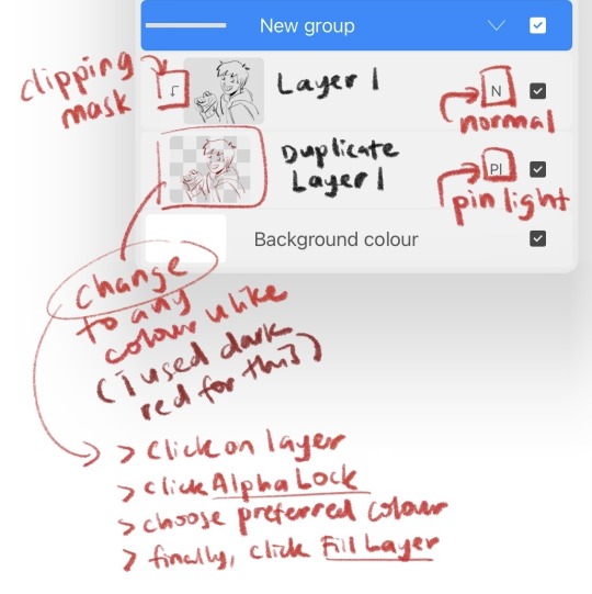
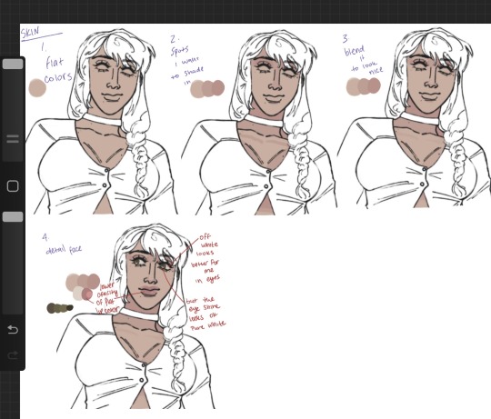
now for coloring i put some visual “guides” together but, like i said i’m rly shit at explaining my process so i really hope this makes sense for u:
this is normally how i color skin:
& this is how i color hair:
if ur confused about any of it i can truly try my best to explain but i am Truly genuinely sorry if this shit makes no sense 😭
LASTLY, this is the finishing touches i put on my drawings:
i’ll try to explain further here if this is too little info.
so to begin my final touches on my art, i flatten the entire drawing into one single layer, then i duplicate that layer.
on the duplicate layer i apply this:
and i look for a gradient map thing i think looks best with my coloring. occasionally (and for this drawing specifically) i look for a layer setting that looks good with the gradient map. most of the time for me they’re kinda wack but for this one i enjoyed it and applied it
after the gradient AND layer setting are applied, the drawing looks like this:
and finally:
after the coloring & filters is all done with, i flatten the entire drawing into one layer and apply noise to it. like barely any tho, 1 % or 2 % is good for me, and then the drawing is done.
i hope this helped 😭😭 like i said i’m not a professional artist. i don’t study colors or color theory. my initial lineart is my lineart for the whole drawing, i don’t do a rough sketch. i honestly don’t really know shit about drawing i just do it LOL that’s why i needed to show u visuals bc i don’t know the actual names for any of this stuff. i hope u understand & enjoy
4 notes
·
View notes
Photo


I had a lot of different ideas for this stream but not enough time, but here’s another stream sketch! Bless the gradient maps in Procreate and maybe I’ll do more when I don’t have a headache
#mcyt#mcyt fanart#dreamsmp#dreamsmp fanart#tommyinnit#tubbo#tommyinnit fanart#tubbo fanart#clingy duo#digital art#my art#stream sketches#the parallels in this stream#theres too many#and i wanna draw them all#again#thank goodness for the gradient map on procreate#literally my life line#ignore the inconsistent art style please
1K notes
·
View notes
Text

when wamen evil but,,, big tiddy 😳
#I’m gonna marry the procreate gradient mapping tool it’s So Good#this poor womans been floating around in limbo for like a month but thanks to gradient mapping I finally managed to get her design done#WOO#my ocs#my art#art#drawing#digital art#artist#oc#original art#character design#original character
4 notes
·
View notes
Note
I love your art! I love the lineart and the colors!!! What art program do you use? What pens? Do you have any drawing tips?
Thank you sm!
I use Medibang Paint for making the art, and Procreate for editing said art (usually by just adding gradient maps, gaussian blur, and chromatic aberration.)
on medibang, I stick primarily to the pencil/thin pencil brushes! They have the look and feel that I couldn't really find in procreate :]
As for tips, uhhh. For coloring, I add a normal layer of one solid color. usually a light pink or peach. I'll lower the opacity (usually somewhere between 50%-70%) And I'll add a layer below that for base coloring! As someone who doesn't have a good eye for color, this trick helps me maintain a color scheme and it makes everything really soft.
Again. If you have access to procreate, gaussian blur, chromatic aberration, and gradient maps are GREAT for editing. wink.
30 notes
·
View notes
Note
every time I see your art on my dash it makes me :D because it's so colourful and joyful and expressive!!! Do you happen to have any tips on how to choose funkier colour palettes and arrange them in an illustration?
Ahh thank you! I absolutely adore your work so much!! :) I love any chance to talk about colours so I present..
⭐️ eliott’s guide to colourful illustrations! ⭐️
I genuinely know very little about colour theory so this method can be super easy to pick up, and the trick is using gradient maps! I find it pretty hard to visualise what colours I want to use and to start picking them out, so I usually start off by colouring my sketch very loosely in greyscale and getting the values right.
Then it’s time to apply some gradient maps! I use procreate but I’m pretty sure you can do this in other programs such as photoshop and clip studio too! I always duplicate the black and white version so I can go back and make lots of different versions.
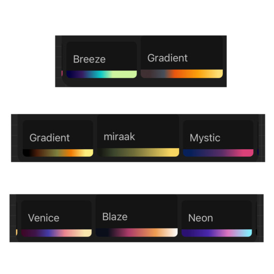
Look at all these fun colour combinations! As you can see, I have a bunch of gradient maps that I just scroll between and some will really work, and some won’t, but it’s fun to try them out and play around with the sliders just to give you some ideas!
The next step is using the colour balance tool to adjust the colours a bit more to get something you’re really happy with. At this stage, I also like to separate the background colour to make sure that it doesn’t blend in too much, and also adjust anything that has to be a certain colour (sometimes skin shades might change too much or the coloured markings on Ashoka’s Lekku which I made more blue in the final illustration) This part can either be really fun or get super frustrating because (at least for me and my lack of colour knowledge) there’s no science behind it and I have to keep trying new things until I think it looks right.
Before and after of some colour balancing


If I don't want something with too much of a wacky colour scheme, I'll colour it in the real-life/accurate colours (rather than greyscale), and then just use the colour balance tool to nudge the colours to something a little more interesting!
So that’s kind of my main process when colouring an illustration, a lot of trying stuff out and seeing what I like the look of! Gradient maps have honestly been so beneficial to me for giving me a jumping-off point when trying to decide on colours!
I’ve got some other random bits of colour advice too if anyones interested, so I’ll add them under here! I hope you find this useful though!
For pieces with complex backgrounds I like to separate the characters from the rest of the scene and apply different gradient maps to each one. This way the characters stand out a lot more and you can easily tell which are the more important details to look at. I’ve noticed when looking back at some of my illustrations that I tend to use close-to complimentary colours schemes when doing this (it would be red/green in this example but I made it more of an orange than red) and have done the same with blue/orange (or pink) as well. It’s not something I ever did on purpose but the fact it’s happened a few times maybe means it’s a good tip?!
Picking warm or cool colours to match the mood and feel of a scene can be really important! Purples can be great for a night-time piece, but someplace with artificial light might use a much cooler/blue shade than a scene lit by a campfire which would be much warmer/red.
A lot of my colour choices are down to exaggeration too, brown and beige robes aren't too colourful, but pushing them to be pink/orange is a bit more exciting!! As long as the contrast between the different colours is okay, you can pretty much get away with anything!
A lot of my colour choices are down to exaggeration too, brown and beige robes aren't too colourful, but pushing them to be pink/orange is a bit more exciting!! As long as the contrast between the different colours is okay, you can pretty much get away with anything!
And lastly, overlay layers can be so much fun to play with too! I just chuck a random fill colour on top and then try out loads of different effects to see what it does- sometimes it will create something completely unexpected! Oooo and they can be good for special lighting effects too! Put a darker overlay layer on top, then erase sections that the light would be hitting and now you have some dramatic lighting! Or the opposite way, draw on just the highlights and turn that into the overlay!
Okay, so there we go! If you couldn’t tell, most of my technique is just throwing stuff together, hoping for the best, and adjusting things until I’m happy - but it works! I’ve never written an advice post like this before so I hope it all makes sense and that it might be even a little bit valuable!
#thank you for giving me an opportunity to talk about colours!#I got way too invested making this post!#and also annoyed that I almost always delete all the original colour roughs I make
21 notes
·
View notes
Note
Prima you're so talented! The way you do lighting, coloring, shading and even how you draw that helps guide the viewer's eye onto a focus point is just beautiful.
Is there any tips/tricks/advices you could so graciously bestow onto others who are struggling?
If there was advice you could give your past self about drawing, what would it be and why?
Thank you in advance Prima, and as always, keep up the amazing work! :)
~With love <3
Thank you for the ask, and thank you for the compliment, you’re very sweet!
Im not the holder of the universal truth, so what I’m about to say is to take with a grain of salt, but here’s what’s working well with me and what I learnt:
I know this has become a joke among the art community, but I flip my canvas a lot lol. The eye tends to get used to the image it sees, so it’s getting harder to spot mistakes as you keep working on your piece.
Learning values!! From the moment I started working in grayscale, it made me realize how important it is to understand how values works, and how they will define your entire piece. Values are directly linked to the light, which is the most important part of a painting, it’s what will give your artwork « life » and its dynamic. Lighting is my first priority when I start something, I always choose a light source first and then I start the process. Learning how light works allows you to understand how it will affect and interact with its environment, how it reflects on some objects, and it helps a lot to construct an homogeneous piece. There are different types of lighting, with variable degree of intensity, and they will set the mood you chose for your piece.
When I start a sketch, I work with shapes first, I make a very messy line work and exaggerate curves instead of trying to make a perfect lineart first. The goal is to « catch » the dynamic of the pose, and to emphasis where the eye is supposed to focus on. It helps to get the proportions right as well.
Now tools speaking, I use Procreate, and I rely a lot on the liquify tool, to make minor changes on my shapes, the lasso tool is very useful to create sharp/smooth edges and for a lot of things actually, to work on some areas without touching their surroundings, the smudge tool, Gradient maps/color balance/curve/Hue settings are pretty uselful throughout all the process, I have no real advice for that, just tinker with it and see what fits you the most. And for the layer modes I use Multiply/Overlay mainly for the shades or to add colors to my grayscale thumbnail, and color dodge/screen/add for the ambiant light, vfx and rim light.
To my past self, I would tell to learn the theory alongside the practice. It’s a lot easier to understand how things work. To try everything, even if it might fail, even if it might take time to learn it. I think that’s the only real advice I can give, try again and again, do not feel discouraged by failure and if things become too overwhelming and if you start feeling you might never succeed in the task, just take a break, do something you know you’re good at, it will boost your self confidence and you will go back to the previous task with renewed confidence, and more willing to keep trying. Learning is a long process, we learn things throughout our entire life, so be patient, you have your whole existence to succeed. Do things at your own pace and even though it’s a completely human thing to do, try to not compare yourself with the others. They also had their hardships, and they also worked hard. Do not be afraid to get inspiration from them tho, we are all influenced by something or someone, so if you want to recreate something you saw, for your own learning process, there’s nothing wrong with it.
I hope this helped, I’m sorry if some things didn’t really make sense, I suck at explaining and at synthesizing. Have a wonderful day! ❤️
36 notes
·
View notes
Note
Hey JP, hope you're doing well. Wanted to ask you, artist to artist, if you could tell me any digital (Procreate) painting tips and what types of brushes you use cause your art is fire🔥 and is great inspiration to me😊❤ (especially your AT, Amphibia, and Spidey artwork)
Hi, thanks so much for the ask and the nice words! I’m more than happy to try and help! I should preface that I’m in no way a professional though and this is just what I’m doing


Something I’ve been doing with my paintings/larger pieces is coming up with colour keys on top of my initial sketch or thumbnail to make sure the colours are cohesive and I don’t have to worry about that too much when painting.
I don’t actually really do my rendering on procreate because I’m used to the brushes I have in clip studio (I usually just sketch and colour correct/add textures in procreate) but these are some default brushes I use there:

My clip studio rendering brushes are a mixture of some of the default thick paint ones and some from Wolfythewitch’s brushpack
Procreate also has a really good perspective grid for background pieces and I use their gradient maps/colour balance tools a lot when I’m sorting out colours and touching up my pieces.
For more general tips, what helped me with painting a lot was watching speedpaints! Trying to sort out in my brain and replicate techniques I see other artists try in their pieces was really helpful for me. I’d take elements of like “oh this shade of purple works really well when shading red” and apply it when the chance occurs. Observe other artworks, it really does help. Photo studies are good. Sinix Design and Ethan Becker on YouTube taught me a lot too, as well as Devinellekurtz ‘s Instagram process story highlights! I learnt so much about composition and being more ambitious with full pieces from her.
This is a little all over the place but if you want something more specific, I’m happy to try and answer. If you want to see my painting process specifically, I have a YouTube channel where I upload speedpaints sometimes!
17 notes
·
View notes
Note
hiiii! i just wanna say, i adore your art. second, im teaching myself to draw and while i can draw simple basics (mouths and sometimes eyes if im lucky), im still a beginner. ive watched many art videos and im still a bit confused on wtf im doing. so i just came here to ask if you had any words of wisdom for beginners? could be anything from what tablets to buy to simple mistakes to avoid. ive read some of the other posts here and have found it all extremely helpful so far! Thx for all you do!!
Hey there! Thank you so much!
I would put a read more but tumblr is broken. I’m trying to cover a lot of varied thoughts in little points, so if there’s anything you would like me to elaborate on or otherwise have questions on, feel free to shoot me an ask or dm me!
General
I think the biggest thing to remember is not to compare yourself extensively to others. A little bit of comparison is healthy... But too much will destroy your confidence, motivation, and take the fun out of art. Particularly if you are comparing yourself to someone older than you (life experience and coordination come into play here) or that has been drawing much longer (practice).
Additionally... If you’re not having fun (and you’re not getting paid to do it), don’t force yourself. If you find yourself being frustrated or bored with art, don’t force yourself to do it. That��s how you burn out and get art block! This applies to parts of a peice, too! If you don’t feel like drawing a face or a hand today? don’t force yourself to finish it. Come back to it later when you aren’t as frustrated or are getting better results. Even if its a week or a month from now. Honestly, at any given time I have probably ten headless bodies in my drafts. That’s okay! I just come back to them when I’m ready to do the face. And don’t be afraid to abandon something if it doesn’t feel right!
Something that also doesn’t get said enough.... take care of your body! I never knew when I started art, but artists are supposed to do warmup sketches and stretches and muscle exercises! I didn’t do any of this, and i went through a period of a few months where I was drawing for 5ish hours every single day. I developed carpal tunnel from it! So remember to take care of yourself. Take breaks, stretch, remember to eat.
Practice
Practice!!!! Even if its just for fifteen minutes every day. Or twice a week. But if art is something you really want to get good at, you have to put in the time and effort!! You can’t expect to draw an hour per month and be on the same level as someone who draws an hour a day!
I know I say this a lot but I think the biggest thing is just reference! If you don’t know what something looks like, look at a picture of it when you draw it! To go hand in hand with that, though, don’t just copy what you see! Learn from it and apply it! So take, for example, a shoe! pay attention to the way the heel is shaped, the location of the eyelets for the laces... how large the toe is, how steep the top! While you’re at it, look at other styles of shoes as well, and compare them! See what makes it look like a boot versus a trainer! And then the next time you draw it, hopefully you’ll remember all the things you learned the first time around!
I do lots of studies that serve no purpose other than to teach me things! I use referencing/studies to learn about color theory, shapes, and anatomy in a real environment. For example, hands or fabric folds! Oftentimes I’ll do them timed (20 or 45 minutes) so that I don’t fixate on perfecting things, just on the process itself and what I can learn from it. This also helps with getting better acclimated to your software and more coordinated with what you’re doing. Repetitive learning, like with playing sports.
I’ve realized a lot of people don’t quite understand what a study is? Basically you just look at a photo and try to replicate it so that you can learn about lighting or color theory or textures or anatomy or whatnot. So here’s an example of a timed study.
Additionally, don’t avoid!! We, as humans, have a tendency to avoid things that make us uncomfortable or are difficult. But it will make you a better artist in then end. When I first started, I absolutely hated doing fabric. I felt like I wasn’t good at it. So instead of avoiding drawing clothing, I sat down and did studies and sketches of different kinds of fabric. By the end of this learning period, I became comfortable with it and grew to enjoy it. These days, I adore sketching clothes, and it’s why my pants and shirts and things tend to be detailed instead of stylized in line art. If you don’t like drawing hands because you feel like you aren’t good at it? Sit down, look at a bunch of pictures of different hands, and practice it. By the end, you’ll be more comfortable, you’ll have learned something. Even if you feel like the drawings you ended up with aren’t good, you’ll still have learned, and that’s what matters!
Style
I worked on basics before I tried to develop a style. I made sure to start with a very realistic method at first, so that I could be sure I understood how fabric folds, anatomy, and realistic expressions worked before I tried to stylize them. I think in the long run this approach really paid off for me. It also allowed me to be conscientious of what elements I was absorbing into my artwork. I hear from so many artists that they started drawing when they were younger and into anime or cartoons or things like that, and tried to emulate it. Because those styles became so ingrained into their artistic skillset, it becomes near impossible to iron out those influences and get rid of them later. So starting with realism is a way to ingrain proper anatomy and other good practice into your artwork.
One way to develop style is to take a look at the artwork of someone you admire, and try to list out the things you like form their style - perhaps the thickness of their lines, or the way they do eyes. Do this with several artists, take all those little details you like and try them out! See if you enjoy using them in your own drawing process! Think of it like a grab bag or a pick-n-mix, sprinkling in the elements you like here and there to create something new and your own - not just copying another artists style word for word.
Don’t worry too much about it though; don’t allow yourself to become anxious or fixated on “achieving a style”. Its a natural ever evolving process that comes with time and practice. I know a lot of people get hung up on style, but just take it one day at a time!
Also try to keep in mind what style you’re going for as you begin drawing. And I don’t mean that like sailor moon vs. ghibli. I mean that as in, is this piece going to be a painting, a lineart, a lined painting, cell shading...? It will help you in the longrun if you narrow down the broad kind of style you use, and refine from there.
Workflow
My workflow for paintings is very different from my workflow for lineart and cell shading. A full tutorial on how I do paintings can be found here! A process video for how I cell shade can be found here!
Everyone is going to have a different method that works for them! You just have to experiment and find out how you like to draw! For me, personally, I use color blocking for painting (see the tutorial above) and a spine method for lineart. How the spine method works is that I will draw lines that represent the legs, arms, back, etc. so that I can determine the placement, length, and composition. From there, I’ll add a dark outline that actually shows the shapes of the body. Then, I’ll use thinner lines to add details. This is the method I’ve found that works for me. Another commonly used method that I’m sure you’ve seen is representing body parts with cylinders and cubes. There are lots of good tutorials out there on breaking down bodies into shapes like this!
Something that I do is if I’m not quite happy with a part of a drawing, I don’t just erase it. I duplicate the layer so that I always have the original copy, and then I make changes from there. Sometimes I can end up with five or six different versions of the same arm or face that i’ve made minor changes to. And then I compare and pick the one I like best, or condense all the parts I like from each version to make a “best” version.
Tools
Currently I use Procreate and the standard Ipad with Apple Pencil. Prior to March I was using a Wacom Bamboo Touch and Photoshop Elements 2008. I find its harder for me to do full paintings in procreate, but its made my life a million times easier for lineart and cell shading. The pen pressure is phenomenal, and I also adore that its wireless / active screen instead of plug in like the wacom. The programme itself is intuitive and easy to get the hang of; it simply lacks a lot of the neat tricks that photoshop has, like rendering (lens flares, for example), gradients, and gradient maps. Try testing out different trials of programmes... firealpaca, photoshop, autodesk, whatever it may be! What works for me may not work for you!
287 notes
·
View notes