#taxonomy is so weird
Explore tagged Tumblr posts
Text
It's so hilariously American-centric to say that
This (Southern Resident)

Is a distinct species from this (Transient/Bigg's):

-
But that means that this (Bremer Canyon offshore ecotype)

is the same species as this (Type D Antarctic ecotype)

And is also the same species as this (Icelandic ecotype)

I get we have a lot of data on Residents and Transient/Bigg's but it's going to get real confusing if we start defining killer whale ecotypes as entirely different species - especially if the most distinctly different ecotypes are being ignored.
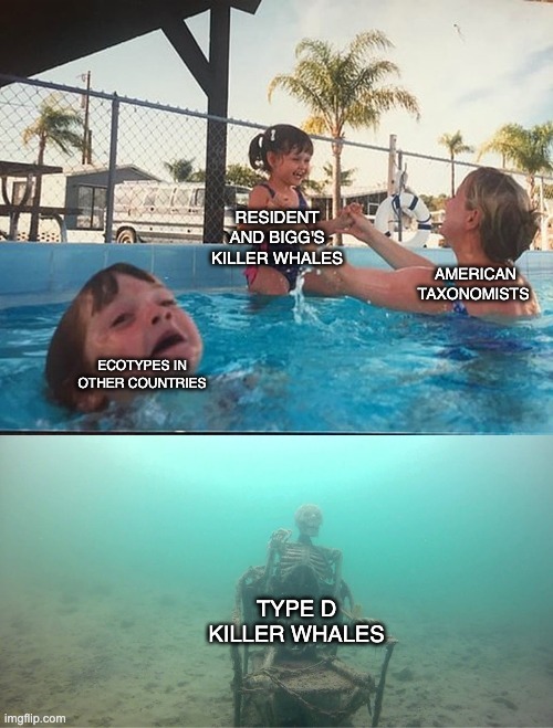
Edit: I am mostly joking here and I get that by defining them as a separate species, they could be considered more for protections like the endangered Southern Residents. However I feel like they will still be referred to as killer whales by the general public, who will be going off visual rather than the other genomic evidence provided in the paper.
It's not a huge drama, really. It's just going to be interesting to see if every ecotype is going to be given its own species classification and how that relates to the conversation about culture transmission and hybridisation in killer whales as well.
#taxonomy is so weird#also I still feel weird about calling them Bigg's - calling animals after the people who discovered them feels colonialist to me#they existed before you discovered them you don't own them#idk people are weird about their killer whales in the Pacific Northwest too#killer whale#orca
12 notes
·
View notes
Text


Cladonia leporina
Jester lichen
Currently yelling at my colleague about how ridiculous it is that for most of my life, I didn't *see* Cladonias, or most lichens for that matter. I, who spent so much time outside and considered myself a real student of nature never noticed them. Seriously, how was I just overlooking things like this in the world? The mind boggles. C. leporina has a fruticose thallus of widely spreading branches growing is cushions up to 5 cm tall and 10 cm wide. It is greenish-yellow in color, with a smooth, corticate (bark-like) surface. It produces bright red apothecia from the branch tips. C. leporina grows on sandy soil and wood in the southeastern USA and Caribbean islands. I understand Elton John when I look at this little guy, because honestly, how wonderful life truly is, while Cladonia's in the world.
images: source | source
info: source | source
#lichen#lichenology#lichens#lichenologist#ecology#mycology#biology#botany#bryology#systematics#taxonomy#symbiosis#symbiotic organisms#algae#Cladonia#Cladonia leporina#Jester lichen#life science#environmental science#natural science#the natural world#beautiful nature#weird nature#go outside#take a hike#look for lichens#lichens are so good#lichen a day#daily lichen post#lichen subscribe
527 notes
·
View notes
Note
Hi I'm the person who sent the ask about using weird hypnotism porn as guided mediation. Thank you for the youtube ASMR suggestion I never thought of that because most ASMR triggers just make me uncomfortable but apparently a woman talking in a soothing voice with ambient music in the background and no other sounds also counts as ASMR somehow???
Which is actually great for me specifically but I now have a new problem: learning how to navigate the extremely strange world of youtube ASMR. What is even happening over here. Somewhere there is someone cataloguing ASMR taxonomy hell. Or if there isn't there should be.
listen. i could go the fuck on about asmr taxonomy hell. the whisperers stole 'softly spoken' and i will not stop yelling about it. there is massive overlap between asmr triggers and misophonia triggers so almost no one tags for the latter. literally with a lot of asmr triggers either they hit and you get tingles or they miss and you get viscerally uncomfortable. i feel like you could do really interesting research into that overlap and how it mirrors arousal/disgust.
my first asmr experiences were reading phrenology handbooks so 90% of all asmr videos do not trigger tingles for me at all. 'unintential asmr' and 'unintentional style' are some of the only things i can count on to indicate that there won't be whispering now that softly spoken has fallen. there's a ton of newer creators who don't actually try to trigger tingles, they're just doing horny roleplays. which is fine, more power to them, but it's making it really hard to find cyberpunk hardware inspections or whatever the fuck. i'd give you some recs but i don't know if anyone i'm into would fit what you're looking for aside from some jellybean green stuff.
if someone made some kind of web app or something that could be used as a link database with community tagging, i would use it for porn, but i would actually also use it for asmr videos because i am so tired of misophonia roulette and trying to find the specific type of exam/inspection that will trigger me 😭
#original#asmr taxonomy hell#that can be a tag now. whomst can stop me. no one.#the weirdest part. the weirdest. is that i thought light stuff didn't do it for me. BUT IT TURNS OUT. RED LIGHT SPECIFICALLY. TINGLE CITY.#what's up with that. that's so fucking weird.
77 notes
·
View notes
Text
Donovan’s Tryptich
It’s one of those blissfully rare days where the breeze drifting off the lake tricks you into thinking the humidity is actually bearable. You’ve opened the window in your living room, holding your breath as Donnie’s precariously-installed hack job of a box fan threatens to teeter over the edge, and you’re rewarded with the low drone of gentle wind across your skin as you melt into the couch. It hasn’t been a terrible day, but it’s certainly been long; you spent hours running around putting out fires at work (which you secretly love), and when you weren’t assuaging the office’s collective neurosis you were feverishly trying to get your two thousand words in before the deadline. Your editor, as always, was impressed, and sure, maybe the word “promotion” has been thrown around here and there, but it was really nothing. All in a day’s work.
The train was crowded, so you got off one stop early and walked home. You can still feel the sun emanating from you; you can almost smell its heat on your skin. Now, wonderfully horizontal with a book in your hand (VC Andrews, you can’t resist), all you have to do is wait for your boyfriend to make his way back to the apartment. Today’s was a day game against the Brewers. Donnie loves day games because they’re the only time your schedules actually match up–he can put in a full day’s work and make it home in time for dinner.
As if on cue, Donnie’s sunshine voice sounds from the entryway. “Honey, I’m home!” he calls; the two of you never really call each other “honey,” but it’s his habit. You never totally got it until you spent a weekend with his parents in the suburbs and realized that his dad does it every time he enters the house.
“In here,” you reply, lying the book face-down on your chest. When you got home, you immediately changed into comfortable denim shorts and one of Donnie’s old T-shirts. You’d be lying if you said it wasn’t mostly to get a reaction out of him–he melts when you wear his clothes.
You hear a telltale thud–Donnie’s dropped his work bag unceremoniously on the floor–and seconds later your boyfriend rounds the corner with that signature goofy grin plastered across his face. He crosses the room toward you, all long limbs, and lowers his body indiscriminately on top of yours. You laugh as he briefly crushes you beneath him, basking in the shared afterglow of the sun on both of your skin. After a moment, the spine of your book digging into his sternum, he raises himself up on one arm. “What’s this–My Sweet Audrina?” he asks, delicately lifting the book out of the way so as not to lose your place.
“Mm-hmm. It was my favorite when I was, like, thirteen,” you say, “you’d hate it.”
He hums in response, his focus shifting to your–his–T-shirt. It’s an old gray thing with “Loyola Track & Field” emblazoned across the front, a relic of his oldest sister’s college days. Donnie–slowly, gently–hooks one long finger beneath the collar, barely grazing your throat. “Are you trying to kill me?” he asks, his voice low, never losing that boyish smile. You shrug coyly and he gives a small, breathy laugh before dropping his lips to your neck, your jaw–and then he stops. In spite of yourself, you let out a quiet whine, and Donnie laughs again. “I have a proposal for you,” he says, “you ready?”
You sigh dramatically. “Okay. But you have to get off me, I can’t breathe.”
Now it’s Donnie’s turn to sigh, but he rolls off the couch, leaving you free to sit up. Once the two of you are comfortably situated–you cross-legged against the armrest, him facing you with one leg tucked underneath the other–he clears his throat as if to quiet a congregation. “Okay, so here’s the deal,” he says, “I love you more and more every single day.” He says this like it’s a known fact, like he’s telling you the sun rises in the East. You swallow the strangled noise that rises in your throat, having learned long ago not to question the depth of the man’s devotion. “And when I leave for a week or, god forbid, two weeks at a time, it blows,” he continues.
“Blows in a major way,” you agree sagely, trying hard not to smile–he’s taking this extremely seriously for someone who just used the word “blows” in civilized conversation.
“Right, exactly. And you come with me sometimes, and it’s great, but we barely see each other.” He looks at you expectantly then, like you should know where he’s going with this, but all you can do is nod. It’s true–you love accompanying him on work trips, but by the time he finishes photographing each game and makes his way back to your shared hotel room you’re often well on your way to a good night’s sleep. Seemingly satisfied, Donnie continues: “So I was thinking. You’re coming with me to Baltimore in a few weeks, so what if we took off a few days early and turned it into a road trip? I mean, a lot of it would just be Indiana, but still,” he pauses, almost nervous, before continuing. “It’s been a long time since I got to spend a whole forty-eight hours with my girl.”
This is not strictly true; it’s early enough in the season that the last time the two of you spent a whole weekend together couldn’t have been more than a month or two ago–which now, thinking about it, actually does seem like an unbearably long time. A smile slowly spreads across your face, and you see it mirrored in Donnie’s as you reply. “Okay,” you say, “sure. I’ll get the time off work.” You might have to squeeze some writing in here and there depending on your deadlines for the coming weeks, but you’re pretty sure you can make it work. It’ll be worth it just for the look on his face right now.
“Yeah?” Donnie asks, barely-restrained excitement evident in his smile lines.
“Yeah,” you reply. The word has barely crossed your lips, and he’s grabbed your ankle, tugging you gently to a prone position on the couch. For all of his speed and intensity, you’re always amazed at the delicacy with which he handles your body. In the blink of an eye, he’s on top of you again, suspended above you and kissing every inch of you that he can reach while you laugh beneath him.
—
Indiana is so, so much bigger than anyone gives it credit for. Or maybe it just feels that way when you’re driving through it–I mean honestly, does anyone live there or is the whole state just one big cornfield? You thought you’d died and gone to heaven when, at long last, you crossed the border out of that fine state.
You’re somewhere in the part of Kentucky that cradles Ohio, and things are beginning to look blessedly green again. You’re not sure exactly which town you’re passing through, but it’s adorable. The houses are adorned with big, beautiful front yards, rows and rows of flowers and vegetable gardens laid out neatly on the edges of perfectly manicured lawns. It’s a little Edward Scissorhands for your tastes, but you can appreciate the beauty of it for what it is.
There seems to be some kind of farmer’s market happening, if the signs tacked to the town’s fences and light posts are to be believed–RHUBARB FESTIVAL, they read, each charmingly hand-painted and decorated with red stems. You smile to yourself as you pass what must be ten of them in a row staked to flower beds along the main street. Your hometown had something similar in the summer, and it’s almost enough to make you nostalgic. Almost.
At a stoplight, you glance to your right to find Donnie looking contemplative. No, not contemplative–confused. Perplexed. Preoccupied. He’s been oddly silent since you entered the town, and you wonder for a moment if he knows something you don’t. Maybe you’re lost. You’ve been following the map pretty faithfully, you think, but Donnie’s always been better with directions. He has a weird sixth sense for these things, like growing up in the dystopian traffic hellscape of downtown Chicago has enabled him to navigate any route with ease.
“What’s up?” you ask as the light turns green. The car accelerates gently and you drive for a few moments before he finally replies.
“Who the hell is R. Hubarb?” Donnie asks.
“R. Hubarb?” you reply, confused.
“Yeah, R. Hubarb. The guy on all the signs? I wonder if he’s the mayor or something,” He gestures vaguely beyond the dashboard, where another RHUBARB FESTIVAL banner hangs brightly from a patio fence.
You glance over at him, schooling your face into neutrality with significant difficulty when you realize he’s being completely serious. “Baby,” you say–you break, unable to keep yourself from laughing– “do you mean rhubarb?”
“Rhubarb?” your boyfriend asks, rolling the word around on his tongue like it’s the first time he’s heard of such a thing. Then, all at once, it dawns on him. “Oh my god,” he says, “rhubarb. Like rhubarb pie. Oh my god, I’m such a dumbass.”
You really crack up now. Maybe it’s the heat, or the fact that you’ve spent so many hours in the car, but “R. Hubarb” might actually be the funniest thing you’ve ever heard in your life. Your laughter quickly becomes untenable, your eyes genuinely tearing up. Trying in vain to tame the fit with deep breaths, you throw on your right-hand turn signal and pull over into the first available parking space along the main street, where you proceed to rest your head against the steering wheel, gripping it like your life depends on it. Your cheeks hurt from smiling, and the laughter racks your whole body.
“Oh come on, it wasn’t that damn funny,” Donnie attempts, though you can hear in his voice that he’s laughing right along with you.
“R. Hubarb,” is all you can manage as you peel yourself off the steering wheel to look at him.
“Jesus, you’re actually crying,” he grins, brushing a thumb across your cheek.
You take a few more deep breaths (though not without lapsing into hysterical laughter once or twice) before you’re finally able to pull off the side of the road. You kiss him once before you do, smiling against his lips. “I love you so much it’s ridiculous,” you say.
“I’m just glad I can still entertain you,” Donnie murmurs good-naturedly before delicately pecking the tip of your nose.
—
The first game of the series ran late. The Orioles made the Cubs work for their win, and Donnie was likewise exhilarated. When you met in your hotel room, he kissed you in a haze and murmured “Dinner?”
In that moment, something devious occurred to you. “Sure,” you said, “you go ahead and get changed, I’ll run down to the lobby and grab us a table.”
Donnie either didn’t clock that this was unusual or he was too distracted with the Cubs’ continuing hot streak to care, which led you to this moment. A little conspiracy with the waiter, an extra $10 for the effort, and voila–it was the perfect setup.
You’ve been patient all throughout dinner, surreptitiously winking at the waiter when he cleared the last of your plates, and it’s truly taking everything in your power not to burst out in laughter right at this moment. It’ll be worth it, you tell yourself, this little prank you’ve concocted. You’ve literally never once successfully pulled one over on Donnie. He takes one look at you and just knows, but not this time. This time you have the upper hand.
Your absolute champ of a waiter makes quick work of your scenario. He sets the bill in the center of the table at the same moment that he slides a beautifully-plated piece of pie–triple berry because they didn’t have rhubarb, whatever–squarely in front of Donnie.
“Compliments of Mayor Ron Hubarb,” he mutters conspiratorially to your boyfriend, whose eyes blow wide as he trains them directly on your face.
Donnie’s fit of laughter is barely restrained as he thanks the waiter, his gaze never leaving yours. As soon as the man is gone, the two of you dissolve into the gauzy, champagne-light fog of delirium, laughing with abandon so that Donnie can barely manage the billfold in his hands as he shakily attempts to settle the bill on the table.
“I’m never living this down,” he says through a grin. It’s not a lament, just a statement of fact, and you shake your head in agreement.
“Not a chance,” you say through your own triumphant smile, “we’ll be eighty and living in a retirement home and I’ll be telling all the nurses about my friend R. Hubarb.”
#toady talkin#i will 100% tag this appropriately once I get my taxonomy set up#but yeah enjoy!#i had so much fun writing this#and if you’re like ‘wow that seems kind of specific i wonder how she came up with that’#it was me i said it#i was camping with friends and said this exact thing while driving up to a trailhead#what can i say there’s a little bit of me in all my characters ♥️#feeling something kind of angsty next but I need the right scenario#can’t use the angst in my own love life for inspo unforch that would just make things weird
15 notes
·
View notes
Text
yay selfship reblog game
reblog with a pic of your f/o and ill assign them a caniform!
(caniforms are "dog-like" carnivorans)
(also disclaimer that im not an expert on these)
#anii speaks#selfship game#selfship#self ship#selfshipping#self ship game#reblog game#self shipping#taxonomy#probably a weird thing but i like taxonomic classification ok#also caniforms are my favorite suborder so thats why im doing them
15 notes
·
View notes
Text
Apparently buckwheat isn't a cereal. Isn't a grass. Isn't even close to grass. Is in the same general ballpark as carnations, cacti, and beets. Wut.
#taxonomy is weird#why are carnations cacti and beets even in the same ballpark#what do these plants have in common?#if it's beet land is it also like...kale land? cruciferous vegetable land?#so many questions
19 notes
·
View notes
Text
ae had no idea how many birds were passeriformes until now. turns out it's...most of them probably
#we're not very good at taxonomy at all#just because it's so much to remember and there's so many layers and there's so many aghhhhhh#so we don't tend to pay attention to stuff like that#we knew that corvids were passeriformes but we didn't know orioles and tanagers were too#we knew that owls were strigiformes but they're also the only ones that are strigiformes#don't ask about anything else cause we don't know#wait no we've got one more. rabbits are lagomorphs. we know that. cause it's weird why are they called that#the fuck is a lagomorph. a rabbit apparently. and pikas#is. is carnivora an order#oh. it is#ae'm confused. taxonomy time over#now you know a fun fact about us
4 notes
·
View notes
Text
I will never shut up about Monotremes being a fantastic Nonbinary analogy!!
Taxonomy is weird as shit and categories are made up, so these little weirdoes have trouble fitting into any of the categories! They lay eggs, but they're mammals, so they have mammary glands to feed their young, but also they don't have teats!
"Youre either a man or a woman, anything else is unnatural" The fucking platypus exists and I'm the weird one? Have you seen nature??
im only a man when im a grown ass man and im only a woman when god forbid women do anything
any time other than that? im a fucking Echidna
#ramble#crimes against the gender convention#goes to show that human made categories can never perfectly describe everything#platypodes are like a weird amalgamation of mammals birds and reptiles so i have no clue how they settled on mammal specifically#according to wikipedia theres an aboriginal story about mammals birds and reptiles fighting to get the platypus to join their group#but the platypus said it was its own thing and would rather be friends with all three groups#tell me thats not perfect for the platypus and the nonbinary#i am a platypus enthusiast for gender reasons#also i know thats a very reductive summary of taxonomy as a concept but i stand by it tbh. in another world we made up different categories#im not sure how many of the weird things were platypus exclusives or general monotreme things but the ones in the post are all monotreme#monotremes are so weird for real#queer#genderqueer#trans#platypus#echidna#monotreme
105K notes
·
View notes
Text
Noooo Argoctenus type specimens got lost lol 😭😭😭😭 no wonder it is such a disaster
#Like I really don't think that fluffy spider everyone keeps calling an argoctenus is an argoctenus... But there's like nothing published and#There's been Museum Issues so I haven't been able to go in and look at anything...#Tbh I want to do a taxonomy study on them so bad miturgidae is a DISASTER#And 5 new genera finally got published last year but. A lot of them they just had the male and like... there was no DNA stuff which seems a#bit weird for a taxonomy study in 2023? Particularly for a family that's been such a taxonomic mess FOREVER#Someone please please please let me do miturgidae DNA phylogeny tbh
1 note
·
View note
Text
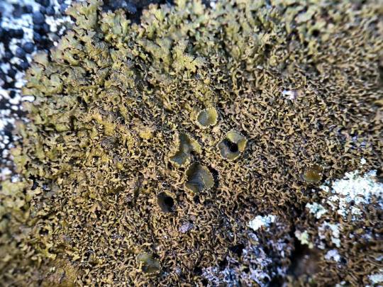
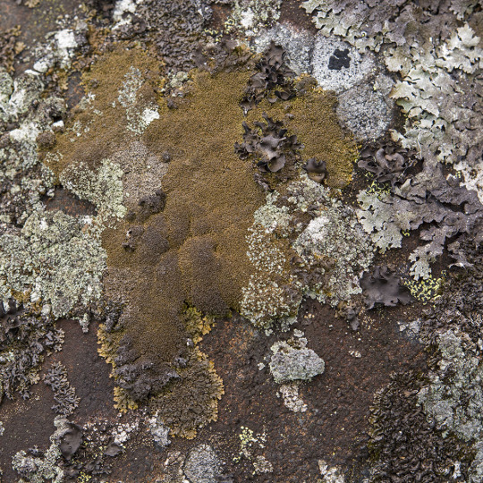

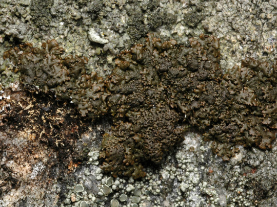

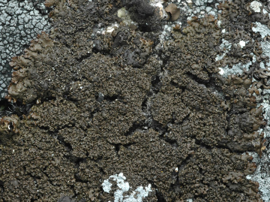
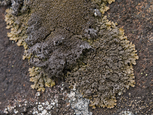
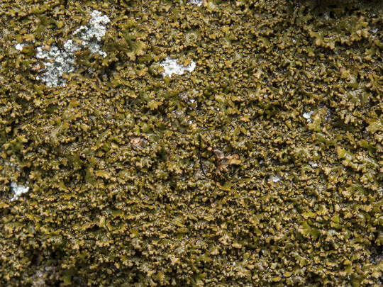
Montanelia panniformis
Shingled camouflage lichen
A "type species" is a species around which a new genus is based, and must represent the characteristics associated with that genus. M. panniformis is the type species for the Montanelia genus established in 1978. It is a great representative of the small lobes, clear pseudoyuphellae, and secondary metabolites associated with species of Montanelia. This foliose lichen grows on inclined, siliceous rock in boreal habitats in Asia, Europe, and North America. It has a cushiony, felty thallus up to 10 cm in diameter made up of small, crowded lobes. The upper surface is olive green-brown to red-brown in color, and the lower surface is black with dark rhizines. It only rarely produces apothecia, which are concolorous with the thallus, with a sunken disc and a papillate margin. Genetic studies have actually revealed M. pannifromis to be made up of 2 genetically distinct species, but they look so similar that they have not yet been delineated.
images: source | source | source
info: source | source | source
#lichen#lichens#lichenology#lichenologist#mycology#ecology#biology#fungi#fungus#symbiosis#symbiotic organisms#algae#trypo#trypophobia#Montanelia panniformis#Montanelia#I'm lichen it#lichen a day#daily lichen post#lichen subscribe#life science#environmental science#natural science#nature#the natural world#beautiful nature#weird nature#taxonomy#systematics#lichens are so good
68 notes
·
View notes
Text
Okay im going to lose it because I looked at this bird and went, theres no way in hell its a quail, and it turns out theres a whole rabbit hole.
Quail-Plovers are Button-quail(family: Turnicidae) but are not really related to Quail(order: Galliformes), and are instead in the same order as Plovers(order: Charadiiformes).
The domestic “button quail” (Synoicus chinensis) are not actually button quail, but are called that due to their appearance. They can be more accurately called King Quail or Chinese Painted Quail.
So this domestic button quail(King Quail) are NOT Button-quail(family: Turnicidae) but are Quail(order: Galliformes).


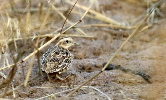
the quail-plover is a small member of the buttonquail family found in dry regions of africa. the ‘plover’ portion of their name originates not from any close relation, but from the plover-like barred marking visible on the wing in flight. these birds are often found as individuals or in pairs, and primarily live in scrubland habitats.
510 notes
·
View notes
Note
If an author writes a book not knowing the genre, will the book fit into a genre when it’s finished—or is it possible for a book to be completely genre-less?
I'm about to GO OFF, so if you just want the short answer:
I presume that if an author is writing a novel and they don't have a specific genre in mind when they are doing it, they are just writing fiction. You can get more specific after you finish the book and figure out where it belongs in the bookstore and how to describe it.
It's not really possible for a book to be "completely genre-less" because that implies that it CAN'T be categorized in a bookstore -- I bet your book can be. (I should hope so, anyway, otherwise how will it sell???) -- but also, uh -- it doesn't really matter? Everyone gets really hung up on these hyper-specific genre labels, but you don't really need to get THAT specific. If your book is just "general interest fiction" that's OK -- so call it a novel and describe what the tone is. (Funny? Realistic? Literary? Fast paced? Tearjerking? There has to be some way to describe it, no? )
Even if your book is just weird as hell rambling about things I would never read about in a hundred years -- guess what, that's a genre, Experimental Fiction. ;-)
--
Long Answer: Fun fact about the word "genre" -- it comes from the same root as genus, like what you probably heard back in school when learning about the taxonomy of animals and whatnot.
Because I am extra, I decided to do a little taxonomy of books. It's still a work in progress, I might decide to change it a bit, but this is the basic chart.

I'll assume that pretty much any book we're talking about here has the same domain, kingdom, phylum and class, and PROBABLY the same order, too, since most of you are likely writing Fiction.
Within the order FICTION, there are "families", which I here call Categories -- novels, graphic novels, plays, essay collections, short story anthologies, young adult novels, young adult anthologies, middle grade novels, middle grade graphic novels, chapter books, picture books, ETC. Categories in the order NONFICTION include Biography/Memoir, Cookbook, Reference, Religion, History, Science, etc.
Within each Category, there are different Genres -- that is, the type of [novel, or whatever] it is. Genres of novel include mystery, science fiction, horror, realistic, historical, romance, western, etc.
And within each Genre, you can get even more specific with species, which I am calling subgenre/tone. That's the type of the type, in other words. There are well-established subgenres (like Horror could be slasher, or gothic, or psychological. Romance could be historical, or realistic/contemporary, or whatever) -- but it's also acceptable to get more specific with tone or style -- "Comedic", "literary", "commercial" "upmarket" etc. (You can also have books that have both subgenre AND tone -- that's like species and sub-species)
Examples:
DRACULA: ORDER: Fiction > CATEGORY: Classic Novel > GENRE: Horror > SUBGENRE/TONE: Gothic
DON'T LET THE PIGEON DRIVE THE BUS: ORDER: Fiction > CATEGORY: Picture Book > GENRE: Meta-fiction > SUBGENRE/TONE: Comedic
LINCOLN IN THE BARDO: ORDER: Fiction > CATEGORY: Novel > GENRE: Magical Realism > SUBGENRE: Experimental > TONE: Literary
JAMES: ORDER: Fiction > CATEGORY: Novel > GENRE: Historical Fiction > SUBGRENRE: Retelling > TONE: Literary
You get it?
OK SO, in the bookstore, the books are first divided by CATEGORY. All the Cookbooks are together, because that's the Category, but if there are a lot of them, they will be broken up into categories-within-the-category ("genre" if you will). Perhaps they would be grouped by region or style (Mexican cuisine, Middle Eastern cuisine, European cuisine; Health Food; Baking; etc). Mastering the Art of French Cooking would be in Cookbooks, of course -- but in a larger bookstore with many cookbooks, it would likely be found in its region, either French or European Cuisine -- and in a store with a HUGE French cooking section, those books might even be further divided into "French > classic techniques" "French > desserts" "French > postmodern cuisine", etc. So:
MASTERING THE ART OF FRENCH COOKING: Order: Nonfiction > Category: Cookbook > Genre: French > Subgenre: Classic Technique
And so it goes with Fiction as well; the sections are divided by Category. So all the Middle Grade Novels are probably together. All the Picture Books are probably together. Etc. But for very large categories (like Fiction > Novel), there are enough books that it becomes easier to browse if they give the biggest genres their own shelving. Hence there are probably sections for Mystery, Science Fiction/Fantasy, Romance, etc.
MIND YOU: There are PLENTY of books that fall under "Fiction" and DON'T get separated out into one of those other genres. They are just categorized as fiction. The fiction section is probably the largest section in most bookstores -- it's not weird to write a book that gets filed in the "fiction" section! Those books still have a genre. That genre just might be "realistic" or "historical" or "western" or magical realism" or "postmodern/experimental" or something that doesn't neatly fall into the Mystery or Science Fiction (or whatever) genre categories.
For example: At my bookstore, we ONLY separate out Mystery, Science Fiction/Fantasy/Horror, Romance, Classics. So within the regular Fiction section you'll find a huge variety of books -- they all DO have a "genre" -- it just isn't one of those genres that gets shelved separately!
So, no, I don't believe there are books that just *don't have* a category or genre. ALL books have them. We might disagree a little about what they should be -- we might use slightly different words -- new species might pop up here and there -- we might be able to categorize some of them into even more minute niches -- but all books CAN be categorized in some fashion.
659 notes
·
View notes
Note
Pls give recommendations for Odd books 🙏
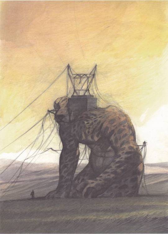
Here we go, a list of literary oddity :) This post contains majestic spheres, alien taxonomies, cruel subway polytheism, a fourth-dimensional cat, disturbing earthworms, infinite space football, existential mussel terror, a Parisian absurdist time loop, and a picture of a telegraph-pole-man-cheetah. I'm not exactly recommending these books, in the sense that I won't take any complaints if you find them more odd than good, and some of them transcend the concepts of good and bad anyway.
• The Other City, Michal Ajvaz. It's all like this:

• Contes du demi-sommeil, Marcel Béalu ('Half-asleep tales') —is the book that prompted my post about stories that have no ambition or justification beyond being odd. I'm sad that it hasn't been translated :( One of the tales is about a strange opaline sphere that rolls on the road. It doesn't accelerate when the road becomes a steep slope but continues rolling majestically. At one point it floats away towards the sky. Someone wonders if it was the moon. Someone else says authoritatively "It was an angel's egg." Everyone is reassured by this explanation. The whole thing feels exactly like remembering a dream you had. There is also a man who reads too much and whose body atrophies so only his head is left and his wife puts it in an egg cup for better stability.
• Leonora Carrington— The Skeleton's Holiday, or maybe the Hearing Trumpet. I've read them so long ago but I think the latter is the one with the old ladies and nuns? There's also a guy who was murdered in his bath by a still-life painter because he said there was a carrot in one of his paintings, but it might not have been a carrot? It's hard to remember details from this book without feeling like I might be making them up. Bonus Leonora Carrington painting which kind of feels like a short story:

• The Codex Seraphinianus, of course. I wish there were more bizarre encyclopaedias out there.


Also I love this review:

• Sleep Has His House, Anna Kavan —I really liked the way this book used language; making life feel like a fever dream even more than in Samanta Schweblin's Fever Dream (which I really liked too.)
The eye is checking a record of silence, space; a nightmare, every horror of this world in its frigid and blank neutrality. The actual scope of its orbit depends on the individual concept of desolation, but approximate symbols are suggested in long roving perspectives of ocean, black swelled, in slow undulation, each whaleback swell plated in armour-hard brilliance with the moonlight clanking along it . . .
• The second half of Michael Ende's Neverending Story, where things get stranger! I remember the hand-shaped castle with eyes and the city of amnesiac former emperors and the miserable ugly worms who cry all the time out of shame then create beautiful architecture with their tears...
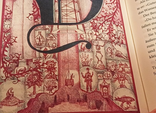
• The Gray House, Mariam Petrosyan. This is the one I had in mind when I talked about a 'museum of the strange, but one you wouldn't want to be trapped in after closing time'. Another book that made me feel uncomfortable in a similar (good) way was Edward Carey's Observatory Mansions, the protagonist of which is a man who curates an odd private museum and can't stand the sight of his own hands.
• Oh, speaking of uncomfortable, and hands—He Digs A Hole, by Danger Slater. To me this book was in the more-odd-than-good category but I liked its refusal to have a coherent philosophical meaning. It's about a man who can't sleep so he goes to his garden shed and saws off his hands and replaces them with gardening tools. Then he starts digging a hole. And then it gets weird. (Read at your own discretion if you have a worm phobia; there's some body horror featuring sexually aggressive earthworms. And then it gets disturbing.)
• 17776 — Someone sent me an ask a few years back to recommend this online multimedia narrative to me and I really enjoyed it! Here's the summary, borrowed from the wiki page: Set in the distant future in which all humans have become immortal and infertile, the series follows three sapient space probes that watch humanity play an evolved form of American football in which games can be played for millennia over distances of thousands of miles. The work explores themes of consciousness, hope, despair, and why humans play sports.
• Saint-Glinglin, Raymond Queneau —the author admitted that this book presents some "internal discontinuities." I didn't like it much but I respect the talent it takes to write a novel where everything feels like a random digression, including the key suspenseful scene that matters to the plot. The one digression I loved had to do with the way the narrator is existentially horrified by various sea creatures. It's like he dreads them so much he can't help but think about them when he should be telling a story.
The oyster... This gob of phlegm, this brutal way of refusing the outside world, this absolute isolation, and this disease: the pearl... If I conceptualise them even a little, my terror starts anew. The mussel is even more significant than the oyster and even more immediately admissible in the domain of terror. Let us indeed consider that this little sticky mass whose collective stupidity haunts our piers, consider that it is alive in the same way as a cow. Because there are no degrees in life. There is no more or less. The whole of life is present in every animal. To think that the mussel, that the mussel has, not a conscience, but a certain way of transcending itself: here I am once again plunged into abysses of anxiety and insecurity.
Near the beginning he philosophises about what would happen if a man and a lobster were the only two survivors of the apocalypse. The lobster would break the man's toe and the man would say, "We are the only beings that remain on this devastated Earth, lobster! The only living beings in the universe, struggling alone against the universal disaster, don't you want to be allies?" But the lobster would disdainfully walk away towards the ocean, and "the sight of the inflexible and imperturbable lobster pierces the sky of humanity with its unintelligible claws." (I can't overstate how little this has to do with the rest of the book.)
• Autumn in Beijing, Boris Vian —needless to say the story does not take place in autumn nor in Beijing.* To the extent that it can be said to be "about" something, it's about people trying to build a train station in a desert with tracks that lead nowhere. (I just went on goodreads to check the title, and it's actually called Autumn in Peking in English. I also discovered that it was featured in a list of Books I Regret Reading. I liked this book, but I understand.)
(* French writers love doing this—like when Alphonse Allais said about his 1893 book The Squadron's Umbrella "I chose this title because there aren't any umbrellas of any sort in this volume, and the important notion of the squadron, as a unit of the armed forces, is never brought up at all; in these conditions, hesitating would have been pure madness.")
• The Library at Mount Char, Scott Hawkins—I fear this one makes a little too much sense for this list, but you can't say it isn't weird; and I loved it and recommend it any chance I get.
• The Eleven Million Mile High Dancer, Carol Hill —this book was so wacky and made me laugh. I've not yet managed to successfully recommend it to someone; its brand of odd didn't resonate with the people I know who've read it but that's okay. You could say it's about a woman astronaut whose weird cat disappears into the fourth dimension (or the quantum realm?) and she goes to space to save him—but that makes the book sound more straightforward and less messy than it is. Her cat leaves her a note before he disappears:

• The Bald Soprano, Ionesco —fun fact, there's a tiny theatre in the Latin Quarter in Paris where this absurdist play has been staged every night for nearly 70 years, with the exact same set design and costumes and everything, like the actors are stuck in a time loop. They celebrated the 20,000th performance this year! There's an actress who has been playing her character for 40 years and said joining this theatre was like joining a religion. I've been going to see this play as a New Year tradition with my best friend since we were 14, so I love it madly, though I wouldn't say it's good, necessarily—the author said it was about "absolutely nothing, but a superior nothing."
• Statuary Gardens; or Les Mers perdues (apparently not translated) by Jacques Abeille. This man is obsessed with weird statues. Unfortunately I find his writing style rather dull—I feel like he takes strange ideas and makes them feel mundane in a bad way...! But his books still have a nice, quiet, oneiric atmosphere, and images that stayed with me, like a solitary gardener trying to grow stone statues in the depleted soil of a walled garden. Here are some illustrations from the second one:

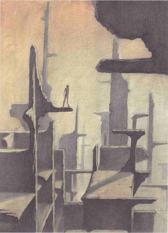
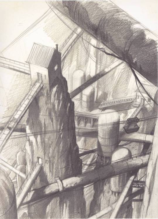

I'll look into some of the books recommended on my previous post! (and I agree with the people who brought up Cortázar, Borges, and Junji Ito. <3) Some potentially-odd books I have on my to-read list: Clive Barker's Abarat, Goran Petrović's An Atlas Traced by the Sky, Salvador Plascencia's The People of Paper, Jean Ray's Malpertuis; Jan Weiss's The House of a Thousand Floors; Brice Tarvel's Pierre-Fendre.
#ask#book recs#i know i've made some of these sound barely readable but it would be risky to oversell them#it's funny how indignant i felt when i first thought that saint-glinglin didn't exist in english translation even though objectively it#wouldn't have been a huge loss and i don't think english speakers are clamouring for more crustacean existentialism after sartre's lobsters#but they should get to choose not to read this book!
587 notes
·
View notes
Text
Happy/spooky Friday everyone.
Obviously I'm sad about the long days getting shorter and summer fruit season slowly drawing to a close, but there are compensations. Like PERSIMMONS!!!
(happy it's persimmon season dance.)
Not only are persimmons delicious, but they are also in the order ericales in the...taxonomic category*...asterids, which you can vote for (or against) in the @plant-taxonomy-showdown bonus round semi-finals which will almost certainly start later today! So, keep your eyes peeled!
But your persimmons don't have to be!
*the correlation between traditional linean categories and actually useful categories is a bit hit or miss.
#ericales is a really fun order it's so random#blueberries and brazil nuts and shea butter and tea#sure why wouldn't that all be in one order?#that's not anywhere near other berries (other than cranberries) (either in the culinary sense or in the technical sense)#and not anywhere near coffee#and not anywhere near other orders that have nuts#and not anywhere near other orders that have plant based oils#plant taxonomy is so weird I love it so much#blueberries and cranberries are in the same genus so they're like siblings
2 notes
·
View notes
Text
I really wonder exactly how Japan became seemingly the most creature obsessed culture on earth. Everybody has a mythology of spirits and beasts to some extent but in decades of my hyperfixation on monsters all over the globe I'm forced to concede that no surviving culture has so enthusiastically kept such a huge volume of their weird guys as widely relevant in the public eye as Japan has with youkai, let alone gone on to make such a high density of modern monster media including several of the most globally successful franchises on earth.
Mizuki Shigeru (Gegege no Kitaro) is popularly credited with having personally "saved" youkai culture from relative obscurity, but while the success of his work definitely had (still has) a massive snowball effect I still don't think that answers the whole question. The Kaiju genre for instance feels fairly independent of the sudden youkai craze associated with Kitaro. I guess there's probably a whole lot of factors that just perfectly came together.
I mean they even seem to think about *animals* more than is usual around the world, more than just pets and livestock and as more than just kid stuff. Their public education system spends evidently more time going over biology, taxonomy and evolution than that of many other countries, what's with that? I don't care about the anime and maid cafe tourist crap I just want to know why the rest of us are so behind Japan in appreciating varmints and critters.
595 notes
·
View notes
Text

Monster Hunter Wilds got me wanting to make Monster taxonomy diagrams again, so I decided to start off with the newest (natural) monster class, Cephalopods! This tree was relatively simple, as unlike with other groups, most of the members had very clear real life analogs. I decided to place Escunites as Nautiloids rather than Ammonoids due to the hood over their head and their eyes being more akin to those of nautilus. Nu Udra is an octopodiform, that one's easy, and the Rise/Sunbreak squids are decapodiforms. Interestingly enough, some cephalopods in MH seem adapted to freshwater (with no irl cephalopod displaying this trait for multiple reasons). In the case of the two cuttlefish, the Goliath Squid and Nakarkos, I like the idea of them sharing an euryhaline (that is, an animal capable of surviving in both salt and freshwater) ancestor within sepiida, with Nakarkos retaining this adaptation while the Goliath Squid fully adapted to freshwater in the waterways of the Eastlands.
Then there's Xu Wu. It's got a whole array of weird anatomical quirks that make it quite hard to classify. I placed it into the fictional order Paraoctopodiformes, which I've depicted here as an early divergent Coleoid group. The placement is uncertain, however, which is why I made the line discontinuous. In truth, we don't know enough about Xu Wu to fully ascertain what Paraoctopodiformes actually are. Cephalopods? Some other type of mollusk? An entirely different phylum of animals? Anyway, that'd be all so far. I'll post more diagrams in the future for each group. Feedback will be appreciated.
#monster hunter#monster hunter taxonomy#taxonomy#speculative zoology#cladogram#speculative evolution#speculative biology#nu udra#xu wu#nakarkos#cephalopod#mayfly06 monster hunter
55 notes
·
View notes