#t: color palette challenge
Explore tagged Tumblr posts
Visit Tumblr Blog
Explore Tumblr blogs with no restrictions, modern design and the best experience.
Last Seen Tumblr Blogs


Fun Fact
The Tumblr app for Google Glass was released on May 16, 2013.
Note
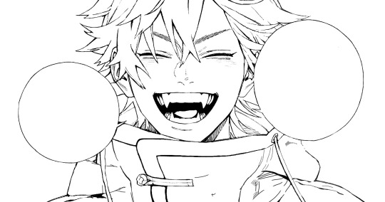
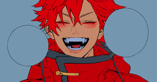
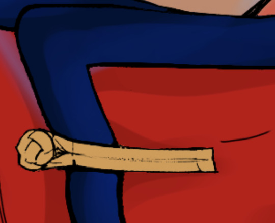
is there perhaps a little bee friend you have catalogued as well?


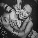
Lalna says: Yeah! He's a bit shy and grumpy at times, but after months of just sorta staring at each other we've finally started, interacting, I guess? (He doesn't really talk. Or at least if he does, I can't hear him. Vocal chords are too small, I guess.)
He used to live in my garden, but I think he's holed up in my walls now? Which is a bit weird, but hey, what could be better than an easily accessible specimen?


#lalna answers#melonthep00p#melon when i say i have thought about this ask for MONTHS and needed it to be PERFECt before i answered bc i was so excited- /pos#fairy au#yogscast#yogs#lalna#xephos#fairy!xephos#beephos#g/t#sfw g/t#also don't mind me reusing the lines from a color palette challenge i just loved it too much to leave alone
35 notes
·
View notes
Text

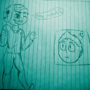
day 23 - pick a colour palette and paint a scene/character/object using only those colours (some blending allowed)
used this day as an excuse to do some simple little thumbnails exploring how my main guys' colours might change depending on environment
#ngl this day was really fun i'm excited to do coloured thumbnails for the other major environments in my thing#artists on tumblr#my art :0#improvement hell#oc art#ocs#oc#my ocs#original character#digital art#digital illustration#color study#color pallete challenge#color pallete art#color palette#t/a
16 notes
·
View notes
Text
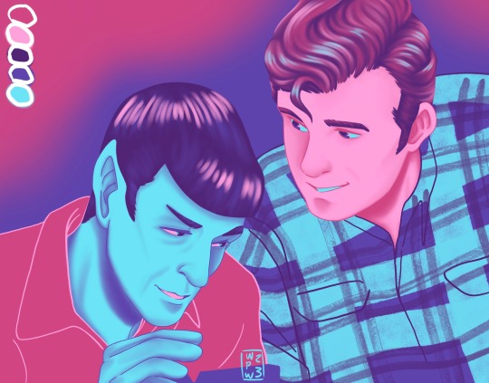
Spirk with “City Lights” from This palette
Request from @isthisamew I hope you like!
#star trek tos#spirk#k/s#space husbands#tos spirk#star trek#james t kirk#tos spock#city on the edge of forever#my art#color palette challenge
278 notes
·
View notes
Note
mallory keen with A! please <3
I REALIZED I FORGOT TO INCLUDE GREEN IN THE PALETTE EVEN THOUGH THAT'S A MAJOR COLOR IN THE STORY (it's about tennis, among other things) LMAO ANYWAY

Here's Mallory!!
Valentine's stories palette challenge
#mcga#magnus chase and the gods of asgard#magnus chase#riordanverse#mallory keen fanart#mcga fanart#mcatgoa#color palette challenge#this is not my favorite drawing ever..#pinkie pie lookin'#but without the green not much distinguishes A! from C&T
66 notes
·
View notes
Text
Saint

also something made in process
#my art#ms paint#rain world#saint#five pebbles#i just like him t-posing#he's both jesus and the deadliest weapon at the same time so it makes sense#five pebbles on picture is ascended#hence why head is damaged#was using palette colors#and it's really difficult to make range of colors from black to white#i still would work in csp for more speed and detalization#mspaint is interesting challenge anyway#but i miss juicy colors and more convenient interactions
9 notes
·
View notes
Note
4 electric feel for neelo or 87 carry that weight for whitlock :3


[Image description: Two drawings, both half body digital portraits with limited colors palettes. On the left is Neelo (he/him) and on the right is Whitlock (he/him). Neelo's palette is comprised of bright pink, and four shades of green starting at a dark forest green and getting lighter, ending with a pale lime green. Neelo, a young goblin with short curly hair, is cheering excitedly, his arms raised triumphantly. He is wearing a snap back hat and a tanktop that reads "Suns Out Guns Out". Whitlock's palette is comprised of forest green, sunny yellow, warm dark brown, warm light brown, and teal. Whitlock, a gnome with his hair in a bun, is in three quarters profile, his cheek in his hand as he looks lovingly off-screen. He has small lightning bolts in his eyes. End description.]
Getting this challenge started with some top tier bois!!
Feel free to send me a palette # and a character to draw!
#Eli's Art#Ask Games#Color Palette Challenge#Strength of Thousands#SICL#Neelo#Whitlock#best bois#these were so fun to draw#fun little challenge to work with the limited palettes i loved it#thanks for the stellar picks T 💙💙
15 notes
·
View notes
Note
Kotetsu T. Kaburagi in A Nasturtium for Noah?

I have no idea who this man is but... He do be... he do be kinda cute 👀
Link to color palette challenge
(plz send me more ask stuff this is a lot of fun :D)
15 notes
·
View notes
Text

Forgot to post this but here's a Yuta fanart from last year lmao. It was supposed to be for a color palette challenge but my friend never finished their part T^T
#jjk fanart#jjk#jujutsu kaisen fanart#jjk yuta#yuta okkotsu#color palette challenge#fanart#art#jjk okkotsu#okkotsu yuta
252 notes
·
View notes
Note
Huey/duke of making a mess; a8; fistfight with god? TYSM if u do this ^w^

Another Huey! And again angry about something
And you're welcome!! This challenge is very enjoyable for me, I'm only glad to draw your requests :)
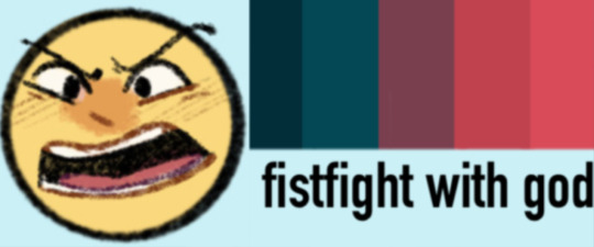
Emotions and palettes are here
ID in alt and under cut
[ID
A colored half-body digital doodle of Huey Duck from Ducktales 2017, done in a limited palette of dark shades of turquoise and red.
He is wearing a polo t-shirt and a baseball cap.
He stands facing the viewer. He looks angry. He shouts, throwing up his hands as if arguing with someone.
End ID]
#ask box#yara's art#art#digital art#doodle#art challenge#emotion challenge#palette challenge#duckverse#ducktales#dt#ducktales 2017#dt17#huey dewey and louie#huey duck#ducktales huey#id in alt text#id included#image description included#image described
144 notes
·
View notes
Text
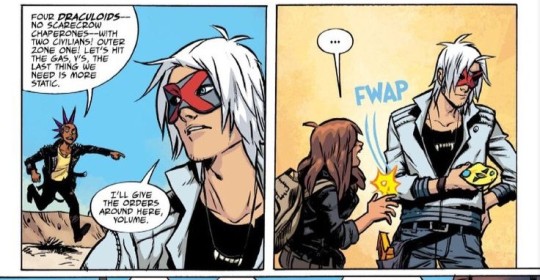
I think we don't talk enough about the implications of Val Velocity's main color being white. So I'm writing a short essay about it.
About Val Velocity's character design
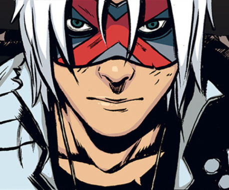
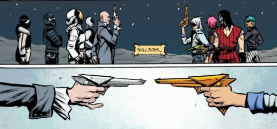
I need to start this off with a brief rundown of the narrative of Danger Days. Danger Days is centered around themes of self expression, anti-conformism and anti-corporation. The killjoys are rebels who are fighting BL/ind, an evil company that seeks to control every aspect of an individuals' life. The Killjoys fight with their appearance just as much as they do with guns. They use their flamboyant, eccentric and colorful clothing as a way to challenge the sanitized, conformist society that BL/ind is promoting. The mask, which in other media is typically used to indicate hiding one's true self, in the context of Danger Days takes the opposite meaning: the Killjoys' customized masks are the ultimate tool of self-expression. Each member of the Fabulous Four, the original gang of Killjoys, has a color distinctive to them, which matches the color of their gun.
In the context of Danger Days, whites and greys are used to symbolize lack of identity and conformism. This is evident if we compare the original Killjoys to BL/ind agents.


Now we get to Val Velocity as a character. His story takes place several years after the Fabulous Four, have been killed. Val is the leader of a group called the Ultra Vs, and he's trying to continue the legacy of the Fabulous Four. We learn that he particularly looks up to their leader, Party Poison. This is reinforced by the fact that his own gun is yellow just like theirs. However, Val is fundamentally different than the former Killjoys. He's arrogant, and he fights because he craves violence and glory, rather than to actually stand up for what is right.
His design and attitude conveys this quite well in my opinion:
His palette is almost completely monochromatic. Hell, if he was placed amongst the BL/ind henchmen instead of the Killjoys in the pic below I wouldn't even bat an eye.
Val does not understand what the Fabulous Four standed for. He's not fighting BL/ind to protect people, or for the sake of freedom of self expression, or to fight conformism. In fact, Val's own sense of identity is shaky, as he's trying to follow the footsteps of someone else. Most of his identity revolves around trying to emulate Poison: even his own gun, which is almost as important as the mask to a Killjoy, is the same color as theirs. And the gun, something he has assimilated from someone else's identity, is one of the few things differentiating him from the BL/ind agents as far as color schemes go.
Val is not fighting for ideals, he's fighting because he craves violence. We see him hurting others with no remorse, often deliberately harming those who are weaker than him for the sake of it. In which way is his violence any better than BL/ind's?
The necklace with vampire fangs, arguably his most iconic design element, also plays into this. The Killjoys are fighting the Dracs, BL/ind agents who wear a mask with vampire fangs. In the context of Danger Days, his necklace is an open threat to the Dracs. His most prominent design element is a symbol of violence.
His palette being mostly white, in an universe where color is a synonym of resistence and self expression, is very telling. One would naturally assume that if he were to add color to his appearance during the story, it would be a sign of character growth. But the ttlotfk comics subvert that expectation, because when that moment comes it has exactly the opposite meaning:
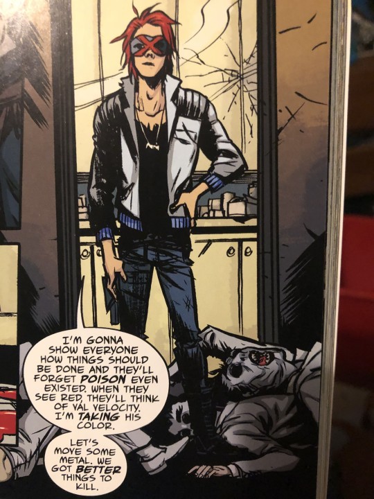
Val, after spiraling into paranoia and mania, dyes his hair "Poison red" in an attempt to appropriate Poison's legacy. This is the ultimate act of lack of self identity. The first time Val has tried to add color to his appearance, what should have been an act of self-expression, is him attempting to "take" someone else's color. But he cannot be Poison, or overshadow his legacy. Val is only a caricature of who Poison was: aside from the gun, and the bright red hair, he has nothing in common with them. He doesn't have the morals, nor he fights for the same ideals.
I think Val, as a character, is meant to be a testament to how in every rebellion there will be people looking for an outlet for violence rather than fighting for a right cause.
#mcr#my chemical romance#the true lives of the fabulous killjoys#ttlotfk#danger days#ttlotfk California#val velocity#kie being normal about media
141 notes
·
View notes
Text
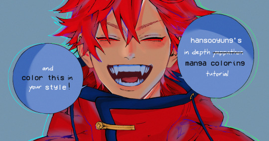
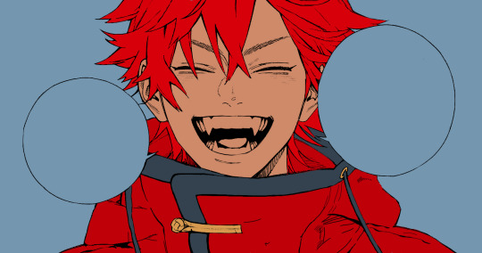
hansooyung's coloring tutorial & ctiys: alma time! 🍒
hello everyone! though i've been meaning to for a while, i've finally gotten around to making my first manga coloring tutorial! i'll be going over cleaning panels and screentones, choosing base colors, and finally shading and lighting.
this will also be a color this in your style challenge, so if you're willing, feel free to post your colored panel and tag me in it!! i'd love to see all the results :)
find details under the cut! 🦋
DISCLAIMERS:
this is just how i personally color! i know for a fact that some of my other friends follow other methods and have such beautiful colorings <33
for colors specifically, i play around a LOT. if you don't like your color scheme for the time being, mess around with it! i don't use psds since i like to mess around by hand with color palettes, but maybe i'll look into it for the future.
i explain a lot just bear with me gang 🙏
TECHNICAL STUFF:
software: ibis paint x (on iphone). i use ibis since it is FREE for all phones and it worked on my chromebook as well.
while this tutorial is made for ibis paint x, everything works on other softwares except the brushes, which i've provided alternatives for below.
brushes: i will be using dip pen (hard) which is automatically included with ibis, and two other brushes i made myself which you can find here and here. for more brushes, @/bkdkdh was incredibly helpful and posted her awesome set here!
for other softwares, you can use similar brushes. dip pen (hard) can just be the default brush, while wet edges is just the default brush on lowered opacity (and more of a rectangle/marker shape?). watercolor pencil is a watercolor brush in the rectangle/marker shape as well. if you can't get the shape, you can always smudge your lines into shape as well, so don't fret too much! a bunch of people only use one brush for coloring everything (which is insane to me, personally, they are so talented!)
fun fact: the first brush listed that i made was originally called "aki tao watercolor smooth" 👍
ok here we go guys!!
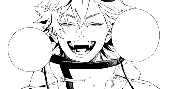
STEP ONE: CLEANING THE PANEL
i think of this part as setting up the panel for coloring! usually it's pretty exhausting cuz it's all b&w but it's all worth it i swear. the panel i'll be coloring is this beautiful one of alma from chapter 2:
imgur link here (x)
a lot of people redraw their lines to avoid screentones, which is extremely helpful. however, i work on a phone and my fingers are not steady even with the stabilizer turned all the way up T~T. i do it this way, but a different (possibly easier) way may work for you!!!
your first step will be to remove all the white, giving us a transparent background to work with. THIS IS THE NUMBER ONE REASON WHY I USE IBIS PAINT X.
when you upload the image to ibis, a popup comes asking if you would like to "extract line drawing". this creates a lineart of your image. click yes, and your work is like 90% done.
if you're not on ibis, you can redraw your panel, put lineart layer on screen, etc. or you can just extract line drawing from ibis and upload to software of your choice
for those of you not on ibis, i've included the line drawing here (x) if it looks black, don't worry and set your background to white.
omg i was not kidding when i said i explained a lot. ok now onto the three main steps of cleaning the panel:
cleaning background
removing screentones
repainting black lines
for cleaning the background, we're going to clear off all the extraneous stuff. this includes the text in the speech bubble, the gradient screentones behind alma, and the panel line on the left side. just use your eraser tool and go crazy! (i forgot to save the panel at this point of the coloring OTL)
for removing screentones, we're going to remove all those "dots" that mangakas use for shading. these are used to show value for b&w art, but since we're coloring we don't need them—a lot of people have really cool ways of incorporating screentones in their colorings though, and it looks amazing! i used it on nana's hand in my bnha coloring.
remove the screentones from alma's hair and jacket with your eraser tool. this will take time, but it's worth it in the end!
for portions with a bunch of lines, you can create A NEW LAYER and redraw some of the lines. that way, you can erase indiscriminately from the original layer but the lines you drew are still there. again, like i said, my hand is really shaky so i don't do it a lot, but it's extremely helpful for smaller parts where i have control! i used this on alma's jacket, and here's a screenshot of the process:

(i made his jacket purple so i could distinguish between layers easily).
it should look like this when you're done:
for the final step of cleaning, i like to erase all the things colored black (the collar and strings of the jacket, along with the back part of his hair). that way, i can color them in with dark colors and it adds to the whole look of the coloring.
i've circled the parts i'm going to erase below:

and it should look like this when you're done!
ok everyone cheer we're ready to color now!!!!
STEP TWO: BASE COLORS
CROWD CHEERS ok lets go!
this part is the most important to me, because it sets the tone for the whole coloring. i like to use three-four main colors in my colorings, and it's usually background, skintone, hair, and the secret fourth color. the secret fourth color is usually whatever color fits the character's vibe, or if the character's color is the bg, it'll be an accent color.
for example, with my nagi coloring, i used white for the hair, i had my skintone, i had blue as the main coloring vibe (as nagi's color), and black as the accent color.
for alma, i chose his main color to be red! it's the color of his hair and his jacket, so i wanted it to be vibrant and stand out. since blue contrasts red, i went for a greyish-blue shade for the background. (i went for grey rather than solely blue because then it would clash rather than complement).
disclaimer please please please take your device off night mode warm mode f.lux whatever you have. this has screwed me over more times than you may think :(
i like to make my vibrant colors closer to the right end of the color square. for alma's hair, i chose this color:

i dragged it down from the corner a bit but kept the saturation since his hair is kind of dark. we can use vibrant colors to shade it though, so don't worry!
here's his hair and the background together:
now from here, play around with skintones until you find one that matches the hair!
i usually drag around the wheel to the orange-red intersection, and have it on the lighter, more saturated side. here's the color i chose for alma's skintone.
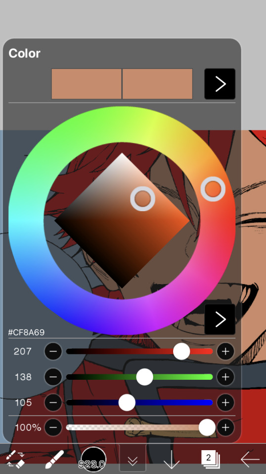
i thought his original skintone looked a bit too orange, so i pulled the saturation back a little bit (moved closer to the left side of the square).
after that, color in his jacket with a bit darker red than hair, choose a gold color for the accents on his jacket, and color in the black parts with a grey-ish color (we will change that later).
here's the base colors!
if it looks a bit bright, don't worry! we can change that with shading. or you might just have to. accept the light.
STEP THREE: SHADING AND LIGHTING
wooo we made it!!!!!!! ok now i lied, we have a bit more of base colors to go. on a layer above the skin, color in your teeth and tongue. for pieces that have a more red feel (like this one), i like to make the teeth and the shading a more vibrant blue color. (for blue pieces, i make it a purple!).
IMPORTANT NOTE: ALL SHADING AND ALL COLORS SHOULD BE DONE ON NEW, CLIPPED LAYER.

i'll then go in and do some light shading with my wet edges brush. i'll use a darker color for hard shadows and then a lighter, more vibrant color to accentuate it.
next up we have blush! a lot of people do this in very different ways but i like to do it directly under the eyes, in a vibrant red shade. make a new layer above the skin and clip it on. color pick alma's hair and drag it to the most saturated shade (red corner). then using the watercolor pencil brush, lower the opacity of the brush and drag a line under the eyes on both sides.
make sure to erase the portion of blush that goes above the eyeline. i also added some lips for alma as you can see, and then added a red line under the eyes! this was back to the regular dip pen (hard) brush on 100% opacity. it may take a few tries to get your blush to the way you want it, so don't worry too much.
now we can start our actual shading!
i break this part up into three steps: skin shading, blue shading, and light shading (highlights?)
for all of them, think about where the light is falling and how it will look on alma.
quick interlude about brushes: i use the watercolor pencil brush for softer, bouncy looks (like blush and noses) and i use the wet edges brush for more hard lines in shading.
again, make a new layer above the skin and clip it on. (i like to have it below the blush, so it doesn't cover it). for skin shading, i take the vibrant red and lower the opacity of the wet edges brush by a significant amount (specifics don't really matter, as long as you're happy with it). i'll trace his neck, from the shadow of his face, shadows of his hair falling on his face, ears, and nose. (for the nose i used the watercolor pencil brush for a softer look).

this is what i have once i'm done!
next we have skin shading part two, where we basically make a new layer on top of our first shading, lower the opacity further, and trace outside whatever we just did to blend it in more.

i used the watercolor pencil brush since it's more softer shading meant for blending! i also added it around the eyebrows for depth.
next up we have our blue shading! this is a technique that i learned from @/bkdkdh's colorings, but adding blue as a shadow really adds to the whole coloring. using the watercolor pencil brush, select a light-ish blue shade (a bit more saturated than background color) and use it to shadow a few more areas than your skin shading. i always make sure to hit the underside of the nose, cuz i think it adds depth!
finally, to wrap up our skin shading we have our lights. i use an orange-ish yellow color, which i set pretty light to not blend into the skin. using the watercolor pencil brush, i'll basically highlight any areas opposite to where the blue was, and highlight different parts. i always highlight one side of the nose as well.
i erased the line around the nose since we now have shading there, and added a darker shade to the teeth since i felt it wasn't shaded enough.
now onto the hair!!! (guys we're almost done bear with me, skin and hair are the two main things and then you can half-ass the clothes)
color pick alma's hair color, then drag the red a bit further down to get a darker yet still saturated color. here's mine:

then, using the wet edges brush, draw lines of shadow wherever clumps of his hair fall or overlap with each other. you can have the opacity set to whatever level you want, i just went with around 90. just try to follow the natural lines and patterns of the original line drawing, and everything should work out fine.

here's how mine looks! then, just like we did for skin shading, place a layer on top and lower the opacity to around 50%. place some more shading to blend it in. you can also shade more parts with this shade for some softer shading. i actually forgot to take a screenshot of this step but you'll see it in the next one!
for our (almost) last part of hair shading, take a layer and place it below both of your shading layers. this is going to be our highlight layer! you can see it below, labeled 49%.

remember how we set alma's hair a bit darker from the corner color? now select that corner color and draw highlights in the center of each hair clump.

lightly visible but it's there!
now here i skipped around a bit bc i was having fun and forgot i was doing a tutorial, but repeat the shading (not highlighting) steps with darker colors for alma's jacket. you should have your base layer, a dark shading, and a softer shading for blending.
we're almost there guys!!!
for the pretty much final step of shading, select a light blue color and do some blue shading with the watercolor pencil brush opposite to wherever your darker shading falls (just like we did on the face). make sure to do it to both your hair and your jacket! here's mine:
now for the black portions, we're going to color the whole thing in a dark blue color. just alpha lock your layer and make a big stroke of dark blue, almost black. for our black shading, we're actually going to go lighter.
select a lighter (but still dark) color and place highlights on the base layer, then take an even more vibrant, lighter blue and place it on the very outside for highlights. a better example of this would be nagi's legs in his blue lock uniform here. then, choose a shade to apply shading to the gold accents on alma's jacket and we're done!
CROWD CHEERS!!!!!
STEP FOUR: FINISHING TOUCHES
we made it guys!!!! for finishing touches, i'll usually do background effects or text or that kind of stuff.
step one is coloring your lines. you can add a new layer and clip it to your lineart, or simply alpha lock your lineart and color directly on top. for hair i like to add vibrant blue/purple lines, along with a few red ones. for skin lines i try to do dark brownish purples, but leaving some black is good too bc it adds flavor!
i colored in the text boxes and added shadows using the wet edge feature, then added some text. for the glitch effect, i duplicated the lineart, dragged the layer below all of my colors (including speech bubbles) and then used the glitch effect with height full from ibis. if you don't have ibis, you can look into features on your software, or you can also just drag your lineart layer a bit to either side and color it in. i also applied just the tiniest bit of noise on top of everything
and there we go!!!!! we made it to the end :)
if you've read all the way til here, thank you so much! if you decide to color this panel of alma (or any other panels!) don't be afraid to post them and tag me for a color this in your style type of thing! (you can also put it in my tracked tag, #user.roy) i'd love to see everyone's works :)
here's the full timelapse: (it stalls for a bit at some times but hey we can't have everything)
#roy colors#tutorials#manga coloring tutorial#useraki#usergojoana#usermica#usernikiforova#tagging some friends <3#alma#gokurakugai
98 notes
·
View notes
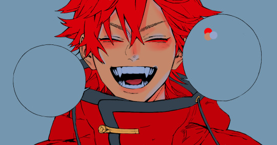
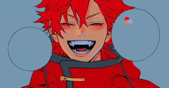
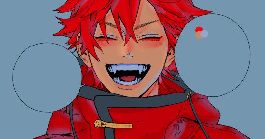
Note
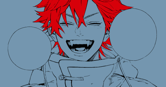
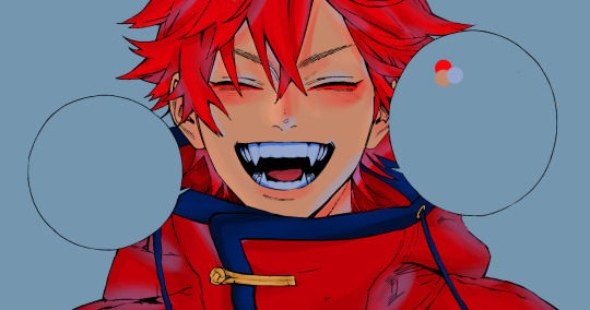
hi i'm back again- could we see fairy!xeph in Origin? i love aus like that


It’s one of my favorite aus as well so I’m glad you keep spoiling me with requests, Anon <3
Send me a character and a palette!
#floyd answers#color palette challenge#this palette was a bit difficult but i think we got there in the end#yogscast#xephos#fairy au#g/t#yogs#i wont tag him specifically but lalna is holding him lol#fanart#anonymous#fairy!xephos#sfw g/t#g/t handheld
24 notes
·
View notes
Note
Requests are open you say?👉👈
If I may, I'd like to see my darling Eönwë with the angelic messenger palette - yeah, I know, obvious choice, but I feel like it fits😁
(Feel free to delete/ignore if it's not to your liking and/or you don't have time ^^)
Our all favorit Herald<33
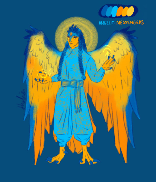
I really like this challenge surprisingly much as it´s calling me to some new colors I usually don´t use XDXD
68 notes
·
View notes
Note
This is your buddy @anewstartrekfan it’s just tumblr asks don’t let me do my alt accounts. My main is for doctor who didn’t want it to get confusing.
Anyway if you’re up for it, maybe Summer Shells with the triumvirate looking out at an endless ocean?
I mean if you want to turn it into a joke Kirk is enjoying himself taking it all in, Spock is stoically playing along, and then Bones has to point out their on a sandbar in the middle of nowhere. XD
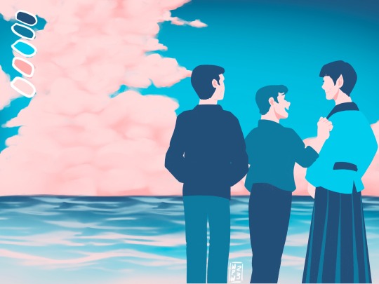
For you my friend!! 😊 They’re on shore leave! 🧡💛💙
Palette from Here
#star trek tos#star trek#james t kirk#mr spock#tos bones#triumvirate#color palette challenge#requests#my art#I am headcanonning that Kirk and Spock are needing out about the unique geography of the planet#and Bones is begrudgingly enjoying them enjoying themselves
77 notes
·
View notes
Text

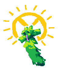
I did a little art prompt challenge on top of a color palette challenge! Decide to sacrifice Chips (Eclipse from R E S E T) for this artwork. It was supposed to be a warmup buuuuut-
Character is shared with @dragoncxv360 and @polaris-stuff
#art#TSAMS#TSAMS au#r e s e t#r e s e t au#eclipse#tsams eclipse#he’s such a grey area bc he is eclipse but he’s not eclipse#like are you an oc or not dude
23 notes
·
View notes
Text
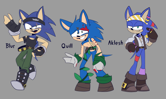
wowie i did it! I drew sonic designs for if he were in each shatterverse!
Im very proud of them, they look so skrungly
Also this was a challenge for me, i just kinda made up their designs as i went along with no references and no premade color palettes
Heres the post where i first made the idea:
Anyway, closeups + character info below
(Keep in mind, these characters exist in a timeline where the prism was never shattered)

Renegade Blur, the Sonic of the New Yoke City Shatterverse
I took some design element inspo from Knucks, with the scars and the lil spine dent thingies
He is incredibly reckless and very loud and overconfident (his scars are from being reckless and stupid)
He is kinda similar to Chaos Sonic tbh
He stops at nothing to defeat his enemies, even when his body cant take another hit
He can be a lil bit overbearing, but when it counts, his heart is usually in the right place
He works with Rebel and Knucks, and sometimes they don't get along but they can trust Blur usually
Loves races and is a sore loser
He's also never met Nine, but if he were to meet Nine, he'd be able to get along with him, but would side with the Rebels and agree he can't always be trusted
Very violently aro/ace, he do his own thing and doesn't like the idea of being bogged down by another person he has to take care of

Quill, the Sonic of the Boscage Maze Shatterverse
Took some design inspo from Gnarly and Thorn, as well as the facepaint from Prim
He can be a lil nervous and underconfident, and doesnt know he can run fast (hes a lil bit klutzy - if he runs too fast he trips on something and falls over, so he doesnt run too fast typically)
He loves his friends! He hates getting abandoned
He typically hangs out with Prim, Gnarly, Hangry and Mangey above the forest, but he does hang out with Thorn occasionally below the treetops (the rest of the group has no idea)
Thorn scares him a lot. He is so afraid of her, but he sticks around cuz they do actually care about each other, but they refuse to admit it
Quill is usually the one that the group sends below the forest, cuz he is able to grab some food without immediately getting sent up by Thorn and Birdie
If Thorn ever catches him taking berries, Quill is usually able to explain himself, and Thorn usually lets him off the hook
Quill and Thorn like each other (shhhh dont tell anyone i said that, not even quill knows he likes her)
Mangey is one of his best buds! They get along so well and no one knows why
Has never heard of the idea of relationships, but he has these weird fuzzy feelings for Thorn that he cant identify, hm must be nothing
Sexuality? Whats that?

Aklesh, the Sonic of the No Place Shatterverse
This one was my fav to design. I took a lot of inspo from a lot of the No Place characters, and "Aklesh" is Sanskrit for "Swift Lord"
The shiny rings and accessories are the colors of his friends - Red for Dread, Yellow for Sails, Pink for Black Rose, and Purple for Batten
His bandana on his head is yellow to go along with how Sails's bandana is blue
He just loves vibing with his crew, he gets along well with everybody - Sails and Dread are his besties tho
He's perfectly fine with being lazy and not doing anything everyday, but when the time calls, he's more than happy to be a swashbuckling pirate
Surprisingly, he is not afraid of water
He loves his colorful shiny accessories and is a bit of a collector
The peacemaker of the group, he settles disputes and suggests that the answer isn't through violence - but if the answer is to use violence, like if another pirate ship raids them, he won't stop fighting until he is victorious
Kind of unofficially unspokenly the second in command to Dread
Raging pansexual. Kind of a slut, with how he keeps his shirt half open /j
Aklesh thinks Dread is very very neat (and they were crewmates wink wink). Dread has no clue
ok thats all i needed to say, hope ya like it
#clip studio paint pro#digital art#my art#sonic prime#sonic au#sonic oc#blur the hedgehog#quill the hedgehog#aklesh the hedgehog#sonic the hedgehog
49 notes
·
View notes