#subtractive color
Explore tagged Tumblr posts
Photo
I guess the question is, are the four cones in a tetrachromatic eye at the same frequencies as in a trichromtic eye, plus one extra, or are they at different frequencies?
The former, from everything I've read/watched. So you'd still have the three cones being targeted by RGB, and a fourth cone that falls between two of them.
I know that the brain is perfectly well aware of the difference between mixed frequency light and a single pure frequency, otherwise the colour magenta would not exist - to create magenta, the brain takes a mixture of red and blue and, instead of averaging as it would usually do (which would give green), instead interprets it as a completely different colour that doesn't actually exist as a pure frequency. So the processing that's going on when seeing the colours on a monitor is super complex.
It's not as hard to model as you might think.
Our understanding of which colors are "primary" in light and pigment are directly related to the cones we have. The concept of primary colors doesn't exist as a function of the wavelengths of light, it exists as a function of our reception of color and resulting processing.
Magenta works as a secondary color because we do have receptors for Green as a primary color, and thus recognize its absence, and extrapolate Magenta accordingly. Red and Blue with Green present doesn't get you Green, it gets you White. Green alone is not the averaging of Red and Blue, it's the direct reception of Green. That's how Red, Green, and Blue are the primary colors of light.
The secondary colors and below are averages of varying amounts of Red, Green, and Blue, and we're pretty clear on how because we've been using Red, Green, and Blue lights to generate the full rainbow for far longer than we've had colored LEDs - additive and subtractive color theory is essential for theatre tech.
But now anybody can play with it, because we can see how a set of RGB LEDs themselves stay their own colors, and how the resulting light on other surfaces is the selected blended color.
This is why I don't see how a fourth cone is going to help distinguish more detail in digital color, and possibly not in CMYK ink either, given that they work by layering pigments in primary colors to get secondary colors.
But traditional pigments, color in nature where what's being reflected is the specific wavelengths of that color, rather than sets of other wavelengths for our brains to average/blend? Yeah, that makes sense. That's exactly why other animals do have other cone sets.
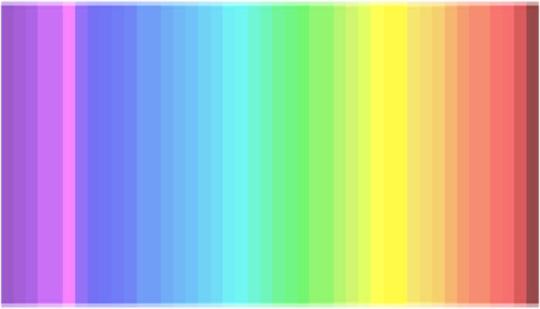
25% of the people have a 4th cone and see colors as they are
Given the sudden interest for the color of dresses and vision, here some of the fascinating findings we did recently.
The color nuances we see depend on the number and distribution of cones (=color receptors) in our eye. You can check this rainbow: how many color nuances do you count?
You see less than 20 color nuances: you are a dichromats, like dogs, which means you have 2 types of cones only. You are likely to wear black, beige, and blue. 25% of the population is dichromat.
You see between 20 and 32 color nuances: you are a trichromat, you have 3 types of cones (in the purple/blue, green and red area). You enjoy different colors as you can appreciate them. 50% of the population is trichromat.
You see between 33 and 39 colors: you are a tetrachromat, like bees, and have 4 types of cones (in the purple/blue, green, red plus yellow area). You are irritated by yellow, so this color will be nowhere to be found in your wardrobe. 25% of the population is tetrachromat.
You see more than 39 color nuances: come on, you are making up things! there are only 39 different colors in the test and probably only 35 are properly translated by your computer screen anyway :)
It is highly probable that people who have an additional 4th cone do not get tricked by blue/black or white/gold dresses, no matter the background light ;)
(x)
379K notes
·
View notes
Text

Four swords adventure gang
This link has one of the bigger depatures from both sprite and game art, but i'll explain in the tags
Also no funny page but cooler pose so~
#tloz#princess zelda#link#four swords adventures#art#my art#redesign#loz redesigns round 2#this link and zelda went through so many changes i swear#but yeah when differentiating between the f-s and fsa sprites there arent many differences#zeldas sprite being slightly warmer and having a slightly different hairstyle#and losing the cape and just generally a bunch of details#meanwhile link just has slightly longer ears#so when debating what to do with link i decided this one would have a white tunic with a dark undershirt#being rgb additive and subtractive#i figured it made sense for it to fit this link as he had the longer adventure#so he has a more visible change from using the four sword more/for longer#whereas i just gave f-s link multicolored tinting to his tunic-vest#so f-s has the more traditional coloring but less traditional outfit#i figured it was a fair trade-off#and seeing as they have a longer/harder journey theyre also older than the f-s pair#which is also why i traded the bow in zeldas hair out for a crescent hair fork
399 notes
·
View notes
Text
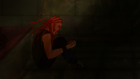


Artwork finished for the story Nightmares Run Wild. (Had to draw this to get some tension out of my system)
>>next<< The story of (almost) losing a best friend (but being just as traumatic) was heavily inspired by pausing the movie's end, way too many times. So here's a quick summary under the cut for those who need it:


He was left behind, frozen. It only lasted a few moments in the movie, but they've made so many scenes of Pickles still not moving from Nathan's side after minutes long, maybe an hour too of dragging his body across the snowy terrain.



Pickles lost his instinct to cover his head from a lightning bolt.
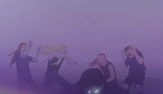
Then his eyes, when he finally saw Nathan live.

Someone give this man a break.
#metalocalypse#mtl#dethklok#mtl fanart#metalocalypse fanart#dethklok fanart#pickles the drummer#nathan explosion#in the background of the painting a star is dying#since I've made the two galaxies merging together concept a nebulea collapsing after losing a huge chunk of itself looked only logical here#nickles#kind of?#post aotd#mtl aotd#I used a bit of color theory here for fun. when you look at the rgb additive color synthesis diagram#you can notice that when you subtract blue you get green. yellow. and red. this was made bc Nathan's color is blue
107 notes
·
View notes
Text
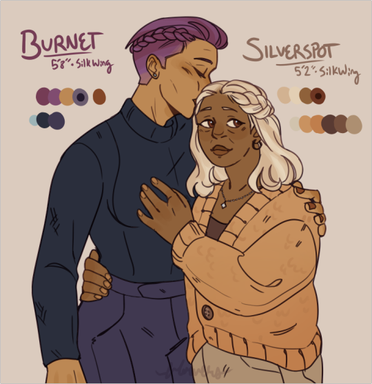
i know they don't even have canon descriptions but i wanted to draw blue and luna's parents! love having older queer characters in a book ✨
#art#design#wings of fire#wof#silkwing#silverspot#burnet#human#i tried to pick their colors based on how their kids look and subtracting what admiral (green and blue) contributed to their appearances
421 notes
·
View notes
Text

October 1992. Y'know, some people would be grateful to be in a castle with three hot vampire women, but not Jonathan Harker, in this scene from the comics adaptation of the film BRAM STOKER'S DRACULA, written by Roy Thomas with art by Mike Mignola and John Nyberg, and originally published by Topps Comics.
When IDW reprinted the adaptation a few years back, they offered both color and B&W editions, the latter presumably intended to better showcase Mignola's art:

#comics#movies#dracula#bram stoker's dracula#jonathan harker#brides of dracula#francis ford coppola#roy thomas#mike mignola#john nyberg#mark chiarello#keanu reeves#vampires#i think the color version works better and is very striking-looking#comics art intended for B&W needs different techniques than art intended for color#just subtracting color will often end up losing some visual coherency#a problem dc's stupid “noir editions” emphasize
40 notes
·
View notes
Text
I've been using the subtract blending mode a lot lately in shading and it's really fun
#normally if i was using a blending mode instead of just eyeballing shading i would use multiply or color/linear burn#but subtract is fun and interesting
14 notes
·
View notes
Note
hellO! sorry to barge in, but i am absolutely in love with your bdubs greenhouse painting. May i ask, is it a traditional painting, or digital? Because i adore the texture and colors, i would love to know how to achieve them. Thank you!
hi, thank you so much!! it's digital, i just put a paper texture on top :D ive linked & explained how to get the texture before here
as for colours im gonna be honest i dont really know what im doing but i usually try to limit my palettes, and also almost everything i use is colourpicked from somewhere in this picture. also i put a 10% opacity solid colour layer on top of the drawing with layer mode set to 'colour', which does wonders tbh

#months ago this picture was going around on twitter with a caption like 'stop learning color theory just pick from this image forever'#so uuhh. yeah#also my big tip for digital artists is to use more layer modes than just overlay and multiply#i use colour burn and divide/subtract a lot personally and i like those a lot more. especially when youre going for vibrant colours#asks
15 notes
·
View notes
Text

they hate me because I do everything on one layer
#okay I add and subtract as I go but I generally try to paint mostly on one layer#I usually save copies of the lineart and sketch and flat color layers just as like. a fail safe just in case#even though I usually don’t end up needing them#but for some reason when it saved it just merged everything so like. whatever
2 notes
·
View notes
Photo
German art teacher here. We are "mean" to our kids for the first few pictures after we teach them about CMY and let them only use those so they learn to mix their colours before the other colours in their watercolour paint pan are allowed again. Sometimes we show them the older systems, like that of Goethe too.
I am kind of stunned by people not knowing about the different systems... None of my 11 year old leaves my class without that knowledge. They all know that there is a difference between mixing light and mixing paint as well.
Kind of makes me wonder if it's a fault in the American school system or if the people just forgot (as they do with lots of stuff they did actually learn in school and later claim to never have heard about).


974K notes
·
View notes
Text
You own the home you live in. The last owners painted the walls of your bedroom a horrible off white.
You fucking hate it. Every day you wake up to off-white walls and off-white ceilings and pass through your off-white door to get to the rest of the house. You feel like you've been locked up in a padded room. It makes you want to die.
So what is there to do? Well, you own the home. Go out and get some paint, a roller or two, and a drop cloth. If the color makes you want to kill yourself, you should obviously change it.
But what if you didn't hate it. What if it just mildly perturbed you? Or maybe what if you didn't, like, reeeeeally mind it all that much, but you knew that another color would make you a lot happier? Does the decision that you come to change?
Sure, it's work moving the furniture out, setting up, painting, making sure you get the edges, cleaning up, letting it all dry, etc, but isn't adding joy to your life worth the effort? Don't you owe it to yourself to subtract mediocrity and add happiness? Do you need to be miserable to envision a better life?
48K notes
·
View notes
Text
I am always surprised to see how many people fundamentally don't understand subtractive color palletes. Like they hear that all the colors mix to make white and think that if they mix all of the colors of paints, they'll get white paint. Transversally, people will hear that cmy are primary colors, and then when a digital artist says that red is a primary color, they'll be all up in their case saying it's not, and it's starting to piss me off.
So let's clear things up a little.
Subtractive color palette (CMYK): mixing colors subtracts brightness, meaning the more colors are mixed, the darker it will get. Mixing every color will result in black. the "purest" colors need to be brighter. This is the color spectrum that paints, inks, dyes, and all other physical pigments use.
Additive color palette (RGB): mixing colors adds brightness, meaning the more colors mixed, the brighter it gets. Mixing every color result will result in white. This is the "true" color palette as it is how light waves interact. Only digital palettes can be RGB.
#this has been a psa#because honestly im getting pissed off#colors#additive colors#subtractive colors#art#gremling talks#please stop arguing with artists about primary colors#i promise you they know that theyre doing
0 notes
Text
Review: Everything You Need to Ace Math
Synopsis: It’s the revolutionary math study guide just for middle school students from the brains behind Brain Quest.Everything You Need to Ace Math . . . covers everything to get a student over any math hump: fractions, decimals, and how to multiply and divide them; ratios, proportions, and percentages; geometry; statistics and probability; expressions and equations; and the coordinate plane…

View On WordPress
#addition#ALGEBRA#Amazon#BASIC MATH#book review#charts#Colorful#easy to understand#education#Engaging#Everything You Need to Ace Math#excellent learning tool#fun#GEOMETRY#Goodreads#grades 2-12#Highly Recommended#intergers#makes learning math easy#MATH#math book#must read#new#recommended#reference#subtraction#teaching#well-done#word problems#Workman Publishing
0 notes
Text

was working on this subtractive (?) self-portrait thing when I realized the way I was zoomed in reminded me of something

#it's being called 'subtractive' but we're apparently supposed to be drawing in white over a black background layer#which. I'm pretty sure is not subtractive#that'd be having a black layer that you erase parts of to reveal a white layer underneath‚ right? or any 2 colors#I think more accurately this is supposed to be a value portrait#anyway. I'll fix the head shape and other proportions when I get around to hair; I'm just working on Very basic values atm
0 notes
Note
If the primary colors were to get into a fight, which would win and why?
good question would this include the additive and subtractive models? red vs blue vs yellow vs green vs cyan vs magenta
15K notes
·
View notes
Text
Diagnostic Vascular Tests | Venous Doppler Test | CT Angiography Test

Diagnostic Vascular Tests help in vascular & endovascular conditions diagnosis. Book An appointment for the Ankle Brachial Index Test, Color Doppler Test, and more.
#Vascular lab#Non-invasive diagnostic tests#Arterial conditions#Venous conditions#Ankle Brachial Index (ABI)#Color Doppler test#CT Angiography#MRI Angiography#Digital Subtraction Angiography (DSA)
0 notes
Text
If colors had tumblr

🍀 greenasthegrass Follow
hate when yellow gets all the credit for being a primary color when it's literally r G b
⭐️ mellow-yellow Follow
uhh... i literally am a subtractive primary. like yeah it sucks that you don't get the recognition you deserve but you don't have to put down other colors
🌷 majestic-magenta Follow
at least you're on the color wheel :(
159,903 notes

💎 cyan-ide Follow
I hate colors whose hex codes start with F. It's literally such a red flag
255 notes

🔍 clearasday Follow
not absorbing light, not reflecting light, but a secret third thing (letting it pass through me)
1516 notes

🔮therealroyalpurple Follow
you're in her dms, i'm a fundamental part of her personality. we are not the same.
541,094 notes

🍎 rubyred Follow
if you can't be represented by a wavelength of light you're not a real color
🌷 majestic-magenta Follow
this is literally so toxic wtf! colors that are perceived only when the short and long cones are activated together are valid!
🎱 blackasmysoul Follow
tired of ppl telling me i'm the "absence of color" and therefore not a color myself. like you don't get to choose how I identify!
980,195 notes

🎱 blackasmysoul Follow
why is everyone saying that orange is the new me. I literally haven't gone anywhere
🏀 thecolornotthefruit Follow
sounds like a skill issue????
765 notes

💎 cyan-ide Follow
stop saying me and blue look alike!!! we are literally different colors!!!
💙 therealroyalblue Follow
yeah i'm so much hotter than that
💎 cyan-ide Follow
fuck you
106,399 notes

thank you for coming to my tumblr post
9K notes
·
View notes