#stylistic suck
Explore tagged Tumblr posts
Text

this is sorta how i used to draw when i was 16/17 💀
⬇️and that's the kind of music i listened to back then (i still unironically like it)
youtube
#i know its cringe but now i sorta feel nostalgic for it#cute#girly#kawaii#stylistic suck#my melody licca chan#doll fanart#should i go back to this style?#just kidding!#not an actual old drawing#just the same style#2016#2017#Youtube
4 notes
·
View notes
Text
the lamb gets a video
#the cult of the lamb#funny#the lamb#the one who waits#shitpost#stylistic suck#fan art#cult of the lamb fan art
2 notes
·
View notes
Text

Truly boneshilling horrific panel from Soul Eater post chapter 6
Truly, a great finalle for Haloween
#soul eater#soul eater post#manga panel#screencap#comic panel#soul eater evans#stylistic#bad on porpuse#stylistic suck#avant garde#emotional#reaction image#avi#when your mom brings out the baby images infront your friends#haloween#tw the scariest most disturbing thing you ever seen#is it still haloween#prolly#never celebrated it anyways#lol
4 notes
·
View notes
Photo
[ID: Two stills from the animated short film.
A title card consisting of an orange starburst over a city skyline at night. Inside the starburst is the text: DC Showcase: Blue Beetle. The text for 'blue beetle' is blue and gives the illusion that it is moving forward towards the viwer.
A still of the superhero Blue Beetle 2, a white man in a two-toned blue bug themed superhero costume with a cowl that has yellow goggles and exposes the area from his nose to his chin. He's in a villain's lair, pressing a hand to the side of his face with an annoyed expression. /end id]


Psst, you want DC’s 60s-inspired Blue Beetle animated short film? Here you go, pal.
561 notes
·
View notes
Text

Themetober: Dream (Inktober), Heterochromia (Cringetober) Because I have no sense of moderation, I'm participating in art prompts this month. Plural. Three of them. In the form of a comic. Don't ask, I have weird ideas of what 'self-love' is. :v
#inktober#inktober 2023#cringetober#cringetober 2023#comic#comic art#digital art#faux pixel art#firealpaca#stylistic suck#this took a week#life decided to go hard mode for a few days#long story...
1 note
·
View note
Text

Did I mistake you for a sign from god?
I just wanna hug this man
Pls??
I swear I'm just gonna jump over the barricade when I see them next year
Also, here's my reference<3

#art#My art#So I decided to dust off my display tablet again...#drawing#artists on tumblr#fanart#my art#sleep token#worship#digital drawing#digital art#digital painting#sleep token band#sleep token vessel#Vessel I#We love vessel#And I love this guy wayyy to much#Eepy I#sketch#i actually like this#And normally I suck at drawing by reference#Should I color this in a more realistic way?#I didn't because I know I'll hate it but yeah#Digital#Stylistic drawing
67 notes
·
View notes
Text
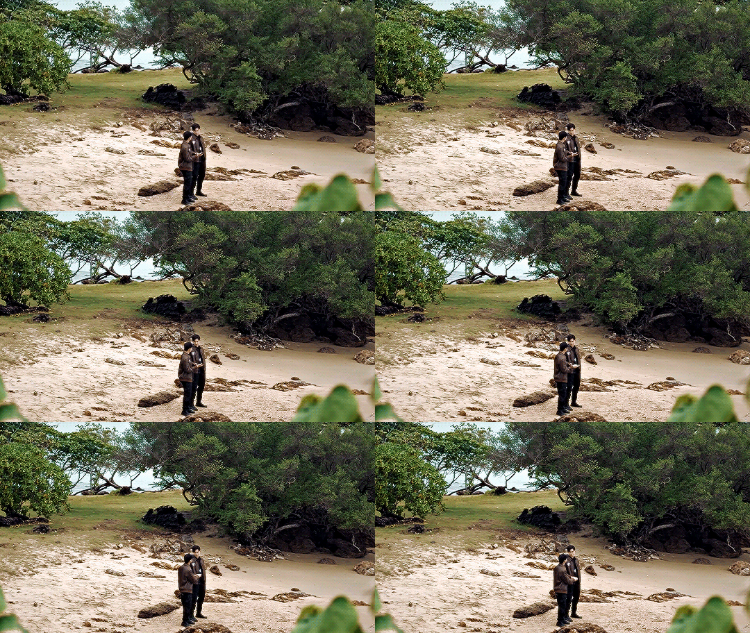
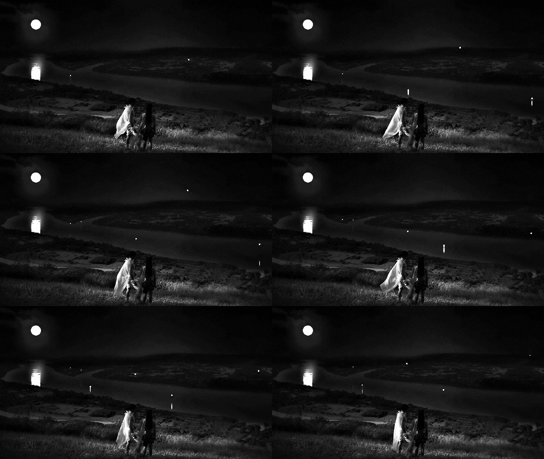

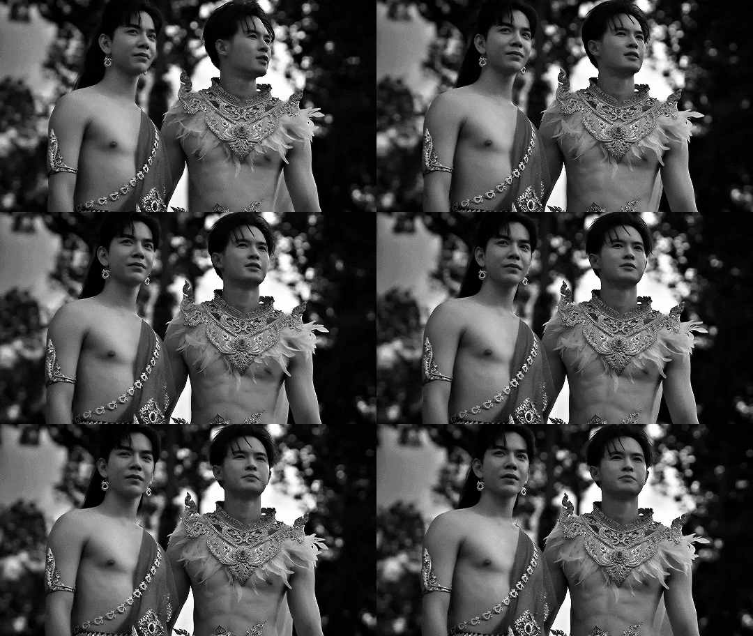

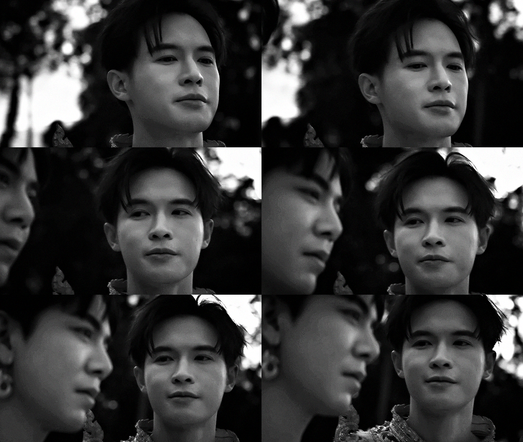
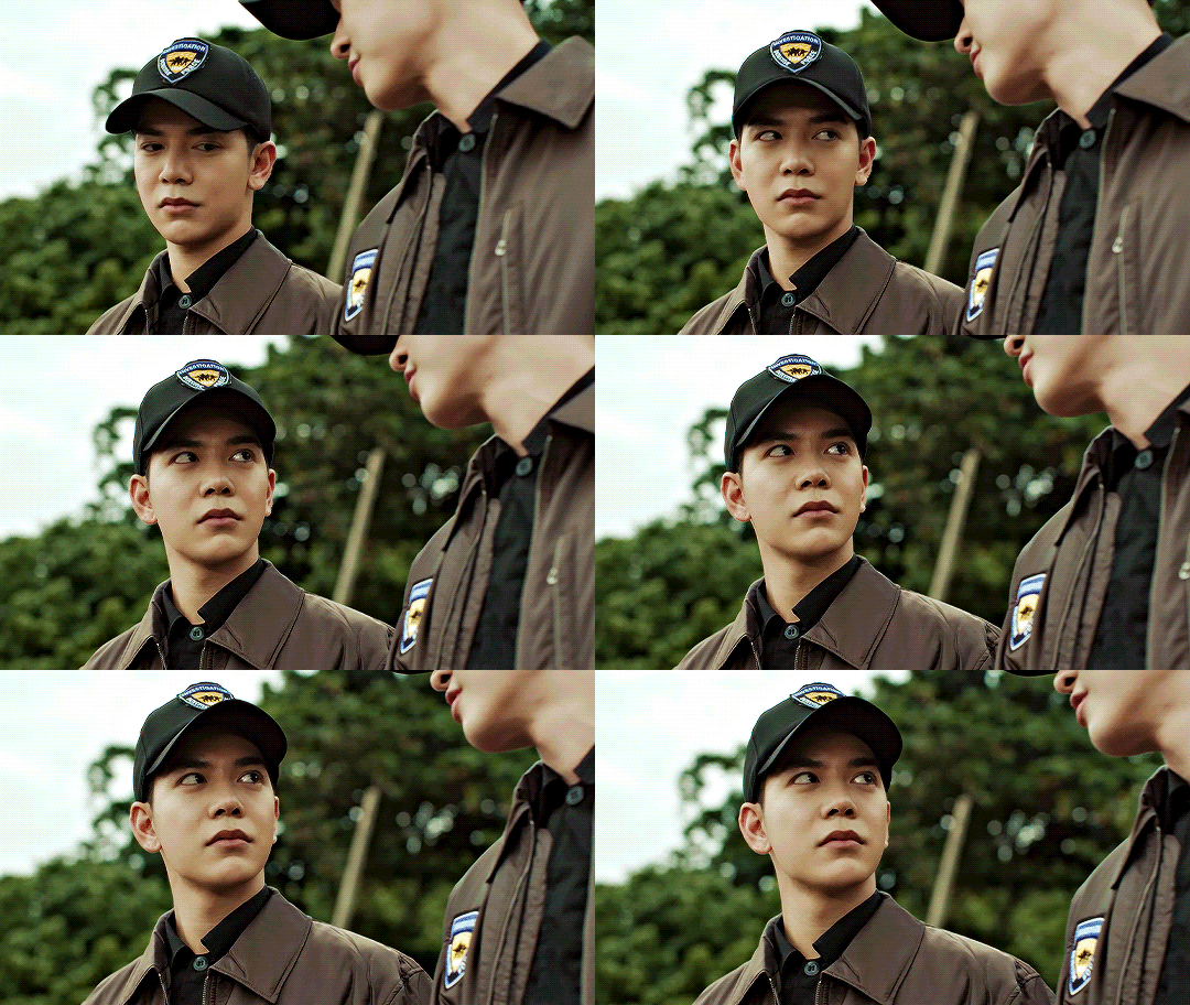
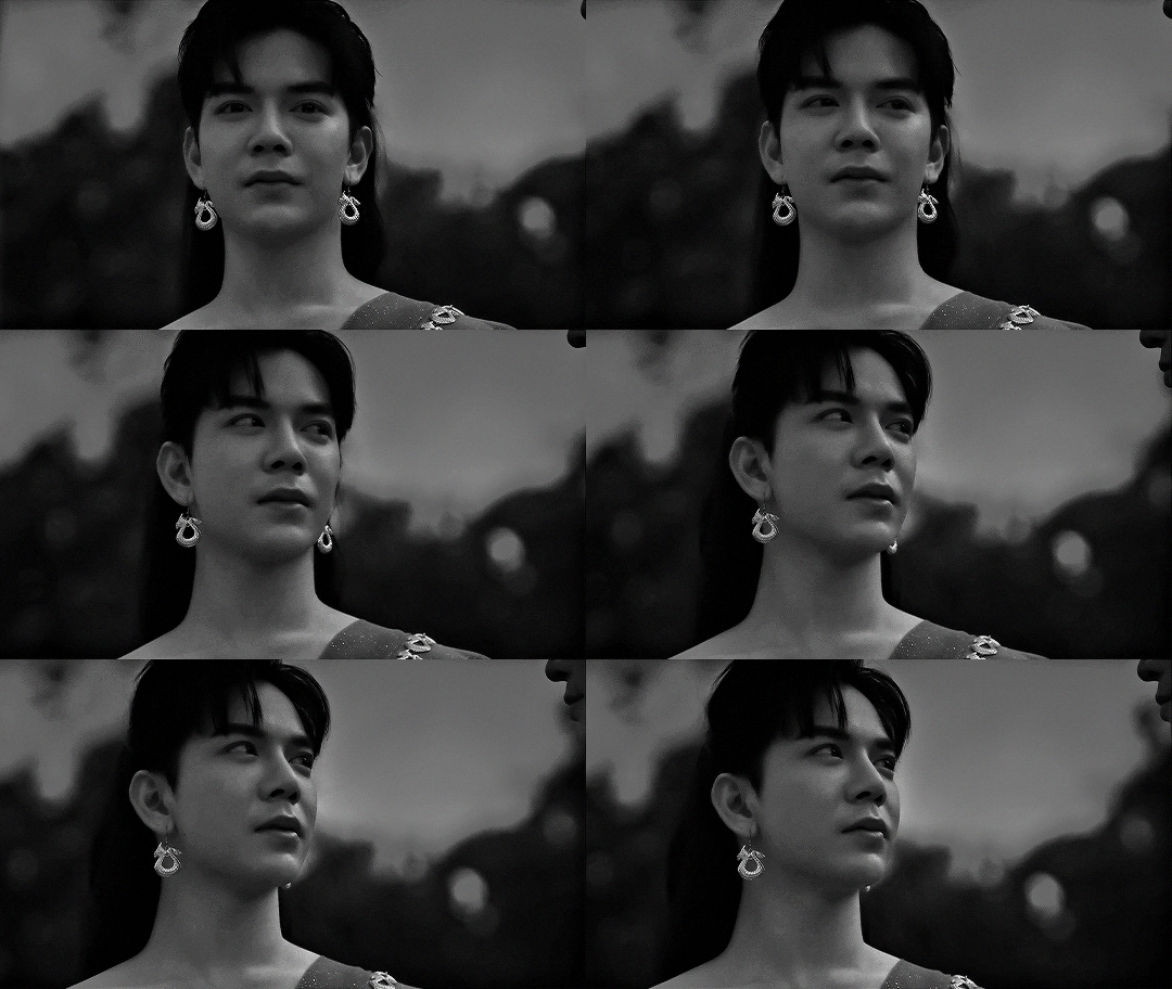

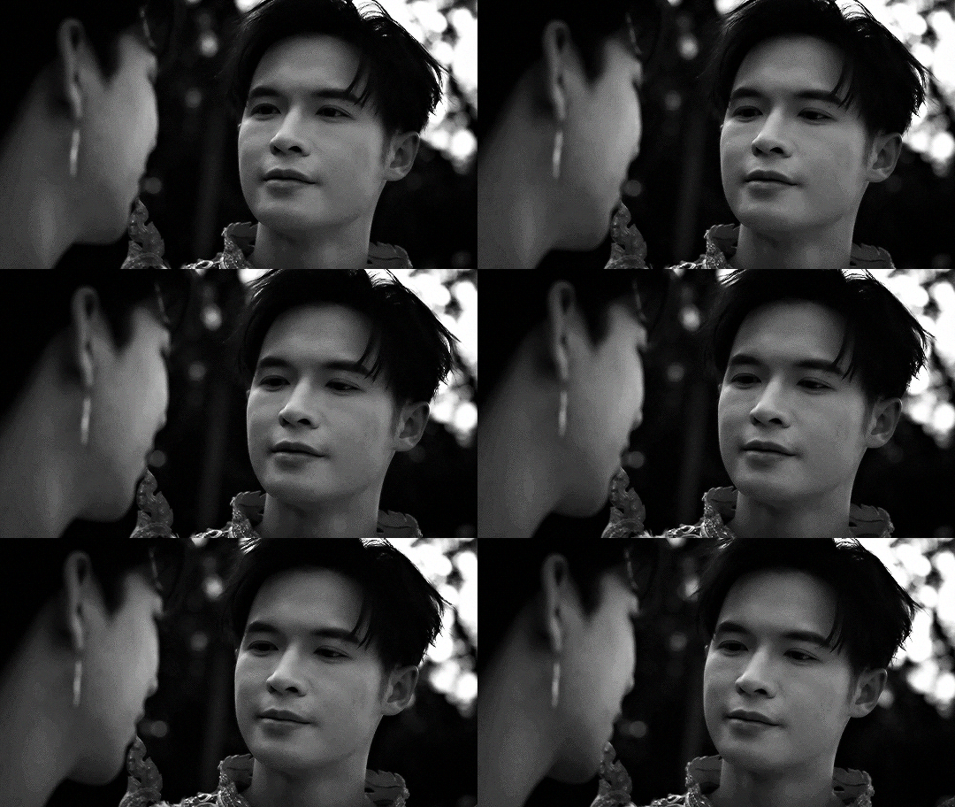
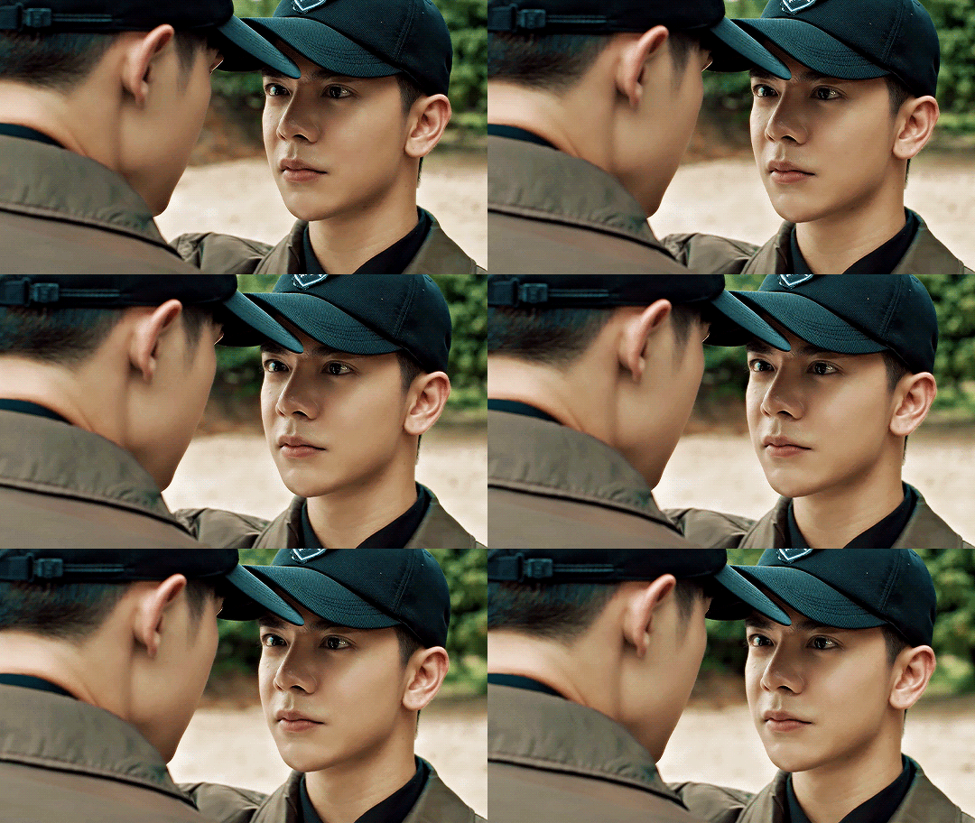
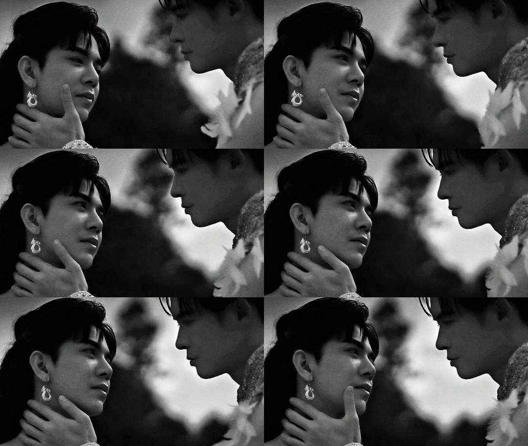
So you're telling me that the reason I have you in this life is because we made a commitment in our past lives?
#the sign#the sign the series#phayatharn#billybabe#asianlgbtqdramas#asiandramanet#userdramas#boyslovesource#userpharawee#userspicy#uservix#usergooseras#tobelle#*#*the sign#making the flashback scenes black and white was a stylistic choice and definitely NOT because i suck at coloring!!
293 notes
·
View notes
Text
There's going to be a lot of tragedy in SOTR, but everyone is forgetting the fashion tragedy that will befall our D12 tributes:

#hey the movies will have an easy job of this since their capitol clothes suck#sotr#the hunger games#also this is why i don't think tigris is going to be haymitch's stylist#if she is suzanne is retconning it to connect things
30 notes
·
View notes
Text
you know allikatnya's videos are kind of regarded with this nostalgic love but i also do think they are just unironically really well done. they have a great grasp of pans, cuts, and static images to save energy for scenes that need a lot of animation. if warrior cats animation was a film class i would make everyone study them.
#rewatched gravity of love for reference purposes#and got sucked down the hole of rewatching everything#the stylistic choice of irl backgrounds is also just like. iconic. really well done#makes the amvs stand out even more AND saves time#like genuinely you dont need fancy effects or anything for a good amv#just well timed pans and cuts can absolutely elevate your work
39 notes
·
View notes
Text

Eavesdropping
(timelapse + notes under the cut)
soo this was actually meant to be part of a comic but i wound up just illustrating this part on its own and had a blast trying out a new lineart style and coloring all the dramatic lighting. the comic was about amity willow and gus talking about staging some kind of intervention for luz and hunter bc of their Concerning Behavior, meaninwhile cut to luz and hunter had been having a fun chat on the roof about how shitty they feel, who have now been interuppted and are awkwardly listening in. wonderful times. anyways i actually dont hate this piece shocker. lets hope it doesnt look super weird after i post <3
also im trying out smthn new and posting my timelapses! a sneak peak into my weirdass art process! i couldn’t figure out which style i wanted this piece in hence the weird back and forth at the beginning lol
#the background is kinda sparse but i feel like if i added more details it would look stylistically weird???#and also im just shit at backgrounds lol. need to work on that#anyways. this will probably be the last art piece i post for a While#now that classes are sucking up all my free time#woohoo i love switching to a major thats 10x more difficult what is wrong with me <3 (i say like i don't fucking love it)#anyways please pray for me. and the kiddos too theyre going through it rip luz and hunter#the owl house#toh#toh fanart#luz noceda#amity blight#willow park#hunter toh#gus porter#lilac art#god luzs face is still bothering meeeeeeeeeeeeee#whatever its fine i dont wanna look at it anymore a bitch is tired#anyways. this is an excuse for more luz+hunter suicide pact moments <3#image id included#image id in alt text
30 notes
·
View notes
Text
Someone new to ARK: but the dinosaurs are inaccurate :c A giant spider? That's unrealistic, even for a show about humans and dinosaurs. Just seems weird.
Me, Being Very Normal About Lore I Cannot Share Without Spoilers: Yes, That Is On Purpose. Trust Me, It Is By Design. Just Have Patience.
#i promise its not ALL stylistic suck in action re realism#there is a reason and we just aren't there yet#ark#ark survival evolved#ark animated series#ark survival animated series#ark tas
11 notes
·
View notes
Text
i hope everyone else is having a great new year's eve, because i surely am not

#i feel like all this time inactive did a significant damage to my stylistic skills#i've been trying to draw something even just a small sketch to celebrate the new year#and everything comes out awful#at this point its no use no matter how i try#the creativity drain doesn't help either#every idea i have ends up discarded eventually#maybe eventually i'll figure something out but it sucks being so bad at something i remember having so much fun doing#i know i must practice to keep it good but i just wish i still got it#crepe talks#vent-ish#might delete later
13 notes
·
View notes
Text

This episode of Bluey is called unsupervised internet access
0 notes
Text
This attempt to grow slightly longer hair is really destroying my will to go on. I think I'll just bring a picture of Tintin to my next appointment.
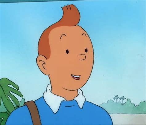
This is a good choice because there's no hair touching Tintin's face & annoying the living shit out of him all day long.
#my hair has been super short since the early 90s and it is TOO LATE to go back#my stylist can suck it I am never listening to her again#she keeps trying to get me to grow my hair out#and I keep falling for her bullshit#she's like Lucy with the football except the football is my smooth sleek head & untickled face
8 notes
·
View notes
Text
another thing that i hate about the ROR designs is that for all the young villains-they all look-modern-everyone is designed to be in the same era when thats not the case! if Chloe and Red go back in the past when their parents/the villains were teens-it should be like-the 80s at the very LEAST!!! like half of those fukin villains shouldnt be in school together anyway becuase HADES IS A 1000+ YEAR OLD GOD FROM THE OLD GREEK AGE, Maleficent is like-from the middle ages!!!! they shouldn't be teens together, and oh FG WAS AN OLD LADY WHEN SHE MET CINDERELLAAAAA at the very least, if you're going to put time travel in a movie, DESIGN UR OUTFITS APPROPRIATELY. the teen villains all look like teens of the 2020s! they should look, older than that!
#rant#rise of red rant#GOD the fucking costume department for this movie sucks ass#Theres no love in this movie#not a lick of love from the producers the director the stylists#nothing#it feels cheap looks cheap sounds cheap#that preview looked like it was recorded on a freaking phone#which phone recordings can look amazing#BUT THIS IS DISNEYS DESCENDANTS#it had 3 sucessful movies!#tehre was budget and they refused to use it!#i bet they didnt even get the Auradon prep castle again
35 notes
·
View notes
Text
also to add to that HER EYES ARE SO SCARY!?? how did d*sney manage to fuck up so bad they made mirabel scary? FUCKING MIRABEL LIKE !??
look at the difference💀
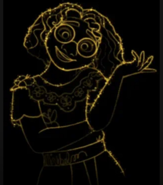
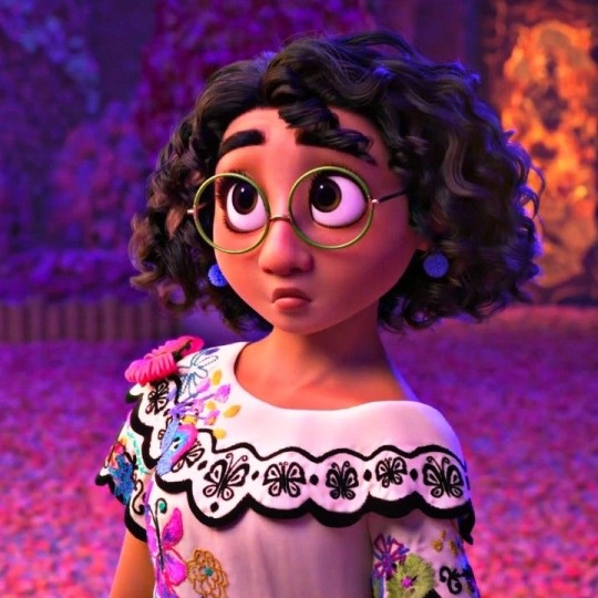
my god they never do her justice! “It’s a different art style” ok but explain why she has murder in her eyes then
#encanto#encanto disney#disneys encanto#mirabel madrigal#mirabel encanto#yes I know the obvious ‘it’s stylistic’ but they could stylise the eyes so it’s not FNAF night 4!??#I wanna try do something like that now#poor mirabel she’s stuck in that pose for LIFEEEE#disney’s encanto#yes I’m getting overly passionate over a 2 second clip of end credits why do u ask?#no but that’s like not mirabel idk who she is maybe she sucked her soul#anyways another reason why w*sh sucks ig#this is all like lighthearted btw#I always feel like I need to clarify because I speak too literally#ok so to add to the evergrowing list of shit I wanna draw we have sparkly magic mirabel without nightmare fuel
32 notes
·
View notes