#stripes doing shit
Explore tagged Tumblr posts
Text
gonna draw my favorite poly (texcalhoma) cause I can
you guys choose poses please :3

#wttsh#wttt#stripes doing shit#wttsh oklahoma#wttt oklahoma#wttsh texas#wttt california#wttsh california#wttt texas
23 notes
·
View notes
Text
ohoho yes I do-
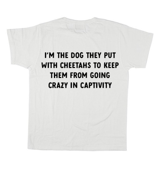
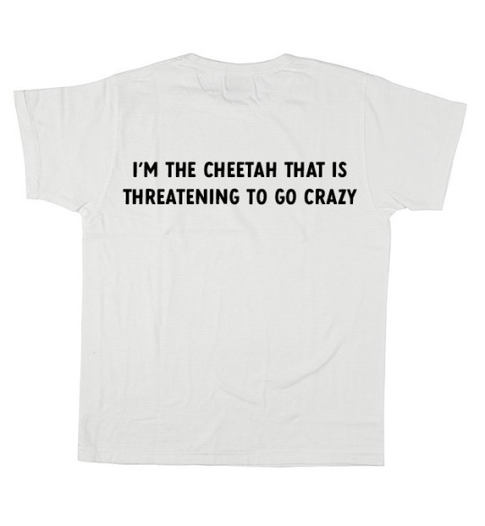
couple’s t-shirt idea
#hehehehe#I have atleast two days of nothing to do till I can get more paint#and I have p l a n s#I have been a bit inactive in the fandom for my taste soo-#hehehhe#stripes doing shit
108K notes
·
View notes
Note
Do yoy like their silly little dance
the inside of my brain at any given moment:

#twisted wonderland#twisted wonderland spoilers#stage in playful land#stage in playfulland#gif warning#gifs that bop along to your music warning#gidel is SO little#look at him compared to everyone else!#three apples tall!#i could put him in my pocket and still have space to pack him a lunch#this rhythmic is so silly. i love when we get a cutesy upbeat rhythmic right before everything goes straight to shit.#fellow and gidel: (dance around all cutely and throw confetti)#fellow and gidel: anyway now it's time to sell you#just the most adorable little kidnappers 🩷#so glad they made an official gidel chibi because otherwise i would have tried to and it would not have ended well#i'm trying to do a meleanor right now and she is giving me enough trouble. she doesn't even have any STRIPES.#do you think the riggers got handed the designs for this event with all the stripes and swirlies and patches and patterns#and just had to go stare at a wall for an hour or two#'okay look people are going to see this on a small screen with a rhythm game going on in the foreground'#'nobody is going to take a high-res screen recording and then go through it frame-by-frame to scrutinize our rigging breakdowns'#'what kind of HUGE NERD do you think plays this stupid game'#(shifty eyes)
1K notes
·
View notes
Text


Real smooth
#my art#sonadow#sonic#sonic the hedgehog#shadow the hedgehog#fav#DUMBASSES GOT CAUGHT IN A THUNDERSTORM#backgrounds? never heard of her#WHAT YOUR ASKING WHY SONICS QUILLS AND EYES CHANGE COLOR EVER 5 SECONDS IDK ASK HIM YOURSELF#xddd#lmao how do you like my super awesome sound effects omggg#SHIT I FORGOT SHADOWS RED STRIPES ON HIS ARMS AND LEGS IN THE FIRST PANEL NOOO HES NAKED
296 notes
·
View notes
Text

#lurantis#yes their eyes are a little weird and spotty but you really can't blame me at this point when i'm doing my damn best at this shit#lurantis is like. one of my favorite pokémon. cool pink fucking bug with big talons and striped pants. that's fucking epic. i love their#color scheme and everything. so obviously i would have tried to make it look as good as possible#but!!!! y'know!!!!! it's fine!!!!!!!!!!#edited like half a year later: it's better now
273 notes
·
View notes
Text
didn't dan stop saying 'what can i say' after he saw that compilation. i fear for the lives of the outfits about to be roasted
#the gray jumperTHE STRIPED SWEATERRR#WHAT ARE WE DOING HERE#but then again he also said he wanted to stop giving a fuck and enjoy life or something#and also he's a grown man bla bla#idk im just saying shit cause im procrastinating on going to sleep#dan howell#phil lester#dnp#dan and phil#phan#fandometrics the bit the legacy etc etc#dnposting#watch him not even be in the video
104 notes
·
View notes
Text

★unjuraka, poppe the clown★
CW: minor blood, axe. all poorly drawn.


#★..I am#I am so confused as to how to accurately design his costume#I know it's a me issue— but the stripes are a little too many#and I am having trouble with em.#y'know what I'm also struggling to draw correctly??#props#props. that's it.#they sometimes look inconsistent and wobbly— when I'm drawing a weapon the hilt will just be stable on the one end#and I draw the other all..yeergh#almost as if it's misplaced and shit#..well it can't be seen here I guess. I dunno.#..Ggogle how do you draw blood accurately on traditional art without destroying the drawing#pretty sure an axe has more blood on it after it gets swung to strike someone.#..will work on improving that in the future.★#ptp#popee the performer#popee the ぱフォーマー#ptp popee#popee the clown#ptp fanart#popee the performer fanart#pen art#pen doodle#pen sketch#cw blood#cw weapon#★steren's art★
33 notes
·
View notes
Text
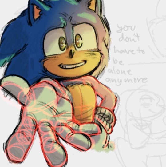

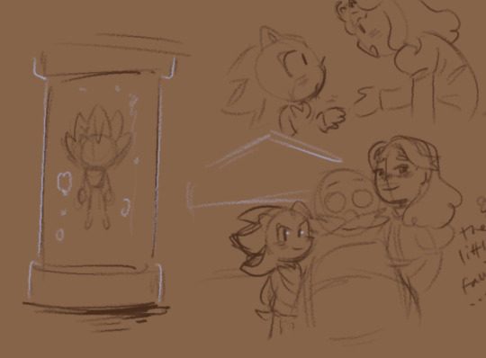


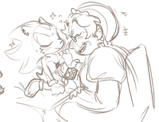

DOODELS
#my art#tryignt o do sm shit help i wanma draw and finish things so baddd#the brown sketches r me crying @ the phrase 'to be loved is to be changed' i wanna make a sad emo angsty comic abt shadows loss and pain an#still endong up with a happy life bc. 🧍♂️ fuck i want that for myself too#THE 2NDD... MY SKY PIRATE GRANDMA MARIA AU 🫶🫶🫶🫶 basically shes super inspired by dola from castle in thsky lol#shes putting makeup on shad bc hes going on his first date ever....#in his 50yr immortal ish ageless life hes going on a date and maria will damn sure make sure hes gonna have a nice one#ehehehe guess whos hes going on a date w....👁👁(obvious)#uhhhh the cat is just older blaze leik burnin blaze inspired by her concept art#one of her hair styles is like fire and im like. thats fuckin cool!!#sHE GETS STRIPED AND GETS FWUFFY WHEN SHES OLDER bc i think its kyut 🫶#makes her related to big the cat ehehehe alt dimension shit or smhtn idk im not thinking anymore#oh fuck i forgot to tag the charas#sonic the hedgehog#maria robotnik#eggman#shadow the hedgehog#blaze the cat#amy rose#sonic chao#uhhh it uink thqts it#sowowiwjekwo#sowwy its a mess
824 notes
·
View notes
Text
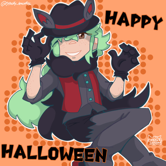
bringing zoroark suit N back for halloween!
#oogh. posting this late cuz i got called into work and then had to get ready for tricking and treating right after#i may be too old for such affairs but. i'm curious to see how long i can do it before people refuse to give me candy#anyways i made a couple changes to the outfit here#i do kinda wanna redesign it at some point to make it look less like hilbert's mightyena suit#oh shit i forgot the stripes. whatever#pokemon#pokemon black and white#n harmonia#pokemon bw#pokemon n#natural harmonia gropius#my art lol#zoroark#halloween#gengar's cool art
84 notes
·
View notes
Text
I am in desperate need of gay cowboys
give me caltexhoma content PLAES
gimmi them being muah
I BEG
#it get boring being the only one making stuff ._.#wttt#wttsh#stripes doing shit#wttsh oklahoma#wttt oklahoma#wttsh texas#wttt texas#wttt california#wttsh california
18 notes
·
View notes
Text
Hey, hey, I just wanna pop in here real fast and say that I've just discovered the funniest fucking trans head canons/aus, and that's the Teenaged Mutant Ninja Turtles trans head canons/aus where they have no fucking clue that they're trans because Splinter doesn't know turtle anatomy.
It's the best. Holy shit. It's hilarious dog. They're so fucking stupid, it's great. This is my new favorite thing. They just find out one day that they've actually been trans this whole time because their Dad just assumed all of them were male. But surprise bitch! One/all/whatever of your sons actually had XX chromosomes the whole time!!
This is like... assigned cis at birth lmao
This is fantastic
#hooooly shitballs its so funny#these are officially the best coming out stories ever#imagine having to come out as trans to yourself#im in love. these are hilarious#no one knows shit about turtle anatomy its amazing#hey shout out to rottmnt for giving all the boys concave plastrons and Leo non fading red stripes#cause thats all supposed to be XX chromosome linked .. so like rottmnt said trans rights#bam! all the tmnt are trans now. they just don't know lmfao#rottmnt said trans rights and it also said that splinter is stupid and i support both of those statements wholeheartedly#rottmnt#tmnt#trans rights#turtle power = trans power????#anyway im still on my tmnt bullshit fyi#(aw fuck i fucked up my tags. the boys got NON concave plastrons cause their abs do be ab-ing#(and thats the xx linked trait not the other way around)#(turns out that i too do not know turtle anatomy. it do be like that folks. i do be stupid but that aint new lmfao)
108 notes
·
View notes
Text
Zoro 🐯 Process:
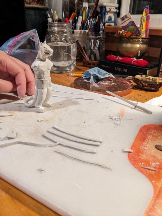
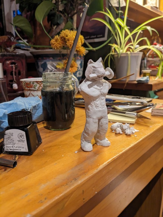
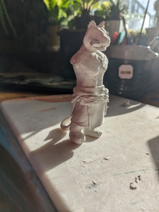
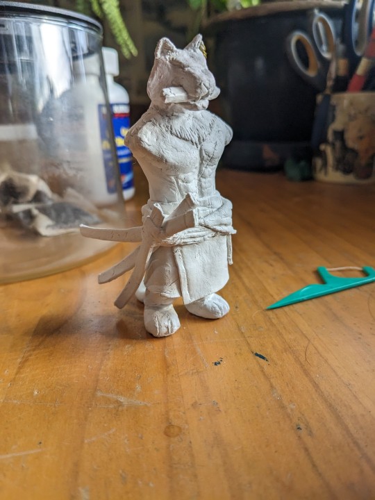
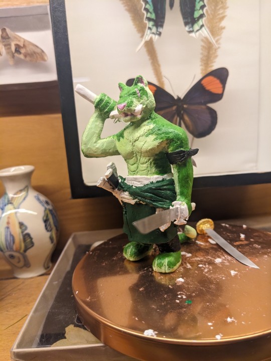
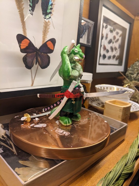
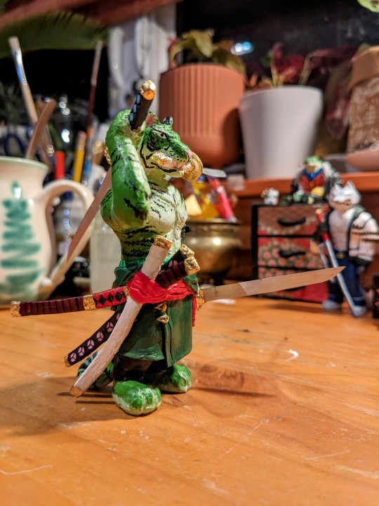
Commentary below:
Notes:
One of the first attempts at sculpting the boy; the head was later altered quite a bit and the legs entirely scrapped, and the torso bulked up shaking my shoulders feverishly: we need to properly represent his 110 cm bust and what we have isn't cutting it. Scabbards were made (which survived till the end!) and the original clay swords were made by this point.
New torso and legs give (hallelujah), as well as the loops and holes for the ears (such finicky small work, fuck me) were made. Holes were first made with straight wire and dried before the hoops were gently (and with swearing) inserted through.
Clothes added, also with swearing as the clay dried and stiffened faster then I wanted to and made it hard to get nice folds. Scarf was re-made and smoothed later.
Scabbards added! Immediately drops it and breaks a piece of it off. I've glued multiple bits of the scabbards back on the flimsy bastards. He remained armless for a good while. A Venus on the shelf by my desk...
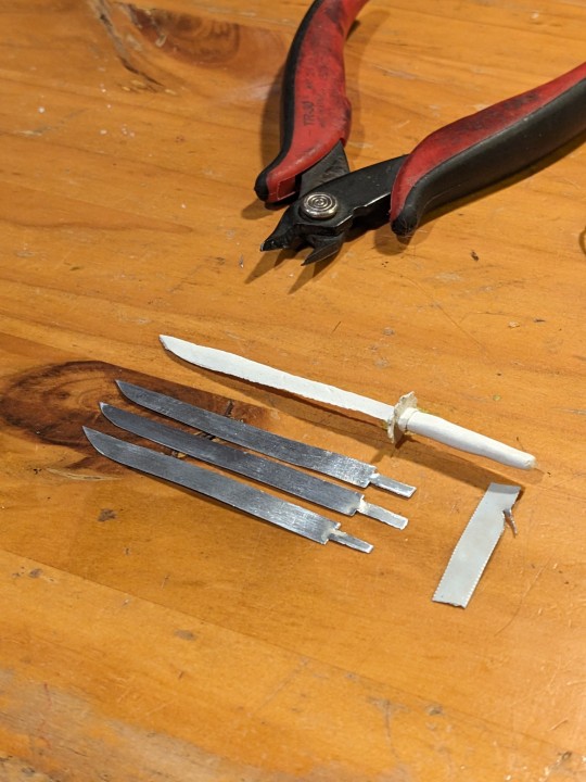
Because the clay sword (after a good hour of tender focused work) would IMMEDIATELY would break upon the lightest touch, annoying me to no end, one evening was like God I wish I had actual metal to use instead wouldn't that be cool, and then was like OH! I COULD DO THAT! So the metal is actually cut from the tin of a cat food can, straightened and sanded., as seen in photo!
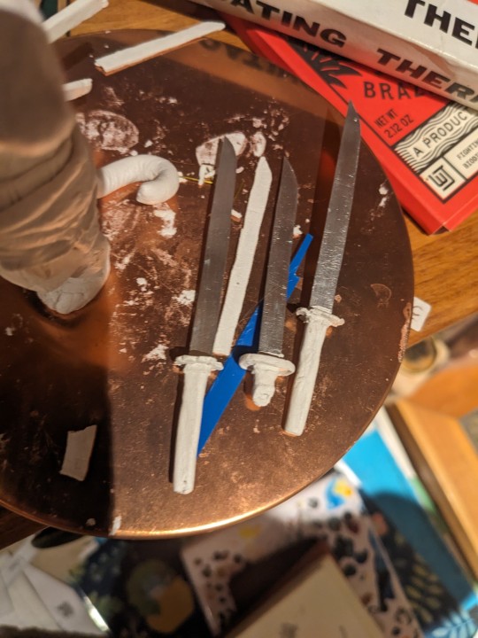
The blades hilted, before placed in capable hands
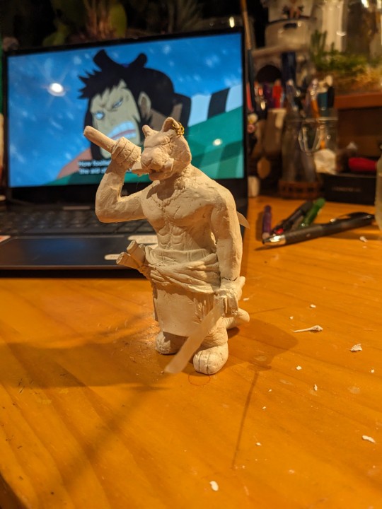
ARMS! and the sculpting is finished. Onto painting!
First layers of paint on various parts; I generally paint via colours I'm using at the moment (ie, greens in this instance)
More layers laid down. I generally go for shading in rules of three (main colour, lighter, and darker hues) and apply them at different opacity of acrylic. Adjusted the green since I found it too pungent. Once the fur tones were finished I gave him his stripes (cue me searching up loads of photos of tigers and tiger fursonas to see how people have done the stripes. Did you know depending on the area they are from they have different face shapes and stripe patterns? Fascinating stuff)
Finished project! Last layers, and highlights where added, adjusted the eye and fuck-ups re-adjusted. Dropped and had to reglue things. The gold is actual gold leaf I applied using a glue you paint on but that was a bit of a whole mess and took a long time, and doesn't go on very flat on very not-flat surfaces... (Who would have thought...) In the future may instead use gold paints for metallics.
Here's also the link to the post of more photos of him finished!
#one piece zoro#roronoa zoro#zoro#op zoro#zoro figure#op figures#hugin scribbles#hugin sculpts#hugin wip#op fanart#one piece#furry art#anthro#furry#tiger zoro#not sure if people find this interesting but i do so. BEHOLD MY PROCESS#i have like zero knowledge on actual sculpting of figures. i just do it and go well. sure that works#should watch some doll making vids or something to pick up better techniques. hm#theres something so clean and nice about the non+painted versions. pure#god when i firsy put down the green i was like. oh this looks SO much like someones unrealistic lime green tiger fursona#muting the tones a bit helped with that. and the stripes#was a bit annoyed with the stripes at first cause i was like oh no thats too realistic but i think it looks good that way#not pictured is me swearing while working on his fucking earrings#theyre brass wire with the caly and holy shit the clay is so finicky when its that small. the length of time it took to do them.#did them like three times separately and then also LOST ONE and then had to also apply the adhesive for the gold foil and the gold foil#never again for something that small.#but at the same time oooo fuck yeah onto the next project. that hopefully WONT take me like 8 fucking months
29 notes
·
View notes
Text
youtube
Such a good video I found from Paul and Artie's 1982 tour of Japan!!
#the only reason i found this was because i had a VPN with my location set to Japan#this vid was uploaded like a month ago#i search for s&g and paul interviews i havent seen MULTIPLE times a day but youtube cant fathom putting this in my recommended??#i thought maybe it wasnt recommended to me before because it was blocked in countries outside of japan or smth#but no its perfectly visible in my country and the youtube algorithm is just useless as all hell#anyway theyre really cute in this#and i must say this is the only time ive seen paul being filmed at his eye level#and artie being filmed from a low angle because i suppose he's very tall by japanese standards#that was really funny to me#betcha paul was loving the feeling of being average height for once lmao#the interview is so sweet as well and i feel artie was REALLY flirting with the interviewer#how many striped shirts does paul simon own???#“paul was the funniest person i ever met” “artie was a good first-baseman” oH MY GOD PAUL#being zoomed in on artie while paul was doing some weird shit was criminal tho#baseball charade i presume#theyre so not normal#simon and garfunkel#simon & garfunkel#s&g#paul simon#art garfunkel#paul simon 80s#Youtube
19 notes
·
View notes
Text

Look at my Yuri Manga boy cosplay
#my fayce#i am doing dumb shit idk#i dont have any yuri manga sorry i hope this copy of madoka given to me by the girl i was in love with in college is good enough#sorry my only vest is striped its too many stripes#silver thread#alicia wilkershire
26 notes
·
View notes
Text
i’ve stopped expecting interesting animation from bones. the star and stripe fight is cool but like every other fight/moment in mha, it’s only cool bc the source material itself is cool; bones does nothing to elevate the manga
they rarely try to experiment with colour and style. i saw so many colourings of the moment star and stripe made a giant version of herself out of the air; people made her look like a cosmos, like it reflected and bent the sky around her, doing so many inventive things and for the anime to just make her an outline against that godforsaken sky? i’m disappointed
but people will take me saying i’m disappointed and spin it to me saying the fight was bad. it wasn’t, just like most fights and moments in the anime aren’t bad but that’s all bc horikoshi knows how to draw. they never do anything beyond that; they never try and adapt it. whether it’s bc of time, direction, budget, or what have you, they will never do something truly inventive with their colouring
i’ve said this before and i��ll say it again, it’s not just that the sky is blue; it’s what the blue sky represents and that is an unwillingness to broaden their colour palette or atmosphere to support the changes in the tone of the story. the story isn’t just “will midoriya get into his dream high school and achieve his dream job?” it’s child abuse and societal systems and their dysfunctions, it’s racism and morality and is it right to try and save someone who’s determined to destroy the world just bc they are also a victim?
look at the finale of atla, a show that mirrors the narrative tone of mha; it starts out bright and colourful and vibrant to match the happy and small stakes nature of the story and as the tone of the story changes, the environment changes to reflect that. the siege of the north pole? everything goes blood red when the moon spirit is threatened, then goes completely desaturated when it is killed with only fire bending having any colour. the day of black sun? uses a solar eclipse to change the lighting. the entire sozin’s comet fight? has red skies and lighting to show the threat
bones abject refusal to change anything about the art itself is a detriment to horikoshi’s complex narrative
#its not just about the colour of the sky#lets get that straight#we’re doing some real the curtains arent just blue shit here so keep up#colour and lighting are a very deliberate choice in any visual medium#and choosing to ignore it and not take advantage of it will just be a detriment to whatever youre creating#i see so many colourings of manga panels where they do insane things and really do next level colourings#and to then see the anime that has so much money and talent behind it just for it to be flat and emotionless with no atmosphere?#it sucks#when you can pick out a scene from something called the WAR ARC and it looks the same as the sports festival arc? come on#and i know theres more to making a scene out of a panel then there is to colouring one#but when these indie creators doing visually gorgeous colourings its hard not to feel like the anime is lacking#and when your colours are flat and your camera angles are uninteresting then what is the point of an anime adaptation#even if they do change things here and there like the endeavour v hood fight or all might v afo#it doesnt change that the majority of the time its the exact same#and when the storm eventually comes round? that wont satisfy me either enless they change the colors of everything as well to be desaturate#and fully embrace the new atmosphere that horikoshi has very deliberately drawn#class a v deku is the one time they did a sustained colour difference and theres a reason that went over so well#coming out of my cage and ive been doing just fine.txt#go beyond plus ultra#mha#bnha#my hero academia#boku no hero academia#star and stripe#shigaraki tomura#izuku midoriya#bakugou katsuki#save post
21 notes
·
View notes
Text
Gero and Scars
MarriageToxin Theory Time: Gero is horribly scarred. Specifically, on his torso.
Let's explore this:
>>Already has a facial scar

Gero is a bit unique among romcom protagonists for having a visible facial scar. And that one looks CHEMICAL. We know that Gero's upbringing was rough--was it due to his harsh poison training? If so, there's no way that treatment didn't leave other lasting marks elsewhere on his body.
>>Clothing as cover
Through the series so far, Gero tends to hide his body. He's shy to begin with, leaping away from nudity (with Kinosaki in chp 1, and with Ushio chp 91). But this also applies to himself as well. Gero is largely conservative about his own clothing.
He wears big, baggy clothes. Never goes anywhere without his coat either (although the character profile notes this is due to his job--lots of poison compounds hiding under there). It's relevant to note that we haven't seen him shirtless yet, despite other male characters (Sound User, Ushio's gym-obsessed uncle) stripping down.


Furthermore, when on the Ocean date with Himekawa, Gero wears a FULL WETSUIT. He really covers as much of his body as possible.


>>Hesitance around physical intimacy
Although this is a smaller point, it could perhaps be relevant. We know that Gero is very anxious about touch. Over the course of lots of character development he's become much more comfortable (such as being on Arashiyama's lap) with it, but in early chapters he used to physically flinch away and duck out of reach (Kinosaki, Ureshino). This could hint at a deeper discomfort with touch and physical intimacy--maybe he's subconsciously afraid of what people might 'discover' if they get too close.


>>All for the family
We have heard Gero speak about his childhood upbringing, and it was not a happy one.


The Poison Clan has no problem abusing their children if it means competent heirs. We see 'sensei' hitting him to the point of internal injury. And we also see him as an older boy, trembling as he works with chemicals.


Furthermore, when it comes to facial scars, his cousin Teruaki has one as well, at one eyebrow. It runs in the family, being a trauma that leaves marks both seen and unseen. Come to think of it, it's a bit strange that his sister Akari doesn't have one? If she does, where is it? I swear to god if that was because of some twisted sexist reason like 'don't ruin the girl's face so we can marry her off' ughhh Either way, in the Gero clan, there's no way you get out unscathed. Literally.
>>Survivor of a death game


This has not been fully elaborated on in-canon, but the implications have been fairly strong. The Poison Clan appears to select (or perfect) their heir by having children go through a set of trials. The survivor (?) becomes the official heir. Gero himself refers to this as essentially a death game.


It would be impossible to get out of this kind of Hunger Games without receiving some nasty injuries. Especially given the kinds of chemical substances that these potential heirs may have played with. Not to mention, the scene with him in kimono is the first appearance of that incredibly suspicious scar around Gero's eye, which I suspect may have a dramatic reveal later on. Really, I wouldn't be surprised if his body is littered with scars and/or other chemical burn marks.
What if Gero takes his shirt off and we just see a battlefield.
EDIT: slightly jossed by this counterpoint:
>>Arms


We do see a bit more skin than usual in his cat cafe date! Arashiyama really has a way of loosening him up. Here, the front of Gero's arms are visible, all the way to the mid-biceps. And....there's no scars. No suspicious chemical burns or missing fingertips. Hmm. Maybe he's a miracle heir and managed to avoid all damage except his eye? Or there are scars, just hidden around where the T-shirt covers instead?
#Marriagetoxin#Marriage Toxin#gero hikaru#why do I always post my theories a few days before chapter drops smh#yknow this reminds me of yakuza tattoo policies#where they specifically tattoo gang members so that wrists and mid-chest stripes are clear#so they can wear normal suits without showing any identifying tattoo ink in regular life#terrifying to see a parallel with the poison clan#so yeah I really headcanon the gero poison family as Absolutely Messed UP#if his eye is the only scar gero has I'm gonna scream#cmon MT authors don't be cowards#also shoutout to pneu on twitter for sharing this headcanon with me#If you saw the preview for next chapter btw No You Didn't <3#marriagetoxin theory#marriagetoxin posting#ALSO HOLY SHIT SORRY FOR IMAGES tumblr won't let me resize things??? someone pls explain to me how#hikaru gero
12 notes
·
View notes