#some of the links and posts in that highlight are already in the tumblr post i linked
Explore tagged Tumblr posts
Text
Since I don’t see anyone talking about the current situation in Valencia (Spain), I figured it could be a good idea to share this here too:
Here’s a post explaining what happened + ways to help:
And here’s a story highlight in my instagram account with more information and ways to donate even outside of Spain:
A lot of information in this story highlight is in spanish because it’s for Spain specifically, but there’re also links to donate from other countries and information in english. I’ll also keep updating this highlight as i keep resharing more posts on instagram. (Y si sois de España, probablemente ya hayáis visto los posts pero podeis pasaros por la destacada igual por si acaso!)
#signal boost#spain#valencia#current events#donations#donate#resources#españa#some of the links and posts in that highlight are already in the tumblr post i linked#but i’ll keep updating it and adding things so i decided to share it too
20 notes
·
View notes
Text
Master-List of Active Detroit: Become Human Writers On Tumblr
(Updated November 22, 2024)
[Update includes the addition of some new names & AO3 but unfortunately the hyperlink is capped, so I still dropped their pseuds and regular links in the list!]
[Colors to indicate my reader checklist have been scrapped; Tumblr tag colors do not show up on mobile, so I have highlighted the AO3 names with the applicable colors.]
New to writing fiction for the fandom, or your name isn't on the list? Comment/Reblog and I will add your name to this post! Note that I am adding writers with fics already up on AO3/Wattpad only, but I will continue to add more as we grow!
Apologies for mass tagging people, but I wanted there to be a list of active DBH Fanfiction writers to make it easier to find each other on here! LINKS TO fanfic source and Tumblr are included!
I also would like readers to take note that EVERY WRITER that I post here will appreciate positive comments on their fic! Even if it's just a heart, emoji, "I enjoyed it", or "Second Kudos", it will MAKE THEIR DAY! Please comment on fics that you enjoyed no matter hold old they are!
Also stats such as Hits, Kudos, or the fact that I have read the fic is in no way a reflection of the quality of the fic! I will put the writers in alphabetical order based on their Tumblr name for organizational purposes!
Also if you wish to be taken off this list, just shoot me a DM and I will do so. It is so awesome that there are not only so many active DBH writers but also - if you made it to this list, that means you haven't blocked me yet, so Kudos to you for that! :D
[Update pending: Will add relationship/family/character tags in a future update on December 5th, 2024. (You can also feel free to comment your fave ship to write about in the replies) Sorry this is just a list of names with any distinguishing of category, but this already took so long, you will just have to try your luck! Please notify if one of or more of the links is wrong/broken; Tumblr has a limit on hyperlinks unfortunately, so for some I had to just drop their pseuds.
Color coding:
Recent - Updated within the past 3 months
Active - Writing for the Fandom (Updated within the last 13 months)
Hiatus - Updated over 13 months ago/Leaving Fandom
??? - 2+ Years Since Last Update/ No Longer Writing for the Fandom, but still replies to comments!!!
[Sometimes I'll mix colors 'cause they wrote recently but are leaving the fandom or something]
[Example of my color system would be:
@kissoflightning because this writer has posted a DBH fic in November, 2024]
Okay, brace yourself for a LONG LIST below the cut!
# - C
Tumblr: @8-rae-rae-8
AO3: emogoose
Tumblr: @a-feral-coffee-enthusiast AO3: Unfortunately_sentient
Tumblr: @aghostinmyownmachine @scribeofred @thewritinggrindstone
AO3: scribeOfRED
Tumblr: @alecthewreck AO3: AlecTheWreck
Tumblr: @andthekitchensinkao3 AO3: andthekitchensink
Tumblr: @angelgirl768 AO3: angelgirl768
Tumblr: @anonymousedward AO3: anonymousEDward
Tumblr: @autiacorart AO3: Autiacora
Tumblr: @archadianskies
AO3: Archaidian_Skies
Tumblr: @astrahannah AO3: AstraHannah
Tumblr: @average-mako-enjoyer
AO3: AverageMakoEnjoyer
Tumblr: @aydaptic AO3: Aydaptic (Fic & Webcomic)
Tumblr: @brokskar AO3: brokskar
Tumblr: @calamity-jc AO3: Calamity_JC
Tumblr: @chaos-thirium AO3: chaos_thirium
Tumblr: @connor-rk800 AO3: thespacebetweenstars
Tumblr: @connor-sent-by-cyberlife @timebird84
AO3: Connor sent by Cyberlife (Timebird84)
Tumblr: @connorboyyy AO3: hereforthegayy
Tumblr: @connorsjorts AO3: connorsjorts
Tumblr: @cptjh-arts (Fic Art) AO3: cptJH
Tumblr: @cryptidblossomd AO3: C0nt0l_cha0s
Tumblr: @changethecircumstances AO3: ChangeTheCircumstances
D-K
Tumblr: @detroitbecomeonline
AO3: TrinityOnline
Tumblr: @discodeviant AO3: DiscoDeviant
Tumblr: @einradi AO3: Einradi
Tumblr: @illegalvampire Wattpad: vampyrl0ser AO3: vampyrl0ser (TBD)
Tumblr: @incomprehensible-phasmid AO3: IncomprehensiblePhasmid
Tumblr: @insignova AO3: Insignova
Tumblr: @fadedflame
AO3: FadedFlame
Tumblr: @fizzlefudge AO3: FizzleFudge
Tumblr: @fumikosushi AO3: FumikoSushi
Tumblr: @gauzyfruitcake AO3: beeayy
Tumblr: @gavinisqueer @listeningboy AO3: ListeningBoy
Tumblr: @gildedfrost-ao3 AO3: GildedFrost
Tumblr: @glxyqst AO3: GLXYQST
Tumblr: @hauntedoneao3 AO3: HauntedOne
Tumblr: @headfulloffantasy
AO3: HeadFullOfFantasy
Tumblr: @hemlockdumpling AO3: Hemlock_Dumpling
Tumblr: @hothotpot
AO3: hothotpot (https://archiveofourown.org/users/hothotpot/pseuds/hothotpot/works?fandom_id=23172234)
Tumblr: @katlakitty AO3: katlakitty
Tumblr: @kamari2038 AO3: kamari2038
Tumblr: @karasgotagun @jazzmckay AO3: karasgotagun (jazzmckay)
Tumblr: @kissoflightning AO3: KissOfLightning
Tumblr: @konami-code-ao3 @alcatrazoutpatient AO3: AlcatrazOutpatient
L-N
Tumblr: @l1av AO3: L1av
Tumblr: @ladydrace
AO3: LadyDrace
Tumblr: @leelany-world AO3: Leelany
Tumblr: @lethotep
AO3: Lethotep
Tumblr: @lilaccadenza AO3: LilacCadenza
Tumblr: @littlehaize AO3: haize
Tumblr: @litoperezito (Webcomic) AO3: LitoPerezito
Tumblr: @lugiadepression
AO3: LugiaDepression
Tumblr: @mangabirdao3 AO3: Manga_bird Wattpad: Manga_bird
Tumblr: @mercilessflowchart AO3: Mercilessflowchart
Tumblr: @moonlitmilo AO3: MoonlitMilo
Tumblr: @mnictasbcl
AO3: mnictasbcl
Tumblr: @my-name-is-markus-with-a-k @unlisshed AO3: Unlisshed
Tumblr: @nartes
AO3: nartes
Tumblr: @negative-citadel AO3: Negative_Citadel
Tumblr: @nock-and-bolt
AO3: Nock_and_Bolt
Tumblr: @nothinggathers AO3: AtropaAzraelle (Polyoxyethylene)
O- S
Tumblr: @peachymilkshakes
AO3: peachienne
Tumblr: @peskellence AO3: peskellence
Tumblr: @r-ate-9
AO3: Kangarooney
Tumblr: @qrjung AO3 : qrjung
Tumblr: @ranunculus-bloom
AO3: Queerapika
Tumblr: @pseudonymmcwriter AO3: PseudonymMcWriter
Tumblr: @rking200
AO3: rking200 (Mawific)
Tumblr: @rk800-is-hot-change-my-mind @spensual AO3: Spensual
Tumblr: @sevdrag
AO3: sevdrag (seventhe)
Tumblr: @shinyportalsandthings AO3: FancyPantsu
Tumblr: @simping-for-kamski AO3: TranscientNight
Tumblr: @sunwarmed-ash AO3: sunwarmed_ash
Tumblr: @sweeteatercat AO3: SweetEaterCat
Tumblr: @systemic-dreams AO3: systemic_dreams
T-Z
Tumblr: @temporary-enthusiasm AO3: TemporaryEnthusiasm
Tumblr: @the-ineffable-wanderer
AO3: KetchupOnToast
Tumblr: @thenookienostradamus AO3: nookienostradamus (https://archiveofourown.org/users/nookienostradamus/pseuds/nookienostradamus/works?fandom_id=23172234)
Tumblr: @titaniumpsychologist
AO3: TitaniumPsychologist (https://archiveofourown.org/users/TitaniumPsychologist )
Tumblr: @veilder AO3: Veilder
Tumblr: @wamblings AO3: ambling
Tumblr: @wyntereyez @wynterscribbles @wyntergamez AO3: wyntereyez
Tumblr: @yayen-chan AO3: yayenchan
Tumblr (Inactive) : @zeliannetascho (Will actively discuss HCs with you in the breakroomDMs Discord server) AO3: ZeliaTascho
#Long post#KOL: Master List#dbh fanfic#dbh fanfic writers#dbh#detroit: become human#detroit become human#PLEASE COMMENT ON WORKS THAT YOU LIKE NO MATTER HOW OLD#links#ao3#dbh fanfiction#KOL#wattpad#writers of tumblr#Detroit Fanfic Master List#dbh fandom#People actively writing DBH Fanfic#archive of our own
311 notes
·
View notes
Text
Oh, you know, just the usual internet browsing experience in the year of 2024

Some links and explanations since I figured it might be useful to some people, and writing down stuff is nice.
First of all, get Firefox. Yes, it has apps for Android/iOS too. It allows more extensions and customization (except the iOS version), it tracks less, the company has a less shitty attitude about things. Currently all the other alternatives are variations of Chromium, which means no matter how degoogled they supposedly are, Google has almost a monopoly on web browsing and that's not great. Basically they can introduce extremely user unfriendly updates and there's nothing forcing them to not do it, and nowhere for people to escape to. Current examples of their suggested updates are disabling/severly limiting adblocks in June 2024, and this great suggestion to force sites to verify "web environment integrity" ("oh you don't run a version of chromium we approve, such as the one that runs working adblocks? no web for you.").
uBlockOrigin - barely needs any explanation but yes, it works. You can whitelist whatever you want to support through displaying ads. You can also easily "adblock" site elements that annoy you. "Please log in" notice that won't go away? Important news tm sidebar that gives you sensory overload? Bye.
Dark Reader - a site you use has no dark mode? Now it has. Fairly customizable, also has some basic options for visually impaired people.
SponsorBlock for YouTube - highlights/skips (you choose) sponsored bits in the videos based on user submissions, and a few other things people often skip ("pls like and subscribe!"). A bit more controversial than normal adblock since the creators get some decent money from this, but also a lot of the big sponsors are kinda scummy and offer inferior product for superior price (or try to sell you a star jpg land ownership in Scotland to become a lord), so hearing an ad for that for the 20th time is kinda annoying. But also some creators make their sponsored segments hilarious.
Privacy Badger (and Ghostery I suppose) - I'm not actually sure how needed these are with uBlock and Firefox set to block any tracking it can, but that's basically what it does. Find someone more educated on this topic than me for more info.
Https Everywhere - I... can't actually find the extension anymore, also Firefox has this as an option in its settings now, so this is probably obsolete, whoops.
Facebook Container - also comes with Firefox by default I think. Keeps FB from snooping around outside of FB. It does that a lot, even if you don't have an account.
WebP / Avif image converter - have you ever saved an image and then discovered you can't view it, because it's WebP/Avif? You can now save it as a jpg.
YouTube Search Fixer - have you noticed that youtube search has been even worse than usual lately, with inserting all those unrelated videos into your search results? This fixes that. Also has an option to force shorts to play in the normal video window.
Consent-O-Matic - automatically rejects cookies/gdpr consent forms. While automated, you might still get a second or two of flashing popups being yeeted.
XKit Rewritten - current most up to date "variation "fork" of XKit I think? Has settings in extension settings instead of an extra tumblr button. As long as you get over the new dash layout current tumblr is kinda fine tbh, so this isn't as important as in the past, but still nice. I mostly use it to hide some visual bloat and mark posts on the dash I've already seen.
YouTube NonStop - do you want to punch youtube every time it pauses a video to check if you're still there? This saves your fists.
uBlacklist - blacklists sites from your search results. Obviously has a lot of different uses, but I use it to hide ai generated stuff from image search results. Here's a site list for that.
Redirect AMP to HTML - redirects links from their amp version to the normal version. Amp link is a version of a site made faster and more accessible for phones by Bing/Google. Good in theory, but lets search engines prefer some pages to others (that don't have an amp version), and afaik takes traffic from the original page too. Here's some more reading about why it's an issue, I don't think I can make a good tl;dr on this.
Also since I used this in the tags, here's some reading about enshittification and why the current mainstream internet/services kinda suck.
#modern internet is great#enshittification#internet browsing#idk how to tag this#but i hope it will help someone#personal#question mark
1K notes
·
View notes
Text
I know a lot of people on qsmpblr use Tumblr mobile, but if you do use browser Tumblr then I would recommend the Simple Translate extension. Because Tumblr doesn't have built in translation like Twitter, there's less fans posting in their native language, instead most people just use English.
Simple Translate is an extension that allows you to translate text that you highlight into a target language. (It uses Google Translate API, but so does Twitter so the translation quality is pretty much the same).
Firefox Extension | Chrome Extension

When you highlight text in another language, a translate icon appears, when you click on it a panel containing the translation of the text appears.

You can also change the settings of the extension so that the translation panel automatically appears when you highlight text in another language.

Here's some more examples using the official QSMP Twitter accounts, you do not need to change the settings of the extension to translate from different languages into your target language.
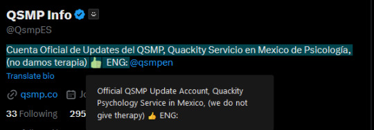
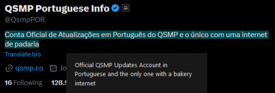

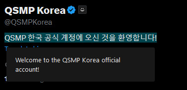
(All of these match the translations given when using the "translate bio" button on Twitter directly.)
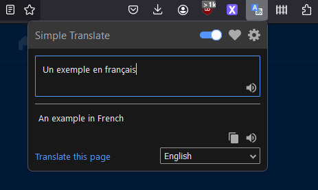
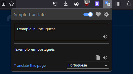
You can also access a translation box using the icon in the toolbar, any text you enter can be translated to the language selected in the drop-down menu (meaning you don't need to open a new tab to use Google Translate).
Some settings explanation and other stuff under the cut. Not super important but I figured I'd add it anyways.

There is an option to use DeepL API as opposed to Google Translate (it's another translation tool, there is free access to the API with a limit of 500,000 characters/month, and a pro version for unlimited access).
Whatever the target language is set as is what text you highlight will be translated into. There is another option for a second target language, I'll explain that further down.
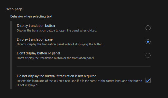
This option changes how you view the translation panel, the first option (default) has the icon appear when you highlight text (as seen in the first image of the post), the second option has the translation panel appear automatically when you highlight text, and the for third option the panel and icon won't automatically appear, but can still be accessed by right-clicking the highlighted text and selecting "translate selected text".
The checkbox below these options means that if the text you're highlighting is already in your target language, the translation icon and panel will not appear, it can again still be accessed by right-clicking what you've highlighted and selecting translate.

This option appears twice, in both the Web-page section (for translating selected text) and the Toolbar Popup section (for the translation box in the toolbar popup).
The web page option, when toggled on, means that when you select text that is in your target language, the translation panel will translate into the second target language that has been selected. If the checkbox for "do not display if translation is not required" is toggled on, you can only view the translation from Target -> 2nd Target by right-clicking to translate selected text.
The toolbar popup version of this option is used to automatically switch the language in the toolbar translation box when you input something in your main target. (ie. second target set to French means that when you input English text in the translation box it will switch the translation setting from "(detect language) -> English" to "English -> French").
There are also settings to change the style and size of the translation button and panel.
Side note: Mixed language messages (not containing your target language) will only translate one of the languages, you can work around this by highlighting the different languages separately.
Links again if you don't want to scroll all the way back up
Firefox Extension | Chrome Extension
#if you use twitter and want to crosspost this feel free#but please link to this post and perhaps paste the post text into the alt text of the screenshot#so people can translate the post text from english to their own language (or honestly feel free to translate it yourself and post that too)#qsmp#qsmpblr#qsmptwt#i think this could also maybe be useful for tweets that arent detected as another language so the translate option doesnt appear?#idk i dont use twt much#idk if anything like this has been posted before tbh#i just enjoy seeing people speaking in their native languages over on qsmptwt and when it occasionally happens here too#and i think itd be pretty cool to see it more on qsmpblr#tiggady tags#also i figure it could be useful translating from english into ur native lang!!! forgot to mention that in the post
790 notes
·
View notes
Text
here's a list of mozilla add-ons for all of you tumblrinas out there to have a better internet experience
also, if you like my post, please reblog it. Tumblr hates links but i had to put them so you adhd bitches actually download them <3 i know because i am also adhd bitches
BASIC STUFF:
AdGuard AdBlocker / uBlock Origin : adguard is a basic adblock and with origin you can also block any other element you want. for example i got rid of the shop menu on tumblr

Privacy Badger : this add on will block trackers. if an element contains a tracker it will give you the option to use it or not
Shinigami Eyes: this will highlight transphobic and trans friendly users and sites using different colors by using a moderated database. perfect to avoid terfs on any social media. i will explain how to use this and other add-ons on android as well under the read more cut
THINGS YOU TUMBLINAS WANT:
Xkit: the best tumblr related add on. with many customizable options, xkit not only enhances your experience from a visual standpoint, but provides some much needed accessibility tools
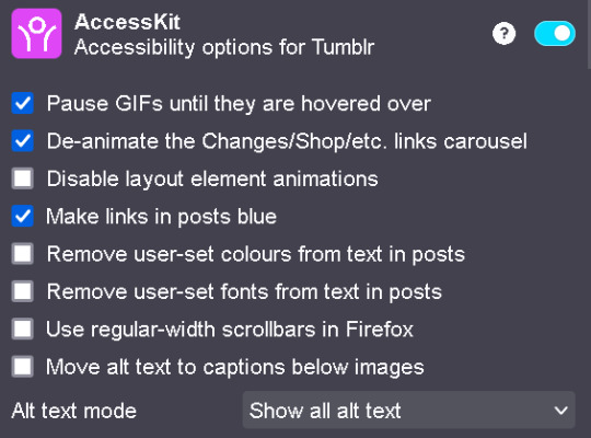

bonus: if you are into tf2 and wanna be a cool cat, you can also get the old version to add cool reblog icons

AO3 enhancer: some basic enhancements including reading time and the ability to block authors and tags
YOUTUBE
Return of the YouTube Dislike : pretty self explanatory
Youtube non-stop: gets rid of the annoying "Video paused. Continue watching?" popup when you have a video in the background
SponsorBlock: gives you options to skip either automatically or manually sponsors, videoclip non music sectors and discloses other type of sponsorships/paid partnerships
Enhancer for YouTube: adds some useful options such as custom play speed, let's you play videos in a window and most important of all, it allows you to make the youtube interface as ugly as your heart desires. I can't show a full image of what it looks like because i've been told its eye strainy and i want this post to be accessible but look at this <3

PocketTube: allows you to organize your subscriptions into groups
YouTube Comment Search: what it says
FINDING STUFF
WayBack Machine: you probably know about this site and definitely should get the add on. this allows you to save pages and access older versions with the click of a button. while you can search wayback using web archives, please get this one as well as it allows you to easily save pages and contribute to the archive.
Web Archives: it allows you to search through multiple archives and search engines including WayBack Machine, Google, Yandex and more.
Search by Image: allows you to reverse image search using multiple search engines (in my experience yandex tends to yield the best results)
Image Search Options: similar to the last one
this next section is pretty niche but... STEAM AND STEAM TRADING
SteamDB: adds some interesting and useful statistics
Augmented Steam: useful info specially for browsing and buying games
TF2 Trade Helper: an absolute godsend, lets you add items in bundles, keeps track of your keys and metal and your recent trades, displays links to the backpack tf page next to users profiles and more. look it tells me how much moneys i have and adds metal to trades without clicking one by one oh may god

IN CONCLUSION: oooooh you want to change to firefox so badly, you want to delete chrome and all the chrome clones that are actually just spyware and use firefox
HOW TO USE MOZILLA ADD-ONS ON YOUR PHONE
if you already use firefox on android, you'll know there are certain add-ons compatible with the app, some of them even being made just for the mobile version such as Video Background Play FIx. while most of them are pretty useful, some more specific ones aren't available on this version of the browser, but there's a way of getting some of them to work
you need to download the firefox nightly app, which is basically the same as the regular firefox browser but with the ability of activating developer mode. you can find how to do that here. once you've enabled it, you need to create a collection with all the add ons you want. i wouldn't recommend adding extensions if the creators haven't talked about phone compatibility, but XKit and Shinigami Eyes should work
also, don't tell the government this secret skater move, but you can try using both the regular firefox browser and nightly so you can have youtube videos in a floating box while you browse social media.
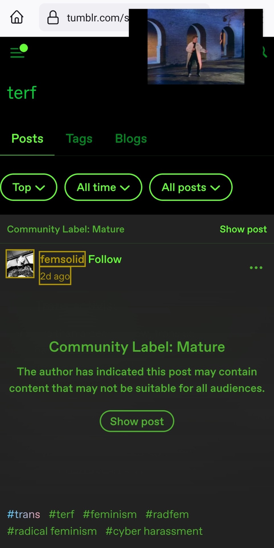
see? i can block this terf while Rick Rolling the people following this tutorial. isn't that tubular?
#zezo talks#firefox#internet safety#accessibility#id in alt text#this will get tagged as tf2 because mine heart desires and its mentioned like twice#tf2#long post#but it's worth it i promise#tumblr
3K notes
·
View notes
Text
The best Bloodborne Wiki is a passion project of a single person, is about to get even better + how it can be sustained for years to come!
Hello guys! So like many of you've learned from the post with super good model view of Winter Lantern, recently, on Twitter, Meph announced ( x ) the plan to fill the wiki with very useful, very comprehensive screenshots of the models for bosses, enemies, NPCs and even cut content! The wiki has already been a huge help for lorediggers and artists, but THIS is what we will get:

This page is for Lady Maria and you can check it yourself here: ( x )! It is broken down in the categories of general close-ups of her model, then very high-quality screenshots of every attack during her boss battle and walking, and then raw model!

(I never was able to capture a good look at her using Arcane too like here, for example!)

Winter Lantern page ( x ) is using similar principle!
This is not a secret that very often in Fromsoft games, additional information can be obtained not through descriptions but through visual hints! For example, some people only learned that Winter Lantern's head is made of melted Messengers only now, after a proper look at her model! So, of course getting a proper look at every single character and creature from the game could always be helpful!
This, however, is just a recent highlight for this Bloodborne Wiki! Even prior that, it has been providing invaluable help for the fans! Examples off the top of my head: comprehensive data on what character has what items used or not, great and comprehensive hints and tutorials on upgrades and farming and builds for the players, making every bit of information on Chalice Dungeons and glyphs easily accessible, making datamined NPC sliders of all characters way more accessible and easy to grab and repeat, access to much more obscure models (like Gratia's model), full list of internal filenames and patches progress, making information from physical Bloodborne tutorial book accessible...
There are probably more things to cover that me and others found a great help in, and sometimes we might not even notice! I am sure many people could name at least one way where this wiki has been very helpful, offering raw facts and 100% valid information (and properly sourced whenever someone else helped!) without any speculating, in the most elaborate manner! We should not take it for granted because all this information, found or reshared, was compiled by just one guy out of raw passion for the game! And although this project is not profit-based and Meph is willing to commit to it and pay as much as needed to keep it living, I really still wanted to share the Ko-fi link that exists for anyone who is willing to help sponsoring it!
This is not necessary, and Meph has stated the same, but this project is not only helpful but also really hefty to sustain. The monthly support is only $3 per month, but every little bit not only helps the sustenance, but also knowing how much fans care and simply feeling their support is very significant and sometimes you don't even know how much. Heck, when Meph learned how excited people on Tumblr were about Wiki improving with full compilation of models from every angle.. the reaction was "I am so glad that people still care"! I think everyone who does their best to be useful for the fellow fans needs confirmation that they ARE, for sure, helping!
I just really wanted to get the word out anyways because honestly, none of my super elaborate theories and detailed fanart would've been possible without Meph's Wiki. and also because I am trapped in a clown country where I can't send any international money transfer so the feeling of 'do what I can't' got to me too fsdhfdhs There is no pressure or necessity, but here is the link to anyone who can help and feels the wish to! You've noticed I didn't tag Meph.... since there is no Tumblr account to tag, but again, the Twitter link is also here: ( x )!
#bloodborne#bloodborne wiki#bloodborne reference#lady maria of the astral clocktower#winter lantern#bloodborne enemies#screenshots#use later#all the models are yet to be added but I've already seen really good cainhurst king models and I am SCREAMING#my ass as an artist has never been safer
243 notes
·
View notes
Text
automattic vs wp engine mastterpost
adrienne's GitHub recap is probably the best place to see a comprehensive timeline of what's going down. it's been kept up to date. my (very out of date) previous writeup is here.
what's happened/other links

Matt has not logged off, just switched platforms, so there's lots on X/Twitter, Reddit, and Hacker News. it's really not worth wading through.
WP Engine actually filed suit.
the complaint includes some truly remarkable screenshots of Matt trying to blackmail the CEO of WP Engine.

which... personally i would not happily work for someone who just blackmailed me while not even my boss, but that's just me. he hasn't denied this at all, in fact confirming on Hacker News:
I haven't doxxed any private texts from other parties like they have. [source]
and, notably,
I even invited her to my 40th birthday on Jan 11, another text message she decided not to share. [source]
this gives me the creeps. in the context of the rest of the way he's talking to her, and the ways in which he's interacted with women in general, it's. not great.
also he slid into an ex-employee (also a woman)'s DMs asking why she was being mean to him bc he'd never been nothing but nice to her, while also making legal threats. so y'know, pattern of behaviour.
a good writeup of the social side of things
if you don't care so much about the open-source stuff, Steph Lundberg's writeup is, like her previous one on Matt's Tumblr meltdown, pretty solid and people-focused.
Mullenweg has already demonstrated egregious lapses in judgment and abuses of power, it’s just that up until now he’s wielded his power against vulnerable populations without access to high-powered lawyers and their own massive platforms.
a more technical writeup
this one is melodramatic in the same ways Matt was (uses war terminology), which i don't agree with, and which led to some... internal arguments at Automattic. that part's not my story to tell, but a little more on that later. it's a solid writeup of the actual WordPress side of things. there's some seriously dodgy trademark behaviour going on here.
of note: this blogger locked comments on his post:

and then Matt, uh, found a way around that:

wild!
10% of Automattic leaves
that's a link to Matt's blog post. here's an Internet Archive link.
in short, staff were offered a severance deal of the higher of $30k or six months' salary. while that's very generous, it's still very risky in today's tech market, especially (for the same reasons i mentioned when Matt was melting down on here) for people outside the US, people who need the health insurance, or people with young kids. despite that, 10% decided with very little notice (they had two days to decide) to leave.
However now, I feel much lighter. I’m grateful and thankful for all the people who took the offer, and even more excited to work with those who turned down $126M to stay. As the kids say, LFG!
i'm thrilled to see some of my ex-colleagues make it out. i'm keeping the rest who have stayed on in my thoughts. i don't know anyone who's wholesale shilling for Matt.
Matt's been pressuring staff to post in support of him, @-ing the entire company to vote on Twitter polls in his favor, and so on. many of the people who stayed have written blog posts about it, all starting with "I stayed". people on social media have pointed out the very clear pattern of Automatticians jumping into discourse to defend Matt, and it doesn't look good.
i don't have a lot to say about those posts, except to highlight Jeffrey Zeldman, whose "I stayed" post is perhaps one of the more honest ones. (his Rodney King reference was in poor taste, and he... i don't like his role at automattic, tbc) but like. he's nearly 70. he helped shape the modern internet and develop its accessibility standards. he has often put his neck on the line for disabled staff who don't have as much clout as he does. given the financial troubles he talks about and the state of this market and how old he is, i personally have read between the lines of what he's saying in a particular way.
fuck, man. i'm sad. i'm sad for all my friends who are creaking under the strain and watching others leave but who can't do that. i'm sad that many of them are left in teams which are half-empty or divisions where significant senior leadership are just gone, with no time to document what they had in progress.
i'm sad for Josepha Haden Chomphosy, the former executive director of the WordPress Foundation, who was dealing with a personal emergency and ended up having to miss WordCamp US (where Matt started publicly starting shit with WPE). she came back from that to a gigantic fire in the community she's invested a decade of careful, Matt-negotiating, stewardship to, and decided to take the severance offer. she deserved better.
other things Matt's been up to
mostly linking to comments or posts which compile things here, bc it's too scattered otherwise.
blocking people from the official WordPress X account if they disapprove of his actions.
publicly talking about a vulnerability in ACF, a plugin WPE maintains, which could put thousands of sites at risk. this is not normal, and he met with so much horror even from current staff that he deleted his post.
saying he comes across badly because he's "a little ASD", which is driving me personally up the fucking wall. he's never once said it before and he really is turning into Temu Elon.
generally bragging that he still has more planned. jesus fucking christ
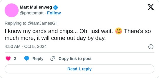
continually saying that WPE's suit is against WordPress.org and the community, which is not true. on which note, his pinned tweet is certainly something:
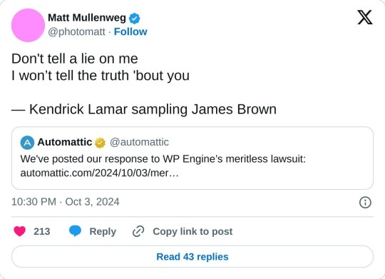
his choice of lawyer is uh. the kind of guy to defend nestle against literal child slaves.
as always, while i think WordPress crumbling will disproportionately affect websites in poorer parts of the world, there are certainly tyrants who are causing much more immediate and potent suffering. if you've read this far, please do send anything you have spare to gazafunds.com.
#long post#automattic#tumblr meta#this is not a complete writeup. adrienne's link does better#but here's a few things of interest to tumblr probably ig#tony muses
190 notes
·
View notes
Text
Here are two non-obvious things about the Tumblr UI that I feel like I can make more clear with some images. As of July 17, 2022 2023... oops:
links to posts on blog themes:

There's a link to view a post on the user's custom blog theme—if they have a custom theme, and have their blog accessible to logged-out users, of course—as the first item in the ⋯ ("meatballs") menu. (This used to be the dog-ear corner at the top right corner of the post, if you remember that.)
Like any normal link, you can control/command click this menu item to open it in a new tab, or right click it to copy the link URL.
links to individual reblogs:

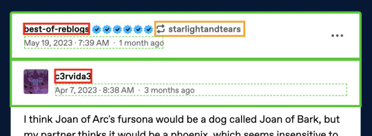
The header areas highlighted in green here—specifically their empty areas—are links directly to the individual reblogs they're the headers for. This is also true in the mobile apps!
You can control/command click them to open them in a new tab.
You can sort of right-click them to copy the link URL... but only if you have post timestamps turned on (it's in your tumblr settings in the dashboard section near the top), and only if you right click on the timestamp, or actually the dashed green area. (I wish this could be true for the whole header, but it's kind of hard for technical web browser limitation reasons.)
The above statements are true without XKit!
Now: by default, the areas highlighted in red and orange are links to the blogs in question. The "restore links to individual posts" option in Tweaks in XKit Rewritten (check out @addons!) does two things:
It changes the red-highlighted links to point directly to the reblog in question, just like their surrounding green area. This doesn't really add any functionality; you could already access that, as just discussed! Edit: I got this wrong; the reblog trail blog names should not be highlighted red.
It changes the orange-highlighted link to point to the immediately preceding reblog (i.e. the one "prev tags" refers to). This definitely does add functionality, since there was literally no way to step backward through the reblog chain otherwise!
For the record, what I would probably have done if I were Staff or if I had been the one to write the XKit Rewritten tweak without anyone else's input is:
Make the green-highlighted areas link to the reblog, as they currently already do.
Make the red-highlighted links point to the user blog, as they currently already do.
Make the orange-highlighted link, including the reblog icon, link to the immediately preceding reblog (i.e. the one "prev tags" refers to). That section is a different color than a blog link and has a special icon, after all; I think it's totally reasonable for it to have slightly different functionality.
In any case, it imo quite obviously should not be impossible to step back through the reblog chain, no matter what you think of the "prev tags" phenomena. Without an extension, there's no way to do this at all right now unless the post has very few notes and you can dig through them.
Some might argue for solving this by putting the a link to the previous reblog in the ⋯ menu. That would certainly be better than nothing, but I think using the orange-highlighted area is a better way. It's not like it's hard to get to a blog from an individual-post-viewed-on-that-blog, anyway.
1K notes
·
View notes
Text
LARRY RESOURCES: A beginner's guide
────x────
II. ADVANCED RESEARCH
Larry’s time capsule. Deep research.
Note: For mobile users, there is a search bar where you can type in the topics you’re curious about.
────x────
Source: Gina (@twopoppies) 𓏔 Tumblr Link: Mobile | Desktop 𓏔 Tags Links: Part 1 | Part 2 | Part 3 | Part 4 | Part 5 | Part 6 | Part 7 | Part 8
──
Source: Daisy (@daisiesonafield-blog) 𓏔 Tumblr Link: Mobile | Desktop 𓏔 Tags Link (check on desktop to view the complete list of her tags)
──
Source: Allie (@skepticalarrie) 𓏔 Tumblr Link: Mobile | Desktop
𓏔 Tags Link
──
Source: Sabine (@awesomefringey) 𓏔 Tumblr Link: Mobile | Desktop
──
Source: @bulletprooflarry 𓏔 Tumblr Link: Mobile | Desktop 𓏔 Tags Link (timelines and tags)
──
Source: @bulletprooflarrybackup-blog 𓏔 Tumblr Link: Mobile | Desktop
──
Source: Marte (@alarrytale) 𓏔 Tumblr Link: Mobile | Desktop 𓏔 Tags Link
──
Source: Paz (@hoovesandfloorpaws) 𓏔 Tumblr Link: Mobile | Desktop 𓏔 Tags Link
──
Larry Stylinson Google Site 𓏔 Website
──
Source: Cosmic Leeds 𓏔 YouTube
──
Source: Freddieismyqueen 𓏔 Re-uploads from various people
──
There we have it! If there’s anything important I missed that should be highlighted, I might just add them in next time. My main goal here is to make a quick overview and one-stop guide especially for baby larries. Since some people aren’t familiar with Tumblr and other platforms, it can be harder to do research without knowing where to start. Don’t hesitate to ask questions if there's anything you're looking for (I've gotten pretty good in scouring the crevices of the internet and we have lots of credible larrie blogs out here ♡ There are some I might've forgotten to add, but they are definitely just as amazing x), but please do check the posts first in case your question has already been answered.
Hope this helps your Larrying journey. And again, TPWK!
Guide by @fookinhellcurlyy | originally posted on my now-backup account, @fookinhellcurly. Will update and create another part as needed.
#larry stylinson#larry masterpost#larry timeline#for beginners#sources#mine#updated post#larry resources: a beginner's guide
122 notes
·
View notes
Text
RODGER:
•┎────────────────────•┖─► ” Good afternoon. I usually keep my phone clean of unnecessary apps.. But Toodles (my beautiful little girl) suggested that I blog in some kind of.. ‘Tumblr' (I've never heard of it)..? It's too hard for me to refuse her, that's why I'm here now. Be polite and don't write me nonsense. Then it will be a pleasure for me to do business with you. ”

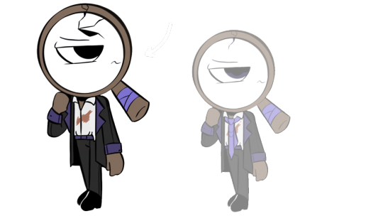
HIGHLIGHTS OF THE BLOG'S PLOT:
— Rodger believes that almost all of his memories are fake because he is a toon (people just created a ‘life’ in the toons' head in order to make full-fledged personalities out of them). Link
— Roger has fully confirmed the fact of his divorce from Teagan. Link
— The termen ‘Twisted' is not known to Rodger. However, he is currently conducting three investigations.: 1) why the Medjers abandoned toons, 2) Why Dandy is looking for a corrupted Ichor, 3) the loss of Astro. Link. Perhaps the star boy went to look for books for Brigtney on the lower floors.. But why hasn't he been here yet? Link. An Ichor cluster disappeared on the lower floors, which greatly surprised Rodger. But now the toons have the opportunity to get previously unavailable supplies.. Did Astro do this? Link. The pipes started making a suspicious noise, which made Rodger very worried. However, a new stage of the operation begins, where he will search for seeds and simultaneously find out about star boy. Link Astro has been declared completely missing. Link
Twisted: 0?/27
— Rodger can how to switch his eye to his mouth. Link
— Roger talks to Glisten all the time out of pity, but is that so? One thing is clear — he does not have mutual feelings for him... Or is he experiencing it? Roger seems to be confused about himself. Link It seems that a serious conversation didn't go very well and Rodger just decided to run away from the problem. What happened? Link
— Brigtney has a more sophisticated club, which now includes: Rodger, Toodles, Teagan, Razzle and Dazzle, Glisten, the lost Astro and actually Vee. Link
━ ─ ─── · ─ ⊰ °.⋆ ❀ ⋆.° ⊱ ─ · ─── ─ ━
Hi!! I am Fiddii/FiRRii! You may have already seen me, because I'm making art on DW. I was very much inspired by this game, so I wanted to create a blog on behalf of Rodger) But this is not an ordinary rp.. I decided to literally make it look like the character is running this page and posting his thoughts here^^ Keep that in mind.
I want to do EVERYTHING here in my headcanon, so don't beat me up (mean, there will be some restrictions on the relationship). I will try to answer in a written form and sometimes Iwill draw small sketches ;)
| | | | | | | • • • • • ★
𖥸 | 𖥸 | 𖥸 | 𖥸 • • • • • • • • ☆
❀ ❀ ❀ • • • • • • • • • • ★
(DNI: PROSHIPPERS, XENOPHILES, HOMOPHOBIA, AND RACISM WILL NOT BE TOLERATED)
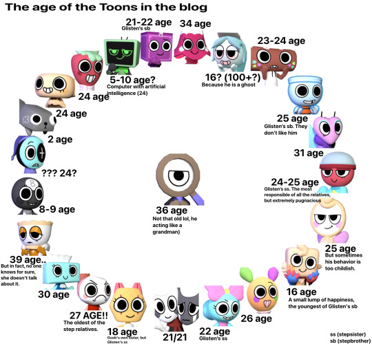
1. Ships (broships) only those that are listed on my.. table (???) sorry
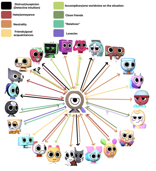
+ table age!
2. If you want to write a question on behalf of toon's, then it's purely in the form of a ‘phone text’ (As I wrote, this is a real blog on tumblr).
3. The blog is conducted exclusively in the world of "Dandys World". Please don't bring up our real world (there may be some exceptions, but they're just for me)
4. As Rodger said, be polite and don't incite hatred here.
5. Yes, this is my au, based on headcanon (But I'm trying to rely on canon Dandys world for the most part).
6. Caution: mention of reflective detective (Please have tolerance for this blog).

╘──────────────────────
│ │ │
│ │ ✦
│ ✦
.✦
‘Enjoy watching!’ #blog rodger_bll
62 notes
·
View notes
Text

Introduction
This is a fan analysis about the results of 24 polls posted on Tumblr by the user @zeldatourney. Huge thanks to them to have organized this tourney.
(Keep in mind my first language isn't English, so I might make some minor mistakes)
This is a long post with multiple graphs, so I'm putting a "Read more" button here!
For each game, the question asked was "How high does [game] rank?" with 7 answers possible to choose:
S tier (One of the greatest)
A tier (A favorite)
B tier (I like it)
C tier (Meh)
D tier (I'd rather play something else)
F tier (AWFUL)
I haven't played this game
The poll started on the 2nd of December 2024 and ended the 9th of December 2024.
Disclaimer: This is not a representation of the Zelda community as a whole, but a result of people who saw and voted for the polls between those previously quoted dates.
For the rest of this post, I will simplify each game's name by its abbreviations. For example, "A Link To The Past" will be named "ALTTP". The polls didn't specify if it contains the original games or both the original games and the remakes. They will be named as such:
[TLOZ] The Legend of Zelda
[AOL] Adventure of Link
[ALTTP] A Link to the Past
[LA] Link's Awakening (DX) (+ the unnamed 2019 remake)
[OOT] Ocarina of Time (3D)
[MM] Majora's Mask (3D)
[OOS] Oracle of Seasons
[OOA] Oracle of Ages
[FS] Four Swords (Anniversary Edition)
[TWW] The Wind Waker (HD)
[FSA] Four Swords Adventures
[TMC] The Minish Cap
[TP] Twilight Princess (HD)
[PH] Phantom Hourglass
[ST] Spirit Tracks
[SS] Skyward Sword (HD)
[ALBW] A Link Between Worlds
[HW] Hyrule Warriors (Legend / Definitive Edition)
[TFH] Tri Force Heroes
[BOTW] Breath of the Wild
[COH] Cadence of Hyrule
[AOC] Hyrule Warriors: Age of Calamity
[TOTK] Tears of the Kingdom
[EOW] Echoes of Wisdom
Collected data
Each poll being independent from each other, the number of votes varies from one poll to another.
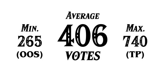
For each games, I added the percentage (as picked up from the HTML for a better precision). The result is either 99.999, 100 or 100.001, so I sometimes cheated to add or remove 0.001 somewhere. Tumblr doesn't give you access to the exact numbers of vote per option.
So before ranking the games, I have to show you first what games are the most played. Adding all answers and doing:
Played (%) = 100 - "I haven't played this game" (%)
I'll use colours to differentiate 2D games (in terms of gameplay) to 3D games. I'll also highlight spin-off games and multiplayer games.
Here are the games played by more than 75% of players:
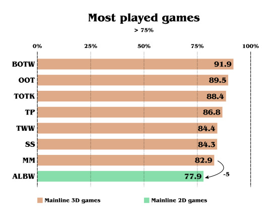
We can already see a huge pattern. All the 3D games are there. And the only 2D Zelda game to be played by 75% of players is ALBW. BOTW and OOT are the most played games of the sample, as those were huge turning points and both cultural and commercial success.
We can also notice the difference of 5% between the least played 3D game (MM) and the most played 2D game (ALBW).
Let's continue to look at the other played games:
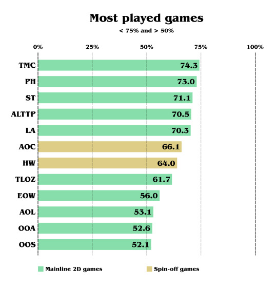
EOW is most likely low as it's the most recent game, at this time, but also because it's not a 3D game. And the hype train was low compared to TOTK. (3 months of anticipation compared to 4 years)
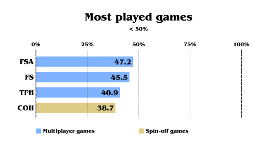
And finally, the multiplayer games are the least played games, excluding COH. Also worth noting that all the spin-off games cited can also be played with another player, but it wasn't the main focus of the communication. COH being a musical tactical rogue-lite only appealed to a specific part of Zelda fans.
If these polls contained the CD-i Zelda games, Link's Crossbow Training and Tingle games, the score would probably be under COH, but we never know!
I'll keep these colours as labels, to recognize them better in the next images.
Alright. Time to share the ranking. Here is the global result, sorted by release date in North America:
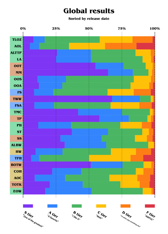
It's kind of a lot to see! Overall, the games are pretty liked. So first, let's take a look at the disliked games:
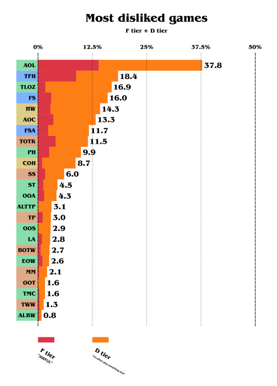
Please note that the X-axis was zoomed, so we can see the result better.
We can already notice that AOL makes a huge contrast. As this game is considered as the black sheep of the franchise because of how different it is, its reputation mostly came from the difficulty of that game.
Almost a factor of 0.5 divides the first disliked game to the second. TFH the second disliked and the original TLOZ follows.
ALBW is the least disliked, with under 1%, counting D tier and F tier.
But notice the F-tier (red) line. It varies a lot, so let's take a look at the most hated games:
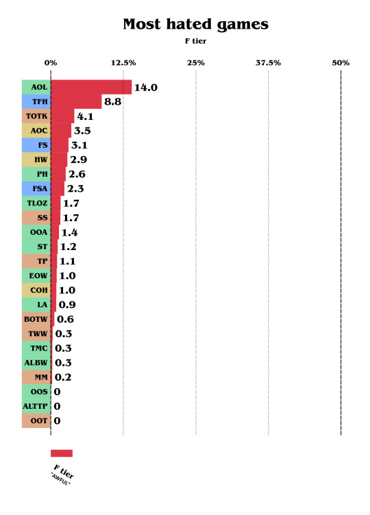
Yep, TOTK is third, this time. As I don't personally think it's awful, it definitively disappointed many by being too close to BOTW and having a lot of issues BOTW didn't have.
Nobody voted "F tier" for ALTTP nor OOT. Same for OOS but keep in mind this game was the least voted one too!
Alright, enough for the hate! Let's look at the most appreciated Zelda games.
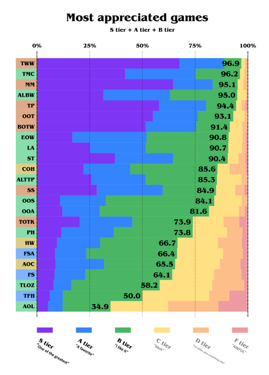
Yep, the majority of Zelda fans like 22.5 out of 24 of the games! (TFH being exactly 50, I half-counted it!)
TWW is being almost unanimously appreciated, with almost 97%, and the second one to get this score is TMC, a 2D game, with more than 96%!
You can notice some gaps, like between ST and COH, and then between the Oracle games and TOTK.
Now let's look at the most loved games:
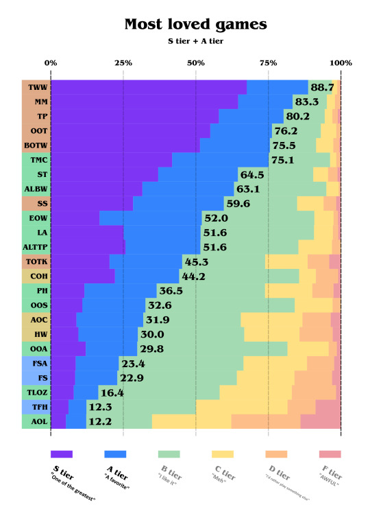
5 3D games are in the top 5, except for SS and TOTK. TMC is very close to beat BOTW and remains the most loved 2D Zelda game. Notice how SS and TOTK make a huge gap between the game before and the game after, like voters use them as references. The two Hyrule Warriors games are, in a funny way, between the Oracle ones.
Let's add a step forward and look at the S tier only:
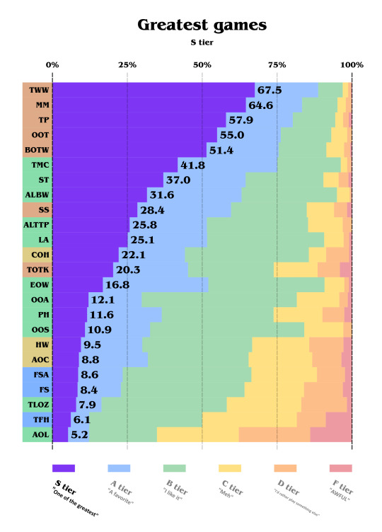
Nothing changes for the top 9 games. However, EOW seems more nuanced and is less considered as best than TOTK.
Final results
And finally, let's rank them using the Majority Judgment:

The Majority Judgment was created to propose a more democratic way to vote. Each candidate has multiple mentions, and you (the elector) must attribute one mention to each candidate. Since this poll uses this exact method of vote, I decided to rank them all using the Majority Judgment. To count using the Majority Judgment, you must focus on the 50% axis, and look at the category that crosses it (more than 50%). That gives you the tier, and the best tier wins.
When two or more candidates get the same tier, there are multiple ways to rank:
The first way is to put a line at the middle and see which line has the higher percentage. (Less precise but more simple)
The second way is to divide it into multiple tiers by doing the first method again and again until each candidates has a unique tier. (More precise but less simple)
But since I didn't want to compare B++++ to B+++-, I used the first method. It's my democracy and I do whatever I want!
Just keep in mind that depending on the way to count these games may be swapped:
ALTTP and LA
OOA and PH
AOC and HW
SO, for the data. Top 5 is TWW, MM, TP, OOT and BOTW. To be honest, I imagined MM to be a more nuanced game, or at least more controversial, since it has a unique concept.
The A tier only contains 2D games, except SS. TMC, ST and ALBW are the favourite 2D games. ALTTP and LA are always very close. The last one of the tier is EOW.
Only mainline games are in the S and A tier.
The first game of the B tier is a spin-off game, followed by TOTK.
TFH was one vote away from being in the B tier. And no surprise, AOL is the last one.
To sum up, according to the participants who voted for these polls:
S tier
🥇 The Wind Waker
🥈 Majora's Mask
🥉 Twilight Princess
⭐ Ocarina of Time
⭐ Breath of the Wild
A+ tier
The Minish Cap
Spirit Tracks
A- tier
A Link Between Worlds
Skyward Sword
A Link to the Past
Link's Awakening
Echoes of Wisdom
B+ tier
Cadence of Hyrule
Tears of the Kingdom
Oracle of Seasons
Oracle of Ages
Phantom Hourglass
B- tier
Age of Calamity
Hyrule Warriors
Four Swords Adventures
Four Swords
The Legend of Zelda
C+ tier
Tri Force Heroes
C- tier
Adventure of Link
Thank you for reading! ~
#the legend of zelda#analysis#the wind waker#wind waker#majora's mask#twilight princess#ocarina of time#breath of the wild#the minish cap#minish cap#spirit tracks#a link between worlds#skyward sword#a link to the past#link's awakening#echoes of wisdom#cadence of hyrule#crypt of the necrodancer#hyrule warriors#tears of the kingdom#oracle of ages#oracle of seasons#phantom hourglass#age of calamity#four swords adventures#four swords#tloz#tri force heroes#adventure of link#zelda 2
56 notes
·
View notes
Text
September Creator of the Month: Tveitertotwrites

Please welcome this month’s Creator of the Month: @tveitertotwrites
Each month, CFWC highlights one of our talented fanfic writers or artists. The writer or artist is selected at random. More info can be found on the navigation page. Past COTMs can be found here.
Tumblr Blog Name: Tveitertotwrites
How do you want to be known on Tumblr? Megan
Quick Links:
Tumblr Blog
Masterlist
1- When did you start playing Choices? What was the first book you played?
I started playing in 2019, and my first book was Rules of Engagement.
2- When and why did you join Choices fandom?
I joined the fandom in January 2022. I had taken a break from Choices for a while but went back in November/December 2021 and started trying to look for fanfiction for Open Heart as I wanted to see if there was more Open Heart content, so I turned to Tumblr and AO3 and decided to join.
3- How did you pick your blog name?
It was the first thing I could think of. I’m not creative with naming things (if anyone remembers my original blog name, it was openheartfanfiction because I only wrote for OH and couldn’t think of anything else). So I was like, “I’m a fan of Aaron Tveit. His fans are called Tveiter Tots, so why not?” I then added writing because most of the content I make is fanfiction.
4- Pull up the first post in your archive, and tell us about it!
It was actually a little intro to my account, but I had deleted it a while back so now it’s this. It is not my favorite. I would definitely redo it now that I have had more experience with text fics.
5- Do you write fanfiction, create fan art, or are you one of those really gifted people who do both?
While I would love to make fan art, currently, I only write fanfiction.
6- How long have you been creating for Choices and for any other fandoms?
I have been writing/creating Choices content since 2022. But I have been writing for Star Wars and Adam Driver Characters since 2020 (even though I am on hiatus from it, and I don’t know if/when I will pick it back up). I also wrote some Marvel fanfiction with a friend in 2021. More recently, I have started writing stuff for Aaron Tveit and Cillian Murphy characters on my non-Choices blog.
7- What is your favorite Choices book, and what is your favorite Choices book to create for?
Right now, I would say either Red Carpet Diaries or America’s Most Eligible is my favorite. But I also like Open Heart, High School Story, and others. I want to create more for RCD and AME, but I think I like creating content for OH.
8- Share your first Choices fanfic or fan art that you posted with us. Do you still like it, or would you change it if you were creating it today?
Since I already mentioned the text fic, I chose the next fic I did. It was for my Open Heart MC’s (Claire Evans) Birthday. And I would 100 percent go back and rewrite it. I like the idea of what I wrote, but I don’t like its execution, and I need to go back and rewrite it.
9- What is your favorite piece of fiction or art that you created?
Right now, I have these two favorites. While I like writing angst, I enjoy writing fluffy stuff like these two fics. Plus, it’s my MC and OC who are besties (Claire and Adelaide), so I had to choose one from both of them.
10- Do you have a fic/art that you didn’t expect to be well received, but it was? What about one you expected to do well but found it could use a little more love?
This was a fic that I wasn't expecting to get notes on. I was still very new to the fandom at the time and hadn’t really interacted with anyone at that point, so seeing people like it was a shock.
Something that I wish I could do better is the content I make for my RCD and AME MCs (Brooklyn Moore and Charlie Howard). I love that people like my OH content, but I don’t see many people liking content from those books (which is fine if you don’t like it).
11- If you could write only angst, fluff, or smut for the rest of your writing life, which would it be and why?
Fluff. While writing Angst and Smut can be fun, writing fluff is a nice escape from real life.
12 - Do you ever recognize yourself in any of your MCs or in your writing?
Yes, I have put some things from myself into my MCs and OCs, like some personality traits, some physical traits, and some hobbies/things they enjoy. So, I do see myself sometimes, but not always.
13 - What element of writing/art do you struggle with most?
Either coming up with titles or writing bits in between the big parts. Usually, one of the last things I do is come up with a title because I can never think of one. Also, writing the “less important” parts in between the parts I want to write is what gets me sometimes and is why I have unfinished fics that I have abandoned.
14 - Do you have any neglected work you really want to finish?
I have some fics that I had done some previews for (last year or the year before) that I would like to finish at some point. Right now, I am trying to finish a Dancing with the Stars AU for Adelaide and Tobias, so that is my writing priority.
15 - If someone you know in real life (who isn’t involved in fandoms) asked to see your work, would you let them? If yes, what would you show them first?
Maybe it depends on who it is. While I don’t think anyone would be too judgemental, I would still be very nervous to show them in fear of them hating it or something like that. I wouldn't show them the smut or some of my earlier fics but the fluff I would.
16 - Are there any writers (published authors and/or fanfic writers) who influenced your writing or art? Are there any artists that influence you?
Not really. I have liked a lot of people’s work, but I don’t think that it really influences my writing at all though.
17- Which one of your stories would you most like to see as a movie/series?
I think my fic “Coming to You” would be fun to see as a movie. Seeing how Ethan and Claire’s relationship grows on screen when they’re in two different worlds would interest me.
19- Do you write original fiction or create non-fandom art?
I have thought about trying to write an original fiction book, but right now I don’t. I do currently write some original screenplays as I am in college for screenwriting.
20- What other hobbies do you have?
I like to paint and listen to music. I like to take drives in the morning to get coffee and relax or at night with my dogs. I like to watch movies and musicals (like Moulin Rouge and Six).
21: BONUS - tell us anything you’d like (if you want to)
Thank you to anyone who has read any of my fics or enjoyed the content I create. It means a lot, and I hope to continue writing content that both you and I can enjoy.
#cfwc creator of the month#playchoices#creator of the month#americas most eligible#red carpet diaries#open heart#pixelberry#choices fic writers creations#tveitertowrites
54 notes
·
View notes
Text
Creating Aesthetic Posts On Tumblr! 🎨
Do you know the exciting thing about formatting on Tumblr? You get to do what you want with your post.
However, if it's still confusing how you can make that happen, let's dive in right away.
♡ 🌹 ♡
STEP ONE: Know your post.
Figure out what your post is about and get it ready. Is it a prompt, an excerpt from your story, your characters, or writing tips and advice?
Ensure you already have the draft edited and ready.
STEP TWO: Major headlines or titles.
If your post has headlines, use the biggest font for the title. Examples:
⚔️ Five easy ways to get a novel done in 6 months.
Chapter 2: A Broken Mirror. 💔
👉Interview with my characters.
STEP THREE: Minor headlines or subheadings.
If you have subheadings or minor headlines, use the bigger font. Examples:
✯✯Read books to be a writer.
✯✯Attend local writing events.
✯✯ Share your work for feedback.
✯✯Write consistently
✯✯Set goals.
STEP FOUR: Colour and highlights.
You can colour your text too, to prove a point, highlight an important message, or for beauty. Long press or highlight the word, phrase, or sentence you wish to add colour to. Example:
With the recent activity happening lately, it has been concluded that it's dangerous to go outside at night.
Give me a reason why you chose to call at such an odd hour.
Cats and dogs are great pets.
Be my bestie!
STEP FIVE: Bold and italics
Long press or highlight your words to bold or italicize. Example:
I can't believe she just said that.
STEP SIX: Embedded link and link box.
If you have a link you want to share, you can do it in two ways.
👉 Embed the link in a text by long-pressing or highlighting the word, phrase, or sentence, clicking the chain icon, and inserting the link. Example:
Buy me a rose if you love what I do to support me.❣️
👉 You can also click on the chain icon to generate a link box, then paste the link in it, and click enter. It would show the content of your link. Example:
If you'd like to support me, buy me a rose.
STEP SEVEN: Emojis.
Use emojis to enhance the beauty of your posts when you feel the need to. Example:
My beautiful plushies just arrived, guys; unbox with me!! 😍🧸
STEP EIGHT: Emoticons
Use emoticons. They are similar to emojis, but made up of signs and symbols. You can use them as emojis or as beautification. Examples:
✅ I pranked my brother with water balloons yesterday; now he hates me. :(
☞ Some items my friend asked me to get for her birthday. ☜
☞Heels
☞Balloons
☞Dress
☞Cake
☞Confetti
☞Donut
☞Punch bowl
STEP NINE: Use listicle
To organize your work and keep it clean, make use of lists. Examples:
Wake up in the morning.
Brush your teeth.
Wash your face.
Eat breakfast, and
Drink coffee.
OR
Wake up in the morning.
Brush your teeth.
Wash your face.
Eat breakfast, and
Drink coffee.
STEP TEN: Images and image descriptions.
You can use images that are free for use on sites like Pexels, Unsplash, etc. Example:

OR
You create your own images on Canva. The image could be infographics, mood boards, etc. Example:
Image descriptions: To increase accessibility, click on the ellipsis on your image, click 'add alt text, then enter a description of your image. See examples above!
If you are an artist, your art can be added to your post where necessary.
STEP ELEVEN: GIF
Use GIF when you feel like it.

STEP TWELVE: Memes.
Create memes on sites like Memix to add a comical side to your post. Example:

OR writing-related memes like:

STEP THIRTEEN: Polls.
You can add a poll to ask the audience questions, giving them specific answers to choose from. You can also set how long you want the poll to last from the drop-down icon, and have up to twelve options.
To create a poll, click on the beach wave-like icon located in the lower right, next to the two human-like figures. Example:
STEP FOURTEEN: Music.
The headphone icon is to add any music to your post. Could be a music that speaks more of your character, etc.
STEP FIFTEEN: Tags
You can tag your mutuals, friends, or people you want to see a certain post. In most cases, writing games and challenges.
@tahbhie
Before posting your formatted post, add # to increase the visibility. There's an option under your post that lets you do that. Click the plus icon and you're on your way. Popular writing tags: #writerblr #writers #novel writing etc..
☞ You can mix all of these ideas to get what works best for each of your posts.
#Spotify#writeblr#writers on tumblr#writers and poets#writing#writerscommunity#writer#wattpad#writing community#ao3 writer#a03 writer#new to tumblr#aspiring writer#aspiring author#writing advice#writing tips#writing techniques#writing blog#blog#writers of tumblr#poets on tumblr#aesthetic#creative writing
22 notes
·
View notes
Note
Hi. I’ve been following you for a while and I really appreciate all the OFMD gifs you make and how you add really good image descriptions. I’m pretty bad at social cues and I wanted to know if you have tips for how to thank gif makers? Do you have advice for how to word the thank you without accidentally sounding weird or rude? Is it OK for someone to thank a gif maker in their ask box if the asker doesn’t follow the gif maker? Any sort of advice like that would be appreciated, or sample scripts that are socially acceptable to send. I know gif makers work really hard and I want to say thanks without accidentally breaking unspoken social rules I don’t know about and I felt safest asking you. I hope that’s OK. Thank you very much.
hi anon 💗 first of all this is such a lovely message and sentiment, thank you 🥹 i'd say you're pretty well on your way already!
i think every gif maker i know would LOVE getting a thank you message! as you say it is hard work, and having that acknowledged will always be appreciated 💗 (no matter if you follow them or not)
here is my specific advice on how to thank gif makers:
reblog! we share the gifs we make because we want to share our love for the show/movie/actor/etc. with other people, and by reblogging, you help us do that. adding something nice in the tags, whether it's something like "this is gorgeous!" or "thank you for giffing this moment, op!", compliments on the coloring (like "love the coloring"/"wow you did such a good job brightening this dark scene!"/"these look so crisp/sharp!"), or commentary on what the gifs show (like "he looks so sad, i wanna give him a hug"/"this scene is so funny/heartbreaking/sweet"/"i never noticed this detail before"), or simply emojis (any combinations of 💖, 🫠, 🥹, 🥺, 😭, 😍 or whatever the gif makes you feel), any kind of reaction like that will be very much appreciated - for me, it's the highlight of making and sharing gifs!
as for sending an ask, i think any kind of thank you message would make gif makers extremely happy 🥹 here are some sample sentences - any variation and combination of these would be lovely to receive, i think (some ideas/options in [brackets]): "i love seeing your gifs on my dash" "thank you for [creating/posting/sharing] your gifs, they [bring so much joy/always make me happy to see]" "i love your coloring, it's so [warm/vibrant/gorgeous/bright and sharp/colorful]" "thank you for giffing [character/person/show], i really appreciate seeing gifs of [that/them]" "thank you for adding [alt text/image descriptions] to your gifs, it helps a lot!" "i really admire how [fast/talented/creative] you are at giffing" ok these are just a few ideas but i hope it's helpful! 💗
this is not a direct way of thanking gif makers (as it should be a given), but i wanna add it because it's important to me: give credit if you share our gifs in other ways than reblogging the original post. please please please do not repost/crosspost gifs without credit. if a gif maker doesn't want their gifs reposted/crossposted at all, please respect it. most, like me, will be fine with it if you credit properly. here are some ways to do that: if you want to use a gif in your own post on tumblr, you can use the Add GIF function, which automatically adds credit (and we get a lil notification), or tag the creator and/or link the original gifset in the post (e.g. "gif by @bizarrelittlemew"). if you want to post a gif to another platform, e.g. twitter, these are some examples on how to give credit: "gif by @/bizarrelittlemew on tumblr", "📸: @/bizarrelittlemew", "gif by @[twitter handle]", "gif source: [link]" and variations of these, written either in the post itself or in a reply right below. not only in the ALT text (as that is for, well, ALT text) and not by making a general note on your profile that "gifs are not my own"/"the gifs i post are from tumblr" or similar (as this won't be evident from the post itself and doesn't credit the gif maker). ok that got a bit long but hopefully it makes sense!
also, if a gifset inspires you to write meta or make your own post about what the gifset depicts, we'd also be very happy if you linked it (like "this gifset reminded me of... / made me think about...") OR simply add it in a reblog of the gifset! the exception (for me, others may feel differently) is if the meta/comment "disagrees" with the gifset, like if the gifset shows "[character] being considerate" and the comment is something like "actually, i don't think this is [character] being considerate, i think they're manipulative". then making a separate post would be more welcome (i'd personally still appreciate a link to the gifset if you were inspired by it).
something that would be rude (since you ask how to avoid that) would be somehow criticizing the gifset in the comments/tags/replies, like disagreeing with the composition (e.g. "i don't think gif number X fits with this theme"), or being negative about the editing/giving unsolicited advice (e.g. "wish these gifs were brighter/sharper" or "hey op you should make your gifs slower/faster"), or talking about how you dislike the show/movie/characters (because the gif maker will see your tags/comments and they probably made the gifs out of love for the thing). as long as you avoid that, you should be fine! 💖
once again thank you for this lovely ask and for wanting to show your appreciation for gif makers 💗
#asks#Anonymous#gifs#gif making#gif makers#sorry for the super long post but i wanted to be thorough for such a lovely ask!! <3
37 notes
·
View notes
Text
alright, guess we're complaining now.


[Image ID: First image: A cropped screenshot of Tumblr's Friday, May 26th, 2023 changelog which reads, "On web, clicking anywhere in a post’s header now opens that post. Previously, you had to click specifically on the blog name."
Second image: A cropped screenshot of Tumblr's Tuesday, May 30th, 2023 changelog which reads, "To clarify a point made in last Friday’s post: on web, clicking the reblogged-from blog name in a reblog’s post header now takes you to that blog, not their reblog. Clicking in the empty space in the post’s header, and in the header of each reblog trail item, now takes you to that specific post in the blog view popup. This is one of a series of updates we’re making to the reblog consumption experience across all platforms, to make it more intuitive and consistent, especially for new users." End ID.]
Tumblr, this change is bad. A lot of other people have already shared their own complaints for this new and awful system, but it's time for me to properly throw my hat in the ring instead of at-ing you directly due to user error. Whoops.
[UPDATE 6/11/2023] HORRIBLE NEWS, EVERYONE! This change has hit mobile. There is no longer any way to access the previous version of a post except through theme reblog chaining on desktop. I've added some extra fun comments both as an edit to this post and as a reblog so nobody misses out.
All my complaints are in the read more because this got LONG.
TL;DR- This change breaks a major signifier used across the site, removes post functionality only to replace it with redundant blog links, and completely destroys a primary mode of social interaction that's been used on Tumblr for over a decade. Here's the Tumblr Staff support link so you can give feedback on how bad this change is.
Part One: Signifiers and Consistency
This is my biggest point, so it will be a bit of a doozy. Strap in.
This change is about making Tumblr operation 'intuitive and consistent' by unifying behavior between like-designed parts of the site. Now on the face that's not a bad reason to do things, and making sure users are able to intuit what a button does based on its properties is good design. I'll give an example:
Hearts symbolize the 'Like' function on Tumblr. The heart button on a post adds it to your Likes, the Likes option on your account is accompanied by that same heart, and Likes show up in post notes with that heart. This heart, then, becomes a consistent and reliable signifier. If you see a heart button on Tumblr, then whatever it's attached to probably has something to do with Likes.
So, back to the change. This change relates to the signifier of the 'Tumblr blog url link'. The idea is thus- on other parts of the site, such as the Search tab on mobile and on a blog in the dashboard tray, you will see related or similar blog suggestions like these:

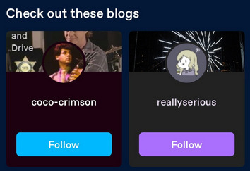
[Image ID: First image: A cropped screenshot of Tumblr's Getting Started help page. It shows an example blog with the 'Blogs like this one' tray visible, populated with four example blogs.
Second image: A second cropped screenshot of Tumblr's Getting Started help page. It shows an example of the Search page on mobile with the 'Check out these blogs' feature highlighted, where two example blog cards are shown. End ID.]
These suggestions are Tumblr blog urls paired with their icon and a little bit of their blog, either the title or some recent posts of theirs. If you click on that url title, the link follows through to that blog. So there's the signifier: click on the url, go to the blog.
But now we have a bit of a snag. What about these?

[Image ID: A cropped reblog screenshot. The crop shows the Tumblr urls of the reblogger @coelpts and reblogged @coelpts-artchives with the reblog symbol between them, the rebloggers icon, and the date that this reblog was posted. End ID.]
Well, these LOOK like Tumblr blog url links. They're styled in the same way. In fact, the reblogger even has a blog icon next to it! So all signs point to these url links pointing directly to a Tumblr blog if clicked on. After this change, that's exactly what they do- so, like, no problem, right?
But, hold on. There's another signifier here! These aren't JUST Tumblr blog url links! This is…


[Image ID: First image: The former image of a cropped reblog screenshot, focused on the urls and reblog icon.
Second image: The Tumblr reblog icon. End ID.]
Our good friend, the Reblog button! That's another classic Tumblr signifier, and it sits right next to the Like button I pontificated about. Reblogs are an integral part of Tumblr, and on top of every single reblogged post you will see that icon. And would you look at that- it's even the same color as the second url link!
Those url links that established the 'url link' signifier that we talked about before, in the search page and on the dashboard tray, aren't attached to any posts. But this url is, and the reblog symbol is right next to it. The reblog signifier modifies the url link signifier. This link should go to the reblog from this user. Right? Because it is a reblog FROM that url link- so that's where it should go! And that's where it used to go, before this update.
[EDIT] I came back to fix some typos I noticed but while I was away I tested mobile to see if this change hit the app yet. It has not, but what I saw instead confirmed the above point- on mobile, selecting the reblogged's url ALSO highlights the reblog icon next to it! These two signifiers are connected, and should be read together.
By changing the url links to be more 'consistent' with other url links across the site, a major signifier that keeps the site together has been broken entirely. What should lead to a reblog- something that is clearly shown through use of a recognizable, consistent symbol- no longer does.
Part Two: Redundant Redundancy
Okay, so that's not all this change does. It also adds a brand new functionality to the post header- the white space is now clickable and serves as a replacement for the original 'to this post' link on the reblogger's side of things. These headers also generate for anyone who adds to the post, and you can click through OP too.

[Image ID: The cropped reblog screenshot from before, but with the word 'Clickable!' written in purple in the blank space above the date. End ID.]
This is also part of that design unity thing; on mobile tapping anywhere on the post header takes you to the post, and you can only tap on the blog url of the person the reblogger reblogged from. That makes sense, since on mobile you're maneuvering your fingers on a small screen and tapping a tiny url next to another tiny url is bound to cause problems.
I don't necessarily have a problem with this on the base of it. I have opinions about mobile and desktop parity that aren't really important here, but it does nicely showcase an issue I DO have- most of the changes made to reblogged posts are completely redundant and unnecessary.
---
[UPDATE] This change has hit mobile now, and it's added a fun new complaint about desktop-mobile parity that is now very suddenly a problem; the headers generated from reblogs with content don't have any responsive feedback for tapping them on mobile. OPs does, but any old Joes doesn't. This is not true on desktop, where on-hover a post header will change color; on mobile they stay completely white and plain with no on-tap color change. On top of that, the new headers are actually harder to see on mobile! There's no clear way to actually see where the header starts and the post continues! Tapping a header was deeply confusing because I got no confirmation I did anything of value until I was wisked away to a post- there's no signifier on mobile that this is a thing you can press.
This is what I was talking about in regards to desktop and mobile parity that wasn't important at the time- what's good for mobile isn't always good for desktop and vice versa. Having a post header be tappable on mobile instead of op's url link, where you have less fine motor control and there's a lot of small buttons clustered together, makes sense; but making all post headers into buttons on desktop isn't a good idea because they aren't 'buttons' and it's very hard to make it clear they are. I mentioned signifiers above and that applies to this change- there just aren't enough signs that show these are all buttons now and where they go. The fact that they're completely unresponsive on mobile really is the cherry on top, because you do not KNOW it's a button unless you tap it accidentally or already know from desktop that all headers link to reblogged posts. The design has been made more confusing; what was a functional affordance on mobile has been applied to desktop without limits or concern, making the original mobile affordance more confusing and producing a poor signifier.
Alright, that's enough from future me. Let's get back to the original post, about how this change that introduces a bad signifier is also redundant.
---
First of all, it's not like clicking the link url just threw you into a post abyss when you clicked it. Clicking through to a reblog…still took you to that blog, both on mobile and on desktop. On mobile all you need to look through the blog proper is to pull down and refresh; on desktop it's even easier, because following a link pulls up the dashboard tray for that blog with the blogs url immediately below their icon.

[Image ID: A screenshot of the previously cropped reblog, now shown on the blog @coelpts. The post is on the left, and the user info card is on the right. End ID.]
This change then removes one step to get to the front of a blogs page, and puts the original longer path on the new clickable header. They go to the same place, the first is just exactly one click faster. You could do the exact same thing by clicking the user icon instead.
But wait! We can get even more redundant! You know what else is standard Tumblr functionality on desktop? The hover card!
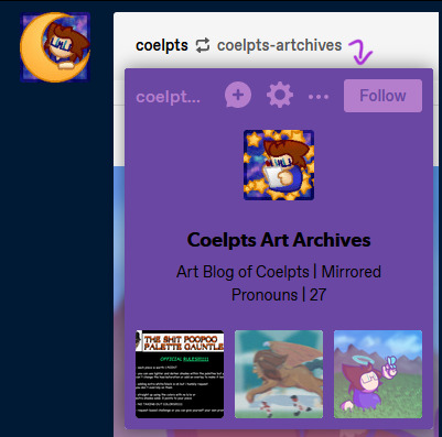
[Image ID: A screenshot of the previously cropped reblog, now showing the card for @coelpts-artchives below the icon. It has the blog title and description alongside three popular posts. A purple arrow points to it from the url. End ID.]
If you hover over any url link for about a second, a card for that blog will pop up. This tray lets you follow a blog, send asks, report them, check their popular posts and do a bunch of stuff straight from the dashboard. It also takes you directly to their blog if you click the url link on the card itself! That's right, there was already a way to go directly to the blog the previous user reblogged from! And every single blog url link does this, too- not just on post headers, but even in the text of a post itself.
So before this change, you had five ways of interacting on a post:
Click the reblogger's url > Reblogger's post.
Click the reblogged's url > Reblogged's post.
Click the reblogger's icon > Reblogger's blog.
Hover on the reblogger's url > Reblogger's blog.
Hover on the reblogged's url > Reblogged's blog.
One of these is redundant, but that's fine- it's just how url links work, and it's better that all urls can do that. Signifiers, we talked about this. But every other link goes to a different place, including the previous version of the post.
After this change, there's six, with changes in bold:
Click the reblogger's url > Reblogger's blog.
Click the reblogged's url > Reblogged's blog.
Click the reblogger's icon > Reblogger's blog.
Hover on the reblogger's url > Reblogger's blog.
Hover on the reblogged's url > Reblogged's blog.
Click the white space header next to a user > User's post.
We now have three ways of getting to the blog of the person who reblogged this post, two ways to get to the blog of the person they reblogged from, ONE way to get to the post, and ONLY if someone added to it!
This change removes functionality and replaces it with needless redundancy. As I said near the top of this section, we could already get to the blog through a reblog link- so all this does is remove getting to previous post iterations.
Part Three: Broken Chains
And hey, let's talk about previous post iterations. Y'know, something that's super important on Tumblr? Different versions of a post float around the site for years- some have been around for a decade or more. And some are only available for one post.
As I'm sure everyone knows, unless a group of tags are peer reviewed and added to the body of the post itself or are appended to the next reblog in the chain, they only exist on that version of the post. This means every iteration of a post is functionally unique, and long before we were given the ability to check the tags on a reblog directly, the only way you could check the tags for a post was by checking every iteration. This practice still exists today with 'prev tags'- users still find it useful to gesture to a previous version of a post and show what other people were thinking or add their own thoughts.
Remember the new redundant links? All that means you can't get to a previous version of a post anymore. Those tags are functionally lost now, unless you dig through that persons blog or through all the notes of a specific post. Sure that may not be a problem for a post with 300 notes or so- but what about 27,000? What about a post that was reblogged three weeks ago? If you're trying to wrangle Tumblr's dodgy search function on the blog itself, what if the post has no text to search for, or if the blog has it's search function turned off? Any post tagged with prev tags now directs to literally nothing. Anyone arguing or conversing in the tags is now speaking at air to everyone else.
There is still one way to trace reblogs. You can access the blog itself- not the dashboard tray, but the actual url.tumblr.com blog- by using a hidden link in the meatball menu off the side of the post.

[Image ID: A screenshot of the previously cropped reblog, now showing the meatballs menu accessed. The first option, showing the date of the reblog, is highlighted. A purple arrow points to this option from the meatballs menu icon and a circle is drawn around it. End ID.]
From there, you can track a post backwards through proper blogs. The reblogged posts will have a 'via Blog' note on them, and you can follow that trail all the way up a chain.
…Unless someone doesn't have a theme enabled. Without a theme, a user won't have a url.tumblr.com domain and it will redirect to the dashboard tray, breaking the chain. And, as of an older update, blogs by default do not have themes enabled- so any and all new users suddenly roadblock this process. Oops.
All of this means that what was once a convenient social aspect of Tumblr has been completely severed with little to no alternative. Trying to wade through hundreds upon hundreds of notes to find the one you're looking for is tedious, time consuming, and potentially impossible if the post is large enough.
Finale: What Now?
Right, so- this sucks. I didn't even go into how this makes it tough to find and block cr/pt/t/rfs if a post passes into their hateful space, or how this makes it harder to copy post links without tracking shit because it's in a different menu now, or how it's now more difficult to access a previous post for reporting purposes. All that shit's also true, but they're side effects of the big three problems the changes introduce.
This change is ultimately user-hostile and seems to follow the worrying trend of 'other sites are doing it, so let's do it too!' Tumblr's been kicking about recently. Tumblr Live, the new change to images and videos, gating viewing posts behind making an account, and attempted algorithm feeds through 'Best Stuff First' and 'Based On Your Likes' are what immediately come to mind. Tumblr's defining, driving aspect for it's continued existence has and always will be its uniqueness. Pretending to be Instagram and TikTok and fucking Twitter will do it absolutely no favors- all it does is undermine what actually makes this site, as a social platform, interesting and vibrant.
But it's one thing to just complain and it's another entirely to provide feedback. Here's a link to the Tumblr Staff support page. They've walked back on new features before when we've made a ruckus- the Shop icon replacement is on the forefront of my mind right now- so it's time to make another.
TL;DR 2- This change makes browsing Tumblr more difficult than it needs to be. It breaks previously established signifiers and removes vital social functions only to add redundant and empty features to cater to a new userbase instead of actually improving the site for the users they already have. It's not a good change.
Thanks for reading ✌️
#tumblr update#staff#support#i highly doubt i'm the only person whose thrown its hat into the ring#but the more posts we have on this bullfuckery the better i say!#at the very least my dear mutuals will be able to see it#and honestly i needed to get this off my chest. it ruined my sleep last night
337 notes
·
View notes
Note
Want to know more about canon killer, but honestly Tumblr is kinda hard to navigate, ya got like a post about it, outside or in your blog, please?
Here’s a Google doc. It wasn’t made by me and some of the links are very out of wack, but it’s there. I’ve been thinking about making my own canon Killer google doc sometime.
I made a ao3 canon killer facts thing like awhile back, like a year. It has absolutely 0 links and I need to go back and fix it sometime, some of the stuff is outdated and worded weirdly so im not really gonna link it, but you can find it on my pinned post.
But I would mostly recommend going to the search on my blog and looking up/clicking on the tag #canon k1ll_sans. You’ll find canon posts I reblogged from his creator and posts I made/reblogs I tagged with it.
I would also definitely recommend giving Killer’s friend, Color and his AU, Othertale, a look if you haven’t already. You can find stuff about his canon on my blog under the tags #0thertale and #canon c0lor sans, but if you don’t want to do that, there’s a link to a google doc I made highlighted in green on my pinned post.
#howlsasks#tempblogac#canon k1ll_sans#utmv#sans au#sans aus#killer sans#killer!sans#killertale#killertale sans#undertale au#undertale something new#undertalesomethingnew#something new#something new sans#something new au#utmv au#utmv fandom#google docs#0thertale#canon c0lor sans#color sans#colour sans#color spectrum duo#color!sans#othertale sans#othertale#they’re a bonded pair#you cannot separate them. they have separation anxiety.
25 notes
·
View notes